Chapter 12
Surveys
You may know whom you want as your ideal target audience, but do you know who is actually using your product? Are your actual users the people you imagined while building the product, or are they completely different? You may know some things about which parts of your product are used and what people complain about. But how widespread are those complaints? Are people using your product as anticipated, or are they using it for something else? Unless you can get the opinions of a large section of your audience, you won’t know what makes your product popular (or disliked).
Qualitative techniques such as interviews, think-aloud usability tests, and observational research give you insight into why people do the things they do when using your product and how some people use your product, but they can’t accurately tell you the prevalence of characteristics and tendencies in user population. Only quantitative techniques can predict how many of your users are teenagers and whether those teenagers in your audience generally desire the new features you’re considering. Knowing your audience’s makeup can tell you on whom to concentrate your qualitative research and, more important, can give you information about what qualities define your audience.
The best tool to find out who your users are and what opinions they hold is the survey. A survey is a set of questions that allows a large group of people to describe themselves, their interests, and their preferences in a structured way. Using statistical tools on the results, you can reveal broad characteristics about your users and extract interesting patterns. When done correctly, surveys can give you a higher degree of certainty about your overall user population than using only qualitative research methods.
Surveys can answer such questions as:
• What kind of Internet connection do they have?
• Is your user population homogeneous, or does it consist of a number of distinct groups?
• What do they want? Does the product provide it?
• What do they like about the product? What do they dislike?
However, surveys can easily go wrong. If not designed carefully, they can ask the wrong people the wrong questions, producing results that are inaccurate, inconclusive, or, at worst, deceptive. Web-based surveys are especially vulnerable because, lacking any direct contact with respondents themselves, their accuracy depends on the perceptions people have of themselves and their ability and willingness to honestly report those perceptions. Without direct contact (whether through in-person visits or analysis of behavioral data), you cannot tell what services respondents really use or whether their descriptions of themselves are accurate. Respondents can only tell you what they think.
When to Conduct Surveys
If you already have a group of people using your product, then the kind of questions you want to ask them will determine when you do a survey. A profile, for example, can be done anytime you want a snapshot of the composition of your current user population. A satisfaction survey could be run before a major redesign in order to make sure the redesign resolves the main problems people are experiencing. A value survey, investigating what people find important, could be run before a major marketing campaign to shape how it describes and promotes the product.
Surveys come in all sizes and structures. Ultimately, it depends on what kind of survey you want to field and what you want to get out of it.
Although it’s possible to use simple surveys to gain a basic understanding of your audience, statistically accurate survey creation is very complex. This chapter covers only fielding a basic survey through a website. For anything more complicated than a simple profile survey, for telephone or email surveys, or for important product decisions that require accurate numerical results, we recommend reading the following books or hiring a professional survey company.
Survey Research Methods by Earl Babbie
The Handbook of Online Marketing Research by Joshua Grossnickle and Oliver Raskin
It can be particularly useful to field a survey after preliminary qualitative research. Methods such as focus groups, interviews, and observational research can give you detailed, specific information about values and behaviors to guide writing survey questions that examine their prevalence. For example, a series of interviews with owners of toy robots can suggest some behaviors to track that you might not imagine yourself: treating the toys like family pets, restricting children from playing with them, giving them as gifts to family and friends, throwing them away after a few days, etc. They can also help guide the kind of terminology you use, so that you’re not writing questions using words participants find confusing.
How to Field a Survey
Before designing a survey, you need to know what you’re trying to accomplish. Start by writing a sentence or two about why you’re doing this survey—your goal. For example, say that you have a mature product, a website that’s been around for several years. Although revenue is decent, the growth of new users has slowed. You have an idea of the size of your audience—but you’re assuming that the kinds of people using your site now are the same as when the site launched. Further, although your site has some unique features, several competitors have similar feature sets. You’ve been counting on your unique features to drive user growth. Though the log files show that the features get used, it’s difficult to tell whether the unique features are the reason people use your product or whether they’re icing on the cake. Completing the sentence “We are going to run a survey,” the reasoning could read as follows:
To understand if our user base has changed since last year, and if so, how, and to understand which features they find most attractive.
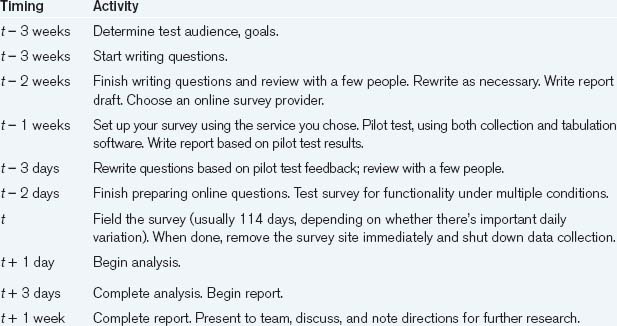
Setting the Schedule
Once you’ve decided on the overall goal for the survey, you need to construct a schedule. Since the preparation of a survey is critical to its success, a typical survey research schedule includes enough time for questions to be written and reviewed and for the survey to be tested and revised as necessary. Once a survey has been sent out, no changes can be made to maintain statistical validity, so leaving time for survey testing and redesign is crucial.
Writing the Survey
You should start by enumerating the goals of your survey as specifically as possible, based on desired outcomes. These might include:
With this list, you should have enough information to choose the kind of survey you’re going to be fielding.
Table 15.1. A Sample Survey Schedule
Brainstorm Your Questions
With the survey goals in mind, brainstorm your questions (you can do this by yourself or with a group). Without stopping, write down every question you can think of that you want to answer with the survey. Don’t try to phrase them in “survey-ese,” just write down what you want to know.
As you’re brainstorming, keep in mind that there are two different kinds of survey goals, descriptive and explanatory.
Descriptive goals aim to profile the audience. They summarize your audience’s composition in terms of their personal characteristics, what they own, what they want, and how they claim to behave. Although such profiles can be quite extensive and sophisticated, they do not attempt to understand how any of the characteristics affect each other.
Explanatory goals explain people’s beliefs and behaviors by uncovering relationships between their answers. For example, a mostly descriptive survey would seek to know which features people use and what their average incomes are, whereas an explanatory survey would try to explain how the size of their income affects the features they prefer. Such goals aim to find inherent relationships between characteristics. The more these relationships can be isolated, the more precise the explanation.
Survey questions themselves come in a variety of flavors. General question categories can be divided into characteristic questions that describe who someone is and what his or her physical and software environment is like, behavior questions that outline how someone behaves, and attitudinal questions that inquire into what people want and believe.
Each of these major categories can have lots of subcategories. We provide some common subcategories to give you an idea of what you might ask.
Characteristic Categories
Demographic. These are questions about who the respondents are. How old are they? What do they do for a living? How educated are they?
Technological. These questions ask about their digital technology setup and experience. What kind of mobile phone do they own? How expert are they at managing online privacy settings?
Behavioral Categories
Technology use. These questions ask people how they use the technologies you care about. How often are they online every week? What kinds of things do they use their washing machine for? What kind of computer experience do they have?
Usage. What product features do they (claim to) use? How often do they use them? What are the reasons they come to your site? How long have they been using it?
Competitive. What other sites do they visit? How often? How long have they been using them? What features do they use?
Attitudinal Categories
Satisfaction. Do they like your product? Does it do what they had expected? Are they able to do what they want with it?
Preference. What do they find most compelling about your product? Which features do they tell their friends about? What do they consider unnecessary or distracting?
Desire. What do they want? What features do they feel are lacking?
Now, with your list of questions in mind, ask other members of your development team to come up with a list of their own. You may want to show them your list, but first ask them to do it from scratch so that they’re not biased by your ideas. Then, when you’ve collected everyone’s questions, share them and see if any additional questions appear from the mix.
This initial list could look like this.
How old are you?
How much do you make?
What’s your education level?
What operating system do you use?
Have you ever heard of Linux?
Have you ever used Linux?
Do you ever use eBay?
What speed is your connection?
How much time do you spend on the web?
How long are you willing to wait to get an answer?
Have you ever used Quicken?
How long have you had your current computer?
Do you own a mobile phone?
How much do you spend on your mobile phone per month?
Do you have a phone plan or do you top up?
What time zone do you live in?
Write the Questions
Ask people only questions that they are likely to know the answers to, ask about things relevant to them, and be clear in what you’re asking. The danger is that people will give you answers—whether reliable or not.
—Earl Babbie, Survey Research Methods,
Now it’s time to write the questions. In Chapter 6, there are a number of rules for asking nondirected questions, questions that don’t lead the person answering them to think that there’s a “right” answer. Most of the suggestions in that section concentrate on the moderator’s immediate behavior and helping staying nonjudgmental, but they apply equally well to survey questions. However, whereas qualitative research questions need to be flexible in order to avoid cramping respondents’ answers, survey questions need to be more precise and restricted in order to be unambiguous. Unlike most interviews, where the questions should be open ended (in other words, they should not limit the set of responses to a list compiled by the interviewer), most survey questions are closed ended. In general, open-ended questions require much more effort from the person answering them and from the analyst. This is desirable in long interview situations with a few people, but much more difficult in a survey situation when there may be potentially thousands of participants. Open-ended questions may be used in surveys—they can provide answers in situations where you have no idea how to write the question in a closed-ended way—but they need to be used carefully and sparingly.
The most common type of closed-ended survey question is the single-answer multiple-choice question. We’ve all seen this type of question: it has a range of choices for the respondent, only one of which may be picked.
Another common type of question is the checklist. This question consists of a list of answers, any number of which can be chosen.
What kinds of news stories have you read in the last week? (Check all that apply.)
In order for closed-ended questions to be comfortably answerable by the respondents, the answers to them need to be specific, exhaustive, and mutually exclusive. Specificity reduces the amount of uncertainty when the time comes to analyze the answer. If your audience consists of dance music DJs and you’re asking about what kind of music they spin, it is important to make sure that you don’t just ask about “dance music,” because DJs themselves may distinguish between two dozen different subgenres. Exhaustive answer lists include all possible answers. For example, the responses to the question above include both “other” and “I haven’t read any news stories.” They reduce respondent frustration and errors, because people won’t be as likely to choose a random answer after searching fruitlessly for the one that matches what they really mean. If you can’t make an exhaustive list of answers, the question should not be closed ended. Answers should also be mutually exclusive to reduce the amount of ambiguity among the choices. If you want to know where people shop, and you ask them to choose between “in my neighborhood” and “nearby,” they could honestly pick either answer—leaving you with inaccurate data.
Obviously, requiring closed-ended questions limits what you can ask. You will have to rephrase your questions to make them closed-ended and eliminate the ones that can’t be rewritten.
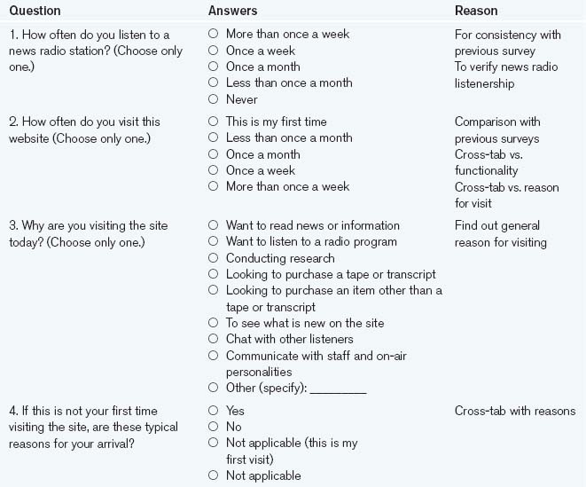
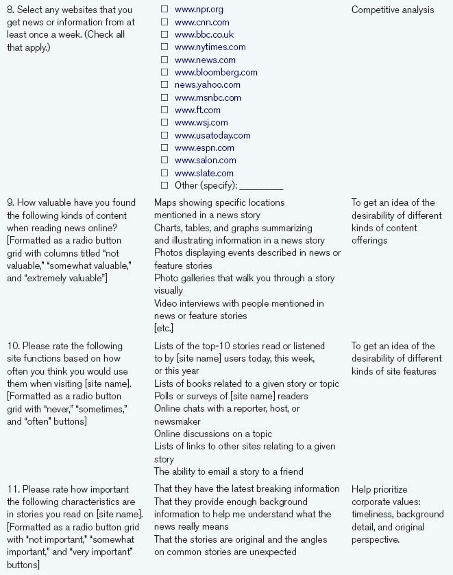
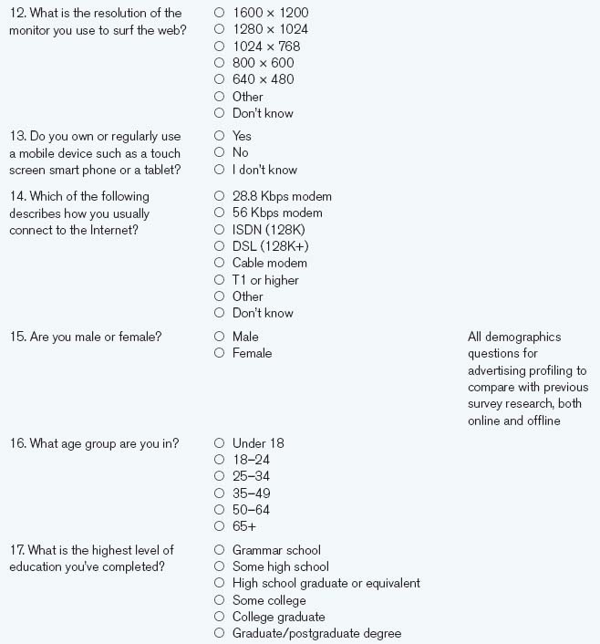
Now, make a grid with four columns. For each question, write the question, the instructions you’re going to give to the respondent, the possible answers, and why you’re asking the question. The “reasons” column is especially important, because you need to make sure that you have a specific justification for each and every question. Why is it important? What is the information going to be used for? Who wants to know? Long surveys can discourage people from completing them, so you want to make sure you have a very good reason for each question.
You may also want to make a second list of information that can be gathered automatically. Web server log files can collect the time a survey was taken, the operating system of the machine used to take the survey, the kind of browser they were using, what Internet domain the machine was on, and so on. Cookies can keep track of who has visited your site before, who has purchased from you before, what their preferences are, and the like.


When writing questions, don’t make people predict their behavior. People’s past behavior is usually better at predicting their future behavior than their statements are. If you’re interested in whether someone would use an online calendaring system, don’t ask
Will you use an online calendaring system?
Ask instead
Have you ever used or ever wanted to use an online calendar system such as Yahoo! Calendar or Google Calendar?
In some cases, people may have little or no appropriate past experience to base their answers on. For example, the process of buying a home (or getting open-heart surgery or enrolling in a university) is relatively infrequent for most people, and past experience may have little relation to their future behavior. This is the one time when asking a hypothetical question may be better than asking about past behavior, since past behavior would be unlikely to yield any useful information.
Avoid negative questions. Negative questions are more difficult to understand and easy to mistake for the positive versions of themselves.
Which of the following features are you not interested in?
can be easily read as
Which of the following features are you interested in?
It’s much simpler to ask
Which of the following features are you interested in?
and then to infer the ones that are not checked are uninteresting to the respondents.
Don’t overload questions. Each question should contain at most one concept that you’re investigating. Although multiple concepts may be linked, they should still be divided into separate, clear individual questions. Compound questions are frustrating for the respondent who only agrees with half of the question, and more complicated for the analyst who needs to infer the respondent’s perspective on both parts of the question.
Do you find yourself frustrated with the performance of the website because it is slow to load?
can be rewritten as
Are you frustrated by the website’s performance?
If so, which of the following aspects of the website’s performance frustrate you?
etc.
Be specific. Avoid words with multiple or fuzzy meanings (“sometimes,” “around,” “roughly,” “any”). When speaking in units other than money, percentages, or other common abbreviations, make sure that the whole name of the unit is written out (“hours” instead of “hrs.,” “thousands” instead of “K,” etc.). Use exact time periods.
So rather than writing a question about how often someone reads news as
the question can be written as
How much time did you spend reading news and information on the web in the last week?
One of the virtues of staying specific is that you avoid the common mistake of asking people to judge their own expertise. The research of communications scholar Eszter Hargittai suggests that asking people to rate their own knowledge, skill, or effectiveness runs into the same problems of self-perception as asking people to predict their future actions. Asking questions about frequency of use or time spent doing certain activities at least allows a more objective comparison between participants. As well, try asking questions that require people to demonstrate, rather than claim, knowledge. Hargittai suggests asking people to choose the one fake term from a list of technical-sounding words.
Never shut people out. Questions should always give people an option that they feel applies to them. The following question, for example, assumes a lot of things about the respondents and their attitudes.
What do you love most about CNN’s website?
Should be rewritten as
Which of the following features are important to you in CNN’s website? (Check all that apply.)
The latter phrasing avoids most of the problems with the earlier question—especially if it provides an option for “None”—and provides most of the same answers.
Stay consistent. Ask questions the same way every time. This means more than just using similar wording for similar questions. You should also strive to maintain consistency in meaning in the order of answer options and in the way the questions are presented.
Avoid extremes. Extreme situations rarely happen, and most people infrequently find themselves exhibiting extreme behavior, so avoid situations that require or imply the need for extreme behavior.
Do you visit a news website every time you go online?
This would probably produce almost exclusively negative responses since it’s likely that only a few people check news every single time they surf. A better way would be to ask
How often do you visit news websites?
and compare the responses to how often people say they surf the web to see the proportion.
Make questions relevant. If people are confronted with a list of questions that don’t relate to their experience or their life, they’re not likely to finish the survey. For example, a group of computer service technicians will respond differently to questions about the minutia of their computer configuration than will a group of taxi drivers. If the respondent can’t answer many of the questions or if they’re not interested in the answers, they’re not likely to be interested in finishing the survey.
Use Likert scales. Likert scales are a familiar method of presenting multiple-choice answers. They consist of a statement or series of statements followed by a choice of three, five, or seven options (most surveys use three or five) that define a possible range of answers, including a neutral middle option.
Rate the following aspects of news and information websites for how interesting they are to you.

Create follow-up questions. When technologically possible, ask questions that further expand on a given answer. Ideally, follow-up questions should appear only after a specific answer for a given question. This is technologically possible with many online survey services. When it’s impossible, it should be clear that the follow-up questions are related to a given answer and that they should not be answered otherwise.
If one question asks
Check all the sites that you read regularly.
a follow-up can then contain a list of sites that were marked as being read regularly.
Rate how important each of the following sites are to you, from “Crucial” to “Unimportant.”
![]() A list of common questions is provided on the book’s website, at www.mkp.com/observing-the-user-experience. However, don’t hesitate to experiment with new questions and question types. Much online research still shows its roots in the paper survey world, with online questions essentially the same as their printed ancestors. Using the possibilities of technology offers a lot of possibilities for innovative questions. A simple example: Rather than asking people for the size of their web browser window (something that many people may not know), it’s possible to put a picture of a ruler onscreen and ask “In the image above, what’s the largest number you can see without scrolling?”
A list of common questions is provided on the book’s website, at www.mkp.com/observing-the-user-experience. However, don’t hesitate to experiment with new questions and question types. Much online research still shows its roots in the paper survey world, with online questions essentially the same as their printed ancestors. Using the possibilities of technology offers a lot of possibilities for innovative questions. A simple example: Rather than asking people for the size of their web browser window (something that many people may not know), it’s possible to put a picture of a ruler onscreen and ask “In the image above, what’s the largest number you can see without scrolling?”
Include an opt-out option. Always include an option for people to signify that a question does not apply to them or that none of the suggested options are appropriate. These are typically phrased as variations on “None of the above,” “Don’t know,” or “No answer,” depending on what’s appropriate for the question.
Leave space for comments. Although most people won’t use them, you should include a space at the end of the survey for people to provide comments about it.
Edit and Order the Questions
The first thing you need to do is to pare down the survey size. One way to maximize the number of responses to a survey is to keep it short. Most people should be able to complete your survey in 20 minutes or less. Surveys that take more than 20 minutes begin feeling like a burden, and respondents have to schedule time to do them. Since reading the instructions takes about 5 minutes and each question takes 30 seconds or so to read and answer, this limits you to about 30 questions total. Keeping a survey to 20 questions leaves you with a safe margin. Besides, as the old game implies, you can find out almost anything about anyone in 20 questions, provided you choose the questions carefully.
Once you’ve written and culled your questions, it’s time to edit and organize them. The question order is as important as the wording. A survey is a dialogue, with every question revealing something to the person taking the survey and providing information to the person receiving the results. Question order should pace, focus, and selectively reveal information.
In some ways, a survey is like a short story. The beginning grabs the readers’ attention, drawing them in. As they read the survey, they begin to get an idea of what kind of information the survey is trying to find out. In the middle, big ideas are explored and “twists” on the basic plot are introduced as certain avenues of inquiry are followed. Finally, loose ends are tied up, and the survey ends. Admittedly, even at their best, surveys do not make exciting stories, but writing them with even a small narrative arc can make them more interesting for the participants, which reduces the number of people who drop out due to boredom.
As in a story, you can gradually reveal what the survey is about, not explaining too much upfront in order to get people’s responses about general topics. Earlier topics may influence people’s expectations and thoughts. If your survey is trying to understand how people buy toys online, you may not want to reveal that your survey is about toys until after you’ve gotten a general picture of their buying behavior.
For example, a survey is trying to understand the relationship between people’s food-buying and toy-buying habits. The following two questions are logical ones to pose.
A. What was the total price of groceries you bought last year?
B. How carefully do you track your purchases?
If question A is asked before question B, then people may think B applies only to groceries, which they may track very carefully, but the survey is more interested in people’s general purchasing behavior. By asking B before A, the survey collects people’s general impressions without constraining their perception of the survey’s scope.
A typical survey has four parts.
1. An introduction that presents the purpose of the survey, instructions for filling it out, the duration of it, and contact information in case questions arise.
2. A beginning with teaser questions. These questions should be interesting to the person taking the survey, drawing them in. They should not be demographic questions, which often bore people and, at this early stage, can be seen as intrusive.
3. A middle, where it’s a good idea to keep things moving by alternating questions that are likely to be interesting to the respondents with questions that are not. Questions are grouped thematically, such as “General News Reading Behavior,” “Online News Reading Behavior,” “Quality of News Sources,” and “Unmet Needs and Desires.”
4. The end, which concludes with all the remaining demographic questions, provides an open-ended field for general response, and reiterates the contact information.
Within this structure, the survey should be flexible. When there isn’t a logical progression in a list of answers to a multiple-choice question (best-to-worst, most-to-least, first-to-last, etc.), the list should be randomized whenever possible. This reduces the chances that the order of the answers will affect how people choose. Some online survey software products do this automatically, but it’s also possible to create several versions of the survey with answers in a different order and randomly assign people to them when creating invitations.
Write the Instructions
There are two different kinds of instructions in a survey: general instructions and individual question instructions.
The general survey instructions should be brief and straightforward. They should run a paragraph at the longest and contain several pieces of information:
• That the survey is important. “We want to make vFork a better service for you. Your participation in this survey is very important to us.”
• What it’s for. “The survey is to help us understand the needs and desires of the people using vFork.”
• Why people’s answers are safe. “All of your answers are confidential and will be used strictly for research. There will be no sales or marketing follow-up because of your participation in this survey.”
• What the reward is. “By completing this survey, you will have our gratitude and a 1 in 100 chance of winning an iPad.”
• Who is responsible for the survey, if not the company in question. “This survey is being administered for vFork by YourCompany LLC.”
• How long the survey is running. “This survey will run from July 17, 2010, until July 24, 2010.”
• Who to contact with questions. “If you have any questions or comments about this survey, you may enter them into the form at the bottom of the survey or mail them to Mike Kuniavsky at [email protected].” This also personalizes it (the survey is no longer an anonymous form), which tends to increase the response rate.
Many places, such as most of the United States, have laws governing sweepstakes (which is what a survey offering a “one in X” chance to win something becomes). Sweepstakes laws require posting their rules clearly along with the survey description. You can get most of what you need by copying the rules from other sweepstakes, but you should absolutely have a lawyer look at what you’ve written before you publicly launch your survey.
Likewise, many places have rules about interviewing children. You should make it clear that only people 18 and older should take the survey. If necessary, ask respondents to verify, through a checkbox on an entry page, that they are over 18 before allowing them to progress into the survey proper. If your survey must involve kids, you should consult a lawyer about how to allow them to take the survey (often this requires written permission from their parents).
Question instructions should likewise be simple and straightforward. Most closed-ended questions won’t need special instructions, but open-ended questions should say exactly what kind of answers you want. Rather than writing
List your favorite websites.
the instructions could say
Make a list of the URLs (web addresses) of sites that you go to often or that you really like. Write up to 10 addresses.
For questions where you want a single answer, but people may feel that any of several options may be adequate, make it clear that they have to select what they feel is the strongest option.
Likert scale grids generally need a couple of sentences of explanation.
The following is a list of features that can be found on vFork and other online fork sites. If you believe that you have used one of these features on vFork, please rate how important the service is to you when buying forks online. If you have never used a feature on vFork please select “Never Used.” If you don’t know whether you have used it, select “Don’t Know.”
You should also make additional instructions visible whenever it’s appropriate, such as for error pages or for sections of questions that resemble other sections but function differently. For example, if a page reloads because of an error, highlight the reasons for the reloaded page and any new instructions on the first screen people see after the new page appears.
Lay Out the Report
The report? But we haven’t started yet! That’s right, lay out the report. One of the best ways to know what questions to ask is to make a list of the answers you want.
The data you collect should be dependent on what analysis you want to perform, what questions you want to answer. You should never ask questions “just in case” (although it’s okay to ask exploratory questions for which you don’t have a good idea about how people will answer).
Your report should begin with your goals and your methods. Writing as if the survey has already been completed, describe why you’ve run this survey, your goals, and the design of your research. Include information about your estimates of the size of the total population from which you sampled, your sampling method, the size of the sample, the completion rate, and how you analyzed the data. Then write your conclusions. Of course, before you start analyzing your data, you won’t know what your real conclusions will be, so these will be your hypotheses, but you will have some idea of what kinds of conclusions you want to have. So write those down.
Sixty-five percent of the people who bought forks in the last month buy forks three times a year or more.
This tells you that you need to collect information about when the last fork was bought, how many times people buy forks a year, and the people who bought forks in the last month need to be large enough for analysis based on it to produce statistically significant results.
Once you’ve written down your placeholder conclusions, you should make all the tables and graphs you’re going to use to back up your conclusions. As the following example shows, the tables should say exactly what variables are being plotted against what other variables and what’s being displayed.

Because the process of writing the report can affect the content of the survey, make sure you budget enough time to at least outline the report beforehand. That way you can make changes to the survey method or the kind of data you collect.
After you’ve run your pilot survey, use your report mockup and run all the pilot data through the same processes you’re planning for the real data, making the same tables and drawing conclusions as you would with the real thing. This will help shake out issues with your analysis procedure.
Web Survey Tips
Now you’re ready to build the survey on the Internet. We won’t go into the technical aspects of creating online surveys since the process will depend on what service or software you chose. However, the basic structure of all web surveys is the same: an HTML page containing a form and a backend program or email-based script to collect the results. Tabulation is accomplished via a custom program, a statistical program, or for simpler surveys, a spreadsheet.
Web Survey Tools
There are a wide variety of online survey options as of 2012. Some are services hosted by an independent website. Others are software packages that you can install and run on your own website. Different services offer different features—from more varied input types to more complicated internal question branching and skipping options. They also offer differing tabulation and reporting options. Part of the work of setting up an online survey is figuring out what services support the type and complexity of questions you need. Note that hosting services often offer free survey packages. These provide more limited functionality (usually, fewer features and a limited number of responses). These free services are great for small, simple projects. Trying out free options can also help you decide whether you want to commit to a paid subscription for a more large-scale and complex survey.
There are some things to keep in mind when building any kind of web-based survey.
• Error checking. The backend system can check how people responded. If any are missing or incorrectly filled out (for example, if someone checked a checkbox for a specific choice and “None of the Above”), the page should be reproduced with the incorrectly filled-in responses clearly flagged.
• Functionality. If you are hosting your own survey system, survey pages should be checked like any other page for functioning HTML, even more than usual. The survey page should download quickly and look right on as many browsers, operating systems, screen sizes, and bandwidth speeds as possible. If you expect a segment of your user base to be behind a firewall, make sure you check the performance with those systems, too.
• Usability. Usability test the survey just as if it were a new feature. This helps to make sure that everything works and that people’s experience of it matches their expectations.
• Timing. Since you can keep track of when responses are returned, do so. This will help keep track of what responses arrived within the research period, and it provides another piece of information about the behavior of your user population. If a large group of your respondents claim to be in the Eastern Standard time zone and their responses arrived between 9 AM and 5 PM EST, you can hypothesize that they were accessing your site from work.
• Mortality. Keep track of the people who drop out of the survey. Note at which points they dropped out, and try to draw some conclusions about how they differ based on the answers they completed.
• Response rate. Similar to mortality, this is a count of people who were offered to take the survey versus how many actually responded. This is critical information when projecting your analysis to a larger population.
Test the Survey
A survey can often only be run once. Rerunning a whole survey is almost as expensive as running the survey the first time; surveys shouldn’t be changed on the fly. Pretesting (also known as pilot testing) the survey is a critical part of its development and can eliminate a lot of costly mistakes.
A pretest is run just like the real thing, using all the same software, the same recruiting methods, the same data collection methods, and the same analysis methods as the final survey. You should even make a pretest report using your report template, drawing conclusions just as you would with the final data. The difference is in terms of sample size. A pilot sample contains 5–10 responses from people who are, ideally, representative of the group who will be responding to the survey (if you can’t get people who match that profile, it’s okay to use people who may match only some of the key criteria). Don’t tell the participants that it’s a pretest. Use the same invitation materials you would use for the regular test, and see if the answers they provide are what you had expected.
Afterward, or simultaneously, do two or three in-person user tests of the survey, watching people as they take the survey. Keep track of how long it takes them to take it and what problems and questions they have about it. You can also follow up with an email to the pilot participants, asking them to discuss how the survey went, what kinds of problems they had, and so forth.
If you have the resources or if this is going to be a particularly involved survey, consider running a prepilot, where you present 5–10 people with the survey questions phrased in an open-ended way. If all of their responses fit within the responses you have written for in your prepared survey, you can be pretty sure you’ve covered the appropriate ground.
Since a large amount of survey analysis involves understanding the uncertainty of the collection method, one of your chief goals in survey design should be to reduce the number of variables that need to be considered and controlled. Everything can influence how people respond to the survey, from who sees the survey to how fast the description page downloads. Thus, as you’re creating the survey and the mechanisms for gathering respondents and collecting responses, continually think of ways of reducing the number of unknown variables.
The Incentive
Unless your survey is extremely short, you should provide an incentive for people to take it. You will want to provide an incentive that’s related to the complexity of your survey and the interests of your audience. Knowing your audience is important to picking the right incentive. The incentive for a site for teenagers and one for middle-aged millionaires will be different, but the goal is the same: it’s a reward for giving up a portion of their time and personal information. An online gaming information site offered a chance to get one Microsoft Xbox in exchange for its visitors’ participation in a survey. Ninety-five percent of the people visiting the site took the survey, a proportion that beats many censuses.
The way you present your incentive is important. If you’re offering something that’s worth $2 for a completed response and your survey takes half an hour to complete, many people may not think that it’s worth their time to fill out. However, if you offer a 1 in 100 chance to win something that costs $200, you’re likely to get more responses. Although the end costs to you are the same, it’s been shown that people would rather gamble with their time for something that’s worth more than take a sure thing that’s worth less.
Fielding the Survey
Fielding a survey is the process of inviting people to take it. It sounds simple, but it’s not. Surveys are neither censuses, which attempt to get responses from the entire population, nor questions answered by a haphazard group of people. They attempt to contact a randomly selected, evenly distributed subset of the population in a controlled way.
So before thinking about how to field your survey, it’s important to discuss what it means to pick a sample from a population.
The Sample and the Sampling Frame
The group of people who fill out your survey is called a sample, but what is it a sample of? It’s a randomly chosen subset of the group of people your sampling method can put you in contact with. This group is called the sampling frame (see Figure 12.1). In other words, out of the universe of all of your users, there’s a subset your methods allow you to contact and a subset they don’t. The subset you can hypothetically contact is your sampling frame; a random selection of people from your sampling frame is your sample.

Figure 12.1 Sample and sampling frame.
Ideally, the sampling frame matches the whole population of people you’re interested in. If it doesn’t, then your results can be inaccurate and misleading since they will not represent the views of your entire audience. For example, if you field a survey only to the people who have complained about your product, you’re not likely to get a good representation of your whole audience’s opinion. Likewise, if you talk only to people who have signed up for a mailing list or who have purchased something from your site, you’re talking only to a group of people who have expressed an active interest in your product, and those people likely form a minority of all the people who may be interested in what you have to offer.
Sampling frame mismatches come in many flavors. If a survey is run only on Monday and Tuesday for a shopping sales notification website that gets the majority of its use on Thursday and Friday, the results will not be representative since the weekend shopping audience is likely to be different from the midweek audience. Likewise, just running the survey on Thursday and Friday may miss a key market of hardcore shopping enthusiasts. Knowing the composition of your sampling frame is critical to knowing how valid your results are. Unfortunately, there are many, many ways to sample badly and get the wrong sampling frame.
First, define the groups of users you’re most interested in. Usage frequency is a good place to start. Are they regular users? (How do you define “regular”? Every day? Every week?) First-time users? Infrequent users?
Now add other characteristics that are important and that can affect the way you recruit people for your survey. Are they people who have bought products from your site? Are they from a specific geographic region? Are they students? People who are thinking of switching from your competitors’ products? Power users?
Your survey may end up being the combination of several subgroups (power users and frequent users, older shoppers, and others).
Having decided who your users are, you will have to create a way that will comprehensively invite the people who make up your target audience, without missing or overrepresenting any groups. Each characteristic will create a different method of inviting people and a different set of potential problems in terms of data collection.
For example, say you’re interested in the usability problems of frequent users, so you’d like to profile people who use your application all the time. Although it may be interesting to know if there’s an observable difference between people who visit often and people who visit and buy your products, you need to stay focused on your target audience choices. So, for example, you decide that your target audience is “users who use the website at least once a week and who have bought something as a result.”
So how do you contact these people? You could use a tracking cookie and ask questions of people whose cookies are less than a week old. But that’s dependent on people not having switched machines, deleted their cookies, or changed browsers. What’s more, it assumes that you have tracking cookies. It may be easier to randomly invite users using a pop-up window and filter out the responses of anyone who doesn’t say they visit at least once a week. Moreover, you will need to run your survey for at least a week or in week-long increments, so as to not overrepresent the visitors who show up on any given day. But is that still guaranteed to target all the users who fit your target profile? No. Some of them may be on vacation; others may skip a week and miss your survey. However, since people do these things randomly, it’s unlikely that this will affect your results. There may also be other groups of users—say, people who shop infrequently but buy a lot—who are also important to you, but you’re not aware of their existence. Missing these people can really affect your results. So how are you going to know about and contact all these people? You won’t and you can’t, but you should strive to contact enough people that their responses can make a positive change in your product.
All this is to say that the more you know about your population and their habits, the better you can choose your sampling frame. However, if you know little about your audience, don’t panic. You can field your first survey to reveal a lot about your audience’s profile, and qualitative research (interviews, focus groups, site visits) can reveal things about their behavior so that subsequent surveys can be more accurately targeted.
Sample Size
So how many people do you invite?
Surveys always contain some amount of uncertainty. There always is a possibility of error in a sample since you’re not asking every single member of the population the same questions in the same way. The size of the uncertainty can be estimated mathematically, but the amount that’s acceptable will have to be decided by you.
Ultimately, surveys depend on the variation in your population. If all of your users are identical, then you need to ask only one of them to understand how all of them would respond. But all of your users aren’t identical, so you have to estimate how many to ask based on how varied the population is. This is a classic chicken-and-egg problem: You can’t find out how varied your audience is without surveying them, and you can’t survey them unless you know how varied they are. Fortunately, it’s possible to estimate how many people to invite by assuming that your population has a pretty “standard” variation and then adjusting future surveys if the estimate turns out to be too low (asking too many people is rarely a problem, other than the extra work it involves).
Let’s start with the assumption that your entire user population has 10,000 people in it. That means that if you count everyone who has ever used your site or is ever likely to use it (within reason, say, within the next year), you’ll get 10,000 people. Now you want to find out how many of them you need to survey in order to be able to get an idea of how all (or the majority) would answer your questions. You’ll never get the “real” values unless you survey all 10,000 people, but (without going into the math—that’s covered later in this chapter) by asking 300 of them, you can be 95% confident that the answers you get from them will fall in a 10% range (“plus or minus 5%,” as they say on TV) of what you’d get if you asked everyone. What does “95% confident” mean? It, too, is explained later in the chapter, but for now you can read it as “pretty darned confident.”
Three hundred people is fine, it’s not such a big number, but what if your audience has a million people in it? Thirty thousand is a lot of people to have in a survey. Fortunately, the relationship between the number of people in your population and the number of people you need to talk to is not proportional in that way. The way the math works, you need to sample only 2000, which is significantly easier. So, without consulting a statistician, you can use the following table to estimate the number of people you need in your sample.
Approximate Sample Sizes∗
| Population | Sample Size |
| 1000 | 150 |
| 10,000 | 300 |
| 100,000 | 800 |
∗ Assuming 5% standard error, 95% confidence, and normal variation.
These numbers are a very rough minimum number of responses necessary for you to be able to extrapolate a survey statistic to the population at large. Statisticians will chastise me for butchering the statistics involved (and, believe me, they are butchered), but the numbers are close enough to make some educated guesses.
To complicate things a bit more, these numbers don’t apply to your whole sample size, but to any single group you’re going to be studying. If you’re going to be segmenting your audience into subgroups (such as by gender or by experience or by region) and doing calculations on the subgroups, then each subgroup needs to be that big. For example, if your product has 10,000 unique users and you’re planning to analyze frequent users separately from infrequent users, both sets of data have to have at least 300 entries. This means you’ll have to have at least 600 responses in your total sample.
Bias
Sampling bias is the Great Satan of survey research. It’s clever, insidious, omnipresent, and impossible to eradicate. Sampling bias occurs when the people who you thought would respond—the members of your sampling frame—are not members of the population that you’re trying to sample (as illustrated in Figure 12.2). This is very dangerous.

Figure 12.2 Sampling bias.
For a sample to provide useful information about the population as a whole, it needs to resemble that population and their views. If it does not, then certain subgroups or views will be overrepresented while other groups and views get shortchanged. When the data from a biased survey are tabulated, the results don’t describe the population. Since the purpose of a survey is to describe your users, misrepresenting elements of your audience undermines the whole endeavor.
To some extent, you are always going to exclude certain people. Just by fielding an online survey, you are cutting out people who are not online. By writing your survey in English, you are cutting out those who don’t read English. The keys are to know whom you are excluding (or misrepresenting) and to make sure that they are not members of your target audience and that you do not include them in your analysis.
One of the most common and important kinds of bias is nonresponder bias. Some number of people will always ignore your invitation, but if there’s a pattern to those who do, it’s bias. If your survey is repelling a certain group, then they’ll never be represented in your research. For example, if you’re surveying people about their time use, and your survey takes 45 minutes to complete, you may be missing the most important segment of your market simply because they don’t have time to fill out your survey. There many other different kinds of nonresponder bias.
• Timing bias. Does the time you invited people affect the way they answered? If you ask people about how much they enjoy shopping for gifts on the day before Christmas, you may get a different response than if you ask at a time when people aren’t frantically grabbing toys off the shelf.
• Duration bias. Some behavior is cyclical: it consistently peaks during a certain part of the day or week or month. If your target audience consists of commodities traders and you run your survey from 9 AM to 5 PM, when most traders are too busy to fill out surveys, you will likely miss a large portion of your audience.
• Invitation bias. How did you invite people to participate in the survey? The places, times, incentive, and wording all affect who is going to respond. If you’re trying to invite skateboarders and you begin your invitation with “Dear Sir or Madam, you are cordially invited to…” you will likely lose much of your audience (unless the invitation is obviously ironic). If you offer t-shirts as an incentive to senior managers, you’re not likely to get a representative group.
• Self-selection. A special kind of invitation bias and a common mistake in web surveys is the practice of letting people choose whether they want to participate in a survey without explicitly inviting them. “Click here to take our survey!” is often how this is presented. Who is going to take that survey? Why will they take it? In an opt-in situation like this, you have no idea who the people who aren’t clicking on the link are. They could be the same kind of people who click on the link, but it’s doubtful. Opt-in surveys tend to attract people who have extreme opinions and specialized interests, which is rarely the only group that you want to attract. It’s better to have people have to opt out of a survey by closing a pop-up window than opt in. That way you know that a random distribution saw the invitation, how many people were invited, and how many chose not to take it.
• Presentation bias. The way you present the survey, the survey’s look and feel, also determines who feels interested in answering it. Technologically, if you use Flash to perform a certain key function and a portion of your key population has Flash turned off, they won’t be able to take your survey. Aesthetically, if you present the survey with a bunch of cute cartoon characters around it, businesspeople may be reluctant to take it (conversely, if you present a plain black-and-white screen full of text to a group of teenagers, they may think it’s too boring to even read). The visual polish of surveys should match that of the sites they’re linked from. If a slick site links to a survey that is too stylistically unsophisticated, it may cause confusion. If the shift is too harsh, it may even damage people’s perception of the site brand.
• Expectation bias. People have expectations of what a survey is going to be about and why they should take it. If those expectations are not met, they may abandon it. In a pretest of a survey, one user said, “Oh, I thought that this was going to be about me and it’s asking all these questions about how I change the oil. I don’t care about that.”
The art of survey design is in tracking response rates to minimize and understand all the preceding factors while maximizing participation. Tabulating results and drawing conclusions are pretty straightforward in comparison. Typical online survey response rates vary between 20% and 40% (which means that between 20% and 40% of the people who are offered to take the survey take it and finish it). Much less than 20% and the results of a survey are highly dubious. As Joshua Grossnickle, co-author of The Handbook of Online Marketing Research, says, “a survey with a 1% response rate is worthless data.” Testing your survey and understanding the implications of your design in terms of the groups that it is excluding are key ways of minimizing the amount of bias.
Invitation
After bias reduction, the next task to consider is how to randomize your sample. Finding a truly random sample can be tough and depends on how you invite people. There are a number of common ways of inviting people to take your survey, and each method has its own benefits and carries its own problems.
Invitation Link
This is the easiest but least accurate online survey invitation method. It consists of a link from a key page (generally the home page) inviting people to participate in a survey. Its benefits are that it’s cheap and unobtrusive, but it suffers heavily from self-selection bias. There’s no guarantee that a random selection of users to the site sees it, and there’s no attempt to distribute the invitation among visitors, so the people who take it are likely to be people who want to communicate something about the site. These groups are likely to be experienced users who have strong opinions. Their views are useful, but are rarely representative of the typical user’s views.
If you do use a front-door invitation link, keep track of all the unique visitors to that page and compare it to the number of people who responded. This will give you some idea of how many have seen the invitation versus how many filled out the survey. If the response rate is small (say 5% of the number of people who have seen the site), then there’s a high chance that the responses are not representative of your audience. The survey may still produce useful information, but it’s unlikely that the conclusions can be extrapolated to the population at large.
If you have a list of known users, you can select a random subset of them and invite them to take the survey. Such an invitation list won’t reach users who aren’t in your database (and therefore haven’t used the services of your site that get them into your database), and it won’t reach people who have opted-out of having email sent to them, but it will let you contact people who almost certainly use your site. More important, it lets you issue explicit invitations so that you know that all potential users were exposed to the same invitation (thus reducing the problems of self-selection), and it lets you track exactly how many invitations resulted in responses.
There are two basic kinds of email survey invitation: one that’s just an invitation to visit a web-based survey and one that results in an email-based survey. Although email-based surveys can reach a wider group of people, they involve more work on the data collection side since the responses have to be parsed (either by hand or with software). Web-based surveys are generally preferred.
Ideally, each email survey invitation will have a unique identifier that will allow you to track which and how many people responded.
When using tracking identifiers, make it clear that the survey software possesses this capability so that respondents who expect the survey to be anonymous know that it’s not. Also make it clear that even though it’s not anonymous, responses will be still be confidential.
Interruption
An interruption invitation works by inviting random users to take a survey as they are visiting your site. Every user has an equal chance of being invited (either every time they visit the site or once per user), and the invitation interrupts their experience of your site such that they have to actively accept or decline the invitation to continue using the site. Interruption invitations tell you exactly how many people were invited, ensure that they were all equally aware of the survey, and guarantee a random sample of all users.
Random interruptions can sample either by probability or systemically. Sampling by probability involves choosing visitors according to a probability that will make the total amount of visitors that meet that probability roughly equal to the expected number of responses. In practice, this generally involves picking a random number for each visitor. If the random number matches a predetermined “magic number,” then the person sees the invitation. Otherwise, they experience the site normally, never knowing that a survey is underway for others. So if you have determined that you need 1000 responses for a week-long survey and the site gets about 100,000 unique visitors per week, then each visitor during that week should have a 1 in 100 probability of being invited to take the survey.
Random Selection
A useful way of creating a consistent probability sample is to include a piece of code on every page. This code performs the necessary calculations about whether the current visitor should be offered the survey and leaves a cookie in his or her browser so that the visitor isn’t considered for invitation more than once per survey (unless, of course, the survey is measuring behavior per visit, rather than per visitor, but those types of surveys are considerably rarer).
In order to accurately measure all visitors, not just those who visit the home page, the code needs to be inserted into every page that someone can get to by typing in a URL. This is easiest with dynamically generated sites, or sites that include a uniform navigation header (in which case the code can be inserted as part of the header), but even sites that are “flat,” made with plain HTML, should still have it inserted at all the likely entry points into a site.
This means that you will need access to the site’s code in order to insert your pop-up. There’s no way around it. Commercial surveying packages will make it a lot easier to insert this code.
Systemic interruptions are sometimes simpler. A systemic sample works by inviting every nth visitor. In our example, this would equate to picking a random number between 1 and 100 and then taking every 100th visitor after that person until 1000 visitors have been invited. This is more of a traditional paper survey technique, where it has the advantage of being simpler to implement, but it’s not as flexible.
Telephone, In-Person, and Standard Mail Surveys
Traditional survey techniques such as telephone, in-person, and paper mailed surveys are beyond the scope of this book, but they should not be forgotten. These are the typical survey techniques used by political and market research. They are the most effective ways to get a truly random sample of the population. One typical tool is the random phone call: a machine randomly dials phone numbers within a certain area code and telephone exchange until someone answers, then a person takes over and begins reading a telephone survey script. However, users of a specific software product or visitors to a certain website are likely harder to find by randomly dialing phone numbers than people who belong to a certain political party or who buy a certain product, so the technique isn’t as efficient for finding users. Although collecting data in person seems to defy the global nature of the Internet, if your audience is easily accessible—such as for an application that serves the teachers in a local school district—then the flexibility and information-gathering potential of an in-person survey is hard to beat. These methods are generally more time consuming and expensive than web-based surveys, but they should not be forgotten just because they’re not digital.
How to Analyze Survey Responses
The world abounds with bad survey research that’s bandied about just because it contains numbers. Do not be deceived by numbers, and do not try to deceive with numbers. Seeing numbers used as evidence does not mean that a rigorous process produced them.
Survey analysis and interpretation is as much of an art as a science. Although it deals with numbers, proportions, and relationships, it also measures statements, and the relationship between statements and actions is notoriously difficult to understand. From the ambiguities of recruiting bias, to misunderstandings in question wording, to the tendency of people to exaggerate, the whole process involves approximations and estimates. Ultimately, every person is different, and the final analysis will miss the subtleties of any single person’s perceptions, behavior, or experience. However, this is all right. In most cases, results can be valuable and useful without complete certainty, and often it’s important to only know the odds in order to make an informed decision.
Thus the analysis of survey data should strive for accuracy and immediate utility. Although sophisticated techniques can sometimes extract important subtleties in data, simpler analysis is preferable in most cases. Simpler methods reduce the possibility of error and labor and are sufficient to answer the majority of questions that come up in typical product development situations.
The two common analysis techniques can be summarized simply as counting and comparing.
Counting
The easiest, and often the only, thing that you can do with results is to count them (to tabulate them, in survey-speak). When basic response data are counted, it can reveal simple trends and uncover data entry errors. It consists of counting all the response values to each question.
You should start by looking through the raw data. The raw information can give you ideas of trends that may be present in the data before you start numerically abstracting the results. How are the results distributed? Is there an obvious way that some responses cluster? Are there any really clearly bogus or atypical responses (such as teenagers with $150,000 personal incomes or skateboarding octogenarians)? Spending time with the raw data can give you a gut-level feeling for it, which will prove useful later.
Once you’ve looked through the raw data, a simple count of all the answers to a given question can be useful. For example, adding up the answers to the question “Which of the following categories includes your household income?” could yield the information shown in Table 12.2.
Table 12.2. Example 1
| Less than $20,000 | 0 |
| $20,001–$29,999 | 2 |
| $30,000–$39,999 | 3 |
| $40,000–$49,999 | 10 |
| $50,000–$59,999 | 12 |
| $60,000–$69,999 | 20 |
| $70,000–$79,999 | 25 |
| $80,000–$99,999 | 28 |
| $100,000–$119,999 | 22 |
| $120,000–$149,999 | 17 |
| $150,000 or over | 5 |
| No answer | 10 |
Displayed as a simple histogram, this reveals some interesting information about the distribution of your audience’s income (Figure 12.3).

Figure 12.3 Example 1, a normal distribution.
From Figure 12.3, it looks like the audience’s income peaks somewhere between $80,000 and $100,000, and that people with incomes between $60,000 and $150,000 make up the majority of the users. If your site was aimed at lower-middle-income participants, then it’s clear that your site isn’t attracting those people in the way you had hoped.
Taking the data from the table, it’s possible to calculate the mean and mode of the data. The mean is the average of the values, in the traditional algebraic sense. It’s calculated by adding all the values of the responses to a given question and then dividing by the number of responses. In the case of ranges of numbers, such as the one above, you can use the midpoint of every range as your starting point. For this example, the mean would be about $86,000, calculated as such

It is “about” $86,000 because the ranges are broad, and the highest range of “$150,000 or over” is unbounded at the upper end (the lower bound was used in calculations). For practical purposes, this is generally enough.
A small number of extreme results can easily skew a mean. It’s the “billionaire” problem: If you’re sampling the actual values of annual salaries and you happen to survey the CEO of Apple, your “average” value is likely to be significantly higher than what the majority of people in your sample make. This is where looking at the raw data is important since it will give you a gut-level expectation for the results. Your gut could still be wrong, but if you looked at a bunch of responses where people had $40,000 and $50,000 incomes and your mean turns out to be $120,000, then something is likely pushing the value up. You should start looking for outliers, or responses that are well outside the general variation of data since a few extreme values may be affecting the mean.
The mode, the most common value, can be compared to the mean to see if the mean is being distorted by a small number of extreme values (in our example, it’s “$80,000–$99,000,” which has 28 responses). When your responses fall into a normal distribution, where the data rise up to a single maximum and then symmetrically fall off (forming the so-called bell curve), the mean and mode are the same (as they are in the example). The larger the sample, the more likely you are to have a normal distribution. However, sometimes you don’t. If for some reason, your site manages to attract two different groups of people, the mean and mode may be different numbers. Take, for example, a site that’s used extensively by practicing doctors and medical school students. The income distributions may look something like that shown in Table 12.3.
Table 12.3. Example 2
| Less than $20,000 | 20 |
| $20,001–$29,999 | 17 |
| $30,000–$39,999 | 14 |
| $40,000–$49,999 | 6 |
| $50,000–$59,999 | 10 |
| $60,000–$69,999 | 12 |
| $70,000–$79,999 | 18 |
| $80,000–$99,999 | 22 |
| $100,000–$119,999 | 20 |
| $120,000–$149,999 | 15 |
| $150,000 or over | 9 |
| No answer | 3 |
The mean of incomes based on this table is about $70,000, but the mode is about $90,000. This is a large enough difference that it says that the distribution of responses is not a balanced bell curve (in fact, it’s what’s called a bimodal distribution), so it’s a tip-off that additional analysis is necessary. A histogram (Figure 12.4) shows this clearly.

Figure 12.4 Example 2, a bimodal distribution.
Since it’s important to know whether you have a single homogeneous population or if you have multiple subgroups within your group of users, looking at the difference between the mode and mean can be an easy, fast check.
Likewise, the median, the value at the halfway point if you sort all the results, can also tell you if your mean is being affected by extreme values. The median of Example 2 is about $75,000 and the mode is $90,000, which tells you that the mean value of $72,000 is being affected by a large cluster of lower numbers, which the histogram clearly shows. Because outliers affected the median less than the mean, the median is the standard typically cited and compared when discussing standard demographic descriptors such as income and age.
How to Deal with Missing Data
Not everyone will answer every question. How should you deal with that? The simplest common method is to report the missing elements when tabulating variables and eliminate those responses from calculations that use those variables in comparisons. Elimination creates the problem that different calculations and conclusions will rely on different numbers of responses. If the sample is sufficiently large and the number of eliminated responses is relatively small, the calculations should still be usable and comparable, but it becomes an issue when the amount of missing data overwhelms the margin of error. Regardless, when the number of responses differ, always list the actual number of responses used. This is generally reported as N = x,where x is the number of responses used in the calculation.
Comparing
Tabulating single variables can be informative and useful, but the real power of survey research lies in comparing the contents of several variables to each other. For example, you may be interested in how the frequency with which people use your site affects what kinds of features they use. Do people who use the site all the time use a different set of features than people who use it occasionally? Knowing this could allow you to better emphasize features and create introductory help. This type of relationship is difficult to discern by just looking at the data, so you need to start using a comparison technique. The most common comparison technique is cross-tabulation. Cross-tabulation uncovers the relationship between two variables by comparing the value of one to the value of another.
Although there are a number of ways to create a cross-tab, a typical technique works as follows:
• Start by identifying the independent variable. This is the factor that you feel is doing the “affecting” and the one that is the subject of your question. In “How is the frequency of visitation affecting the kinds of features our users use?” the independent variable is the frequency of visitation since that is likely affecting the features that people are using (rather than the other way around, where using certain features causes people to visit the site more—this is possible, but not as likely, based on what you know of people’s use of the site).
• Group the responses to the question according to the values of the independent variable. For example, if your question asked, “How often do you use [the site]?” and the multiple-choice answers were less than once a month, once a month, several times a month, and so on, then grouping the responses according to the answers is a good place to start.
• Tabulate the answers to the other variable, the dependent variable, individually within each independent variable group. Thus, if another survey question said, “Which of the following features did you use in your last visit to [the site]?” then people’s answers to it would form the dependent variable. If the answers to this question were the Shopping Cart, the News Page, and the Comparison Assistant, you would tabulate how many people checked off one of those answers for each group.
• Create a table with the tabulated values. For example, the following table compares the features that various groups of people report using in their last visit to the site:

At this point, it should be possible to see simple relationships between the two variables, if any are there to be seen. For example, people who use the site multiple times a month use the Comparison Assistant significantly more than people who use the site less frequently, which likely means that the more people use the site, the more that feature becomes valuable to them. (Why? That’s a question that surveys can’t easily answer. A full research project would likely follow up the survey with interviews to answer questions like that.) Likewise, the News Page seems to be somewhat less important to frequent users than to others, which isn’t surprising considering they visit enough so that less is new to them with each visit. Additional relationships can be found by comparing other variables to each other (for example, length of use to frequency of use: Do people use the site more frequently the longer they’ve been using it?).
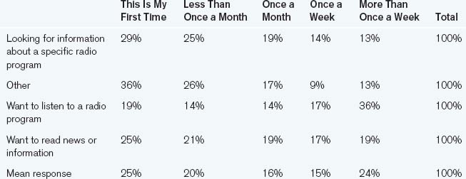
The following table compares the answers to the question “How often do you visit this website?” with “Why are you visiting this site today?” in order to understand whether frequency of visitation affects the reasons why people come to a site. It summarizes only the responses to “Why are you visiting this site today” that have 500 responses or more (because that was determined as the minimum number necessary to be statistically significant).
Displayed as percentages, it’s a little more informative.
A proportion chart, shown in Figure 12.5, however, tells the most compelling story.

Figure 12.5 Example cross-tabulation chart.
Just glancing at the chart reveals several observations.
• Regular visitors visit to listen more than more casual visitors. This implies that one of the driving “stickiness” factors may be the fact that the site offers audio streaming capability.
• Infrequent users tend to look for program information more than regular users. Maybe this is because they don’t know that there’s more there. If so, this could impact both the site’s design and its marketing. Such users also have a tendency to look for “other” things, which may be a further indicator that the site insufficiently communicates what is available since that value drops only a small bit for people who have visited more than once.

Of course, there are other conclusions that can be drawn and many more sophisticated ways of manipulating and displaying relationships between variables, but these topics are beyond the scope of this book (for that, see the excellent information visualization books by Edward Tufte).
If you are using Microsoft Excel for tabulation, much of the grunge work of doing cross-tabs is eliminated by pivot tables. Pivot tables allow you to take lists of raw survey data, one complete set of responses per row, and automatically cross-tab one variable against another. This can be a great timesaver, but be careful: It’s easy to get lost in comparisons and easy to compare things that–logically–should not be compared.
When constructing the table, you should always make it clear how many total responses there are to each independent variable group. The customary way to do this is to add a “total” column (though that’s less useful when discussing percentages, in which case the total is usually 100%; in those cases, use the N = notation, where N is the number of responses).
This is also the time when the calculation for a minimum number of responses comes into play. If the total number of responses in any independent variable group is less than the minimum sample size you calculated at the beginning of the survey, you should not draw any conclusions about that variable. The results are insignificant and should be marked as such, or left out of the report entirely. You can, however, merge groups to create larger groups that have the requisite sample size. When you do that, you should label the new “supergroup” clearly. Thus, if there weren’t enough results in “18–24 years old” to draw any conclusions, you could leave it out of the report entirely, or you could merge it with “25–30 years old” and create an “18–30 years old” group. This, of course, works only with groups where it makes sense to combine the categories.
Estimating Error
Since every survey uses a sample of the whole population, every measurement is only an estimate. Without doing a census, it’s impossible to know the actual values, and a lot of confusion can come from the apparent precision of numerical data. Unfortunately, precision does not mean accuracy. Just because you can make a calculation to the sixth decimal place does not mean that it’s actually that accurate. Fortunately, there are ways of estimating how close your observed data is to the actual data and the precision that’s significant. This doesn’t make your calculations and measurements any better, but it can tell you the precision that matters.
Standard error is a measurement of uncertainty. It’s a definition of the blurriness around your calculated value, and a measure of the precision of your calculations. The smaller the standard error, the more precise your measurement—the larger, the less you know about the exact value. Standard error is calculated from the size of your survey sample and the proportion of your measured value to the whole. It’s calculated as
![]()
where P is the value of the percentage relative to the whole, as expressed as a decimal, Q is (1 – P), and n is the number of samples.
So if you sample 1000 people, 400 of whom say that they prefer to shop naked at night to any other kind of shopping, your standard error would be calculated as the square root of (0.4 ∗ 0.6) / 1000, or 0.016. This means that the actual value is probably is within a 1.6% spread in either direction of the measured value (“plus or minus 1.6% of the measured value”). This is sufficiently accurate for most situations.
Standard error is also useful for figuring out how much precision matters. Thus, if your calculation is precise to six decimal places (e.g., 0.000001), but your standard error is 1% (e.g., 0.01), then all that precision is for naught since the inherent ambiguity in your data prevents anything after the second decimal place from mattering.
The easiest way to decrease the standard error of your calculations is simply to sample more people. Instead of sampling 1000 people, as in the example above, sampling 2000 gives you a standard error of 1.1% and asking 5000 people reduces it to 0.7%. However, note that it is never zero—unless you ask every single person in the target population, there will always be some uncertainty.
Standard deviation is a measure of confidence. It tells you the probability that the real answer (which you can never know for sure) is found within the spread defined by the standard error. With a normal “bell curve” distribution, the numbers are standard: The real value has a 68% chance of being within one standard deviation (one standard error spread) on either side of the measured value, a 95% chance of being within two standard deviations, and a 99% chance of being within three.
The range that a standard deviation specifies around the measured value is called the confidence interval (see Figure 12.6). It’s how standard error and standard deviation are related. Standard error defines the width of the range where you can expect the value to fall, whereas standard deviation gives you the odds that it’s in there at all.

Figure 12.6 Confidence intervals.
Say, for example, a survey measures that 50% of the population is made with a 3% standard error. This means that you can have 68% confidence (one standard deviation, as shown in Figure 12.7) that the actual male percentage of the population is somewhere between 47% and 53%, 95% confidence that the actual percentage is between 44% and 56% (two standard deviations), and 99% confidence that it’s between 41% and 59% (three standard deviations). You can’t know where in that range it is (maybe it’s 54.967353%), but if you need to make decisions based on that amount, at least you’ll know how close your guess is to reality.

Figure 12.7 Confidence interval example.
Measurement Errors
By calculating the standard error and confidence level of a sample, you can get some idea of how close your measured data is to the (often unknowable) objective truth. That doesn’t mean, however, that your data actually represent what it’s supposed to represent. It’s still possible to systematically collect data in a logical, careful, statistically accurate way and still be completely wrong.
As an example of problems that cannot be compensated or predicted with statistics, witness the crash of NASA’s Mars Climate Orbiter. The Orbiter was a state-of-the art piece of equipment built by some of the smartest people in the world. It was launched from Earth in December 1998 and was scheduled to reach Martian orbit in the fall of 1999. The margin of error for such a trip is exceedingly small since the craft carries almost no fuel for corrections should something go wrong. For most of the journey, everything looked great. It flew the whole way flawlessly, its systems regularly reporting its position and velocity back to Earth. The last critical phase before it began its scientific mission was its entry into Martian orbit, which was to be carried out automatically by its systems. As it approached the planet, it began its automatic deceleration sequence. At first it got closer and closer to the planet, as it should have, but then it began to go lower and lower, dropping first below its designated orbit, then below any moderately stable orbit, then below any survivable altitude, and finally into the atmosphere, where it disappeared forever. In the investigation that followed, it was discovered that although one development team was using the English measure of force to measure thrust, pounds per second, another was using the metric measure newtons per second, which is four times weaker. So, although both sets of software were working as designed, the spacecraft thought that it was using one measurement system when, in fact, it was using another, causing a multi-hundred-million-dollar spacecraft to crash into Mars rather than going into orbit around it.
Something similar happens all the time in survey research. A financial website may want to know how often people make new equity investments. The question “How often do you buy new stocks?” may make sense in light of this, but if it’s asked to a group of grocery store owners without first preparing them for a financial answer, it may be interpreted as referring to their inventory. The analysts believe they’re measuring one thing, while the participants are referring to something entirely different.
This is called systematic error since it affects all the data equally. The Mars Climate Observer suffered from an extreme case of systematic error. No matter how accurate the measurements were made, the measurements weren’t measuring what the engineers thought they were. However, there is also random error, the natural variation in responses. Measurements of standard error are, in a sense, a way to compensate for random error; they tell you roughly how much random error you can expect based on the number of samples you’ve collected. Since random errors can appear in any direction, they can cancel each other out, which is why standard error shrinks as the number of samples grows.
Drawing Conclusions
The conclusions you draw from your results should answer the questions you asked at the beginning of the research, the questions that are most important to the future of the product. Fishing through data for unexpected relationships is rarely fruitful.
Before you begin making conclusions, you need to refresh your understanding of the tables you put together at the beginning, and which you are filling out as part of the analysis. What variables do they display? What do those variables measure? Why are those measurements important? Redefine your tables as necessary if your priorities have changed over the course of your analysis.
When you are comparing data, you may want to use numerical tests to determine whether the differences in responses between two groups of responses are significant. In the radio example, the difference between people who came to read news once a week and those who came to read news more than once a week is 2%. Is that a significant difference? The chi-square test and the Z-test are two tests that can be used to determine this though explaining the math behind them is beyond the scope of this book.
When making conclusions from data, there are a number of common problems that you should avoid.
• Confusing correlation and causation. Just because two things happen close together in time does not mean that one causes the other. A rooster crowing at dawn doesn’t make the sun come up though it does usually precede it. This is one of the most commonly made mistakes (look for it and you’ll find it all over the media and in bad research) and is probably one of the strongest reasons for surveys and statistics getting a bad name. It’s a simple problem, but it’s insidious and confusing. Just because a group of people likes a product and uses it a lot doesn’t mean that liking the product makes people use it more or that frequent use makes people like it better. Just think about the case of a company in which everyone is required to use the same email program, whether they like it or not. The two phenomena could be unrelated.
• Not differentiating between subpopulations. Sometimes what looks like a single trend is actually the result of multiple trends in different populations. To see if this may be the case, look at the way answers are distributed rather than just the composite figures. The distributions can often tell a different story than the summary data. For example, if you’re doing a satisfaction survey and half the people say they’re “extremely satisfied” and the other half say they’re “extremely dissatisfied,” looking only at the mean will not give you a good picture of your audience’s perception.
• Confusing belief with truth. Survey questions measure belief, not truth. When you ask, “Have you ever seen this banner ad?” on a survey, you’ll get an answer about what people believe, but their beliefs may not have any relationship to reality. Banner ads, for example, are notoriously liable to a phenomenon called “ad blindness,” in which people who see many advertisements actually stop noticing them. This is also why questions about future behavior rarely predict actual actions: People may honestly believe they can predict how they behave, but their state of mind and apprehension of what’s at stake may be very different when the time actually comes for them to act.
Even if you draw significant distinctions between responses and you present them with the appropriate qualifications, there are still a number of issues with the nature of people’s responses that interpretations of survey data must take into account.
• People want everything. Given a large enough population, there’s going to be a group of people who want every possible combination of features, and given a list of possible features abstracted from an actual product, everyone will pretty much want everything. And why not? What’s wrong with wanting it cheap, good, and fast, even though you know it’s impossible? Thus, surveys usually can’t identify one universally approved combination of features—but a survey can tell you how people prioritize features and which ones they value most highly.
• People exaggerate. When presenting ourselves—even anonymously—we nearly always present ourselves as we would like ourselves to be rather than how we actually are. We exaggerate our positive features and deemphasize our failings. Taking people’s perspectives on their opinions and their behavior at face value almost always paints a rosier picture than their actual thoughts and actions.
• People will choose an answer even if they don’t feel strongly about it. There’s a strong social pressure to have an opinion. When asked to choose from a list of options, even if people feel that their feelings, thoughts, or experiences lie outside the available options, they’ll choose an answer. This is one of the failings of the multiple-choice survey, and it’s why the choices to a question need to be carefully researched and written, and why providing “None,” “Does Not Apply,” or “Don’t Care” options is so important.
• People try to outguess the survey. When answering any question, it’s common to try to guess the reasons behind the question and what the questioner expects to hear. For that reason, it’s important to avoid leading questions. However, you should also keep the phenomenon in mind when interpreting people’s answers. Pretesting and interviewing survey respondents is a good way to avoid questions that provoke attempts to outmaneuver them.
• People lie. Certainly not all people lie all the time about everything, but people do exaggerate and falsify information when they have no incentive to tell the truth or when they feel uncomfortable. For example, if you ask for an address that you can send a prize to, it’s unlikely that people will lie about being able to receive mail there, but if you ask about their household income and they feel that it doesn’t benefit them to answer honestly, they’re less likely to be as truthful.
Ultimately, the best way to analyze a survey is to hire a professional statistician who has appropriate survey research experience and to work with him or her to answer your questions about your product. Ideally, you can begin working with the statistician before you even write the survey. The more you work with a statistician, the more you will realize what kinds of questions can be asked and what kinds of answers can be obtained.
But don’t shy away from running surveys if you don’t have access to a statistician. Without a pro, it’s still possible to field surveys that produce valid, useful, significant results, but it’s important to stay with straightforward questions and simple analyses. A limited survey with a small number of questions fielded to a well-understood group of customers can reveal a lot about your user base, enough to form a foundation from which you can then do other research.
Follow-up and Ongoing Research
Once you’ve run one survey, you should not consider your surveying complete and the survey process over. As your product grows and changes, so will your audience and your knowledge of them. Following up with qualitative research and tracking your audience’s changes can help guide your other research and predict the needs of your audience rather than just reacting to them.
Follow-up Qualitative Research
Survey research tells you what people feel and think about themselves, their behavior, and your product, but it’s too limited a technique to say much about why they feel that way and the nuances of their actions. For that, you need to follow up with qualitative research.
When trying to understand people’s values and their causes, good tools include interviews (Chapter 6), focus groups (Chapter 7), and site visits (Chapter 9). For example, if you are running a satisfaction survey and your audience says that they’re unsatisfied with a certain feature or features, it’s almost impossible to understand why they’re unsatisfied. Is it the idea of the feature? Is it the implementation? Is it the way that it interacts with other features? It’s difficult to understand this without asking people directly, but without first running a survey, interviews—and, in particular, focus groups—may concentrate on less important features than those that really matter to the audience.
To understand people’s actual behavior, rather than how they report their behavior in the survey, direct observation is important. Site visits (Chapter 9) can reveal how people make certain decisions in context. If, in your survey, people say that they read online news two to three times an hour, it’s possible to get an idea of the accuracy of that by actually observing a group of people for a couple of hours during the day. If only a few follow the “two to three times an hour” pattern, then you may take that fact with a grain of salt when interpreting the results. Automatically gathered data (Chapter 16) reveal the pure patterns of their online activities. If a surveyed population overwhelmingly reports visits two or three times an hour, but log file analysis doesn’t support it, you also have cause to doubt what they’re telling you.
Usability testing (Chapter 11) and other think-aloud techniques can reveal people’s decision making and what functionality leads to their perceptions of the product. If they don’t like it, maybe it’s because they can’t use it. Or maybe they like it because it’s fast. Or maybe the speed doesn’t matter and they don’t like it because the button text is red on black or they can’t find what they’re looking for. It’s difficult to know what causes opinions from a survey, but once you know what those opinions are, it helps focus the questions of later research.
Tracking Surveys
By running the same survey in the same way at regular intervals, it’s possible to track how your product’s audience changes. So, for example, as a certain kind of service becomes more popular, it’s likely to attract more and more mainstream users. But how many more? What defines “mainstream”? Repeatedly presenting the same survey to a similar number of people who are invited in the same way reveals whether the profiles change and, if they do, in what ways.
Refined Surveys
If you determine a set of “core” characteristics that define your audience, you can field additional surveys that ask additional questions that deepen your knowledge. So if you determine that the most important factors that define your audience are the level of their computer experience, the frequency of their computer use, and what software they use, you can field surveys that—in addition to asking these questions—ask further questions to probe their preferences, their satisfaction, the common ways they use your product, and so on. Asking all this on one survey may be impossible for purposes of length, but spreading the “noncore” questions among similarly sized groups with a similar composition can give you deeper knowledge than you could acquire otherwise.
Pre/Post Surveys
There are times when you want to know how your audience changes in reaction to a specific change. It could be a major interface change, or it could be an advertising campaign. Identical surveys conducted before and after a significant change in a site or its marketing can reveal how the users’ opinions or how the makeup of the users’ population changes because of the product changes.
A pre/post survey is, as its name implies, run before and after a certain event. The results are compared to see what, if any, effect these changes had on the population. Was a new demographic group attracted to the product after an ad campaign? Are the users more satisfied since the redesign?
Before running a pre/post survey, it’s important to determine what variables you will be observing. What do you expect will change as a result of the changes you’re about to implement? What do you not want to change? Write your survey with those issues in mind, making sure to include appropriate questions that will address these issues.
It’s also important to try to understand the effects of timing on these surveys so that the “pre” survey is fielded before the effects of the change have affected the audience, and the “post” fielded when the effects are greatest. When do you expect that the most significant change will happen? Will it be immediate, or will it take a while to affect the population? Do you expect there to be buzz around the changes you’re about to make? Taking these things into consideration well ahead of the change can minimize the “noise” in observations between the two groups.
In general, multiple surveys can monitor not just what changes happen in your audience, but also how the audience changes. Ideally, you should run two surveys before the change and compare them to give you an idea of some of the natural variation in the way people respond to your survey (the natural bias in people’s answers). Several surveys after the change can help you track how the changes progress. For example, running one survey a week after your change and then a second one several months later may tell you which changes were short term and which were more long term. Even a postsurvey a year after a presurvey is possible if the product does not change in a way significant to what you’re testing.
When fielding multiple surveys, the most critical thing is to keep the surveys as similar as possible. Don’t change the wording, the presentation, or the way that people are invited to take them. Analyze them the same way. Then compare the analyses with an eye for the element that you think changed between the two surveys. Say your changes were made to capture a different market—was your market in fact different? Was it different in the ways you had expected?
Again, the most important thing when analyzing the data from multiple surveys is to make sure that you have set out your questions in advance and that you’ve focused your whole survey effort on answering those questions. Otherwise, you risk snow blindness in the whiteout of data that surveys can generate.
This chapter merely scratches the surface of what surveys can do. The possible combinations of survey methods are limitless. When used carefully with supporting research, they can provide insight into who your audience really is and what they think.
Example: News Site Survey
This is a survey that was written to profile the users of a radio network’s website and to find out the general categories of information that are driving people to go to the site. It was designed to reveal visitors’ expectations in order to optimize the presentation of the content and to provide constraints for subsequent qualitative research. Secondary goals were to prioritize site functionality and to perform a basic analysis of the competitive landscape.