
Chapter 11
Usability Tests
Usability tests are structured interviews focused on specific features in an interface prototype. A one-on-one usability test can quickly reveal an immense amount of information about how people use a prototype, whether functional, mockup, or just paper. The heart of the interview is a series of tasks performed by the interface’s evaluator (typically, a person who resembles the product’s imagined audience). Researchers analyze recordings and notes from the interview for the evaluator’s successes, misunderstandings, mistakes, and opinions. After a number of these tests, researchers compare the observations, collecting the most common issues into a list of functionality and presentation problems.
Using usability tests, the development team can immediately see whether their assumptions about how people will understand and use their designs as they are hold true. Unfortunately, the technique has acquired the aura of a final check before the project is complete. Usability tests often happen at the end of the development cycle—with the feature set already locked, the target markets already determined, and the product ready for shipping. Although prerelease testing can certainly inform the product’s next revision, the full power of the technique remains untapped. Usability tests are more useful when they provide feedback earlier in the development cycle. Then they can check the usability of specific features, investigate new ideas, and evaluate hunches.
This chapter covers tests focused on task completion, rather than activities that address broad questions about how people use certain products. Techniques such as interviews, diary studies, surveys, log analysis, and field visits best accomplish those kinds of broad goals.
When to Test
Usability testing examines how people perform specific tasks, guiding the definition and implementation of functionality. For that reason, usability tests are not a good way to study an entire experience with a product or service. Usability testing is most effective in the early to middle stages of development, before a feature is locked in and its interaction with other features is set. Testing a finalized feature is more of an investment in the next version than in the current one.
Unlike some of the other techniques in this book, usability testing is almost never a one-time event in a development cycle for a product. Every round of testing should focus on a small set of features (usually no more than five). A series of tests can encompass a whole interface or fine-tune a specific set of features.
It makes sense to start usability testing when the development cycle is underway, but not so late that it is impossible to implement extensive changes if testing indicates their necessity. Occasionally, usability testing reveals problems that require a lot of work to correct, so the team should be prepared to rethink and re-implement (and, ideally, retest) what they have tested. For websites and other software, this generally takes at least a couple of weeks, which is why iterative usability testing often occurs about once a month. Changes to hardware, plastic casing, and other nondigital product elements can take longer to re-implement, making tests less frequent.
There are four main types of usability testing.
• Exploratory, to test preliminary concepts and evaluate their promise
• Assessment, to test features during implementation
• Comparison, to assess one design against another
• Validation, to certify that features meet certain standards and benchmarks late in the development process
Figuring out which type of test your planned activity most resembles will help you figure out which features you want to examine, and how.
A solid usability testing program will include iterative usability testing of every major feature. Tests scheduled throughout the development process reinforce and deepen knowledge about people’s behavior, ensuring that designs get more effective with each cycle of testing.
Completely open-ended testing, or “fishing,” is rarely valuable. When you go fishing during a round of user research—often prompted by someone saying, “Let’s test the whole thing”—the results are neither particularly clear nor insightful. Know why you’re testing before you begin (see Chapter 4 for a guide to research planning).
For example, take an iterative usability testing process at Wikipedia, the user-created online encyclopedia. Wikipedia wanted to make it easier for new users to participate in the project by editing or contributing new content. Over a year, the organization partnered with two user research companies to conduct three tests of their user contribution interface. Wikipedia was most interested in the problems novice users might encounter in creating and editing articles. The organization also wanted to know if the help documentation was useful during that process. Third, the developers had questions about the usability of specific features. Finally, the organization also wanted to surface any unknown user experience problems unrelated to those in creating and editing articles.
The first, exploratory, test diagnosed both specific problems for new users (“Clutter”), and some broader reactions to the interface that put them off (“Feeling stupid”). After extensive redesigns, a second test combined validation of the changes, further assessment of specific features, and more exploration of patterns in user experience. The third and final test, which we’ll return to later in the chapter, validated changes made in the third redesign.
How to Do It
Preparation
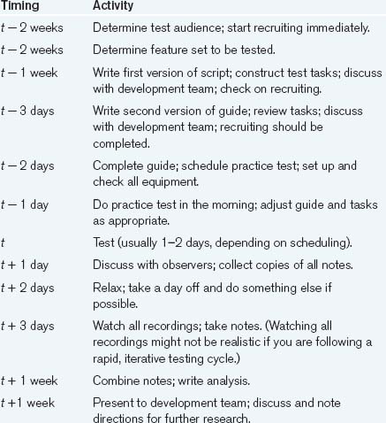
Although it’s similar to the “friends and family” test described in Chapter 2, a full usability test takes significantly longer to plan, execute, and analyze (see Table 11.1). You should start preparing for a usability testing cycle at least three weeks before you expect to need the results.
Table 11.1. A Typical Usability Testing Schedule
Before the process can begin, you need to know whom to recruit and which features to have them evaluate. Both of these things should be decided several weeks before the testing begins.
Recruiting
Recruiting is the most crucial piece to start early. It needs to be carefully timed and precise, especially when outsourced to a specialist recruiting company. Finding the right people and matching their schedules to yours takes time and effort. The more time you can devote to the recruiting process, the better (although more than two weeks in advance is generally too early, since people often don’t know their schedules that far in advance). You also need to choose your screening criteria carefully. The initial impulse is simply to recruit people who fall into the product’s imagined target audience, but that’s usually too broad. You need to hone in on the representatives of the target audience who are going to give you the most useful feedback. (We’re presenting a condensed explanation of the recruiting process here. See Chapter 6 for a more in-depth discussion.)
Say you’re designing a website that sells forks. Your imagined audience consists of people who want to buy forks.
In recruiting for a usability test, that’s a pretty broad range of people. Narrowing your focus helps preserve clarity, since different groups can exhibit different reactions to the same features. Age, expertise, and motivation, just to name a few common differences, can result in very different user experiences. Choosing the “most representative” group can reduce the amount of research you have to do in the end and focus your results.
The best people to invite are those who are going to need the service you are providing in the near future or who have used a competing service in the recent past. These people will have the highest level of interest and knowledge in the subject matter, so they can concentrate on how well the interface works rather than on the minutia of the information. People who have no interest in the content can still point out interaction flaws, but they are not nearly as good at pointing out problems with the information architecture or any kind of content-specific features since they have little motivation to concentrate and make it work.
Say your research of the fork market shows that there are two strong subgroups within that broad range: people who are replacing their old silverware and people who are buying wedding presents. The first group, according to your research, is mostly women in their 40s, whereas the second group is split evenly between men and women, mostly in their mid-20s and 30s.
You decide that the people who are buying sets of forks to replace those they already own represent the heart of your user community. They are likely to know about the subject matter and may have done some research already. They’re motivated to use the service, which makes them more likely to use it as they would in a regular situation. So you decide to recruit women in their 40s who want to buy replacement forks in the near future or who have recently bought some. In addition, you want to get people who enjoy shopping online, so that you do not confuse problems with this specific website with dislike of online shopping in general. Including all these conditions, your final set of recruiting criteria looks as follows:
Men or women, preferably women
25 years old or older, preferably 35–50
Have Internet access at home or work
Use the web five or more hours a week
Have made at least three online purchases
Notice that there is some flexibility in the age and gender criteria. This is to make the recruiter’s life a little easier. You may insist that the participants be all female and that they must be between 40 and 50 years old, but if a candidate comes up who matches the rest of the criteria and happens to be 33 and a man, you probably don’t want to disqualify him immediately. Purchasing experience, on the other hand, requires precise requirements, since getting people who aren’t going to be puzzled or surprised by the details of purchasing online is key to making the test successful. Testing an e-commerce system with someone who’s never bought anything online tests the concept of online shopping as much as the specific product. You rarely want that level of detail, so it’s best to avoid situations that inspire it in the first place.
Recruiters will try to follow your criteria to the letter, but if you can tell them which criteria are flexible (and how flexible they are) and which are immutable, it’s easier for them. Ultimately, that makes it easier for you, too.
How many participants do you need? Unfortunately, there’s no simple answer. More evaluators means catching more potential problems—but at a certain point the cost of recruiting and the extra effort needed to run the tests and analyze the results lead to rapidly diminishing returns. For many years, the conventional choice, following a study by Jakob Nielsen, has been at least five evaluators per simple test. Larger groups still produce useful results, especially for complex tests with many different elements, but after eight or nine users, you may find that the majority of problems appear several times.
However, careful recruiting and task coverage matters. Research from scientists Gitte Lindgaard and Jarinee Chattratichart suggests that the number of tasks and type of evaluators are as important as the number of evaluators. A large number of evaluators who are unrepresentative of your target users will likely be less effective than a smaller number of representative evaluators. Similarly, a large number of representative evaluators performing a very limited number of tasks—or tasks that are irrelevant to actual use—will likely catch fewer severe problems than the same number performing more tasks.
So, to check your understanding of your primary audience, you can recruit one or two people from secondary target audiences—in the fork case, for example, a younger buyer or someone who’s not a recent online shopper—to see whether there’s a hint of a radically different perspective in those groups. This won’t give you conclusive results, but if you get someone who seems to be reasonable and consistently says something contrary to the main group, it’s an indicator that you should probably rethink your recruiting criteria. If the secondary audience is particularly important, it should have its own set of tests, regardless.
To offset no-shows, it’s a good idea to schedule a couple of extra people beyond the basic five. And to make absolutely sure you have enough people, you could double-book every time slot. This doubles your recruiting and incentive costs, but it ensures that there’s minimal downtime in testing. So, for focused task-based usability testing, you should recruit from six to ten people to make sure you have at least five evaluators for each round of testing.
Having decided whom—and how many—to recruit, it’s time to write a screener and send it to the recruiter. (Chapter 6 of this book describes screeners and recruiting.) Make sure to discuss the screener with your recruiter and to walk through it with at least two people in-house to get a reality check.
Then pick a couple of test dates and send out invitations to the people who match your criteria. Schedule interviews at times that are convenient to both you and the participant and leave at least half an hour between them. That gives the moderator enough buffer time to have people come in late, for the test to run long, and for the moderator to get a glass of water and to discuss the test with the observers. With 60-minute interviews, this means that you can do four or five in a single day, and sometimes as many as six. With 90-minute interviews, you can do three or four evaluators, and maybe five if you push it and skip lunch.
If you’re testing for the first time, schedule fewer people and put extra time in between. Usability testing can be exhausting, especially if you’re new to it.
At this point, you will have your evaluators picked and scheduled. To help keep everything straight, we suggest making a master spreadsheet (see Table 11.2) that contains all the pertinent information—time of test, name, responses to the screener questions, and which test conditions each person saw (if you are testing multiple versions of the products). This will help you later, when you need to analyze the data and want some context for your analysis. It will also help speed up writing evaluator profiles for the report.
Table 11.2. A Sample Spreadsheet Layout

Choosing Features
The second step is to determine which features to test. These, in turn, determine the tasks you create and the order in which you present them. Give yourself enough lead time to fine-tune the procedure. A 60- to 90-minute interview can cover five features (or feature clusters). Typical tests range from one to two hours. Initial or broad-based testing requires two-hour tests, while in-depth research into specific features or ideas can take less time (though it’s perfectly acceptable to do a 90-minute broad-based test).
If you have very distinct, different markets for your product, consider creating a different set of tasks for each major market, as people in each market are likely to use your product quite differently.
Test individual functions in the context of feature clusters. It’s rarely useful to test elements of a set without looking at least a little at the whole set. Here’s a good rule of thumb: something is testable if you would draw it while making a 30-second sketch of the interface. If you would sketch a blob labeled “nav bar,” then think of testing the entire navigation bar, not just the new link to the home page.
The best way to start the process is by meeting with the development staff (at least the product manager, the interaction designers, and the information architects) and making a list of the five most important features to test. To start discussing which features to include, look at features that are:
Considered troublesome, based on feedback from earlier versions
Potentially dangerous or have bad side effects if used incorrectly
A Feature Prioritization Exercise
This exercise is a structured way of coming up with a feature prioritization list. It’s useful when the group doesn’t have a lot of experience prioritizing features or is having trouble.
Step 1: Have the group make a list of the most important things on the interface that are new or have been drastically changed since the last round of testing. Importance doesn’t just mean visible prominence; it can change relative to the corporate bottom line or managerial priority. Thus, if next quarter’s profitability has been staked on the success of a new Fork of the Week section, it’s important, even if it’s a small part of the interface.
Step 2: Make a column and label it “Importance.” Look at each feature and rate it on a scale of 1 to 5, where 5 means it’s critical to the success of the product, and 1 means it’s not very important.
Next, make a second column and label it “Doubt.” Look at each feature and rate how comfortable the team is with the design, labeling the most comfortable items with a 1 and the least comfortable with a 5. This may involve some debate among the group, so you may have to treat it as a focus group of the development staff.
Step 3: Multiply the two entries in the two columns and write the results next to them (See Table 11.3). The features with the greatest numbers next to them are the features you should test. Call these out and write a short sentence that summarizes what the group most wants to know about the functionality of the feature.
Table 11.3. Top Five Fork Catalog Features by Priority

Once you have your list of the features that most need testing, you’re ready to create the tasks that will exercise those features.
In addition, you can include comparative (or competitive) usability testing. Although comparing two interfaces is more time consuming than testing a single interface, it can reveal strengths and weaknesses between products. Performing the same tasks with an existing interface and a new prototype, for example, can reveal whether the new design is more functional (or, as every designer fears, less functional). Likewise, performing the same tasks or conducting similar interface tours with two competing products can reveal relative strengths between the two products. In both situations, however, it’s very important to not bias the evaluator toward one interface over the other. (Competitive research is covered extensively in Chapter 5.)
Creating Tasks
Tasks need to be representative of typical user activities and sufficiently isolated to focus attention on a single feature (or feature cluster) of the product. Good tasks should be:
• Reasonable. They should be typical of the kinds of things that people will do. Most people are unlikely to order 90 forks, each in a different pattern, and ship them to 37 different addresses. So although it would certainly test how well the site supports complicated activities, it’s not typical enough to test. However, ordering a dozen forks and shipping them to a single address definitely seems like a typical task.
• Described in terms of end goals. Every product is a tool. It’s not an end in itself. Even when people spend hours using it, they’re doing something with it. Much as actors emote better with a detailed sense of their characters’ motivations, interface evaluators perform more realistically if they’re motivated by a lifelike situation. Phrase your task as something related to the evaluators’ lives. If they’re supposed to find some information, tell them why they’re trying to find it (“Your company is considering opening an office in Moscow and you’d like to get a feel for the reinsurance business climate there. You decide to check today’s business headlines for information about reinsurance companies in Russia.”). If they’re trying to buy something, tell them why (“Aunt Millie’s car sounds like a jet plane. She needs a new muffler.”); if they’re trying to create something, give them some context (“Here’s a picture of Cousin Fred. You decide that as a practical joke you’re going to digitally put a silly hat on him and email it to your family.”).
• Specific. For consistency between evaluators and to focus the task on the immediate functionality in question, the task should have a concrete end goal. So rather than saying “Go shop for some forks,” say, “You saw a great Louis XIV fork design in a shop window the other day; here’s a picture of it. Find that design in this catalog and buy a dozen fish forks.” However, it’s important to avoid using words mentioned in the interface (like “shopping cart”) since that tends to tip off the participant about how to perform the task.
• Doable. If your site has only forks, don’t ask people to find knives. It’s sometimes tempting to see how they use your information structure to find something impossible, but it’s deceptive and frustrating. Ultimately, it will reveal little about the quality of your design.
• In a realistic sequence. Tasks should flow like an actual session with the product. A shopping site could have a browsing task followed by a search task that’s related to a selection task that flows into a purchasing task. This makes the session feel more realistic and can point out interactions between tasks that are useful for designers in determining the quality of the flow through the product.
• Domain neutral. The ideal task is something that everyone who tests the interface knows something about, but no one knows a lot about. When one evaluator knows significantly more than the others about a task, their methods will probably differ from the rest. They’ll have a bigger technical vocabulary and a broader range of methods to accomplish the task. Conversely, it’s not a good idea to create tasks that are completely alien to some evaluators, since they may not even know how to begin. For example, when testing a general search engine, you might have people search for pictures of Silkie chickens. Everyone knows something about chickens, but unless you’re a hen farmer, you probably won’t know much about Silkies. For really important tasks where an obvious domain-neutral solution doesn’t exist, careful recruiting can exclude people with specific knowledge (for example, asking “Do you know what a Silkie chicken is?” in the recruiting screener can eliminate people who may know too much about chickens).
• A reasonable length. Most features are not so complex that to use them takes more than 10 minutes. Three things should determine the duration of a task: the total length of the interview, its structure, and the complexity of the features you’re testing. In a 90-minute task-focused interview, there are 50–70 minutes of task time, so an average task should take about 12 minutes to complete. In a 60-minute interview, there are about 40 minutes of task time, so each task should take no more than 7 minutes. Aim for 5 minutes in shorter interviews and 10 in longer ones. If something needs more time, break it down into subfeatures and reprioritize them (though be aware of exceptions: Even though some important tasks take a much longer time and do not subdivide easily, they still need to be tested).
Estimating Task Time
Usability consultant Carolyn Snyder recommends this method of estimating how long a task will take:
Step 1: Ask the development team how long it takes an expert—such as one of them—to perform the task.
Step 2: Multiply that number by 3 to 10 to get an estimate of how long it would take someone who had never used the interface to do the same thing. Use lower numbers for simpler tasks such as found on general-audience websites and higher numbers for complex tasks such as found in specialized software or tasks that require data entry.
One or more tasks should test each feature on your list. Usually, it’s useful to have two or three alternative tasks for the most important features in case there is time to try more than one or the first task proves to be too difficult or uninformative.
People can also construct their own tasks, within reason. In fact, many usability researchers prefer to have evaluators come up with their own tasks. At the beginning of a usability test, you can ask the participants to describe a recent situation they may have found themselves in that your product could address. Then, when the times comes for a task, ask them to try to use the product as if they were trying to resolve the situation they described at the beginning of the interview.
Another way to make a task feel authentic is to use real money. For example, one e-commerce site gave each of its usability testing participants a $50 account and told them that whatever they bought with that account, they got to keep (in addition to the cash incentive they were paid to participate). This presented a much better incentive for them to find something they actually wanted than they would have had if they just had to find something in the abstract.
Although usability testing is generally a qualitative procedure, you can also add some basic quantitative metrics (sometimes called performance metrics) to each task in order to investigate the relative efficiency of different designs or to compare competing products. Some common quantitative measurements include:
Because such data collection cannot give you results that are statistically usable or generalizable beyond the testing procedure, such metrics are useful only for order-of-magnitude ideas about how long a task should take. Thus, it’s often a good idea to use a relative number scale rather than specific times.
For the fork example, you could have the set of tasks in Table 11.4, as matched to the features listed earlier.
Table 11.4. Sample Fork Tasks

When you’ve compiled the list, you should time and check the tasks. Do them yourself and get someone who isn’t close to the project to try them. This can be part of the pretest dry run, but it’s always a good idea to run through the tasks separately if you can.
In addition, you should continually evaluate the quality of the tasks as the testing goes on. Use the same guidelines that you used to create the tasks and see if the tasks actually fulfill them. Between sessions, think about the tasks’ effectiveness and discuss them with the moderator and observers. Although it’s a bad idea to drastically change tasks as you go, it’s okay to make small tweaks that improve the tasks’ accuracy in between tests, keeping track of exactly what changed in each session.
Originally, usability tasks tested small, discrete actions that could be easily timed (such as “Save a file”). After numerous tests, researchers would compare task completion times to a predetermined ideal time. Although that’s useful for seeing how frequent, long-term users of dedicated applications perform low-level tasks, larger-grained tasks are a simpler way to analyze many casual interactions. Moreover, timing task completion diverts attention from qualitative issues of comprehension and satisfaction, which is what largely leads to whether people want to use a product or service again.
Writing a Script
With tasks in hand, it’s time to write the script. Sometimes called a “protocol,” sometimes a “discussion guide,” the script is really just that—a list of instructions for the moderator to follow so that the interviews are consistent and everything gets done.
A script generally has three parts: the introduction and preliminary interview, the tasks, and the wrap-up. The one that follows is a sample from a typical 90-minute e-commerce website usability testing session for people who have never used the site under review. About a third of the script explores the participants’ interests and habits. Although those topics are typically part of an interview or a focus group, it’s often useful to investigate them as well in usability testing. Another third focuses on task performance, where the most important features get exercised. A final third is administration.
Introduction (5–7 minutes)
The introduction is a way to break the ice and give the evaluator some context. This establishes a comfort level about the process and their role in it.
[Monitor off, video off, computer reset]
Hi, welcome, thank you for coming. How are you? (Did you find the place okay? Any questions about the non-disclosure agreement? Etc.)
I’m _____. I am helping _______ understand how well one of their products works for the people who are its audience. This is ______, who will be observing what we’re doing today. We’ve brought you here to see what you think of their product: what seems to work for you, what doesn’t, etc.
This evaluation should take about an hour.
We’re going to be video recording what happens here today, but the video is for analysis only. It’s primarily so I don’t have to sit here and scribble notes and I can concentrate on talking to you. It will be seen by some members of the development team, a couple of other people, and by me. It’s strictly for research and not for public broadcast, publicity, promotion, or laughing at holiday parties.
Video equipment is often blatantly obvious and can be intimidating. Talking about it helps relieve a lot of tension about it. Likewise, if there’s a two-way mirror, mentioning it—and the fact that there are people behind it—also serves to alleviate anxiety. Once mentioned, don’t bring it up again. The equipment fades quickly into the background, and discussing it again is a distraction.
Also, note that the script sounds conversational. It’s unnecessary to read the script verbatim, but the style of the script should remind the moderator to keep the tone of the interview casual. In addition, every section has a duration associated with it so that the moderator knows about how much time to spend on each one.
Like I said, we’d like you to help us with a product we’re developing. It’s designed for people like you, so we’d really like to know what you think about it and what works and doesn’t work for you. It’s currently in an early stage of development, so not everything you’re going to see will work right.
No matter what stage the product team says the product is in, consider telling evaluators that it’s in an early stage. Telling evaluators that the product is a work in progress helps them relax and gives them more license to make comments about the product as a whole.
The procedure we’re going to do today goes like this: We’re going to start out and talk for a few minutes about how you use the web, what you like, what kinds of problems you run into, that sort of thing. Then I’m going to show you a product that ________ has been working on and have you try out a couple of things with it. Then we’ll wrap up, I’ll ask you a few more questions about it and we’re done.
Any questions about any of that?
Explicitly laying out the whole procedure helps the evaluator predict what’s going to come next and gives them some amount of context to understand the process.
Now I’d like to read you what’s called a statement of informed consent. It’s a standard thing I read to everyone I interview. It sets out your rights as a person who is participating in this kind of research.
As a participant in this research:
The informed consent statement tells the evaluators that their input is valuable, that they have some control over the process, and that there is nothing fishy going on.
Preliminary interview (10–15 minutes)
The preliminary interview establishes the context for the participant’s later comments. It also limits the interview’s focus to the space of the evaluator’s experience by beginning with general questions and then narrowing the conversation to the context of the product. For people who have never participated in a usability test, it increases their comfort level by asking some “easy” questions that build confidence and gives them an idea of the process.
In this case, the preliminary interview also features a relatively extensive investigation into people’s backgrounds and habits. It’s not unusual to halve the number of questions and to allot the initial context-setting interview 5 minutes, rather than 10–15.
[Video on]
How much time do you normally spend on the web in a given week?
How much of that is for work use, and how much of that is for personal use?
Other than email, is there any one thing you do the most online?
Do you ever shop online? What kinds of things have you bought? How often do you buy stuff online?
Do you ever do research online for things that you end up buying in stores? Are there any categories of items that this happens with more often than others? Why?
Is there anything you would never buy online? Why?
When applicable, it’s useful to ask about people’s offline habits before moving the discussion to the online sphere. Comparing what they say they do offline and what you observe them doing online provides insight into how people perceive the interface.
Changing gears here a bit, do you ever shop for silverware in general, not just online? How often?
Do you ever do that online? Why?
[If so] Do you have any favorite sites where you shop for silverware online?
[If they do] What do you like the most about [site]? Is there anything that regularly bothers you about it?
It’s important that evaluators don’t feel belittled during the test. Badly designed tools and arrogant companies have conditioned people to blame themselves for unsuccessful experiences. Although it’s difficult to undo a lifetime of software insecurity, the evaluation instructions help get evaluators comfortable with narrating their experience, including positive and negative commentary, in its entirety.
Evaluation instructions (3 minutes)
In a minute, I’ll ask you to turn on the monitor and we’ll take a look at the product, but let me give you some instructions about how to approach it.
The most important thing to remember when you’re using it is that you are testing the product, the product is not testing you. There is absolutely nothing that you can do wrong. Period. If anything seems broken or wrong or weird or especially, confusing, it’s not your fault. However, we’d like to know about it. So please tell us whenever anything isn’t working for you.
Likewise, tell us if you like something. Even if it’s a feature, a color, or the way something is laid out, we’d like to hear about it.
Be as candid as possible. If you think something is awful, please say so. Don’t be shy; you won’t hurt anyone’s feelings. Since it’s designed for people like you, we really want to know exactly what you think and what works and doesn’t work for you.
Also, while you’re using the product I’d like you to say your thoughts aloud. That gives us an idea of what you’re thinking when you’re doing something. Just narrate what you’re doing, sort of as a play-by-play, telling me what you’re doing and why you’re doing it.
A major component to effective usability tests is to get people to say what they’re thinking as they’re thinking it. Introduce the technique upfront, but also emphasize it during the actual interview.
Does that make sense? Any questions?
Please turn on the monitor [or “open the laptop”]. While it’s warming up, you can put the keyboard, monitor, and mouse where they’re comfortable for you.
First impressions (5–10 minutes)
First impressions of a product are incredibly important, so testing them explicitly is always a good thing and quick to do. Asking people where they’re looking and what they see points out the things in an interface that pop and provides insight into how page loading and rendering affects focus and attention.
If you are evaluating a website, the interview begins with the browser up, but set to a blank page. Loading order affects the order people see the elements on the page and tends to affect the emphasis they place on those elements. Knowing the focus of their attention during the loading of the page helps explain why evaluators view certain elements as more or less important.
Now that it’s warmed up, I’d like you to select “Forks” from the “Favorites” menu.
[Rapidly] What’s the first thing your eyes are drawn to? What’s the next thing? What’s the first thought that comes into your mind when you see this page?
[after 1–2 minutes] What is this site about?
Are you interested in it?
If this was your first time here, what would you do next? What would you click on? What would you be interested in investigating?
At this point, the script can go in two directions. It can be a task-based interview, where the user immediately begins working on tasks. Alternatively, it can be a hybrid interview—half task-based and half observational interview.
The task-based interview focuses on a handful of specific tasks or features. The hybrid interview is useful for first-time tests and tests that are early in the development cycle. In hybrid interviews, the evaluator goes through an interface tour, looking at each element of the main part of the interface and quickly commenting on it before working on tasks.
A task-based interview would look like the following.
Tasks (20-25 minutes)
Now I’d like you to try a couple of things with this interface. Work just as you would normally, narrating your thoughts as you go along.
Here is the list of things I’d like you to do. [Hand out list.]
The first scenario goes as follows:
Let’s go back to the first page you saw on this site. I know you’re planning to replace some forks from your silverware set. If you wanted to find one of those forks on this website, how would you do that? Go ahead and show me.
[Hand out Task 1 description sheet.]
[Give participant five minutes to locate the forks of their choice.]
Great, thanks. The second thing I’d like you to do is
When there is a way to observe participants through a one-way mirror or streaming video, it is sometimes useful to ask them to try a couple of the listed tasks on their own, without the moderator in the room. This can yield valuable information about how people solve problems without an available knowledge source. In addition, it gives the moderator time to discuss the test with the observers. When leaving the room, the moderator should reemphasize the need for the evaluator to narrate all of his or her thoughts.
Including a specific list of issues to probe helps ensure that you answer all the important questions. The moderator should feel free to ask the probe questions whenever it is appropriate in the interview.
Probe questions (investigate whenever appropriate)
Do the names of navigation elements make sense?
Do the interface elements function as the evaluator had expected?
Are there any interface elements that don’t make sense?
What draws the evaluators’ attention?
What are the most important elements in any given feature?
Are there places where the evaluator would like additional information?
What are their expectations for the behavior/content of any given element/screen?
A hybrid interview could look as follows. It begins with a quick general task to see how people experience the product before they’ve had a chance to examine the interface in detail.
First task (5 minutes)
Now I’d like you to try something with this interface.
Work just as you would normally, narrating your thoughts as you go along.
The first scenario goes as follows:
Interface tour (10 minutes)
Okay, now I’d like to go through the interface, one element at a time, and talk about what you expect each thing to do.
[Go through:
[Focus on:
Major feature labels and behaviors
Per element probes[Ask for each significant element, when appropriate.]
In a couple of words, what do you think this does?
What does this [label, title] mean?
Where do you think this would go?
Without clicking on it, what kind of page would you expect to find on the other side? What would it contain? How would it look?
Per screen probes [Ask on each screen, when appropriate.]
What’s the most important thing on this screen for you?
Is there any information missing from here that you would need?
After you’ve filled it out, what would you do next?
How would you get to the front door of the site from here? What would you click on?
With the tasks completed, the heart of the information collection and the interview are over. However, a wrap-up is useful for the observers and analysts to get a perspective on the high points of the discussion. In addition, a blue-sky discussion of the product can provide good closure for the evaluator and can produce some good ideas. You can also use the time to ask people to draw what they remember of the interface as the moderator leaves the room and asks the observers if they have any final questions for the participant.
Wrap-up and blue-sky brainstorm (10 minutes)
Please turn off the monitor and we’ll wrap up with a couple of questions.
Wrap-up
How would you describe this product in a couple of sentences to someone with a level of computer and web experience similar to yours?
Is this an interesting service? Is this something that you would use?
Is this something you would recommend? Why/Why not?
Can you summarize what we’ve been talking about by saying three good things and three bad things about the product?
Blue-sky brainstorm
Okay, now that we’ve seen some of what this can do, let’s talk in blue-sky terms here for a minute. Not thinking in practical terms at all, what kinds of things would you like a system like this to do that this one doesn’t? Have you ever said, “I wish that some program would do X for me”? What was it?
Do you have any final questions? Comments?
Thank you. If you have any other thoughts or ideas on your way home or tomorrow, or even next week, please feel free to send email to _______. [Hand out a card.]
Finally, it’s useful to get some feedback about the testing and scheduling process.
And that’s all the questions I have about the prototype, but I have one last question:
As with every phase of user research, the product stakeholders should have input into the testing script content. The stakeholders should still vet the complete script draft to assure that the priorities and technical presentation are accurate. Give the first draft to the development team at least a week before testing is to begin. Show them a second version incorporating their comments at least a couple of days beforehand.
After a few usability tests, you may see some emerging trends that you want to explore more fully. Perhaps testers consistently hit the same obstacle; perhaps they have broader problems with the aims and means of the product you’re testing. At that point, you don’t need to slavishly preserve the original script. You can, and should, include follow-up probes in the script to give you and your stakeholders more information about the dimensions and severity of any widespread problems.
Conducting the Interview
There are two goals in conducting usability testing: getting the most natural responses from evaluators and getting the most complete responses. Everything that goes into a test, from the physical space to how moderators ask questions, supports these two goals.
The Physical Layout
The test site should resemble the kind of space where people will use your product. If you’re doing remote usability testing, or visiting participants in their own homes or workplaces, then you have nothing more to do. If you are having participants come to your own facilities, and it’s a business product, then conduct the test in an environment that resembles a nice office, preferably with a window. If for home use, say, in a living room, then find some furniture for the test that resembles what your users would have in their homes. The illusion doesn’t have to be exact; you can achieve an appropriate impression with just a few carefully chosen props. Soft indirect lighting, a comfortable chair, and a tablecloth over an office desk instantly make an office feel a little more home-like.
Often, however, the usability test must take place in a scheduled conference room or a rented lab, where extensive alteration isn’t possible. In those situations, make sure that the space is quiet, uncluttered, and as unintimidating as possible.
Video record interviews whenever possible. Ideally, you’ll want to have a “picture in picture” recording of the evaluator’s face and hands and a recording of their on-screen activity (see Figure 11.1). The moderator does not have to appear in the shot. You can either use the computer’s built-in camera or position an external camera on the monitor or to one side. As of 2012, Morae (www.techsmith.com/morae.asp) is a standard, if expensive, commercial usability testing software. Lower-price alternatives, such as Silverback (Mac-only, www.silverbackapp.com) are useful if you can accept a more limited set of features.

Figure 11.1 Picture-in-picture video documentation.
Accurate, clear audio is extremely important, so the video camera should have a good built-in microphone that filters out external noise. Alternately, you can invest in an external microphone. The evaluator can clip it onto his or her clothing, or the moderator can tape it to the monitor.
How you accommodate observers depends on whether you have access to a traditional usability lab facility. Lab facilities enable in-person observation with a space divided by a two-way mirror—one room for the test, and a soundproofed separate observation room.
Outside of a traditional usability lab, the most efficient way to enable remote or next-door observation of usability test is to use commercial usability software (such as Morae) that supports easy sharing of picture-in-picture video and screen activity. In that case, your computer setup would resemble Figure 11.2. Many commercial software makers offer generous free trials—but over the long term, investing in specialized usability testing software can simplify your life.

Figure 11.2 A typical usability testing configuration, with no external observers and all recording done on participant’s computer.
Without using expensive commercial software, it gets complicated to simultaneously record and broadcast screen activity, video from camera, and audio. Bandwidth is limited; computers crash; no one program will do everything you want. As of 2012, you will have to be prepared to do some work and make some trade-offs.
Still, if you don’t have a lot of money and your needs exceed the capabilities of a trial software version, you still have some options. The cheapest (though incomplete) solution is to use free software (such as Skype) that allows remote observers to view screen activity and hear audio from the participant’s computer (setup resembles that in Figure 11.3). However, you won’t be able to share video, and you may have compatibility problems in trying to get a separate program to record your audio and screen sharing. If you have some money to spend, you can subscribe to a web-based conferencing software, such as GoToMeeting, that will broadcast and record screen activity and audio. However, as of 2012 you will still not be able to record video.

Figure 11.3 Configuration for remote external observation of a usability test.
In both cases, if you really need video and you need to support live observers, the best choice may be to run an external video camera, record that video to another computer, then later recombine the video and screen activity into a picture-in-picture video using any one of a number of lower-cost commercial video editing choices.

Figure 11.4 Running live video and screen activity to on-site observers in a separate room.
If your observers are on site, it may be more practical to use a combination of external video camera and shared monitors. That is, you would record screen activity as usual on the participant’s computer. Then you would run another cable to the separate room and share the participant’s screen with another monitor. Finally, you would set up an external video camera to capture audio and facial expressions, then show the live video on a separate computer and monitor in the observation room (e.g., Figure 11.4).
Testing Mobile Devices
Most of this chapter assumes that you are testing software on a conventional desktop computer. But what if you’re working with a mobile device?
The same principles apply to usability testing for mobile devices as for desktop applications. However, in practice the many contexts in which we use mobile devices and the different modes of interactions they require trigger new questions. You may be interested, for example, in how people use tiny keyboards, buttons placed on the backs and sides of cases, and screen buttons. You may be studying device interactions that take place through shaking, bumping, or waving. Or you may need to understand how people complete tasks on the go, outside of home, lab, or office.
Obviously, you’re going to have to make some changes to the traditional usability setup. Depending on the goals of the project, your mobile usability test will need to record:
As of the time of this edition’s publication, there is no standard commercial equipment for mobile usability testing. There are some commercial sleds made by companies such as Noldus and Tracksys, but they are typically quite expensive and limited in functionality. Cheaper or more extensive solutions are a decidedly DIY activity, rewarding creativity and gumption.
If you can keep the device tethered to a computer, one solution is a sled (Figure 11.5). The “sled” is a piece of plastic or metal that securely holds one or more cameras in position to record the evaluator’s fingers moving and, if desired, the evaluator’s face. You can use video editing software to combine the input from the webcam(s) later.

Figure 11.5 A custom-built mobile sled by Patrick Kennedy. Two cameras record input simultaneously for picture-in-picture display. The camera positions are adjustable for use with both mobile phones and tablets. Learn more about building this sled at http://usit.com.au/the-claw-mobile-device-usability-testing-jig.
Image courtesy of News Digital Media’s user experience team.
You can also use what’s called a “document camera”—a desk-mounted camera that points downward onto a flat surface. The usability participant must hold the device below the camera. Document cameras are usually far more expensive than the tiny webcams used in sleds, and they limit participants’ range of movement. However, they do provide much better image quality.
But mobile usability tests also leave the lab, moving through streets, into cars, and onto public transportation. In that case, mobile usability testing is necessarily a two or more person activity, with one person documenting the activity through video, and another handling the interviewing. It’s still possible to use a sled, however—you just hook up the cameras to a laptop in a backpack. Alternatively, you can make your own creative alternative—there are many ways to record what you need.
Whatever you choose, the most important thing to remember about mobile usability testing is the old real estate agent catchphrase: location, location, location. You can learn a lot about your application or product from testing in the lab. Going out into the world takes more preparation and more creativity. But if you really want to get the most out of your testing, you’re going to have to go where the action is.
Moderation
The moderator needs to make the user feel comfortable and elicit useful responses at appropriate times without drastically interrupting the flow of the user’s own narration or altering his or her perspective. Use the nondirected interviewing style, as described in-depth in Chapter 6.
Apart from the general interviewing style outlined in Chapter 6, there are several things that moderators should do in all interviews.
• Probe expectations. Before participants click on a link, check a box, or perform any action with an interface, they have some expectations about the result. The expectations may be vague and unformed, but they are always there. Performing an action forever alters their perception of its effect. The only way to capture that original expectation is to stop participants as they’re about to perform an action and ask them to imagine its effect. With a link, for example, asking the evaluators to describe what they think will happen if they click on it can reveal a lot about their mental model of the functionality of the site. Asking “Is that what you expected?” immediately after an action is also an excellent way of finding out whether the experience matches expectations.
• Ask “why” a lot. It’s possible to learn a lot about people’s attitudes, beliefs, and behaviors by asking simple, direct, unbiased questions at appropriate times. Five-year-olds do this all the time: they just ask “Why?” over and over again, digging deeper and deeper into a question without ever telegraphing that they think there’s a correct answer. For example, when someone says, “I just don’t do those kinds of things,” asking “Why?” yields better information than just knowing that he or she does or doesn’t do something.
• Suggest solutions, sometimes. Don’t design during an interview, but it is okay to probe whether a particular idea (that doesn’t exist in the current product) would solve a problem. This is useful as a check on the interviewer’s understanding of the problem, and it can quickly sanity check potential solutions. For example, a number of people in a usability test said they kept a personal schedule using Microsoft Outlook and their phone. They weren’t interested in online schedules since they felt it would involve duplicating effort, even though they liked the convenience of a web-based calendar. When the moderator suggested that their offline schedule could be synchronized with the online, they were universally excited and said that they would be much more likely to use the entire service if that feature were available.
• Investigate mistakes. When evaluators make mistakes, wait to see if they’ve realized that they’ve made an error. Next, immediately probe their thoughts and expectations. Why did they do something one way? What were they hoping it would do? How did they expect it to work? What happened that made them realize that it didn’t work?
• Probe nonverbal cues. Sometimes people will react physically to an experience in a way that they wouldn’t normally voice. When something is surprising, unexpected, or unpleasant, someone may flinch, but not say anything. Likewise, a smile or a lean forward may signify satisfaction or interest. Watch for such actions and follow up, if appropriate. For example, “You frowned when that dialog box came up. Is there anything about it that caused you to do that?”
• Keep the interview task centered. People naturally tend to digress. Performing a task may remind participants of an idea or an experience that they want to explore. Allowing people to explore their experiences is important, but you also need to keep the test focused on the product and the task. When someone leans back, takes his or her hands off the keyboard, stops looking at the monitor, and starts speaking in the abstract, it’s generally time to introduce a new task or return to the task at hand.
• Respect the evaluator’s ideas. When people are off topic, let them go for a bit (maybe a minute or so) and see if they can wrap up their thoughts on their own. If they’re not wrapping up, steer the conversation back to the task or topic at hand. If that doesn’t seem to work, then you can be more explicit: “That’s interesting and maybe we’ll cover it more later, but let’s take a look at the Fork of the Week page.”
Throughout this chapter, we refer to the people who are testing the interface as “evaluators” and “participants” rather than “subjects,” “guinea pigs,” or whatnot. This is intentional. The people you have recruited to evaluate your interface are your colleagues in this process. They are not under examination; the product is. While it may be tempting to see the test as a psychology experiment, usability is a means of directed product evaluation, not scientific inquiry. Treat it as such on all levels.
• Focus on their personal experience. People have a tendency to idealize their experience and to extrapolate it to others’ needs or to their far future needs. Immediate experience, however, is much more telling about people’s actual attitudes, needs, and behaviors and is usually much more useful than their extrapolations. When Peter says, “I think it may be useful to someone,” ask him if it’s useful to him. If Maria says that she understands it, but others may not, tell her that it’s most important to understand how she views it, not what others think. If Ken says that something “may be useful someday,” ask him if it’s useful to him now.
Managing Observers
Getting as many members of the development team to observe the tests is one of the fastest ways to relate the findings of the test and win them over.
Make the appropriate staff watch the usability tests in real time, if possible. There’s nothing more enlightening to a developer (or even a vice president of product development) than watching their interfaces misused and their assumptions misunderstood and not being able to do anything about it.
Bring in plenty of food (sandwiches usually work). The team can then lounge in comfort and discuss the tests as they proceed (while not forgetting to watch how the participants are actually behaving). Since they know the product inside and out, they will see behaviors and attitudes that neither the moderator nor the analyst will, which is invaluable as source material for the analyst and for the team’s understanding of their customers.
![]() The standard technologies for managing, recording, and sharing usability tests change every few years. Please check www.mkp.com/observing-the-user-experience for up-to-date information.
The standard technologies for managing, recording, and sharing usability tests change every few years. Please check www.mkp.com/observing-the-user-experience for up-to-date information.
If neither a two-way mirror nor live video is available, it’s possible to have members of the team observe the tests directly. However, there should never be more than one observer per test. It’s intimidating enough for evaluators to be in a lab situation. To have several people behind them, sometimes scribbling, sometimes whispering, can be too creepy for even the most even-keeled. If an observer is in the room, introduce him or her by name. An introduction allows the participant to treat the observer as a legitimate, nonthreatening presence, not as “that guy watching me silently from the corner.”
We have found that multiple observers in the same room usually makes participants uncomfortable and hence compromises evaluation quality. It may be possible to for participants to act naturally and comfortably with a bunch of people staring at them—stage actors do this all the time, after all. However, we try to avoid complications by avoiding having any observers in the room at all.
Give observers some instructions on acceptable behavior. This will also set their expectations for what’s going to happen.
Usability test observer instructions
Listen. As tempting as it is to immediately discuss what you’re observing, make sure to listen to what people are really saying. Feel free to discuss what you’re seeing, but don’t forget to listen.
Usability tests are not statistically representative. If three out of four people say something, that doesn’t mean that 75% of the population feels that way. It does mean that a number of people may feel that way, but it doesn’t mean anything in the context of your larger user population.
Don’t take every word as gospel. These are just the views of a couple of people. It’s great if they have strong opinions, but trust your intuition in judging their importance unless there’s significant evidence otherwise. So if someone says, “I hate the green,” that doesn’t mean that you change the color (though if everyone says, “I hate the green,” then it’s something to research further).
People are contradictory. Listen to how people are thinking about the topics and how they come to conclusions, not necessarily their specific desires. A person may not realize that two desires are mutually incompatible, or he or she may not care. Be prepared to be occasionally bored or confused. People’s actions aren’t always interesting or insightful.
Don’t expect revolutions. If you can get one or two good ideas out of each usability test, then it has served its purpose.
Watch for what people don’t do or don’t notice as much as you watch what they do and notice.
For in-room observers, add the following instructions:
Feel free to ask questions when the moderator gives you an explicit opportunity. Ask questions that do not imply a value judgment about the product one way or another. So instead of asking, “Is this the best-of-breed product in its class?” ask “Are there other products that do what this one does? Do you have any opinions about any of them?”
Do not mention your direct involvement with the product. It’s easier for people to comment about the effectiveness of a product when they don’t feel that someone with a lot invested in it is in the same room.
If the observers are members of the development team, encourage them to wait until they’ve watched all the participants before generalizing and designing solutions. People naturally want to start fixing problems as soon as possible, but teams need to determine the context, magnitude, and prevalence of a problem before expending energy to fix it.
Tips and Tricks
• Do a dry run of the interview a day or two beforehand. Get everything set up as for a real test, complete with all the appropriate hardware and prototypes installed. Then get someone who is roughly the kind of person you’re recruiting, but who isn’t intimately involved in the development of the product, and conduct a full interview with him or her. Use this time to make sure that the script, the hardware, and the tasks are all working as designed. Go through the whole interview and buy the evaluator lunch afterward.
• Reset the computer and the test environment in between every test. Make sure every user gets the same initial experience by clearing the browser cache, resetting the history (so all links come up as new and cookies are erased), and restarting the browser so that it’s on a blank page (you can set most browsers so that they open to a blank page by default). Clear off any notes or paperwork from the previous person and turn off the monitor.
• If you are testing a product that runs on different platforms (say, both Macintosh and PC), allow the evaluator to use whichever makes him or her the most comfortable. You can even include a question about it in the screener and know ahead of time which one the participants typically use.
• Don’t take extensive notes during the test. This allows you to focus on what the user is doing and probe particular behaviors. Also, the participants won’t jump to conclusions about periods of frantic scribbling, which they often interpret as an indicator that they just did something wrong.
• Take notes immediately after, writing down all interesting behaviors, errors, likes, and dislikes. Discuss the test with any observers for 10–20 minutes immediately after and take notes on their observations, too.
Remote Usability Testing
What we’ve just described is a tried-and-true method for basic in-person usability testing. However, it’s possible—and often desirable—to test products remotely by interacting through the Internet and telephone.
Proponents of remote usability research point out that it is both more efficient—you don’t have to get researchers and evaluators in the same place—and more natural. If you intercept people when they are visiting your website, your evaluation can come from someone at the precise moment of interest in the product—what remote research specialists Nate Bolt and Tony Tulathimutte call “time-aware research.” Even if you pre-recruit and thus are not “time-aware,” you can also increase the number and geographic diversity of your participants, making for a richer sample. So it would seem that remote research is preferable to in-person tests.
But wait! Remember, we wrote earlier that the two goals of a usability test are to get the most natural responses from evaluators and to get the most complete responses. Remote testing can advance the first, but don’t forget the second: complete responses. Remote usability can miss parts of face-to-face research, such as the richness and spontaneity of body language and gesture. Many experienced remote research practitioners believe that they gather as much emotional information from vocal tone as in-person researchers do from body language. But even die-hard remote research evangelists will tell you that their sensitivity to vocal intonations took practice to develop.
If you really need to see a participant’s full body in action, or you have specialized equipment that you need to run in person, then voice-based remote research isn’t for you. As of the time of writing, remote usability is less useful for interfaces to consumer electronics, such as appliances or mobile devices. For those who don’t advocate remote usability, the lack of face-to-face presence can also inhibit the development of empathetic rapport between evaluator and researcher.
According to Bolt and Tulathimutte, there are two main kinds of remote research—moderated and automated. In moderated research, a researcher actively leads evaluators through a series of tasks, asking questions and monitoring their reactions to the product. It requires the same kind of engagement as in-person testing, but the human interaction takes place over the telephone or through online chat. For that reason, moderated testing most resembles the in-person usability tests we describe in this chapter. Moderated testing produces similar kinds of rich qualitative data, as well. Automated usability research, on the other hand, relies on specialized software to prompt completion of simple tasks and record results. It results in sparser results but can feasibly engage many more evaluators in the same amount of time.
Remote Usability Basics
The initial tasks of remote usability, such as choosing tasks and writing a protocol, generally resemble those of in-person testing. There are some small differences, though. A remote usability protocol will have more up front explanations of the study, any incentive payments, how to use the screen sharing tool, and the necessity for clear verbal communication at all times.
From there, recruiting and interviewing require different tools. Both moderated and automated tests usually involve a custom pop-up window that “intercepts” potential participants as they visit a website. This means that you will need access to the website you are testing in order to install the pop-up code. The pop-up usually has a screening questionnaire (see Chapter 6 for more on how to write one) that asks a few simple demographic questions, ascertains willingness to participate in a usability test, and gets voice contact information. The researcher then telephones any eligible, willing candidates immediately or at an agreed-upon later time and date. If there are observers, they can listen through conference call functionality. Of course, you will need to prepare some initial explanations of what you’re doing, since most people don’t anticipate being called by strangers who want to look at their computer screen!
In order to see what the evaluator is doing, the researcher asks the evaluator to share a view of his or her computer screen—typically with an online tool, such as Adobe Connect. Software on the evaluator’s computer then records this screen activity. Some screen-sharing tools have built-in recording functionality. Otherwise, you will need to install a program to capture the screen activity on your own computer. As well, some programs may allow you to access the evaluators’ webcams in order to record their faces as they speak. However, taking over someone’s webcam to record his or her face may be seen as too invasive—you’ve only just introduced yourself. Of course, the evaluator needs to give explicit permission before you make and store any kind of recording.
Then the evaluator follows the protocol, much as in an in-person test (see Chapter 6 for a discussion of telephone interviewing techniques). At the end of the test, the evaluator terminates the phone call and the screen sharing, assuring the evaluator that his or her screen is no longer visible and confirming the necessary contact information for sending the evaluator an incentive payment.
Remote Usability Tips and Tricks
Here’s some advice from Jodi Bollaert, of the advertising agency Team Detroit:
• You may find it difficult to recruit enough eligible and interested participants if you have a low-traffic website.
• For higher-quality recordings, screen participants for high-bandwidth connections and make sure to call them on landline telephones.
• Remind observers to turn their phones to “mute”—you don’t want the participant to hear any backchat!
• You don’t have to use working websites! Remote observation also can help in evaluating wireframes and concept sketches.
We can only provide a brief introduction to remote usability techniques here. For a thorough guide, we recommend Remote Research, by Nate Bolt and Tony Tulathimutte, which is the source of many of our recommendations. You can see some examples of their work at www.remoteusability.com.
Eye Tracking
Interview-based usability testing evaluates user experiences at a conscious level. That is, participants perform a task and reflect verbally on their experiences, while the moderator watches and conscientiously notes his or her observations of the interaction. But there are some aspects of computer-human interaction that escape this technique. They happen too quickly, and the user is typically not aware that they are occurring.
A user may be looking directly at the product page of a shirt for sale on your website, but he still reports that he cannot find any sizing information, even though sizes are specified in a table on the right. In the seconds during which he was looking at the web page, did he literally not see the sizing table, or did he fail to notice it, read it, or understand it? What specific changes to the page might make him notice, read, and understand that information? These are the types of questions that eye-tracking usability studies can address.
Eye tracking uses an invisible infrared light source and a special video camera mounted on a specially constructed computer monitor. The video camera senses the infrared light reflected from the eyes, tracking even tiny movements of the user’s eyes. As the participant uses the computer to perform a task, software measures those movements and logs where on the screen the user looks, the path of the gaze from one point to another, and the length of time the user’s gaze is fixated on one point. Originally developed to study how people read, eye tracking can now be used to analyze a person’s visual processing of any media that can be presented on a digital screen. (At this time, eye tracking is not widely used to evaluate small-screen or mobile device interfaces, but this may be changing.)
The best-known results of eye-tracking studies are heat map graphics (Figure 11.6), in which a screenshot is overlaid with a multicolored map showing the regions on which study participants tended to focus most and least. Another well-known result is a gaze plot (Figure 11.7). Unlike the heat map, which represents overall trends, the gaze plot shows the trajectory of one person’s eye around a screen. Circles represent points of fixation, and lines represent the paths, called saccades, that the eye took between them.

Figure 11.6 Heat map.
Image courtesy of Tobii Technology AB.

Figure 11.7 Gaze plot.
Image courtesy of Tobii Technology AB.
Eye-tracking activities usually occur in conjunction with, or following, conventional interview-based usability. Eye tracking produces a lot of compelling data, but heat maps and gaze plots can be deceptively simple. Just because you know where someone is looking doesn’t mean you know what they’re thinking about—or if they’re thinking at all. A very long fixation on one spot of the screen could indicate deep thought…or daydreaming. Since asking questions during an eye-tracking session can potentially distract the participant, ask retrospective questions after the session ends.
Conducting usability studies with eye tracking is a highly specialized skill and can be very costly. It requires pricey equipment, significant computing power, and extensive training of the moderator. Because eye-tracking data are “noisy” (i.e., people’s eye movement patterns are unpredictable and vary for many reasons), eye-tracking studies usually require more participants than conventional usability studies. The large quantities of numerical data they generate require a knowledgeable analyst to produce useful insights.
You should consider conducting eye-tracking studies if all the following are true:
1. You have a specific objective or task you want to enable, and the task has a clear measure of success.
2. Your objective has to do with the way users visually process a website or software interface. For example, you want them to notice and read the lead article, or browse more of the products on a catalog page.
3. You have already determined that the content is of interest to users, conducted interview-based usability testing and A/B testing (See Chapter 16 for more on A/B testing.), and optimized your page design based on the results, and you have not seen the improvements you seek.
Offered by a number of usability consultancies, eye tracking is a well-accepted part of the usability toolkit. Choose an eye-tracking research vendor the way you would select any other consultant: by meeting them and evaluating examples of their work. While the technology may be shiny, don’t underestimate the analysis component. Your vendor should be able to do more than provide pretty heat maps. They should be able to tell you how they will address your specific questions and demonstrate that they can run the tests and analysis you need to make a difference to your product’s usability and effectiveness.
![]() We don’t go into much detail on the technical details of eye tracking because the technology changes so frequently. If you’re thinking about doing an eye-tracking study, check out the resources at www.mkp.com/observing-the-user-experience.
We don’t go into much detail on the technical details of eye tracking because the technology changes so frequently. If you’re thinking about doing an eye-tracking study, check out the resources at www.mkp.com/observing-the-user-experience.
How to Analyze Usability Tests
Although some conclusions are going to be obvious, a formal analysis is necessary to get to underlying causes and to extract the most value from the interviews. Analyzing the output is a three-stage process: collecting observations, organizing observations, and extracting trends from the observations. The analysis process described in this chapter is specific to usability testing; there is a longer and much more thorough description of general qualitative data analysis in Chapter 15.
We refer to the moderator and analyst as separate people here, but in practice the same person often performs both roles.
Collecting Observations
There are three sets of observations to be collected: the moderator’s, the observers’, and the analyst’s.
Collecting the moderator’s and observers’ notes is pretty straightforward. Get their notes (or copies) and have them walk you through them, explaining what each one means. In addition, interview them for additional observations that were not in their notes. These are frequently large-scale perspectives on the situation that the person made in the days or hours following the last test.
The analyst’s notes are the most important and time-consuming part of the data collection process. The analyst should go through at least four of the videotapes and note down all situations where there were mistakes or confusion or where the evaluators expressed an opinion about the product or its features. He or she should note which features the evaluators had problems with, under what circumstances they encountered those problems, and provide a detailed description of the problem. You will likely find the majority of the usability problems in the product during this phase, as the patterns in people’s behavior and expectations emerge.
Quantitative information, although not generalizable to the whole target market at large, is often useful when summarizing and comparing behavior (however, it’s fraught with potential problems, as people reading reports can latch on to largely meaningless numbers as some kind of absolute truth). To collect quantitative information, first create a measurement range for each question that everyone in the analysis team agrees upon. Don’t use a stopwatch and take exact numbers. The statistical error present in the small sample of people in a usability test negates the accuracy of a stopwatch. The most useful metrics are the ones that are the most general. Flow Interactive, Limited, a UK user experience design and evaluation consulting company, uses the following range to measure how long people take to perform a task:
Most of the time, you don’t need any more precision, since making critical comparisons only requires an order-of-magnitude measure. Each scale should have three or five steps (don’t use two, four, or six since it’s hard to find a middle value; don’t use more than five because it tends to get confusing) and a separate value for failure.
Make a grid for each participant consisting of the task metrics you’re going to collect. As you watch the videos, note the severity in each cell (when appropriate, define severity using the same language and scale that is used by the development team to define how serious code bugs are). For the fork tasks, the following table would reflect one person’s performance.
Then, when compiling the final analysis, create a table for each metric that summarizes the whole user group’s experience. For the completion time metric, two summary tables could look as in Table 11.5 and Table 11.6.
Table 11.5. Tina’s Task Performance

Table 11.6. Task Performance Time Measures Summary

The average numbers, although not meaningful in an absolute context, provide a way to compare tasks to each other and between designs.
Note feature requests and verbatim quotations from the evaluators, especially ones that encapsulate a particular behavior (e.g., “I don’t understand what “Forkopolis” means, so I wouldn’t click there”). Feature requests are often attempts to articulate a problem that the evaluator can’t express in any other way. However, they can also be innovative solutions to those same problems, so capture them, regardless.
If time and budget allow, a transcription of the session is helpful, but use it only as an aid in watching the video. Transcriptions miss the vocal inflection and behavior that can clarify some situations. For example, the statement “A-ha! There it is!” doesn’t sufficiently convey the effect of a confused pause of five seconds while an evaluator passes his pointer over every single visual element on the screen looking for somewhere to click.
Organizing Observations
First, read through all the notes once to get a feeling for the material. Look for repeated concerns as well as multiple issues that may have their origin in common underlying problems.
Then put all the observations into a pile (literally, or in a single large document). Opening a separate document in a word processor, go through each observation and group it with other similar observations in the new document. Similarity can be in terms of superficial similarity (“Term not understood”), feature cluster (“Shopping cart problems”), or in terms of underlying cause (“Confusing information architecture”). Group the observations with the most broadly sweeping, underlying causes. Pull quotations out and group them with the causes that they best illustrate.
Much as with other forms of qualitative data analysis (see Chapter 15 for a deeper discussion) organizing usability testing information and extracting trends can be done in a group with the development team (and other stakeholders, as appropriate). This allows the group to use its collected knowledge to flesh out the understanding of the problem and to begin working on solutions.
Extracting Trends
Having grouped all the observations, go through the groups and consolidate them, separating the groups of unrelated topics. Throw away those that only have one or two individual observations. For each group, try to categorize the problem in a single short sentence, with a couple of sentences to fully describe the phenomenon. Explain the underlying cause as much as possible, separating the explanation of the phenomenon from your hypothesis of its cause. Concentrate on describing the problem, its immediate impact on the user experience, and the place where the problem occurred. Be very careful when suggesting solutions. Ultimately, the development team knows more about the technology and the assumptions that went into the product, and the responsibility for isolating underlying causes and finding solutions is theirs. Your recommendations should serve as a guide to where solutions could exist, not edicts about what must be done.
Describe the severity of the problem from the user’s perspective, but don’t give observations numerical severity grades. If a shorthand for the characterization of observations is desired or requested, categorize the observations in terms of the effects they have on the user experience, rather than assigning them an arbitrary number. Such an effect scale could be “Prevents an activity,” “Causes confusion,” “Does not match expectations,” “Seen as unnecessary.”
It’s easy to turn user severity measures into project development priorities. This is usually inappropriate. What’s most important to a user’s success with the product is not necessarily what’s most important to the product’s success. Inform the product team of problem severity from the user’s perspective. Problem severity can tell you how to determine project priorities, but the two aren’t the same.
Once all this is done, you should have a list of observations, hypotheses for what caused the phenomena, and quotations that reinforce and summarize the observations. Some of those observations will likely please your stakeholders. But usability reports can be controversial, as well. Nobody likes hearing bad news, but it’s almost unavoidable with usability tests. No product is perfect all the time, and usability tests are designed to find trouble spots. By this time, you will likely have a good sense of which, if any, of your observations will be controversial or difficult for your stakeholders to accept.
As you assemble your report, consider these common-sense tips for breaking bad news:
• Don’t present an entirely negative report. There’s bound to be some positive comments you can find to soften a harsh set of findings. Don’t invent positivity where there is none—but by the same token, don’t assume that your job is only to present only problems. Celebrate successes where you can.
• Put the focus on real people. Demonstrate that the source of critical findings is not the usability research team. Quotations from users, especially in a video-highlights clip, establish the credibility of your findings and give them more weight. It’s harder to doubt the existence of a problem when a video clip shows a succession of real people struggling with your product.
• Be constructive. We know we told you to be wary of making design edicts. But that doesn’t mean you should never make any recommendations. If a problem has an obvious fix, especially if suggested by evaluators, say so! Even if your recommendation isn’t taken up, you have at least acknowledged that there are potential solutions.
The problem with consistently bringing only bad news is twofold. If your stakeholders are already fearful about the product, it can make the problems seem hopeless. Second, you can damage the credibility of usability research in general. Usability can become synonymous with criticism, and people understandably end up resenting it. The goal is for stakeholders to welcome your reports, not dread them.
Luckily, it’s usually not that hard to balance calls for improvement with praise for success. Let’s take a look at a usability report prepared for the Wikipedia Foundation by the design and research firm gotomedia. (Note: We’ve edited this report down because our space is limited, but what you see here remains basically identical to what was delivered.)
Anatomy of a Usability Test Report
This is the last usability test of three that Wikipedia conducted to redesign their article editing and creating interfaces.
There is no one right way to report usability test results. You can put them in email, make a word processing document, or a presentation. What’s important is that you use a medium that gets the message across to your stakeholders in a convincing and timely way. Here, we’re focusing on the content of the report, and not the design. See Chapter 18 for more tips on formatting and presenting reports.
Project Overview
As a part of the Wikipedia Usability Initiative, the Wikimedia Foundation asked gotomedia to conduct a series of usability tests to evaluate progress toward the Initiative’s overall goal of “measurably increase(ing) the usability of Wikipedia for new contributors.”
The primary research goals were to:
• evaluate the progress/improvements made by the team in reducing the obstacles that novice users encounter in editing a Wikipedia article, including—but not limited to—adding personal content, fixing a typo, adding a reference, formatting content, and creating an article.
In previous rounds of testing, Wikipedia and Bolt | Peters uncovered and documented many usability issues that exist in Wikipedia generally, and in the editing process specifically.
Our research reaffirmed these previously documented issues such as:
• People love Wikipedia. Wikipedia is extremely popular with users. All of the participants we spoke to use the site at least several times a week, and many use it several times a day.
• People don’t think they have anything to add. Nearly everyone we interviewed reported that they are reticent to add to Wikipedia because they are not confident in the quality or validity of their own potential contribution.
• Wikitext is easy…and hard. Users are able to make simple text changes to a Wikipedia article with relative ease, but more advanced editing tasks such as creating links, footnotes, and tables proved to be more challenging.
• Users learn by example. When confronted with a task that they did not immediately understand, most users looked for examples in the Wikitext and attempted to mimic what other editors had done.
• Users are not able to create a new article. Only one of our participants was able to figure out how to start a new article on Wikipedia.
These issues are well documented. We did not find anything in our research that significantly contradicts any of the findings of the previous studies. We will focus our comments on more specific editing issues, new functionality that was introduced since the previous tests were conducted, and additional observations not previously documented.
Overviews are very useful when communicating results. The vice president of product development may never read the report but might skim a couple of paragraphs giving a high-level overview. Highlight the main points, maybe by bolding them, maybe by making them a different color. When attaching the report in an email, the executive summary should be included in the email, while the rest of the report—including the executive summary—is included as an attachment.
Procedure
Sessions began with a brief interview about participants’ computer use in general and their past experience with Wikipedia. Sessions then progressed to Usability Testing of the prototype editing interface. In Usability Testing, participants from a representative sample of website users are observed as they perform a set of predetermined tasks from a script. The 75-minute sessions were led and moderated by an experienced Usability Specialist. Throughout the session, the UX Specialist asked additional questions to clarify and expand on participant responses. This process helps create an understanding of how users interact with the website and illuminates potential usability problems.
The interview scripts were developed by a gotomedia User Experience Specialist and are outlined in Appendix A. Participants were chosen based on the segmentation agreed upon by gotomedia and Wikipedia, focusing on Wikipedia users who had limited or no editing experience.
Though the script was generally task based, the questions were open ended and left room for interpretation, encouraging subjects to not try to complete the tasks in any “correct” way, but rather to go about them naturally, if they had felt the motivation to do so on their own. Open-ended interview questions including “How did you find that process?” regularly follow every “task.” The script was piloted on one staff member of gotomedia, a reader (but not editor) of Wikipedia prior to any official testing.
A quick description of the procedure demystifies the process and provides important context for report recipients to be able to understand the results.
Testing Environment and Recruiting Criteria
Ten participants were interviewed at Fleischman Field Research in San Francisco on March 25–26, 2010. Nine additional participants were interviewed remotely via web conference. Remote participants were all from the continental United States, and all but one were from the center of the country or the east coast. Participants were selected according to the target demographics defined in cooperation with Wikipedia.
The participants were divided into two primary groups: Wikipedia users with no editing experience and Wikipedia users with limited editing experience. The recruiting criteria are outlined below. Participant grids are available in Appendix B.
Recruit:
All Participants
• Are suitably articulate to share their opinions in the testing setting
Group 1—No Successful Editing Experience
Group 2—Limited Editing Experience
As in past studies, we recruited over 2,000 San Francisco residents for the in-person testing and over 1,000 U.S. residents for the remote testing. A banner/alert was placed and displayed at the top of every 1 in 100 Wikipedia pages for the duration of 3 days. When users viewed our message by clicking, they were forwarded to an Ethnio recruiting system where we asked them a series of questions. Specifically, users were asked about what they were doing on Wikipedia, how often they used Wikipedia, if they had ever contributed to Wikipedia (and in what manner), their age, gender, location, and availability. Based on these criteria, the 3,000+ users who responded to our survey were filtered down to 500 viable subjects based on their answers to these questions. The team and gotomedia worked with Fleischman Field Research to contact, filter, and schedule these participants based on a further phone conversation covering their Wikipedia usage patterns, reasons for not contributing, talkativeness, and occupation.
It’s important to explain exactly who was recruited, and how. This section follows proper inverted pyramid style: It begins with the most important and general information, then introduces more detail with each paragraph. Finally, actual information about each participant appears in an appendix at the end. (Depending on your stakeholders’ expectations and your own preferences, information about the actual participants can go in this section as well.) Remember: Usability tests aren’t experimental science; it’s more important to respond to the needs of your immediate situation than to exactly replicate this format.
Key Findings
General Editing Issues
Wikitext presents significant barriers to editing. The best way to really open up the editing process to all users would be to hide Wikitext from users altogether. Wikipedia participation will only be truly open to everyone when a true WYSIWYG interface can be developed. There are many technical, cultural, and financial reasons why a true WYSIWYG interface probably won’t be implemented at Wikipedia any time soon, and there are legitimate arguments about whether or not making editing that easy would ultimately be good for Wikipedia. However, if the goal is to truly open up editing to all users, a true WYSIWYG interface would be the best way to accomplish that goal.
“I am not a technical person so I have no idea (how to do this).” —Carrie, 32, Account Manager
“…seems like that would be so much easier than dealing with code. The way it’s doing it now, it seems to be keeping some people out. It seems exclusionary.” —Phil, 22, Freelance Writer
“I know my mother couldn’t use this!” —Oliver, 48, Business Analyst
New editors need more help. Several users expressed a desire for a short video or tutorial that would give them a basic understanding of the editing process. Many users were observed looking for help in the left-hand column of the page, and those that did so expected to find edit-specific information under the Toolbox menu in that left column.
“Some of the things aren’t actually intuitive. So either they could make it more obvious for a novice or lay people, or make a tutorial. (And) make that tutorial really, really obvious for when features are just rolled out.” —Bianca, 22, Intern
“I think they should highlight the Help and how to contribute. It should be super obvious on the front page. I had no idea and had never tried, but I think if it were more obvious (how easy editing is) then more people like myself would.” —Adam, 21, Student
“I would likely look at a video. I know Google does that for their suite of apps…” —Clayton, 22, Tutor
Recommendations: A tutorial would be very valuable for new users, particularly those who are not used to dealing with markup languages. If tutorials are produced, they should be modular in nature and short in duration. Users are less likely to sit through and understand a long tutorial that addresses many editing tasks. A short tutorial should explain the very basics of making a text edit, using Preview, and Publish. Additional self-contained tutorials should address specific issues such as linking, references, tables, images, etc. A tutorial should offer a quick way to learn a needed skill in real time, not a 20 minute distraction from the task at hand. Users should be able to view a short tutorial about the specific task they are trying to accomplish at the time they are trying to accomplish it. Tutorials should display in a new window so editors can view it side by side with the editing interface.
Also, Wikimedia should consider adding clearly labeled links to edit-specific help in the left-hand column of the page while in Edit mode.
[some findings omitted]
Editing Toolbar
The editing toolbar (Figure 11.8) definitely represents an improvement for editors over the tools previously available to them, and the changes made to the toolbar since the previous rounds of testing do appear to facilitate easier editing. Toolbar visibility was improved over the previous design. Some participants still overlooked the toolbar, but most users did eventually find the toolbar on their own.

Figure 11.8 Editing toolbar.
The findings section summarizes the main themes. In general, organize the findings section into subsections according to the technical features in question. In this case, boldface headings subdivide the technical features even further. This helps readers easily navigate the mass of text.
You should also include quotations. Some well-chosen words from evaluators are more compelling than a paragraph of explanation. The readers can see how evidence from actual people supports all of your points. When placed next to each point, they reinforce each one’s meaning. When presented all at once, they communicate the overall “feel” of a usability test.
Where relevant, include screenshots or other documentation of what you tested. That way, readers don’t have to fumble through their own files trying to figure out exactly what evaluators tested. If necessary, you can annotate these with drawn-on boxes, text, and arrows to make sure everyone understands exactly what evaluators are discussing.
Finally, remember that usability tests don’t always have to surface problems. If there is good news, the findings section should also highlight it.
We’ve shortened the report to fit in this chapter. However, here’s one example of a typical participant grid (all names are pseudonyms):
Appendix B

Evaluator profiles are often in table form like this one, but they can also be in paragraph form. Evaluator profiles are useful both to help the report reader understand the context in which people’s statements were made and as a way to personify the participants to those who were unable to observe the tests. Like personas (described in Chapter 17), these profiles help personalize the abstract concept of a product’s users and make the results that much more immediate. This is where it comes in handy to have a spreadsheet to keep all the relevant evaluator information in one place.
Conclusion
Usability tests are one of the workhorses of user experience research. They can be done quickly and inexpensively and provide a lot of immediately actionable information. Too often, they serve as the only form of user feedback, but when used correctly, they’re invaluable.