
Chapter 15
Analyzing Qualitative Data
Research inevitably produces a lot of information: not just notes, but audio files, transcripts, sketches, and video. Add collages, maps, and other artifacts from interviews, and you’re facing what we call “the wall of data.”
Faced with that wall, it’s easy to panic. Suddenly, the sheer amount of information isn’t inspiring—it’s terrifying. To scale that wall, you can’t necessarily rely on the tools that helped so much in analyzing quantitative survey data. No, you’re interested in rich accounts of people’s behaviors, rationales, values, and personal characteristics. This kind of information is not particularly suited to statistical analysis. How to make sense of it all? Where to start?
This chapter will introduce some reliable techniques for drawing insights from qualitative—that is, nonnumerical—data. In doing so, we will lay out two sample processes: one “lightweight” and one “heavyweight.” However, as will become clear, qualitative data analysis is an art and a craft. There is no one “right way” to do it, and your own projects will likely fall somewhere on a spectrum between the two extremes we present. The techniques you use will depend on the questions you need to answer, the constraints of schedule and budget, and your own skills and preferences.
Your goals, however, will remain the same: to find and confirm patterns within that data, interpret those patterns, and create analyses that inform action.
This Is Not a Fishing Trip
Luckily, you are not on a fishing expedition, and you are not flying blind. (How’s that for mixed metaphors?) User research is applied research, which is to say that when you begin analysis you should already have a clear statement of the problem to solve and a specific list of questions to answer.
Those clear guidelines to what you need to get out of this process will shape your analysis. You can take them from any design briefs for your project, from a statement of work, from stakeholder interviews, or from talking with your team. Of course, guidelines aren’t set in stone. You can and should negotiate with other stakeholders or revise your own understanding of the situation on your own. The point, however, is to start your research with at least a preliminary sense of what kind of reports or documents you’ll be making at the end, and what kinds of information they should contain.
Then you can match analytical strategies to desired outcomes. For example, if you know you are building scenarios or informing the interaction flow of an application, you will probably want to focus on the sequence of tasks in an activity and what resources are required to complete that activity. If you know you are creating a touchpoint map for a service covering multiple locations, you will probably want to do a spatial analysis of where certain interactions with a service take place and what kinds of interfaces are used.
If you don’t know what kind of outcomes your research will produce, read Chapter 17 before proceeding.
An Ideal Process for Qualitative Analysis
Later in this chapter, we’ll present sample “lightweight” and “heavyweight” data analysis plans. For now, though, we’ll simplify matters by describing the basic components of qualitative user research analysis in some detail. You don’t have to follow these recommendations exactly—in fact, you’ll probably always alter them—but it’s useful to have some notion of what an ideal-world process would look like. If you’re not sure how to climb your wall of data, you can start by adapting these components to your own schedule and needs.
Codes and Coding
Throughout this chapter we’ll talk a lot about “codes.” Despite what you may think, “coding” has nothing to do with programming software. A code is a descriptive word or short phrase that describes a piece of data. It’s essentially a label. Codes can indicate the subject of a comment, the nature of the comment (a question, a feature request, etc.), its tone (“anger,” “praise,” etc.), its speaker, or whatever else makes sense for the analysis. Each code will likely describe multiple items, and the same item can have multiple codes. The end goal of coding is to categorize the data into code groups. Explaining the significance of the most important groups will form the backbone of your analysis.
Capture and Discuss Your Initial Insights
Data analysis starts immediately as we (naturally) try to identify patterns as soon as we have even a single unit of information. You may later decide that your first take on a person or situation is incorrect. But in order to do that, you have to have noted that observation in the first place! You should start analyzing your data during—not after—data collection so that the natural process becomes part of a planned approach.
Develop a routine of capturing swift, gut-level observations as data come in. Discussing hypotheses early, while the data are fresh in your mind, will give you a head start and save you a lot of time. Whether working alone or with a partner, start noting initial analyses as soon as possible in your research encounter. That can mean making notes during the research activity, finding a quiet place to write down your thoughts when you have a break, or scheduling regular time to talk with other researchers.
This last activity, called “debriefing,” is helpful even if you talk with team members who were not actually present at the research activity. Early discussions can prompt you to record concrete details, check your interpretations, question assumptions, and surface disagreements. Depending on your comfort level with this kind of research, your knowledge of the project subject area, and the progress of the project, debriefing may take as little as ten minutes or as long as an hour for each session.
As you take notes during a research activity, separate what you are seeing and hearing from your interpretations and analyses. You can do that by writing interpretations in a special place on the page, using a different color of pen, or bracketing them [like this] as you scribble. You don’t want to confuse what you really did see and hear with your initial assumptions about what it means.
These first-order, quick analyses help direct the data collection that happens later. If you wait until you have “everything in order” to begin noting any opinions or insights, you will likely have already forgotten many of your important initial thoughts—and you may not be conscious of how initial impressions shaped your perspective.
Prepare Your Data
You’ll need to process your raw data before you can manipulate them. No one wants to read messy, handwritten notes, or view photographs on a digital camera screen, or watch hours of video when only 15 minutes is actually relevant. Getting your data into a manageable format for sharing and discussion is crucial.
For a list of online transcription services visit www.mkp.com/observing-the-user-experience
Transcription
Analysis often begins with transcription. The traditional method is to hire a transcription service. The service will provide a document containing every word every person said.
Transcription services vary in cost and expertise. Expect transcription to take at least a week, unless you are willing to pay for rush service. Noisy audio, more than two speakers, very technical terminology, and unfamiliar accents will also raise the price and lengthen the amount of time necessary.
You can transcribe your files yourself—and in fact, many academic social science researchers think doing so has benefits. However, expect to spend at least two hours of transcription per hour of recording. Transcripts can be unwieldy, and it’s not unusual to get a 100-page transcript for a two-hour focus group.
The key to transcribing is capturing the meaning of people’s words, so although you should aim for exact transcription, don’t shy away from paraphrasing, dropping unnecessary words, or adding parenthetical expressions to provide context. However, always make it clear which words are yours and which are the participants’.
Even without formal transcription, review your audio and video files if you have any questions at all about your notes. Merely remembering a situation can miss subtle behaviors. Words can be misquoted. Researchers can fall into groupthink. Watching the original recordings can clarify ambiguities and reveal shades of meaning hidden when working from memory or notes alone. Review the files in order of presumed usefulness. As you watch, take more notes and revise the notes you have. Even if you are not transcribing word for word, note down especially compelling words and phrases.
Generally, that means:
• Move photographs and video from capture devices to file systems and label them with important information. Intial metadata might include: date and time of capture; participant name, pseudonym, or code; and perhaps researcher name.
• Get audio and video transcribed into text files. Messy handwritten notes should also be typed in.
• Break up large chunks of data into smaller units that can be recombined more easily. For example, you might copy each separate statement from an interview into a different row in a spreadsheet, or handwrite quotes and paraphrases onto Post-it notes. If you are doing remote interviews, you can save time by typing notes directly into a spreadsheet—but try to avoid doing so when the participant can see you, as it can seem impolite.
![]() Social science researchers working on long-term projects often use specialized qualitative data analysis software. This software is complex, and often expensive, but it does help make sense of very large data sets. For most user researcher projects, paper tools, a word processor, or simple spreadsheets work just fine. Visit www.mkp.com/observing-the-user-experience for a list of quantitative data analysis resources.
Social science researchers working on long-term projects often use specialized qualitative data analysis software. This software is complex, and often expensive, but it does help make sense of very large data sets. For most user researcher projects, paper tools, a word processor, or simple spreadsheets work just fine. Visit www.mkp.com/observing-the-user-experience for a list of quantitative data analysis resources.
Your end goal is to get all the relevant data—text, pictures, video, drawings, etc.—into a format that your team can work on together. Often, the best way to do that is by “making the data visual and physical,” as Dan Saffer recommends in Designing for Interaction. That means organizing the data so the group can work on different clusters of data simultaneously, that anyone can easily make and break up groups of data, and work is preserved from session to session. Saffer recommends that you print out all interesting quotes and photographs on sticky notes so you can see all of them at once and move them around. For text analysis projects, shared spreadsheets with one quote per row will work fine, too.
It can also be useful to keep photographs and brief summaries of participants’ key characteristics posted on a wall near where you are working so that they are always in your mind.
Remember, preparing your data is also a form of analysis. You will never have the time, budget, or even necessity to transcribe every word and gesture from audio or video, or even every word from your notes. It is a filtering process. You are choosing to highlight some information and leave other information buried in your notes, or in video and audio files. Moreover, you will have to choose where, and how, to break up text into smaller pieces.
Until you are sure you have a good handle on the direction of the project, it’s a good idea to raise any questions with team members about data preparation choices as you go. That way, you can cooperatively decide on your priorities and make sure you check your choices against the research plan.
Find Patterns and Themes
Once you have prepared your data, you can look for patterns. In sections below, we will describe various tools and techniques more specifically. However, they all rely on the same basic principle: playing with different ways to categorize data until you are satisfied with how you can answer your research questions.
Like playing with your food, playing with your research data can feel messy and unpredictable. Nevertheless, following these steps will help you cope with even the highest mountain of data.
Sort the Data into Groups and Assign Codes
Categorizing and sorting data into groups is the first step in finding patterns in data. It typically involves both deductive—top-down —grouping, in which you use pre-predetermined categories to sort the data, and inductive—bottom-up—grouping, in which you immerse yourself in the data and allow them to suggest new groups to you.
Whether inductive or deductive, the goal of this grouping activity is to give each group a short, descriptive label, or code, that characterizes the group. A single item or group can have multiple codes.
To code a piece of data, start by examining it carefully.
For a photograph or other image, start by identifying the people, places, and things pictured in it. What is close together? What is far apart? What is publicly visible and easily accessible? What is hidden or hard to access? For example, Figure 15.3 shows an intermediate data analysis report for an observational study on working outside of offices.
Most of the data you will work with is likely some form of text. If it is a piece of text, read it carefully. What does it really mean in context of everything else the participant has told you? You might want to see if you can restate it in different words. Take a quote like this,
The tyranny of the urgent.
from a study of how people work when outside an office. The speaker, Kiran, is responding to a question asking why he works one day a week in a café near his house.
One obvious first category is “reasons to leave the office.” But the phrase “tyranny of the urgent” is so vivid! It begs for a little more analysis. Clearly, Kiran feels in some way oppressed at the office. What does the “tyranny of the urgent” include? Well, earlier in the interview he complained about “distractions,” and that his colleagues frequently visit his desk to ask him questions. Later in the interview, he says that it’s not a problem for him to leave the office, because his firm only measures performance by results: “If you don’t do your work, you’re gone.”
So, digging deeper, we could start to see this complaint as indicative of two properties of office work—interruptibility and obligation. Kiran feels obligated to respond to his colleague’s interruptions, but he also knows that he needs to get his own work done in order to keep his job. So he leaves the office in order to manage access. After some analysis, this quote (and similar ones from other interviews) formed part of a coding structure in which managing interruptions was linked to leaving the office.
Over the course of coding, you will begin to identify various properties and dimensions (Strauss and Corbin, 1998) of the categories that the codes represent. For example, take the code “office.” What makes an office an office? One property of the office as experienced by research participants, as Kiran’s experience suggests, is interruptions. In turn, you find that interruptions vary along the dimension of time: “frequent,” “occasional,” and “rare.” For this type of coding, it doesn’t matter so much which of the specific workplaces in your study produce frequent or rare interruptions—what matters is how we can find comparative patterns. For example, are interruptions often cited as a reason to work at a café? Or do many people welcome interruptions and see them as a positive part of office work? Figure 15.1 illustrates how people can physically arrange pieces of data to represent those patterns.

Figure 15.1 A design team in the midst of data analysis at Adaptive Path, an interaction design consultancy. Each color of sticky note represents a different research participant. The team has clumped notes into large groups, and they are making patterns (labeled in red marker) within the themes.
Many, if not most, projects will start with a preexisting set of codes. These codes are based on the themes that you’re trying to follow or questions that you’re trying to answer. That’s why it’s important to go into data analysis with a clear sense of your own desired outcomes.
For example, a common research goal is to identify and characterize different kinds of people who use a product or perform an activity. That goal often leads to the creation of personas (see Chapter 17). Here are some categories you can start with that may help you understand differences between people:?
• Values. People’s value systems consist of likes, dislikes, beliefs, and the associations they make between these elements and the objects, people, and situations in their lives. What do people find of worth—not just in the product but in the activity that it supports? What are the criteria that they use when they decide whether they like or dislike something? How do their values interrelate?
• Mental models. Mental models, like metaphors, linguistically represent how we understand the world. Take George Lakoff and Mark Johnson’s description of the “time is money” metaphor in their classic Metaphors We Live By. When talking about time, English speakers will often analogize it to money—time is “made,” “wasted,” “spent,” and so forth. This may be important for the maker of a piece of collaborative software to know since it may make the creation of an information architecture and the naming of interface elements easier. Some people give software a personality and think of it, in some sense, as a helper, friend, or confidant. Of course, mental models have limits. Time can’t really be “earned,” except in prison, so that model should not be taken too literally. Mental models are more detailed understandings of how systems and institutions work. For example, people may not realize that they can challenge an insurance claim adjuster’s estimate. Their mental model doesn’t include the concept of arbitration or second opinions.
• Goals. What do people want to get out the product or activity? How do they know when they have succeeded or failed?
• Behaviors. What actions do people regularly (or irregularly) perform? What are their stated goals in taking those actions? What triggers an action, and what is the usual result? Behaviors are one of the main building blocks of human-centered design. Whether you find moments of delight or pain points, understanding what people do, and the circumstances under which they do it, is an important starting point for design.
• Role. What function do they have in their organization, community, or household? In workplace studies, you may find it easier simply to start by sorting the data into roles, so that you look at all the salespeople together, all the tech support people together, etc. In families, you may want to compare parents and kids. However, you may find that there are relevant roles that are unofficial, or unstated, such as “cook,” “peacemaker” or “home maintenance specialist.” Those unofficial roles may be as important or more important than the official ones.
• Skill level. How do they define expertise? Is it different from how you or your clients would define expertise? How expert are they?
• Preferred or alternative tools. What means do they use to perform the activity or solve the problem? (This may be particularly useful for competitive analysis as well.)
Use demographic codes sparingly. It can be tempting to assume that characteristics like gender or age cause different responses to a product or service. But this assumption can come not from the data but from unconscious biases or stereotypes that you hold about different types of people. Sometimes, demographic coding can be useful—for example, if you are interested in how families shop for groceries. For that question, categorizing parents by age and number of children might be helpful. But in general, if your research does not specifically relate to demographic characteristics, avoid them in coding. They can be a waste of your time, and at worst will lead you to unsupported generalizations.
• Pain points. What difficulties do they face in using the product or performing the activity?
• Demographics. What stable personal characteristics do they share, such as gender, age, or income level?
If you want to understand people’s priorities, you could have different codes for expressed preferences.
Another common goal is the decomposition of processes in an activity, leading to a process map or task analysis (see Chapter 17). In that case, your coding would focus less on personal characteristics and more on establishing the sequence of actions. For example:
• Tasks. What specific actions have to be successfully accomplished in order for the activity to proceed?
Then, for each task:
• Resources. What do people need to accomplish those tasks—whether tools, information, approval from others, etc.?
• Mistakes/Corrections. Are there errors, and if so, how do people recover from them?
• Decision points. When do choices need to be made between tasks?
• Outcomes. What are the possible outputs of the task?
• Frequency. How often does this task occur?
• Importance. How necessary is this task?
• Risks. What happens if there’s failure along the way?
• Purpose. Why is this action here? How does it move the task toward its goal?
• Cues. What tells the person that it’s time to perform this action?
• Options. What other actions are available at this point? How did this action get chosen?
In all cases, you can start your list of codes with the topics that drove the writing of the research plan, adding others that may have come up during debriefings and other meetings.
If you’d like to isolate the kinds of experiences people have in specific situations, you could code for different situations or experiences. Those situations or experiences will vary project by project.
For example, if your original goals were “to understand the mental models people use when researching insurance” and “to collect stories of how people’s existing insurance failed them,” and you observed that people felt intimidated by their insurance company, then your initial set of codes could include:
Bad Story: Episodes where the process of picking insurance or the process of filing an insurance claim has been difficult or frustrating. This can include mistaken expectations, disappointment, or even the insurer’s outright failure to deliver on promises. If there are positive stories, these can be coded as “Good Story.”
Intimidation: If the participant ever felt intimidated by his or her insurance company, scared by the process, or that the process was not under his or her control.
You could also work from the bottom up if you don’t know where to start or have very broad questions about a location or an activity. In that case, you would group together items that seem like they belong together, and later work out the logic behind your groupings and give them more specific labels (see Figure 15.2). This activity is called affinity clustering.

Figure 15.2 Use sticky notes to make different kinds of information visible from a distance. The yellow are data, the blue label single codes, and the green label groups of categories.
However, analysis rarely starts with a genuinely blank slate, even if you are using affinity clustering. It’s more likely that you have some organizational system at the back of your head that is prompting your choices. If you don’t know where to begin, try beginning to organize your data following this simple system created by Christina Wasson and other researchers at the Doblin Group (see Chapter 9 for more on this organizational framework):
The results of following a basic scheme can generate a more project-specific set of codes for your actual interviews. For example, you might be designing a government service for issuing permits to street vendors. Through analyzing pilot interviews, you might discover that a street vending business involves activities such buying supplies, finding a spot, getting permission from the local authorities, cooking the food, managing money, etc. All of those could be used to prime your coding.
In any case, you will likely come up with ideas for new codes as you work. Feel free to include those in your analysis. If the initial codes you chose do not adequately describe the data, you should revisit them.
Here are some tips for getting the most useful information out of the data.
• Concentrate on the reasons people use to explain what they do. Their actual actions are important, too, but the reasons behind them can be even more revealing.
• Note people’s terminology. How does that terminology compare to how your clients or stakeholders describe the same situation? One of the most valuable outcomes of data analysis can be a better understanding of how to talk to people in their own preferred language.
• Watch out for contradictions. How people say they behave or what they say they want may not actually correspond to what they actually do or how they’ll actually use a product.
• Watch for situations where people change their mind. Knowing that someone changed his or her mind can reveal a lot about what he or she values.
• Look for stories about success or failure. What tools or resources made the difference? More importantly, how do your participants themselves define what divides the two?
• Treat words like “always” and “never” as red flags. It’s certainly possible that those statements are the final word. But it’s equally possible that you can develop a more nuanced interpretation of the data by looking for examples that complicate those firm rules. Such rigid statements can mask more flexible options, responses, and workarounds in practice. You don’t want to base design decisions on an illusory inflexibility.
• Don’t ignore personal judgments. People often express belief systems through value judgments about other people and things. If a participant talks about a colleague who does not “respond to messages on time,” the identity of that colleague isn’t important. What’s important is the importance placed on prompt responses—and how research participants define “prompt.”
As you sort through your data, you will probably find some photographs, video clips, quotations, or stories that seem particularly compelling or significant. Take note of them as you go. You will want to have them handy later when you assemble your reports (see Chapter 18 for more on reporting).
You will also probably begin to have a sense of the logic behind some of the groupings and the relationships between different groups. For example, does intimidation by the process of making an insurance claim relate to one’s driving history? For the moment, don’t get too focused on any of these ideas about the relationships between groups—what we might call tentative hypotheses. For now, your job is just to sort all the data. Write your ideas down, but just keep going with your overall sorting.
Coding Tools and Techniques
Before you start preparing your data, you will need to decide whether to start with the data on paper or in digital form. Both have advantages and disadvantages. In fact, for many projects you will want to move back and forth between the two in order to get the best of both worlds.
Coding with Paper
Many professional researchers transfer the snippets of data that seem most useful and relevant onto “stickies”—3M Post-it notes and their generic equivalents. Then the stickies are transferred to a wall or whiteboard, where they are physically moved into proximity with each other to make groups (see Figures 15.1, 15.2, and 15.11). The groups are then labeled with different colors or sizes of notes to make the difference between data and descriptive labels easily visible.
To code with sticky notes, begin by handwriting single quotes, paraphrases, or insights from the research onto the notes. Write the source of each quote on the note (you can use initials, or code numbers such as U01, U02, U10). You can also use different note colors to indicate the different participants, roles, or sites—but you may find that you run out of colors fast.
Get a group of people together in a room with a large open vertical space, such as a wall, a whiteboard, or a window (as in Figures 15.1 and 15.11). Add relevant stakeholders to the group such as developers or product managers if you can. By including these stakeholders in the analysis, you can build shared understandings and consensus during the process. You will likely need to ask people to block out a whole day, or more, for this activity—so you may not be able to achieve consistent participation from all the stakeholders. Aim for what is doable. This activity is best done with under ten people, especially if many of the people are unfamiliar with user experience research.
Ask everyone to start putting notes that belong together on the board in clusters. (You will likely need to kick off the process yourself, but once people see how simple it is they will likely join in.) As clusters form, give them labels written on notes of a different color, shape, or size. Tell the group to bring notes they are unsure about up for discussion.
As the number of clusters grows, you may see affinities between the clusters themselves. Move the groups together and label them with another size/shape/color of note. (It helps to have planned your labeling strategy ahead.) For example, in the car insurance research, a cluster titled “anger” and a cluster titled “disappointment” could be linked into a larger group called “negative reactions to disputes.” Alternately, a single large cluster of notes should probably be broken down into smaller clusters, and with all the clusters relabeled in the right size/color/shape of note.
Sticky notes are, of course, not mandatory. But they are very convenient. The lightweight adhesive means that researchers can move the notes around easily. The small size forces writers to distill ideas and concepts down to a phrase or sentence. If stickies are not easily available, cut-up slips of paper with tape on them work almost as well.
Advantages. A three-week research project with more than ten participants can result in hundreds of snippets of data. Transforming those data into individual, tangible objects can help groups of people get a handle on the information they have and look for connections between the pieces. If you put the notes on a writeable surface, like a whiteboard, you can also use different colors of markers to indicate and label those connections, adding layers of meaning to your analysis. (See Figure 15.1 for an example of what this looks like in practice.)
As Dan Saffer writes, “The purpose of making everything visual and physical is to be able to draw connections across various pieces of data, and that can be hard to do unless you see the data, and can physically manipulate it.” As well, writes Saffer, “Working while surrounded by images and quotes can lead to unexpected insights.”
Spreading paper out on a wall makes it easier for different people to work on the data. Team members can work on different areas of simultaneously. It also helps people outside your team contribute to your work—from colleagues passing by who might have helpful ideas to external stakeholders who can get a better sense of the logic underlying your conclusions.
Disadvantages. You will need to get your digitized data onto those paper notes. You can use word processor templates to format text for printing to Post-its, but most often notes are handwritten—which is no small investment of time and effort. Nor can paper notes be easily shared—you will need to take high-resolution photographs of the final arrangement to archive them and share them online.
Rearranging them must also be done by hand. Unlike a spreadsheet, there are no cut-and-paste shortcuts. Once placed, large groups of stickies tend not to be moved until they are permanently removed to make more space. A sticky-based analysis can take over every available vertical surface like kudzu.
Digital
For many projects, especially with one or two researchers or solely text-based data, digital tools will speed up your process.
The simplest way to digitally sort data requires only a text editor. First, create a master document with all your codes. Then, go through the digitized transcripts/notes and cut and paste each statement under the code that best describes it. This case works much like the digital version of the Post-it notes—the codes serve as labels for groups of data snippets. If you do this with an online shared text editor, such as Google Docs, you can collaborate on the organizing the notes with colleagues working elsewhere.
Presentation software such as Keynote or PowerPoint is an easy way to collage text and images together (Figure 15.3). Each slide, or screen, represents a group. You can then print out the slides or project them in order to share them with a team.
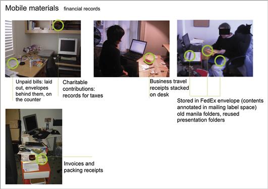
Figure 15.3 A PowerPoint slide showing images that have been clustered according their content. The cluster is labeled “financial records” and the green circles highlight why these images were organized together: they all show how people in the research study organize paper financial records when working outside the office.
However, you may want to have some more functionality for manipulating the data than text editors or presentation software possesses. As in card sorting, you may want to be able to see if the same snippet could belong to multiple groups, or perhaps be able to prioritize the most interesting quotes and observations.
That’s where spreadsheets come in (see Figure 15.4). They can help you chop and recombine rows of data. Assign each snippet of data one row on the spreadsheet. The data go in the first column. Then, you fill the following columns with different codes—as many as you need. After that, you can use the spreadsheet functionality to sort rows by code, or you can manually move rows around to group them.

Figure 15.4 Qualitative analysis using a spreadsheet and diagramming software. The spreadsheet contains notes from the video, and the mind-mapping software organizes codes in families. In this case, a line of text from the video has been coded as “Does not see value in connecting with strangers,” in the tentative code family “Meet new friends.”
Image courtesy of User Insight.
Advantages. Digital files are much quicker to manipulate and share than paper notes. They don’t take up wall space, and you can quickly iterate on coding schemes.
Disadvantages. However, groups of two or more may find joint data analysis more difficult. Small computer screens do not leverage human peripheral vision and skill for visual pattern matching in the same way. However, some teams have recently started to solve this problem by projecting shared spreadsheets onto a wall. Each team member can edit the shared document, and the results are visible to everyone in the room.
Moreover, all the programs currently available have their disadvantages. It is difficult to work with photographs in a spreadsheet, but hard to draw connections between groups in presentation software.
At the time of writing this book, there are also numerous online “sticky note” applications that enable collaborative activities resembling those with Post-its. It’s telling, though, that most design research companies tend not to use them, preferring the tactile qualities of paper. While there are promising experimental digital technologies for large touch screens, at the time of writing none of those technologies are available for commercial use.
Mixing Digital and Paper Coding
Most projects will utilize some combination of paper and digital tools. In order to free up wall space, you can take a high-resolution photograph of a wall of stickies, then type them into a spreadsheet. Alternately, typed quotations can be printed out onto stickies using a word processing template and printer-ready sticky pages for more convenient group work.
Revisit Your Codes and Groups
At this point, you will probably have lots of big groups of items. Now is the time to delve deeper into them and begin to look for internal petterns.
Maybe there are several clear subcategories; maybe the entire group consists of a time-based sequence of activities; maybe you can now identify some properties and dimensions. Some patterns will be expected and clear. Others will be surprising. There may be situations where you expected to find material to support an idea, but didn’t. There may be extra items that, when you examine the groups more closely, don’t fit where you thought.
Groups can be divided or combined. As with the case of the street vendor research, it may be appropriate to create several subgroups based on the properties and dimensions of each top-level code. But don’t get overzealous. Although some social research studies are known to code hundreds of different kinds of events and utterances, you’ll probably stick with under 50. Some related groups can probably be combined together, or at least moved in proximity so that you remember that they are related.
Analysis can be contentious. Keeping distance between the analyst and the product is the key to a credible analysis. Even if you’re deeply involved in the product, now is the time to take a neutral stance. Do not let expectations, hopes, or any conclusions you initially had affect your perception of the participants’ statements and behavior.
If a piece of data no longer fits in a group, move it somewhere more suitable. If the group itself no longer seems justified, break the group apart and redistribute the pieces into existing or new groups. Continue until you feel confident that your clusters show identifiable patterns, but don’t get too obsessed about perfecting them. As Kim Goodwin writes in Designing for the Digital Age, “The diagram itself is not the point of the exercise; insight is”.
Relate Groups into Frameworks
The ultimate purpose of the framing step is to reframe, to come up with a new story to tell about how the user might solve his or her problem or to come up with a new way of seeing the problem, which in turn will allow the team to come up with new solutions.
Sara L. Beckman and Michael Barry, in “Innovation as a Learning Process: Embedding Design Thinking”
Using your clusters to generate insights is not the final step of analysis. As Beckman and Barry imply, the goal of analysis is to see how those insights might create opportunities for change—to reframe how we see the world and our place in it.
The first step in reframing a situation is to relate the various groups and elements to each other—to understand the world as it is right now. There are a number of tools you can bring to bear on your grouped data, depending on what your questions are and what the data suggest to you. In fact, it’s likely that you’ve been using some of these tools all along during coding in order to understand the internal logic of your code groups. Here’s a short list of ways to make frameworks:
• Taxonomies. A taxonomy is a hierarchical organization. In this type of analysis, a taxonomy essentially brings together all your existing categories and subcategories. Taxonomies are especially useful in translating your analysis into frameworks useful for interface and information design. Card sorting (Chapter 8) is another way of making taxonomies. Taxonomies are often represented as branching tree diagrams, as seen in Figure 15.5.

Figure 15.5 Example taxonomy diagram.
• Maps. Placing data into spatial representations serves a variety of purposes. Designing mobile- or location-based services may involve where activities typically happen. For digital appliance design, for example, you may want to represent the location of important resources—such as power outlets. And product strategy decisions may rely on the emotional associations with familiar places. Figure 15.6 shows a typical customer’s pathway through a café to help situate an educational display explaining the energy consumption of the various café appliances.

Figure 15.6 Example spatial map.
• Timelines. Chronological order is the basis for many research outcomes, such as day-in-the-life scenarios, task analysis, and process maps (see Chapter 17 for more on these). Timelines can help you track and present sequences of activities over a day, a month, or even decades. This is particularly important if you are interested in activities that follow cyclical schedules, such as annual tax preparation, or phenomena that change slowly, such as consumer attitudes towards recycling.
Timelines can often immediately show you a number of interesting patterns that would be otherwise difficult to observe. For example, a diary study (Figure 15.7) could map the amount of times “advanced search options are mentioned” (one of the coding categories) against time in order to see whether people mention the advanced options more as they use the product.

Figure 15.7 Example timeline.
• Flowcharts. Maybe the best way to describe a sequence of events isn’t as a linear, chronological process. Maybe you have noticed that a process can go one way or another at an important decision points. You can capture that in a flowchart (Figure 15.8), a classic representation of branching action pathways used widely in engineering. The flowchart can help you work out different scenarios or use cases that the design of a system or service must take into account.

Figure 15.8 Example flowchart.
• Spectrums. You may have attitudes, behaviors, or values that seem in opposition. For example, perhaps insurance brokers intimidate some of the people in your study, while others treat insurance brokers as helpful assistants. Oppositions are rarely binary—that is, people rarely lie at the extremes. But two opposites create a spectrum along which people can vary. Naming the spectrum allows you to identify an important way in which people differ: attitude toward brokers. Typically, as in Figure 15.9, the spectrum is laid out horizontally, and each participant is given a specific point on the line.

Figure 15.9 Example spectrum.
• Two-by-two matrixes. A two-by-two matrix uses two spectrums as the axes for a grid (see Figure 15.10). Then research elements (people, objects, activities, products, etc.) can plotted on both. The resulting distribution of items around the four quadrants can tell you a lot. Is one quadrant overfull? One nearly empty? Does it seem like there is a relationship between an item’s place on one axis and its place on the other? This can help you make comparisons between different categories or start thinking about cause-and-effect relationships. Sometimes, examples may fill all the quadrants of the matrix. Alternately, an empty space or an unusually crowded area in the matrix can prompt you to think more about the relationships between the axes.

Figure 15.10 Example matrix.
We will go into more detail on research outcomes in Chapter 17
The Importance of Stories
As you work more and more with codes, you may find yourself losing sight of the people and stories who have motivated your work thus far. Making frameworks is, inevitably, a process of abstraction. But don’t lose sight of the stories!
In fact, a successful analysis has two parts: the framework, or model, and the representations of people and their behavior that support it. Without the stories and quotations as evidence, your framework will be less credible and less compelling. Without the framework, your stories and quotations may be compelling, but your audience may find it hard to draw out actionable recommendations.
Stories are a powerful way to understand the intricacies of people’s experiences. They provide details about people’s assumptions, the sequences in which they do things, how they solve problems (and what problems they have), and their opinions. Moreover, they can illuminate and clarify many choices in product development all at once.
Take Jim’s story, from the same study of work outside the office.
When I first started freelancing, I worked from home and I had a desktop and I couldn’t leave. I spent four or five months working with a company and I knew I had to be at my desk. They would call me, and I needed to be at home. I went nutty. You have to live in your house night and day for months on end. It’s lonely.
For the report, this story could have been summarized as, “Jim works at cafés because he gets lonely at home.” But that’s a rather shallow description of a complex situation. After reading this story, however, you can imagine yourself in Jim’s shoes—stuck at home, waiting for a phone call. You can empathize with his situation, and perhaps you might start thinking up ways to help Jim feel less lonely. Based on this story, you might also prioritize some of your product ideas over others. That’s the role of stories—they prompt informed empathy and invention.
If you have been noting compelling stories and quotations along the way and keeping them linked back to your codes through documenting your analytic process, you will have a storehouse of examples—video, photographs, and quotations—to draw upon.
You will know you have completed research analysis when you can tell a compelling, relevant, evidence-based story to support each of your recommendations and conclusions. If you cannot, go back to the data and keep looking. If you can’t find any story or quotation to support your recommendation, you may need to discard it as unsupported by your data. But more likely, there is a good story that you have simply overlooked.
Typical Analysis Plans
Many projects do not require and will not significantly benefit from the most rigorous analytic process possible. Your project will probably not require every component of the process we just described. Based on the amount of time and money available, your familiarity with the domain, and the stakes resting on the project’s success, you will make choices that result in a more or less intensive analysis. There are many different possible configurations of techniques and timelines, but for the purposes of this book we’ll outline two sample plans to give you a sense of the options available. The lightweight process, like that described below, will work fine for many projects. However, some projects, such as long-term strategic research or medical device design, may demand something resembling the heavyweight plan.

Figure 15.11 The results of data analysis. Two researchers initially transcribed interview notes to Post-its, one using pink and the other yellow. They then jointly clustered their notes, using blue Post-its for labels. The two researchers took two weeks to analyze 33 interviews.
Image courtesy of the Centre for User Experience Research, KU Leuven (University of Leuven).
Lightweight Data Analysis
In lightweight data analysis, the notes taken during data collection (e.g., during/right after the interview, or as diary entries come in) are the main input to the analysis. You may go back to watch the video of someone especially interesting, or to verify or clarify an observation from the notes, but there is no time to review the recordings comprehensively.
If you have short videos from a diary study, schedule time to review them and make summary notes during the collection period.
In this case, make sure to take good notes at interviews. If you have the time, type up everything you think is interesting from those notes, or handwrite onto Post-its. If not, you will be working directly from your notes. If time is extra tight, skip the data preparation and coding stages. You will then draw conclusions based only on your notes, scribbled interpretations, and your discussions with team members.
For example, let’s say you are helping a development team make a tiny, but high-quality, printer designed for people who work in cafés or other public places. Their schedule is tight: They need to select a single form factor from multiple concepts and they only have a week to do it.
First, you schedule three focus group series in one day, using a “friends and family” recruitment strategy to find people who work in cafés at least two days a week. On the day of the series, you set up a fake café table and chairs in a conference room to set the mood. The focus groups start with discussion about where and how the participants work, and then the participants physically demonstrate, using the café table and foam prototypes from the industrial designers, where and how they might set up the printers. At the end, participants fill out “debriefing sheets” ranking the prototypes and the features. Your assistant videotapes the sessions and takes photographs, along with detailed notes. On the drive home, you and your assistant note questions and conclusions from the groups.
Over the next week, you combine all the rankings into a unified set of recommendations for prototypes and features. You re-read your notes and discuss your conclusions with the rest of the team. Finally, you use quotations from the notes and photographs of the session to illustrate the final report that explains the results of the groups. You might try to turn the video into a highlights clip—but more likely you will only have time to paste a few stills into a presentation.
This is an extreme case of a lightweight analysis. You can complete a report this quickly because your questions are few and straightforward: provide guidance to select between concept designs.
In a lightweight process, by the time you start manipulating your data, you should already have an initial ordering scheme for the data and plans for making deliverables. For example, if you know that you will need to present compelling stories about user pain points, be on the lookout from the beginning for quotations, photographs, and video clips that will support that outcome.
A good rule of thumb for planning lightweight analysis is that two people can analyze and write the report for 8–10 interviews in two weeks.
When Do I Do It?
A lightweight process is appropriate when one or more of the following applies:
• The protocol remains uniform across most or all participants.
• The outcome is strongly structured, as with a prioritized feature list.
• The reporting format is predictable, as with a standard usability report.
Table 15.1. A Typical Lightweight Data Analysis Schedule
| Timing | Activity |
| t – 2 weeks | Process notes and summaries. Begin data analysis. |
| t – 1 weeks | Finish analyzing data and make documentation. |
| t | Distribute documentation. |
Heavyweight Data Analysis
Heavyweight data analysis follows the same basic steps, but in a more thorough way. Researchers take more time to prepare their data—including getting transcriptions—collaboratively code it, and revisit their conclusions before moving into frameworks.
A good rule of thumb for heavyweight analysis is that it will take four weeks for three researchers to thoroughly analyze and report the data from, for example, a diary study and onsite visit with 12–16 participants. In our experience, it is rare to have more than three researchers working on data analysis at a time, so consider these limits when budgeting and scheduling.
When Do I Do It?
As a rule of thumb you will likely need a more rigorous process if you have more participants than your team can easily name and describe off the top of their heads. You should also consider a more heavyweight process if you are analyzing more than three research activities simultaneously. For example, a study that involves an interview, a diary study, and then a follow-up home visit is a good candidate for a more organized and thorough approach. Open-ended questions with wide-ranging discussions, unfamiliar subject domains, cross-region, cross-cultural, and longitudinal comparisons—all of those should prompt you to invest more time and resources in analysis. Warning bells should also go off if you are trying to apply a lightweight process with the exact format of your final research deliverables still unsettled. If the final goal of the deliverables is in doubt, then a substantial amount of analytic work will likely go into settling it.
Table 15.2. A Typical Heavyweight Data Analysis Schedule

Conclusion
However intensive your process, you will know your analysis is complete when you feel that you are no longer consistently generating new ideas, insights, and questions. This is what many analysts call “saturation.” Another signal is that you can tell coherent, compelling stories about the data. Of course, in most projects, you are likely to still want to do more analysis even as the project schedule forces you to deliver your final report!
And that’s not a bad thing. Your report should accurately reflect what you saw but suggest new directions for more research or design. The process of making abstractions inevitably bleeds into the process of designing and delivering research outcomes. In the end, you don’t just want to keep your insights to yourself—you also want to share them with other people and ask new questions to drive further research.