
4. Evaluating and Choosing the Best Segmentation Approach
Overview
In this chapter, you will continue your journey with customer segmentation. You will improve your approach to customer segmentation by learning and implementing newer techniques for clustering and cluster evaluation. You will learn a principled way of choosing the optimal number of clusters so that you can keep the customer segments statistically robust and actionable for businesses. You will apply evaluation approaches to multiple business problems. You will also learn to apply some other popular approaches to clustering such as mean-shift, k-modes, and k-prototypes. Adding these to your arsenal of segmentation techniques will further sharpen your skills as a data scientist in marketing and help you come up with solutions that will create a big business impact.
Introduction
A large e-commerce company is gearing up for its biggest event for the year – its annual sale. The company is ambitious in its goals and aims to achieve the best sales figures so far, hoping for significant growth over last year's event. The marketing budget is the highest it has ever been. Naturally, marketing campaigns will be a critical factor in deciding the success of the event. From what we have learned so far, we know that for those campaigns to be most effective, an understanding of the customers and choosing the right messaging for them is critical.
In such a situation, well-performed customer segmentation can make all the difference and help maximize the ROI (Return on Investment) of marketing spend. By analyzing customer segments, the marketing team can carefully define strategies for each segment. But before investing precious resources into a customer segmentation project, data science teams, as well as business teams, need to answer a few key questions to make sure the project bears the desired result.
How should we decide the number of segments the activity should result in? How do we evaluate the robustness of the segments? Surely, before spending millions using these segments, the business would want to ensure that these segments are robust from a technical perspective as well; the fact that they are indeed homogenous must be numerically established. As an analyst, you will also want to explore alternate machine learning techniques for clustering that may be more suitable for the nature of the data. What if most of the features are categorical features? All of these are pertinent questions for any real-world customer segmentation with high stakes.
In the previous chapter, we introduced the concept of clustering and practiced it using k-means clustering – a simple and powerful approach to clustering that divides the data points into a pre-specified number of clusters. But we used several assumptions in the previous chapter. We created a pre-determined number of clusters, assuming that we had the right number of clusters with us, either from intuition or business constraints. Also, to evaluate the resulting clusters, we used a business perspective to assess the actionability and quality of the clusters. To complete our understanding of clustering and to ensure we have the right knowledge base to tackle any problem around segmentation, we need to be able to answer the following questions for any segmentation exercise:
- How do we choose the number of clusters?
- How do we evaluate the clusters statistically/numerically?
- Which is the best clustering algorithm for the task?
As with many questions in data science, the short answer to these questions is, "it depends". But we will not stop at that vague answer. Instead, in this chapter, we will understand all the considerations to make a choice. We will start by answering the first question. To choose the right number of clusters, in addition to business considerations, we will look at three different approaches to statistically arrive at a number. We will apply these methods, compare them, and see for ourselves the benefits and drawbacks of each.
Then, we will also explore methods that do not expect us pre-specify the desired number of clusters. These techniques will bring their own tradeoffs that we must understand. Knowing multiple methods and understanding how to choose between them will be an essential addition to your data science repertoire.
So far, we have only worked with data that is fairly easy for k-means to deal with: continuous variables or binary variables. In this chapter, we will explain how to deal with data containing categorical variables with many different possible values, using the k-mode and k-prototype clustering methods.
Finally, we will learn how to tell whether one method of clustering is better than another. For this purpose, we want to be able to tweak the hyperparameters of a modeling algorithm and be able to tell whether that led to a better or worse clustering, as well as compare the completely different types of algorithms to each other. In the process, we will answer the remaining two questions we asked above.
Choosing the Number of Clusters
While performing segmentation in the previous chapter, we specified the number of clusters to the k-means algorithm. In practice, though, we don't typically know the number of clusters to expect in the data. While an analyst or business team may have some intuition that may be very different from the 'natural' clusters that are available in the data. For instance, a business may have an intuition that there are generally three types of customers. But an analysis of the data may point to five distinct groups of customers. Recall that the features that we choose and the scale of those features also play an important role in defining 'similarity' between customers.
There is, hence, a need to understand the different ways we can choose the 'right' number of clusters. In this chapter, we will discuss three approaches. First, we will learn about simple visual inspection, which has the advantages of being easy and intuitive but relies heavily on individual judgment and subjectivity. We will then learn about the elbow method with sum of squared errors, which is partially quantitative but still relies on individual judgment. We will also learn about using the silhouette score, which removes subjectivity from the judgment but is not a very intuitive metric.
As you learn about these different methods, there is one overriding principle you should always keep in mind: the quantitative measures only tell you how well that number of clusters fits the data. They do not tell you how useful those clusters are for business. We discussed in the previous chapter that usually it is the business teams that consume and act upon these segments. The clusters, no matter how good statistically, are useless if they are not actionable by the business. There are two ways in which the clusters can turn out to be non-actionable:
- The clusters don't make business sense
- The cluster are far too many
The clusters must be interpretable by the business for them to be actionable. For instance, for making marketing campaigns most effective, you need to understand well the nature of the clusters and what each cluster cares about so that the messaging can be tuned accordingly. Regarding the number of clusters, creating a differential marketing strategy or customer experience for 30 different clusters is not practical. Often, there is an upper limit to the number of clusters that is practical for a business to act on.
Using fewer clusters and fewer variables can often lead to easier-to-interpret clusters. In general, real-world data is quite messy and there are a lot of judgment calls to be made. Learning about these methods will help you tell how good your clusters are while ensuring the methods themselves are well-founded. But keep in mind that they are only one factor. From a quantitative perspective, the difference between choosing four clusters versus five may be small, and at that point, you should be prepared to use your judgment on deciding what's best.
Now that we understand the considerations in choosing the right number of clusters, let us see these methods in practice. Let us begin by employing the simple visual approach to the mall customers in the next exercise.
Note
Unless specified otherwise, you will need to run the exercises in this chapter in the same Jupyter notebook.
Exercise 4.01: Data Staging and Visualization
You will be revisiting the business problem you worked on in Chapter 3, Unsupervised Learning and Customer Segmentation. You are a data scientist at a leading consulting company and its new client is a popular chain of malls spread across many countries. The mall wishes to re-design its existing offers and marketing communications to improve sales in one of its key markets. An understanding of their customers is critical for this objective, and for that, good customer segmentation is needed.
The goal of this exercise is to load the data and perform basic clean-up so that you can use it conveniently for further tasks. Also, you will visualize the data to understand better how the customers are distributed on two key attributes – Income and Spend_score. You will be using these fields later to perform clustering.
Note
All the exercises in this chapter need to be performed in the same Jupyter Notebook. Similarly, the activities too build upon each other, so they need to be performed in a separate, single Jupyter Notebook. You may download the exercises and activities Notebooks for this chapter from here: https://packt.link/ZC4An.
The datasets used for these activities and exercises can be found here: https://packt.link/mfNZY.
- In a fresh Jupyter notebook, import pandas, numpy, matplotlib and seaborn libraries and load the mall customer data from the file Mall_Customers.csv into a DataFrame (mall0) and print the top five records, using the code below.
import numpy as np, pandas as pd
import matplotlib.pyplot as plt, seaborn as sns
mall0 = pd.read_csv("Mall_Customers.csv")
mall0.head()
Note
Make sure you place the CSV file in the same directory from where you are running the Jupyter Notebook. If not, make sure you change the path (emboldened) to match the one where you have stored the file.
You should get the following output:
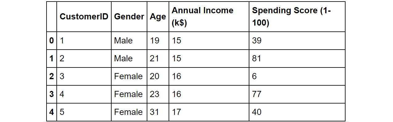
Figure 4.1: The top five records of the mall customers dataset
We see that we have information like gender and age of the customers, along with their estimated annual income (Annual Income (k$)). We also have a spending score calculated by the mall (Spending Score (1-100)), a percentile-based score which denotes the extent of shopping the customer has done at the mall – a higher score means higher spend (highest spender gets a score of 100).
- Rename the columns 'Annual Income (k$)' and 'Spending Score (1-100)' to 'Income' and 'Spend_score' respectively. Print the top five records of the dataset to confirm that the change was completed. The following is the code:
mall0.rename({'Annual Income (k$)':'Income',
'Spending Score (1-100)':'Spend_score'},
axis=1, inplace=True)
mall0.head()
The output will be as follows:
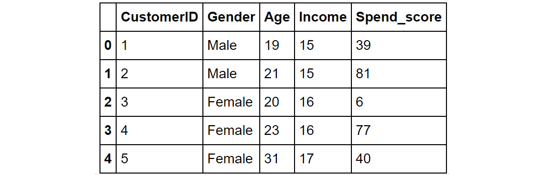
Figure 4.2: The mall0 DataFrame after renaming the columns
- Plot a scatterplot of the Income and Spend_score fields using the following code. You will be performing clustering later using these two features as the criteria.
mall0.plot.scatter(x='Income', y='Spend_score', color='gray')
plt.show()
Note
The value gray for the attribute color (emboldened) is used to generate graphs in grayscale. You can use other colors like darkgreen, maroon, and so on as values of color parameter to get the colored graphs. You can also refer to the following document to get the code for the colored plot and the colored output: http://packt.link/NOjgT.
The plot you get should look like the one shown here:

Figure 4.3: Scatterplot of Spend_score vs. Income
Figure 4.3 shows how the customers are distributed on the two attributes. We see that in the middle of the plot we have a bunch of customers with moderate income and moderate spend scores. These customers form a dense group that can be thought of as a natural cluster. Similarly, customers with low income and low spend scores also form a somewhat close group and can be thought of as a natural cluster. Customers with income above 70 and a spend score of less than 40 in the lower right area of the plot are interesting. These customers are thinly spread across and do not form a close group. However, these customers are significantly different from the other customers and can be considered a loose cluster.
Visualizing the data provides good insights into the distribution and can give us a sense of the natural groups in the data. These insights can inform the numbers that we choose for the clustering activity. Let us discuss this idea further in the next section.
Simple Visual Inspection to Choose the Optimal Number of Clusters
An intuitive and straightforward method of choosing the number of clusters is to perform clustering with a range of clusters and visually inspect the results. You can usually tell by looking at data how well separated the different clusters are.
Clusters are better when they are well separated, without too much overlap, and when they capture the most densely populated parts of the data space. In Figure 4.3, the cluster in the center of the chart – with about average income and spend score, is a good tight cluster as the points are close to each other in a dense area. The cluster in the lower right corner, on the other hand, is thinly spread across a larger area. In an ideal scenario, we would only have dense, non-overlapping clusters.
The choice of the number of clusters has a significant effect on how the clusters get allocated. Too few clusters will often lead to plots that look like a single cluster is spanning more than one densely packed space. On the other hand, too many clusters will often look like two are competing for a single densely packed space. When dealing with more than two dimensions, we can use dimensionality reduction techniques to enable the visual assessment. Remember that because two-dimensional representations of the high dimensional space are not perfect, the more dimensions there are, the poorer the visualization is of how the data are actually clustered.
Choosing the number of clusters based on visual inspection is often appealing because it is a decision based on looking at what is happening with the data most directly. People are usually quite good at looking at how much different clusters overlap and deciding whether a given number of clusters leads to too much overlap. This is not a quantitative method; however, as it leaves a lot to subjectivity and individual judgment, for many simple problems, it is a great way to decide how many clusters to use. Let us see this approach in action in the exercise that follows.
Exercise 4.02: Choosing the Number of Clusters Based on Visual Inspection
The goal of the exercise is to further refine the customer segmentation approach by using visual inspection to decide on the optimal number of clusters. You will try different numbers of clusters (ranging from two to six) and use visual inspection to evaluate the results and choose the right number of clusters. Continue in the Jupyter notebook from Exercise 4.01, Data Staging and Visualization and perform the following steps.
- Standardize the columns Age, Income and Spend_score, using the StandardScaler from sklearn, after copying the information into new dataset named mall_scaled, using the following code:
mall_scaled = mall0.copy()
cols_to_scale = ['Age', 'Income', 'Spend_score']
from sklearn.preprocessing import StandardScaler
scaler = StandardScaler()
mall_scaled[cols_to_scale] = scaler.fit_transform
(mall_scaled[cols_to_scale])
- Import the Kmeans module from the sklearn package. Create a list, 'cluster_cols' that stores the names of the fields (Income and Spend_score) and define the colors and shapes that you will use for each cluster (since you will be visualizing up to seven clusters in all, define seven different shapes), as follows:
from sklearn.cluster import KMeans
cluster_cols = ['Income', 'Spend_score']
markers = ['x', '*', '.', '|', '_', '1', '2']
When plotting the obtained clusters, items in the clusters will be represented by the symbols in the list in order. 'x' will represent the first cluster (Cluster 0). For the final clustering with 7 clusters, all the shapes in the list will be used and Cluster 6 will be represented by the marker '2' (called the 'tickup').
- Then, using a for loop, cluster the data using a different number of clusters, ranging from two to seven, and visualize the resulting plots obtained in a subplot. Use a separate for loop to plot each cluster in each subplot, so we can use different shapes for each cluster. Use the following snippet:
for n in range(2,8):
model = KMeans(n_clusters=n, random_state=42)
mall_scaled['Cluster']= model.fit_predict
(mall_scaled[cluster_cols])
plt.subplot(2,3, n-1)
for clust in range(n):
temp = mall_scaled[mall_scaled.Cluster == clust]
plt.scatter(temp.Income, temp.Spend_score,
marker=markers[clust],
label="Cluster "+str(clust), color='gray')
plt.title("N clusters: "+str(n))
plt.xlabel('Income')
plt.ylabel('Spend_score')
plt.legend()
plt.show()
Note
The value gray for the attribute color (emboldened) is used to generate graphs in grayscale. You can use other colors like darkgreen, maroon, and so on as values of color parameter to get the colored graphs. You can also refer to the following document to get the code for the colored plot and the colored output: http://packt.link/NOjgT.
Note
If the plots you are getting are overlapping or are not clear, you can try changing the dimensions of the plot by modifying them in the emboldened line of code.
You should see the following plots when this is done:

Figure 4.4: Scatterplots of Income and Spend_score with clusters progressing from 2 to 7
By observing the resulting plots, we can see that with too few clusters (2, 3 or 4), we end up with clusters spanning sparse regions in between more densely packed regions. For instance, with 3 clusters, we see that we get one huge cluster for lower-income customers. On the other hand, with too many (6 or 7), we end up with clusters that border each other but do not seem separated by a region of sparseness. Five clusters seem to capture things very well with clusters that are non-overlapping and are fairly dense. Five is, therefore, the 'right' number of clusters. This is in line with our expectation that we built in Exercise 4.01, Data Staging and Visualization. This simple visual method is effective, but note that it is entirely subjective. Let's now try a quantitative approach, which is the most popular approach for determining the optimal number of clusters.
The Elbow Method with Sum of Squared Errors
Often, it is difficult to tell by visualization alone how many clusters should be used to solve a particular problem. Different people may disagree about the number of clusters to use, and there may not be a clear, unanimous answer. With higher dimensional data, there is an additional issue: dimensionality-reduction techniques are not perfect. They attempt to take all the information in multiple dimensions and reduce it to only two. In some cases, this can work well, but as the number of dimensions increases, the data becomes more complex, and these visual methods quickly reach their limitations. When this happens, it's not easy to determine through visual inspection what the right number of clusters to use is. In these cases, it's often better to reach for a more quantitative measure. One such classic measure is to look for an elbow in a plot of the sum of squared errors, also called an Inertia Plot.
The sum of squared errors (SSE) is the sum of the "errors" (the difference between a data point and the centroid of its assigned cluster) for all data points, squared. Another term for it is inertia. The tighter the clusters, the closer the constituent points to their respective clusters, and the lower the SSE/inertia. The sum of squared errors for the model can be calculated using the following equation:

Figure 4.5: Equation for calculating the sum of squared errors of data points in a dataset
Here, μk is the location of the centroid of cluster k, and each xi is a data point assigned to cluster k. When all the entities are treated as a single cluster, this SSE value is at its maximum for the dataset. As we increase k, we should expect the sum of squared errors to decrease since there are more centroids. In the extreme case, when each point is a cluster, the SSE/inertia value is 0, as each point is the centroid for its own cluster. In scikit-learn, you will use the 'inertia_' attribute that is available after fitting a model. For instance, if 'model' is the name of the Kmeans instance you fit on the data, extracting and printing the SSE is as simple as the following command:
print(model.inertia_)
This would print the value of the SSE as a simple number. We will see this in action in the next exercise.
Note
The Kmeans model in Python calculates the SSE exactly as in the equation in Figure 4.5. The value for SSE/inertia is available in the 'inertia_' attribute of the trained model. The documentation on this can be found at the following link: https://scikit-learn.org/stable/modules/generated/sklearn.cluster.KMeans.html.
This intuition helps identify the optimal number of clusters. When SSE/inertia is plotted at different numbers of clusters, there often is an elbow in the plot, where the gain in terms of reduced errors seems to slow down for each new cluster. An example plot is shown below in Figure 4.6.

Figure 4.6: SSE/inertia for different values of k, with an "elbow" (inflection point) at k=4
The elbow method is a simple and commonly used method for choosing the number of clusters. With the theory understood, let us now see the method in practice to make our understanding concrete. Let us create an inertia plot for the mall customer data and choose the optimal number of clusters, in the following exercise.
Exercise 4.03: Determining the Number of Clusters Using the Elbow Method
In this exercise, you will use the elbow method to identify the optimal number of clusters. The goal is to improve upon the mall customer segmentation approach by using a principled method to determine the number of clusters so that all involved stakeholders, including business teams, gain more confidence in the soundness of the approach and the resulting clusters. Try the range 2 – 10 for the number of clusters using the age and income data. Continue in the same Jupyter notebook you have been using for the exercises so far.
- On the scaled mall customer data (mall_scaled), using the columns 'Income' and 'Spend_score', create three clusters using the KMeans algorithm:
K = 3
model = KMeans(n_clusters=K, random_state=42)
model.fit(mall_scaled[cluster_cols])
- Once the model is fit, the SSE/inertia is available very conveniently in the 'inertia_' attribute of the model object. Print out the SSE/ inertia for the model with 3 clusters using the following code:
print(model.inertia_)
You will see that inertia is 157.70. Note that this number by itself does not mean much to us. We are more interested in how this number changes with the number of clusters.
Note
You may observe minor differences in the value owing to randomization in the processes, some of which we can't control. The values should be of a similar order.
- Next, fit multiple KMeans models with the number of clusters ranging from 2 to 10 and store the inertia values for the different models in a list. The code is as follows:
X = mall_scaled[cluster_cols]
inertia_scores = []
for K in range(2,11):
inertia = KMeans(n_clusters=K, random_state=42).fit(X)
.inertia_
inertia_scores.append(inertia)
The list inertia_scores should now contain the sum of squared errors for different values of K.
- Create the SSE/inertia plot as a line plot with the following code.
plt.figure(figsize=[7,5])
plt.plot(range(2,11), inertia_scores, color='gray')
plt.title("SSE/Inertia vs. number of clusters")
plt.xlabel("Number of clusters: K")
plt.ylabel('SSE/Inertia')
plt.show()
Note
The value gray for the attribute color is used to generate graphs in grayscale. You can use other colors like darkgreen, maroon, and so on as values of color parameter to get the colored graphs. You can also refer to the following document to get the code for the colored plot and the colored output: http://packt.link/NOjgT.
You should get the following plot.

Figure 4.7: SSE plot for different values of k, showing an "elbow" (inflection point) at k=5
By observing the preceding plot, you will notice that there is an elbow in the plot at K=5. So, we take five as the optimal number of clusters, the best value of K for the KMeans algorithm. Before that, every additional cluster gives us big gains in reducing the sum of squared errors. Beyond five, we seem to be getting extremely low returns.
In this exercise, you created sum of squared error plots to visually identify the optimal number of clusters. You now understand and have implemented two approaches for the task, making your overall approach to clustering, and therefore customer segmentation, technically far more robust. It's time to put your learning to the test in the next activity, where you will employ both approaches for solving a business problem using customer segmentation.
Activity 4.01: Optimizing a Luxury Clothing Brand's Marketing Campaign Using Clustering
You are working at a company that sells luxury clothing. Their sales team has collected data on customer age, income, their annual spend at the business, and the number of days since their last purchase. The company wants to start targeted marketing campaigns but doesn't know how many different types of customers they have. If they understood the number of different segments, it would help design the campaign better by helping define the channels to use, the messaging to employ, and more.
Your goal is to perform customer segmentation for the company which will help them optimize their campaigns. To make your approach robust and more reliable to business, you need to arrive at the right number of segments by using the visualization approach as well as the elbow method with the sum of squared errors. Execute the following steps to complete the activity:
Note
The file for the activity, Clothing_Customers.csv, can be found on GitHub at https://packt.link/rwW7j.
Create a fresh Jupyter notebook for this activity.
- Import the libraries required for DataFrame handling and plotting (pandas, numpy, matplotlib). Read in the data from the file 'Clothing_Customers.csv' into a DataFrame and print the top 5 rows to understand it better.
- Standardize all the columns in the data. You will be using all four columns for the segmentation.
- Visualize the data to get a good understanding of it. Since you are dealing with four dimensions, use PCA to reduce to two dimensions before plotting. The resulting plot should be as follows.

Figure 4.8: Scatterplot of the dimensionality reduced data
- Visualize clustering with two through seven clusters. You should get the following plot.

Figure 4.9: Resulting clusters for different number of specified clusters
Choosing clusters using elbow method - create a plot of the sum of squared errors and look for an elbow. Vary the number of clusters from 2 to 11. You should get the following plot.

Figure 4.10: SSE plot for different values of k
- Do both the methods agree on the optimal number of clusters? Looking at the results from both, and based on your business understanding, what is the number of clusters you would choose? Explain your decision.
Note
The solution to this activity can be found via this link.
More Clustering Techniques
If you completed the preceding activity, you must have realized that you had to use a more robust approach to determine the number of clusters. You dealt with high dimensional data for clustering and therefore the visual analysis of the clusters necessitated the use of PCA. The visual assessment approach and the elbow method from the inertia plot however did not agree very well. This difference can be explained by understanding that visualization using PCA loses a lot of information and therefore provides an incomplete picture. Realizing that, you used the learning from the elbow method as well as your business perspective to arrive at an optimal number of clusters.
Such a comprehensive approach that incorporates business constraints helps the data scientist create actionable and therefore valuable customer segments. With these techniques learned and this understanding created, let us look at more techniques for clustering that will make the data scientist even more effective and proficient at customer segmentation.
So far, we have been employing the k-means algorithm for clustering on multiple datasets. We saw that k-means is a useful clustering algorithm because it is simple, widely applicable, and scales very well to large datasets. However, it is not the only clustering algorithm available. Some techniques don't need to pre-specify the number of clusters, while some other techniques are better equipped to handle different data types. Each clustering algorithm has its own strengths and weaknesses, so it's extremely useful to have more than one in your toolkit. We will look at some of the other popular clustering algorithms in this section.
Mean-Shift Clustering
Mean-shift clustering is an interesting algorithm in contrast to the k-means algorithm because unlike k-means, it does not require you to specify the number of clusters. The intuition of its working is rather simple – it works by starting at each data point and shifting the data points (assigning them to clusters) toward the area of greatest density – that is, towards a natural cluster centroid. When all the data points have found their local density peak, the algorithm is complete. This tends to be computationally expensive, so this method does not scale well to large datasets (k-means clustering, on the other hand, scales very well).
The following diagram illustrates this:

Figure 4.11: Illustration of the workings of the mean-shift algorithm
Figure. 4.11 shows the working of the mean-shift algorithm. Note that the 'shifting' of the points does not mean that the points themselves are altered, but rather there is an allocation to a center of high density. Effectively, as we progress from step 1 to step 5, the clusters become more defined and so do the greater density areas.
While not needing to choose the number of clusters sounds great, there is another hyper-parameter that strongly influences the behavior of the algorithm - bandwidth. Also referred to as window size, bandwidth defines how far each data point will look when searching for a higher density area. As you can expect, a higher bandwidth would allow points to look farther and get linked to farther away clusters and can lead to fewer, looser, larger clusters. Consider the image for Step 1 in Figure 4.11: if an extremely high bandwidth parameter (close to 1) were employed, all the points would have been lumped into one cluster. On the other hand, a lower value of bandwidth may result in a higher number of tight clusters. Referring again to Step 1 of Figure 4.11, if we used a very low value of bandwidth (close to 0) we would have arrived at dozens of clusters. The parameter, therefore, has a strong impact on the result and needs to be balanced.
A common method (which we will use shortly) for determining the best bandwidth is to estimate it based on the distances between nearby points (using a quantile parameter which specifies the proportion of data points to look across), but this method requires you to choose a quantile that determines the proportion of points to look at. This is non-trivial. In practice, this ends up being a very similar problem to the problem of choosing a number of clusters where at some point you, the user, have to choose what hyperparameter to use.
For the Python implementation for estimating bandwidth, you will employ the estimate_bandwidth utility in scikit-learn. You need to first import the estimate_bandwidth utility from sklearn, then simply execute it by providing the data and the quantile parameter (discussed in the previous paragraph). The function returns the calculated bandwidth. The commands below demonstrate the usage of estimate_bandwidth.
from sklearn.cluster import estimate_bandwidth
bandwidth = estimate_bandwidth(data, quantile=quantile_value)
Where data is the dataset you wish to cluster eventually and quantile_value is the value for quantile that you can specify.
Let us make this understanding concrete by applying the mean-shift algorithm to the mall customers' data.
Note
For the Python implementation for estimating bandwidth, we will employ the estimate_bandwidth utility in scikit-learn. More details and usage examples can be found at the official documentation here: https://scikit-learn.org/stable/modules/generated/sklearn.cluster.estimate_bandwidth.html.
Exercise 4.04: Mean-Shift Clustering on Mall Customers
In this exercise, you will cluster mall customers using the mean-shift algorithm. You will employ the columns Income and Spend_score as criteria. You will first manually specify the bandwidth parameter. Then, you will estimate the bandwidth parameter using the estimate_bandwidth method and see how it varies with the choice of quantile. Continue in the Jupyter notebook from Exercise 4.03, Determining the Number of Clusters Using the Elbow Method and perform the following steps.
- Import MeanShift and estimate_bandwidth from sklearn and create a variable 'bandwidth' with a value of 0.9 – the bandwidth to use (an arbitrary, high value). The code is as follows -
from sklearn.cluster import MeanShift, estimate_bandwidth
bandwidth = 0.9
- To perform mean-shift clustering on the standardized data, create an instance of MeanShift, specifying the bandwidth and setting bin_seeding to True (to speed up the algorithm). Fit the model on the data and assign the cluster to the variable 'Cluster'. Use the following code:
ms = MeanShift(bandwidth=bandwidth, bin_seeding=True)
ms.fit(mall_scaled[cluster_cols])
mall_scaled['Cluster']= ms.predict(X)
- Visualize the clusters using a scatter plot.
markers = ['x', '*', '.', '|', '_', '1', '2']
plt.figure(figsize=[8,6])
for clust in range(mall_scaled.Cluster.nunique()):
temp = mall_scaled[mall_scaled.Cluster == clust]
plt.scatter(temp.Income, temp.Spend_score,
marker=markers[clust],
label="Cluster"+str(clust),
color='gray')
plt.xlabel("Income")
plt.ylabel("Spend_score")
plt.legend()
plt.show()
Note
The value gray for the attribute color (emboldened) is used to generate graphs in grayscale. You can use other colors like darkgreen, maroon, etc. as values of color parameter to get the colored graphs. You can also refer to the following document to get the code for colored plot and the colored output: http://packt.link/NOjgT.
You should get the following plot:
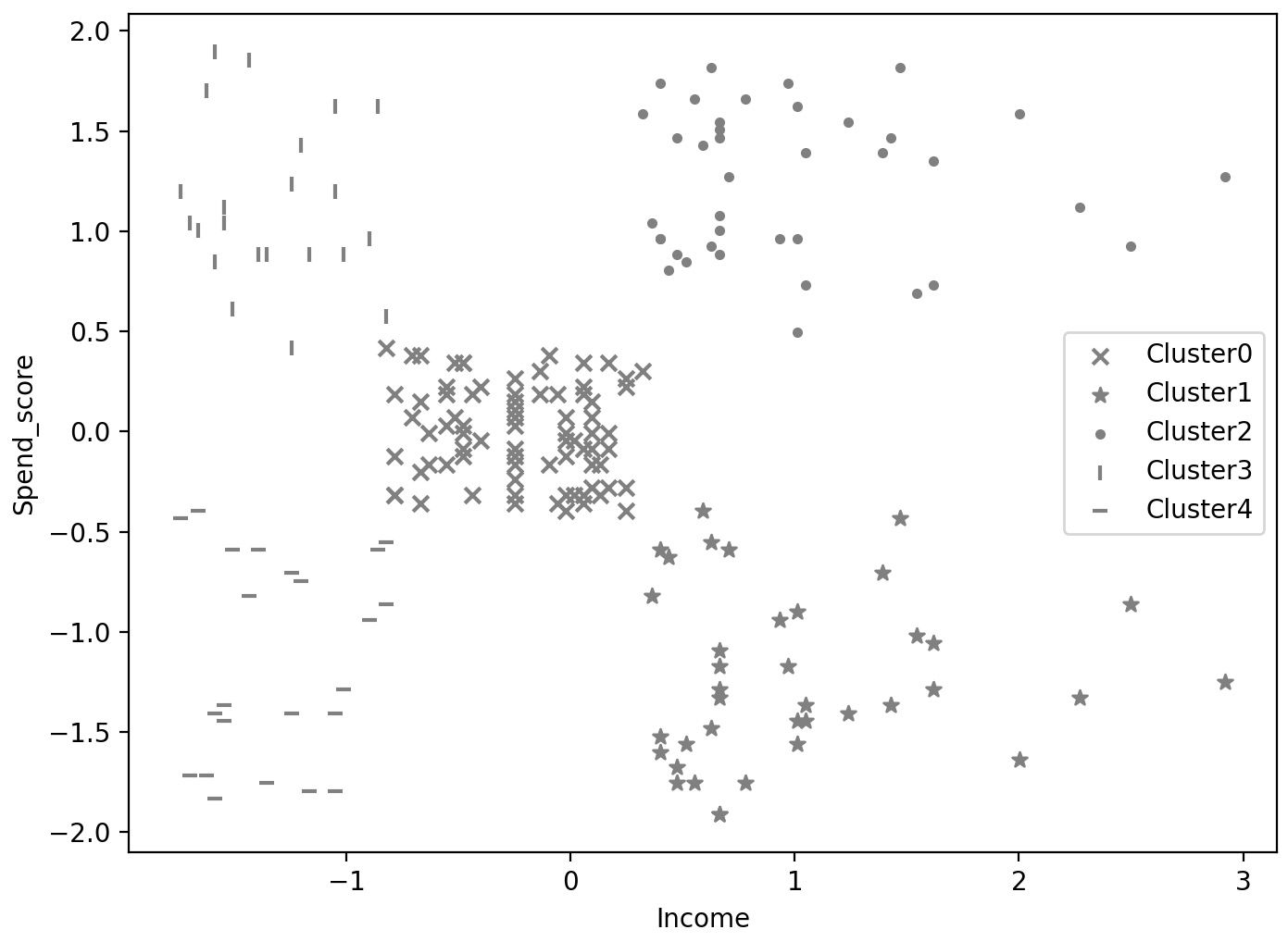
Figure 4.12: Clusters from mean-shift with bandwidth at 0.9
The model has found five unique clusters. They are very much aligned with the clusters you arrived at earlier using K-means where you specified 5 clusters. But notice that the clusters on the right have areas of very low density. The choice of bandwidth has led to such loose clusters.
- Estimate the required bandwidth using the estimate_bandwidth method. Use the estimate_bandwidth function with a quantile value of 0.1 (an arbitrary choice) to estimate the best bandwidth to use. Print the value, fit the model, and note the number of clusters, using the following code:
bandwidth = estimate_bandwidth(mall_scaled[cluster_cols],
quantile=0.1)
print(bandwidth)
You will get a value of about 0.649. Using this, fit the model on the data.
ms = MeanShift(bandwidth=bandwidth, bin_seeding=True)
ms.fit(mall_scaled[cluster_cols])
mall_scaled['Cluster']= ms.predict(mall_scaled[cluster_cols])
mall_scaled.Cluster.nunique()
The output for the unique number of clusters is 7.
- Visualize the obtained clusters using a scatter plot.
plt.figure(figsize=[8,6])
for clust in range(mall_scaled.Cluster.nunique()):
temp = mall_scaled[mall_scaled.Cluster == clust]
plt.scatter(temp.Income, temp.Spend_score,
marker=markers[clust],
label="Cluster"+str(clust),
color='gray')
plt.xlabel("Income")
plt.ylabel("Spend_score")
plt.legend()
plt.show()
Note
The value gray for the attribute color is used to generate graphs in grayscale. You can use other colors like darkgreen, maroon, and so on as values of color parameter to get the colored graphs. You can also refer to the following document to get the code for the colored plot and the colored output: http://packt.link/NOjgT.
The output should look like the following plot:
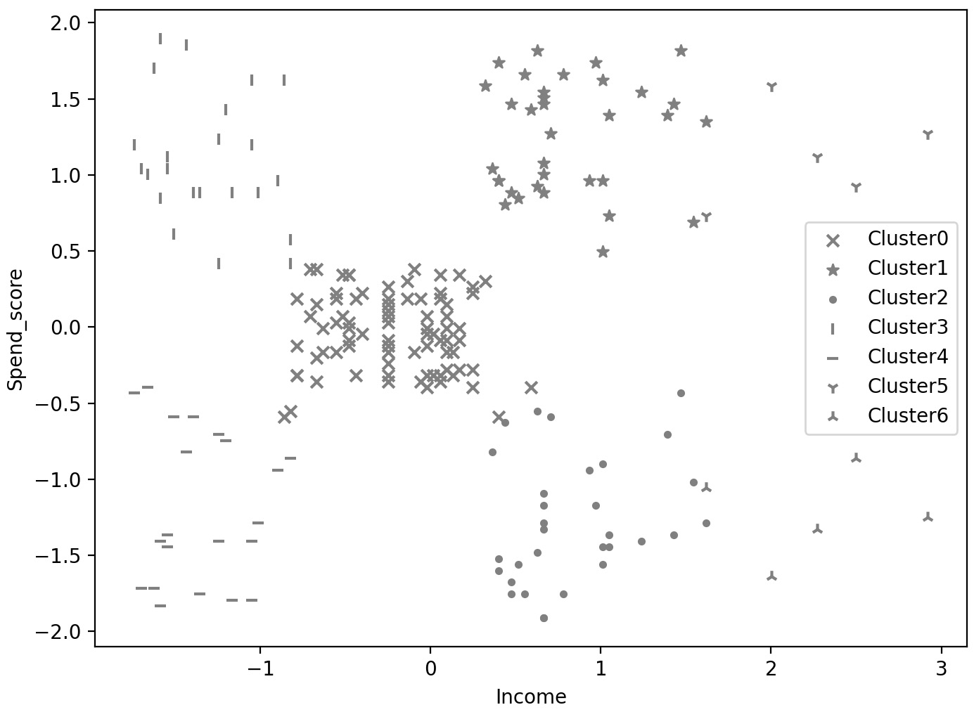
- Estimate the bandwidth again, this time with a quantile value of 0.15. Print out the number of clusters obtained.
bandwidth = estimate_bandwidth(mall_scaled[cluster_cols],
quantile=0.15)
print(bandwidth)
The calculated bandwidth is 0.858.
- Use the bandwidth calculated in the previous step to fit and extract the number of clusters.
ms = MeanShift(bandwidth=bandwidth, bin_seeding=True)
ms.fit(mall_scaled[cluster_cols])
mall_scaled['Cluster']= ms.predict(mall_scaled[cluster_cols])
mall_scaled.Cluster.nunique()
The result should be 5.
- Visualize the clusters obtained.
plt.figure(figsize=[8,6])
for clust in range(mall_scaled.Cluster.nunique()):
temp = mall_scaled[mall_scaled.Cluster == clust]
plt.scatter(temp.Income, temp.Spend_score,
marker=markers[clust],
label="Cluster"+str(clust),
color='gray')
plt.xlabel("Income")
plt.ylabel("Spend_score")
plt.legend()
plt.show()
Note
The value gray for the attribute color (emboldened) is used to generate graphs in grayscale. You can use other colors like darkgreen, maroon, and so on as values of color parameter to get the colored graphs. You can also refer to the following document to get the code for the colored plot and the colored output: http://packt.link/NOjgT.
The output should be as follows.

Figure 4.14: The data clustered using mean-shift clustering, quantile value of 0.15
You can see from Figure 4.14 that you have obtained five clusters. This is the optimal number as you have seen from multiple approaches, including visual inspection.
In this exercise, you successfully used mean-shift clustering with varying parameters to make your understanding more concrete. When you used a quantile value of 0.15, which means you looked at more points to estimate the bandwidth required, you ended up with a bandwidth of about 0.86 and obtained 5 clusters. When you used a quantile value of 0.1, though, the estimated bandwidth was about 0.65 and obtained 7 clusters. This demonstrates the impact of the bandwidth parameter, alternatively, the quantile parameter used to estimate the bandwidth.
Benefits and Drawbacks of the Mean-Shift Technique
In the previous exercise, we saw that the mean-shift algorithm too had its own key hyper-parameters. This is again a choice to be made by the user. Why, then, bother with mean-shift clustering? To answer this let us understand the benefits and drawbacks of the mean-shift algorithm.
Benefits of mean-shift algorithm
- We don't need to pre-specify the number of clusters.
- The single parameter, bandwidth, has a physical meaning and its effects are easy to interpret.
- It can identify complex-shaped clusters (k-means only gave spherical/globular clusters).
- Robust to outliers.
Drawbacks of mean-shift algorithm
- Computationally expensive, doesn't scale well to large datasets.
- Does not work well with a high number of dimensions (leads to unstable clusters).
- No direct control over the number of clusters, which is problematic when we have business constraints on the number of clusters.
We can see that the mean-shift algorithm is another powerful, density-based approach to clustering. While it has its own hyper-parameter and some issues with scalability, it does have its merits which can be extremely useful in certain situations. But both approaches we saw so far work only for quantitative data. In practice, we come across many situations that need us to work with non-numeric data. Let us now explore another technique for clustering, that helps us handle different types of data better.
k-modes and k-prototypes Clustering
k-means clustering is great when you are dealing exclusively with quantitative data. However, when you have categorical data (that is, data that can't be converted into numerical order, such as race, language, and country) with more than two categories, the representation of this data using numbers becomes a key consideration. In statistics, one common strategy for dealing with categorical data is to use dummy variables—the practice of creating a new indicator variable for each category - so that each of these dummy variables is a binary. When clustering, this can lead to complications, because if you have many different categories, you are adding many different dimensions for each categorical variable and the result will often not properly reflect the kinds of groupings you're looking for.
To handle such situations, two related methods make dealing with categorical data more natural. k-modes is a clustering algorithm that uses the mode of a cluster rather than the mean, but otherwise performs just like the k-means algorithm. Like mean is a good measure for the typical/ central value for a continuous variable, 'mode' or the most commonly occurring category is the typical value for a categorical variable. The K-modes algorithm is a great choice for categorical data.
k-prototypes clustering allows you to deal with cases where there is a mix of categorical and continuous variables. Instead of defining a centroid for each cluster like k-means or k-modes, k-prototypes clustering chooses a data point to be the prototype and uses that as if it is the centroid of the cluster, updating to a new data point closer to the center of all data points assigned to that cluster using the same process as k-means or k-modes.
For the Python implementation, you will be using the kmodes package. Make sure you install the package, which can be done using the pip command:
!pip install kmodes
The package contains the kmodes and Kprototypes techniques, which can be employed using the same syntax that we used for the Kmeans technique. For example, Kprototypes can be imported and an instance of it created using the following command:
from kmodes.kprototypes import KPrototypes
kp = KPrototypes(n_clusters=N, random_state=seed_value)
Where N is the number of clusters and seed_value is the random_state to ensure reproducibility of results. The model can then be fit on any dataset using a command like the one below:
kp.fit(dataset)
Where dataset contains the data you wish to cluster. Note that the syntax is consistent with the Kmeans package and fit_predict and predict methods will work the same way. A similar syntax will work for the Kmodes technique as well.
Exercise 4.05: Clustering Data Using the k-prototypes Method
For this exercise, you will revisit the customer segmentation problem for Therabank, that you encountered in Activity 3.01, Bank Customer Segmentation for Loan Campaign. The business goal is to get more customers to opt for a personal loan to increase the profitability of the bank's portfolio. Creating customer segments will help the bank identify the types of customers, tune their messaging in the marketing campaigns for the personal loan product. The dataset provided contains data for customers including demographics, some financial information, and how these customers responded to a previous campaign.
Note
The file for the exercise, Bank_Personal_Loan_Modelling-2.csv can be found here: https://packt.link/b0J5j.
An important feature for business is the education level of the customer and needs to be included in the segmentation. The values in the data are Primary, Secondary, and Tertiary. Since this is a categorical feature, K-means is not a suitable approach. You need to create customer segmentation with this data by applying k-prototype clustering to data that has a mix of categorical (education) and continuous (income) variables.
You can continue using the same Jupyter notebook from the previous exercises, or feel free to use a new one. Execute the following steps.
Note
If all variables were categorical, we would use k-modes instead of k-prototypes clustering. The code would be the same, except all references to kprototypes would be changed to kmodes. You will use kmodes in the next activity.
- Import pandas and read in the data from the file Bank_Personal_Loan_Modelling-2.csv into a pandas DataFrame named bank0:
import pandas as pd
bank0 = pd.read_csv("Bank_Personal_Loan_Modelling-2.csv")
bank0.head()
Note
Make sure you place the CSV file in the same directory from where you are running the Jupyter Notebook. If not, make sure you change the path (emboldened) to match the one where you have stored the file.
The output should be:
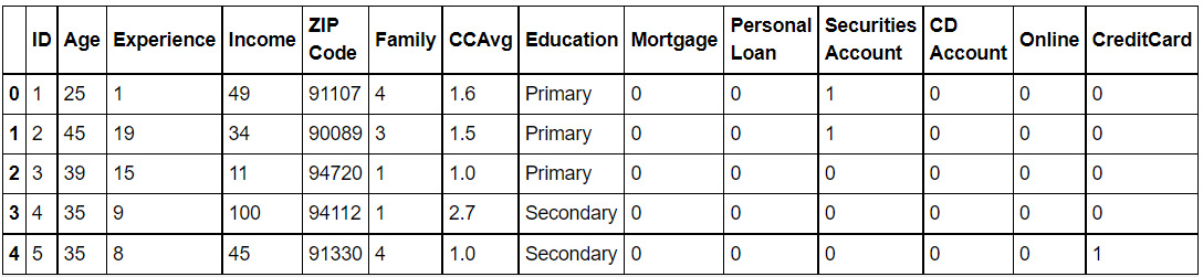
Figure 4.15: First five rows of the DataFrame
- Standardize the Income column:
from sklearn.preprocessing import StandardScaler
scaler = StandardScaler()
bank_scaled = bank0.copy()
bank_scaled['Income'] = scaler.fit_transform(bank0[['Income']])
- Import KPrototypes from the kmodes module. Perform k-prototypes clustering using three clusters, specifying the education column (in column index 1) as categorical, and save the result of the clustering as a new column called cluster. Specify a random_state of 42 for consistency.
from kmodes.kprototypes import KPrototypes
cluster_cols = ['Income', 'Education']
kp = KPrototypes(n_clusters=3, random_state=42)
bank_scaled['Cluster'] = kp.fit_predict
(bank_scaled[cluster_cols],
categorical=[1])
- To understand the obtained clusters, get the proportions of the different education levels in each cluster using the following code.
res = bank_scaled.groupby('Cluster')['Education']
.value_counts(normalize=True)
res.unstack().plot.barh(figsize=[9,6],
color=['black','lightgray','dimgray'])
plt.show()
Note
The values black, lightgray, and dimgray for the attribute color (emboldened) are used to generate graphs in grayscale. You can use other colors like darkgreen, maroon, etc. as values of color parameter to get the colored graphs. You can also refer to the following document to get the code for the colored plot and the colored output: http://packt.link/NOjgT.
You should get the following plot:
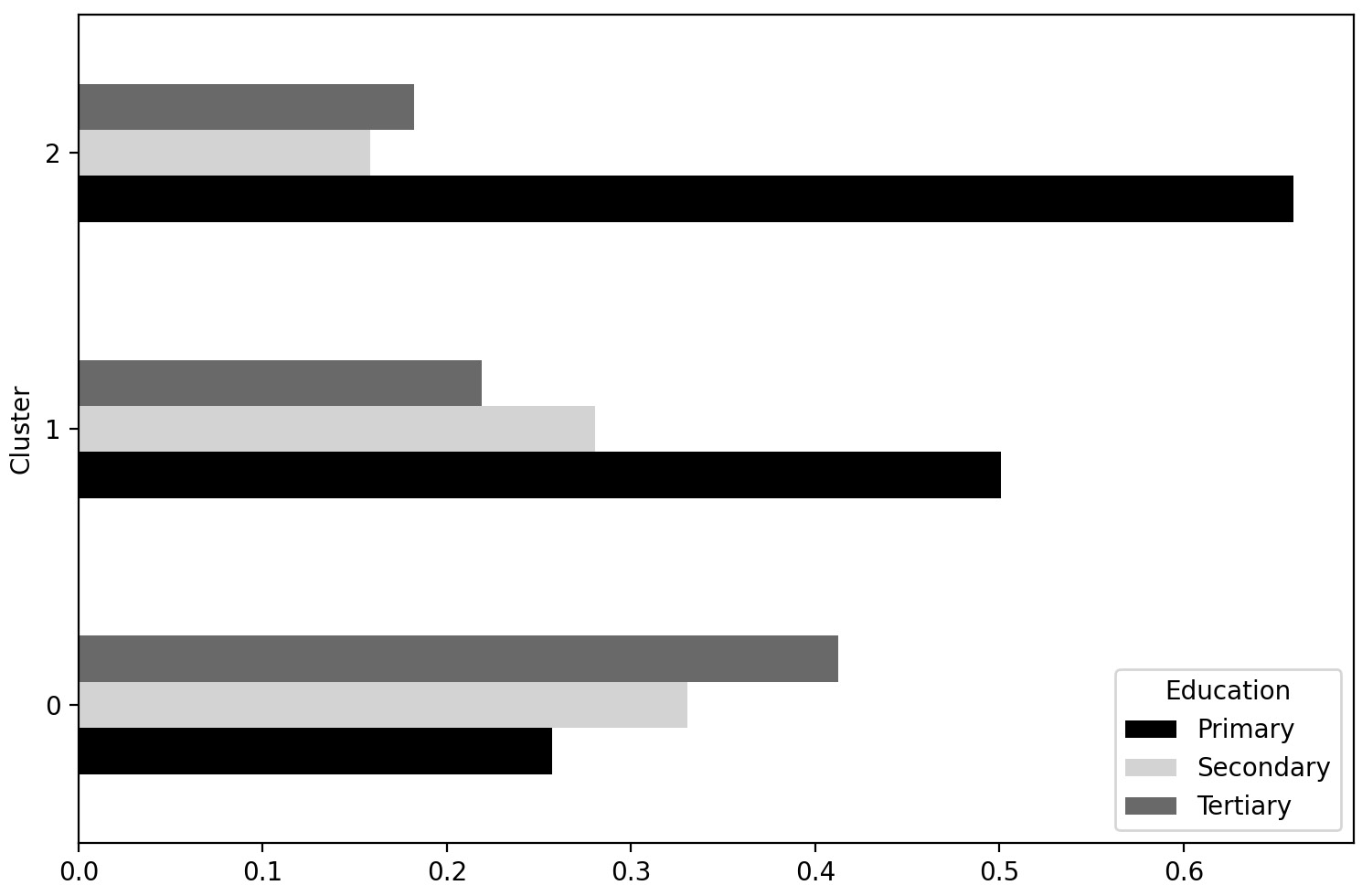
Figure 4.16: The proportions of customers of different educational levels in each cluster
Note
You can get a different order for the clusters in the chart. The proportions should be the same, though. This is because the clusters that you get would be the same. The order in which the clusters are numbered, in other words, which cluster becomes Cluster 0 is affected by randomization that we cannot control by setting the seed. Therefore, while the numbers assigned to the clusters can differ, the resulting groups and their respective attributes will not.
You can see in Figure 4.16 that cluster 2 is dominated by customers with primary education. In cluster 1, the number of primary educated customers roughly equals the number of secondary and tertiary educated customers together. In cluster 0, customers with higher education (secondary or tertiary) significantly outnumber those with primary education.
Note
We used this method of visualizing the education data instead of the usual scatterplots because the categorical data increases the dimensionality. If we used dimensionality reduction to visualize the data, we would not be able to visualize how the clusters capture the different education levels.
With this exercise, you have successfully used k-prototypes clustering to segment people based on their Income and Education levels. A visual analysis gave insight into the nature of the clusters. Visual analysis is good but brings a lot of subjectivity and isn't always a good idea when dealing with high-dimensional data. It is always good to have quantitative measures for evaluating clusters. Let's discuss some approaches in the next section.
Evaluating Clustering
We have seen various ways of performing clustering so far, each approach having its merits. For the same task, we saw that the approaches provided varying results. Which of them is better? Before we answer that, we need to be able to evaluate how good the results from clustering are. Only then can we compare across segmentation approaches. We need to have, therefore, ways to evaluate the quality of clustering.
Another motivation for cluster evaluation methods is the reiteration that clustering is a part of a bigger segmentation exercise, of which clustering is a key part, but far from the whole. Recall from the discussion in the previous chapter that in segmentation exercises, business is often the end consumer of the segments and acts on them. The segments, therefore, need to make sense to the business as well and be actionable. That is why we need to be able to evaluate clusters from a business perspective as well. We have discussed this aspect in the previous chapter and stated the involved considerations. Let us further the discussion on the technical evaluation of clusters.
A principled, objective way of evaluating clusters is essential. Subjective methods, such as visual inspection, can always be used, but we acknowledge that they have serious limitations. Quantitative methods for cluster evaluation remove subjectivity and have the added advantage of enabling some level of automation. One such measure is the silhouette score - a powerful objective method that can be used with data that is more difficult to visualize. We will learn more about this in the next section.
Note that the silhouette score is a general measure of how well a clustering fits the data, so it can be used to not only compare two different models of different types but also choose hyperparameters, such as the number of clusters or choice of quantile for calculating bandwidth for mean-shift clustering.
Silhouette Score
A natural way to evaluate clusters is as follows: if the clusters are well-separated, then any point in a cluster should be closer to most of the points in the same cluster than to a point from another cluster.
This intuition is quantified through the silhouette score. The silhouette score is a formal measure of how well a clustering fits the data. The higher the score, the better the clusters are. The score is calculated for each data point separately, and the average is taken as a measure of how well the model fits the whole dataset altogether.
Let us understand the score better. There are two main components to the score. The first component measures how well the data point fits into the cluster that it is assigned to. This is defined as the average distance between it and all other members of that same cluster. The second component measures how well the data point fits into the next nearest cluster. It is calculated in the same way by measuring the average distance between the data point and all the data points assigned to the next nearest cluster. The difference between these two numbers can be taken as a measure of how well the data point fits into the cluster it is assigned to as opposed to a different cluster. Therefore, when calculated for all data points, it's a measure of how well each data point fits into the particular cluster it's been assigned to.
More formally, given data point xi, where axi is the average distance between that data point and all other data points in the same cluster and bxi is the average distance between data point xi and the data points in the next nearest cluster, the silhouette score is defined as follows:

Figure 4.17: Equation for calculating the silhouette score for a data point
Note that since we divide by the maximum of axi and bxi, we end up with a number between −1 and 1. A negative score means that this data point is actually on average closer to the other cluster, whereas a high positive score means it's a much better fit to the cluster it is assigned to. A value close to 0 would mean that the sample is close to both clusters. When we take the average score across all data points, we will therefore still get a number between −1 and 1, where the closer we are to one the better the fit.
Silhouette score in Python is calculated using the silhouette_score utility in scikit-learn, which calculates the value exactly as described in Figure. 4.17. To calculate the silhouette score, you need the data and the assigned clusters. You can import the silhouette_score utility and calculate the score like in the commands below –
from sklearn.metrics import silhouette_score
silhouette_avg = silhouette_score(data, cluster_assignments)
where data contains the data you clustered and cluster_assignments are the clusters assigned to the rows.
Note that the silhouette score is a general measure of how well a clustering fits the data, so it can be used to choose the optimal number of clusters for the dataset. We can also use the measure to compare clusters from different algorithms, an idea that we will explore later in this chapter. Let us proceed and use silhouette score for choosing the number of clusters.
Exercise 4.06: Using Silhouette Score to Pick Optimal Number of Clusters
In this exercise, you will continue working on the mall customer segmentation case. The objective of the exercise is to identify the right number of clusters using a statistical approach that is, the silhouette score. You will perform k-means clustering on mall customers using different numbers of clusters and use the silhouette score to determine the best number of clusters to use. You will need to continue in the Jupyter notebook used for the exercises so far.
- On the scaled mall customer dataset (mall_scaled) created in Exercise 4.02, Choosing the Number of Clusters Based on Visual Inspection, fit a KMeans model using the features 'Income' and 'Spend_score', specifying 3 clusters. Extract the assigned cluster for each point, using the fit_predict method of the model as in the following code:
cluster_cols = ['Income', 'Spend_score']
X = mall_scaled[cluster_cols]
model = KMeans(n_clusters=3, random_state=42)
cluster_assignments = model.fit_predict(X)
- Import the silhouette_score method from sklearn and calculate the average silhouette score for the current cluster assignments with three clusters using the code that follows:
from sklearn.metrics import silhouette_score
silhouette_avg = silhouette_score(X, cluster_assignments)
print(silhouette_avg)
You should get the value 0.467. Note that this number by itself is not intuitive and may not mean much, but is useful as a relative measure, as we will see in the next step.
- Now that you know how to calculate the silhouette score, you can calculate the scores, looping over different values of K (2-10), as follows:
silhouette_scores = []
for K in range(2, 11):
model = KMeans(n_clusters=K, random_state=42)
cluster_assignments = model.fit_predict(X)
silhouette_avg = silhouette_score(X, cluster_assignments)
silhouette_scores.append(silhouette_avg)
- Make a line plot with the silhouette score for the different values of K. Then identify the best value of K from the plot.
plt.figure(figsize=[7,5])
plt.plot(range(2,11), silhouette_scores, color='gray')
plt.xlabel("Number of clusters: K")
plt.ylabel('Avg. Silhouette Score')
plt.show()
Note
The value gray for the attribute color (emboldened) is used to generate graphs in grayscale. You can use other colors like darkgreen, maroon, etc. as values of color parameter to get the colored graphs. You can also refer to the following document to get the code for the colored plot and the colored output: https://packt.link/ZC4An.
Your plot will look as follows:

Figure 4.18: Average silhouette score vs. K. K=5 has the best value.
From the preceding plot, you can infer that K=5 has the best silhouette score and is therefore the optimal number of clusters.
In this exercise, you used silhouette score to choose the optimal number of clusters. This was the third approach you saw and applied for choosing the number of clusters.
Note
The three approaches to choosing optimal clusters may not agree for many datasets, especially high dimensional, where the visual inspection method may not be reliable. In such cases, supplement the silhouette scores and elbow method with your business understanding/ inputs from business teams to choose the right number of clusters.
Train and Test Split
The methods discussed so far were around examining, either visually or through numbers, how well separated the clusters were. Another important aspect of the quality of the clusters is how generalizable they are to new data. A quite common concern in machine learning is the problem of overfitting. Overfitting is when a machine learning model fits so well to the data that was used to create it, that it doesn't generalize to new data. This problem is usually a larger concern with supervised learning, where there is a label with the correct result expected from the algorithm.
However, it can also be a concern with clustering when you are trying to choose the best clustering technique or hyperparameters that fit the data. One of the problems is getting a good result merely by chance. Because we try many combinations of parameters and algorithms, there is a possibility that one set came out on top just because of some peculiarity in the data on which it was trained. The same set may not work well on a similar dataset that the model hasn't seen before. We want the model to generalize well and identify clusters equally well on newer data.
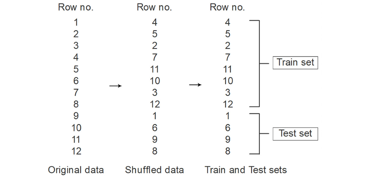
Figure 4.19: The train test split process illustrated
It is therefore considered a best practice to evaluate your models using a held-out portion of the data called the test set. Figure 4.19 shows the steps employed in the process. The dataset is first shuffled so that there is no order in the rows and therefore any underlying logic that was employed to order the rows in the data is no longer applicable. This would ensure that in the next step, where some records are allocated to the train and test sets, the allocation happens randomly. Such random sampling helps make each of the sets representative of the entire dataset. This is useful because if any model you make performs well on the test set as well (which it has never seen before), then you can be sure the model would generalize well to other unseen data as well.
Before doing any kind of clustering, the data is divided into the training set and the test set. The model is then fit using the training set, meaning that the centroids are defined based on running the k-means algorithm on that portion of the data. Then, the test data is assigned to clusters based on those centroids, and the model is evaluated based on how well that test data is fit. Since the model has not been trained using the test set, this is just like the model encountering new data, and you can see how well your model generalizes to this new data, which is what matters the most.
For the Python implementation of the train-test split, we will be employing the train_test_split function from scikit-learn. The function is simple to use and returns train and test sets from any dataset provided to it. You first import the utility from scikit-learn using the following command:
from sklearn.model_selection import train_test_split
Next, you execute the function by supplying to it the dataset to split, the proportion of data to go into the train set and a random_state for consistency of results, like in the command below:
data_train, data_test = train_test_split
(data, train_size = 0.8,
random_state=seed_value)
In the example above, 80% of the data points are assigned to the train set and 20% to the test set. The function returns two datasets corresponding to the train and test datasets respectively. The train and test datasets will then be available to you to continue the modeling process. Let us now see the train test split in action and use it to evaluate clustering performance.
Exercise 4.07: Using a Train-Test Split to Evaluate Clustering Performance
In this exercise, you will use a train-test split approach to evaluate the performance of the clustering. The goal of the exercise is to ensure reliable and robust customers segments from the mall customers. You will need to separate the data into train and test sets first. Then, you will fit a K-means model with a sub-optimal number of clusters. If the clusters are good, the silhouette score should be consistent between the train and test data. Continue in the same Jupyter notebook used so far for all the preceding exercises.
Note
The scaling of the data needs to be performed after the train test split. Performing scaling before the split would leak data from the test set in the calculation of mean and standard deviation. Later, when we apply the model on the test data, it wouldn't really be 'unseen'. This is an example of 'data leakage' and should be carefully avoided.
- Import the train_test_split function from sklearn and perform the split on the mall customer data. Specify the train size as 0.75 and a random_state of 42. Print the shapes of the resulting datasets.
from sklearn.model_selection import train_test_split
df_train, df_test = train_test_split
(mall0, train_size=0.75,
random_state=42)
Specifying a train_size of 0.75 assigns 75% of the records to the train set and the remaining to the test set. Using random_state ensures that the results are reproducible.
print(df_train.shape)
print(df_test.shape)
The shapes would be printed as follows:
(150, 5)
(50, 5)
- Fit a Kmeans mode with 6 clusters on the train data. Calculate the average silhouette score. Ignore the warnings (if any) resulting from this step.
model = KMeans(n_clusters=6, random_state=42)
df_train['Cluster'] = model.fit_predict(df_train[cluster_cols])
silhouette_avg = silhouette_score
(df_train[cluster_cols], df_train['Cluster'])
print(silhouette_avg)
The score should be 0.545. Next, find out the score when the model is applied to the test set.
- Using the predict method of the model, predict the clusters for the test data. Then, calculate the average silhouette score for the test data using the following code. Ignore warnings, if any, from the code.
df_test['Cluster'] = model.predict(df_test[cluster_cols])
silhouette_avg = silhouette_score
(df_test[cluster_cols],df_test['Cluster'])
print(silhouette_avg)
The silhouette score is 0.495, which is a big drop from 0.545 on the train set. To understand the cause for this drop, you'll need to visualize the clusters on the test data.
- Visualize the predicted clusters on the test data using a scatter plot, marking the different clusters.
for clust in range(df_test.Cluster.nunique()):
temp = df_test[df_test.Cluster == clust]
plt.scatter(temp.Income, temp.Spend_score,
marker=markers[clust],
color='gray')
plt.xlabel("Income")
plt.ylabel("Spend_score")
plt.show()
Note
The value gray for the attribute color (emboldened) is used to generate graphs in grayscale. You can use other colors like darkgreen, maroon, etc. as values of color parameter to get the colored graphs. You can also refer to the following document to get the code for colored plot and the colored output: http://packt.link/NOjgT.
You should get the following plot:

Figure 4.20: The clusters on the test data
What do you gather from the plot? First, the top right cluster doesn't seem to be a good one. There are two points that are far from the dense part of the cluster. This is not a tight cluster. Second, the bottom right cluster contains just two points, both of which are very close to another cluster. This cluster should be merged with the adjacent cluster.
In this exercise, you saw that if your clusters are not optimal and are fitting the train data too well, the clusters don't generalize well on unseen data. The performance on unseen data can very effectively be measured using the train-test split approach.
Activity 4.02: Evaluating Clustering on Customer Data
You are a data science manager in the marketing division at a major multinational alcoholic beverage company. Over the past year, the marketing team launched 32 initiatives to increase its sales. Your team has acquired data that tells you which customers have responded to which of the 32 marketing initiatives recently (this data is present within the customer_offers.csv file). The business goal is to improve future marketing campaigns by targeting them precisely, so they can provide offers customized to groups that tend to respond to similar offers. The solution is to build customer segments based on the responses of the customers to past initiatives.
In this activity, you will employ a thorough approach to clustering by trying multiple clustering techniques. Additionally, you will employ statistical approaches to cluster evaluation to ensure your results are reliable and robust. Using the cluster evaluation techniques, you will also tune the hyperparameters, as applicable, for the clustering algorithms. Start in a new Jupyter notebook for the activity.
Note
customer_offers.csv can be found here: https://packt.link/nYpaw.
Execute the following steps to complete this activity:
- Import the necessary libraries for data handling, clustering, and visualization. Import data from customer_offers.csv into a pandas DataFrame.
- Print the top five rows of the DataFrame, which should look like the table below.
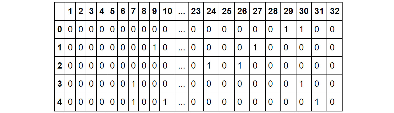
Fig. 4.21: First five records of the customer_offers data
- Divide the dataset into train and test sets by using the train_test_split method from scikit-learn. Specify random_state as 100 for consistency.
- Perform k-means on the data. Identify the optimal number of clusters by using the silhouette score approach on the train data by plotting the score for the different number of clusters, varying from 2 through 10. The plot for silhouette scores should be as follows:

Fig. 4.22: Silhouette scores for different number of clusters
- Perform K means using k found in the previous step. Print out the silhouette score on the test set.
- Perform mean-shift clustering on the data, using the estimate_bandwidth method with a quantile value of 0.1 to estimate the bandwidth. Print out the silhouette score from the model on the test set.
- Perform k-modes on the data. Identify the optimal number of clusters by using the silhouette score approach on the train data by plotting the score for the different number of clusters, varying from 3 through 10. You should get the following output.
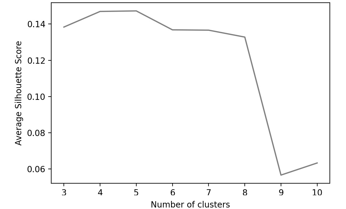
Fig 4.23: Silhouette scores for different K for K-modes
- Using K found in the previous step, perform K-modes on the data. Print out the silhouette score on the test set.
- Which of the three techniques gives you the best result? What is the final number of clusters you will go with?
Note
The solution to this activity can be found via this link.
The Role of Business in Cluster Evaluation
By now, we understand that the clusters need to be sensible and actionable for the business. Machine learning-based approaches identify the naturally occurring clusters in the data. We also know that there is some subjectivity in this process and identifying the right number of clusters is not trivial. Even if the algorithms have correctly identified the true, natural clusters in the data, they may not be feasible for action. Statistical measures may suggest 20 optimal clusters, but the business may be able to act on only four clusters.
Consider another situation in which the clustering activity outputs 2 clusters of a certain nature. Businesses may come back with a strong point of view on the validity of those clusters. For example, a business may assert that, by knowing their own business and the customers so thoroughly, they expect at least 4 distinct clusters with certain behaviors. Or in a different scenario, they may disagree with at least one of the features you have used for the clustering. Or maybe they strongly believe that a particular feature should get a much higher weight among all features.
All of these are cases where business inputs can lead to significant changes in your clusters. Business review of the clustering process and therefore the segments is imperative. Business plays the role of not only the important 'human in the loop' in the segmentation process, but also provides indispensable inputs to make your segments much more useful to the organization and create business impact.
Summary
Machine learning-based clustering techniques are great in that they help speed up the segmentation process and can find patterns in data that can escape highly proficient analysts. Multiple techniques for clustering have been developed over the decades, each having its merits and drawbacks. As a data science practitioner in marketing, understanding different techniques will make you far more effective in your practice. However, faced with multiple options in techniques and hyper-parameters, it's important to be able to compare the results from the techniques objectively. This, in turn, requires you to quantify the quality of clusters resulting from a clustering process.
In this chapter, you learned various methods for choosing the number of clusters, including judgment-based methods such as visual inspection of cluster overlap and elbow determination using the sum of squared errors/ inertia, and objective methods such as evaluating the silhouette score. Each of these methods has strengths and weaknesses - the more abstract and quantified the measure is, the further removed you are from understanding why a particular clustering seems to be failing or succeeding. However, as we have seen, making judgments is often difficult, especially with complex data, and this is where quantifiable methods, in particular the silhouette score, tend to shine. In practice, sometimes one measure will not give a clear answer while another does; this is all the more reason to have multiple tools in your toolkit.
In addition to learning new methods for evaluating clustering, we also learned new methods for clustering, such as the mean-shift algorithm, and k-modes and k-prototypes algorithms. Finally, we learned one of the basic concepts of evaluating a model, which will be important as we move forward: using a test set. By separating data into training and testing sets, we are treating the test set as if it's new data that we didn't have at the time that we developed the model. This allows us to see how well our model does with this new data. As we move into examples of supervised learning, this concept becomes even more important.
In the next chapter, we will learn about using regression, a type of supervised learning, for making predictions about continuous outcomes such as revenue.