
Introduction
How do you change minds?
My brother and I huddled in my basement, putting the finishing touches on our analysis. The sun had set and our presentation was the following morning. We had spent the last month gathering data about student retention at online schools. We wanted to know what caused students to leave and what kinds of students tended to stay.
We had the slides to share with the executive team. The presentation summarized an attrition model, segmented the student population, and offered recommendations. Yet we felt something was missing.
How could we teach people to care?
Behind our numbers were individual students who chose the online school, took out student loans to pay for their education, spent hours with the online coursework, consulted with teachers, and tried to keep up with the schedule. Our analysis flattened the individual stories, successes, and struggles of these students. How could we bring real life back into our presentation?
As the clock ticked toward midnight, we got an idea: We’d create an animated movie. It would show how every student found their way into the school from different points of origin, how they progressed through their schoolwork, and how they eventually made the decision to stay or leave.
The movie-making was more quick and dirty than elegant. We constructed images showing where each student existed on their journey then joined them into a single image for each day of the school year (Figure 1). The students were positioned precisely and moved like stop-motion figures. Finally, Chris wrote a script to generate hundreds of single-day snapshots then weaved them together into an animation. For a couple of tired data junkies, our couple minutes of movie magic felt like a Spielbergian masterpiece.
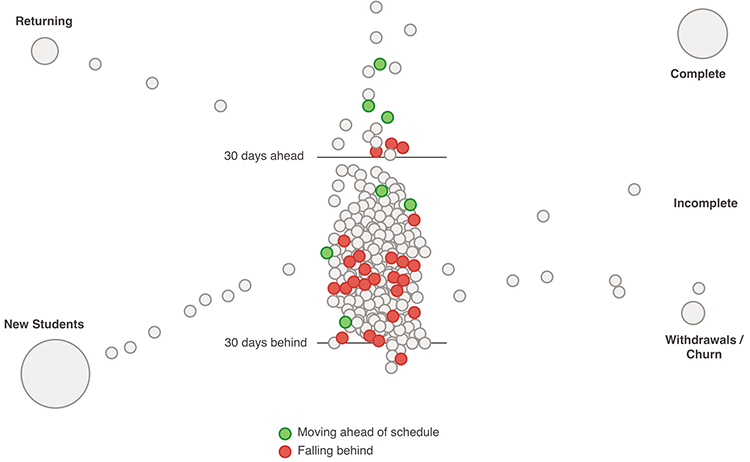
Figure 1 A point in time from our movie about student retention
The students marched across the screen on their way to joyful completion or disappointing withdrawal. The data had new life. And it sparked a conversation with our client.
That creative exercise ignited a passion. We had started Juice Analytics a few months prior, knowing that we wanted to help businesses gain insight and understanding from their data.
That night helped us turn from focusing solely on the numbers to how they are communicated. We realized we wanted to find better and more creative ways to help people understand data. Could we bridge the gap between data analysts and the people who can take action from their work?
For almost a decade we have pursued this goal. Juice Analytics has worked with over a hundred companies—from start-ups trying to deliver data to their customers to global brands looking for better ways to communicate data to executives. We’ve designed engaging interactive dashboards, reports, and analytical tools—all with the goal of helping real people make sense of and act on data.
Along the way, we’ve learned a few important lessons.
Data Is the New Language of Business
Data is a medium to communicate and convince. Its value has been recognized and elevated over the last few years. Media sites such as FiveThirtyEight (from ESPN) and Upshot (from The New York Times) are creating public discussions that combine data analysis and visualization with journalistic storytelling. These sites are a public expression of a trend that has been percolating within many smart organizations.
However, not everyone is comfortable communicating with data. Many of the audiences we design for—administrators, attorneys, marketers—are unfamiliar and inexperienced with getting value from data, even in small doses. One of the great challenges of data communication is building a dialogue. As much as a speaker must express himself through clear, accurate data presentation, the audience needs to be a willing and capable recipient. Presenters of data need to meet their audiences where they are, in ways that their audience can comfortably engage with the content.
How do you create common ground for more effective data communication? You can start by teaching the fundamental grammar of data visualization: metrics, dimensions, distributions, relationships, outliers, and variance. You can encourage good choices for how to express data by picking the right chart to emphasize the important elements in the data. You can learn from the expert data communicators to see how they fluently use the language of data.
More than ever, data will be a large part of how you convey messages. You need to ensure that everyone in your organization can participate in the discussion.
Data Communication Is a Social Problem, Not a Technology Problem
For years, many organizations found it important to strive for data volume and invest in bigger databases and feature-rich platforms. Lost in the focus on size was the real prize—actionable insights in the hands of people who can do something about it. The first generation of business intelligence was about delivering complex, full-featured solutions designed for the IT team. Yet vast quantities of data collected by organizations remain disconnected from the people who might make use of it.
Making data useful is a problem that ultimately must be solved by people—people who understand the specific context of the data, people on the front-lines of decisions, and people who deeply understand the problems that data can illuminate. Data is useful when people use it to tell stories, craft compelling visualizations, and construct thoughtful analyses. People are the missing ingredient.
Unlocking the value of data takes more than individual efforts. It takes the interactions between people who communicate with data, discuss meanings, and debate what actions to take. There is a need for a data culture within organizations that embraces informed decision making.
Data is a cold, lonely medium on its own. Data needs to be humanized and human-sized. It needs to be made relevant to the audience by being clearly linked to relatable problems. It should be presented in intuitive, visual, and simple ways. And like any language, data should be about conveying meaning.
Connecting and Collaborating
Much of the conversation on data occurs across the great divide between those who have a cultivated knowledge of data and those who have responsibilities that seldom involve digging into data. There are language barriers, biases, and misconceptions between these groups of people.
On the one hand, consider a data analyst who has created a complex spreadsheet that helps explain inefficiencies in operations or perhaps defines marketing channel attribution. To do this they have learned the intricacies of APIs, how data is collected and defined, where it is gathered and how it can be joined to other data. To them, data is a flashlight illuminating a bit of truth in a chaotic world.
The analyst’s boss comes from an entirely different world. She is equally smart and invested in finding ways to improve the organization’s bottom line, but she has little attention or time for a detailed spreadsheet or black-box data algorithm. She’s more likely to be moved by a compelling story than a table of numbers.
If these types of people can find a way to collaborate, the organization can benefit. The analyst’s work can see the light of day and drive smarter decisions. His manager can help keep the focus on the pressing problems where better analysis can impact actions.
Our goal has been to create a productive dialogue among those who are data fluent and those who are just learning the language of data. If we can do this, we can connect people who can ask the best questions with those who can answer the questions.
Turning Data into Action
I was presenting to an audience about the untapped value of data when I saw a hand shoot up in the back of the room. It belonged to a serial entrepreneur who I had known for years. He commented to the crowd, “Data isn’t valuable. In fact, it is costly. Think about all the money that goes into gathering, storage, management, and software. The insights that can be found in the data, isn’t that what’s valuable?” He offered a valuable distinction. But maybe we should go further. It is only through actions taken that true value that can be unleashed from data.
The data industrial complex—big business intelligence providers like IBM, MicroStrategy, and SAP—have plenty of incentive to make you believe that gathering more data is a source of value. More data needs more powerful tools with complex feature sets. Bigger data is better data.
Don’t buy it.
A core principle of product design, according to Joshua Porter, Director of User Experience for HubSpot, is “Usefulness is job #1.” He goes on to say, “If your product is not useful, if humans do not find use for it, then the design has failed. Your product must help people do something valuable in their lives.”1
Your data is made useful when it helps people do something better in their job. When data is communicated in ways that are easy for people to grasp, the information can drive dialogue and discussion. The insights and stories in data can get people talking in a productive way. And from these discussions come better decisions and actions. Without this journey of insight to action, all your data might as well be hot air.
Visualization Is Only a Piece of the Solution
The human brain has an incredible ability to absorb and process visual information. We may not remember someone’s phone number or the name of that person we just met, but our visual systems can put computers to shame. Those annoying CAPTCHA systems used to verify that you aren’t a spamming robot are evidence that our minds can process information and find patterns with ease. This is the foundation on which data visualization has been built.
Over the last decade, we have had a front-row seat to watch the explosive growth of data visualization. In 2005, we started blogging about data visualization and a handful of passionate practitioners and academics were at the core of a fledgling data visualization community. Today, there are dozens of conferences, established academic programs, and thousands of designers eager to visualize your data in an infographic.
Lost in this beehive of activity is a simple fact: Data visualization is but a means to an end. That end is to effectively communicate ideas and insights by transforming and representing numbers in ways that everyone can understand. The means can—and must—go beyond charts, infographics, and sophisticated interactive visualizations.
How do we reach beyond infographics? Helping an audience work with data requires creating a logical flow through the information—a flow that has a clear beginning and an end that can lead to actions. Good data communication means providing guidance about the meaning of data elements and timely insertion of contextual information. Presenting data isn’t just about how that data is visualized, but also about how the user can interact, explore, and have a great experience that works with what they already know.
If data is a new medium for communication, there is something to be learned from the many other forms of communication that have come before—like print, photography, and film. A movie director does much more than string together a series of images. He connects to the viewer by artfully combining elements like music, sound effects, editing, and cinematography.
The role of the data communicator is similarly complex. The goal should be to create “information experiences” that transform how audiences think about a subject and make better decisions.
Whether better decisions are made with data often depends on organizational dynamics. Organizational culture deeply influences whether “data products” lead to better decisions. Processes need to support effective data communication. And, in dynamic organizations, effective data communication constantly shapes better processes, systems, and decisions.
It is these lessons, and many more, that we share in Data Fluency. Our ambitions are broad. We hope to construct a roadmap that organizations large and small can use to improve how they work with data.
Who Is This Book For?
The journey to data fluency is important for any organization that wants to have data inform decision-making. It takes a diverse set of people to build the skills and culture for data fluency. Whether you are a leader or an analyst, this book offers practical guidance to help you and your organization on this journey. Data fluency requires:
- Organizational leaders who want to create a culture of data communication and usage, and need to build a team of savvy data consumers and analysts.
- Data novices who are beginning to learn how to communicate with data.
- Experienced analysts who work deeply with data and need to effectively communicate their findings.
- Data product authors who design and create dashboards, reports, and data-rich applications, and want their work to engage their audiences.
- Technology leaders who are responsible for managing data, creating data solutions, and ensuring the organization extracts maximum value from its data assets.
- Human Resource managers who need to select and train their staff with the skills necessary to work with data.
The first chapter explains the Data Fluency Framework in detail. With an understanding of the Data Fluency Framework, Figure 2 identifies a few of the best chapters to focus on if you are interested in quickly getting to the content most relevant to your role.

Figure 2 Chapter Guide