
Chapter 12. Project Management Tools
This chapter covers the following topics:
![]() Understand project management tools: Tools include project scheduling software, charts, dashboards and status reports, knowledge management tools, performance measurement tools, SWOT analysis, and RACI matrixes.
Understand project management tools: Tools include project scheduling software, charts, dashboards and status reports, knowledge management tools, performance measurement tools, SWOT analysis, and RACI matrixes.
Today, sophisticated tools can help with the many details of project management. Each type of tool described in this chapter fulfills specific needs within the project, such as predicting scheduling conflicts, analyzing task performance, or graphically depicting quality issues. The project manager should fully research features and select the best available tools for the job. Some project managers may have to work with the tools available from or dictated by their organization or project management office (PMO).
This chapter covers the following objective for the Project+ exam:
4.1. Compare and contrast various project management tools.
Note
Reminder: CompTIA might use slight variations of industry-standard terminology on the Project+ exam. For a detailed list of known vocabulary differences, see Chapter 15, “Final Preparation.”
“Do I Know This Already?” Quiz
The “Do I Know This Already?” quiz allows you to assess whether you should read this entire chapter thoroughly or jump to the “Exam Preparation Tasks” section. If you are in doubt about your answers to these questions or your own assessment of your knowledge of the topics, read the entire chapter. Table 12-1 lists major headings in this chapter and their corresponding “Do I Know This Already?” quiz questions. You can find the answers in Appendix A, “Answers to the ‘Do I Know This Already?’ Quizzes and Review Questions.”
Table 12-1 “Do I Know This Already?” Foundation Topics Section-to-Question Mapping
Foundation Topics Section |
Questions Covered in This Section |
Project Scheduling Software |
1 |
Charts and Diagrams |
2–3, 10 |
Dashboards and Status Reports |
4 |
Knowledge Management Tools |
5 |
Performance Measurement Tools |
6, 9 |
SWOT Analysis |
7 |
RACI Matrix |
8 |
Caution
The goal of self-assessment is to gauge your mastery of the topics in this chapter. If you do not know the answer to a question or are only partially sure of the answer, you should mark that question as wrong for purposes of the self-assessment. Giving yourself credit for an answer you correctly guess skews your self-assessment results and might provide you with a false sense of security.
1. Which project tool is used mainly to track project activities, their durations, and the personnel assigned to them?
a. process diagram
b. histogram
c. fishbone
d. project scheduling software
2. What is the purpose of a histogram?
a. setting priorities
b. categorizing the potential causes of a problem to identify root causes
c. depicting the approximate distribution of statistical data
d. depicting the steps in a business process in sequential order
3. Which project chart is used to find a correlation between two variables?
a. run chart
b. scatter chart
c. Pareto chart
d. Gantt chart
4.Which of the following answers best states the purpose of the project dashboard?
a. providing the project status
b. displaying project activities over time
c. showing trends, variations, or declines/improvements in a project over time
d. managing collaborative content
5. Which knowledge management tool provides project team members with answers to questions about third-party products?
a. wiki pages
b. vendor knowledge base
c. intranet site
d. collaboration tool
e. dashboard
6. Which KPI is used to show the value a project has earned from the money spent to date?
a. CPI
b. AC
c. PV
d. EV
7. What is the purpose of a SWOT analysis?
a. identifying risks
b. identifying roles and responsibilities
c. estimating costs
d. breaking down activities
8. Which tool is used to determine the roles required to handle each project activity?
a. SWOT analysis
b. RACI matrix
c. Pareto chart
d. BSC
9.What categories are analyzed in a BSC?
a. Planning, Initiating, Executing, Monitoring and Controlling, and Closing
b. Responsible, Accountable, Consulted, and Informed
c. Missed Milestones, Crossed Deadlines, and Resource Utilization
d. Financial, Customer, Internal Process, and Learning and Growth
10. Which project tool helps the project manager identify the largest single source of problems in a project?
a. histogram
b. Gantt chart
c. Pareto chart
d. scatter chart
e. fishbone diagram
Foundation Topics

Project Scheduling Software
Having just the right tool can make the project manager’s job much easier. Modern project scheduling software (both programs and apps) supports “what if” scenarios, tracks project efficiency, and analyzes schedules by using customizable Gantt charts, diagrams, and more. Other desirable features include the ability to run on multiple operating systems and the option to work in the cloud or via local installation.
Project scheduling software allows the project manager to enter the raw data for project tasks, project resources, and task durations, displaying the results in multiple common formats as needed. Most project scheduling software also includes the ability to create custom charts and reports.
The selection of software tools is often influenced by their price as much as their usability. For example, Microsoft Project is a popular choice, but it can be expensive; Microsoft Project Pro for Office 365 is offered as a per-user license, which can be cheaper. Other commercial options include Zoho Projects, FastTrack Schedule, Primavera P6, and Workfront.
Charts and Diagrams
Just by their nature, most projects have lots of information that needs to be disseminated to the project’s sponsor, stakeholders, and team members. Unfortunately, raw data is hard for many people to understand, and it must be analyzed to reveal trends. Charts can put the data into a format more easily understood by everyone. Displaying project information graphically also makes it easy to determine the project’s status, identify issues, and make decisions.
While many types of charts are used in projects, CompTIA has identified seven main chart types that Project+ candidates need to understand: process diagrams, histograms, fishbone diagrams, Pareto charts, run charts, scatter charts, and Gantt charts.
Both spreadsheet programs and all-in-one project management software can be used to create charts like the ones discussed in this chapter. Popular spreadsheet applications, such as Microsoft Excel, include charting capabilities and can convert data into project-specific displays. All-in-one solutions have these tools built in, but they typically allow you to export your data to and from common spreadsheet formats so that the data can be used across multiple tools.
The most common tool used to create charts like those discussed in this section is a spreadsheet application, such as Microsoft Excel. When using this method, the project manager will need to enter the data and use the spreadsheet functions to convert the data to a bar chart, Pareto chart, or any other chart.
Note
For purposes of this discussion, the terms chart and graph are generally synonymous.
Process Diagram
A process diagram or flowchart is a sequential breakdown of the steps required to complete a business process, displayed in relation to each other. It includes the sequence of actions, inputs and outputs for each step, decision points, personnel involved, and time required. Process diagrams should be created for any procedure that is part of the project or is necessary for the project’s completion, particularly business and manufacturing processes.
Process diagrams help project team members study a process for potential improvements or understand why the process is vital to the project. These diagrams can also be used to demonstrate to project team members and stakeholders how a process is conducted.
Figure 12-1 shows part of a process diagram for a procurement process.
The components in a process diagram generally use the following symbols
(see Figure 12-2):
![]() Boxes detail individual steps.
Boxes detail individual steps.
![]() Arrows show direction flow from one step or decision to another.
Arrows show direction flow from one step or decision to another.
![]() Diamonds mark decision points in the process. A question is written inside the diamond, with multiple arrows coming out of the diamond based on the potential answers to the question.
Diamonds mark decision points in the process. A question is written inside the diamond, with multiple arrows coming out of the diamond based on the potential answers to the question.
![]() Semi-circles show delays or waits in the process.
Semi-circles show delays or waits in the process.
![]() Circles denote links to another page or another flowchart. The same symbol on the linked page or chart indicates that the flow continues at that point.
Circles denote links to another page or another flowchart. The same symbol on the linked page or chart indicates that the flow continues at that point.
![]() Parallelograms designate input to or output from the process.
Parallelograms designate input to or output from the process.
Tip
Usage varies. Some organizations or artists may use these symbols in different ways, add other symbols, impart meaning with line width or color, and so on.

Figure 12-1 Example of a Procurement Process Diagram

Figure 12-2 Common Symbols Used in Process Diagrams
A number of commercial software applications can make creating process diagrams easier. Microsoft Visio, Novagraph Chartist, RFFlow, WizFlow Flowcharter, 1888 Quick Flow Chart Creator, and other such applications vary in complexity, cost, and features. The project manager or the PMO should find the product that best suits the organization’s needs. Some applications, such as Microsoft Visio, provide a bit more than just process diagrams, including network diagrams, data flow diagrams, and others that require specialized pieces.
Histogram
A histogram is a specialized type of bar graph. A standard bar graph depicts data by presenting different categories in separate bars, such as comparing the number of people who work outside the home against the number of people who commute to work by car. By contrast, the bars of a histogram represent continuous data for a specific range, such as the number of commuting drivers on the road during each hour of a 12-hour period. The data within the range is measured in terms of frequencies and intervals. The histogram’s primary purpose is to graphically depict the approximate distribution of statistical data.
In project management, histograms are often used to show the frequency of causes of quality problems, in order to determine and understand preventive or corrective actions. However, histograms can also show other project data, such as the distribution of resources based on job title, or the usage of equipment. They can even be used to represent data gathered for a project, such as statistical population or income data that could be used as input to the project.
Figure 12-3 shows an example of a histogram that represents the number and types of phone calls received by a receptionist.
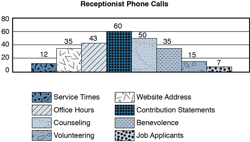
Figure 12-3 Example of a Histogram
Fishbone Diagram
A fishbone diagram, also referred to as a cause-and-effect diagram or Ishikawa diagram, categorizes the potential causes of a problem to help the project team identify root causes. A project manager may use this tool for brainstorming when a team’s thinking tends to fall into a rut.
The left side of the diagram lists the causes, broken into major categories. The identified causes will be placed in the appropriate cause categories as the diagram is built. The right side of the diagram lists the effect. The effect is written as the problem statement for which the project manager is trying to identify the causes. The partial fishbone diagram in Figure 12-4 shows reasons why product quality does not match quality standards.

Figure 12-4 Example of a Fishbone Diagram
Fishbone diagrams are usually hand-drawn during project team meetings. Popular tools for creating fishbone diagrams include SmartDraw, Edraw Max, RCAXPress Fishbone Diagram Builder, XMind, and Nevron.
Pareto Chart
A Pareto chart helps project managers set priorities for quality control and is most often used in conjunction with fishbone diagrams. Project managers can find out the relative importance of or causes behind a project’s problems as part of quality management. The theory behind a Pareto chart is the “80/20 rule,” which suggests that most of the problems in a project (80%) are caused by the same few factors (20%). The project manager can eliminate the largest number of issues by identifying which root cause to address first.
A Pareto chart combines a vertical bar chart with a line graph, showing importance or other values graphed from highest to lowest. The project manager uses a list of the project’s problems as the base of the bar chart. The most common problem should be listed on the left side, and the least common problem on the right. Each parameter’s importance is measured by several factors, such as frequency, time, or cost. Data points that represent the cumulative total percentage are plotted on the line graph.
Many Pareto charts include a cutoff cumulative percentage (such as 80%). Any bar that rises above that cutoff value shows the highest cumulative percentage of problems, which indicates the cause to prioritize. Data falling below the cutoff line indicates lower-priority root causes.
Figure 12-5 shows an example of a Pareto chart.

Figure 12-5 Example of a Pareto Chart
Run Chart
Like Pareto charts, a run chart is used in quality management. Run charts show trends, variations, or declines/improvements in a project over time, using a line graph (see Figure 12-6). Project managers can use run charts to analyze the following data trends:
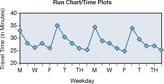
Figure 12-6 Example of a Run Chart
![]() Too many runs above or below the center line
Too many runs above or below the center line
![]() Too many points continuously increasing or decreasing
Too many points continuously increasing or decreasing
![]() Too many points on the same side of the center line
Too many points on the same side of the center line
![]() Too many points alternating up or down
Too many points alternating up or down
EXAMPLE: As a project manager, you need to document the number of coding errors detected weekly throughout an application development project. Team members work in teams to develop code, and then the teams review each other’s code. They report the number of coding errors to you, and you document the total count in a run chart, with the goal of reducing the number of coding errors as the project progresses.
Scatter Chart
A scatter chart, also known as a scatter diagram, scatter plot, or correlation chart, is used to find the correlation between two variables, such as traffic speed and number of accidents. The first variable is independent, and the second variable is dependent on the first variable. The diagram shows how the dependent variable is affected by changes to the independent variable:
![]() No correlation between the variables (see Figure 12-7)
No correlation between the variables (see Figure 12-7)
![]() Moderate correlation between the variables (see Figure 12-8)
Moderate correlation between the variables (see Figure 12-8)
![]() Strong correlation between the variables (see Figure 12-9)
Strong correlation between the variables (see Figure 12-9)

Figure 12-7 Scatter Chart with No Correlation Between the Variables

Figure 12-8 Scatter Chart with Moderate Correlation Between the Variables

Figure 12-9 Scatter Chart with Strong Correlation Between the Variables
To interpret the scatter chart correctly, the project manager needs to understand outliers, which are data points that fall outside the pattern of the majority of the points. The trend line of a scatter chart is the line along which most of the points lie.
The scatter chart in Figure 12-10 shows the correlation between the number of visitors and the average daily temperature at a beach.
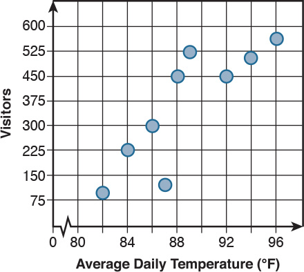
Figure 12-10 Scatter Chart Example
Gantt Chart
A Gantt chart displays a project’s scheduled activities or tasks over time, often including the activity’s dependencies and relationships. Gantt charts are one of the main tools used for project scheduling and can also depict the project schedule baseline. The left side of the chart lists the activities, and the top or bottom of the chart shows the time scale. The length and position of the bars within the grid depict each activity’s start date, duration, and end date (see Figure 12-11). In a Gantt chart, the project manager, team members, and stakeholders can see the following schedule characteristics:
![]() Project activities
Project activities
![]() Activity start and end dates
Activity start and end dates
![]() Activity durations
Activity durations
![]() Activity overlap
Activity overlap
![]() Project start and end dates
Project start and end dates
In some cases, Gantt charts may be modified to include information about the resources allocated to the activity, add milestones as zero-duration tasks, and mark critical activities.

Figure 12-11 Example of a Gantt Chart
Project scheduling software and project management software provide built-in functionality for generating Gantt charts from the task, duration, and time data on a project. It is possible but time-consuming to create a functional Gantt chart with a spreadsheet application.
Dashboards and Status Reports
Project charts and status reports are the easiest options for project managers to summarize and communicate key data about a project’s status without overwhelming the audience. A type of graphical report called a dashboard displays important project status information, usually including key performance indicators, project metrics, current progress, and related issues. A written status report may or may not include sections from the dashboard; it is sent to the project sponsor and any stakeholders wanting this information.
Project management software or standalone dashboard applications allow the project manager to customize the information available on the dashboard. For example, the project manager may decide to create one dashboard with summary data for stakeholders and a separate dashboard for project team members with more detailed information. The following list describes some common dashboard formats.
![]() Burndown dashboard: Shows how many activities are completed and what is left to be done.
Burndown dashboard: Shows how many activities are completed and what is left to be done.
![]() Cost overview dashboard: Displays the current cost status of the project, usually including planned costs, remaining costs, actual costs, cumulative costs, baseline costs, and percentage of completion, to help determine whether the project will stay within budget.
Cost overview dashboard: Displays the current cost status of the project, usually including planned costs, remaining costs, actual costs, cumulative costs, baseline costs, and percentage of completion, to help determine whether the project will stay within budget.
![]() Project overview dashboard: Reports project activity completions, upcoming milestones, and activities that are past due.
Project overview dashboard: Reports project activity completions, upcoming milestones, and activities that are past due.
![]() Work overview dashboard: Includes a work burndown for the project and the work statistics for all top-level tasks to help determine the percentage of completion and remaining work.
Work overview dashboard: Includes a work burndown for the project and the work statistics for all top-level tasks to help determine the percentage of completion and remaining work.
Popular project management applications with dashboard functionality include Microsoft Project, Asana, Basecamp, Mavenlink, and Smartsheet.
Tip
A quick search online for “project overview dashboard images” will present plenty of ideas for constructing useful dashboards for your project.
Knowledge Management Tools
Project teams need to share information as the project progresses. Knowledge to be shared may include documented processes and procedures, available tools and technologies, databases, source code repositories, and so on. Knowledge management tools can provide a central location where all project team members can easily access shared data, regardless of their location or platform.
CompTIA expects Project+ certification candidates to be familiar with the features of common knowledge management tools: intranet and Internet sites, wiki pages, vendor knowledge bases, and collaboration tools.
Intranet and Internet Sites
An intranet site is accessible exclusively within an organization, and an Internet site is a website that is hosted publicly. Both can be used as project repositories. The project manager can add project information to an existing intranet or Internet site or set up a new site for the project. These sites usually include a task manager, project documents, a discussion board, a calendar, and general information such as team member biographies.
Websites offer several advantages for knowledge management:
![]() Data is accessible via web browser
Data is accessible via web browser
![]() Easy to set up
Easy to set up
![]() Low cost
Low cost
![]() Improved productivity
Improved productivity
The biggest disadvantage of using websites as knowledge management tools is the security implications, particularly for projects that are confidential or have a high monetary value. Even intranet sites can be susceptible to attacks. Prior to placing project information on an intranet or Internet site, the project sponsor and project manager should assess the project’s data confidentiality needs and determine whether the value of sharing the project information within and/or outside the organization is worth the security risk. If organizations are concerned about the project’s confidentiality being breached (such as proprietary information leaking to competitors), they might need to opt for a less-risky knowledge management tool.
Wiki Pages
A wiki is a type of website that is used to manage collaborative content. The wiki users determine the structure of the site and are able to edit the content on demand without going through a formal editing or upload process. While intranet and Internet sites require knowledge of web development technologies and languages such as HTML, wiki pages typically need little technology expertise. Wikis are particularly useful for projects requiring lots of documentation that will be accessed and edited by team members in multiple locations and time zones.
For project management, using a wiki offers several advantages:
![]() Anyone can edit the content.
Anyone can edit the content.
![]() Posting information on wiki pages is quick and easy.
Posting information on wiki pages is quick and easy.
![]() Shared data facilitates communication and discussion.
Shared data facilitates communication and discussion.
![]() Wiki pages can be linked to simplify accessing related data.
Wiki pages can be linked to simplify accessing related data.
![]() All changes to wiki pages are tracked.
All changes to wiki pages are tracked.
![]() Launching and maintaining a wiki is often less expensive than many other options.
Launching and maintaining a wiki is often less expensive than many other options.
But wikis also have disadvantages:
![]() Anyone can edit the content.
Anyone can edit the content.
![]() Published sites may be open to spam and malware.
Published sites may be open to spam and malware.
![]() Wiki structures can quickly become disorganized.
Wiki structures can quickly become disorganized.
You may have noticed that the first advantage and disadvantage are the same in the two lists above. The ease of editing increases the likelihood of conflicting changes among multiple users, and published documents may not stay “finished” when users have the option to make further edits. Larger organizations may need to create style guides specifying language rules, product trademarks and service marks, and regulations dictating what can/cannot be published and/or changed in project documents.
Vendor Knowledge Bases
A vendor knowledge base is a database that contains authorized information about a particular vendor’s products. Most operating system vendors, such as Cisco, Microsoft, and Apple, have extensive knowledge bases that are searchable by the public, though some content may be reserved for subscribers or product owners. Knowledge bases are particularly helpful if a project requires a particular vendor’s products but the project team does not have extensive knowledge of the product.
Project managers should ensure that project team members know how to access and search vendor knowledge bases. Team members may also need to understand how to make requests in a vendor knowledge base for new or updated product information.
Collaboration Tools
Collaboration tools are used in projects to help the project team work together. A wide variety of tools is available to help team members collaborate, varying in function from centralized document management to productivity to conferencing. These tools often allow for shared document management with version control. Collaboration tools focus on helping increase efficiency and output within the team, rather than communicating with individuals outside the team.
Popular project management collaboration tools include Asana, Projecteev, Podio, Redbooth (formerly Teambox), Trello, Flow, Conceptboard, Basecamp, Binfire, Projecturf, Wiggio, Zoho, and G Suite. Tools with less extensive capabilities focus mainly on file sharing: SharePoint, Dropbox, Microsoft OneDrive, WebEx, GoToMeeting, and Skype.
All project team members must know how to access and update project resources or communicate using the selected collaboration tool(s).
Note
The Project+ exam focuses on the functionality that charts and knowledge management tools provide to a project. Do not expect to be tested on specific tools. The objective is about understanding the purposes of these tools and when you would select them.
Performance Measurement Tools
Projects need ways of quantifying success. Performance measurement tools such as key performance indicators, key performance parameters, and balanced score cards help project managers show project success in a measurable format. When such measurements are provided, even people who are unfamiliar with project terminology can understand how the project is performing.
Caution
Be careful not to confuse performance measurement tools with project quality tools, which measure quality specifications in the project.
Key Performance Indicator (KPI)/Key Performance Parameter (KPP)
A key performance indicator (KPI) is a measure that evaluates the success of a project or deliverable in meeting objectives for performance. The U.S. Department of Defense (DoD) refers to these as key performance parameters (KPPs). KPIs and KPPs are usually documented in the project dashboard.
Table 12-2 shows KPIs and KPPs that project managers typically provide in the dashboard.
Table 12-2 Key Performance Indicators/Key Performance Parameters
|
KPI or KPP |
Description |
planned value (PV) |
The planned cost for the amount of work that is currently completed. |
actual cost (AC) |
The actual money spent to date on a project. |
earned value (EV) |
The value a project has earned from the money spent to date. |
cost variance (CV) |
The budget deficit or surplus at any given point in time. |
cost performance index (CPI) |
The ratio of earned value to actual cost. |
schedule performance index (SPI) |
The ratio of earned value to planned value. |
schedule variance (SV) |
The difference between the earned value and the planned value. |
return on investment (ROI) |
The total dollar/time return the project sponsor will receive for the project. ROI is calculated using one of two formulas:
|
cost of managing processes |
An overview of time and resources spent on supervising and managing the project. |
overdue project tasks (also called crossed deadlines) |
The number of project activities that are overdue. A calculated percentage of project activities that go past their due date is compared to all completed project activities. |
missed milestones |
Indicates whether a project is running ahead of schedule, on time, or behind schedule. |
percentage of tasks completed |
Indicates how far along the tasks are toward completion. |
resource utilization |
Measures how the team members’ time is used while working on the project. Specifically, this measurement shows how much time team members are spending on billable activities compared to the time spent on non-billable tasks, such as meetings. |
percentage of projects completed on time |
Helps demonstrate the overall project success for an organization. |
percentage of canceled projects |
Shows how sustainable an organization’s projects are. Projects risk cancellation from internal factors such as lack of budget or sponsor support, or external factors such as regulatory or environmental issues. If too many projects are canceled, the organization should change its approach to project management or focus on different types of projects. |
Note
See Chapter 3, “Project Cost Control,” for PV, AC, EV, CV, CPI, SPI, and SV and their formulas. Missed milestones are noted in the milestone list, which identifies all project milestones and indicates whether each milestone is mandatory. See Chapter 4, “Project Schedules,” for details on milestones.
Other KPIs or KPPs may be added based on the organization’s needs. Project managers should ensure that the project sponsor and stakeholders understand what each measurement means.
Balanced Score Card (BSC)
Understanding what management is trying to measure helps project managers gather and report the project information that affects those measurements. This understanding also helps explain to the project team why particular measurements are needed. In the organization’s balanced score card (BSC), management uses project management tools and principles to clarify the strategic targets for the organization as a whole, and not just its projects or its portfolio.
A BSC includes four sets of measures:
![]() Financial: The Financial section answers the question, “How can we show our shareholders that we succeed financially?” This section contains the financial targets for the organization, using Specific, Measurable, Achievable, Realizable, Time-bound (SMART) goals. This section typically includes statements like “Increase revenue by 15% during fiscal year 2018” or “Cut operating costs by 10% in Q4.”
Financial: The Financial section answers the question, “How can we show our shareholders that we succeed financially?” This section contains the financial targets for the organization, using Specific, Measurable, Achievable, Realizable, Time-bound (SMART) goals. This section typically includes statements like “Increase revenue by 15% during fiscal year 2018” or “Cut operating costs by 10% in Q4.”
![]() Customer: The Customer section answers the question, “How can we align the customer”™s perception of our company with our vision?” This section ties the goals in the Financial section to how they will affect the organization’s customers. For example, if a financial goal is to increase revenue, marketing and sales efforts may focus on obtaining a certain number of new customers or increasing the number of orders from current customers.
Customer: The Customer section answers the question, “How can we align the customer”™s perception of our company with our vision?” This section ties the goals in the Financial section to how they will affect the organization’s customers. For example, if a financial goal is to increase revenue, marketing and sales efforts may focus on obtaining a certain number of new customers or increasing the number of orders from current customers.
![]() Internal Process: The Internal Process section answers the question, “What business processes must excel, or what systems must be put into place, to achieve our Customer and Financial goals?” This section ties the organization’s internal business processes and operations to the goals in the Financial and Customer sections. For example, if a Financial goal is to increase revenue, and a Customer goal is to obtain a certain number of new customers, the sales and marketing team may have an Internal Process goal of working together to develop new marketing materials to attract new customers.
Internal Process: The Internal Process section answers the question, “What business processes must excel, or what systems must be put into place, to achieve our Customer and Financial goals?” This section ties the organization’s internal business processes and operations to the goals in the Financial and Customer sections. For example, if a Financial goal is to increase revenue, and a Customer goal is to obtain a certain number of new customers, the sales and marketing team may have an Internal Process goal of working together to develop new marketing materials to attract new customers.
![]() Learning and Growth: The Learning and Growth section answers the question, “What knowledge, skills, and abilities will we need in order to support our Financial and Customer goals?” This section ties the organization’s capabilities to the goals in the Internal Process, Customer, and Financial sections. For example, if a Financial goal is to increase revenue, a Customer goal is to obtain a certain number of new customers, and an Internal Process goal is to develop new marketing materials, the marketing team may need a new software application to help the team in developing new marketing initiatives.
Learning and Growth: The Learning and Growth section answers the question, “What knowledge, skills, and abilities will we need in order to support our Financial and Customer goals?” This section ties the organization’s capabilities to the goals in the Internal Process, Customer, and Financial sections. For example, if a Financial goal is to increase revenue, a Customer goal is to obtain a certain number of new customers, and an Internal Process goal is to develop new marketing materials, the marketing team may need a new software application to help the team in developing new marketing initiatives.
Each section of the balanced score card should contain objectives, measures, targets, and initiatives. The project manager should study each section carefully to ensure that the project’s goals align with the organization’s goals, mapping project strategies back to the BSC in order to ensure project adoption and success.
SWOT Analysis
Strengths, weaknesses, opportunities, and threats (SWOT) analysis is used during the Planning phase of a project to identify project risks. The project manager uses this tool to identify areas within the project that may cause problems or present opportunities.
Strengths and weaknesses are internal factors, whereas opportunities and threats are external factors. With both of these groupings (internal and external), one factor of each is positive, and the other is negative:
![]() Internal factors: Strengths analysis addresses positive internal factors, while weaknesses analysis focuses on negative internal factors.
Internal factors: Strengths analysis addresses positive internal factors, while weaknesses analysis focuses on negative internal factors.
![]() External factors: Opportunities analysis looks at positive external factors, while threats analysis concentrates on negative external factors.
External factors: Opportunities analysis looks at positive external factors, while threats analysis concentrates on negative external factors.
The project manager’s SWOT analysis examines each of these aspects individually:
![]() Strengths: Analyze in-house skills and experience, budget sufficiency for all tasks, project benefits, and other similar projects to identify any strengths the organization or team provides for the project. Strengths include organizational track record, resource availability, skill levels, processes and systems, reputation, and so on.
Strengths: Analyze in-house skills and experience, budget sufficiency for all tasks, project benefits, and other similar projects to identify any strengths the organization or team provides for the project. Strengths include organizational track record, resource availability, skill levels, processes and systems, reputation, and so on.
![]() Weaknesses: Analyze the availability of contingency funds, outsourcing needs, schedule realism, and project drawbacks to identify any weaknesses in the project. Weaknesses might include issues such as gaps in knowledge and expertise, timescale and deadlines, budget and funding, processes and systems, and competing projects.
Weaknesses: Analyze the availability of contingency funds, outsourcing needs, schedule realism, and project drawbacks to identify any weaknesses in the project. Weaknesses might include issues such as gaps in knowledge and expertise, timescale and deadlines, budget and funding, processes and systems, and competing projects.
![]() Opportunities: Analyze competitor weaknesses, current industry trends, new technologies, and other areas of the business where opportunities should be seized to help the project. Opportunities could include technology development, infrastructure development, emerging and developing markets, new innovations, and market demand.
Opportunities: Analyze competitor weaknesses, current industry trends, new technologies, and other areas of the business where opportunities should be seized to help the project. Opportunities could include technology development, infrastructure development, emerging and developing markets, new innovations, and market demand.
![]() Threats: To identify threats to the project, analyze whether team members are difficult to replace, required new technologies have been tested, changing trends will affect the project, or project results could be copied by competitors. Typical threats include environmental factors, competitor activities, economic factors, seasonal effects, and political factors.
Threats: To identify threats to the project, analyze whether team members are difficult to replace, required new technologies have been tested, changing trends will affect the project, or project results could be copied by competitors. Typical threats include environmental factors, competitor activities, economic factors, seasonal effects, and political factors.
Table 12-3 shows a SWOT analysis example for a new restaurant.
Table 12-3 SWOT Analysis Example
|
Strengths |
Weaknesses |
Location: Our first location downtown will draw in visitors and downtown shoppers. |
Lack of capital: All startup funds will come from loans and investors. |
Uniqueness: We stand out as a unique alternative to fast food, and we offer high-quality food in a distinctive atmosphere. |
Lack of reputation: Though all our restaurants are successful, we need to establish a consistent brand. |
Strong management: Our management team has successfully opened twelve concept restaurants in five years. |
|
Opportunities |
Threats |
Area growth: The city is growing by 8.5% annually. |
Competition: One competitor sells similar foods and has loyal customers, as well as relationships with businesses that regularly buy from them. |
Working families with children: This is a growing population, both in numbers and in their choice of convenient foods. Two-income families have less time to prepare meals. |
Being unprepared for opening numbers: Poor service or product quality during opening week could discourage customers from returning. |
SWOT analysis offers some advantages over complex analysis options, but disadvantages are also part of the bargain, as Table 12-4 shows.
Table 12-4 SWOT Analysis Advantages and Disadvantages
Advantages |
Disadvantages |
Straightforward analysis. |
Simplicity of creating a SWOT table may encourage list building rather than focusing on achieving objectives. |
Low cost to perform. |
A more expensive analysis might produce more useful results. |
Produces new ideas quickly. |
Does not organize ideas to fit established priorities. |
Allows general response plans |
Useful risk preparation requires a more detailed analysis. |
RACI Matrix
The project manager creates the responsible, accountable, consulted, and informed (RACI) matrix during the Planning phase of a project to analyze the project stakeholder and team member roles and responsibilities in relation to project activities or tasks. For each task, the project must identify the following:
![]() Responsible (R): Who does the work to complete the activity?
Responsible (R): Who does the work to complete the activity?
![]() Accountable (A): Who is accountable for the activity?
Accountable (A): Who is accountable for the activity?
![]() Consulted (C): Who provides information regarding the activity?
Consulted (C): Who provides information regarding the activity?
![]() Informed (I): Who needs to know the activity’s progress?
Informed (I): Who needs to know the activity’s progress?
To create the RACI matrix, most project managers start with the work breakdown structure (WBS) that is created during the Planning phase. A grid lists the project activities down the left-hand column. Then each project stakeholder or team member is listed in an individual column, with designations for each activity (R, A, C, and/or I) in the fields below the person’s name or role (see Table 12-5). In most cases, only the project manager uses the RACI matrix. If other team members need this document, the project manager should explain that stakeholders should not be given access. Table 12-5 shows a RACI matrix template.
Table 12-5 RACI Matrix Template
Activity |
Role 1 |
Role 2 |
Role 3 |
Role 4 |
Role 5 |
Activity 1.1 |
R |
A |
C, I |
||
Activity 1.2 |
R, A |
C |
I |
||
Activity 2.1 |
I |
I |
R |
A, C |
|
Activity 2.2 |
R |
A |
C, I |
I |
|
R = Responsible |
A = Accountable |
C = Consulted |
I = Informed |
The terms responsible, accountable, consulted, and informed need to be defined thoroughly so that no one misunderstands what is expected of those designations. Each activity should have only one person assigned the responsible (R) designation and one person assigned the accountable (A) designation. These may or may not be the same person. The C and I designations do not have assignment limitations. However, anyone with the I designation may be affected or may need to take action when that activity is complete.
Exam Preparation Tasks
As mentioned in the section “How To Use This Book” in the Introduction, you have several choices for exam preparation: the exercises here; Chapter 15, “Final Preparation”; and the Pearson Test Prep practice test software online.
Review All Key Topics
Review the most important topics in this chapter, noted with the Key Topics icon in the outer margin of the page. Table 12-6 provides a reference of these key topics and the page number on which each begins.
Table 12-6 Key Topics for Chapter 12
Key Topic Element |
Description |
Page Number |
Section |
Overview of project scheduling software |
247 |
Section; list; Figures 12-1 and 12-2 |
Discussion and example of process diagram (or flowchart) |
248 |
Section; Figure 12-3 |
Discussion and example of histogram |
250 |
Section; Figure 12-4 |
Discussion and example of fishbone diagram |
251 |
Section; Figure 12-5 |
Discussion and example of Pareto chart |
251 |
Section; list; Figure 12-6 |
Discussion and example of run chart |
252 |
Section; list; Figures 12-7 through 12-10 |
Discussion and examples of scatter chart |
253 |
Section; list; Figure 12-11 |
Discussion and example of Gantt chart |
256 |
Section; list |
Discussion and examples of project dashboards |
257 |
Sections; lists |
Overview of knowledge management tools |
257 |
Section; lists; Tables 12-2 through 12-5 |
Overview of performance measurement tools |
260 |
Define Key Terms
Define the following key terms from this chapter and check your answers in the Glossary:
key performance indicator (KPI)
key performance parameter (KPP)
strengths, weaknesses, opportunities, and threats (SWOT) analysis
responsible, accountable, consulted, and informed (RACI) matrix
Review Questions
The answers to these questions appear in Appendix A. For more practice with sample exam questions, use the Pearson Test Prep practice test software online.
1. A project team member has several questions about how sales occur, including how shipping decisions are made. Which document should the team member consult?
a. histogram
b. process diagram
c. Pareto chart
d. run chart
2. While managing a project, the project manager gives a histogram to a team member. Which of the following options best describes the purpose of this document?
a. identifying potential causes of problems
b. showing trends
c. graphically depicting the distribution of a process data set
d. displaying activities or tasks over time, including the activity’s dependencies and relationships
3. A project team member is conducting some research on the project you are managing. When the research is complete, the project team member gives you a chart like the one shown in Figure 12-12. Which type of chart does this figure show?
a. run chart
b. histogram
c. process diagram
d. fishbone diagram
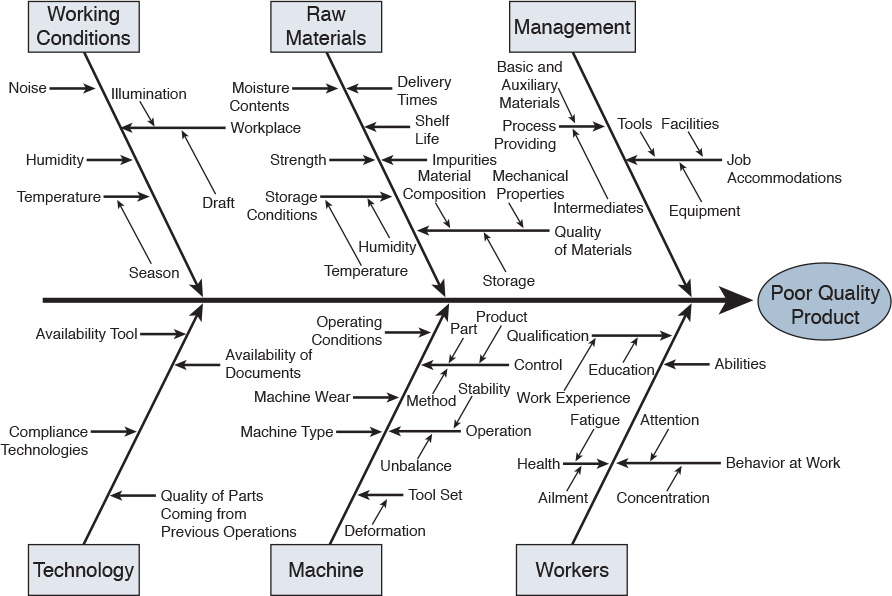
Figure 12-12 Acme Corporation’s Widget Development
4. You have decided to create a Pareto chart for the project you are managing. What is the purpose of this chart?
a. showing the causes of problems, ranked by occurrence
b. showing trends in quality
c. showing correlation between two variables
d. showing relationships between project activities
5. A project team has created the chart shown in Figure 12-13. What type of chart is this team using?
a. Gantt chart
b. Pareto chart
c. scatter chart
d. run chart

Figure 12-13 Chart Showing Payment Errors
6. You are the project manager for a large project. Your team needs a collaborative tool that allows the team to determine the structure of the tool and to edit it on demand. Which tool should you use?
a. RACI matrix
b. vendor knowledge bases
c. wiki pages
d. project scheduling software
7. You need to determine the total dollar return that the project sponsor will receive for a project. Which KPI should you use?
a. CV
b. ROI
c. CPI
d. PV
8. A project manager needs to map a project’s objectives to ensure that the project aligns with the organization’s goals. Which performance measurement tool is the best choice for this purpose?
a. BSC
b. KPI
c. SWOT analysis
d. RACI matrix
9. Which project tool is used during the Planning phase to identify project risks?
a. RACI matrix
b. SWOT analysis
c. run chart
d. scatter chart
10. During the Planning phase of a project, you are given the document shown in Figure 12-14. What type of document is this?
a. Gantt chart
b. SWOT analysis
c. RACI matrix
d. Pareto chart
