
Chapter 5
Data Analysis and Statistics
THE COMPTIA DATA+ EXAM TOPICS COVERED IN THIS CHAPTER INCLUDE:
In Chapter 4, “Data Quality,” you learned where data comes from, when quality issues crop up and how to mitigate them, and techniques to prepare data for analysis. Once you have good, clean data, you are ready to develop insights. An insight is a new piece of information you create from data that then influences a decision.
While it's possible to make decisions using intuition, it is preferable to be analytical and use data. An analytical approach applies statistical techniques to analyze data on your journey to create insights.
This chapter will explore foundational statistical techniques that describe data and show why they are essential. You will also develop an understanding of how to generate and test hypotheses using statistics and whether or not you can make generalizations using your analysis. We will wrap up the chapter by exploring situations where statistical techniques are particularly helpful in developing context and influencing decisions.
Fundamentals of Statistics
Knowledge of statistics is foundational for the modern data analyst. Before we explore the different branches of statistics, it is essential to understand some core statistical concepts.
One key concept is the definition of a population. A population represents all the data subjects you want to analyze. For example, suppose you are an analyst at the National Highway Traffic Safety Administration (NHTSA) and start to receive reports about a potential defect in Ford F-Series trucks. In this case, the population is all Ford F-Series trucks. If you want to examine all Ford F-Series vehicles, you'd have to conduct a census. A census is when you obtain data for every element of your population. Conducting a census is typically infeasible due to the effort involved and the scarcity of resources.
Collecting a sample is a cost-effective and time-effective alternative to gathering census data. A sample is a subset of the population. Suppose that further investigation into the potential defect identifies a batch of faulty third-party windshield wiper switches. Tracing the distribution of the defective component identifies F-Series vehicles made in Chicago between February 14, 2000, and August 4, 2000, as being potentially impacted. In this case, F-Series vehicles made in Chicago between February 14 and August 4, 2000, represent a sample. For this chapter, presume that you are working with sample data.
A variable is a unique attribute about a data subject. Recalling the definition of tabular data from Chapter 2, “Understanding Data,” a variable corresponds to a column in a table. In this example, the serial number that uniquely identifies a wiper switch is a variable. Univariate analysis is when you explore the characteristics of a single variable, independent of the rest of the dataset.
An observation is an individual record in a dataset corresponding to a tabular data row. Continuing the example, whereas the serial number for a wiper switch is a variable, the serial number's unique value for a specific switch is an observation of the wiper switch variable.
When working with statistics, one thing to be mindful of is the sample size. Since it is unusual to have a full census for the population you are studying, you typically analyze data for a sample taken from the population. For example, suppose you want to discern the average height for females in the United States. Collecting that information about every female is infeasible. Instead, you would gather that data from a representative sample of females in the United States. The sample size is the number of observations you select from the population. For example, instead of measuring every female, you may identify 1,000 females and obtain their heights. An n represents sample size in statistical formulas. The larger the sample size, the more confident you can be that the results of your analysis accurately describe the population.
You analyze samples in terms of statistics. A statistic is a numeric representation of a property of a sample. Considering the aforementioned sample of females, the average height is a statistic. You use statistics to infer estimates about the population as a whole.
You also use a sample statistic to estimate a population parameter. A parameter is a numeric representation of a property for the population. Continuing the example, you can use the average height of females from your sample to estimate the average height of all females. Just as statistics summarize sample information, parameters summarize the entire population.
When working with statistics, keep in mind that they depend entirely on the sample taken from the population. Every calculation you perform is specific to that sample. If you were to take a different sample from the same population, you'd have to recalculate all your statistics.
Descriptive Statistics
Descriptive statistics is a branch of statistics that summarizes and describes data. As you explore a new dataset for the first time, you want to develop an initial understanding of the size and shape of the data. You use descriptive statistics as measures to help you understand the characteristics of your dataset.
When initially exploring a dataset, you may perform univariate analysis to answer questions about a variable's values. You also use descriptive measures to develop summary information about all of a variable's observations. This context helps orient you and informs the analytical techniques you use to continue your analysis.
Measures of Frequency
Measures of frequency help you understand how often something happens. When encountering a dataset for the first time, you want to determine how much data you are working with to help guide your analysis. For example, suppose you are working with human performance data. One of the first things to understand is the size of the dataset. One way to accomplish this quickly is to count the number of observations.
Consider Figure 5.1, which has four variables. The first variable uniquely identifies an individual, the second is a date, the third is the person's sex, and the fourth is the person's weight on that date. Looking at this excerpt, you have no idea how many total observations exist. Understanding the total number helps influence the tools you use to explore the data. If there are 2 million observations, you can analyze the data on a laptop computer. If there are 2 billion observations, you will need more computing power than a laptop provides.

FIGURE 5.1 Weight log
Count
The most straightforward way to understand how much data you're working with is to count the number of observations. Understanding the total number of observations is a frequently performed task. As such, there is a count function in everything from spreadsheets to programming languages. As Table 5.2 shows, you have to decide how to account for null values and then make sure you're using the appropriate function.
TABLE 5.2 Selected implementations of count
| Technology | Count implementation | Description |
|---|---|---|
| Google Sheet | counta(cell range) | Counts the number of values in a dataset, excluding null values |
| Google Sheet | count(cell range) | Counts the number of numeric values in a dataset |
| Microsoft Excel | counta(cell range) | Counts the number of values in a dataset, excluding null values |
| Microsoft Excel | count(cell range) | Counts the number of numeric values in a dataset |
| SQL | count(*) | Counts the number of rows in a table |
| SQL | count(column) | Counts the number of rows in the specified column, excluding null values |
| R | nrow(data frame) | Counts the number of rows in a data frame |
| R | nrow(na.omit(data frame)) | Counts the number of rows in a data frame, excluding null values |
| Python | len(data frame) | Counts the number of rows in a data frame |
| Python | len(data frame.dropna()) | Counts the number of rows in a data frame, excluding null values |
Percentage
The percentage is a frequency measure that identifies the proportion of a given value for a variable with respect to the total number of rows in the dataset. To calculate a percentage, you need the total number of observations and the total number of observations for a specific value of a variable.
Table 5.3 illustrates the count of males and females for the sex variable in a dataset. Note that the total number of males and females together equals 200. You would use the following formula to calculate the percentage of females in the data:

TABLE 5.3 Sample data
| Count of Males | Count of Females |
|---|---|
| 98 | 102 |
Knowing that 51 percent of the sample is female helps you understand that the balance between males and females is pretty even.
Understanding proportions across a dataset aids in determining how you proceed with your analysis. For example, suppose you are an analyst for the National Weather Service and receive a new dataset from a citizen-provided weather station. Using a count function, you determine it has 1 million observations. Upon further exploration, you observe that 95 percent of the observations for the temperature variable are null. With such a large percentage of the data not containing meaningful values, you would want to discuss this initial finding with the data provider to ensure something isn't wrong with the data extraction process.
Exploring percentages also gives you a better understanding of the composition of your data and can help identify any biases in your dataset. When data has a bias, your sample data isn't representative of the overall population you are studying. Suppose you are working with the complete dataset of which Figure 5.1 is an excerpt. Examining the Sex column, it takes you by surprise that all observations in the dataset are male, as Table 5.4 illustrates. To determine whether or not this is appropriate, you need to put it in context regarding the objective of your analysis.
TABLE 5.4 Exploring percentages
| Male | Female |
|---|---|
| 100% | 0% |
For instance, if you are analyzing a men's collegiate athletic team, having 100 percent males in your data makes sense. However, suppose you are studying weight across all students at a coeducational university and the university's enrollment is evenly split between males and females. With this context, you would expect 50 percent of your data to be for males, with females representing the other 50 percent. An absence of data about females indicates a bias in the data and that your sample data doesn't accurately represent the population. To remediate the bias, you would want to understand the data collection methods to ensure equal male and female participation. After ensuring there is no collection bias, you would expect the proportion of males and females in your sample to align more appropriately with your knowledge about the population.
Apart from examining the static percentage for a variable in a dataset, looking at percent change gives you an understanding of how a measure changes over time. You can calculate the relative change by subtracting the initial value from the final value and then dividing by the absolute value of the initial value:

For example, if a stock's price at the beginning of a trading day is 100 and its price at the end of the day is 90, there was a 10 percent decrease in its value.
Percent values are also applicable when comparing observations for a variable. The percent difference compares two values for a variable. You calculate the percent difference by subtracting the initial value from the final value and then dividing by the average of the two values:

For example, suppose you receive two datasets. Each dataset is from a factory that creates automotive switches. Upon initial exploration, you find the first dataset has 4,000 observations while the second dataset has 6,000 observations, for a difference of 40 percent. You would want to understand why there is a discrepancy in the number of observations. If the factories are supposed to generate the same output, you are missing data, which will impact your ongoing analysis.
Frequency
Frequency describes how often a specific value for a variable occurs in a dataset. You typically explore frequency when conducting univariate analysis. The histogram, which you first saw in Chapter 4, is an optimal way to visualize frequency for continuous data. In Chapter 7, “Data Visualization with Reports and Dashboards,” you will meet the bar chart. Bar charts are the visualization of choice for categorical data as there is no continuity to the values.
In the United States, the Scholastic Aptitude Test (SAT) is an admissions test that some colleges and universities use to assess applicants. Figure 5.2 illustrates the average SAT score for admitted students at colleges and universities across the United States.

FIGURE 5.2 Histogram of average SAT score for U.S. institutions of higher education
It is often helpful to compare frequency across values for an observation. For example, consider the histograms in Figure 5.3, which show the count of average SAT scores for private and public institutions. Since the histogram for private schools looks larger than the one for public schools, you might think that there are more private schools than public schools. To validate this conclusion, you can analyze the percentage of public and private schools, as shown in Table 5.5.
TABLE 5.5 Institutional control percentage
| Private | Public |
|---|---|
| 60% | 40% |

FIGURE 5.3 Histograms of SAT averages and institutional control
Returning your attention to the x-axis of Figure 5.3, you conclude that some private schools have an average SAT score of over 1400. Meanwhile, no public school in this sample has an average SAT score of over 1400.
Measures of Central Tendency
To help establish an overall perspective on a given dataset, an analyst explores various measures of central tendency. You use measures of central tendency to identify the central, or most typical, value in a dataset. There are numerous ways to measure central tendency, and you end up using them in conjunction with each other to understand the shape of your data. We will explore the different shape types when we discuss distributions later in this chapter.
Mean
The mean, or average, is a measurement of central tendency that computes the arithmetic average for a given set of numeric values. To calculate the mean, you take the sum of all values for an observation and divide by the number of observations. In the comparatively unlikely event that you have a complete census for your population, the following formula is the mathematical definition for calculating the mean of a population:

Although the formula for calculating the sample mean looks slightly different, the process is the same. You sum all sample observations for a variable and then divide by the number of observations:

Data analysis tools, including spreadsheets, programming languages, and visualization tools, all have functions that calculate the mean.
While the mean is one of the most common measurements of central tendency, remember that you can only calculate a mean for quantitative data. You should also be mindful of the effect outliers have on the mean's value. An outlier is a value that differs significantly from the other values of the same observation. In Figure 5.4A, the mean salary for the 10 individuals is $90,600. In Figure 5.4B, ID 993496 has a salary of $1,080,000 instead of $80,000 in Figure 5.4A. The salary value for 993496 in Figure 5.4B is an outlier. The effect of the outlier on the mean is dramatic, increasing it by $100,000 to $190,600.

FIGURE 5.4A Mean salary data

FIGURE 5.4B Effect of an outlier on the mean
Median
Another measurement of central tendency is the median, which identifies the midpoint value for all observations of a variable. The first step to calculating the median is sorting your data numerically. Once you have an ordered list of values, the next step depends on whether you have an even or an odd number of observations for a variable.
Identifying the median for an odd number of observations is straightforward—you just select the number in the middle of the ordered list of values. Mathematically, you add one to the total number of values, divide by 2, and retrieve the value for that observation. The formula for calculating the median for an odd number of values is as follows:

Suppose you have the following numbers: {1,3,5,7,9}. To find the median, you take the total number of values, add 1, divide by 2, and retrieve the corresponding value. In this case, there are five numbers in the dataset, so you retrieve the value for the third number in the ordered list, which is 5.
For datasets with an even number of observations, you need to take the average of the two observations closest to the midpoint of the ordered list. The following formula describes how to calculate the median:
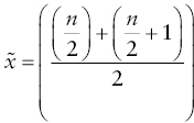
Suppose you have the following numbers: {1,3,5,7,9,11}. Since there are six observations, the median is the mean of the values that surround the midpoint. In this case, you find the mean of 5 and 7, which is 6.
Outliers don't impact the median as dramatically as the mean. Consider the calculation for mean in Figure 5.5A, which uses the same data as for Figure 5.4A. For this small dataset with 10 data points, the difference between the mean and median is 9,100.
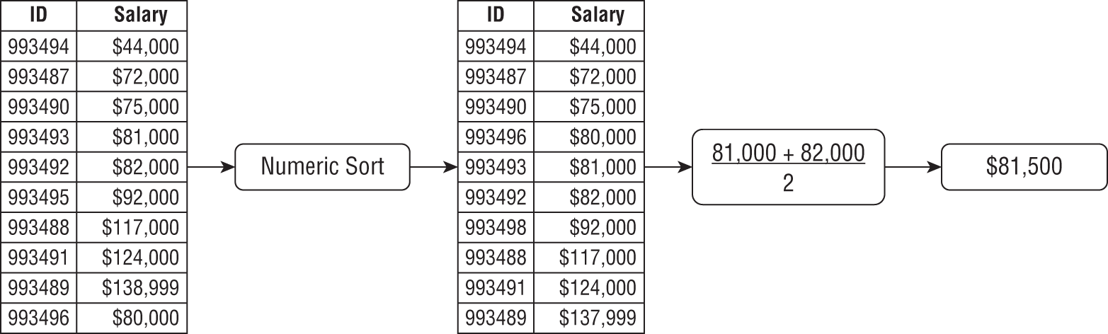
FIGURE 5.5A Calculating median salary data

FIGURE 5.5B Effect of an outlier on the median
Now consider Figure 5.5B, which calculates the median using the same data from Figure 5.4B. The difference between the mean and the median is 103,600. This gap is much more significant than when there are no outliers present. Because of this effect, you should explore both the mean and median values when analyzing a dataset.
Mode
The mode is a variable's most frequently occurring observation. Depending on your data, you may not have a mode. For example, consider the salary data from Figure 5.4A. With only 10 values and no repeating value, there is no mode for this dataset. Depending on the level of precision and amount of data, the mode may not facilitate insight when working with numeric data.
However, the mode is more applicable when working with categorical data. For example, suppose you are collecting data about eye color from a group of people and use the survey question in Figure 5.6. Determining the mode of responses will identify the most commonly reported eye color.

FIGURE 5.6 Categorical question
Measures of Dispersion
In addition to central tendency, it is crucial to understand the spread of your data. You use measures of dispersion to create context around data spread. Let's explore five common measures of dispersion.
Range
The range of a variable is the difference between its maximum and minimum values. Understanding the range helps put the data you are looking at into context and can help you determine what to do with outlier values. It can also identify invalid values in your data. Spreadsheets and programming languages have functions available to identify minimum and maximum values.
For example, suppose you are examining a group of people and their age in years. If the minimum value is a negative number, it indicates an invalid value as it isn't possible to have a negative age. A maximum value of 140 is similarly invalid, as the maximum recorded lifespan of a human is less than 140 years.
If you are working with temperature data, it's reasonable to expect both positive and negative values. To identify invalid temperature values, you need to establish additional context, such as location and time of year.
Distribution
In statistics, a probability distribution, or distribution, is a function that illustrates probable values for a variable, and the frequency with which they occur. Histograms are an effective tool to visualize a distribution, because the shape provides additional insight into your data and how to proceed with analysis. Distributions have many shapes possible shapes, including normal, skewed, and bimodal.
Normal Distribution
The normal distribution is symmetrically dispersed around its mean, which gives it a distinctive bell-like shape. Due to its shape, the normal distribution is also known as a “bell curve.” Figure 5.7 is a good example of normally distributed data, with a high central peak and a high degree of symmetry.

FIGURE 5.7 Normal distribution
The normal distribution is applicable across a number of disciplines due to the central limit theorem (CLT), a foundational theorem for statistical analysis. Recognizing that many different samples of a given sample size might be chosen for your data, the CLT tries to make sense of all the possible results you might obtain. According to the CLT, as sample size increases, it becomes increasingly likely that the sampling distribution of all those means will be normally distributed.
The sampling distribution of the mean will be normal regardless of sample size if the parent population is normal. However, if you have a skewed parent population, then having a “sufficiently large” sample size may be needed to get a normally distributed sampling distribution. Most people define sufficiently large as 30 or more observations in your sample. Because of the CLT, the normal distribution applies across a wide variety of attributes.
For example, suppose you are working with quantitative data about people. According to the CLT, you can expect the normal distribution to describe the people's height, weight, and shoe size. You can test out the CLT at home by rolling a pair of dice at least 30 times to get a sufficiently large sample and then plotting the value and frequency of your rolls.
One way to use measures of central tendency to verify the normal distribution is to examine the proximity of the mean and median. When the mean and median are relatively close together, the distribution will be symmetrical. If the mean and median are far apart, the data is skewed, or asymmetrical.
Skewed Distribution
A skewed distribution has an asymmetrical shape, with a single peak and a long tail on one side. Skewed distributions have either a right (positive) or left (negative) skew. When the skew is to the right, the mean is typically greater than the median. On the other hand, a distribution with a left skew typically has a mean less than the median.
Consider the histogram in Figure 5.8, which illustrates a distribution with a right skew. The long tail to the right of the peak shows that while most people have a salary of under $100,000, a large portion of the population earns significantly more. It is reasonable to expect that a right skew for income.

FIGURE 5.8 Right skewed distribution
There are times when you would expect to see a left skew in the data. For example, imagine grades on a 100-point exam for students in a graduate statistics class. You would expect these students to have high intrinsic motivation and an innate desire to learn. While it is inevitable that some students perform poorly, it is reasonable to presume that most students would perform well. As such, you would expect the distribution to have a left skew, as Figure 5.9 illustrates.

FIGURE 5.9 Left skewed distribution
Bimodal Distribution
A bimodal distribution has two distinct modes, whereas a multimodal distribution has multiple distinct modes. When you visualize a bimodal distribution, you see two separate peaks. Suppose you are analyzing the number of customers at a restaurant over time. You would expect to see a large numbers of customers at lunch and dinner, as Figure 5.10 illustrates.
Variance
Variance is a measure of dispersion that takes the values for each observation in a dataset and calculates how far away they are from the mean value. This dispersion measure indicates how spread out the data is in squared units. Mathematically, ![]() signifies population variance, which you calculate by taking the average squared deviation of each value from the mean, as follows:
signifies population variance, which you calculate by taking the average squared deviation of each value from the mean, as follows:


FIGURE 5.10 Bimodal distribution
However, you will usually be dealing with sample data. As such, the formula changes slightly when calculating sample variance, as follows:
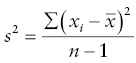
The slight difference in the denominator between the formulas for calculating population and sample variance is due to a technique known as Bessel's correction. Bessel's correction specifies that when calculating sample variance, you need to account for bias, or error, in your sample. Recall that a sample doesn't fully represent the overall population. When you have sample data and use the degrees of freedom in the denominator, it provides an unbiased estimate of the variability.
When the variance is large, the observations’ values are far from the mean and thus far from each other. Meanwhile, a small variance implies that the values are close together.
Consider Figure 5.11, which shows histograms of temperature data for Chicago, Illinois, and San Diego, California. As a city in the Midwest, Chicago is known for having cold winters and hot summers. Meanwhile, San Diego has a must more stable climate with minor fluctuations in temperature. Using the data behind Figure 5.11, the variance for Chicago temperature is 517.8, while the variance for San Diego is 98.6.

FIGURE 5.11 Temperature variance
Variance can be a useful measure when considering financial investments. For example, a mutual fund with a small variance in its price is likely to be a more stable investment vehicle than an individual stock with a large variance.
Standard Deviation
Standard deviation is a statistic that measures dispersion in terms of how far values of a variable are from its mean. Specifically, standard deviation is the average deviation between individual values and the mean. Mathematically, ![]() signifies population standard deviation, which you calculate by taking the square root of the variance, as follows:
signifies population standard deviation, which you calculate by taking the square root of the variance, as follows:

Similar to the difference between population and sample variance, the formula for sample standard deviation uses Bessel's correction:

As you can see from these formulas, calculating variance is an important step on the way to determining standard deviation.
Similar to variance, the standard deviation is a measure of volatility, with a low value implying stability. Standard deviation is a popular statistic because of the empirical rule. Also known as the three-sigma rule, the empirical rule states that almost every observation falls within three standard deviations of the mean in a normal distribution. Specifically, the empirical rule states that approximately 68 percent of values are within one standard deviation of the mean, 95 percent of values fall within two standard deviations, and 99.7 percent fall within three standard deviations.
Combining the central limit theorem and the empirical rule makes standard deviation a common way of describing and discussing variability. For example, using the data behind Figure 5.12, the San Diego temperature mean is 64, and the standard deviation is 10. Using the empirical rule, this implies that 68 percent of the time, the temperature in San Diego is between 54 and 74 degrees. Similarly, using two standard deviations, the implication is that the temperature in San Diego is between 44 and 84 degrees 95 percent of the time.
Standard deviation is a widely accepted measure of quality control in manufacturing processes. Large manufacturers implement programs to improve the consistency of their manufacturing processes. The goal of these programs is to ensure that the processes operate within a certain number of standard deviations, or sigmas. Quality control literature frequently uses the word sigma instead of standard deviation due to sigma being the mathematical symbol for population standard deviation.
One quality control program is known as Six Sigma, which sets the goal for a production process to six standard deviations. Achieving that degree of consistency is difficult and expensive. However, considering the data in Table 5.6, achieving six standard deviations of consistency implies a process that has almost no defects.
TABLE 5.6 Standard deviation performance levels
| Standard deviations | Defects per million | Percent correct |
|---|---|---|
| 1 | 691,462 | 30.85 |
| 2 | 308,538 | 69.146 |
| 3 | 66,807 | 93.319 |
| 4 | 6,210 | 99.379 |
| 5 | 233 | 99.9767 |
| 6 | 3.4 | 99.9997 |
Special Normal Distributions
The Central Limit Theorem and empirical rule combine to make the normal distribution the most important distribution in statistics. There are two special normal distributions that have broad applicability and warrant a deeper understanding.
Standard Normal Distribution
The standard normal distribution, or Z-distribution, is a special normal distribution with a mean of 0 and a standard deviation of 1. You can standardize any normal distribution by converting its values into ![]() -scores. Converting to the standard normal lets you compare normal distributions with different means and standard deviations.
-scores. Converting to the standard normal lets you compare normal distributions with different means and standard deviations.
Student's t-distribution
The Student's t-distribution, commonly known as the t-distribution, is similar to the standard normal distribution in that it has a mean of 0 with a bell-like shape. One way the t-distribution differs from the standard normal distribution is how thick the tails are since you can use the t-distribution for sample sizes of less than 30. Consider Figure 5.12, which overlays a normal distribution and a t-distribution. Note that there is more area under the tails of the t-distribution than of the normal distribution.

FIGURE 5.12 Standard normal distribution and t-distribution
It's crucial to note that the height of the bell and the thickness of the tails in t-distributions vary due to the number of degrees of freedom. Numerically, the value for degrees of freedom is 1 less than the number of observations in your sample data. The degrees of freedom represent the number of values that can vary when calculating a statistic.
For example, consider the data in Table 5.7. In each row, there are three observations, and the value of the mean calculates to 50. In this example, if the first two observations are known, the value of the third observation must be fixed in order to calculate a mean of 50.
TABLE 5.7 Illustrating degrees of freedom
| Mean | |||
|---|---|---|---|
| 49 | 50 | 51 | 50 |
| 40 | 50 | 60 | 50 |
| 20 | 50 | 50 | |
| 20 | 50 |
Consider the third row of Table 5.7. Since the mean is 50, the value of ![]() must be 80:
must be 80:

Now consider the last row of Table 5.7, where ![]() and
and ![]() represent unknown values:
represent unknown values:
In this case ![]() and
and ![]() can be any combination of values that add up to 130, meaning that the values are free to vary. Since there are two observations that can have variable values, this sample data has 2 degrees of freedom.
can be any combination of values that add up to 130, meaning that the values are free to vary. Since there are two observations that can have variable values, this sample data has 2 degrees of freedom.
Recall that by definition, the number of degrees of freedom increases as the sample size goes up, affecting the shape of the curve. The greater the degrees of freedom, the more the t-distribution looks like the standard normal distribution.
Measures of Position
Understanding a specific value for a variable relative to the other values for that variable gives you an indication of the organization of your data. Statisticians commonly use quartiles to describe a specific observation's position. The process of obtaining quartiles is similar to that of determining the median. You first sort a numeric dataset from smallest to largest and divide it positionally into four equal groups. Each grouping is known as a quartile. The first quartile is the group that starts with the minimum value, whereas the fourth quartile is the group that ends with the maximum value.
Figure 5.13 visualizes a dataset containing the sales price for 30,000 homes. To better understand the specific values for this data, you calculate an initial set of summary statistics, including the minimum, median, and maximum values, as well as the quartiles. Table 5.8 illustrates these summary statistics for this data.

FIGURE 5.13 Sales prices for 30,000 homes
TABLE 5.8 Illustrating interquartile range
| Positional statistic | Value |
|---|---|
| Minimum | 128,246 |
| First Quartile | 146,657 |
| Median | 150,069 |
| Third Quartile | 153,420 |
| Maximum | 172,197 |
Once you've calculated these summary statistics, you have a better understanding of the position of your data, as shown in Table 5.9.
TABLE 5.9 Illustrating lower and upper limits for interquartiles
| Quartile | Lower bound | Upper bound | Range |
|---|---|---|---|
| First | 128,246 | 146,657 | 18,411 |
| Second | 146,657 | 150,069 | 3,412 |
| Third | 150,069 | 153,420 | 3,351 |
| Fourth | 153,420 | 172,197 | 18,777 |
The interquartile range (IQR) is the combination of the second and third quartiles and contains 50 percent of the values in the data. When exploring a dataset, recall that outliers can have a significant impact on mean and range. Using the IQR as a dispersion indicator, in addition to the range, improves your perspective since the IQR excludes outliers.
Inferential Statistics
Inferential statistics is a branch of statistics that uses sample data to draw conclusions about the overall population. For example, suppose you are trying to quantify the weight of college students in the United States. With more than 20 million college students, getting a complete census is not feasible. By combining balanced, representative sample data with inferential statistical techniques, you can confidently make assertions about the broader population.
Confidence Intervals
Each time you take a sample from a population, the statistics you generate are unique to the sample. In order to make inferences about the population as a whole, you need a way to come up with a range of scores that you can use to describe the population as a whole. A confidence interval describes the possibility that a sample statistic contains the true population parameter in a range of values around the mean. When calculating a confidence interval, you end up with a lower bound value and an upper bound value. Given the confidence interval range, the lower bound is the lower limit, and the upper bound is the upper limit.
When calculating a confidence interval, you need to specify the confidence level in addition to the sample mean, population standard deviation, and sample size. Based on the empirical rule, the confidence level is a percentage that describes the range around the mean. The wider the confidence level, the more confident one can be in capturing the true mean for the sample. High confidence levels have a wide confidence interval, while low confidence levels have a narrower confidence interval.
The critical value is a ![]() -score you specify to denote the percentage of values you want the confidence interval to include. Since deriving critical values is beyond the scope of this book, Table 5.10 illustrates commonly used confidence levels and their corresponding critical values. When looking at the mathematical formula for calculating confidence intervals,
-score you specify to denote the percentage of values you want the confidence interval to include. Since deriving critical values is beyond the scope of this book, Table 5.10 illustrates commonly used confidence levels and their corresponding critical values. When looking at the mathematical formula for calculating confidence intervals, ![]() is the symbol for the critical value associated with a particular confidence level.
is the symbol for the critical value associated with a particular confidence level.
TABLE 5.10 Confidence level and critical value for normally distributed data
| Confidence level | Critical value (2-tail) ( |
|---|---|
| 80% | 1.282 |
| 85% | 1.440 |
| 90% | 1.645 |
| 95% | 1.960 |
| 99% | 2.575 |
| 99.5% | 2.807 |
| 99.9% | 3.291 |
In addition to the critical value, you need the standard error. The standard error measures the standard deviation of the distribution of means for a given sample size. You calculate the standard error by taking the population standard deviation divided by the square root of the sample size.
Now that you know all the components, you need to calculate a confidence interval. Here is the formula:
Let's look at a practical example of why understanding confidence intervals is crucial when working with sample data. Suppose you are working with a population of 10,000 people and have a sample size of 100. If you take 20 different samples, the specific observations in each sample will vary across each of the 20 samples, as Figure 5.14 illustrates. Looking at Figure 5.14, the outer circle represents the population and the small circles denote individual samples. Since the sample membership is random, they should be representative of the overall population. However, it is statistically possible for a group of extreme values to make up a sample.

FIGURE 5.14 Samples in a population
Now, suppose you want to estimate the population mean using the mean of your samples. The likelihood that the mean of a given sample is the actual mean of the population is low, so you build a buffer of numbers around the sample mean in the hopes of capturing the true value of the population. Start by specifying a confidence level. A 95 percent confidence level indicates that 95 percent of the time, the range of values around the sample mean will contain the population mean. That implies that in 5 percent of the samples, or 1 in 20, the range around the sample mean will not contain the population mean.
Consider Figure 5.15, which shows a different depiction of the 20 samples from Figure 5.14. Figure 5.15 also shows that this population has a mean of 50. The population mean value is fixed and doesn't change. As such, a given sample may or may not contain the actual population mean. In Figure 5.15, you see a population mean of 50 and 20 samples at a 95 percent confidence level. Notice that the second sample doesn't contain the population mean because the line indicating the range of values around the sample mean doesn't cross the line for the population mean.

FIGURE 5.15 Samples at a 95 percent confidence level and population mean
The higher the confidence level, the wider the range of values it contains. Consider Figure 5.16, which shows the width of a 95 percent and a 99 percent confidence interval on a normal distribution. The higher the confidence interval, the more values it contains; thus, we can be “more confident” that we have captured the true parameter value within its boundaries if we have a larger confidence level.

FIGURE 5.16 Confidence levels and the normal distribution
When using confidence intervals, you need to balance what's good enough for the situation at hand. For example, a 95 percent confidence interval may be appropriate for estimating the average weight of adult females in the United States. However, if you are trying to achieve a Six Sigma manufacturing process, you need greater accuracy than a 95 percent confidence interval.
Hypothesis Testing
Data analysts frequently need to build convincing arguments using data. One of the approaches to proving or disproving ideas is hypothesis testing. A hypothesis test consists of two statements, only one of which can be true. It uses statistical analysis of observable data to determine which of the two statements is most likely to be true.
For example, suppose you are a pricing analyst for an airline. One question you might want to explore is whether or not people over 75 inches tall are willing to pay more for additional legroom on roundtrip flights between Chicago and San Francisco. By conducting a hypothesis test on a sample of passengers, the analyst can make an inference about the population as a whole.
A hypothesis test consists of two components: the null hypothesis and the alternative hypothesis. When designing a hypothesis test, you first develop the null hypothesis. A null hypothesis (![]() ) presumes that there is no effect to the test you are conducting. When hypothesis testing, your default assumption is that the null hypothesis is valid and that you have to have evidence to reject it. For instance, the null hypothesis for the airline example is that people over 75 inches tall are not willing to pay more for additional legroom on a flight.
) presumes that there is no effect to the test you are conducting. When hypothesis testing, your default assumption is that the null hypothesis is valid and that you have to have evidence to reject it. For instance, the null hypothesis for the airline example is that people over 75 inches tall are not willing to pay more for additional legroom on a flight.
You also need to develop the alternative hypothesis. The alternative hypothesis (![]() ) presumes that the test you are conducting has an effect. The alternative hypothesis for the airline pricing example is that people over 75 inches are willing to pay more for more legroom. The ultimate goal is to assess whether the null hypothesis is valid or if there is a statistically significant reason to reject the null hypothesis.
) presumes that the test you are conducting has an effect. The alternative hypothesis for the airline pricing example is that people over 75 inches are willing to pay more for more legroom. The ultimate goal is to assess whether the null hypothesis is valid or if there is a statistically significant reason to reject the null hypothesis.
To determine the statistical significance of whether to accept or reject the null hypothesis, you need to compare a test statistic against a critical value. A test statistic is a single numeric value that describes how closely your sample data matches the distribution of data under the null hypothesis. In the airline pricing example, you can convert the mean price people are willing to pay for additional legroom into a test statistic that can then be compared to a critical value, ultimately indicating whether you should reject or retain the null hypothesis.
In order to get the right critical value, you need to choose a significance level. A significance level, also known as alpha (![]() ), is the probability of rejecting the null hypothesis when it is true. Alpha levels are related to confidence levels as follows:
), is the probability of rejecting the null hypothesis when it is true. Alpha levels are related to confidence levels as follows:
For example, suppose you specify a confidence level of 95 percent. You calculate the significance level by subtracting the confidence level from 100 percent. With a confidence level of 0.95, the significance level is 0.05, meaning that there is a 5 percent chance of concluding that there is a difference when there isn't one. The significance level is something you can adjust for each hypothesis test.
Consider Figure 5.17, where the population mean is 50. The unshaded area represents the confidence level. The shaded areas are the critical regions. A critical region contains the values where you reject the null hypothesis. If your test statistic falls within a critical region, there is sufficient evidence to reject the null hypothesis. Since the area of the critical regions combined is alpha, each tail is half of alpha. For example, if alpha is 5 percent, each critical region in Figure 5.17 is 2.5 percent of the area under the curve.
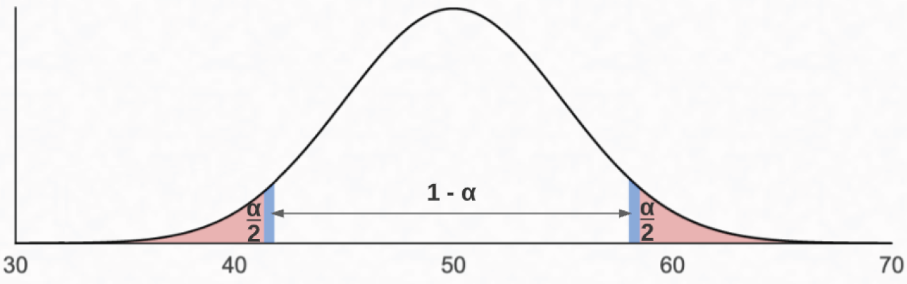
FIGURE 5.17 Visualizing alpha
Once you have a test statistic, you can calculate a p-value. A p-value is the probability that a test statistic is as or more extreme as your actual results, presuming the null hypothesis is true. You can think of the p-value as the evidence against the null hypothesis. The range for p-values falls between 0 and 1. The lower the p-value, the less likely the test statistic results from random chance. When you compare your p-value with your significance level, it is generally accepted that if a p-value is less than 0.05, you may consider the results “statistically significant.”
How you define your null and alternative hypotheses determines whether you are conducting a one-tailed or a two-tailed test. A one-tailed test is when the alternative hypothesis is trying to prove a difference in a specific direction. If your alternative hypothesis is trying to determine if a value is lower than the null value, you use a one-tailed test. Similarly, if your alternative hypothesis is assessing whether a value is higher than the null value, a one-tailed test is appropriate. Since the airline example assesses whether a person is willing to pay more for additional legroom, it is a one-tailed test. Specifically, to reject the null hypothesis, you want the average price people are willing to pay to be in the shaded area in Figure 5.18.

FIGURE 5.18 One-tailed test
A two-tailed test is when the alternative hypothesis seeks to infer that something is not equal to the assertion in the null hypothesis. For example, suppose you manufacture and sell bags of individually wrapped mints. Each bag should contain an average of 100 mints within a range of 95 to 105. In this case, the production process is defective if bags contain on average either less than 95 or more than 105 mints. To determine whether or not this is the case, you use a two-tailed test with the critical regions shaded in Figure 5.19. To conduct a hypothesis test for this example, you select a sample of bags from your production line and then determine if the average number of mints from the sample bags falls within the range from 95 to 105. The larger the sample size, the more reliable your inference will be. You need to carefully balance the number of samples and the proportion of those samples to the population with the cost of obtaining them.

FIGURE 5.19 Two-tailed test
Hypothesis Testing with the  -test
-test
Hypothesis testing with the ![]() -test is appropriate when you have a sample size over 30 and a known population standard deviation, and you are using the normal distribution. When performing a two-tailed
-test is appropriate when you have a sample size over 30 and a known population standard deviation, and you are using the normal distribution. When performing a two-tailed ![]() -test, you can use the
-test, you can use the ![]() -score from Table 5.10 to specify your confidence level. The
-score from Table 5.10 to specify your confidence level. The ![]() -score describes how far away from the mean a given value is.
-score describes how far away from the mean a given value is.
Let's walk through the bag of mints example in detail. Let's say you choose an alpha value of 95 percent. You are working with normally distributed data with a population mean of 100 and a population standard deviation of 2.5. Your null hypothesis is that the bags contain an average of 100 mints, and the alternative hypotheses is that bags do not contain 100 mints.
You then collect a random sample of bags from the production line. Suppose your sample contains 100 bags. You proceed to calculate the test statistic by getting the average number of mints per bag. Suppose the average number of mints from your sample bags is 105.5. At this point, you have all the data you need to calculate the Z-score, as shown in Table 5.11.
TABLE 5.11 Calculating Z-score
| 105.5 | |
|---|---|
| 100 | |
| 2.5 | |
| 2.2 |
Once you have your Z-score of 2.2, you can compare it to the confidence levels in Table 5.10. A Z-score of 2.2 falls between 95 percent and 99 percent. With an alpha of 95 percent, the Z-score of 2.2 indicates that your sample mean falls within the critical region, providing evidence that you should reject the null and conclude that, on average, a bag does not contain 100 mints.
Continuing this example, let's explore precisely where 105.5 falls in the critical region by looking at its probability value, or p-value. Recall that a p-value of less than 0.05 is considered statistically significant. In Figure 5.20, we see that the p-value for 105.5 is 0.028. With a p-value of 0.028, this means that there is only a 2.8 percent probability that a bag contains 100 mints due to random chance. Since 2.8 percent is less than 5 percent, you would say the results of this hypothesis test are statistically significant. Once again, it is a good idea to capture more than one sample to account for your chosen confidence level.

FIGURE 5.20 Sample statistic and p-value
Hypothesis Testing with the t-test
Frequently, the standard deviation of the population is unknown. It's also possible that you will have a sample size of less than 30. In either of those cases, the Z-test is not an option. In this case, you can perform a t-test. A t-test is conceptually similar to a Z-test, but uses the t-distribution instead of the standard normal distribution. You interpret the results of a t-test the same way you interpret a Z-test in terms of critical regions, confidence levels, and p-values.
For example, suppose you want to have the same situation in terms of determining whether or not people over 75 inches tall are willing to pay for additional legroom on a flight. However, due to time constraints, you are only able to collect a sample of 10. You also don't have precise data on the standard deviation on the payment variability for the population of flyers who are over 75 inches in height. As such, you can use a t-test to evaluate your null and alternative hypotheses. Consider the flowchart in Figure 5.21 when determining whether to use a Z-test or t-test.

FIGURE 5.21 Hypothesis testing flowchart
Assessing Hypothesis Tests
Recall that retaining or rejecting the null is based on probabilities. Even with a very low p-value, it is still possible that your sample data won't accurately describe the population, as shown in Figure 5.15. As such, you can end up making a Type I or Type II error, mistakenly rejecting either the null or the alternative hypothesis.
A Type I error happens when you have a false positive, rejecting the null hypothesis when it is true. Continuing with the mint bag example, suppose your sample mean is 105.5. However, despite the low p-value, the actual population mean of the number of mints per bag is 100, which falls outside the critical range as shown in Figure 5.19. Therefore, you end up rejecting the null hypothesis even though it is true and commit a Type I error.
A Type II error happens when you have a false negative, retaining the null hypothesis when it is false. In this case, suppose you calculate a sample mean of 104. As Figure 5.22 shows, the p-value for 104 is 0.11. Leaning on your statistics knowledge, you retain the null hypothesis and conclude that there are an average of 100 mints per bag. If the actual population mean is 107, falling outside the critical regions, you are committing a Type II error. Table 5.12 is a matrix that describes the possible outcomes when conducting hypothesis tests.
TABLE 5.12 Potential hypothesis test outcomes
| When the null hypothesis is: | True | False |
|---|---|---|
| Rejected | Type I error: False positive | Correct decision |
| Accepted | Correct decision | Type II error: False negative |

FIGURE 5.22 Insignificant sample mean
Hypothesis Testing with Chi-Square
Z-tests and t-tests work well for numeric data. However, there are times when you want to compare the observed frequencies of categorical variables against what was expected. The chi-square test is available when you need to assess the association of two categorical variables. In this case, the null hypothesis asserts that there is no association between the variables, and the alternative hypothesis states that there is an association between them.
For example, suppose you want to determine whether a statistically significant association exists between a person's eye color and their favorite music genre. To test this, you survey 100 random people, record their eye color, and ask them their favorite movie genre. After obtaining the data, you perform a chi-square test to assess whether there is a statistically significant relationship between eye color and movie genre. If the results suggest you retain the null, the two variables are independent. If the results suggest you reject the null, then some sort of relationship exists between eye color and favorite movie genre.
Another example where the chi-square test is appropriate is if you want to understand the relationship between a person's favorite sport to watch and where they attend university, as shown in Table 5.13. To test this, you would survey 10 random people from each university and ask them to select their favorite sport. Once you have the data, you perform a chi-square test to determine whether there is a statistically significant association between each person's university and their favorite sport.
TABLE 5.13 Categorical variables
| Options for university | Options for favorite sport |
|---|---|
| Indiana University University of Michigan Michigan State University The Ohio State University Pennsylvania State University University of Illinois University of Iowa University of Minnesota Purdue University University of Wisconsin | Baseball Basketball Football Rugby Soccer Softball Swimming Track and field Volleyball Water polo |
Simple Linear Regression
Simple linear regression is an analysis technique that explores the relationship between an independent variable and a dependent variable. You can use linear regression to identify whether the independent variable is a good predictor of the dependent variable. You can perform a regression analysis in spreadsheets like Microsoft Excel and programming languages, including Python and R. When plotting the results of a regression, the independent variable is on the x-axis and the dependent variable is on the y-axis.
Simple linear regression has many applications. For example, you might use simple linear regression to assess the impact of a marketing promotion on a company's sales. In healthcare, you might explore the relationship between a person's age and body mass index (BMI).
Consider the graph in Figure 5.23, which explores the relationship between a person's age and BMI. In this case, age is the independent variable and BMI is the dependent variable. Each point on the plot is an observation of a given person, their age, and their BMI. The line in Figure 5.23 represents the regression line that best fits the data, minimizing the distance between the points and the line itself. Since the regression line inclines to the right, it has a positive slope. If the line declines to the right, it would have a negative slope. The positive slope of the regression line implies that as age increases, BMI increases as well. Since the slope is so slight, BMI doesn't increase dramatically as a function of age.

FIGURE 5.23 Simple linear regression of age and BMI
Using simple linear regression, you want to determine if the dependent variable truly depends on the independent variable. Figure 5.24 shows the output of a linear model generated with R. Examining Figure 5.24, the Pr(>|t|) column represents the p-value. Since the p-value for age in this output is 0.0000619, you can reject the null hypothesis and conclude that BMI does depend on age.

FIGURE 5.24 Linear model output of age and BMI
Consider Figure 5.25, which examines the relationship between a vehicle's speed and its ability to come to a complete stop. Although there are relatively few observations, the regression line has a positive slope. Since the slope of the line is steeper in Figure 5.25 than in Figure 5.23, you conclude that every increase in miles per hour has a more significant impact on stopping distance than a comparative increase in age has on BMI.

FIGURE 5.25 Simple linear regression of speed and distance
A crucial aspect of linear regression is the correlation between how far the observations are from the regression line. Correlation is a measurement of how well the regression line fits the observations. The correlation coefficient (![]() ) ranges between –1 and 1 and indicates the strength of the correlation. The stronger the correlation, the more tightly the points wind around the line of best fit. Perfect correlation is when
) ranges between –1 and 1 and indicates the strength of the correlation. The stronger the correlation, the more tightly the points wind around the line of best fit. Perfect correlation is when ![]() has a value of either –1 or 1, implying that every data point falls directly on the regression line. Interpreting correlation strength depends on the industry. Table 5.14 provides an example of guidelines for interpreting correlation strength in medical research.
has a value of either –1 or 1, implying that every data point falls directly on the regression line. Interpreting correlation strength depends on the industry. Table 5.14 provides an example of guidelines for interpreting correlation strength in medical research.
TABLE 5.14 Medical research correlation coefficient guidelines
| Association strength | Positive | Negative |
|---|---|---|
| Negligible | 0.0 – 0.3 | 0.0 – –0.3 |
| Low | 0.3 – 0.5 | –0.3 – –0.5 |
| Moderate | 0.5 – 0.7 | –0.5 – –0.7 |
| High | 0.7 – 0.9 | –0.7 – –0.9 |
| Very High | 0.9 – 1.0 | –0.9 – –1.0 |
In Figure 5.23, the correlation is low since many observations are not close to the regression line. Correlation improves in Figure 5.25, since the points are not as widely scattered. Figure 5.26 illustrates a highly correlated relationship. As you can imagine, the better the correlation, the stronger the relationship between the independent and dependent variables.

FIGURE 5.26 Highly correlated data
When evaluating the correlation between variables, one thing to keep in mind is that it does not imply causation. For example, consider the turbine speed of a hydroelectric dam on a river. After heavy rain, the river's flow increases, as does the speed of the turbine, making turbine speed and water flow highly correlated. An incorrect conclusion is that an increase in the turbine's speed causes an increase in water flow.
Analysis Techniques
Data analysts have an abundance of statistical tools available to explore data in the pursuit of insights. While you need to understand when to use the appropriate tool or statistical test, it is crucial to identify and apply techniques that help you structure your approach. When assessing techniques, you should identify and adopt frameworks that help improve the consistency of how you approach new data challenges.
Determine Type of Analysis
When embarking on a new analytics challenge, you need to understand the business objectives and desired outcomes. This understanding informs the type of analysis you will conduct. The first step to understanding the objectives is to ensure that you have clarity on the business questions at hand. Recall that the goal of answering a business question is to develop an insight that informs a business decision.
Business questions come in many forms. You may receive questions informally through hallway conversations, text messages, or emails. More significant initiatives should have written requirements documents defining the business questions that are in scope. Regardless of the form your requirements are in, you need to review the business questions and identify any points that require additional clarification. This clarity will help you identify the data you need as well as the data sources.
While reviewing requirements, develop a list of clarifying questions. This list can help define the scope of your analysis. Your clarification list can also identify any gaps between what is achievable given data source and time constraints. For example, one of the requirements may be to analyze sales data for the past 10 years. However, due to a change in the system that records sales, you only have access to seven years of historical information. The absence of data over a three-year period is a gap you need to discuss with your business partner.
Once you have your list of questions, review it with the business sponsor to ensure you agree on expectations. Recognize that reviewing and refining business questions is an iterative process. While you need to have initial clarity, you will likely have to return to your business leader for additional clarification as you conduct your analysis.
When you have consensus on the scope of your analysis, have clarity about outstanding questions, and know what data you need and where it is coming from, you can proceed confidently with conducting your analysis. It's a good idea to maintain your requirements document as you go about your work. Use the document to track new issues that impact the project timeline and any adjustments to project scope or ultimate deliverables. A running log identifying any scope changes is a valuable aid that can help you make sure you deliver your analysis on time. It can also help you after your work is complete as you reflect on what went well and what would make future endeavors more successful.
Types of Analysis
With a clear scope and access to the data you need, you can get on with your analytical work. One of the types of analysis you may be asked to perform is trend analysis. Trend analysis seeks to identify patterns by comparing data over time. Suppose you work for a hospitality company with properties in the United States, and one of your goals is to evaluate corporate performance. To advance that goal, you examine the total sales for each state over the past five years. In conducting trend analysis, you can identify whether sales are declining, remaining consistent, or growing in every state. Understanding sales trends may influence the company to sell unprofitable properties and invest in areas that show signs of sustained growth.
In addition to trend analysis, you may also conduct performance analysis. Performance analysis examines defined goals and measures performance against them and can inform the development of future projections. Continuing with the hospitality example, the company may have average occupancy goals for each property in its portfolio. Performance analysis can identify whether properties are achieving those goals. Combining performance analysis with trend analysis can help develop projections for the future.
For example, suppose one of the company's properties is a hotel in Chicago. The sales trend for that property has been going up over the past five years. However, the data shows that this property has been inconsistent in achieving its occupancy target. The results of this analysis are that hotel management has found a way to grow sales despite inconsistent occupancy performance. The company could then follow up with local management to understand why this is true and if any local tactics are applicable to other properties.
Suppose another of the company's properties is a hotel in Des Moines, Iowa. The data shows that this property's sales and occupancy numbers are growing. With no obvious location factors influencing this growth, the company can follow up with local management to better understand this location's success. While past performance doesn't guarantee future success, the results of this analysis can help the company establish basic occupancy and sales projections for the coming year.
If you need to explore patterns in the connection between individual observations, it may be necessary to perform a link analysis. Link analysis is a technique that uses network theory to explore the relationship between data points. In 2015, the International Consortium of Investigative Journalists (ICIJ) received one of the most sizable data leaks in history, known as the Panama Papers. Over 11.5 million documents consisting of 40 years’ worth of data are in this leak. By conducting a link analysis, the ICIJ analyzed these documents and uncovered patterns of illicit financial behavior, including tax evasion and money laundering.
Exploratory Data Analysis
At the onset of your analysis, you will encounter many datasets for the first time. When first exploring a dataset, it's a good idea to perform an exploratory data analysis. An exploratory data analysis (EDA) uses descriptive statistics to summarize the main characteristics of a dataset, identify outliers, and give you context for further analysis. While there are many approaches to conducting an EDA, they typically encompass the following steps:
- Check Data Structure: Ensure that data is in the correct format for analysis. Most analysis tools expect data to be in a tabular format, so you need to confirm that your data has defined rows and columns.
- Check Data Representation: Become familiar with the data. In this step, you validate data types and ensure that variables contain the data you expect.
- Check if Data Is Missing: Check to see if any data is missing from the dataset and determine what to do next. While checking for null values, calculate the proportion of each variable that is missing. If you discover that most of the data you need is missing, you need to either categorize it as missing or impute a value for the missing data. You can also go back to the source and remediate any data extraction issues.
- Identify Outliers: Recall from Chapter 4 that an outlier is an observation of a variable that deviates significantly from other observations of that variable. As shown in this chapter, outliers can dramatically impact some descriptive statistics, like the mean. It would be best to determine the cause of outliers and consider whether you want to leave them in the data before proceeding with any ongoing analysis.
- Summarize Statistics: Calculate summary statistics for each variable. For numeric variables, examples of summary statistics include mean, median, and variance. For categorical data like eye color, you could develop a table showing the frequency with which each observation occurs.
- Check Assumptions: Depending on the statistical method you are using, you need to understand the shape of the data. For example, if you are working with numeric data, you should choose a normal or t-distribution for drawing inferences. If you are working with categorical data, use the chi-square distribution.
Summary
Wielding statistical techniques to analyze data is a cornerstone ability of the modern data analyst. It is imperative to appreciate the difference between census and sample data. A census consists of an observation for every member of the population, whereas a sample is data about a specific subset. Since it is frequently prohibitive to obtain a census, analysts typically work with sample data. Whether you are working with census or sample data, you end up using statistics.
Descriptive statistics is a branch of statistics that describes a dataset. Descriptive statistics help you understand the data's characteristics and can help understand events that have already happened. One category of descriptive statistics is measures of frequency. Measures of frequency shed light on recurring values in your data. Count is the most common measure of frequency. For example, one of the first things an analyst does when encountering a new table in a database is to get the total number of rows by issuing the following SQL statement:
SELECT COUNT(*) FROM <table_name>
Once you understand the total number of rows you are dealing with, it is common to understand proportions in the data to check for bias. For example, if the population you are studying is split evenly between men and women, you would expect that any random sample from the population would have an equal proportion of men and women.
Measures of central tendency are descriptive statistics that help you understand how tightly or widely distributed your data is. Mean, median, and mode are all measures of central tendency. Exploring how far apart the mean and median values are can tell you whether you are working with data that follows a normal distribution. If the mean and median are close, the distribution is likely normal. If the mean and median are far apart, the data is skewed to one side.
Measures of dispersion help you understand how widely distributed your data is. The range, or difference between maximum and minimum values, establishes the upper and lower limits for numeric variables in your data. Variance is a dispersion measure that calculates how far each observation in a dataset is from its mean value and is most often used as a path to calculating standard deviation. Standard deviation, or the square root of variance, is a frequently referenced statistic due to the empirical rule, stating that almost every observation falls within three standard deviations from the mean in a normal distribution.
Measures of position help identify where a specific value for an observation is relative to other values. The interquartile range is a valuable measure of position, as it places all values of a variable into one of four quartiles where 50 percent of the values in a dataset are in the second and third quartiles.
Inferential statistics differs from descriptive statistics in that you can use inferential statistics from a sample to draw conclusions about the population. Making generalizations about the population using sample data is a powerful concept that enables impactful decisions.
When performing statistical inference, you have a degree of uncertainty as inferential statistics are based on probabilities. Confidence intervals help you understand how a test statistic relates to its corresponding population parameter. A confidence interval provides the upper and lower limits for a given confidence level that the population parameter falls within the confidence interval's range. The higher the confidence level, the wider the range of values fall within the confidence interval.
You also use statistics to conduct hypothesis tests. Hypothesis tests assert two mutually exclusive statements in the form of the null and alternative hypotheses. When hypothesis testing, you seek to reject the status quo of the null hypothesis by using statistics to assert that the alternative hypothesis is plausible.
The sample size impacts the distribution you use when conducting hypothesis tests. When working with numeric data, you can use the normal distribution if you know the population standard deviation and have a sample size greater than 30. However, if the population standard deviation is unknown or the sample size is less than 30, you use the t-distribution. If you are working with categorical data, you use the chi-square distribution for comparison purposes.
You have to account for potential mistakes when hypothesis testing. A Type I error is a false positive, when you reject the status quo when it is true. A Type II error is a false negative, when you accept the status quo when it is false.
Regardless of the statistics you use, it is crucial to have a systematic approach when conducting an analysis. Having a clearly defined scope that the business representative agrees on is imperative. You also need to have access to good sources of data. With these two things in place, you initiate an analytics project by performing an exploratory data analysis (EDA). The EDA will inform you about the type of data you are working with and whether you have any missing data or outlier values, and it will provide summary statistics about each variable in your dataset.
Exam Essentials
Differentiate between descriptive and inferential statistics. Descriptive statistics help you understand past events by summarizing data and include measures of frequency and measures of dispersion. Inferential statistics use the powerful concept of concluding an overall population using a sample from that population.
Calculate measures of central tendency. Given a dataset, you should feel comfortable calculating the mean, median, and mode. Recall that the mean is the mathematical average. The median is the value that separates the lower and higher portions of an ordered set of numbers. The mode is the value that occurs most frequently. While mean and median are applicable for numeric data, evaluating the mode is particularly useful when describing categorical data.
Explain how to interpret a p-value when hypothesis testing. Recall that p-values denote the probability that a test statistic is as extreme as the actual result, presuming the null hypothesis is true. The lower the p-value, the more evidence there is to reject the null hypothesis. Generally speaking, it is safe to consider p-values under 0.05 as being statistically significant. With p-values greater than 0.05, there is less evidence supporting the alternative hypothesis.
Explain the difference between a Type I and Type II error. When hypothesis testing, a Type I error is a false positive, while a Type II error is a false negative. Suppose you have a null hypothesis stating that a new vaccine is ineffective and an alternative hypothesis stating that the vaccine has its intended impact. Concluding that the vaccine is effective when it isn't is a Type I error. A Type II error is a false conclusion that the vaccine doesn't work when it does have the intended effect.
Describe the purpose of exploratory data analysis (EDA). One of the first things you should perform with any new dataset is EDA, a structured approach using descriptive statistics to summarize the characteristics of a dataset, identify any outliers, and help you develop your plan for further analysis.
Review Questions
- Sandy is studying silverback gorillas and wants to determine the average weight for males and females. What best describes the dataset she needs?
- Observation
- Population
- Sample
- Variable
- James wants to understand dispersion in his dataset. Which statistic best matches his needs?
- Median
- Mode
- Mean
- Interquartile range
- Yunqi is collecting data about people's preferred automotive color. Which statistic will help her identify the most popular color?
- Mean
- Median
- Mode
- Range
- Jenny is an occupancy analyst for a hotel. Using a hypothesis test, she wants to assess whether people with families are willing to pay more for rooms near the swimming pool. What should Jenny's null hypothesis be?
- Families are willing to pay more for rooms near the swimming pool.
- Families are willing to pay less for rooms near the swimming pool.
- Families are not willing to pay more for rooms near the swimming pool.
- Families are not willing to pay less for rooms near the swimming pool.
- Suppose that Mars Candy, the company that makes M&Ms, claims that 10 percent of the total M&Ms they produce are green, no more, no less. Suppose you wish to challenge this claim by taking a large random sample of M&Ms and determining the proportion of green M&Ms in the sample. What is the alternative hypothesis?
- The proportion of green M&Ms is 10 percent.
- The proportion of green M&Ms is less than 10 percent.
- The proportion of green M&Ms is more than 10 percent.
- The proportion of green M&Ms is not 10 percent.
- The sales of a grocery store had an average of $8,000 per day. The store introduced several advertising campaigns in order to increase sales. To determine whether the advertising campaigns have been effective in increasing sales, a sample of 64 days of sales was selected, and the sample mean was $8,300 per day. The correct null and alternative hypotheses to test whether there has been a significant increase are:
- Null: Sample mean is 8,000; Alternative: Sample mean is greater than or equal to 8,000.
- Null: Sample mean is 8,000; Alternative: Sample mean is greater than 8,000.
- Null: Population mean is 8,000; Alternative: Population mean is greater than or equal to 8,000.
- Null: Population mean is 8,000; Alternative: Population mean is greater than 8,000.
- What is the mean of the following numbers: 1, 1, 2, 3, 3, 4, 5, 6, 7, 8
- 1
- 3
- 3.5
- 4
- What is the range of the following numbers: 1, 1, 2, 3, 3, 4, 5, 6, 7, 8.
- 1
- 3
- 7
- 8
- What is the median of the following numbers: 1, 1, 2, 3, 3, 4, 5, 6, 7, 8.
- 1
- 3
- 3.5
- 4
- A hypothesis test sometimes rejects the null hypothesis even if the true value of the population parameter is the same as the value in the null hypothesis. This type of result is known as:
- A Type I Error
- A Type II Error
- A correct inference
- The confidence level of the inference
- Bashar is using a t-test for hypothesis testing. His sample data contains 28 observations. What value should he specify for degrees of freedom are there?
- 0
- 1
- 27
- 28
- Ari is studying the impact of a rural or urban childhood and the degree to which people support parks in their local community. Presuming that people can indicate a low, medium, or high level of support for parks, what should Ari use to determine the existence of a statistically significant relationship between childhood environment and park support?
- Z-test
- t-test
- Simple linear regression
- Chi-square test
- Katsuyuki is exploring how an athlete's weight impacts their time in a 400-meter run. What should Katsuyuki use to determine whether or not weight has an impact on the time it takes to run 400 meters?
- Z-test
- t-test
- Simple linear regression
- Chi-square test
- Zach is interpreting a left skewed distribution of test scores. Enzo scored at the mean, Alfonso scored at the median, and Jezebel scored at the end of the tail. Who had the highest score?
- Zach
- Enzo
- Alfonso
- Jezebel
- Gregory is examining the following sample data:
5, 12, 6, 8, 5, 9, 7, 5, 12, 4, 9, 8, 9, 10, 11, 11
What is the median?
- 8
- 8.5
- 8.125
- 9
- Odin wants to understand patterns in a social network. Which is the most appropriate type of analysis technique to conduct this analysis?
- Trend
- Performance
- Exploratory data
- Link
- Loki is studying global warming by examining temperature data. What type of analysis is Loki conducting? (Choose the best answer.)
- Trend
- Performance
- Exploratory data
- Link
- Balder wants to understand how well his team measures up against corporate sales goals. What type of analysis will give Balder the perspective he needs?
- Trend
- Performance
- Exploratory data
- Link
- According to the empirical rule, what percent of the values in a sample fall within two standard deviations of the mean in a normal distribution?
- 68 percent
- 90 percent
- 95 percent
- 99.7 percent
- Vidar has been asked to determine whether snowboard sales are trending higher over time. Vidar is given two datasets, one with 10 years of precipitation data, and the other with 10 years of snowboard sales from multiple manufacturers. What should he do next? (Choose the best answer.)
- Trend
- Performance
- Exploratory data
- Link