With your theme planned out and a set of rough wireframes in hand, it’s time to start the design phase. This is my favorite part of the entire process, because it’s where you make your vision come to life! The goal of the design phase is to end up with a fully realized set of mockups for your theme to use as a basis for the development phase.
This chapter will be broken up into two main sections: first, we’ll review how the traditional principles of good web design specifically relate to WordPress; then, we’ll discuss the anatomy of a WordPress theme, with examples of how you can approach the design of each component of your theme.
Note: The Tools of the Trade
Before you start designing, you’ll want to decide on a favorite method of mocking up your ideas. Many designers (myself included) use Adobe Photoshop as their software of choice, but I would be remiss to suggest that this is the only tool out there. In addition to using quite a few other competent graphic-creation applications, you can also theoretically do all of your designing directly by coding the CSS on the fly (which some ultra-fast coders prefer). I’ve even seen designers mock up everything by hand.
Whatever method you pick is fine, but it’s worth noting that there are some key advantages to using Photoshop (or a similar program) to design your theme:
-
It’s the industry norm. You’ll end up with an industry-standard file that you can give to people using your theme, which makes it easier for them to implement changes.
-
It’s more organized. You’ll be able to quickly organize your image layers into folders. I personally use a different folder in my Photoshop files for each page template in my theme, so that I can quickly toggle the page design I am working on.
-
It makes redesigning a breeze. Creating a new skin of the theme will be as easy as creating some duplicate layers and customizing them.
The following section is intended to be a quick primer on how core design principles will play into a WordPress theme. It’s worth mentioning that there are some terrific books that discuss these principles in a lot more detail than I’ll go into here. Sexy Web Design and The Principles of Beautiful Web Design are two excellent starting points from SitePoint. If you’re new to the design process, I’d highly recommend digging in a little deeper to familiarize yourself with the principles of design. With that said, this section should serve as a solid review for readers of all levels of experience.
Important: Plan for Customization
Unless you’re designing a WordPress theme for a single-use website, it’s always a good strategy to design with customization in mind. Most of the publishers using your site will want to make it their own, either by adding their logo and adjusting a few colors, or by rearranging the sidebar and menus, for example.
Although coding is reserved for a later chapter, it’s still important to consider at this stage which portions of your theme design will be constant (the layout, content structure, and so on) and which portions will be variable (colors, fonts, and the like). You can make your theme more skinnable by separating the core, unchanging elements from the superficial, variable ones. If the publisher wants to make a change, they won’t need to go digging in your theme’s core; they’ll just need to swap one skin file for another. Or, better yet, you can make the skin selection a custom option in your theme’s administration section (Allan will be covering this in Chapter 7). Even if you’re designing a theme for a single site, this separation practice is still a good idea: it will make changes down the road much easier.
Entire books have been written about color theory, so I’ll avoid going into too much detail here. It’s assumed that you’ll select a harmonious color scheme that works with your vision for the theme. What matters in a theme design is not about the kind of color scheme you use, but rather how you implement it in your theme.
Color has an important function in terms of branding any website. If color plays a dominant role in the theme (for example, if the site’s background is a vibrant red), publishers will likely want to have control over that color to suit their own brand colors. Figure 3.1 shows an example of a template design that allows for customization of the color without any change to the core layout.

Notice how the custom color is used in a number of places in the theme: the background color of the header and footer, the large buttons at the top of the front page, and the standard link color.
In addition to considering how color is utilized for the important elements of the page, you can also make your theme “pop” just by changing the color of decorative elements: using horizontal color stripes, bullets, frames for images, colorful sidebar elements, and bold splashes of color in the footer, for instance.
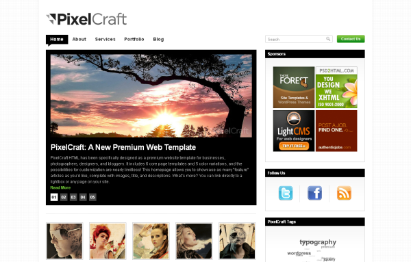
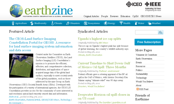
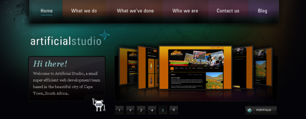
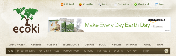
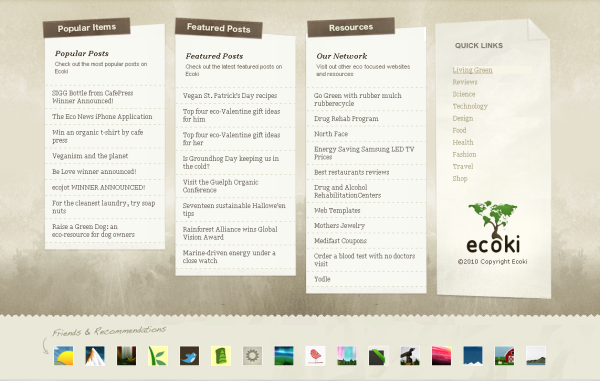
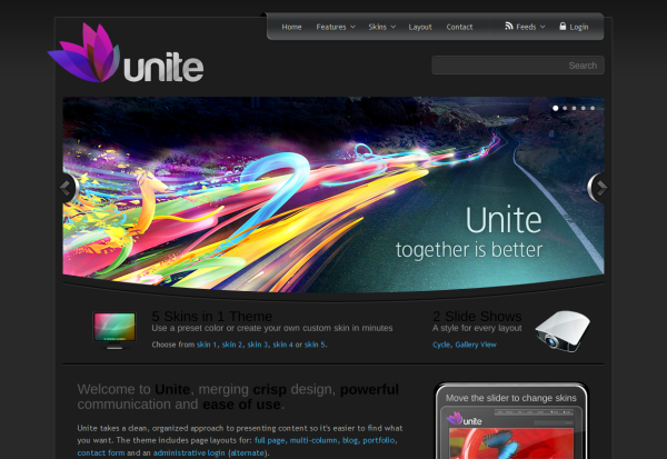
There’s more to color than being decorative, though. Figure 3.2 and Figure 3.3 are examples of themes in which color takes a more central role in the overall feel of the design.


If you’re designing a theme that will be used by a wide range of publishers, it’s important that you consider the role brand will play.
Logos come in a wide range of sizes, colors, and formats. Make sure that your design allows for publishers to use their own logo (or add text for their site title when they don’t have an image). This may seem like obvious advice, but the consideration here is that the theme’s logo space should allow for a variety of possibilities.
Many site owners want to include a prominent tagline or mission statement (about one to two sentences long) for the blog or company that’s prominent on the front page. Make sure you plan for this when building your design.
Additionally, you may want to consider different font stacks to allow publishers to change the tone of their site by selecting an alternative typeface.
Because WordPress sites often use a lot of text, you should be devoting some serious thought to your theme’s typography. While there are probably tens of thousands of unique visual combinations achievable through CSS font styling, there are a few main points that you should consider.
Regardless of the font style you pick, it’s important that you be constant in your font treatment throughout your theme. Using several fonts can make your theme look disorganized and unprofessional. It can also serve to confuse publishers about which fonts to use in which contexts. The best typographic systems use one or two typefaces to develop sophisticated and readable blocks of text on every page.
Use the size and styling of your type to develop the hierarchy on each of your theme’s templates. Traditional print design is an ideal place from which to draw inspiration. Consider a newspaper: the front page will boldly display the main headlines, the lesser articles will receive smaller, but still legible headlines, and the body copy will always be small and uniform from article to article.
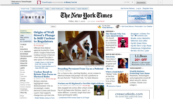
Like the majority of newspaper publishers worldwide, the New York Times has carried over the typographic hierarchy from the print publication to its website, as shown in Figure 3.4. Notice that there are three story headline font sizes: one for the feature story, another for the secondary story in the first editorial column and the photo highlight, and a third for all the other abstracts on the front page.
Also, look at how typography is used to establish a hierarchy in the section listing in the far left menu: you can tell at a glance that “Books” and “Movies” are subsections of “Arts.”
Let’s carry this metaphor over to your WordPress theme. The home page template of your theme should promptly let users know where they are and what the site’s primary content is. Post and page titles should be easy to find, read, and click on. Subheadings should be less dominant and so forth, until you have styled the body copy, which should be simple, readable, and consistent across all parts of the site.
You can of course use other visual design elements to organize content on your pages, but be mindful of the power that type has to communicate information hierarchy. In WordPress themes especially, it’s a powerful way to ensure that content is communicated clearly—even if you’re unsure what that content is going to be.
These elements of design are often overlooked, as the browser defaults are generally seen as being “good enough.” But paying close attention to how these small details will complement your theme’s layout and visual style is often the difference between a good design and one that is truly awesome.
Text should have plenty of room to breathe, and lines of text should avoid being so long that it’s difficult for the eye to scan back to the beginning of the next line. This second point is particularly relevant to flexible-width layouts: consider how the text will stretch if the site is being viewed on a very wide monitor.
Typography on the Web has recently been undergoing a form of renaissance. Previously designers were limited to relying on a user’s installed fonts for CSS styling, or replacing the text with an image or (shudder) Flash movie; now, a number of new font replacement and embedding technologies have become available, allowing you use of virtually any font, so long as the license terms allow it.
You should abstain from using font replacement for body text; instead, limit it to headings, titles, blockquotes, and the like. A custom font can give your theme a distinct personality. Here are few other rules of thumb (break them at your own risk):
-
Avoid using fonts that are hard to read.
-
Don’t use more than one font face as a font replacement unless you have a very good reason.
-
Make sure that browsers will still render legible type when the font replacement doesn’t occur. This means paying attention to line height, font color, and letter spacing. The same rules discussed in the main typography section apply to font replacement.
-
Consider the implications of using a specific typeface on non-English language sites. If your theme is likely to be used with a language that requires characters missing from that typeface, you need to plan for a fallback or alternative font.
Let’s look at a few sites that make clever use of font replacement. Figure 3.5 is a great example: the two distinct header fonts complement each other nicely and contribute to the visual style of the site.

The site shown in Figure 3.6 also uses a few well-chosen custom fonts to contribute to the feel and style of the design.

Color, typography, and texture combine to create a unique visual style for your theme. By having a clear idea from the outset of what you’re trying to achieve, you’ll be better able to combine the distinct parts into a cohesive whole.
Think about the tone and context that you are trying to achieve when arriving at a visual style. Figure 3.7 and Figure 3.8 illustrate two individual visual styles. Consider the message that each style conveys without reading any of the words on the pages.


As seen here, the visual style of your theme can range from clean and minimal to bold and illustrative (and everything in between). If you’re designing a theme that a range of people will use, you should limit the visual styling to simple, unobtrusive elements, as these are much easier to customize. Conversely, if you’re designing a theme for a specific niche, you’ll have a lot more room to maneuver.
At the end of Chapter 2, I discussed the importance of drawing wireframes that map out the content contained on each page of your theme, and how that content will be organized. Now that we’ve reached the design phase, it’s time to map out the theme’s layout in more detail. Selecting the layout of your theme is one of the most crucial decisions to make during the design process.
Dating back to the Renaissance art period, the golden ratio is simply a mathematical ratio that’s widespread in nature, and which tends to give compositions an aesthetically pleasing balance. Everything from an oil painting to a web design can use the ratio. The ratio is fairly close to (but not exactly) a two-thirds to one-third split, as illustrated in Figure 3.9.

In a WordPress theme, the golden ratio usually appears as the ratio of the main content column to the sidebar column; it can also be applied to subcolumns, or to the height of elements in the header or footer. Let’s look at a practical example of what this might mean for your theme layout. A typical site layout is shown in Figure 3.10.
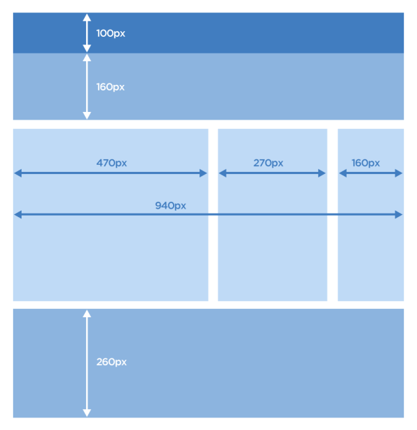
This wireframe actually uses the golden ratio to guide its column and row proportions. The 470px column is balanced against the 270px column, which in turn is balanced against the 160px column. In the header, the two sections are also proportionate to the golden ratio. Notice how pleasing this layout is to the eye. Every column and row works in harmony with the other elements in the template to create a balanced, yet interesting, visual structure.
Because web pages are viewed on a number of screen sizes and resolutions, it’s worth considering how the theme will adapt to all of the various options. Most desktop screen sizes are above 1000px wide by 600px tall (after you remove the browser and operating system chrome). Mobile browsers naturally have a lot less screen real estate to work with, though some—like the iPhone—compensate by zooming the entire page out to fit on the screen.
Your theme can have a fluid width—that is, it can adapt itself to the size of the browser window—or it can be a fixed width. There are pros and cons associated with either approach, though fixed-width designs seem to be increasing in popularity as ultra-wide monitors become more prevalent. They’re also a little easier to code: no more worrying about your layout breaking at a given window size.
But, as with all design decisions associated with your theme, the layout you pick will depend on your theme’s goals and mission statement.
After considering your layout in the abstract, you’ll need to select the dimensions for your theme. In most cases a maximum width of 960px is advisable, because it will display on the majority of screen sizes: your theme will be viewable on a monitor with a resolution of 1024x768px, without any nasty horizontal scrollbars. Even if you’ve chosen to build a theme with a fluid width, you should still start the design phase with a set of dimensions in mind, so that you can establish the default proportions of various elements.
There are a few traditional options from which to pick when considering your layout. The most common ones around are your garden variety two-column and three-column layouts, which adapt well to a number of uses; for simple sites, though, a single-column layout can be effective. Examples of these layouts (in numerical order) are shown in Figure 3.11, Figure 3.12, and Figure 3.13.
These conventional layouts are attractive and functional to boot. However, there’s no need to be limited by convention! There’s a host of newer WordPress themes that are truly outside of most people’s perceptions of a WordPress theme. Figure 3.14 and Figure 3.15 are examples of WordPress themes that use original and unconventional layouts.

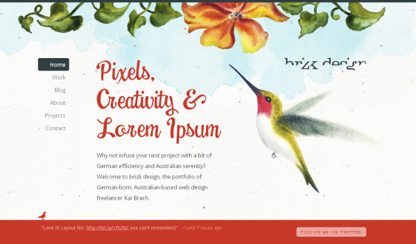
Figure 3.15. Brizk Design's website uses a fixed navigation and a vertically scrolling main body section
Keeping customization in mind, you might also want to plan for multiple layouts and allow your users to pick the one they prefer. You could also provide a few custom page layouts that your users can apply to specific pages on their sites (this will be discussed further in Chapter 7).
In Chapter 2, we went through the theme planning process and ended up with a sitemap and a few wireframes. Now, with the help of the design principles we’ve seen in this chapter so far, we’ll be turning your wireframes into the actual bits and pieces from which a WordPress theme is made.
But just what are those bits and pieces? Like many other content management platforms, WordPress treats most pages and posts in a very modular way. This means that the sidebar on one page will almost always look like the sidebar on another page. The same goes for the header, footer, and other elements. There are several of these modules that come together to form a complete WordPress theme, and it’s important that you understand and address each one in the design phase. In addition, there are a number of specific pages that just about every site will need, and these should be part of your theme: 404 error pages and search results pages, for example.
If you leave one or more of these components undesigned, you will be forced to come up with an appearance for them on the fly when you start coding your CSS; this can often lead to those elements having a poorly defined visual style, or seeming at odds with the rest of your design. By addressing every component in the design phase, you’ll ensure that your theme will have a consistent feel that’s slick and professional.
A few of the core components of a standard WordPress home page template are shown in Figure 3.16.

We’ll now examine each component in turn, and I’ll show you some fine examples of design that should inspire you with ideas about how to implement them in your theme. After that, we’ll address the design of each of the page types in our sitemap. By the end of this section, your head will be spinning with ideas, and you should be raring to start on your own theme’s design.
First impressions matter. Being the first element visitors see when they reach a site, the header is crucial to establishing the site’s tone and message. A clean, uncluttered header is a safe way to go, but it’s far from being the only one, as we’ll shortly see.
The header will almost always include the site’s branding, logo, and possibly its mission statement. Depending on your site’s layout, the header might also include a navigation menu, a search bar, or other elements like links for RSS feeds, social media, login and registration, as well as banner ad spots.
Figure 3.17 through to Figure 3.23 show how versatile a site header can be.

Figure 3.17. This header includes the site navigation, login functionality, and a bold mission statement

Figure 3.19. A minimal header containing only navigation and branding is suitable for the widest range of sites


Take a moment to note what sets each header apart from the next in these examples. Is the header’s goal simply to set the design tone and feel for the site? To convey the site’s mission statement? Or is it to encourage the user to do a specific task, like request a quote or share the site with their friends?
The trick is to use the header to highlight content that’s important to your own theme goals. Make sure that it works in harmony with your overall mission statement for the rest of the theme. Remember, it's your job as a designer to help guide users to the most relevant content. A successful header immediately tells users where they are and what kind of content they’ll find at the site; it should also make it simple to find the most important content. If your header design accomplishes those goals, the rest is just icing on the cake.
All the previous headers shown in this chapter included the site’s main navigation. As navigation is such a necessary part of a site, let’s spend some time focusing on navigation menus in particular. Traditionally they appear at the top of the page—horizontally—but your theme can incorporate any number of navigation displays, from a vertically listed sidebar to a fancy menu that reveals itself when the mouse hovers over it. Keep in mind that as well as the top-level links, you’ll also need to design for the subpages and sub-subpages. Drop-down menus are often a perfect solution for these nested hierarchies; a few examples are shown in Figure 3.24 and Figure 3.25.


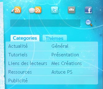
A navigation menu can also include extras like categories (as shown in Figure 3.26), the blogroll, or any other links that you think will be useful to visitors. While it’s important that you avoid having your site’s main menu cluttered with too many options, there’s no need to limit yourself to just pages.

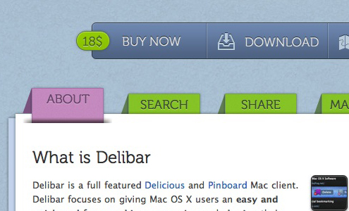
How you treat the visual styling of the navigation is also a significant consideration. Often, visual cues serve to help orientate users by making it obvious which page they’re currently on. A clear example, where tabs are used for this purpose, is shown in Figure 3.27. Even if tabs or buttons are unsuited to your theme’s style or layout, it’s important to ensure that your navigation is easy to find, read, and use.
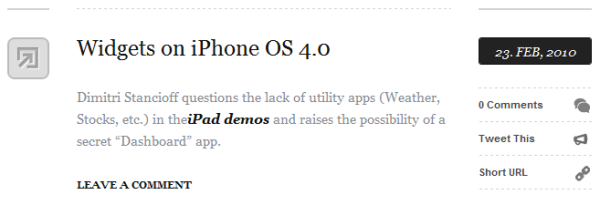
This is arguably the most vital piece of your entire WordPress theme. The Loop is the element that WordPress uses to display posts, whether on the home page, list pages, or single post pages. The Loop will generally include the title of the post, its content (or an excerpt of it), and some metadata such as tags, categories, the author name, and the date of the post.
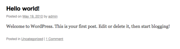
Figure 3.28 shows the way The Loop is styled in WordPress 3.0’s default theme, Twenty Ten. It’s quite basic, but all the elements are there, so it’s a good starting point for your design.
In a plain old vanilla theme, all posts in The Loop will look the same. But life isn’t plain old vanilla, and nor does your WordPress Loop need to be. You can create custom designs for The Loop for various types of content; for example, one layout for a text post and another for a video post, or perhaps different styles for each category.
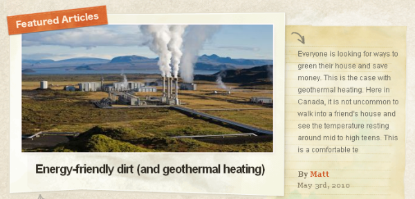
When considering your own design for The Loop, return to your mission statement and decide what pieces of content are pertinent to your theme’s success. If you’re designing an image blog, you might opt to show a thumbnail and a title with a few tags. Alternatively, if you’re designing The Loop for a theme comprising mainly text content, additional metadata such as the post’s date, author, categories, and tags can be helpful for users seeking content relevant to their interests. The examples in Figure 3.29 through to Figure 3.30 show what you can do with The Loop.


Wherever posts are listed, WordPress will automatically split the list into pages if there are more than a set amount. The pagination controls are the links that allow users to navigate back and forth through these list pages. The pagination control is usually placed at the bottom of the page, after The Loop, but often it might feature at both the top and bottom. It can be made up of Next and Previous links, as in Figure 3.33, or a numbered list of pages, as in Figure 3.34.
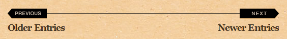

These examples highlight that you need to consider more than just the appearance of the pagination controls: you also need to think about how they’ll work. The standard Next/Previous links work well for simple sites and keep the design tidy, but when you have a large amount of content, it’s advisable to give users a more direct way to find older content, rather than hitting the button 20 times in a row.
WordPress’s comment system is a big draw for publishers, so you should definitely pay attention to this part of your theme! For many sites it will be the primary point of engagement between the site and its readers, so it’s worth spending a little extra time designing it.
There are two components to the comment system that need to be addressed in a theme. The first is the form that visitors will use to post comments, featuring the name, email address, website URL, and, of course, comment text fields.
The examples inFigure 3.35 to Figure 3.38 show approaches to the form’s design, ranging from the extremely simple to the more complex.


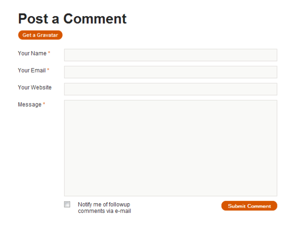
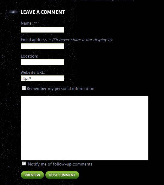
As the latter examples prove, there are certainly a few bells and whistles at your disposal to spruce up the plain old comment form. You need to be aware that publishers using your theme may want to employ these features, and plan for them in the design phase. The Subscribe to Comments plugin, which adds the Notify me of follow-up comments checkbox seen in Figure 3.37 and Figure 3.38 above, is one highly popular example. There are also a number of plugins that provide comment preview functionality, so it’s worth incorporating this handy feature as well.
The second major component of WordPress’s comment system is, of course, the comments themselves. Each comment should show the name of the poster—usually as a link back to the website URL they’ve provided—as well as the date the comment was posted and the actual comment text. WordPress makes use of the Gravatar author thumbnail service by default, so you should plan for displaying avatars with the comments.
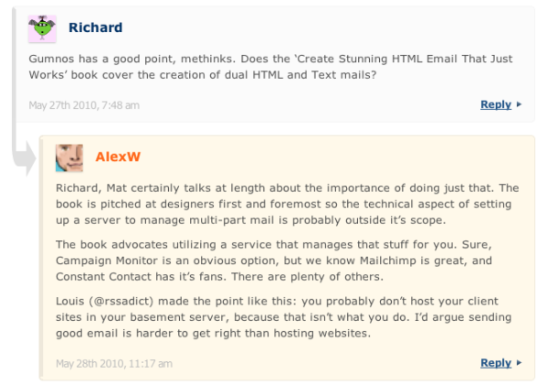
Important: Threaded Comments
Threaded commenting, a relatively new feature to WordPress, allows visitors to reply to previous comments. As a result, the replies will often be displayed indented under the “parent” comment, rather than in an aligned chronological list. It’s highly advisable that your theme at least support threaded commenting; individual publishers may select to opt out of this feature, but as it’s standard in WordPress, you’ll need to ensure that it works for publishers who do choose to allow it.
Let’s take a look at some well-designed comment lists in Figure 3.39, Figure 3.40, and Figure 3.41. You’ll notice the clear separation between comments, as well as author thumbnails and prominent reply buttons.
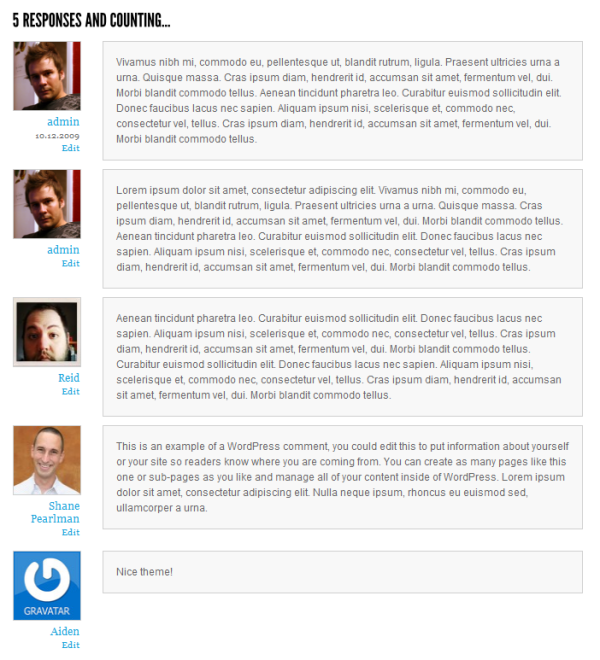

Often comments by the author of the post that’s being commented on are styled differently from other comments, in order to stand out, as seen in the last example. This is a common enough feature that many publishers seek out, so it’s well worth investigating for inclusion in your theme.
The term sidebar has a special meaning in WordPress: rather than referring specifically to a column on one side of a page, the sidebar is actually just a section in your layout that can contain user-specified widgets. The sidebar is an incredibly flexible area, so it’s worth spending time on the design. The overall appearance should be consistent with the rest of your layout, but the individual widgets can be more accentuated than they are in WordPress’s default treatment.
First, just to ground your understanding of what goes into a WordPress sidebar, let’s look at the most basic version of the sidebar, highlighted in Figure 3.42.

Notice that the sidebar includes two elements: widget titles and widget content. Remember those two basic elements as we take a look at other sidebar styles in Figure 3.43 to Figure 3.48.


Now that we've seen a few creative examples, let’s take some time to dissect the sidebar. First of all, a sidebar should be no less than 160 pixels wide to account for the array of widgets out there. Any narrower than that and you risk cramming in too much content for it to be readable, or even breaking the layout of some widgets. Some sidebars can be as large as 300 pixels or more, which is useful if you need to fit standard ad units, such as the popular 300x250px advertisement. Keep in mind that the more space you give to the sidebar, the less you’ll have for the content.
Tip: Sidebars that Aren't Left on the Side
Remember, a sidebar is just a space that can hold a widget. With a little code wrangling, you can easily have these widget-ready areas in the footer, the header, or even in the middle of The Loop. Just remember the rules: make it a minimum of 160 pixels, style the widget titles, and prepare default styles for the widget content.
WordPress provides about 20 default widgets, but there is a nearly limitless number of plugin widgets out there—from page lists and calendars to social media links and contact forms. You can even include your own custom widgets in your theme (Allan will be showing you how to do this in Chapter 6).
It’s impossible to provide a custom design for each widget out there, but the core sidebar elements will always remain the same. If you address the basic elements of font size, padding, margins, widget titles, and widget dividers, chances are you’ll end up with a successful sidebar that can hold all manner of widgets that a publisher might want to use. That said, it’s still worth testing your theme with as many widgets as you can to see how they look.
As the name suggests, the footer of a WordPress theme shows up at the bottom of each page, after the content. For some sites, a conventional colored bar with copyright information and a few links may be appropriate, but this is just a fraction of what can be achieved with a footer; it can provide visitors with some unique content or offer other ways of navigating the site. The footer is like a surprise treat for users who’ve made it all the way to the bottom of the page, rewarding their interest in the site. If they’ve made it this far, why not provide them with some fun and useful links?
Let’s start by checking out footers that lean towards the simple and conventional style. Figure 3.49, Figure 3.51, and Figure 3.50 are all drawn from the popular theme site WooThemes.com.
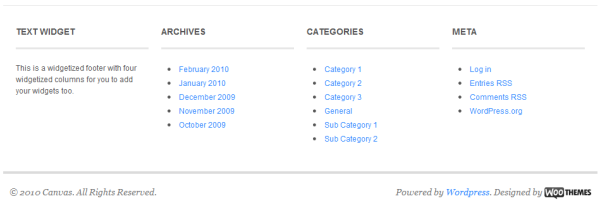
These footers display copyright information, a reminder of the site brand, and one has a widget area. They’re simple and understated, in keeping with the visual styles of the themes from which they’re drawn.
Now to the other end of the spectrum, where we’ll see some more extravagant examples of footer designs in Figure 3.52 through to Figure 3.56.
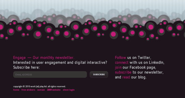
Figure 3.52. This inspired footer design provides additional ways for visitors to interact with the site


The more advanced footers just featured, as well as being highly creative, offer features that complement the site content. These features can serve to redirect users to other content or interaction tools that are of interest to them—users who might otherwise be ready to leave the site.
Now that we’ve covered all the components of a WordPress theme page, it’s time to look at all the pages that constitute a theme. Let’s start from the beginning, shall we?
The home page, front page, landing page, splash page—call it what you like, it’s the page that your theme will call home, the first place that visitors will see when they arrive at your theme through the front door. The way you approach the front page design is tied to the message that you want to deliver. Show off your best features up front, and users will know right away why they want to stick around. If your theme is going to focus on images, showcase them. If your theme is going to concentrate on video, include a video player on the front page. If you plan to dish out text-heavy content, make your page easy to scan.
The front page design will also set the tone and structure for your other templates, so close attention to detail here will pay off, as Figure 3.57, Figure 3.58, and Figure 3.59 attest.


The standard or default page template is the layout that’s used for the theme’s page content, such as an About page. Most themes treat the default page template conservatively, since the content itself is fairly static and any special styling might be distracting. The traditional page template includes the same header, sidebar, and footer that’s seen on the home page.
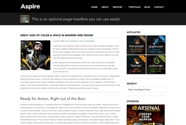
The Aspire theme and the Concept theme, shown in Figure 3.60 and Figure 3.61 respectively, both showcase well-designed page templates. The main elements are all addressed: a uniform header, sidebar, footer (not shown), and page content area. Notice the particular care given to the appearance of subheadings, images, lists, and the like. Publishers are able to use these elements easily within their pages, making them fit seamlessly with the rest of their site.

The single post template is used to display an individual blog post in its entirety. Where a page template typically only displays the page content, the single post template will usually show a lot of the metadata associated with the post, such as tags, categories, trackbacks (a type of linkback), comments, and the like.
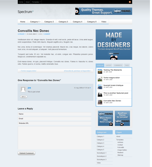
Remember that while The Loop will often only display an excerpt from the post on your list pages, the single post template will display it in full. Some of the customizations you can implement may take the form of custom post images, separately styled pull-quotes, lists of related articles, and unique templates for different types or categories of posts. Let’s take a look at a complete blog post template in Figure 3.62. This example of a single post template comes from the Spectrum theme by WooThemes.
WordPress uses these templates to display lists of posts that are filtered on some criterion; this can be a category, tag, author, or date. As you’ll see in the section called “Quick-and-dirty Template Hierarchy Reference” in Chapter 5, if your theme lacks a category, author, or tag template, the standard date-based archive template will be used to display those pages. This is often sufficient, as the needs of all those page types are very similar. However, you may wish to give one or more of these templates a specific style, and WordPress gives you the flexibility to do that.
These templates are very flexible, and there are a number of ways you can use them to present the posts. Figure 3.63 shows one possibility, from the SitePoint blogs.

This template handles the task of delivering results for search queries entered by the user. And don’t worry: there’s no requirement for you to know anything about search algorithms—WordPress does the hard work for you! All you have to decide on is how to display the results. The design for this page is likely to be similar to the archive template—after all, you’re displaying a list of posts—but you also need to account for any other form of content that might be returned, like authors, categories, or pages.
It’s worthwhile considering customizations that make the search page more helpful to users by showing additional content that might be relevant to a search query. For instance, let’s check out the search results page from the ThemeShaper site in Figure 3.64. Note that the sidebar contains a bunch of suggested posts, in case the searcher failed to find what they were looking for.

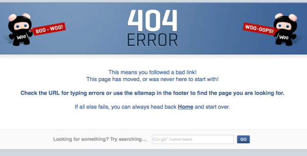
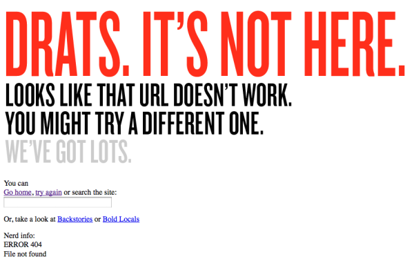
WordPress provides built-in handling of “page not found” (404) errors. Rather than just sending users back to where they came from, an effective 404 page will help users by including a search form to find the content they seek, and suggesting how to report the problem if they arrived via an internal link. You might also consider using this page to display popular content from the rest of the site—after all, there’s no reason for them to leave the site right away!
Figure 3.65 and Figure 3.66 show some cleverly designed 404 error pages.
An often overlooked but crucial piece of the WordPress theme anatomy that should be addressed in the design phase is a standard HTML test page. This is just a regular WordPress page whose purpose is to test styling for all of the commonly used HTML elements: headings, paragraphs, form elements, lists, images, links, blockquotes, and so on, to ensure that they don’t break the layout and that the styling is consistent with the rest of the theme.
The Canvas theme by WooThemes has a very thorough test page, shown in Figure 3.67. Note that the designers have taken care to include both ordered and unordered lists, as well as every level of heading; this is the level of detail you should aim for.

It’s worth contemplating further additional features during the design phase. Think of the traditional WordPress theme being like an anatomically correct body, and these extras as the cool cyborg parts. It’s impossible to list all of the add-on features that are out there, but here are a few of the more popular ones.
Feature sliders are also called dynamic leaderboards, image sliders, carousels, content rotators, feature boxes, and probably a thousand other names. Regardless of what you choose to call it, its purpose is to highlight a selection of featured content. It usually shows up in a prominent location just below the site header and loops through the featured items, often making use of a JavaScript-powered effect.
There are several approaches to designing this sort of feature; two are highlighted in Figure 3.68 and Figure 3.69.

When designing for a WordPress theme, there’s no reason to stop at just one standard page template. You can include a handful of extra page templates for publishers to pick from, should they want to make their content look a little different from page to page. Full-width templates, image gallery templates, and product templates are a few common ones.
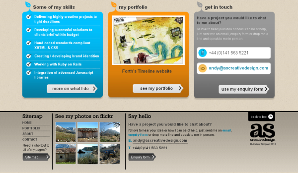
Two alternative page templates from the same theme are shown in Figure 3.70 and Figure 3.71 (for comparison, we saw this theme’s default page in Figure 3.60).


An advertising block is simply a space that is predefined in your theme layout to be used for advertising or promotions. It’s ideal for publishers who want to monetize their sites, but ad blocks also work just fine for standard bloggers for their own promotions.
Figure 3.72 shows a number of ad blocks placed in the sidebar and above the post content.

A lightbox is essentially a JavaScript plugin that allows users to load large images inside a hovering container. This feature has grown steadily in popularity for photography and other image-dependent sites. When designing your theme, you should consider whether a lightbox would be appropriate for users. If you decide that it would be helpful, you’re then faced with choosing what form it takes; this is where your script research from the last chapter will come in handy.
A standard example of a lightbox is shown in Figure 3.73. The prettyPhoto 3.0 plugin uses jQuery to present images in a gallery format. Note the thumbnail images along the bottom, as well as the arrow navigation.

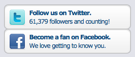
There is a wide variety of free plugins that allow users to include social media links in a WordPress site with little hassle. You can also bake these features directly into a theme, bypassing the need for a plugin altogether. Sidebar widgets and a list of social media buttons—for Twitter, Facebook, Digg, Delicious, and the like—at the bottom or top of a post are the most common ways of including such features, but you can also integrate them into the header or footer of your theme.
Figure 3.74 and Figure 3.75 are two examples of the kind of functionality you might consider; both are taken from the SitePoint blogs.

What you should take away from this chapter is the following: WordPress has a fixed number of parts for which you must design. In order to have a robust, usable theme, you need to account for all of these. Even if you have no plans to use each and every text element, form, or widget in your version of the theme, publishers using your theme might wish to—so to ignore designing for them will only prompt those publishers to go elsewhere because you fail to give them what they need.
Unlike a static website where you know exactly what elements you’re designing for, it’s important to account for everything in a WordPress theme. Make sure you look at all of the common HTML elements, WordPress widgets, and page templates when you’re in the mockup stage.
Now that we’ve reviewed the core principles of design that affect a WordPress theme, as well as the basic elements that a theme is unable to live without, it’s time for you to go to work on your own design. The next steps in the workflow of this book will walk you through actually building your theme, but I hope that you leave this chapter with a better impression of how WordPress themes are structured and designed. At their core, WordPress themes are a lot like any other website design. By following the fundamentals discussed in this chapter, you should be knocking out your own wicked themes in no time!