CHAPTER 4
TARGETED TECHNIQUES
Exploration and experimentation are essential to artistic growth and are reliable routes to discovering your own voice. The following projects will help you stretch your creative muscles: using uncommon methods to alter paper, making a multi-color print with a single pull, and crossing disciplines with fiber arts to name a few. In this chapter, three contemporary printmakers will show us a wide variety of techniques from sweeping landscapes to divine color gradients to possibilities of print on textiles.

PROJECT:
PUZZLE BLOCK PRINT
One simple and efficient way to make a multi-color print in a single pull is by utilizing the puzzle-block method: individual blocks, inked separately, but then assembled and printed as one. You can start with a simple design, like this one, or make one as complicated as you wish with as many pieces and colors as you dare! For projects such as this, I like to use the softer rubber blocks rather than the more firm linoleum, because the rubber cuts smoothly with very little effort, making intricate or small pieces easier to cut out.
Tools and Materials
Scrap pieces of Speedy-Cut carving blocks
7" x 9" (18 x 23 cm) printing papers
Pencil
Tracing paper
Carving tools
Washi/masking tape
Inking plate
Three different ink colors
Palette knife(s)
Brayer(s)
Baren
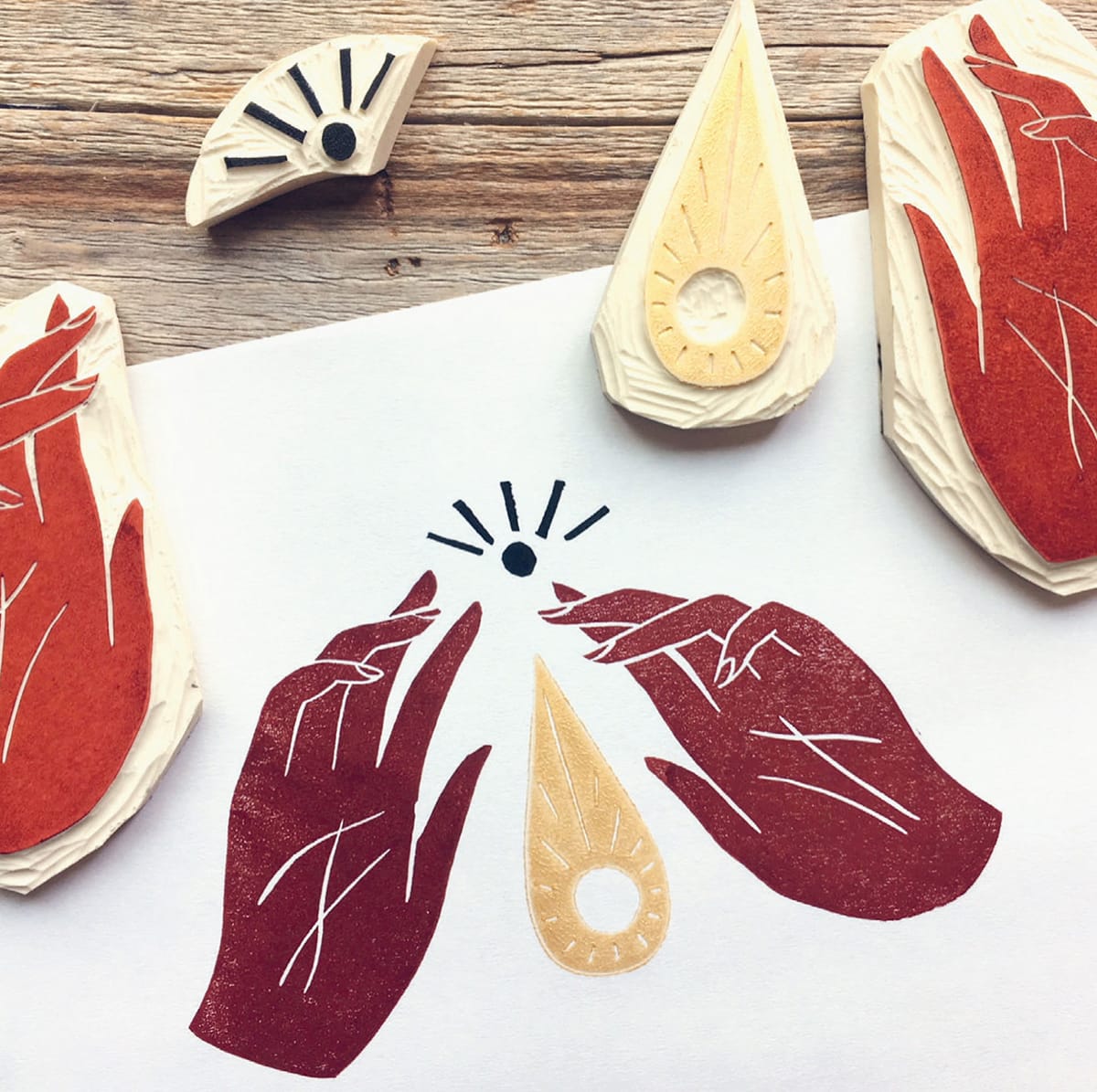
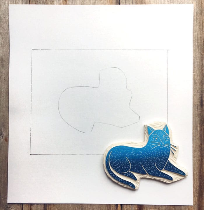
1 Design your print, using two or more colors. Transfer your design to scrap pieces of Speedball Speedy Cut (I used the tracing paper transfer method).

2 Carve out your design, carefully cutting elements apart with a sharp craft knife. Use a self-healing mat to protect your work surface.
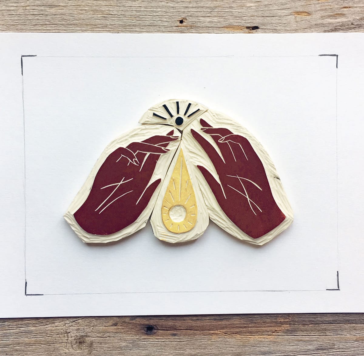
3 Make a simple printing jig: With a sharp pencil trace a sheet of 7" x 9" (18 x 23 cm) printing paper on a larger sheet of paper. Arrange the blocks within this border and trace around the blocks.


4 Select and mix the colors for each block. (I used Caligo SafeWash Relief inks in naphthol red, raw umber, burnt sienna, and black, and Schmincke Aqua Linoprint ink in gold.) Spread and roll out the inks, and apply ink to the blocks using small brayers.


6 Lay a printing paper down on the blocks, pressing very lightly with a padded baren. Speedy Cut is a very soft and malleable material and is prone to bleeding if too much pressure is used during printing.

7 Carefully peel the paper away from the blocks. Set it aside to dry.
PROJECT:
UNCOMMON GROUND
“G round” refers to the background surface on which a print impression is made. The most common ground is plain paper, as received from the manufacturer. Sometimes preparing the ground beforehand can yield interesting results, however, changing the entire mood of the final print.
Playing around with ground is a fun and easy way to experiment, especially when you feel stuck and stale in your practice. But don’t stop with the suggestions here: challenge yourself to think of additional ways to manipulate the surface of your paper and push the boundaries of your creativity. This project focuses on the printing ground, so the design and execution of the block is up to you. You know the drill.
Tools and Materials for Printing
4" x 6" (10 x 15 cm) rubber block
Pencil
Fine-tip permanent marker
Tracing paper
Carving tools
Washi/masking tape
Inking plate
Black ink
Palette knife
Brayer
Baren
Tools and Materials for Groundwork
5" x 7" (12.5 x 18 cm) printing papers (medium to heavy weight)
Tissue paper
Adhesive (I used Mod Podge matte finish)
Glue brush
Watercolor/gouache, paintbrushes, and water cup
Salt
An old book or magazine
Unused black tea bag
Needle and thread or sewing machine
Toned/colored paper
Soft colored pencil or crayon
Craft knife or hole punch
Self-healing mat

1 Design, transfer, and carve your block.

2 Create a simple printing jig by tracing your block and the printing paper.

3 Ink up and print with a baren, using lighter pressure for softer blocks with fine details.
For each of these processes, allow the prepared papers to dry fully before attempting to print on them. Any process involving moisture will cause the paper to curl or warp. You can press the dry papers under a stack of heavy books to combat this. I suggest using a softer rubber block for this project, as the more pliable surface will allow you to better push ink into uneven printing surfaces.

Groundwork: Book Club
This is an easy one: simply cut or tear a book or magazine page to size and print. You could further manipulate the message/meaning of the print by redacting, circling, or underlining words on the page in order to form your own message from the present text.

Groundwork: Tea Party
Use a fresh, wet tea bag to stain plain white printing paper. You can lightly drag the bag across the paper to create a solid wash or you can blot the bag to create interesting patterns and textures.

Groundwork: Tissue Layers
Using a glue brush and matte-finish adhesive, arrange torn bits of tissue paper on heavier-weight printing paper and glue into place, sealing over the top.


Groundwork: Paint Job
Add color, pattern, and extra visual interest to an otherwise simple print with paint experiments. Try painting different patterns and playing with different colors to achieve different moods. Paint precise patterns on dry paper or fluid washes on paper first wet by a clean, watery brush. Try adding a pinch of salt, as salt sprinkled on a wet wash will cause the pigment to gather, resulting in a mottled effect. Brush the salt off after the paint is dry, and before you print.

Groundwork: Brayer Blot
I often have precut papers lying about from other projects. Sometimes during cleanup I blot my brayer on these papers instead of old magazines. This cleans excess ink from the brayer while also giving me a cool, layered print surface for future experiments like this one! Simply roll your brayer, loaded with any color ink onto any color paper.


Groundwork: Transparent Layers
Although this one isn’t technically a specially prepared ground, it is still a cool effect. Print onto sheets of transfer paper and play with layering these prints in various arrangements until you hit on a composition you like.

Groundwork: The Rub
A fun way to utilize old blocks is to create texture rubbings from them. Try using your block from the very first project, the Texture Quilt! Place your printing paper on top of your (clean, dry) previously used block and rub with the tip of a crayon or soft colored pencil. Shift the paper as you go to break up patterns.

Groundwork: Holes
I purchased this paper from a specialty paper shop (see Resources, page 150) to use in collage work. Try printing on paper that you punched holes in or cut in patterns with a craft knife and self-healing mat. When printing on paper with pieces cut out, make sure to place a “buffer” piece of paper behind cut out areas as you print. This will keep the printing area clean of ink and the backs of subsequent prints clean as well. Mount onto a piece of contrasting paper.


Groundwork: In Stitches
Having enjoyed sewing since childhood, I’m always trying to find ways to sneak stitching into my printed projects. I treated these heavyweight tagboard printing papers just like fabric and stitched directly onto them, using my sewing machine and taking care not to tear the paper as I went. Since I couldn’t efficiently tie any knots or back up the stitches, I placed tape on the back of the papers to hold the stitches in place.


Groundwork: Cleanup Crew
When cleaning up after another project, I noticed that the lines created by my wiping made its own kind of drawing. Before all of the ink is fully wiped from your inking plate, blot the plate with a clean piece of printing paper.


ARTIST SPOTLIGHT:
AFTYN SHAH
Crafting exquisitely detailed landscapes from her studio outside of Philadelphia, Pennsylvania, printmaker Aftyn Shah explores inspiration and restoration that nature provides. Her studio practice is named Rise + Wander, a call to adventure, beckoning the viewer outdoors. Shah’s lyrical, playful linework forms bold compositions that seem to breathe with a life all their own.


EH: How did you first become interested in printmaking?
AS: My husband’s family comes from India, and I’ve developed a huge appreciation for the textile industry there—particularly the block printing! I’ve received pieces as gifts and was always in awe of the craftsmanship. Looking for a creative outlet a few years ago, I got it in my head that I wanted to make a scarf, and I headed to the nearest craft store to buy all the supplies. I ended up only printing on paper, but I haven’t stopped since then—and I still haven’t made my scarf!
EH: What drew you to relief in particular?
AS: I love that it removes the need for perfection. Previously, I had always painted or drawn, artforms that involve adding, adding, adding, until the piece is as close to the idea in my head as possible. And nothing ever reached that level, which is disappointing and frustrating, even disheartening. With relief printing, the process is reductive. I tend to work in only black and white (or maybe just a few colors), and I can only remove so much before the piece starts to lose balance. At some point, I have to just stop. I have to step away. There isn’t the sense that I can just add on forever, trying to reach perfection. That’s freeing. Also, I love the more rustic aesthetic, with the occasional wisp of errant ink or a little patching. It makes each piece individual and its own work of art.

EH: How long have you been working as a printmaker?
AS: My first print was a Valentine’s Day card for friends in 2015, and I gradually picked up the pace in my creations over that year, before really dedicating time in the beginning of 2016. I started Rise + Wander in January 2016, and I’ve made it a point to work on something almost every day, even if it’s only for ten minutes.
EH: How would you describe your work and your process?
AS: In a word? Slow. With two young sons, the rhythm of my life—including my art—is set by their schedules. I often have to find time to work between their needs. For this reason, I generally have thought about a design for hours or days, sometimes even weeks, before I actually sketch it out. Because I don’t have as much time as I’d like, I minimize steps where possible, like drawing something out directly on the block. Then, depending on how life goes, it can take weeks to finish even a smaller block. I used to get impatient and frustrated with this slower schedule, but I’ve begun to welcome the pace. This way, I can return to it each time with fresh eyes and evaluate the direction I’m headed with it.
EH: What are your main sources of artistic inspiration?
AS: Definitely nature in all its forms. The majestic, the tiny, the wild, the beautiful. I love taking a walk with my family or hiking by myself and mentally outlining everything. I like to think about how I would represent different details and textures in black and white lines and marks.
EH: How do you stay creative on a day-to-day basis?
AS: I actually think it’s easy for me to stay creative on a daily basis because I’m so limited in time. I spend a lot of my day thinking about ideas, taking in different elements (creative projects my son is working on, our beautiful houseplants, views during hikes, for instance) and synthesizing. As a result, I have a lot of excitement built up when it’s time to finally execute.

EH: Describe the space in which you make your art-do you have a home studio, rent space, or use a print collective?
AS: I work out of a home studio, which we converted from our formal dining room. It’s a nice, big, and fairly light-filled room that allows me to work close to my family—to bounce back and forth between my roles. My favorite part is a giant hand-me-down rug my in-laws gave us that takes up most of the floor. It’s a simple design, but it makes the space comfortable and pretty.

EH: What’s the best advice you’ve ever been given as an artist?
AS: Not everyone is going to like what you create. When we’re creating, we’re putting something of ourselves into our work in one way or another, and when we share it with the world we obviously want it to be appreciated. Unfortunately, not everyone is going to share our taste or our vision, and we just have to accept that. It’s important not to take it personally. As much as we invest in our work, just be sure you like it, so you have the confidence to shrug it off when someone criticizes it or even hates it.

EH: If you could spend a day in the studio with three artists you admire (living or dead) who would you choose?
AS: Emily Carr, Frida Kahlo, and Jane LaFarge Hamill. Each has such a different, well-defined vision, and I would love to just bask in their brilliant talent.
Visit Aftyn Shah at www.riseandwander.com
PROJECT:
LIVING LANDSCAPE
Usually my advice is to work from observation and trust your eyes, but this project has you do quite the opposite. The memory of a place can often be more vivid, more inventive, than a traditional study en plein air or from a photograph. Allow your expression to evolve by gradually removing the burden of reality from your landscape.
Visit a place. Take in the mood. Allow your senses to do the drawing. With your eyes, trace the path of flotsam rushing down a creek. Smell the leaves underfoot and notice their mottled repetition on the forest floor. Listen to the wind crashing through the trees like waves. Watch the clouds boil and tumble across the sky as the sun bleeds into the horizon. The land is alive, and you can inject that same life into your composition.
Return to the studio and record your impression of that place by making sketches. Try drawing from the shoulder, which keeps lines loose and allows them to sweep across the picture plane. I also recommend studying the brushstrokes of such notable post-Impressionist painters as Emily Carr and Vincent Van Gogh. Here we have Van Gogh’s 1889 Wheatfield with Cypresses, where the land appears to undulate and wave. The short, staccato marks in the foreground suggest a dense field, while the longer brushstrokes in the trees fade off into wisps, giving the design more room to breathe. With each mark, Van Gogh suggests the presence of wind and directs our eyes across the page. Though his medium was oil paint on canvas, the same ideas apply to the marks you make with your carving tools.
Tools and Materials
8" x 10" (20.5 x 25.5 cm) unmounted linoleum
9" x 12" (23 x 30.5 cm) printing papers
Pencil
Fine-tip permanent marker
Tracing paper
Carving tools
Washi/masking tape
Inking plate
Black ink
Palette knife
Brayer
Baren


Wheatfield with Cypresses, Vincent van Gogh, 1889
An established foreground, middleground, and background will give the composition balance.
Focused, directional lines that move across the plane will help you achieve the impression of movement in an otherwise static scene.
A wide variety of line widths and lengths will allow you to add texture, energy, and depth to the scene.
1 Starting with a memory of a bonfire on a farm with friends, I sketched up a nighttime landscape that attempts to echo the feeling of that night. I established a foreground with two late-autumn trees acting as a frame for the entire scene, ferns growing at their base. The middleground includes the grasses, pine trees, and cabin. Smoke from the chimney reaches into the black night sky background with a smattering of stars.
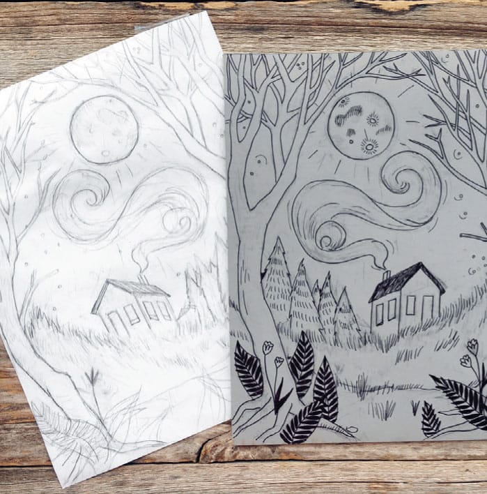
2 When I have a drawing with lots of visual information, I like to transfer the drawing directly to the block by taping it in place and rubbing firmly with the butt of a marker. After a successful transfer, I inked in the lines, making edits as I went along.
3 Desiring to keep my landscape as loose as possible, I didn’t want to plan my marks too much. Carving intuitively can be a bit scary, but the expressiveness of your lines may surprise you! Below are details on how I carved the block.
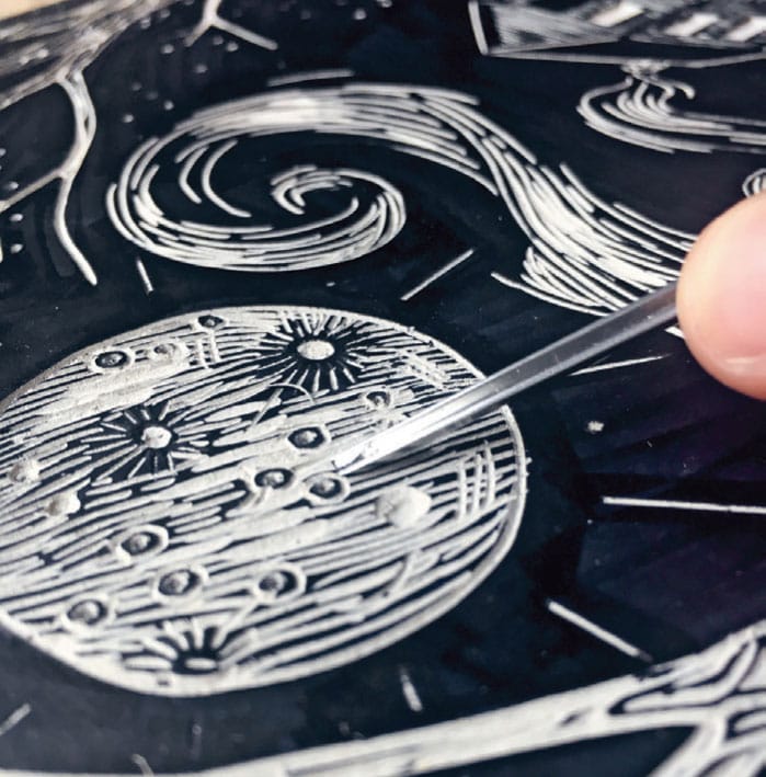
Moon detail: I used contour lines (see Contour Line Skull project, shown here) to give the moon a little bit of volume, curving my marks in accordance with the form, experimenting with craters and pocks. Here I used a 0.5-mm veiner as well as a 2-mm U gouge.

Pine tree detail: Tiers of short cuts with a 1-mm V-parting tool created a stylistic pine tree. Clumping the marks closer together on the right side of the trees act as a highlight, suggesting reflected light from the moon and giving the illusion of volume.

Frame tree detail: Inspired by the cypress trees that are heavily featured in Van Gogh’s body of work, I used my own photo of bald cypress bark to inform my marks. First I outlined the trunk and branches to set the trees apart from the background, then I allowed my interior cuts to cross over one another, come together, and wander apart.

Star detail: To make the tiny holes that read as stars, I held a 0.5-mm veiner perpendicular to the block and gently pushed it straight down until the blade bit in, and then twirled it in place. Instead of spreading the stars evenly across the sky, I decided to cluster them together slightly, meandering upward like a stream.

Ground detail: As the foreground is closest to the viewer, I included more details here. I added in small flowers and ferns, and used small clusters of narrow, wispy, upward strokes to suggest grass receding into the distance.

Smoke detail: Lack of a definite outline keeps the smoke looking loose, as larger spaces between the marks suggest more air. Long, swirling lines appear playful, and further assist in directing the eye around the composition. I used a 1-mm V-parting tool, 0.5-mm veiner, and a 2-mm U gouge to ensure variety, the larger marks appearing to catch more light.
Cabin detail: Repeating parallel lines mimic timber and reinforce perspective. Tiny notched tick marks suggest shingles on the roof catching light from the moon.

4 Print as usual (see Printing Techniques shown here).


The Cabin, fully carved

The completed print
ARTIST SPOTLIGHT:
LILI ARNOLD
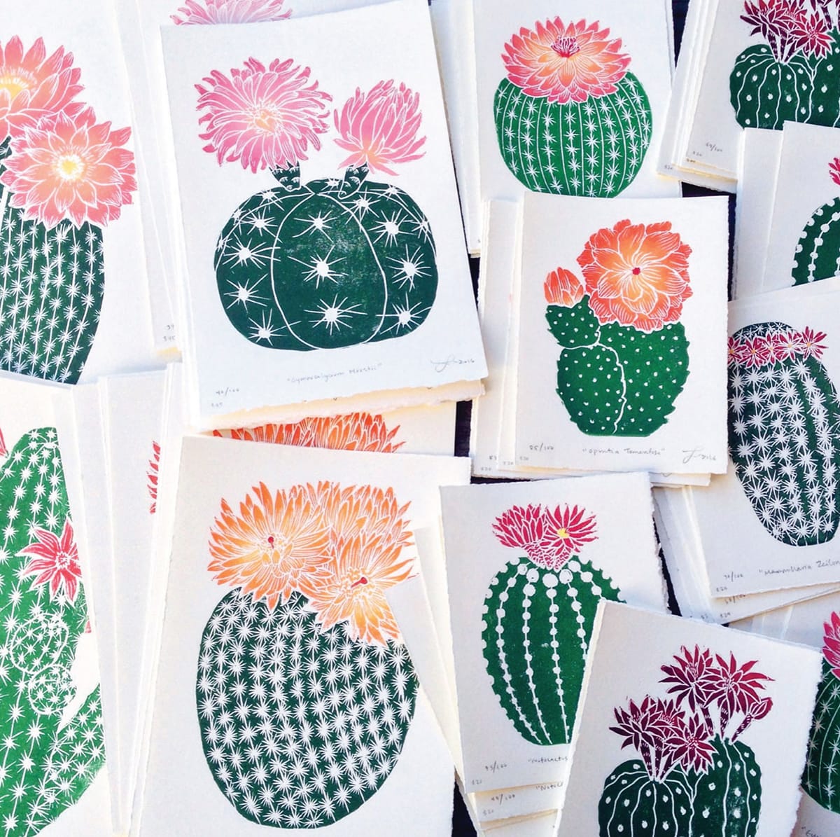
The work of Lili Arnold is instantly recognizable: her colorful block prints are executed with practiced craftsmanship and fueled by a love of nature, especially the flora of her California homeland. Colors blend seamlessly into one another, lending a soft richness to the surface of her prints. Arnold’s compositions are beautifully balanced with a wonderful variety of lines. Read on for a deeper dive into Arnold’s creative practice.

EH: What drew you to relief in particular?
LA: I was drawn to relief printing as first because of its practicality. I don’t have a real art studio or much space to create art, so relief printing has been the perfect solution because I can make prints without a press and with just a few materials: ink, paper, rollers, and a block. When I first started I used a wooden spoon to burnish my prints, but eventually upgraded to a plastic baren, and now I hope to upgrade to a press someday!
What started as something practical really turned into something that I truly loved. I think part of my deep love for relief printing comes from the meditative process of carving the block, and of course printing it in peaceful repetition. I also appreciate the fact that anyone can try it at home; it’s a great art form because it’s accessible to all ages, styles, budgets, and spaces.
EH: How would you describe your work process?
LA: My process is simple, low tech, yet still so satisfying. Working without a press, without multiple layers, and without a real studio has pushed me to figure out alternative ways of being efficient and productive. Through these challenges I was able to create methods that really worked for my subject matter and lifestyle.


EH: What are your main sources of artistic inspiration?
LA: I am constantly inspired by nature. Whether it’s the cacti growing in my backyard, or extremely intricate sea creatures at the aquarium, or the colors of a forest after a light rain. I am always humbled and awestruck by the natural world around me. I also love looking through books of scientific illustration, folk art, and poster art. Something about the tangible pages of a book connects me to what I’m looking at much more than a screen. That said, I do however love Pinterest for organizing ideas and themes, and finding more specific sources of inspiration for a particular project.
EH: What other art forms do you dabble in?
LA: I dabble in a little bit of textile design (both handmade with hand-carved blocks and hand-drawn illustration), watercolor, typography and lettering, and music. I love almost any art form that’s hands on; there’s just not enough time in the day!

EH: How do you stay creative on a day-to-day basis?
LA: To stay creative and productive requires organization, planning, and lots of daydreaming; but there are a few things that really help me stay on top of things. First, having a sketchbook allows me to keep all my ideas in one place, so I always have a project ready to go. Second, making to-do lists has been a total game-changer for my productivity and confidence.
Running my business can get a bit overwhelming at times, but my to-do lists keep me on track and ease my mind, which allows for creativity to continue to thrive among the stress that might otherwise be debilitating. Also, it feels so good to cross out items on a to-do list! Oh the little pleasures. If I’m ever feeling really creatively stumped, I will usually try to immerse myself in the outdoors if I have the time. Whether it’s a hike, a trip to the local arboretum, or just a walk along the beach, getting away from my laptop, or the tall pile of paper I need to tear, or the blank page impatiently waiting for my pencil, or the noisy frat boys that live next door really helps me clear my mind. I usually find that the creative block just dissipates and new ideas start flowing back in.

EH: Describe the space in which you make your art.
LA: My art studio is my bedroom and sometimes my living room. Surprisingly I am able to be quite productive in these small spaces! I think because I don’t have a press, it makes for a more contained environment that doesn’t take up too much room. It’s nice to work at home because I can get started on a project at any point, while balancing freelance design work, making meals, and spending time with my husband. Though working at home can cause some clutter (especially when I’m working on a large edition—prints on the bed, floor, clothesline), I try to clean up and put everything away after every printing session to keep the house feeling peaceful and put together. My equipment is very basic: Speedball linocut tools, Soft-Kut rubber blocks, Speedball water-based inks, rollers, barens, and Stonehenge papers.
EH: Do you have any helpful tricks or “hacks” that you’ve picked up along the way?
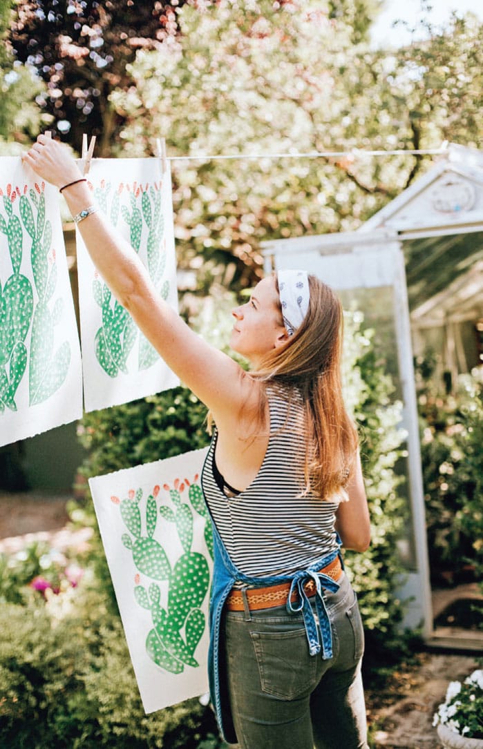
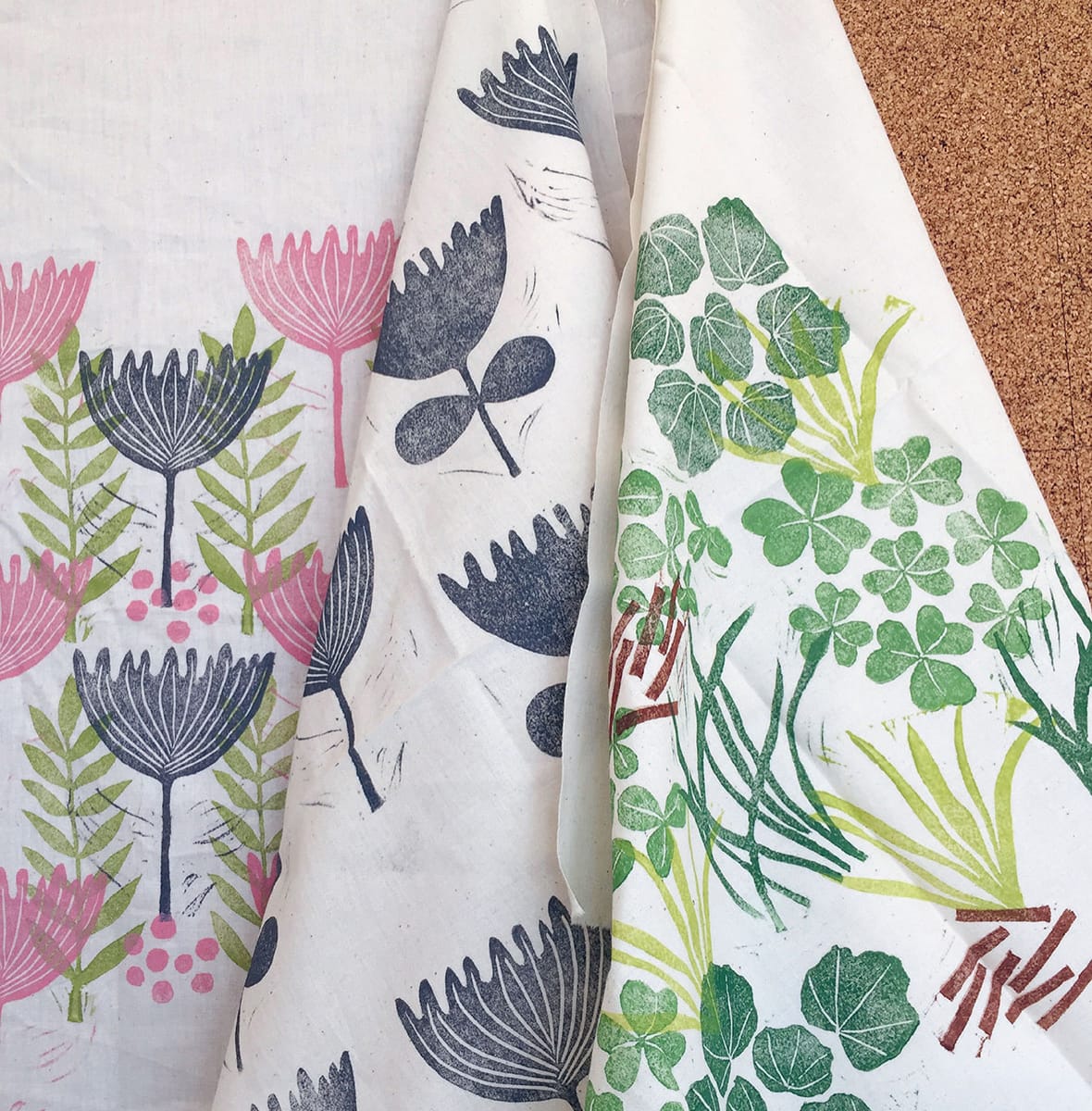
LA: One of my most useful tricks with my botanical prints is using the “puzzle method” in which I cut out the pieces that need to be inked up in a different color, then reassemble the composition when everything’s inked and I’m ready to pull the print. I first figured out this method because I wanted to work in multiple colors, but didn’t have the knowledge or ability to work with multiple blocks and layers. It can be limiting at times, but for the most part it works well for my subject matter.
Another crucial aspect of making my prints work is adding Speedball ink retarder to my inks, especially when working on larger pieces. Because I use water-based inks, they tend to dry out pretty fast and make it hard to print a large edition at once; however, the ink retarder prolongs the life of the ink and allows me to keep working for hours without having to worry about the longevity of the ink.
EH: What is your favorite piece that you’ve ever made?
LA: My most proud project yet was a block-printed poster I made for my favorite musician of all time, Gillian Welch. I have been so inspired by her music for many years, so having an opportunity to collaborate was truly special. I really connect with the visual narratives that her music evokes, so of course I enjoyed every minute of sketching, planning, carving, and printing the piece.
EH: What’s the best advice you’ve ever been given as an artist?
LA: I think some of the most helpful advice I’ve been given as an artist is don’t try to be like anyone else. Though I’ve gotten so much inspiration from other artists over the years, I’ve always been encouraged to find my own artistic path. Staying true to yourself and embracing your own genuine ideas provides the most creative satisfaction, plus it’s what makes you stand out from the crowd.
EH: What music/books/podcasts (if any) do you like to listen to while you work?
LA: I’m always listening to music when I work. I have some go-tos like Gillian Welch, Hiss Golden Messenger, The Wood Brothers, Mandolin Orange, and The Milk Carton Kids. Some days I crave more upbeat vibes, so I’ll throw on something like Stevie Wonder, Leon Bridges, Bahamas, Vulfpeck, or Emily King. Also, my husband is a musician so he’s often recording at home which keeps me entertained.
Visit Lili at www.liliarnold.com
PROJECT:
RAINBOW ROLL
The rainbow roll is one of the great joys of the printing process—a simple, satisfying, and lovely way to play with color in your prints. In fact, I challenge you to pull a rainbow roll and not smile—it simply cannot be done! In this project, you’ll practice blending two inks together to create a smooth gradation, or transition, between two colors.
REMEMBER: Soft-Kut lives up to its name and requires nearly zero power behind a carving tool, so work slowly and deliberately, and mind your cuts. You may also want to trim away excess negative space to minimize noise.
Tools and Materials
3" x 6" (7.5 x 15 cm) rubber block
7" x 9" (18 x 23 cm) printing papers
Pencil
Ruler
Fine-tip permanent marker
Tracing paper
Carving tools
Washi/masking tape
Inking plate
Ink (two different colors)
Palette knife
Brayer
Baren


2 Transfer your design onto your carving material, lock in lines with a fine-tip permanent marker, and carve out the negative space. Though I used Speedball Soft-Kut for this project, you can easily swap in mounted or unmounted linoleum according to your preferences.

3 Select a brayer that is as wide as or wider than the block. Place a small dollop each of two different colors of ink next to each other on the inking plate. (Both inks pictured here were created by blending various quantities of phthalo blue, black, and opaque white.)


4 Use the brayer to pull the ink down. Create the smooth color transition by moving the brayer marginally to one side and then the other with each pull.

5 Once you’ve achieved a smooth gradation, roll the brayer carefully across the block. Make a few passes if necessary, but make sure to pull the brayer in the same direction each time.
6 You can make a simple printing jig to ensure that your block will always land roughly in the same place for each print. Using a large sheet of paper, lay flat a sheet of your prepared 7" x 9" (18 x 23 cm) printing paper. Carefully trace around the perimeter of the printing paper with a sharp pencil. Remove the printing paper and place the block where you’d like the print to land. Trace the block with a sharp pencil.

7 Carefully lay a sheet of printing paper on the inked block, using the traced rectangle as a guide. Using the baren, lightly apply even pressure on the back of the paper. Take care not to use too much pressure if using a softer rubber block, or you might cause fine details to bleed out.
VARIATION: You can also play with using a rainbow roll as ground for your print. Simply roll the ink directly onto the printing paper. Allow the paper to dry, and then print your block on top of that.

8 Carefully peel the paper from the block. Congratulations! You’ve achieved a rainbow roll!
ARTIST SPOTLIGHT:
JEN HEWETT
California native Jen Hewett has built a career on print from her San Francisco studio—she’s a prolific printmaker, surface designer, textile artist, teacher, and author. Hewett’s bright, bold prints evoke the landscape around her. In her book, Print Pattern Sew: Block-Printing Basics + Simple Sewing Projects for an Inspired Wardrobe, Hewett generously shares her extensive knowledge and takes readers on colorful walk through the world textile printing.


EH: How would you describe your work and/or process?
JH: I create visually layered, highly tactile printed work on fabric. Most of my work is inspired by both the natural and manmade California landscapes, and my color palette tends towards the saturated.
EH: How did you first become interested in printmaking?
JH: I was working an uncreative, corporate job, and was looking for a creative outlet. I decided to sign up for a screenprinting class at a local community center on a whim, and I was quickly hooked. Prior to my corporate job I’d had a stationery business, but I had sent the stationery designs off to a printer. With screen printing, I was able to control both the design and the production.
EH: What do you like about relief printing in particular?
JH: I began my printmaking life in silkscreen, which requires having access to special equipment, and spending a lot of time waiting for screens to dry. Relief printing is much more accessible; I only need carving tools and a block. Plus my hands are always busy—drawing, carving, printing. It’s incredibly satisfying to have that uninterrupted connection to what I’m creating.
EH: What drew you to printing on fabric?
JH: I started working on paper, but found that the biggest pain point in sales was that customers saw prints as too much work: they’d have to frame them and figure out where to hang them. I decided to experiment with printing on linen and sewing the printed fabric into bags. Those first bags sold incredibly well so I kept developing new textile work and eventually stopped printing on paper. At the same time, I had begun to sew my own clothing and had a hard time finding printed garment fabric that I liked. It seemed natural to combine my two passions—sewing and printmaking.
EH: How do you stay creative on a day-to-day basis?
JH: I’ve been doing self-imposed creative challenges since 2014, when I did my 52 Weeks of Printmaking project. That year I created a new print every week. The next year I moved on to printing yardage and sewing it into a new garment every month. The past two years, I’ve had a Tea Towel of the Month Club. I design, screenprint, and sell a new tea towel every month, and probably spend more time on that than I need to! I also have some client work that requires me to be constantly creating. And I’ve finally started carving out some time to work on personal projects again.

EH: Describe the space in which you make your art.
JH: I have two studios in my home! One has designated areas for drawing and computer work, sewing, and relief printing. The other studio is my tiny service porch, which I use for my screenprinting room. I do go to a shared studio a few times per month to burn my screens, and to print large-format prints, since I don’t have room in my house for an exposure unit or flat drying racks.
EH: What is your favorite thing that you’ve ever made?
JH: I recently designed my first line of fabric with the company Cotton and Steel. My Cotton and Steel fabric is commercially printed, but my process involved scanning my hand-printed work and manipulating it digitally. I don’t sell hand-printed yardage because it’s so labor intensive, and I’d long wanted to create a fabric line that would be widely available, so this collection is a dream come true.

EH: What’s one piece of advice you’d give to someone new to printmaking?
JH: Print a lot and print regularly! Printmaking is a physical activity, and you do develop muscle memory. I call this “thinking with your hands.” Your hands tell you what direction to carve, how much pressure to apply when you print, etc. But you can’t get to this point unless you are dedicated to the craft.

EH: What music/books/podcasts (if any) do you like to listen to while you work?
JH: I listen to a lot of audiobooks, preferably crime fiction. And, lately I’ve been really into Philip Glass’s music. Much of his work almost forces its technical complexity on the listener, and it’s good company when I have to work in long stretches on more complex (usually screenprinting) work. Nineties R&B and neo-soul can make printing and drawing feel like a party.
Visit Jen at jenhewett.com
PROJECT:
WALL HANGING
This project is sort of the big-sister version of Dress Up (shown here), in that it involves a little bit of mixed media and collage, but this time instead of working on paper we’ll be working on fabric. I’ll take you on a “tour” of how I made this piece, highlighting techniques that you can use to make your own unique wall hanging.
Note: The intricacies of machine sewing are legion, and thus too much to cover in this little printmaking book. Some resources for sewing are located in Resources, page 150. Alternatively, many craft and fabric stores today carry premade, blank canvas banners for crafting that can be used instead of sewing your own.
Textile Tools and Materials
1/2 yd (45.5 cm) 100% cotton duck
14" (35.5 cm) wooden dowel
Jute twine
Embroidery floss
Embroidery hoop
Needle
Fabric scissors
Liquid fray stopper
Permanent fabric adhesive
Sewing machine
Iron
Ironing board
Water-soluble fabric marking pen
Printing Tools and Materials
Ink
Baren
Inking plate
Palette knife
Brayer

To get an even print on fabric, you might find it helpful to first lay a towel on the printing surface, creating more cushion.
The toothier, or rougher, the fabric, the less even your print will be.
For the best results, use inks that are specifically formulated to be used on fabrics—consider their permanence and solubility. Speedball makes a great line of fabric block-printing inks, but my favorite to use are Gamblin relief inks—especially Gamblin Textile Ink. Both of these inks are oil based, and so can both be washed again and again without running or losing intensity.
Always do a few test runs on paper before printing on fabric—this helps to prime the block, getting it fully loaded with ink.
Heat setting: Check the product information on the ink to find out whether or not you need to heat set the ink to make it permanent.
Allow the print on fabric to fully dry before manipulating it—otherwise you run the risk of smearing ink. To speed drying time, you can add cobalt drier to the ink before you print (using gloves!) and point a fan at the drying rack.


1 Iron flat a clean 1/2 yard (45.5 cm) piece of unbleached cotton canvas, and then cut it in half. One half will comprise the base for your wall hanging and the other half is for experimentation and printing additional elements. I kept the design of the central block simple to allow room for improvisation and printed it in the center of the canvas.

2 Whenever I can, I like to repurpose blocks from previous projects, so I printed several additional hands from the Puzzle Block Project (shown here) onto my extra canvas and cut them out. To keep the edges of fabric sharp, clean, and unfrayed, before cutting into the fabric, “trace” around the perimeter of the image with a liquid fray stopper. Once dry, cut out the shapes just as you would if they were printed on paper. (Warning: Liquid fray stoppers can cause water-soluble inks to run, so always test first.)
3 Joining a smaller piece of fabric to a larger one is called appliqué. Traditionally, applique is done by sewing the pieces together, but here I used a permanent fabric adhesive called Liquid Stitch.

4 After placing the hands, the bulk of my design was complete. Using a water-soluble marking pen, I drew a banner shape around my image and cut it out, allowing extra room on all sides for hemming.
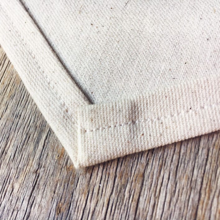
5 To hem the edge of a piece of fabric, simply fold the edge once, then again, and stitch through all layers.

6 Hem the top edge of the banner, stitching close to first fold to allow a narrow sleeve for the wooden dowel to slide through.
A QUICK EMBROIDERY PRIMER
Embroidery is a beautiful means of hand embellishing the surface of a fabric: I like to think of it as drawing with thread. Though some consider it a tedious task, I find the practice of embroidery to be incredibly relaxing and meditative. It’s easy and convenient to carry a work-in-progress around with you to pick up whenever you have a free moment.
Here are three different stitches that can be used to embellish fabric.

Running stitch: small, even stitches that run in and out of the cloth, and which appear like a dotted line; running stitches grouped together to fill a background are called seed stitches.

Split stitch: a chain stitch in which the needle is brought back through the previous stitch; it appears like an unbroken line

Satin stitch: long, straight stitches that are made parallel and close together to fill a space

7 To prepare your wall hanging for hand embellishment, place it in the embroidery hoop. The hoop is made of two circles, a smaller one fitting inside a slightly larger one with a clamp. Place the small hoop underneath the fabric and the larger hoop on top, sandwiching the fabric between the hoops. Gently pull the fabric taut like a drum and tighten the clamp to hold it in place.

8 I began my stitching with a satin stitch in the outer ring of the design, filling in the empty space with parallel stitches in an array of colors.

9 I added longer-length satin stitches to fill in the center of the the floral pods (gold thread). A series of running stitches grouped together make up the seed stitch, and is used for background filling.

10 Reposition the hoop as necessary according to the needs of your design.

11 When finished with the stitching, remove the fabric from the hoop and lay flat to iron out any wrinkles. Slide the 14" (35.5 cm) dowel through the sleeve you created when hemming the banner (store-bought canvas banners are usually already outfitted with hanging hardware). Use a length of jute, hemp, or any other sturdy string to tie around each end of the dowel for hanging.