CHAPTER 3
THE BASICS
The projects in this chapter will take you on a tour of foundational concepts of the relief printing process. Here you’ll learn how to:
![]() Achieve a variety of textures through the manipulation of your tools;
Achieve a variety of textures through the manipulation of your tools;
![]() Make a three-color print with three separate blocks;
Make a three-color print with three separate blocks;
![]() Make a three-color print with a single block;
Make a three-color print with a single block;
![]() Manipulate lines to render an object in three dimensions;
Manipulate lines to render an object in three dimensions;
![]() Use collage and hand painting to embellish a print;
Use collage and hand painting to embellish a print;
![]() Use text to print your own tiny book
Use text to print your own tiny book
In completing these projects, you’ll learn to do a bit of inverted thinking. Remember that relief printing is in essence a reductive or subtractive process—artists remove linoleum from the block to reveal the design (in contrast, hand building with clay is an additive process—where elements are gradually added to the form). Learning to think subtractively will help you plan better prints and execute more nuanced results.

PROJECT:
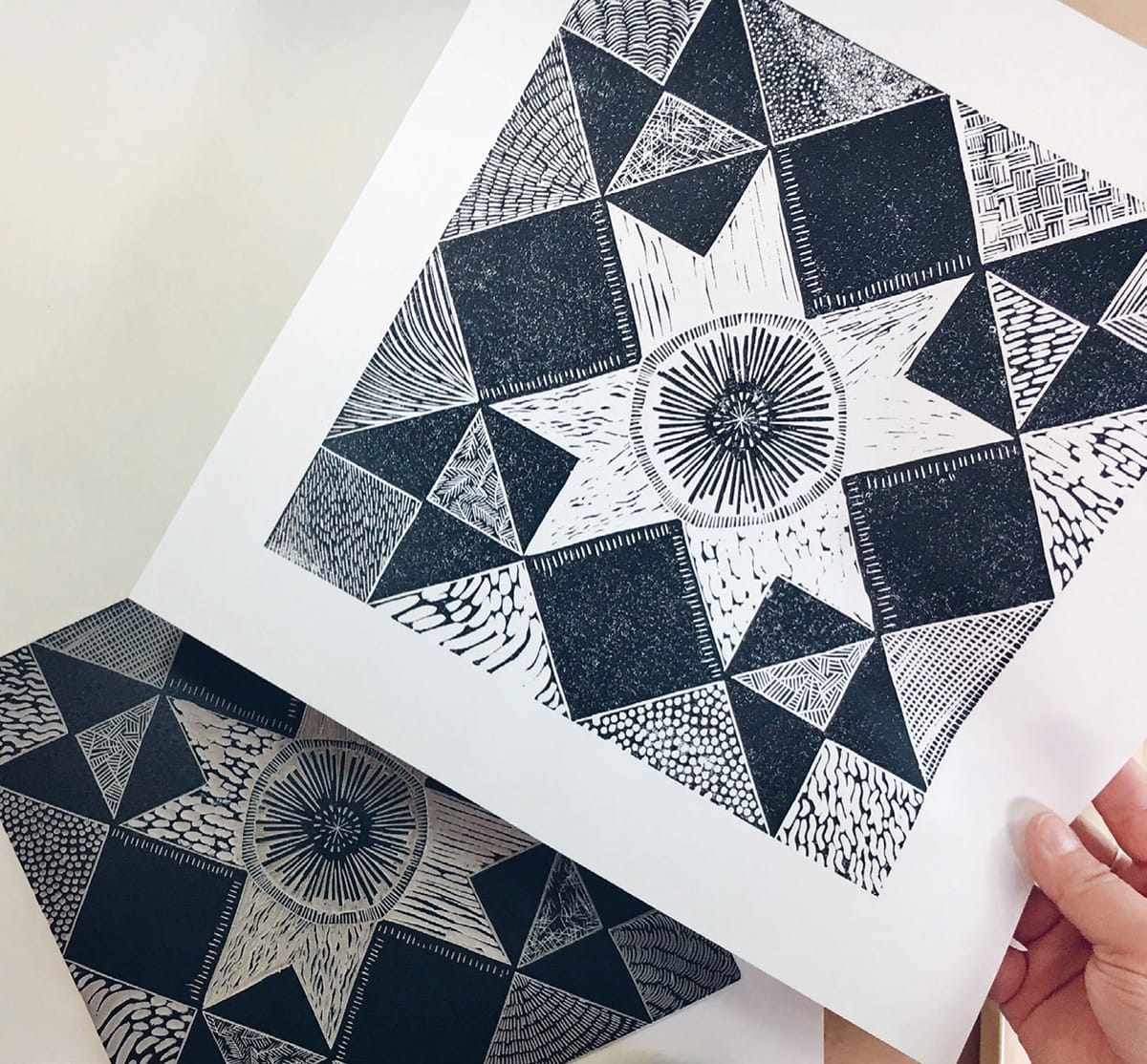
TEXTURE QUILT BLOCK
The best way to get to know your carving tools and the magic of wielding them is to dive right in! This classic moonlight star quilt pattern provides the perfect visual structure for experimenting with mark making, textures, and values all in the same project.
For this project, you will be attempting to use as many of your carving tools as possible to make as many different textures and values as possible.
This will involve experimenting with:
![]() The shapes made by each of your tools or blades
The shapes made by each of your tools or blades
![]() The depth of your blades in the linoleum
The depth of your blades in the linoleum
![]() The length of strokes
The length of strokes
![]() The direction of your strokes
The direction of your strokes
![]() The spacing of your marks
The spacing of your marks
![]() Whether cuts intersect or are parallel
Whether cuts intersect or are parallel
We won’t need to use any transfer techniques for this texture exploration, as we will be drawing directly onto the block. I recommend drawing the full design in pencil first, then going over your drawing with a permanent marker, so you can edit any mistakes.
Tools and Materials
9" x 9" (23 x 23 cm) unmounted linoleum
Pencil
Ruler
Permanent marker
Carving tools
Inking plate
Palette knife
Brayer
12" x 12" (30.5 x 30.5 cm) printing paper
Baren


1 Begin by making a 1 1/2" (4 cm) grid on the linoleum block. Using your ruler for precise measurements, make tick marks at 11/2" (4 cm) increments around the perimeter of the block.

2 Line up the marks on opposite edges with your ruler, using it as a guide to draw perpendicular lines across the block. You should end up with 36 squares measuring 1 1/2" (4 cm) each.

3 Locate the middle mark along each edge. Connect the four middle marks with the ruler to make a diamond shape.

4 Using these sequential images as a guide, complete drawing the moonlight star pattern on your grid. Color the given spaces black with the permanent marker. This will help you remember where to carve.


5 In order to visually anchor the design, you will not carve in the areas filled in with black. The goal is to fill the blank areas of the design with as many different marks, lines, and textures as possible, using as many of your tools as possible. Take a moment to consider all the ways you might manipulate your tools to create different effects.


6 Using a narrow V tool, carve around the inner border of each blank shape. This will help you keep your marks where you want them. Then fill in that same shape with a permanent marker. This will make it easier to see your marks as you carve.


7 Carve until all blank areas have been filled with texture. Treat the star in the center as a free space where you can create any pattern, texture, or design you like to make your print truly your own. If you decide that all that work simply wasn’t enough, you can embellish the black areas as well.
8 Use a draftsman duster to brush off all cuttings. A thorough job of this will mean a cleaner print down the road.

9 Shave a quarter-sized dollop of ink from your tin, and warm it up by spreading it on your inking plate with a palette knife.

10 Using the largest brayer you have to accomodate the block, roll out the ink on the inking plate until you achieve a nice even layer on your brayer.

11 Apply ink to your block by making several passes with the brayer, returning to the inkwell on your platen as needed. Take care not to overink and fill in any fine textures you may have carved. Pay close attention to the edges of the block, which can be easy to miss.
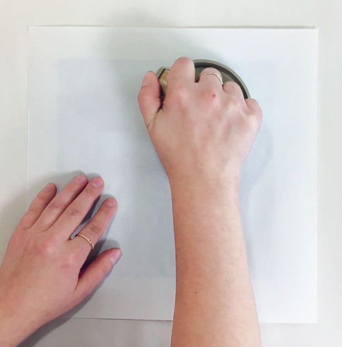
12 Place the paper of your choice (Blick Masterprinter Paper pictured here) over the block, securing it in place by lightly pressing down with your hand. Grip the handle of your baren tightly and rub the back of the paper, applying even pressure across the block. You may wish to further burnish the back of your paper with a wooden spoon to achieve more consistent blacks in the uncarved areas.
13 Carefully peel off the paper, and place in a safe area to dry.
TYPES OF LINES TO CONSIDER:
Straight lines
Curved lines
Swirling lines
Directional lines
Long lines
Short lines
Dots
Scratches
Hairy lines
Overlapping lines
Expressive lines
Lyrical lines
Parallel lines
Feathery lines
Jagged lines
Broken lines
Continuous lines
Woven lines
Marks far apart
Marks close together
Organized lines
Random lines
Wide lines
Thin lines
Unintentional lines

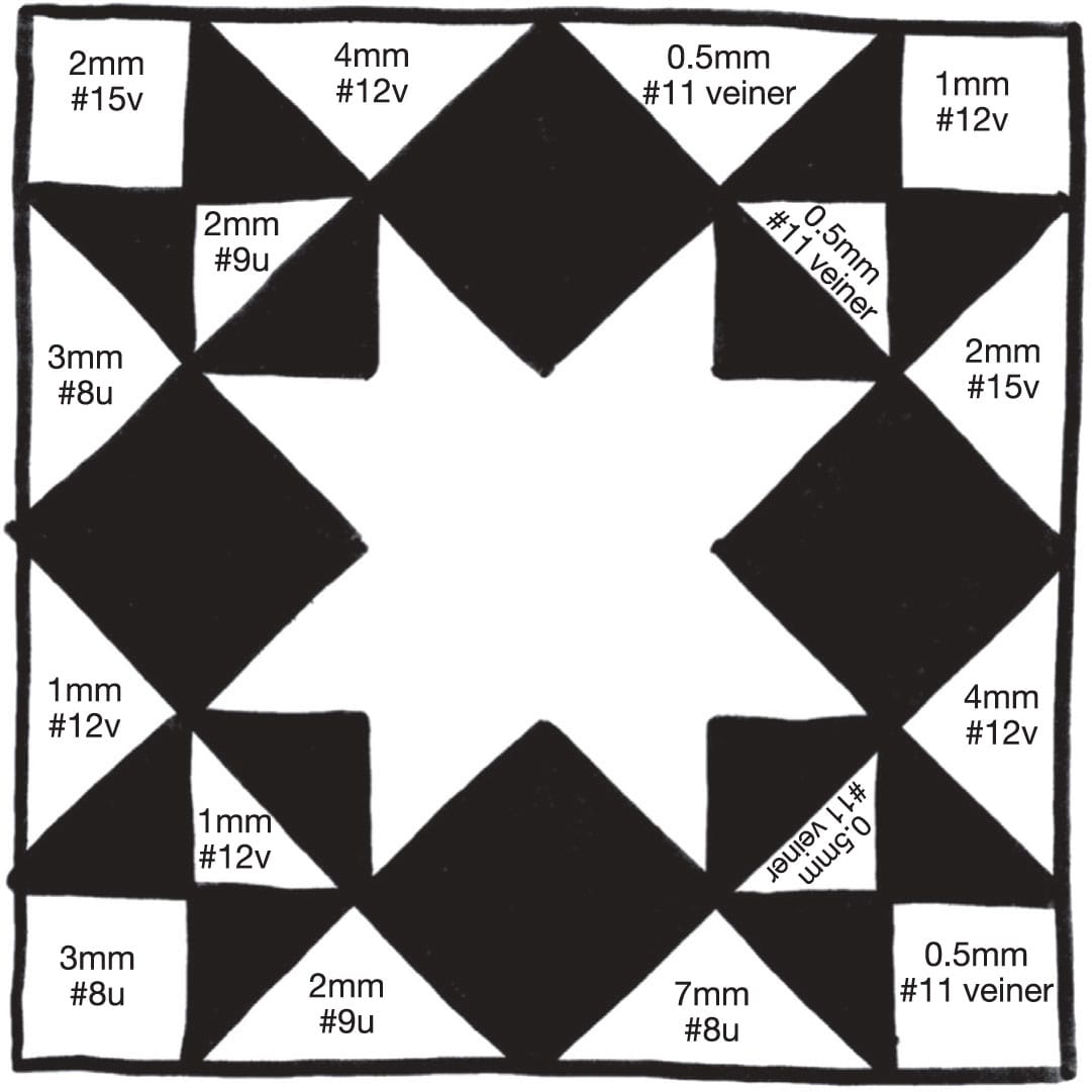
Mark Map: To recreate the marks I’ve made in the completed example above, refer to the map (below) to find out which tools were used to make what marks.
PROJECT:
MULTI-BLOCK HEX SIGN
Hex signs—also referred to as barn stars, but not to be confused with barn quilts—are a ubiquitous part of the rural Pennsylvania landscape, adorning the facades and gables of barns. These striking, perfectly balanced circular designs are part of a folk art tradition brought to the United States by the Pennsylvania Dutch, a group of German immigrants in the early 1700s. Employing either rotational symmetry or parallel (reflective) symmetry, contemporary hex signs often incorporate symbolic motifs: stars and rosettes for good luck, tulips for faith, wheat sheaves and rain drops for abundance, oak leaves for strength of character, and more.
Tools and Materials
Three pieces of 6" x 6" (15 x 15 cm) unmounted linoleum
Three pieces of 7 1/2" x 9 1/2" (19 x 24 cm) firm chipboard, or mat board
Wood glue
Hinged registration device
Pencil
Ruler
Permanent markers in various colors
At least two pieces of tracing paper
Drawing paper
Compass
Carving tools
Three color inks
Inking plate
Palette knife
Brayer(s)
9" x 12" (23 x 30.5 cm) printing paper
Baren
Masking/washi tape

For my hex sign, I used an eight-pointed rosette as the main element, adding in raindrops, a scalloped border, and watchful eyes. You can design your own, using symbols and colors that are meaningful or pleasing to you.
For this project, we will be using the multi-block technique, where the impressions from three separate blocks, each inked with a different color, will create a three-color print. Remember that you are welcome to experiment as you please with colors of your own choosing. Printing with multiple blocks can be a little bit tricky if it’s your first time, but be patient with yourself and diligent with your measurements, and together we can pull something clean! When it comes to multi-block printing, planning is everything, starting with the design.

1 First let’s get a bit of prep work out of the way: each piece of unmounted lino must be adhered to a piece of 7 1/2" x 9 1/2" (19 x 24 cm) board in order to work properly in the hinged registration device. I used chipboard, but you can use mat board or dense cardboard as well. Using a ruler, center your block on the chipboard (the more exact the measurements, the better), and glue it in place with wood glue. Place it under a heavy stack of books to ensure a full bond. Repeat with the remaining two blocks. Add a tab with masking tape at the bottom of each board to make it easier to remove from the device.

2 While you wait for your blocks to bond, plan your design. I usually begin with a simple line sketch, followed by a full-color sketch. Then I visually separate the colors so I can see how my blocks are supposed to look.

3 Now that you have your plan, make a clean, full-size line rendering of your design on drawing paper (we’ll call this the master drawing). I suggest using a ruler and a compass in order to make drafting a perfect circle easier. Be sure this design will fit on your 6" x 6" (15 x 15 cm) blocks.

4 According to the plan, the blue block has the most visual information, so this block will be the key block, which will serve as a guideline for the other colors. Lay a sheet of tracing paper on your drawing, taping it in place if desired. Carefully trace only the blue parts of the design. Mark the top of the design so you know which way is up—when transferring rotational designs, things can get confusing!
5 Grab one of the mounted blocks. Place a mark on the board to signify the top. Transfer your traced image onto the block (see Transfer Methods shown here). Lock the drawing in place with a permanent marker (you don’t have to color in with the marker, you can just draw in the lines).

6 Carve out the negative space.

7 Now we will use the carved key block to transfer the design onto the remaining blocks. Grab the hinged registration device. Firmly tape a clean sheet of tracing paper to the window.
8 Open the window of the registration device and set the key block into the jig, ensuring that it fits snugly in place and does not move.

9 Roll out just a little bit of a light-colored ink and ink up the key block. (I used a dark blue ink, which stained the blocks; lighter inks are easier to remove.)

10 Close the window. Using a baren, gently press and rub the back of the tracing paper until you see the ink transferring. You may find that you need to use a spoon to extract fine details.

11 Now you will transfer the design from the first block onto the second block. Open the window and remove the key block. Replace it with the second mounted block, marking the top.
12 Close the window and rub the back of the tracing paper again, transferring the design back onto the block.

13 Open the window, remove the second block, and set it aside to dry. Repeat step 12 with the final block, marking the top. Set aside to dry. (I let them dry overnight.)
14 Clean excess ink off the key block and set it aside to dry. Remove the printed tracing paper from the window and discard.

15 Take the now-dry second block. This will be the yellow block. Using the transferred image on the block as a guide, draw in the yellow elements freehand. Alternatively, you can return to your master drawing, trace the yellow elements, and then transfer them that way. You won’t have to worry about cleaning the ink off of this block, because you’ll be carving most of the already-inked bits away.
16 Carve away all the negative space—everything except what you want to print yellow. Set the carved block aside after labeling it.

17 Take the final block and draw in all the pink elements.
18 Carve away all the negative space—everything except what you want to print pink. Label the block.
19 Take a clean sheet of printing paper and line it up using the guideline at the top of the closed window of the registration device. Tape it into place.

20 Using a sharp pencil, mark the top of the paper and then make registration marks around the perimeter, using the guidelines on the window. These lines will help you put your paper in the exact same place every time.

21 When printing with multiple colors, it’s best practice to always start with the lightest color first, and then build up to darker colors last. Begin with the pink block. Open the window on the registration device and place it securely within the jig.

22 Mix your inks with a palette knife on your inking plate to get the color you want. To achieve the peachy-pink pictured here, I mixed Caligo Safe Wash Relief Inks in light orange, rubine red, and opaque white.

23 Roll out a small amount of pink ink and apply it to the block with your brayer. Clean up any stray ink with a cotton swab or rag.

24 Close the window. Carefully press the back of the paper with your baren, taking care not to press too hard, lest you tear the paper on a sharp carved edge.

25 You can lift the window to see whether your ink is transferring evenly onto the paper. If it’s not, simply close the window and press again, increasing pressure with your baren or burnishing with a spoon. Once you’ve printed the pink block successfully, open the window and take it out of the jig.
26 Normally I wait 2 to 3 days between printing different layers of color to allow the ink to dry, but since the pink and yellow elements don’t touch in this design, I can print them both in the same session. That means we can leave the paper in the window. Place the yellow block in the jig.

27 Roll out the ink and apply it to the yellow block with a clean brayer.

28 Close the window and press with your baren, printing the yellow block. Now you have both the pink and yellow blocks printed on the same sheet of paper.

29 If you were to print an edition of your own original design, you’d repeat steps 19 through 28 for as many prints as you like. If you are pulling just one print, you can leave the paper in the registration device to dry overnight. Clean up your workstation and tools, and save any excess ink in small, airtight containers.

30 When the print has sufficiently dried (no longer tacky to the touch and your finger comes away clean) it’s time to print the final layer—the key block! Mix the color you’d like to use with a palette knife on your inking plate. I used phthalo blue, black, and opaque white to achieve the smoky navy blue pictured here. Roll out the ink with a brayer and apply it to the block, cleaning up any stray ink.

31 Ensure that the paper is still lined up with the registration marks. Place the block in the jig and close the window.

32 Using a baren, press the back of the paper and print the key block, opening it to check that you’ve hit all areas of the design.
33 Congratulations! Now you have a tightly registered, three-color multi-block hex sign print!
PROJECT:
REDUCTION CUT SUNFLOWERS
In this project, we explore the reduction cut—a method of color printing in which you use the same block over and over, carving more away with each new layer of color. Flowers have been an enduring subject for artists, and their wide range of colors and shapes make them great for study when it comes to reduction cuts.
Tools and Materials
4" x 8" (10 x 20 cm) unmounted linoleum
Pencil
Colored pencils
Ruler
Permanent marker
Tracing paper
Carving tools
Pin-and-tab registration device (see here)
Tabs
Washi/masking tape
Inking plate
Three colors of ink
Palette knife
Brayer
9" x 12" (23 x 30.5 cm) printing papers
Baren


1 Before we begin drafting the block, let’s prepare our printing materials. First, we need to add a custom jig to the pin-and-tab registration device (see here). I knew that I wanted the block relatively centered within the printing paper, so with a pencil I drew two guidelines on the registration device to center the block vertically. Then I eyeballed it so the block would fall between the pins, thus centering the block horizontally.

2 Place a heavy object (I used a stone) on the block to keep it from scooting out of position. Take two strips of mat board, chipboard, or cardboard and position them perpendicular to one another to form a 90-degree angle. Tape these strips firmly into place at the bottom left-hand corner of the block.
3 Now that the jig is ready, the paper must be prepared. Cut or tear paper to 9" x 12" (23 x 30.5 cm). Take a sheet of paper and lay it on the registration device. Line up the top edge of the paper by placing it flush against the raised strip (the bit of board to which the tabs are taped). Once the paper is aligned, attach two tabs to the pins, which will then overlap the top edge of the paper. Tape the tabs into place. Repeat this process for the rest of the papers (as always, the edition size is up to you). These tabs will remain attached to your papers until you’ve printed the third and final color.
AN IMPORTANT NOTE ON TAPES
Test your tapes and how they adhere to your papers before you actually tape the tabs into place. The washi tape used in these photos pulled cleanly off the Blick printmaking papers, but tore the more fibrous kozo paper. Some printmakers prefer painter’s tape, but I find that sometimes it loses its stickiness too quickly. You may need to do a little trial and error beforehand. It would be super sad to ruin a perfect print by accidentally tearing the paper when removing the tabs! (However if this does happen, you can use the print in one of the projects in Chapter 5: Waste Not.)

4 Sketch your design and then do a final line drawing. Use colored pencils to plan where you want your colors.

5 Tape a piece of tracing paper over your drawing and carefully trace the design with a sharp, soft graphite pencil.

6 Flip the tracing paper onto the block and tape it in place. Trace only the outline of your design. Lock the drawing into place with a fine-point permanent marker.
7 Carve out the negative space. This will give your image a clean, blank background.

8 As always, we start with printing the lightest color first, in this case the yellow. (To make a happy, sunshiny yellow, I mixed Caligo SafeWash Relief inks in diarylide yellow and opaque white.) Mix and spread the ink with a palette knife on your inking plate.

9 Roll out the ink and apply it to your block. Take care to wipe off any wayward ink.

10 Set the block into the pin-and-tab registration device, making sure that it is firmly tucked into the corner of the jig.
11 Fit a tabbed piece of printing paper into the pins and carefully lay down the paper. Press firmly on the back of the paper with a baren, taking care to hit every area of the block.

12 Peel up the paper to check that all areas of the block are transferring evenly. Use a firmer baren such as a spoon to coax out stubborn details. This is also a good time to recheck your design. (At this point, I realized that I wanted the veins in the leaves to read as white lines, so I went back and carved them.)

13 Set the print aside to dry and repeat steps 9–12 as often as your edition size calls for. Even when mixing in cobalt drier to speed up drying time, I still like to allow three days in between layers to ensure that the ink dries completely. Printing wet ink onto wet ink can cause a loss of detail and inconsistent, blotchy color.
14 Clean excess ink from the block by first blotting with scrap paper and then wiping the block down. Highly pigmented inks often stain the block, but as long as the block is thoroughly cleaned, these stains will not transfer.

15 Using the traced image from step 5, line up the image with your carved block and transfer the details. Everything that you carve away now will remain yellow on the print. Carve out everything that you want to remain yellow. For this design, you will be mostly carving out the petals of the flowers.

16 Now that you’ve carved the second pass, it’s time to print orange (I used light orange, diarylide yellow, and opaque white to achieve this color). Roll out the ink, apply to the block, and place the block in the jig.

17 You will be printing directly on top of the previous, now-dry yellow layer. Print the orange block and repeat as per your edition size. Set the prints aside to dry.

18 Clean excess ink from the block by first blotting with scrap paper and then wiping the block down.

19 Time to carve for the third and final time. Cut away the portions of the block that you want to remain orange. Everything you leave on the block after this will print black. So for this design, carve out everything except the outline.

20 With the final pass carved, roll out the black ink and apply it to the block. You will be printing directly on top of previous, now-dry yellow and orange layers. Print the black block and repeat as per your edition size. Set aside to dry.

You can try printing on colored paper too!
21 Clean your block, workspace, and tools.
22 When the final layer has completely dried, carefully peel the tape and tabs off your prints.
AN IMPORTANT NOTE ABOUT REDUCTION CUT PRINTS
With reduction prints you will only ever be able to do a single, limited-edition run. Because you use the same piece of substrate for each block, you essentially destroy the first block in order to make the second—and then destroy the second in order to make the third, and so on.
ARTIST SPOTLIGHT:
DERRICK RILEY
My life changed forever when, as a senior at the University of Kentucky, I took my very first printmaking class, beginning woodcut, with Derrick Riley. An MFA and member of the Kentucky Division of the famed Outlaw Printmakers, Riley has been operating his own press since 2005, churning out epic-scale narrative prints that celebrate the strangest of Kentucky folklore, randy robots, and curious creature mashups. He’s known for his bold, graphic style and finely detailed renderings of form.

Cyclopian Gorilla
EH: How did you first become interested in printmaking?
DR: I was a drawing major as an undergrad, and a printmaking course was required for my degree. During the course, in 2000, there was a Joel Feldman retrospective at the university museum. The exhibition had these gigantic banner style black and white woodcuts of Aesop’s Fables that were amazing. Until that time I had never realized that a print could be that large. After that I was hooked.
EH: What drew you to relief in particular?
DR: Several things initially drew me into relief printmaking. First of all, playing with knives all day is pretty awesome. And I was intrigued with how the visual power of a limited palette—and the stark contrast of white and black—is far greater than a full palette. I also happen to be very heavy handed, and the resistance provided by a block of wood or linoleum keeps my heavy hand in check.
EH: How would you describe your work and process?
DR: I start each block by drawing my imagery, first in pencil then again in Sharpie. I meticulously draw each detail until it’s exactly how I want the print to look in the end. I stain the block red so that I’ll be able to see where I’ve carved and where I haven’t—then I start carving. My work is very intricate and tedious. It’s not uncommon for me to work on a block continuously for 6 months at a time.
EH: How do you stay creative on a day-to-day basis?
DR: I give myself strict goals and deadlines, and I stick to them. Many times I find myself telling a friend that I can’t do something because I have to finish a block, When they ask what the block is for, I don’t have an answer for them, there isn’t a deadline, it’s not specifically for anything, but I can still feel the need and drive to finish it.
EH: Describe the space in which you make your art.
DR: I have an amazing basement studio in my home, and I am super proud of it. It’s fully stocked with everything I need to produce woodcuts, linoleum cuts, and silk screens. I have a motorized etching press as well as a letterpress proofing press that I print my relief prints on, a full size drying rack, a guillotine style paper cutter capable of cutting over 200 sheets of paper at a time, a vacuum table, a silk screen exposing unit, and t-shirt press for silkscreen. I literally don’t have to leave the house to make my art.
EH: Name one thing you hate about printmaking and one thing you love about it.
DR: There are five emotional stages to making a relief print.
1. The excitement of starting a fresh block
2. The agony of being so close but yet so far from finishing carving the block
3. The anticipation of pulling the first print
4. The depression of seeing everything backward for the first time
5. Acceptance and moving on
EH: Do you have any helpful tricks or hacks'' that you've picked up along the way?
DR: It’s very easy to overwork a relief print. Taking frequent breaks is important, not only for health reasons, but also as a visual reset. Plan your block completely, leaving nothing to “figure out later.” Rushing into a block is the quickest route to making mistakes.
Even when working with a black and white relief print, there are many grays that can be achieved through carving patterns, hatches, and cross hatches. These hatches and cross hatches will give the print depth. It’s important to give the print enough contrast to make the grays stand out. I’ve found that a balanced print can have at least 20% solid black, 20% solid white, and up to 60% grays. Without enough solid black and white the grays wash out and turn flat.

Tunacorn
EH: What is your favorite piece that you've ever made?
DR: For three years I worked on a series of woodcuts about Kentucky monsters, myths, and legends. It’s a 14-piece series of interconnected prints that can be completely rearranged and still line up edge to edge. All together it measures 32 1/2 feet (9.9 m) long.

EH: What's one piece of advice you'd give to someone new to printmaking?
DR: I’ll give them two. First of all, don’t get discouraged, you have 100 terrible prints in you. The quicker you get them out of the way, the sooner you can make something special.
And the other one is practical: Keep everything clean all the time. Trying to make clean prints in a dirty shop is a nightmare. I always preclean all my palette knives, rollers, roll up slabs, the press, and especially my hands before I print.

Derrick Riley in his studio

Jackalope
Visit Derrick at www.drockpress.com
His work can be seen at: Revelry Gallery (Louisville, Kentucky); Brickaloge Art Collective (Paducah, Kentucky); City Gallery (Lexington, Kentucky); Gather (Bloomington, Indiana); Conspire (Greencastle, Indiana)
PROJECT:
CONTOUR LINE SKULL
Contour lines are lines that suggest the form of an object. These lines can be used to show any planar changes within the form.
In diagram 1, you can see how the simple addition of straight lines and then curved lines transform a flat circular shape into a three-dimensional spherical form.
Diagram 2 breaks down the contour lines of a sphere. To see how contour lines suggest volume, start by quartering a circle, then draw lines that bend by varying degrees the farther away from the center line they are.
For a brilliant example, see these contour lines by the master Albrecht Dürer in this self-portrait woodcut from 1527.
Tools and Materials
8" x 8" (20.5 x 20.5 cm) unmounted linoleum
10" x 10" (25 x 25 cm) printing papers
Pencil
Fine-tip permanent marker
Tracing paper
Carving tools
Washi/masking tape
Inking plate
Black ink
Palette knife
Brayer
Baren

Albrecht Dürer, aged 56, German School, 1527
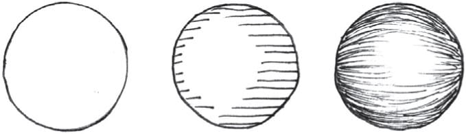
Diagram 1

Diagram 2

2 Lock in the lines with a fine-point marker.

3 Carefully carve out the negative space.
4 Carve out the floral details.

a. Carve out a center line on the leaf.
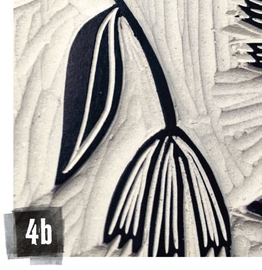
b. Carve an inner border line on one side of the leaf.

c. Beginning at the center line and sloping downward and to the left, carve vein lines for the left side of the leaf, stopping just before the edge.

d. Beginning at the inner border line and sloping upward toward the center line, carve vein lines for the right side of the leaf.

Here is the fully carved out floral background.
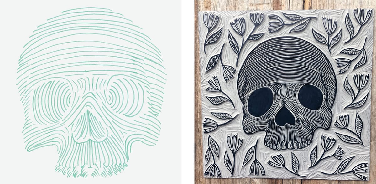

5 Using the contour line guide, lightly draw contour lines across the skull with a pencil. Begin carving out lines that follow the contours of the skull, using a smaller gouge—I used my 1-mm V-parting tool.

6 Continue until the skull is covered in thin contour lines.

7 Take a second pass at carving, this time with a bigger tool. Here I used my 4-mm no. 12 V-parting tool. Concentrate your marks on the apexes of curved areas (the spots that stick out the most, like the forehead and cheekbones). This will help lighten the value in these areas, making them appear to move forward or appear closer to the viewer.

8 Continue carving until you’ve achieved a range of values within your form (dark blacks, medium grays, and light whites).
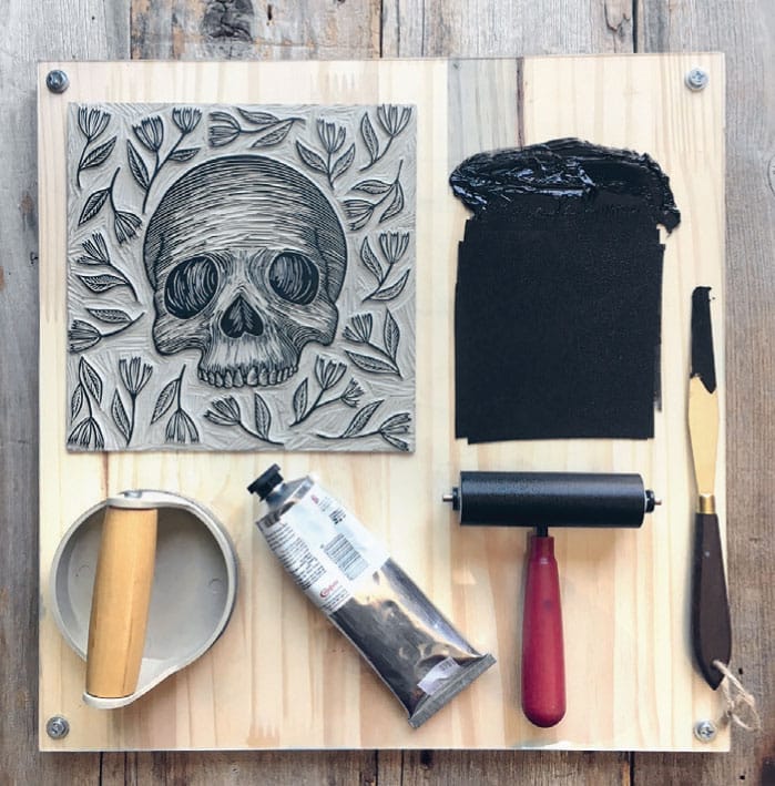
9 Assemble your printing tools and roll out your ink.

10 Make a simple printing jig by tracing the block as well as a piece of the 10" x 10" (25 x 25 cm) printing paper on a larger piece of paper. This will help the print fall roughly in the same spot for each print of the edition.

11 After inking the block, apply paper to the block and press firmly with a baren, burnishing areas with a firmer baren such as a spoon, if necessary.

12 Carefully peel the paper back from the block.

13 Set your print aside to dry.
ARTIST SPOTLIGHT:
KELLI MACCONNELL
A fearless experimenter, student of the natural world, and talented printmaker, Kelli MacConnell of Portland, Oregon, creates intimate portraits of some of nature’s finest specimens. MacConnell’s masterful rendering of trees gives them a life beyond the forest, stately and regal, worthy of reverence. Her prints evoke the peace of the natural world and suggest a thoughtful, studied approach, reminding us that direct observation is often one of the best teachers.


EH: How did you become interested in printmaking?
KM: Art has been a love of mine for as long as I can remember. My focus for many years was landscape drawing and painting, and it actually wasn’t until my third year in college that I discovered printmaking. I took an intro to etching class and unexpectedly found that printmaking felt like the perfect mix of drawing, painting, and sculpture, which was very exciting to me. I felt like I had opened a door to a new world where there was the possibility to explore the true spontaneity of artmaking. In a lot of ways printmaking is a very calculated operation, but inevitably there is a degree of uncertainty because of the process of transferring ink to paper. I never really know exactly how a piece will look until it is printed. I absolutely love the mystery, suspense, and surprise that awaits me after finishing a carved block.

EH: What drew you to relief in particular?
KM: I find I can achieve the graphic images that I set out to create by making linocuts. The color fields of the linocut are rich and uninterrupted by the grain of the wood for example. I’m drawn to the crisp, velvety nature of relief prints.

Also this act of drawing with light, in a sense, holds an innate graphic power that I absolutely love. The idea of taking away to create instead of adding to something has intrigued me from the beginning. In this type of printmaking, shapes are formed by enforcing white or light in the image with carving tools. It's in taking away material from around and within a design that an image will begin to form. This process forces me to deconstruct and abstract the landscape that I’m working from. For me this is a much more challenging undertaking than drawing an image with graphite, for example. I like having to think carefully about mark making in order to portray texture, depth, shadow, fluidity, and softness with a hard line while simultaneously honoring the balance of lights and darks (because I work mainly in black and white) in each composition.
I find it is a sculptural way to make two-dimensional artwork. It’s meditative and so satisfying to watch the image come to life in a three-dimensional form on the block. Some may find hours of carving with tiny knives and gouges mundane and tedious, but I find it to be an extremely calming and therapeutic practice. I feel I’m drawn to this process almost on a subconscious level. The familiarity of picking up the tools is calming and comforting. Spending time using these tools to shape and create something makes me feel like I’m spending time in a tucked-away oasis where I can find a flow and focus, a place that heightens my senses while clearing my mind. The tools become an unconscious extension of myself. When I am deep in this place [where] the craft of cutting/carving happens I lose myself to the intuitive energy that emerges from the emotion and creativity from within.
I also enjoy the process and repeated pattern of movement when creating multiples. I find this step of the process calming and contemplative as well. It is in this rhythm that I notice the beauty and subtleties of each print. Making them their own entity and giving them each their own personality.
EH: How would you describe your work and/or your process?
KM: I would describe my work as graphic, nature-inspired impressions of the wilderness. Creating these pieces brings me joy, and I hope connects others to the natural world as well. I hope that these prints are little reminders of what lies beyond our buildings, windows, phones, computers.
I feel like so many of us have become disconnected from the natural world, and forget that our health is affected by this. I believe contact with nature improves our physical, mental, and emotional well-being. People need to reconnect to the wilderness around them, and it is then that they will feel fulfilled. It is then that they will live a more satisfying life and feel content, and hopefully in turn this will lead to stewardship of the land and the world’s wilderness areas.
My current body of work explores human relationship with trees and their form through relief printmaking. I have created my own interpretations of the species that move me in hopes that they will enchant the viewer and evoke feelings of nostalgia, wonder, and peace. This medium allows me to carve away the unessential and use creative subtraction to form a delicate dance between negative and positive space, designing an image and place for contemplation and reflection. With the simple use of contrast, as well as line manipulation, I strive to create absorbing compositions inspired by the West Coast forests.
My process of transforming my experience into a print involves reversing the image from my sketches onto the relief surface, then carving away the negative space or the areas I would like white. After the block is complete, I roll a thin layer of ink onto the block with a brayer, gently place damp cotton-rag paper on the inked surface of the block, and roll it through a press to transfer the image onto the paper or make an impression of the image onto the paper. I usually publish editions of 20–100 prints.

Kelli MacConnell's Giant Redwood and Vertical Tree Series for the Ford Gallery
EH: Sometimes we have a love/hate relationship with our passions. Name one thing you hate about printmaking and one thing you love about it.
KM: One of the things I find frustrating about printmaking is that occasionally I feel like the process and the steps I’m taking to create a print are the same as I’ve done before, yet I don’t get the outcome I had planned or predicted; this is actually exactly the same thing I love so much about printmaking. In the same breath, I love the unexpected surprises that happen when printing that I can learn from. I suppose it depends on if I’m excited about that surprise outcome or not!

MacConnell's Juniper carving block
Visit Kelli at www.kellimacconnell.com.
PROJECT:
DRESS UP
Sometimes when designing a new print, I want just a little pop of color to really make my composition shine. Such small areas of color rarely warrant their own block, so that’s when I like to apply color by hand. This project details how hand painting and collage can enhance an otherwise simple black ink print.
Note: It’s generally best to use a sturdier, thicker paper as the “support” paper, collaging thinner papers onto it. For this project, I printed on heavyweight tagboard and the collage elements are printed on a lighter, textured coral scrapbooking paper.
Tools and Materials
10" x 10" (25 x 25 cm) unmounted linoleum
12" x 12" (30.5 x 30.5 cm) printing papers
Additional colored paper
Tracing paper
Pencil
Fine-point permanent marker
Carving tools
Washi/masking tape
Inking plate
Palette knife
Brayer
Baren
Adhesive
Gouache or watercolor paint and palette
Water cup and towel
Small paintbrush
Craft knife
Self-healing mat

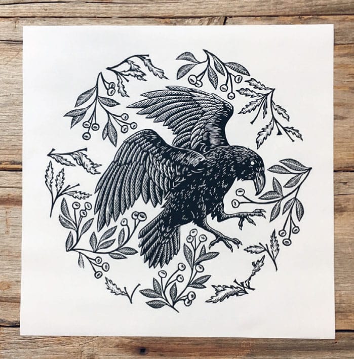
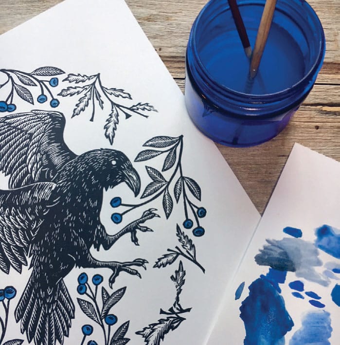
1 Design and plan your print, noting which areas of the print will recieve color via paint or collage. Because this design features a black raven in the center, I plan to apply color in the floral background—hand painting the blueberries and collaging the flower buds.

2 Transfer your design onto the block using the method of your choice, and lock the drawing into place with a fine-point permanent marker.

3 Begin carving the background, protecting small details by first carving outlines with a small V gouge (I used the Pfeil 1-mm no. 12 V-parting tool) and then clearing the negative space.

4 After clearing the negative space, start on the florals. Notice that the flower buds have disappeared from the composition. They will be printed separately on different paper.

5 On the body of the raven, highlight the contours of the feathers using intentional, directional lines. A straight line can suggests a flat plane, and a curved line suggests a curved plane (use the knowledge you gained from the Contour Line Skull project shown here). It can be helpful to go over your carved areas with a thick permanent marker to check your work and get a sense of how the block will look when it prints.

6 Using small, short strokes with a 1-mm V-parting tool, carve the suggestion of the raven’s body feathers. This will make it appear as if the feathers are catching light, and gives the form a more definite sense of volume. Once the block is fully carved, set it aside.
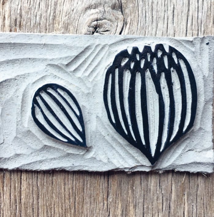
7 The design calls for eight bigger flowers and seven little buds. Transfer the designs for the bigger flower and little bud onto a scrap piece of unmounted linoleum and carve them (since they repeat in the composition, you only need one of each). Now we’re ready to print!
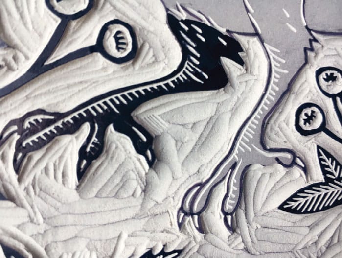
Carve the raven’s talons

8 Set up a simple printing jig using a large sheet of paper or a scrap piece of cardboard. Trace a template for your printing paper (12" x 12" [30.5 x 30.5 cm] square). Position the block in the center and trace around it.

9 Since the design is circular, I've indicated the top in order to give each print in the edition exactly the same orientation. Make a mark at the top of your block with a permanent marker, and extend that mark off of the block and onto the printing jig. Each time you lay the block down, make sure these marks line up.

10 Spread a small amount of black ink onto your inking plate and roll out. Apply to the block.

11 Carefully lay a sheet of printing paper onto the block and press with a baren, coaxing out fine details using a firmer baren or spoon if necessary.

12 Gently peel the print back from the block to check for any areas you may have missed. Set the completed print aside to dry.
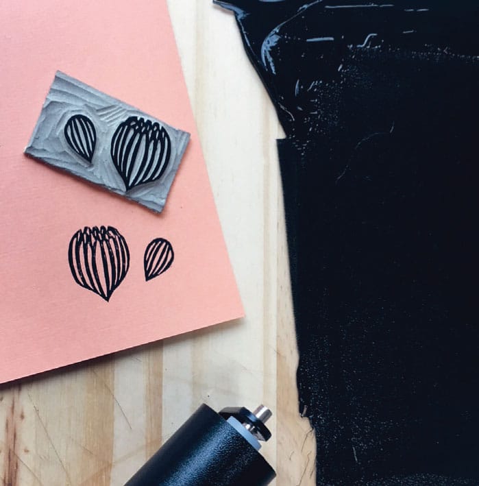
13 Take the small flower block and apply ink. You might want to use a smaller brayer for this one, unless you don’t mind a mess!

14 Remove excess ink from your blocks and clean all your tools and surfaces. Let your prints dry before moving on to the next steps.
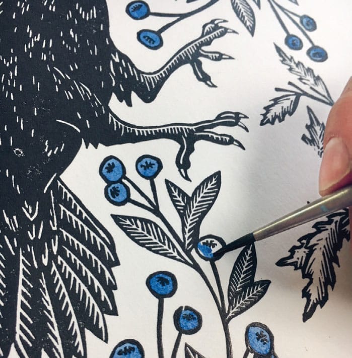
15 We can begin embellishing the now-dry prints, starting with paint. Mix paints with a brush on a palette until you get your desired color. I recommend using watercolor or gouache and testing the paints on a scrap piece of paper before you begin painting on your prints. Taking care not to overload your brush with too much paint or water, carefully paint in each blueberry. If you printed with an oil-based ink, you’ll notice how the paint naturally resists the ink, making it a little bit easier to stay inside the lines. Once the painting is complete, clean your materials and set the print aside to dry.

16 Using a craft knife and self-healing mat or other cutting surface, carefully cut out eight big flowers and seven little buds. It is important to be aware of the blade at all times, never pulling it directly toward your body. Replace the cap when not in use.

17 Refer to the original drawing as a map to show you where to place the flowers. Apply adhesive to the back of each flower, position it on the print, and press it with your (clean) finger or with the (clean) rubber end of your pencil. Repeat for each flower and bud. Once each has been applied, place the print under a heavy stack of books to keep it from warping as the adhesive sets.
18 Repeat as per the size of your edition.
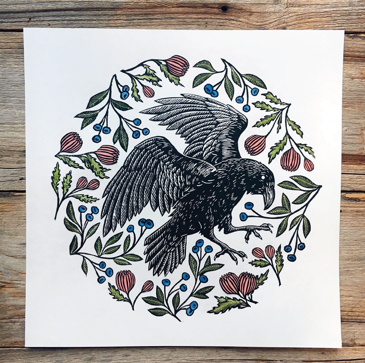
The final product, a bit spiffed up
PROJECT:
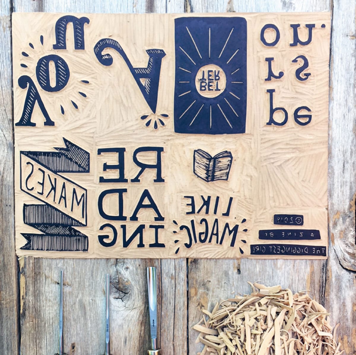
ONE-PAGE POCKET ZINE
Perhaps the greatest legacy of printmaking is its role in democratizing knowledge. The advent of Johannes Gutenberg’s movable type press in 1436 allowed for faster production of printed materials in Europe; books became more widely available and the working classes gained literacy. Given this history, we would be remiss to leave out text in our linoleum prints.
Part of the appeal of printmaking is the potential for nearly limitless multiples, so it’s the perfect medium for creating your very own zine to distribute. A zine is a self-published, small-circulation book or magazine that is usually photocopied and hand bound. For this project, you’ll be making your very own hand-bound and hand-printed zine out of one standard U.S. letter size (or A4) sheet of paper.
Tools and Materials
8 1/2" x 11" (21.5 x 28 cm) unmounted linoleum
Drawing paper
Tracing paper
Pencil
Washi/masking tape
Carving tools
Ink
Brayer
Inking plate
Palette knife
Baren
Scissors

Zines originally emerged as science-fiction-fan magazines in the 1930s, picking up in popularity again with the rise of Star Trek, but then quickly spread to the music scene. The proliferation of copy shops in the 1970s and 1980s along with DIY aesthetic of punk music caused the creating and trading of zines to expand because of quicker and cheaper distribution. Zines today vary a great deal in size, style and content.
Make a Plan
Decide what you want your zine to be about, and then start designing and planning each page. Keep in mind that we’re only going to have six usable “content” pages—you will have eight pages in total, but two of those are the front and back covers. Each page will end up measuring 4 1/4" x 2 3/4" (10.8 x 7 cm) and will be oriented portrait.
Having trouble thinking of an idea? Here are some potential titles to get your brain churning.
Things I Know for Sure
A Simple Recipe
A 6-Line Poem About Hope
A 6-Word Poem About Breakups
A Word of Advice
A Letter to My Haters
Things I Love About You
What I Wish I’d Said
How to Make Friends with a Baby
Lies I’ve Told
A List of Favorite Foods
A Public Service Announcement
Things My Dog Would Say

Illustration 1
1 Grab a piece of 8 1/2" x 11" (21.5 x 28 cm) paper. Fold lengthwise once (like a hotdog bun), once again widthwise (like a hamburger bun), and then (hamburger) once again, as in illustration 1.
Unfold the paper. You should have eight equal rectangles measuring 4 1/4" x 2 3/4" (11 x 7 cm).
Orienting the paper in the landscape direction, label your covers and pages as in illustration 2 .The rectangles on the top half of the sheet will be upside down, and the rectangles on the bottom will be right side up.

Illustration 2
2 Transfer your drawing to your block with the method of your choice (see Transfer Methods, shown here).

3 Double check that your text as it appears on the block reads backward, then ink in your block with a permanent marker.
5 Spread out about a quarter-sized dollop of ink onto your plate. Add a drop of cobalt drier, if desired. Warm up the ink or mix in the cobalt drier by spreading it around with a palette knife. Roll out to an even consistency with the brayer.
6 Carefully roll ink onto the block, taking care not to hit large areas of negative space with the brayer.
7 Line up the edge of your block with the edge of your paper and press the paper firmly to the block. With the block on bottom and paper on top, hold the paper in place while applying firm, even pressure with a baren.

8 Set the baren aside and carefully peel the paper away from the block. Set the paper aside to dry.
9 Print as many as desired, clean all materials, and set the prints aside to dry.

10 Once all pages are completely dry, you can assemble them into booklets. Just as you did with your original sketch paper following illustration 1, fold the paper in half lengthwise (hotdog).


11 Fold it in half again widthwise (hamburger).

12 Fold it in half once more and open the paper back up.


13 Fold the paper in half widthwise, and with a pair of scissors carefully cut only along the fold between the middle pages. Don’t cut your paper in half!


14 Open the paper back up and refold it lengthwise, with the printed side of the paper facing out.

15 Pinching the ends of the paper together, push your hands together to make the cut open up and the middle pages pop out.


17 Fold shut, ensuring that your covers are on the outside

18 Repeat for all prints, and then congratulate yourself. You’ve just self-published your own zine!