Taking advantage of different types of lights in Blender
Setting up effective lighting
Changing the look of your scene with background images, colors, and ambient occlusion
In terms of getting the work you've created in Blender out to a finalized still image or animation, having your scene's environment and lighting set up properly is incredibly important. It goes along hand-in-hand with setting up materials on your object (covered in Chapter 7) as well as the rendering process (covered in Chapter 14). Without light, the camera — and by extension, the renderer — can't see a thing. You could create the most awesome 3D model or animation in the world, but if it's poorly lit, it won't look good.
This chapter covers the types of lights available to you in Blender and details some of the best practices to use them in your scenes. In addition to lighting details, I go into setting up the environment in your scene with the settings in the World buttons. In many ways, these things are what give your scenes that final polish that make them look good.
Lighting has an incredible amount of power to convey your scene to the viewer. Harsh, stark lighting can give you a dramatic "film noir" look. Low-angle lights with long shadows can give you a creepy horror movie feeling, whereas brighter high-angle lights can make things look like they are taking place during a beautiful summer day. Or, you can use a bluish light that projects a hard noise cloud texture and make your scene feel like it's happening under water.
Equally important is setting up your environment. Depending on how you set it up, you can achieve a variety of looks. You can set your scene in an infinitely large white space, commonly known as "the white void" in film and television. Or, you can set your environment to place your scene outside during the day or somewhere on the moon. When you combine good lighting and a few tricks, you can make your scene take place just about anywhere. Figure 9-1 shows a pretty simple scene with a few different environment and lighting schemes to illustrate this point.
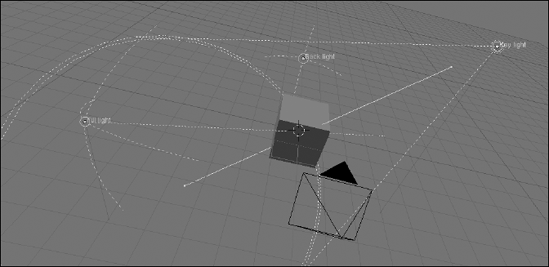
Before I get too deep into how all of this is done in Blender, you should understand some standard lighting setups and terminology. The cool thing is that most of this information isn't limited to use in 3D computer graphics, but it's actually pretty standard in professional film, video, and still photography. In fact, quite a few photographers and directors like to use 3D graphics to test out lighting setups before arriving on set for shooting. (And you thought you were just making pretty pictures on a computer screen! Ha!) One of the most common ways to arrange lights is called three-point lighting. As the name implies, it involves the use of three different sets of lights. It's a common studio setup for interviews and it's the starting point for nearly all other lighting arrangements. Figure 9-2 shows a top-down illustration of a typical three-point lighting setup.
Setting up a three-point lighting scheme starts with placing your subject at the center of the scene and aiming your camera at that subject. Then you set up your main light, the key light. This is usually the most powerful light in the scene. It's where your main shadows come from as well as your brightest highlights. Typically, you want to set this light just to the left or just to the right of your camera and you usually want it to be higher than your subject. This is to ensure that the shadows fall naturally and you don't get that creepy flashlight-under-the-chin look that your friends used for telling scary stories around the campfire.
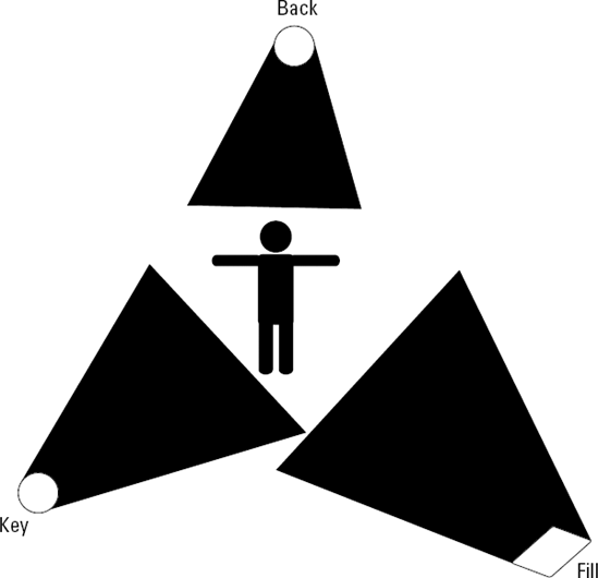
After your key light is established, the next light you want to place is the fill light. The purpose of the fill light is to brighten up the dark parts of your subject. See, the key is great for putting shadows on your subject, but without any other light, the shadows are stark black and they obscure your subject. Unless you're aiming for a dramatic lighting effect, this is not what you normally want. The fill light tends to be less powerful than the key, but you want it to have a wider, more diffuse throw. The throw is the radius of space that the light reaches. For instance, a flashlight has a narrow throw, whereas fluorescent lights throw light wider. You want this wide throw on your fill because it reduces the amount of highlight generated by this light. You don't want highlights from your fill to compete with the highlights from your key. As far as placement goes, you normally want to place your fill on the opposite side of the camera from the key and roughly at the same height as your subject.
Tip
Here's a good way to figure out a good place to position your fill light. Draw an imaginary line from your key light to your subject. Now, with your subject as the pivot point, rotate that line 90 degrees. When you do that, the line points right where you should place the fill.
The last light in a three-point lighting configuration is the back light or rim light. This light shines at the back of your subject, creating a small edge of light around the profile. That sliver of light helps separate your subject from the background and serves as the nice little bit of polish that often separates a mediocre lighting setup from a really good one. Now, I've sat through long discussions about the best way to position a back light (yes, my friends are nerds, too). Some people like to make it directly opposite from the key light. This works well, but sometimes the light rim competes with the key's highlights. Other people prefer placing it opposite to the camera. This, too, is a good way to go, but if the subject moves, you risk the possibility of blinding the audience. And yet another group of people recommend placing the back light opposite to the fill. This can create a nice rim of light that complements the key, but it can also look a bit unnatural.
As you can see, everything is a trade-off when it comes to lighting. And don't even get me started on whether the back light should be above or below the subject! In fact, the only really consistent thing that people agree on is that the light should generally point toward the subject. So the bottom line is that the best course of action is to play around with your back light and see for yourself where you get the best results. As for the power and throw of the back light, you typically want to use a back light that is less powerful than your key so things appear natural. The throw can vary because the highlights are all on the opposite side of your subject. I personally like to keep it narrow, but a wide throw can work nicely for large scenes.
That's basic three-point lighting for you. It works well in computer graphics as well as the "real world" and it's the starting point for most other lighting configurations. Lower the angle of your key to make your subject creepy. Remove or reduce the power of your fill and back lights to get more dramatic shadows. Place your key behind your subject to get a mysterious or romantic silhouette. Add additional lights pointing away from your subject to light the rest of the environment. And that's just the tip of the iceberg!
After you're familiar with the basic principles of three-point lighting, you can use the knowledge to light your scenes in Blender. To add a new light, use spacebar

The Lamp menu offers you the following types of lights to choose from:
Lamp: This is often referred to as a point light or an omni light, meaning that the light is located at a single point in space and emanates in all directions from that point. The default scene when you first load Blender has a single light of this type in it. This is a good general purpose light, but I prefer to use it as secondary illumination or as a fill light.
Sun: The Sun lamp represents a single universal light that comes from a single direction. Because of this, the location of the Sun lamp in your scene doesn't really matter, just the orientation. This type of light is the only one that affects the look of the sky and is well suited as a key light for scenes set outdoors.
Spot: In many ways, the Spot is the workhorse of CG lighting. It works quite a bit like a flashlight or a theater spotlight and, of all the light types, it gives you the most control over the nature of the shadows and where light lands. Because of this control, spots are fantastic key lights.
Hemi: A Hemi lamp is very similar to the Sun lamp in that it doesn't matter where you place the lamp in your scene. It's orientation is the most important aspect of it. However, because it's treated as a full hemisphere of light around the scene, lighting from a Hemi tends to be softer and flatter than the Sun. Hemis are also the only Blender light that cannot cast shadows. I like using them for fills and back lights. They're also handy for outdoor lighting.
Area: Area lights are powerful lights that behave similar to Spots; however, the shadows tend to be softer and more accurate because they're based on having a grid of lights to work with. Because of this, they work well for key lights, but because they tend to take more time to process, you should use them sparingly.
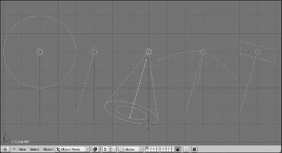
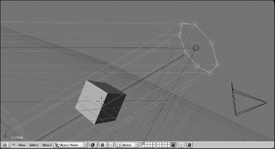
Figure 9-4 shows what each light type looks like in the 3D view.
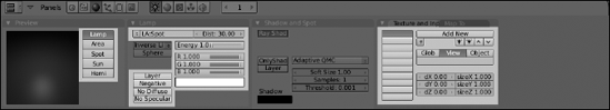
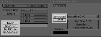
When you've chosen a type of lamp and added it to the scene, the controls to modify these lamps are in the Lamp buttons, which are a subcontext of the Shading buttons. Pressing F5 with a Lamp selected automatically brings up the Lamp buttons. With a couple of exceptions, all of the lamps share a few of the same controls and panels in this window. Figure 9-5 highlights the options that are universal for nearly all lights.
One of the really cool things about Blender's lamps is that you can instantly change lamp types whenever you want. Simply right-click the lamp you want to work with and choose the type of lamp you would like it be in the Preview panel. This is a great feature for quickly sorting out the type of light you want to use. You can test out different lighting schemes without having to clutter the scene with a bunch of extraneous lights that you have to move to other layers or hide.
The Energy value and RGB sliders control the strength and color of the lamp. I rarely set the Energy to a value greater than 1.0, but when you need it, it's handy to have the option. And of course, if you'd rather not use the RGB sliders, you can left-click the color swatch beneath them and use Blender's color picker.
The Dist value is visible for all light types, but it only really has any meaning for the Lamp, Spot, and Area lights. The value is in Blender units and, if an object is farther away from the light than that distance, it receives no light. For each of the light types, there's an indicator that defines the range of this value. For the Area light, it's a line pointing in the direction that the light is facing. For the Spot, it's the length of the cone. For the Lamp, there is no indicator on by default, but if you left-click the Sphere button in the Lamp panel, a dashed circle appears to indicate the distance of the Lamp's throw.
Note
Be careful when enabling the Sphere button on the Lamp. It subtly changes how the light works. With Sphere enabled, light coming from the Lamp starts to weaken, or attenuate, starting at the light's location, so by the time it gets to the Dist value, no light is available. However, if you have Sphere disabled, that attenuation doesn't start until you actually reach that Dist value, so you have a farther throw. Having Sphere enabled makes the light behave more like it would in the real world (or, as I like to say, meatspace), but it's often more convenient to keep it disabled.
With the exception of the Hemi light, each light has the option of using ray-tracing to cast shadows. This is enabled in the Shadow and Spot panel by left-clicking the Ray Shadow button and is the default behavior for new lights. Know, however, that using raytraced shadows can drastically increase your render times. The next section goes more deeply into some techniques for optimizing your lighting to try to deal with that. However, if you do want to use raytraced shadows, you should be aware of a few options:
QMC Sampling Types: You generally have the choice between Adaptive QMC and Constant QMC. QMC stands for Quasi-Monti Carlo, and is an algorithm for taking random samples. Generally speaking, the Adaptive QMC setting should give you faster render times.
Soft Size: This controls how blurry the edge of your cast shadows are. The higher the value, the blurrier the shadow. However, with only one sample (the next option) the shadows will not blur that much. Blurry shadows require more shadows.
Samples: This dictates how many samples the raytraced light uses. Increasing this value increases the accuracy of the shadows at the expense of longer render times.
Threshold: This option is only available when you choose the Adaptive QMC sampling type. It basically helps the renderer decide which samples to use and which ones to ignore. A higher Threshold value shortens your render times, but may decrease the accuracy of your shadows.
Shadow color: Left-click this swatch to get a color picker for selecting the color of your cast shadow.
Note
Without getting too deep into all of the crazy mathematical details, understanding QMC requires knowing a little bit more about how raytracing works. In Chapter 7, I give a brief description of raytracing that said it's done by tracing each and every vector of light bouncing from the light source(s) to the camera. This is somewhat over-simplified. Tracing every single vector would take an incredibly excessive amount of time. In order to get around that, programmers decided to take a sampling of those vectors and approximate everything in between them. To make the best use of these samples, they first tried just randomly picking them. The problem with this, though, is that raw random selection doesn't give consistent or accurate results. Samples may or may not be where they're most useful. So to accommodate that, they decided that samples could be random, but they should be evenly dispersed. This is basically Constant QMC. Of course, the downside to constant QMC is that you still might be taking samples from parts of the scene that don't need very many. If you can stay random, but have more of the samples taken from busier parts of the scene, you might get better performance. This is the logic behind Adaptive QMC.
Like with materials for objects, you can also apply textures to your lights and apply them to the lamp's color, it's shadow's color, or both. This is a great way to use lighting to enhance the environment of your scene or to fake certain lighting effects that are typically only achievable with raytracing. One specific example are caustic effects. If you have some free time, take a glass of water and shine light through it. Due to the refractive nature of the glass and the water, you usually see a strange light pattern on the table near or around the glass. This is an example of caustics and, if you don't need 100% accuracy, you can fake it with a noise texture on a spot light. On a larger scale, caustics are what make the cool moving patterns you can see on the bottom of a swimming pool.
As you can see in Figure 9-5, the Lamp light type has options that are available on nearly every other light type but doesn't have much in the way of unique controls. The same could actually be said of the Hemi light. In fact, it has fewer controls because Hemis can't cast shadows. However, the remaining three lights have some interesting options that allow you to optimize their usage to meet your needs.
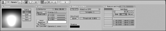
The Sun lamp, in particular, is a lot more useful in Blender 2.48 because it has the ability to behave more like the real sun. It's the only type of light that Blender has that influences the look of the sky and even provides some atmospheric effects. You control this lamp with the Sky/Atmosphere panel that appears in the Lamp buttons. By default, both the Sky and Atmosphere buttons are disabled, but you can turn them on with a left-click. Figure 9-6 shows the panels and options for the Sun light type.

When you enable the Sky button, you get the set of buttons that control how the Sun lamp influences the sky background. The first thing you may want to do is make the Sun visible. Doing this requires that you increase the Sun Bright and Sun Size values. Now if you try to render your scene, you may not see the Sun in your sky, even if you've placed the Sun lamp within your camera's view. This is because, if you recall, the position of the Sun lamp is irrelevant to how it lights the scene. Only its orientation is important. So if you want to see your Sun, you may have to angle the camera up and more skyward. You also have to rotate the lamp so it points in the opposite direction that the camera's pointing.
Now, when you look at the sky on a clear day — the real sky outside; you know, in the for-really-real world — you may notice that it's naturally lighter near the horizon and gets darker as it moves farther from the horizon. The Hor Bright and Hor Spread values are what you use to recreate and control this effect in Blender. At the top of the panel is the Turbidity value. Keep this at a low value for clear day skies and increase it for more foggy, overcast skies.
When you enable the Atmosphere button, you get some buttons that control the Sun's influence on how the air in your scene looks from a distance. These options are best suited for cases where you have a wide camera shot that shows off a large portion of your set's environment. There's really no good way to preview the effects of these values other than to do test renders. Here's a quick guideline to help understand what each one does, though:
Sun Intens: Increasing this value makes objects in the distance bluer, mixing with the natural sky color.
Inscattering: Increasing this value makes the light appear to scatter more between the camera and the objects it's pointing at. Set this to 1.0 for the most physically accurate results.
Extinction: Lower numbers for this option reduce the amount of detail the light brings out in your objects. Like inscattering, having this set to 1.0 gives you the most physically accurate results.
Distance: This setting is similar to Extinction, except it controls how much detail you see as you get closer to the camera. At low values, everything can be seen. As you increase the value, the light becomes yellower and distant objects become more and more like silhouettes.
When working with Spot lights, you have the option of two different ways to cast shadows: raytraced and buffered. The simplest way to know the difference between the two is to know that, generally speaking, raytraced shadows are more accurate whereas buffered shadows render faster. Regardless of which type of shadows you decide to cast (if you decide to have this lamp cast shadows at all), a couple of settings are always available for Spots:
SpotSi: Spot Size. This controls the width of the Spot's throw, measured in degrees. So a value of 180 is completely wide, whereas a value of 30 gives you a narrower cone. Unless I'm doing something special, I like to start with my Spots around 60 degrees.
SpotBl: Spot Blur. This controls the sharpness of the edges at the boundary where the Spot's cone of influence ends. Lower values give you a crisp edge, whereas higher values soften it, making the light appear somewhat more diffuse.
Halo: Enabling this button allows the renderer to show the full cone of light generated by the Spot. This is called volumetric light. You see this effect when you use a flashlight in a dusty room or when you want the "sunbeams from the sky" effect.
HaloInt: Halo Intensity. This value has no influence unless you enable the Halo button. If you do have Halo enabled, increasing this value increases the intensity, or brightness, of the volumetric halo effect.
Square: Enable this button if you would prefer the Spot light to come from a square source rather than a round one.
If you decide to use buffered shadows rather than raytraced ones, the options in the Shadow and Spot panel change. All of the raytraced shadow controls — QMC sampling, Soft Size, Samples, and Threshold — are replaced with a somewhat more involved set of options. The reason for this is because buffered shadows are more of an image-based process than the raytracing method. This means that there are more ways to control how the shadows look because you're no longer constrained by the limits of reality. Figure 9-7 shows the Lamp buttons for a Spot lamp with buffered shadows.

Trying to sort out all of these controls can be daunting. However, the following values are the most important ones that you should know about:
ShadowBufferSize: Buffered shadows is an image-based technique. The Shadow Buffer Size is the resolution of the image used to create the shadows. Lower values work faster, but look more jagged.
Samples: If you increase this value, Blender creates multiple versions of the shadow buffer and mixes them together to get smoother shadow edges. This increases render times, but if you want soft shadows with blurry edges, more samples make it look better.
Halo Step: This value only has an effect if you have the Halo option enabled. Adjusting it controls your volumetric shadow, or how much of the volumetric effect your object blocks. Higher values render faster, but are less accurate. Setting it to one gives you the best, albeit the slowest, results. However, setting it to zero means that there is no volumetric shadow, so you have the volumetric cone, but your object won't block it at all.
Bias: Normally you can leave this value at its default setting. It offsets the shadow from where it connects to the shadow-casting object. Occasionally, you may get some weird jaggies or artifacts in your shadows. Increasing the Bias can help get rid of those artifacts. If you do have to adjust the Bias, adjust it only as low as it can go before artifacting. Otherwise, your shadows will begin to look very unnatural.
Soft: Increasing this value makes your shadows softer and blurrier. To use this setting effectively, make sure you have a Samples value greater than one. And at the same time, you get the best results by not setting the Soft value higher than double your Samples value. So at the default Samples setting of 3, you should keep your Soft value below 6.
ClipSta/ClipEnd: Clip Start and Clip End. Consider these values as a secondary control in addition to the Dist value. Objects that appear within these two values, indicated by a line on the Spot lamp in the 3D View, cast shadows, whereas objects outside of this range do not. Keeping the Clip values as close to your shadow-casting objects as possible gives you the most accurate results. If you don't want to adjust these values manually, left-click the car (automobile) icon next to either one. Blender automatically sets the clip values to include objects within the Spot's cone.
SampleBuffers: It's easy to misunderstand the usefulness of this setting and confuse it with the normal Samples setting. In essence, it basically does the same thing. However, this was added to Blender with the specific purpose of helping render hair and fur more effectively. Higher values give you better results, but at the cost of using more system memory when rendering. Unless you're rendering hair or fine detail, keep this set to one.
Area lamps are very similar to Spots, except unlike Spots, which can use both buffered and raytraced shadows, Area lamps can only use raytracing for creating shadows. This makes the shadows generally smoother and more accurate; however, they can increase your render time dramatically. Figure 9-8 shows the panels and options for Area lights.
The way an area light works is pretty simple. Imagine that at the lamp's location, you don't have a single light, but instead you have a grid of lights and you can control the width and height of this grid as well as the number of lights in it. This means you have even more control over your lamp's throw.
To control the dimensions of your Area lamp, use the Size value in the Lamp panel. This size is measured in Blender units and, by default, controls both the width and the height of the Area lamp. You control the number of lights in the Area lamp by adjusting the Samples value in the Shadow and Spot panel. Because the default shape of the lamp is a square, increasing the number of samples gives you the square of the sample value. So setting Samples to 3 creates 9 lights in the grid, and setting it to 5 creates 25 lights in the grid.
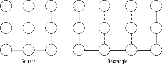
If you would rather have a rectangular Area lamp, left-click the drop-down menu above the Size button and change the shape from Square to Rect. When you do this, the Samples value changes to SampleX and SampleY, giving you control over the number of horizontal and vertical lights you have on your Area light's grid. The total of lights you have in the grid is the value of SampleX multiplied by the value of SampleY. Figure 9-9 shows an illustration of how the lights are arranged in square and rectangular Area lamps.
Tip
When working with Area lights, remember that you actually have multiple lights arranged on the lamp's grid. This can make an Area light with an Energy of 1.0 excessively bright. So if you use an Area lamp, try a much lower Energy value. I usually drop it down 0.050 and use that as my starting point.
I haven't yet talked about six buttons in the Lamp buttons: I like to refer to them as my "cheat buttons" because they're incredibly useful for achieving lighting effects that are difficult or impossible in the real world. The functions that these buttons control are really what makes lighting in 3D computer graphics so powerful. More often than not, if you use them effectively, they can speed up your render times without having a negative effect on the overall quality of your image. Figure 9-10 highlights these buttons in the Lamp buttons.
Descriptions of the function of each button are below:
Layer: Enabling this button makes the light illuminate only the objects that are on the same layer as the light. In real-world lighting, technicians do a lot of work to hide or mask out some lights, so they only shine on certain parts of the scene. For instance, you may want to brighten up the environment without making the lighting on your characters any brighter. You don't have to mask anything out: You just enable the Layer button and make sure your characters aren't on the same layer as the light.
Negative: Turning on this button enables what is, in my opinion, one of the coolest capabilities in CG lighting, inverting the light's output. What this means is that you can basically shine darkness on your scene! This is impossible to do in meatspace and it opens the door to all sorts of interesting possibilities. If part of your scene is too bright or you want to have deeper shadows, don't play with adjusting the Energy of your lights or increasing the Samples for your shadows. Just shine some darkness on the area with a negative light!
No Diffuse: Sometimes when you're lighting, you want to have fine control of your highlights, but you don't want to change the basic illumination of the scene. If you turn off shadow casting for the light and enable this button, you basically have a specular highlight that you can move around your subject at will. This is not a commonly used feature, but having it available has certainly made my life easier on more than one occasion.
No Specular: Earlier in this chapter, I explain that in three-point lighting, you want to reduce the highlights produced by the fill so they don't compete with the key's highlights. Meatspace lighting technicians often attempt to do this by diffusing the fill as much as possible. In Blender, you don't have to go through the trouble. You can just turn off the lamp's specular highlights altogether by left-clicking this button. Pretty sweet, huh?
OnlyShadow/Layer: Enabling this option allows your lamp to cast shadows without adding any additional light to the scene. The best reason why you'd want to do such a thing is to reduce render times by using buffered Spots for shadows while using other lights without shadows for your main illumination. The Layer button just beneath this works like the Layer button in the Lamp panel, but only relates to shadows.
Note
Any object — even lights — can exist on multiple layers. This dramatically increases the power of layer-only lights and shadows. With the object selected, press M to bring up the layer selection pop-up. To place your object on more than one layer, Shift+left-click the layer buttons you want it on.
I often tell people that when it comes to computer graphics, if you're not cheating or faking something, you're probably doing it wrong. I say this because even though you can get great results by using raytraced shadows everywhere with the highest number of samples, this all comes at the expense of high memory usage and lengthy render times. So your scene may look perfect, but if you're taking 16 hours to render every frame in an animation, you could be rendering for a month and not even have two seconds of it done.
A large part of being a CG artist is doing everything you can to reduce the amount of work that needs to be done by both you and the computer while still creating high-quality images. You don't want to be old and gray by the time your first animation is complete. This is why CG artists worry so much about keeping their render times as short as possible and why they use functions like these to cut corners where they can.
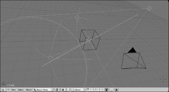
As I mentioned at the beginning of the chapter, my preferred lighting rig in Blender usually starts with a three-point lighting setup. This is what I normally start with:
Key: A buffered Spot works well as the key light. Keep all settings at their default values except for the Spot Size and Clip range. Set the Spot Size to 60 and activate the auto icons for the Clip Start and Clip End values.
Fill: Typically, this is a Hemi with an Energy of 0.5 and the No Specular button enabled in the Lamp panel.
Back: Also a Hemi, but the Energy is usually between 0.75 and 1.0 to get a nice rim light. The lamp is behind the subject, so specularity doesn't matter as much, but just to make sure it doesn't complete with the key's spec, I normally enable the No Specular button on this light as well.
Figure 9-11 shows what this three-point rig looks like. This is a good setup for "studio lighting" and it works really well for scenes set indoors or for lighting isolated objects.
Using a buffered Spot as your key works nicely, but an Area light can usually give you softer shadows. However, Area lights can only use raytracing for shadows, and you have somewhat limited control of the Area light's shape because it can only be a flat square or rectangle. To get around these limitations, you can actually be creative with buffered Spots and use them to make your own Area light. To do this, start with the three-point rig in the last section and then go through the following steps:
Create a circle mesh (Spacebar

Set the number of vertices to 8, set the radius to 2.0, and enable the Fill button.
Add the Spot to your selection, making it the Active object.
Adding the circle should have made it selected by default, so all you should have to do is Shift+right-click the buffered Spot you're using as your key.
Copy the location and rotation of the Spot to the circle object (Ctrl+C
This should place the circle in the same place as the Spot with the same orientation.
Make the circle your Active object (Shift+right-click).
This keeps both the Spot and the circle selected, but now the circle is active.
Parent the Spot lamp to the circle (Ctrl+P
Now if you just have the circle selected and try to move it around, the Spot follows.
Turn on Dupliverts for the circle (F7
Dupliverts are a cool part of Blender. When you have an object parented to a mesh, activating Dupliverts on the mesh object places a copy of the child object at every vertex on the parent.
Congratulations! You now have an Area lamp created by buffered Spots arranged on a custom shape.
Now you can select your Spot and adjust its settings to taste. I typically use the following settings as my starting point:
Energy: 0.200
SpotBl: 1.000
Samples: 8
Soft: 16.00
ClipSta/ClipEnd: These values may need to be manually adjusted to make sure the shadow appears properly.
Figure 9-12 shows the basic three-point lighting rig above with a circular Area light created with buffered spots.
What if you have a large scene or your scene is set outdoors? The limited lighting cone of a single Spot or Area light makes it difficult to illuminate the whole scene in a believable way. For this, I usually bounce between one of two solutions. Both of them involve the Sun lamp. The easiest solution to implement is to change the buffered Spot into a Sun with raytraced shadows. This is a nice way to go because you get shadows for all objects in your scene and, with the sky and atmosphere settings, you can get a really believable result. That said, lighting your scene this way brings two disadvantages. First, it uses raytracing for your shadows, so that can increase your render times if you're not careful. And second, because the Sun illuminates the same everywhere, you don't have as much control over individual shadows. An alternative situation is to use the Sun for full scene lighting and atmosphere, but leave the shadow creation to the Spot light. To do this, begin with the basic three-point lighting rig above and proceed with the following steps:
Add a Sun lamp (Spacebar
I like to put the Sun at the center of the scene (press Shift+C to put the 3D cursor at the center before adding the Sun).
Add the buffered Spot to your selection (Shift+right-click).
The newly added Sun should be selected by default. Shift+right-clicking the Spot also selects it and makes the Spot light the Active object.
Copy the Spot light's rotation (Ctrl+C
Now light from the Sun is coming from the same direction as the Spot. Location for the Sun is irrelevant.
Make the Spot light a shadow-only light (F5
Disable shadows on the Sun by selecting the Sun (right-click) and then disabling raytraced shadows by left-clicking the Ray Shadow button in the Shadow and Spot panel.
Done! If you have other objects in your scene that need shadows, make a linked duplicate (Alt+D) of your shadow-only spot and position the duplicate by Grabbing (G) it to the correct location.
Figure 9-13 shows an outdoor lighting rig with a shadowless Sun and shadow-only buffered Spots.
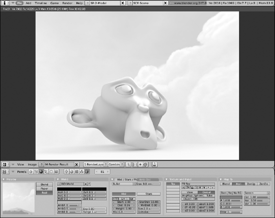
When you set up your scene for rendering, lighting is really only part of the equation. You must also consider your scene's environment. For instance, are you outdoors or indoors? Is it daytime or nighttime? What color is the sky? Are there clouds? What does the background look like? These are considerations you have to make when thinking about the final look of your image. Fortunately, nearly all of the controls for setting up your environment are in the World buttons (F8), shown in Figure 9-14.

If you've worked in Blender for a while and gotten a few renders out, you might be pretty tired of that incredibly bright blue background color that the renderer uses by default. Here's where you change that color: Look in the World panel of the World buttons. The left color swatch sets the horizon color. You can adjust it by using the RGB sliders below it or by left-clicking the swatch and using the color picker.
Note
To the right of the horizon color is the zenith color. You may notice that trying to change this color doesn't seem to affect the background color at all. This is because, by default, Blender is set to use only the horizon color, so you end up with a solid color as the background. To change this, left-click the Blend button in the Preview panel. When you do this, the Preview should show a linear gradient that transitions from the horizon color at the bottom to the Zenith color at the top. If I'm doing a render where I just want to see a model I've created, I often use this setup with my horizon color around 50% gray and my zenith color nearly black.
Of course, the next question you might have is, "Okay, so what do the other two buttons in the Preview panel do?" I'm glad you asked. You can actually activate any combination of these buttons. Here is a description of what each button does when enabled:
Blend: Enables a gradient going from the horizon to the zenith. When enabled by itself, the horizon is always at the bottom of the camera view and the zenith is at the top. This is good for when you want to have a static background that doesn't change based on the camera's orientation.
Paper: You typically use the Paper setting with both Blend and Real also enabled. It keeps the horizon at the center of the camera, no matter where it's pointing. It also adjusts the gradient to make sure that the full zenith color is visible as well as the full horizon color.
Real: Enabling Real sets the horizon to the XY ground plane and the gradient moves in the opposite direction to the zenith color. A bonus to this is that, because the horizon is locked to the XY ground plane, the gradient rotates with the camera, giving a much more realistic feeling to the background. I'm very fond of this setting, especially if I'm using a texture in the background.
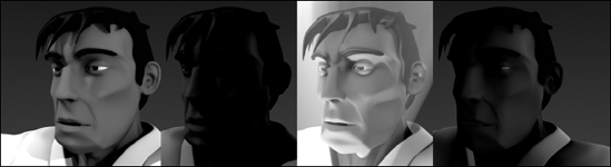
Figure 9-15 shows a simple scene rendered with the various combinations of the Blend button enabled with the other two buttons so you can get a better idea of what they do.

Take a look outside. Now, hopefully it's daytime or this isn't going to work, but notice how much everything seems to be illuminated. Even on a bright sunny day, the deepest shadows aren't completely black. The reason for this is that light from the sun is basically bouncing off of every surface many times, exposing nearly all objects to at least some amount of light. In computer graphics, this phenomenon is often referred to as global illumination, or GI, and it's pretty difficult to recreate efficiently. As you may have guessed, the biggest reason for this is the "light only bounces once" rule that I talked about at the beginning of Chapter 7.
Another reason, which goes hand-in-hand with this one, is that all this bounced light also actually makes subtle details, creases, cracks, and wrinkles more apparent. At first, this may seem like a paradox. After all, if light is bouncing off of everything, intuitively, it would make sense that everything should end up even brighter and seem flatter. However, remember that not only is the light bouncing off of everything, but it is also casting small shadows from all the weird angles that it bounces from. This is what brings out those minor textural details.
The GI effect is most apparent outdoors on overcast days where the light is evenly diffused by cloud cover. However, you can even see it happening in well-lit rooms with a high number of light sources (think about an office building with rows and rows of fluorescent lights lining the ceiling). Now, you can somewhat fake this effect by using a Hemi lamp, but the problem with Hemis is that they don't cast shadows, so you don't get that nice added detail that you GI gives you.
The bad news is that Blender's internal renderer doesn't actually have a "true" global illumination capability. You can use radiosity to do it, but it's a bit slow, unwieldy, and it's not really designed for that purpose. The good news, however, is that Blender does have a great way of approximating the GI effect. It's done with a feature called ambient occlusion or AO. Often called "dirty GI" or "dirt shader," AO basically looks for the cracks, creases, and small details in your object and makes them more apparent by making the rest of the model brighter, making the details darker, or a combination of the two. To enable AO, go to the Amb Occ panel in the World buttons (F8). Blender gives you two ways of calculating AO: as an approximation or with raytracing. Figure 9-16 shows the Ambient Occlusion panel with the options for approximate AO and raytraced AO.

Figure 9-16. The Ambient Occlusion panel in the World buttons with raytraced AO options (left) and approximate AO options (right).
Note
If you're going to use raytraced AO, make sure you have the Ray button enabled in the Render panel of the Render buttons (F10).
As Figure 9-16 shows, most of the controls in raytraced and approximate AO are the same. Below is a description of the options available for both types of AO:
Use Falloff: This option controls the size of the extra shadows that the AO creates. When you enable it, a value field appears below the button. Setting this value to higher numbers makes the shadows more subtle. Note that for this option to work, you must have the Plain button enabled.
Add/Sub/Both: With these buttons, you can control how the AO creates the shadows. Enabling the Add button brightens the rest of the object, making the details apparent by simply staying their own color. Enabling the Sub button darkens the detailed areas while keeping the object's original shading. If you enable both, the details tend to really pop out, but occasionally they pop too much. However, if you increase the Falloff value, that can help mitigate the situation.
Plain/Sky Color: These buttons control the source color for the diffuse energy used by AO. Setting it to Plain means the diffuse energy is just white light. Setting it to Sky Color uses the horizon and zenith colors to provide the diffuse energy. Also, if you're using raytraced AO, there is an additional option to use the sky texture for AO's diffuse energy.
Energy: This the energy for the AO effect. The effect created by the Add and Sub buttons is multiplied by this value. Usually it's a good idea to keep this at 1.0.
Tip
Another setting that you may want to adjust is the Ambient color value in the World panel. You can change it by adjusting its RGB sliders or by left-clicking the swatch and using the color picker. The Ambient color adds itself to the overall color of the scene. I don't normally advocate setting the Ambient color to anything other than black because it has a tendency to wash out the shading in the scene under most circumstances. However, when you use the Ambient color with ambient occlusion enabled, the shading isn't washed out as much and you actually end up with a more believable image.
The other values for raytraced and approximate AO are there for refining and optimizing how they work. If you read about raytraced lights earlier in this chapter, the settings for raytraced AO should be pretty familiar. I recommend using Adaptive QMC for raytraced AO because it typically yields faster results at good quality. Using the other sampling types usually gives you a noisier, or more speckled, result.
When choosing between raytraced and approximate AO, there are a set of trade-offs to keep in mind. As you might expect, raytraced AO gives you more accurate results, but it usually takes longer to process. Approximate AO works very fast and doesn't suffer the noise problem that you get with raytraced AO. Of course, some people actually prefer that noisy grain that raytraced AO gives, and approximate AO is a bit more error-prone in creating its shadows, especially where things touch. So it may take some additional time to set things up so that they look believable. Both techniques offer advantages and disadvantages. You have to weigh them for yourself and see which works best for your projects. I personally prefer approximate AO for the short render times. Figure 9-17 shows the same scene rendered with both types of AO, as well as without any AO at all.

The other tab next to the Ambient Occlusion panel is the Mist/Stars/Physics panel. These settings are somewhat primitive in terms of what they actually do, but they can be pretty handy in a pinch for creating nice atmospheric effects and quick backgrounds. Figure 9-18 shows the Mist/Stars/Physics panel.
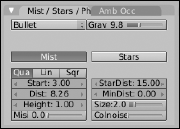
Blender's Mist works by taking objects as they go into the distance and decreasing their opacity so that they mix more with whatever the background image or color is. To use it, left-click the Mist button in the Mist/Stars/Physics panel. From here, you can adjust the Start and Dist values. Start defines how far away from the camera the mist starts to take effect. Dist is the distance from the Start value that the mist effect is at 100%. Anything farther away from the camera than this now shows up in the render.
Tip
These values are in Blender units, but it can be difficult to know intuitively where they actually fall in the scene, relative to your camera. Fortunately, there's a way to see this visually. Select (right-click) the camera and switch to the Editing buttons (F9). On the right side of the Camera panel are four buttons under the label of Show. Left-click the Mist button. When you do this, a line should appear extending from your camera. If you switch back to the World buttons (F8) and adjust the Start and Dist values, you can now see exactly where the mist region of influence is. Figure 9-19 shows a scene in the 3D view with a camera that has its mist limits visible.
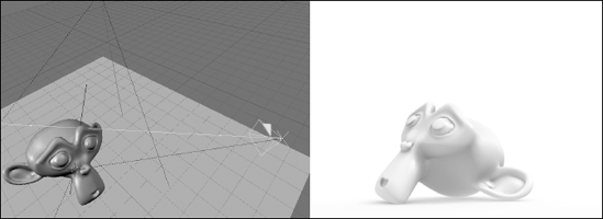
Figure 9-19. A camera in the 3D view with its mist limits visible. To the right is a render of that scene.
The Quad, Lin, and Sqr buttons control how the mist gets thicker from start to finish. Quad tends to be a more subtle effect, whereas Sqr tends to make the mist thicker faster. If you want to limit the mist to a certain height, like when you see an early morning mist in a field, adjust the Height value. Like the other values, this is set in Blender units and works relative to the XY ground plane. The Mist value increases the mist's intensity. Be careful with this setting. Putting it too high hides your entire scene from you.
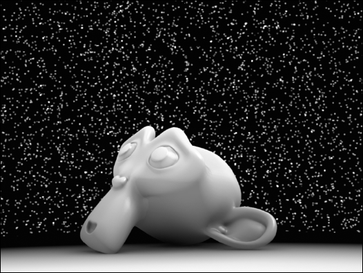
Blender's Stars feature is a quick way of adding star-like halos to your scene. You enable it by left-clicking the Stars button in the Mist/Stars/Physics panel. There aren't very many controls for stars, but they can definitely have an effect on how the stars appear. One thing to bear in mind is that Blender creates these stars in 3D space. They actually have a physical location and they aren't just a randomly generated speckled background. Descriptions of each option are as follows:
StarDist: This is the average distance between stars. Stars are randomly placed in the background, but this controls how dense the star field is.
MinDist: This value controls the minimum distance that stars can be from the camera. Unless you want stars to show up in front of some objects in your scene, this value should be larger than the distance between the camera and the farthest object away from it.
Size: Size controls the size of the stars. Like StarDist, this is an average value. For realistic stars, use a relatively small Size value.
Colnoise: Increasing this value colors the stars randomly. Setting this to its maximum value makes your scene look a bit like a piñata exploded in space. However, putting this at a lower value like 0.050 gives some subtle variety to your stars.
Figure 9-20 shows a simple scene rendered with the Stars feature enabled.
Tip
When using stars, enable the Real button in the Preview panel of the World buttons (F8). This way, if you animate your camera moving in the scene, the stars actually behave realistically.
Flat colors, gradients, and stars are nice, but there are definitely cases where you would rather have an image as your background. Doing this is pretty straightforward. The World for your scene, like materials and lights, can have a texture applied to it. You do this with the Texture and Input panel and the Map To panel in the World buttons as shown in Figure 9-21.
The Texture and Input panel has the familiar texture channels like the ones used by materials and lights. The Map To panel gives you the ability to map the color of the texture to the Blend, horizon color, and the upper and lower zenith colors. To use an image as your Sky texture, use the following steps:
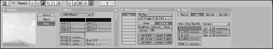
Figure 9-21. The Texture and Input panel and the Map To panel in the World buttons, used for adding textures to your sky.
Left-click the Add New button in the Texture and Input panel (F8
This creates a new texture and places it in the first texture channel.
Switch to the Texture buttons and change the Texture Type to Image (F6
In the Image panel, left-click the Load button and use the File Browser to find the image you want to use.
If you would like to use Blender's Image Browser, Ctrl+left-click the Load button.
Switch back to the World buttons and map the texture to the horizon color (F8
You can leave Blend enabled if you'd like, but it's not necessary.
In the Preview panel, enable the Real button (F8
This ensures that the sky moves properly as you move your camera in the scene.
Tweak the mapping and input settings to taste.
In the Texture and Input buttons, you may have to adjust the input as well as the texture size and offset. I tend to get best results with the Global input setting, but it may be different for you. In the Map To panel, you can control how the Sky texture interacts with the horizon and zenith colors. It's worth it to play around with these settings a bit to land on the look you want. When you're finished, you may have something that looks like Figure 9-22.