
4. Working with Color
Introduction
When you create or open a document, Illustrator creates or looks for a color profile, which specifies color usage in the document. Color modes define the colors represented in the active document. Although you can change the color mode of a document, it is best to select the correct color mode when you create a document. Illustrator’s main color modes are RGB (Red, Green, and Blue) for onscreen and web projects and CMYK (Cyan, Magenta, Yellow, and Black) for commercial printing projects.
Illustrator provides several panels (Tools, Color, Swatches, Color Guide, and Kuler) for you to use to work with color and apply color to one or more objects. For example, the Color panel lets you create colors using different sliders and spectrum color selectors. Illustrator not only lets you select virtually any colors you desire, it also lets you store those colors for future use in the Swatches panel. Along with the panels, Illustrator also provides the Live Color dialog box, which you can use to change multiple colors in your artwork at the same time by editing and applying color groups. This makes it easy to recolor your artwork.
As you start to use color in your document, it’s important to view how your document will actually appear with your current color settings. With Illustrator, you can view a soft proof on your screen to quickly see a simulation of how your colors will appear based on your output device.
Changing Color Settings
Illustrator does its best to manage color for you. However, sometimes there are color conflicts or you have specific color requirements that you want to use. When you create or open a document, Illustrator creates or looks for a color profile, which specifies color usage in the document. The Color Settings dialog box allows you to specify color settings and select options to deal with conflicts. The two main color settings are Working Space and Color Management Policies. Working Space controls how RGB and CMYK colors are used in a document that doesn’t have an embedded profile, while Color Management Policies controls how Illustrator works with color when opening files that don’t have a color profile or one that doesn’t match your current color settings from the RGB and CMYK menus. If you need to convert colors between color spaces, use Advanced mode.
Change Color Settings
![]() Click the Edit menu, and then click Color Settings.
Click the Edit menu, and then click Color Settings.
![]() Click the Settings list arrow, and then select from the following preset color settings:
Click the Settings list arrow, and then select from the following preset color settings:
• Monitor Color. Useful for video and on-screen content. Sets the RGB working space to your current monitor space.
• North America General Purpose 2. Useful for screen and print content in North America.
• North America Prepress 2. Useful for common printing conditions in North America. The default RGB color space is set to Adobe RGB.
• North America Web/Internet. Useful for non-print content on the Web in North America.
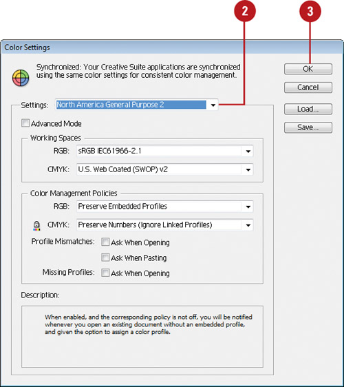
![]() Click OK to use the defined settings, or select your own custom settings:
Click OK to use the defined settings, or select your own custom settings:
• Working Spaces. Controls how RGB and CMYK colors are used in a document that doesn’t have an embedded profile.
Select Monitor RGB for onscreen output; Adobe RGB for photo inkjet printers (converts RGB images to CMYK images); ProPhoto RGB for inkjet printers; and sRGB IEC61966-2.1 for web output.
• Color Management Policies. Controls how Illustrator works with color when opening files that don’t have a color profile or one that doesn’t match your current color settings from the RGB and CMYK menus.
Select Off to prevent the use of color management, Preserve Numbers to preserve the document color profile for CMYK documents, Preserve Embedded Profiles to preserve links to color profiles, or Convert to Working Space to use the working space color (useful for the web).
Select the appropriate check boxes to choose if and when Illustrator will warn you of profile mismatches (no warning, when opening the file, or when pasting) or missing profiles (when opening a file or no warning).
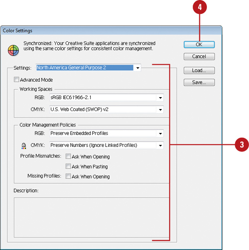
![]() Click OK.
Click OK.
Changing Color Profiles
When you create or open a document, Illustrator creates or looks for a color profile, which specifies color usage in the document. If a document’s profile doesn’t match the current working color space or is missing an assigned color profile, you can use the Assign Profile dialog box to change or remove a profile to avoid conflicts. When you change a color profile, color in your document may shift to match the new color profile.
Change or Remove Color Profiles
![]() Click the Edit menu, and then click Assign Profile.
Click the Edit menu, and then click Assign Profile.
![]() Select one of the following options:
Select one of the following options:
• Don’t Color Manage This Document. Select to remove a color profile from your document.
• Working RGB/CMYK. Select when your document doesn’t have an assigned profile or its profile is different from the current working space.
• Profile. Select to assign a different profile to your document.
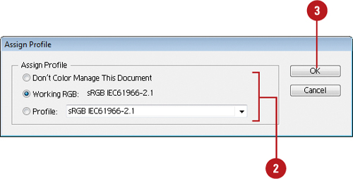
![]() Click OK.
Click OK.
Working with Color Modes
Color modes define the colors represented in the active document. Although you can change the color mode of a document, it is best to select the correct color mode at the start of the project. Illustrator’s main color modes are RGB (Red, Green, and Blue) and CMYK (Cyan, Magenta, Yellow, and Black).
Color modes determine the number of colors and the file size of an image. For example, an RGB image has at least three colors (like a printing plate), one for red, green, and blue color information. Color modes not only define the working color space of the active document, they also represent the color space of the output document. It’s the document output (print, press, or monitor) that ultimately determines the document color mode. Color modes do not just determine what colors the eye sees; they represent how the colors are mixed, and that’s very important because different output devices use different color mixes.
Therefore, when selecting a color mode, know the file format of the document and where it will be used. An image taken with a digital camera and then opened in Illustrator would most likely be in the RGB color mode. An image displayed on a monitor would be RGB, or possibly Indexed Color. A photograph scanned on a high-end drum scanner would most likely be in the CMYK color mode. An image being sent to a 4-color press would be CMYK, too. If you were creating a Illustrator document from scratch, the color mode you choose should represent the eventual output destination of the document, such as on a web page, to an inkjet printer, or a 4-color press.
Switching Between Color Modes
Unfortunately, images do not always arrive in the correct format. For example, you take several photographs with your digital (RGB) camera, but the images are being printed on a 4-color (CMYK) press, or you want to colorize a grayscale image. Changing color modes is a snap, but changing the color mode of an image isn’t the problem. The problem is what happens to the digital color information when you change color modes. For example, if you open an RGB image with the intent of sending it out to a 4-color press (CMYK), the smartest course of action is to remain in the RGB color mode through the processing of the image, and then convert the image into the CMYK mode at the end. The reason has to do with how Illustrator moves between those two color spaces. For example, if you move a color-corrected CMYK image into the RGB color mode, and then back to CMYK, the colors shift because Illustrator rounds color values during the change process. On top of that, a CMYK image is 25% larger than an RGB image, and the RGB color mode represents the color space of your monitor, not a printing press. It is impossible to view subtractive CMYK color on an RGB device. If, however, the image originally came to you as a color-corrected CMYK image, then stay in and work inside that color mode.
Changing Color Modes
When you create a new document, you need to select a color mode, either RGB or CMYK, depending on the type of document that you want to produce. For web and other onscreen projects, RGB is the best choice. For commercial printing, CMYK is the best choice. If you want to create documents for both types of projects, you can save a copy of the document and then change the color mode. When you change the color mode, colors will convert to the mode in the document. You will see a shift in color.
Change Color Modes
![]() Click the File menu, and then click Save As to make a copy of the document.
Click the File menu, and then click Save As to make a copy of the document.
![]() Click the File menu, and then point to Document Color Mode.
Click the File menu, and then point to Document Color Mode.

![]() Click CMYK Color or RGB Color.
Click CMYK Color or RGB Color.
• If you don’t like the change, you can use the Undo command on the Edit menu to reverse the color conversion.
Applying Colors
The Tools panel provides color boxes to make it easy for you to apply fill and stroke colors. The color box in the foreground is the Fill box and the outlined box in the background is the Stroke box. When you select an object, fill, or stroke, the color boxes (also known as thumbnails), on the Tools panel display the current colors. To change the fill or stroke color, select an object, fill or stroke, select the Fill or Stroke box, and then select a color from the Color, Swatches, or Color Guide panel.
Apply Colors to an Object, Fill or Stroke
![]() Select an object, fill, or stroke using the appropriate selection tool.
Select an object, fill, or stroke using the appropriate selection tool.

![]() Click the Fill or Stroke color box on the Tools panel to choose the color’s destination.
Click the Fill or Stroke color box on the Tools panel to choose the color’s destination.

![]() Click the Color button on the Tools panel to apply a color or click None to apply no color.
Click the Color button on the Tools panel to apply a color or click None to apply no color.
![]() Use any of the following methods to change the active fill or stroke colors:
Use any of the following methods to change the active fill or stroke colors:
• Select the Swatches panel, and then click a color swatch to change the color.
• Select the Color panel, and then specify a color using the controls.
• Select the Color Guide panel, and then click a color swatch to change the color.

• Double-click the Fill or Stroke color box to open the Color Picker dialog box, select a color or enter color values, and then click OK.
• To set default color of black and white, click the Default Fill and Stroke icon on the Tools panel.
• To set switch the current fill and stroke color, click the Swap Fill and Stroke icon on the Tools panel.
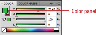
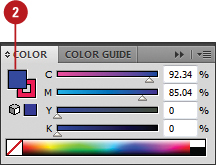
Working with the Color Panel
Illustrator not only lets you select virtually any colors you desire, it also lets you store those colors for future use. For example, you create a color scheme for a recurring brochure and you want a way to save those colors, or you’re working on an Internet graphic and you need a web-safe color panel. Whatever your color needs, Illustrator stands ready to meet them. The Color panel gives you access to Illustrator’s color-generation tools. This single panel lets you create colors using different sliders, spectrum color selectors, a grayscale ramp, and an option that lets you create a color ramp for the current fill and stroke colors. The CMYK spectrum displays a rainbow of colors in the CMYK color gamut. Moving the eyedropper into the spectrum box and clicking lets you select any color and gives you a visual representation of the relationships between various colors. The Grayscale ramp gives you linear access to the 256 available grayscale values.
Work with the Color Panel
![]() Select the Color panel.
Select the Color panel.

![]() Click the Options menu.
Click the Options menu.
![]() Select from the following Color Sliders:
Select from the following Color Sliders:
• Grayscale. Creates a single slider going from white (0) to black (100). Converts the lower portion of the Color panel to a grayscale ramp. Clicking anywhere in the ramp changes the active color.
• RGB. Creates three sliders (red, green, and blue). Each slider has a possible value from 0 to 255. Converts the lower portion of the Color panel to the RGB spectrum. Clicking anywhere in the spectrum changes the active color.
• HSB. Creates three additive sliders (hue, saturation, and brightness). Each slider has a possible value from 0 to 255.
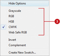
• CMYK. Creates four subtractive sliders (cyan, magenta, yellow, and black). Each slider has a possible value from 0 to 100. Converts the lower portion of the Color panel to the CMYK spectrum. Clicking anywhere in the spectrum changes the active color.
• Web Safe RGB. Creates three sliders (red, green, and blue). Each slider has a possible hexadecimal value from 00 to FF. Restricts the color spectrum to only web-safe colors.
![]() To change a color, click a color box, use a slider, enter specific color values, or click a color in the spectrum. The box with the red diagonal line is the None color.
To change a color, click a color box, use a slider, enter specific color values, or click a color in the spectrum. The box with the red diagonal line is the None color.
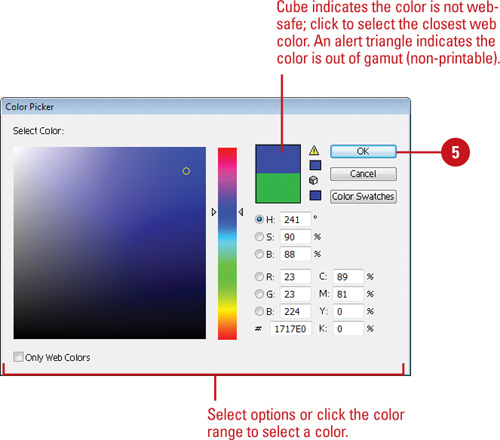
![]() To change a color using the Adobe Color Picker, double-click a color box, select a color using the color range or color mode options, and then click OK.
To change a color using the Adobe Color Picker, double-click a color box, select a color using the color range or color mode options, and then click OK.
Did You Know?
You can identify out of gamut colors. If an out of gamut warning icon (a triangle with an exclamation point) appears below the color boxes on the Color panel, it indicates that the current RGB or HSB color doesn’t have a CMYK equivalent, which means you can’t use it on a commercial project.
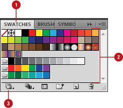
Working with the Swatches Panel
Illustrator not only lets you select virtually any colors you desire, it also lets you store those colors for future use in a library of color swatches, the Swatches panel. Where the Color panel lets you select virtually any color you need, the Swatches panel lets you save, group, and use specific colors that you use often. In the Swatches panel, you can point to a color box to display a tooltip indicating its color settings. If you want to view more information, you can change the Swatches panel display to make it easier to view and work with colors. To help with color organization, you can also create color groups to keep colors for a specific project together.
Change the Swatches Panel Display
![]() Select the Swatches panel.
Select the Swatches panel.
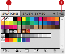
![]() Click the Options menu, and then choose from the following options: Small Thumbnail View, Medium Thumbnail View, Large Thumbnail View, Small List View, or Large List View.
Click the Options menu, and then choose from the following options: Small Thumbnail View, Medium Thumbnail View, Large Thumbnail View, Small List View, or Large List View.
![]() To sort the colors in the Swatches panel, click the Swatches Options menu, and then click Sort by Name or Sort by Kind (by solid, gradients, patterns, and groups).
To sort the colors in the Swatches panel, click the Swatches Options menu, and then click Sort by Name or Sort by Kind (by solid, gradients, patterns, and groups).

![]() To display swatches by type, click the Show Swatch Kinds Menu button, and then select an option: Show All Swatches, Show Color Swatches, Show Gradient Swatches, Show Pattern Swatches, or Show Color Groups.
To display swatches by type, click the Show Swatch Kinds Menu button, and then select an option: Show All Swatches, Show Color Swatches, Show Gradient Swatches, Show Pattern Swatches, or Show Color Groups.
Did You Know?
You can delete a color or color group from the Swatches panel. Open the Swatches panel, display and select the color or color group you want to delete, and then click the Delete button.
Add, Edit, or Duplicate a Color
![]() Select the Swatches panel.
Select the Swatches panel.

![]() To edit or duplicate a color, select a swatch color.
To edit or duplicate a color, select a swatch color.
Timesaver
Drag a color from the color boxes on the Tools or Control panel to the Swatches panel.
![]() Click the Options button to edit a color or click the New Swatch button to add or duplicate a color.
Click the Options button to edit a color or click the New Swatch button to add or duplicate a color.
![]() For a new or duplicate color, enter a name.
For a new or duplicate color, enter a name.

![]() For a new or edited color, select a color type, select or deselect the Global check box, select a color mode, and then specify the color that you want.
For a new or edited color, select a color type, select or deselect the Global check box, select a color mode, and then specify the color that you want.
![]() Click OK.
Click OK.
Create a Color Group
![]() Select the Swatches panel.
Select the Swatches panel.

![]() Select the solid colors that you want in the group.
Select the solid colors that you want in the group.
Use Shift+click to select contiguous color boxes or Ctrl+click (Win) or Command+click (Mac) to select noncontiguous color boxes.
![]() Click the New Color Group button.
Click the New Color Group button.
![]() Enter a name.
Enter a name.


![]() Click OK.
Click OK.
Working with Swatch Libraries
In addition to the standard color swatch libraries, such as Basic RGB and Basic CMYK, you can access the Swatch Libraries menu to use colors from all types of color libraries, such as Corporate, Foods, Kids Stuff, Nature, Skintones. After you open a library, you can apply colors to fills and strokes, as well as copy swatches between libraries. After you modify a swatch library, you can save it to create your own user-defined custom swatch library.
Display and Use a Swatch Library
![]() Select the Swatches panel.
Select the Swatches panel.

![]() Click the Swatch Libraries menu, point to a library (if necessary), and then select the swatch library you want.
Click the Swatch Libraries menu, point to a library (if necessary), and then select the swatch library you want.
• To use default libraries, point to Default Swatches, and then click Basic CMYK, Basic RGB, or one of the other available libraries.
The Library panel appears displaying the selected Swatch library.
![]() To view other related libraries, click the Load Next Swatch Library or Load Previous Swatch Library button on the Library panel.
To view other related libraries, click the Load Next Swatch Library or Load Previous Swatch Library button on the Library panel.
![]() To copy swatches between libraries, open the libraries, and then drag the color box or color group from one library to another.
To copy swatches between libraries, open the libraries, and then drag the color box or color group from one library to another.
• If a Swatch Conflict dialog box appears, select an option to merge swatches or add a new one.
![]() To apply a color to a selected fill or stroke, select the element, click the Fill or Stroke color box on the Tools or Color panel to choose the color’s destination, and then select a color in the Swatch library.
To apply a color to a selected fill or stroke, select the element, click the Fill or Stroke color box on the Tools or Color panel to choose the color’s destination, and then select a color in the Swatch library.


Save Customized Swatches Panels
![]() Select the Swatches panel.
Select the Swatches panel.
![]() Create a customized swatch panel by adding and/or deleting colors from an existing panel.
Create a customized swatch panel by adding and/or deleting colors from an existing panel.
![]() Click the Swatch Libraries menu, and then click Save Swatches.
Click the Swatch Libraries menu, and then click Save Swatches.
![]() Enter a name in the File name box.
Enter a name in the File name box.
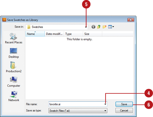
![]() Click the Save In (Win) or Where (Mac) list arrow, and then select a location to store the swatch.
Click the Save In (Win) or Where (Mac) list arrow, and then select a location to store the swatch.
![]() Click Save.
Click Save.
Did You Know?
You can access your customized swatches from the Swatch Libraries menu. When you save swatches in the Color Swatches folder (default location), your customized swatches appear on the User Defined submenu on the Swatch Libraries menu.
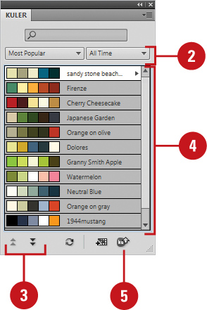
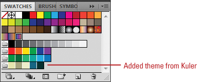
Adding Colors Using the Kuler Panel
The Kuler panel is an extension to Illustrator that allows you to use groups of color, or themes in your projects. You can use the panel to browse thousands of color themes from the Kuler community. After you find the theme you want, you can add it to the Swatches panel for use in your project. You can access the Kuler panel by using the Extensions submenu on the Window menu. The Kuler panel is also available in Photoshop, InDesign, Flash, and Fireworks. In many of these programs, you can also create your own theme using complementary harmony rules, share them with others in the Kuler community, and use them in Illustrator.
Browse Themes
![]() Click the Window menu, point to Extensions, and then click Kuler.
Click the Window menu, point to Extensions, and then click Kuler.
![]() To search for a theme, click in the Search box, enter the name of the theme, a tag, or a creator, and then press Enter (Win) or Return (Mac).
To search for a theme, click in the Search box, enter the name of the theme, a tag, or a creator, and then press Enter (Win) or Return (Mac).

Important
In a search, use only alphanumerical characters (Aa-Zz, 0-9).
![]() To narrow down the browse list, click the popups, and then select the filter options you want. Some include Highest Rated, Most Popular, Newest.
To narrow down the browse list, click the popups, and then select the filter options you want. Some include Highest Rated, Most Popular, Newest.
• To save a search, click the first popup, click Custom, enter your search criteria, and then click Save.
![]() To browse for a theme, click the View Previous Set of Themes or View Next Set of Themes button.
To browse for a theme, click the View Previous Set of Themes or View Next Set of Themes button.
![]() Select a theme in the panel.
Select a theme in the panel.
Add Themes to the Swatches Panel
![]() Click the Window menu, point to Extensions, and then click Kuler.
Click the Window menu, point to Extensions, and then click Kuler.
![]() To narrow down the browse list, click the popups, and then select the filter options you want. Some include Highest Rated, Most Popular, Newest.
To narrow down the browse list, click the popups, and then select the filter options you want. Some include Highest Rated, Most Popular, Newest.
• To save a search, click the first popup, click Custom, enter your search criteria, and then click Save.
![]() To browse for a theme, click the View Previous Set of Themes or View Next Set of Themes button.
To browse for a theme, click the View Previous Set of Themes or View Next Set of Themes button.
![]() Select a theme in the panel.
Select a theme in the panel.
![]() To add the theme to the Swatches panel, click the Add Selected Theme to Swatches button.
To add the theme to the Swatches panel, click the Add Selected Theme to Swatches button.
Replacing Colors
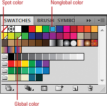
Illustrator uses global and nonglobal process colors along with spot colors. A global color is one that is updated for all uses, while a non-global color is one that is only updated where it’s being used on selected objects. A global process color appears in the Swatches panel with a white corner and no dot, while a nonglobal process color is plain white. A spot color appears with a white corner and a dot. You can change a color back and forth between global and nonglobal by using the Swatch Options dialog box.
Change Global and Nonglobal Colors
• Switch Between Colors. To change a color to global or nonglobal, double-click a global or nonglobal process color in the Swatches panel, select or deselect the Global check box, and then click OK.
• Edit Colors. To edit colors, double-click a global or nonglobal process color in the Swatches panel, select the Preview check box, drag the sliders to change the color, and then click OK.

• Replace Colors. To replace a global or spot color (which updates it everywhere it’s used), Alt (Win) or Option (Mac) drag the new color over the color that you want to replace.
Replace Colors
![]() Select an object with the nonglobal process colors that you want to replace.
Select an object with the nonglobal process colors that you want to replace.

![]() Click the Select Similar Options list arrow on the Control panel.
Click the Select Similar Options list arrow on the Control panel.
![]() Select one of the following options: All, Fill Color, Stroke Color, Fill & Stroke Color, or Stroke Weight.
Select one of the following options: All, Fill Color, Stroke Color, Fill & Stroke Color, or Stroke Weight.
![]() Click the Fill or Stroke color box on the Tools or Color panel to choose the color’s destination.
Click the Fill or Stroke color box on the Tools or Color panel to choose the color’s destination.
![]() Select a replacement color from the Swatches or Color Guide panels.
Select a replacement color from the Swatches or Color Guide panels.
Did You Know?
You can colorize a grayscale image. Select the grayscale image that you want to change, click the Fill box on the Tools or Color panel, and then select a color from the Color, Swatches, or Color Guide panels. Gray areas are recolored with the new color, while a white background remains opaque white.
You can change a color image to grayscale. Select the colored image, click the Edit menu, point to Edit Colors, and then click Convert To Grayscale.
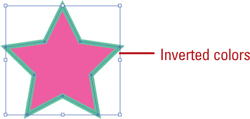
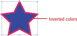
Inverting Colors
Illustrator provides two commands to invert colors, which changes the color to their opposite values on the color scale. The Invert Colors command allows you to invert multiple nonglobal process colors in a selected object, while the Invert command allows you to invert the fill or stroke color (global, nonglobal, or spot).
Invert Nonglobal Colors
![]() Select an object with the nonglobal process colors that you want to invert.
Select an object with the nonglobal process colors that you want to invert.

![]() Click the Edit menu, point to Edit Colors, and then click Invert Colors.
Click the Edit menu, point to Edit Colors, and then click Invert Colors.
Invert a Global, Nonglobal, or Spot Color
![]() Select an object with the nonglobal process colors that you want to invert.
Select an object with the nonglobal process colors that you want to invert.

![]() Select the Color panel.
Select the Color panel.

![]() Click the Fill or Stroke color box on the Tools or Color panel to choose the color’s destination.
Click the Fill or Stroke color box on the Tools or Color panel to choose the color’s destination.
![]() Click the Options menu, and then click Invert.
Click the Options menu, and then click Invert.
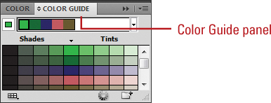
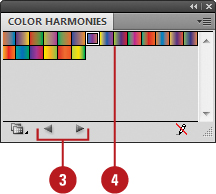
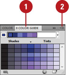
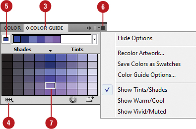
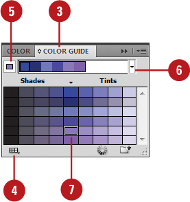
Using the Color Guide Panel
The Color Guide panel allows you to display and apply variations for a color. Along with the Live Color dialog box, you can edit colors in an object or color group, create new color groups, and apply harmony rules, which are predefined color schemes. Variations appear in the Color Guide panel based on a range of color, left or right from center (the small black triangle). You can change the number of columns that appear as well as the color range.
Select Variation Options
![]() Select the Color Guide panel.
Select the Color Guide panel.
![]() Click the Options menu, and then click Color Guide Options.
Click the Options menu, and then click Color Guide Options.
![]() Set the number of variation steps (columns of color) to display on either side of the center column.
Set the number of variation steps (columns of color) to display on either side of the center column.

![]() Drag the Variation slider to set the range of variation.
Drag the Variation slider to set the range of variation.
![]() Click OK.
Click OK.
Display Variation Types
![]() Select the Color Guide panel.
Select the Color Guide panel.

![]() Click the Options menu.
Click the Options menu.
![]() Select one of the following variation types:
Select one of the following variation types:
• Show Tints/Shades. Adds black to the colors on the left and white to the colors on the right of center.
• Show Warm/Cool. Adds red to the colors on the left and blue to the colors on the right of center.
• Show Vivid/Muted. Adds gray to the colors on the left and increases saturation to the colors on the right.
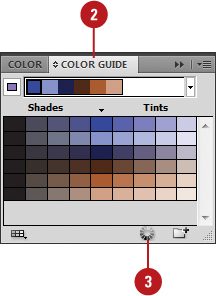
Applying Color with the Color Guide Panel
After you set up the Color Guide panel to display color variations the way you want, you can now start applying colors to objects in your document. You can apply colors to an object based on current colors in the object or use colors from other swatches. Illustrator makes it easy to display and apply variations with Harmony Rules (sets of predefined color schemes), such as Complementary, Analogous, Monochromatic, Shades, or High Contrast. If you want to save a customized set of variations, you can create a color group in the Swatches panel for future use.
Apply Colors to an Object, Fill or Stroke
![]() Select an object.
Select an object.
![]() Click the Fill or Stroke color box on the Tools or Color panel to choose the color’s destination.
Click the Fill or Stroke color box on the Tools or Color panel to choose the color’s destination.
![]() Select the Color Guide panel.
Select the Color Guide panel.
![]() Click the Limit Colors to Swatch Library button, and then click None.
Click the Limit Colors to Swatch Library button, and then click None.
• If you want to use another swatch for color, you can select it from the menu.
![]() Click the Set Base Color to Current Color button.
Click the Set Base Color to Current Color button.
![]() Click the Options menu, and then select a variation type: Show Tints/Shades, Show Warm/Cool, or Show Vivid/Muted.
Click the Options menu, and then select a variation type: Show Tints/Shades, Show Warm/Cool, or Show Vivid/Muted.
![]() Click the variation color that you want to apply.
Click the variation color that you want to apply.
Timesaver
Drag a variation color over any unselected object to apply it.
Use Variations Based on Harmony Rules
![]() Select an object.
Select an object.
![]() Click the Fill or Stroke color box on the Tools panel to choose the color’s destination.
Click the Fill or Stroke color box on the Tools panel to choose the color’s destination.
![]() Select the Color Guide panel.
Select the Color Guide panel.
![]() Click the Limit Colors to Swatch Library menu, and then click None.
Click the Limit Colors to Swatch Library menu, and then click None.
![]() Click the Set Base Color to Current Color button.
Click the Set Base Color to Current Color button.
![]() Click the Harmony Rules list arrow, and then select a rule.
Click the Harmony Rules list arrow, and then select a rule.

![]() Click the variation color that you want to apply.
Click the variation color that you want to apply.
Create a Color Group
![]() Select the Color Guide panel.
Select the Color Guide panel.

![]() Display the color variations that you want to save as a color group.
Display the color variations that you want to save as a color group.
![]() Click the gray area below the color variations to deselect everything.
Click the gray area below the color variations to deselect everything.
![]() Click the Save Color Group to Swatches Panel button.
Click the Save Color Group to Swatches Panel button.
Did You Know?
You can copy a single variation to the Swatches panel. Simply drag the color box in the Color Guide panel to the Swatches panel.
Editing Colors with Live Color
The Live Color dialog box allows you to change multiple colors in your artwork at the same time by editing and applying color groups. This makes it easy to recolor your artwork. You can apply a color group, such as a harmony rule, to objects, or reassign individual colors within a color group to objects. If you have too many colors within objects, you can also reduce the number of colors used while you reassign them.
Apply Color Groups to an Object with Live Color
![]() Select the objects that you want to recolor.
Select the objects that you want to recolor.
![]() Select the Color Guide panel.
Select the Color Guide panel.

![]() Click the Edit or Apply Colors button on the Color Guide panel or click the Recolor Artwork button on the Control panel.
Click the Edit or Apply Colors button on the Color Guide panel or click the Recolor Artwork button on the Control panel.
![]() Click the Edit tab.
Click the Edit tab.
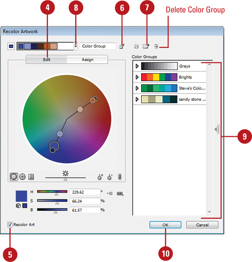
![]() Select the Recolor Art check box.
Select the Recolor Art check box.
![]() Click the Get Colors from Selected Art button to create a color group from the selected objects, and then enter a name in the field next to the button for the group.
Click the Get Colors from Selected Art button to create a color group from the selected objects, and then enter a name in the field next to the button for the group.
![]() Click the New Color Group button to save the color group in the list.
Click the New Color Group button to save the color group in the list.
![]() To change color groups, select one from the Color Groups list or click the Harmony Rules list arrow, and then select a rule.
To change color groups, select one from the Color Groups list or click the Harmony Rules list arrow, and then select a rule.
![]() To edit a color, select a color box, and then drag the sliders and the round markers (largest marker is the base color) on the color wheel to display the color you want.
To edit a color, select a color box, and then drag the sliders and the round markers (largest marker is the base color) on the color wheel to display the color you want.
• Use the buttons below the color boxes to change the wheel display, show saturation or brightness (drag slider to adjust it), add or remove colors, and unlink or link harmony rules.
![]() Click OK.
Click OK.
Assign Color Groups to an Object with Live Color
![]() Select the objects that you want to recolor.
Select the objects that you want to recolor.
![]() Select the Color Guide panel.
Select the Color Guide panel.
![]() Click the Edit or Apply Colors button on the Color Guide panel or click the Recolor Artwork button on the Control panel.
Click the Edit or Apply Colors button on the Color Guide panel or click the Recolor Artwork button on the Control panel.
![]() Click the Assign tab.
Click the Assign tab.

![]() Select the Recolor Art check box.
Select the Recolor Art check box.
![]() Click the Get Colors from Selected Art button to create a color group from the selected objects, and then enter a name in the field next to the button for the group.
Click the Get Colors from Selected Art button to create a color group from the selected objects, and then enter a name in the field next to the button for the group.
![]() Click the New Color Group button to save the color group in the list.
Click the New Color Group button to save the color group in the list.
![]() To change color groups, select one from the Color Groups list or click the Harmony Rules list arrow, and then select a rule.
To change color groups, select one from the Color Groups list or click the Harmony Rules list arrow, and then select a rule.
![]() To reduce the number of colors used in objects, click the Colors list arrow and then specify the number of colors you want.
To reduce the number of colors used in objects, click the Colors list arrow and then specify the number of colors you want.
• Click the Color Reduction Options button to specify how you want to recolor the objects.
![]() To change a new color, select a color and then use the color sliders below it.
To change a new color, select a color and then use the color sliders below it.
![]() To assign a color, drag a current color to another row.
To assign a color, drag a current color to another row.
![]() To prevent a color assignment change, click the arrow between the columns (it changes to a line). Click it again to change it back.
To prevent a color assignment change, click the arrow between the columns (it changes to a line). Click it again to change it back.
![]() Click OK.
Click OK.
Proofing Colors on the Screen
As you start to use color in your document, it’s important to see how your color settings appear. It would be nice to see a printed copy in color to see how colors actually look. However, that is not always possible. Instead you can view a soft proof on your screen to quickly see how your colors will appear. A soft proof simulates the output of your device, such as a printer with a specific type of paper.
Display a Soft Proof
![]() Click the View menu, and then point to Proof Setup.
Click the View menu, and then point to Proof Setup.
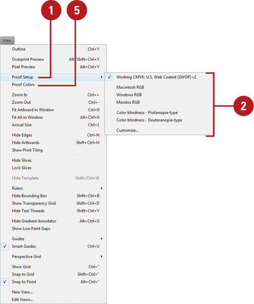
![]() Select from one of the available output devices to simulate, or click Customize to setup your own.
Select from one of the available output devices to simulate, or click Customize to setup your own.
![]() For a custom soft proof setup, select from the following options:
For a custom soft proof setup, select from the following options:
• Device to Simulate. Select a target device to simulate.
• Preserve CMYK Numbers. Select to use colors as they are and not convert them to the working color space. Deselect to use a rending intent option to display colors.
• Rendering Intent. Select an option to display colors: Perceptual (for continuous-tone images), Saturation (for vivid graphics), Absolute Colorimetric (for color preservation) or Relative Colorimetric (for color accuracy).
• Simulate Paper Color. Select to simulate white paper.
• Simulate Black Ink. Select to simulate dark gray for black.
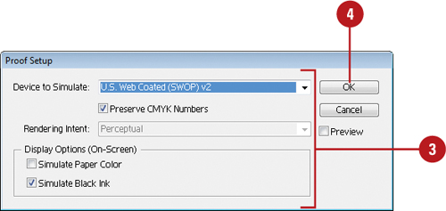
![]() Click OK.
Click OK.
![]() Click the View menu, and then click Proof Colors.
Click the View menu, and then click Proof Colors.