
Lesson 14. Implementing Navigation
Imperative to any application is a navigation system. Users should be able to easily move around in an application and locate the functionality they need. Flex applications can implement navigation in one of two ways: using states, as you learned in the earlier lessons, and by using navigator containers.
Some navigation will be completely at the user’s discretion, such as clicking a button to move to the home page or the checkout process. Other navigation can be tightly controlled by the developer—for example, a checkout process in which users cannot proceed to the next screen until certain conditions are met on an existing screen. In this lesson, you will implement both types of navigation.
The checkout process will be controlled by a ViewStack, one of Flex’s navigator containers.
Introducing Navigation
Navigation enables users to move through your application and (just as important) enables you to control user movement through the application. You will enable both user-controlled movement and application-controlled movement in this lesson when implementing a checkout process for the e-commerce application. During this process, you need to control which screens users see and when they see them.
A navigator container is a container that implements one specific rule on positioning its children: Only one child can ever be seen at the same time. This allows for a multipage view within the application. To help visualize how this works, picture a stack of papers on your desk. At any time, only one page in that stack can be on top, and therefore visible. To do this, the ViewStack toggles the visibility of its children, always ensuring that one and only one child can be seen at any time.
The Navigation components are still implemented using the mx architecture, meaning they are the same components that existed in Flex 3. To enable developers to use both Spark and MX components as children of a ViewStack, the Flex SDK added an INavigatorContent interface. Any class that implements INavigatorContent can be used as a direct child of a ViewStack. In the Spark component set, there is a new container named NavigatorContent that implements the INavigatorContent interface and subclasses the Spark Group class. You can use NavigatorContent instead of Group for adding Spark elements as children of the ViewStack.
Although the ViewStack is the key element to implementing navigation in Flex, it does not intrinsically have a way to switch which child is visible; that must be done using another tool. You can use built-in tools to control the ViewStack or build your own.
Note
Although ViewStack does not have any visible way for a user to navigate between the views, the Accordion and TabNavigator implement the same functionality as a ViewStack, but also provide user interface controls to allow the user to navigate between the views.
To control which child is shown in a navigator container, you can interact with the container’s selectedChild or selectedIndex property.
You use the selectedIndex property to choose which child of the ViewStack should be displayed.
Use the selectedChild property if you would rather indicate which child of the ViewStack should be displayed by referencing the name (id) of the child rather than the numeric index. The selectedChild property will display the appropriate container in the ViewStack based on the instance name provided in the id property. The following example shows how to use plain Button components to control which child of the ViewStack is displayed using both selectedChild and selectedIndex:

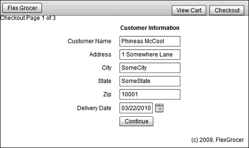
When run, this code creates the result shown in the following figure, where a ViewStack is used with buttons.

With this brief overview of the navigator containers, you are now ready to implement navigation in your applications.
Creating the Checkout Process as a ViewStack
In this exercise, you will import three views that will comprise the checkout process, and add a view stack to allow the user to navigate between them.
- Ensure you have your FlexGrocer project open.
Alternatively, if you didn’t complete the previous lessons or your code is not functioning properly, you can import the FlexGrocer.fxp project from the Lesson14/start folder. Please refer to Appendix A for complete instructions on importing a project should you ever skip a lesson or if you ever have a code issue you cannot resolve.
- Import the Checkout.fxp project from the Lesson14/independent folder.
A few classes are already provided for you. You will be copying these classes into your application.
Run the Checkout application. Notice there are three pages of forms that you can navigate between by clicking the Proceed button.
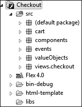
- In the checkout project, select the events, valueObjects, and views.checkout packages, and copy them to the clipboard (Ctrl-C/Command-C). In the FlexGrocer project, select the src directory, and paste the copied folders. A warning box appears, telling you that the events folder already exists. Flex asks if you want to merge the folder’s contents and overwrite any existing files with the same names. Click Yes To All.

The merged project after the paste should look like this:

If your views package doesn’t have a checkout package inside it, you should undo and try again.
Note
Some new constructs have been introduced in the views.checkout classes that will be explained in more detail in Lesson 15, “Using Formatters and Validators.”
- Right-click the Checkout project and select Close Project.
- Right-click the FlexGrocer views package and choose New MXML Component. Give the new component the name CheckOutView, select spark.layout.VerticalLayout for Layout, base the component on spark.components.Group, and remove the preset height and width attributes.
- In the Declarations block, add an instance of the OrderInfo class, which exists in the valueObjects package, and specify an
idoforderInfo.
<valueObjects:OrderInfo id="orderInfo"/>
If a namespace isn’t automatically created for the valueObjects package, add one to the root node like this:
xmlns:valueObjects="valueObjects.*"
- After the closing the Declarations tag, add a ViewStack (from the
mxnamespace) that has anidofvs, and aheightandwidthof100%.
<mx:ViewStack id="vs" width="100%" height="100%">
</mx:ViewStack> - Add an instance of the CustomerInfo class (which exists in the views.checkout package), as a child of the ViewStack by adding it inside of the opening and closing ViewStack tag. Bind the local orderInfo object to the
orderInfoproperty for the CustomerInfo class, and set itsheightandwidthto100%.
<checkout:CustomerInfo orderInfo="{orderInfo}" width="100%" height="100%"/>
If a namespace isn’t automatically added to the root node for the checkout package, manually add one like this:
xmlns:checkout="views.checkout.*"
If you look at the source of CustomerInfo, you will see that its root node is NavigatorContent, so it is allowable as a child of the ViewStack. Additionally, you will find that it has a public bindable property called
orderInfo, which is bound to the controls. - Create a second child of the ViewStack, as an instance of the CreditCardInfo class, which exists in the views.checkout package. Bind the local orderInfo object to the
orderInfoproperty for the CreditCardInfo class, and set itsheightandwidthto100%.
<checkout:CreditCardInfo orderInfo="{orderInfo}" width="100%" height="100%"/>
Much like the CustomerInfo class, CreditCardInfo has a root node of NavigatorContent, making it allowable as a child of the ViewStack. It also has a public bindable property called
orderInfo, which is bound to the controls. - Create the third and final child of the ViewStack, as an instance of the Review class from the views.checkout package. Bind the local orderInfo object to the
orderInfoproperty for the Review class, and set itsheightandwidthto100%.
<checkout:Review orderInfo="{orderInfo}" width="100%" height="100%"/>
Much like the CustomerInfo and CreditCardInfo classes, Review also has a root node of NavigatorContent, making it allowable as a child of the ViewStack. It also has a public bindable property called
orderInfo, which is bound to the controls. - Open the CustomerInfo, CreditCardInfo, and Review classes. Notice that all three broadcast one or more events when you click the buttons in those classes. Next you need to add handlers for those events.
- In CheckOutView.mxml, add an event handler for the
proceedevent from both the CustomerInfo and CreditCartInfo classes, which will call a soon-to-be-written function calledhandleProceed()and pass the impliciteventobject as an argument.
The code in the ViewStack should read like this:

Next you will need to write the
handleProceed()method. - Add an
<fx:Script>block between the end of the Declarations block and the start of the ViewStack. Within the Script block, add a private method calledhandleProceed(), which accepts an argument namedeventas an instance of the flash.events.Event class and avoidreturn type. The body of the function should increment theselectedIndexof the ViewStack by 1.
private function handleProceed( event:Event ):void {
vs.selectedIndex = vs.selectedIndex + 1;
}This method allows users to navigate from the CustomerInfo to the CreditCardInfo to the Review views of the ViewStack. Whether they are in the CustomerInfo or the CreditCardInfo view, clicking the Continue button will bring them to the next screen.
- Still in the Script block, add a method called
handleEdit(), which accepts aneventas an instance of the Event class and avoidreturn type. The body of this method should set theselectedIndexof the ViewStack back to element0.
private function handleEdit( event:Event ):void {
vs.selectedIndex = 0;
}This method will be used if the user clicks the Edit Information button on the Review screen.
- Add an event listener on the Review instance for the
editInformationevent that will call yourhandleEdit()method:
<checkout:Review orderInfo="{orderInfo}"
width="100%" height="100%"
editInformation="handleEdit( event )"/> - Add one more event handler on the Review instance for the
completeOrderevent that will call a soon-to-be-writtenhandleComplete()method.
<checkout:Review orderInfo="{orderInfo}"
width="100%" height="100%"
editInformation="handleEdit( event )"
completeOrder="handleComplete( event )"/> - In the Script block, add a new private method called
handleComplete()that accepts aneventas an argument and avoidreturn type. Inside this method, set theselectedIndexof the ViewStack back to0, and dispatch a new OrderEvent with the nameplaceOrderthat uses theorderInfoproperty as the order for the event. Finally, reset theorderInfoproperty to be a new OrderInfo instance.
private function handleComplete( event:Event ):void {
//reset the navigation for the next order
vs.selectedIndex = 0;
//Send the info up to the event chain
dispatchEvent( new OrderEvent( 'placeOrder', orderInfo ) );
//Clear out this order object for next time
orderInfo = new OrderInfo();
}Make sure that you have an
importstatement for the OrderEvent class from the events package. - After the closing Declarations tag but before the opening Script tag, add metadata to the CheckoutView class declaring that this class is capable of broadcasting an event called
placeOrderof the typeOrderEvent.
<fx:Metadata>
[Event(name="placeOrder", type="events.OrderEvent")]
</fx:Metadata> - Add a public bindable property to the CheckoutView class called
shoppingCartas an instance of the ShoppingCart class.
import cart.ShoppingCart;
[Bindable]
public var shoppingCart:ShoppingCart;As always, ensure that you import the ShoppingCart class.
- Bind the local
shoppingCartproperty into the Review class instance’sshoppingCartproperty.
<checkout:Review orderInfo="{orderInfo}"
width="100%" height="100%"
shoppingCart="{shoppingCart}"
editInformation="handleEdit( event )"
completeOrder="handleComplete( event )"/>This will allow a
shoppingCartproperty to be passed from the main application into the CheckoutView, and then into the Review class itself. - Save and close CheckoutView.
- Open ShoppingView.mxml. Find where the
shoppingCartis declared and instantiated. Remove the instantiation of the new ShoppingCart. Save and close ShoppingView.mxml.
[Bindable]
public var shoppingCart:ShoppingCart;
Since you need to share a single shoppingCart between the shopping and checkout view, you will create the single instance in the main application and pass a reference to each.
All that remains now is to allow the rest of the application to effectively use this new CheckoutView you have created.
Integrating CheckoutView into the Application
Now that you have a class to handle the checkout process, you need to integrate it into the rest of the application.
- Open FlexGrocer.mxml and close all other files. Find the label with the copyright information, and move it to after the instantiation of the ShoppingView component.
<views:ShoppingView id="bodyGroup"
x="0" y="0"
width="100%" height="100%"
groceryInventory="{productService.products}" />
<s:Label text="(c) 2009, FlexGrocer" right="10" bottom="10"/>Having this label defined after the other views will ensure it will always be seen on top of anything else in the application.
- Between the ShoppingView and Label components, create an instance of the CheckoutView component. Give it an
xandyvalue of0, and aheightandwidthof100%.
<views:CheckOutView
x="0" y="0"
width="100%" height="100%"/>As you save the application now, you should have your first chance to find any typos in the CheckoutView class you created. If the application compiles without error, continue. If not, check the code you created in the CheckOutView and fix any errors before proceeding.
- Create a
statesblock in the FlexGrocer application, which contains two states: one called shoppingView, and the other called checkoutView.
<s:states>
<s:State name="shoppingView"/>
<s:State name="checkoutView"/>
</s:states> - Set the ShoppingView instance to be included only in the shoppingView state, and the CheckoutView instance to be included only in the checkoutView state.
<views:ShoppingView id="bodyGroup"
width="100%" height="100%"
groceryInventory="{productService.products}"
includeIn="shoppingView"/>
<views:CheckOutView
x="0" y="0"
width="100%" height="100%"
includeIn="checkoutView"/> - In the controlBarContent node, add
includeIn="shoppingView"to the List instance.
<s:List left="200" height="52"
includeIn="shoppingView"
dataProvider="{categoryService.categories}"
itemRenderer="components.NavigationItem"
change="list1_changeHandler(event)"> - In the Script block, add two new methods. The first,
handleCheckoutClick(), accepts aMouseEventas an argument, has avoidreturn type, and sets thecurrentStatetocheckOutView. The second,handleFlexGrocerClick(), accepts aMouseEventas an argument, returnsvoid, and sets thecurrentStatetoshoppingView.
private function handleCheckoutClick( event:MouseEvent ):void {
this.currentState = "checkoutView";
}
private function handleFlexGrocerClick( event:MouseEvent ):void {
this.currentState = "shoppingView";
} - Add a
clickhandler on the btnCheckout button, which calls thehandleCheckoutClick()method and passes theeventobject. Also add aclickhandler to the Flex Grocer button that calls thehandleFlexGrocerClick()method and passes aneventobject. - In the Declarations section, add a ShoppingCart instance with an
idofshoppingCart.
<cart:ShoppingCart id="shoppingCart"/>
As always, ensure you add the proper namespace to the root node.
- Bind
shoppingCartto the publicshoppingCartproperties of both the ShoppingView and CheckOutView components.
This will allow a single instance of the shoppingCart to be used by both the views.
<views:ShoppingView id="bodyGroup"
width="100%" height="100%"
groceryInventory="{productService.products}"
shoppingCart="{shoppingCart}"
includeIn="shoppingView" />
<views:CheckOutView
x="0" y="0"
width="100%" height="100%"
shoppingCart="{shoppingCart}"
includeIn="checkoutView"/> - Add a private method to the Script block called
handlePlaceOrder()that accepts an instance of the OrderEvent class as an argument and returnsvoid. This method will use an Alert to display information about the order, and will then empty the cart by assigning it a new instance of the shoppingCart class and set thecurrentStateback toshoppingView.

The Alert class has a static method named show. When you call this method and pass it a string, Flex will show an Alert box with your message. If you had a server to submit the order to, the call to that server-side method would go here. You can learn about that in Volume 2 of this book. For now, use an Alert box to display information about the order. As always, ensure that the events.OrderEvent and mx.controls.Alert classes are properly imported.
- Add an event handler for the
placeOrderevent, which calls your newly writtenhandlePlaceOrder()method and passes theeventobject to it.
<views:CheckOutView x="0" y="0"
width="100%" height="100%"
shoppingCart="{shoppingCart}"
includeIn="checkoutView"
placeOrder="handlePlaceOrder( event )"/>
Save your files and run the application. You should now be able to add elements to the cart, click the checkout button, navigate through the checkout process, and complete the order. The application then resets the cart and returns you to the shopping experience.
What You Have Learned
In this lesson, you have:
• Used a ViewStack to allow users to navigate the checkout process (pages 354–357)
• Learned about the NavigatorContent class, which allows Spark containers in a ViewStack (pages 352–353)
• Controlled navigation with the ViewStack’s selectedIndex and selectedChild properties (pages 357–358)