
Chapter 5. Advanced Compositing and Effects

Special effects are just a tool, a means of telling a story. People have a tendency to confuse them as an end to themselves.
—George Lucas
Video editing is about refinement. Images and sound are acquired to document an event or to illustrate a story outlined by a script, but the final message is changed and enhanced substantially by the choices made in the edit room.
![]() Notes
Notes
This chapter’s project files are available for download. Please see “A note about downloadable content” in the Introduction of this book.
Decisions on what images and sound are cut away, and the order and emphasis of what is included are important, but what is done to further enhance or change that material through additional processing in postproduction has significant influence as well.
Adobe Premiere Pro is a capable editing system, but it has more video effects capacity than even many experienced users realize.
In this chapter, we’ll investigate how Adobe Premiere Pro processes effects and I’ll demonstrate several advanced techniques by examining and then combining various effects in ways that will ideally help you expand how you think about Adobe Premiere Pro as a postproduction tool.
Adobe Premiere Pro Effects Processing
When you open the Effects panel (Window > Effects or Shift+7) to examine the inventory of effects and transitions, you’ll notice that some effects have one or more symbols to the right of their name. There are three designations that represent very specific and important aspects of how each effect operates: GPU acceleration, 32 bit float color precision, and YUV color.
Using the sort buttons at the top of the Effects panel, you can view only the effects with the chosen designation or a combination of designations. Selecting YUV hides all effects that do not operate in YUV color (Figure 5.1).
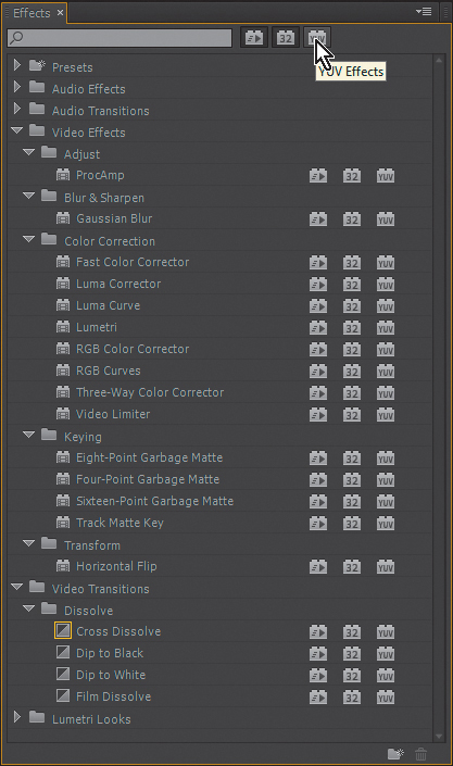
Figure 5.1 Use the sort buttons at the top of the Effects panel to hide any effects without that designation.
GPU Acceleration 
By employing a GPU with at least 1 GB of RAM, GPU-enabled effects are rendered much faster than they would be if they were processed by the CPU alone. In the Project Settings on the General tab, select Mercury Playback Engine GPU Acceleration to enable GPU processing for GPU-enabled effects.
32 Bit Float Color Precision 
Some video effects in Adobe Premiere Pro process at 32 color bits per channel as opposed to the 8 bits per channel standard in most video formats. Choosing these effects enables video effects rendering that doesn’t compromise the quality of high bit-depth video formats, such as v210, ProRes, or 10 bit DNxHD.
To enable preview rendering with 32 bit float color precision when using these effects, select the Maximum Bit-Depth option in the Settings tab (and choose an appropriate preview format for working in color precision deeper than 8 bits) in the Sequence Settings dialog. To process your sequence effects at maximum depth when you export your final project, there is an additional check box for the Maximum Bit Depth option in the Export dialog.
![]() Tip
Tip
Although almost any GPU card with at least 1 GB of RAM should be compatible with the Mercury Playback Engine, there are cards that have been verified to work properly by Adobe and certified for this purpose. Adobe provides a list of certified models on its website at www.adobe.com/products/premiere/tech-specs.html.
YUV Color 
Some effects in Adobe Premiere Pro process in YUV color. Typically, computers work in RGB color—one channel each of red, green, and blue. Each primary channel stores information for that component color, and the full palette is created by combining the channels. Video recording technology usually works a bit differently than the standard computer-based RGB color system. Many video formats use a system in which one grayscale channel is stored as a complete black and white image with all the luma detail in one channel, and two additional channels store hue and saturation information, referred to as Y’UV in notation associated with standard definition, analog video.
![]() Tip
Tip
If you want to apply fixed effect adjustments like Position or Scale and have them render in an order you set prior to the processing of one or more standard effects, use the standard effect named Transform instead of Motion and the effect named Alpha Adjust to make Opacity changes.
In current industry terminology, the “black and white” channel is designated as Y. The other two channels are designated as Pb and Pr in analog systems and Cb and Cr in digital terms, spelled out as Y’PbPr or Y’CbCr to represent this system in many applications or on modern video equipment.
Fixed and Standard Effects
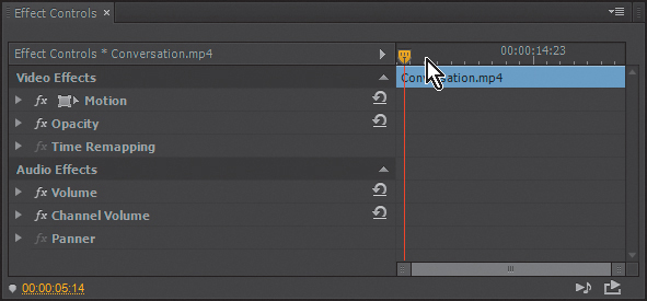
The two basic types of effects in Adobe Premiere Pro are fixed effects and standard effects. Fixed effects are those that are on a clip automatically when it’s placed on a sequence. For example, Motion, Scale, Opacity, and Time Remapping (and Volume for clips containing audio) are applied to every clip (Figure 5.2).
Standard effects are those that need to be applied manually, including most third-party effects plug-ins you might have installed.
Standard effects are rendered in the order they’re listed in the Effect Controls panel (which you can change by dragging each effect up or down in the list), but the fixed effects are always rendered last (Figure 5.3).
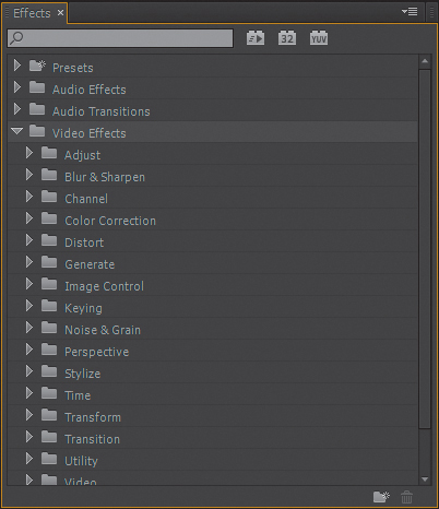
Figure 5.3 Standard video effects subdirectories are listed in the Video Effects category on the Effects panel.
Animating Effects
Many effects need to be applied with settings that change over time. The keyframing system in Adobe Premiere Pro is designed to interpolate effect properties between points in time. Although the mechanism of keyframing is not difficult to learn, advancing toward animating effects to create complex visual sequences or more important, solving a complicated visual problem, has more to do with your thought process. We’ll examine keyframing as a component of several visual effect scenarios moving forward in this chapter.
Keyframes in the Effect Controls Panel
The majority of the effects available in Adobe Premiere Pro have adjustable parameters that control the various aspects of the effect. When a clip on an edit sequence is selected, the settings associated with that clip and its fixed and standard effects are accessible in the Effect Controls panel.
![]() Tip
Tip
If the Effect Controls panel is not visible, you can access it from the Window menu or by pressing Shift+5.
To follow along, in the Chapter 5 project, open the sequence named Effect Controls. Slide the playhead left to the beginning of the Timeline and click on the clip named Conversation. Once the clip is selected, the clip’s effects properties will be visible in the Effect Controls panel. When you play through the clip, you’ll notice that the playhead moves through the Effect Controls panel synchronously with the sequence.
In the Effect Controls panel, you’ll see an empty square to the left of the Motion properties. Select this square to enable the Motion properties (the letters fx will appear in the box to confirm this) (Figure 5.4 on the next page).

When you play the clip on the Timeline with Motion properties enabled, the shot now gradually zooms to the man’s face, which could indicate that whatever his reaction is to the conversation is significant to the story.
This movement is animated with the clip’s Motion-Scale properties (click the disclosure triangle to the left of the Motion check box if Scale and Position values are hidden). The change happens between the two keyframes visible in the Timeline in the Effect Controls panel. Animation of the Scale property is enabled by the stopwatch button to the immediate left.
By using the Go To Next/Previous Keyframe buttons, you can move between the first keyframe (where the clip’s Scale value is 100% of original size) and the second keyframe (set at 120%). When you’re on a keyframe, you can select the Scale value and type a new value (or click and drag over the value to alter it). You can also select and drag keyframes to change their position in time.
The Add/Remove Keyframe button adds or removes a keyframe at the playhead’s position (Figure 5.5). You can also automatically add a keyframe by positioning the playhead at a point where one doesn’t exist and changing the property’s value.

Figure 5.5 The Add/Remove Keyframe button in the Effect Controls panel with the Previous Keyframe button pointing to the left and the Next Keyframe button to the right.
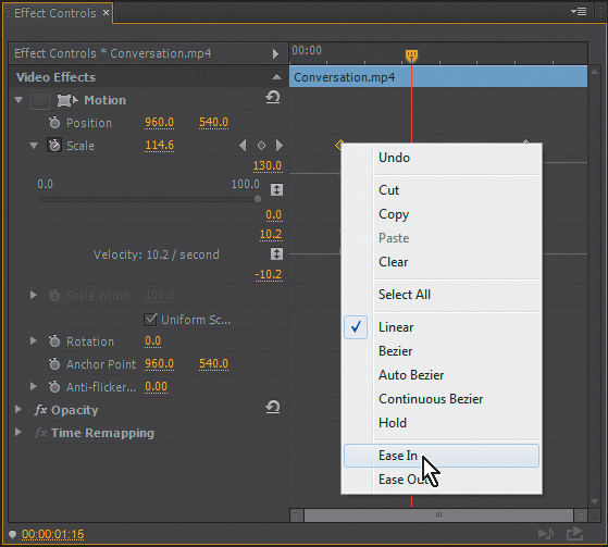
Keyframes like those currently on the Effect Controls Timeline are linear. If you click the disclosure triangle next to the Scale property, you’ll see the graph of the animation. Linear keyframes create a steady interpolation between the two keyframes. By right-clicking on a keyframe, you’ll see that other choices are available (Figure 5.6). Change the first keyframe to Ease Out and the second keyframe to Ease In. Notice the change in the graph and the change in the move when you play the clip now. Using the Ease In/Out and Bezier keyframe interpolation settings makes animated moves and effects look less “mechanical,” and in this case, the camera zoom starts to look a bit more natural.
![]() Tip
Tip
Dragging the playhead to a keyframe in the Effect Controls panel to change its settings can be a temptation, but using the Previous/Next Keyframe arrows is still the best method to move to a keyframe and make a change. Depending on your eye and dragging the playhead alone can create unintended keyframes that exist so close to an adjacent keyframe that they are impossible to see without being extremely zoomed in.
Keyframes in the Sequence
There will be times when you’ll want to position keyframes for properties on one clip by seeing the relationship to something in another clip in your sequence. Because the Effect Controls panel only shows one clip at a time, these type of adjustments can be more intuitively done directly on the sequence. All changes made to keyframes update in both the sequence and the Effect Controls panel regardless of where you make the change.
To make keyframes visible on the sequence, click the Timeline Display Settings icon (it looks like a wrench) below the timecode display in the upper-left corner of the Sequence panel, and enable Show Video Keyframes (Figure 5.7).
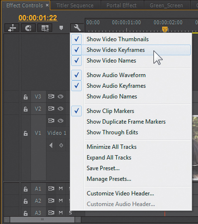
Figure 5.7 Turning on Video Keyframes in a sequence permits easy visualization and timing of keyframes compared to other elements on the Timeline.
The clip will only show one set of keyframes in the sequence at a time, so if you have multiple animated effects on a single clip, you can change which effect’s keyframes you’re viewing by right-clicking on the clip, choosing Show Clip Keyframes, and then choosing the effect from the submenu (Figure 5.8). For the Conversation clip, choosing Motion > Scale will show the Scale keyframes.

You can adjust the keyframes visible on the clip in the sequence by simply dragging them left or right to change their position in time and up or down to change their values. The keyframe interpolation can also be changed by right-clicking on the keyframe and choosing from the menu, similar to how it would be done in the Effect Controls panel.
The keyframe interpolation can be altered with visible “handles” when using one of the Bezier interpolation properties, changing the angle and length of the handle (Figure 5.9).
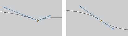
Figure 5.9 Two clip keyframes from an edit sequence showing Bezier “handles” in blue. On the left is a Bezier keyframe where the incoming and outgoing handles can be adjusted individually. On the right is a Continuous Bezier keyframe where the angle is adjustable but constant through the keyframe.
One Effect, Multiple Approaches
When looking at effects and effect design, I felt it was advantageous to show various builds and techniques. This way you can see how the same media could be used from different approaches.
In the Portal Effect sequence, you’ll see a series of clip segments that I’ll use to illustrate a number of effects concepts in Adobe Premiere Pro. Each group has a number in the bottom left of the frame to differentiate the groups. As we move forward we’ll examine several ways to approach an effect within Adobe Premiere Pro, as well as methods for combining techniques that build on each other to create the final example.
Find the clip Apprentice Enters in the Portal Effect bin in the Project panel, and double-click it to open it in the Source panel (Figure 5.10).
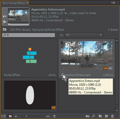
When you view the source clip in its entirety, you can see that the younger man enters screen left foreground and walks to his position next to the older man. Working within the Portal Effect sequence (which you can also find in the Portal Effect bin) we’ll enhance his entrance significantly.
Using Transition as Effect
At times, simply creating a cut with the right transition will get the job done. A transition like a dissolve is typically used to imply a change of time or place in a narrative project, but in this case we can use one to make the young man suddenly appear in the scene as opposed to his long physical approach in the original shot. The older man on the bench affords us this opportunity by staying relatively still.
When you play the first group of clips (with the number 1 visible in the lower left of the screen), you can see that I’ve made a rather simple edit (Figure 5.11). By cutting out the approach segment of the shot and using a cross dissolve, I’ve made the younger man appear in the shot. It looks a little more interesting than just watching him walk in, but it isn’t terribly mystical.

Figure 5.11 Portal Effect group 1 uses a transition and an edit to change the entry method of the young actor.
Animating an Effect
We can add an animated effect to the transition and add some interest. In the second group of clips (labeled 2) I’ve added a Lens Flare effect and used keyframes to animate its settings (we examined keyframes in the previous “Animating Effects” section).
When you play through effect number 2, you’ll see the Lens Flare effect. (If your system is having difficulty playing the effect back, you may want to preview render the segment.)
Click on the second clip in the sequence to view the clip’s properties in the Effect Controls panel. You’ll see the Lens Flare effect applied, and the Flare Brightness property is animated. In this case the flare comes into view with the second clip, but it might be more convincing if it moved a bit with the appearing character.
Clicking the Next Keyframe or Previous Keyframe button next to the Flare Brightness property will position the playhead on the first keyframe. Enabling animation for the Flare Center property by clicking on the stopwatch (Figure 5.12) will automatically create a Flare Center keyframe for the same position.
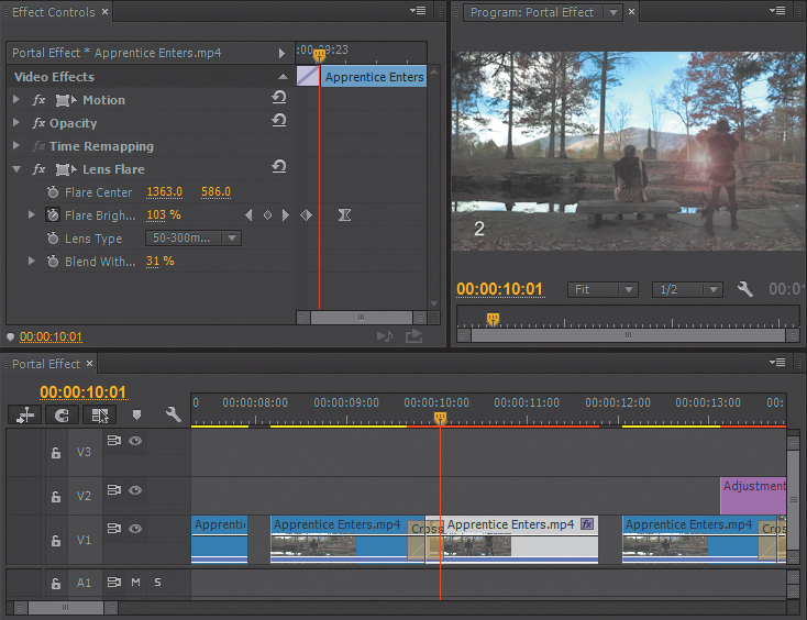
Figure 5.12 Portal Effect group 2 shows a Lens Flare effect added to the second clip with settings visible in the Effect Controls panel.
Positioning the playhead over the last keyframe for the Flare Brightness property and changing the horizontal position of the Flare Center value from 1363 to something around 1505 will make the flare move with the actor.
Now it looks like the young man is entering from somewhere a bit magical, or at least someplace well lit.
Using an Adjustment Layer
Adjustment layers in Adobe Premiere Pro work similarly (although not identically) to Adobe After Effects or Adobe Photoshop. Using adjustment layers is an easy way to apply one effect across a group of clips over time, as well as affect all the video layers below the adjustment layer. Imagine having a simple color correction that needs to be applied to 30 edited clips. Copying the settings from the first and pasting to the other 29 may not be too daunting, but what if you need to make a change in the settings? It’s much quicker to make one change to the effect on the adjustment clip than on 30 individual clips with the same effect applied 30 times.
An adjustment layer can host an effect, such as color correction or in example number 3, a lens flare, and apply it to all the layers that are visible below the adjustment layer (Figure 5.13).

Figure 5.13 Portal Effect group 3 moves the lens flare to an adjustment layer, making the effect more flexible because it is not restricted to the second clip by the video transition.
![]() Tip
Tip
To make a new adjustment layer, click the New Item icon and choose the option from the menu. Once you have one adjustment layer of a particular size and frame rate in your Project panel, you can use it multiple times for different purposes.
In effect number 2, the lens flare is applied to the second clip and is only visible when the second clip is visible, which happens through the transition. In this case, moving the Lens Flare effect to the adjustment layer, you can start animating the effect prior to the transition, gradually building the lens flare to indicate something is coming.
When you click on the adjustment layer, the effect and its keyframes will be displayed in the Effect Controls panel. You can once again animate the Flare Center if you desire. You may also want to explore the other Lens Type options.
The Blend With Original property controls how much of the original image you see along with the effect. In this case it isn’t set to animate, but by clicking the stopwatch you could add keyframes for this property through the course of the effect if necessary.
![]() Tip
Tip
Adjustment layers are very useful for testing effects work like color correction. In cases where I have clients in the room and they want me to try out a color correction change, I turn off the original correction and add an adjustment layer to test the new color correction without altering my original settings should I need to return to them. I’ve also used several adjustment layers with different color correction options for clients to evaluate, simply enabling and disabling video tracks containing the various treatments as needed.
Using Track Mattes
Any time you want to restrict visual content to a certain area onscreen you have to generate a matte to define the area. Adobe Premiere Pro has garbage mattes that can be useful for some purposes, but when you’re looking for a sophisticated shape and softer edges, the best approach is to create a track matte.
Most track mattes are grayscale images that define transparent areas (black) and opaque areas (white) for the source video, with the gray shades in between representing proportional transparency. You can make a track matte in a number of ways. Any paint program can be used to make a still matte. For the example we’re using, we’ll use the drawing tools in Adobe Premiere Pro’s Title Designer (Figure 5.14).

Figure 5.14 Portal Effect group 4a shows the blur obscuring the transition by layering the second clip in the sequence on V2.
When you view the clips in number 4a and number 4b, you’ll notice that two effects are set up: The first effect blurs the entire screen in an attempt to create a sort of visual distortion aesthetic as the young man appears. But with the entire screen blurred we can’t tell if he’s a powerful magician or just got off the school bus because the entire screen is blurry.
Using a track matte we can confine the effect to the screen position where the actor is appearing (Figure 5.15).

Figure 5.15 Portal Effect group 4b makes a more convincing effect by restricting the blur to the area where the actor enters the screen using a track matte effect on the clip on V2 confined by the matte we placed on V3.
In the second effect in group 4, if you double-click on the portal matte clip on V3, you’ll notice that it doesn’t pop up in the Source panel. Instead, it opens the Title Designer interface. The Title Designer is an excellent tool you can use to create quick mattes using the drawing tools, and the bonus is that you can draw the matte while looking at the video underneath. You’ll be creating some interesting effects with the Title Designer later in the chapter. For the moment, close the Title Designer dialog.
Back in the sequence you can see that V2 has the same shot, and it’s synchronized to the second shot in the sequence. If you select either clip on V2 in group number 4a or number 4b, you’ll see that they have an identical Gaussian Blur effects applied. The difference is that the second clip has a Track Matte Key in the Effect Controls panel, and its Matte setting is targeted at Video 3 and the portal matte.
In this case, we’d choose Composite Using > Matte Luma because the matte document is black and white. You could also choose to use the alpha channel on the matte document as the matte definition if you’re using a document with an alpha channel as your matte. When the actor appears in the second effect, he almost looks as if he’s moving through some relatively defined time/space distortion (work with me here) because the blurred clip has been confined to just the area where the actor enters the scene by the portal matte.
![]() Close-Up: Standard Effect Rendering Order
Close-Up: Standard Effect Rendering Order
Using Opacity Blend Modes
Opacity Blend modes may be one of the most underutilized compositing features in Adobe Premiere Pro. Once you find them under the Opacity heading in the Effect Controls panel, it’s easy to become a frequent user.
We’ll use Opacity Blend modes in several of our effects approaches in this chapter and go through a detailed listing of the available modes and how they are designed to work later in the chapter.
Moving to the clips in group number 5, you can see that the Track Matte Key is still defining the area of the effect, but now the portal area is bright white, making the young apprentice appear to be arriving through the portal from someplace—foggy? This is the result of adding a Luma Curve Standard effect (Figure 5.16) and making a change in the Opacity Blend Mode for the matted clip on V2.
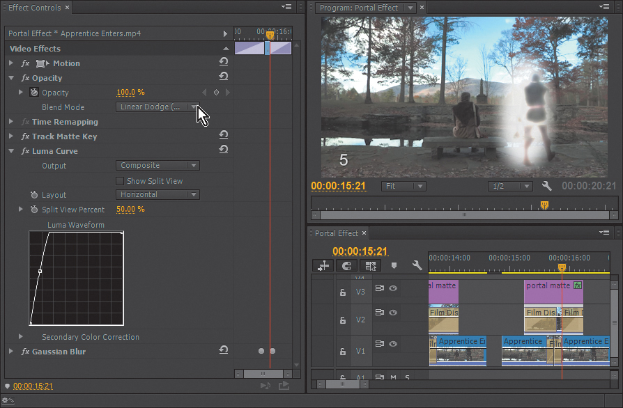
You can view the Luma Curve settings if they’re hidden by clicking the disclosure triangle to the left of the effect name. Click the fx box to the left of the effect name to turn the effect on and off to see the difference.
In the Opacity Fixed effect, the Blend Mode has been changed from Normal to Linear Dodge (Add). You can choose from a selection of Blend modes very similar to those in After Effects or Photoshop. The right Blend mode can make a significant contribution to an effect. For an alternative, try the Pin Light Blend mode, or for a significant change, try the Exclusion or Subtract options (more information on Blend modes later).
Scaling Height/Width Independently
Under the Motion fixed effect, the Scale property can be used proportionately, or you can choose to scale clip height and width independently. It doesn’t seem complex or sexy, but when we apply some basic scaling animation to our matte to make our portal a bit more “elastic,” we contribute another aspect to the effect that doesn’t necessarily appear basic.
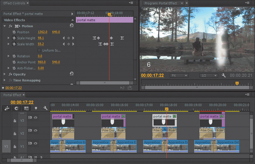
The effect setup in clip group number 6 has the same effects as those in group number 5 with one addition: The portal now scales up and down as the actor crosses the threshold from points unknown into the scene. To change from the “one-size-fits-all” portal of the effects in number 4 and number 5 to the elastic rift in time and space in group number 6, some specific scaling has been applied to the portal matte clip.
When you click on the portal matte clip, you’ll see that Scale keyframes are applied in the Effect Controls panel, but by deselecting the Uniform Scale option, Scale Height and Scale Width become separate properties that can be animated independently (Figure 5.17 on the next page). The keyframes are currently placed to create the height expansion before the width expansion in the opening of the portal, and close in reverse order. As with all keyframes, they can be moved and the interpolation can be changed, so you may want to experiment to make the effect your own.
Putting It All Together: The Portal Effect
We’ve examined transitions; adjustment layers; standard effects like lens flares, blurs, and curves; track mattes; and Opacity Blend modes. It becomes obvious as you layer these approaches together that the strengths of any one of these features pales in comparison to the capabilities of building on combinations.
Group number 7 combines all the effects we’ve worked with thus far. Every effect from group number 6 is included. Plus, the Lens Flare effect was brought back from group number 2 (Figure 5.18), which animates in from the top of the frame on an adjustment layer, landing on the portal. The flare not only scales up and opens, but also moves horizontally to follow the actor during the transition. This complex Portal Effect utilizes just four video layers to bring the young actor from a dimension or a time far away, thus allowing him to just drop his stuff anywhere he pleases.

Figure 5.18 Portal Effect group number 7 adds the Lens Flare effect from group 2 to V4 to complete the effect.
Saving Effect Presets
When you have a set of parameters set up for an effect or group of effects on a clip, you can select and save that effect or combination of effects as a preset for use at a later time.
After pressing Command (Ctrl) to select each effect in the Effect Controls panel that you want to include, right-click and choose Save Preset (Figure 5.19).
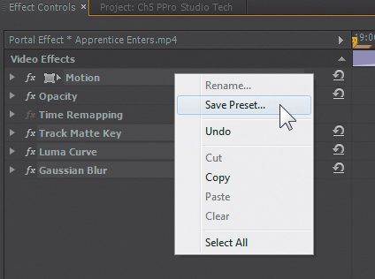
Figure 5.19 After selecting the Motion, Track Matte Key, Luma Curve, and Gaussian Blur effects, right-click to bring up the menu to save the preset.
The next dialog will prompt you to name the preset and specify how it should be applied over time. With effects that have keyframes that animate the beginning of a clip, choosing to Anchor to In Point will ensure your animation maintains its length and relationship to the In point of the clip.
Keyframed presets saved to Scale adjust the keyframe distance to the relative length of the clip. A ten frame entrance animation on the In point of a one second clip saved as a preset that “scales,” would become 600 frames long on a one-minute clip—quite an entrance.
Scale is ideal if the effect is a static color correction or something that doesn’t change. But for almost any effect animated over time, you’ll want to choose to anchor to the In or Out point.
When the preset is saved, you’ll find it in the Presets folder in the Effects panel.
The Warp Stabilizer
The Warp Stabilizer is one of the most talked about features in Adobe Premiere Pro, which meant it was important to write about, given how much it gets used. This effect is extremely effective at making handheld or walking shots steady.
One component of the Warp Stabilizer that was very popular was the Rolling Shutter correction, which compensated for the tendency of certain CMOS camera sensors that scanned an image top to bottom to show skewed horizontal movement or sheared vertical edges if something moved horizontally through the frame faster than the image was scanned.
Although the Rolling Shutter component of the Warp Stabilizer is still in place, it’s also available as its own effect if you don’t need stabilization.
The Warp Stabilizer sequence in the Chapter 5 project contains one shot (Figure 5.20). If you play it back, you’ll notice how the videographer did an amazing job of shooting steadily while running up the stairs. When you select the clip and realize that the Warp Stabilizer is applied in the Effect Controls panel, you might want to turn it off to see what the original shot looked like. And this application was just with the default settings.

Warp Stabilizer Settings
Using the disclosure triangles to open all the properties in the Warp Stabilizer’s settings in the Effect Controls panel reveals the control the user has over the process. These settings can be adjusted to alter the result, but they also affect the processing time; thus, understanding them can be very helpful.
Under Stabilization, choosing Smooth Motion is a good default, because you rarely want to (or even could) lock them down as if they were a static camera, so Smooth Motion is frequently used. No Motion is typically achievable if the camera only moves slightly of course. But for the most part the No Motion result works best if the target object or person is in the frame 100 percent of the time.
The Smoothness property applies to the Smooth Motion Result setting and is fairly straightforward. As you increase this number, you can expect to increase the processing time for the effect as well as more aggressive zooming, and using 50% as the default setting produces impressive results in most cases.
The Method parameter is often left at Subspace Warp; however, this specific method requires the most sophisticated set of calculations. Four methods are available. If one method can’t maintain enough tracking points, the mechanism will drop down a level to try to simplify the stabilization. The four stabilization methods include:
![]() Position. Computed based strictly on X-Y axis movement in the frame. By far it’s the simplest and fastest analyze method.
Position. Computed based strictly on X-Y axis movement in the frame. By far it’s the simplest and fastest analyze method.
![]() Position, Scale, Rotation. Adds frame scaling and rotation to X-Y tracking. This option is still quick but is more sophisticated than Position alone. It is often appropriate for long handheld shots where the videographer loses track of the horizon.
Position, Scale, Rotation. Adds frame scaling and rotation to X-Y tracking. This option is still quick but is more sophisticated than Position alone. It is often appropriate for long handheld shots where the videographer loses track of the horizon.
![]() Perspective. Basically works as a corner-pinning method. It’s not as resource intensive as Subspace Warp but can cause unwanted keystoning if the footage is really active.
Perspective. Basically works as a corner-pinning method. It’s not as resource intensive as Subspace Warp but can cause unwanted keystoning if the footage is really active.
![]() Subspace Warp. The heavy lifter of the group. It takes the image and literally warps it in different parts of the frame to create a steady image. It is very effective on most footage but can introduce some Jell-O-like artifacts in certain circumstances.
Subspace Warp. The heavy lifter of the group. It takes the image and literally warps it in different parts of the frame to create a steady image. It is very effective on most footage but can introduce some Jell-O-like artifacts in certain circumstances.
Under Borders you’ll see the Framing controls. How you treat the edges during stabilization is as important as how you stop the shaking. The Framing controls include:
![]() Stabilize Only. No reframing will occur, just the stabilization. This method is very fast but assumes you’ll be doing a frame-crop somewhere else. It could be useful for a quick pass to send on to visual effects editors who might crop it later.
Stabilize Only. No reframing will occur, just the stabilization. This method is very fast but assumes you’ll be doing a frame-crop somewhere else. It could be useful for a quick pass to send on to visual effects editors who might crop it later.
![]() Stabilize, Crop. Will also not zoom or scale the frame. But this option will create straight edges inside of the frame around the stabilized image.
Stabilize, Crop. Will also not zoom or scale the frame. But this option will create straight edges inside of the frame around the stabilized image.
![]() Stabilize, Crop, Auto Scale. The most frequently employed method. It steadies the shot and scales it up to refill the frame based on the maximum scale settings you specify under Auto Scale.
Stabilize, Crop, Auto Scale. The most frequently employed method. It steadies the shot and scales it up to refill the frame based on the maximum scale settings you specify under Auto Scale.
![]() Stabilize, Synthesize edges. Has the computer looking at previous and upcoming frames within a range you specify in the Synthesis Range Input property for content to insert in the areas where stabilization is creating visible edges. I suppose if you’re on a greenscreen background or something extremely constant it might work acceptably, but even if you use the Synthesis Edge Feather aggressively, having a computer decide what is supposed to be just outside the edge of a moving video frame probably isn’t anyone’s first choice.
Stabilize, Synthesize edges. Has the computer looking at previous and upcoming frames within a range you specify in the Synthesis Range Input property for content to insert in the areas where stabilization is creating visible edges. I suppose if you’re on a greenscreen background or something extremely constant it might work acceptably, but even if you use the Synthesis Edge Feather aggressively, having a computer decide what is supposed to be just outside the edge of a moving video frame probably isn’t anyone’s first choice.
The Borders section essentially directs how the effect should handle the edges of a clip. After all, if you’re moving the clip around to stabilize it (opposite of the shake), you may have to scale up the clip to hide the now visible edges.
You can define the Maximum Scale as well as define an area around the frame edges you don’t feel would be visible (and would be therefore left unfilled by Auto Scale if necessary) by specifying a percentage of Action-safe Margin.
And when the effect is not working (or you want to really fine-tune the effect), you can use the Advanced set of parameters:
![]() Detailed Analysis. I turn on Detailed Analysis probably more often than I should. It does help in cases where the footage is problematic and may require extra tracking points. Each new tracking point creates more data that is stored with the Adobe Premiere Pro project. If you have a two-hour documentary that is all handheld footage, you’ll start creating a very large project file.
Detailed Analysis. I turn on Detailed Analysis probably more often than I should. It does help in cases where the footage is problematic and may require extra tracking points. Each new tracking point creates more data that is stored with the Adobe Premiere Pro project. If you have a two-hour documentary that is all handheld footage, you’ll start creating a very large project file.
![]() Rolling Shutter Ripple. Automatic Reduction is usually adequate for most tasks, but if there are some really obvious issues, you may want to try Enhanced Reduction. Often, some Rolling Shutter artifacts may be made more obvious once a shot is stabilized, and this process is optimized to deal with that situation.
Rolling Shutter Ripple. Automatic Reduction is usually adequate for most tasks, but if there are some really obvious issues, you may want to try Enhanced Reduction. Often, some Rolling Shutter artifacts may be made more obvious once a shot is stabilized, and this process is optimized to deal with that situation.
![]() Crop Less <-> Smooth More. This slider determines the balance you want between maintaining as much image as possible versus how smooth you want the motion to be.
Crop Less <-> Smooth More. This slider determines the balance you want between maintaining as much image as possible versus how smooth you want the motion to be.
To see the stand-alone Rolling Shutter Repair effect applied to some footage at a race track, you can view the Rolling Shutter sequence and disable the effect during the rapid pan to see the difference in the overall skew of the image (Figure 5.21).

Figure 5.21 Disabling and enabling the Rolling Shutter Repair effect in the Effect Controls panel will reveal how much image skew exists during the rapid pan at the beginning of the shot and how little there is after the pan in the later part of the shot.
Rolling Shutter Repair
The stand-alone Rolling Shutter Repair effect has a few more controls than the process that is part of the Warp Stabilizer. Here are some tips for adjusting the parameters:
![]() Rolling Shutter Rate. The Rolling Shutter Rate defines the percentage of “when” the shutter closes. If you have a skewed edge in the shot, you should be able to see it shift as you adjust this property. Most camera shutters will be around 50% or just slightly more than that. Cell phone cameras are wild cards, so don’t rule out trying a higher value if you’re working with phone video.
Rolling Shutter Rate. The Rolling Shutter Rate defines the percentage of “when” the shutter closes. If you have a skewed edge in the shot, you should be able to see it shift as you adjust this property. Most camera shutters will be around 50% or just slightly more than that. Cell phone cameras are wild cards, so don’t rule out trying a higher value if you’re working with phone video.
![]() Scan Direction. Scan Direction of the sensor is always top to bottom, but because you can hold a phone or similar handheld device at almost any angle, you have the option to change the direction.
Scan Direction. Scan Direction of the sensor is always top to bottom, but because you can hold a phone or similar handheld device at almost any angle, you have the option to change the direction.
![]() Advanced. The two methods listed here have a different approach to limiting the rolling shutters. The Warp method tries to point track and warp the image. Optionally, you can select Detailed Analysis to increase the tracking data density. The other option is the Pixel Motion method, which tackles the problem with optical-flow vector computation—a morph-like correction. This uses the Pixel Motion Detail setting to determine the density of the information tracked to attempt to repair the shot.
Advanced. The two methods listed here have a different approach to limiting the rolling shutters. The Warp method tries to point track and warp the image. Optionally, you can select Detailed Analysis to increase the tracking data density. The other option is the Pixel Motion method, which tackles the problem with optical-flow vector computation—a morph-like correction. This uses the Pixel Motion Detail setting to determine the density of the information tracked to attempt to repair the shot.
Using the Title Designer
To Adobe Premiere Pro users, the Title Designer’s capabilities are thought to be well-known. Basic and even moderately sophisticated titles are deceptively easy to create, but the true versatility of this tool is frequently overlooked.
We’ll explore this versatility by looking at examples of styles, adjusting of the fine points of type, and using the Title Designer to perform some advanced effects.
Opening the Titler Sequence
In the Chapter 5 Adobe Premiere Pro Project panel you’ll see a bin labeled Title Designer. Inside that bin you’ll find the Titler Sequence. Double-click to open that sequence, or bring it to the front (Figure 5.22).

Most users understand that you can create custom typestyles in the Title Designer, but they don’t have the time to explore all the tool’s capabilities. I’ve assembled a small set of custom typestyles to help you unlock the possibilities.
The first clips on the Timeline are two titles over black video with large, colorful characters. Each of these characters represents a different custom typestyle created with Adobe Premiere Pro’s Title Designer. Large, single character examples allow the type to be large, making the details clear. These styles are contained in a custom typestyle library I created and included in the Chapter 5 media.
![]() Notes
Notes
If the characters on your system look different than the illustration, it’s possible that your computer system’s font library is slightly different than the computer the styles were built on. The edge and color characteristics should be the same. You can use the style with a different font and save the new font/color/edge combination by choosing New Style in the Title Style panel menu.
Load the Custom Style Library
The Custom Style Library is a function of the Title Designer that makes saving and recalling different libraries of styles effortless.
Move the playhead past the two typestyle clips on the Timeline to a point where only the black video fills the screen. Double-click on Typestyle 1 on the Timeline to open the Title Designer interface.
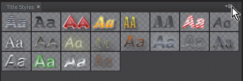
Below the canvas you’ll see the default Title Style Library displayed with thumbnails. After clicking on the panel menu icon at the top right of the Title Styles panel, you’ll see the options to Reset, Append, Save, or Replace the Style Library among the menu options (Figure 5.23).
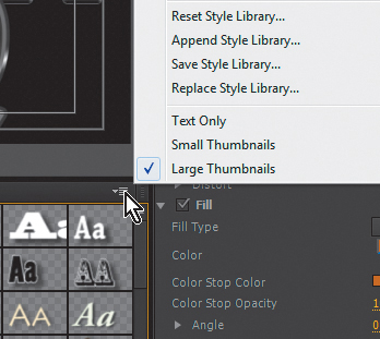
You can add a Style Library to the existing styles by choosing Append Style Library, or you can replace it completely. You can reset the Style Library at anytime to return to the original Style Library.
After choosing to Append or Replace the Style Library, browse to where you’ve stored the Chapter 5 media, and select the StudioTech_TypeStyles Library to load the new Style Library (Figure 5.24).
Examples of Metallic Styles
The metallic type styles in group number 1 were created inside the Title Designer with the tools you see in the interface. By clicking on each letter with the Selection tool, the settings on the Title Properties tab on the right change. Each typestyle has specific parameters that combine the fill, stroke, and shadow properties to create a certain look.
Hover over the swatches in the Title Styles panel to see the names of each style pop up as a tool tip. For example, the R character has the Rust Double Edge style applied. In the Title Properties panel, you may have to click the disclosure triangles to see the settings for the Fill properties and the Inner and Outer Strokes. Find the Inner Stroke size property, which currently displays a value of 10 (Figure 5.25).
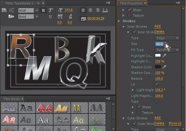
Figure 5.25 Each letter is a separate type object, and clicking to select a letter shows the Title Properties in the panel to the right.
You can change this property like any property in any other Adobe application by dragging left and right across it, or by simply clicking on it and keying in a new property. By changing this property to 65 (Figure 5.26), the Inner Stroke will completely fill the face of the character, making it appear concave—almost the reverse of a lowercase “k” on the right side of the frame. Changing the Outer Stroke size to 25 creates a heavy outer edge that gives the character an engraved metal appearance.

Notice that the Lit property is enabled for each stroke. Try deselecting the check box for this property for each stroke and notice the change. Using the Lit property along with its Light Angle setting adds a convincing feeling of depth. You can click back and forth between the k and the R to see how the difference in lighting angle affects the perception of whether the character is convex or concave.
On the orange R character, the Sheen property is selected for each stroke. Deselecting Sheen for the Inner or Outer (or both) Stroke properties removes the metallic appearance. Each character in the Typestyle 1 document has Sheens applied to the Fill (face) or to Strokes, or to both. The metallic look in the characters in Typestyle 1 are the result of different use of color and light properties. For the Q character, the Chrome Thick Trace style has the Fill property set to Eliminate to show through to the background (Figure 5.27).

To save any changes you’ve made for later use, choose New Style from the Title Styles panel menu. If you want to return the R character to its original style, simply select it and click on the style from the swatches in the Title Styles panel.
Close the Title Designer dialog.
Examples of More Colorful Styles
Although it may set your teeth on edge, sometimes more colorful styles are needed. Whether it’s to be loud, satisfy client demands, or just for fun, these styles show off the flexibility of the Title Designer.
Double-click on the Typestyle 2 from the Timeline. When the Title Designer is open, click the N character in the upper left. If your system doesn’t have the Comic Sans font installed, other lightweight (slim, not bold) fonts could illustrate the intent behind the Yellow Neon typestyle. In this typestyle you’ll notice that several strokes transition from the “hot” fill color to the more subdued colors in the strokes toward the edge, but the Shadow properties are probably the most significant feature. When you scroll down in the Title Properties tab to the Shadow properties, you’ll see that the color is actually quite bright. By thinking a bit “out of the shadow box” a glow effect has been created (Figure 5.28).
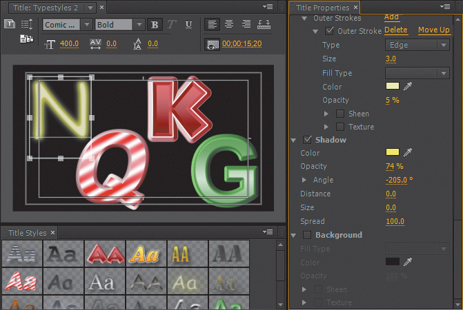
Figure 5.28 Clicking the N character reveals the unconventional use of the Shadow parameter in the Title Properties.
You can adjust the glow effect by changing the Opacity, Size, and Spread settings until they fit your taste. You can also change the color of the neon by changing the Fill and Stroke colors. If you’ve made a change you want to keep, make sure the N text object is selected, choose New Style from the Title Styles menu, and save your style for later use.
Click the Q character next (Figure 5.29). This typestyle is named Striper, and it gets its candy cane appearance from the Linear Gradient Fill Type. In the list of properties under Fill Type, you’ll see the Repeat property, which creates the stripes by repeating the red-to-white gradient seven times. If you change the Repeat property to its maximum value of 20 or reduce it to 3, the look of the style changes considerably.

You can also deselect the Sheen option and see what it adds to the nonmetallic surface.
Note that only an Outer Stroke is enabled, and the two Inner Strokes that are disabled are actually left over from a typestyle that started out as green, obviously not a particularly appetizing addition to the candy cane lettering at this stage.
You can create new custom typestyles by making changes to these or the standard style library styles and saving them as you gradually become comfortable enough to create typestyles from scratch.
Character Spacing, Kerning/Tracking
Kerning adjusts the space between two specific letters, whereas tracking adjusts the space between multiple letters in a word or line.
They’re are critical components in creating appealing type graphics. Letters have flow, and the appropriate spacing can help the readability of titles more than most users realize.
Most fonts have some intelligent spacing built in, but that only goes so far. A capital T will appear to be unusually distant from the next lowercase letter because of the space between the T’s narrow base and the next letter, whereas replacing the capital T with an A may create the opposite issue, appearing to leave too little space. Being observant of how type is laid out around you and being aware of it in your own projects will raise the production value of your entire program.
Move down the Titler Sequence to example number 3, which reads Candy and has a white matte on the track below it. The typestyle used is Hard Candy 1 from the custom typestyle set (if your system doesn’t have the font Lithos Pro, you can substitute a bold or black font). Many typestyles, or even a particular font, may have character spacing inconsistencies. In this case, the typestyle Outer Stroke weight has created a heavy character overlap that detracts from the effect. To revise this, double-click on the Candy title to open it in the Title Designer. Click the text object in the canvas and adjust the Tracking property in the Title Properties tab (Figure 5.30).

Increasing the Tracking value increases the uniform spacing for the characters in the text object. Kerning serves a similar purpose but works in between specific letters where you need it. To change kerning, click the Type tool, click into the word Candy between any two letters, and adjust the Kerning value to see the adjustment.
Using Gradients in Titles
It’s likely you’re familiar with gradients. The Title Designer allows you to create and adjust text and other objects that start with one color and finish with another.
Typestyles with gradients often appear to be more attractive aesthetically, and the color treatment of the title can also contribute to a compositing effect.
In group number 4 the text BRIKZ is superimposed over an appropriate background. Double-click on the first BRIKZ text document to open it in the Title Designer. The Fill Type is a Linear Gradient, and the color gradient is displayed below the Fill Type, showing two color swatches and a gradient strip (Figure 5.31).
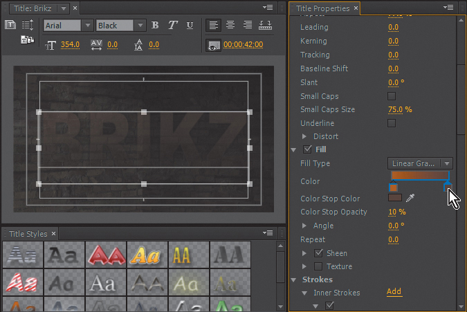
Figure 5.31 The color blocks at the ends of the gradient swatch each have a different Color Stop Opacity value.
Note that the text is partially transparent, and if you click on each color swatch and observe the Color Stop Opacity property (below the swatches), you’ll notice that neither color is set to 100%. The difference in the two values is the reason that the text is more transparent at the bottom than the top. If you invert the two values, making the darker shade 44% and the lighter shade 10%, the effect won’t change symmetrically because darker and lighter colors blend differently. This text object also has a 50% overall Opacity setting at the top of the Title Properties tab under Transform. If you’ve made changes but want to return the document to its original state, simply select the text object and click the Earth Blended typestyle swatch.
Titles with Effects and Blends
Titles can also be combined with other effects or Blend modes to complete the effect.
The second BRIKZ clip positioned in group number 5 is composited with the wall in such a way as to almost imply graffiti. Title Designer documents can be used in conjunction with other effects and Blend modes just like any other video or graphic source in Adobe Premiere Pro.
On the second BRIKZ document (from number 5), the Effect Controls panel shows the effects that are applied to the title. Through the use of the Basic 3D effect, the title was moved and angled to appear as if it’s attached to the wall on the right. The Divide Blend mode in the Opacity settings was also used to change how it combines with the background, and the overall Opacity was reduced to achieve a bit more blend (Figure 5.32).
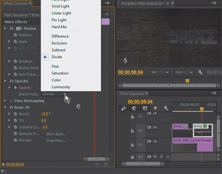
You can run through the selection of Blend modes available to see the results of each; however, note that once you employ a Blend mode other than Normal, the Color Stop Opacity gradient will interact with each differently.
Title Effect Using a Nested Sequence and a Track Matte
A nested sequence in Adobe Premiere Pro acts like a clip when it’s placed on another edit Timeline. There are any number of advantages to working with nested sequences—for instance, the ability to work on each scene in a long program separately and nest the edited sequences to one final Timeline for mastering. In group number 6 we’ll use a nested sequence to “pre-animate” a still graphic before we composite the nested sequence of the animation into our effect.
In the grouping under number 6, you’ll see that the Titler Sequence features the text Epic Title. Play through them to see a glint of light animate left to right across the metallic edges of the title (Figure 5.33). Many users would like to have animated effects within the Title Designer, but Adobe Premiere Pro’s animation capabilities can be used to animate effects for titles like any other video or graphics clip.

Notice the brick wall background on V1 and the Epic Title Base title document on V2. A nested sequence is on V3. If you double-click on Glare Animation Nested, you’ll open another sequence that shows the title document called Glare animating from left to right with some Position keyframes visible in the Effect Controls panel along with a Gaussian Blue effect applied. This is the moving glare on the text (Figure 5.34).
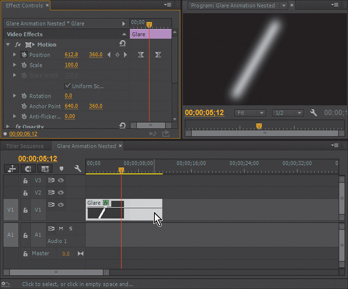
Figure 5.34 The Glare Animation Nested sequence is a simple animation of the white graphic from left to right.
Click into the Titler Sequence to view the nested sequence. In the Effect Controls panel you’ll see that the Glare Animation Nested sequence has the Track Matte Key applied.
Similar to the track matte in the Portal Effect earlier in the chapter, the luminance values of the matte determine the matting, and we’ve targeted that matte on Video Track V4. On V4 the Epic Title Matte restricts the glare to the “metallic” edges of the text. Double-click on the Epic Title Matte to open it in the Title Designer. The title simply consists of white strokes that create the outline of the text; shadows are off and a black background is turned on. This matte title document is a duplicate of the foreground title that I created at the same time by simply saving a version with the face transparent and the outline changed to white with a black background (Figure 5.35).
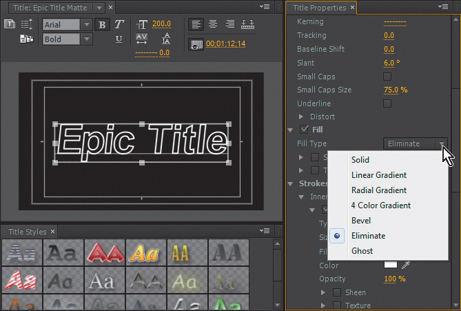
Figure 5.35 The matte is a copy of the main title and uses the Eliminate Fill Type and a black background.
To make the effect even more convincing, enable the Gaussian Blur effect on the Epic Title Matte clip on V4 by selecting the box next to the effect in the Effect Controls panel (Figure 5.36).
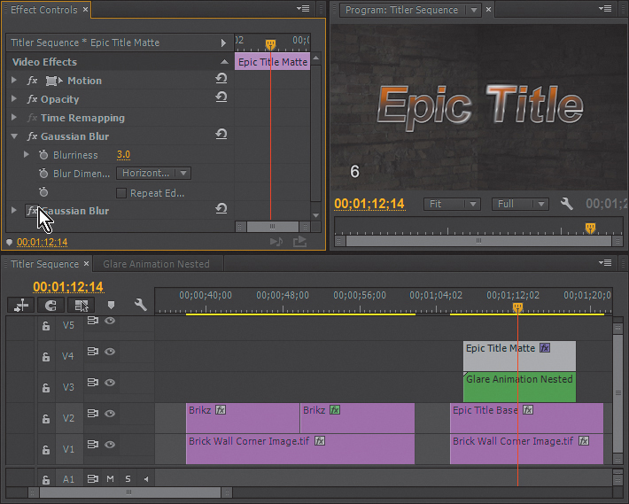
Figure 5.36 Switch on the Gaussian Blur effect on the Epic Title Matte to view its effect on the light glare.
The Glare document in this example consists of a line that was drawn in the Title Designer because it’s a quick solution versus opening another art application like Illustrator or Photoshop.
The animated glare must be a nested sequence because the Track Matte effect will link the matte to the key source clip, thus animating the matte from left to right with the glare if we would have simply animated the glare on the master Timeline.
Keying and Compositing
Everyone knows about chroma keying, which is often greenscreen keying where the background color (chroma) is measured and turned into a transparent area in video.
Different chroma keyers use different math to produce this transparency area. Adobe bought Serious Magic for its Ultra Key technology, making the Ultra Key effect one of the best “original equipment” color keyers available. The Ultra Key gets very good results and is easy to use.
In the real world, there aren’t many effects that begin and end with a simple chroma key application. But there are many other tools that a compositor could use to contribute to delivering a completed effect, such as mattes and additional Blend modes or effects, such as color correction and so on.
Using Adobe Premiere Pro’s Ultra Key
Let’s look at an effect that goes beyond a normal color key. You’ll recognize many of the concepts I’ve addressed thus far in the chapter. We’ll add a few new tricks and once again allow them to build on each other and employ them along with the Ultra Key to create an ultimate, ghostly effect.
Open the Green_Screen_Shot sequence. Using a similar numbering system as in previous exercises, the first clip is the effect group 1. Play the Timeline to see a young girl in a white gown on a greenscreen background reaching toward the screen with an expressionless gesture as if beckoning from the beyond (or perhaps she’s just a typical teenager being distant and cryptic). The girl was shot horizontally to maximize image resolution for this vertical shot, so we start with the key source rotated 90 degrees and scaled down to an appropriate size (Figure 5.37).

Figure 5.37 Find the Ultra Key effect in the Effects panel and drag it to the Green_Screen_Shot in group 1.
To apply the Ultra Key to this clip, go to the Effects panel, type Ultra in the search field, and drag the Ultra Key to the first Green_Screen_Shot clip on V2. After dropping the effect onto the clip, make sure the clip is selected, and in the Effect Controls panel, use the arrow to reveal the settings for the Ultra Key effect.
Use the Key Color eyedropper to choose the clip’s green background in the Program Monitor. Keep in mind that the background is not absolutely uniform, so you may want to try using the eyedropper in several places to determine which gives you the best color (Figure 5.38).

Directly under the Ultra Key effect name, you can change the Output to show the alpha or color channel associated with the Key setting instead of the composite (Figure 5.39).
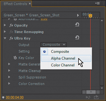
The Alpha Channel setting is usually the best mode for making adjustments under the Matte Generation and Matte Cleanup headings to get the cleanest key. For quick, somewhat less nuanced adjustments, using the preset Default, Relaxed, and Aggressive Setting choices can help you avoid some manual adjustments by giving you a good start.
If you’re adjusting the key manually, you may want to use the eyedropper in the bottom-right area of the background and raise the Contrast and Mid Point values while watching the alpha channel output to achieve the cleanest black and white areas in the matte (Figure 5.40).
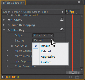
Figure 5.40 After choosing a key color, you can use one of the Setting presets as a starting point, and then follow it with fine adjustments.
Refining the Key Background
The Green_Screen_Shot is probably far from the most challenging key most of you have been faced with in postproduction, but some finesse is still called for. As versatile as the Ultra Key is, there are still occasions when having some additional strategies to better prepare key source footage can still be helpful.
Group number 2 shows the green screen shot once again. When you click on it, you can see in the Effect Controls panel that the clip has an RGB Curves effect applied but disabled. RGB curves, and color correction in more comprehensive terms are covered in Chapter 6, but in this case the Secondary Color Correction feature was used in the effect to isolate a correction to the green background (Figure 5.41).
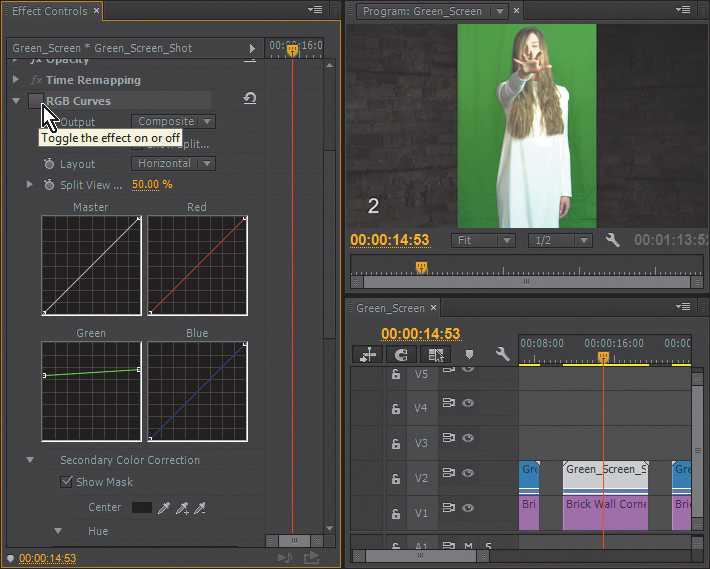
If you enable the RGB Curves effect in the Effect Controls panel, you’ll see the matte that defines the area of operation for the correction. As with the mattes you’ve worked with thus far, white represents the area of operation and black represents the area protected from the effect.
Scroll down in the Effect Controls panel to the settings just below the graphs and deselect Show Mask to see the correction (Figure 5.42). You can switch the RGB Curves effect on and off to see the change. The greenscreen is nearly the same value throughout the image. The curve adjustment evident in the curve on the Green channel shows the adjustment made. Basically, it reduces contrast and thus most of the variation in the green background, but most important, the fabric border that intersects our talent disappears.
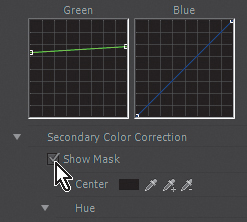
Figure 5.42 Deselect the Show Mask option in the RGB Curves effect to shut off the matte and view the change.
Apply the Ultra Key effect to this clip, ensuring that it is listed after the RGB Curves effect in the Effect Controls panel, and see how much easier the clip is to key with almost no fine adjustments needed.
Ultra Key as Matte Generator
There are times when an effect will require a matte beyond a simple greenscreen key. You’ve already worked with track mattes several times in this chapter, and the Ultra Key can be used to generate a moving matte for a color background key shot like the Green_Screen_Shot sequence. In clip group number 3, the Ultra Key is used to generate a matte by simply leaving it set on Alpha Channel Output. By generating a track matte in this way, the movement is an exact match for the clip (Figure 5.43).

Figure 5.43 The Ultra Key effect can be used to generate a matte by using it with the Alpha Channel setting.
Ultra Key and Added Effects
As noted earlier, the Ultra Key can be combined with other effects to expand what’s possible: We’re beginning to move toward a ghost-like final effect.
![]() Notes
Notes
The Green_Screen_Shot sequence group number 4 is another occasion to observe how changing the order of the standard effects in the Effect Controls panel (the Gaussian Blur and the Ultra Key in this case) will create an obvious difference in the combined effect.
In group number 4 the Ultra Key effect was combined with keyframes for Opacity (instead of the Film Dissolves used in the Portal Effect), and a keyframed Gaussian Blur was added as well. The foreground clip is starting to look a little ghostly but still a little mechanical, even with the blurring and transparency (Figure 5.44).
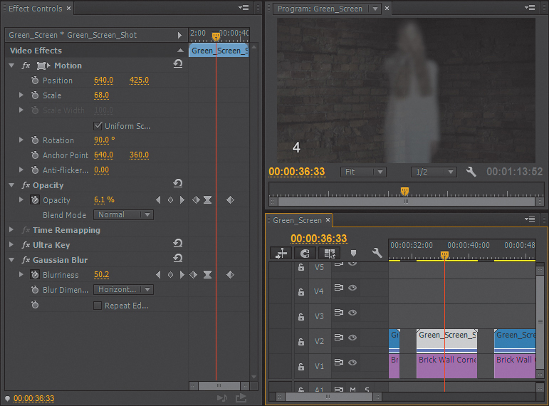
Figure 5.44 In group 4, adding a Gaussian Blur effect and animating its settings makes the keyed young woman look less defined as she fades in and out.
Ultra Key and Blend Modes
If you’ve read this far in the chapter, you must have known that we’d use Blend modes at some point as we build this effect, right?
Even though a greenscreen key is already a type of Blend mode, you can still combine any standard effect key with various Opacity Blend modes to create more detailed effects. In group number 5, the Screen Opacity Blend Mode was applied and combined with the effect that was constructed in group number 4 (Figure 5.45).
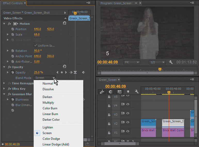
Figure 5.45 In clip group number 5, changing the Opacity Blend Mode changes the way the foreground blends with the background.
By using the Screen Blend Mode, the Opacity value at the second keyframe is actually increased, yet maintains or even enhances the appearance of the girl as something of an illusion because the wall behind her seems to be seen through her more prominently, in a way different than just adjusting opacity.
Duplicate the Key Source
An old trick when using transfer modes is to duplicate the clip that’s set to one of the Blend modes, like Screen, Overlay, or Multiply. I tend to use layers multiple times to intensify an effect in many compositing jobs. It creates more opportunity to be subtle and to capitalize on the strengths of multiple Opacity Blend modes.
So, in group number 6, the key layer, V2 is duplicated onto track V3, and to intensify the effect further, the V3 clip’s Blend mode was switched to Hard Light.
![]() Notes
Notes
Using a double-layered key can be useful in a variety of circumstances, including instances where a challenging key source means choosing between a clean outer edge and some interior areas that may show through. Placing another layer behind the primary layer and adding a slight blur can help fill interior holes and also soften edges to help subdue the feeling of separation between the key source and the background.
The V2 clip is a very soft, bright, blurry layer because of the added Luma Curve effect and the fact that the Gaussian Blur value was kept rather high. This treatment along with dropping the color saturation to zero in the Ultra Key’s post-key color correction properties helps make the girl appear a bit less defined (Figure 5.46).
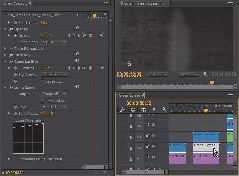
Figure 5.46 Duplicating the Green_Screen_Shot on V3 and adding a Luma Curve effect on top of an intensified Gaussian Blur to the clip on V2 adds even more softness to the effect.
Combining Techniques: Keying
In group number 7 the techniques mentioned in the preceding sections are combined. At this point we have a keyed element, which has been duplicated to intensify the ghost effect. Now, we’ll add another element—a Mist animation (Figure 5.47).
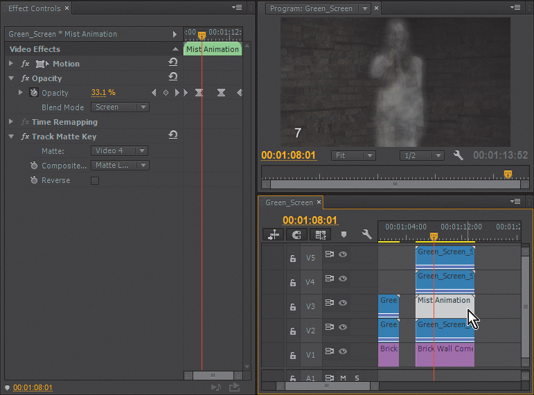
Figure 5.47 In group number 7 the Mist Animation nested sequence is inserted on V3 and a matte is inserted on V4, pushing the duplicate Green_Screen_Shot clip from V3 in group number 6 to V5 in group number 7.
A simple document was created in Photoshop (mist smoke.tif) and animated with some simple movement on a nested sequence (Mist Animation). Double-clicking on the Mist Animation clip on V3 will open the sequence and enable you to adjust the animation if you desire (Figure 5.48).
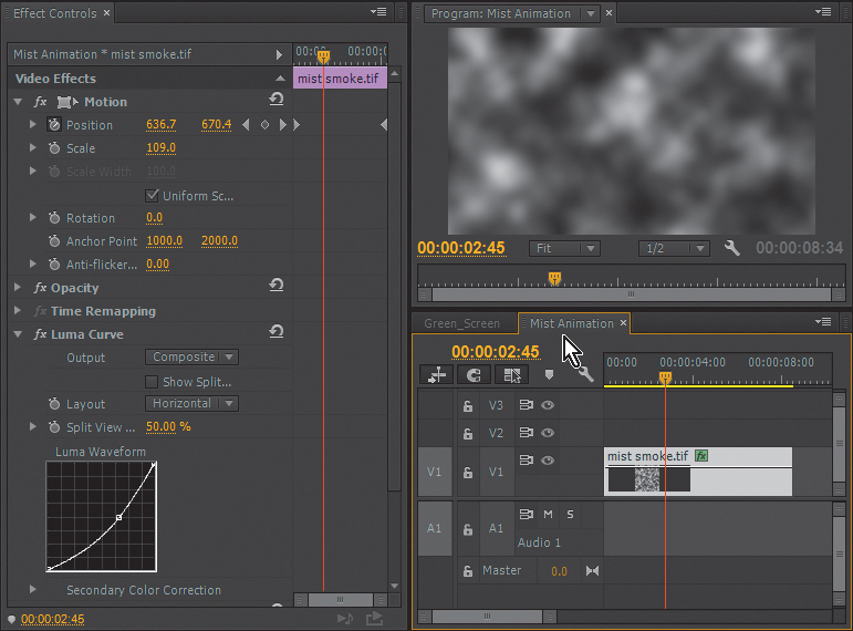
Figure 5.48 The Mist Animation sequence is a simple Motion animation of a TIF document, also altered with a Luma Curve effect.
The Mist Animation nested sequence is contained in an area defined by the Track Matte effect using the matte created with the Ultra Key from the Green_Screen_Shot on V4. By using soft, blurred layers on V2 and V5, and using various Blend modes to complete the illusion, the ghost forms from the smoky vapor and fades back to it after only a glimpse.
Opacity Blend Modes
In this chapter we’ve worked with Opacity Blend modes. You may be familiar with them if you’re experienced with the Blend modes in Photoshop or After Effects. But often, even those of us who use these Blend modes frequently don’t necessarily know how each one calculates a result. So, I’ve compiled a description of each mode and how it is designed to calculate the blend.
![]() Tip
Tip
Opacity Blend modes can also be applied by using the standard effect Calculations so you can control their rendering order in relation to other effects.
Adobe has divided them into six categories with borders in the menu, although the groups have no labeling in the menu. They are listed here from top to bottom the way they display in the menu (Figure 5.49).
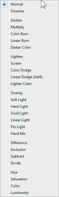
Normal Category
Normal in this case means each layer is treated “normally” with no additional mathematical formula:
![]() Normal. The pixels of the source layer are not affected by the pixel values of underlying layers unless Opacity is set to less than 100% The result color is the source color. This mode ignores the underlying color. Normal is the default mode.
Normal. The pixels of the source layer are not affected by the pixel values of underlying layers unless Opacity is set to less than 100% The result color is the source color. This mode ignores the underlying color. Normal is the default mode.
![]() Dissolve. Each pixel is either completely opaque or completely transparent depending on the opacity setting and the pixel values. This tends to look like old-school pixel dithering to me.
Dissolve. Each pixel is either completely opaque or completely transparent depending on the opacity setting and the pixel values. This tends to look like old-school pixel dithering to me.
Subtractive Category
Subtractive Blend modes involve measuring the RGB value of the pixel of a clip and subtracting information from it as it blends with an element below itself on the Timeline:
![]() Darken. Each color channel will look at the source and the underlying values at each pixel and adopt the darker value of the two.
Darken. Each color channel will look at the source and the underlying values at each pixel and adopt the darker value of the two.
![]() Multiply. The math starts to get a bit more sophisticated as you get into the modes that truly blend instead of simply choosing a pixel value. Multiply takes each source pixel color channel value, multiplies it with the underlying pixel color channel value, and then divides by the maximum value for the color precision you’re working in (255 being the maximum for 8-bits per channel material, etc.). You’re guaranteed to never produce a brighter value because if either value is full white, the other value is adopted, and if either color is full black, then black is adopted.
Multiply. The math starts to get a bit more sophisticated as you get into the modes that truly blend instead of simply choosing a pixel value. Multiply takes each source pixel color channel value, multiplies it with the underlying pixel color channel value, and then divides by the maximum value for the color precision you’re working in (255 being the maximum for 8-bits per channel material, etc.). You’re guaranteed to never produce a brighter value because if either value is full white, the other value is adopted, and if either color is full black, then black is adopted.
![]() Color Burn. Each pixel of the source layer is darkened according to the value of the underlying layer color by increasing the contrast. Pure white in the source layer does not change the underlying color.
Color Burn. Each pixel of the source layer is darkened according to the value of the underlying layer color by increasing the contrast. Pure white in the source layer does not change the underlying color.
![]() Linear Burn. Similar to Color Burn, the source pixels are darkened according to the value of the underlying color. Pure white produces no change. I prefer the results I get from Linear Burn because it doesn’t “pop” contrast as much as Color Burn.
Linear Burn. Similar to Color Burn, the source pixels are darkened according to the value of the underlying color. Pure white produces no change. I prefer the results I get from Linear Burn because it doesn’t “pop” contrast as much as Color Burn.
![]() Darker Color. Each pixel adopts the darker of the source color value or the underlying color value. Darker Color operates on the combined pixel color value as opposed to affecting each color channel as in the Darken Blend mode.
Darker Color. Each pixel adopts the darker of the source color value or the underlying color value. Darker Color operates on the combined pixel color value as opposed to affecting each color channel as in the Darken Blend mode.
![]() Tip
Tip
In cases where I have footage that is somewhat overexposed or has milky blacks, I duplicate the footage on the video track above and Multiply Blend it on top of itself, using the Opacity value of the top layer to moderate the effect. Although it isn’t as versatile as a full color correction pass, it’s a quick way to use the actual image to redefine the grayscale “slope.”
![]() Tip
Tip
Although I use Multiply on overexposed or bright shots, I use Screen on underexposed shots in the same way. By duplicating the footage on the video track above and Screening it on top of itself, the grayscale within the footage scales various brightness values proportionately.
Additive Category
Additive Blend modes involve measuring the RGB value of the pixel of a clip and adding information from it as it blends with an element below itself on the Timeline:
![]() Lighten. Each pixel color channel chooses between the source and the underlying color channel value, adopting whichever value is lighter (or higher).
Lighten. Each pixel color channel chooses between the source and the underlying color channel value, adopting whichever value is lighter (or higher).
![]() Screen. Adobe explains that the Screen Blend mode “Multiplies the complements of the channel values, and then takes the complement of the result.” Although explaining this mathematical formula in literal terms would put most artists to sleep, Adobe has a more intuitive description to help those of us without a slide rule; “Using the Screen mode is similar to projecting multiple photographic slides simultaneously onto a single screen.” As with overlapping two slide projectors, this Blend mode will never produce a darker value.
Screen. Adobe explains that the Screen Blend mode “Multiplies the complements of the channel values, and then takes the complement of the result.” Although explaining this mathematical formula in literal terms would put most artists to sleep, Adobe has a more intuitive description to help those of us without a slide rule; “Using the Screen mode is similar to projecting multiple photographic slides simultaneously onto a single screen.” As with overlapping two slide projectors, this Blend mode will never produce a darker value.
![]() Color Dodge. Each source pixel is lightened by decreasing contrast based on the value of the underlying layer color, except where the source layer color is black, in which case the underlying color will be adopted.
Color Dodge. Each source pixel is lightened by decreasing contrast based on the value of the underlying layer color, except where the source layer color is black, in which case the underlying color will be adopted.
![]() Linear Dodge (Add). This Blend mode is rather straightforward. Each source color channel value is “added” to the corresponding color channel values of the underlying color. Because the only results of a Linear Dodge calculation are additive, you will never create a pixel value darker than either original color. This is Screen mode’s bully of a big brother.
Linear Dodge (Add). This Blend mode is rather straightforward. Each source color channel value is “added” to the corresponding color channel values of the underlying color. Because the only results of a Linear Dodge calculation are additive, you will never create a pixel value darker than either original color. This is Screen mode’s bully of a big brother.
![]() Lighter Color. Each pixel adopts the lighter of the source color value or the underlying color value. Lighter Color operates on the combined pixel color value as opposed to affecting each color channel as in the Lighten Blend mode.
Lighter Color. Each pixel adopts the lighter of the source color value or the underlying color value. Lighter Color operates on the combined pixel color value as opposed to affecting each color channel as in the Lighten Blend mode.
![]() Tip
Tip
Because Overlay and Soft Light Blend modes both “stretch” gray scales to add contrast to images, I’ll often use one or the other on raw footage shot with a log curve. This footage usually looks milky and low contrast until color corrected because the flattened curve facilitates the storage of more grayscale information. Duplicating the footage over itself and applying Overlay or Soft Light is a way to add contrast to the footage rapidly when you have to edit but may have to leave final color correction for a later time.
Complex Category
The complex Blend modes involve measuring the RGB value of the pixel of a clip, and based on more complex math to produce a result, it blends with an element below itself on the Timeline:
![]() Overlay. A combination of Multiply and Screen, it applies both calculations to each color channel of the image, applying a Multiply blend to values less than 50% and Screen blend to values more than 50%. The bright and dark values of an underlying image layer will be preserved.
Overlay. A combination of Multiply and Screen, it applies both calculations to each color channel of the image, applying a Multiply blend to values less than 50% and Screen blend to values more than 50%. The bright and dark values of an underlying image layer will be preserved.
![]() Soft Light. The results of Soft Light will remind you of a “kinder, gentler” Overlay. The two calculations applied are more of a dodge and burn than a Screen and Multiply. If you’ve applied Overlay and your reaction was “I love that effect but with a bit more subtlety please,” you may want to try Soft Light blend as an alternative.
Soft Light. The results of Soft Light will remind you of a “kinder, gentler” Overlay. The two calculations applied are more of a dodge and burn than a Screen and Multiply. If you’ve applied Overlay and your reaction was “I love that effect but with a bit more subtlety please,” you may want to try Soft Light blend as an alternative.
![]() Hard Light. The Hard Light Blend mode does less “blending” with underlying images than some of the other modes. It multiplies or screens the input color channel values similar to Overlay, but it operates by focusing far more on the original source color values for input. Hard Light may improve on the results achieved with Overlay or Soft Light when the video layer you’re blending is disappearing, or at least becoming more transparent than you intend.
Hard Light. The Hard Light Blend mode does less “blending” with underlying images than some of the other modes. It multiplies or screens the input color channel values similar to Overlay, but it operates by focusing far more on the original source color values for input. Hard Light may improve on the results achieved with Overlay or Soft Light when the video layer you’re blending is disappearing, or at least becoming more transparent than you intend.
![]() Vivid Light. Working a bit like Soft Light mode, it burns or dodges the colors according to whether the underlying color is lighter or darker than 50% gray by increasing or decreasing the contrast. The result can be “contrasty,” visually similar to the Hard Light Blend mode except that even very bright areas of the blended layer are more likely to become completely transparent when over very dark colors or black in the underlying clip.
Vivid Light. Working a bit like Soft Light mode, it burns or dodges the colors according to whether the underlying color is lighter or darker than 50% gray by increasing or decreasing the contrast. The result can be “contrasty,” visually similar to the Hard Light Blend mode except that even very bright areas of the blended layer are more likely to become completely transparent when over very dark colors or black in the underlying clip.
![]() Linear Light. Similar to Vivid or Soft Light modes, you are applying a burn or dodge calculation to the colors by decreasing or increasing the brightness, depending on the underlying color. If the underlying color is lighter than 50% gray, the layer is lightened because the brightness is increased. If the underlying color is darker than 50% gray, the layer is darkened because the brightness is decreased.
Linear Light. Similar to Vivid or Soft Light modes, you are applying a burn or dodge calculation to the colors by decreasing or increasing the brightness, depending on the underlying color. If the underlying color is lighter than 50% gray, the layer is lightened because the brightness is increased. If the underlying color is darker than 50% gray, the layer is darkened because the brightness is decreased.
![]() Pin Light. This mode is tough to predict without trying it. This is another Blend mode that doesn’t so much blend as just replace pixels. If the underlying color is lighter than 50% gray, pixels brighter than the underlying color don’t change, but pixels darker than that color get replaced. Pixels lighter than the underlying color are replaced if the underlying color is darker than 50% gray, leaving pixels darker than the underlying color untouched.
Pin Light. This mode is tough to predict without trying it. This is another Blend mode that doesn’t so much blend as just replace pixels. If the underlying color is lighter than 50% gray, pixels brighter than the underlying color don’t change, but pixels darker than that color get replaced. Pixels lighter than the underlying color are replaced if the underlying color is darker than 50% gray, leaving pixels darker than the underlying color untouched.
![]() Hard Mix. Adobe’s description of Hard Mix is that it “enhances the contrast of the underlying layer that is visible beneath a mask on the source layer. The mask size determines the contrasted area; the inverted source layer determines the center of the contrasted area.” Honestly when I’m trying out Blend modes in After Effects, Photoshop, or Adobe Premiere Pro, I always try this mode and prefer pretty much any other Blend mode in pretty much every situation. Until I find a use for this Blend mode, I’ll have to leave you with the official Adobe description.
Hard Mix. Adobe’s description of Hard Mix is that it “enhances the contrast of the underlying layer that is visible beneath a mask on the source layer. The mask size determines the contrasted area; the inverted source layer determines the center of the contrasted area.” Honestly when I’m trying out Blend modes in After Effects, Photoshop, or Adobe Premiere Pro, I always try this mode and prefer pretty much any other Blend mode in pretty much every situation. Until I find a use for this Blend mode, I’ll have to leave you with the official Adobe description.
Difference Category
The difference Blend modes involve measuring the RGB value of the pixel of a clip and the clip beneath it, and displaying how much “difference” there is between the two:
![]() Difference. The darker value is subtracted from the lighter input value on each color channel. This effect is more obvious with lighter backgrounds because a white background will invert most colors, but a black background will have almost no effect.
Difference. The darker value is subtracted from the lighter input value on each color channel. This effect is more obvious with lighter backgrounds because a white background will invert most colors, but a black background will have almost no effect.
![]() Exclusion. Basically, this is Difference mode with less contrast for a more subtle effect.
Exclusion. Basically, this is Difference mode with less contrast for a more subtle effect.
![]() Subtract. Takes the pixel values of your source file and (oddly enough) subtracts them from the underlying values unless the source color is black, in which case the underlying value is adopted. The calculation for this Blend mode could actually result in values less than 1.0 in a 32-bit per channel sequence (where Max Bit Depth is enabled).
Subtract. Takes the pixel values of your source file and (oddly enough) subtracts them from the underlying values unless the source color is black, in which case the underlying value is adopted. The calculation for this Blend mode could actually result in values less than 1.0 in a 32-bit per channel sequence (where Max Bit Depth is enabled).
![]() Divide. Not surprisingly, this Blend mode divides the underlying color value by the source color value. This is the opposite of Subtract mode. If the source color is white, the underlying color is adopted. Funky math is possible with this Blend mode as well because it’s possible to calculate values greater than 1.0 in 32-bit per channel sequences.
Divide. Not surprisingly, this Blend mode divides the underlying color value by the source color value. This is the opposite of Subtract mode. If the source color is white, the underlying color is adopted. Funky math is possible with this Blend mode as well because it’s possible to calculate values greater than 1.0 in 32-bit per channel sequences.
![]() Tip
Tip
If you are stickler for detail with footage or a graphic you are trying to position precisely over itself in perfect alignment, using the Difference Blend mode on the top layer will allow you to hit the position exactly because the clip will turn completely black when the difference between the pixels is zero and the clip is perfectly aligned.
HSL Category
The HSL Blend modes don’t use math or difference, but rather substitute hue, saturation, color, or luminance between the blend of two clips:
![]() Hue. The hue value from the source clip is applied to the underlying clip, maintaining the underlying clip’s luminosity and saturation levels.
Hue. The hue value from the source clip is applied to the underlying clip, maintaining the underlying clip’s luminosity and saturation levels.
![]() Saturation. The saturation value from the source clip is applied to the underlying clip, maintaining the underlying clip’s luminosity and hue values.
Saturation. The saturation value from the source clip is applied to the underlying clip, maintaining the underlying clip’s luminosity and hue values.
![]() Color. The underlying clip maintains its original luminosity value but takes on the hue and saturation values of the source clip.
Color. The underlying clip maintains its original luminosity value but takes on the hue and saturation values of the source clip.
![]() Luminosity. The underlying clip maintains its hue and saturation while taking on the luminosity of the source clip.
Luminosity. The underlying clip maintains its hue and saturation while taking on the luminosity of the source clip.
Dynamic Link
Dynamic Link provides you with the powerful ability to transfer Adobe After Effects compositions directly into Adobe Premiere Pro. When you change your composition in After Effects and click Save, the results are updated dynamically in Adobe Premiere Pro’s Timeline.
As versatile as the effects capabilities of Adobe Premiere Pro are, some effects will still require more than a video editing application to complete. Adobe After Effects is designed not only to do complex visual effects and motion graphics work, but also to work very closely with Adobe Premiere Pro through Adobe Dynamic Link.
In the Chapter 5 project is a sequence titled Ghost Composite, which you can open from the Dynamic Link bin in the Project panel, or simply bring it to the front if it’s already a tab in the Timeline panel (Figure 5.50).
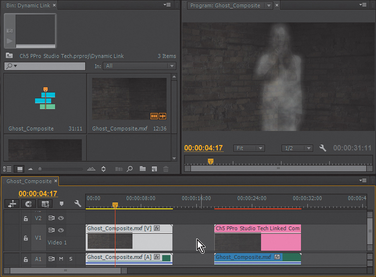
The first clip on the Timeline is a compiled clip showing the completed ghost composite. The second clip started as the same media but was changed to a Dynamic Linked After Effects Composition.
Provided you have Adobe After Effects installed on your system, you can right-click on the Ch5 PPro Studio Tech Linked Comp 01 clip and choose Edit Original to open the After Effects project and view the After Effects Composition.
Because After Effects has a 3D camera, it can be used to make the ghost shot seem a bit more spontaneous, as if the videographer was startled and struggling to capture a proper image. The 3D camera imitates a handheld camera and introduces camera movement and focus adjustments in After Effects. Any adjustments you make to the After Effects comp will be reflected in Adobe Premiere Pro, allowing you to render the effect only once (Figure 5.51).
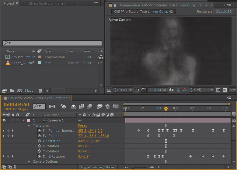
Figure 5.51 Using Dynamic Link, the clip from Adobe Premiere Pro is animated using the 3D camera in After Effects, and the changes are immediately updated in Adobe Premiere Pro.
You can create a new Dynamic Link to an After Effects comp from a clip in a sequence by choosing File > Adobe Dynamic Link or by right-clicking on a clip and choosing Replace with After Effects Composition (Figure 5.52).

Figure 5.52 With a clip selected on the Timeline, choose Replace with After Effects Composition to open it in After Effects.
After Effects opens, and after you’ve named the project and specified a location to save it to, an After Effects composition opens with the same settings as the Adobe Premiere Pro sequence you’re currently working on.
As much as the result of our longer scenarios was a matter of combining effects and using them together, the goal of this chapter was to create some situations where these techniques are used in some sort of context. The idea was to expand the list of options you have as you use Adobe Premiere Pro in postproduction to solve problems and create value for your clients. Hopefully this chapter held some value for you, even if you’re an experienced user.