
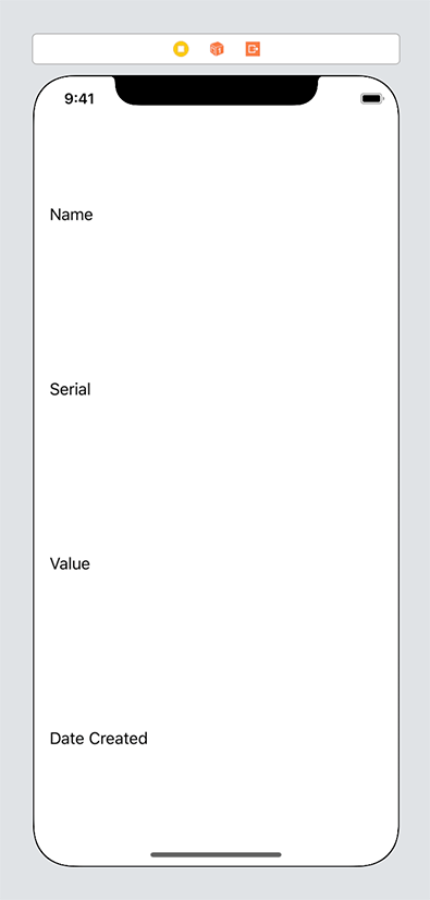
At the top level, your new interface will have a vertical stack view with four elements displaying the item’s name, serial number, value, and date created (Figure 11.2).

Open your LootLogger project and then open Main.storyboard. Drag a new View Controller from the library onto the canvas. Drag a Vertical Stack View from the library onto the view for the View Controller. Add four constraints to the stack view: Pin it to the leading and trailing margins, then pin the top and bottom edges 8 points from the top and bottom of the safe area.
Now drag four instances of UILabel from the library onto the stack view. From top to bottom, give these labels the text Name, Serial, Value, and Date Created (Figure 11.3).

You might notice a warning that some views are vertically ambiguous. And if you select any of the labels, you will see that they all have a red top and bottom border (indicating a vertical Auto Layout problem). There are two ways you can fix this issue: by using Auto Layout or by using a property on the stack view. Let’s work through the Auto Layout solution first, because it highlights an important aspect of Auto Layout.
You learned in Chapter 3 that every view has an intrinsic content size. You also learned that if you do not specify constraints that explicitly determine the width or height, the view will derive its width or height from its intrinsic content size. How does this work?
It does this using implicit constraints derived from its content hugging priorities and its content compression resistance priorities. A view has one of each of these priorities for each axis:
-
horizontal content hugging priority
-
vertical content hugging priority
-
horizontal content compression resistance priority
-
vertical content compression resistance priority
The content hugging priority is like a rubber band that is placed around a view. The rubber band makes the view not want to be bigger than its intrinsic content size in that dimension. Each priority is associated with a value from 0 to 1000. A value of 1000 means that a view cannot get bigger than its intrinsic content size on that dimension.
Let’s look at an example with just the horizontal dimension. Say you have two labels next to one another with constraints both between the two views and between each view and its superview, as shown in Figure 11.4.
This works great until the superview becomes wider. At that point, which label should become wider? The first label, the second label, or both? As Figure 11.5 shows, the interface is currently ambiguous.

This is where the content hugging priority becomes relevant. The view with the higher content hugging priority is the one that does not stretch. You can think about the priority value as the “strength” of the rubber band. The higher the priority value, the stronger the rubber band and the more it wants to hug to its intrinsic content size.
The content compression resistance priorities determine how much a view resists getting smaller than its intrinsic content size. Consider the same two labels from Figure 11.4. What would happen if the superview’s width decreased? One of the labels would need to truncate its text (Figure 11.6). But which one?

The view with the greater content compression resistance priority is the one that will resist compression and, therefore, not truncate its text.
With this knowledge, you can now fix the problem with the stack view.
Select the Date Created label and open its size inspector. Find the Vertical Content Hugging Priority and lower it to 249. Now the other three labels have a higher content hugging priority, so they will all hug to their intrinsic content height. The Date Created label will stretch to fill in the remaining space.
Let’s take a look at another way of solving the problem. Stack views have a number of properties that determine how their content is laid out.
Select the stack view, either on the canvas or using the document outline. Open its attributes inspector and find the section at the top labeled Stack View. One of the properties that determines how the content is laid out is the Distribution property. Currently it is set to Fill, which lets the views lay out their content based on their intrinsic content size. Change the value to Fill Equally. This will resize the labels so that they all have the same height, ignoring the intrinsic content size (Figure 11.7).
We recommend that you read the documentation to learn about the other distribution values that a stack view can have. For now, change the Distribution of the stack view back to Fill; this is the value you will want going forward in this chapter.
One of the most powerful features of stack views is that they can be nested within one another. You will use this to nest horizontal stack views within the larger vertical stack view. The top three labels will have a text field next to them that displays the corresponding value for the Item and will also allow the user to edit that value.
Select the Name label in the item detail view hierarchy on the canvas. Click the rightmost icon in the Auto Layout constraints menu ( ) and then select Stack View from the Embed In View section. This will embed the selected view in a stack view.
Select the new stack view and open its attributes inspector. The stack view is currently a vertical stack view, but you want it to be a horizontal stack view. Change the Axis to Horizontal.
Now drag a Text Field from the library to the right of the Name label. Because labels, by default, have a greater content hugging priority than text fields, the label hugs to its intrinsic content width and the text field stretches. The label and the text field currently have the same content compression resistance priorities, which would result in an ambiguous layout if the text field’s text was too long. Open the size inspector for the text field and set its Horizontal Content Compression Resistance Priority to 749. This will ensure that the text field’s text will be truncated if necessary, rather than the label.
The label and text field look a little squished because there is no spacing between them. This is easy to fix, because stack views allow you to customize the spacing between items.
Select the horizontal stack view and open its attributes inspector. Change the Spacing to be 8 points. Notice that the text field shrinks to accommodate the spacing, because it is less resistant to compression than the label.
Repeat these steps for the Serial and Value labels:
-
Select the label, click the
icon, and select Stack View. -
Change the stack view to be a horizontal stack view.
-
Drag a text field onto the horizontal stack view and change its horizontal content compression resistance priority to be
749. -
Update the stack view to have a spacing of 8 points.
There are a couple of other tweaks you will want to make to the interface: The vertical stack view needs some spacing. The Date Created label should have a center text alignment. And the Name, Serial, and Value labels should be the same width.
Select the vertical stack view, open its attributes inspector, and update the Spacing to be 8 points. Then select the Date Created label, open its attributes inspector, and change the Alignment to be centered. That solves the first two issues.
Although stack views substantially reduce the number of constraints that you need to add to your interface, some constraints are still important. With the interface as is, the text fields do not align on their leading edge due to the difference in the widths of the labels. (The difference is not very noticeable in English, but it becomes more pronounced when localized into other languages.) To solve this, you will add leading edge constraints between the three text fields.
Control-drag from the Name text field to the Serial text field and select Leading. Then do the same for the Serial text field and the Value text field. The completed interface will look like Figure 11.8.

Stack views allow you to create very rich interfaces in a fraction of the time it would take to configure them manually using constraints. Constraints are still added, but they are being managed by the stack view itself instead of by you. Stack views allow you to have very dynamic interfaces at runtime. You can add and remove views from stack views by using addArrangedSubview(_:), insertArrangedSubview(_:at:), and removeArrangedSubview(_:). You can also toggle the hidden property on a view in a stack view. The stack view will automatically lay out its content to reflect that value.