
APPENDIX
Service Trends and Take-Aways
In the course of our work, we have tracked a number of global trends in the service sector. They disclose interesting patterns for service work in the developed economies of the world. Some of the most interesting are presented in the following figures. Observations that they support include those shown in the sidebar.
Of the trends mentioned in the sidebar, two highlight concerns of ours and of economists in general.
The first is the productivity gap between workers in manufacturing and services. Data in figure A-4 shows that in the United States between 1987 and 2011, productivity in manufacturing grew a full percentage point a year more than in a wide cross-section of businesses encompassed by the Bureau of Labor Statistics under “services.” Both an explanation for this and a caution for the future is contained in figure A-5. It shows that inputs to production from labor have actually increased for services, from 57.5 percent in 1987 to 58.2 percent in 2011, while they have fallen substantially for manufacturing, from 34.8 percent in 1987 to 27.1 percent in 2011. If inputs from labor are so important to services, the search for higher labor productivity in services surely takes on more urgency.
This urgency is heightened by the fact that many service jobs, particularly in sectors such as health care and education, increasingly can be carried out without proximity of service provider and customer.1 As a result, these jobs are becoming tradable, subject to international competition and pressures for increased productivity. By contrast, lower productivity increases characterize the less tradable jobs in location-based service settings such as public education, health care, and leisure and hospitality. Even these kinds of jobs are showing signs of becoming more tradable, as we have seen.
A second and even more important matter concerns us as students of management. We would like to think that frontline employees have been provided with more control over the outcomes of their work. That they’ve been given bigger jobs requiring more training that has improved their productivity. That support systems have been designed to enable more of them to deliver results to customers. We would like to think that they are more satisfied with their jobs. Unfortunately, what one would like to think is not always an accurate reflection of reality.
How does one explain the results of a 2014 Conference Board survey indicating that 47.7 percent of US workers were satisfied with their jobs, a figure only slightly higher than the all-time 27-year low.2 Why did a similar 2005 study of workers in 16 countries show that only 14 percent answered that they were “highly engaged” with their work while 29 percent indicated that they were “disengaged”?3And why did a recent Gallup Poll survey show that only 2 percent of Singapore’s workers “feel engaged by their jobs.”4 The bottom-line importance of the finding of the 2005 study was that the “highly engaged” workers said they were twice as likely to remain in their jobs as those who were “disengaged.”5
There are several possible explanations for these disappointing findings. First, of course, attitudes toward work may be influenced by many factors somewhat outside the control of individual managers. There is one important factor, however, that isn’t outside the control of management. It’s job satisfaction. Satisfaction is a function of the positive or negative difference between what is actually experienced as opposed to what is expected. Low job satisfaction may be a function of unrealistically high expectations, increasingly negative experiences, or both. We’ve found in our research that unmet expectations are also associated with a lack of trust among employees toward an organization and a boss, which is yet another piece of the puzzle of employee dissatisfaction. Whatever the explanation, management has to take some responsibility for the condition and how to correct it.
Figure A-1 Trends in US Employment, by Sector, 1900–2013
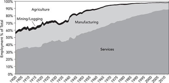
Source: US Bureau of Labor Statistics, Historical Statistics of the US, www.bls.gov/data/#employment, accessed June 20, 2014.
Take-aways: The proportion of jobs devoted to services in the United States has climbed steadily since 1900 with the exception of the periods during the Great Depression and World War II. It is approaching its ultimate share of nearly 90 percent of all jobs.
Figure A-2 Service Sector as a Percentage of All Employment, UK, France, Mexico, China, 1969–2012
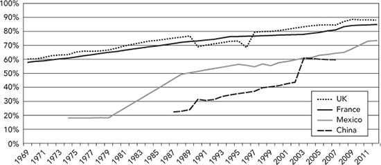
Source: International Labour Organization, ILOSTAT Database, www.ilo.org, accessed June 19, 2014.
Take-aways: The proportion of jobs devoted to services has shown gains in both more and less developed economies around the world for decades. The rate of increase is greater in developing economies like Mexico and China. It is slowing in developed economies like the United Kingdom and France, where it is approaching the same proportion as in the United States
Figure A-3 Share of Services in Gross Domestic Product, US and the World, 1990–2011
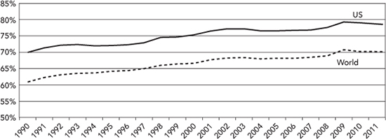
Source: World Bank, World Development Indicators, http://data.worldbank.org/data -catalog/world-development-indicators, accessed July 8, 2014.
Take-aways: The share of Gross Domestic Product (GDP) generated by services has increased from about 70 percent in 1990 to about 78 percent of GDP in 2011. The same pattern describes world trends, although shares of GDP from services globally have trailed those for the United States by about 10 percentage points in recent years. Comparing this data with that in figure A-1 showing employment in services at about 89 percent of the US total, it suggests that the value of output, measured in GDP, is lower per employee for services than for manufacturing in the United States. This is one way of measuring productivity, however imperfect it may be.
Table A-1 Revenue per Employee for Various Types of Enterprises, US, 2012
Type of Enterprise |
Revenue per Employee |
Oil and gas extraction |
$1,738,163 |
Wholesale trade |
1,184,560 |
Utilities |
796,943 |
Insurance carriers and related activities |
749,774 |
Manufacturing |
510,816 |
Mining |
446,244 |
Information |
384,227 |
Retail trade |
286,887 |
Real estate and rental and leasing |
247,760 |
Professional, scientifc, and technical services |
189,574 |
Transportation and warehousing |
172,653 |
Other services (except public administration) |
125,063 |
Health care and social assistance |
110,349 |
Arts, entertainment, and recreation |
96,273 |
Educational services |
85,480 |
Accommodation and food service |
59,083 |
Warehousing and storage |
44,276 |
Note: Types of enterprises listed in bold print are primarily services.
Source: US Bureau of the Census, http://factfinder2.census.gov/faces/tableservices/jsf/pages/productview.xhtml?pid=ECN_2012_US_00CADV1&prodType=table, accessed July 9, 2014.
Take-aways: Revenue per employee varies greatly by type of enterprise in the United States. For most types of service enterprise, it is far lower than that in manufacturing. It is, however, a poor indicator of productivity because labor input (and cost as a proportion of revenue) is generally lowest in those businesses with high revenue per employee. To the extent that revenue puts an upper limit on the total labor bill, and to some degree on wages per hour, it is important in services ranging from information services to warehousing and storage. It is a reminder of the need for productivity improvements, particularly in services with low revenue per employee such as education, accommodation and food service, and warehousing and storage.
Figure A-4 Productivity Changes, Manufacturing vs. Selected Services, U.S., 1987–2011

Source: US Bureau of Labor Statistics, http://www.bls.gov/mfp/mprdload.htm, accessed July 11, 2014.
Take-aways: During the 24-year period between 1987 and 2011, the average annual multifactor productivity increases in several service categories (trade, transportation and warehousing, and information) approximated those in manufacturing. However, multifactor productivity in many service jobs (encompassed by “services”) hardly changed at all, explaining why productivity increases in service jobs as a whole trailed those in manufacturing. However, during the most recent period of 2007 to 2011, generally years of the Great Recession, even in jobs included under “services,” productivity increases were roughly comparable to those in manufacturing.
Figure A-5 Inputs to Production from Labor, Services vs. Manufacturing, US, 1987 to 2011

Source: US Bureau of Labor Statistics, http://www.bls.gov/mfp/mprdload.htm, accessed July 8, 2014.
Take-aways: Although manufacturing enterprises reduced labor inputs to finished products between 1987 and 2011, service enterprises were unable to do so. Data in table A-2 provides one possible explanation. It shows that the largest job growth in services in recent years has occurred among jobs in leisure and hospitality, jobs with the highest share of labor to total input and jobs that are the lowest paying. As shown in table A-1, these are also jobs in organizations that generate lower revenues per employee. This helps explain why productivity increases in services as a whole have been smaller than those in manufacturing over this period.
Figure A-6 Trends in the US Trade in Goods and Services, Balance of Payments (BOP) Basis, 1980–2011
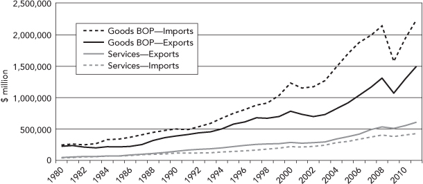
Source: US Bureau of Economic Analysis, http://www.census.gov/foreign-trade/statistics/historical/gands.txt, accessed June 19, 2014.
Take-aways: Services have generated substantial positive trade balances for the United States for many years. Such balances, however, have not been sufficient to offset larger negative trade balances generated by manufactured goods.
Figure A-7 Average Hourly Wages in Service & Manufacturing Sectors, US, 1966–2013

Source: US Bureau of Labor Statistics, http://data.bls.gov/pdq/SurveyOutputServlet, accessed June 18, 2014.
Take-aways: Average wages in services in the United States have steadily gained ground on those in manufacturing since 1994, and have actually exceeded them in the years since 2010.
Table A-2 US Hourly Earnings and Employment in 2013 and Job Growth, 2004–2013, for Manufacturing, Selected Services, and Extracting Enterprises

Note: Service enterprises are shown in bold print.
Source: US Bureau of Labor Statistics, http://www.bls.gov/opub/eef/archive.htm, accessed June 24, 2014.
Take-aways: While, on average, service jobs pay more than manufacturing jobs in the United States, in fact wages vary over a wide range, with many jobs falling at both the top and bottom of the range. Job growth in all services has exceeded that in manufacturing, with the highest rate of growth coming in low-paying leisure and hospitality as well as high-paying professional and business services.
Figure A-8 Stability of Employment in Services and Manufacturing, US, 1901–2013

Source: US Bureau of Labor Statistics, Historical Statistics of the US, www.bls.gov/data/#employment, accessed June 20, 2014.
Take-aways: During the period shown in Figure A-8, employment in services has been more stable than that in manufacturing in the United States. Most recently, this was true as well during the Great Recession of 2008 to 2010.