11. Back to Basics
,In this chapter, we go back over the basics of risk, risk diagrams, and the interaction of risk management with the more familiar roles of project management. Our purpose in this second pass is to add a bit of rigor to the fast-and-loose presentation of the introductory chapters.
The Hidden Meaning Behind “I Don’t Know”
An essential part of project management is coming up with answers to key questions such as, When will you be done? What mean-time-to-failure will your product exhibit? Will your user accept and use the product? All of these are money questions since they deal directly with the cost/value trade-off of the product to be delivered.
One honest answer to all of these questions is, “I don’t know.” Of course you don’t know. The person who is asking you knows that you don’t know. Questions about future outcomes and the very concept of knowing are mutually incompatible.
One approach is to preface whatever answer you come up with by saying, “I don’t know, but . . .” However, even if you don’t begin with this qualifier, it is implicitly understood.
Our point here is that you need to recognize these I-don’t-know questions because they are always indicators of risk. Whatever you don’t know has a downside that can turn against you, and that is your risk. If you could compile all the unique I-don’t know questions about your project and get to the root cause of each one’s unknown, you’d have a complete list of the project’s risks.
A tactic that is intrinsic to risk management is to listen to yourself saying “I don’t know” (out loud or mentally) and force yourself each time to ask the subsidiary question:
What do I know (or what could I know) about what I don’t know?
There is always some information available about the unknown. And you are always better off having that information than proceeding without it.
Here’s an example. You plant your garden on March 31, and since there is no water handy at the garden site, you’re counting on rain to water it for you. So, the money question here is, How much rain will fall on the garden? Your answer, of course, is, I don’t know. Clearly, this signals a risk that your effort and the cost of your seed may be lost due to insufficient moisture for proper germination. You now ask the subsidiary question: What do I know (or what could I know) about what I don’t know? A quick Web search or a visit to your county’s agricultural agent is likely to produce the following kind of information about past rainfall in your area:
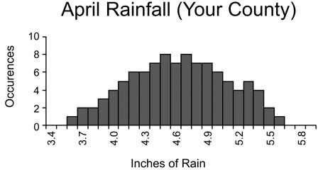
What’s shown here is a historical record of the past hundred years of April rainfall in your county. If the information from your seed supplier suggests that germination requires only two inches of watering during the first month, you can feel pretty confident that the extent of your risk is small. Suppose you need at least 4.4 inches? Well, now the risk is more serious. You can see from the chart that in nearly a third of the past hundred years, April rainfall has been less than that amount.
You still don’t know what the rainfall will be this year. But what you now know about your unknown is of value. It guides you in planning how to cope with your uncertainty. If a given mitigation scheme (such as arranging to have a pipe installed all the way back to the house) is expensive, you have some useful input to your decision on whether or not to mitigate.
Uncertainty Diagrams (Risk Diagrams) Again
No surprise here, the rainfall chart you’ve been looking at is an uncertainty diagram. Our formal definition is this:
uncertainty diagram n: a graphic that shows a set of enumerated outcomes along the horizontal, with the vertical scale showing the relative likelihood of each outcome
When the thing you’re uncertain about has financial significance to your project, its diagram is called a risk diagram.
An uncertainty diagram shows a pattern of past outcomes:
By convention, we scale the vertical so that the sum of all the likelihoods is equal to one.
For most I-don’t-know questions, reviewing the pattern of the past is essentially the best you can do to understand the extent of your uncertainty about the future. It doesn’t answer your question, but it does give you a handle on the extent to which you don’t know the answer. It helps you to locate yourself along the uncertainty scale from Clueless to Confident.
A Better Definition of Risk
Let’s shift from the garden example to a more immediately worrisome one, the uncertainty about when your software project will be done:

Spot us for the moment that you’re ever going to be able to come up with such a diagram for your project, and let’s focus first on what good it will do for you if you can.
You can use a risk diagram to quantify the extent of any given risk. For example, you can look for the point at which half the area is to the left and half is to the right and call that your fifty-fifty risk, the earliest outcome for which the likelihood of exceeding catches up with the likelihood of not exceeding. You can look farther out to the right where 90 percent of the area is included (looks like approximately May of next year) and know that if you assert that as your delivery date, you have only a 10-percent likelihood of needing more time. In other words, it’s far more likely that you’ll come in early than late. You could also exclude the most optimistic 10 percent and the most pessimistic 10 percent and assert that you have an 80-percent chance of finishing sometime between this May and the next. A risk diagram is a tool for assessing the extent of risk, in whatever form you choose to express it. However, we’re going to urge a more grandiose understanding of the risk diagram upon you, the idea that the situation portrayed by the diagram is the risk. This leads us to the following final definition of risk, replacing the temporary definition given in Chapter 2:
risk n: a weighted pattern of possible outcomes and their associated consequences
In defining risk this way, we’re trying to wean you off the habit of thinking numerically about risk and to encourage you instead to think about it graphically. In the past, a question from your boss like, “What is the risk that we won’t be ready by the first of next year?” has always seemed to beg for a percentage answer, either explicit or inferred:
• “It’s in the bag, boss” (essentially 100-percent certain); or,
• “I guess we’ve got an even shot at it” (50 percent); or,
• “We really don’t have a snowball’s chance in hell” (less than a percent).
With our now-refined concept of risk, we answer the question with a risk diagram, like the one shown above. We don’t digest the answer for the boss or the client or the stakeholder, but instead lay all the cards on the table: “As you always understood, there is uncertainty in the process of making software, and here is the extent of it for this project.”
Characteristics of Risk Diagrams
Some of the uncertainty diagrams we’ve shown you were simple bar charts where the bars corresponded exactly to the enumerated outcomes. And others were smooth curves. What’s the difference? Take the diagrams below, for example: How is the rainfall diagram on the left different from the one on the right?
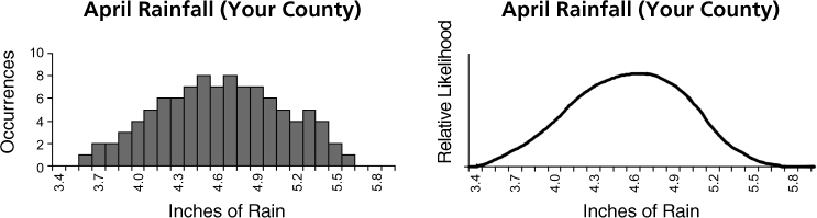
The difference is entirely a matter of granularity. With data from only a hundred years, the curve of the left graph is bumpy and the bars need to be wide enough to be visible. If we had data from a million years, the curve would smooth out substantially and the bars could be made ever thinner, thus producing the more continuous curve shown on the right.
For practical purposes, local data (the results of the handful of projects that you’ve observed in your company) tends to be of coarse granularity, and industry trends, including thousands of projects, tend to be smooth. Without too much loss of rigor, we can always approximate a granular curve with its smooth near-equivalent.
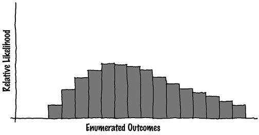
Risk diagrams often have fairly characteristic shapes. We might, for example, come across one that mathematicians would call “normal,” or symmetrical around a midpoint:

Far more common are skewed diagrams that look like this:
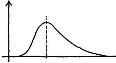
The reason for this is that human performance tends to be skewed in just this shape, with relatively more clustering at the high-performance end (usually the left, indicating quicker completion) than at the low-performance end.
Finally, there is a class of weird-looking diagrams such as the following:
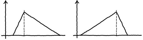
Weird, but useful. These rather artificial forms approximate smooth curves without sacrificing too much rigor. You can see the appeal of these triangular uncertainty diagrams: They allow us to focus on best case, worst case, and most likely case. As you will see, these curves are very handy for dealing with some of the component risks that drive our projects.
Aggregate and Causal Risks
So far, we’ve lumped together risks of two rather different types. We’ve given the risk profile of entire projects, expressed with uncertainty diagrams showing delivery dates, total cost or effort, or versions likely to be delivered by a fixed date. And we’ve also spoken of component risks, such as the production rate of staff or the loss of personnel. The first category consists of what we call aggregate risks, since they deal with the project as a whole; we call the second category causal or component risks. Clearly, the two are related. Uncertainty about an aggregate result is a direct function of the uncertainties in those causal factors that lead to success or failure:
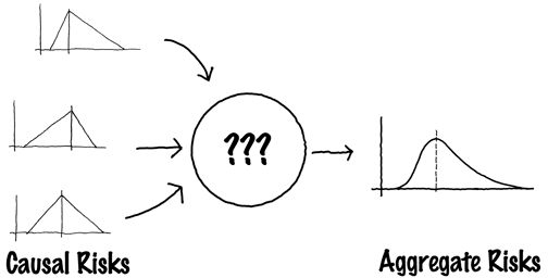
The process in the middle (the business of transforming a set of causal risks into aggregate risk) is what we refer to below as a “risk model.”
As you can see, our prescription calls for the use of risk diagrams as input to and output from this process. In other words, each of the component or causal risks is described by a risk diagram, and we use an automated approach to digest the causals and to create from them an aggregate indicator of risk, again in the form of a diagram.
Two Kinds of Model
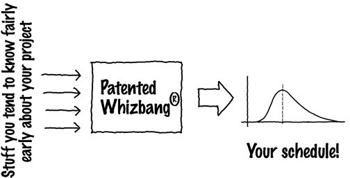
What would be handy here is a combination prognosticator and risk indicator. First, it would ask you for dozens or scores of questions about your project, and then it would put out a risk diagram showing a range of likely done dates, each of them associated with a degree of uncertainty. It would do your estimating for you and also perform an uncertainty analysis on the estimates it came up with.
Such a whizbang would be part parametric estimator and part uncertainty overlayer. The parametric estimator component of this is already available on the market. You probably already have such a tool, whether it was purchased by your company or developed in-house. You pour in what you know about the project (function points, SLIM parameters, COCOMO predictors, or whatever), together with some customizing information about your procedures and past history, and it offers up an elapsed time in which the project could be done.
We’re going to propose that you continue to use whatever your present estimator is (even if it’s just a wet finger in the wind) and combine it with the risk model we supply in the two chapters just ahead. The estimator is your production model since it shows how much you can produce over time, and the risk model shows you how much uncertainty should be associated with the production estimate. Working together, the two models interact like this:
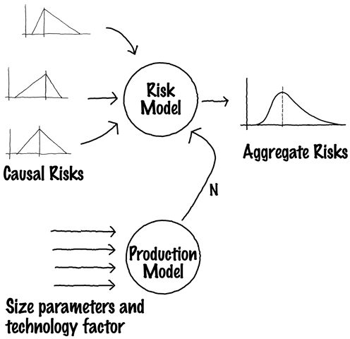
We’ve shown the output as a schedule in risk-diagram form. It shows how certain or uncertain you can be of delivery at any given time in the future. The same scheme could be used to produce an aggregate risk diagram showing versions likely to be delivered over a range of dates.
The single parameter connecting the two models is N, the nano-percent date. As implied by the diagram, we encourage you to turn your production model or estimator up to its most optimistic settings to determine N, the best case. The risk model then overlays the uncertainty to produce the aggregate diagram.
One More Nuance About Risk Diagrams
To demonstrate the next idea, we need to construct a very coarse uncertainty diagram (its coarseness will help the effect to be clearly visible). Let’s suppose we’re studying a small group of students. We have some data about them, including their weight in pounds. We group the data points into twenty-pound increments and find that there is one child in the 101-to-120 pound group, three in the 121-to-140 pound group, and two in the 141-to-160 pound group:

This graphic can be viewed as an uncertainty diagram: Suppose one of the kids is about to jump into your lap—this type of diagram can be used to show how uncertain you are about how much weight to expect. The diagram shows the relative likelihood of each of the three weight ranges.
The exact same data might be shown in a slightly different form, grouped cumulatively:

This diagram needs to be read slightly differently: The graph shows the probability that the child who jumps in your lap will be in or below the indicated weight group. Below the first weight group, the probability is zero (there are no kids who weigh less than 100 pounds in the class). At the upper weight group and beyond, the probability is 100 percent since all the kids in the class are in the top group or below.
Both diagrams portray the same data. The first shows the relative likelihood of there being a child in a given group, and the second shows the cumulative likelihood of there being a child in the indicated group or any lower one. We shall term these two kinds of uncertainty diagram incremental and cumulative, respectively.
Now, back to the real world: Shown below are the incremental risk diagram for a project’s delivery date and, immediately underneath, its cumulative equivalent:
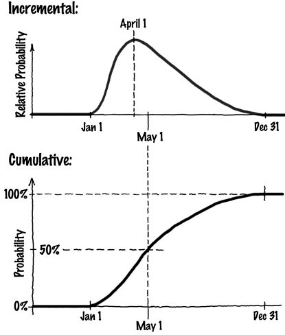
Again, both graphs show the same data, just presented slightly differently. The first thing you’ll notice is that the scale along the vertical of the cumulative form is a bit easier to grasp: It conveys straight probability from 0 to 100 percent. Any date south of January 1 is hopeless (0-percent likely), and if we’re willing to go all the way out to the end of December of next year, it’s essentially certain (100-percent likely) that we’ll make the date. The fact that May 1 of next year is the fifty-fifty date is read directly off the cumulative diagram, but you’d have to estimate areas to the left and right to see it on the incremental.
Both forms are useful, and if you have the data for either one, you can always use it to derive the other.