Overview
This chapter reviews the geographic capabilities available within Tableau. Tableau provides an extensive set of options for working with location-based source data, which can help you design solutions using either point or polygon location data. By the end of this chapter, you will be able to effectively use geographic data in Tableau to perform sophisticated location-based analyses. You will gain a greater understanding of how to import multiple data formats and use your data to create polished, interactive maps. These skills will be developed through a series of exercises followed by an activity wherein you will create your own geographic workbook from start to finish.
Introduction
In the last chapter, you explored distributions and relationships in a dataset and learned how to identify patterns within a given dataset. This chapter will focus on the geographic aspect of data and how location affects those distributions and relationships.
Understanding geographic patterns is critical for many datasets, whether they are revenue patterns around the world for a global corporation or local purchase patterns for a small business. This type of data is especially useful for explaining patterns to internal or external customers with maps, in which you can show patterns at the region or country level all the way down to postal code or even smaller geographic levels, depending on how the data is collected. This can be highly useful for visualizing purchase, voting, or demographic patterns, as just a few examples.
One of the most powerful aspects of using geographic data and maps lies in the intuitive understanding of location data many users are likely to have. This helps to put patterns in perspective, allowing you to more quickly derive critical insights about the locations and interactions of customers, clients, donors, or other stakeholders within your organization.
Geographic data can be as simple as basic street address information or as complex as custom location-based hierarchies created by an organization, where multiple geographic levels have been defined based on a set of custom boundaries. Ideally, your work starts with data that has already been geocoded, making it quite simple to read the data into Tableau without further steps. In some cases, you will need to do some additional work so that your location data is accurately defined. It is very important to understand the level of geographic granularity you are working with in your data, as well as the type of location information that is captured in the data: do you have latitude and longitude coordinates in your source data, or will you use Tableau to automatically perform this process?
In this chapter, you will learn how to import geographic data and use it in your Tableau worksheets and dashboards. The chapter will also highlight when location data should be mapped and when it is best used within charts to tell the most effective story, as well as which level of geographic granularity (postal code, city, state, and so on) is appropriate for an analysis. By the end of the chapter, you will be proficient in using geographic data as a critical part of your Tableau toolkit.
In this chapter, you will work with a Madrid Airbnb dataset for your point data and a shapefile with New York City boundaries for your polygon data.
Importing Spatial Data
Before you can use the many capabilities Tableau provides for geographic datasets, it is important to understand the geographic data types that Tableau can utilize. Tableau can ingest geospatial data from many popular formats, including shapefile, GeoJSON, and MapInfo sources. The next section will cover some of the most common spatial formats and how to add them to your workbooks.
Spatial data is unique in how it defines geographic attributes. While typical spreadsheet or database data may contain geographic elements (city, state, country, postal code, and so on), it will not contain additional information about those entities. Most often, you will have a pair of geographic coordinates to work with: latitude and longitude. For common entities such as a country, state, or province, mapping software will recognize the codes and allow the use of choropleth (filled) maps.
Choropleth maps are shapefiles/GeoJSON data sources that not only contain simple latitude/longitude values corresponding to a postal code centroid, a store location, or even a city, but also include shape details as well as other geospatial details. You can create choropleth maps based on polygons in the data source. For anything more sophisticated or customized, you will typically rely on some type of spatial file that provides very detailed boundary information. Choropleth maps are synonymous with filled maps—the type often seen in displaying political or other preference data at a country, state, or county level. They differ from point-based maps, which are typically defined by a single latitude and longitude set of coordinates. In some cases, you can overlay points on a choropleth map to communicate a second layer of information to the viewer. Now that you have a basic understanding of what spatial, as well as choropleth, maps are, you can now proceed to learn about types of data files for these map types.
Data File Types
This section will briefly discuss several types of spatial files that can be easily used in Tableau. Each of these data types represents specific spatial (geographic) data formats that may contain additional values at specific geographic levels. As previously noted, these types differ from typical databases or spreadsheet data that may also contain geographic fields such as city, state, or postal code. Those data sources will be addressed in the following subsection; your current focus is on several very specific spatial sources. Let's take a brief tour of each type.
ESRI Shapefiles
Shapefiles are commonly encountered when users are looking for boundary files defining specific geographic levels. This type of data is frequently viewed as polygons (or areas corresponding to specific geographic definitions) but may also contain point or line data. Shapefile data is contained in a set of multiple file types, and must contain at a minimum the .shp, .shx, and .dbf file type extensions. There are many other optional extensions providing additional information about the underlying geographic data.
Shapefiles are quite popular and are used especially for choropleth maps showing specific attributes about defined geographic areas, often based on administrative boundaries such as country, state/province, or county, such as official zoning maps from the city government, which you will explore later in the chapter.
GeoJSON Files
GeoJSON is a format dating from 2008 and may contain geographic details at the point, line string, and polygon levels, as well as combinations of these three types. Files in this format can be more flexible than shapefiles as they use the JSON structure to include multiple levels of detail. Not all geometries can be represented in GeoJSON, but it is now recommended as a preferred alternative to shapefiles in many instances.
GeoJSON also enables geographic movement to be represented; for example, a driving route or a flight path can be tracked by a series of geographic coordinates in sequence, forming a LineString. Other geographic types include Point, Polygon, MultiPoint, MultiLineString, and MultiPolygon. These types may be used individually or in combination, making GeoJSON a flexible, powerful geospatial source.
KML Files
KML is an acronym for Keyhole Markup Language and is in an XML type of format, always with latitude and longitude attributes as well as named geographic points (London, New York City, and so on). This has traditionally been the format used by Google Earth for plotting coordinates on a map.
MapInfo Interchange Format
MapInfo Interchange Format (MIF) files contain database and map information originating in the MapInfo software program, one of the oldest and most popular dedicated Geographic Information System (GIS) platforms.
MapInfo Tables
MapInfo tables (the .tab file extension) contain vector data formats for use in GIS software. As with shapefiles, there are multiple files used to contain attribute data, location data, and other related information.
TopoJSON Files
TopoJSON is an extension of GeoJSON that also includes topology information, which can be used to color maps based on topological features within an area.
Downloading the Data Source from GitHub
As has been previously mentioned, to complete this or any other chapter in this book, it is highly recommended that you use the data source uploaded to the official GitHub repository. The reasoning for this is that, by the time you are reading this book, the official data source or the link to that data source might have been changed. In addition, most times, the data source that is part of the GitHub repository for the book is cleaned to aid understanding of the concepts. Therefore, wherever possible, utilize the data from the official GitHub link, rather than downloading the data from official data sources.
The Chapter 6: Data Exploration: Exploring Geographical Data GitHub data source folder can be found at the following URL: http://packt.link/6fzj9.
- NYC Zoning Data: ESRI which stands for Environmental Systems Research Institute, is an organization which has supported in design, development as well as implementation of geographic based information management systems since 1969. In our data folder "New York City Zoning" folder, contains ESRI format spatial files which is a combination of .shp, .shx, .dbf, and .prj file formats. To connect to these spatial files, all the above files as well as .zip files should be included in the same folder.
City of New York data source link: https://data.cityofnewyork.us/City-Government/Zoning-GIS-Data-Shapefile/kdig-pewd.
- Madrid Airbnb data source: InsideAirBnB.com was created by Murray Cox for his project on Airbnb and the dataset contains multiple files including listing details, reviews, as well as neighborhood details.
InsideAirBnB data source link: http://insideairbnb.com/get-the-data.html.
- SF buyout data: This file is obtained from the City of San Francisco's public data repo, which contains a shapefile (.shp) of all the buyout agreements of the City of San Francisco from 2015. You will use this data source in the activity section.
SFGov.org data source link: https://data.sfgov.org/Housing-and-Buildings/Buyout-Agreements/wmam-7g8d/data.
Exercise 6.01: Downloading the Source Data
In this exercise, you will download and import a geospatial data source that can be used for filled (choropleth) maps.
Perform the following steps to complete this exercise:
- Open a browser and navigate to the Chapter06 GitHub repository: http://packt.link/6fzj9.

Figure 6.1: New York City zoning shapefile
- Click on the NYC Zoning Data folder and download the ZIP file. Extract the ZIP file to the location of your choice:

Figure 6.2: New York City data download formats
- Locate and extract the shapefile you just downloaded.
- Open a new Tableau workbook.
- Add a new data source by selecting Data | New Data Source:

Figure 6.3: Adding New Data
- Select Spatial file from the Connect menu:

Figure 6.4: Selecting the Spatial file option
- Open the downloaded file and import the .shp file into Tableau. When you add the .shp(spatial) file from the NYC Zoning Data folder, Tableau processes all the files in that folder including rest of four file formats and creates a polygon map of the data. ESRI files in Tableau gets processed when all the files are combined into one shape file and loaded onto Tableau:
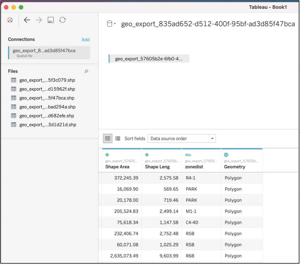
Figure 6.5: Importing the data source
- Click on Sheet 1 to create your first sheet.
- Find the Geometry measure and drag it to the Detail card:

Figure 6.6: Adding the Geometry measure to the Detail card
Tableau will automatically create a map using the shapefile information, as shown here:

Figure 6.7: The default Tableau map output
The preceding screenshot shows a shapefile version of New York City and completes the goal of loading spatial data files into Tableau.
In this exercise, you downloaded the data source from https://www1.nyc.gov/ and imported a shapefile to display zoning districts for New York City. You can now view the information related to each of the polygon shapes in the file. In the next section, you will learn how to import non-spatial geographic data sources and join them for analysis later in the chapter.
Importing Non-Spatial Geographic Data Sources
Many geographic data sources are not specifically spatial sources but are instead found in spreadsheet or database formats as part of a larger dataset. These datasets will typically contain non-geographic data, such as customer information, time-period details, and assorted metrics. Geographic features such as country, state, and city will often also be included, making it possible to create maps displaying many data attributes.
Tableau makes it easy to create maps from these sources, although you may need to assist in the process, as you'll see shortly. Since many Tableau data sources will not reside in spatial formats, it is essential to make sure you can use general data sources to display geographic information at the appropriate level of detail.
Importing these sources is no different than the process for any general type of Tableau data. The only difference here is that you require one or more geographic fields to help you put your data in a map format. In the following section, you'll work through a quick exercise where you will import a non-spatial source.
Your first data source will be a detailed listing of Airbnb properties in Madrid. This file will contain information about the host, property location, ratings, reviews, and other property details.
Exercise 6.02: Importing a Non-Spatial Data Source
In this exercise, you will import the detailed listings text file, which has already been downloaded. By the end of this exercise, you will have a Tableau data source with several attributes that can be used for mapping properties in a Tableau worksheet. If you have not already downloaded the listings_detailed.csv file, you can find it here: http://packt.link/Hh7ZL.
The steps to achieving this are as follows:
- Select Data | New Data Source from the top menu:

Figure 6.8: Creating a new data source
- Select the Text file option:

Figure 6.9: Selecting the Text file option
- Locate your downloaded file. It will be a .zip file probably, so extract the file in a folder and that folder should contain multiple files. To import the file (listings_detailed.csv), locate listings_detailed.csv and click the Open button:

Figure 6.10: Adding the text file data source
- For the purposes of efficient data performance, create an extract of this data instead of live data so that when you are developing your visualization, your data operations will be quick. Select the Extract radio button under Connection at the top right of the data pane and then click Update Now. This will populate your window with a subset of data:

Figure 6.11: Selecting the Extract option
- Rename the data source bnb listings and save your extract when prompted:

Figure 6.12: Renaming the data source
- Select a sheet and let the extract run. You will now see all your data dimensions and measures, along with a blank workspace:

Figure 6.13: Viewing the workspace after creating the extract
In the previous exercise, you imported spatial data, and in this exercise, you've imported a non-spatial data source containing several geographic fields that will help you to create informative maps using the location of thousands of Airbnb properties. Next up are relationships between spatial and non-spatial data.
Data Relationships
One Tableau feature you can use for geographic data (or indeed any data type) is joins, which allows you to create relationships at the data source level. Tableau has always permitted joins between multiple data sources added separately, but this was often useful only for smaller datasets where a simple join was sufficient. Using data relationships at the data source level takes a more robust approach, allowing multiple types of joins as well as unions of source datasets. This approach also leads to much better performance, especially when creating an extract.
Creating joins at the data source level allows connecting data from multiple sources (text, Excel, database, and so on), making it simple to combine data using a single key field within a join. This can be especially useful when different parts of an organization (that is, marketing versus finance) use different information systems, or when you require a simple lookup table to provide intuitive definitions that are not included in your source database information.
Exercise 6.03: Joining Two Data Sources
In the following exercise, you will join two data sources to create additional possibilities for your analysis. The first (primary) source is the listings_detailed.csv file, and your secondary file is a simple neighborhoods file that will provide neighborhood names and was part of the data source you downloaded in the previous exercise. Keep in mind this exercise is for illustration purposes only. You can do much more with data joins, assuming your secondary file has additional fields. This topic will be covered in the subsequent chapters.
Creating your data join consists of a few simple steps:
- Add a new data source or edit the existing source to be the listings_detailed.csv file if it's already been created:

Figure 6.14: Adding the listings file to the data window
- Add the primary data source to the window (if it's not already there) by dragging it from the Connections tab.
- Drag the secondary source (the neighborhoods file) to the data source window from the Connections tab.
- Create a join between the two sources using the Neighbourhood field from each data source in the drop-down menu for each source. Then, select the Inner join option. Your window should look like this:

Figure 6.15: Creating a table join between two data sources
- Update the extract by selecting the Update Now button.
Your final output should be the following:

Figure 6.16: Creating a table join between two data sources
You will now have the new field(s) available from the secondary source. As mentioned previously, this is a very simple example, but you could also use the secondary source as a reference table to provide additional information about a neighborhood, such as the number of bars, restaurants, or tourist attractions. There are many other possibilities; all that is needed is a common field to create a join. In the next section, you will explore how to edit locations and their aliases and create custom geographies.
Managing Location Data
The key to producing maps and other meaningful geographic analyses is to have the necessary location elements (country, state, city, and so on) and to make sure they are classified correctly in Tableau. In many instances, Tableau will correctly identify these roles, making your job simple. In other cases, you will need to tell Tableau the correct role. This is often the case when your source field names do not correspond to the standard naming conventions used by Tableau. There may also be cases where Tableau incorrectly assumes that a non-geographic field represents location data based on the field name of the dimension, or where a value cannot be automatically identified.
This section will explore the various ways in which geographic data can be created and maintained in Tableau using three primary approaches—assigning roles, editing locations, and building custom geographic levels.
Assigning Geographic Roles
Tableau is quite adept at interpreting geographic levels based on source data naming conventions. For example, if you have a source field named city, then Tableau will assume you want to use this field to identify cities on a map. This may not always be the case—a field named city neighborhood may identify a different geographic level. In these instances, Tableau will require your guidance to match source fields to the correct geographic levels. Being familiar with your data sources will make this task simple.
Have a look at the following imported listings data to see how Tableau handled the data, and whether you need to make any modifications. You can easily locate the fields Tableau has determined are geographic by looking for a globe icon. In this dataset, you can see dimensions for city, country, country code, state, and ZIP code—each with a globe icon. Check to make sure each has the correct geographic role, starting with city:

Figure 6.17: Associating geographic roles to data source fields
The city dimension has been correctly associated with a city geographic level. This is expected based on the naming convention; it might have required a manual linkage if the dimension were named host city or some other variation. You can then go through the same process and note that each dimension has been correctly identified with its geographic role. Also note that both the country and country code are associated with the Country/Region role; either field can be used to identify the country level on a map.
In a case where the geographic association has not been made or is incorrectly associated, you will need to inform Tableau of the correct category. This will often occur when a field name is unclear—for example, if country had been named CTRY in your source data, it is quite likely you would need to tell Tableau that this field is in fact referring to one or more countries. To make this correction, you simply select the Geographic Role | Country/Region option for this dimension and assign the proper value.
Note
Figure 6.18 shows 13 unknown values below. Please note, however, that you may get different unknown values as the data gets updated constantly.
Editing Locations
There will be times when Tableau is unable to recognize geographic data, often due to misspellings in the source data. This will result in null values when you attempt to map your data, leaving users with an incomplete picture of the information. Fortunately, you can provide more information on these values to help get them mapped correctly. See what happens when you attempt to map the state dimension:

Figure 6.18: Mapping the state dimension
Notice that in the bottom right of the preceding screenshot, there is a message that tells you that you have 13 unknown values. Tableau is not recognizing the states provided in your dataset. To find out what's happening, click on the 13 unknown button, which opens a Special Values window:

Figure 6.19: Editing locations to update unknown values
You then select the Edit Locations... option to open a window where you can begin the matching process. When this window opens, you quickly see the issue: your default Country/Region is set according to your location (the United States in this example), not Spain.

Figure 6.20: Identifying unrecognized geographic values
This is easily rectified by finding Spain in the drop-down list and setting it as your default. When you apply this change, you see that many of the entries have been automatically updated, especially any with Madrid as part of their name

Figure 6.21: Updating unrecognized values using the Edit Locations window
There are others that have not been automatically updated, perhaps as a result of dirty data. You can now investigate these entries to determine the extent of the issue. Since you know that your dataset is entirely composed of Madrid properties, it is probably safe to update the remaining entries to the same Comunidad de Madrid entry. For each Unrecognized state in the Edit Locations window, simply double-click Unrecognized and select the Comunidad de Madrid entry from the drop-down list to make the manual updates.
Building Custom Geographies
In many cases, you will want to create custom geographic levels that are not already defined in your data source. This can be done quite easily in Tableau by specifying how you want the new level to be created, using an existing geographic attribute. You can also create custom geographies using calculated fields. Let's look at a single example for each approach.
Creating a New Geography Using an Existing Role
In some cases, you will create new geographic levels based on a level that already exists in the source data. This might be related to sales territories, neighborhoods, or some other aggregation where you don't have a formally defined geographic level in place. Let's look at an example using the Madrid dataset ZIP codes and neighborhoods.
You already have the ZIP code (postal code) data in the data source file, and you have neighborhood data as well, although only in text form. Your goal is to create geographic neighborhood definitions you can show on a map. To do this, right-click the Neighbourhood dimension and select Geographic Role | Create from | zipcode. This tells Tableau to build a geography at the neighborhood level using existing ZIP code data. Here is a view of the menu selections:

Figure 6.22: Creating a geographic role
You can see from the Data pane that Tableau does this by creating a hierarchy wherein Neighbourhood is the top level and zipcode is the lower level:

Figure 6.23: Building a custom geography level
What will this look like on a map? To display your new level, drag the Neighbourhood field from the hierarchy to the Detail mark, drag Neighbourhood to the Label marks card, and add SUM(Number of Records) to the Color mark, and then select the Map option from the Show Me menu, yielding this display:

Figure 6.24: Mapping the newly created neighborhood polygons
You can see from the map that you again have an unknown issue with 66 values you were not able to associate with a neighborhood. This is most likely due to something in the source data—perhaps missing values in the Neighbourhood dimension or dirty ZIP code data. This sort of issue can frequently occur when there is not a strict standard for data entry; it is up to the Tableau designer to determine whether the issue is significant or minor and act accordingly.
Creating a New Geography Using Groups
A second method for building a new geographic level is to create a calculated field, again using an existing geographic level as the base. You could do this again with a calculation based on ZIP codes (perhaps the first three or four digits), yielding an aggregate level similar to the neighborhood example. This assumes that the ZIP codes are assigned in a manner where this method makes sense.
Another possibility is to create a group in which you assign a name to each of your aggregate clusters, which can then be mapped accordingly. In the following example, a set of neighborhood clusters using the Group function have been created:

Figure 6.25: Creating groups based on neighborhood names
To create groups, follow these simple steps:
- Highlight one or more individual neighborhood values.
- Click on the Group button.
- Name the group by editing the default Tableau group name.
- Repeat Step 1 to Step 3 for each additional group.
- Click the OK button to save all groups.
Now you can add these clusters to a map by dragging the Neighbourhood Clusters dimension to the Detail mark; you can continue to use the SUM(Number of Records) measures for coloring purposes. Here's the result:

Figure 6.26: Mapping the neighborhood clusters
Note that there are 12 unknown entries; these can be addressed as detailed previously by clicking on the message and using the Edit Locations screen to update the entries.
Grouping geographic areas in this manner can help aggregate your data to meaningful levels for analysis, especially if you are familiar with the geographic attributes in your source data. In the next exercise, you will practice these concepts using the Airbnb dataset that you have been using.
Exercise 6.04: Building Custom Geographies
In this exercise, you will create custom geographies using both the existing role and group approaches. This will provide additional mapping options using these aggregate dimensions, starting with the role approach.
Perform the following steps to complete this exercise:
- Open a new or existing Tableau workbook.
- Import the listings and neighborhood files if you have not already done so.
- Make sure you have a data source with the listings_detailed and neighbourhoods files joined. If not, create this relationship by joining them on the Neighbourhood field.
Figure 6.27: Joining two files as a single data source
- Create an extract by selecting the Extract radio button. Save the extract and open a worksheet.
- Create a geographic role for Neighbourhood by selecting the dimension and creating a role based on zipcode.

Figure 6.28: Assigning a custom geographic role
- Right-click on the Neighbourhood dimension and select the Create | Group... menu item:

Figure 6.29: Creating a group from an existing field
- Select the entries from Acacias through Atocha and click the Group button. Name this Cluster 1. Then, select some more entries through Gaztambide and click the Group button. Check the Include 'Other' checkbox:

Figure 6.30: Results after creating groups from the Neighbourhood dimension
- Click the OK button. You will now see a [Neighbourhood Clusters] Group dimension.

Figure 6.31: The Neighbourhood Clusters group as a new dimension
In this exercise, you created two new geographic fields using a pair of approaches. You can now use these dimensions to create filled maps, which is what you will be exploring in the next section, using a couple of options displayed in the Show Me menu.
Creating Maps in Tableau
Tableau provides two distinct map options in the Show Me menu—one for symbol maps and a second for choropleth maps. If your data has simple latitude/longitude values corresponding to a postal code centroid, such as a store location (or even a city), then your mapping will be focused on the symbol map option. If, however, your data has more detailed data based on a shapefile or GeoJSON data source, you can then use the choropleth option to create filled maps based on the polygons in the data source. In some cases, you will have access to both types of source data and will be able to create a dual-axis map, which will be explored later in this section. The following is a simple comparison of the two types, with choropleth (filled) on the left and symbol on the right:

Figure 6.32: A choropleth (filled) map and a symbol map
Geocoding
Geocoding is the process of assigning geographic attributes to a data field that may not be automatically recognized as a traditional geospatial field. In these cases, you need to assign values that correspond to these dimensions so maps can be created. This section will examine how this can be handled in Tableau.
In many cases, you will be presented with geographic attributes that Tableau will be unable to recognize without some guidance. Street addresses are a common example of this; unlike country, state, or even city, street addresses are too often duplicated across multiple geographies, making them very difficult to locate correctly on a map. Fortunately, Tableau enables custom geocoding, where you can use two distinct methods to provide more precise information. In both cases, you start with a .csv file.
The first case is where you wish to use existing geographic definitions and simply extend them to include new members. For example, if you need to add a new country, state, or county to your maps that is not recognized by Tableau, you can provide this information using a .csv file. You simply select the Map | Geocoding | Import Custom Geocoding menu option and direct Tableau to your directory where the .csv file has been created. The data field names must match the existing Tableau field names (Country, State, and so on) and should include latitude and longitude information so Tableau knows where to locate the new entries on a map.
The second type of custom geocoding involves information that may be specific to an organization (such as a regional sales hierarchy), or that may reference non-traditional point data such as lightning strikes or volcanic eruptions. In these cases, you create specific names for the new items, and then add a new field name that can be used in Tableau. For example, the field name might be called Lightning Strikes if you are attempting to map those events. Once again, latitude and longitude data must be included, as well as other appropriate geographic levels, such as Country and State.
Adding this custom geocoded information extends the mapping capabilities of Tableau beyond traditional boundaries and definitions.
Note
The steps to create the map shown in Figure 6.33 are explained in Exercise 6.05.
Symbol Maps
Symbol maps represent all maps where location data is provided in a point-based latitude and longitude format. Latitude represents the north-south location of a data point, while longitude provides the east-west location. Using these two measures in Tableau allows you to pinpoint the precise location of stores, offices, parks, museums, and many other entities with specific locations. These points may represent a central location within a large geographic entity (such as a park) or may have a higher precision level, depending on how detailed your source data is. For example, a latitude value of 45.37187 will be more precise than the same value rounded to 45.37.
Symbol maps are quite simple yet very powerful in their ability to tell stories based on geographically positioned data. Let's explore the process for building effective symbol maps in Tableau. Everything starts with latitude and longitude measures, which may be included in your source data or can be calculated by Tableau for recognized attributes such as country, state, and county. As an example, using your Madrid locations data, here is a simple view based on the latitude and longitude data in the source file. You can select any point to see the supporting geographic coordinates:

Figure 6.33: Details of a data point in a symbol map
Each point in the map is positioned based on latitude and longitude, as seen in the tooltip for the map. You can use additional map layers to provide more context, but for now, this is a good starting point.
Adding Data to Symbol Maps
While placing location points on a map can be informative, more often you will also wish to add data measures to those points—perhaps revenue for a store location or the number of visitors to a tourist attraction as two simple examples. This is easily done in Tableau using colors, sizes, or shapes to identify one or more features of a geographic point. You first need to determine which data fields will be most meaningful to display; this will allow you to build logic to display specific information based on user interaction.
When you add a measure to a symbol map, there are two commonly used approaches to display this data; the first is the use of colors or shapes, and the second is the use of the sizing of symbols. If you are adding dimensional information to the display, you will usually opt for colors or shapes to represent these categories. In some cases, both shapes and colors can be used to provide additional detail to the map viewer. If you are adding measures to your symbol display, sizing will often be the preferred approach, since it will help in identifying numerical differences across locations. Using colors or shapes is not as effective with measures, although either one could be used in tandem with size. In the following sections, you will see examples for each of these options.
Coloring a Symbol Map
Colors can be used to provide insight into both categorical dimensions and numeric measures. This will give users a nice visual cue to help them see geographic-related patterns in the information. When using colors, it is important to recall that the human visual system has a limited range with respect to viewing colors; you typically would like to keep this to less than 10 distinct colors or shades. The Color Brewer website at https://colorbrewer2.org provides color palettes ranging from 3 to 12 distinct shades for mapping. Some users will be able to distinguish additional distinct colors, but it is best to err on the low side and minimize the number of map colors. You can also decide on colors based on your data distributions and find that you may need as few as 3 or as many as 9 or 10 colors to tell the story correctly.
Here, you can see an example of coloring using neighborhood groups in which you have nine colors:

Figure 6.34: Coloring a symbol map using the Neighbourhood Group dimension
Notice how easily each neighborhood group is seen when you use distinct colors. Using a color palette with distinctly different colors is very helpful in this case, whereas a single color with shaded gradations would be more difficult to interpret. This same approach can be applied when you have distinct categories such as political districts or postal codes. On the other hand, if you wanted to see the percentage of voters voting for a political party or candidate, the best approach is to use shades of a single color to reflect percentages ranging from the minimum to maximum levels (perhaps 10% to 70% as an example).
To color the map, you perform the following steps:
- Drag the coloring field (Neighbourhood Group in this case) to the Color card.
- Select the Color card to edit colors if needed.
- Choose an opacity level for optimal display; less than 100% opacity is recommended, especially when there are overlapping symbols on a map. This will improve data visibility.
Sizing a Symbol Map
Individual points may also be sized based on values in the data, typically based on a single measure. For example, you may choose to display points sized based on revenue for each store location. Stores with higher revenue will have a larger dot (or another symbol) corresponding to their revenue relative to locations with lower values. This can be an effective approach, given that size differences are one of the more easily detected visual cues.
In the Madrid example, the dots are sized based on the number of bedrooms for each lodging. You can keep the colors already created so that your map will become even more informative for the viewer.
To do this, follow these steps:
- Drag the Bedrooms dimension to the Size card in the Marks area of your worksheet.
- Click on the Size card and adjust the symbol size using the slider tool.
Zoom in so you can see the effect more clearly:

Figure 6.35: Sizing map symbols using the Bedrooms dimension
You now have points with anywhere from 0 to 8 bedrooms, with the differences quite noticeable at this zoom level. It may take a bit of work to distinguish between 6 and 7 or 3 and 4; this is where tooltips can provide further clarity. You can easily adjust the size of your marks by selecting the Size card and dragging the bar to the left or right.
Using Shapes in a Symbol Map
Let's continue exploring using the Madrid data. You have already used color and size to make your map more informative; now you can add shapes to provide one more level of detail to the map. At this point, you may wish to be careful by not adding too many shapes to the display, so a simple category is in order. Use the Instant Bookable field since it contains just two values.
To create this map, follow these steps:
- Simply drag the Instant Bookable dimension to the Shape card.
- Select the shapes you wish to display for each value by clicking on the Shape card and assigning a shape value to each data category.
Here is the result:

Figure 6.36: Using shapes to show the Instant Bookable value
Now you have a map that provides a wealth of information to the user, including neighborhood group, number of bedrooms, and whether a property is instantly bookable. To provide even more insight, you can customize tooltips so that users learn more about a property as they hover over a point.
Adding Map Tooltips
Providing informational tooltips is a great finishing touch that helps users navigate maps and the underlying information they contain. While map labels can be helpful, there is a point at which they become visual noise that obscures the meaningful information contained in the map. This is where tooltips become especially useful as they can hold a lot of information without getting in the way of the map display.
Let's walk through a quick example of building a simple yet informative tooltip in your map. You've already seen tooltips in their simplest version, but they are capable of so much more, as you're about to see.
To add additional fields to a tooltip, simply drag dimensions or measures to the Tooltip card in the Marks pane. This will make these fields accessible even if they don't wind up being used in your text. Tableau, by default, will provide a functional tooltip containing information associated with the map, as seen in Figure 6.37 With just a little effort and the use of contrasting font colors, tooltips can become much more powerful. You can drag the Host Name, Host Response Rate, Zipcode, and Summary dimensions to the Tooltip card and continue to use the existing Neighbourhood Group and Bedrooms dimensions to tell a small story about the property, as seen in Figure 6.38.

Figure 6.37: Customizing tooltips to tell a detailed story
As you can see, tooltips are a great way to include helpful information without the need to clutter a map with too much detail.
Navigating Symbol Maps
Tableau provides some simple tools for navigating maps. In the upper-left area of the Map window is a small toolbar with the following features:
- Search creates the ability to locate elements in a map.
- Zoom in is very useful for navigating a densely populated map.
- Zoom out can be used to display an entire map and provide surrounding context.
- Reset map will set the map to a fixed display size.
- Zoom area is an extension of zoom in that allows you to select a specific part of the map to zoom in on.
- Pan provides the ability to move the map up and down or side to side.
- The three selection tools (rectangle, radius, and lasso) enable highlighting elements within a selected portion of the map.
These tools make it easy to move the map within the map window, enlarge or shrink the data points, fix the display size (using reset map), and create custom selections using the three selection tools. Map data can also be filtered by using the map legends, as you'll see in the next section.
Filtering Symbol Maps
In an earlier section, you learned about the challenge of differentiating between places with three or four bedrooms, since the symbols are nearly the same size. This presents an issue for a user who may require four bedrooms but cannot easily see the difference based on symbol size. To address this, the user can simply click on the 4 in the Bedrooms legend and select the Keep Only option. Tableau will automatically add a filter to the Filters pane reflecting this selection.
The same can be done using the Color legend you have for Neighbourhood Group. With colors, you can click on one or more options and the data will be highlighted. In this case, both the Centro and Chamberi neighborhood groups have been selected, yielding this result:

Figure 6.38: Filtering a map by selecting legend values
You could also select the Keep Only option and Tableau will add a filter reflecting your choice.
The shapes filter works like the size filter, allowing users to select the Keep Only option to set up a filter. Alternatively, users can choose the Exclude option if they wish to remove some locations from the map.
While these are very useful options, users can go one step further and build new groups and sets using map data. We'll visit those options in the next section.
Creating Groups and Sets from Symbol Map Data
One of the useful functions in Tableau mapping is the ability to create groups and sets based on a selection of points in a map. This is important because you won't always be aware of patterns until seeing them on a map. You can then grab a collection of data points using rectangular, radial, or lasso selections and create a group or set immediately. This is a powerful feature that allows users to take advantage of patterns revealed on a map to create meaningful aggregations of data.
Consider the following example using your previously created symbol map. Using the map toolbar, select the rectangular selection tool and highlight an area of points with it. (Notice the different colors for all the points in your selection area.)

Figure 6.39: Selected points are displayed in a different color
You then create a group for the selected points by using the Group Members icon:
Figure 6.40: Creating a group dimension using the Group Members icon
Tableau has now created a group in the Dimensions pane that can be used in your analysis. This is a more intuitive, faster means to create groups rather than doing it manually using the group function.
The steps to do this are as follows:
- Select the rectangular selection tool from the map toolbar.

Figure 6.41: Selecting the rectangular selection tool
- Highlight the area you wish to select within the map.
- Hover over any of the selected data symbols.
- Select the Group Members icon, as shown previously.
- You can inspect your results to verify the group has been created:

Figure 6.42: Viewing the values in the newly created group
This example illustrates another way you can use geographic data and maps to expand your analysis capabilities. You will now practice these concepts around the symbol map, including grouping locations and coloring them according to their groups.
Exercise 6.05: Building a Symbol Map
In this exercise, you will create a symbol map using data from the Madrid listings data. This will help provide insight into listing patterns across the city.
Perform the following steps to complete this exercise:
- Import the Madrid listings dataset if you have not already done so.
- Create a data source by joining multiple files as shown in previous sections/exercises.
- Add a new Tableau worksheet.
- Drag the Longitude measure to the Rows shelf and the Latitude measure to the Columns shelf. (Use these rather than the generated values provided by Tableau.) Change both Longitude and Latitude to Dimension:

Figure 6.43: Setting Latitude values to Dimension
- Drag the City dimension to the Detail card and the SUM(Number of Records) measure to the Size card and adjust the symbol size to better display all points. If for some reason you don't get a Map, click on "Show Me" card and manually select Symbol Maps from.

Figure 6.44: Adjusting the Size card for displaying symbols on the map
- Replace SUM(Number of Records) with the Accommodates measure on the Size card:

Figure 6.45: Using the Accommodates dimension to size points on the map
- Drag the Neighbourhood Group dimension to the Color card and call this worksheet Madrid Accommodates Map. You will be using the same worksheet later in the chapter in Exercise 6.07: Creating a Dual-Axis Map:

Figure 6.46: Coloring the map using the Neighbourhood Group dimension
It is now easy to identify the density of listings in the Centro neighborhood (displayed as the orange cluster in the lower half of the screenshot). Each of the surrounding neighborhoods has fewer listings scattered across the map due to their greater distance from the primary tourist attractions found in Centro.
In this exercise, you created a symbol map that details listing patterns across the city of Madrid. This map can form the basis for additional insights using multiple measures, parameters, and filters. In the upcoming section, you will review the second type of map that Tableau supports, which is choropleth maps, which you briefly learned about at the start of the chapter.
Choropleth (Filled) Maps
Choropleth maps differ from symbol maps in one important respect: locations are now based on shapes (polygons, lines, or points) rather than on a single point using latitude/longitude coordinates. These maps will typically use officially defined geographic designations (country, state, city) as the basis for analysis, with colors as the primary method for displaying measures since size and shape are already defined. Filled maps may also be used with symbol maps to provide multiple levels of geographic analysis.
Note
For Avg Area measure creation mentioned in the topic below, if you are using any further version of Tableau than 2020.1, the field Number of Records does not exist. For creating Avg Area measure, you can explicitly create Number of Records on your own. Please refer to this link for more information: https://tarsolutions.co.uk/blog/number-of-records-missing-in-tableau/.
Coloring a Choropleth Map
As previously noted, colors will generally be the method used to display measure differences in a filled map. Distinct color sets are used when comparing dimension (categorical) values, while shaded palettes are the best approach for displaying measures.
Let's look at these two cases, first using a dimension, followed by a measure example. Both examples will use the previously downloaded New York City zoning data. For the dimension example, no new fields are needed; you simply drag the Geometry measure to the Detail card, allowing Tableau to use the shapefile polygon data, and then drag the zonedist dimension to the Color card. The result looks like this:

Figure 6.47: New York City zoning map colored by detailed zonedist values
Note that you have many detailed zoning types. These could probably be aggregated to present a similar map without unnecessary detail. To do this, you'll create a simple grouped field from the zonedist values, with very high-level groups in which zones starting with C are commercial zones, M are manufacturing zones, and R are residential zones; the others are self-explanatory. Let's revisit the map and drag the zonedist (group) dimension to the Color card. Here's your new map:

Figure 6.48: New York City zoning map colored by grouped zonedist values
Now you can see the more evident patterns between residential, commercial, and manufacturing areas, which were previously masked by the many subtypes within each designation.
You can use the same data to create a filled map based on measures, although you'll need to do a little work to create some new measures. Some datasets may have useful measures included (income, population density, and so on) but that isn't the case here. You'll create two measures you can use on the map (Avg Area and Zone Counts) using the following formulas.
The Avg Area measure can be created using the following steps:
- Right-click in the Data panel and select Create Calculated Field.
- Enter the SUM([Shape Area])/SUM([Number of Records]) formula.
- Name the calculation Avg Area and click the OK button to close the window.
Zone Counts can be created in a similar manner:
- Right-click in the Data panel and select Create Calculated Field.
- Enter the COUNT([Zonedist]) formula.
- Name the calculation Zone Counts and click the OK button to close the window.
You can now create a filled map using either of these measures as the color. Drag zonedist on the Detail card and Zone Counts to the Color card to update the map, like this:

Figure 6.49: New York City zoning map colored by zone counts
You now see each zone colored by the frequency of occurrence (notice the highest count is represented by the darkest color). This is the type of color scheme to use when you have a continuous measure displayed on a map, as opposed to the dimension map where you used distinct colors. When numbers are below zero or an average value, a two-color scheme is useful to show low versus high values (red to blue, for example). Tableau has many native color palettes to choose from, making it easy to create compelling maps.
Navigating a Choropleth Map
You can use the same map tools discussed in the symbol map section when navigating a map:
- Search creates the ability to locate elements in a map.
- Zoom in is very useful for navigating a densely populated map.
- Zoom out can be used to display an entire map and provide surrounding context.
- Reset map will set the map to a fixed display size.
- Zoom area is an extension of zoom in that allows you to select a specific part of the map to zoom in on.
- Pan provides the ability to move the map up and down or side to side.
- Three selection tools (rectangle, radius, and lasso) enable highlighting elements within a selected portion of the map.
Filtering a Choropleth Map
You can also use the same filtering tools discussed in the section on filtering a symbol map, including the ability to create groups and sets using the selection tools. Note that when selecting areas on a filled map, you do not need to select an entire area to include it in your group or set. If you need more precision, then click on each desired area to build new groups or sets. Now, you will execute the following steps to build your own choropleth maps.
Exercise 6.06: Building a Choropleth Map
In this exercise, you will create and populate a filled map using the New York City zoning shapefile you downloaded in Exercise 6.01:
- Open your existing Tableau workbook or create a new workbook.
- If you have not already done so, import the data source from https://data.cityofnewyork.us/City-Government/Zoning-GIS-Data-Shapefile/kdig-pewd.
- Add the data source by navigating to the Data | New Data Source menu:

Figure 6.50: Adding a new data source
- Select the Spatial file option:

Figure 6.51: Connecting to a spatial file
- Locate your downloaded file and select it. A sample of the data will appear in the import window:

Figure 6.52: Viewing the spatial file attributes
- Add a new worksheet and make sure it uses the spatial data source:

Figure 6.53: A worksheet with dimensions and measures from the spatial file
- Drag the Geometry measure to the Detail card. Tableau will add Latitude and Longitude fields and create a map:

Figure 6.54: Adding the Geometry measure to the Detail card
- Drag the zonedist dimension to the Color card:

Figure 6.55: Coloring the map using the zonedist dimension
- Create a zonedist (group) dimension by summarizing all R, C, and M zones into RESIDENTIAL, COMMERCIAL, and MANUFACTURING groups. Click OK to save the group as a dimension.

Figure 6.56: Creating a zonedist (group) dimension
- Drag the zonedist (group) dimension to the Color card:
Figure 6.57: Coloring the map using zonedist (group)
In this exercise, you added a spatial data source and used the Geometry field to populate a map. You also learned how to color the map using both an existing and a newly created dimension. In the following subsection, you will gain an understanding of how to use dual-axis maps and when are they used.
Dual-Axis Maps
Tableau allows you to create dual-axis maps so that you can overlay point data on a polygon map or simply use the second axis to display the data in a new way. This type of map could be used when you wish to overlay two data variables with different purposes for each, or even from distinct data sources. For instance, you could overlay a dataset based on geographic boundaries (states) with one using symbol data (latitude/longitude addresses), or you can simply create additional information from a single set of data points, as the following example will illustrate. In this example, you will use the second axis to create a density map to show areas within Madrid with the highest concentrations of Airbnb properties.
To do this, you start with an existing symbol map like the one built earlier in this chapter. All you need to do to create a dual-axis map is to drag the Latitude measure to the Columns shelf, placing it to the right of the existing Latitude measure.

Figure 6.58: Adding a second Latitude dimension
Tableau will create a second map by default; you need to use the drop-down menu from the new Latitude measure and select the Dual Axis option. You also need to tell Tableau to treat your new measure as a dimension by selecting the Dimension option from the same menu.

Figure 6.59: Setting up a Dual Axis map
Once you have the second axis specified, you can move to the Marks area, where a Latitude (2) entry has been added. In this case, you would choose the Density option for the display type and adjust the intensity and opacity levels to your preference. This will give you a map that retains the original elements from the map while adding the density markers.
The Density option will now display areas with a higher concentration of properties as blurred colors. The Centro neighborhood in the middle of the map will be especially dense at this zoom level. As you zoom in, the individual properties will gradually be revealed. In this section, you revisited a dual-axis chart but in map form. Now you will grasp these concepts in a better way by executing the next exercise.
Exercise 6.07: Creating a Dual-Axis Map
In this exercise, you will create a dual-axis map, using symbols for the base map and then adding a second axis that uses the density markers. You will use the Madrid Airbnb data source as you have in previous exercises.
Perform the following steps to complete this exercise:
- Open the Madrid Accommodates Map worksheet that you created in Exercise 6.05.

Figure 6.60: Symbol map colored by Neighbourhood Group
- Drag the Latitude measure to the Rows shelf, next to the existing Latitude measure:

Figure 6.61: Adding a dual axis using two Latitude measures
- Set the new Latitude measure as a continuous dimension and check the Dual Axis item to combine the elements into a single map:
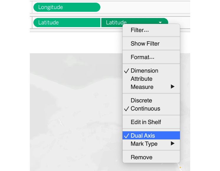
Figure 6.62: Selecting the Dual Axis option
- In the Latitude (2) Marks area, choose the Density option:

Figure 6.63: Selecting a Density symbol
- Adjust the Density settings by clicking on the Color card:

Figure 6.64: Adjusting the Density coloring
- View the map to see the impact of the Density symbols:

Figure 6.65: The completed dual-axis map with symbols and density
In this exercise, you created a dual-axis map using circle symbols on the first axis and density symbols on the second axis. You learned how to use them together to create a more complete map. The second level of density details that you added will now display areas with a higher concentration of properties as blurred colors. The Centro neighborhood in the middle of the map will be especially dense at this zoom level. These extra details on maps help end users/stakeholders to observe the map with extra context in one view instead of switching the view multiple times. In the next section, you will review what map enhancement options Tableau provides and how to best add/use them in your maps.
Map Enhancements
Tableau has multiple features you can use to upgrade your maps and make them effective for users. Some of these are native while others can be added quite easily. In this section, you will cover some simple ways to improve on the base maps used in Tableau.
Setting Map Options
Map options are simple selections that can be chosen to determine how a user can interact with a map. To set these options, select the Map | Map Options menu item, which will open a small window:

Figure 6.66: Map Options menu items
These options allow users to navigate the map using pan (to shift your map from side to side or up and down) and zoom, allow users to perform searches, and allow the functionality provided by the toolbar (radial selections, and so on). If you want your map to remain fixed with a single size and location, disable these capabilities.
Using Existing Layers
Default Tableau background maps provide numerous map layers that can easily be selected and deselected by users depending on their preferences. Map layers help you to add extra details such as highways, borders, terrains, coastlines, and county borders where these layers add minute details to the maps. To change the default map layer, click on Map | Map Layers from the menu. Tableau offers the following layer options:

Figure 6.67: Map Layers menu options
These layers can be used to customize the appearance of a map. For example, in the Madrid listing example, if you select Streets, Highways, Routes as well as Zip Code Labels, you will notice how extra details are added to the map, as shown in the following screenshot:

Figure 6.68: Map Layers menu options with added layers
Although aligning with data visualization best practices, you would generally try to minimize the number and visibility of these layers to not distract users from the map data. Using just enough layers to provide context is a smart approach.
In addition, more than 20 demographic layers are available as overlays for US-based data, which essentially allows you to add a data mask layer depending on the demographic you choose from the dropdown. But as mentioned previously, seldom do you have to use these extra layers in your maps because, more often than not, these layers confuse stakeholders rather than help them.
Layers are very easy to add or remove in Tableau, so it is wise to spend some time with the many options until your map is visually pleasing. As with most charts, less is often more on a map; make sure the focus is on the data and not on the map layers.
Adding Mapbox Background Maps
You do have options beyond the standard Tableau background maps. One of these is to embed Mapbox background maps in Tableau—an approach that enables the creation of uniquely styled maps. Mapbox is a popular map creation platform enabling users to customize maps for use in many applications. Tableau added Mapbox integration back in Tableau 9.2, so the ability to use Mapbox background maps is not new but should nonetheless be explored if you wish to feature maps beyond the native Tableau versions. You will need to create a free Mapbox account at https://www.mapbox.com/ to build these maps.
To export a Mapbox map for use in Tableau, navigate to Mapbox Studio, https://studio.mapbox.com/, and then simply create your own style by clicking on New Styles and choosing an option under Choose a template as well as Choose a variation from the popup:

Figure 6.69: Choosing a template and variation for Mapbox
Then, select the Share… icon at the top right of the map and view the Third party options to find the Tableau dialog:

Figure 6.70: Exporting a Mapbox background map to Tableau
This provides you with a link to be used in Tableau as a background map style to provide a customized background to set your maps apart from the standard Tableau options. The link can be copied to the clipboard and then added as a background map. In Tableau Desktop, create a new sheet and select the Map | Background Maps | Manage Maps menu item, which will open a Map Services window. Clicking the Add button gives you two options: WMS Servers… (Web Map Server, similar to Mapbox) and Mapbox Maps…. Click on the Mapbox option and you will see a dialog screen:

Figure 6.71: Adding a Mapbox map using the Mapbox URL
Here, you can add a style name of your choice, and then copy your Mapbox link to the URL text box. The remaining information will be automatically updated based on the URL link, and your background map will be ready to go. Multiple maps can be added using this same process, which will give you many options beyond the native Tableau map backgrounds. Now, use this Mapbox map style for your Madrid worksheet. Click on Maps | Background Maps | Default Galaxy Style (or your style name). Here's a look at your data with a new background map:

Figure 6.72: A custom Mapbox map of Madrid
If you open the Map | Map Layers card, you will see the available layers from the selected Mapbox map. Note that each map style will have its own set of options. Here is what you have with your style:

Figure 6.73: Selecting Map Layers for the Mapbox map
Using these checkboxes makes it simple to customize a map to work best with your existing point data. You can also use the Washout slider to add some level of transparency to the display.
As you have seen, Mapbox background maps can be used to add visual interest to your worksheets and dashboards and can be customized in Mapbox using an almost endless combination of colors and styling. To assimilate what you read in this section, you will now go through an exercise to add Mapbox and understand how to use it in Tableau.
Exercise 6.08: Adding Mapbox Background Maps
In this exercise, you will practice adding Mapbox data to the New York zoning data and apply a new Mapbox style for the GIS data that you have previously used.
Perform the following steps to complete this exercise:
- Load the New York City zone shapefile if you have not already loaded the data into Tableau Desktop.
- Drag Geometry to the Detail marks card and a New York City map will be created, which you have also seen previously.
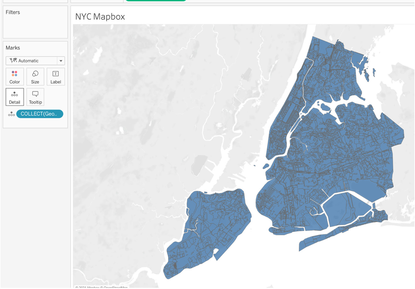
Figure 6.74: New York City zoning data map
Note
You can create an account with https://studio.mapbox.com/ and can continue to work on the exercise for free. Please make sure that you fill in the necessary credentials.
- Now, go to https://studio.mapbox.com/ and sign in/sign up if you have previously not done so.
- Click on the New style button at https://studio.mapbox.com/.

Figure 6.75: Creating a new style in Mapbox
- Next, select the style you want to use. For the purposes of this exercise, select the Streets template as the style. Click on the Customize Streets button to create your own Mapbox style.
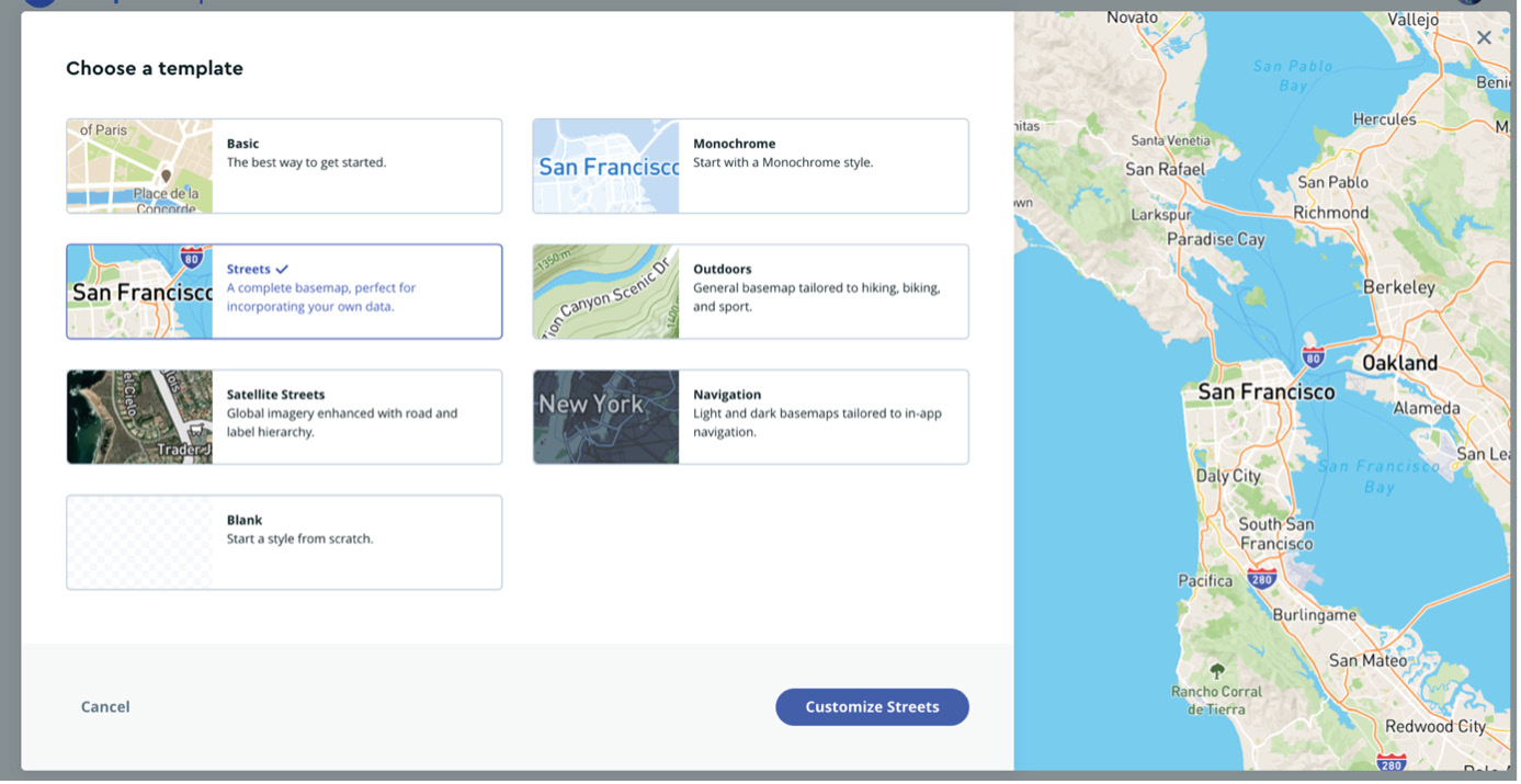
Figure 6.76: Choosing styles on Mapbox
- On the new page that was loaded, click on the Share button in the top right-hand corner, scroll down the popup and click on Third party, then select Tableau from the dropdown, as shown, and copy the integration URL:

Figure 6.77: Selecting Tableau as the third-party service in Mapbox
- In your Tableau Desktop instance, click on Map | Background Maps | Manage Maps, and in the popup, click on Add… and select Mapbox Maps…, as shown in the following screenshot:

Figure 6.78: Adding new Mapbox maps to Tableau
- Name your map style appropriately and paste your integration URL in the Url field. Other fields should autoload, as shown in the following screenshot. Click OK:

Figure 6.79: Adding a new Mapbox style
The New York City zoning map should have autoloaded the new Mapbox style with a lot more details than Tableau default map options, as shown in the following output:

Figure 6.80: NYC Mapbox loaded in the new Mapbox style
As you can see, the Mapbox background map, when zoomed in, provides a lot more extra detail, including the city line and street names.
In this exercise, you practiced adding Mapbox to your Tableau maps with new styles with a shapefile, while previously, before the exercise, you only worked with ZIP code data. With Mapbox, you were able to add a lot more minute details to the maps, such as streets, neighborhoods, important attractions, coastlines, and highways. These newly added details have enhanced the map for end users.
This wraps up the theoretical aspects of this chapter. Next, you will go through a new set of data and a final activity to test the knowledge you have gained throughout the course of this lesson and the previous exercise by attempting to create useful and powerful maps.
Activity 6.01: Creating a Location Analysis Using Dual Axis and Background Maps
As a data developer for a San Francisco City Department, you are asked to create a report/visualization that will showcase the hotspots of house buyout agreements in the city from a high level and gather contextual information about the house, its neighborhood, its actual address, its buyout date, and its total number of tenants, as well as the buyout amounts for the houses. Stakeholders also want to be able to filter the map data points by buyout dates. You will be using the SF Buyout Agreement data provided in the GitHub link or by downloading the .shp file from the following link: https://packt.link/ojAf3.
Perform the following steps to complete this activity:
- Locate the SF Buyout Data.shp file that you downloaded from GitHub and add that as a data source in Tableau.
- Create a new worksheet named SF Buyout Map.
- Add Buyout Date as a filter. Only include non-null values by selecting relative dates. Show the Buyout Date filter.
- Before proceeding to the next steps, edit the title to SF Buyout Map and rename some of the column names for easier understanding. The mappings are as follows:
- Case Number – Case Number
- Date Pre B – Pre Buyout Disclosure Date
- Date Buyou – Buyout Date
- Buyout Amo – Buyout Amount
- Number of – Tenants
- Analysis N – Neighbourhood
- Drag Geometry onto the Detail card.
- Duplicate the Latitude(generated) column and create a dual axis.
- Under the first Latitude(generated) marks card, change Marks Type to Density.
- Add SUM(Tenants) to the Color marks card and add Case Number to the Detail marks card.
- For the second Latitude, change Marks type to the Circle symbol.
- Add Neighbourhood to the Color marks card and Case Number to the Detail marks card.
- To add context to your map when you or a stakeholder hovers or clicks on the map, you will add Address, Buyout Date, Buyout Amount, and Tenants to a tooltip and edit the tooltip to look as in the following output.
The expected output is as follows:

Figure 6.81: Activity 6.01 expected output
Note
The solution to this activity can be found here: https://packt.link/CTCxk.
Summary
This chapter introduced you to many of the geographic capabilities and methods designers and users can employ in Tableau. The ability to take geographic data and create powerful, attractive maps that integrate with other displays is a critical skill in building visual insights. You learned how Tableau maps can incorporate size, color, shapes, and filtering so users can explore and understand geographic information more thoroughly.
You also learned that while Tableau is not a dedicated mapping platform, it can be used to replicate much of the functionality of traditional mapping and GIS software. Being able to map geographic data is an essential skill in developing complete Tableau solutions for users and can be incorporated into any analysis where geospatial data is available and interacting with external map files can add an additional layer of detail to maps.
In the next chapter, you will be moving into the analysis section of the course with Chapter 7: Analysis : Creating and Using Calculations. This next chapter will extend your ability to create many types of calculations that go beyond the few simple ones used in creating your maps.