
Overview
In this chapter, you will learn to create and use various types of calculations, not just within an existing data source, but also across data sources. This chapter first describes the definitions and the differences between Aggregate and Non-Aggregate values. Then, you will learn about various types of calculations, such as numeric calculations, string calculations, and date calculations, as well as how to write logic statements in Tableau.
By the end of this chapter, you will be able to create and use various types of calculations in Tableau.
Introduction
Typically, the first step when analyzing data is to start with some questions or goals. It could be as simple as determining your most profitable customers, or more complicated, such as investigating which products are leading to losses despite high sales. After deciding on questions or goals, you would audit your data. This means identifying where data resides—whether the required fields are stored in a single or in multiple data sources and whether all fields are readily available for use. Then, you would check the integrity and validity of your data. This means checking whether the data needs any modifications in terms of cleaning, combining, or restructuring.
Once data is audited, the tools in Tableau Desktop allow you to explore it visually for more streamlined analysis. This can mean building charts, adding interactivity, separating data into groups, or creating calculations to derive more meaningful insights. Once analysis is complete, the insights you gather will be ready to share with others. This chapter aims to cover all aspects of the data analysis cycle.
In this chapter, you will later learn how to create and use Tableau's various types of calculation, which is an essential skill in data analysis. Differentiating Between Aggregate and Non-Aggregate
To work effectively with Tableau, it is vital that you have a thorough understanding of aggregation. When adding any data, Tableau quickly classifies the data in the Data pane as Dimensions and Measures. When a Measure enters the view, Tableau aggregates it (typically, using the SUM aggregation).
This can be demonstrated using the Orders data from Sample-Superstore.xlsx, which can be found at DocumentsMy Tableau RepositoryDatasources or downloaded from this book's GitHub repository at the following link: https://packt.link/T9PeZ.
Once you have access to the data, drag the Profit field from the Data pane into the Rows shelf. Notice that the properties of the field have changed to SUM(Profit) and a vertical bar is generated. Refer to the following figure:

Figure 7.1: A screenshot showing SUM(Profit)
Look at the status bar at the bottom of the sheet. Notice there is only 1 mark and the SUM(Profit) is 286,397. This is the total aggregated profit of the data:

Figure 7.2: A screenshot showing SUM(Profit) in the status bar
Now, observe what happens when you disaggregate it. In order to disaggregate the Measure, uncheck the Aggregate Measures option, which is available in the toolbar under Analysis:

Figure 7.3: A screenshot showing the Aggregate Measures option
The SUM(Profit) field, which was in the Rows shelf, has now changed to show just Profit. Further, the bar chart is now broken into multiple bubbles; some bubbles are on the negative axis, and the status bar now shows 9994 marks:

Figure 7.4: A screenshot showing disaggregated profit
When you uncheck the Aggregate Measures option, the Profit value becomes non-aggregated, which in turn breaks the aggregated profit bar showing the Sum of Profit in bubbles that represent every transactional profit value in the data. At any given point, you can right-click on a bubble to view the data and see the full details of a transaction:

Figure 7.5: A screenshot showing the view data option
By default, the Aggregate Measures option is on, and all Measures will be aggregated by default (unless you choose to disaggregate them as explained above). Further, the default aggregation of Measures is SUM and this can be changed by right-clicking on a Measure in the Data pane and changing Aggregation under Default Properties from Sum to Average or Minimum to Maximum, etc.:
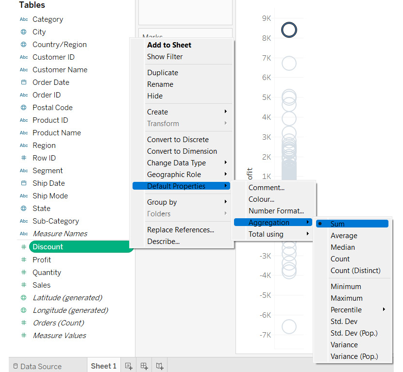
Figure 7.6: A screenshot showing how to change aggregation
From the previous example, you can conclude that when you see SUM(Profit) in the view, it means that Tableau is aggregating all transactional values. When you see Profit only, it means that Tableau is taking notice of the transactional values without aggregating them. This particular distinction is important, especially when creating calculated fields. You will further explore this point when diving deeper into creating and using calculations.
In the previous example, you looked at aggregating and disaggregating Measures. However, when dealing with Dimensions, which includes all categorical data, there are additional considerations. Specifically, you should be asking yourself: Which/Who? and How many?.
Taking the Sample-Superstore.xlsx file as an example, when analyzing Sub-Category, you might ask the following questions: Which sub-categories are profitable? or How many sub-categories are profitable? The first question is easy to answer as you are only concerned with data members from the Sub-Category field that are in profit. When you drag a dimension into the view, you will get the list of all unique data members of that field by default. So, dragging the Sub-Category field into the Rows shelf will result in the following view:

Figure 7.7: A screenshot showing the unique list of data members of a dimension
However, for the second question, you need to find the number of sub-categories that have positive profit. This means finding the number of data members for that dimension. This is achieved by clicking on the dropdown of the Sub-Category field, and selecting the Count or Count(Distinct) option, available under Measure:

Figure 7.8: A screenshot showing the Count and Count (Distinct) options for a dimension in the view
When selecting the Count or the Count(Distinct) option, notice that the list of sub-categories changes into a bar showing that there are a total of 17 sub-categories in the data. This method will only make the count of sub-categories available in the worksheet where they were created. However, if you need to show the same information for other visualizations across your workbook, it makes sense to have the count in your Data pane, so you can drag it into the view as and when required. This can be achieved in two ways:
- The first method is to change the Sub-Category dimension into a Measure, which will change the original Dimensions field from showing a list of data members into a Measure showing a distinct count of sub-categories:

Figure 7.9: A screenshot showing aggregation of a dimension by converting it into a measure
- The second way is to create a calculated field on the Sub-Category dimension. This will not only maintain the original dimension, but we will also have another field that can be used to get the desired output. You will learn more about creating a calculated field in the topics to come.
Creating and Using Ad hoc / Edit in Shelf Calculations
Ad hoc / Edit in Shelf calculations are the quickest and easiest way to create a new calculated field in Tableau. Ad hoc calculations can be created in the Rows, Columns, and Measure Values shelves, as well as in the Marks cards.
Simply double-click on the existing field in your shelf of choice, or, alternatively you can use the Edit in Shelf option in the drop-down list of that field, as shown in the following figure:
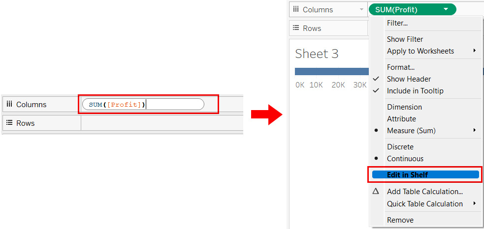
Figure 7.10: A screenshot showing how to create an ad hoc calculation
These ad hoc calculations are useful when creating quick, on-the-fly calculations that you may or may not want to save and reuse. You will explore this in the exercise below.
Exercise 7.01: Creating an Ad Hoc Calculation to Highlight Loss-Making Sub-Categories
The aim of this exercise is to find out which sub-categories have negative profit and which ones have positive profit. Those with negative profit will be your loss-making sub-categories and will be color-coded orange. You will use the Orders data from Sample-Superstore.xlsx for this exercise.
Perform the following steps:
- Start by creating a bar chart showing SUM(Sales) by Sub-Category with SUM(Profit) in the Color shelf, as shown in the following screenshot.

Figure 7.11: A screenshot showing a bar chart of Sales by Sub-Category with profit in color
The bars have a color palette of orange and blue, with shades of orange indicating negative profit, and shades of blue indicating positive profit. The shades indicate the intensity of Profit. However, the task at hand is to highlight the bars that are loss-making, which means those with a profit less than zero. The intensity of profit is irrelevant for this task.
To address this, either double-click or use the Edit in Shelf option in the dropdown of the SUM(Profit) field in the Color shelf and type the following formula:
SUM(Profit) < 0
- Hit Enter to see the new ad hoc calculation. It now shows two colors instead of the previously seen diverging colors. In this case, the orange bars indicate subcategories are loss-making and the blue bars indicate subcategories are profitable. Refer to the following screenshots:

Figure 7.12: Screenshots with an ad hoc calculation in the color shelf
Further, as mentioned previously, this ad hoc calculation is an on-the-fly calculation that may be used only in this specific visualization, in which case, there isn't any need to save this calculation.
- So that you can reuse this in other visualizations, save the calculation in the Data pane by simply dragging and dropping, as shown in the following screenshots:

Figure 7.13: Screenshots showing how to save an ad hoc calculation
Creating and Using Different Types of Calculations
Tableau is a simple yet versatile tool, and the ability to create calculations gives users the flexibility to perform powerful analysis, which can help with decision-making. Most of the time, creating calculations in Tableau is a fun experience, but sometimes it can be a little frustrating as well, especially if you are coming from a different platform to Tableau and are trying to replicate some functionality. The way these tools are structured and designed is different and trying to replicate the functionality from one tool in another can make the experience frustrating. The best way to avoid frustration while creating calculations in Tableau is to start small and get acquainted with the functions that Tableau has to offer. While writing a calculation in Tableau is easy, it is recommended that, if possible, you should try to use the built-in native features first, instead of creating a new calculated field. Some examples of these features are as follows:
- The Split or Custom Split function, available under the Transform option when right-clicking any String Dimension in the Data pane. This is used to split the string into smaller sub-strings. For example, splitting a customer name into, for example, the first name and last name.
- The Group function, which is available under the Create option when right-clicking any dimension in the Data pane. This is used to group the data members of that dimension into higher categories, for example, grouping the data members of the geographic state field into, for example, regions.
- The Custom date function, which is available under the Create option when right-clicking on a Date Dimension in the Data pane. This is used to truncate dates into different granularities such as month, month-year, etc.
- The Bins function, which is available under the Create option when right-clicking on a Measure in the Data pane. This is used to group Measure values into different range buckets, for example, age bins that range from, for example <10 years, 11-20 years, 21-30 years, etc.
- The Combined Field function, available under the Create option when selecting more than 1 String Dimension in the Data pane, and then right-clicking any selected string dimension. This is useful when combining multiple string dimensions into one field.
- The Aliases function, which is available upon right-clicking any dimension in the Data pane. This is useful when renaming the members of any dimension.
A point to note is that all objectives mentioned here can be achieved by creating a calculated field from scratch, but since these native functions are readily and easily available, it is best to avoid the hassle and make use of them. Over the course of this chapter and various other chapters in this book, you will explore these functions in a little more detail.
To understand the process of creating calculations, you will first create a basic calculation to find the distinct count of your order IDs. You can do this in many ways. You could change the Order ID dimension into a Measure or click the dropdown of the Order ID field that is shown in your view, and then click the Measure | Count (Distinct) option. Alternatively, you could even create an ad hoc calculation.
In an earlier topic, you saw how to save an ad hoc calculation in the Data pane. However, inexplicably, when attempting this after performing basic aggregations such as sum, average, or count, you'll find that the ad hoc calculation does not save. From testing, the drag-drop method appears to fix this issue. Try it with the calculation below:
COUNTD([Order ID])*1
You will now be creating a calculation in Tableau from scratch. To do this, you will continue with the objective of getting the distinct count of order IDs.
Right-click on the Order ID dimension in the Data pane and select the Create | Calculated Field option. This will open a new type in the box, as shown in the following screenshot:

Figure 7.14: A screenshot showing components of a calculation box
Figure 7.14 shows the components of a calculation box. These are as follows:
- 1 – Calculation name: This is where you can define the name of a calculation. It is always recommended to give meaningful names to calculated fields.
- 2 – List of functions / types of functions: This is the list of all functions available in Tableau. The functions are listed in alphabetical order, and are classified as Number, String, Date, Type Conversion, Aggregate, Logical, etc. When clicking any of these functions, Tableau presents the syntax of that function, an explanation of what the function does, and an example. Refer to the following screenshot:

Figure 7.15: A screenshot showing details of the selected function
- 3 – Calculation editor: This is where you will type your formula.
- 4 – Syntax validator: This will validate whether your formula and calculation are syntactically correct. If there are any issues, the text will read as The calculation contains errors in red font, and the calculation editor box will display a red squiggly line near the text with the error.
Ever since you right-clicked on the Order ID field to create a calculation, Tableau has assumed you will be creating a calculation for that field, and because of that, it has already fetched the field into the calculation editor.
Start by typing the word CountD before Order ID. As you type, Tableau starts recommending functions, as well as data fields that share characters with what you type. Now, name the calculation 'Count of Orders'. Your calculation box should look like the following screenshot:
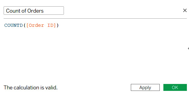
Figure 7.16: A screenshot showing the formula for calculating the distinct count of Order ID
Once, you have valid calculation, you can click OK and proceed to use it. Clicking OK will save your calculation in the Data pane, as shown in the following screenshot:

Figure 7.17: A screenshot showing the newly created calculated field
Now, that you have your calculated field available in the Data pane, you can start using it across the entire workbook. There are, however, a few important points to note:
- In the previous example, you right-clicked on Order ID and selected the Create | Calculated Field option, which opened the calculation editor box. This can also be made available by selecting the Analysis | Create Calculated Field... option in the toolbar, or by clicking on the dropdown in the Data pane and selecting Create Calculated Field...:
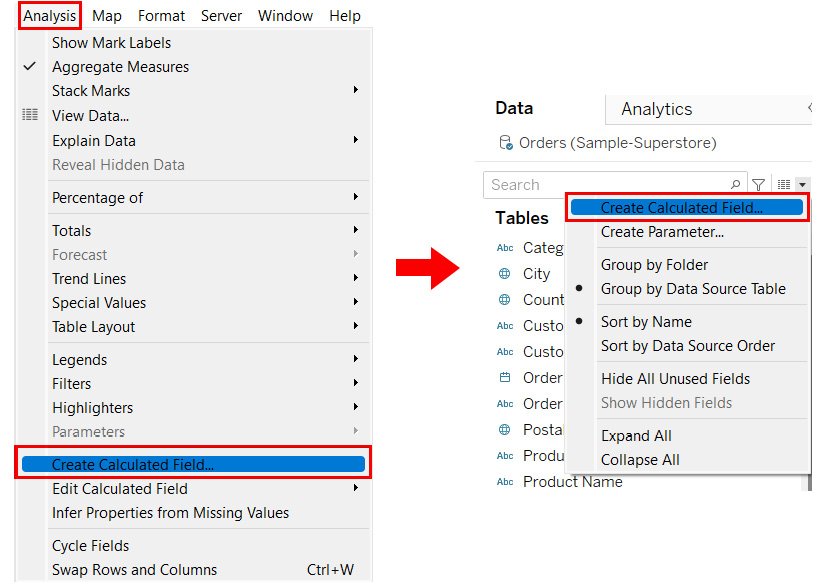
Figure 7.18: A screenshot showing other ways to create a calculated field
- Any field that is computed or calculated in Tableau will have = as a prefix, which indicates that the field was created in Tableau, and does not derive from the data itself. The = sign will be followed by either Abc or # (or something similar), which indicates the data type of that field. So, for example, =Abc is indicative of a computed field with a string output.
- To add comments to a calculation, you need to make use of two forward slashes, that is, //. Tableau will ignore anything that follows the //. Refer to the following screenshot:

Figure 7.19: A screenshot showing how to add comments in a calculated field
- The functions (blue text in Figure 7.19 in Tableau are not case-sensitive, but data fields (orange text in Figure 7.19) are, hence, you need to be extra careful about the case, as well as the spelling of the data field. If there are any issues, the syntax validator will give an error, and you will not be able to use the calculated field for further analysis. To overcome this, drag and drop the desired field from the Data pane into the calculation editor box instead of typing the text, as shown in the following screenshot:

Figure 7.20: A screenshot showing dragging and dropping fields into the calculation editor
- Tableau supports all standard operators, such as multiplication (*), division (/), modulo (%), addition (+), subtraction (-), as well as all the comparisons, such as equal to (== or =), greater than (>), greater than or equal to (>=), less than (<), less than or equal to (<=), and not equal to (!= or <>). These operators must be typed and are not part of the list of functions in the calculation box.
- Since Tableau is a read-only tool, the calculated fields you are computing will not be written back to the data, thus keeping the integrity of your data intact.
- You can create a calculated field and use it in other calculated fields as well.
You will now work through examples of how some of these calculations can be created and used.
Creating and Using Different Types of Calculations: Numeric Calculations
Numeric calculations are used when performing mathematical/arithmetic functions on numeric data in order to return a numeric output. The Number functions supported by Tableau at this point in time (that is, in version 2020.1) are as follows:
- Basic math functions such as the ABS function, which is used to return the absolute value of the number; the ROUND function, which is used to round the number to the specified number of decimal places; SQRT, which is used to return the square root of a number; and the ZN function, which returns zero if there are null values, or returns the value itself otherwise.
- Trigonometric functions such as ASIN, ACOS, ATAN, SIN, COS, TAN, and others.
- Angular functions such as DEGREES and RADIANS.
- Mapping functions such as HEXBINX and HEXBINY.
- Logarithmic functions such as LN and LOG.
- Exponential and Power functions such as EXP and POWER, and others.
As mentioned earlier, when selecting any of these functions, you will see the syntax of that function, an explanation of the purpose of that function, along with an example. Further, with these numeric functions, as well as the arithmetic operators above, you can create some immensely powerful and useful calculations.
In the previous topic, you created a new calculated field called Count of Orders, which gave the distinct count of your order IDs. You will now use this computed field to create another calculated field to find the average order value for your sub-categories.
Exercise 7.02: Creating a Numeric Calculation
The objective of this exercise is to create a numeric calculation to find the average order value of each sub-category. You will continue with the Orders data from the Sample-Superstore.xlsx file and, using the Sales field and the previously created Count of Orders field, create a new calculated field called Average Order Value (AOV) for each Sub-Category and display it in a bar chart.
- First, drag your Sub-Category field and drop it in the Rows shelf. Next, drag the Sales and the Count of Orders field into the Columns shelf. Now enable the labels for your bar charts by clicking on Show Marks Label in the toolbar. See the following screenshot:

Figure 7.21: A screenshot showing a bar chart with Sales and Count of Orders across sub-categories
- Create a calculated field called Average Order Value (AOV) with the following formula:
SUM([Sales])/[Count of Orders]
You should see the following on your screen:

Figure 7.22: A screenshot showing the formula for the Average Order Value (AOV) calculation
- Drag and drop the Average Order Value (AOV) next to the Count of Orders field in the Columns shelf. Refer to the following screenshot:

Figure 7.23: A screenshot showing the bar chart with the Average Order Value (AOV) calculation
As you can see in Figure 7.23, the Copiers sub-category has the highest average order value followed by Machines.
Note that the prefix for Average Order Value (AOV) is AGG, which stands for Aggregate. This is Tableau's way of telling you that the calculation is pre-aggregated by the user (since you are using SUM() for sales and the count of orders field is using the COUNTD() function).
This exercise shows an example of creating and using a numeric calculation. You have created a new calculation called Average Order Value (AOV) using the Sales field and the Count of Orders field. Since this Average Order Value (AOV) field has a numeric output, the calculation is called a numeric calculation.
Creating and Using Different Types of Calculations: Logic Statements
Logic statements are typically used for criteria-based or condition-based evaluation. Some of the logical functions available in Tableau are as follows:
- Operators such as AND, OR, and NOT.
- Functions such as IF, ELSE, ELSEIF, CASE, IIF, IFNULL, ISNULL, ISDATE, etc.
IF…ELSE, IF…ELSEIF…ELSE, and CASE are the most commonly used logic functions and, typically, when using these logic functions, the THEN function is used to specify the value that needs to be displayed when the expression is true.
An important point to remember here is that when using the IF statement or a CASE statement for logical evaluation, you need to terminate your logical statement with the END function.
You have already seen an example of a logic statement in the Creating and Using Ad Hoc / Edit in Shelf Calculations section, where you found out which sub-categories were profitable, and which were not. You created a calculation to see whether SUM(Profit) was greater than or less than zero. The output of this calculation was a Boolean output, with the outcome being either True or False. Boolean calculations are a quick and easy type of logic statement. They get executed quickly and perform well compared to the other types of logic statement.
Although Boolean calculations have many advantages, they could confuse an end user if they are unaware of what True and False stand for. The meaning of Booleans depends on the criteria in your calculations. In the earlier example, the outcome True indicates either positive or negative profit, depending on what is specified in your calculation. If the end user is unfamiliar with these criteria, the Boolean outcome will be unhelpful.
To avoid confusion, it is best to use a more elaborate logic statement incorporating user-friendly tags. You will explore this by following the steps in the following exercise.
Note
If you are using a version of Tableau later than 2020.1, you may need to create Number of records to match the output of Exercise 7.03.
Exercise 7.03: Creating a Logic Calculation
In this exercise, you will create a logic calculation to find unprofitable products. as well as to find out how many transactions for each product are unprofitable. You will use the CoffeeChain Query table from the Sample-Coffee Chain.mdb dataset. This is a Microsoft Access Database. The dataset can be downloaded from the following link: https://1drv.ms/u/s!Av5QCoyLTBpnmkPL8Yx_0_2KtrG4?e=rWpksB.
First, you will connect to the CoffeeChain Query table from the Sample-Coffee Chain.mdb dataset and create a bar chart using the Product field and the Number of records field. You will then create new calculated fields, which will help find and highlight unprofitable products, and find out how many of the transactions in each product are unprofitable.
- Connect to the CoffeeChain Query table from Sample-Coffee Chain.mdb. Create a bar chart by dragging the Product Name field into the Rows shelf. Then, drag Number of Records into the Columns shelf and enable the labels for these bars. Refer to the following screenshot:
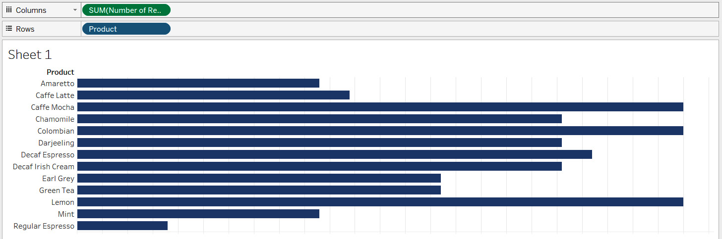
Figure 7.24: A screenshot showing the bar chart showing Number of Records by Product
Now, you want to find the profitability of your products. However, profitability (especially in this case) can be computed on two levels.
There is the overall profitability of a product, and there is how many transactions for a product are profitable. Both these requirements are useful to know. You will begin by finding the overall profitability of your products.
Note
Please replace the quotes around Profitable Product and Unprofitable Product after pasting the code in Step 2 below. This will ensure the output is error-free.
- Create a new calculated field called Overall Profitability using the IF…THEN…ELSE…END function. The formula will be as follows:
IF SUM([Profit])>0 THEN "Profitable Product"
ELSE "Unprofitable Product"
END
Refer to the following screenshot:

Figure 7.25: A screenshot showing the formula for Overall Profitability
- Click OK and drag this new field into the Color shelf. Your view will update, as shown in the following screenshot:
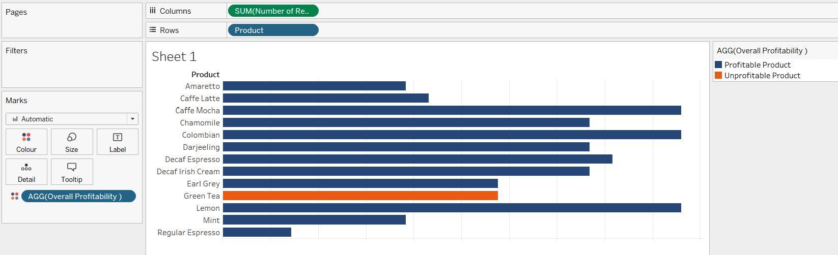
Figure 7.26: A screenshot showing Overall Profitability using color
As you see from the color legend, the blue bars are the profitable products, and the orange bars are the unprofitable products. In the preceding screenshot, you can clearly see that green tea is the only product that is unprofitable.
In the ad hoc calculation example (Exercise 7.01, Creating an Ad Hoc Calculation to Highlight Loss-Making Sub-Categories), when you saved the calculation in the Data pane, you had a Boolean output with a prefix of =T|F, whereas when you save this Overall Profitability calculation by clicking OK, you see that the output is a string with the prefix =Abc. Refer to the following screenshot:

Figure 7.27: A screenshot showing the prefix for an ad hoc calculation and Overall Profitability calculation
Now that you have found which of your products are profitable, it is time to find out how many profitable transactions there are for each product.
- Duplicate the Overall Profitability calculation and change the code.
- Use the IF…THEN…ELSE…END function. The formula and syntax should be similar to the Overall Profitability calculation, except for a change in the aggregation of the Profit field and the displayed output string. Name this calculated field Transactional Profitability. The formula will be as follows:
IF [Profit]>0 THEN "Profitable transaction"
ELSE "Unprofitable transaction"
END
Refer to the following screenshot:

Figure 7.28: A screenshot showing the formula for Transactional Profitability
- Click OK and drag this new field into the Color shelf. Your view will update, as shown in the following screenshot:

Figure 7.29: A screenshot showing Transactional Profitability in color
As you see from the color legend, the blue bars represent profitable transactions, and the orange bars represent unprofitable transactions. From this, you can find some interesting outcomes. For example, it shows that all Decaf Espresso transactions are profitable.
You have now successfully created and used logic statements to find the profitability, and profitable transactions for each of your products
Creating and Using Different Types of Calculations: String Calculations
In Tableau, string calculations can be performed on any data type. Tableau converts and processes all such data types and yields a string output. You can create string calculations on Integer fields, as well as Date fields by first converting them into a string. You can use the type conversion function STR() in Tableau to achieve this. The various string functions supported by Tableau (in version 2020.1) are as follows:
- Functions such as ASCII and CHAR find the ASCII code of a character and the character based on the ASCII code, respectively.
- Case functions such as LOWER and UPPER change the casing of strings to lowercase and uppercase, respectively.
- Functions such as CONTAINS, STARTSWITH, ENDSWITH, and ISDATE check string or substring conditions.
- Functions such as TRIM, LTRIM, and RTRIM remove blank spaces.
- Functions such as FIND and FINDNTH find the position of a substring.
- Functions such as LEFT, RIGHT, and MID, return the specified number of characters in a string.
- Regular expressions such as REGEXP_EXTRACT, REGEXP_EXTRACT_NTH, REGEXP_MATCH, and REGEXP_REPLACE allow you to specify patterns to match, locate, and manage text.
- Some other string functions available in Tableau are LEN, which returns the length of the string; REPLACE, which searches for a specified substring and replaces it with a replacement substring; SPLIT, which returns the substring from a string based on the specified delimiter; and MIN and MAX, which return either the alphabetically minimum or maximum value for a string.
In this section, you will further explore some of these functions.
You will now continue with the Orders data from Sample-Superstore.xlsx and work with the Customer Name field. Currently, this field is a combination of the first names and last names of customers. First and last names are separated by a space. For this example, you would separate the first and last names of each customer, and then find the initial letters of the last names for your customers.
After that, you create groups for names starting with letters A to I, J to R, and S to Z to find out how many customers fall in each group.
You begin by dragging the Customer Name field into the Rows shelf. There should be 793 unique customers.
To find the last name, you have to create calculations on the Customer Name field. Right-click on the Customer Name field in the Data pane and choose the Split or Custom Split option available under Transform. Refer to the following screenshot:

Figure 7.30: A screenshot showing the Split and Custom Split options
When using the Split function, Tableau automatically creates two calculated fields named Customer Name – Split 1 and Customer Name – Split 2. When you edit these calculated fields, you will see the following syntax for Split 1 and Split 2 respectively:
TRIM( SPLIT( [Customer Name], " ", 1 ) )
TRIM( SPLIT( [Customer Name], " ", 2 ) )
This auto split targeted delimiter, which in this case was space, and on that basis, has split the field to give the first column before the space, which is customer first names second column after the space, which in this case is customer last names.
The Custom Split option allows for more control than the auto split option. Here, for example, only the last name is needed. The first name isn't of any use at this point. So, instead of using the auto split option, you can use Custom Split, which brings up the following screenshot:

Figure 7.31: A screenshot showing the Custom Split option
Here, you can specify the separator/delimiter. You can decide whether you want the first column or the second column, and whether you want to split the columns. To get only the last name, choose space as the separator, and then Split off the Last 1 column. You get one new calculated field called Customer Name - Split 2. The syntax of this field is as follows:
TRIM(SPLIT([Customer Name], " ", -1 ))
Split and Custom Split are shortcut options provided by Tableau to split strings. However, you could get the same result by creating new calculated fields from scratch using some of the previously stated string functions. You will now explore this further.
First, parse the string to find the position of the space. Next, ask Tableau to give the string that follows the space. To find the position of the space, use the FIND function in Tableau. The syntax of the calculated field should be as follows:
FIND([Customer Name]," ")
This gives the position of the space as a numeric value. However, you need the string after the space. To identify this, use the MID function. The syntax should be as follows:
MID([Customer Name],FIND([Customer Name]," "))
This formula gives you the string followed by the space, but this also includes the leading space. To remove this leading space, either use the TRIM function or the LTRIM function as follows:
- TRIM:
TRIM(MID([Customer Name],FIND([Customer Name]," ")))
- LTRIM:
LTRIM(MID([Customer Name],FIND([Customer Name]," ")))
Either of these two functions will remove the leading space and give only the string followed by the space. However, if you don't want to use the TRIM or LTRIM function, you could even modify the calculation to tweak the FIND function, as shown here:
MID([Customer Name],(FIND([Customer Name]," ")+1))
The +1 in the preceding example finds the first position after the space, and thus will work similarly to the TRIM and LTRIM functions.
The point of discussing all these options is to show that many string functions can be utilized differently to get the same output. Now, choose any of the preceding formulae and save your calculated field as Last Name. Refer to the following screenshot:

Figure 7.32: A screenshot showing the Last Name calculated field
Now, you have the Last Name of your customers, it is time to find the initial letter of Last Name. Here, again, you can use functions such as LEFT and MID. The syntax for both these functions is as follows:
LEFT([Last Name],1)
MID([Last Name],1,1)
The LEFT function will return the specified number of characters (shown as 1 in the previous example) from the start of the given string.
The MID function will return the characters from the middle of the string, giving a starting position and a length (shown as 1,1 in the previous example). So, both the LEFT and the MID functions will give us the first character of the string.
Here, you will continue with the MID function, as shown in the following screenshot:

Figure 7.33: A screenshot showing the initial letter of the Last Name calculated field
Finally, it is time for you to create your groups. You can use the following formula:
IF [Starting alphabet of Last Name] <= "I" THEN "A-I"
ELSEIF [Starting alphabet of Last Name] >= "S" THEN "S-Z"
ELSE "J-R"
END
Name this calculation Groups-Starting alphabet of Last Name. Refer to the following screenshot:

Figure 7.34: A screenshot showing the Groups-Starting alphabet of Last Name calculated field
Change the Customer Name field in the Rows shelf to show the distinct count of customers. Then, drop the new calculated field into the Columns shelf. Refer to the following screenshot:

Figure 7.35: A screenshot showing the bar chart of Groups-Starting letter of Last Name
Figure 7.35 shows that there are more than 350 customers whose last name starts with a letter that is between A and I.
Typically, when dealing with string data, the two main operations you might perform are splitting a string into substrings or concatenating two or more strings to make one long string. You have now learned how to split strings. In the following exercise, you will be concatenating two strings together.
Exercise 7.04: Creating a String Calculation
In this exercise, you will create a string calculation that will combine Product Type, Product, and the aggregated Sales value. You will continue using the CoffeeChain Query data from the Sample-Coffee Chain.mdb file. You will use the Product Type and Product fields, along with SUM(Sales).
- Start by creating a bar chart using the Product Type, Product, and SUM(Sales) fields, as shown in the following screenshot:

Figure 7.36: A screenshot showing the bar chart of SUM(Sales) by Product Type and Product
Once the bar chart is created, create a calculated field that is a combination of the first three letters of Product Type followed by the Product text and the SUM(Sales) value. So, for example, if Product Type is, Coffee and Product is Colombian, and if the total sales for this Product are $90,000, then the output should be COF-Colombian: $90000.
To achieve this, you must change the Product Type to upper case, then pick only the first 3 characters. You must append the Product labels, and the SUM(Sales) value, which needs to start with a $ sign and must be rounded off to show zero decimals. You also need to add some special characters such as space, -, and :. These can be inserted using either single quotes or double quotes. Follow along with this exercise to learn how.
- Begin by creating a new calculated field called Concatenated string and type the following formula:
LEFT(UPPER([Product Type]),3) + "-" + [Product] + " : "
This gives you the first part of what the desired string should look like. So, for example, if the desired output is COF-Colombian: $90000, then the preceding calculation gives an output of COF-Colombian:.
You are halfway there. Now, if you saved the calculation mid-way, you will have to right-click on this new calculated field and edit it from the Dimensions pane. However, if not, you can continue working in the same calculation box.
- Now you must append the SUM(Sales) value, and this is where things start to get complicated. Firstly, Product Type and Product are string values, but SUM(Sales) is an integer value, so it is not possible to concatenate them, unless you convert SUM(Sales) to a string value. Further, you need the SUM(Sales) value to be rounded off to zero decimal places and it needs to have $ as a prefix. Keeping this in mind, amend the existing calculation as follows:
LEFT(UPPER([Product Type]),3) + "-" + [Product] + " : " + STR(ROUND(SUM([Sales]),0))
- You will see that Tableau doesn't agree with this formula and gives an error indicator. Refer to the following screenshot:

Figure 7.37: A screenshot showing the error in the calculation of Concatenated string
- Click the error dropdown. You should see an error that reads Cannot mix aggregate and non-aggregate arguments with this function. Refer to the following screenshot:

Figure 7.38: A screenshot showing the "Cannot mix aggregate and non-aggregate arguments…" error
This is a classic error common in Tableau. It means that SUM(Sales) is an aggregated field whereas the Product Type and Product fields, being Dimensions, are not aggregated and, logically, Tableau can't work with aggregated and non-aggregated values in a calculation. So, to overcome this, you must aggregate the Product Type and Product fields. Since both the Product Type and Product fields are dimensions, you can use any of the following functions: MIN, MAX, or ATTR.
Save your existing calculation as it is and spend a little time understanding these three functions before amending it.
When aggregating the dimension using the MIN function, you get the alphabetically minimum or lowest value. The MAX function, on the other hand, gives the alphabetically maximum or highest value. The ATTR function gives the value of the field as is if it has a single value for all rows; otherwise, it will return an asterisk.
- To demonstrate this, create a new sheet to show Product Type in the Rows shelf. Then, create a new calculated field called Min of Product with the following formula:
MIN([Product])
Refer to the following screenshot:

Figure 7.39: A screenshot showing Min of Product calculation
Save the calculation. Notice that even though it has a string output, it is now part of the Measures pane. This is because it is now an aggregated field and, as discussed earlier, any aggregated field becomes part of the Measures pane.
- Now, create another calculation called Max of Product with the following formula:
MAX([Product])
Refer to the following screenshot:

Figure 7.40: A screenshot showing the Max of Product calculation
- This calculation should also be in the Measures pane.
- Finally, create a calculation called Attribute of Product with the following formula:
ATTR([Product])
Refer to the following screenshot:

Figure 7.41 – A screenshot showing the Attribute of Product calculation
Now drop these three calculated fields into your sheet, right after the Product Type field in the Rows shelf.
- First, drop the Min of Product field, followed by Max of Product, and finally Attribute of Product. You should notice that all three fields give different outputs. Refer to the following screenshot:

Figure 7.42: A screenshot showing the output of Min, Max, and Attribute of Product calculations at the Product Type level
As you can see, Min of Product gives you Amaretto for Coffee, Caffe Latte for Espresso, Chamomile for Herbal Tea, and Darjeeling for Tea. These are the alphabetically minimum values of our Product field within that Product Type. Similarly, Max of Product is giving Decaf Irish Cream for Coffee, Regular Espresso for Espresso, Mint for Herbal Tea, and Green Tea for Tea. These are the alphabetically maximum values of your Product field within that Product Type. Further, Attribute of Product is giving neither the minimum nor the maximum; instead, it is giving an asterisk. This means there is more than 1 Product under that Product Type and since Tableau can't display all the values, it is showing the asterisk to indicate there is more than 1 Product under each Product Type.
- Now drag the Product field from the Dimensions pane and drop it after Product Type in the Rows shelf. Refer to the following screenshot:

Figure 7.43: A screenshot showing the output of Min, Max, and Attribute of Product calculations at the Product level
As you see, when the Product field is in the view, all three calculations give the same value. This is because the Min or Max of a Product at the Product level is the Product itself (that is, the Min or Max for Colombian will be Colombian itself). Similarly, for the Attribute function, since there is only one row of Product under each Product, you get the output as that Product itself, and not an asterisk. However, the minute you remove the granularity of the Product, you start getting different results. So, keep in mind that if the dimension being aggregated is in the view, all three of these functions will give the same output.
- Now you have seen the various options for aggregating dimensions, you will now go back and amend your Concatenated string calculation. Since you have two dimensions, namely, Product Type and Product, you must aggregate both. Since both dimensions are in the view, you can use any of the functions discussed. For this, use the MIN function. Your formula should update as follows:
MIN(LEFT(UPPER([Product Type]),3)) + "-" + MIN([Product]) + " : $" + STR(ROUND(SUM([Sales]),0))
Refer to the following screenshot:

Figure 7.44: A screenshot showing the error-free calculation of Concatenated string
- Click OK and go back to the sheet where you created a bar chart showing Product Type, Product, and SUM(Sales). Drop this new field, which is now found under the Measures pane, into the Rows shelf just after Product. Refer to the following screenshot:

Figure 7.45 – A screenshot showing the output of the Concatenated string calculation
You have now created and used string functions in Tableau. You created a concatenated string using dimensions and aggregated Measures. You saw how to typecast an integer of a float value into a string, and how to aggregate a dimension using either the MIN, MAX, or ATTR functions to get rid of the Cannot mix aggregate and non-aggregate arguments… error. Now you know how to manipulate string fields, it is time to explore date functions.
Creating and Using Different Types of Calculations: Date Calculations
When manipulating Date fields, you can use the various Date functions supported by Tableau. At this point in time (that is, in version 2020.1), these are as follows:
- DATENAME, DATEPART, DATETRUNC, YEAR, QUARTER, MONTH, WEEK, DAY, ISOYEAR, ISOQUARTER, ISOWEEK, and ISOWEEKDAY, which can be used to find the date part of the Date field.
- DATEDIFF and DATEADD, used to find the difference between two dates or to generate a new Date field based on an incremental interval.
- TODAY and NOW, which give the current date or date and time.
- ISDATE, used to find out whether a given field is a Date field.
You will now use a Date calculation to find out how many months it has been since your customers last made a purchase.
Exercise 7.05: Creating a Date Calculation
The objective of this exercise is to create a Date calculation to find the number of months since the last purchase for your customers. You will continue using your Orders data from Sample-Superstore.xlsx and use the Customer Name and the Order Date fields.
Perform the following steps:
- Start by dragging Customer Name into the Rows shelf. Then, right-click drag and drop the Order Date field into the Rows shelf, which should create a Menu. Select MDY(Order Date). Refer to the following screenshot:

Figure 7.46: A screenshot showing the right-click drag-drop menu for Order Date
Now you can see all order dates at the customer level. There is no point looking at all transactional dates for every customer. You are only interested in the last purchase date, and how many months it has been since it occurred.
- To achieve this, first create a calculation called Last purchase date with the following formula:
MAX([Order Date])
Refer to the following screenshot:

Figure 7.47: A screenshot showing the Last purchase date calculation
- Since this calculation will be computed on the fly, the Max date is dependent on the dimensions in the view. If you drag and drop this new field into your Rows shelf, you should notice that the values are the same as for the MDY(Order Date). This won't work for you; you want the Max date for each customer, and hence you must remove the MDY(Order Date) granularity. This will update your view, as shown in the following screenshot:

Figure 7.48: A screenshot showing the Last purchase date for each customer
Now you have your Last purchase date field, it is time to find out how many months it has been since the customers last made a purchase. This can be achieved by finding the difference between two dates, that is, Last purchase date and, ideally, Today. However, since your data is not daily-updating, you will consider the end date as December 31, 2019, which is the last date in the data.
- Create a new calculated field called Months since last purchase and use the following formula:
DATEDIFF('month', [Last purchase date], #2019-12-31#)
Refer to the following screenshot:
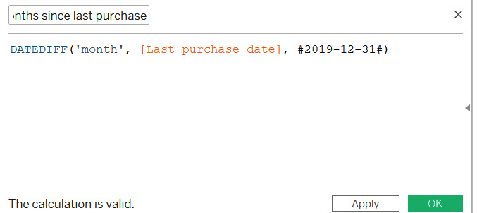
Figure 7.49: A screenshot showing the Months since last purchase calculation
- After you save this calculation, you can drag it into the Text shelf, and should get the desired output. This calculation finds the difference in months between Last purchase date and December 31, 2019. A point to remember is that when you need to enter a hardcoded date, it will start and end with a hash (#), as shown above. Further, if this data was daily-updating and you wanted to find the difference with respect to Today, that is, the current date, then you could use the Today() function, and the calculation would update as shown here:
DATEDIFF('month', [Last purchase date], Today())

Figure 7.50: A screenshot showing the final output of the Date calculation
In this exercise, you used the DATEDIFF() function to find how many months it has been since customers last made a purchase. In the next section, you'll see what to do when the value of data for a product is returned as null.
Handling Null Values while Creating and Using Calculations
Often, you might deal with data containing null values. These could be genuine entries in the data. For example, there may not be any Sales value to report against a particular product—even though it is part of the inventory, it may not have been sold yet. These nulls could also be because of some data entry errors. Most likely, you would identify and take care of these nulls at the data preparation stage. However, that may not always be the case. At times, you may need to tackle them within Tableau Desktop using calculations. Null values tend to pose a problem when used in calculated fields, simply because when doing arithmetic operations on fields, it may result in the output being null in Tableau. Refer to the following screenshot:

Figure 7.51 – A screenshot showing the Excel data and the output of the calculation on fields with null values
The preceding screenshot is a quick mockup to show the Excel data on the left and the Tableau display on the right. You can see that both fields (that is, Value of Product A and Value of Product B) have null values in certain months. Now, when you want to find the total value in each month, you add the values of product A and product B. However, since both of these fields have null values in certain months, the calculated field only shows the output for months with values in both columns. For months where either of the values are missing, the calculated field gives null output. This is simply because you can't do math on null values without getting a null output.
To overcome this, you will use functions such as ZN, IFNULL, and ISNULL.
The data for this section is available for download using this link: https://packt.link/k59i9.
Refer to the Handling Null Values in Tableau.xlsx data file for this section. Begin by connecting to this data in Tableau and creating a quick tabular view showing Month and Value of Product A and Value of Product B. Create a calculated field called Value of Product A + B. The formula is as follows:
SUM([Value of Product A]) + SUM([Value of Product B])
Add this calculated field to the view. It should update as shown in the following screenshot:

Figure 7.52: A screenshot showing the output of calculation on fields with null values
As you see, the calculated field needs some tweaking. The best way to handle these null values when doing mathematical operations is to convert them to zero. You will use either the ZN, IFNULL, or ISNULL function.
First, try the ZN function. ZN stands for Zero if Null, and that is exactly what this function does; it replaces the nulls with zero. Since both fields contain null at some point, you need to use the ZN function for both fields. Tweak your calculation to use the following formula:
ZN(SUM([Value of Product A])) + ZN(SUM([Value of Product B]))
Once you update the calculation, your view will update as shown in the following screenshot:

Figure 7.53: A screenshot showing the output of the calculated field using the ZN function
You now get values for every single Month, despite the nulls because Tableau is now converting these nulls to zero before adding them up.
You will now look at the IFNULL function. Amend your calculated field to comment out the formula using the ZN function, and instead use the IFNULL formula as follows:
IFNULL(SUM([Value of Product A]),0) + IFNULL(SUM([Value of Product B]),0)
Refer to the following screenshot:

Figure 7.54: A screenshot showing the syntax of the IFNULL function
Once you click OK, you will see that you still get output for each Month. The IFNULL function returns the expression if it is not null; otherwise, it returns the alternate expression that is defined: zero, in this case.
Now you understand the ZN and the IFNULL functions, you will look at the ISNULL function. The ISNULL function returns True if the expression contains a null value; otherwise, it returns False. In other words, the ISNULL function gives us a Boolean output as either True or False. If you wish to specify some criteria for when a null condition is True, you should use the ISNULL function with either a CASE statement or an IF statement. Edit your existing calculated field to comment out the IFNULL formula and use the following formula:
IF ISNULL(SUM([Value of Product A])) THEN 0 ELSE SUM([Value of Product A]) END
+
IF ISNULL(SUM([Value of Product B])) THEN 0 ELSE SUM([Value of Product B]) END
Refer to the following screenshot:

Figure 7.55: A screenshot showing the syntax of the ISNULL function
Once you click OK, you see that you still get output for each Month. The ISNULL function, when used in the IF statement, will return Zero if it the Null condition is True; otherwise, it returns the False condition, which is the field that we have specified.
Creating Calculations across Data Sources
In earlier sections of this chapter, you have seen how to create and use calculations, but all these calculations were done within the same data source. Having all your data in one source would be an idealistic scenario; however, that may not always be the case, and you may have to deal with data coming from multiple sources. This means you may have to compute calculations across data sources, too.
In this section, you will focus on how to create calculations across data sources using data blending. You will also look at how to create and use calculated fields to join data. You have already seen the data blending and join functionality in previous chapters, and you will use that knowledge to create and use calculations across data sources.
You will use the Modified CoffeeChain data along with Budget Sales for CofeeChain.xlsx. These can be downloaded at the following links:
Once downloaded, load the files into Tableau Desktop. Use the Microsoft Access option to connect to the CoffeeChain Query table from the Modified_CoffeeChain.mdb data. Refer to the following screenshot:

Figure 7.56: A screenshot showing the preview of the Modified CoffeeChain data
Look at this data preview. Notice that the Date field is of a DATETIME data type, even though the timestamp is 00:00:00. Once you familiarize yourself with this dataset, you will try to get the Budget data as well. To achieve this, click on the Add button in the left-hand side section of this data connection window and select the Microsoft Excel option to select Budget Sales for CoffeeChain.xlsx. This should create a cross-database join between the two. Refer to the following screenshot:

Figure 7.57 – A screenshot showing the preview of a cross-database join of CoffeeChain data and Budget Sales
Something has gone wrong with the join, indicated by the red exclamation mark and the lack of data to preview. This is because the Date field in the Access database is a DATETIME field whereas, the Date field in the Excel data is a DATE field. To use the Date field as a common linking field between both these datasets, it will have to be of the same data type. So, change the DATETIME field to a DATE field and then try to enable the join. Changing the datatype could be done in many ways; however, here, you will use the calculation method and will use this calculation to create a join between the two data sources.
Begin by clicking the red exclamation mark and then clicking the dropdown under the left column in the window where you are defining the join criteria. Select the Create Join Calculation... option. Refer to the following screenshot:

Figure 7.58: A screenshot showing the Create Join Calculation option
Type the following formula:
DATE([Date])
Refer to the following screenshot:

Figure 7.59: A screenshot showing the Create Join Calculation formula for typecasting the Date field
Since the Date field in the Budget Sales data is already a DATE data type, select the Date (Budget Sale) field from the dropdown. Refer to the following screenshot:

Figure 7.60: A screenshot showing the Date field in the Budget Sales data being used for joining
You should see that the Join condition is resolved, and your dataset is now ready for use. The output of this join will be a single combined dataset and you can then create other calculations using this combined dataset.
You will now use a calculation across data sources using data blending, where you first connect to these datasets independently and then combine them on the fly as and when required.
So, you have the Modified CoffeeChain data and Budget Sales for CoffeeChain data, and you want to use these independently across your workbook. This won't present issues until you need to get data from both these data sources in one single sheet. For example, imagine you want to find the percentage of a target you have achieved across months of a year. You have the Sales field in the Modified CoffeeChain data and Budget Sales in the Budget Sales for CoffeeChain data; to find the percentage of the target achieved across those months, you need to create a new calculated field. Name this new calculated field % Target Achieved.
Begin by connecting to the Modified CoffeeChain data independently and then connect to the Budget Sales for CoffeeChain data. You should get two separate data sources in your Data pane. Refer to the following screenshot:

Figure 7.61: A screenshot showing Budget Sales and Modified CoffeChain as separate and independent data sources
Once you have both these data sources within Tableau Desktop, drag the Date field from the Modified CoffeeChain data into the Rows shelf, then drop the Product field from the same data source into the Rows shelf just after YEAR(Date). Next, double-click on Sales from the Measures pane of the Modified CoffeeChain data. Then click on the Budget Sales for CoffeeChain data in the Data pane to enable the dimensions and Measures for that data source. You should now notice the blending link enabled for the Date field, as well as the Product field. Keep these links as is, then double-click the Budget Sales field from the Measures pane of the Budget Sales for CoffeeChain data. The view updates, as shown in the following screenshot:
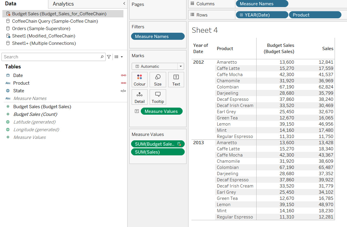
Figure 7.62: A screenshot showing the results of data blending
Now, create a new calculated field called % Target Achieved in your Budget Sales for CoffeeChain data. Drag the Sales field from the Modified CoffeeChain data into the calculation box and divide this by SUM([Budget Sales]). The formula is as follows:
SUM([Sheet1 (Modified CoffeeChain)].[Sales])
/
SUM(Budget Sales [Budget Sales])
Refer to the following screenshot:

Figure 7.63: A screenshot showing the formula of the % Target Achieved calculation
The field Sales is shown as [Sheet1 (Modified CoffeeChain)].[Sales], which shows that the field is coming from the Modified CoffeeChain data. Click OK and save this calculation. Change Default Properties to format this new field to show Percentage with 2 decimals. This can be done by using the Default Properties > Number Format option, which is available when right-clicking on the field in the Measures pane. Now, drop this new calculated field in the view and your view should update, as shown in the following screenshot:

Figure 7.64: A screenshot showing the output of the % Target Achieved calculation
As you see in the preceding screenshot, there are some products where the % Target Achieved is less than 100%, and there are certain products where the % Target Achieved is more than 100%. You have now learned to create calculations across data sources. A point to remember here, is that when you do this, the fields you use always need to be aggregated.
You will now try some activities based on what you have learned so far.
Note
Now, even though we have tried to cover a lot of the Tableau functions, we still haven't been able to go through all the functions that Tableau has to offer. If you wish to know more about all the functions that Tableau has to offer, then you can look at the following links:
https://help.tableau.com/current/pro/desktop/en-us/functions_all_categories.htm
https://help.tableau.com/current/pro/desktop/en-us/functions_all_alphabetical.htm
Activity 7.01: Calculating the Profit Margin
As a data analyst, you may encounter a scenario where you are required to compute profit margins using the Profit and Sales field and filter this Profit Margin below a certain threshold. The aim of this activity is to calculate the Profit Margin, which is computed by dividing Profit by Sales. Once you have the Profit Margin computed, you want to filter products and only display the Profit Margin for the Xerox product. Finally, you want to filter the Xerox products, and only look at those where the Profit Margin is more than 45%.
Steps for completion:
- For this activity, use the Orders data from the Sample-Superstore.xlsx file.
- Create a table/tabular view to show Product Name, Profit, and Sales.
- Create a calculated field on Product Name to identify the Xerox products and group the rest of the products as Others.
- Use this new calculated field to filter the table to show only the Xerox products.
- Then create another calculated field to compute the Profit Margin, which will be derived by dividing the Profit values by the Sales values.
- Add this new calculated field into the view and make sure to change the number format to show percentages with two decimals.
- Use this new calculated field to filter the view to show the Profit Margin above 45% and sort the final output in ascending order of Profit Margin. Refer to the following screenshot:

Figure 7.65: A screenshot showing the expected output of Activity 7.01
Note
The solution to this activity can be found here: https://packt.link/CTCxk.
Activity 7.02: Calculating the Percentage Achievement with Respect to Budget Sales
As data analysts, you may often be required to compare actual sales with budgeted sales, to determine performance. In this activity, you will find out what percentage of budget sales targets have been achieved for the year 2012. You will use the CoffeeChain Query table from the Sample-Coffee Chain.mdb dataset. The data can be downloaded from the following link for this activity: https://1drv.ms/u/s!Av5QCoyLTBpnmkPL8Yx_0_2KtrG4?e=TrYFWQ.
- Use the Sample-Coffee Chain.mdb data.
- Create a bar chart to show Sales across Products for the year 2012.
- Create a calculated field to find out the percentage Achievement of Actual Sales with respect to the Budget Sales for all the Products displayed in the view.
- Color code the bars with respect to % Achievement in such a way that Products with less than 95% Achievement are called <95% of Target achieved (color-coded orange). Those with more than 100% Achievement are called >100% Target achieved (color-coded gray). Those between 95% and 100% Achievement are called Between 95% to 100% Target achieved (color-coded blue). Refer to the following screenshot:

Figure 7.66: A screenshot showing the expected output of Activity 7.02
Note
The solution to this activity can be found here: https://packt.link/CTCxk.
Summary
In this chapter, you explored some important aspects involved in creating and using calculations in Tableau and studied the difference between aggregate and non-aggregate fields. You looked at numeric, string, and date calculations, and learned to write logic statements and handle null values. Finally, you looked at how to use these calculations across data sources.
In upcoming chapters, you will move on to more advanced table and level of detail calculations, which will allow you to do even more with your data.