
Overview
In this chapter, you will learn about the different types of table calculations in Tableau, their benefits, and how to use them effectively. The goal of this chapter is to improve your analytical skills using table calculations by looking at data through different views to understand the underlying patterns. By the end of this chapter, you will be well positioned to perform complex analysis on the data in your visualizations using table calculations.
Introduction
In any visualization, a virtual table is created based on the dimensions used in the view. This is added to the Columns, Rows, and Marks shelves.
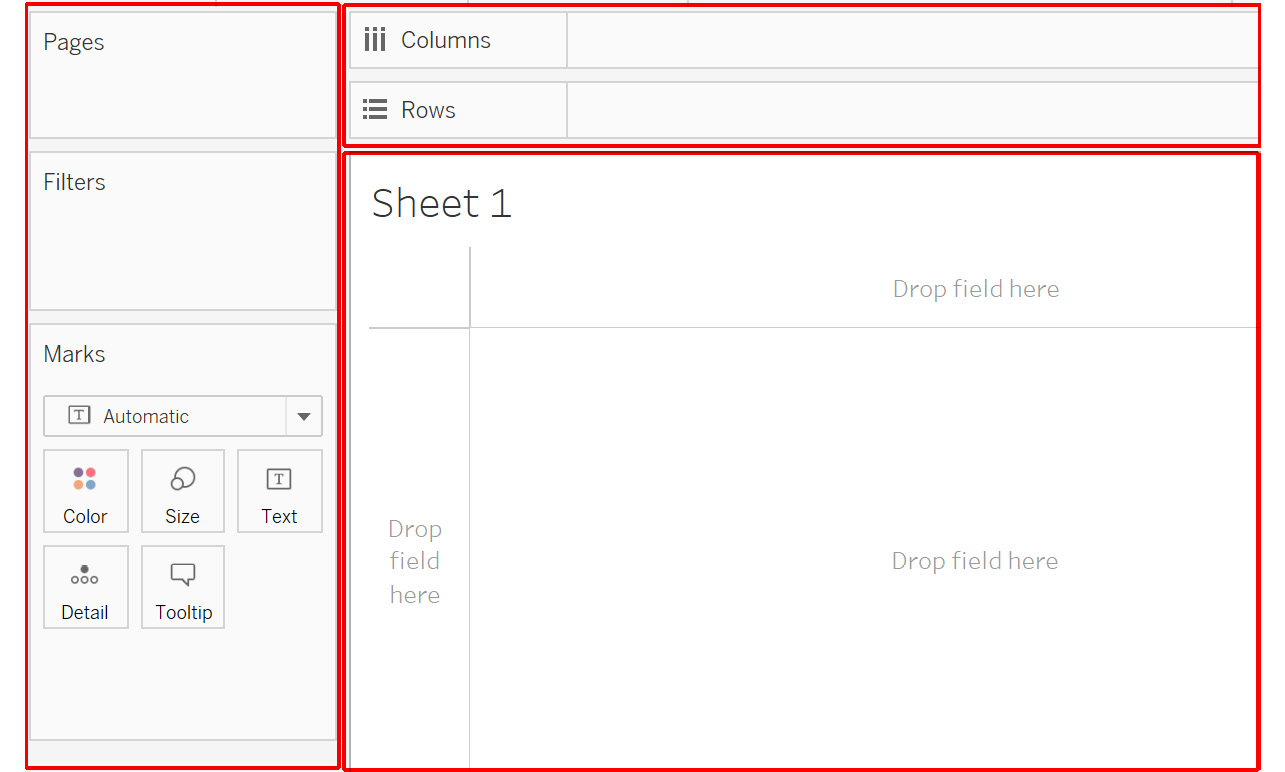
Figure 8.1: Virtual table in the view
The highlighted area in the preceding figure consisting of the Rows, Columns, and Marks shelves will make up your level of detail. The empty canvas outline for dropping fields contains the virtual table that will be affected by table calculations.
A table calculation is simply a calculation that computes results based on the table segment in scope. You will learn about segments and scope in detail in the following sections. For now, assume it is the entire empty canvas area. All table calculations will only be computed within the empty canvas outline or the virtual table.
In previous chapters, you learned about visualization methods that present data in a meaningful way. There may be times where you need to analyze a table, such as when you want to find the most profitable sub-category within a category. This is where table calculations come in handy.
In this chapter, you will learn about table calculations and their applications through various exercises. You will also learn about the functions that are a part of table calculations, and how to apply them. You will use the Sample - Superstore dataset throughout the exercises.
Quick Table Calculations
Quick table calculations, as the name suggests, allow you to quickly apply frequently used table calculations to the view using the most typical settings for that calculation type. They save you the effort of using the column fields from data to create calculations. They have inbuilt logic , so you can use them directly in the view. Some of the most commonly used table calculations are as follows:
- Running Total
- Difference
- Percent of Total
- Percent Difference
- Percentile
- Rank
- Moving Average
You will start by learning how to apply quick table calculations, using the Sample - Superstore dataset. This file can be found by following the Documents | My Tableau Repository | Data Sources system path, and then opening the Sample - Superstore.xls file.
To begin, create a view that shows Category against YEAR(Order Date) and SUM(Profit), as follows:
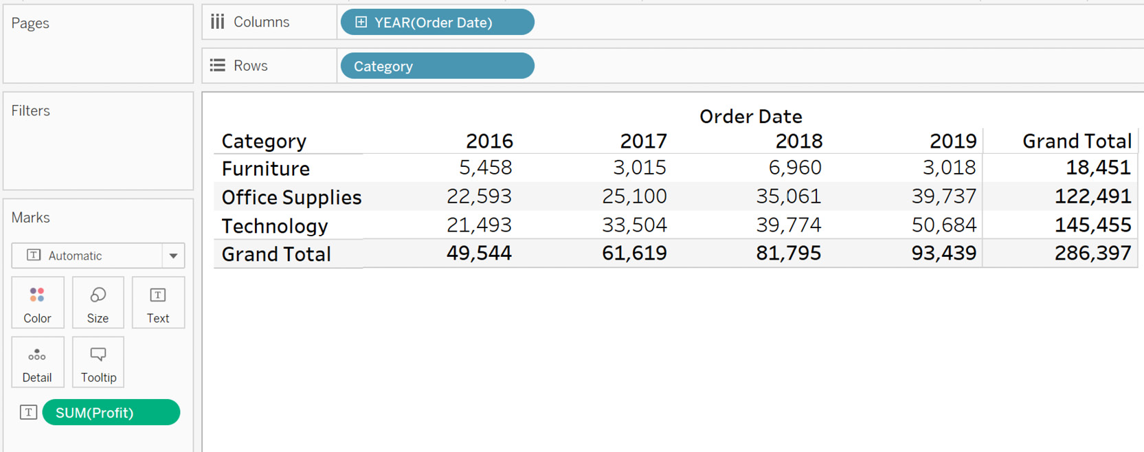
Figure 8.2: Initial view
Table calculations only work with measures, so you need a measure to add a calculation. To add a quick table calculation, first click on the measure dropdown, which is SUM(Profit) in this case.
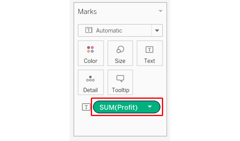
Figure 8.3: Accessing the Profit drilldown
Navigate to the Quick Table Calculation menu.
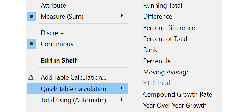
Figure 8.4: Various quick table calculations
You can see that there are numerous quick calculations available, such as Running Total, Percentile, and Rank. You will now go through each of these in detail.
Running Total
Running Total, as the name suggests, is used to calculate the cumulative total of a measure across a specific dimension or table structure. It adds up the previous value with the current value to display that result in the current value's place in the running total. For example, consider that you are working on a project related to a car manufacturer. A common use case for this calculation, would be to calculate the month-by-month cumulative car sales for a year, to find out the total sales for that year. You can also further calculate it on a year-by-year basis to find out the overall car sales to date. The next exercise looks at this in detail.
Exercise 8.01: Creating a Running Total Calculation
In this exercise, you will calculate the cumulative profit earned across different years for a particular category using the Running Total calculation. This allows you to view all years together for the profits earned, rather than individual years. The following steps will help you complete this exercise:
- Load the Sample – Superstore dataset in your Tableau instance. In the Connect pane, click on Microsoft Excel and navigate to Documents | My Tableau Repository | Data Sources, and then open the Sample - Superstore.xls file.
- Create a view that shows Category against YEAR(Order Date) and SUM(Profit), as follows:
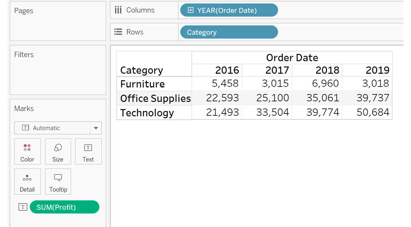
Figure 8.5: Running total initial view
- Add a Running Total quick calculation to the view by selecting the following highlighted options:
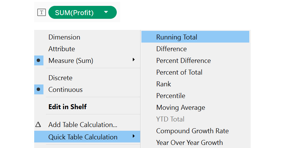
Figure 8.6: Accessing Quick Table Calculation | Running Total
- The following view shows the final output:
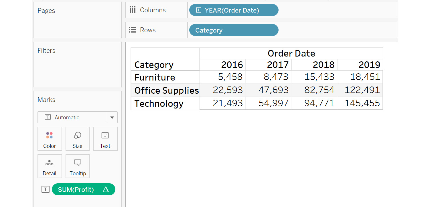
Figure 8.7: Final output
As you can see, by comparing the previous figure (final view) with the next one (initial view), the profit has been summed cumulatively by taking the previous year's profit, as well as the current year's profit. With Furniture, for example, the second value under the running total is computed using the previous value and the current value, that is, 5,458 + 3,015 = 8,473, and this is done similarly for other values.
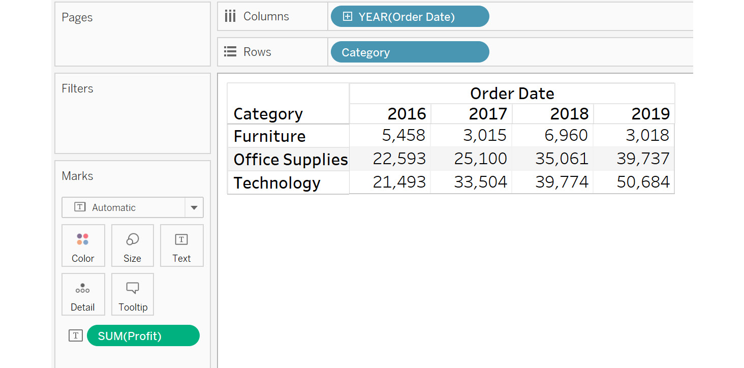
Figure 8.8: Initial view
This view is helpful for calculating the cumulative profit earned, year after year, for the different categories, as well as for identifying which category has been performing well and which hasn't. These insights can help you make important business decisions to understand which products can be used to generate higher profits.
Next, you will learn about the Difference table calculation.
Difference
Difference, as the name suggests, is used to calculate the difference of a measure across a specific dimension or table structure from its previous value. Often, you may need to analyze how individual categories compare with their past performances, i.e. comparing product sales from previous quarters. Continuing with the car manufacturer example, a common scenario to apply this calculation, would be to compare the sales for the months of a year. This allows you to find out whether the total sales are greater or fewer, compared to the previous months. In the following exercise, you will learn how to apply a Difference table calculation to a worksheet.
Exercise 8.02: Creating a Difference Calculation
In this exercise, you will calculate the profit difference across years for a category. This will help you analyze whether that category is profitable or not:
- Load the Sample – Superstore dataset in your Tableau instance.
- Create a view that shows Category against YEAR(Order Date) and SUM(Profit), as follows:
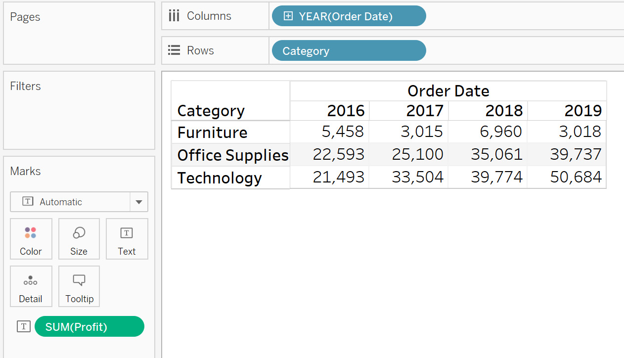
Figure 8.9: Initial view
- Add the Difference quick calculation to the view, as shown in the following figure:
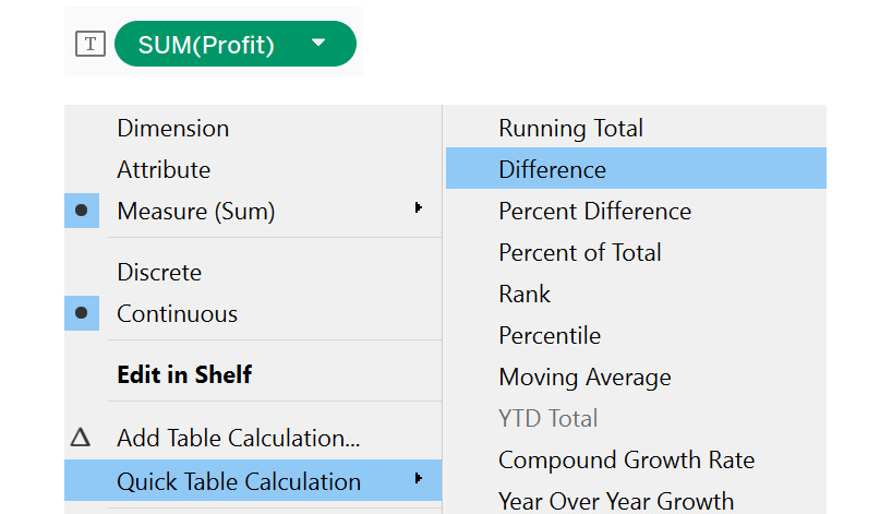
Figure 8.10: Accessing quick table calculation difference
The final view will be as follows:
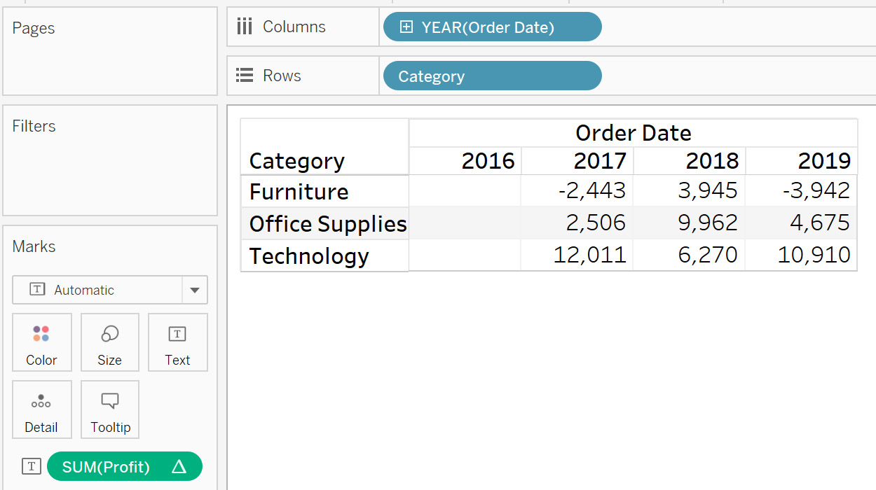
Figure 8.11: Final output
As you can see, the result is the difference between the current year's profit and the previous year's profit; for example, for Furniture, the second value under Difference is computed using the previous value and the current value, that is, 3,015 – 5,458 = -2443. This is done similarly for the other categories. One thing to note here is the first year's value will always be blank, as there is nothing to compute the difference from.
In the next section, you will learn about the Percent of Total table calculation.
Percent of Total
A Percent of Total calculation is used to calculate the percent distribution of a measure across a specific dimension or table structure. For example, if you are analyzing a project that operates in multiple countries, you can calculate what percentage of the total revenue each country generates. This in turn can highlight underperforming countries, as well as the better-performing ones.
You will use this calculation in the next exercise.
Exercise 8.03: Creating a Percent of Total Calculation
In this exercise, you will calculate the Percent of Total profits earned in different years for a category. By doing so, you can understand how each category has contributed to yearly profits. Perform the following steps to complete this exercise:
- Load the Sample – Superstore dataset in your Tableau instance.
- Create a view that shows Category against YEAR(Order Date) and SUM(Profit), as follows:
Figure 8.12: Initial view
- Add the Percent of Total quick calculation to the view
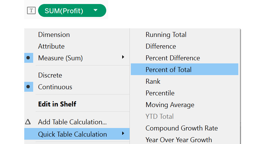
Figure 8.13: Accessing quick table calculation | percent of total
The following view is the final output:
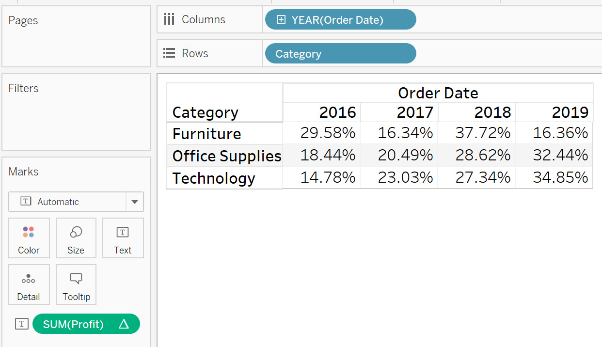
Figure 8.14: Final output
You can see that the profit has been converted to a percentage of the total, from all the years' profits. For example, for Furniture, you can first compute the sum of all the years' profits, which comes to 18,451. Then, divide each year's profits with this number. So, for 2016, you can compute it as 5,458 / 18,451, which is 29.58%.
This view helps find out which year has been better for generating profits for each category. The next step is to identify patterns indicative of higher profits in those years, and to try to replicate the patterns for the current year to generate similar or higher profits.
The next section looks at the Percent Difference table calculation.
Percent Difference
Percent Difference, as the name suggests, is used to calculate the change in the percent distribution of a measure across a specific dimension or table structure. This calculation will first subtract a value from its previous value, and then compute the percentage change. As you may have noticed, this table calculation is a combination of the Difference and Percent of Total calculations. The reason for using a percentage is that absolute numbers do not always show the complete picture. For example, the sale of 10 Ferrari cars will generate more profit compared to 50 Honda cars. But if you compare this using actual numbers, the data will say that Honda is more profitable, even though Ferrari is actually more profitable.
You will learn more about using this calculation in the next exercise.
Exercise 8.04: Creating a Percent Difference Calculation
In this exercise, you will be calculating Percent Difference across the different years for a particular category. This will help you analyze, in terms of percentage, the profit difference for the various categories:
- Load the Sample – Superstore dataset in your Tableau instance.
- Create a view that shows Category against YEAR(Order Date) and SUM(Profit), as follows:

Figure 8.15: Initial view
- Add the Percent Difference quick calculation to the view:
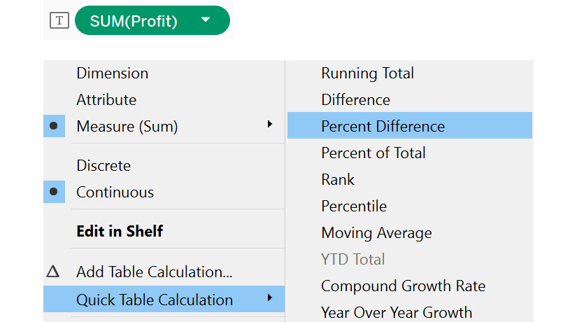
Figure 8.16: Accessing quick table calculation | percent difference
The following figure shows the final output:
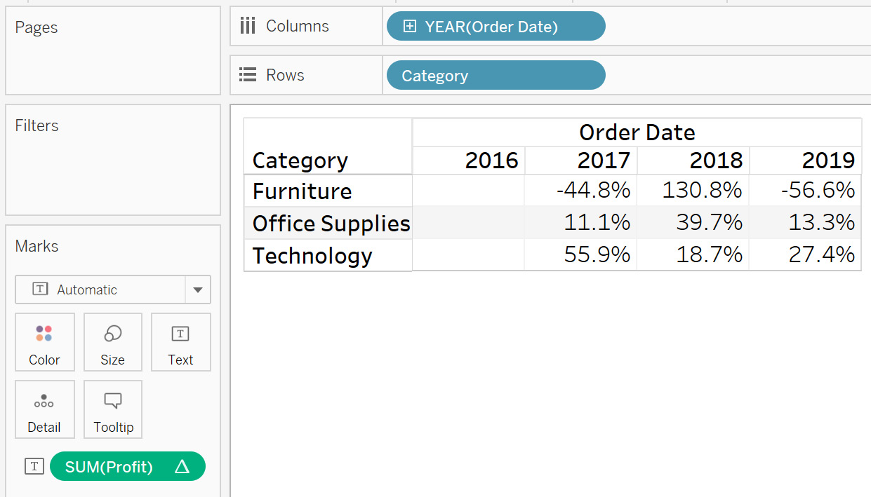
Figure 8.17: Final output
As you can see, the output shows the difference between the current value and previous values, divided by the previous value; for Furniture, the percent difference for 2016 is computed as 3,015 – 5,458 / 5,458, which comes to -44.8%.
This view helps to compare the individual category profits in terms of percent, and identifies how each category has performed compared to the previous year. This can help you understand whether the category did better (or not), compared to the previous year.You can further investigate the reason for performance differences, and act on the analysis accordingly.
Next, you will learn about the Rank and Percentile table calculations.
Percentile and Rank
Percentile, as you may have guessed, is used to calculate the percentile of a measure across a specific dimension or table structure. Similarly, Rank will rank the measure across a specific dimension or table structure. You will learn about these in detail in the next exercise.
Exercise 8.05: Creating Percentile and Rank Calculations
In this exercise, you will calculate Percentile and Rank across different years for a particular category. This will help you understand how much profit various categories have generated in different years. Follow these steps to complete this exercise:
- Load the Sample – Superstore dataset in your Tableau instance.
- Create a view that shows Category against YEAR(Order Date) and SUM(Profit).
Figure 8.18: Initial view
- Add the Rank quick calculation to the view, as shown in the following figure:
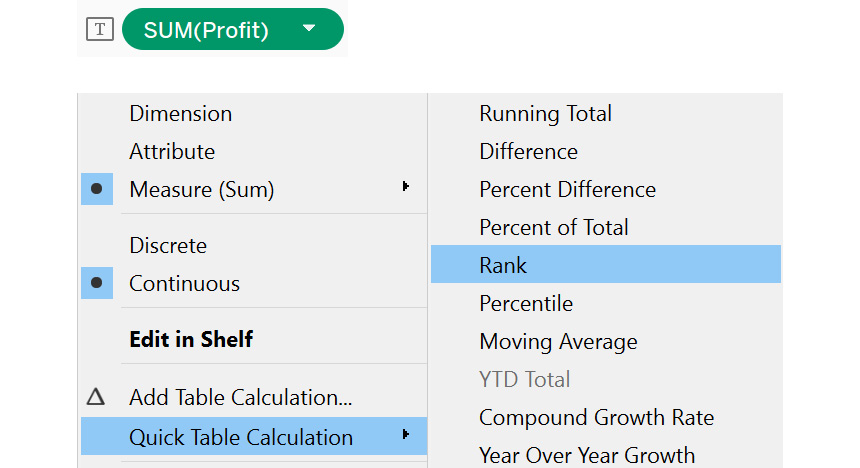
Figure 8.19: Accessing quick table calculation | rank
The following view will be the final output for Rank. The output is ranked based on the descending values of SUM(Profit):
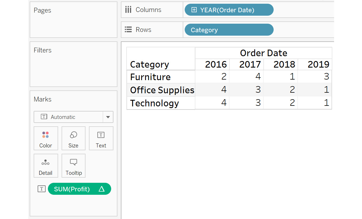
Figure 8.20: Rank output on selecting the Rank quick table calculation
- Similarly, add the Percentile quick calculation to the view by selecting the Percentile quick table calculation. The following figure shows the final output for this:

Figure 8.21: Percentile output on selecting the Percentile quick table calculation
With the Rank calculation, you ranked each year in a particular category based on the sum of the profits. The preceding figure shows the Percentile operation. For Furniture, the profit for 2016 is at the 0th percentile, which means that 0% of data is under $3,015. Similarly, for 2017, the profit is $6,960 at the 100th percentile, meaning that the profit for all other years is below this value. This view can help you do a year-by-year comparison for individual category profits in terms of percentile and rank, to identify how each category has performed compared to the previous year.
Next, you will learn about the Moving Average quick table calculation.
Moving Average
Moving Average is used to calculate the average of a measure across a specific dimension or table structure in a dynamic range, rather than being static. The advantage of using a moving average is that more importance is given to the values of recent history, rather than using all historic data. Moving averages are commonly used for identifying trends of share prices, where you can analyze a 20-day moving average (last 20 days of share price), or a 50-day moving average (last 50 days of share price), to understand how the share price is moving. The next exercise looks at this in detail.
Exercise 8.06: Creating a Moving Average Calculation
In this exercise, you will calculate the moving average of profit earned across different years for a particular category. This will help you understand whether the average value is higher or lower than the previous year's profits:
- Load the Sample – Superstore dataset in your Tableau instance.
- Create a view that shows Category against YEAR(Order Date) and SUM(Profit).
Figure 8.22: Initial view
- Add the Moving Average quick calculation, as shown in the following figure:
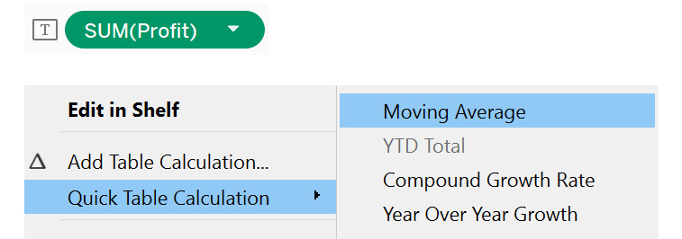
Figure 8.23: Accessing quick table calculation | moving average
This view will be the final output:

Figure 8.24: Final output
As you see, the profit has been averaged across the total from all the years' profits. First, the sum of all the years' profits is computed, and then, this number is divided by the number of years. For example, for 2017, the moving average comes to 8,473 / 2 = 4,236.
Table Calculation Application: Addressing and Partitioning
In the previous section, you learned about quick table calculations. But did you notice that all these calculations were working at the row level? What if you need to apply calculations at the column level? This is where the concept of addressing and partitioning comes into play.
Addressing means defining the direction of the calculation. A calculation can compute horizontally or vertically, depending on the option selected. Partitioning can be defined as the scope of the calculation; for example, you can partition a view into various years for different categories, or various categories for the same year.
In this section, you will learn about the following methods to address and partition data:
- Table(across)
- Table(down)
- Table(across then down)
- Table(down then across)
- Pane(down)
- Pane(across then down)
- Pane(down then across)
- Cell
- Specific Dimensions
You will continue working with the same example that you have been using in the previous exercises. First, you will explore the various ways of addressing data.
Table (across)
Table(across) performs a calculation horizontally across a table, and restarts after each row. For example, consider you have years on the Columns shelf for various product names on the rows, along with their sales. Here, Table(across) would perform the calculation for all the years' sales for an individual product, and then restart for the next product. The next exercise looks at this in detail.
Exercise 8.07: Creating a Table (across) Calculation
Considering the example of car manufacturer sales, suppose you want to compare the sales for the various years. In this exercise, you will use a Table(across) calculation to find this. The following steps will help you complete this exercise:
- Load the Sample – Superstore dataset in your Tableau instance.
- Create a view that shows Category against YEAR(Order Date) and SUM(Profit).
Figure 8.25: Initial view
- Add the Running Total quick calculation to get the following view:
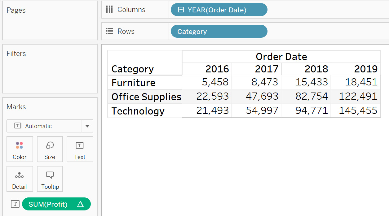
Figure 8.26: Running total for SUM(Profit)
- Now, select Compute Using and then Table(across), as shown in the following figure
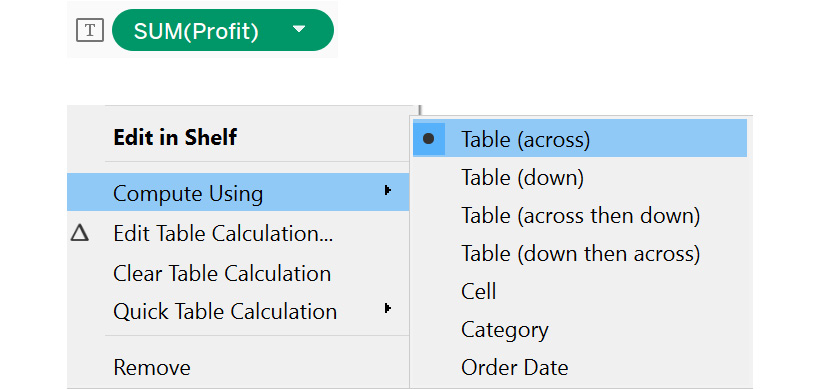
Figure 8.27: Selecting table (across)
The next figure shows the final view. You can see that the Profit table calculation is done for every Category (partitioning) across the different Order Date years (addressing):
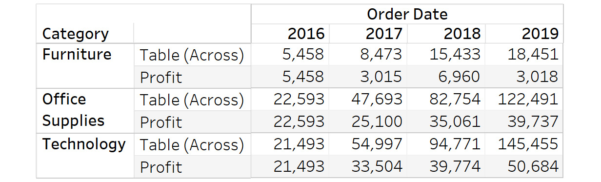
Figure 8.28: Final output
This view helps find the cumulative profit for the various categories over the years. This can help youunderstand how each category has been performing compared with other categories, over the years.
Next, you will learn about the Table(down) calculation.
Table (down)
Table(down) computes the calculation vertically down the table, and restarts after each column. For example, consider that you have the various years on the Columns shelf for the product names (and their sales) on the rows. Table(down) would compute the calculation for all of a product's sales for an individual year, and then restart at the next product.
Exercise 8.08: Creating a Table (down) Calculation
For this exercise, you will compare the sales for various years, using the Table(down) calculation along years. This will help you compare the profits for the years, and help you understand whether the sales are improving or declining:
- Load the Sample – Superstore dataset in your Tableau instance.
- Create a view that shows Category against YEAR(Order Date) and SUM(Profit).
Figure 8.29: Initial view
- Add the Running Total quick calculation to get the following view. This is the default, which is the across or horizontal direction:
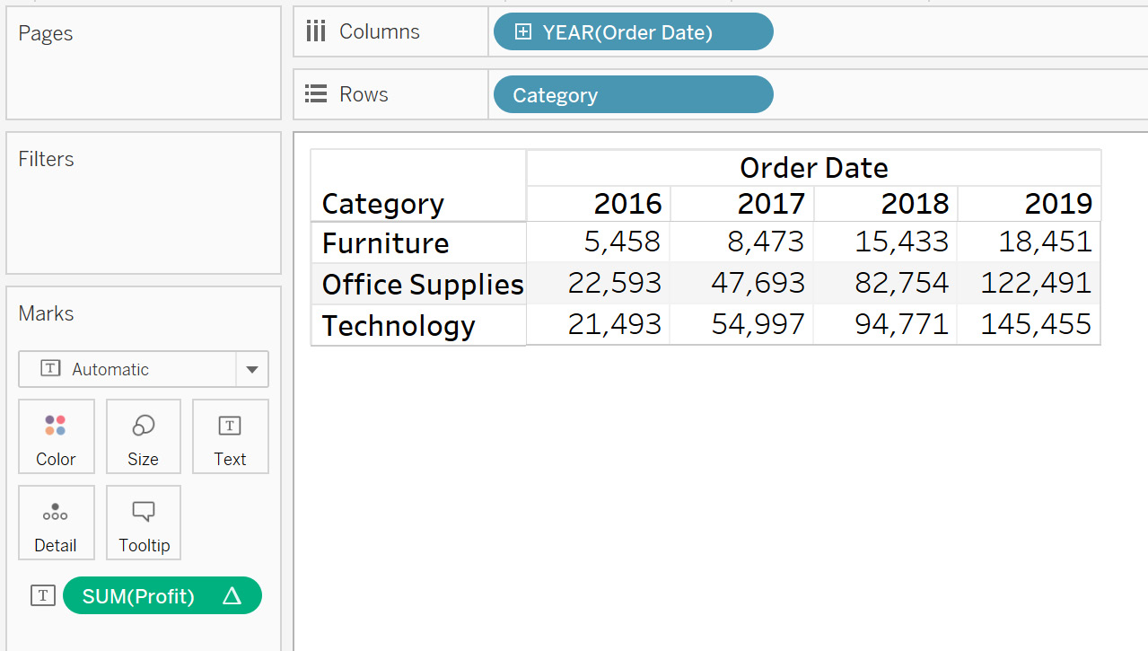
Figure 8.30: Running total for SUM(Profit)
- Select Compute Using and then Table(down), as follows:
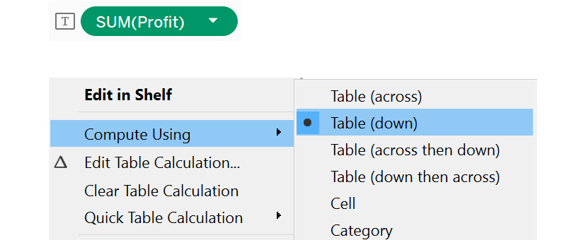
Figure 8.31: Accessing compute using | table (down)
- The following figure shows the final view. You can see that the Profit table calculation is computed for every Order Date year (partitioning) for the three Category values (addressing):
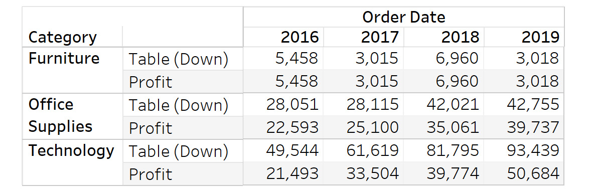
Figure 8.32: Final output
This view can help you answer how each category has been performing based on profits across years. You could potentially make important business decisions based off these results.
Next, you will learn about Table(across then down) and Table(down then across) together. These are opposites. Table(across then down) computes the calculation horizontally across the table and adds the values at the end of each row to the first value of the next row. Table(down then across) performs the calculation vertically down the table, and adds the values at the end of each column to the first value of the next column.
In the Table(down) and Table(across) exercises, you treated the end totals for each column or row as separate values. So, you got a comparison for the different addressing results. For Table(across then down) and Table(down then across), a value for the current row/column will be the result of the previous rows/columns along with the current row/column.
Considering the previous example of car manufacturer sales, suppose you perform Table(down) and then Table(across) for sales; Tableau would first compute the sales for the current year for all products, and then add that value to the next year's values. Hence, for the current year, you would get cumulative values for the previous years and the current year's sales.
Exercise 8.09: Creating Table (across then down) and Table (down then across) Calculations
In this exercise, you will continue with the example used in the previous exercises, and use Table(across then down) and Table(down then across) calculations. The following steps will help you complete this exercise:
- Load the Sample – Superstore dataset in your Tableau instance.
- Create a view that shows Category and Sub-Category against YEAR(Order Date) and SUM(Profit), as follows. Filter on Category: Technology by placing Category on the Filters shelf:
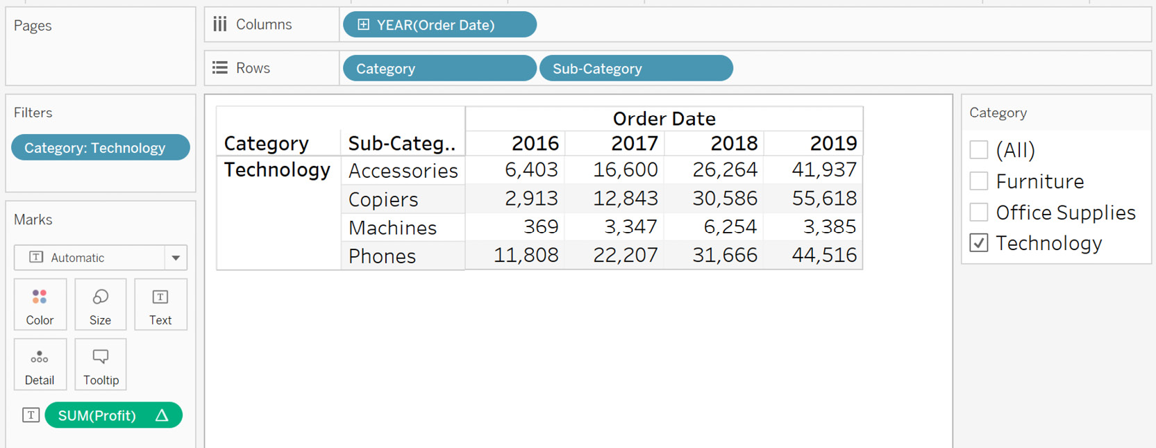
Figure 8.33: Initial view for table (across then down)
- Add the Running Total quick calculation to get the following view. Here, you get the cumulative sum of profits for all the years for a sub-category. The default addressing would be Table(across):
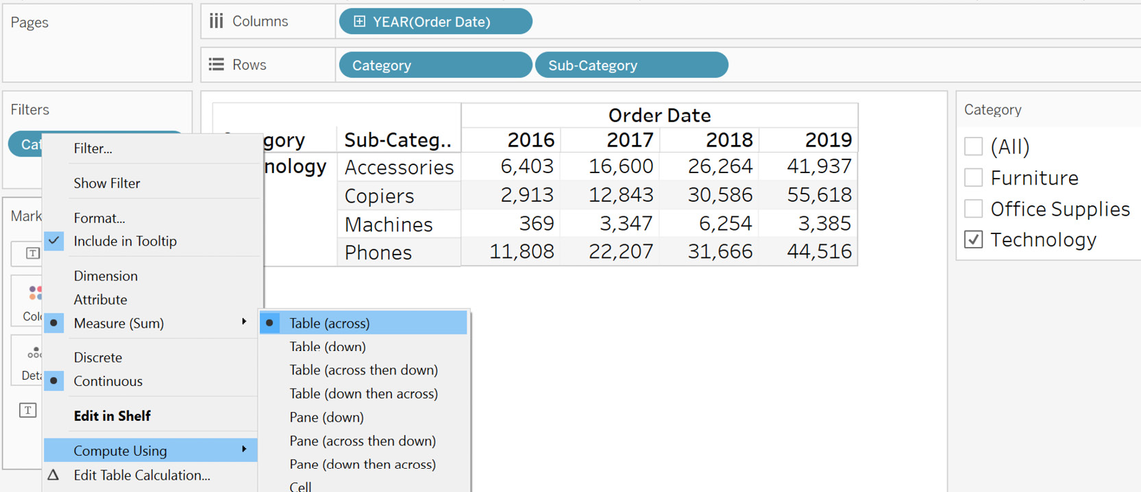
Figure 8.34: Running total for SUM(Profit)
- Select Compute Using and then Table(across then down).
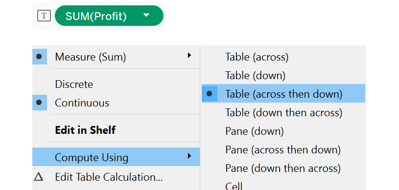
Figure 8.35: Accessing compute using | table (across then down)
The following is the generated view. You can follow the lines shown in the following figure to see how the computation is done:

Figure 8.36: The working of table (across then down)
First, Table(across) is performed for Accessories (see the orange lines). Then, that total ($41,937) is computed by Table(down) (green line) with the profit of Copiers ($2,913) making it $44,850. This process is repeated until the table ends.
- To change this to Table(down then across), select Compute Using and then Table(down then across), as follows:
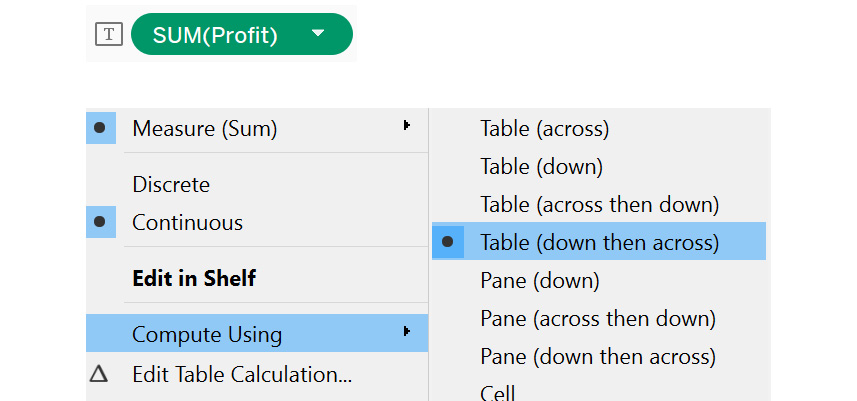
Figure 8.37: Accessing compute using | table (down then across)
This will be the generated view. Again, you can follow the lines to see how the computation is done. This is exactly the opposite of how Table(across then down) works:
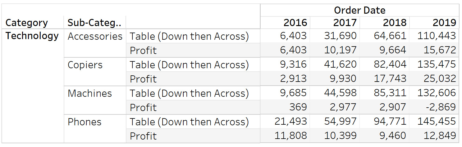
Figure 8.38: The working of table (down then across)
As you see, first the profits are added in a downward direction, then this sum is taken across to a different year. This process continues until the final year. This view can help you understand how the different sub-categories have been performing, based on profits summed together over the previous years.
Next, you will learn about panes. Table calculations can work down or across panes, depending on the calculation type. A pane can be defined as a combination of cells made up of fields on the Rows and Columns shelves, as in the following screenshot:
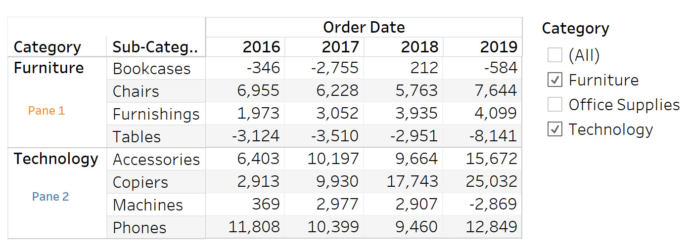
Figure 8.39: Panes
They can also be thought of as smaller tables within a bigger table. Table calculations can be performed on panes similar to how you did at the table level. The following is a list of the various pane-related computations:
- Pane(across)
- Pane(down)
- Pane(across then down)
- Pane(down then across)
You will start with Pane(across).
Exercise 8.10: Creating a Pane (across) Calculation
Pane(across) computes the calculation horizontally across the pane, and restarts at the next pane. Considering your previous example of car manufacturer sales, suppose you want to compare the sales for the various years, while also considering the different car segments, such as hatchback, sedan, and SUV. In this exercise, you will use the Pane(across) calculation to do this.
The following steps will help you complete this exercise:
- Load the Sample – Superstore dataset in your Tableau instance.
- Create a view that shows Category against YEAR(Order Date), QUARTER(Order Date), and SUM(Profit), as follows:
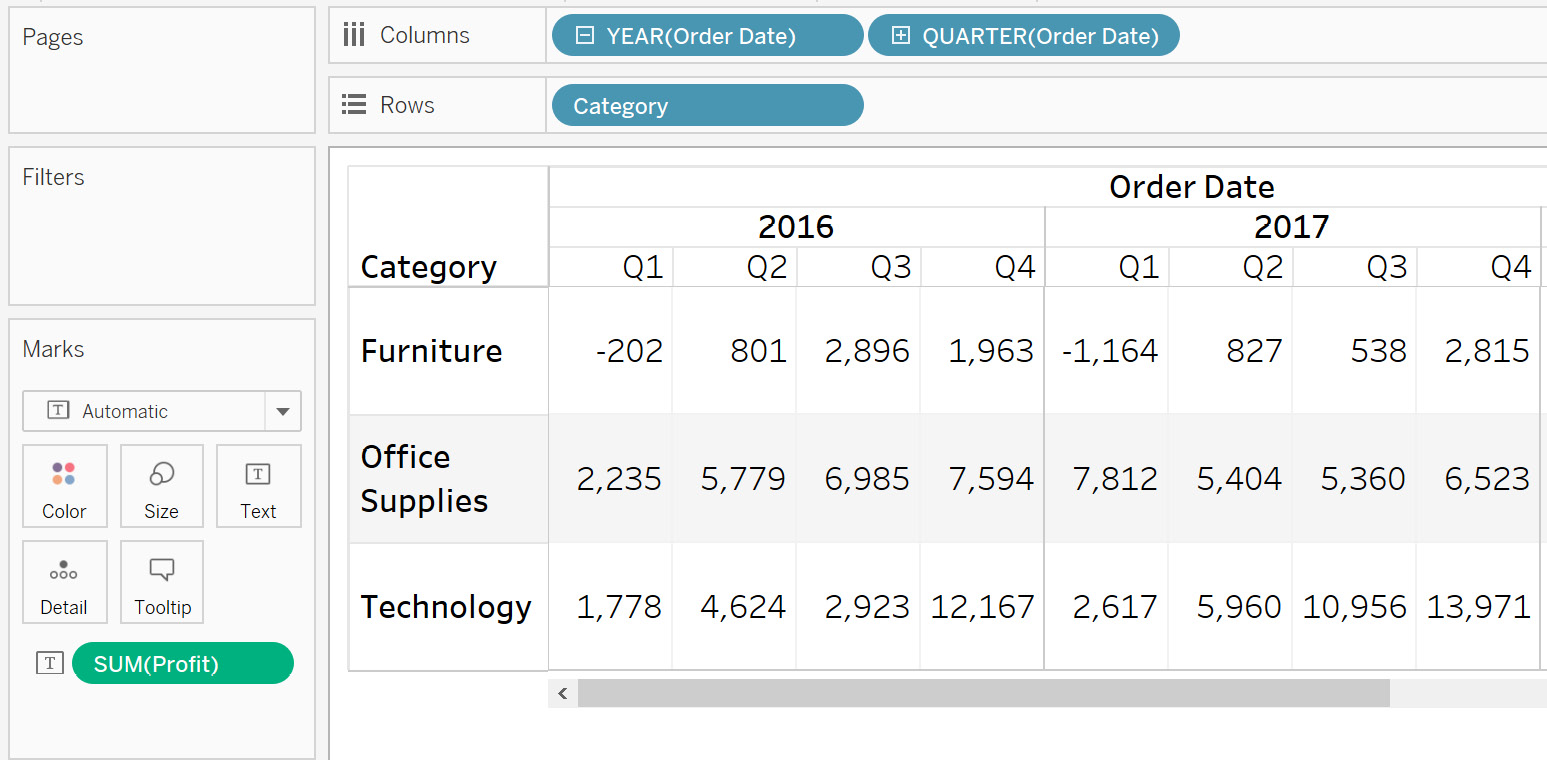
Figure 8.40: Initial view with a running total for SUM(Profit)
- Filter on YEAR(Order Date) as 2016 and 2017.

Figure 8.41: Adding a YEAR filter
- You now have two horizontal panes. For a pane table calculation to be activated, you need more than one dimension in the rows or the columns. A pane here will be one row, per Category,per year; so you'll have six panes in the view. The first pane looks like this:
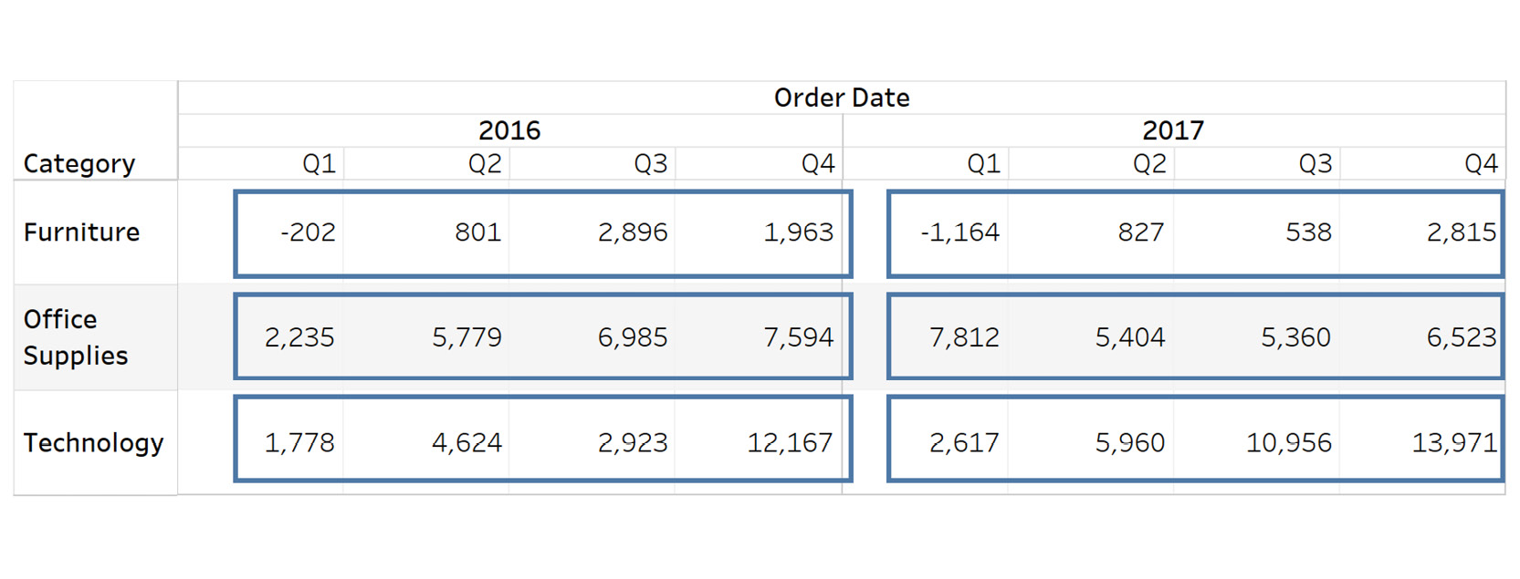
Figure 8.42: Understanding pane (across)
- Add a Running Total of Sum(Profit) and then select the Pane(across) option by clicking again on SUM(Profit).
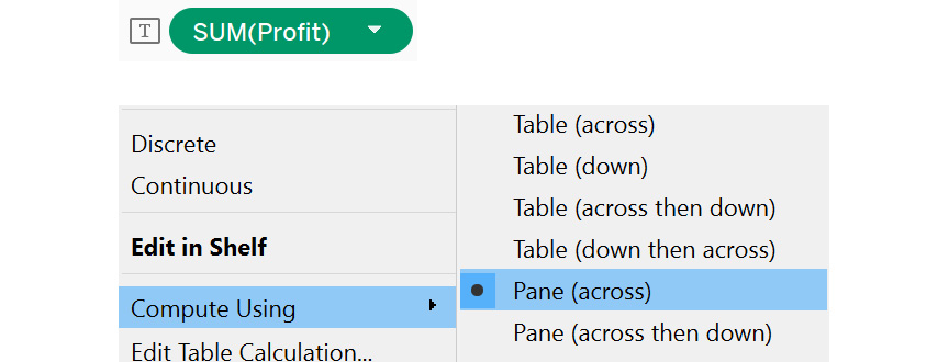
Figure 8.43: Accessing compute using | pane (across)
On selecting Pane(across), you should see the following output:
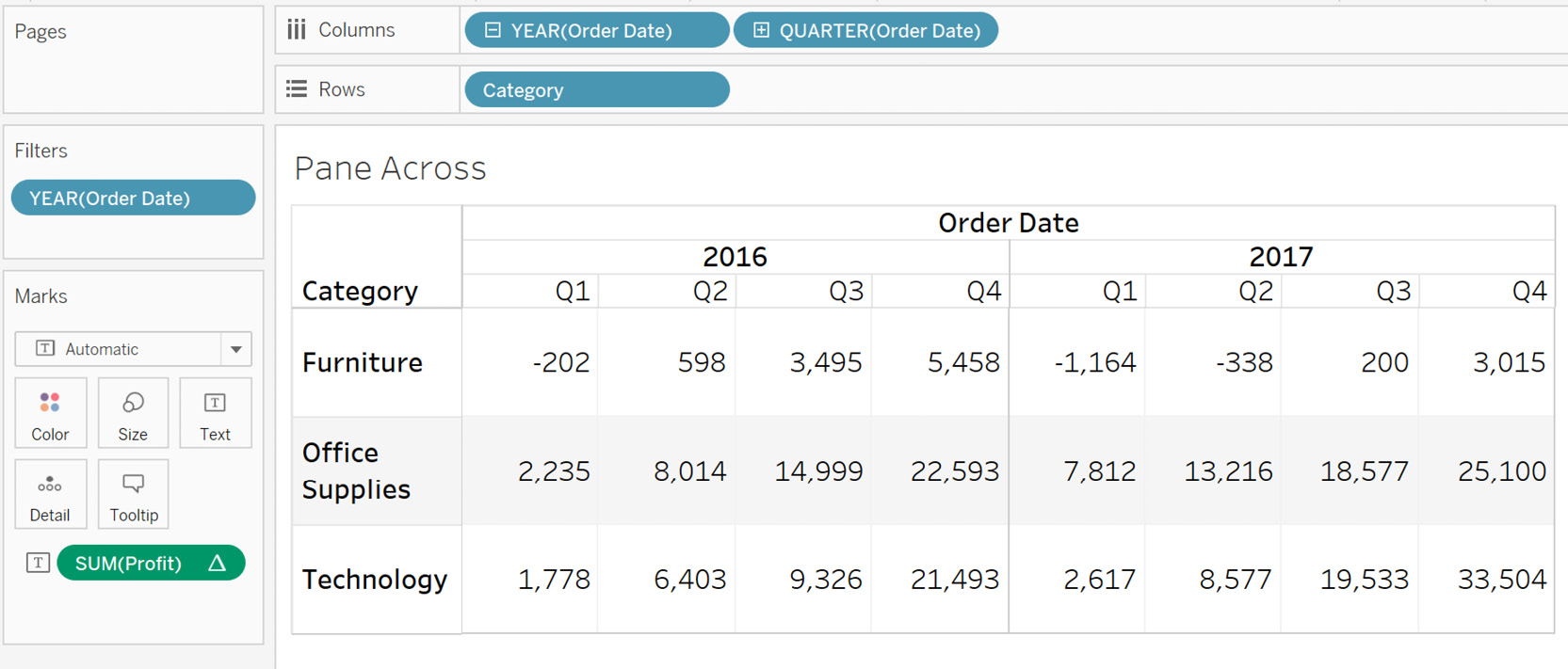
Figure 8.44: Final output
- To understand this better, add Profit to another view and compute the result.
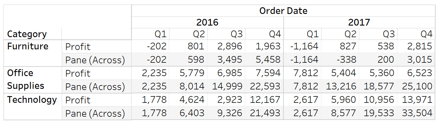
Figure 8.45: The working of pane (across)
As you see, each of the highlighted blue boxes just adds profits horizontally, and this restarts after each partition or pane horizontally. You can also validate the sum of profit by referencing the bottom table.
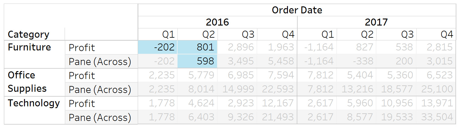
Figure 8.46: Final output analysis
This view can help you see how different categories have performed based on profits summed together over all different quarters across the two Order Date years. This can help you hone in on profits, to understand which quarters generated the highest profits.
Next, you will learn about Pane(down). Pane(down) performs the calculation vertically down the pane, and restarts at the next pane.
Exercise 8.11: Pane (down) Calculation
Considering the example of car manufacturer sales, suppose you want to analyze the sales of various car models sold per segment per year. Here, you can use Pane(down) addressing on the segment partitioning. The following steps will help you complete this exercise:
- Load the Sample – Superstore dataset in your Tableau instance.
- Create a view that shows YEAR(Order Date) and Category against QUARTER(Order Date) and the running total for SUM(Profit), as follows:
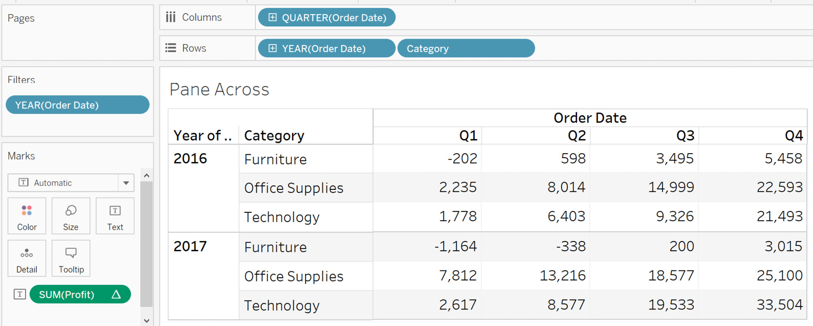
Figure 8.47: Initial view with the running total for SUM(Profit)
- Filter on YEAR(Order Date) as 2016 and 2017.

Figure 8.48: Adding a YEAR filter
- Now, you will have eight vertical panes – four for 2016 and four for 2017 – based on the four quarters and two years.
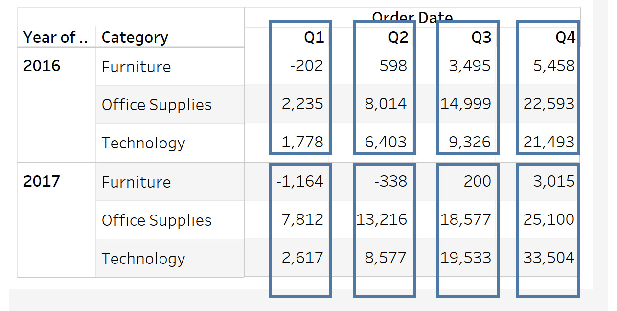
Figure 8.49: Understanding pane (down)
- Select the Pane(down) option by clicking again on SUM(Profit), as follows:
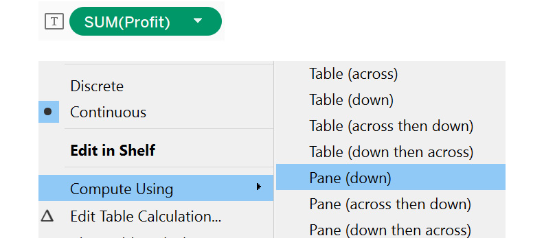
Figure 8.50: Accessing compute using | pane (down)
You will see the following output:
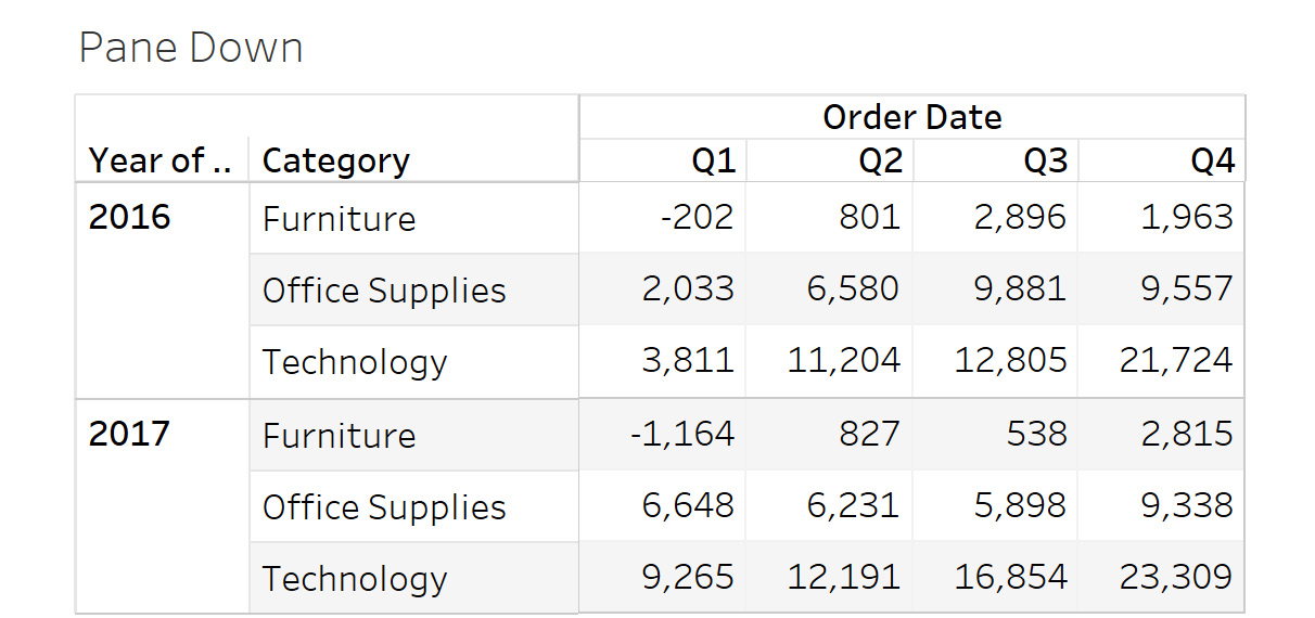
Figure 8.51: Final output
- To understand this better, add Profit to the view and see the result.
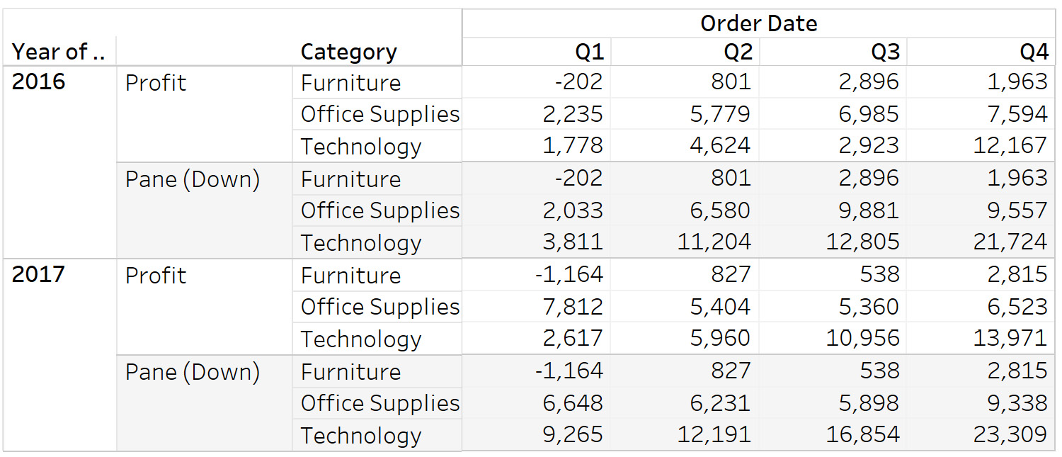
Figure 8.52: The working of pane (down)
As you see, the values in each blue pane (highlighted) are summed in a downward direction, and this process restarts after every pane. Here, you can compare quarterly profits. For example, for Q1 2016, the total profit is $3,811 and similarly, for Q1 2017, it is $9,265, which is approximately 2.5 times more profit. The same is cannot be said for Q2 profits. Based on this, you can try to analyze the reasoning behind such differences, and use those insights to tweak business strategy.
Next, you will learn about Pane(across then down) and Pane(down then across). Pane(across then down) is a combination of Pane(across) and Pane(down); that is, it computes the calculation horizontally across the pane and combines the result with the values in the next pane. Pane(down then across) is the opposite of Pane(across then down), as it performs the calculation vertically down the pane and combines the result with the values in the next pane. The next exercise looks at this in detail.
Exercise 8.12: Creating a Pane-Level Calculation
This exercise continues with the example of car manufacturer sales. Suppose you want the sales per segment per quarter for the different years together. Here, you can use the option of Pane(across then down) or Pane(down then across). The result combines all detailed panes into a cumulative overall total. The following steps will help you complete this exercise:
- Load the Sample – Superstore dataset in your Tableau instance.
- Before creating the view, you must first create a combined field for Category and Sub-Category. This is required for the Pane(across then down) calculation, else Tableau will merge the sub-categories. Select Category and Sub-Category together, then, right-click and select Create and then Combined Field, as follows:
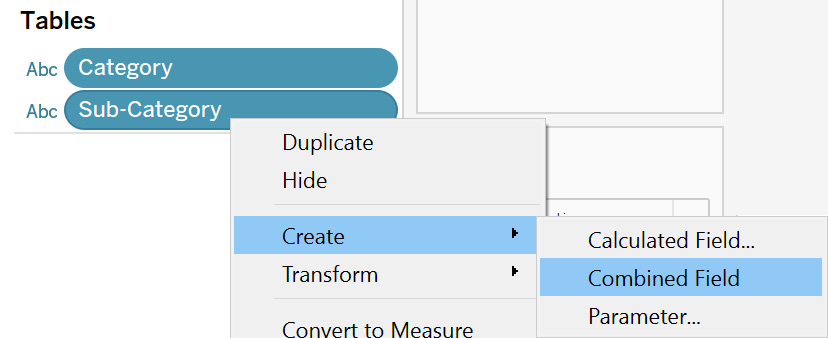
Figure 8.53: Creating a combined field
- Create a view that shows YEAR(Order Date) and QUARTER(Order Date) against Category, Sub-Category, and the combined field. Also, add the running total for SUM(Profit), as follows:
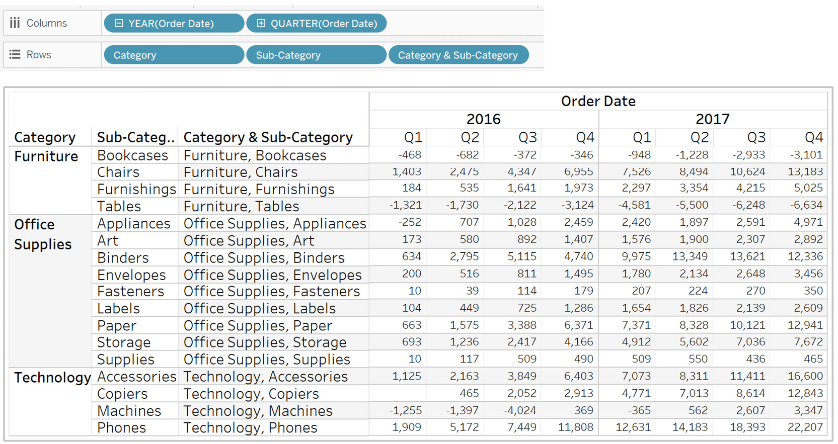
Figure 8.54: Initial view with the running total for SUM(Profit)
- Filter on YEAR(Order Date) as 2016 and 2017. Also, filter on Category by selecting Furniture and Technology, as follows:
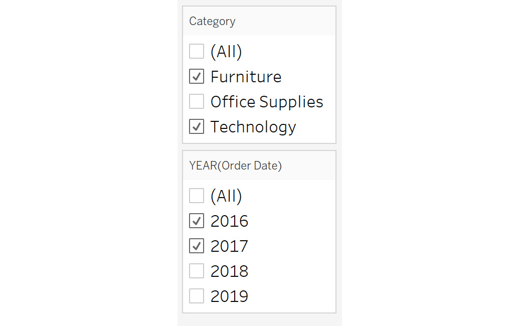
Figure 8.55: Adding category and YEAR filters
- You now have two horizontal Year panes and two vertical Category panes. Select the Pane(across then down) option by clicking again on SUM(Profit).
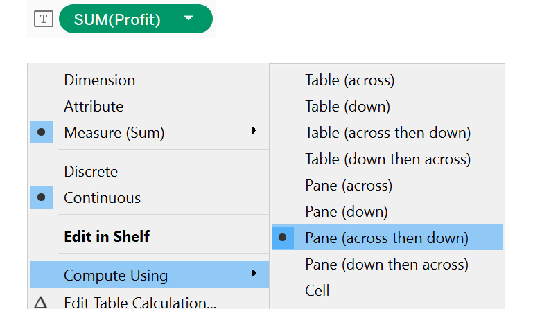
Figure 8.56: Accessing compute using | pane (across then down)
- On selecting Pane(across then down), the output generated is as follows:
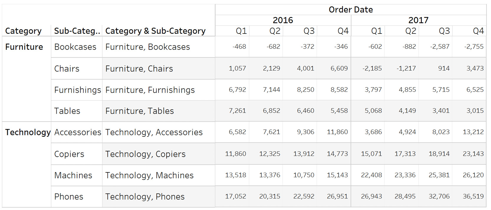
Figure 8.57: Final output for pane (across then down)
- To understand this better, add Profit to the view and calculate the result.
Figure 8.58: The working of pane (across then down)
Notice the blue arrows, which indicate the profits being summed from the first to the last value in that row; the orange arrow indicates that the last value of each row is added to the first value of the next row. This process is repeated until the last row for each year. Once a year is completed, the calculation restarts for the next year. You can validate the numbers by looking at the Sum(Profit) values, as seen on the right side.
- Change the calculation to Pane(down then across), as shown in the following figure:
Figure 8.59: Accessing compute using | pane (down then across)
The output generated will be as follows:
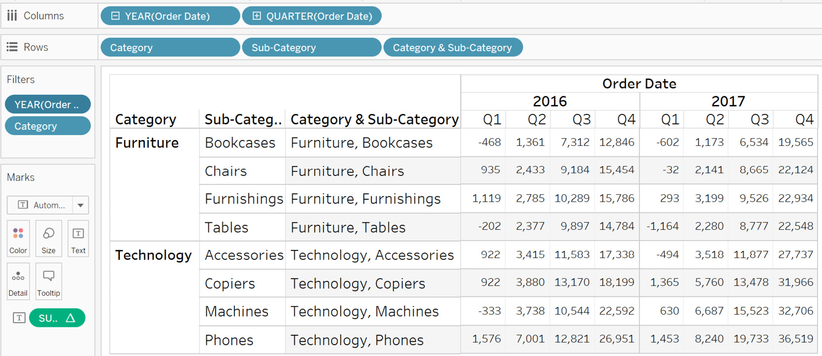
Figure 8.60: Final output for Pane (down then across)
- To understand this better, add Profit to the view and calculate the result for 2016.
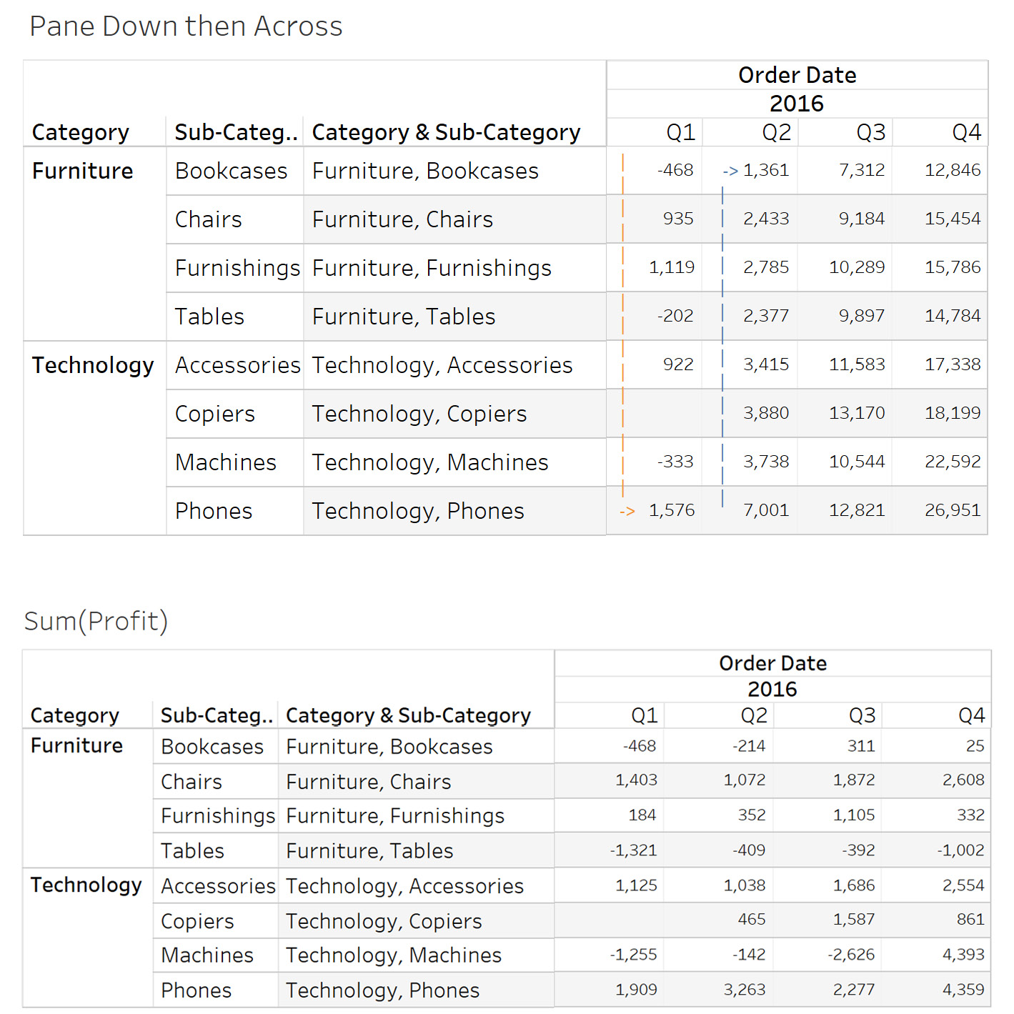
Figure 8.61: The working of pane (down then across)
Observe the blue arrows, which indicate the profits being summed from the first to the last value in the column. The orange arrow indicates that the last value of each column is added to the first value of the next column. This process is repeated until the last row for each year. Once a year is completed, the calculation restarts for the next year. Once again, you can validate the numbers by looking at the Sum(Profit) values, as seen on the right side.
Cell
Cell computes across the individual cells. The result is the same as adding the measure to the shelf directly, as shown in the following figure (the cell is highlighted using a box):
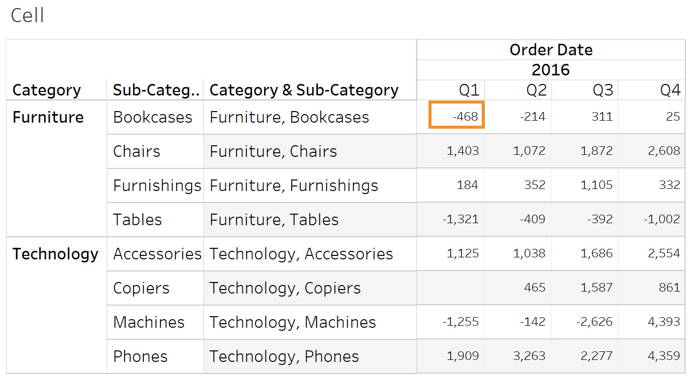
Figure 8.62: Computing using cell
The values are the same in both tables. Specific Dimensions computes using the dimensions you specify. You will learn about this in more detail in the following section.
Creating, Editing, and Removing Table Calculations
Hopefully you now have a good understanding of quick table calculations, but what if you need to use some other calculation, such as ranking the rows in a table? Here, you can use the Create calculation window. Tableau supports many table functions besides quick table calculations. In this section, you will learn how to create, access, edit, and remove a table calculation.
Creating a New Table Calculation
To create a table calculation, right-click on any measure value, and then click on Create , then Calculated Field..., as follows:
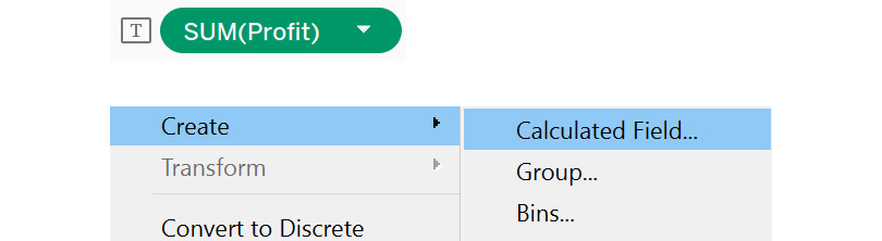
Figure 8.63: Creating a calculated field from Profit
Once you click on Calculated Field..., a calculation editor window will open up, as follows:
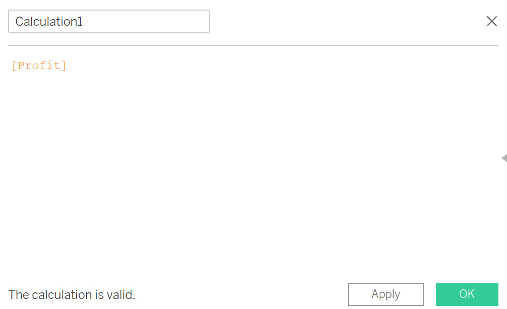
Figure 8.64: Calculation editor
Now, you can click on the dropdown and select the Table Calculation menu, as follows:
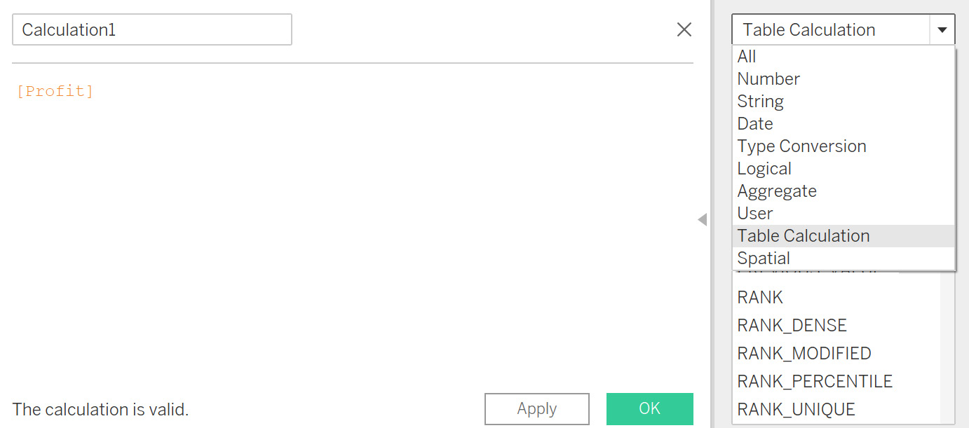
Figure 8.65: Accessing table calculation functions in the calculation editor
Next, the list of all the table calculations supported by Tableau appears, as follows:
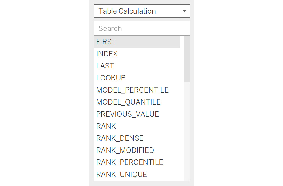
Figure 8.66: Various table calculation functions
In Tableau, it's very easy to understand these table calculations. Each calculation is defined by specifying the syntax for use, the expected result from using the calculation, followed by an example.
You are already familiar with RUNNING_TOTAL, which is similar to RUNNING_SUM. The same calculation type can be used to do a variety of operations, such as sum, average, and finding the minimum and maximum values, which can be referenced under the table calculation menu.
Exercise 8.13: Creating a Table Calculation Using the Calculation Editor
In your projects, you might need to use one of the table calculation functions in the view. An example of this is the index function, which adds serial numbers to the rows in the view. You can do this by creating a table calculation. In this exercise, you will calculate the rank of Sub-Category based on SUM(Profit) across years. The following steps will help you complete this exercise:
- Load the Sample – Superstore dataset in your Tableau instance. Use the combined field that you created earlier along with YEAR(Order Date). Create a view as follows and also filter Category for Furniture:
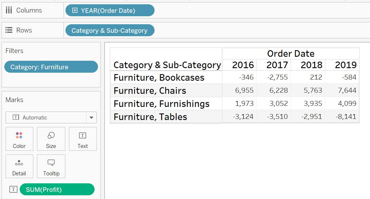
Figure 8.67: Initial view with SUM(Profit)
- Now, create a RANK table calculation. Right-click on Profit in the data pane and select Create | Calculated Field…. This will open up the calculation editor.

Figure 8.68: Creating a calculation using Profit
- Add the following expression to the calculation editor:
RANK(SUM(Profit))
This is shown in the following figure:

Figure 8.69: Profit_Rank calculation
- Name it Profit_Rank.
- Drag this onto the view on Text, as follows:
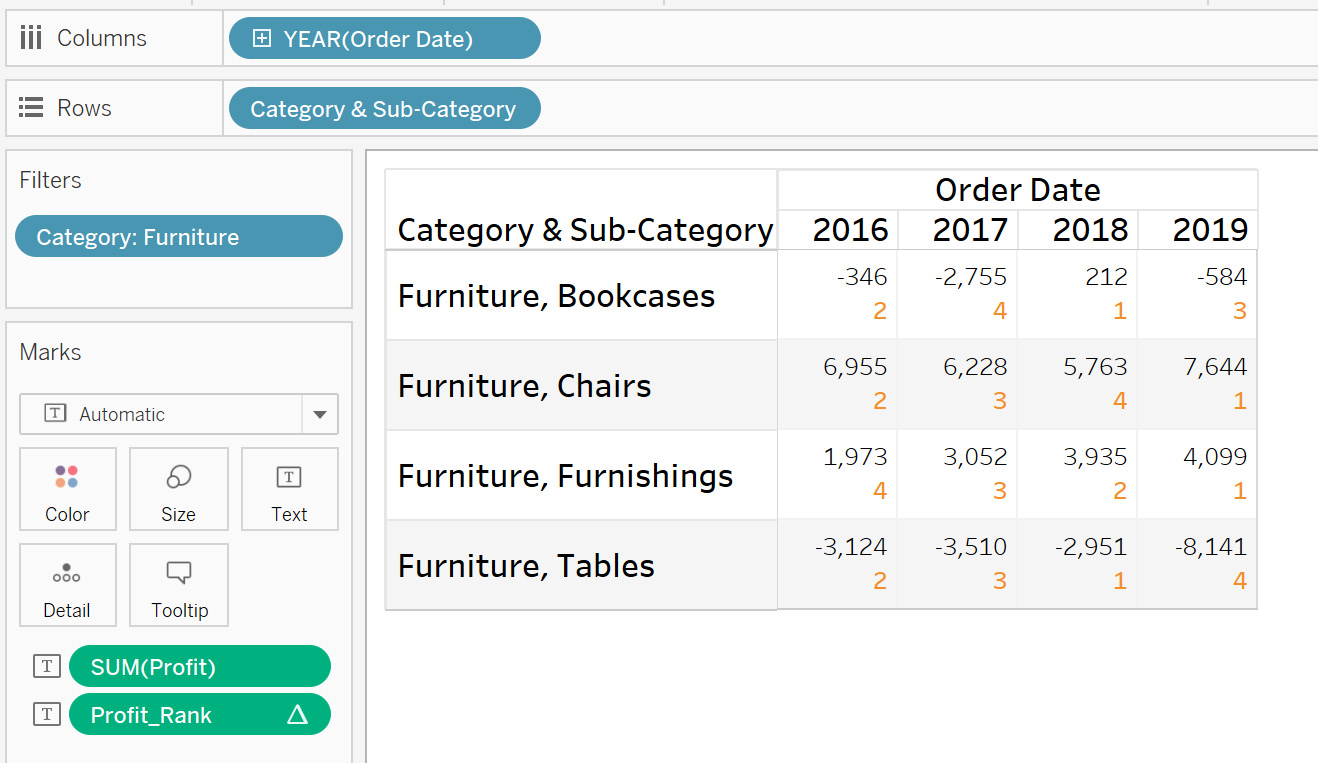
Figure 8.70: Adding the Profit_Rank calculation to the view
- Observe that the default is the Table (across) direction. Edit this and try to change the computation on specific dimensions in the view. Click on the Profit_Rank dropdown and select Edit Table Calculation… and then Specific Dimensions, as shown in the following figure:
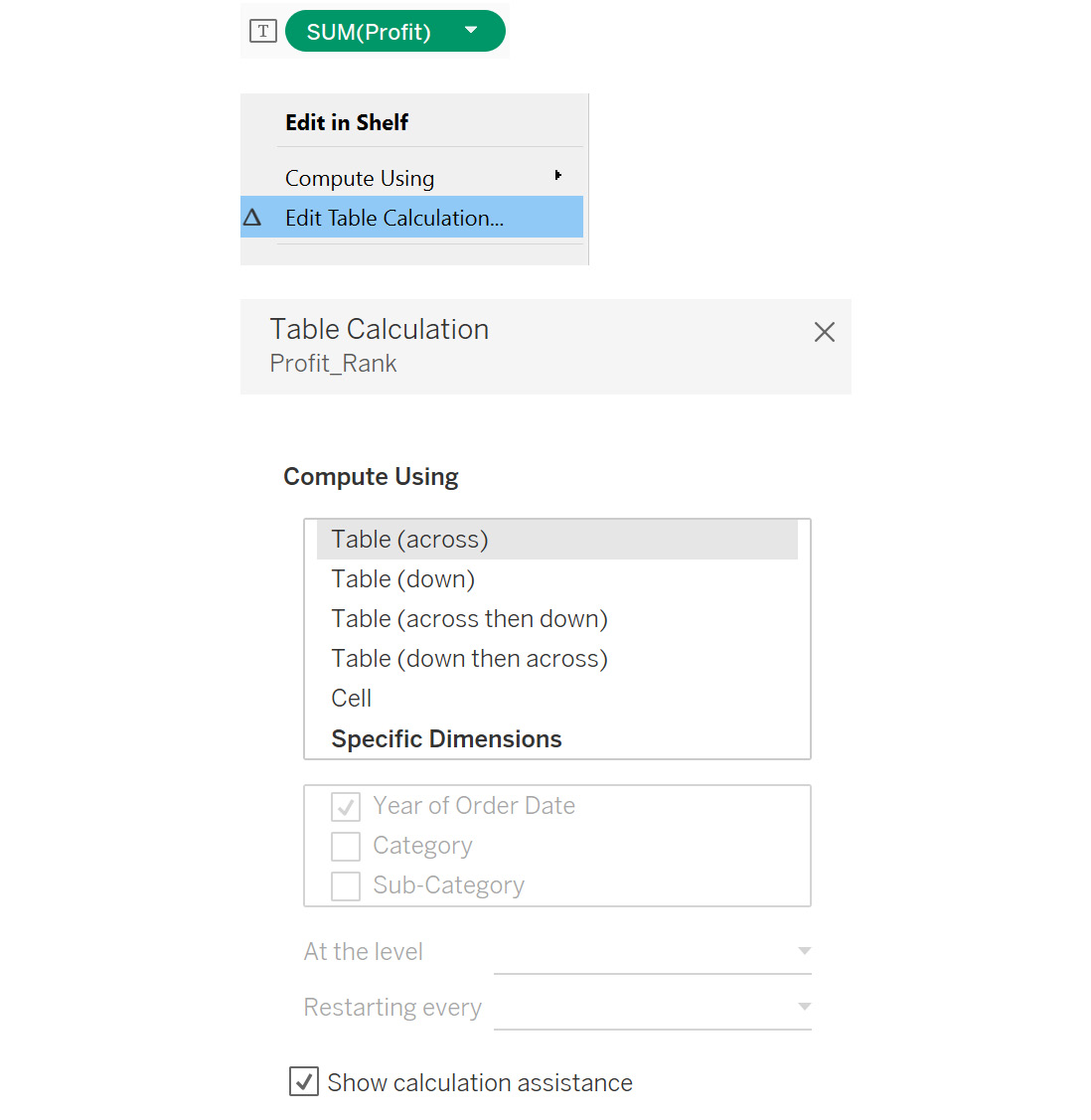
Figure 8.71: Accessing edit table calculation
Using these options, you can control how the table calculation is computed. It is important to understand the different options here:
- At the level: This determines the level at which the calculation is computed. The level here implies the different dimensions in the view, such as Category and Sub-Category. Deepest is the default if multiple dimensions are selected, which means the computation will happen at the lowest level of granularity, which is Sub-Category in your view.
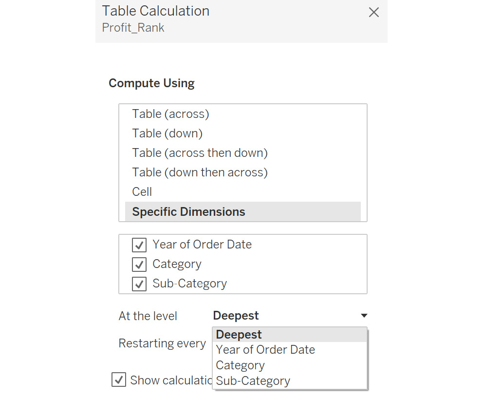
Figure 8.72: Various options under the At the level dropdown
- Restarting every: This option can be used to restart the computation based on the field selected.
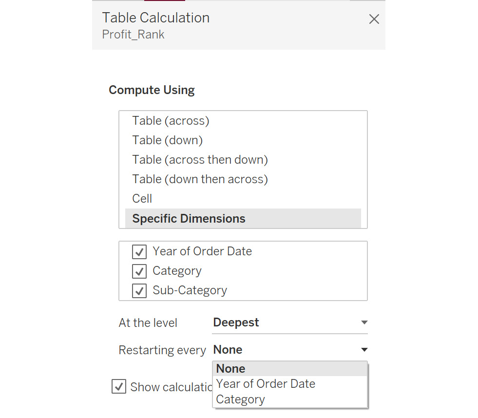
Figure 8.73: Various options under the Restarting every dropdown
- Show calculation assistance: This option highlights how the computation will work based on your selections. As the following figure shows, based on the selections, Profit_Rank will work in the downward direction (highlighted):
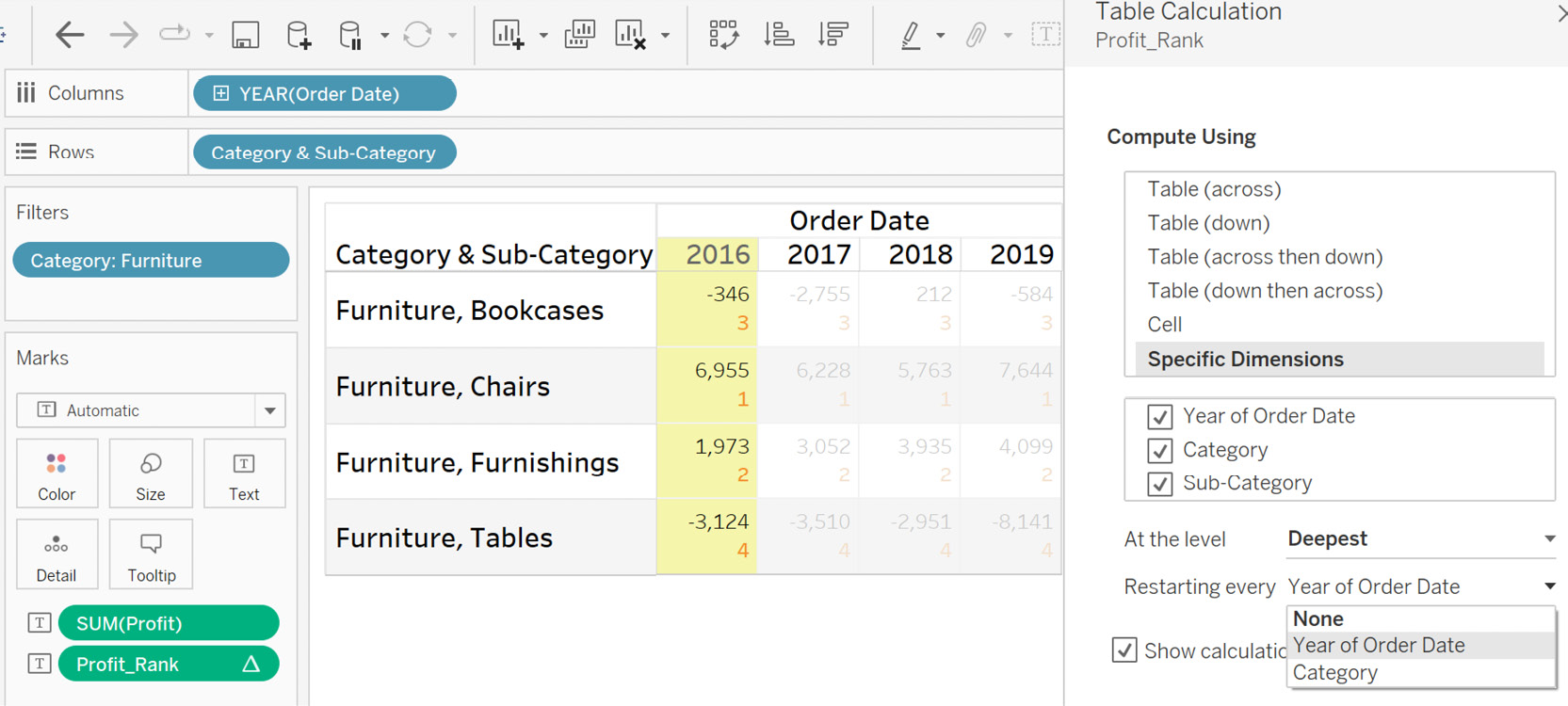
Figure 8.74: Using Show calculation assistance
This view showed how you can perform table calculations at different levels using the dimensions in the view.
Removing a Table Calculation
Once you have added a table calculation, you should also be able to remove it. This can be done by clicking on an existing quick table calculation and selecting the Clear Table Calculation option, as follows:
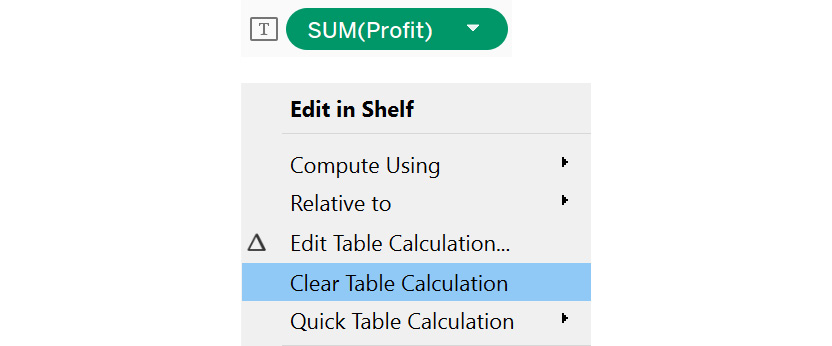
Figure 8.75: Selecting the Clear Table Calculation option
Activity 8.01: Managing Hospital Bed Allocations
There may be scenarios where you need to use the historic value of a measure to compute its current value, for example, when finding the cumulative sum of sales for all quarters in a year.This can, in turn, help you visualize the entire year's sales, or the sales difference, compared to previous quarters. In such cases, a table calculation can be useful, as all logic is inbuilt, and you need only apply the calculation to the measure value.
In this activity, you will apply table calculations to a hospital-based project, to identify how many patients are currently admitted.You willconsider factors such as new admissions, discharges, and routine follow-ups, to check whether the threshold for beds is sufficient. By doing this, you can ensure the hospital will not run out of beds in the case of an emergency.
In the dataset, there is a date column indicating the current day, an Open column indicating the number of patients admitted, Discharges indicating the number of discharges, and Re-open indicating the number of patients getting re-admitted or following up for a previous admission. In addition, you also need to keep 100 of the total 900 beds free in case of an emergency. If the number of patients exceeds 600, it should be highlighted visually.
Note
The dataset used for this activity can be found and downloaded from https://packt.link/NNzlJ.
The following steps will help you complete this activity:
- Open and connect the dataset for Activity 1 in your Tableau instance.
- Create a calculation named current_patients to find the number of patients currently admitted. This can be calculated after considering the Open, Discharges, and Re-open columns.
- Once you have a bar chart view, display the date at the exact date level, along with the number of patients currently in the hospital, using the current_patients field created in the previous step. This view helps you view how many patients are admitted on a given day.
- Add a running_sum table calculation to the current_patients table calculation in the existing view. This view helps you visualize the number of patients admitted on a given day considering all the previous days as well.
- Create another calculation named Alert to indicate that the patient count is above 600. You need to use running_sum to identify the number of patients on a given day.
- Now, you should be able to analyze the total number of patients admitted to the hospital, and see whether there are enough beds available.
- The initial view is as follows:
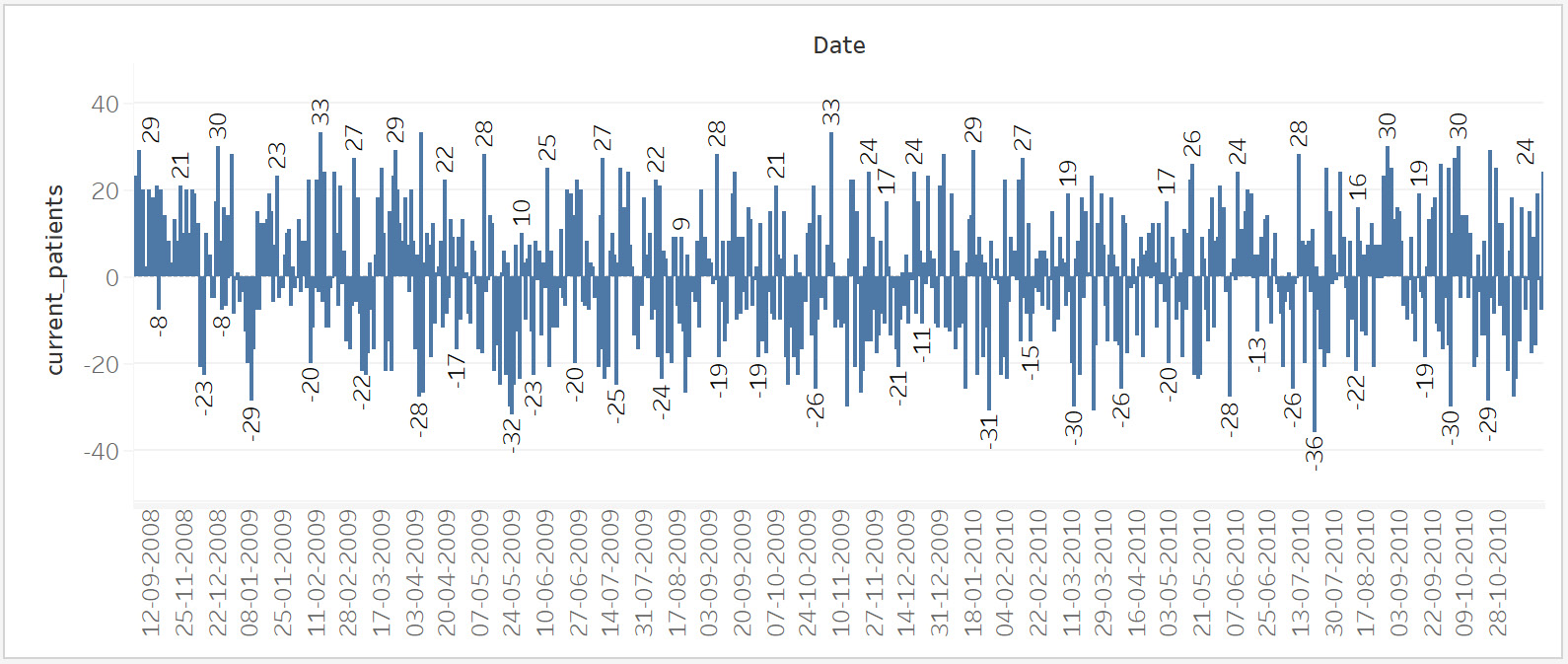
Figure 8.76: Initial view – activity
The final output is as follows:
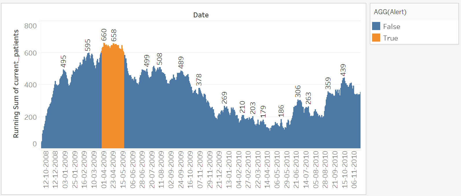
Figure 8.77: Final view – activity
Here, you can see that in 2009, there was a period when the number of patients was more than the number of beds. Although such incidents are rare, it is imperative that they are managed properly.
With this activity, you strengthened your knowledge of creating and using table calculations. This activity helped you see how you can use cumulative values to better analyze data, by highlighting anomalies or events that may have a significant business impact.
Note
The solution to this activity can be found here: https://packt.link/CTCxk
Activity 8.02: Planning for a Healthy Population
In the previous activity, you created a visualization to indicate a drastic increase in the number of patients. As an analyst, you should also be able to use historic data, and identify patterns when the number of patients go up.
In this activity, you will use a range window to identify when the current admissions increase, and whether there is a specific observable trend. In this way, the hospital can be better prepared for the future. You will use the same hospital data used in the previous activity. The following steps will help you complete this activity:
- Plot the window average of the RUNNING_SUM of current_patients, weekly. A window average takes the average of all values in the window, which in this case is the view.
- Remove the average for the last 10-week range to check whether the count of currently admitted patients goes up or down. Create a parameter that can be used as input for the range; you can name it Range_input.
- Use this Range_input parameter as the input for the WINDOW_AVG calculation named avg_admitted. You need to calculate the average from the last 10 weeks to the current week.
- Use a dual-axis to show the RUNNING_SUM of current_patients and WINDOW_AVERAGE. Recall that a dual-axis is used to show two measures side by side in the same view. Right-click on the axis to enable this option after adding both measures.
- Create an alert to compare the RUNNING_SUM of current_patients and avg_admitted. Highlight the weeks when the sum is more than the average.
- The initial view would look like this:
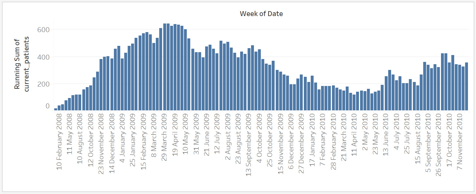
Figure 8.78: Initial view – activity
The final view should look like this:
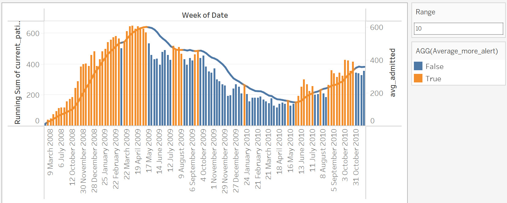
Figure 8.79: Final view – activity
You can now see when the current admitted patient count has gone higher than the 10-week average. The range can be changed based on the requirement by changing the input. An interesting observation is the month of July, which had a higher-than-average number of patients for the all of the previous 3 years, indicating thepossibility for a similar occurance for next July.
Note
The solution to this activity can be found here: https://packt.link/CTCxk.
Summary
In this chapter, you learned about table calculations. You started by performing some quick table calculations, used to quickly apply commonly used table calculations in the view. Then, you explored ways to apply a table calculation using addressing and partitioning – how addressing defines the direction of the calculation, while partitioning defines its scope. Finally, you learned about creating a table calculation using the calculation editor, and about ways to address the view using specific dimensions.
In the next chapter, you will learn about Level of Detail, which is another powerful concept, used to control how views are displayed.