Overview
In this chapter, we will be using a real-world dataset and a supervised learning technique called classification to generate business outcomes.
By the end of this chapter, you will be able to formulate a data science problem statement from a business perspective; build hypotheses from various business drivers influencing a use case and verify the hypotheses using exploratory data analysis; derive features based on intuitions that are derived from exploratory analysis through feature engineering; build binary classification models using a logistic regression function and analyze classification metrics and formulate action plans for the improvement of the model.
Introduction
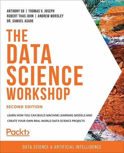
In previous chapters, where an introduction to machine learning was covered, you were introduced to two broad categories of machine learning; supervised learning and unsupervised learning. Supervised learning can be further divided into two types of problem cases, regression and classification. In the last chapter, we covered regression problems. In this chapter, we will peek into the world of classification problems.
Take a look at the following Figure 3.1:
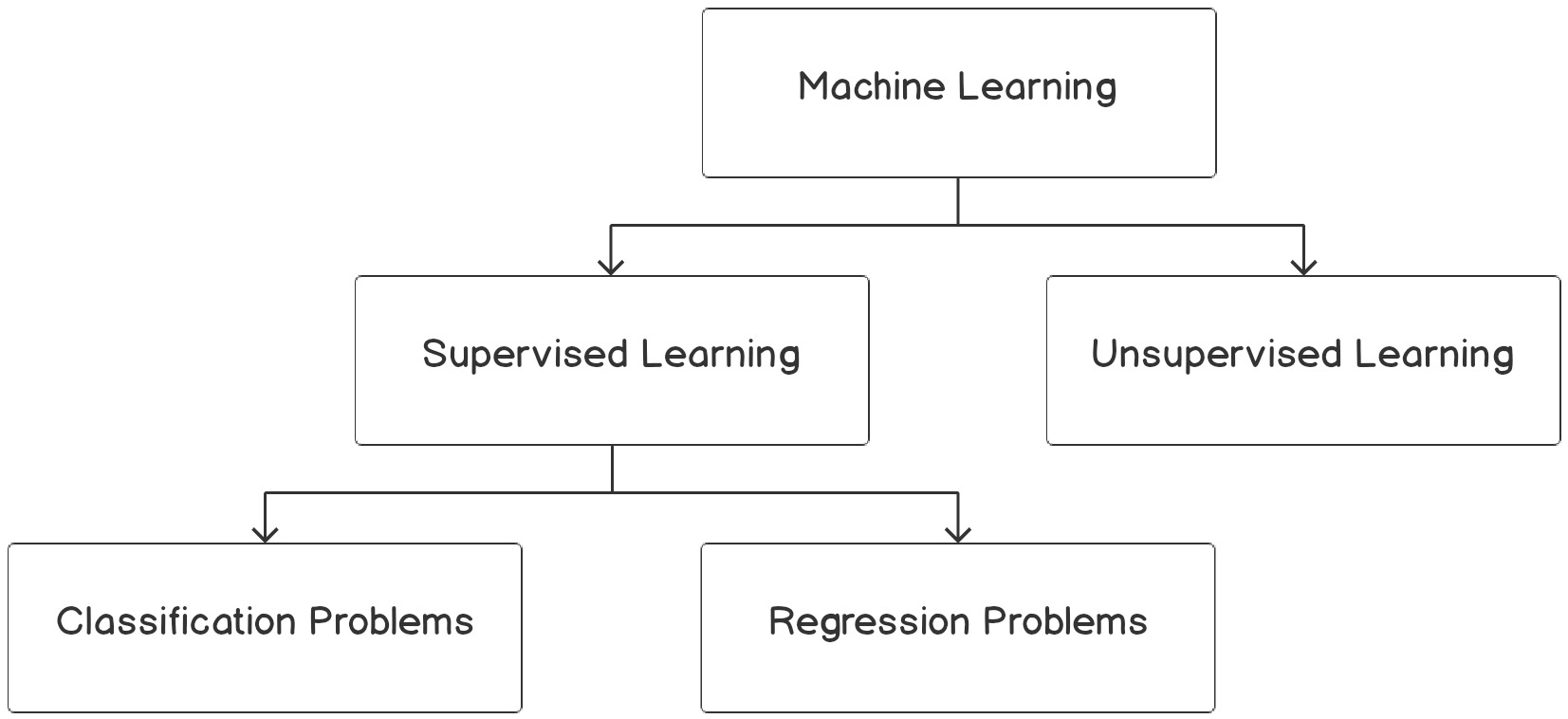
Figure 3.1: Overview of machine learning algorithms
Classification problems are the most prevalent use cases you will encounter in the real world. Unlike regression problems, where a real numbered value is predicted, classification problems deal with associating an example to a category. Classification use cases will take forms such as the following:
- Predicting whether a customer will buy the recommended product
- Identifying whether a credit transaction is fraudulent
- Determining whether a patient has a disease
- Analyzing images of animals and predicting whether the image is of a dog, cat, or panda
- Analyzing text reviews and capturing the underlying emotion such as happiness, anger, sorrow, or sarcasm
If you observe the preceding examples, there is a subtle difference between the first three and the last two. The first three revolve around binary decisions:
- Customers can either buy the product or not.
- Credit card transactions can be fraudulent or legitimate.
- Patients can be diagnosed as positive or negative for a disease.
Use cases that align with the preceding three genres where a binary decision is made are called binary classification problems. Unlike the first three, the last two associate an example with multiple classes or categories. Such problems are called multiclass classification problems. This chapter will deal with binary classification problems. Multiclass classification will be covered next in Chapter 4, Multiclass Classification with RandomForest.
Understanding the Business Context
The best way to work using a concept is with an example you can relate to. To understand the business context, let's, for instance, consider the following example.
The marketing head of the bank where you are a data scientist approaches you with a problem they would like to be addressed. The marketing team recently completed a marketing campaign where they have collated a lot of information on existing customers. They require your help to identify which of these customers are likely to buy a term deposit plan. Based on your assessment of the customer base, the marketing team will chalk out strategies for target marketing. The marketing team has provided access to historical data of past campaigns and their outcomes—that is, whether the targeted customers really bought the term deposits or not. Equipped with the historical data, you have set out on the task to identify the customers with the highest propensity (an inclination) to buy term deposits.
Business Discovery
The first process when embarking on a data science problem like the preceding is the business discovery process. This entails understanding various drivers influencing the business problem. Getting to know the business drivers is important as it will help in formulating hypotheses about the business problem, which can be verified during the exploratory data analysis (EDA). The verification of hypotheses will help in formulating intuitions for feature engineering, which will be critical for the veracity of the models that we build.
Let's understand this process in detail from the context of our use case. The problem statement is to identify those customers who have a propensity to buy term deposits. As you might be aware, term deposits are bank instruments where your money will be locked for a certain period, assuring higher interest rates than saving accounts or interest-bearing checking accounts. From an investment propensity perspective, term deposits are generally popular among risk-averse customers. Equipped with the business context, let's look at some questions on business factors influencing a propensity to buy term deposits:
- Would age be a factor, with more propensity shown by the elderly?
- Is there any relationship between employment status and the propensity to buy term deposits?
- Would the asset portfolio of a customer—that is, house, loan, or higher bank balance—influence the propensity to buy?
- Will demographics such as marital status and education influence the propensity to buy term deposits? If so, how are demographics correlated to a propensity to buy?
Formulating questions on the business context is critical as this will help in arriving at various trails that we can take when we do exploratory analysis. We will deal with that in the next section. First, let's explore the data related to the preceding business problem.
Exercise 3.01: Loading and Exploring the Data from the Dataset
In this exercise, we will load the dataset in our Colab notebook and do some basic explorations such as printing the dimensions of the dataset using the .shape() function and generating summary statistics of the dataset using the .describe() function.
Note
The dataset for this exercise is the bank dataset, courtesy of S. Moro, P. Cortez and P. Rita: A Data-Driven Approach to Predict the Success of Bank Telemarketing.
It is from the UCI Machine Learning Repository: https://packt.live/2MItXEl and can be downloaded from our GitHub at: https://packt.live/2Wav1nJ.
The following steps will help you to complete this exercise:
- Open a new Colab notebook.
- Now, import pandas as pd in your Colab notebook:
import pandas as pd
- Assign the link to the dataset to a variable called file_url
file_url = 'https://raw.githubusercontent.com/PacktWorkshops'
'/The-Data-Science-Workshop/master/Chapter03'
'/bank-full.csv'
- Now, read the file using the pd.read_csv() function from the pandas DataFrame:
# Loading the data using pandas
bankData = pd.read_csv(file_url, sep=";")
bankData.head()
Note
The # symbol in the code snippet above denotes a code comment. Comments are added into code to help explain specific bits of logic.
The pd.read_csv() function's arguments are the filename as a string and the limit separator of a CSV, which is ";". After reading the file, the DataFrame is printed using the .head() function. Note that the # symbol in the code above denotes a comment. Comments are added into code to help explain specific bits of logic.
You should get the following output:

Figure 3.2: Loading data into a Colab notebook
Here, we loaded the CSV file and then stored it as a pandas DataFrame for further analysis.
- Next, print the shape of the dataset, as mentioned in the following code snippet:
# Printing the shape of the data
print(bankData.shape)
The .shape function is used to find the overall shape of the dataset.
You should get the following output:
(45211, 17)
- Now, find the summary of the numerical raw data as a table output using the .describe() function in pandas, as mentioned in the following code snippet:
# Summarizing the statistics of the numerical raw data
bankData.describe()
You should get the following output:

Figure 3.3: Loading data into a Colab notebook
As seen from the shape of the data, the dataset has 45211 examples with 17 variables. The variable set has both categorical and numerical variables. The preceding summary statistics are derived only for the numerical data.
Note
To access the source code for this specific section, please refer to https://packt.live/31UQhAU.
You can also run this example online at https://packt.live/2YdiSAF.
You have completed the first tasks that are required before embarking on our journey. In this exercise, you have learned how to load data and to derive basic statistics, such as the summary statistics, from the dataset. In the subsequent dataset, we will take a deep dive into the loaded dataset.
Testing Business Hypotheses Using Exploratory Data Analysis
In the previous section, you approached the problem statement from a domain perspective, thereby identifying some of the business drivers. Once business drivers are identified, the next step is to evolve some hypotheses about the relationship of these business drivers and the business outcome you have set out to achieve. These hypotheses need to be verified using the data you have. This is where exploratory data analysis (EDA) plays a big part in the data science life cycle.
Let's return to the problem statement we are trying to analyze. From the previous section, we identified some business drivers such as age, demographics, employment status, and asset portfolio, which we feel will influence the propensity for buying a term deposit. Let's go ahead and formulate our hypotheses on some of these business drivers and then verify them using EDA.
Visualization for Exploratory Data Analysis
Visualization is imperative for EDA. Effective visualization helps in deriving business intuitions from the data. In this section, we will introduce some of the visualization techniques that will be used for EDA:
- Line graphs: Line graphs are one of the simplest forms of visualization. Line graphs are the preferred method for revealing trends in the data. These types of graphs are mostly used for continuous data. We will be generating this graph in Exercise 3.02, Business Hypothesis Testing for Age versus Propensity for a Term Loan.
Here is what a line graph looks like:

Figure 3.4: Example of a line graph
- Histograms: Histograms are plots of the proportion of data along with some specified intervals. They are mostly used for visualizing the distribution of data. Histograms are very effective for identifying whether data distribution is symmetric and for identifying outliers in data. We will be looking at histograms in much more detail later in this chapter.
Here is what a histogram looks like:

Figure 3.5: Example of a histogram
- Density plots: Like histograms, density plots are also used for visualizing the distribution of data. However, density plots give a smoother representation of the distribution. We will be looking at this later in this chapter.
Here is what a density plot looks like:
Figure 3.6: Example of a density plot
- Stacked bar charts: A stacked bar chart helps you to visualize the various categories of data, one on top of the other, in order to give you a sense of proportion of the categories; for instance, if you want to plot a bar chart showing the values, Yes and No, on a single bar. This can be done using the stacked bar chart, which cannot be done on the other charts.
Let's create some dummy data and generate a stacked bar chart to check the proportion of jobs in different sectors.
Note
Do not execute any of the following code snippets until the final step. Enter all the code in the same cell.
Import the library files required for the task:
# Importing library files
import matplotlib.pyplot as plt
import numpy as np
Next, create some sample data detailing a list of jobs:
# Create a simple list of categories
jobList = ['admin','scientist','doctor','management']
Each job will have two categories to be plotted, yes and No, with some proportion between yes and No. These are detailed as follows:
# Getting two categories ( 'yes','No') for each of jobs
jobYes = [20,60,70,40]
jobNo = [80,40,30,60]
In the next steps, the length of the job list is taken for plotting xlabels and then they are arranged using the np.arange() function:
# Get the length of x axis labels and arranging its indexes
xlabels = len(jobList)
ind = np.arange(xlabels)
Next, let's define the width of each bar and do the plotting. In the plot, p2, we define that when stacking, yes will be at the bottom and No at top:
# Get width of each bar
width = 0.35
# Getting the plots
p1 = plt.bar(ind, jobYes, width)
p2 = plt.bar(ind, jobNo, width, bottom=jobYes)
Define the labels for the Y axis and the title of the plot:
# Getting the labels for the plots
plt.ylabel('Proportion of Jobs')
plt.title('Job')
The indexes for the X and Y axes are defined next. For the X axis, the list of jobs are given, and, for the Y axis, the indices are in proportion from 0 to 100 with an increment of 10 (0, 10, 20, 30, and so on):
# Defining the x label indexes and y label indexes
plt.xticks(ind, jobList)
plt.yticks(np.arange(0, 100, 10))
The last step is to define the legends and to rotate the axis labels to 90 degrees. The plot is finally displayed:
# Defining the legends
plt.legend((p1[0], p2[0]), ('Yes', 'No'))
# To rotate the axis labels
plt.xticks(rotation=90)
plt.show()
Here is what a stacked bar chart looks like based on the preceding example:

Figure 3.7: Example of a stacked bar plot
Let's use these graphs in the following exercises and activities.
Exercise 3.02: Business Hypothesis Testing for Age versus Propensity for a Term Loan
The goal of this exercise is to define a hypothesis to check the propensity for an individual to purchase a term deposit plan against their age. We will be using a line graph for this exercise.
The following steps will help you to complete this exercise:
- Begin by defining the hypothesis.
The first step in the verification process will be to define a hypothesis about the relationship. A hypothesis can be based on your experiences, domain knowledge, some published pieces of knowledge, or your business intuitions.
Let's first define our hypothesis on age and propensity to buy term deposits:
The propensity to buy term deposits is more with elderly customers compared to younger ones. This is our hypothesis.
Now that we have defined our hypothesis, it is time to verify its veracity with the data. One of the best ways to get business intuitions from data is by taking cross-sections of our data and visualizing them.
- Import the pandas and altair packages:
import pandas as pd
import altair as alt
- Next, you need to load the dataset, just like you loaded the dataset in Exercise 3.01, Loading and Exploring the Data from the Dataset:
file_url = 'https://raw.githubusercontent.com/'
'PacktWorkshops/The-Data-Science-Workshop/'
'master/Chapter03/bank-full.csv'
bankData = pd.read_csv(file_url, sep=";")
Note
Steps 2-3 will be repeated in the following exercises for this chapter.
We will be verifying how the purchased term deposits are distributed by age.
- Next, we will count the number of records for each age group. We will be using the combination of .groupby(), .agg(), .reset_index() methods from pandas.
Note
You will see further details of these methods in Chapter 12, Feature Engineering.
filter_mask = bankData['y'] == 'yes'
bankSub1 = bankData[filter_mask]
.groupby('age')['y'].agg(agegrp='count')
.reset_index()
We first take the pandas DataFrame, bankData, which we loaded in Exercise 3.01, Loading and Exploring the Data from the Dataset and then filter it for all cases where the term deposit is yes using the mask bankData['y'] == 'yes'. These cases are grouped through the groupby() method and then aggregated according to age through the agg() method. Finally we need to use .reset_index() to get a well-structure DataFrame that will be stored in a new DataFrame called bankSub1.
- Now, plot a line chart using altair and the .Chart().mark_line().encode() methods and we will define the x and y variables, as shown in the following code snippet:
# Visualising the relationship using altair
alt.Chart(bankSub1).mark_line().encode(x='age', y='agegrp')
You should get the following output:

Figure 3.8: Relationship between age and propensity to purchase
From the plot, we can see that the highest number of term deposit purchases are done by customers within an age range between 25 and 40, with the propensity to buy tapering off with age.
This relationship is quite counterintuitive from our assumptions in the hypothesis, right? But, wait a minute, aren't we missing an important point here? We are taking the data based on the absolute count of customers in each age range. If the proportion of banking customers is higher within the age range of 25 to 40, then we are very likely to get a plot like the one that we have got. What we really should plot is the proportion of customers, within each age group, who buy a term deposit.
Let's look at how we can represent the data by taking the proportion of customers. Just like you did in the earlier steps, we will aggregate the customer propensity with respect to age, and then divide each category of buying propensity by the total number of customers in that age group to get the proportion.
- Group the data per age using the groupby() method and find the total number of customers under each age group using the agg() method:
# Getting another perspective
ageTot = bankData.groupby('age')['y']
.agg(ageTot='count').reset_index()
ageTot.head()
The output is as follows:

Figure 3.9: Customers per age group
- Now, group the data by both age and propensity of purchase and find the total counts under each category of propensity, which are yes and no:
# Getting all the details in one place
ageProp = bankData.groupby(['age','y'])['y']
.agg(ageCat='count').reset_index()
ageProp.head()
The output is as follows:

Figure 3.10: Propensity by age group
- Merge both of these DataFrames based on the age variable using the pd.merge() function, and then divide each category of propensity within each age group by the total customers in the respective age group to get the proportion of customers, as shown in the following code snippet:
# Merging both the data frames
ageComb = pd.merge(ageProp, ageTot,left_on = ['age'],
right_on = ['age'])
ageComb['catProp'] = (ageComb.ageCat/ageComb.ageTot)*100
ageComb.head()
The output is as follows:
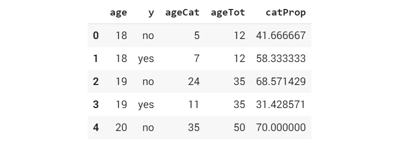
Figure 3.11: Merged DataFrames with proportion of customers by age group
- Now, display the proportion where you plot both categories (yes and no) as separate plots. This can be achieved through a method within altair called facet():
# Visualising the relationship using altair
alt.Chart(ageComb).mark_line()
.encode(x='age', y='catProp').facet(column='y')
This function makes as many plots as there are categories within the variable. Here, we give the 'y' variable, which is the variable name for the yes and no categories to the facet() function, and we get two different plots: one for yes and another for no.
You should get the following output:
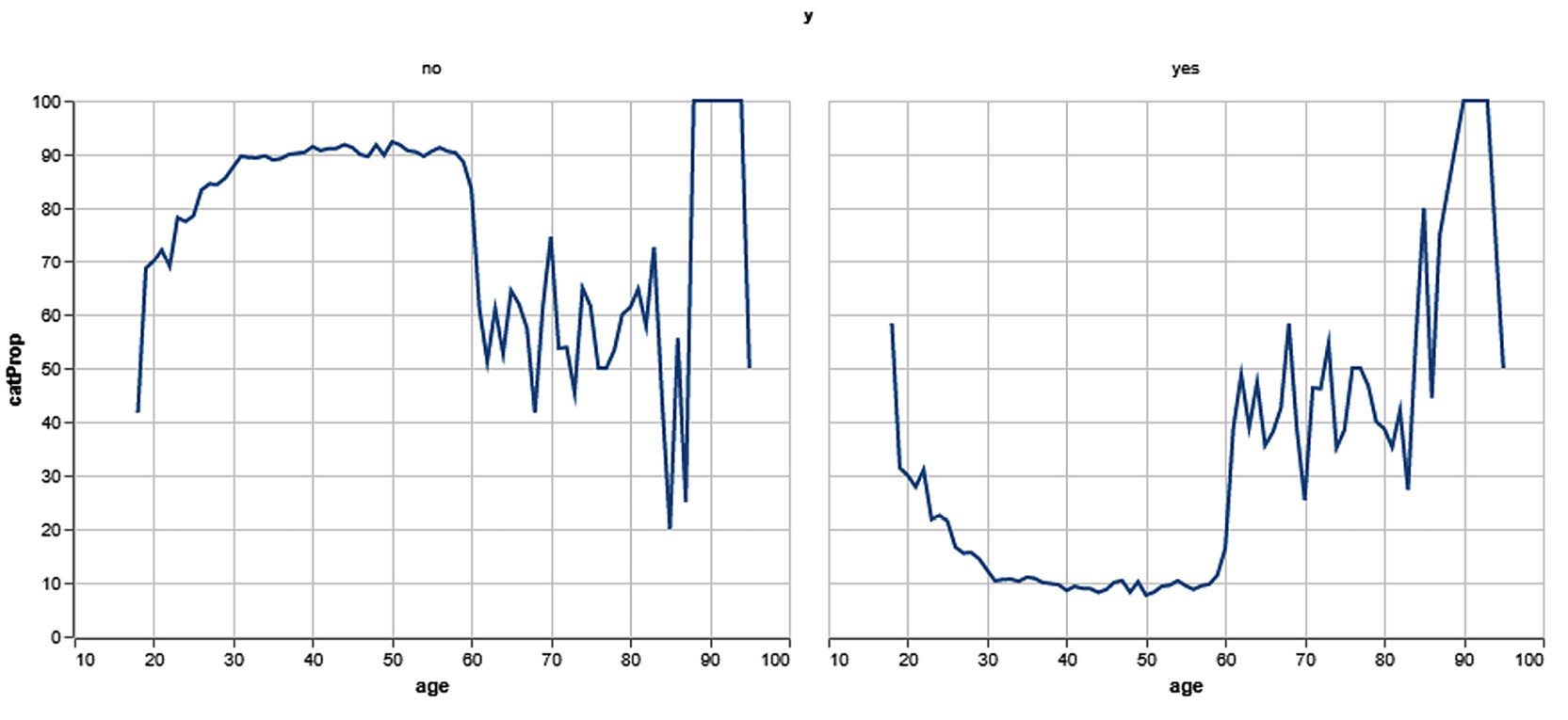
Figure 3.12: Visualizing normalized relationships
By the end of this exercise, you were able to get two meaningful plots showing the propensity of people to buy term deposit plans. The final output for this exercise shows two graphs in which the left graph shows the proportion of people who do not buy term deposits and the right one shows those customers who buy term deposits.
We can see, in the first graph, with the age group beginning from 22 to 60, individuals would not be inclined to purchase the term deposit. However, in the second graph, we see the opposite, where the age group of 60 and over are much more inclined to purchase the term deposit plan.
Note
To access the source code for this specific section, please refer to https://packt.live/3iOw7Q4.
This section does not currently have an online interactive example, but can be run as usual on Google Colab.
In the following section, we will begin to analyze our plots based on our intuitions.
Intuitions from the Exploratory Analysis
What are the intuitions we can take out of the exercise that we have done so far? We have seen two contrasting plots by taking the proportion of users and without taking the proportions. As you can see, taking the proportion of users is the right approach to get the right perspective in which we must view data. This is more in line with the hypothesis that we have evolved. We can see from the plots that the propensity to buy term deposits is low for age groups from 22 to around 60.
After 60, we see a rising trend in the demand for term deposits. Another interesting fact we can observe is the higher proportion of term deposit purchases for ages younger than 20.
In Exercise 3.02, Business Hypothesis Testing for Age versus Propensity for a Term Loan we discovered how to develop our hypothesis and then verify the hypothesis using EDA. After the following activity, we will delve into another important step in the journey, Feature Engineering.
Activity 3.01: Business Hypothesis Testing to Find Employment Status versus Propensity for Term Deposits
You are working as a data scientist for a bank. You are provided with historical data from the management of the bank and are asked to try to formulate a hypothesis between employment status and the propensity to buy term deposits.
In Exercise 3.02, Business Hypothesis Testing for Age versus Propensity for a Term Loan we worked on a problem to find the relationship between age and the propensity to buy term deposits. In this activity, we will use a similar route and verify the relationship between employment status and term deposit purchase propensity.
The steps are as follows:
- Formulate the hypothesis between employment status and the propensity for term deposits. Let the hypothesis be as follows: High paying employees prefer term deposits than other categories of employees.
- Open a Colab notebook file similar to what was used in Exercise 3.02, Business Hypothesis Testing for Age versus Propensity for a Term Loan and install and import the necessary libraries such as pandas and altair.
- From the banking DataFrame, bankData, find the distribution of employment status using the .groupby(), .agg() and .reset_index() methods.
Group the data with respect to employment status using the .groupby() method and find the total count of propensities for each employment status using the .agg() method.
- Now, merge both DataFrames using the pd.merge() function and then find the propensity count by calculating the proportion of propensity for each type of employment status. When creating the new variable for finding the propensity proportion.
- Plot the data and summarize intuitions from the plot using matplotlib. Use the stacked bar chart for this activity.
Note
The bank-full.csv dataset to be used in this activity can be found at https://packt.live/2Wav1nJ.
Expected output: The final plot of the propensity to buy with respect to employment status will be similar to the following plot:

Figure 3.13: Visualizing propensity of purchase by job
Note
The solution to this activity can be found at the following address: https://packt.live/2GbJloz.
Now that we have seen EDA, let's dive into feature engineering.
Feature Engineering
In the previous section, we traversed the process of EDA. As part of the earlier process, we tested our business hypotheses by slicing and dicing the data and through visualizations. You might be wondering where we will use the intuitions that we derived from all of the analysis we did. The answer to that question will be addressed in this section.
Feature engineering is the process of transforming raw variables to create new variables and this will be covered later in the chapter. Feature engineering is one of the most important steps that influence the accuracy of the models that we build.
There are two broad types of feature engineering:
- Here, we transform raw variables based on intuitions from a business perspective. These intuitions are what we build during the exploratory analysis.
- The transformation of raw variables is done from a statistical and data normalization perspective.
We will look into each type of feature engineering next.
Note
Feature engineering will be covered in much more detail in Chapter 12, Feature Engineering. In this section you will see the purpose of learning about classification.
Business-Driven Feature Engineering
Business-driven feature engineering is the process of transforming raw variables based on business intuitions that were derived during the exploratory analysis. It entails transforming data and creating new variables based on business factors or drivers that influence a business problem.
In the previous exercises on exploratory analysis, we explored the relationship of a single variable with the dependent variable. In this exercise, we will combine multiple variables and then derive new features. We will explore the relationship between an asset portfolio and the propensity for term deposit purchases. An asset portfolio is the combination of all assets and liabilities the customer has with the bank. We will combine assets and liabilities such as bank balance, home ownership, and loans to get a new feature called an asset index.
These feature engineering steps will be split into two exercises. In Exercise 3.03, Feature Engineering – Exploration of Individual Features, we explore individual variables such as balance, housing, and loans to understand their relationship to a propensity for term deposits.
In Exercise 3.04, Feature Engineering – Creating New Features from Existing Ones, we will transform individual variables and then combine them to form a new feature.
Exercise 3.03: Feature Engineering – Exploration of Individual Features
In this exercise, we will explore the relationship between two variables, which are whether an individual owns a house and whether an individual has a loan, to the propensity for term deposit purchases by these individuals.
The following steps will help you to complete this exercise:
- Open a new Colab notebook.
- Import the pandas package.
import pandas as pd
- Assign the link to the dataset to a variable called file_url:
file_url = 'https://raw.githubusercontent.com'
'/PacktWorkshops/The-Data-Science-Workshop'
'/master/Chapter03/bank-full.csv'
- Read the banking dataset using the .read_csv() function:
# Reading the banking data
bankData = pd.read_csv(file_url, sep=";")
- Next, we will find a relationship between housing and the propensity for term deposits, as mentioned in the following code snippet:
# Relationship between housing and propensity for term deposits
bankData.groupby(['housing', 'y'])['y']
.agg(houseTot='count').reset_index()
You should get the following output:

Figure 3.14: Housing status versus propensity to buy term deposits
The first part of the code is to group customers based on whether they own a house or not. The count of customers under each category is calculated with the .agg() method. From the values, we can see that the propensity to buy term deposits is much higher for people who do not own a house compared with those who do own one: ( 3354 / ( 3354 + 16727) = 17% to 1935 / ( 1935 + 23195) = 8%).
- Explore the 'loan' variable to find its relationship with the propensity for a term deposit, as mentioned in the following code snippet:
"""
Relationship between having a loan and propensity for term
deposits
"""
bankData.groupby(['loan', 'y'])['y']
.agg(loanTot='count').reset_index()
Note
The triple-quotes ( """ ) shown in the code snippet above are used to denote the start and end points of a multi-line code comment. This is an alternative to using the # symbol.
You should get the following output:

Figure 3.15: Loan versus term deposit propensity
In the case of loan portfolios, the propensity to buy term deposits is higher for customers without loans: ( 4805 / ( 4805 + 33162) = 12 % to 484/ ( 484 + 6760) = 6%).
Housing and loans were categorical data and finding a relationship was straightforward. However, bank balance data is numerical and to analyze it, we need to have a different strategy. One common strategy is to convert the continuous numerical data into ordinal data and look at how the propensity varies across each category.
- To convert numerical values into ordinal values, we first find the quantile values and take them as threshold values. The quantiles are obtained using the following code snippet:
#Taking the quantiles for 25%, 50% and 75% of the balance data
import numpy as np
np.quantile(bankData['balance'],[0.25,0.5,0.75])
You should get the following output:

Figure 3.16: Quantiles for bank balance data
Quantile values represent certain threshold values for data distribution. For example, when we say the 25th quantile percentile, we are talking about a value below which 25% of the data exists. The quantile can be calculated using the np.quantile() function in NumPy. In the code snippet of Step 4, we calculated the 25th, 50th, and 75th percentiles, which resulted in 72, 448, and 1428.
- Now, convert the numerical values of bank balances into categorical values, as mentioned in the following code snippet:
bankData['balanceClass'] = 'Quant1'
bankData.loc[(bankData['balance'] > 72)
& (bankData['balance'] < 448),
'balanceClass'] = 'Quant2'
bankData.loc[(bankData['balance'] > 448)
& (bankData['balance'] < 1428),
'balanceClass'] = 'Quant3'
bankData.loc[bankData['balance'] > 1428,
'balanceClass'] = 'Quant4'
bankData.head()
You should get the following output:
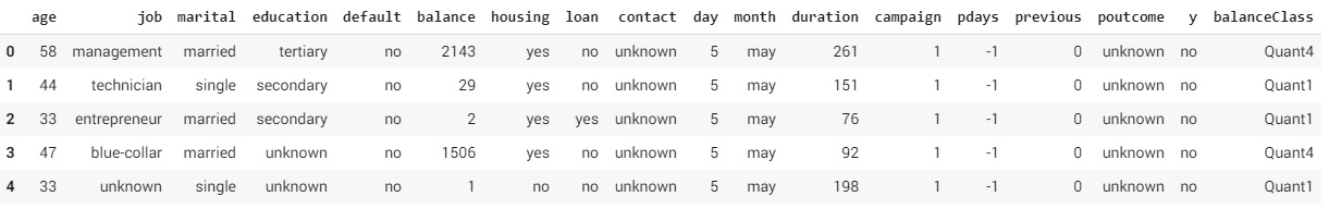
Figure 3.17: New features from bank balance data
We did this is by looking at the quantile thresholds we took in the Step 4, and categorizing the numerical data into the corresponding quantile class. For example, all values lower than the 25th quantile value, 72, were classified as Quant1, values between 72 and 448 were classified as Quant2, and so on. To store the quantile categories, we created a new feature in the bank dataset called balanceClass and set its default value to Quan1. After this, based on each value threshold, the data points were classified to the respective quantile class.
- Next, we need to find the propensity of term deposit purchases based on each quantile the customers fall into. This task is similar to what we did in Exercise 3.02, Business Hypothesis Testing for Age versus Propensity for a Term Loan:
# Calculating the customers under each quantile
balanceTot = bankData.groupby(['balanceClass'])['y']
.agg(balanceTot='count').reset_index()
balanceTot
You should get the following output:

Figure 3:18: Classification based on quantiles
- Calculate the total number of customers categorized by quantile and propensity classification, as mentioned in the following code snippet:
"""
Calculating the total customers categorised as per quantile
and propensity classification
"""
balanceProp = bankData.groupby(['balanceClass', 'y'])['y']
.agg(balanceCat='count').reset_index()
balanceProp
You should get the following output:

Figure 3.19: Total number of customers categorized by quantile and propensity classification
- Now, merge both DataFrames:
# Merging both the data frames
balanceComb = pd.merge(balanceProp, balanceTot,
on = ['balanceClass'])
balanceComb['catProp'] = (balanceComb.balanceCat
/ balanceComb.balanceTot)*100
balanceComb
You should get the following output:
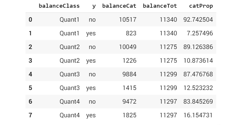
Figure 3.20: Propensity versus balance category
From the distribution of data, we can see that, as we move from Quantile 1 to Quantile 4, the proportion of customers who buy term deposits keeps on increasing. For instance, of all of the customers who belong to Quant 1, 7.25% have bought term deposits (we get this percentage from catProp). This proportion increases to 10.87 % for Quant 2 and thereafter to 12.52 % and 16.15% for Quant 3 and Quant4, respectively. From this trend, we can conclude that individuals with higher balances have more propensity for term deposits.
In this exercise, we explored the relationship of each variable to the propensity for term deposit purchases. The overall trend that we can observe is that people with more cash in hand (no loans and a higher balance) have a higher propensity to buy term deposits.
Note
To access the source code for this specific section, please refer to https://packt.live/3g7rK0w.
You can also run this example online at https://packt.live/2PZbcNV.
In the next exercise, we will use these intuitions to derive a new feature.
Exercise 3.04: Feature Engineering – Creating New Features from Existing Ones
In this exercise, we will combine the individual variables we analyzed in Exercise 3.03, Feature Engineering – Exploration of Individual Features to derive a new feature called an asset index. One methodology to create an asset index is by assigning weights based on the asset or liability of the customer.
For instance, a higher bank balance or home ownership will have a positive bearing on the overall asset index and, therefore, will be assigned a higher weight. In contrast, the presence of a loan will be a liability and, therefore, will have to have a lower weight. Let's give a weight of 5 if the customer has a house and 1 in its absence. Similarly, we can give a weight of 1 if the customer has a loan and 5 in case of no loans:
- Open a new Colab notebook.
- Import the pandas and numpy package:
import pandas as pd
import numpy as np
- Assign the link to the dataset to a variable called 'file_url'.
file_url = 'https://raw.githubusercontent.com'
'/PacktWorkshops/The-Data-Science-Workshop'
'/master/Chapter03/bank-full.csv'
- Read the banking dataset using the .read_csv() function:
# Reading the banking data
bankData = pd.read_csv(file_url,sep=";")
- The first step we will follow is to normalize the numerical variables. This is implemented using the following code snippet:
# Normalizing data
from sklearn import preprocessing
x = bankData[['balance']].values.astype(float)
- As the bank balance dataset contains numerical values, we need to first normalize the data. The purpose of normalization is to bring all of the variables that we are using to create the new feature into a common scale. One effective method we can use here for the normalizing function is called MinMaxScaler(), which converts all of the numerical data between a scaled range of 0 to 1. The MinMaxScaler function is available within the preprocessing method in sklearn:
minmaxScaler = preprocessing.MinMaxScaler()
- Transform the balance data by normalizing it with minmaxScaler:
bankData['balanceTran'] = minmaxScaler.fit_transform(x)
In this step, we created a new feature called 'balanceTran' to store the normalized bank balance values.
- Print the head of the data using the .head() function:
bankData.head()
You should get the following output:

Figure 3.21: Normalizing the bank balance data
- After creating the normalized variable, add a small value of 0.001 so as to eliminate the 0 values in the variable. This is mentioned in the following code snippet:
# Adding a small numerical constant to eliminate 0 values
bankData['balanceTran'] = bankData['balanceTran'] + 0.00001
The purpose of adding this small value is because, in the subsequent steps, we will be multiplying three transformed variables together to form a composite index. The small value is added to avoid the variable values becoming 0 during the multiplying operation.
- Now, add two additional columns for introducing the transformed variables for loans and housing, as per the weighting approach discussed at the start of this exercise:
# Let us transform values for loan data
bankData['loanTran'] = 1
# Giving a weight of 5 if there is no loan
bankData.loc[bankData['loan'] == 'no', 'loanTran'] = 5
bankData.head()
You should get the following output:

Figure 3.22: Additional columns with the transformed variables
We transformed values for the loan data as per the weighting approach. When a customer has a loan, it is given a weight of 1, and when there's no loan, the weight assigned is 5. The value of 1 and 5 are intuitive weights we are assigning. What values we assign can vary based on the business context you may be provided with.
- Now, transform values for the Housing data, as mentioned here:
# Let us transform values for Housing data
bankData['houseTran'] = 5
- Give a weight of 1 if the customer has a house and print the results, as mentioned in the following code snippet:
bankData.loc[bankData['housing'] == 'no', 'houseTran'] = 1
print(bankData.head())
You should get the following output:

Figure 3.23: Transforming loan and housing data
Once all the transformed variables are created, we can multiply all of the transformed variables together to create a new index called assetIndex. This is a composite index that represents the combined effect of all three variables.
- Now, create a new variable, which is the product of all of the transformed variables:
"""
Let us now create the new variable which is a product of all
these
"""
bankData['assetIndex'] = bankData['balanceTran']
* bankData['loanTran']
* bankData['houseTran']
bankData.head()
You should get the following output:

Figure 3.24: Creating a composite index
- Explore the propensity with respect to the composite index.
We observe the relationship between the asset index and the propensity of term deposit purchases. We adopt a similar strategy of converting the numerical values of the asset index into ordinal values by taking the quantiles and then mapping the quantiles to the propensity of term deposit purchases, as mentioned in Exercise 3.03, Feature Engineering – Exploration of Individual Features:
# Finding the quantile
np.quantile(bankData['assetIndex'],[0.25,0.5,0.75])
You should get the following output:

Figure 3.25: Conversion of numerical values into ordinal values
- Next, create quantiles from the assetindex data, as mentioned in the following code snippet:
bankData['assetClass'] = 'Quant1'
bankData.loc[(bankData['assetIndex'] > 0.38)
& (bankData['assetIndex'] < 0.57),
'assetClass'] = 'Quant2'
bankData.loc[(bankData['assetIndex'] > 0.57)
& (bankData['assetIndex'] < 1.9),
'assetClass'] = 'Quant3'
bankData.loc[bankData['assetIndex'] > 1.9,
'assetClass'] = 'Quant4'
bankData.head()
bankData.assetClass[bankData['assetIndex'] > 1.9] = 'Quant4'
bankData.head()
You should get the following output:
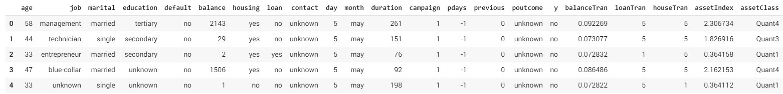
Figure 3.26: Quantiles for the asset index
- Calculate the total of each asset class and the category-wise counts, as mentioned in the following code snippet:
# Calculating total of each asset class
assetTot = bankData.groupby('assetClass')['y']
.agg(assetTot='count').reset_index()
# Calculating the category wise counts
assetProp = bankData.groupby(['assetClass', 'y'])['y']
.agg(assetCat='count').reset_index()
- Next, merge both DataFrames:
# Merging both the data frames
assetComb = pd.merge(assetProp, assetTot, on = ['assetClass'])
assetComb['catProp'] = (assetComb.assetCat
/ assetComb.assetTot)*100
assetComb
You should get the following output:
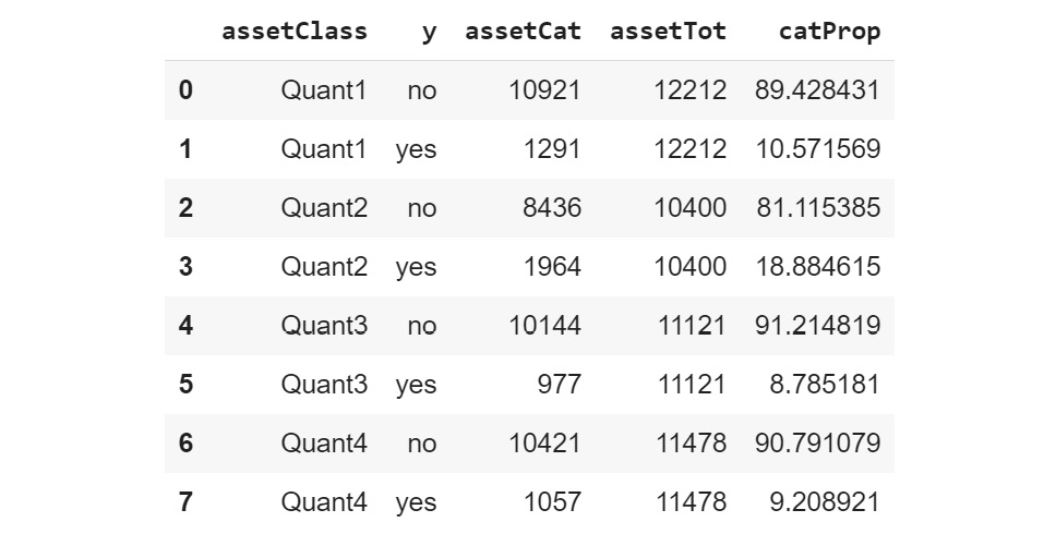
Figure 3.27: Composite index relationship mapping
From the new feature we created, we can see that 18.88% (we get this percentage from catProp) of customers who are in Quant2 have bought term deposits compared to 10.57 % for Quant1, 8.78% for Quant3, and 9.28% for Quant4. Since Quant2 has the highest proportion of customers who have bought term deposits, we can conclude that customers in Quant2 have higher propensity to purchase the term deposits than all other customers.
Note
To access the source code for this specific section, please refer to https://packt.live/316hUrO.
You can also run this example online at https://packt.live/3kVc7Ny.
Similar to the exercise that we just completed, you should think of new variables that can be created from the existing variables based on business intuitions. Creating new features based on business intuitions is the essence of business-driven feature engineering. In the next section, we will look at another type of feature engineering called data-driven feature engineering.
Data-Driven Feature Engineering
The previous section dealt with business-driven feature engineering. In addition to features we can derive from the business perspective, it would also be imperative to transform data through feature engineering from the perspective of data structures. We will look into different methods of identifying data structures and take a peek into some data transformation techniques.
A Quick Peek at Data Types and a Descriptive Summary
Looking at the data types such as categorical or numeric and then deriving summary statistics is a good way to take a quick peek into data before you do some of the downstream feature engineering steps. Let's take a look at an example from our dataset:
# Looking at Data types
print(bankData.dtypes)
# Looking at descriptive statistics
print(bankData.describe())
You should get the following output:
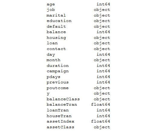
Figure 3.28: Output showing the different data types in the dataset
In the preceding output, you see the different types of information in the dataset and its corresponding data types. For instance, age is an integer and so is day.
The following output is that of a descriptive summary statistic, which displays some of the basic measures such as mean, standard deviation, count, and the quantile values of the respective features:

Figure 3.29: Data types and a descriptive summary
The purpose of a descriptive summary is to get a quick feel of the data with respect to the distribution and some basic statistics such as mean and standard deviation. Getting a perspective on the summary statistics is critical for thinking about what kind of transformations are required for each variable.
For instance, in the earlier exercises, we converted the numerical data into categorical variables based on the quantile values. Intuitions for transforming variables would come from the quick summary statistics that we can derive from the dataset.
In the following sections, we will be looking at the correlation matrix and visualization.
Correlation Matrix and Visualization
Correlation, as you know, is a measure that indicates how two variables fluctuate together. Any correlation value of 1, or near 1, indicates that those variables are highly correlated. Highly correlated variables can sometimes be damaging for the veracity of models and, in many circumstances, we make the decision to eliminate such variables or to combine them to form composite or interactive variables.
Let's look at how data correlation can be generated and then visualized in the following exercise.
Exercise 3.05: Finding the Correlation in Data to Generate a Correlation Plot Using Bank Data
In this exercise, we will be creating a correlation plot and analyzing the results of the bank dataset.
The following steps will help you to complete the exercise:
- Open a new Colab notebook, install the pandas packages and load the banking data:
import pandas as pd
file_url = 'https://raw.githubusercontent.com'
'/PacktWorkshops/The-Data-Science-Workshop'
'/master/Chapter03/bank-full.csv'
bankData = pd.read_csv(file_url, sep=";")
- Now, import the set_option library from pandas, as mentioned here:
from pandas import set_option
The set_option function is used to define the display options for many operations.
- Next, create a variable that would store numerical variables such as 'age','balance','day','duration','campaign','pdays','previous', as mentioned in the following code snippet. A correlation plot can be extracted only with numerical data. This is why the numerical data has to be extracted separately:
bankNumeric = bankData[['age','balance','day','duration',
'campaign','pdays','previous']]
- Now, use the .corr() function to find the correlation matrix for the dataset:
set_option('display.width',150)
set_option('precision',3)
bankCorr = bankNumeric.corr(method = 'pearson')
bankCorr
You should get the following output:

Figure 3.30: Correlation matrix
The method we use for correlation is the Pearson correlation coefficient. We can see from the correlation matrix that the diagonal elements have a correlation of 1. This is because the diagonals are a correlation of a variable with itself, which will always be 1. This is the Pearson correlation coefficient.
- Now, plot the data:
from matplotlib import pyplot
corFig = pyplot.figure()
figAxis = corFig.add_subplot(111)
corAx = figAxis.matshow(bankCorr,vmin=-1,vmax=1)
corFig.colorbar(corAx)
pyplot.show()
You should get the following output:

Figure 3.31: Correlation plot
We used many plotting parameters in this code block. pyplot.figure() is the plotting class that is instantiated. .add_subplot() is a grid parameter for the plotting. For example, 111 means a 1 x 1 grid for the first subplot. The .matshow() function is to display the plot, and the vmin and vmax arguments are for normalizing the data in the plot.
Let's look at the plot of the correlation matrix to visualize the matrix for quicker identification of correlated variables. Some obvious candidates are the high correlation between 'balance' and 'balanceTran' and the 'asset index' with many of the transformed variables that we created in the earlier exercise. Other than that, there aren't many variables that are highly correlated.
Note
To access the source code for this specific section, please refer to https://packt.live/3kXr9SK.
You can also run this example online at https://packt.live/3gbfbkR.
In this exercise, we developed a correlation plot that allows us to visualize the correlation between variables.
Skewness of Data
Another area for feature engineering is skewness. Skewed data means data that is shifted in one direction or the other. Skewness can cause machine learning models to underperform. Many machine learning models assume normally distributed data or data structures to follow the Gaussian structure. Any deviation from the assumed Gaussian structure, which is the popular bell curve, can affect model performance. A very effective area where we can apply feature engineering is by looking at the skewness of data and then correcting the skewness through normalization of the data. Skewness can be visualized by plotting the data using histograms and density plots. We will investigate each of these techniques.
Let's take a look at the following example. Here, we use the .skew() function to find the skewness in data. For instance, to find the skewness of data in our bank-full.csv dataset, we perform the following:
# Skewness of numeric attributes
bankNumeric.skew()
Note
This code refers to the bankNumeric data, so you should ensure you are working in the same notebook as the previous exercise.
You should get the following output:

Figure 3.32: Degree of skewness
The preceding matrix is the skewness index. Any value closer to 0 indicates a low degree of skewness. Positive values indicate right skew and negative values, left skew. Variables that show higher values of right skew and left skew are candidates for further feature engineering by normalization. Let's now visualize the skewness by plotting histograms and density plots.
Histograms
Histograms are an effective way to plot the distribution of data and to identify skewness in data, if any. The histogram outputs of two columns of bankData are listed here. The histogram is plotted with the pyplot package from matplotlib using the .hist() function. The number of subplots we want to include is controlled by the .subplots() function. (1,2) in subplots would mean one row and two columns. The titles are set by the set_title() function:
# Histograms
from matplotlib import pyplot as plt
fig, axs = plt.subplots(1,2)
axs[0].hist(bankNumeric['age'])
axs[0].set_title('Distribution of age')
axs[1].hist(bankNumeric['balance'])
axs[1].set_title('Distribution of Balance')
# Ensure plots do not overlap
plt.tight_layout()
You should get the following output:
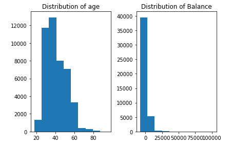
Figure 3.33: Code showing the generation of histograms
From the histogram, we can see that the age variable has a distribution closer to the bell curve with a lower degree of skewness. In contrast, the asset index shows a relatively higher right skew, which makes it a more probable candidate for normalization.
Density Plots
Density plots help in visualizing the distribution of data. A density plot can be created using the kind = 'density' parameter:
from matplotlib import pyplot as plt
# Density plots
bankNumeric['age'].plot(kind = 'density', subplots = False,
layout = (1,1))
plt.title('Age Distribution')
plt.xlabel('Age')
plt.ylabel('Normalised age distribution')
pyplot.show()
You should get the following output:

Figure 3.34: Code showing the generation of a density plot
Density plots help in getting a smoother visualization of the distribution of the data. From the density plot of Age, we can see that it has a distribution similar to a bell curve.
Other Feature Engineering Methods
So far, we were looking at various descriptive statistics and visualizations that are precursors for applying many feature engineering techniques on data structures. We investigated one such feature engineering technique in Exercise 3.02, Business Hypothesis Testing for Age versus Propensity for a Term Loan where we applied the min max scaler for normalizing data.
We will now look into two other similar data transformation techniques, namely, standard scaler and normalizer. Standard scaler standardizes data to a mean of 0 and standard deviation of 1. The mean is the average of the data and the standard deviation is a measure of the spread of data. By standardizing to the same mean and standard deviation, comparison across different distributions of data is enabled.
The normalizer function normalizes the length of data. This means that each value in a row is divided by the normalization of the row vector to normalize the row. The normalizer function is applied on the rows while standard scaler is applied columnwise. The normalizer and standard scaler functions are important feature engineering steps that are applied to the data before downstream modeling steps. Let's look at both of these techniques:
# Standardize data (0 mean, 1 stdev)
from sklearn.preprocessing import StandardScaler
from numpy import set_printoptions
scaling = StandardScaler().fit(bankNumeric)
rescaledNum = scaling.transform(bankNumeric)
set_printoptions(precision = 3)
print(rescaledNum)
You should get the following output:

Figure 3.35: Output from standardizing the data
The following code uses the normalizer data transmission techniques:
# Normalizing Data (Length of 1)
from sklearn.preprocessing import Normalizer
normaliser = Normalizer().fit(bankNumeric)
normalisedNum = normaliser.transform(bankNumeric)
set_printoptions(precision = 3)
print(normalisedNum)
You should get the following output:
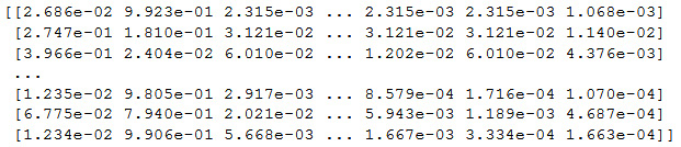
Figure 3.36 Output by the normalizer
The output from standard scaler is normalized along the columns. The output would have 11 columns corresponding to 11 numeric columns (age, balance, day, duration, and so on). If we observe the output, we can see that each value along a column is normalized so as to have a mean of 0 and standard deviation of 1. By transforming data in this way, we can easily compare across columns.
For instance, in the age variable, we have data ranging from 18 up to 95. In contrast, for the balance data, we have data ranging from -8,019 to 102,127. We can see that both of these variables have different ranges of data that cannot be compared. The standard scaler function converts these data points at very different scales into a common scale so as to compare the distribution of data. Normalizer rescales each row so as to have a vector with a length of 1.
The big question we have to think about is why do we have to standardize or normalize data? Many machine learning algorithms converge faster when the features are of a similar scale or are normally distributed. Standardizing is more useful in algorithms that assume input variables to have a Gaussian structure. Algorithms such as linear regression, logistic regression, and linear discriminate analysis fall under this genre. Normalization techniques would be more congenial for sparse datasets (datasets with lots of zeros) when using algorithms such as k-nearest neighbor or neural networks.
Summarizing Feature Engineering
In this section, we investigated the process of feature engineering from a business perspective and data structure perspective. Feature engineering is a very important step in the life cycle of a data science project and helps determine the veracity of the models that we build. As seen in Exercise 3.02, Business Hypothesis Testing for Age versus Propensity for a Term Loan we translated our understanding of the domain and our intuitions to build intelligent features. Let's summarize the processes that we followed:
- We obtain intuitions from a business perspective through EDA
- Based on the business intuitions, we devised a new feature that is a combination of three other variables.
- We verified the influence of constituent variables of the new feature and devised an approach for weights to be applied.
- Converted ordinal data into corresponding weights.
- Transformed numerical data by normalizing them using an appropriate normalizer.
- Combined all three variables into a new feature.
- Observed the relationship between the composite index and the propensity to purchase term deposits and derived our intuitions.
- Explored techniques for visualizing and extracting summary statistics from data.
- Identified techniques for transforming data into feature engineered data structures.
Now that we have completed the feature engineering step, the next question is where do we go from here and what is the relevance of the new feature we created? As you will see in the subsequent sections, the new features that we created will be used for the modeling process. The preceding exercises are an example of a trail we can follow in creating new features. There will be multiple trails like these, which should be thought of as based on more domain knowledge and understanding. The veracity of the models that we build will be dependent on all such intelligent features we can build by translating business knowledge into data.
Building a Binary Classification Model Using the Logistic Regression Function
The essence of data science is about mapping a business problem into its data elements and then transforming those data elements to get our desired business outcomes. In the previous sections, we discussed how we do the necessary transformation on the data elements. The right transformation of the data elements can highly influence the generation of the right business outcomes by the downstream modeling process.
Let's look at the business outcome generation process from the perspective of our use case. The desired business outcome, in our use case, is to identify those customers who are likely to buy a term deposit. To correctly identify which customers are likely to buy a term deposit, we first need to learn the traits or features that, when present in a customer, helps in the identification process. This learning of traits is what is achieved through machine learning.
By now, you may have realized that the goal of machine learning is to estimate a mapping function (f) between an output variable and input variables. In mathematical form, this can be written as follows:
Figure 3.37: A mapping function in mathematical form
Let's look at this equation from the perspective of our use case.
Y is the dependent variable, which is our prediction as to whether a customer has the probability to buy a term deposit or not.
X is the independent variable(s), which are those attributes such as age, education, and marital status and are part of the dataset.
f() is a function that connects various attributes of the data to the probability or whether a customer will buy a term deposit or not. This function is learned during the machine learning process. This function is a combination of different coefficients or parameters applied to each of the attributes to get the probability of term deposit purchases. Let's unravel this concept using a simple example of our bank data use case.
For simplicity, let's assume that we have only two attributes, age and bank balance. Using these, we have to predict whether a customer is likely to buy a term deposit or not. Let the age be 40 years and the balance $1,000. With all of these attribute values, let's assume that the mapping equation is as follows:

Figure 3.38: Updated mapping equation
Using the preceding equation, we get the following:
Y = 0.1 + 0.4 * 40 + 0.002 * 1000
Y = 18.1
Now, you might be wondering, we are getting a real number and how does this represent a decision of whether a customer will buy a term deposit or not? This is where the concept of a decision boundary comes in. Let's also assume that, on analyzing the data, we have also identified that if the value of Y goes above 15 (an assumed value in this case), then the customer is likely to buy the term deposit, otherwise they will not buy a term deposit. This means that, as per this example, the customer is likely to buy a term deposit.
Let's now look at the dynamics in this example and try to decipher the concepts. The values such as 0.1, 0.4, and 0.002, which are applied to each of the attributes, are the coefficients. These coefficients, along with the equation connecting the coefficients and the variables, are the functions that we are learning from the data. The essence of machine learning is to learn all of these from the provided data. All of these coefficients along with the functions can also be called by another common name called the model. A model is an approximation of the data generation process. During machine learning, we are trying to get as close to the real model that has generated the data we are analyzing. To learn or estimate the data generating models, we use different machine learning algorithms.
Machine learning models can be broadly classified into two types, parametric models and non-parametric models. Parametric models are where we assume the form of the function we are trying to learn and then learn the coefficients from the training data. By assuming a form for the function, we simplify the learning process.
To understand the concept better, let's take the example of a linear model. For a linear model, the mapping function takes the following form:

Figure 3.39: Linear model mapping function
The terms C0, M1, and M2 are the coefficients of the line that influences the intercept and slope of the line. X1 and X2 are the input variables. What we are doing here is that we assume that the data generating model is a linear model and then, using the data, we estimate the coefficients, which will enable the generation of the predictions. By assuming the data generating model, we have simplified the whole learning process. However, these simple processes also come with their pitfalls. Only if the underlying function is linear or similar to linear will we get good results. If the assumptions about the form are wrong, we are bound to get bad results.
Some examples of parametric models include:
- Linear and logistic regression
- Naïve Bayes
- Linear support vector machines
- Perceptron
Machine learning models that do not make strong assumptions on the function are called non-parametric models. In the absence of an assumed form, non-parametric models are free to learn any functional form from the data. Non-parametric models generally require a lot of training data to estimate the underlying function. Some examples of non-parametric models include the following:
- Decision trees
- K –nearest neighbors
- Neural networks
- Support vector machines with Gaussian kernels
Logistic Regression Demystified
Logistic regression is a linear model similar to the linear regression that was covered in the previous chapter. At the core of logistic regression is the sigmoid function, which quashes any real-valued number to a value between 0 and 1, which renders this function ideal for predicting probabilities. The mathematical equation for a logistic regression function can be written as follows:

Figure 3.40: Logistic regression function
Here, Y is the probability of whether a customer is likely to buy a term deposit or not.
The terms C0 + M1 * X1 + M2 * X2 are very similar to the ones we have seen in the linear regression function, covered in an earlier chapter. As you would have learned by now, a linear regression function gives a real-valued output. To transform the real-valued output into a probability, we use the logistic function, which has the following form:

Figure 3.41: An expression to transform the real-valued output to a probability
Here, e is the natural logarithm. We will not dive deep into the math behind this; however, let's realize that, using the logistic function, we can transform the real-valued output into a probability function.
Let's now look at the logistic regression function from the business problem that we are trying to solve. In the business problem, we are trying to predict the probability of whether a customer would buy a term deposit or not. To do that, let's return to the example we derived from the problem statement:

Figure 3.42: The logistic regression function updated with the business problem statement
Adding the following values, we get Y = 0.1 + 0.4 * 40 + 0.002 * 100.
To get the probability, we must transform this problem statement using the logistic function, as follows:

Figure 3.43: Transformed problem statement to find the probability of using the logistic function
In applying this, we get a value of Y = 1, which is a 100% probability that the customer will buy the term deposit. As discussed in the previous example, the coefficients of the model such as 0.1, 0.4, and 0.002 are what we learn using the logistic regression algorithm during the training process.
Metrics for Evaluating Model Performance
As a data scientist, you always have to make decisions on the models you build. These evaluations are done based on various metrics on the predictions. In this section, we introduce some of the important metrics that are used for evaluating the performance of models.
Note
Model performance will be covered in much more detail in Chapter 6, How to Assess Performance. This section provides you with an introduction to work with classification models.
Confusion Matrix
As you will have learned, we evaluate a model based on its performance on a test set. A test set will have its labels, which we call the ground truth, and, using the model, we also generate predictions for the test set. The evaluation of model performance is all about comparison of the ground truth and the predictions. Let's see this in action with a dummy test set:
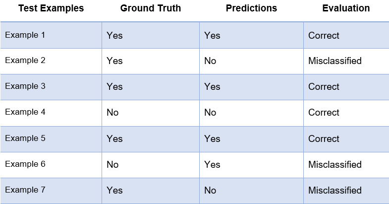
Figure 3.44: Confusion matrix generation
The preceding table shows a dummy dataset with seven examples. The second column is the ground truth, which are the actual labels, and the third column contains the results of our predictions. From the data, we can see that four have been correctly classified and three were misclassified.
A confusion matrix generates the resultant comparison between prediction and ground truth, as represented in the following table:

Figure 3.45: Confusion matrix
As you can see from the table, there are five examples whose labels (ground truth) are Yes and the balance is two examples that have the labels of No.
The first row of the confusion matrix is the evaluation of the label Yes. True positive shows those examples whose ground truth and predictions are Yes (examples 1, 3, and 5). False negative shows those examples whose ground truth is Yes and who have been wrongly predicted as No (examples 2 and 7).
Similarly, the second row of the confusion matrix evaluates the performance of the label No. False positive are those examples whose ground truth is No and who have been wrongly classified as Yes (example 6). True negative examples are those examples whose ground truth and predictions are both No (example 4).
The generation of a confusion matrix is used for calculating many of the matrices such as accuracy and classification reports, which are explained later. It is based on metrics such as accuracy or other detailed metrics shown in the classification report such as precision or recall the models for testing. We generally pick models where these metrics are the highest.
Accuracy
Accuracy is the first level of evaluation, which we will resort to in order to have a quick check on model performance. Referring to the preceding table, accuracy can be represented as follows:

Figure 3.46: A function that represents accuracy
Accuracy is the proportion of correct predictions out of all of the predictions.
Classification Report
A classification report outputs three key metrics: precision, recall, and the F1 score.
Precision is the ratio of true positives to the sum of true positives and false positives:

Figure 3.47: The precision ratio
Precision is the indicator that tells you, out of all of the positives that were predicted, how many were true positives.
Recall is the ratio of true positives to the sum of true positives and false negatives:

Figure 3.48: The recall ratio
Recall manifests the ability of the model to identify all true positives.
The F1 score is a weighted score of both precision and recall. An F1 score of 1 indicates the best performance and 0 indicates the worst performance.
In the next section, let's take a look at data preprocessing, which is an important process to work with data and come to conclusions in data analysis.
Data Preprocessing
Data preprocessing has an important role to play in the life cycle of data science projects. These processes are often the most time-consuming part of the data science life cycle. Careful implementation of the preprocessing steps is critical and will have a strong bearing on the results of the data science project.
The various preprocessing steps include the following:
- Data loading: This involves loading the data from different sources into the notebook.
- Data cleaning: Data cleaning process entails removing anomalies, for instance, special characters, duplicate data, and identification of missing data from the available dataset. Data cleaning is one of the most time-consuming steps in the data science process.
- Data imputation: Data imputation is filling missing data with new data points.
- Converting data types: Datasets will have different types of data such as numerical data, categorical data, and character data. Running models will necessitate the transformation of data types.
Note
Data processing will be covered in depth in the following chapters of this book.
We will implement some of these preprocessing steps in the subsequent sections and in Exercise 3.06, A Logistic Regression Model for Predicting the Propensity of Term Deposit Purchases in a Bank.
Exercise 3.06: A Logistic Regression Model for Predicting the Propensity of Term Deposit Purchases in a Bank
In this exercise, we will build a logistic regression model, which will be used for predicting the propensity of term deposit purchases. This exercise will have three parts. The first part will be the preprocessing of the data, the second part will deal with the training process, and the last part will be spent on prediction, analysis of metrics, and deriving strategies for further improvement of the model.
You begin with data preprocessing.
In this part, we will first load the data, convert the ordinal data into dummy data, and then split the data into training and test sets for the subsequent training phase:
- Open a Colab notebook, mount the drives, install necessary packages, and load the data, as in previous exercises:
import pandas as pd
import altair as alt
file_url = 'https://raw.githubusercontent.com'
'/PacktWorkshops/The-Data-Science-Workshop'
'/master/Chapter03/bank-full.csv'
bankData = pd.read_csv(file_url, sep=";")
- Now, load the library functions and data:
from sklearn.linear_model import LogisticRegression
from sklearn.model_selection import train_test_split
- Now, find the data types:
bankData.dtypes
You should get the following output:
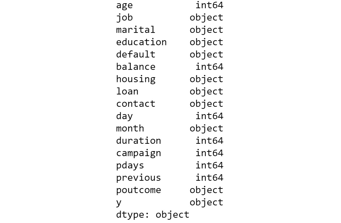
Figure 3.49: Data types
- Convert the ordinal data into dummy data.
As you can see in the dataset, we have two types of data: the numerical data and the ordinal data. Machine learning algorithms need numerical representation of data and, therefore, we must convert the ordinal data into a numerical form by creating dummy variables. The dummy variable will have values of either 1 or 0 corresponding to whether that category is present or not. The function we use for converting ordinal data into numerical form is pd.get_dummies(). This function converts the data structure into a long form or horizontal form. So, if there are three categories in a variable, there will be three new variables created as dummy variables corresponding to each of the categories.
The value against each variable would be either 1 or 0, depending on whether that category was present in the variable as an example. Let's look at the code for doing that:
"""
Converting all the categorical variables to dummy variables
"""
bankCat = pd.get_dummies
(bankData[['job','marital',
'education','default','housing',
'loan','contact','month','poutcome']])
bankCat.shape
You should get the following output:
(45211, 44)
We now have a new subset of the data corresponding to the categorical data that was converted into numerical form. Also, we had some numerical variables in the original dataset, which did not need any transformation. The transformed categorical data and the original numerical data have to be combined to get all of the original features. To combine both, let's first extract the numerical data from the original DataFrame.
- Now, separate the numerical variables:
bankNum = bankData[['age','balance','day','duration',
'campaign','pdays','previous']]
bankNum.shape
You should get the following output:
(45211, 7)
- Now, prepare the X and Y variables and print the Y shape. The X variable is the concatenation of the transformed categorical variable and the separated numerical data:
# Preparing the X variables
X = pd.concat([bankCat, bankNum], axis=1)
print(X.shape)
# Preparing the Y variable
Y = bankData['y']
print(Y.shape)
X.head()
The output shown below is truncated:

Figure 3.50 Combining categorical and numerical DataFrames
Once the DataFrame is created, we can split the data into training and test sets. We specify the proportion in which the DataFrame must be split into training and test sets.
- Split the data into training and test sets:
# Splitting the data into train and test sets
X_train, X_test, y_train, y_test = train_test_split
(X, Y, test_size=0.3,
random_state=123)
Now, the data is all prepared for the modeling task. Next, we begin with modeling.
In this part, we will train the model using the training set we created in the earlier step. First, we call the logistic regression function and then fit the model with the training set data.
- Define the LogisticRegression function:
bankModel = LogisticRegression()
bankModel.fit(X_train, y_train)
You should get the following output:

Figure 3.51: Parameters of the model that fits
- Now, that the model is created, use it for predicting on the test sets and then getting the accuracy level of the predictions:
pred = bankModel.predict(X_test)
print('Accuracy of Logistic regression model'
'prediction on test set: {:.2f}'
.format(bankModel.score(X_test, y_test)))
You should get the following output:

Figure 3.52: Prediction with the model
- From an initial look, an accuracy metric of 90% gives us the impression that the model has done a decent job of approximating the data generating process. Or is it otherwise? Let's take a closer look at the details of the prediction by generating the metrics for the model. We will use two metric-generating functions, the confusion matrix and classification report:
# Confusion Matrix for the model
from sklearn.metrics import confusion_matrix
confusionMatrix = confusion_matrix(y_test, pred)
print(confusionMatrix)
You should get the following output in the following format; however, the values can vary as the modeling task will involve variability:

Figure 3.53: Generation of the confusion matrix
Note
The end results that you get will be different from what you see here as it depends on the system you are using. This is because the modeling part is stochastic in nature and there will always be differences.
- Next, let's generate a classification_report:
from sklearn.metrics import classification_report
print(classification_report(y_test, pred))
You should get a similar output; however, with different values due to variability in the modeling process:

Figure 3.54: Confusion matrix and classification report
Note
To access the source code for this specific section, please refer to https://packt.live/2CGFYYU.
You can also run this example online at https://packt.live/3aDq8KX.
From the metrics, we can see that, out of the total 11,998 examples of no, 11,754 were correctly classified as no and the balance, 244, were classified as yes. This gives a recall value of 11,754/11,998, which is nearly 98%. From a precision perspective, out of the total 12,996 examples that were predicted as no, only 11,754 of them were really no, which takes our precision to 11,754/12,996 or 90%.
However, the metrics for yes give a different picture. Out of the total 1,566 cases of yes, only 324 were correctly identified as yes. This gives us a recall of 324/1,566 = 21%. The precision is 324 / (324 + 244) = 57%.
From an overall accuracy level, this can be calculated as follows: correctly classified examples / total examples = (11754 + 324) / 13564 = 89%.
The metrics might seem good when you look only at the accuracy level. However, looking at the details, we can see that the classifier, in fact, is doing a poor job of classifying the yes cases. The classifier has been trained to predict mostly no values, which from a business perspective is useless. From a business perspective, we predominantly want the yes estimates, so that we can target those cases for focused marketing to try to sell term deposits. However, with the results we have, we don't seem to have done a good job in helping the business to increase revenue from term deposit sales.
In this exercise, we have preprocessed data, then we performed the training process, and finally, we found useful prediction, analysis of metrics, and deriving strategies for further improvement of the model.
What we have now built is the first model or a benchmark model. The next step is to try to improve on the benchmark model through different strategies. One such strategy is to feature engineer variables and build new models with new features. Let's achieve that in the next activity.
Activity 3.02: Model Iteration 2 – Logistic Regression Model with Feature Engineered Variables
As the data scientist of the bank, you created a benchmark model to predict which customers are likely to buy a term deposit. However, management wants to improve the results you got in the benchmark model. In Exercise 3.04, Feature Engineering – Creating New Features from Existing Ones, you discussed the business scenario with the marketing and operations teams and created a new variable, assetIndex, by feature engineering three raw variables. You are now fitting another logistic regression model on the feature engineered variables and are trying to improve the results.
In this activity, you will be feature engineering some of the variables to verify their effects on the predictions.
The steps are as follows:
- Open the Colab notebook used for the feature engineering in Exercise 3.04, Feature Engineering – Creating New Features from Existing Ones, and execute all of the steps from that exercise.
- Create dummy variables for the categorical variables using the pd.get_dummies() function. Exclude original raw variables such as loan and housing, which were used to create the new variable, assetIndex.
- Select the numerical variables including the new feature engineered variable, assetIndex, that was created.
- Transform some of the numerical variables by normalizing them using the MinMaxScaler() function.
- Concatenate the numerical variables and categorical variables using the pd.concat() function and then create X and Y variables.
- Split the dataset using the train_test_split() function and then fit a new model using the LogisticRegression() model on the new features.
- Analyze the results after generating the confusion matrix and classification report.
You should get the following output:

Figure 3.55: Expected output with the classification report
The classification report will be similar to the one shown here. However, the values can differ due to the variability in the modeling process.
Note
The solution to this activity can be found at the following address: https://packt.live/2GbJloz.
Let's now discuss the next steps that need to be adopted in order to improve upon the metrics we got from our two iterations.
Next Steps
The next obvious question we can ask is where do we go from all of the processes that we have implemented in this chapter? Let's discuss strategies that we can adopt for further improvement:
- Class imbalance: Class imbalance implies use cases where one class outnumbers the other class(es) in the dataset. In the dataset that we used for training, out of the total 31,647 examples, 27,953 or 88% of them belonged to the no class. When there are class imbalances, there is a high likelihood that the classifier overfits to the majority class. This is what we have seen in our example. This is also the reason why we shouldn't draw our conclusions on the performance of our classifier by only looking at the accuracy values.
Class imbalance is very prevalent in many use cases such as fraud detection, medical diagnostics, and customer churn, to name a few. There are different strategies for addressing use cases where there are class imbalances. We will deal with class imbalance scenarios in Chapter 13, Imbalanced Datasets.
- Feature engineering: Data science is an iterative science. Getting the desired outcome will depend on the variety of experiments we undertake. One big area to make improvements in the initial model is to make changes to the raw variables through feature engineering. We dealt with feature engineering and built a model using feature engineered variables. In building the new features, we followed a trail of creating a new feature related to the asset portfolio. Similarly, there would be other trails that we could follow from a business perspective, which have the potential to yield more features similar to what we created. Identification of such trails would depend on extending the business knowledge we apply through the hypotheses we formulate and the exploratory analysis we do to validate those business hypotheses. A very potent way to improve the veracity of the models is to identify more business trails and then build models through innovative feature engineering.
- Model selection strategy: When we discussed parametric and non-parametric models, we touched upon the point that if the real data generation process is not similar to the model that we have assumed, we will get poor results. In our case, we assumed linearity and, therefore, adopted a linear model. What if the real data generation process is not linear? Or, what if there are other parametric or non-parametric models that are much more suitable for this use case? These are all considerations when we try to analyze results and try to improve the model. We must adopt a strategy called model spot checking, which entails working out the use case with different models and checking the initial metrics before adopting a model for the use case. In subsequent chapters, we will discuss other modeling techniques and it will be advisable to try out this use case with other types of models to spot check which modeling technique is more apt for this use case.
Summary
In this chapter, we learned about binary classification using logistic regression from the perspective of solving a use case. Let's summarize our learnings in this chapter. We were introduced to classification problems and specifically binary classification problems. We also looked at the classification problem from the perspective of predicting term deposit propensity through a business discovery process. In the business discovery process, we identified different business drivers that influence business outcomes.
Intuitions derived from the exploratory analysis were used to create new features from the raw variables. A benchmark logistic regression model was built, and the metrics were analyzed to identify a future course of action, and we iterated on the benchmark model by building a second model by incorporating the feature engineered variables.
Having equipped yourselves to solve binary classification problems, it is time to take the next step forward. In the next chapter, you will deal with multiclass classification, where you will be introduced to different techniques for solving such problems.