
Drill down
Use tree diagrams to deconstruct any problem
The only people who see the whole picture are the ones who step outside the frame.
Salman Rushdie, The Ground Beneath Her Feet
BENEFITS OF THIS MENTAL TACTIC
Breaking data down into its components helps you structure projects, find important sources of value and identify root causes. Tree diagrams have stood the test of time to be the key visualisation tools for this. They prompt you to think through the relationships between parts and help you with communicating complex matters. They enable you to ask more useful questions such as “Is what I’m observing an extreme case, or average?” and form hypotheses about the rest of the population in a sample. As a result, they can help find value that would have remained hidden.
Tree diagrams are a useful tool when:
- understanding the drivers of cost and revenue for a business
- designing a work plan for a project
- identifying the failure modes of a product or software
- hypothesising about root causes
- diagnosing a disease, given symptoms
- understanding and influencing value drivers (revenues, profits, costs)
- prioritising components of a problem to solve
- thinking through arguments logically, assessing necessary and sufficient conditions
- visualising multi-stage outcomes and product variations
- mapping out probabilities.
USE TREE DIAGRAMS TO DECONSTRUCT ANY PROBLEM
Let’s say you’ve taken stock of your cognitive inventory. You’ve thought hard about the legitimacy of the beliefs you hold, and you are ready to uncover any potential blind spots. You have taken into account any cognitive biases that distort your clear thinking, and you’ve learned about the conditions required for data to be trustworthy, such as sample size and representativeness.
Now it is time to analyse your dataset: to peel back the layers of the onion. The primary way to do so is through tree diagrams.
Tree diagrams (or driver trees as they are sometimes known) help break down complex problems into their individual parts, equations into their factors and goals into their components. They also come in handy if you are trying to categorise or segment a market or customer type. Trees are the manager’s favourite tool to graphically structure thinking. Just as a tree is made up of multiple levels – a trunk, branches, twigs and leaves – the visual tree diagram has similar features.
By their nature, tree diagrams prompt you to be comprehensive. They capture all of the components that make up the issue being investigated. Trees allow you to zero in on the factors that are or could be responsible for the behaviour (or outcome) you observe. For example, let’s say you stroll outside your home one morning and your car won’t start. There could be myriad causes. A tree diagram won’t get your car started again but it might help you figure out what’s going wrong.
Developed in 1962 by H.A. Watson of Bell Labs, the tree diagram found its initial use as a fault tree. Fault trees visualise failure paths within a system and make it easy to find problems, test reliability and assess safety.
Let’s look at an example of a fault tree: identifying the reasons for your car not starting. What could be the potential reasons for the car’s inability to start? First-level branches divide the problem into user, mechanical and electrical errors. On the second level, each of those categories further divide into a number of separate reasons.

CLARIFYING PRIORITIES FOR FURTHER ANALYSIS
Let’s start with an example from the financial world. In typical business situations you are interested in the key drivers to increase or decrease a particular value, say revenues or costs.
Here’s a simple driver tree that adds up costs for a fictional airline, Dhar Airways.

Or take a look at the driver tree below which focuses on website traffic and generated revenues. Note that this tree could have been designed in a more complex way, depending on the question you are trying to answer.

Trees like the one illustrated can help you distinguish important and irrelevant drivers as well as point you towards the factors that are most likely to cause the effect you are interested in (in this case, revenues). They also help you understand where the opportunity lies. It could be that you’ve only reached a tiny number of your target group (revealed by % penetration) or it could be that revenue from advertisements is quite high, but from sales is tiny.
STRUCTURING HIERARCHIES
Let’s start with the most straightforward application: designing a work plan for a project. The different levels of a project could be:
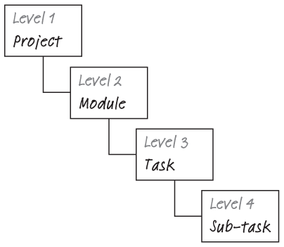
The completion of all work packages is necessary for a task to be completed. The completion of all tasks is necessary for a module to be completed, and so on.

As a graphic way of depicting hierarchies, tree diagrams are also widely used for depicting organisational charts or structures of departments and offices.
CHECKLIST
How to plant a tree
 DECIDE ON VERTICAL OR HORIZONTAL LAYOUT
Trees are typically built from top to bottom or from left to right. Except for space limitations on the paper in front of you, there are no rules as to what layout to use. We tend to use top-to-bottom trees for breakdowns of modules, products or failure modes. For breakdowns of quantitative structure or causal relationships, we typically use left-to-right tree charts.
SKETCH OUT THE TREE
Start by writing the theme or question at the top (or left) of the diagram. Create the first sub-level of branches by asking yourself which factors add up to whatever you wrote at the top.
VERIFY THAT THE TREE IS MECE – NO OVERLAPS, NO GAPS
You might have heard of the abbreviation MECE (pronounced mee cee). It stands for mutually exclusive, collectively exhaustive. It is a helpful framework to break down a bigger issue into its parts. First, the elements of the sub-level must be distinct from each other. There shouldn’t be any overlap. This forces you to carefully look at each box on the sub-level and make sure you haven’t accidently put parts in more than one box. Second, taken together, the total sum of the elements should be sufficient to constitute the higher level. When using a tree to display the five team members of a project group, no one should be left out. The problem or structure should be divided into categories with a finite number of general categories (boxes on the sub-level).
DEFINE THE FUNCTIONAL DEPENDENCIES
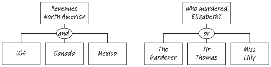
Typically, the functional relationship between any sub-group and the top is ‘and’. For example, if the top box says Revenues in North America, the boxes below should say USA, Canada and Mexico. The implicit relationship between them is ‘and’.
But it can also be ‘or’. For example, for Who murdered Elizabeth? it could be The Gardener or Sir Thomas or Miss Lilly (of course, it could have also been a plot of two or more).
DECIDE ON AN ADEQUATE LEVEL OF DEPTH, THEN STOP
Trees can extend over a large number of sub-levels. Typically, trees with a level of three or a maximum of four sub-levels are sufficient to visualise and analyse a problem.
Using trees to de-average
We use averages all the time. There are more than 152 sunny days per year in Seattle. The current life expectancy in Japan is 83.8 years. In 2017, more than 40% of the world’s population owned a smartphone.
There’s nothing wrong with these numbers, but real insights can typically only be gained by breaking down those numbers. As we discussed earlier, averages are a great way to communicate findings but not necessarily an ideal way to truly understand a phenomenon.
Healthcare is one sector where de-averaging is key. Consider Jonathan, Head of Research of a mid-sized company producing dietary supplements. His product development team ran a six-month study to test the efficacy of an all-natural product aimed at lowering blood pressure. The test wasn’t able to show positive effects for the average patient. Instead of simply dismissing the product based on the unsuccessful trial, Jonathan’s team ‘de-averaged’ the study results. They discovered that while not all patients responded positively to the blood pressure supplement, a sizeable number of patients did. By de-averaging by age and gender, he found that men under 40 seemed to benefit most. Armed with this knowledge, the product development team brainstormed ways to reach exactly this segment. This way, they avoided blanketing the market with advertising, as doing so would not only be a waste of expenses, but could potentially even lead to negative word-of-mouth and poor reviews from those whom the supplement didn’t help.
CHECKLIST
How to de-average
START WITH WHAT YOU ALREADY KNOW – THE AVERAGE NUMBER
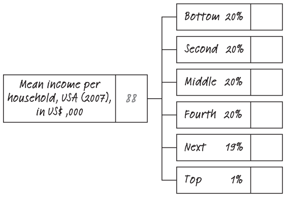
In the following example, the mean income per household is of interest.

HYPOTHESISE ABOUT RELEVANT AND INTERESTING SUB-SEGMENTS
What are you looking for? Let’s say, of particular interest here is the distribution of income by group or percentile of people. This is a common way to look at inequality in a country. Say you are specifically interested in the income distribution of deciles in the population, i.e. ‘buckets’ of 20% of the whole population. You are particularly keen to know the income of the top 1%. As such, your tree will have six branches.
AGGREGATE THE NUMBER
You need to know two variables:
- The average income for each of the groups
- The ‘weight’ of each of the groups
By definition, we already know the weight: it is equivalent to the number of people in each of the branches (the percentage figures in the boxes below). To identify the average income per sub-group, we need to do some research. A good source are international organisations (OECD), universities or research institutes.
The de-averaged mean income per household, broken down into the sub-groups of interest is shown below.
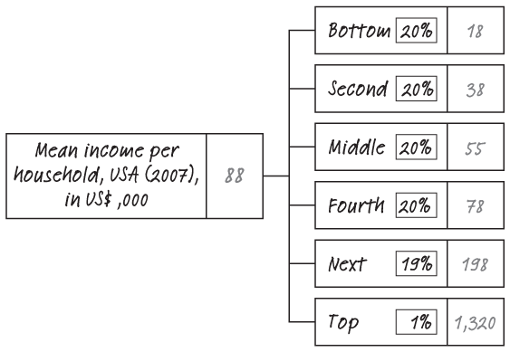
DOUBLE-CHECK THE NUMBERS
To do a double-check multiply each weight with the mean income for that sub-group, and add them all up. They need to total the mean income per household.
USING TREES AND FLOW CHARTS TO IDENTIFY A ROOT CAUSE
Trees are a visual tool that breaks an observed phenomenon down into its parts. But they are also suitable for identifying the root causes of problems. Root causes are the ultimate reason for the existence of a problem. They need to be distinguished from symptoms which are simply signals or indicators of the problem. Alleviating symptoms will not affect the root cause. Without tackling the root cause directly, similar symptoms will arise in the future. Let’s look at a medical example: a symptom could be a sore throat, a cough or a runny nose. The actual root cause might be an infection. Treating the symptoms will help the patient feel better in the short term: an aspirin will typically reduce these uncomfortable symptoms, but will do nothing to fight the problem’s root cause, or in this case cure the illness.
Enter root cause analysis, also known as the ‘five-why-analysis’ or a cause map. The root cause analysis combines visual thinking with the structured approach of asking “Why?” repeatedly. Here’s a simple linear example, analysing the root causes for a student having received a bad grade.

CHECKLIST
Finding root causes
CLEARLY DEFINE THE PROBLEM
Refer to Chapter Zero for more information. Start by writing down the issue or problem in the box to the very left. The empty black boxes will each become building blocks of the analysis.

WRITE DOWN THE CAUSES
Then proceed with writing down the causes for each of the previous effects, constantly asking why it happened as you proceed with filling out the boxes on the right.

Connect each of the boxes with an arrow. The arrow has two different meanings:
- From left to right, the arrow prompts the question why this effect happened.
- From right to left, you can substitute the arrow with ‘was caused by’.
OBSERVE THE CAUSES
As you continue with the analysis, you will notice that, many times, the causal mesh isn’t as linear as in the example shown. Instead, effects can have multiple causes in one of the following two ways:
- Both causes were required to bring about the effect (and).
- Either cause was required to bring about the effect (or).
Here’s a simple example. To start a fire, you need fuel (tinder, wood, petrol) and an initial spark or a flame. But to stop a fire, you can either withdraw fuel or oxygen.

Using logical operators such as or and and is closely related to the concept of necessary versus sufficient conditions.
- Necessary conditions: we can talk of fuel (tinder) and the fire source (spark) as each being necessary for the fire to start. Only both of them taken together are sufficient for the fire.
- Sufficient conditions: for the fire to stop, each of the displayed reasons in itself is sufficient. Either you withdraw the fuel or the oxygen – you don’t have to do both to stop the fire.
Identifying and working towards fixing the root causes, instead of focusing on the symptoms or first-order effects allows you to tackle problems more effectively and sustainably.
FURTHER EXAMPLES
Optimising your recruiting pipeline
Running a young but growing start-up, Alyssa’s first priority is to increase the size of her team with skilled and ambitious talent. Let’s say she needs to hire 20 developers over the course of the next month. She’s already pulled a number of levers to market the open positions. She has posted on online job boards, social networks such as LinkedIn and local blackboards frequented by developers in areas such as campus cafeterias. And it worked – she has received a number of applications, with varying quality. Using a tree diagram, Alyssa de-averaged the stream of applications and broke them down by channels. To do this, she asked every applicant invited to an interview to fill out a short survey. This allowed her to identify the channels with particularly high-quality applicants, and double-down on those.

THE BOTTOM LINE
Problems and data are often complex and messy. Tree diagrams provide a useful way to add structure to your thinking and give you a useful means of communication. Trees help you break down a trend or dynamic into their drivers, de-average aggregated numbers, find the root cause of a problem, or structure a presentation, project or vacation. Tree diagrams require you to think MECE (mutually exclusive, collectively exhaustive), and allow you to understand problems and data in a much deeper and clearer way.