
Explore your data
Gather, scrutinise and visualise information to discover insights
The goal is to turn data into information, and information into insight.
Carly Fiorina, former CEO of Hewlett-Packard Co
BENEFITS OF THIS MENTAL TACTIC
When we first set out to examine or resolve a problem, we naturally start to look for evidence. When we do, we often jump at the first clue. This is misdirected – if your data does not do a reasonable job of reflecting reality, you risk missing the point entirely.
We are often consumers of data, rather than direct producers of analysis. You are typically critically examining someone’s output, rather than compiling it yourself. So the checklist looks a little different – it’s a guide to what questions to ask and when.
GATHER, SCRUTINISE AND VISUALISE INFORMATION TO DISCOVER INSIGHTS
When should you start a company?
There is a pervasive belief in Silicon Valley that the best technology CEOs are the youngest. They are capable of the most original ideas, can disrupt existing industries and are prepared to take the biggest risks. Pause for a moment and imagine a successful technology CEO. What do they look like? I bet they’re wearing jeans and sneakers, and they are young. Very young. This is an extremely common assumption. So common, in fact, that major investors and venture capitalists have started to look with some suspicion upon CEOs older than about 30. Paul Graham, co-founder of leading incubator Y-Combinator, told The New York Times: “The cut-off in investors’ heads is 32.”34

Is this what a CEO looks like?
This assumption makes some sense. We can all readily summon an image of a superstar founder like Mark Zuckerberg, who founded Facebook from his Harvard dorm room, or Sergey Brin, who co-founded Google at 25. The problem with drawing inferences from these readily accessible data points is that they turn out to be totally unrepresentative and easily refuted by data. Here we will illuminate why we often struggle to use quantitative evidence to make persuasive arguments.
We will return to our CEO friends in a moment. First, we want to give you the tools to gather data correctly – and make sense of it. These tools will help you to overcome the biases we have just discussed, opening the way for more rational and objective decision making.
One of the first steps in making consistent, high-quality decisions is getting access to, and using, the data that will help you formulate an objective point of view. Many of us think that we have a good handle on how to access, manipulate and make sense of data. The evidence suggests otherwise: we don’t think clearly and carefully about problems, even when lots of money is on the line. We don’t design structured, data-driven approaches to solving problems, even when we could. As Paul Graham put it in the same interview: “I can be tricked by anyone who looks like Mark Zuckerberg.”35
Back to the CEOs. It turns out that the wildly successful young CEO is a myth. Here’s where four talented, quantitatively minded researchers come in: Pierre Azoulay, Benjamin Jones, J. Daniel Kim and Javier Miranda. They’d also looked around at the magazine covers trumpeting CEOs in their twenties or start-up founders in their teens. After examining the winners of a prominent start-up competition, they concluded that the winners were, on average, 29.36 The judges of this competition are savvy, sophisticated investors, who must know what they are doing. Wrong.
Using data from the United States Census Bureau, the researchers examined the average age at which Americans founded a business. It turned out that the average age for starting a business was 42 – more than double the age of 19-year-old Facebook founder Zuckerberg. Furthermore, the researchers found that older entrepreneurs were more likely to succeed beyond their wildest imaginations. Extreme start-up success (defined by being in the top 0.1% of start-ups by employment growth) increased as entrepreneurs aged, all the way until their late fifties. Our entrepreneurial heroes, it turns out, don’t look anything like Mark Zuckerberg. We want to help you stop thinking in terms of single data points (whether one outlier or an average) and start thinking in terms of distributions.
FORMULATE YOUR HYPOTHESIS
Sometimes you’ll be handed a pile of data, such as a quarterly sales report, a bundle of receipts, a list of the GDP growth rates of various countries, and asked to make sense of it. You also might be the one handing someone the data and will then need to check if someone has indeed made sense of it.
To start the process of sense-making, you need to be systematic. As a first step, we urge you to lay out a hypothesis, and use that as the basis for checking your work. Without a hypothesis, you can play around in the data forever without ever really making progress.37
You should think about data analysis as the opportunity to generate insight into one or more very specific questions. The best entry point for that type of exercise is to state a clear hypothesis, which is framed in the form of a proposition, not a question. Imagine that you have some annual sales data about your sales people, some of whom receive an incentive payment for bringing in additional business and others who just receive their fixed salary. You are curious about whether the incentive payment is worthwhile and jot down some ingoing hypotheses (think of these as very early thoughts). A quick list might look something like this.
H1: Sales people sell more when offered an incentive payment
H2: Sales increase in line with an increasing rate of potential incentive payment
H3: The resulting increased sales outweigh the cost of providing the incentive payment
Sometimes when we mentor new or junior staff, they are hesitant to commit to a hypothesis. They are fearful that if the hypothesis is disproven, this will somehow reflect badly on them. We may hear something like: “I don’t want to venture an opinion until I have looked at the data thoroughly” or “It’s too soon to say anything.” We understand, but a hypothesis is a proposition, not an answer or a conclusion. The purpose of stating your hypothesis is to structure and prioritise your analysis. Without it, you could be swimming in data forever. This step is even more important if you won’t be the one performing the analysis, but are the end-consumer. If someone on your team or an advisor is preparing to do this work, it’s critical that you are involved in formulating and refining your hypotheses so that you get what you want from the exercise.
SCRUTINISE YOUR DATA
Even though you’ve developed a number of thoughtful hypotheses, don’t jump right into testing them just yet. You first need to check if your data is actually suitable for that job. The following checklist provides an overview of the questions we typically ask before diving into data sets.
| WHAT TO ASK | WHY IT MATTERS | EXAMPLE | ||
| Is this data set fully representative? | Your data needs to approximate reality. It can do that in one of two ways: | You might have data on every single transaction every customer has ever performed with your company. For your purposes, that can be considered population data. But if, for instance, you only had a record of credit card, but not cash transactions, that would not be representative. | ||
| • | whole population data | |||
| • | random samples. | |||
| If your data does not comprise the whole population of observations or a statistical random sample, it will not be representative. This means it will be not be possible to draw statistically valid inferences from the data. It may still provide helpful insights into the issue that you are wrestling with, but you should be wary. | Sometimes it’s unwieldy, impractical or expensive to try and gather data on a whole population. For example, say you wanted to understand the satisfaction of every employee in the organisation. You could ask every individual or you could ask a random sample of the same employees. The important thing is that the sample approximates your population on dimensions that matter (it has about the same number of women and men as in your total labour pool, representative numbers of older and younger people, and a sample of people from all locations). | |||
| What are the sources of this data set? How was it collected? | Warning signs of data that is likely to be biased or unrepresentative: | Continuing our employee survey example, if you send out a survey to all your employees asking about their satisfaction, you should assume that your responses are representative. Who replies to such surveys? Those who are very satisfied, those who are very dissatisfied, and those who have an interest in the results looking particularly strong or weak. | ||
| • | Self-selected responses: is there any particular sub-group of people who are more likely than others to respond? | |||
| • | Self-reported responses: people have a tendency to answer questions in a way that will be seen favourably by others. | |||
| • | Self-interested analyst: data where the person conducting the research has an interest in the outcome should also be viewed with suspicion. For instance, a study by a cleaning products manufacturer that concludes that the average home is filled with harmful bacteria that can be removed with vigorous use of cleaning products should be treated with suspicion. | Second, if you are asking people what they do versus observing what they do or have done, be warned. As a behavioural economist, one of the axioms Julia lives by is “everyone misleads, without bad intent”. People will tend to overstate their positive behaviours and understate their less-positive ones (this is called the ‘self-serving bias’). Anytime you are relying on self-reported data, you should be looking for risks of self-serving bias. | ||
| • | Intentional responses versus observed behaviors: asking gym members if they intend to exercise during next week is likely to be much less indicative of actual exercise habits than reviewing the logs of members signing into the gym itself (revealed preferences). | For example, if you ask members of heterosexual couples what percentage of the housework each of them does, the total will typically add to much more than 100%. Clearly, observing behaviour or even reviewing household labour diaries here would be much more valuable. | ||
| Who is not captured in this data set?38 | Knowing who or what is missing from your data set is critically important. There are two failure modes to be aware of: | What do these two types of missing data look like? | ||
| • | Data missing at random: think of this as observations that have been excluded from your data set but not in a way that influences the variables you are interested in. | • | Data missing at random: say the point-of-sale machine wasn’t accurately recording transactions in one of your stores one day in May. For that store, you only have 364 days of data. Unless that day is particularly important to the analysis (e.g. the shopping holiday Black Friday), its exclusion probably doesn’t alter your analysis of which stores are most successful. You might be able to supplement this missing data by including the data from the same day in the same store a year prior. | |
| • | Data missing not at random: observations that are missing from your data set in ways that do affect the variables you are interested in. These are systematic biases that will distort the insights you may be able to extract from the data set significantly. | • | Data missing not at random: in our sales data set, online sales in certain states are not captured, only direct sales made by human sales people, as well as online sales in other states. In this case, you need to find a different way to gather the missing data before proceeding. Or you can use it to reach conclusions about your human sales people, but not your online channels. | |
PUT YOUR DATA IN THE BIN
So you’ve reviewed the table on the previous pages and are comfortable with your data. It seems representative, relatively unbiased and fit for purpose. Now let’s put it to good use.
Our brains love what economists call ‘reference points’. These are bits of data that we can latch on to and start to organise our thoughts around. An average is a classic reference point. We all recall from school maths that an average is calculated by dividing the sum of all the values in the set by their number. In that sense, the average is useful. It lets us get an idea of what is about right.
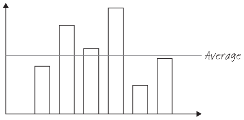
But in another sense, an average is almost no help at all, and the fixation that executives, educators, politicians and analysts have on average performance can be misleading and even dangerous. On the other hand, averages can be an extremely powerful motivational tool. Human beings love comparing themselves to the average and trying to beat it.
As a starting point, let’s consider the example of a biology teacher with a class of 30 students. These students are regularly tested with written exams to determine their understanding of the course material. Of course, some students perform better than others. Here’s a simple plot of their performance on the last exam: the number of students with a particular score on the Y-axis, and the score (out of 100) on the X-axis.

We can start to make some observations about how our data is distributed. We have a small number of students scoring less than 50 out of 100, quite a large number scoring between 60 and 80 and a sizeable amount scoring between 80 and 100. To really make sense of any new data set, the first thing we do is put it into a histogram. We think the histogram is a vital but unloved graph. A histogram immediately lets you start to explore probabilities. It gives you an opportunity to visualise how likely a certain observation (in this case, a score) is.
Check out the histogram for these test scores.
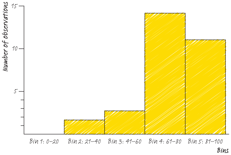
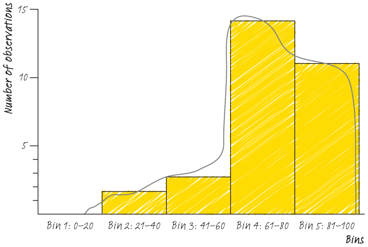
Once we have this histogram, we can immediately examine over and underperformance. We can also start to see how the data is distributed. See below for a rough sketch of the data distribution here. You have a class who performed pretty well on this test, but with some clear under-performers. Imagine repeating this exercise for sales people and revenue generation, or IT support teams and number of requests processed. You can immediately see the power of the histogram in shaping our impressions of data. We can see a good number of students performing very well on the test, a large number performing well and a smaller number (the ‘tail’ struggling).
From looking at the above, you should have the impression that an average (mean) score is not necessarily terribly useful here. But there are a few other scores you might find helpful to know. You might want to understand the range of performance by looking at the minimum and maximum scores. After we’ve plotted our histogram, we immediately run a set of descriptive statistics to help us investigate the story the data is telling. We’re going to do exactly that for this data set on the following page. The goal of all of this work is to help you get a sense of the data, not necessarily to reach any conclusions. For example, we don’t know from the above histogram whether the test was difficult or easy, whether the worse-performing students were confused or ill or just distracted after lunch. Once you have your histogram, the next step should be a ‘five-number summary’.
USING DESCRIPTIVE STATISTICS
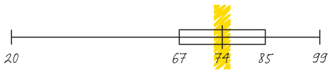
The five-number summary is a simple tool to help you explore your data one step further. For this data set, it looks like this.
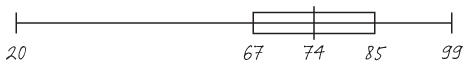
The diagram is known as a ‘box and whiskers’ plot. It’s another under-rated graph, and powerfully visualises your data. In a box and whiskers plot, five things are on display:
- The median, or the score at the midpoint of your distribution. It’s always helpful to take the median of a dataset as well as the average, since it’s less sensitive to outlier values (e.g. a very high or a very low score).
- The minimum observation in the data set (in this case, our unfortunate student scoring 20).
- The maximum observation in the data set (in this case, our 99% smarty-pants).

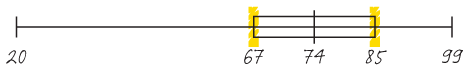
- The first quartile of the data set (Q1) and the third quartile in the data set (in this case 67 and 85, respectively).
The data exercises we’ve just described take almost no time. In a small data set, you can perform them by hand like we did here. In a large data set, data analysis packages (Microsoft Excel, SPSS, Stata, R) will allow you to compute them almost instantly. For those of you who manage people who do the data analysis, asking for these quick descriptive overviews before any other work starts gives you a reality check on the data that you are working with.
These three tools (x–y scatter plot, histograms and box and whiskers plots) can be a powerful help in getting to grips with your data. Imagine for a moment that you are a call centre manager and that the data we used above represents the average minutes of idle time each of your staff has between calls. It is now very easy to identify leaders and laggards and see the variation in performance among your team. In our box and whiskers plot, our teacher has immediately segmented his data. No longer does he have 30 students, but 4 clusters of performers who might each require a different approach.
DISTRIBUTE YOUR DATA
Now that you’ve seen how values in one example are distributed, we want to introduce you to some common distributions (that is, the shapes that our data can take), and to help you anticipate where you might see them.39 By knowing the most common types of distributions and the conditions under which they are most likely to occur, you can make inferences about the likelihood of having observed what you, in fact, did observe. Even more importantly, knowing the typical distributions will help you make a better guess about those data points you haven’t yet observed. Understanding the distribution of your data is how you move beyond single observations to identifying patterns.
Normal distribution
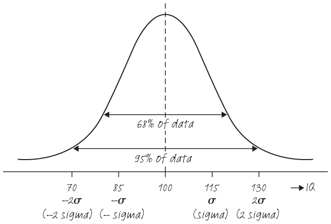
This is the distribution you are most likely to be familiar with (commonly called the ‘bell curve’ for its shape, or also the Gaussian curve after the famous mathematician and physicist Carl Friedrich Gauss). It’s one of the most prevalent distributions that occur in natural history. For example, distribution of human heights or IQs typically take the form of a bell curve. The mean IQ of the population is standardised at 100. This means you can expect 68% of the population to have IQs between 85 and 115, and 95% between 70 and 130. In other words, it’s extremely unlikely for a randomly picked person to have an IQ above 130 or below 70.
Pareto distribution
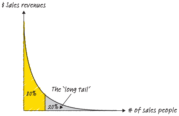
You might have heard of the 80:20 rule. It’s the idea that 80% of the sales are made by 20% of the sales people or that 80% of the complaints are caused by 20% of customers. This broad phenomenon is captured by the pareto principle. When you see a distribution like this, you’re seeing a story where a relatively small number of the inputs are responsible for a relatively large share of the output.
Where can you see this distribution in action? Many communities (especially online – think of Wikipedia or YouTube) are powered by super-users. Super-users are individuals who spend much of their personal time and energy on a platform. Your super-users are your outliers in that they sit outside (sometimes very far outside) the two standard deviations described above. But their impact can be disproportionate.
For instance, in 2015, the well-known blog Priceonomics reported that Wikipedia had some serious outliers: “Of Wikipedia’s 26 million registered users, roughly 125,000 (less than 0.5%) are ‘active’ editors. Of these 125,000, only some 12,000 have made more than 50 edits over the past six months.”40
As you think about your average customer, you should also ask yourself, who are your power-users and what do they contribute? How well are you serving or appreciating these statistical outliers? Does the change you are contemplating work for them?
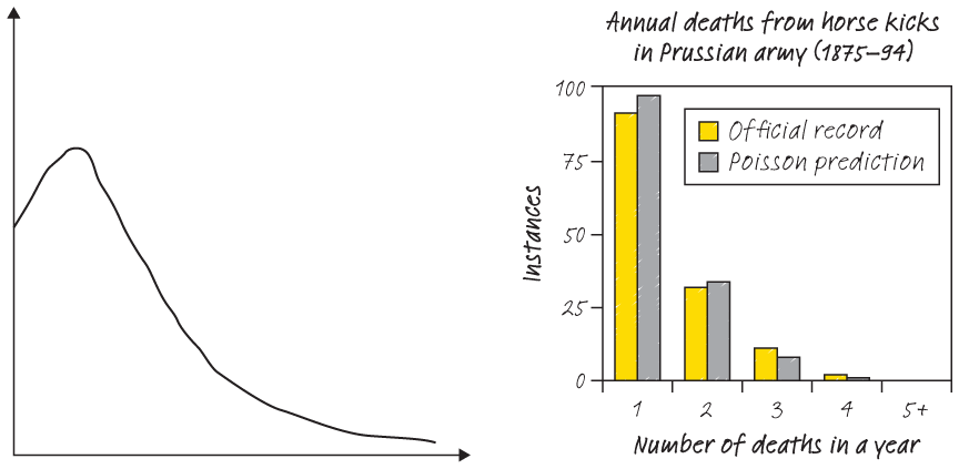
Poisson distribution
Whenever you estimate the number of events per unit of time, area or volume, you will be using the Poisson distribution. One of the first real-world datasets that contained a Poisson distribution was a list of Prussian soldiers accidentally killed by a horse-kick between 1875 and 1894. Other examples include the arrivals of customers in a retail store per hour, the number of customers who call about a problem per month or the number of aeroplane crashes per one million flight hours.
THE BOTTOM LINE
The data you use to kick off your analysis will determine how useful your results are – and whether they are useful at all. Make sure that your data is good quality, and form hypotheses to make sense of your information. Always look for ways to go beyond the average and see the full picture of your data (by looking at descriptive statistics and forming views about the underlying distribution of your data). That’s where the real insight is.