
Chapter 8: Analyzing Your Data
Analysis is the core of the research process. It’s where you transform your raw data (in other words, your observations about what users did or said) into insight and ideas. It’s where you organize your evidence and agree upon a shared understanding of the facts. It’s the foundation of good design work to follow.

Research cycle: analysis
Despite its importance, analysis is often overshadowed by more flashy parts of the process, such as debrief presentations or the interviews themselves. But it shouldn’t be. It often happens behind closed doors, but it shouldn’t do. Analysis should involve the people who will use the research – such as product managers, designers, developers and marketing colleagues – not shut them out.
In this chapter, we’ll take you through a more systematic way of doing what we all do on a daily basis: making sense of the world as we encounter it. You don’t need a particular academic background or theoretical framework to do this kind of analysis, but it can appear to be intimidating if it doesn’t have a structure. If you plan your activity and approach it step by step though, you don’t need to worry.
Why Bother?
You’ve finished interviewing, and you want to get on and use what you’ve learned. You feel like you’ve already got some of the answers in your head. In those circumstances, analysis can feel like it’s an unnecessary extra hurdle, getting in the way of your progress. But if you skip it, you’re missing out. Here are six good reasons for spending time on analysis:
- Just because you have a lot of data, doesn’t mean you’ve digested it. You need to understand it before you can make good decisions with it.
- It will stop you from feeling overwhelmed. You might have a sense of what’s going on, but you need to organize your observations. When we feel overwhelmed, we have a tendency to jump to conclusions based on the most vivid, memorable evidence.
- You saw what happened, but you still need to figure out why it happened. If you don’t do the analysis, you won’t be able to separate out different causes, and you won’t know what to act upon.
- You need to organize examples of compelling evidence to make your case to others. To a skeptical audience, your off-the-cuff reflections won’t convince them to change their minds. Analysis allows you to process the data into assets that can be shared with the team.
- You may need to use your data generatively, to come up with ideas. If you want to get beyond the obvious and avoid a rerun of ideas that have been tried before by others, you’ll need to really dig into the data.
- Involving your colleagues in the process of analysis can help them to weed out personal bias and build team spirit around the research project.
Phases of Analysis
See analysis as an ongoing activity throughout the project. It begins right at the start, and runs all the way to the end, when you’ve got the insight, evidence, ideas and story you need. There are five distinct phases for analysis, and if you base your approach on these phases, you’re less likely to get lost. You can be realistic about whether you’re on track, and avoid wasting valuable time.
The first three phases are non-negotiable. You’ll have to do these to some extent, even if your project is very short.
- Make a plan. You’ll do this right at the start of your project, and return to it when you get into fieldwork.
- Absorb the data. After fieldwork, you’ll need to tidy up the data you’ve collected into a usable shape. This phase focuses on organizing and digesting the evidence.
- Find patterns. Sift the data to uncover common themes and explanations. This phase focuses on generating the insights.
Phases 4 and 5 are optional, depending on the outputs you need from the project.
- Use patterns. Reconfigure the patterns you’ve uncovered to generate new ideas. This phase focuses on producing ideas.
- Create your narrative. Rework the insights and evidence as a communication. This phase is about creating a story.
The reason they’re optional is that research projects aren’t always about generating new ideas, or producing communications. If you’re working in an agile environment, and you just need to get answers and share them informally or add them to a backlog, then you can skip phases 4 and 5.
Cherry-picking Analysis Activities
Once you understand which phases you need to include, you can start to figure out what you’ll be doing in each of them. It’s a good idea to take a modular approach: depending on what you’re trying to achieve, and how long you’ve got, you can keep it simple by choosing one quick module, or go into more depth by going with multiple modules in each phase. The different modular activities are described later in this chapter. Taking this approach has several benefits:
- You can choose the mix of modules that best fit your needs, objectives and experience.
- You can invent or add new activities and slot them alongside your existing favourites.
- If analysis ever starts to feel stale or formulaic, you can mix things up to keep it fresh!

Analysis modules
As an illustration of how this works, you can see the mix of modules for three example projects below:

Small discovery project

Large discovery project

User test
How Much Time Do I Need?
The more research sessions you’re running, and the more data you’re dealing with, the greater the stakes when it comes to analysis. It means there’s much more to discover, but it also means it’s easier to become lost. It’s obvious, but you should allow much more analysis time for a major discovery research project (where you want to understand behaviour in depth, and may hope to generate novel ideas) than you would do for a quick round of user testing.
Sometimes, of course, you just don’t have much time for analysis. Where that’s the case, you need to be hyper-organized before you start interviewing: you can see a time breakdown for this kind of research in the table below.
| Stage | Discovery research | User testing | Quick & dirty day of research |
|---|---|---|---|
| Planning | An hour | 15 minutes | 5 minutes |
| Absorb the data | Equivalent of the research session time (ie, one hour of interview equals one hour of re-listening), plus one to two days for other activities | An hour to collate notes | None. All of the data will be collected in a pre-prepared format (eg, a spreadsheet or the output of a workshop activity), which makes it easy to use immediately |
| Finding patterns | Two days | Two hours | One hour, on the same day |
| Working with patterns | One to two days | One to two hours (optional) | One to two hours (optional) |
| Creating a narrative | Two hours | Half an hour | Half an hour |
For a large discovery project, it can be helpful to think of the analysis phase as a distinct sprint, and plan accordingly.
Phase 1: Make a Plan
The purpose of this phase is to make sure you’re getting maximum benefit out of the rest of the project. You’ll make sure that you’re recording the data in a format that makes it easy to work with, and you’ll make best use of the time you’ve got for analysis afterwards.
- Who’s involved: the core project team, including designers and researchers.
- How long: 5 minutes for a small, simple project, to two hours for a more complex discovery project.
- Where to do it: in the project space, or a meeting area with a large wall or whiteboard.
Activities
You’ll need to work through a series of activities. If there are several people in the team, it can be best to do this in a structured way, as a mini-workshop. If it’s just one or two of you, it can be more informal.
- First, be clear about your end output. Do you need ideas? A backlog of improvements? A better understanding of your users’ needs? A business case?
- Secondly, clarify your resources. How much time do you have for analysis after the interviews? What kind of space will you have to work in?
- Third, sense-check the kinds of data you’re going to collect, the equipment you’re going to use, and the evidence you might need (see Chapter 2). Example: you have a hypothesis that customers are ignoring letters from your company because they see them as junk mail. If it’s true, you expect your marketing team to be resistant to the finding. Because you know you will need evidence, you decide it would be helpful to collect photos of participants’ piles of unopened letters. Add a camera to the list of equipment to take with you to the interview.
- Fourth, decide whether you need to generate ideas or not – in which case, you can drop Phase 4, and whether you need to create a story or not – in which case, you don’t need Phase 5.
- Fourth, map out the time available on a wall or whiteboard.
- Now, choose activities to go into those spaces. As a guideline, there’s usually time for two activities in the morning and two in the afternoon. Use a Post-It for each activity. Make this planning process a discussion with the team, as it will help to build consensus and highlight any disagreements about the best way to proceed.

Analysis planning
What to watch out for:
- Analysis planning is also a great time to discuss hypotheses. Doing so at this stage will help you write your discussion guide and plan logistics for interviews.
- Use the session to surface any doubts or misunderstandings about analysis. Expect some of your team to be unfamiliar with the process, or with particular methods.
- The clearer you can be about your analysis approach before you begin fieldwork, the better your notes and data collection will be, especially if you’re relying on other people. Planning well saves time and wasted effort.
- Be prepared to come back to your planning and rethink it as the project goes on. Because your planning is always subject to change, keep it in a format that’s easy to revisit and revise. If you can’t hang on to your project space, take a photo or use software like Trello or Excel.
Phase 2: Absorb the Data
When you finish interviewing, your data probably isn’t in a very tidy format. You may have audio recordings that need to be exported, notes that need to be tidied up or printed, and photos that need to be categorized. If you’ve done more than a handful of interviews, it’s likely that you’ve begun to forget what happened in the first sessions, and can only recall the most recent or vivid participants.
The purpose of this phase is to re-absorb the detail of the data, and to get it into a format that’s easy to work with for the following phases. When you’re finished, you’ll have the detail in your head and also in an external format such as Post-Its, written notes or a spreadsheet.
- Who’s involved: the people who conducted the research, working individually
- How long: extremely variable, from hours to weeks
- Where to do it: somewhere quiet, where you’re less likely to be disturbed
Depending on your requirements, and the time you’ve got available, you’ll want to select some activities from the options below (or others you may prefer). Don’t worry that you haven’t got time for all of them, or even most of them! If you’re in a hurry just choose the quickest ones.
Create a Space
If you don’t already have one, now is a good time to create a project space. Ideally, this would be a whole room, but if not, you can get by with a wall, a whiteboard or a large sheet of brown paper.

Example project space
The purpose of a project space is for the team to be able to immerse themselves in the data and cut out distractions. Handily, it’s also a good way to share your work with curious colleagues as a sort of mini-exhibition for a show and tell (see Chapter 9).
To create your project space, begin by building a stimulus wall, using a selection of the different printed resources available to you. These could include:
- Participant quotes
- Photos of participants or their environment
- Screengrabs
- Leaflets
- The project sample structure
- Infographics or slides
- A map of your travels
- Sketches
- Post-It notes of observations. Don’t feel like you need to be completely exhaustive: a selection is fine. Leave another blank area of wall (at least two metres squared) for working on in the next phase.
If you don’t have a handy wall space, don’t panic. It’s not essential, and you can create an online equivalent using digital spaces like Trello for quotes and observations, and Tumblr for videos and images. However, do be careful of data protection rules when you choose where to upload sensitive information from interviews.
Collate Sources
Even in the simplest project, you’re likely to have data in several different sources or locations. Gather it together.
If you’ve been thorough in your analysis planning earlier, you should already know what types of data you were intending to collect, but you may have added others in the meantime (by opportunistically picking up a leaflet while you were conducting ethnography, for example). You may also have other sources, such as analytics or reports that you could be referring to. Make sure you get what you need from the whole project team, and ask for it in plenty of time. Waiting for your colleague to get back from holiday so you can access their notes is an irritation best avoided!
Reformat
Sadly, the format you found convenient for capturing data is probably not the most convenient format to work with in the analysis. For example, dictaphone recordings may be in a proprietary format, and need converting to MP3. Photos may need printing. Expect to spend some time re-formatting your data: for video content, handbrake.fr is a free and effective tool.
Rejecting Bad Data
It feels somehow wrong to throw away data, but now’s the time to be ruthless. Bad data is your worst enemy: it will lead you to the wrong conclusions. If you’re working with colleagues who don’t have much experience of research, it’s even more important to get rid of it, because they will be tempted to take it at face value.
The main source of bad data in qualitative research is mis-recruitment. If you had a participant who wasn’t part of your target user group, then it’s best to jettison them from your analysis rather than include them just to make up the numbers. Botched questions or activities can also deliver bad data. If your prototype didn’t work then your observations aren’t likely to be helpful, and if you asked a leading question then you should reject the answer too.
Prioritize
By the time you’ve finished interviewing, you’ll probably have many hours of recordings. In all likelihood, you don’t have time to review all (or even most) of them. You need to decide how best to spend the time you’ve got.
The best way to avoid this problem is to have a note-taker present throughout the sessions (see Chapter 6). But if that’s not possible you’ll need to prioritize which to return to. One way to do this is to rate each session out of ten, with a score of ten meaning that it felt like a helpful, fruitful session, and one meaning that it felt like a waste of time. Then, starting with your highest-rated sessions, work through them until it’s time to move on to the next module.
Another way to prioritize is to sort your sessions into three groups:
- Clear and helpful
- Confusing or complicated
- Clear and unhelpful. Having done so, leave enough time to listen to as many as possible from the second group, one or two from the first group, and none from the third group. This might seem counter-intuitive. Why go back to the second group rather than the first? The reason is that you will extract more insight from the sessions that at the time seemed confusing. For the clear ones, your notes are often a sufficient guide.
You can apply these approaches to whole recordings, or to sections of recordings. For example, you may think that the last 20 minutes of a particular recording would be worth watching again, but you can rely on your notes for the rest of the session.
Review Recordings
By re-watching or re-listening to your recordings, you achieve two things. Firstly, you take yourself back to the moment of the interview, rekindling your memories and feelings at the time. Secondly, you’re able to listen more clearly, because you’re not being distracted by thinking about what question to ask next, wondering if the prototype is working, and so forth. In short, reviewing the recordings means that you get more insight out of your research.
It’s up to you whether you review whole recordings, the same section of each recording – for example, the middle 20 minutes – or snippets from different sessions. Mostly, this will be a matter of time and the decisions you’ve made (see previous module). Whatever you decide to do, try to make time to listen to at least five minutes of every recording. The last five minutes is normally best, because the participant will be summing up. It’s amazing how much of a memory boost you’ll get from just hearing a participant’s voice again for five minutes.
What should you be doing while the recording is playing? It’s a bit like the approach to note-taking we described in Chapter 6. Some people like to transcribe in full, others like to do nothing but watch and listen. Our preference is to make handwritten notes on Post-Its. Hand-written because it ensures you only capture the important details, not every single thing that’s said or done. Post-Its because it enables you to use them in affinity sorting later on. You should also be listening out for good quotes, and then either typing them up or creating a timestamp to go back to later.
Improving Your Technique
Listening back to your own interviewing is the single best way you can get better at it. You’ll hear your messy questions and the moments where you interrupted too soon. For this reason alone, you should try it.
Transcribe
Researchers tend to have a love-hate relationship with transcripts. On the one hand, they enable you to scan and make notes more easily than any other format. On the other hand, they can be time-consuming to create manually, and they miss a lot of the important detail of what people actually do, not what they say. So we might consider them for depth interviews, but not normally for user tests.
One time-saving option is to use Google Docs’ voice-typing feature. We find this achieves about 85% accuracy, which is fine for many situations, but because they’re so laborious to make, we wouldn’t normally recommend transcribing interviews, other than the exact wording of quotes that we intended to use later on. However, if you need to, it’s possible to pay a transcription service to produce them for you, or use a time-saving app like otranscribe.com
If you do have transcripts, you can go through and write notes to capture your thoughts and observations on what’s been said. This is a great way to start to generate ideas for the following phase of the analysis process. The ideal scenario is to have someone else create a transcript for you to use in this way while at the same time watching the recording, but this is often prohibitively expensive.

Transcript example, with researcher comments added
What to Watch Out For
- In terms of how long it takes, data preparation is the most variable phase of the process. If you’re not careful, it can eat up your remaining analysis time, and you’ll have nothing left to generate actual insights. In particular, don’t underestimate how long activities like transcription can take. In most cases, it won’t be worth the effort. You can also save a bucket load of time in analysis if you get note-taking right in the first place!
- Data preparation is best done individually and in a quiet space: we try to do it at home, or lock ourselves away in a quiet area of the studio. However, you do need to communicate with your colleagues regularly to ensure you’re all working to the same format and the same timelines, so plan to catch up at least once or twice every day.
- If you’re working in evaluative research mode like user testing, rather than a discovery approach like depth interviewing or contextual research, then note-taking is easier. You can probably fast-forward through this phase rather than spending lots of time re-immersing yourself in the interviews.
Phase 3: Finding Patterns
Your groundwork is done. Now it’s time for the fun part! The purpose of this phase is to go from individual observations (what your individual participants did or said) to patterns and rules (the general conclusions you can draw based on your data).
- Who’s involved: the core project team. Later on, you may chose to involve other people, such as stakeholders and/or service users.
- How long: half a day to two days.
- Where to do it: in a room with plenty of space to move around and stick things onto walls. Ideally, you’ll already have set up a project space in the previous phase. If not, a large meeting room will do. If you can’t have sole use of the space, stick brown paper to the walls first so you can transport your work when you’re finished.
Here are some of the activities you can choose from. Choose those that work best for you, depending on your time and preferences.
Review Objectives or Rolling Hypotheses
Begin phase three by collectively reminding yourselves what your purpose is. If you wrote a shortform brief, now’s the time to read it out loud to the group. If you created research objectives, you should summarize these instead. If you started with rolling hypotheses, recap them. This phase marks the transition from individual analysis to working as a group, so it’s important that the whole team is present, so you can read your objectives out loud and discuss them if necessary.
Brain Dump
It can be helpful to begin your group analysis in an unstructured way. Just chew the fat about your experiences of conducting the research, and your top-of-mind impressions of what happened.
Don’t:
- Worry about keeping to the data. It’s fine to digress into your own feelings about the research, conclusions you’ve drawn, or related topics.
- Try to take structured notes. Let the conversation flow.
- Keep strictly to the time. This is really a warm-up activity. 30 minutes is plenty.
- Let everyone speak. The person who’s managing the timing should also act as moderator, if one or two people are dominating the discussion.
- Pay attention to the topics and concepts that are emerging from the discussion. These will be useful later.
- Capture the highlights. While written notes get in the way, there may be an interesting point raised in the course of the conversation.
Who Were the People?
This is a great exercise to bring to life the participants and reduce bias in your analysis, especially if not everyone in the analysis team was present at all of the research sessions.
Here’s how it works. For each participant, use three Post-Its.
- Post-It 1: a participant number, first name, and three to four immediate observations about them.
- Post-It 2: the participant’s needs. Again, use three to four bullet points.
- Post-It 3: finally, three to four participant pain points. Work as a group, with the person who did the interview describing the participant, someone else writing the Post-Its, and the rest of the team acting as the audience and asking questions to clarify.
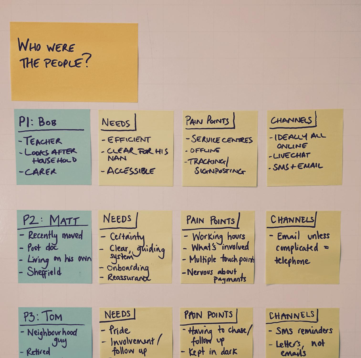
Who were the people?
Take about five minutes per person. It’ll probably feel like a drag when you’re raring to get going, but there are good reasons for taking the time to do it. It ensures that all participants are represented equally in your analysis, not just the loudest or most memorable. It begins to generate patterns, as you observe the themes that keep re-emerging in your Post-It summaries. And it gives you a tool for sense-checking hypotheses later on, as you can easily refer back to the individuals you’ve posted on the wall.
Conceptual Diagrams
Through your earlier activities and hypotheses, you’ll have started to get a sense of themes emerging. Let’s attempt to visualize those patterns.
The key question here is, “How do these two observations relate to each other?” Your task is to draw these relationships, and you can do this in a variety of ways: on a spectrum, 2x2 matrix, Venn diagrams, concentric circles, timeline, whatever works for you. I wouldn’t try to pre-judge which you’ll use either, just let it emerge as you draw (and throw away) your initial sketches.

Conceptual diagrams, roughly drawn
Taking a spectrum as an example, here’s how to approach the activity:
- First, draw a line, and give the end points provisional labels (eg, ‘cautious’ at one extreme, and ‘loves risk’ at the other).
- Add your participants as marks on the spectrum.
- As you go along, debate and challenge:
- Where should participants be placed?
- What should the labels at the extremes say?
- Is this spectrum useful?
- Are you mashing together two different variables in one spectrum (for example, does our ‘cautious - loves risk’ spectrum mask a ‘novice - expert’ spectrum within it?).
- Is the format you’ve used the right one? Perhaps you’d be better with a 2x2 grid instead?
- It can also help to label different parts of the spectrum.
- Force yourselves to create several different spectrums, and ask which of them provides the best explanation or insight.
The process is similar for all the other kinds of visualization. If you’re doing it right, then quite a lot of good-natured arguing is involved. A colleague of ours uses the phrase ‘strong opinions, lightly held’, and I think that’s the perfect mentality for this kind of work. Be vocal, but be prepared to be persuaded.
Once again, when you’ve done your visualizations, stick them up on the wall. Your project space should be filling up nicely now.
Maps & Sketches
As well as abstract conceptual diagrams, it can also be useful to draw maps and sketches. For instance, if your work involves designing digital products in stores, you might want to draw a map to show how customers move around the floor. If you’re designing an app, you might want to draw an idealized version of a screen for a particular user – not because you’re planning to implement that design, but because it will help you think about what they need.
Tablecloth
A more formal, structured approach involves creating a special sort of matrix called a tablecloth. In the past, researchers would spread a large sheet of paper on a table and divide it into columns and rows, hence the name. Nowadays, you have the option of using a spreadsheet instead; both approaches have their advantages.
To create the tablecloth, add a column for each participant (or group of participants if you’ve got a larger sample). In the rows, add the variables you’re interested in. These might be answers to particular questions, observations on whether or not participants were able to complete individual tasks, or sections from your discussion guide. Once you’ve got your matrix, populate each cell: this can simply be a yes/no if you’re interested in task completion, or a paragraph description if you’re wanting to conduct more detailed analysis.
The benefit of a tablecloth is that it allows you to spot patterns and easily make relatively structured comparisons between groups. If this is one of your main objectives (for example, if you want to compare users in different markets, or customers versus non-customers), then a tablecloth can really help. Bonus feature: if you opt for a spreadsheet, you can use conditional formatting to help highlight patterns, creating a ‘rainbow tablecloth’.
Using a Spreadhsheet
Bonus feature: if you opt for a spreadsheet for your tablecloth, you can use conditional formatting to help highlight patterns, creating a ‘rainbow tablecloth’.
Affinity Sort
Affinity sorting is one of the most popular methods for making sense of data from qualitative research. It’s actually very simple:
- First, you need your observations on Post-Its, which you should have done either when you were actually observing the interviews, or in the data preparation phase when you were reviewing recordings or notes. Remember: one observation per Post-It. Don’t write an essay on each one.
- Add them to the wall in a jumble. Don’t try to impose any sort of order at this stage. You’ll organize them in a moment.
- Now, as a group, move the Post-It notes into groupings, where you can see common themes between them (see photos below). Work as a group. It’s vital that you discuss your thinking with the team as you go along, because this conversation is the analysis as much as the configuration of Post-Its you end up with.
- Once you’ve got your groups, use a different colored Post-It to give the group a title.
- Finally, you can choose to highlight or prioritize certain groupings as more important than others. We do this using dot voting: each participant gets a small number of colored dots to stick onto the title Post-It, and the votes are then counted.
Affinity sorting is absorbing, and really insightful. Expect to be stumped for the first couple of minutes as you stare at the Post-Its, but after that it’s surprising how quickly an order emerges.
It’s common practice to run the sort more than once, to see what other patterns might emerge. However, be aware that you’re unlikely to be able to do it more than two or three times: your group will get tired, and your Post-Its will lose their stickiness eventually! If you do run another sort, remember to take photos each time.
Affinity sorting has one other benefit. It’s the best way to construct a narrative about the findings, as you’ll see in phase 5.
Use Theory to Help You Understand the Data
Unlike analysis in an academic context, design researchers don’t tend to rely on using a particular theoretical framework to explain the data. Sometimes, though, it can be helpful to lean (lightly) on theory to help find insights. We’ve found it useful to draw on ideas from human-computer interaction, social psychology, anthropology, systems theory, game design and elsewhere.
For example, the anthropologist Mary Douglas’s theory of category outliers was originally intended to explain food taboos in ancient societies. But it’s a great way to think about categorization problems in information architecture, too.
If you take this approach, remember that any theory is there to help you, not get in the way. Don’t worry about using a pick-and-mix approach (the technical term is ‘bricolage’). Whatever you do, don’t get bogged down in debates about whether you’re applying theories correctly or not: just think of them as a toolbox of metaphors that might give you a different perspective on the data. If an idea isn’t useful, ditch it and move on.
Avoid Getting Heavy With Theory When Presenting Your Findings
By all means have fun with theory while you’re doing the analysis, but be aware that it can feel excluding and off-putting for team members who don’t have the same background as you. For the same reason, don’t refer to theory in your debriefing to stakeholders, even if you found it really useful in the analysis. It will confuse your message, and alienate your audience.
Check Your Biases
As you work through some of the activities mentioned above, it’s a good idea to keep checking back on your biases and assumptions. Ideally, the whole team will adopt a culture of doing this for each other, but you can help facilitate it if you set an example and do it to yourself to begin with.
- Consider your cultural biases. For analysis in particular, a diverse team is a good team. Is there something about your own background or experiences that is predisposing you to look at the data in a certain way? You probably can’t avoid this totally, but at least if you’re aware of it you can factor it into your interpretation. It can be easier for other people to spot this, so encourage them to do so, and be grateful rather than defensive if they do!
- Watch out for your cognitive biases. Are you being influenced by the availability heuristic in your interpretation? Are you making attribution errors? Are you at risk of confirmation bias? Cognitive biases are great theoretical tools for analysis in their own right, so it’s worth reading up on them before you begin – there are lots of resources online that explain what all these phrases mean!
- Create and test deductive statements. Although the analysis approaches described above are mostly inductive, it can be useful to use deductive rules to check your working. Whereas inductive conclusions are drawn from observing the same thing happening on a number of occasions, deductive thinking typically follows the pattern if a=b and b=c, a=c. Do this towards the end of phase three, rather than at the beginning. For example, you might work through a thought process like the following: “People on unstable incomes are most interested in the content on homelessness. Therefore people on unstable incomes are concerned about becoming homeless.” with the check “Does our other data support that conclusion?”
What to Watch Out For
- It’s a good idea to take a break between the Absorbing Data and Finding Patterns phases. Overnight is best, but if that’s not possible then take a lunch break or go for a 15-minute walk. These two phases demand very different kinds of mental effort, and you need to refresh yourself before you begin.
- Aim to create a culture of analysis where it’s OK to challenge and be challenged. Try to remove hierarchy within the analysis team, and avoid the debate being dominated by one or two people. If you can foster a spirit of playfulness and a sense of humour, then this will really help people to work to the rule of ‘strong opinions, lightly held’ without feeling defensive or under-appreciated.
- You can’t re-run activities many times: tiredness sets in, and sticky notes lose their stickyness.
- Sometimes it’s possible to over-analyse a particular point. If you feel you’ve got what you need, move on.
- Don’t forget that you’re cherry-picking from these modules, not doing them all. You’ll get diminishing returns from using activity modules that are too similar.
- These activities are immersive, and it’s easy to lose track of time. Have an agenda and appoint one member of your analysis group as timekeeper.
- After each activity, check back on your analysis plan and consider whether you need to change anything.
Phase 4: Working With Patterns
The purpose of this phase is to expand your understanding of your users’ needs through creative activities. If your aim is to generate ideas, it’s particularly important to spend time in this phase, as the playful nature of many of the activities is ideal for generating fresh thinking.
- Who’s involved: the same group who were involved in phase 3.
- How long: half a day to a day.
- Where to do it: in the project area.
This phase flows naturally on from phase 3. In fact, sometimes it can be beneficial to move back and forth between the two phases, so don’t think of them as completely separate. Nonetheless, it’s good to come to these activities fresh, so try to schedule a lunch break or overnight rest between them if you can.
Again, you should cherry-pick modules like the ones below depending on your preference, your objectives, and how much time you’ve got.
Thought Experiments
Thought experiments are a game-like approach to understanding your users’ needs better. The idea here is to achieve insights by manipulating some aspect of your themes, by asking a lot of “what if?” questions
A well-known example of this is the “if this product was magic, what would it do?” question used in product design. But there are lots of what if-style games you can play along the same lines – adding, removing or stretching to understand how that might result in a different outcome.
Some example thought experiments:
- What if cooks didn’t have access to spatulas. What would they use instead, and why?
- What if cooks had someone to help them. What would that person be doing?
- What if cooks were able to build their kitchen specially to create this meal, what would it include/look like?
The purpose of this is to stretch your themes, to give yourself another angle on why people do things the way they do them. But do keep returning to the data to sense-check and challenge your thinking. You may find you want to update or amend your themes and visualizations as a result of this exercise. You can also sketch up the new concepts and metaphors you come up with to decorate your project area.
Extension
A variation on thought experiments, extension involves taking one attribute of your product or experience and greatly exaggerating it or eliminating it. What difference might it make for users?
- What would be missing if there was no sound whatsoever?
- What option would these users choose if money was no object?
Think By Making
The idea of prototyping needs no introduction, but it’s a great way to extend the ideas you’ve developed already and begin to ‘think by making’. Imagine you’ve been researching the TV needs of football fans. If you had to create a personalized homepage for one of your participants, what would it look like? Going through this exercise will help you consider and challenge your findings in greater depth.
Another, more abstract version of this activity is the cereal box. Imagine you were creating the ideal product for your participants. What would the box show on the outside? What would it say about the product? Rather than doing this in words, create an actual ‘cereal box’ in pairs, then compare your results.
Metaphor
A strong, unfamiliar metaphor can be a powerful design tool. At this stage in the analysis process, you’re in a position to try out some new ways of describing users’ relationship to the product. This can be a good activity to use after thought experiments, as metaphors can sometimes emerge in the process.
As an example of metaphor, flat-pack furniture construction is generally communicated as a DIY task. If, in research, you found that some customers enjoyed the challenge of constructing furniture (perhaps comparing it to a jigsaw puzzle), then a new metaphor presents itself: flatpack furniture presented as a rewarding challenge like Lego, rather than a chore. In turn, this metaphor might impact on how you design instructions, on marketing, the store and possibly even the product itself.
What to Watch Out For
- Timing is important at this stage. Spend too long, and it can start to feel forced and stale. Don’t spend long enough, and it can be superficial.
- Don’t forget to capture ideas as you generate them. It can be easy to get swept up in the fun, and lose track of why you’re there.
- Take breaks between activities, and swap around teams and roles so it stays fresh. If it’s a small team, consider hosting one activity each.
Phase 5: Creating a Narrative
In most situations, you’ll want to tell people outside your immediate team about your findings. The key to doing this effectively is to have a clear, logical core narrative that you can use in different media to tell your story.
- Who’s involved: the whole team
- How long: 30 minutes to a day
- Where to do it: in the same area you used for phases 3 and 4
By the time you’re finished, you’ll have a flexible narrative at your disposal:
- It’s compact. You could tell your CEO in two minutes.
- It’s expandable. You can also tell the long version, diving into the detail of particular sections (or not) as required.
- It’s hard to argue with, because it traces a clear relationship between the main points and the evidence that informs them.
Here’s how you do it:
- Return to your affinity sort. You’ve already grouped the individual observations together into findings, and given them titles on a different-colored Post-It note.
- Now, group these into themes. Give them a title too.
- Repeat step 2 until you’ve arrived at a set of 8 or fewer high-level findings.
- Finally, state your conclusion in a single sentence. This should be a logical extension of your themes – ie, because x, y and z are true, we therefore conclude…
- You’ll now have created a pyramid of findings, with the individual data at the bottom, and your conclusion at the top. Incidentally, this is why this approach is known as the ‘pyramid technique’ for creating a narrative.

A pyramid of findings
- Now it’s time to arrange your narrative.
- Start by restating the reason for the research: “We wanted to know whether travellers could use the new app to book hotels…”
- Then state your conclusion: “… and the answer is yes, but there are problems that are affecting conversion.”
- Then state your meta findings (the ones that inform your conclusion): “That’s because a) all the people we tested with were able to find and book accommodation, but b) they struggled to do so and took several wrong turns, and c) they were confused by the terminology and icons used by the app.”
- Easy. If your audience doesn’t want or need to know any more, you can just leave it there. Or, if they are happy with points a) and b), but unconvinced by point c), you can then dig down lower into your pyramid: “The reasons why they were confused were that a) a pin icon isn’t understood to mean ‘map’, b) ‘basket’ is the expected label in place of ‘my rooms’ and c) generally, the site gives little explanation and assumes a lot of knowledge.”
If your audience still wants to know more about c), you can dig down further. And so on. At the bottom of the pyramid are your original observations: your evidence, in other words. So use these quotes, video clips and photos to help tell your story if you need to.

Arranging a narrative from the elements created in the affinity sort
We’ll talk about different ways of sharing your narrative in the next chapter.