
Analysis of Cumulative Measures
Cumulative measures are routinely used for audience analysis. These metrics are distinguished from gross measures because they depend on tracking individual media users over some period of time. Historically, gross measures would summarize use over a week or a month. But with the increased use of meters and server-centric measurement, it is common to see time periods as brief as a session on the Web. As those time periods shrink and the number of cumulative measures grow, it can be difficult know whether a particular measure is technically gross or cumulative. As a rule, if it reflects knowledge of repeat customers or it reports characteristics of average users, chances are it is a cumulative measure.
Ultimately, the technical distinction is less important than what these metrics reveal about audience behavior. While gross measures are often the preferred measure of a program’s or outlet’s popularity, cumulative measures reveal more about audience loyalties and the extent to which people are exposed to advertising campaigns. They also form the basis of some measures of engagement. Analysts sometimes combine gross and cumulative measures to produce hybrid measures.
In this chapter, we identify the standard cumulative metrics used in the more traditional broadcast environment. We then look at a newer generation of metrics born of the Web. We review the concepts of reach and frequency, which are crucial to advertisers, and delve deeper into the concept of audience duplication, which can be a building block for many types of analyses. As we did in the last chapter, we provide some examples of how these metrics can be usefully compared and, finally, demonstrate how cumulative analysis can be used to explain patterns of audience behavior.
Once again, we begin with broadcast-based metrics. These are used to summarize people’s use of radio and most forms of television. They also set a precedent for the measurement of nonlinear media, including the Web-based metrics we review in the following section. Ultimately, the kinds of cumulative analyses that are possible depend on how the data were collected and exactly what information they contain. Most broadcast-based measures were initially derived from samples responding to questions or filling out diaries. The introduction of peoplemeters and servers made it possible to track users on a moment-by-moment basis and for longer periods of time.
Some cumulative measures appear routinely in ratings reports or the spreadsheets analysts use to manage aggregated data. Other, more specialized, metrics can be calculated by combining common summary statistics. Many other forms of cumulative analysis are possible if the analyst has access to the underlying, respondent-level, data sets.
Cume is the most common cumulative measure of the audience; it is the total number of different people or households who have tuned in to a station at least once over some period of time—usually a “daypart” (e.g., primetime), day, week, or even a month. The term cume is often used interchangeably with “reach” and “unduplicated audience.” When a cume is expressed as a percentage of the total possible audience, it is called a cume rating. When it is expressed as the actual number of people, it is called cume persons. These audience summaries are analogous to the ratings and projected audiences we discussed in the previous chapters.
Like ordinary ratings and audience projections, variations on the basic definition are common. Cumes are routinely reported for different subsets of the audience, defined both demographically and geographically. For example, Arbitron reports a station’s metropolitan cume ratings for men and women of different age categories. Cume persons can also be estimated within different geographic areas within the market. Regardless of how the audience subset is defined, these numbers express the total, unduplicated audience for a station. Each person or household in the audience can only count once in figuring the cume. It does not matter whether they listened for 8 minutes or 8 hours.
In addition to reporting cumes across various audience subsets, the ratings services also report station cumes within different dayparts. In the United States, radio ratings reports estimate a station’s cume audience during so-called morning drive time (i.e., Monday through Friday, 6 A.M.–10 A.M.), afternoon drive time (i.e., Monday through Friday, 3 P.M.–7 P.M.), and other standard dayparts. Cume audiences can also be calculated for a station’s combined drive-time audience (i.e., how many people listened to a station in A.M. and/or P.M. drive time).
If cumes are based on diary data, they run no longer than a week. In principle, household meters could produce household cumes, and peoplemeters could produce person cumes over any period of continuous operation (e.g., years). As a practical matter, cume audiences are rarely tracked for more than 1 month. These 4-week cumes are commonly reported with meter-based data, and they are particularly useful for television programs that air only once per week.
Two other variations on cumes are reported in radio. The first is called an exclusive cume. This is an estimate of the number of people who listen to only one particular station during a given daypart. All other things being equal, a large exclusive audience may be more saleable than one that can be reached over several stations. Arbitron also reports cume duplication. This is the opposite of an exclusive audience. For every pair of stations in a market, the rating services estimate the number of listeners who are in both stations’ cume audiences. It is possible, therefore, to see which stations tend to have an audience in common.
The various cume estimates can be used in subsequent manipulations, sometimes combining them with gross measures of the audience, to produce different ways of looking at audience activity. One of the most common is a measure of time spent listening (TSL). The formula for computing TSL is as follows:
![]()
The first step is to determine the average quarter-hour (AQH) audience for the station, within any given daypart, for any given segment of the audience. This will be a projected audience reported in hundreds. Multiply that by the total number of quarter hours in the daypart. For A.M. or P.M. drive time, that is 80 quarter hours. For the largest daypart (Monday through Sunday, 6 A.M.–Midnight), it is 504 quarter hours. This product gives you a gross measure of the total number of person quarter hours people spent listening to the station. Dividing it by the number of people who actually listened to the station (i.e., the cume persons) tells you the average amount of time each person in the cume spent listening to the station. At this point, the average TSL is expressed as quarter hours per week, but it is easy enough to translate this into hours per day, in order to make it more interpretable. Table 6.1 shows how this exercise could be done to compare several stations.
TABLE 6.1
Calculating TSL Estimates Across Stationsa

aThis sample calculation of TSL is based on estimated audiences Monday-Sunday from 6 a.m. to midnight. That daypart has 504 quarter hours (QHs).
As you will note, the average amount of time listeners spend tuned in varies from station to station. All things being equal, a station would rather see larger TSL estimates than smaller TSL estimates. Of course, it is possible that a high TSL is based on only a few heavy users, whereas a station with low TSLs has very large audiences. For example, compare the first two stations on the list in Table 6.1. In a world of advertiser support, gross audience size will ultimately be more important. Nonetheless, TSL comparisons can help change aggregated audience data into numbers that describe a typical listener, and so make them more comprehensible. Although TSLs are usually calculated for radio stations, analogous time spent viewing estimates could be derived by applying the same procedure to the AQH and cume estimates in the daypart summary of a television ratings report.
With direct access to the audience database it is possible to simply count the number of quarter hours a person spends watching television or listening to a particular station. Further, if the data are based on meters rather than diaries, you can count the actual minutes spent watching or listening. Since many large consumers of ratings information now pay for direct access to the data, a new kind of cumulative share calculation has become increasingly common, especially in studies of television audiences. Essentially what the analyst does is count the number of minutes that a given audience spends viewing a particular source (e.g., a network, station, or program) over some period of time and divides that by the total time they spend watching all television over the same time period. Recall Figure 2.2, which depicted the way in which big-three prime time audience shares had declined over the years. That pictured a succession of cumulative shares in each of the last 18 television seasons. Analogous share values could conceivably be computed for individuals by counting the number of minutes each person spent watching a channel and dividing by the total time they spent watching all television. The equation below shows the basic recipe for calculating cumulative shares. Be aware that the unit of analysis could be anything the analyst chooses (e.g., households, adults aged 18 and older, etc.), as could the programming source (e.g., channel, station, program, etc.).

Another combination of cume and gross measurements results in a summary called audience turnover. The formula of audience turnover is:

Estimates of audience turnover are intended to give the analyst a sense of how rapidly different listeners cycle through the station’s audience. A turnover ratio of 1 would mean that the same people were in the audience quarter hour after quarter hour. Although that kind of slavish devotion does not occur in the “real world,” relatively low turnover ratios do indicate relatively high levels of station loyalty. Because listeners are constantly tuning into a station as others are tuning out, turnover can also be thought of as the number of new listeners a station must attract in a time period in order to replace those who are tuning out. As was the case with TSL estimates, however, the rate of audience turnover does not tell you anything definitive about audience size. A station with low cume and low AQH audiences could look just the same as a station with large audiences in a comparison of audience turnover. For a discussion of other inventive ways to use published data to measure radio station loyalty, see Dick and McDowell (2004).
Another fairly common way to manipulate the cume estimates that appear in radio ratings books is to calculate what is called recycling. This manipulation of the data takes advantage of the fact that there are cumes reported for both morning and afternoon drive time, as well as the combination of those two day-parts. It is, therefore, possible to answer the question, “Of the people who listened to a station in A.M. drive time, how many also listened in P.M. drive time?” This kind of information could be valuable to a programmer in scheduling programs or promotion. Estimating the recycled audience is a two-step process.
First, you must determine how many people listened to the station during both dayparts. Suppose, for instance, that a station’s cume audience in morning drive time was 5,000 persons. Let’s further assume that the afternoon drive time audience was also reported to be 5,000. If it was exactly the same 5,000 people in both dayparts, then the combined cume would be 5,000 people as well (remember each person can only count once). If they were entirely different groups, the combined cume would be 10,000. That would mean no one listened in both dayparts. If the combined cume fell somewhere in between those extremes, say 8,000, then the number of people who listened in both the morning and the afternoon would be 2,000. This is determined by adding the cume for each individual daypart, and subtracting the combined cume (i.e., A.M. cume + P.M. cume—combined a.M. AND P.M. cume = persons who listen in both dayparts).
Second, the number of persons who listen in both dayparts is divided by the cume persons for either the A.M. or P.M. daypart. The following formula defines this simple operation:

Essentially, this expresses the number of persons listening at both times as a percentage of those in either the morning or afternoon audience. Using the hypothetical numbers in the preceding paragraph we can see that 40 percent of the morning audience recycled to afternoon drive time (i.e., 2,000/5,000 = 40 percent).
Nearly all radio stations get their largest audiences during the morning hours when people are first waking up, so programmers like to compare that figure with those who listen at any other time of the day. It may also be useful to compare whether these same listeners tune in during the weekend, for example. In both television and radio, the promotion department can use data detailing when the most people are listening to schedule announcements about other programs and features on the station. Thus, stations hope to “recycle” their listeners into other dayparts—this builds a larger AQH rating for the station.
Unique Visitors, Visits, and Page Views. One of the most widely used Web metrics is unique visitors. It is a count of the number of different people who have visited a website over some period of time, often a month. It is a cumulative measure because users must be tracked over time to know if they are a new or returning visitor. The unique visitors metric is directly analogous to the cume measures used in broadcasting. Both count the number of unduplicated audience members. As is the case with cumes, unique visitors can be computed on different subsets of the audience (e.g., men, women, etc.) or over varying lengths of time. Many Web analytic tools allow researchers to look at daily unique visitors, weekly unique visitors, and so on.
If the measurement of unique visitors is based on a user-centric panel in which the identity of respondents known, then the computation is relatively straightforward. If, on the other hand, the metric is based on server-centric data, calculating unique visitors becomes more challenging. As we explained in chapter 3, servers typically identify returning visitors by using cookies, which have several limitations as a method of tracking audience behavior. For example, a single computer might be used by more than one person. Alternatively, one person might use different browsers on different platforms to access the Web (e.g., a desktop at work, a laptop at home, and a smartphone on the go). In either case one cookie cannot be clearly equated with one user. Further, many people reject or delete cookies on a regular basis. By one estimate, deletion rates range from 30 percent to 43 percent (Nielsen, 2011). Nonhuman agents, like robots or spiders, that search engines use to scour the Web also complicate the picture. The affected industries are studying these issues and possible solutions (e.g., IAB, 2009; MRC, 2007).
The IAB highlighted these difficulties in what they call the “Hierarchy of Audience Measurement Definitions in Census-Based Approaches” seen in Figure 6.1. Moving between each level in the hierarchy requires a mathematical adjustment to correct for over or under counting. The problem is, there are different ways to do that. None of them is without error. And each provider of server-centric measurement employs different algorithms to produce an estimate. Our purpose in pointing out these details is not to torture the reader with trivia, but to demonstrate that with server-centric measurement, it is never as straightforward as one would think. The devil, as they say, is in the details.

FIGURE 6.1. Hierarchy of Audience Measurement Definitions in Census-based Approaches
Each visitor can, over a period of time, be responsible for one or more visits. As we noted, the sheer number of visits a site receives is another popular metric, but since it does not account for repeat customers, it is a gross measure. Visits will, therefore, always equal or exceed unique visitors. During a visit, or “session,” users will view one or more pages and will spend varying amounts of time on each one. These behaviors are the foundation of two additional metrics: page views and time spent. For example, a particular page might have been 1,000 page views. The gross measure does not tell you whether that is the product of 1,000 different people or one person clicking on it 1,000 times. But page views and time spent can be tied to specific visitors, which results in averages that describe the typical user.
Average page views are reported and calculated in a variety of ways. It could be the average page views per visit, in which case you simply divide page views by visits, both of which are gross measures. It could be the average page views per visitor, which can be calculated as follows.
![]()
Alternatively, it is possible to count the number of pages viewed by each user, resulting in respondent-level scores. Doing it that way, if your analytics program allows it, has the advantage of producing an average and letting you see the entire distribution. In this case you could tell whether visitors were all about the same, or highly variable in their use of pages.
Time Spent Viewing/Listening. In order to report time spent, the meters and servers must record how many minutes and seconds each site or page is viewed during each visit. These sessions are initiated when a user requests a page from a website. The session lasts as long as the user remains active. Of course, people will sometimes leave tabs open while they do something else, so most systems will end a session if there is no activity for 30 minutes. If they return after that time, it is recorded as another visit. Within a typical visit, users click from one page to the next, and each new request marks the end time for viewing the previous page.
Measuring this activity with meters is straightforward, since the metering software can be designed for that purpose. But once again, servers present a problem. Servers can see when a user requests a page. They can tell how long a user spends on that page by when the user requests another page. But most servers have no way of knowing when a user actually leaves the last page they view. So time spent on the last page is a mystery. That is potentially important, since their final destination might reveal what they were really after. Once again, various rules or algorithms must be used to “guestimate” the duration.
Like page views, average time spent metrics can be reported in various ways. It could be time spent per visit, per visitor, per site, per page, etc. Often these metrics appear as averages. But as was the case with page views, an analyst can get a better understanding of any time spent phenomenon if they can look at respondent-level scores. That is, he or she can generate time spent per whatever score, for each user. By doing so, you not only see what the average is, you can see differences among people. It might be that most people spent little time on a site, but a minority devotes hours. Knowing about those loyalists and what they do could provide an important insight into how to manage the site.
Conversion Rate. One metric that is near to the heart of many Web publishers and marketers is the conversion rate. A conversion rate is a percentage of the number of visitors who actually take some desired action like ordering or downloading a product. Avinash Kaushik (2010) argues that it is most appropriate to express it as a percentage of unique visitors. In which case, it is calculated as follows:
![]()
User Loyalty and Engagement. Cumulative measures are often used to assess user engagement. Because they track users over time, cumes offer a window into people’s loyalties and the intensity with which they attend to something. In fact, a great many cumulative measures can be read as measures of engagement. They include the usual metrics of page views and time spent, along with the frequency of visits, all of which are best analyzed in respondent-level distributions. It is also worth noting that all these are ultimately based on measures of exposure. Because of that, analysts caution that these measures are better at suggesting the level of engagement rather than the kind of engagement. In other words, people who appear engaged, might love something, hate something, or simply find it bizarre and outlandish. Data on exposure cannot make that determination.
That is one reason the data harvested from social media sites like Facebook and Twitter are attracting the interest of media industries. These platforms allow people to comment, express their likes and dislikes, and share things with other people in their networks. All of these activities can be, and are, reduced to audience metrics. Facebook, which has close to a billion users worldwide, provides a service to page owners called “Page Insights.” For each marketer who has a fan page, Facebook reports the number of self-declared fans, how many friends of fans there are, the number of “engaged users” (including measures of exposure like viewing photos) and “talking about this” (including the number of likes). Figure 6.2 is an example of what these data contain and how they are reported.
Some Observations About Web Metrics. The most important thing about these, or any, metrics is what they tell you about audiences and, in turn, how best to conduct your business. Just what all these metrics are telling us is debated, especially in the world of Web analytics. It is clear that they capture different kinds of behaviors and may constitute different measures of success. For example, a search engine might hope to have many unique users but expect to have relatively low page views or time-spent measures. After all, a really good search engine helps you find what you want and sends you on your way. Social networking sites, on the other hand, might hope to keep users engaged for long periods of time and would measure success in page views, time-spent metrics, or other measures of engagement.

FIGURE 6.2. Measures of Engagement in Facebook: (a) Engaged Users and (b) Talking About This
Source: Facebook (2011). Facebook Page Insights: Product Guide for Page Owners. Used by permission.
A somewhat different way to express cumulative measures is to talk of reach and frequency. These concepts are widely used by advertisers and media planners. One of their primary interests is how many different people have seen a commercial campaign and how often they have seen it.
The term reach is just another way to express a cumulative audience—that is, how many unduplicated people were exposed to the message. This is like a broadcaster wanting to know the station’s cume, or a Web publisher wanting to know a site’s unique audience. However, an advertiser wants to know the reach of an advertising campaign, which often that means counting exposures across multiple stations or websites. Historically, it has been difficult to measure reach across different media (e.g., combining reach across television and the Web), but newer services like Nielsen’s “cross-platform campaign ratings” are designed to do just that. As is the case with cumes, reach can be expressed as the actual number of people or households exposed to a message, or it can be expressed as a percent of some population.
Although reach expresses the total number of audience members who have seen or heard an ad at least once, it does not say anything about the number of times any one individual has been exposed to that message. Frequency expresses how often a person is exposed, and is usually reported as the average number of exposures among those who were reached. For example, a media planner might say that a campaign reached 80 percent of the population, and it did so with a frequency of 2.5.
Reach and frequency, which are both cumulative measures of the audience, bear a strict mathematical relationship to gross rating points (GRPs). That relationship is as follows:
Reach × Frequency = GRPs
A campaign with a reach of 80 percent and a frequency of 2.5 would, therefore, generate 200 GRPs. Knowing the GRPs of a particular advertising schedule, however, does not give you precise information on the reach and frequency of a campaign. This is because many combinations of reach and frequency can add up to the same number of ratings points. Nonetheless, the three terms are related, and some inferences about reach and frequency can be made on the basis of GRPs. Additionally, analysts use algorithms to translate GRPs to estimates of reach and frequency. These calculations take into account the time of day and type of program, as well as any other variables that might affect the balance of reach and frequency.
Figure 6.3 depicts the usual nature of the relationship. The left-hand column shows the reach of an advertising schedule. Along the bottom are frequency and GRPs. Generally speaking, ad schedules with low GRPs are associated with relatively high reach and low frequency. This can be seen in the fairly steep slope of the left-hand side of the curve. As the GRPs of a schedule increase, gains in reach occur at a reduced rate, while frequency of exposure begins to increase.
The diminishing contribution of GRPs to reach occurs because of differences in the amount of media people consume. People who watch a lot of television are quickly reached with just a few commercials. The reach of a media schedule, therefore, increases rapidly in its early stages. Those who watch very little television, however, are much harder to reach. In fact, reaching 100 percent of the audience is virtually impossible. Instead, as more and more GRPs are committed to an ad campaign (i.e., as more and more commercials are run), they simply increase the frequency of exposure for relatively heavy viewers. That drives up the average frequency. These patterns of reach and frequency can be predicted with a good deal of accuracy across all types of media, including the Internet. For a review of the various mathematical models used to estimate reach and frequency, see Cheong, Leckenby, and Eakin (2011).

FIGURE 6.3. Reach and Frequency as a Function of Increasing GRPs
As the preceding discussion suggests, reporting the average frequency of exposure masks a lot of variation across individuals. An average frequency of 2.5 could mean that some viewers have seen an ad 15 times and others have only seen it once. It is useful to consider the actual distribution on which the average is based. These distributions are usually lopsided, or skewed. The majority of households could be exposed to far fewer advertising messages than the arithmetic average, and a relatively small number of “heavy viewing” households might see a great many advertisements. In light of these distributions, advertisers often ask, “How many times must a commercial be seen or heard before it is effective?” “Is one exposure enough for a commercial to have its intended effect, or even be noticed?” “Conversely, at what point do repeated exposures become wasteful, or even counterproductive?” Unfortunately, there are no simple answers to these questions. For many years, the rule of thumb was that an ad had to be seen or heard at least three times before it could be effective. More recent research and theory suggest that one exposure, particularly if it occurs when a consumer is ready to buy, is sufficient to trigger the desired effect. That is one reason that paid search advertising is particularly appealing to advertisers. Whatever the number, the fewest exposures needed to have an effect is referred to as the effective frequency.
If one exposure, timed to hit the consumer when he or she is ready to buy, constitutes effective communication, then achieving reach becomes the primary concern of the media planner. This idea, sometimes called “recency theory,” along with concerns about audience fragmentation and the variable cost of different advertising vehicles, caused advertisers to push for new ways to optimize reach. The solution came in the form of optimizers. These are computer programs that take respondent-level data from a research syndicator and cost estimates for various kinds of spots and identify the most cost-effective way to build reach. For example, instead of simply buying expensive prime-time spots to achieve reach, an optimizer might find a way to cobble together many smaller, less-expensive audiences to accomplish the same result. Today, optimizers, which tend to be expensive to run, are used by most big advertisers and media services companies to plan their advertising schedules.
As is the case with gross measures of the audience, it is a common practice to make comparisons among cumulative measures. Comparisons, after all, can provide a useful context within which to interpret the numbers. However, with cumulative measures, part of the impetus for comparing every conceivable audience subset, indexed in every imaginable way, is absent. As a practical matter, gross measures are used more extensively in buying and selling audiences than are cumulative measures, so there is less pressure to demonstrate some comparative advantage, no matter how obscure. Although some cume estimates, like reach, frequency, and unique visitors, can certainly be useful in buying and planning media, much of the comparative work with cumulative measures is done to realize some deeper understanding of audience behavior.
Interesting analyses have been performed by looking at the reach and time spent viewing of television stations. Barwise and Ehrenberg (1988) argued that television stations rarely have small-but-loyal audiences. Instead, it is almost always the case that a station that reaches a small segment of the audience is viewed by that audience only sparingly. This is sometimes labeled a double jeopardy effect because a station suffers not only from having relatively few viewers, but also from having relatively disloyal or irregular viewers. To demonstrate the double jeopardy effect, they constructed a graph based on television ratings data in both the United States and the United Kingdom. More recent studies of the same sort have been done in the United States, United Kingdom, and Australia. All of these are depicted in Figure 6.4.
Along the horizontal axis of each is the weekly reach of the television channels, expressed as a percent of the total audience. Along the vertical axis is the average number of hours each channel’s audience spent viewing in a week. As you can see, the slope of each curve is remarkably similar despite reporting on different countries during different decades. They are rather flat to begin with but rise sharply as the reach of the channel increases. This means that, as a rule, low reach is associated with low amounts of time spent viewing.
Many people find double jeopardy effects counterintuitive. After all, niche media are often characterized as responding to audience loyalists by giving them exactly what they want rather than “lowest common denominator” programming (Anderson, 2006). But even media like movies and recorded music demonstrate double jeopardy effects (Elberse, 2008). In television, there are two noteworthy exceptions. First, minority language channels often have small-but-loyal audiences. Even the original work by Barwise and Ehrenberg (1988) noted this exception, and you can see evidence of it in the circled outliers in the lower right hand graph of Figure 6.4. Second, premium channels, like movie channels for which people pay an extra fee, generally have smaller audiences that spend a good deal of time watching them (Webster, 2005). Many people do not want to pay a premium to watch television, but those who do want to get their money’s worth.
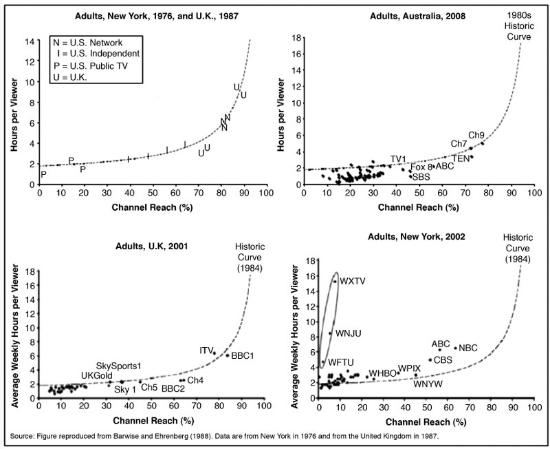
FIGURE 6.4. Comparing Reach and Average Time Spent Viewing in Multiple Countries
Source: Sharp, Beal, & Collins (2009)
The newer video delivery platforms offered by the Web present new opportunities to understand audience behavior. Figure 6.5 presents a comparison of online video destinations using two cumulative measures. On the left are the most popular destinations as measured by the “unique viewers” watching video. This is like the unique visitors metric we just reviewed. You can see that YouTube is the number one destination, by a wide margin. On the right are video destinations ranked by the average time spent viewing per month. Here the number one platform is Netflix, by a similarly wide margin. This seems analogous to the premium channel exception to double jeopardy. YouTube, and many other online services, at present specialize in relatively short video clips. Netflix, which charges its subscribers, offers longer-form movies and television programs. Of course, that may change, and analysts should be able to see if those changes affect viewing behavior by comparing cumulative measures.

FIGURE 6.5. Comparing Cumulative Measures of Video Destinations
Source: Nielsen (2011). State of Media Consumer Usage Report 2011.
One of the simplest, and most powerful, ways to understand cumulative audience behavior is to analyze audience duplication. Basically, analyses of audience duplication ask, “Of the people who were exposed to one program or outlet, how many were exposed to another?” This question can be asked in many ways. Of the people who watched one program, how many watched another? Of the people who visited one website, how many visited another? In each such comparison, we want to measure the size of the duplicated audience. That can help answer very pragmatic questions like, “Are the people who watch my program also going to my website?” And when you look at audience duplication across many different pairs of outlets, you can often see larger patterns of audience behavior. We will describe what studies of audience duplication reveal about audiences in the last section on explaining and predicting behavior. This section begins by concentrating on the basics.
Unfortunately, most questions of audience duplication cannot be answered by looking at the typical numbers in a ratings report. To observe that one television program has the same rating as its lead-in is no assurance that the same audience watched both. However, if the analyst has access to the respondent-level data on which the ratings are based, a variety of analytical possibilities are open. These days, that is often possible. Nielsen and other television ratings companies offer online tools that allow analysts to request data on audience duplication. Similarly, Internet measurement companies, like comScore, have online tools that report audience duplication and “source/loss” (which tells you where visitors to a site are coming from and going to). All of these begin with a straightforward statistical technique called cross-tabulation.
Cross-tabulation is described in detail in most books on research methods, and is a common procedure in statistical software packages. Cross-tabs, as they are sometimes called, allow an analyst to look at the relationship between two variables. If, for instance, we conducted a survey about magazine readership, we might want to identify the relationship between reader demographics and subscription (e.g., are women more or less likely than men to buy Cosmopolitan?). Each person’s response to a question about magazine subscription could be paired with information on their gender, resulting in a cross-tabulation of those variables.
When cross-tabulation is used to study audience duplication, the analyst pairs one media-use variable with another. Suppose, for example, we had diary data on a sample of 100 people. We would then be in a position to answer questions like, “Of the people who watched one situation comedy (e.g., SC1), how many also watched a second situation comedy (e.g., SC2)?” These are two behavioral variables, among a great many, contained in the data. A cross-tabulation of the two would produce a table like Table 6.2.
TABLE 6.2
Cross-Tabulation of Program Audiences
| (a) | Viewed SC1 | |||
Yes |
No |
Total |
||
Yes |
5 |
15 |
20 |
|
Viewed SC2 |
No |
15 |
65 |
80 |
| Total | 20 | 80 | 100 | |
(b) |
Viewed SC1 |
|||
Yes |
No |
Total |
||
Yes |
O = 5 |
O = 15 |
20 |
|
Viewed SC2 |
E = 4 |
E = 16 |
||
No |
O = 15 |
O = 65 |
80 |
|
E = 16 |
E = 64 |
|||
| Total | 20 | 80 | 100 | |
The numbers along the bottom of Table 6.2 a show that 20 people wrote “yes,” they watched SC1, whereas the remaining 80 did not watch the program. The numbers in these two response categories should always add up to the total sample size. Along the far right-hand side of the table are the comparable numbers for SC2. We have again assumed that 20 people reported watching, and 80 did not. All the numbers reported along the edges, or margins, of the table are referred to as marginals. We should point out that when the number of people viewing a program is reported as a percentage of the total sample, that marginal is analogous to a program rating (e.g., both SC1 and SC2 have person ratings of 20).
By studying audience duplication, we can determine whether the same 20 people viewed both SC1 and SC2. The cross-tabulation reveals the answer in the four cells of the table. The upper-left-hand cell indicates the number of people who watched both SC1 and SC2. Of the 100 people in the sample, only 5 saw both programs. That is what is referred to as the duplicated audience.
Conversely, 65 people saw neither program. When the number in any one cell is known, all numbers can be determined because the sum of each row or column must equal the appropriate marginal.
Once the size of the duplicated audience has been determined, the next problem is one of interpretation. Is what we have observed a high or low level of duplication? Could this result have happened by chance, or is there a strong relationship between the audiences for the two programs in question? To evaluate the data at hand, we need to judge our results against certain expectations. Those expectations could be either statistical or theoretical/intuitive in nature.
The statistical expectation for this sort of cross-tabulation is easy to determine. It is the level of duplication that would be observed if there were no relationship between two program audiences. In other words, because 20 people watched SC1 and 20 watched SC2, we would expect that a few people would see both, just by chance. Statisticians call this chance level of duplication the expected frequency. The expected frequency for any cell in the table is determined by multiplying the row marginal for that cell (R) multiplied by the column marginal (C) and dividing by the total sample (N). The formula for determining the expected frequency is:
R × C/N = E
So, for example, the expected frequency in the upper-left-hand cell is 4 (i.e., 20 × 20/100 = 4). Table 6.2b shows both the observed frequency (O) and the expected frequency (E) for the two sitcom audiences. By comparing the two, we can see that the duplicated audience we have observed is slightly larger than the laws of probability would predict (i.e., 5 > 4). Most statistical packages (e.g., SPSS) will run a statistical test, like chi-squared, to tell you whether the difference between observed and expected frequencies is “statistically significant.”
From one time period to another, audiences will overlap. For example, if 50 percent of the audience is watching television at one time, and 50 percent is watching later in the day, a certain percentage of the audience will be watching at both times. The statistical expectation of overlap is determined exactly as in the example just given, except now we are dealing with percentages. If there is no correlation between the time period audiences, then 25 percent will be watching at both times, just by chance (i.e., 50 × 50/100 = 25). We routinely observe a level of total audience overlap or duplication that exceeds chance.
It is here that second kind of expectation comes into play. An experienced analyst knows enough about audience behavior to have certain theoretical or intuitive expectations about the levels of audience duplication he or she will encounter. Consider those two sitcoms again. Suppose we knew that they were scheduled on a single channel, one after the other, at a time when other major networks were broadcasting longer programs. Our experience with “audience flow” would lead us to expect a large duplicated audience. If each show were watched by 20 percent of our sample, we might be surprised to find anything less than 10 percent of the total sample watching both. That is well above the statistical expectation of 4 percent. On the other hand, if the two shows were scheduled on different channels at the same time, we would expect virtually no duplication at all. In either case, we have good reason to expect a strong relationship between watching SC1 and SC2.
The research and theory we reviewed in chapter 4 should give you some idea of the patterns of duplication that are known to occur in actual audience behavior. You should be alert, however, to the different ways in which information on audience duplication is reported. The number of people watching any two programs, or listening to a station at two different times, is often expressed as a percentage or a proportion. That makes it easier to compare across samples or populations of different sizes. Unfortunately, percentages can be calculated on different bases. For each cell in a simple cross-tab, each frequency could be reported as a percent of the row, the column, or the total sample.
Table 6.3 is much like the 2 × 2 matrix in Table 6.2. We have decreased the size of the SC1 audience, however, to make things a bit more complicated. First, you should note that changing the marginals has an impact on the expected frequencies (E) within each cell. When SC1 is viewed by 10, and SC2 by 20, E equals 2 (10 × 20/100 = 2). That change, of course, affects all the other expected frequencies. For convenience, let us also assume that we actually observe these frequencies in each box. We can express each as one of three percentages or proportions. Because our total sample size is 100, the duplicated audience is 2 percent of the total sample (T). Stated differently, the proportion of the audience seeing both programs is 0.02. We could also say that 20 percent (C) of the people who saw SC1 also saw SC2. Alternatively, we could say that 10 percent (R) of the people who saw SC2 also saw SC1.
TABLE 6.3
Cross-Tabulation of Program Audiences with Expected Frequencies and Cell Percentages
Viewed SC1 |
|||
Yes |
No |
Total |
|
Yes |
E = 2 |
E = 18 |
20 |
T = 2% |
T = 18% |
||
R = 10% |
R = 90% |
||
C = 20% |
C = 20% |
||
Viewed SC2 |
|||
No |
E = 8 |
E = 72 |
80 |
R = 10% |
R = 90% |
||
| C = 80% | C = 80% | ||
| 10 | 90 | 100 | |
Different expressions of audience duplication are used in different contexts. The convention is to express levels of repeat viewing as an average of row or column percentages. These are usually quite similar because the ratings of different episodes of a program tend to be stable. This practice results in statements like, “The average level of repeat viewing was 55 percent.” Channel loyalty is usually indexed by studying the proportion of the total sample that sees any pair of programs broadcast on the same channel. We will have more to say about this later on when we discuss the “duplication of viewing law.” Audience flow, sometimes called inheritance effects, can be reported in different ways (Jardine, 2012; Webster, 2006). We will give you an example of how a major U.S. media company studies audience flow in chapter 8.
The audience behavior revealed in cumulative measurements can be quite predictable—at least in the statistical sense. We are dealing with mass behavior occurring in a relatively structured environment over a period of days or weeks, so that behavior can be approximated with mathematical models—often with great accuracy. This is certainly a boon to media planners attempting to orchestrate effective campaigns, especially because actual data on audience behavior is always after the fact. As a result, much attention has been paid to developing techniques for predicting reach, frequency of exposure, and audience duplication.
The simplest model for estimating the reach of a media vehicle is given by the following equation:
Reach = 1 − (1 − r)n
where r is the rating of the media vehicle, and n is the number of advertisements, or insertions, that are run in the campaign. When applying this equation, it is necessary to express the rating as a proportion (e.g., a rating of 20 = 0.20). Although straightforward, this model of reach is rather limited. In the early 1960s, more sophisticated models were developed based either on binomial or beta binomial distributions (e.g., Agostini, 1961; Metheringham, 1964). These and other techniques for modeling reach and frequency are described in detail by Rust (1986) and Cheong et al. (2011).
Although models of reach embody some assumptions about audience duplication, to predict duplication between specific pairs of programs, it is best to employ models designed for that purpose. One such model, called the “duplication of viewing law,” was developed by Goodhardt et al. (1987). It is expressed in the following equation:
rst = krsrt
where rst is the proportion of the audience that sees both Programs s and t, rs is the proportion seeing program s, rt is the proportion seeing program t (i.e., their ratings expressed as proportions), and k is a constant whose value must be empirically determined. When the ratings are expressed as percentages, the equation changes slightly to:
rst = krsrt/100
The logic behind the duplication of viewing law is not as complicated as it might appear. In fact, it is almost exactly the same as determining an expected frequency in cross-tabulation. If we were trying to predict the percent of the entire population that saw any two programs, we could begin by estimating the expected frequency. Remember, that is determined by E = R × C/N. If we are dealing with program ratings, that is the same as multiplying the rating of one program (s) by the rating of another (t), and dividing by 100 (the total N as a percentage). In other words, the general equation for expected frequency becomes rst = rsrt/100, when it is specifically applied to predicting audience duplication. That is exactly the same as the duplication of viewing equation, with the exception of the k coefficient.
Goodhardt and his colleagues compared the expected level of duplication with the actual, or observed, level of duplication across hundreds of program pairings. They discovered that under certain well-defined circumstances, actual levels of duplication were either greater or less than chance by a predictable amount. For example, for any pair of programs broadcast on ABC, on different days, it was the case that audience duplication exceeded chance by about 60 percent. In other words, people who watched one ABC program were 60 percent more likely than the general population to show up in the audience for another ABC program on a different day. To adapt the equation so that it accurately predicted duplication, it was necessary to introduce a new term, the k coefficient. If duplication exceeded chance by 60 percent, then the value of k would have to be 1.6.
The values of k were determined for channels in both the United States and the United Kingdom. American networks had a duplication constant of approximately 1.5 to 1.6, whereas English channels had a constant on the order of 1.7 to 1.9. These constants serve as an index of channel loyalty; the higher the value of k, the greater the tendency toward duplication or loyalty.
As more networks have become available, many catering to a particular segment of the audience, indices of channel loyalty have generally gone up. Recent research has reported k values more like 2.0. Increasing channel loyalty has implications for both programmers and advertisers. As Sharp et al. (2009) note:
This rising channel loyalty is associated with increasing audience fragmentation and suggests that, when confronted with a large number of channel choices, viewers restrict their viewing to a small group of learned favorites. Channel loyalty is not necessarily good news for advertisers. It does suggest that spreading advertising across channels is increasingly important if they wish to gain high reach relative to frequency of exposure. (p. 216)
Noting deviations from levels of duplication predicted by the duplication of viewing law also serves as a way to identify unusual features in audience behavior. In effect, the law gives us empirical generalizations against which we can judge specific observations. One important deviation from the law is what Goodhardt et al. (1987) called inheritance effects. That is, when the pair of programs in question is scheduled back-to-back on the same channel, the level of duplication routinely exceeds that predicted by ordinary channel loyalty. There is now a considerable body of research on inheritance effects or “audience flow” (e.g., Adams, 1997; Eastman et al., 1997; Henriksen, 1985; McDowell & Dick, 2003; Tiedge & Ksobiech, 1986). Despite the increased use of remotes and nonlinear media, inheritance effects appear to be as robust as ever (Jardine, 2012; Webster, 2006). Building a program audience is still affected by the channel that carries a show and the strength of the lead-in program.
The duplication of viewing law represents one way data on audience duplication can be analyzed to develop empirical generalizations about audience behavior. But it is not the only way. It has, in fact, been criticized for being inflexible (Headen, Klompmaker, & Rust, 1979; Henriksen, 1985). An alternative way to manage data on duplication is to define program pairs as the unit of analysis and treat the duplicated audience (e.g., rst) as the dependent variable. The independent variables in this kind of analysis become attributes that describe the program pairs. Recall that the model of audience behavior we presented in chapter 4 identified both structural and individual-level factors that explain audience behavior. Many of those can be translated into variables that characterize a program pair. For example, structural factors could include things like, Are the programs on the same channel (Y/N), or are they scheduled back to back (Y/N)? Theories of program choice would suggest programs of the same type should have relatively high levels of duplication. So an individual-level factor might suggest program pairs be described as being of the same type (Y/N). With such an approach, all independent variables can enter a regression equation and the analyst can see their relative ability to explain audience duplication.
This way of handling pairwise audience duplication has become common, although the technical details vary from study to study (Headen, Klompmaker, & Rust, 1979; Henriksen, 1985; Jardine, 2012; Webster, 2006). Neither is this approach limited to television only. As media users move from platform to platform, it becomes important to understand the patterns of use that emerge across media. So, in principle, the pair could be a television network and a website, or a television program and a YouTube video. As long as the analyst has access to respondent-level data that track users across platforms, audience duplication across any pair of outlets or products is possible.
Yet another way to conceptualize and manage audience duplication is to think of media outlets as nodes in a network and levels of duplication as the strength of the links between those nodes. This strategy allows the analyst to use statistical procedures borrowed from social network analysis (see Ksiazek, 2011). That was the approach Webster and Ksiazek (2012) took to study audience fragmentation across platforms. They used Nielsen “convergence panel” data, which tracked the same panel members across television and the Internet using peoplemeters and metering software on personal computers. Figure 6.6 shows a portion of the outlets that they studied, visualized as a network. For example, it indicates that 48.9 percent of the audience watched NBC and visited a Yahoo website in the course of a month. That is a measure of audience duplication (essentially rst) and it quantifies the strength of the link between those two nodes. Treating the data in this way allows the analyst to identify which, if any, nodes are central destinations and whether outlets (i.e., nodes) cluster together in some discernible way.

FIGURE 6.6. A Network of Television Channels and Internet Brands Defined by Audience Duplication
Source: Webster & Ksiazek (2012). Based on Nielsen TV/Internet Convergence Panel, March 2009.
Audience duplication between any pair of media outlets, then, can be thought of as a building block for many different forms of cumulative analysis. These can include fairly conventional multivariate approaches, like multiple regression, and newer techniques like social network analysis. Since more and more research syndicators are making data on audience duplication available through online tools, the building blocks should become more readily available to analysts. As long as analysts are guided by an integrated model of audience behavior, they will know the right questions to ask. That is over half the battle. Armed with the right data and analytical techniques, we should be able to explain and predict audience behavior as never before.
Barwise, P., & Ehrenberg, A. (1988). Television and its audience. London: Sage.
Easley, D., & Kleinberg, J. (2010). Networks, crowds, and markets: Reasoning about a highly connected world. Cambridge, UK: Cambridge University Press.
Goodhardt, G. J., Ehrenberg, A. S. C., & Collins, M. A. (1987). The television audience: Patterns of viewing. Aldershot, UK: Gower.
Kaushik, A. (2010). Web analytics 2.0: The art on online accountability & science of customer centricity. Indianapolis, IN: Wiley.
Sissors, J. Z., & Baron, R. B. (2010). Advertising media planning (7th ed.). New York: McGraw Hill.
Rust, R. T. (1986). Advertising media models: A practical guide. Lexington: Lexington Books.
Webster, J. G., & Phalen, P. F. (1997). The mass audience: Rediscovering the dominant model. Mahwah, NJ: Lawrence Erlbaum Associates.