
In the new world of ever increasing data volumes, the ability to visually communicate insights from data is an important skill set. Both the structure of an app and the chosen visualizations affect how data is perceived.
An app can contain many sheets, and the order of the sheets and what you put in them is the first consideration. The best practices can be summarized in three words: dashboard, analysis, and report (DAR).
The dashboard is where the high-level perception takes place. It is usually the first sheet or the landing page, and it should give just the most important information and have the least amount of interactivity. Its main purpose is to help users get an overview and scan for status changes. The users can see at a glance whether things are working or not. It's a starting point, such as a table of contents; the user gets an idea of what is available and then heads off to other parts of the app based on what they have seen.
Some advice on dashboards:
- Display data only on a high level
- Don't use too many KPIs
- Use no or very few filtering options
- The most important information should be large
The analysis pages should be more interactive: they should help users explore the data and look for answers to questions they may have formed on the dashboard page. Analysis pages are where the user spends time and interacts with the data. Typically, each sheet has a theme and covers a specific aspect of the business. The analysis pages are where the user learns from data.
Some advice on the analysis pages:
- Allow filter panes or listboxes to facilitate selections
- Make sure an entire page is about a particular topic
- Use graphs
The third type of sheet is the reporting sheet. It is not always necessary to have these, but often it is advantageous to gather the most granular information on dedicated sheets. This is the purpose of the reporting sheets: to give the most granular information with tabular data. This is where a user can spend a lot of time sorting and filtering through the details.
Further, users sometimes want to export or print data, and the starting point is often a reporting sheet. All Qlik Sense objects can be printed or exported, either as images, as data, or bundled in a PDF document.
Some advice on the reporting sheets:
- Display transactional data in tabular form
- Give the users the ability to view every detail, so they can assess what actions they need to take
The structure within a sheet is also important. When you create an app, it's your job to prioritize information and display it in such a way that users better understand the data and find their way in the app.
The human eye scans most content in an F pattern. The first time we see a page, we read the first line, then a bit of the second line, and then work our way down the left-hand side of a page looking for keywords. This means the content at the top of the page is the most important real-estate on a page, especially the top-left. The top of the sheet gives the users an idea of what content a page may contain and the scent of whether or not they are on the right track to finding what they are looking for. So, label the sheets appropriately.
It is also important that users easily find objects they are looking for. This applies to filter panes and listboxes, where the user makes selections. If used in several sheets, they should be placed in the same place in all sheets, if possible. Further, given how a human eye scans the page, these objects should preferably be placed to the left.
Visualization also includes choosing appropriate graphs. Getting the graph right is important; otherwise, the data can be misinterpreted. There are several highly regarded thought leaders who have written excellent reading material on this topic, for example, Edward Tufte and Stephen Few. If you have not read any book in this area and you intend to build business intelligence applications, we recommend that you do this. It will help you in your work.
Dimensions and measures are sometimes confused for one another, but it is really quite simple. You should start by asking yourself, "What do I want to show?". The answer is usually sales, quantity, or some other number. This is your measure.
The second question you should ask yourself is, "How many times should this measure be calculated?" or "Per what do I want to show this measure?" The answer could be once per month, once per customer, once per supplier, or something similar. This is your dimension.
The dimension and the measure of a chart are the core of the visualization and often indicate what visualization to choose. It is important to understand which type of field is used as a dimension. For example, when showing trends over time, you should usually use a line chart or a bar chart. The same is also true for any dimension with an implicit, intrinsic order. By the same token, you should never use a line chart unless the dimension has an implicit order.
The fields used as dimensions can be classified into the following groups:
- Nominals: These are fields with qualitative values that lack intrinsic order, for example, product, customer, color, gender, and so on.
- Ordinals: These are fields with qualitative values that have intrinsic order, for example, ratings such as unsatisfied, neutral, or satisfied; that is, fields that have no numeric meaning.
- Intervals: These are fields with quantitative values that lack a natural zero. They are like coordinates, for example, date, time, longitude, temperature, and so on.
- Ratios: These are fields with quantitative values that have a natural zero. They are like amounts, for example, quantity, sales, profit, weight, and so on.
With this classification in mind, it is easier to describe what you can and cannot do with some graph types.
The most common visualization is the bar chart. Bar charts can be used for almost any dimension, and it is easy to compare the sizes of two bars. Further, they are good for ordinal data, since the intrinsic order can be used. This also means that trends over time can easily be spotted.
If a second measure is added to the bar chart, you will get two bar series so that you can make comparisons both between the measures and along the dimension. For example, in the following chart, you can compare not only the sales regions, but also the commercial vehicle sales with total sales:

A bar chart is often the best visualization. By adding a second measure or a second dimension, you can get several series of bars.
The next visualization is the pie chart. This should only be used if the dimension is of the nominal type and you want to display the relative proportions. Pie charts are not good for ordinal data, since the order of the dimensional values isn't obvious.
Pie charts are, by some experts, considered a poor visualization, and a bar chart is indeed often a better alternative since it conveys the information more efficiently.
But pie charts are still useful to convey an overview of the relative sizes. For instance, in the following pie chart, you can clearly see that the combined sales in the USA and China constitute more than 50 percent—something that is not at all clear if you instead look at the corresponding bar chart:

Hence, a bar chart is often easier to read, but, in this case, the pie chart is better at showing the relative proportions of the largest countries. However, it can sometimes be hard to judge the relative sizes of the slices in a pie chart if there is only a small difference between them. Then, a bar chart is a better choice.
The next visualization is the line chart. This should only be used if the first dimension is of the ordinal or interval type. Line charts are particularly useful for showing a change over time. Several lines can be used, either using a second dimension or by adding measures:

Line charts are good when you want to analyze trends over time.
A new object in Qlik Sense is the KPI object. With this, you can display a measure or a KPI on a dashboard and label it so that it is clear what it is:

This allows you to create an overview so the user quickly and easily sees the main information. But you cannot show the number over a dimension, for example, per month or per customer, since there is no dimension in this object. It is just a number that is valid for the entire selected dataset.
The gauge object is similar to the KPI object, in that it shows a measure and has no dimension. It should be used the same way as the KPI object—to create an overview.
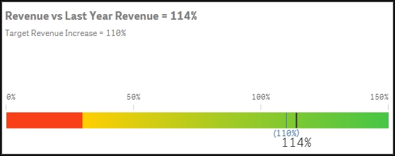
The difference with a KPI object is that a gauge can also show a basic graphical element—either a radial display like a speedometer or a linear display like a thermometer.
Scatter charts are good if you want to compare two different quantitative measures for the same dimension, that is, pairs of data per some dimension. Such plots are useful to find clusters of values, linear arrangements, gaps, and values that are much different from the norm. These are the kinds of patterns that are meaningful in correlation relationships.
The unique strength of this chart type is its ability to encode values along two quantitative scales used as two axes. Note that the logical dimension is not used as an axis. Instead, two measures are used as axes.
The dimension, which should normally be of the nominal type, defines the number of points in the scatter chart:

The preceding scatter chart shows the amount of roads per country (in million kilometers) versus the number of cars (in million units). The color indicates the country's population.
If you have a scatter chart with large amounts of data, Qlik Sense uses an algorithm to create an overview of the data, as shown in the following screenshot—it pixelates the data points and color codes the density of the data points.
Not only does this result in a better overview of a large number of data points, it also minimizes the amount of information that needs to be transferred from the server to the client.

However, if you drill down in the chart by zooming or making selections so that the number of data points is reduced to less than 1,000, the data will be shown as individual data points.
Another chart type to mention is the tree map (called block chart in QlikView). This is an excellent visualization if you have two or more dimensions and one single measure. The reason why it is called tree map is that it was originally designed to display hierarchical relationships that have a structure like a tree. In Qlik Sense, you can use it for nonhierarchical relationships that have no resemblance with trees whatsoever. Again, the dimensions should be of the nominal type:

A tree map showing the number of cars in different countries
The last chart type to mention is the geographical map. This visualization allows you to display regions and areas on a map of a country or region. Also, here the dimension is of the nominal type:

In Qlik Sense, you can connect maps to the data. Just as all other charts, a geographical map can be used for both input and output. Selections in other objects will affect how the geographical areas are displayed, and selections can be made directly in the map.
There are two table types in Qlik Sense—the standard table and the pivot table. They are similar to each other in that, just as charts, they can have both dimensions and measures. But they are slightly different in appearance and capabilities.
The pivot table is excellent for grouping data and showing it in a compact way. Dimensions can be used both as rows and columns, and rows can be collapsed into the above dimension:

The standard table is different. All data is displayed in one long table, and its advantage is that you have full freedom in how to sort the data any way you want. In addition, you can make searches directly in the table:

Both table types are good for showing details of the data, but to give the user an overview, a graphical visualization is better.
Once you have chosen the appropriate chart type, you should choose the appropriate chart settings, for example, scale, sorting, and appearance. Nominals should be sorted alphabetically or by some form of measure, for example, the size of the measure. The other types should be sorted according to the intrinsic sort order.
You also need to label the chart, for example, add a title, descriptions, y axis units, and so on.
Finally, you should also make sure to use the appropriate colors. But be careful here… bright colors are beautiful, but when it comes to data visualization, it is best practice not to use highly saturated colors. Instead, it is good to tone it down a bit. The main reason is that lighter colors are much easier on the eyes, so they show data better, for example, when displayed on large screens.
Further, bright colors draw attention, so they should only be used to highlight a specific field value or condition.
One way is to use the same color everywhere for the same dimensional value. This way, the user will easily identify the corresponding bars or slices in multiple visualizations.
Another way is to use a color that has an intensity that is in proportion to a specific calculation. For instance, in the following bar chart, the bars indicate the total number of sold cars in different countries and the color intensity indicates the number of sold cars per capita. This is one good way of using colors.
