
In the last section, we discussed distributions and we saw some measures that describe them. In this section, we're going to see how to visualize distributions. Visualizations are more intuitive than numeric measures and they will help us to understand our data.
Rattle offers two different set of charts depending on the nature of the variables. For numeric variables, we can use Box Plot, Histogram, Cumulative, and Benford. And for categorical variables, Rattle provides us with Bar Plot, Dot Plot, and Mosaic charts. We're going to explore the most common visual representations.
Before using Rattle to plot charts, make sure that the Advanced Graphics option is unchecked. With this option checked, some charts like histograms will not be plotted. This is shown in the following screenshot:

We're going to use the variable Age of the Titanic passenger list to show the different types of charts with numeric variables. Load the data set, set the variable Survived as target, and go to the Explore tab and select the Distributions type. The central area of the screen is divided into two panels – the upper panel is reserved for the numeric variables and the lower one for categorical variables.
In the numeric variables area, you can see six variables (Survived, Pclass, Age, SibSp, Parch, and Fare) and four different plots (Box Plot, Histogram, Cumulative, and Benford). To plot a chart, you have to select the appropriate checkbox and click on the Execute button, as shown in the following screenshot:

The first chart we're going to discuss will be the Box Plot. We're going to plot a chart of the variable Age of the Titanic's passenger list. Select the Annotate checkbox in order to have the values of the data points labeled as shown in the following screenshot:

These plots summarize the distribution of a variable in a dataset. In the following screenshot, we can see the representation of the variable Age:

If you have identified the target variable when you loaded the dataset, Rattle will create a plot for all observations and a plot for every possible value of the target variable. In this example, the target variable Survived has two possible values, – 0 and 1.
We have highlighted some points of the central plot – the green part. In the center of the plot, the horizontal line labeled with a 28 is the median. The point labeled with a 21 is the first quartile, or Q1, and 39 represents the third quartile, or Q3. In this plot, the interquartile range is 39 - 21 = 18 (Q3 – Q1). The lower and upper points labeled with 1 and 66 are 1.5 times the interquartile range from the median. Points above the point labeled with a 66 are outliers.
Histograms give us a quick view of the spread of a distribution. Rattle's histogram combines three charts in one, namely the R histogram (the bars), the density plot (the line), and the rug plot. The rug plot is marked with a red arrow in this screenshot:
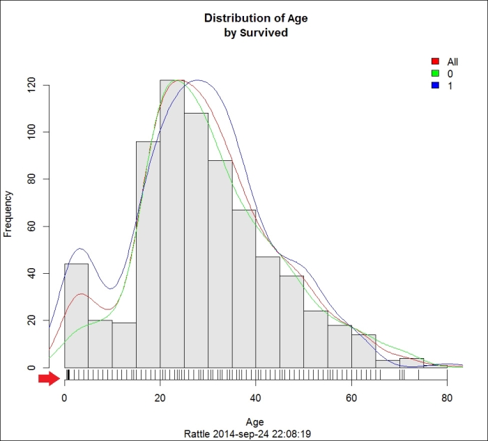
This histogram shows us the distribution in terms of age. The vertical bars are the original histogram. Every bar represents an Age range and the height of the bar represents the Frequency or the number of observations that fall in that age range. The density plot is a more accurate representation of the estimated values. Finally, in the rug plot, every line shows the exact value of an observation, as shown in the following screenshot:

In the preceding histogram, we can see that most people on the Titanic were between 20 and 40 years of age.
The cumulative plot represents the percentage of the population that has a value than or equal to the value shown in the x axis. I've plotted the cumulative plot for the variable Age. If you look at the following screenshot, you can see that nearly 80 percent of the passengers were less than or equal to 40 years old.
We've circled the younger passengers. In this plot, like in the histogram we plotted before, we see that young people had a greater probability of survival.

We're now going to explore categorical variables. As with numeric variables, you have to load the Titanic dataset and set Survived as the target variable. Then go to the Explore tab and select the Distributions type.
To plot a new graph, you have to check the plot and the variable in the Categoric variable panel and click on Execute. This is illustrated in the following screenshot:

We'll use the variable embarked from the Titanic passenger list to plot a bar plot, a dot plot, and a mosaic plot.
The bar chart is probably the simplest and easiest to understand – it uses vertical or horizontal bars to compare among categories. In the following screenshot, we can see a bar chart of the variable embarked:

In the previous chapter, we introduced this dataset and we explained that the variable embarked has three possible values – C for Cherbourg, Q for Queenstown, and S for Southampton. If you look at this chart, it is quick and easy to see that most of the people (644) embarked in Southampton. Looking at the blue and green bars, we can see that around a third of the passengers that embarked at Southampton survived and around half of the passengers who embarked at Cherbourg survived.
The mosaic plot shows the distribution of the values for a variable. Look at the following screenshot. At the top of the plot, there are three letters—S, C, and Q—representing the three harbors. Below each letter, there is a bar divided into two sub-bars (blue and green). We have highlighted the bar below Q, as shown in the following screenshot:

The width of this bar represents the number of occurrences. In our plot, the wider bar is the bar below S. This is the harbor where most of the people embarked. For each harbor, we have a green and a blue bar. The size of the green bar represents the number of people who didn't survive and the blue bar represents the number of people who survived.
As you can see, the mosaic plot gives us a fast understanding about how our data is distributed.