Chapter 13. Custom Controls
In ASP.NET, Microsoft distinguishes between user controls , which are segments of ASP.NET pages that can be reused in other pages, and custom controls, which are compiled controls that act, from the client’s perspective, much like web (ASP) controls. Custom controls can be created in one of three ways:
By deriving a new custom control from an existing control (e.g., deriving your own specialized text box from
asp:textbox). This is known as a derived custom control.By combining two or more existing controls into a new control. This is known as a composite custom control.
By deriving from the base control class, thus creating a new custom control from scratch. This is known as a full custom control.
User Controls
User controls allow you to save a part of an existing ASP.NET page and reuse it in many other ASP.NET pages. A user control is almost identical to a normal .aspx page, with two differences: the user control has the .ascx extension rather than .aspx, and it cannot have <HTML>, <Body>, or <Form> tags.
The simplest user control is one that displays HTML only. A classic example of a simple user control is an HTML page that displays a copyright notice. To demonstrate this, create a new web application named UserControls. Once the application is open, right-click on the project and choose Add New Item. Highlight Web User Control and name your new control Copyright.ascx, as shown in Figure 13-1.
Example 13-1 shows the complete listing for Copyright.ascx, which you will notice is nothing but HTML.

<%@ Control Language="VB" AutoEventWireup="false"
CodeFile="Copyright.ascx.vb" Inherits="Copyright_ascx" %>
<hr>
<table>
   <tr>
      <td align="center">Copyright 2005 Liberty Associates, Inc.</td>
   </tr>
   <tr>
      <td align="center">Support at http://www.LibertyAssociates.com</td>
   </tr>
</table>
To see your user control at work, you’ll modify Default.aspx, adding a few controls as well as the user control (to provide a copyright at the bottom of the page). The first step is to register your copyright control at the top of the page with a Register statement:
    <%@ Page Language="VB" AutoEventWireup="false"
    CodeFile="Default.aspx.vb" Inherits="Default_aspx" %>
    <%@Register tagprefix="OReilly" Tagname="copyright" src="copyright.ascx" %>
Notice that this consists of a tagPrefix (e.g., "OReilly") and a TagName: "copyright" as well as a pointer to where this control is defined (src="copyright.ascx").
The next step is to add the control to your page. Just as you have used a tagprefix (asp) and a tagname (Button) for web controls:
<asp:Button>
here you will use your own prefix and tagname:
<OReilly:copyright runat="server" ID="copyright1" />Add this line to the bottom of your form, just above the closing <div> statement. Next, switch to Design view and you’ll see the copyright in place.
Now, create a second page (testUserControl.aspx) and add controls to that page. Remember to register the user control at the top of the page using the same Register directive, and place the control in the page where you want it to appear. Create hyperlinks on both pages so that you can move from one to the other. You should see that the user control is displayed at the bottom of each page, serving as reusable code, as demonstrated in Figure 13-2.
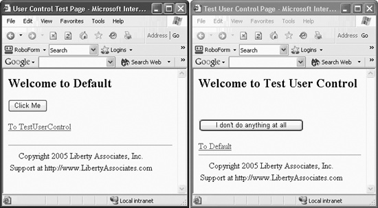
The copyright user control is shown at the bottom of both pages, as you would expect.
Adding Code to User Controls
So far, all you’ve put into the user control is straight HTML. This is simple, but also somewhat limited. In the next example, you’ll create a user control that reuses your carefully developed and somewhat complex interface and code from a previous example.
Reopen the WebNorthWindDataControls application you developed in Chapter 10 (or use the downloaded source). Open the Products.aspx page and copy everything within the <div> tags to the clipboard.
Now return to your UserControls application and create a new User Control. Name it NorthWindProductsControl.ascx. Open the file in Source view, and paste the clipboard contents anywhere after the <%@ Control> directive.
Go back to WebNorthWindDataControls. Copy the code-behind for the methods used by this page, and paste them into the code-behind of your new user control.
Finally, open TestUserControl.aspx and add two lines. The first is the registration line for your new user control at the top of the page:
    <%@Register tagprefix="OReilly" Tagname="Products" src="NorthWindProductsControl.
    ascx" %>
The second line inserts an instance of this control into the page:
<OReilly:Products runat="server" ID="Products1" />
To make the control stand out, I’ll place it within an ASP:Panel:
    <asp:Panel Height="50px" ID="Panel1" runat="server"
    Width="125px" BackColor="#C0FFFF" BorderStyle="Groove">
        <OReilly:Products runat="server" ID="Products1" />
    </asp:Panel>
The panel surrounds the control (and creates a border and background color) while the single line placing the Products control includes the entire control and its supporting code.
There is one more thing you must do before you run this program, however. Examine the .ascx file and search for either of the SqlDataSource controls
. You’ll find that both refer to the NorthwindConnectionString, which you created in the previous project, but not in this one:
    <asp:SqlDataSource ID="NorthWindProductsDataSource" runat="server"
        SelectCommand="SELECT [ProductID], [ProductName] FROM [Products]"
        ConnectionString="<%$ ConnectionStrings:NorthwindConnectionString %>">
    </asp:SqlDataSource>
This is easy to rectify, however. Return to WebNorthWindDataControls, and open the Web.config file. You’ll find connectionString defined as follows:
<connectionStrings>
<add name="NorthwindConnectionString"
connectionString="Your connection string here"
providerName="System.Data.SqlClient" />
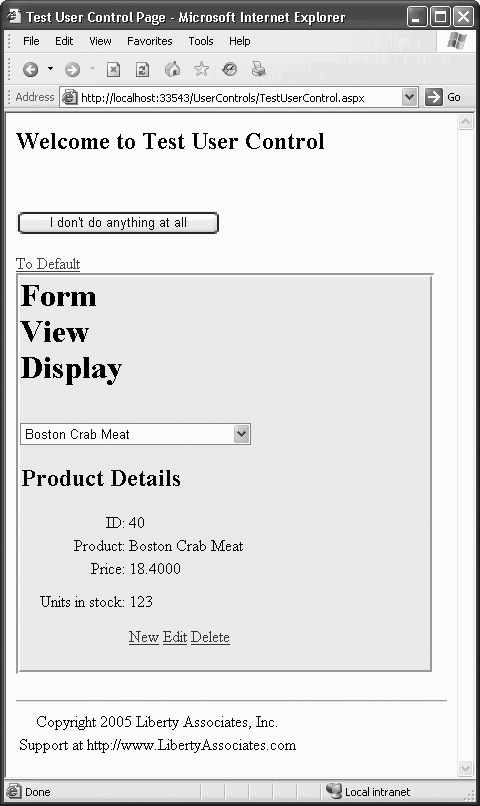
</connectionStrings>Open the Web.config on your new project and you’ll find an empty connectionStrings element. (If you haven’t yet run the application in Debug mode, you won’t have a Web.config file. In this case, just press F5 to run the application, and tell Visual Studio to create a Web.config file when it asks what it should do.)
<connectionStrings />
Replace the empty element with the element you retrieved from WebNorthWindData-Controls, and you are ready to run your application. It should look like Figure 13-3
Control properties
There can be only one @Control directive for each user control. This attribute is used by the ASP.NET page parser and compiler to set attributes for your user control. Possible values are shown in Table 13-1.
|
Attribute |
Description |
Possible values |
|
|
|
|
|
|
The class name for the page. |
Any valid class name. |
|
|
Passed to compiler. |
Any string indicating valid compiler options. |
|
|
Whether to compile with debug symbols. |
|
|
|
Text description of the page. |
Any valid text. |
|
|
Is view state maintained for the user control? |
|
|
|
Should page be compiled with VB.NET option explicit? |
|
|
|
Defines a code-behind class. |
Any class derived from |
|
|
The language used for inline rendering and server-side script blocks. |
Any .NET-supported language. |
|
|
Page should be compiled using VB.NET Strict option. |
|
|
|
Name of the source file for the code-behind. |
Any valid filename. Not used by Visual Studio 2005. |
|
|
Compiler warning level at which compilation will abort. |
|
Custom Controls
So far, you have created user controls, which are essentially reusable web page fragments.[*] You can also create your own compiled custom controls . As noted earlier, there are three ways to create custom controls :
Create a derived custom control by deriving from an existing control.
Create a composite control by grouping existing controls together into a new control.
Create a full custom control by deriving from
System.Web.UI.WebControls.WebControl.
The custom controls most similar to user controls are the composite controls. The key difference is that composite controls are compiled into a DLL and used as you would any server control you find in the Toolbox.
Creating a Web Control Library
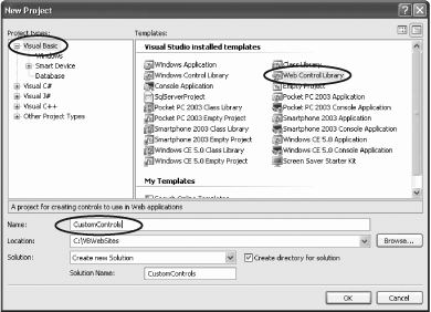
To get started, you’ll create a Web Control Library in which you’ll place the various custom controls for this chapter. Open Visual Studio .NET and choose New Project. In the New Project Window, create a Web Control Library called CustomControls, as shown in Figure 13-4.
After clicking OK, you’ll notice that Visual Studio has created a complete custom control named WebCustomControl1
. Before examining this control, create a web application to test it. Right-click on the solution in the Solution explorer and choose Add → New Web Site. Set the name of your web site to CustomControlTester. Your solution now includes two projects: a web site (with Default.aspx) and a Custom Controls library (with WebCustomControl1.vb).
Web Custom Control 1
Web Custom Control 1 is a full custom control, derived from System.Web.UI.WebControls.WebControl. Even before you fully understand how this code works, you
can test it in the test page you created. Open Default.aspx in the tester application and add a statement to register the new control:
    <%@Register TagPrefix="OReilly"
    Namespace="CustomControls"
    Assembly="CustomControls" %>
This registers the custom control with the web page, similar to how you registered your user controls. Once again you use the @Register tag and provide a tag prefix (OReilly). Rather than providing a Tagname and src, however, you provide a Namespace and Assembly, which uniquely identify the control and the DLL that the page must use.
You now add the control to the page. The three attributes you must set are the Runat and ID attributes, which are needed for all server-side controls, and the Text attribute, which this custom control uses to determine how the control is displayed at runtime:
<OReilly:WebCustomControl1 Runat="Server" Text="Hello World!" Id="WC1" />
To build your new custom control, you must inform the CustomControlTester project about the CustomControls project. To do so, right-click on the CustomControlTester project and choose Add Reference. The Add Reference dialog opens. Select the Project tab, and choose the CustomControls project, as shown in Figure 13-5.
Click OK and then compile and run your test application. You will be asked to add a new Web.config file. As usual, click OK. When you view the page, the text you passed in as an attribute (“Hello World”):
<OReilly:WebCustomControl1 Runat="Server" Text="Hello World!" Id="WC1" />is displayed, as shown in Figure 13-6.


Before proceeding, let’s examine the code in WebCustomControl1.vb, created by Visual Studio 2005. This control contains a single property, Text, backed by a private string variable, _text:
    Dim _text As String

    <Bindable(True), Category("Appearance"), DefaultValue("")>_
    Property [Text]() As String
        Get
            Return _text
        End Get

        Set(ByVal Value As String)
            _text = Value
        End Set
    End Property
Notice that there are attributes (see the sidebar "Attributes“) provided both for the property and for the class. These attributes are used by Visual Studio .NET and are not required when creating custom controls. The most common attributes for custom controls are shown in Table 13-2.
|
Attribute |
Description |
|
|
Boolean. |
|
|
Boolean. Is the property displayed in the designer? |
|
|
Determines in which category this control will be displayed when the Properties dialog is sorted by category. |
|
|
The default value. |
|
|
The text you provide is displayed in the description box in the Properties panel. |
Properties
Custom controls can expose properties just as any other class can. You access these properties in two ways:
The Text property of the control is accessed through the Text attribute in the web page.
In the case of the Text property and the Text attribute, the mapping between the attribute and the underlying property is straightforward because both are strings.
ASP.NET will provide intelligent conversion of other types, however. For example, if the underlying type is an integer or a long, the attribute will be converted to the appropriate value type. If the value is an enumeration, ASP.NET matches the string value against the enumeration name and sets the correct enumeration value. If the value is a Boolean, ASP.NET matches the string value against the Boolean value; that is, it will match the string “True” to the Boolean value True.
The Render Method
The key method of the custom control is Render
:
    Protected Overrides Sub Render( _
    ByVal output As System.Web.UI.HtmlTextWriter)
        output.Write([Text])
    End Sub
This method is declared in the base class, and must be overridden in your derived class if you wish to take control of rendering to the page. In this example, the Render method uses the HtmlTextWriter object passed in as a parameter to write the string held in the Text property.
The HtmlTextWriter class derives from TextWriter and provides rich formatting capabilities. HtmlTextWriter will ensure that the elements produced are well-formed, and it will manage the attributes, including style attributes. Thus, if you want to set the text to red, you can add a color attribute, passing in an enumerated color object that you’ve translated to HTML, as shown in Example 13-2.
Rendering Text with Tags
You can set the text to be rendered within header (<h2>) tags with the HtmlTextWriter’s RenderBeginTag and RenderEndTag methods:
    output.RenderBeginTag("h2")
    output.Write(Text)
    output.RenderEndTag()
The result is that when the text is output, the correct tags are created, as shown in Figure 13-7. (The source output that illustrates the HTML rendered by the HtmlTextWriter is circled.)
Maintaining State
In the next example, you’ll add a button to increase the size of the text in your custom control. To accomplish this, you’ll eschew the rendering support of the

HtmlTextWriter, instead writing the text yourself, using a new Size property (to set the size of the output text). Return to the Render method and replace the code you have with this new code.
    Protected Overrides Sub Render(ByVal output As _
                                   System.Web.UI.HtmlTextWriter)
       output.Write("<font size = " & Size & ">" & [Text] & "</font>")
    End Sub
The Size property must maintain its state through the postback initiated by pressing the button.
    Public Property Size() As Integer
       Get
          Return Convert.ToInt32(ViewState("Size"))
       End Get
       Set(ByVal Value As Integer)
          ViewState("Size") = Value.ToString()
       End Set
    End Property
The property Get method retrieves the value from ViewState, casts it to a string, and then converts that string to its integer equivalent. The property Set method stashes a string representing the size into ViewState.
To ensure that a valid value is in ViewState to start with, you’ll also add a constructor to this control:
    Public Sub New()
       ViewState("Size") = "1"
    End Sub
The constructor initializes the value held in ViewState to 1. Each press of the button will update the Size property. To make this work, drag a button onto CustomControlTester.Default.aspx, next to the custom control. Set its text to Increase Size and double-click on it to open the default (click) event handler.
    Protected Sub Button1_Click( _
    ByVal sender As Object, ByVal e As System.EventArgs) Handles Button1.Click
        WC1.Size += 1
    End Sub
Each time the button is clicked, the state variable Size is incremented; when the page is drawn, the state variable is retrieved and used to set the size of the text, as shown by creating
a copy of the running program in Figure 13-8.

Creating Derived Controls
Most custom controls need not be created from scratch. If you are doing anything more than writing text, it is far easier to use the rendering capabilities of one or more existing controls.
Often, all you want to do is to extend the behavior of an existing control type. To do so, you will derive from that control just as you might derive from any class.
Imagine, for example, that you would like a button to maintain a count of the number of times it has been clicked. Such a button might be useful in any number of applications, but, unfortunately, the web Button control does not provide this functionality.
Create a new class in your custom controls library named CountedButton, as shown in Figure 13-9.
The Add New Item - CustomControls dialog will pop up. Select Web Custom Control and name it CountedButton.vb, as shown in Figure 13-10.
A new custom class is created for you. By default, it will inherit from System.Web.UI.WebControls.WebControl. Change the Inherits statement so it derives from System.Web.UI.WebControls.Button.
    Public Class CountedButton
        Inherits System.Web.UI.WebControls.Button
This will allow your new custom control to inherit all the features of the standard button, which you can then extend. Your new class needs a Count property to keep track of the number of times the button is clicked. Since Count must survive the


roundtrip to the server, you must store it in either Session or view state. Because the number of clicks is really a property of the CountedButton (rather than a value you might want to pass from page to page or persist for the life of the session), it is most appropriate to use view state, as shown in Example 13-3.
Remember to initialize the Count to 0 in the constructor:
    Public Sub New()
        Me.Text = "Click me"
        ViewState("Count") = 0
    End Sub
Notice that the constructor also sets the Text property of the CountedButton (inherited from the base class button) to "Click Me".
The CountedButton also inherits, and must override, the OnClick event. Be careful here: you are not implementing an event handler, you are overriding an event declared in the base class. To do so, type Protected Overrides, and IntelliSense will offer all members of the base class that you are free to override. Choose OnClick, as shown in Figure 13-11.

When you select OnClick, the entire event is set up for you, including a call to MyBase.OnClick and the capitalization is fixed for you as well. This is just what you want. You’ll put in your own mechanism to update the counter and to update the button’s text, and then you’ll call the base class (Button’s) OnClick event to allow it to do whatever work it normally does.
    Protected Overrides Sub OnClick(ByVal e As System.EventArgs)
        ViewState("Count") = CInt(ViewState("Count")) + 1
        Me.Text = ViewState("Count") & " clicks"
        MyBase.OnClick(e)
    End Sub
When you extract the object whose key is "Count" from ViewState, what you get back is of type Object. You cast it to integer using CInt, then add 1 to that value. Finally, you store it back into ViewState using the same key: "Count".
ViewState("Count") = CInt(ViewState("Count")) + 1Once you have the new count in ViewState, you can update the text of the button to reflect the number of clicks:
Me.Text = ViewState("Count") & " clicks"Adding the Derived Custom Control to the ASPX Page
Return to the ASPX page to add an instance of your counted button. Since you’ve already registered your CustomControl library, you only have to add the actual CountedButton itself to the form:
    <div>
        <OReilly:WebCustomControl1 Runat="Server" Text="Hello World!" Id="WC1" />
        <asp:Button ID="Button1" runat="server" Text="Increase Size" />
        <OReilly:CountedButton Runat="Server" id="CB1" />
     </div>
When you run the application, you can click on the button, and it keeps track of the number of times it was clicked, as shown in Figure 13-12.

Creating Composite Controls
The third way to create a custom control is to combine two or more existing controls into a single bundled control. You can even combine custom controls with the controls provided by Microsoft.
In the next example, you’ll create a somewhat advanced composite control to keep track of the number of inquiries you receive about books (perhaps books you sell on your web site). The architecture of your custom control is as follows:
The
BookInquiryListis a custom composite control that serves as a collection ofBookCountercontrols.The
BookCounteris a custom control with two properties:BookNameandCount.The (revised)
CountedButtoncontrol is a derived control (derived fromButton).
The BookCounter has an instance of CountedButton as a member in its Controls collection. The BookInquiryList has, in its Controls collection, zero or more instances of BookCounter.
The finished product is shown in Figure 13-13.

What is most interesting about this project is that you will declare the BookCounter members of the BookInquiry control declaratively in your aspx page. Just as you might write:
    <asp:ListBox ID="ListBox1" runat="server">
        <asp:ListItem>Item 1</asp:ListItem>
        <asp:ListItem>Item 2</asp:ListItem>
        <asp:ListItem>Item 3</asp:ListItem>
    </asp:ListBox>
so, with the BookInquiry control, you can write:
    <OReilly:BookInquiryList Runat="Server" id="bookInquiry1">
       <OReilly:BookCounter Runat="server" BookName="Book 1" ID="B1" />
       <OReilly:BookCounter Runat="server" BookName="Book 2" ID="B2" />
       <OReilly:BookCounter Runat="server" BookName="Book 3" ID="B3" />
    </OReilly:BookInquiryList>
This kind of declaration requires that you teach the ASP.NET parser how to create BookCounter objects based on their declaration; a topic covered later in this chapter. The best way to build this, however, is inside out: starting with the CountedButton control, then using that to build the BookCounter, and finally populating the BookInquiry control with BookCounter objects.
Modifying the CountedButton Derived Control
Modify the CountedButton class so that the client of your Countedbutton (any method that creates a CountedButton object) can pass in the string to be displayed on the button. That is, rather than displaying “5 clicks,” the client can pass in (for example) the string “Inquiries” and the button will display “5 Inquiries.”
Reopen the CountedButton.vb file and add a class member displayString of type String:
Private displayString As String
Modify the constructor to initialize displayString to the string "clicks" if no string is supplied, by creating both a default constructor (that takes no arguments) and a constructor that takes a string argument, as shown in Example 13-4.
Public Sub New()
    Me.New("clicks")
End Sub

Public Sub New(ByVal displayString As String)
    Me.displayString = displayString
    If ViewState("Count") Is Nothing Then
        ViewState("Count") = 0
        Me.Text = "Click me"
    End If
End Sub
Rather than duplicating code in both constructors, the bulk of the work is done in the second constructor. The default constructor invokes the second constructor, passing in the string clicks. Modify the OnClick event to use the display string in its display, as shown in Example 13-5.
With these changes, the CountedButton is ready to be used in the first composite control, BookCounter
.
Creating the BookCounter Control
The BookCounter control is responsible for keeping track of and displaying the number of inquiries about an individual book. It does no rendering, it simply “holds” a book name (using ViewState) and a counted button (which is responsible for its own count).
Create a new class called BookCounter in your custom controls library, of type Web Custom Control, just as you did for CountedButton.
Replace the _text member variable with _countedButton of type CountedButton:
Dim _countedButton As CountedButton = New CountedButton("Inquiries")Delete the methods provided by Visual Studio 2005 and add a property to hold the book name, as shown in Example 13-6.
Public Property BookName() As String
    Get
        Return CStr(ViewState("BookName"))
    End Get
    Set(ByVal Value As String)
        ViewState("BookName") = Value
    End Set
End Property
The book name will be held in ViewState so that it persists across postback events. Book counter needs a second property, Count
, but you’ll implement Count by delegating responsibility to the member variable _countedButton, as shown in Example 13-7.
Public Property Count() As Integer
    Get
        Return _countedButton.Count
    End Get
    Set(ByVal Value As Integer)
        _countedButton.Count = Value
    End Set
End Property
You’ll need a method to reset the CountedButton’s count to 0, shown here in Example 13-8.
In a moment, you’ll create the BookInquiryList class which will consist of zero or more BookCounter objects. To make sure that the CountedButton is a control within each BookCounter
object created, you’ll need to add _countedButton to the Controls collection of your BookCounter control. You do so by overriding the CreateChildControls method:
Protected Overrides Sub CreateChildControls()
Controls.Add(_countedButton)
End Sub
CreateChildControls is called in preparation for rendering and offers the BookCounter class the opportunity to add the CountedButton object as a contained control.
There is no need for BookCounter to override the Render method; the only thing it must render is the CountedButton, which can render itself. The default behavior of Render is to render all the child controls, so you don’t need to do anything special to make this work.
INamingContainer
Because your BookCounter class contains a control, you must implement the INamingContainer interface. This is a “marker” interface that has no methods. The purpose of this interface is specifically to identify a control as a container control to ASP.NET. By implementing I Naming Container you instruct ASP.NET to create a new ID namespace for your BookCounter control, guaranteeing that all child controls have IDs that are unique to the page.
Public Class BookCounter
Inherits System.Web.UI.WebControls.WebControl
Implements INamingContainerTip
For more on interfaces, please see Chapter 16.
To make this crystal clear, Example 13-9 has the complete definition of the BookCounter class.
Public Class BookCounter
Inherits System.Web.UI.WebControls.WebControl
Implements INamingContainer
Dim _countedButton As CountedButton = New CountedButton("Inquiries")
Public Property BookName() As String
Get
Return CStr(ViewState("BookName"))
End Get
Set(ByVal Value As String)
ViewState("BookName") = Value
End Set
End Property
Public Property Count() As Integer
Get
Return _countedButton.Count
End Get
Set(ByVal Value As Integer)
_countedButton.Count = Value
End Set
End Property
Public Sub Reset()
    _countedButton.Count = 0
End Sub
    Protected Overrides Sub CreateChildControls()
        Controls.Add(_countedButton)
    End Sub
End ClassYou have now created a CountedButton and a custom control, BookCounter, that holds the name of a book and an instance of CountedButton within it. All of this will be wrapped within a BookInquiryList control that will be designed to hold zero or more BookCounter instances.
To start, create a new custom control: BookInquiryList. Strip out the attributes created by Visual Studio 2005 and strip out all the code within the class. Once again, have your class implement INamingContainer:
    Public Class BookInquiryList
    Inherits System.Web.UI.WebControls.WebControl _
    Implements INamingContainer
Declaring the BookCounters in the .aspx File
As noted above, you want to be able to declare a BookInquiryList in your aspx page, and then to declare BookCounter elements
within the BookInquiry list, just as you do with Lists and ListItems. You can type this right into the aspx file itself.
    <OReilly:BookInquiryList Runat="Server" id="bookInquiry1">
       <OReilly:BookCounter Runat="server" BookName="Book 1" ID="B1" />
        <OReilly:BookCounter Runat="server" BookName="Book 2" ID="B2" />
        <OReilly:BookCounter Runat="server" BookName="Book 3" ID="B3" />
    </OReilly:BookInquiryList>
Tip
Making this work with a Visual Studio collection editor is a much more advanced topic beyond the scope of this book.
For this to work, the ASP.NET parser must know how to create the BookCounter objects within the BookInquiryList. You accomplish this in two steps:
Declare a class
BookCounterBuilderthat inherits fromControlBuilder, and that knows how to “build” an instance ofBookCounter(more on that below).Add an attribute to the declaration of
BookInquiryListindicating where to find theBookCounterBuilder.
To get started, create your BookCounterBuilder. It will inherit from ControlBuilder and override just two methods: GetChildControlType and AppendLiteralString. The latter will be left empty; its job is just to have the AppendLiteralString method do nothing.
    Public Overrides Sub AppendLiteralString(ByVal s As String)
    End Sub
The override of GetChildControlType is slightly more complicated. It is passed in a tagName by the ASP.NET parser (the tag you declare in the .aspx page) and a dictionary of attributes (attributes you add to the declaration in the .aspx page).
In this case, all you need to do is examine the tag name. If it is “BookCounter,” you create a BookCounter object and return its type by calling its inherited GetType method:
    Public Overrides Function GetChildControlType( _
          ByVal tagName As String, ByVal attributes As IDictionary) As Type
        If tagName = "BookCounter" Then
            Dim theBookCounter As BookCounter
            Return theBookCounter.GetType
        Else
            Return Nothing
        End If
    End Function
With the BookCounterBuilder created, you are ready to add the required attributes to the BookInquiryList:
    <ControlBuilder(GetType(BookCounterBuilder)), ParseChildren(False> _
    Public Class BookInquiryList
    Inherits System.Web.UI.WebControls.WebControl _
    Implements INamingContainer
The ControlBuilder attribute specifies the ControlBuilder class for building a custom control within the ASP.NET parser that will parse your aspx page. The second attribute, ParseChildren, must be set to False. If the value were True, you’d be signaling that the nested values were properties of the object, rather than child controls.
Implementing BookInquiryList.Render
All that is left is to override the Render method. You’ll start by declaring a local variable to keep track of the total number of clicks of all the buttons:
Dim totalClicks As Integer = 0
You’ll then write out a table, complete with a header:
    output.Write("<Table border='1' width='90%' cellpadding='1'" & _
       "cellspacing='1' align = 'center' >")
    output.Write("<TR><TD colspan = '2' align='center'>")
    output.Write("<B> Inquiries </B></TD></TR>")
You next create a table row for each BookCounter object you’ll add. To determine how many books to add, you’ll extract all the BookCounter objects in the BookInquiryList’s Controls collection. Each time you extract one, you’ll ask it for its count (which will, you remember, pass the query along to its counted button). You will then call RenderControl on the BookCounter, and the control will be rendered to the page within the table cell tags.
    For Each current As BookCounter In Controls
        totalClicks += current.Count
        output.Write("<TR><TD align='left'>" & _
           current.BookName + "</TD>")
        output.RenderBeginTag("TD")
        current.RenderControl(output)
        output.RenderEndTag()            ' end td
        output.Write("</tr>")
    Next
Once you are done, you’ll add one more row for the total:
    Dim strTotalInquiries As String = totalClicks.ToString()
    output.Write("<TR><TD colspan='2' align='center'> " & _
       " Total Inquiries: " & _
       CStr(strTotalInquiries) & "</TD></TR>")
The complete Render method is shown in Example 13-10.
Protected Overrides Sub Render(ByVal output As HtmlTextWriter)

    Dim totalClicks As Integer = 0

    ' Write the header
    output.Write("<Table border='1' width='90%' cellpadding='1'" & _
       "cellspacing='1' align = 'center' >")
    output.Write("<TR><TD colspan = '2' align='center'>")
    output.Write("<B> Inquiries </B></TD></TR>")

    ' if you have no contained controls, write the default msg.
    If Controls.Count = 0 Then
        output.Write("<TR><TD colspan='2' align='center'>")
        output.Write("<B> No books listed </B></TD></TR>")
        ' otherwise render each of the contained controls
    Else
        ' iterate over the controls collection and
        ' display the book name for each
        ' then tell each contained control to render itself
        'Dim current As BookCounter

        For Each current As BookCounter In Controls
            totalClicks += current.Count
            output.Write("<TR><TD align='left'>" & _
               current.BookName + "</TD>")
            output.RenderBeginTag("TD")
            current.RenderControl(output)
            output.RenderEndTag()            ' end td
            output.Write("</tr>")
        Next
        Dim strTotalInquiries As String = totalClicks.ToString
        output.Write("<TR><TD colspan='2' align='center'> " & _
           " Total Inquiries: " & _
           CStr(strTotalInquiries) & "</TD></TR>")
    End If
    output.Write("</TABLE>")
End Sub
You are now ready to declare an instance of BookInquiryList within Default.aspx, adding any number of BookCounter entries, as shown in Example 13-11.
<%@ Page Language="VB" AutoEventWireup="false" CodeFile="Default.aspx.vb"
Inherits="Default_aspx" %>
<%@Register TagPrefix="OReilly" Namespace="CustomControls" Assembly="CustomControls"
%>

<!DOCTYPE html PUBLIC "-//W3C//DTD XHTML 1.1//EN" "http://www.w3.org/TR/xhtml11/DTD/
xhtml11.dtd">

<html xmlns="http://www.w3.org/1999/xhtml" >
<head runat="server">
    <title>Custom Control Tester</title>
</head>
<body>
    <form id="form1" runat="server">
    <div>
        <OReilly:WebCustomControl1 Runat="Server" Text="Hello World!" Id="WC1" />
        <asp:Button ID="Button1" runat="server" Text="Increase Size" />
        <OReilly:CountedButton Runat="Server" id="CB1" />

        <br /> <h2>Book Inquiry List </h2>

      <OReilly:BookInquiryList Runat="Server" id="bookInquiry1">

         <OReilly:BookCounter Runat="server"
         BookName="Programming Visual Basic 2005"
         ID="Bookcounter9"/>

         <OReilly:BookCounter Runat="server"
         BookName="Programming ASP.NET"
         ID="Bookcounter1"/>

         <OReilly:BookCounter Runat="server"
         BookName="Programming C#"
         ID="Bookcounter2" />

         <OReilly:BookCounter Runat="server"
         BookName="C#: A Developer's Notebook"
         ID="Bookcounter10" />

         <OReilly:BookCounter Runat="server"
         BookName="Programming .NET Windows Applications"
         ID="Bookcounter11" />


         <OReilly:BookCounter Runat="server"
         BookName="Teach Yourself C++ in 21 Days"
         ID="BookCounter3" />

         <OReilly:BookCounter Runat="server"
         BookName="Teach Yourself C++ in 24 Hours"
         ID="Bookcounter4" />

         <OReilly:BookCounter Runat="server"
         BookName="Clouds to Code"
         ID="Bookcounter5" />

      </OReilly:BookInquiryList>

     </div>
    </form>
</body>
</html>
Assignment of Responsibilities
In this composite control the various responsibilities
are spread among the participating objects illustrating good encapsulation. The BookInquiryList object assumes all responsibility for laying out the control, creating the table, and deciding what will be rendered where. However, it delegates responsibility for rendering the button object to the individual contained controls.
Similarly, the BookInquiryList is responsible for the total number of inquiries—because that information transcends what any individual BookCounter object might know. However, the responsibility for the count held by each BookCounter is delegated to the BookCounter itself. As far as the BookInquiryList is concerned, it gets that information directly from the BookCounter’s Count property. It turns out, however, that BookCounter, in turn, delegates that responsibility to the CountedButton.
[*] In fact, user controls were originally called “Pagelets”—a far better name in my opinion, but no one at Microsoft asked my opinion.