
Mobile Support
Using mobile devices for viewing websites is becoming increasingly common. Some estimates show mobile devices account for 20 percent of web traffic, and it's on the rise. It's important to think about your site's appearance and usability on mobile devices.
There are a variety of approaches for enhancing the mobile experience of your web application. In some cases, you just want to make some minor style changes on smaller form factors. In others you may want to completely change the visual appearance or content of some views. And in the most extreme case (before moving from mobile web application to native mobile application), you may want to create a web application that is specifically targeted at mobile users. MVC 4 provides a range of options to target each of these scenarios:
- Adaptive rendering: The default Internet and Intranet application templates use CSS media queries to gracefully scale down to smaller mobile form factors.
- Display Modes: MVC 4 uses a convention-based approach to allow selecting different views based on the browser making the request. Unlike adaptive rendering, this allows you to change the markup that's sent to mobile browsers.
- Mobile project template: This new project template helps you to create web applications that are intended for mobile-only use.
Adaptive Rendering
The first step in improving your site's mobile experience is taking a look at your site in a mobile browser. Figure 15.1 shows how the MVC 3 default template home page looks (or in this case, the Windows Phone Emulator).
There are a number of problems with this experience:
- A lot of the text isn't even readable at the default zoom level.
- The navigation links in the header are unusable.
- Zooming in doesn't really help since the content doesn't reflow, so you're stuck looking at a tiny portion of the page.
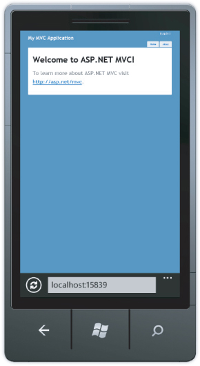
And that's just a quick list based on a very simple page.
Fortunately, the MVC 4 default template fares a lot better in a mobile browser, without additional work on your part, as shown in Figure 15.2.
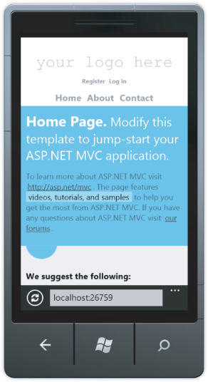
What's immediately obvious is that this page is intelligently scaled to the screen size of the mobile device. Rather than just scaling the page down (shrinking text and all), the page is redrawn so that it's usable in the device's dimensions.
What might not be immediately obvious is that the page layout actually changes subtly at this smaller size to optimize for the new dimensions. Some examples from the header area:
- The logo is aligned left in the desktop view but centered in the mobile view.
- The registration/login links are aligned to the top right in the desktop view, and are both centered and dropped below the logo in the mobile view.
- The Home/About/Contact links are aligned in the mobile view.
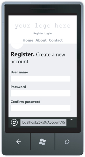
Scrolling down further, you can see the other simplifications to the mobile view to tighten it up and maximize the screen real estate. While the changes are subtle, they make a difference. For example, the round bullet icons in the “We suggest the following” list are removed and the footer text is centered. Clicking the Register link in the header shows that the form fields are appropriately sized for a mobile device, as shown in Figure 15.3.
These templates are using what's known as adaptive rendering to automatically scale the page depending on page width.
Note that I didn't say that the application is scaling the page by guessing if the user's on a mobile device based on headers or other clues. Instead, this page is making use of two commonly supported browser features, the Viewport meta tag and CSS media queries.
The Viewport Meta Tag
The majority of web pages have been created without any thought to how they'll appear in smaller form factors, and mobile browsers have long struggled with guessing how best to display them. Designs that are primarily focused on semantically structured textual content can be reformatted to make the text readable, but sites with rigid (brittle?) visually oriented designs don't reformat well at all and need to be handled with zooming and panning.
Since the majority of websites weren't designed to scale well, when mobile browsers have to guess how to render your page they'll generally fail safe and go with the zoom and pan style rendering. The solution to this problem is to tell the browser what your design dimensions are so that it doesn't have to guess.
Often, Viewport tags are used only in pages that are specifically designed for small form factors, based on browser sniffing or user selection. In this case, you'd see a Viewport tag that looks something like this:
<meta name="viewport" content="width=320">
This works for mobile-specific views but doesn't adapt to larger sizes well.
A better solution is to design your CSS to scale well at all sizes (more on that in a second), and then tell the browser that the Viewport is whatever the device supports. Fortunately, that's pretty easy:
<meta name="viewport" content="width=device-width">
Adaptive Styles Using CSS Media Queries
Okay, we've told browsers that our page will look brilliant when scaled to the current device's screen dimensions. That's a bold claim! How will we follow through on that promise? The answer is CSS Media Queries.
CSS Media Queries allow you to target CSS rules at particular media (display) features. From the W3C Media Queries documentation:
HTML4 and CSS2 currently support media-dependent style sheets tailored for different media types. For example, a document may use sans-serif fonts when displayed on a screen and serif fonts when printed. ‘screen' and ‘print' are two media types that have been defined. Media queries extend the functionality of media types by allowing more precise labeling of style sheets.
A media query consists of a media type and zero or more expressions that check for the conditions of particular media features. Among the media features that can be used in media queries are ‘width,’ ‘height,’ and ‘color.’ By using media queries, presentations can be tailored to a specific range of output devices without changing the content itself.
http://—http://www.w3.org/TR/css3-mediaqueries/
To summarize, whereas with CSS2 you could use target media types like screen and print, with media queries you can target a screen display with a certain minimum or maximum width.
Remembering that CSS rules are evaluated from top to bottom, this means that you can apply general rules at the top of your CSS file and override them with rules specific to smaller displays later in your CSS, surrounded by a media query so that they won't be applied by browsers in larger form factor displays.
In the following very simple example, the background will be blue on displays wider than 850px and red on displays narrower than 850px:
body {background-color:blue;}
@media only screen and (max-width: 850px) {
    body {background-color:red;}
}
That's exactly how the CSS in the default ASP.NET MVC 4 template works: general rules followed by mobile form-factor rules guarded by an 850px max-width media query. To see this code, look at the Mobile Styles section /Content/Site.css.
If you've been paying attention, you'll have guessed that you can test this out just by resizing a desktop browser narrower than 850px (see Figure 15.4), and that guess would be correct.
You can easily test this out without writing any code: Create a new MVC 4 project using the Internet application template, run it, and resize the browser.
Even if you're not building on top of the default layout and styles in an MVC 4 application, you can make use of them as an example of how to add some basic adaptive layout support to your existing web applications.
With adaptive rendering, you're sending the same markup to every browser and using CSS to reformat or toggle visibility of certain elements. In some cases, that's not enough: You need to vary the markup sent to all mobile browsers. That's where Display Modes come in handy.
Display Modes
The view selection logic in MVC 4 has been altered to add convention-based support for alternate views. The default view engine first looks for views with names ending in .Mobile.cshtml when the browser's user agent indicates a known mobile device. For example, when a desktop browser requests the home page, the application will use the ViewsHomeIndex.cshtml template. However, if a mobile browser requests the home page, and a ViewsHomeIndex.Mobile.cshtml template is found, it will be used instead of the desktop view. This is all handled via convention; there's nothing to register or configure.
To try this out, create a new MVC 4 application using the Internet application template. Make a copy of the ViewsHomeIndex.cshtml template by selecting it in the Solution Explorer and pressing Ctrl+C and then Ctrl+V. Rename this view Index.Mobile.cshtml. The ViewsHome directory should appear, as shown in Figure 15.5.

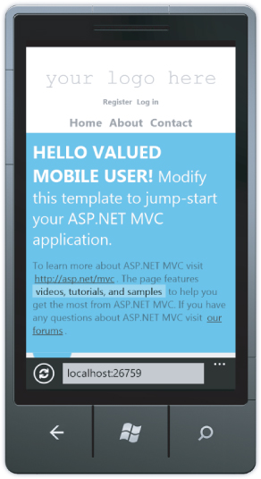
Edit the Index.Mobile.cshtml view, perhaps changing the page title:
<hgroup class="title">
    <h1>HELLO VALUED MOBILE USER!</h1>
    <h2>@ViewBag.Message</h2>
</hgroup>
Run the application and view it in a mobile emulator to see the new view, as shown in Figure 15.6.
Layout and Partial View Support
You can also create mobile versions of both layouts and partial view templates.
If your ViewsShared folder contains both the _Layout.cshtml and _Layout.mobile.cshtml templates, by default the application will use _Layout.mobile.cshtml during requests from mobile browsers and _Layout.cshtml during other requests.
If a ViewsAccount folder contains both _SetPasswordPartial.cshtml and _SetPasswordPartial.mobile.cshtml, the instruction @Html.Partial(”∼/Views/Account/_SetPasswordPartial”) will render _ SetPasswordPartial.mobile.cshtml during requests from mobile browsers, and _ SetPasswordPartial.cshtml during other requests.
Custom Display Modes
Additionally, you can register your own custom device modes that will be based on your own custom criteria. For example, to register a WinPhone device mode that would serve views ending with .WinPhone.cshtml to Windows Phone devices, you'd use the following code in the Application_Start method of your Global.asax:
DisplayModeProvider.Instance.Modes.Insert(0, new DefaultDisplayMode("WinPhone")
{
    ContextCondition = (context => context.GetOverriddenUserAgent().IndexOf
        ("Windows Phone OS", StringComparison.OrdinalIgnoreCase) >= 0)
});
That's it — there's nothing to register or configure. Just create views that end with .WinPhone.cshtml, and they will be selected whenever the context condition is met.
The context condition isn't limited to checking the browser's user agent; there's no requirement that it does anything with the request context at all. You could set up different display modes based on user cookies, a database query that determines the user's account type, or the day of the week. It's completely up to you.
Display Modes make it easy to override views for mobile browsers, but what if you're creating an application that's only intended for use on mobile browsers? In that case, it may be time to create a new application using the Mobile Site template.
Mobile Site Template
The Mobile Site template preconfigures your site to use the jQuery Mobile library. jQuery Mobile offers a number of enhancements for mobile web applications:
- The user interface uses UI widgets that are touch optimized, ensuring that users won't become frustrated by tiny buttons and form fields.
- It's designed for (and tested against) all major mobile browsers.
- Ajax navigation offers animated page transitions and better performance over low bandwidth.
- Theme support allows you to re-skin the entire site through CSS themes.
- List views offer a great experience for viewing and manipulating lists of information in a mobile-friendly interface.
You can get a quick introduction by creating a new project using the Mobile Project template, running it, and viewing it in a mobile emulator (see Figure 15.7).

The Mobile Project template gets you started with a jQuery Mobile-powered ASP.NET MVC application. To get much further, you'll need to learn your way around jQuery Mobile. That's outside the scope of this book, but the following resources will get you well on your way:
- The jQuery Mobile site (http://jquerymobile.com/) offers a ton of information, including documentation, live demonstrations, theme builder support, and more.
- The ASP.NET MVC 4 Mobile Features tutorial on the ASP.NET website (http://www.asp.net/mvc/tutorials/mvc-4/aspnet-mvc-4-mobile-features) walks you through a detailed tutorial in which you build out a mobile conference website. The tutorial offers the source for the completed application, so you can just download and run it if you'd like.
- K. Scott Allen's ASP.NET MVC and jQuery Mobile presentation from NDC 2012 (http://vimeo.com/43624503) explores adding jQuery Mobile support to the MVC Music Store sample. He shows some advanced features like page events and touch gesture support.
MVC 4 gives you a lot of tools to provide better experiences to users on mobile browsers. The best advice I can give you is to make a habit of testing your sites in a mobile browser. When we ran through this on the ASP.NET website (http://asp.net), we found that it was really difficult to navigate the site and read the content. We were able to dramatically improve the site experience through adaptive rendering, and have since seen significantly higher mobile usage.