
Chapter Three:
PLAYING WITH COLOR
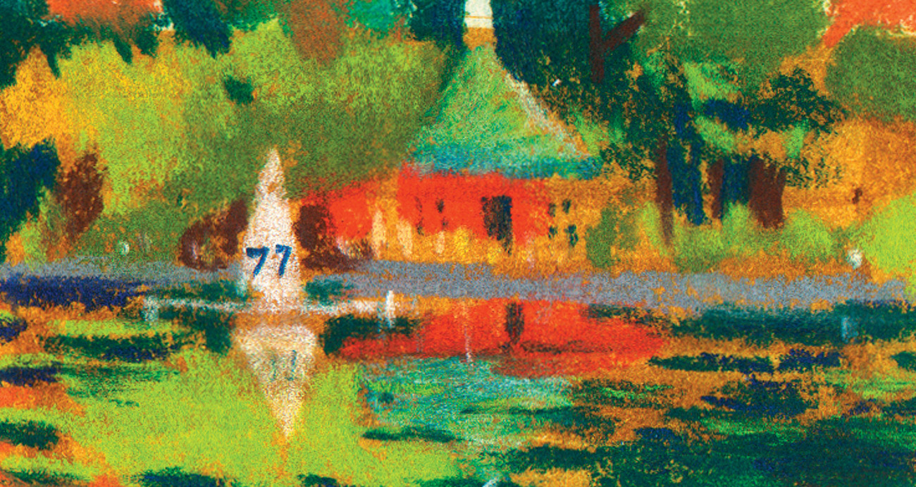
Central Park boathouse, by Despina Georgiadis, pastel
DAY 9
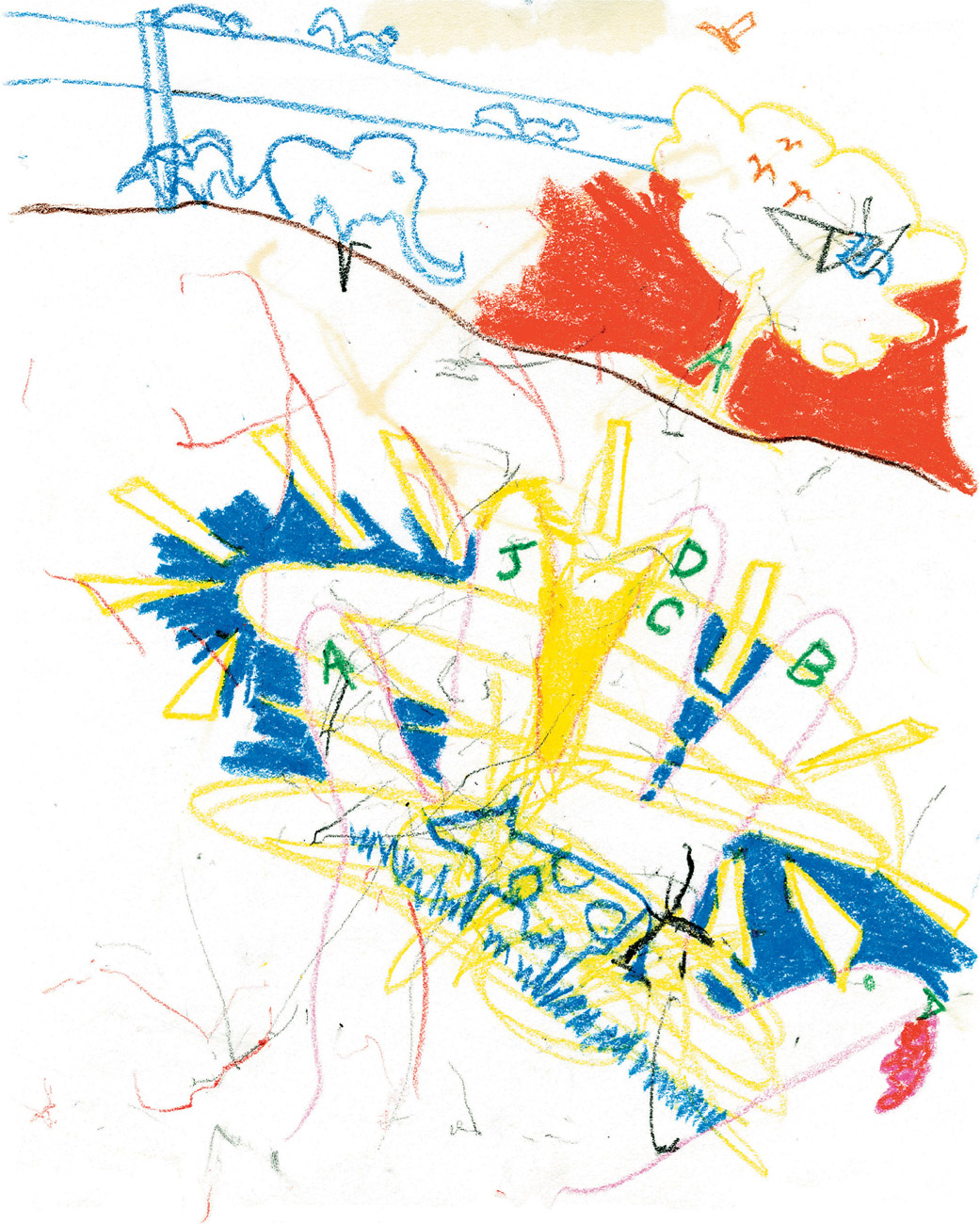
Childhood fantasy, crayon drawing,
“But she didn’t, she only art directed. Actually, my daughter Anastasia did draw a little of this. I gave her my sketchbook and asked her to trace her hand. She said, ‘You do it,’ and then proceeded to put yellow scribbles around my hand’s outline. That was all the heavy artwork she was prepared to do. After that, she rattled off the letters I should draw: a for Anastasia [her name], j for Joanna [my wife], d for Dominick [me], and then b and c because they come after a. Anastasia then looked out of our window at the squirrels and directed me to put some into the drawing, as well as birds and an elephant. The exercise lasted about 10 minutes. My daughter got nothing from the experience but supervisor training and she still tells me what to draw, but at least we have developed a good working relationship. Oh yeah, she chose the colors too.”—Dominick
EXERCISE 9
Get yourself a big piece of cheap paper and a box of crayons. If you want to, go for the sixty-four-color Crayola special box with the sharpener in the back, but any kind of child’s crayons will do. This exercise is our introduction to playing with color. And the key word here is play.
You can ask a child to tell you what to draw or simply channel your inner child. To begin, trace your hand with a colored line and then decorate it. Add letters and numbers. Think of symbols that you liked when you were young: stars, hearts, cars, flowers, animals, animated characters—anything goes. Create some lines with color and make some solid shapes as well. Relax and remember the feeling of playing with crayons that you had when you were young. Pick any color at random; don’t worry about which color is right, good taste, or good design. Just grab ’em and get busy! Don’t forget to include a decent amount of scribbling—it’s good for you. If it helps you to get in the mood, have some cookies and milk while you do the exercise.
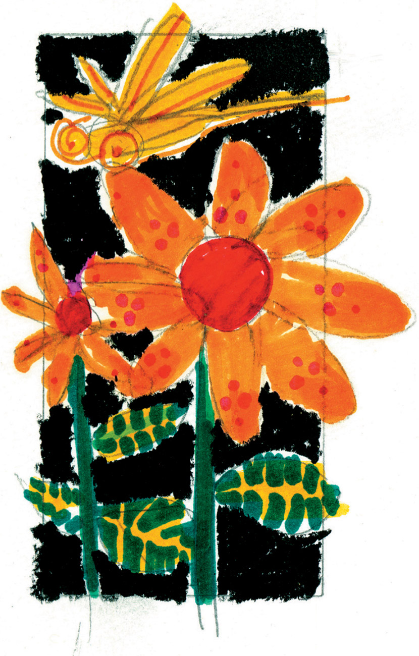
Dragonfly and flower, markers on paper
VARIATION
Now that you are feeling a little bit freer with color, get some nice, thick colored markers and try a bold picture like the brightly colored drawing of flowers and a dragonfly that Eddie has done. Pick a still-life subject with big shapes of color. Start by drawing the lighter shapes and overlay them with darker shapes and patterns. Try dots, dashes, checks, scribbling. You might incorporate a crayon or two into the drawing as well, but don’t overcomplicate it. Just play around with the richness and layering of the colors. Have fun!
DAY 10
“My son James and I hang out together a lot. Every once in a while as he plays, I see some funky-looking light fall upon him. So I grab my crayons and I play, too.
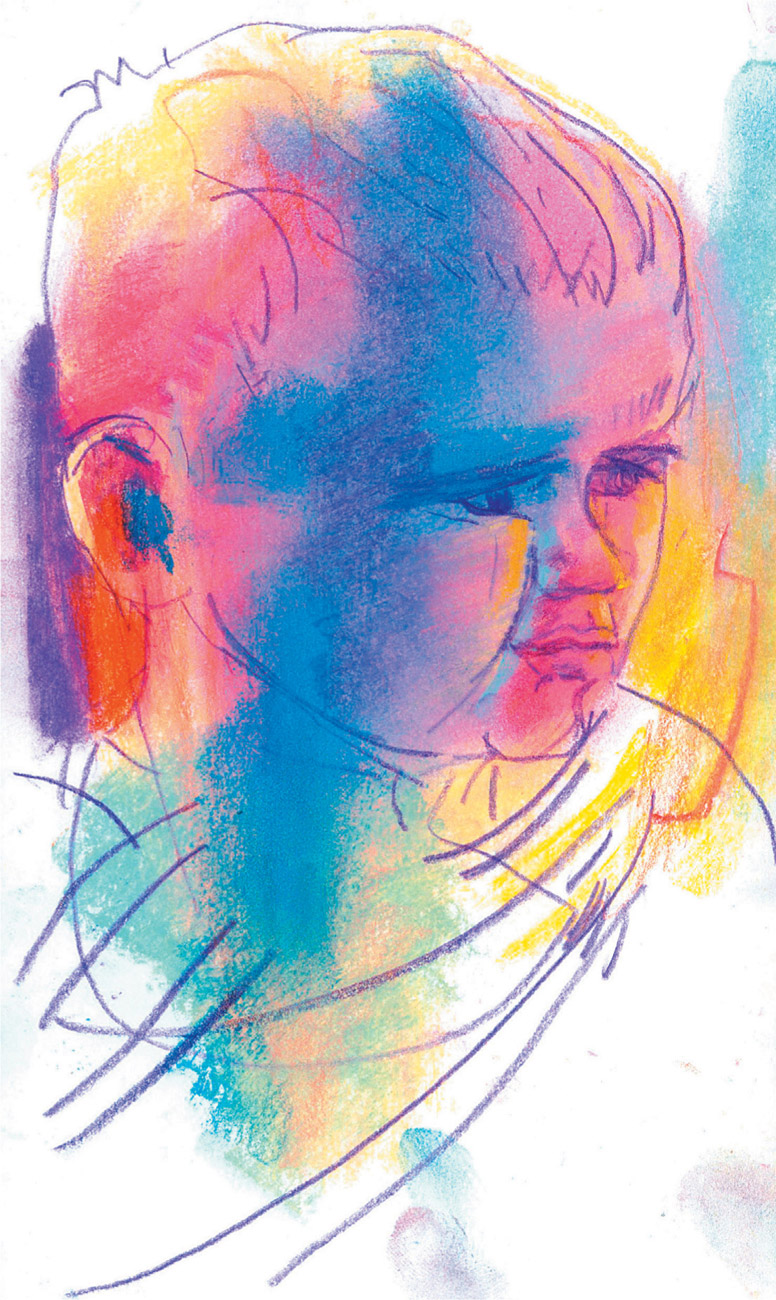
James, pastel and colored pencil on paper
“Sometimes I like to find the light when I draw. I try to see how it changes the things it touches. And then the challenge for me is to find a good combination of colors that can explain what I’m seeing and feeling. I tried it again with a portrait of my mother.”—Despina
EXERCISE 10
Now that you’ve played with color a bit, let’s try a color portrait.
Color is light, energy. Despina looks for a special kind of “funky” light that gets her excited to draw: What kind of light do you find the most beautiful? Whatever time of day that is, ask a friend or family member to pose for you at that time. Using pastels and colored pencils, create a portrait that reflects the feel of the light that you’ve chosen. As with the work Despina did here, allow yourself to go beyond the confines of what the color actually is and move toward how the color actually feels. Don’t be afraid of vibrant colors: Play around with crazy combinations to see what results you can get—you may find them closer to reality than you expect!

Mama, pastel and colored pencil on paper
TIPS
- Try to find the large shapes in the face and put them down with color in a bold way. Let the pastel colors define the shapes and use the colored pencil for line and details.
- It sometimes helps to draw someone who is an artist or a fan of your work—people get tired of posing very quickly!
DAY 11
“What better way to say goodbye to summer fun than spending time colorin’ with water down at New York City’s South Street Seaport? The sun was hot, the coffee was iced, and the color was flowing. It’s wonderful to make art.”—Michele

Woman at the seaport, watercolor
EXERCISE 11
Get a set of watercolor pans and some watercolor paper and head out to your favorite urban hangout. Michele picked a seaport, but any place you like to visit will work. If you live in a small town, think about going to the town square. Pick a scene that offers a few views, so you can paint more than one. Without drawing a pencil outline, pick a view and paint some solid shapes that you observe, directly with the watercolor. Put enough water on your brush to saturate the pans of color, but not so much that you lose the ability to control the shapes as you paint them.
Start with the lighter shades and add the darker ones on top. Pay attention to textures and patterns that can form strong picture shapes as well. Be patient and allow each layer to dry before you add more color over it. Allow the scene to build up naturally; that’s the idea of doing more than one drawing at the same time. While one of them dries, you can work on the other one.
Don’t be afraid to incorporate people into your scene—keep them as simple shapes in design as Michele has done with these. You might even turn the final paintings into postcards for your hometown!
South Street Seaport scene, watercolor
TIPS
- Try using a thin brush with color to create some linear effects.
- A watercolor block will keep the paper stretched and flat while you are working, as opposed to loose sheets of paper.
- Use a sable-haired brush for greater sensitivity. It will also hold more paint.
DAY 12

Sacré-Coeur, monoprint of water-soluble crayon drawing
“Something always makes me think of France. Drawing at the Basilique du Sacré-Coeur was an experience that has stayed with me over the years. The basilica of Sacré-Coeur, which means ‘sacred heart’ in English, sits on the highest point of Paris, at the top of Montmartre. The Montmartre district of Paris was the home to many famous artists, among them Pablo Picasso, Vincent Van Gogh, and Amedeo Modigliani. I can see why they liked living here—this district is a very romantic must-see for any artist visiting the city of light!”—Dominick
EXERCISE 12
Create a monoprint of a local landmark. You will need a stack of watercolor or other absorbent paper, a spray bottle filled with water, and several water-soluble crayons. Bring a range of color that seems like it will be aesthetically suited to the place you plan to visit. Don’t worry so much about the actual colors of the place—by selecting them before you go you will be true to the impression that the landmark has left on you.
Working quickly, create an impressionistic drawing with the water-soluble crayons, spray it with water, and press a clean sheet of watercolor paper on top. Smooth it out with the palm of your hand to be sure you are making good contact. Experiment with different colors and different amounts of water: Don’t hesitate to draw into the print with the crayons after you’ve created it either. You might even try this on different surfaces to experiment with other textures. Work to get the feel of the landmark that you’ve chosen. When you’re finished, be sure to sign your one-of-a-kind print!
Sacré-Coeur, detail
TIPS
- It can be interesting to add other materials to the printing process—leaves and scraps of paper can create some unusual effects when printing.
- Using the side of the crayon will give you bold strokes of color.
DAY 13

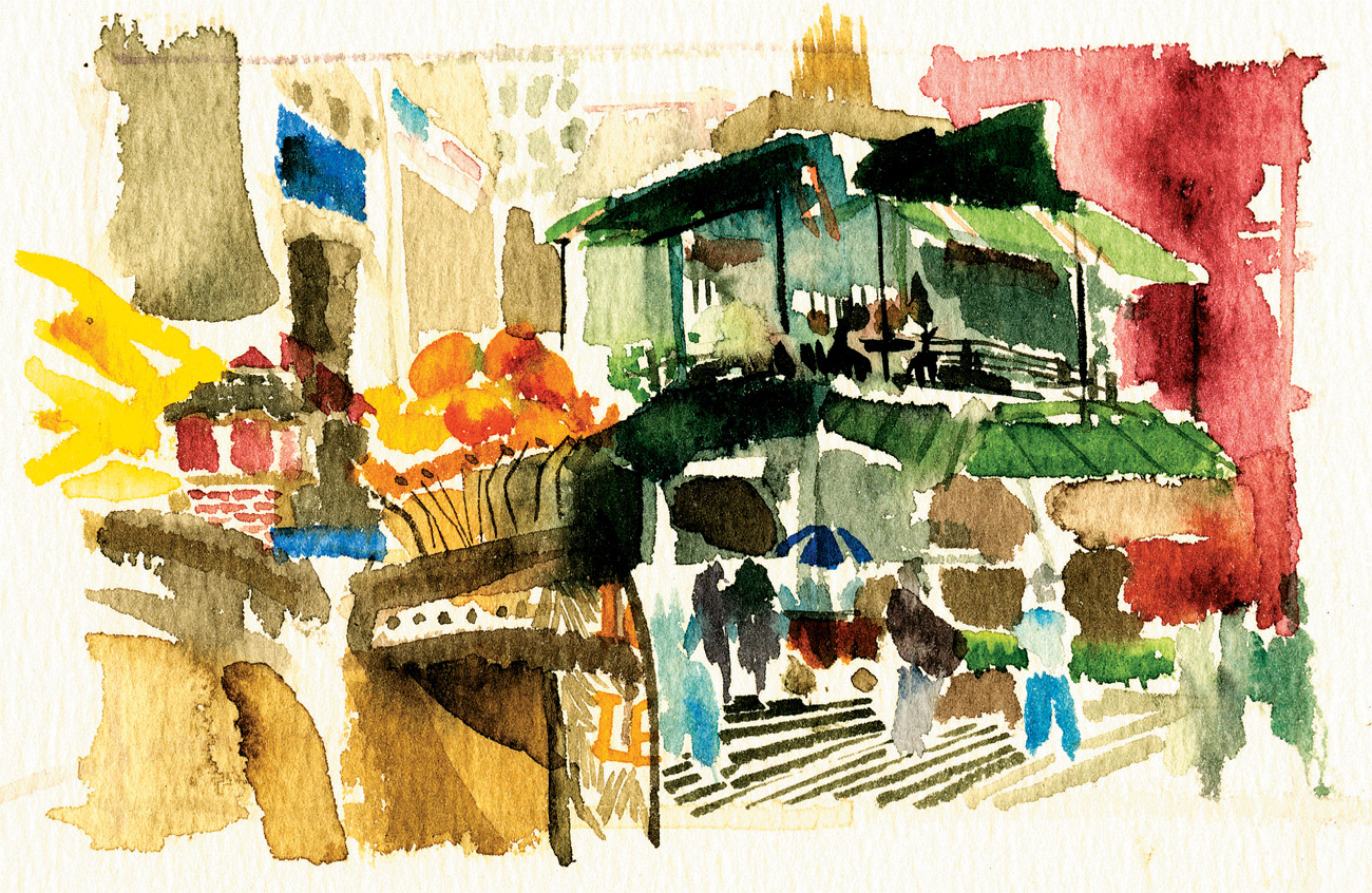
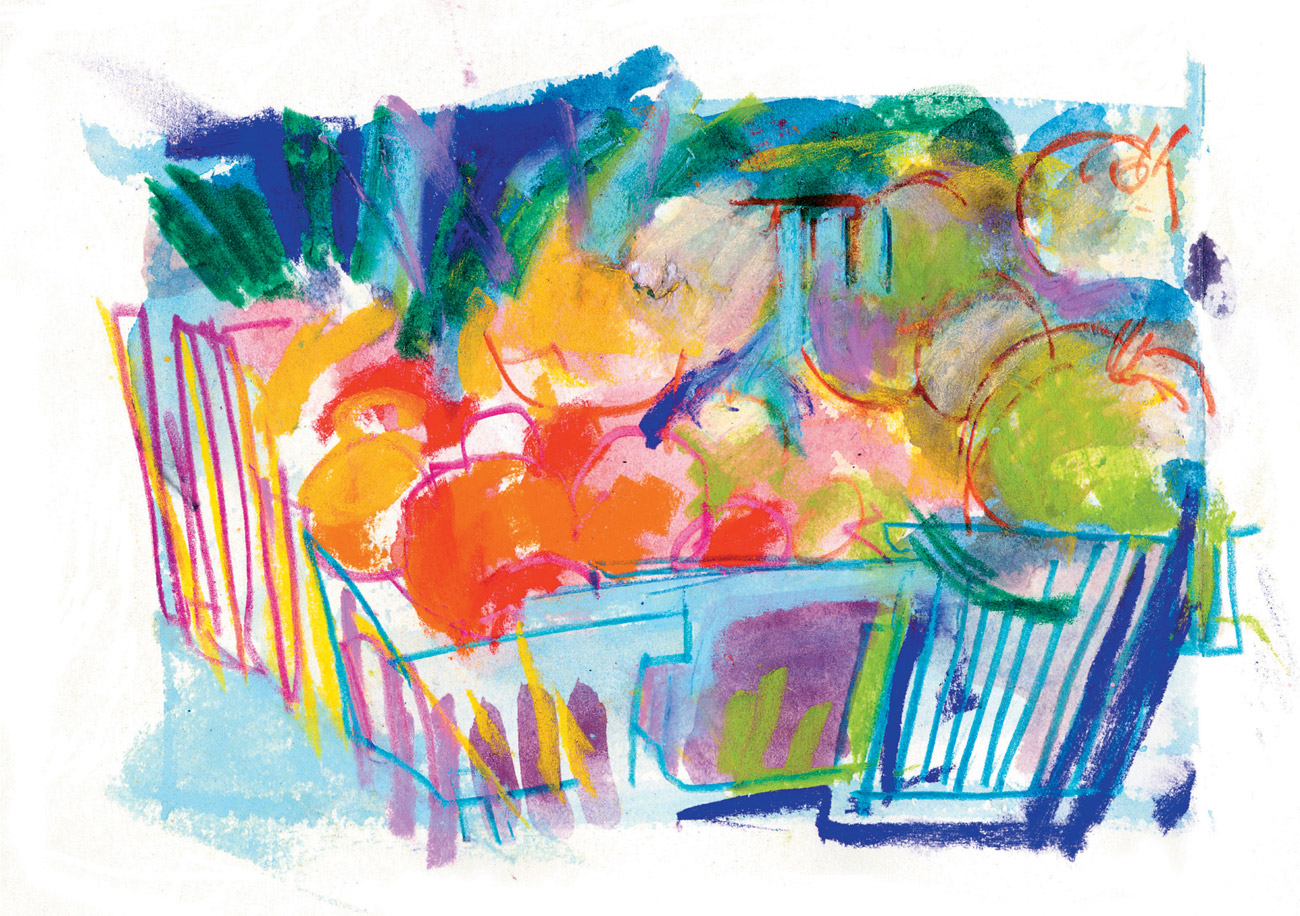
Fruit stand, pastel
“This little drawing is of dogs socializing at the Bethesda Fountain in New York’s Central Park. You really know spring is in the air when dogs start appearing en masse at the city’s parks as the perfect accessories for their owners.” (New Yorkers are their own breed.)—Kati
EXERCISE 13
For this exercise, we are going to make a line drawing with color. Pick a spot where you like to draw. It could be a location, such as a dog park, or a still life you set up in your own home. This exercise can be done with any subject.
Using pastels, colored pencils, or crayons, create a line drawing using a minimum of five different colors. Notice what color choices feel right as opposed to being overly influenced by the colors that exist in the scene. (Or you could choose them totally at random, as Kati did when drawing the doggies in the park.) The idea is to do a drawing as you would with a black line, substituting colored lines instead. This is a good exercise for developing your individual taste in color.
VARIATION
You might try an additional color drawing that includes a few solid shapes of color with the line, as Kati has done in her drawing of a California fruit stand, left.
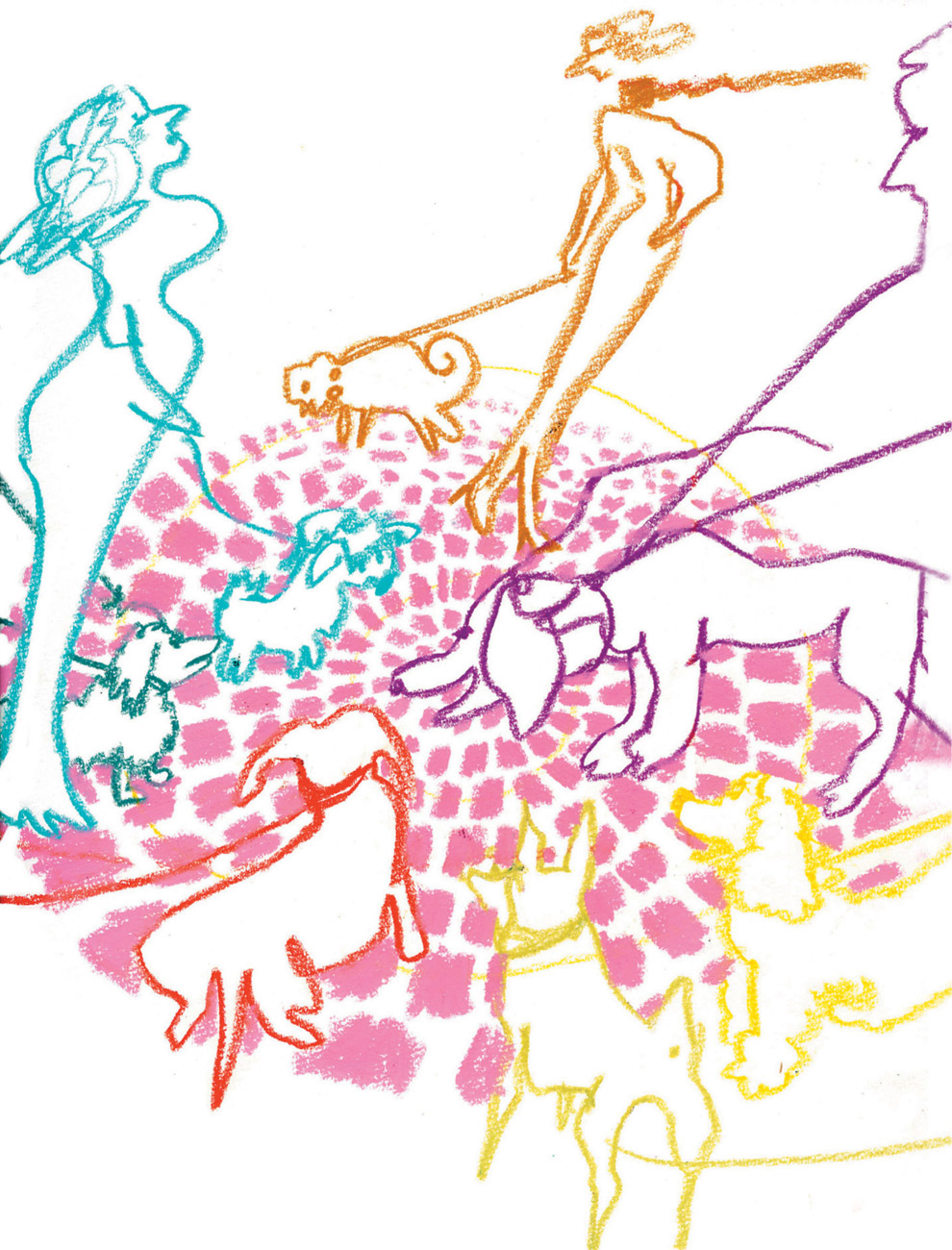
Doggies, water-soluble crayon
DAY 14
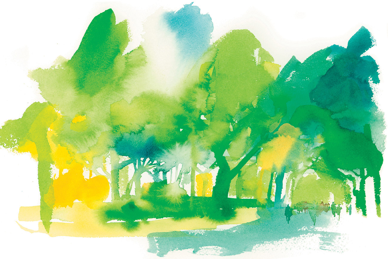
Central Park spring colors, watercolor
“Here is a watercolor I made at Central Park in the springtime and one I made in fall, with the changing colors. In the fall one, some of the trees were still green, but many of the leaves had begun turning into intense and beautiful colors. Fall is such a brief time to be happy before everything turns gray and white.”—Greg
Find a group of trees or shrubbery with nice full shapes to work with. Set up a piece of watercolor paper and squeeze some color down on the page, using the shapes of the shrubbery as a rough guide. Use undiluted paint from tubes (rather than pans) and put the greatest concentration of paint in the area where you want the most vibrant color. Then, using a wet brush, bleed the color out from there. Work directly with the paint; don’t pencil anything in first or mix the paint on a palette. Use some thick brushstrokes for lines and rough in shapes; let the colors flow one into the other. Think about creating an impression of the scene in front of you rather than strict realism.
Create two versions: In the first, choose one color that dominates the scene and practice using different shades of that color. In the second version choose colors that would represent a change of season or a change of weather, such as autumn or a rainy gray day.
TIP
- Create greater depth with transparency: That is the most unique feature of the watercolor medium. Add a significant amount of water to your pigment, apply, and let dry. Once the area of color is dry, paint over it with the same color to create a deeper value or choose another color to see how the two mix. Watercolor paper works best for this exercise.
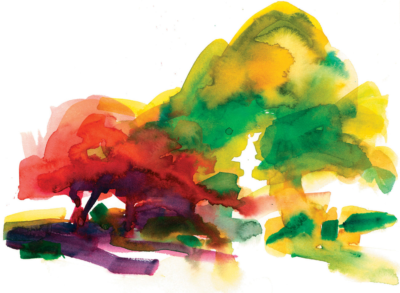
Autumn in Central Park, watercolor
DAY 15
“Whew! When this drawing was done, I had just returned from a month of traveling and finally unpacked my suitcase. Spent some time in Barcelona with my husband, Neil, then traveled to Paris with the Dalvero Academy and eventually wound up my travels by going to Portland, Oregon, as a presenter at the 1st Annual Urban Sketchers Symposium! The drawing below was made at the farmer’s market in Portland, so I’ve called this exercise ‘Bountiful Harvest.’ Meaning, to explain, the harvest of all kinds that reportage drawing and illustration has brought me: my old friends and dearest Studio 1482 family, the wonderful group of artists who study with Margaret and me at the Dalvero Academy, and the new friends and sketching enthusiasts from around the world that I met in Europe and at the Urban Sketchers Symposium. Not to mention the joy I get every day from doing what I love, drawing. What a bountiful harvest indeed!”—Veronica
Bountiful harvest, watercolor, pastel, pencil
EXERCISE 15
This is an exercise in mixing several different mediums and proportions of color. Use watercolor, pastel, and colored pencils.
Go to a farmer’s market near you, or if you don’t have one, visit a local produce stand in your town. Choose a spot to draw that shows a wider range of color. Working quickly, lay down some shapes with the watercolor, then add to them with pastel. Add some solid line with the colored pencil for detail and work back into the drawing with the watercolor and pastel again. Add more line if you think it’s necessary or use the pencils for specific detailed marks. Work fairly quickly and keep it loose: Notice how I have kept the shapes half open and worked the spaces between foreground and background. Don’t be afraid to mix colors in new ways: You want an overall impression of what you’re drawing. Keeping the shapes from closing entirely will give the drawing a sense of life and vibrancy. Of course, you will need to draw one or two shapes completely so the viewer can fill in the rest in their head!

Poppies, colored pencil and pastel
VARIATION
You might try a mixed color drawing that emphasizes line over shape, as I have done with this drawing of poppies, above. Make your line drawing with colored pencils, and then add a bit of pastel or watercolor, or both, in a limited amount. This creates unusual proportions and can be a nice variation to the piece with heavy emphasis on color shapes and marks.
DAY 16
“What was happening the day I did this carousel drawing is that I just wanted to play a little with all the colors and the shapes that surrounded the actual horses that made up the carousel. And of course, when I went to draw them, the carousel was moving, and so I saw the art as more motion and color and line than as a traditional carousel drawing/painting. So all of the color and activity surrounded the horse, and he became the means of identity to the carousel. It was just fun to approach it that way!”—Margaret

Detail, carousel
EXERCISE 16
Today we are going to take color drawing into painting, as Margaret has done with this lovely expression of a carousel.
Find a spot that is loaded with color. It can be a fantasy, such as a carousel, or something more grounded in reality, such as a flower market. Whatever place you choose, make sure it has more colors than you can count! Using a mixture of oil-based grease crayons and water-soluble crayons, create a vignette of what you are looking at, on the spot. A vignette is a picture that forms its own borders and is usually an irregular shape. Use the crayons to create lines, solid shapes, and markings or textured patterns. Layer the color and get abstract, as Margaret has done. Notice in the detail at left how a piece of the whole looks like an abstract expressionist painting! The key is to make a bit of a mess of the color and enjoy the process. How much information do you need to keep the picture clear?

Carousel, oil and water-soluble crayon
TIP
- Look for an overall shape that you can anchor your work to. Pulling out identifying details with line will keep the subject of the vignette from becoming a total abstraction.