
Chapter at a glance
Create
Creating a new presentation based on a theme or template
Customize
Customizing your file with colors, fonts, and effects

Add
Adding graphics to the slide master and layouts
Create
Creating a custom slide layout
IN THIS CHAPTER, YOU WILL LEARN HOW TO
Create a new presentation based on a theme or template.
Apply a theme to an existing presentation.
Customize your file with colors, fonts, and effects.
Apply theme effects to your presentation.
Add graphics to the slide master and layouts.
Create a custom slide layout.
Change your presentation from a 16:9 to a 4:3 format.
Microsoft PowerPoint is such a popular tool because it is practically synonymous with presentations. Used thoughtfully, it is a great program for producing clear, professional presentations to share ideas and concepts with an audience.
Creating an effective PowerPoint presentation is mostly a matter of form following function. You don’t want the available features to overwhelm the content of your presentation. For that reason, when you are planning a presentation, it’s best to work on the content before you bring PowerPoint and all its bells and whistles into the mix.
There are a number of recommendations for ways of doing this—jot ideas on sticky notes and rearrange them into blocks of content, create an outline in Microsoft Word, or even scribble thoughts on the back of a napkin. Regardless of how you do it, the goal is to concentrate on the content before you worry about how things look.
With that said, Microsoft Office themes and PowerPoint templates give you a lot of power and flexibility so you don’t have to worry so much about how things look as you’re creating your content. A good theme or template can help make that happen, because nearly everything in a presentation is affected by one or more theme elements.
In this chapter, you’ll start creating a presentation based on a variant of an existing theme, and then you’ll tweak the layout to better suit your needs. You’ll learn how to change colors and font themes as well as create your own customized layout. You’ll also learn how to add graphics to a slide master.
Practice Files
To complete the exercises in this chapter, you need the practice files contained in the Chapter12 practice file folder. For more information, see Download the practice files in this book’s Introduction.
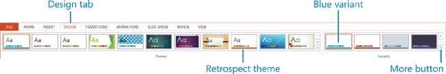
Like all the other Office Home and Student 2013 applications, PowerPoint uses the new Start user interface, complete with a thumbnail gallery and dynamic previews of available themes. The themes that appear might vary a bit depending upon whether you’re signed into Office. Either way, PowerPoint 2013 takes the theme preview concept a step further—each theme now has variations where the fonts or colors have been changed. These are called variants, and they’re displayed in the preview windows. You can select a variant to quickly change the look and feel of a theme or template.
In this exercise, you’ll start a new presentation based on a theme variant.
Set Up
You don’t need any practice files to complete this exercise. Just start PowerPoint and follow the steps.
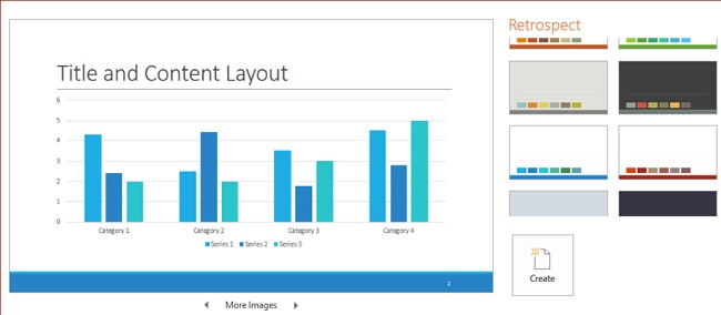
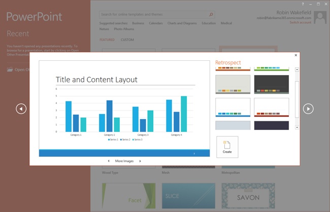
On the PowerPoint Start screen, click the Retrospect theme thumbnail to open the Preview window.
In the Preview window, click the blue variant.
Click the arrows next to More Images to view how the blue variant looks on some sample content.
Click Create to create a new presentation based on the blue variant of the Retrospect theme.
You won’t always start from scratch when creating a presentation. In fact, you’ll often begin with a presentation you’ve already done. That’s not a problem, because you can apply a theme and its variants to your slides from the Design tab in PowerPoint. You can even right-click the thumbnails in the Themes and Variants galleries to apply them to specific slides in the presentation.
In this exercise, you’ll apply a theme and a variant to an existing presentation.
Set Up
You need the SampleContentA_start presentation located in the Chapter12 practice file folder to complete this exercise. Open the SampleContentA_start presentation, and save it as SampleContentA. Then follow the steps.
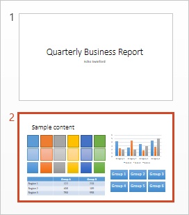
In the slide thumbnails pane on the left side of the PowerPoint workspace, click slide 2 so you can view how changing the theme affects the sample content.
Click the Design tab, and then in the Themes gallery, click the Retrospect theme to apply it to the presentation.
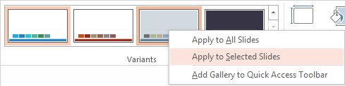
In the Variants gallery, click the blue variant to apply it to all slides in the presentation.
Select the title slide (slide 1) in the slide thumbnails pane.
In the Variants gallery, right-click the gray variant and choose Apply to Selected Slides to apply this variant to the title slide only.
Click the blue variant again to reapply the color change to the title slide.
Every theme, even the blank Office theme, has a set of colors, fonts, and effects built in. And since every template is based on a theme, the colors, fonts, and effects are also built into every template. Of course, because every PowerPoint file is based on a template or a theme, the colors, fonts, and effects sets are built into every presentation as well.
As shown in the two previous exercises, applying a theme to a presentation can completely change its appearance. This is because the slide master and layouts are part of the theme, and they affect how the content is positioned on the slides. You’ll learn more about this in upcoming exercises.
For now, it’s most important for you to know that you don’t have to apply an entire theme (the full set of colors, fonts, effects, and slide layouts) to a presentation. You can change the look and feel of a presentation at any time by simply applying different theme colors, fonts, or effects.
You’ll find the theme fonts that are used in a presentation listed on the Home tab in the Font gallery. Click into any text on a slide, and then on the Home tab, click the arrow to open the Fonts list. At the top of the Fonts list are the theme fonts that are used in the presentation.

Heading fonts are generally applied to titles and subtitles, whereas the Body font is used for most other text.
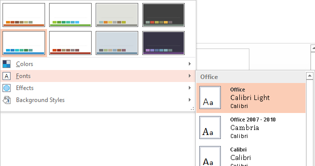
You can choose a different theme font set from the Theme Font gallery by expanding the Variants gallery on the Design tab of the ribbon. If you don’t find a font set you like, you can create your own there as well.
You’ll find theme colors in almost every option that has anything to do with color. They show up in all formatting galleries—Shape Styles, Tables, Charts, SmartArt, and Pictures—as well as in the fill and outline colors for shapes, lines, and fonts.
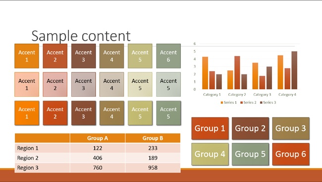
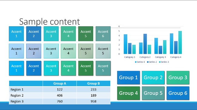
Theme color sets consist of 12 colors: two light/dark combinations, six accent colors, and a hyperlink and a followed hyperlink, although the hyperlink and followed hyperlink colors don’t actually show in any of the galleries. The full palette is derived from tints and shades of the theme colors.
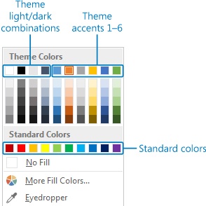
The two light and dark combinations are generally used for text and slide background colors. They’re designed to work together. If you change your slide background style from white to black, for example, any text that was black will turn white so it will be visible on the black background. SmartArt, tables, and charts all rely on dark/light combinations for their font colors as well.

The accent colors are used for everything else. You’ll find these on every color gallery throughout the PowerPoint interface—Shape Styles, Table Styles, Chart Styles, SmartArt Styles, fill, line, and font colors, and more.
When you are applying a theme color to an object (or when PowerPoint applies it for you), that color is really just referencing a position in the theme color gallery. For example, if you fill a square shape with Accent 2 (which happens to be orange in the default Office theme), and you change themes, your orange shape will become whatever color the new theme uses for Accent 2. Think about how the colors changed in the SampleContentA file when you changed from Retrospect with its brown and yellow colors to the blue variant; that is a color theme in action.
You can choose a new theme color set from the Colors gallery that’s accessed by expanding the Variants gallery. If you don’t find a color set that you like, you can create your own set of theme colors.
Using absolute colors
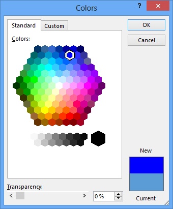
Sometimes a red is just a red, and you don’t have one in your theme colors. No problem! You can always use colors that aren’t part of your theme. These colors are known as absolute colors, and they won’t change when you change theme colors.
To access non-theme colors, choose one of the standard colors or click More Colors on any color gallery. For example, if you’re using the Fill color gallery, click More Fill Colors. If you’re using the Outline color gallery, choose More Outline Colors.
This opens the familiar honeycomb where you can choose from one of the standard colors, or you can insert your own RGB (red, green, blue) or HSL (hue, saturation, luminosity) values on the Custom tab.
Theme effects are things like default shadows and gradients or other fill styles that are built into a theme. You can view different theme effects in action by expanding the Variants gallery and pointing to the various sets of effects to view how they affect and change your slides. Some of the theme effects, like the default Office theme, will be fairly subtle. Others, like Grunge or Milk Glass, will have textured fills or extreme gradients and shadows.
See Also
For an overview of how themes work, see Chapter 1.
In this exercise, you’ll apply new theme fonts and effects to an existing presentation. You’ll also customize and apply a new theme color set to the presentation.
Set Up
You need the SampleContentB_start presentation located in the Chapter12 practice file folder to complete this exercise. Open the SampleContentB_start presentation, and save it as SampleContentB. Then follow the steps.
With slide 2 selected (to demonstrate how changing theme effects, colors, and fonts affects the sample content), expand the Variants gallery on the Design tab and click Fonts to open the Theme Fonts gallery. Scroll through the theme font sets to display a live preview of their effect on the fonts in the presentation.
Click the Franklin Gothic theme font set. This applies the Heading font, Franklin Gothic Medium, to slide titles and subtitles, and the Body font, Franklin Gothic, to all other text.
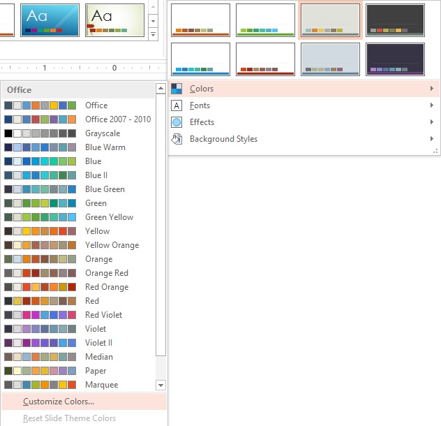
Expand the Variants gallery again and click Colors. Scroll through the Theme Colors gallery to view how the different theme color sets would affect your presentation.
Click Customize Colors at the bottom of the Theme Colors gallery.
Click Accent 6, and then click the More Colors option.
On the Custom tab, enter 122 for Red, 188 for Green, and 50 for Blue, and then click OK to close the Colors dialog box.
Click the Hyperlink color swatch, and then click Turquoise, Accent 3 in the Theme Colors palette.
Click the Followed Hyperlink color swatch and change it to a shade of gray by selecting a tint or shade of black or white in the Theme Colors palette.
Name your new Theme Colors set by entering Fabrikam in the Name box.
Click Save to save and apply the new theme colors.
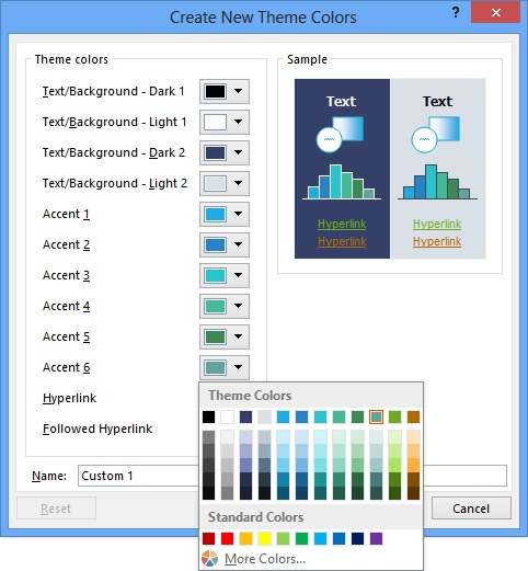
Expand the Variants gallery and click Effects. Point to the different theme effects sets to see how they will affect your content.
Click Office to apply the Office Home and Student 2013 theme effects to your file.

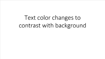
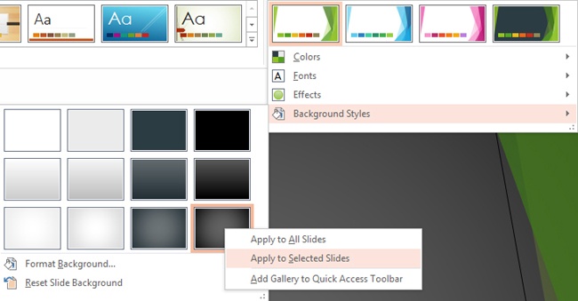
Every theme includes a set of background styles, which are also accessed by expanding the Variants gallery on the Design tab.
These background styles work with the text and background color combinations (the first four color swatches) in your color theme to ensure that text is always visible. That’s why it’s important to make sure those dark and light text and background colors have enough contrast when you’re creating a custom color theme. It’s also generally a good idea to choose your text colors from those background and text colors, because then the text color will be updated when you change the slide background style or paste the slide into a new presentation.
Tip
In the Create New Theme Colors dialog box, the first four theme colors are called Text/Background Dark 1, Text/Background Light 1, Text/Background Dark 2 and Text/Background Light 2. In the ScreenTips that appear when you point to a color in the various color galleries in PowerPoint, they’re called Background 1, Text 1, Background 2, and Text 2.
In this exercise, you’ll apply new theme background styles to view how they affect font colors and visibility.
Set Up
You need the SampleContentC_start presentation located in the Chapter12 practice file folder to complete this exercise. Open the SampleContentC_start presentation, and save it as SampleContentC. Then follow the steps.
Expand the Variants gallery on the Design tab and click Background Styles. Notice that the slide uses the white background style.
Point to the lower-right thumbnail in the Background Styles gallery. (The ScreenTip will say Style 12). Click to apply this dark background to all slides. Black text that wouldn’t be visible on the dark background changes to white.
Open the Background Styles gallery again and click Style 5 (first column, second row) to apply a subtle light gradient to all slides.
With slide 1 selected, open the Background Styles gallery again, right-click Style 12, and choose Apply to Selected Slides to give the title slide a more dramatic look.
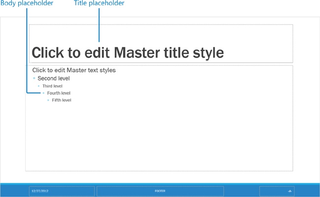
Many people don’t realize that the PowerPoint slide master and layout features give you a lot of control over the look of your slides. You can add graphics and images to the master, and you can format the placeholders on the master as well. These settings trickle down to the individual layouts, which provide combinations of placeholders to help you create content for your slides.
Placeholders are preformatted content containers. When you apply formatting to them on the slide masters and layouts, then any content that’s created in a placeholder on a regular slide will inherit those settings.
Although PowerPoint provides you with a set of layouts built into each theme, template, and presentation, you can still create your own custom layout that has exactly the placeholders and graphics you need.
Most formatting that can be applied to shapes can be applied to placeholders as well, but the most common way to format a placeholder is to format the settings that are specific to the text; for example, the font color and size, paragraph settings, and bullet points.
Tip
Text formatting can be applied to any text in your presentation, but it’s best to apply these settings to the placeholders on the slide master and layouts to create consistency throughout your slides. You can always apply manual formatting to override the placeholder, if necessary.
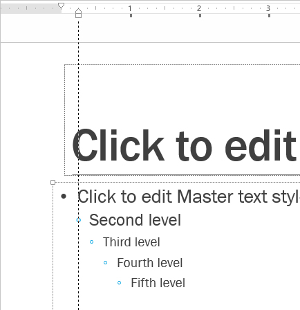
Text formatting, such as bold, italics, and underlines, is probably obvious to most PowerPoint users, but you might not think of PowerPoint as having “paragraphs,” and you’d be right! A PowerPoint paragraph is the text that’s included in a bullet point. You can have up to nine levels of text in a presentation (although this is definitely not recommended), but PowerPoint shows only five by default in Slide Master view. You’ll want to specify common paragraph settings, such as line spacing and the indentation size for each paragraph level of text.
See Also
For more about formatting text, see Chapter 13.
In this exercise, you’ll format placeholders on the slide master and layouts.
Set Up
You need the SampleContentD_start presentation located in the Chapter12 practice file folder to complete this exercise. Open the SampleContentD_start presentation, and save it as SampleContentD. Then follow the steps.
Click the View tab, then Slide Master to open Slide Master view. Scroll to the top of the Slides pane and click the large Slide Master thumbnail.
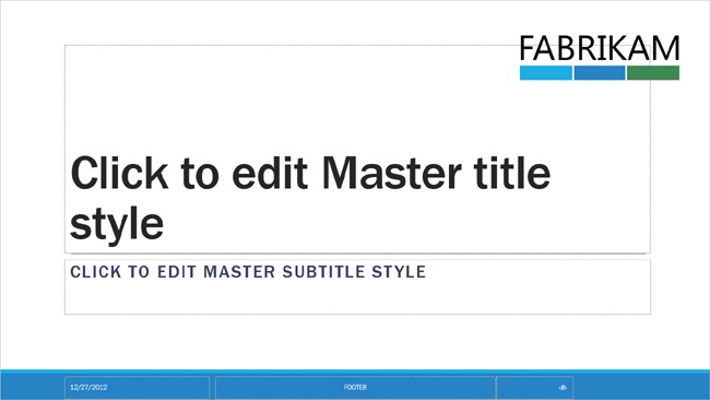
Select the Title placeholder (the one that says, Click to edit Master title style) by clicking its edge.
Click the Home tab and then click the Font Size drop-down list. Click the Decrease Font Size button twice to apply a smaller font size to the title placeholder.
Select the Body placeholder (the one with five levels of bulleted text). On the Home tab, click the Increase Font Size button once to increase the size for all levels of text in the placeholder.
Click in the top level of text in the Body placeholder. On the Home tab, expand the Bullets gallery by clicking the arrow next to the Bullets button. Choose Filled Round Bullets to add a bullet to the top level of text.
To adjust the positioning of the bullet, first turn on the ruler by selecting the Ruler option on the View tab.
With your cursor still in the top line of text, on the ruler, click and drag the upward-pointing indent marker to adjust the space between the bullet point and the text.
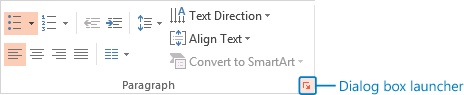
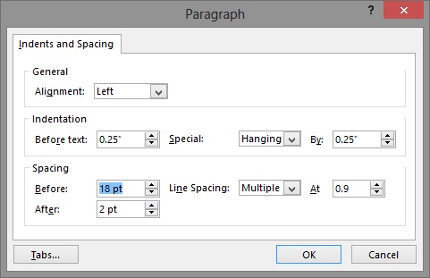
With your cursor still in the top level of text, click the Paragraph dialog box launcher on the Home tab to adjust the line spacing between first-level paragraphs of bulleted text.
In the Paragraph dialog box, increase the Before spacing from 12 pt to 18 pt, and click OK to close the dialog box.
Tip
Before and After spacing refers to the space before and after the paragraph levels of the bulleted text. Line spacing refers to the space within a level of text. Click the Line Spacing box and select Single for single-spaced text. Use Multiple at .9 for line spacing that is 90% as tall as single-spaced text. Going below about .7 will cut off the ascenders and descenders of letters on many fonts.
Click the Title Slide layout directly below the Slide Master. Select the Title placeholder and change the font size to 66 pt.
Review the slide layouts to confirm that the bullet has been added to all top-level text and the spacing has been adjusted according to the changes you made on the master.


In this exercise, you’ll add graphics to the slide master and layouts.
Set Up
You need the SampleContentE_start presentation and the Fabrikam_Logo_Large.png and Fabrikam_White_Small.png images located in the Chapter12 practice file folder to complete this exercise. Open the SampleContentE_start presentation, and save it as SampleContentE. Then follow the steps.
On the View tab, click Slide Master to open Slide Master view.
With the Slide Master selected, on the Insert tab, click Pictures. Navigate to the Fabrikam_White_Small.png file and click Insert.
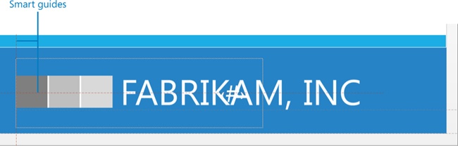
Select the Fabrikam logo in the center of the Slide Master and then click the Picture Tools Format tab. In the Size group, enter 2 in the Width box and press Enter. The logo height will change proportionately.
Drag the logo to the lower-right corner of the slide. Pay attention to the PowerPoint Smart Guides. They will help you align the logo vertically and horizontally to the footer placeholders that hold dates, page numbers, and footer text. Place the logo so its left edge is in the same position as the left edge of the slide number placeholder. It should also align vertically with the center of the slide number placeholder.
Select the slide number placeholder. Press Shift and drag the placeholder to the left so it’s no longer behind the logo.
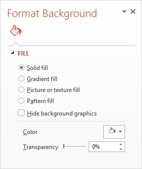
Select the Title Slide layout (the first layout beneath the slide master). Right-click away from the slide and choose Format Background.
In the Format Background pane, clear the Hide Background Graphics check box to unhide the graphics that the layout has inherited from the Slide Master. The thin gray line inherited from the Slide Master appears near the top of the Title placeholder.
Select the two blue rectangles at the bottom of the slide and move them so you can view the identical graphics and small Fabrikam logo from the Slide Master beneath.
Press Ctrl+Z twice to undo steps 6 and 7.
Click the Insert tab and then click Pictures. Navigate to Fabrikam_Logo_Large.png and click Insert.
Select the logo, and change its width to 3”. Drag the logo to the upper-right corner of the slide.
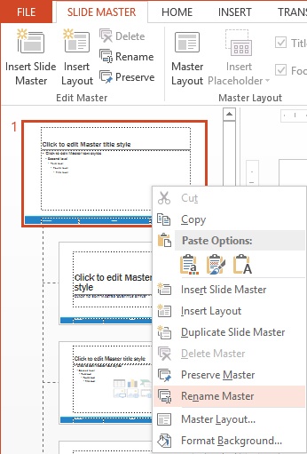
In this exercise, you’ll create a custom slide layout, rename it and the Slide Master, and save the file as a template.
Set Up
You need the SampleContentF_start presentation located in the Chapter12 practice file folder to complete this exercise. Open the SampleContentF_start presentation, and save it as SampleContentF. Then follow the steps.
On the View tab, click Slide Master to open Slide Master view. Right-click the Slide Master and choose Rename Master.
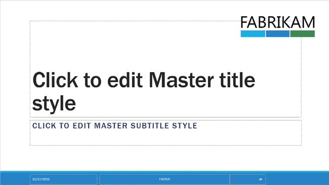
In the Rename Master dialog box, enter Fabrikam, Inc and click Rename.
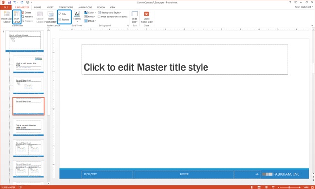
Point to the layouts beneath the Slide Master to find the one called Title and Content Layout. Select that layout.
On the Slide Master tab, click Insert Layout to add a new layout after the Title and Content layout.
The new layout will have title and footer placeholders.
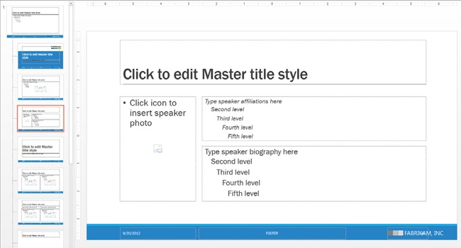
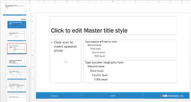
Right-click the new layout and choose Rename Layout. Name the layout Speaker Bio.
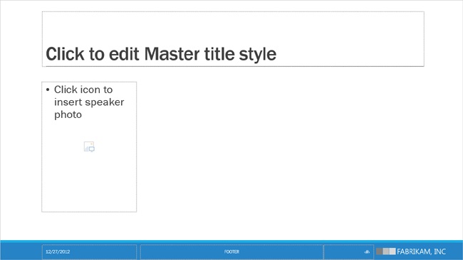
With the Speaker Bio layout selected, on the Slide Master tab, click Insert Placeholder, then Picture. Drag the slide to create a rectangular picture placeholder for the speaker’s headshot. It should be about as wide as the date placeholder.
Click inside the picture placeholder and enter Click icon to insert speaker photo.
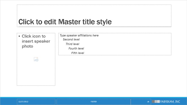
On the Slide Master tab, click Insert Placeholder again, and then click Text.
Click and drag on the slide to create a text placeholder. It should start near the upper-right corner of the picture and extend the width of the title placeholder.
Select the edge of the placeholder you just created, and change the font size to 16 pt by selecting that size from the Font Size list on the Home tab. Click the bullet icon to remove the bullets from all levels of text.
Select the first level of text and enter Type speaker affiliations here.
Copy the text placeholder (Ctrl+C) you added in step 9 and press Ctrl+V to paste it onto the layout. Drag the new placeholder into position directly beneath the original.
Select the edge of the placeholder and increase the font size to 20 pt. Select the first level of text and enter Type speaker biography here.
Click Close Master View on the Slide Master tab to return to Normal view.
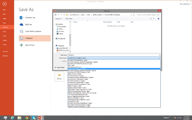
Click File, then Save As. Under Save As, select Computer, then click Browse to open the Save As dialog box.
In the Save As dialog box, click the Save As Type drop-down list and choose PowerPoint Template (*.potx) to save your file as a template. Enter Fabrikam in the File name field, and then click Save.
You’ve probably noticed this already, but in case you haven’t, the default slide size in PowerPoint 2013 is 16:9. Actually, that’s the default proportion. The actual slide size is 13.33 inches wide by 7.5 inches tall. Previous versions of PowerPoint used a default slide size of 10 inches wide by 7.5 inches tall, which is a 4:3 proportion. The 4:3 format is the typical sort-of-square, old-school slide projector and screen size, whereas a 16:9 format is considered wide-screen, which is more in line with most of our computers, monitors, and television screens today.
You might be wondering why this is important. In previous versions of PowerPoint, when you would change an existing presentation from 16:9 to 4:3 (or vice versa), your content would be distorted. Squares would become narrow rectangles, people in pictures would look skinnier, and SmartArt diagrams would get rearranged.

PowerPoint 2013 works a lot better than previous versions, and it actually gives you a couple of options when you’re changing the proportions of a presentation or template. You’ll still want to choose your proportion before developing your content whenever you can, but at least now when you change the slide size, you’ll have a choice of whether to make the content as large as it can be (taking into account that it might extend beyond the edge of the slide), or scale your content so it will fit on the new slide size. Either way, your content won’t be distorted!
In this exercise, you’ll change a 16:9-proportioned slide to a 4:3 format, and then you’ll revert to the original size.
Set Up
You need the Fabrikam.POTX template located in the Chapter12 practice file folder to complete this exercise. Double-click the Fabrikam.POTX template to open a presentation based on the Fabrikam PowerPoint template. Save the file as SampleContentG. Then follow the steps.
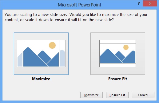
On the Design tab, click Slide Size, then click Standard (4:3).
Choose Maximize, which doesn’t scale your content.
PowerPoint maximizes the slide content, keeping everything the same size and letting it fall off the edges of the new 4:3 slide as necessary.
Press Ctrl+Z to undo the last step and return to the original slide size.
Click Slide Size, then Standard (4:3), and choose Ensure Fit.
PowerPoint scales the content so it fits on the slide without distortion.
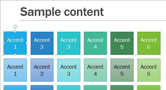
On the slide, select the first blue shape labeled Accent 1, and look at its font size on the Home tab. You’ll notice that PowerPoint changed it to 13.5 to help with the fit.
Click Slide Size again, and this time, click Widescreen (16:9).
PowerPoint will reposition the objects on the slide, but they will not become any larger. The font size will remain at 13.5 points.
A theme is a set of colors, fonts and effects, along with Slide Masters and layouts for PowerPoint.
A template is a theme plus content (usually sample slides). A PowerPoint presentation can be based on either a template or a theme.
The theme elements are built into all template and presentation files.
You aren’t required to apply the whole theme. You can apply theme colors, fonts, and effects separately. Mix and match ‘em! Have fun!
Slide layouts inherit their settings from the Slide Master.
Graphics added to the Slide Master appear on all slide layouts unless you choose to hide background graphics.
Placeholders are preformatted content holders that can help you create consistency and cohesion throughout your presentation.
Right-click a theme or variant to apply it only to selected slides as opposed to the entire presentation.