
Chapter at a Glance

In this chapter, you will learn how to | |
|---|---|
✓ | Edit pictures. |
✓ | Customize diagrams. |
✓ | Format charts. |
✓ | Arrange graphics. |
In Chapter 5, you were introduced to the primary ways you can use graphic elements to convey information or dress up your slides. You inserted pictures and clip art images, created a diagram, plotted data in a chart, drew shapes, and eased the transition from one slide to another with a graphic effect. These simple techniques might be all you need to enhance your presentations. But if you need to manipulate graphic elements to produce more dramatic effects, you can push the Microsoft Office PowerPoint 2010 capabilities further to get just the result you are looking for.
In this chapter, you’ll create a photo album and insert and manipulate photographs. Next, you’ll manipulate shapes to customize an organization chart. Then you’ll format a chart and save it as a template. Finally, you’ll use various techniques to arrange graphics.
Practice Files
Before you can complete the exercises in this chapter, you need to copy the book’s practice files to your computer. The practice files you’ll use to complete the exercises in this chapter are in the Chapter08 practice file folder. A complete list of practice files is provided in Using the Practice Files at the beginning of this book.
From time to time in this book, we have alluded to the modern trend away from slides with bullet points and toward presentations that include more graphics. Successful presenters have learned that most people can’t listen to a presentation while they are reading slides. So these presenters make sure most of their slides display graphics that represent the point they are making, giving the audience something to look at while they focus on what is being said.
PowerPoint 2010 gives you the tools you need to create graphic-intensive rather than text-intensive presentations. When you want to display a dynamic array of pictures in a presentation, you can use a photo album template to do the initial layout and then customize the album by adding frames of different shapes, as well as captions.
Tip
To integrate the slide layouts from a photo album template into a more traditional presentation, create the photo album and then import its slides into the other presentation by clicking Reuse Slides at the bottom of the New Slide gallery. For information about reusing slides, see Adding Slides with Ready-Made Content in Chapter 2.
After you insert any picture into a presentation, you can modify it by using the buttons on the Format tab that is displayed on the ribbon only when the graphic is selected. For example, you can do the following:
Remove the background by clicking the Remove Background button and then designating either the areas you want to keep or those you want to remove.
Sharpen or soften the picture, or change its brightness or contrast, by choosing the effect you want from the Corrections gallery.
Enhance the picture’s color by making a selection from the Color gallery.
Make one of the picture’s colors transparent by clicking Set Transparent Color at the bottom of the gallery and then selecting the color.
Choose an effect, such as Pencil Sketch or Paint Strokes, from the Artistic Effects gallery.
Apply effects such as shadows, reflections, and borders, or apply combinations of these effects by choosing a predefined style from the Picture Styles gallery.
Add a border consisting of one or more solid or dashed lines of whatever width and color you choose.
Rotate the picture to any angle, either by dragging the green rotating handle or by clicking the Rotate button and then choosing a rotating or flipping option.
Crop away the parts of the picture that you don’t want to show on the slide. (The picture itself is not altered—parts of it are simply covered up.)
Minimize the presentation’s file size by clicking the Compress Pictures button and then choosing where or how the presentation will be viewed—for example, on the Web or printed—to determine the optimum resolution. You can also delete cropped areas of a picture to reduce file size.
In this exercise, you’ll create a photo album displaying pictures of native plants. You’ll crop, resize, remove the background, apply an artistic effect, and add captions. You’ll also reuse a slide from another photo album, and apply a theme.
Set Up
You need the NativePlant1 through NativePlant8 photographs and the PhotoAlbumTitleSlide presentation located in your Chapter08 practice file folder to complete this exercise. Open a blank presentation, and then follow the steps.
On the Insert tab, in the Images group, click the Photo Album button.
The Photo Album dialog box opens.
Under Insert picture from, click File/Disk.
The Insert New Pictures dialog box opens.
Navigate to your Chapter08 practice file folder, click NativePlant1, hold down the Ctrl key, and click NativePlant3 through NativePlant5. Then click Insert.
The Photo Album dialog box now has four graphics files listed in the Pictures In Album list.
In the Pictures in album list, click NativePlant4, and then click the Move Up button to make it the second picture in the list.
Preview the pictures in turn, and then click the Contrast and Brightness buttons as necessary to give the four photographs a more even tone.
You could also adjust the rotation of a picture, but in this case, that is not necessary.
In the Album Layout area, display the Picture layout list, and click 2 pictures.
Display the Frame shape list, click Rounded Rectangle. Then click Create.
PowerPoint creates a presentation called Photo Album that contains a title slide and two slides each containing two pictures.
Troubleshooting
The appearance of buttons and groups on the ribbon changes depending on the width of the program window. For information about changing the appearance of the ribbon to match our screen images, see Modifying the Display of the Ribbon at the beginning of this book.
Save the presentation as My Photo Album.
Display Slide 2, and click the photo on the left. Then on the Format contextual tab, in the Size group, click the Crop arrow. In the list, point to Aspect Ratio, and then under Portrait, click 2:3.
PowerPoint crops away parts of the picture, leaving a centered "window" over the photo, sized to the proportions you specified.
Click the photo on the right, and then repeat the cropping process in step 9.
In turn, select each photo, and drag the upper-left and bottom-right corner handles until the photos occupy the majority of the space on the slide.
Display slide 3, and crop the photo on the left to Square, 1:1. Then point inside the crop window, and drag to the left until the cropping window is centered on the flower.
PowerPoint maintains the size of the crop window but moves the photo under the window to the left.
Click the photo on the right, and in the Size group, use the down arrow to reduce the height to 3". Then crop the photo to Square, 1:1, adjusting the crop window so that all of the flower is showing.
Enlarge and align the photos so that they occupy the entire width of the slide.
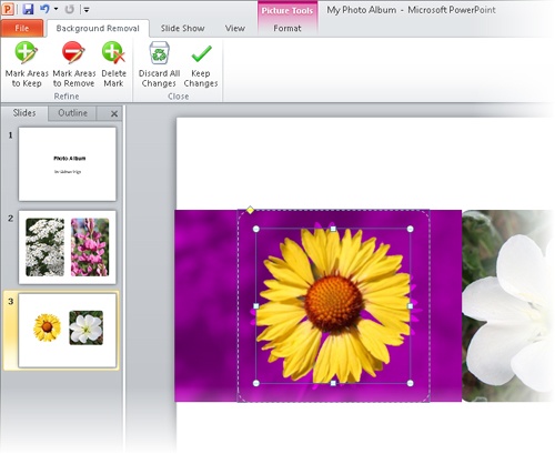
Click the left photo, and in the Adjust group, click the Remove Background button.
The Background Removal contextual tab appears, and PowerPoint marks the areas of the photo that will be removed.
Drag the handles on the frame surrounding the flower until the entire flower is visible within the frame. Then in the Close group, click the Keep Changes button.
Repeat steps 15 and 16 to remove the background of the photo on the right. Then click a blank area of the slide.
The background is removed from both flower photos.
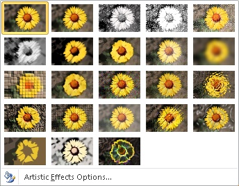
Click the photo on the left, and then on the Format tab, in the Adjust group, click the Artistic Effects button.
The Artistic Effects gallery appears.
Point to each thumbnail in turn to see a live preview of the photo with the effect applied. Then click the third thumbnail in the second row (Paint Brush).
Repeat steps 18 and 19 for the photo on the right.
The two photos now resemble paintings.
On the Insert tab, in the Images group, click the Photo Album arrow, and then click Edit Photo Album.
The Edit Photo Album dialog box opens. This dialog box is the same as the Photo Album dialog box. With it, you can make changes to an existing photo album.
In the dialog box, under Picture Options, select the Captions below ALL pictures check box, and then click Update.
Replace the file names below each photograph with the following captions:
NativePlant1 Achillea
NativePlant4 Hedysarum
NativePlant3 Gaillardia
NativePlant5 Oenothera
Click slide 1, and on the Home tab, in the Slides group, click the New Slide arrow, and at the bottom of the gallery, click Reuse Slides.
The Reuse Slides task pane opens.
In the Reuse Slides task pane, click Browse, and click Browse File. Then browse to your Chapter08 practice file folder, and double-click the PhotoAlbumTitleSlide presentation.
This presentation contains one slide that was based on a slide in the Contemporary Photo Album template available under the Sample Templates on the New page of the Backstage view.
In the Reuse Slides task pane, click Slide 1 to insert it after the title slide of the My Photo Album presentation. Then close the task pane.
Delete the blank title slide. Then on the Design tab, in the Themes group, display the Themes gallery, and select a theme that showcases the photos.
We chose the Trek theme.


We’ve already told you how to use SmartArt to create a diagram, and we’ve shown you how to move and size it and apply simple formatting. But many diagrams involve different levels of information and benefit from more sophisticated formatting techniques. After you create a basic diagram, you can customize it at any time by clicking it and then using the commands on the Design and Format contextual tabs.
You can use the commands on the Design contextual tab to make changes such as the following:
You can use the buttons on the Format contextual tab to customize individual shapes in the following ways:
Change an individual shape—for example, change a square to a star to make it stand out.
Apply a built-in Shape Style.
Change the color, outline, or effect of a selected shape.
Tip
If you customize a diagram and then decide you preferred the original version, you can revert to the original by clicking the Reset Graphic button in the Reset group on the Design contextual tab.
In this exercise, you’ll customize an organization chart by adding subordinate shapes. You’ll change the layout of the chart as a whole and then change the color, size, and text of individual shapes.
Set Up
You need the ReorganizationMeeting_start presentation located in your Chapter08 practice file folder to complete this exercise. Open the Reorganization-Meeting_start presentation, and save it as ReorganizationMeeting. Then follow the steps.
Display slide 5, click the diagram to activate it, and then select the Ryan Danner shape for manipulation.
On the Design contextual tab, in the Create Graphic group, click the Add Shape arrow, and then click Add Shape Below.
PowerPoint adds a shape to the organization chart.
Open the Text pane, click to the right of the bullet symbol, type Jerry Orman, and press Enter.
PowerPoint adds a duplicate shape at the same level in the hierarchy.
Type Nate Sun.
In the Text pane, click to the right of Erin Hagens, press Enter, press Tab, and then type Sarah Davis.
The new shape is a subordinate of Erin Hagens.
In the diagram, select the Florian Stiller shape for manipulation, click the Add Shape arrow in the Create Graphic group, and then click Add Assistant.
In the Text pane, click to the right of the arrow bullet symbol, and type Andy Ruth. Then close the Text pane.
In the diagram, select the Nate Sun shape for manipulation, and then in the Create Graphic group, click the Promote button.
The selected shape moves up one level in the hierarchy.
Drag the handles around the frame of the diagram until it fills the available space on the slide.
On the Design contextual tab, display the Layouts gallery, and point to each thumbnail in turn to see a live preview of the various layout options for an organization chart. Then click the second thumbnail in the second row (Hierarchy).
Display the SmartArt Styles gallery, and after previewing the available styles, under 3-D, click the last thumbnail in the first row (Cartoon).
Andy Ruth is an assistant, not a manager, so select his background shape, and on the Format tab, in the Shape Styles group, click the Shape Fill arrow. Then under Theme Colors in the palette that appears, click the tan box (Tan, Text 2).
Click the Florian Stiller shape (not the text), and then in the Shapes group, click the Larger button three times.
Troubleshooting
Be sure to click the border of the shape. Otherwise, you will select the text for editing instead of the shape itself.
The background shape grows with the selected shape.
In the Shape Styles group, click the Shape Fill arrow, and then in the palette, click the third box in the fifth column (Gray-50%, Accent 1, Lighter 40%)
Display the WordArt Styles gallery, explore the options, and then click the third thumbnail in the first row (Fill – White, Drop Shadow).
The text in the shape is now a contrasting color.
Click outside the diagram frame.
You can now see the final result.


You already know how to plot data in simple charts and how to edit that data in the associated Microsoft Excel worksheet. Often, you will need nothing more than these basic techniques to be able to convey your numeric data in a visual format. However, for those times when you need more than a basic chart, PowerPoint provides formatting capabilities that enable you to produce just the effect you want.
If you decide that the type of chart you selected doesn’t adequately depict the most important characteristics of your data, you can change the type at any time. There are 11 chart types, each with two-dimensional and three-dimensional variations, and you can customize each aspect of each variation. Common chart types include the following:
Column charts. Used to show how values change over time.
Bar charts. Used to show the values of several items at one point in time.
Line graphs. Used to show erratic changes in values over time.
Pie charts. Used to show how parts relate to the whole.
If you don’t want to spend a lot of time on a chart, you can apply the predefined combinations of formatting from the Chart Layouts and Chart Styles groups on the Design contextual tab to create sophisticated charts with a minimum of effort. However, if you want more control over the appearance of your chart, you can use the options on the Layout and Format contextual tabs. It is worth exploring these options so that you know how to do the following:
Add shapes and pictures.
Format individual elements such as titles, axes, data labels, and gridlines.
Add trend lines, bars, and other lines.
Customize the walls and floor or otherwise manipulate a three-dimensional chart.
Customize the look of shapes.
Add and format fancy text (WordArt).
Arrange objects precisely.
Precisely control the overall size of the chart.
You can double-click almost any chart object to change its attributes. For example, you can double-click an axis to display the Format Axis dialog box, where you can change the scale, tick marks, label position, line style, and other aspects of the axis. If you have trouble double-clicking some of the smaller chart elements, you can select the element you want to format from the Chart Elements list in the Current Selection group on the Format tab, and then click the Format Selection button in the same group to display the Format dialog box for the selection.
If you make extensive modifications, you might want to save the customized chart as a template so that you can use it for plotting similar data in the future without having to repeat all the changes.
In this exercise, you’ll modify the appearance of a chart by changing its chart type and style. You’ll change the color of the plot area and the color of two data series. You’ll then hide gridlines and change the layout to display titles and a datasheet. After adding an annotation in a text box, you’ll save the chart as a template.
Set Up
You need the LandscapingChart_start presentation located in your Chapter08 practice file folder to complete this exercise. Open the LandscapingChart_start presentation, and save it as LandscapingChart. Then follow the steps.
Display slide 14, and click the blank area above the chart legend to activate the chart without selecting any of its elements.
Troubleshooting
Be sure to click a blank area inside the chart frame. Clicking any of its elements will activate that element, not the chart as a whole.
PowerPoint displays the Design, Layout, and Format contextual tabs.
On the Design contextual tab, in the Type group, click the Change Chart Type button.
The Change Chart Type dialog box opens.
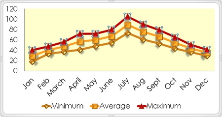
In the gallery on the right, under Line, double-click the fourth thumbnail (Line with Markers).
The column chart changes to a line chart, which depicts data by using colored lines instead of columns.
In the Chart Styles group, click the More button.
The Chart Styles gallery appears.
In the gallery, click the last thumbnail in the fourth row (Style 32).
The lines are now thicker, and the data markers are three-dimensional.
Move the pointer over the chart, and when a ScreenTip indicates you are pointing to the plot area, click to select it.
The plot area is the area between the axes that contains the data markers.
On the Format contextual tab, in the Shape Styles group, click the Shape Fill arrow, and then in the list, click More Fill Colors.
The Colors dialog box opens.
On the Standard page, click the pale yellow below and to the left of the center, and then click OK.
The plot area is now a pale yellow shade to distinguish it from the rest of the chart.
At the top of the Current Selection group, click the Chart Elements arrow, and then in the list, click Series "Maximum".
Tip
If you have trouble selecting an element of the chart by clicking it, you can choose it from the Chart Elements list.
An outline appears around the data points of the selected series.
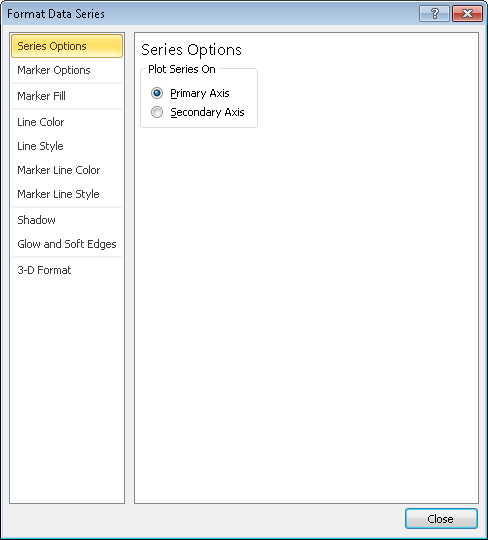
In the Current Selection group, click the Format Selection button.
The Format Data Series dialog box opens.
In the left pane, click Marker Fill, and on the Marker Fill page, click Solid Fill. In the Fill Color area, click the Color button, and under Standard Colors, click the first box (Dark Red).
In the left pane, click Line Color. Then on the Line Color page, click Solid line, and change the color to the same dark red.
Repeat step 12 for the marker line color, and then click Close.
The Maximum data series is now represented by the dark red color.
On the Layout tab, in the Axes group, click the Gridlines button, point to Primary Horizontal Gridlines, and then click None to remove the horizontal gridlines from the chart.
On the Design contextual tab, in the Chart Layouts group, click the More button.
The Chart Layouts gallery appears.
In the gallery, click the first thumbnail in the second row (Layout 4).
The legend now appears below the chart.
On the Layout contextual tab, in the Insert group, click the Text Box button.
Point below the chart title and above the July maximum temperature, and then drag diagonally down and to the right until the text box stretches as far as the December data.
Type Hot periods can last several days. Then select the text, and on the Home tab, in the Font group, change the size to 10 points and the color to Red.
Click a blank area within the chart frame to release the text box selection.
You can now see the results.
On the Design contextual tab, in the Type group, click the Save As Template button.
The Save Chart Template dialog box opens and displays the contents of your Charts folder, which is a subfolder of your Templates folder.
With the Charts folder displayed in the Address bar, type Temperature By Month in the File name box, and then click Save.
In the Type group, click the Change Chart Type button, and then in the left pane of the Change Chart Type dialog box, click Templates. Then point to the icon under My Templates in the left pane.
A ScreenTip identifies this template as the one you just created.

In the future, you can click the custom template to create a chart with the same layout and formatting.
Tip
To delete a custom chart template, click Manage Templates in the lower-left corner of the Change Chart Type dialog box, and then when Windows Explorer opens with your Charts folder displayed, right-click the template and click Delete. Confirm that you want to delete the template by clicking Yes, close Windows Explorer, and then close the Change Chart Type dialog box.
Click Cancel to close the dialog box.


After inserting pictures or drawing shapes in the approximate locations you want them on a slide, you can align them and change their stacking order by clicking the buttons in the Arrange group on the Format contextual tab.
Clicking the Align button gives you access to commands for aligning individual or multiple graphics in several ways. For example, you can:
Align graphics vertically by the left or right edges or centerline, or horizontally by the top or bottom edges or centerline.
Distribute graphics evenly within their current space, either horizontally or vertically.
Align graphics relative to the slide that contains them or to other selected objects.
Align graphics relative to a position on the slide.
Align graphics against gridlines and adjustable horizontal and vertical guides.
Tip
If you added pictures to a slide by clicking the Picture button in the Images group on the Insert tab, you can group them and then align and position them as a group the same way you would group shapes. However, if you have added them by clicking the Insert Picture From File button in a content placeholder, you cannot group them. For information about grouping shapes, see Drawing Shapes in Chapter 5.
When graphics overlap each other, they are stacked. The stacking order is determined by the order in which you inserted the graphic. You can change the stacking order by selecting a graphic and then clicking the Bring Forward or Send Backward button to move the graphic to the top or bottom of the stack. To move the selected graphic forward in the stack one graphic at a time, click the Bring Forward arrow and then click Bring To Front in the list; to move it backward, click Send To Back in the Send Backward list.
Tip
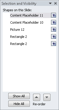
If you can’t select a graphic because it is covered by others in the stack, click the Selection Pane button to display the Selection And Visibility task pane, and then select the graphic you want from the Shapes On This Slide list.
In this exercise, you’ll align graphics in various ways, change their stacking order, and position them with the help of a grid and guidelines.
Set Up
You need the GardenResidents_start presentation located in your Chapter08 practice file folder to complete this exercise. Open the GardenResidents_start presentation, and save it as GardenResidents. Then follow the steps.
On slide 1, select the three pictures.
On the Format contextual tab, in the Arrange group, click the Align button, and then in the list, click Distribute Vertically.
The middle picture moves down so that it is the same distance below the left picture as it is above the right picture.
In the Arrange group, click the Align button, and then click Align Center.
The pictures are now stacked on top of each other.
Click away from the stack, and then click the top picture.
In the Arrange group, click the Bring Forward arrow, and then click Bring to Front.
The top picture moves forward in the stack, obscuring the middle picture.
In the Arrange group, click the Selection Pane button.
The Selection And Visibility task pane opens.
In the task pane, under Shapes on this Slide, click Content Placeholder 10.
On the slide, the selection rectangle indicates that the middle picture is selected.
Close the Selection and Visibility task pane.
In the Arrange group, click the Bring Forward button.
The middle picture moves forward in the stacking order.
In the Arrange group, click the Align button, and then click View Gridlines.
A faint dotted grid appears on the slide.
Drag the selected cat picture to the right and down, so that its right and bottom borders align with the first gridlines from the right and bottom edges of the slide.
Drag the crow picture so that its right and bottom borders align with the second gridlines from the right and bottom edges of the slide.
Drag the frog picture so that its right and bottom borders align with the third gridline from the right and bottom edges of the slide.
The pictures are now evenly stacked and spaced.
In the Arrange group, click the Align button, and then click Grid Settings.
The Grid And Guides dialog box opens.
In the Grid settings area, clear the Display grid on screen check box.
In the Guide settings area, select the Display drawing guides on screen check box, and then click OK.
The grid disappears, and vertical and horizontal guides span the slide.
Point to the vertical guide away from any text or objects, and drag it to the left, releasing it when the accompanying ScreenTip reads 3.50. Then drag the horizontal guide down until its ScreenTip reads 0.50.
Troubleshooting
If you move an object on the slide instead of a guide, click the Undo button, and then point outside the margins of the slide to drag the guide.
The ScreenTips show in inches how far each guide is from the 0 mark in the center of the slide. As you drag, numbers are skipped because the Snap Objects To Grid check box is selected in the Grid And Guides dialog box.
Point to the selected frog picture, and drag it to the left until its left and bottom borders align with the guides.
Select all the pictures. Then on the Format tab, in the Arrange group, click the Align button, and in the list, click Distribute Horizontally.
Repeat step 19 to distribute the pictures vertically.
In the Arrange group, click the Align button, click Grid Settings, and in the Grid and Guides dialog box, clear the Display drawing guides on screen check box. Then click OK.
Click the shape behind the pictures, and drag the green rotating handle clockwise until the shape stretches diagonally across the slide. Then drag the shape’s middle sizing handles until it is almost as wide as the pictures.
With the shape still selected, in the Arrange group, click the Send Backward arrow, and click Send to Back.
The shape now sits behind the slide title as well as the pictures.
On the View Shortcuts toolbar in the lower-right corner of the program window, click the Reading View button.
You can now see what the slide will look like during presentation delivery.


A growing trend among presenters is to create graphic-intensive rather than text-intensive presentations.
If you want to move beyond simple diagrams, you need to know how to manipulate levels of text in shapes and how to format individual shapes as well as the diagram as a whole.
With all the sophisticated chart formatting tools PowerPoint provides, it is important to remember that to be effective, charts need to be simple enough for people to grasp key trends at a glance.
Knowing how to manipulate graphics on a slide will help you position, align, and stack them to get the effect you want.