| 7 | Time, Percentages, and Graphs |
You can use various linear units to measure height, width, or depth. That is the first dimension. Area is the second dimension, and volume is the third. And then you have time! It, too, is a dimension. In this chapter, you’ll see how time relates to the three so-called spatial dimensions. You’ll also learn how changing quantities, in any dimension, can be considered as percentages and portrayed as graphs.
TIME AS A DIMENSION
In mathematics, any measurable quantity can be called a dimension. We use a variety of schemes and devices to measure time. The ancients used sand in an hourglass. Until recently, we used spring-wound or weight-driven clocks and watches. Quartz-crystal electronic clocks use alternating-current (ac) signals at precise frequencies to count “ticks” of time.
According to the above definition, we can call temperature, weight, brightness of light, loudness of sound, and intensity of taste “dimensions,” although people rarely think of them that way. Even taste has at least four “dimensions”: sweet, sour, bitter, and salty. For now, let’s confine ourselves to the traditional four dimensions commonly called height, width, depth, and time. This gives us a four-dimensional continuum. Albert Einstein coined a term for this in the early 1900s, and it has been used ever since: spacetime. Some folks turn this around and call it time-space.
TIME AND SPEED
Combining length one way with length another way defines an area. Similarly, combining time with length or distance defines speed. Suppose you walk at a steady rate to travel a distance of 1 mile in 15 minutes. If you don’t change that pace, you will go another mile in the next 15 minutes. In an hour (60 minutes) you’ll go 4 miles. Your speed is therefore 4 miles per hour (mph or mi/h).
Keep it up, and you’ll do 4 more miles in the next hour, and so on. To find the total distance traveled, you multiply speed by time. The same is true of driving. If you drive at a speed of 60 mph, you go a mile every minute. In 60 minutes (1 hour), you will go 60 miles. In 1 second, you’ll go 1/60 mile, or 88 feet, based on the fact that there are 5,280 feet in a mile.
To calculate speed, you must know how far you go and how long it takes you to get there. If you travel 300 miles in 6 hours at a steady speed, you must be doing 50 miles every hour. Six hours at 50 miles each hour is 300 miles. Speed is distance (a length dimension) divided by time.
AVERAGE SPEED
In the last section, it was assumed that speed was steady. This is almost never the case, of course! Suppose that, on a 300-mile journey, you go 30 miles in the first hour, 45 miles in the second hour, 60 miles in the third hour, and 55 miles in each of the fourth, fifth, and sixth hours. A total of 300 miles are traveled in 6 hours (Fig. 7-1). Your average speed for the trip is therefore 300 miles divided by 6 hours: 300/6 = 50 mph. You don’t travel at a steady speed all the way. You stop now and then to get fuel or to have lunch, or because a traffic light in a town turns red. Your speed at any given time is called the instantaneous speed.
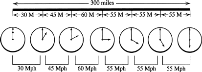
Figure 7-1
To find the average speed over the course of a trip, we divide the total distance by the total time. In this example, we go 300 miles in 6 hours, so the average speed is 300/6 = 50 mph.
Watch your car’s speedometer. You will find that you can seldom go at a steady speed even for a few minutes, unless you are on a freeway in the Great Plains on a calm day with the cruise control set! Measuring the distance covered every hour shows the average speed during that hour. Instead of noting the distance traveled every hour, you might notice your speed on the speedometer every few minutes. The speedometer will show how your speed varies during each hour. Perhaps you have to brake to a stop during the hour. What does that do to the average? Later in this course, you will see how calculus can help you answer that question.
Now imagine a race car driver who watches her speed closely. Suppose that each lap of track is exactly 1 mile long. The average speed for a lap can be figured by timing that lap. If a lap is made in exactly 1 minute, the average speed for that lap is 60 mph. If a mile requires 40 seconds (2/3 of a minute), her average speed for that mile is 90 mph, as shown in Fig. 7-2.

Figure 7-2
A racecar driver can calculate her average speed over the course of a 1-mile lap by measuring the time it takes to complete the lap.
Suppose you time a 50-mile race that takes place by driving 10 laps on a 5-mile course. The times made by one driver for the 10 laps are precisely 6, 5, 4, 3.5, 4, 3.5, 5.5, 4.5, 4, and 4 minutes. The total time for 50 miles is therefore exactly 44 minutes. If you want to determine the average speed for the entire race, divide the total distance in miles (50) by the total time in hours (44/60). You can use your calculator to figure out that the average speed for the race is 50 / (44/60) = 68.181818 … mph. Using your knowledge of decimals and fractions, you can see that this is 68-18/99 mph, which can be simplified to 68-2/11 mph. All this assumes, of course, that your measurements are accurate and exact enough to justify the number of significant figures you include in your final answer.
MAKING UP FOR LOST TIME
Suppose you travel at 30 mph for exactly 1 hour. When you have completed the trip, you will have gone 30 miles, and the average speed for the hour will have been 30 mph. Now suppose you keep going for another hour. You go 30 mph for the first 50 minutes and then 60 mph for the last 10 minutes, so you travel 25 miles at 30 mph and 10 miles at 60 mph for a total of 35 miles. The average speed for the second hour is 35 mph. Over the whole 2-hour journey, you have gone 65 miles, so the average speed for the 2 hours is 32.5 mph. From all this, you can see that the average speed for a given length of time traveled increases as more of the time is spent moving at a higher speed.
Now suppose you have 45 miles to go and an hour to do it in. If you travel at a steady speed, you must go 45 mph. If you go 30 mph for the first 10 minutes, that’s 5 miles traveled, leaving you with 40 miles to go in 50 minutes, or 48 mph. If you go 30 mph for the first 30 minutes, you’ll have gone 15 miles, leaving yourself with 30 miles to cover in 30 minutes. So for the rest of the trip, you’ll have to go 60 mph. Now figure this out: What if you go 30 mph for the first 50 minutes? How fast will you have to go for the rest of the trip, to finish in the allotted hour?
FRACTIONAL GROWTH
Speed and rate of growth are similar ideas, rather like comparing the hare and the tortoise methods of travel. Similar—but different too! You measure time in seconds, minutes, hours, days, or weeks. You measure distance in miles, hundreds of feet, yards, feet, inches, or fractions of an inch. It all depends on how time and distance are related. Watching an auto race is fun. Watching a tree grow is dull.
If a seedling is 2 inches high today, and tomorrow it’s 3 inches high, that sounds like fast growth. However, if a 30-foot tree grows to 30 feet 1 inch by tomorrow, you’ll have to measure it to see if it grew at all. When you add 1 inch to 2 inches, that’s a big growth. But added to 30 feet, 1 inch seems like nothing. Absolute growth and relative growth are vastly different concepts!
The seedling grew from 2 inches to 3 inches, increasing by one-half of yesterday’s height. The 30-foot tree was 30 × 12 = 360 inches tall at first, and then it added 1 inch. That is only 1/360 as a fraction of the height of the tree. Considered as a fractional increase, the seedling grew 180 times as much as the tree overnight, even though both actual increases were 1 inch. As the seedling keeps growing taller day by day, say at the rate of 1 inch daily for weeks on end, the fractional daily increase will get smaller and smaller. The same thing will also happen with the tree, but the change in the fractional rate of growth will take place more slowly because it was tiny to begin with.
PERCENTAGES
The percentage method is a standard way to express fractional increases or decreases. Percentages were developed before decimals to make working in fractions simpler. Decimals might be easier to understand directly, but percentages were used for so many years that they became a sort of mathematical habit, especially in economics and statistics.
Percentages began because fractions are clumsy. If you were asked which is the bigger fraction, 2/5 or 3/8, could you answer just by looking at them? Converting to decimals makes the comparison easy: 2/5 = 0.4 and 3/8 = 0.375.
Percentages always use 100 as the denominator. The numerator is written as a number followed by the word “percent” or the symbol %. You should get used to seeing either the word or the symbol. In this book we’ll use both. Percentages, like decimals, make it easy to compare fractions at a glance. You can easily see that 40 percent (or 40/100) is more than 37.5 percent (or 37.5/100).
When a percentage expresses a change in a value, it always refers to the starting size or number. If you say something grew by 1 inch, you don’t know whether to think that’s fast or slow, unless you know how big it was at the beginning. The seedling in the above example grew 1 inch from a starting height of 2 inches, so the percentage increase was 1/2 = 50/100 = 50 percent. The tree grew 1 inch from a starting height of 360 inches, so the percentage increase was 1/360 = 0.2777 … / 100 = 0.2777 … percent. You might want to round that up to 0.28 percent or even 0.3 percent.
When you have any fractional expression—something with a numerator and a denominator—you can easily find the percentage with a calculator. Just divide the fraction out so the calculator shows it as a decimal. Then multiply that number by 100 to get the figure as a percentage.
PERCENTAGES WITH MONEY
When dealing with money, you often hear about percentages. If railway or airline fares increase, it’s usually figured as a percentage. Dividends on stocks and other investments are paid as a percentage, so that everything can be divided fairly.
Suppose that a commuter railway company has to raise fares because its have increased. It would not be fair to charge everyone $10 more. That would raise a one-time $1 fare to $11, an increase of $10 / $1 = 1,000 / 100 = 1,000%. But it would raise a $100 full-year pass to $110, a much smaller percentage increase of $10 / $100 = 10/100 = 10%.
Here is another example. Suppose the profits for a company are $10,000 in a given year, and there are 200 stockholders. If $50 is given to each of the stockholders, is that fair? Most likely not! One stockholder might have invested $100 in the company, another $100,000. It would be inequitable for them both to receive $50 of the profit for the year.
Such things are worked out on a percentage basis. If the railway’s costs rise from $100,000,000 to $110,000,000, that is a 10% increase. To get this money back in fares charged, each fare should increase by 10%. Thus, the $1 fare would increase to $1.10, and the $100 full-year pass would increase to $110. Similarly, if profits are $10,000 on a total investment of $2,000,000 in a given year and the dividend rate is 0.5%, then the stockholder who invested $100 gets $0.50, and the one who invested $100,000 gets $500.
PERCENTAGES UP AND DOWN
Here is an important thing to keep in mind when you are calculating percentages. We’ve already mentioned it, but it bears repeating, with a “bullet” for emphasis!
• Always use the starting figure of a transaction or calculation as the 100% point.
Suppose a woman buys property for $200,000 and its value increases, so she sells it for $250,000. She’s made 25% profit on the deal. It cost her $200,000; she recovered that and made $50,000 more. The profit is $25 for every $100 of the starting price.
But the second owner is not so lucky. The value decreases, so he sells it for its original price of $200,000. Since it is back to its original price, after having gone up 25%, you might think it dropped 25%. But it hasn’t! The second owner paid $250,000. Of his original investment, he gets $200,000. The loss is $50,000, the same as the profit the first owner made. But now it’s a fraction or percentage of $250,000 (the starting price), not of $200,000. The loss is 20% because he lost $20 for every $100 of his purchase price.
Does this seem odd to you? A 25% increase is the same fractional change, reversed, as 20% decrease. Some things in mathematics are counterintuitive. The “discrepancy” here depends on the extent of the change. Smaller percentages come nearer to being the same, either way. For larger percentages, the difference is larger. A doubling of the starting value represents an increase of 100%. But the reverse, which is halving, is a decrease of only 50%. If the initial value increases by an amount equal to 10 times itself (say from 8 to 88), that is an increase of 1,000%. But if it goes down to only one-tenth as much (say from 100 to 10, which is 100 − 90), it is a decrease of 90%. Make up and solve a few of these problems on your own, and pretty soon you’ll develop a good sense of how it works.
Here’s an interesting twist. There is no limit to the percentage by which something can increase. You can, at least in theory, have something increase by a trillion percent! But a decrease can never be more than 100%, which represents a decrease from some defined starting value all the way down to zero.
THE BAR GRAPH
Visual presentation of statistics is common these days. Television and Internet advertisements use it all the time (even if their facts are questionable!). Visual comparison conveys an impression more quickly and effectively than plain numbers.
The bar graph is one of the most common methods of graphical representation. Numbers are replaced by lines or bars having various lengths. Suppose, for example, you come across old records for the membership in your local golf and country club. You see data for years from 1953, when the club was founded, through 1961. The membership figures for the successive years are 47, 52, 65, 73, 76, 77, 85, 96, and 110. To show this growth, you can draw bars to represent the number of members for each year. Figure 7-3 shows two ways this can be done, called the horizontal bar graph (at A) and the vertical bar graph (at B).

Figure 7-3
At A, a horizontal bar graph showing the membership in a club over a span of years. At B, the same data portrayed as a vertical bar graph.
In a basic bar graph, the lengths of the bars are directly proportional to the quantities rendered. If you draw each member at 1/16 of an inch, for example, then a bar representing 10 members measures 10/16 (or 5/8) of an inch long, and a bar representing 100 members measures 100/16 (or 6-1/4) inches long. The thicknesses of the bars are all the same in most bar graphs, although in more complicated ones called histograms the thicknesses of the bars can vary in order to portray a second dimension.
OTHER GRAPHS
Graphical presentations can clarify things in many ways. A college might want to show how many of its alumni belong to certain groups such as engineers, doctors, lawyers, salesmen, factory workers, shop assistants, truck drivers, and musicians. A bar graph can work well for this purpose, but there are other ways, too.
If you want to see how much of the whole is represented by each particular group, you can use a box graph. A rectangle of suitable height and width is marked off in 100 units, and each group is given an area that represents its percentage of the total. Because the total is 100%, all the widths together must exactly fill the box, as shown in Fig. 7-4A.

Figure 7-4
At A, a box graph can help show proportions of various groups. At B, a pie graph can do the same thing. At C, a pie graph is constructed by dividing a circle into 100 equal angular parts.
Another scheme to show this situation involves dividing or “slicing” up a circle, just like you would slice up a pie. In fact, because it looks like a sliced-up pie (Fig. 7-4B), it is often called a pie graph. You divide up the circumference into 100 equal angular parts (10 are shown here to make it clearer). Then you divide the circumference according to the percentages in the groups, and you draw lines from each marker to the center (Fig. 7-4C).
INTERPOLATION
Graphs are used to help make calculations and to figure out how much of something will be needed to do a certain task. Suppose tests on an electric motor relate the electrical wattage input to the mechanical horsepower output. The results are tabulated, from electric power running “light” with no mechanical load to electric power inputs for various mechanical horsepower outputs.
Suppose you have a job that requires a certain amount of horsepower not shown in the table at the bottom of Fig. 7-5. How do you determine the electric power it needs? A graph, as shown above the table, makes the job easier. You place points on squared paper to show all the figures in the table, and then you join the dots you have made. This gives you a line or curve from which you can visually guess at intermediate values.

Figure 7-5
Graphs can be used for interpolation. Here, we determine the amount of electrical power that a certain motor will need to produce 0.5 horsepower of mechanical work.
You need not know anything about electricity to make this graph. But if you do have some electrical expertise, you will notice that this motor does not convert all the electricity it receives to mechanical work. If it did, it would get 1 horsepower from 746 electrical watts, not 1,050 watts! The extra electricity is wasted as heat in the motor. An electrical engineer would say that the motor has an efficiency of less than 100%—another use of percentages! If you have to put in 1,050 watts of electricity to get 746 watts of mechanical power out of the motor, then the motor efficiency is 746 / 1,050 = 0.71 = 71%, at least for a load that demands exactly 1 horsepower from the motor.
In this situation, you can find the amount of electric power that is needed for any particular job by reading it on your graph. This process is called interpolation. Figure 7-5 shows an example. If you need 0.5 horsepower from the motor, it will consume about 560 watts of electricity.
GRAPHS CAN HELP YOU EVALUATE DATA AND FIND ERRORS
Graphs can show things that are not obvious from the data used to make them. Graphs also are useful to check and interpret data, and to find and correct mistakes.
Consider a meter that has numbers on its scale at 20 and 30, with unnumbered “hash marks” in between to represent the single units as shown in Fig. 7-6. The reading in this case should be 23 units. But suppose you write down 27 by mistake when tabulating the data, and that is the only mistake you make. You plot your graph, using your figures. All the points line up nicely, except the one that you wrongly copied as 27. This “off-the-track” point immediately shows you that something is wrong, and it also shows you where the error occurred. So you take that particular meter reading again.
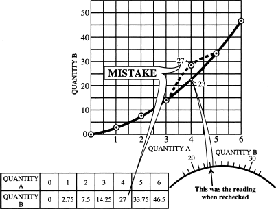
Figure 7-6
Graphs can be used to detect and locate errors when reading meters or collecting data.
Specific information can often be presented in multiple ways. Figure 7-7 shows three ways to graphically show a race car driver’s performance as he makes 10 laps around a 5-mile track. Each graph gives you a different “picture” of the driver’s performance. The first graph (A) is based on the cumulative distance traveled, the second (B) is based on the lap-by-lap average speed, and the third (C) is based on the time per lap.

Figure 7-7
At A, a graph showing time vs. distance for a racer who drives 10 laps around a 5-mile track. At B, a bar graph showing average speed for each lap. At C, a bar graph showing the elapsed time for each lap.
QUESTIONS AND PROBLEMS
This is an open-book quiz. You may refer to the text in this chapter (and earlier ones, too, if you want) when figuring out the answers. Take your time! Consider all values given as exact, so you don’t have to worry about significant figures. The correct answers are in the back of the book.
1. How far will a car go at 35 mph for 36 minutes? (Hint: find what fraction of an hour is represented by 36 minutes.)
2. A riverboat makes a water speed (at which its motor propels it through the water) of 10 mph. The river has a downstream current flowing at 2 mph. How fast does the boat go (a) upstream and (b) downstream?
3. How long will the riverboat in question 2 take to make a journey of 96 miles (a) upstream and (b) downstream?
4. Traveling at a water speed of 10 mph, the riverboat in question 2 burns one-half ton (1 ton is 2,000 pounds) of fuel per hour. How much fuel does the boat use on a 96-mile journey (a) upstream and (b) downstream?
5. If the boat reduces its downstream water speed to make the downstream journey in the same length of time as the upstream journey, and if that reduces fuel burned in proportion to the water-speed reduction, will reducing the downstream water speed save fuel? If so, by how much? What would be the percentage saving (on the round trip)?
6. If the boat reduces its water speed on the upstream run, will it save fuel or use more? How much? What percentage?
7. A man invests $50,000 in stock. For the first year, it pays a dividend of 5% on his investment. At the same time, the value of his stock rises to $60,000. If he sells the stock, how much profit will he make (a) in cash and (b) as a percentage?
8. During early weeks of growth, a tree’s height is recorded every week. For 5 successive weeks, the heights are 16 inches, 24 inches, 36 inches, 54 inches, and 81 inches. What is the percentage growth per week for each of the 4 weeks? What is the percentage for the whole month?
9. Make a graph of the tree’s growth (from question 8) for the month. From the graph, estimate the height of the tree in the middle of the second week.
10. A race track has an 8-mile lap that consists of 5 miles with many hairpins, corners, and grades. The remaining 3 miles have straightaways and banked curves. The best time any car can make over the 5-mile part is 6 minutes, but the 3-mile section lets drivers “open up.” Two drivers tie for the best on the 5-mile part, but one averages 90 mph on the 3-mile part, and the other averages 120 mph. Find the average speed for each on the whole lap.
11. A car is checked for mileage per gallon and is found to get 32 miles per gallon (mpg) for straight turnpike driving. How far will it go on a tankful if the tank holds 18 gallons?
12. A company needs printed-circuit boards for which two processes are available. The first needs a tool that costs $2,000, then makes boards for 15 cents apiece. The other uses a procedure that initially costs $200, then makes boards for 65 cents each. Find the cost per board by each process, assuming the total quantity ordered is 100, 500, 1,000, 2,000, 5,000, and 10,000 units.
13. Plot a graph of the cost per board by the two processes (question 12) for quantities from 1,000 to 10,000 boards. For how many boards would the costs of both processes be the same?
14. Driving a car at a steady 40 mph produces a mileage of 28 mpg. Driving the same car at 60 mph reduces the mileage to 24 mpg. On a journey of 594 miles, how much gas will be saved by driving at the slower speed? How much longer will the journey take?
15. A man pays $200,000 for some property. After a year its value rises 25%, but he does not sell. During the next year its value drops 10%, after which he sells. What profit did he make on his original investment (a) in cash and (b) in percent? Why was it not 25 − 10 = 15% profit?
16. After all allowances and deductions have been made, a man’s taxable income for a given year is $120,000. How much tax will he pay at 20% on the first $30,000 and 22% on the rest?
17. A square-cornered triangle with 12-foot and 16-foot adjacent sides (against the square corner) has the same area as a parallelogram with opposite pairs of sides that are 10 feet and 16 feet long. What is the perpendicular distance between the 16-foot sides of the parallelogram?
..................Content has been hidden....................
You can't read the all page of ebook, please click here login for view all page.