Chapter 2
Principles: UI and Project Organization
After more than a decade in the architecture, engineering, and construction (AEC) industry, Autodesk® Revit® software continues to be unique in its combination of powerful features and ease of use. Revit may not be the absolute best tool to design and document every imaginable building type, but its features and functions make the vast majority of production tasks much more efficient and accurate.
Revit is a completely bidirectional, multiuser, working environment, so if you’re trying to compare its functionality to other 2D computer-aided drafting (CAD) or 3D BIM tools, stop now. Instead of layers and vectors, you will be using terms such as projects, components, and parameters along with tools like Wall, Door, and Floor. The concepts and terminology should seem familiar if you have experience in the building industry; however, it can be a daunting task to learn a completely new software application. This chapter provides an overview of the Revit user interface as well as the key aspects of data organization within a project.
In this chapter, you’ll learn to:
- Understand the user interface
- Understand project organization
Understanding the User Interface
The user interface is based on the Windows ribbon framework and is rather elegant compared to similar CAD or BIM applications. Within Revit, you will find many commands and tools that utilize similar dialog boxes and workflows. For example, you won’t find disparate dialog boxes for door properties versus window properties. Persistence of tool location is another key to increased usability. Even though tools remain contextually exposed or hidden, the majority of them can be found in the same place relative to the overall UI.
 You now have the ability to access all three disciplines of the Revit software suite—Architecture, Structure, and MEP—provided you have licenses to use each. This functionality is addressed in the Ribbon section of this chapter.
Figure 2.1 shows the Autodesk® Revit® Architecture 2014 UI. To illustrate some different project views, we’ve tiled four view types: plan, elevation, 3D, and sheet. In the following sections of this chapter, we will review the major components of the user interface.
Figure 2.1 The Revit Architecture 2014 user interface

Application Menu
Clicking the big R in the upper-left corner of the UI opens the Application menu and allows you to access commonly used commands: New, Open, Save, Print, and so on. You can also export your project to a number of 2D and 3D formats from this menu. This menu is also where you manage licensing information. The Publish option lets you upload RFA files to Autodesk Seek (http://seek.autodesk.com) or utilize a Buzzsaw® connection to share project documents with your team. Use the Close command to quickly close a project or family without the necessity of closing every open view. When accessing some of the flyout commands in the Application menu, be aware that there may be additional commands or options on the flyout that are hidden. This is most evident on the Export command flyout in which you must scroll to the bottom of the flyout to access exporting options for IFC and others.
Quick Access Toolbar
The Quick Access toolbar (QAT) allows you to keep frequently used tools at your fingertips. Some commonly used commands are included by default in the QAT, but you can customize it to meet your own needs.
Right-click any button in one of the ribbon tabs, and you will find the command Add To Quick Access Toolbar. By clicking the small, down-facing arrow to the far right of the QAT, you’ll find that tools may be further customized, grouped, and removed from the toolbar (Figure 2.2). You also have the option to show the QAT below the ribbon.
Figure 2.2 Customizing the QAT

InfoCenter
To the far right of the QAT is the InfoCenter (Figure 2.3).
Figure 2.3 InfoCenter
From left to right, you have the ability to search for help solutions, access the Subscription Center, open the Communication Center, show Favorites (saved articles and solutions from the Communication Center), sign in to other Autodesk services (such as cloud rendering), and open the help service (http://wikihelp.autodesk.com/revit). Note that you can customize your Revit.ini file to force the Help command to open a local file instead of accessing the online help service; however, Autodesk no longer supplies an offline help file. These instructions are available on the online help service by searching for “OnlineHelpServer.”
Ribbon
The ribbon is the primary location to access all commands and tools you will use in a project (Figure 2.4). You can launch commands and tools using the ribbon or you can create customized keyboard shortcuts as an alternative. Refer to the section on the View tab for more information on keyboard shortcuts. Throughout this book, we will refer to the ribbon frequently, so you should be familiar with its basic parts: tabs and panels.
Figure 2.4 The ribbon

Note that the organization and size of the icons within each panel on the ribbon will change slightly as you scale the size of your application window. As the application window gets smaller, the icons will decrease in size and will sometimes stack or the command descriptions will be hidden.
Tabs
Tabs are used to select from among the various groups of functionality. There are up to 11 tabs along the top of the ribbon. We’ll take a moment to briefly describe them:
Figure 2.5 Setting the User Interface options
 One of the most important settings that you’ll use during your project is Object Styles on the Manage tab. Selecting this option will allow you to manage the global visibility settings for just about everything in your project: how it projects, how it cuts, and its associated color and pen weight. Learn more about this and other project settings in Chapter 4, “Configuring Templates and Standards.”
Figure 2.6 Example of a contextual tab
A simple, yet important setting that is exposed on the contextual tab when placing model content is Tag On Placement. Modeling commands like Door, Window, and Component allow you to enable automatic tagging to reduce overall documentation time. If you are working in an early design phase, you may wish to disable the Tag On Placement setting.
Panels
Within each tab in the ribbon are groups of tools and commands referred to as panels. If you want to make any panel consistently available, you can pull it out of its tab and arrange it anywhere on your computer screen. To relocate a panel, drag the panel out of the ribbon using your mouse pointer on the panel title bar (Figure 2.7).
Figure 2.7 Panels can be relocated anywhere in the user interface.

The panels will snap together if you hover over a previously placed panel. To return a panel to the ribbon, hover the mouse pointer over a floating panel and the panel’s border will appear. Click the arrow in the upper portion of the gray bar at the right of the floating panel.
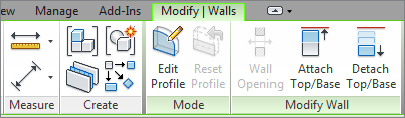
On some panels, you will find special features that can be accessed from the panel’s title bar. An example of these features can be seen in the Annotate tab of the ribbon. In Figure 2.8, the small arrow on the Text panel is known as a dialog launcher and will open the Type Properties dialog box for Text. Clicking the down arrow on the Tag panel exposes an expanded panel that displays the Loaded Tags and Keynoting Settings commands.
Figure 2.8 Special panel features
Options Bar
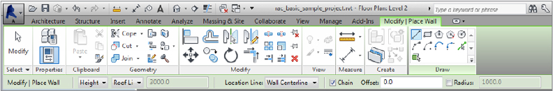
Now that we’ve covered the fundamental elements contained in the ribbon, let’s look at other important aspects of the UI. The Options bar is located directly below the ribbon and is a contextually sensitive area that gives you feedback as you create and modify content. In Figure 2.9, you see the options available below the ribbon when the Wall tool is active. You can also use the Options bar when an object already placed in a project or family is selected.
Figure 2.9 Options appear in a bar below the ribbon.
An especially important and frequently used option is included with any annotation symbol—the ability to include or exclude a leader. This will help you place tags in the clearest location within your documentation while maintaining a parametric relationship to the associated model element. Look for this option when you use the Tag By Category command from the Annotate tab in the ribbon.
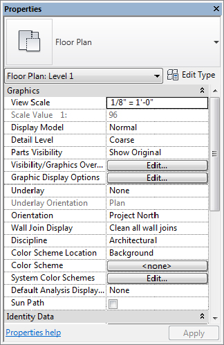
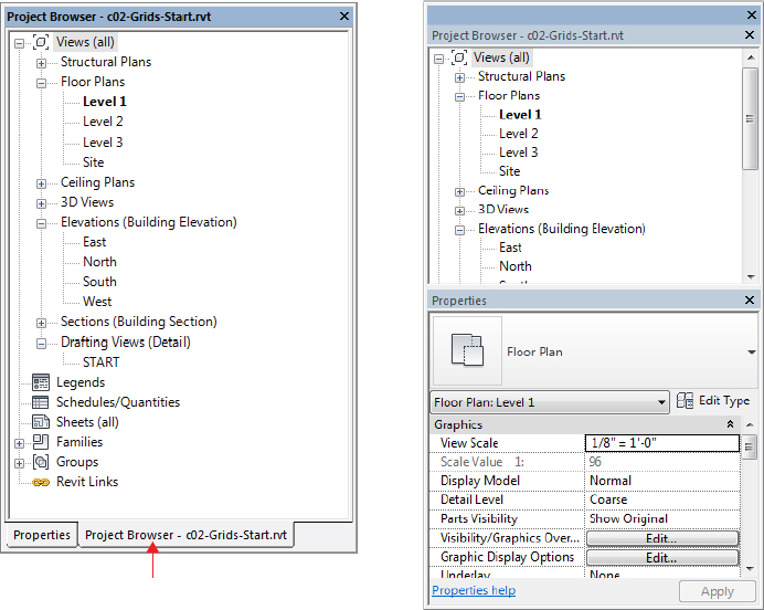
Properties Palette and Project Browser
The Properties palette contains the instance parameters of whatever you’re currently working on. In this palette, you will find the Type Selector, a selection filter, and the Edit Type button (Figure 2.10). You’ll learn more about filtering selected objects in Chapter 3, as well as much more about parameters in Chapter 14, “Family Editor.”
Figure 2.10 Properties palette
The Project Browser (Figure 2.11) is a hierarchical listing of all the views, legends, schedules, sheets, families, groups, and links in your project. You can collapse and expand the project tree by selecting the + or – icons.
Figure 2.11 Project Browser

You can search for elements by right-clicking anywhere in the Project Browser and selecting Search from the context menu. The simple search function will highlight any view, sheet, family, or type with the matching text in its name.
The Project Browser can also be filtered and grouped into folders based on a number of user-defined parameters (see Figure 2.12). To access the Browser Organization tool, right-click the Views portion at the top of the palette. You can also access this tool in the View tab under the User Interface flyout button. Learn more about Project Browser customization in Chapter 4.
Figure 2.12 Project Browser’s type properties

The Properties palette and Project Browser can be undocked from the main UI and can also be placed on a secondary monitor simply by dragging or double-clicking the top border of either palette. You can also drag these UI elements onto each other to utilize them in a unified tabbed or stacked palette, as shown in Figure 2.13. Dragging one palette onto the top border of the other will create a tabbed palette, whereas dragging it just below the top border will result in a stacked palette.
Figure 2.13 Properties and Project Browser combined in a tabbed or stacked palette
Status Bar
The status bar at the bottom of the UI provides useful information about selected objects and active tools. When you start a tool, the status bar will display prompts about the next step required of the tool. For example, select an object and start the Rotate command; the status bar will read “Click to enter rotate start ray or drag or click the rotation center control.” It is also useful when you are using the Tab key to toggle between object snap points or when selecting chains of elements.
Toward the middle of the status bar, you will find toolbars for worksets and design options. At the far right end, you will see a filter icon next to a number. When you select objects in a view window, the number of selected objects will be displayed here. Click the filter icon to open the Filter dialog box and refine the selection set.
Drawing Area
The drawing area is the window into your design space. As shown previously in Figure 2.1, you can tile several views from any number of open files or you can maximize the view windows. When the view windows in the drawing area are maximized, press Ctrl+Tab on the keyboard to cycle through the open views. To reverse the cycling, press Ctrl+Shift+Tab.
If you decide to use tiled views when you work in Revit, you should be aware of a subtle limitation. You’ll be able to zoom into only the extents that are defined by the drawing area. If you want to get around this limitation, here’s a helpful tip:
Create a new sheet, but then delete the sheet border. This is your “working” space for any view of the project. Now you can create duplicate views of any of your project views and assemble them in this working space (Figure 2.14). Zooming in and out is much more fluid, and you’re not limited to the extents of one drawing area. You can create a keyboard shortcut to activate and deactivate views, which is helpful as well.
Figure 2.14 Working sheet view

View Control Bar
The view control bar is at the bottom of every view and changes slightly depending on the type of view (Figure 2.15). For example, sheet views only have four buttons and perspective views don’t have a scale option. In Figure 2.15, we have tiled three view windows to illustrate some of the differences in the view control bar. From top to bottom, you can see a drafting view, a plan view, and a 3D view.
Figure 2.15 View control bar examples

Some of the buttons in the view control bar are just shortcuts to view parameters that are also available from the Properties palette. Scale, Detail Level, Crop View, and Crop Region Visible are found in both the view control bar and the Properties palette. The Visual Style button allows you to select from a short list of graphic display modes that can be customized in detail with the Graphic Display Options in the Properties palette.
Other buttons in the view control bar are unique commands. One example is the Temporary Hide/Isolate command. When you select an object in a view window, use this button to select from various tools to hide or isolate either the selected objects or the entire category of objects. Temporary visibility states do not affect printing, and the view window will display with a turquoise border until the temporary visibility is reset. Next to the Hide/Isolate button is the Reveal Hidden Elements button. Use this tool to highlight any elements that are hidden in the current view, either temporarily or through other methods.
The last button is available only on projects where worksharing is enabled. Worksharing visibility can be enabled and configured in any view to illustrate Owners, Checkout Status, Model Updates, and Worksets. Refer to Chapter 5 for a detailed explanation of these visibility features.
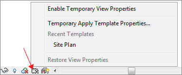
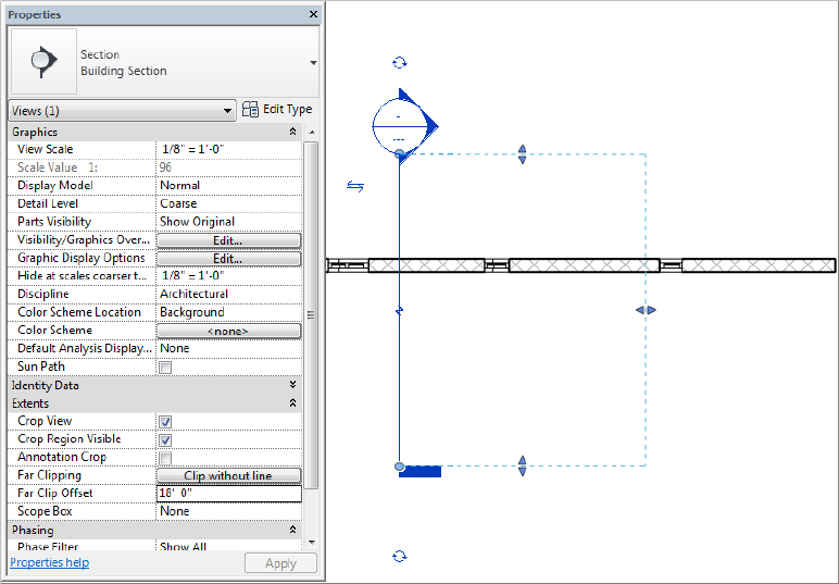
Temporary View Properties
A new feature in the 2014 version of Revit is the ability to temporarily modify view properties or apply a view template. When you click the Temporary View Properties icon in the view control bar, you will have a choice of Enable Temporary View Properties or Temporary Apply Template Properties, as shown in Figure 2.16. Because these applied properties are only temporary, they will not affect printing and they will not be saved with the project.
Figure 2.16 Temporary View Properties command
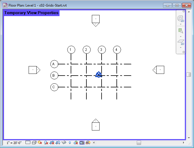
If you select Temporary Apply Template Properties, you can select from any view template established in your project. Once a view template is applied to the view with this tool, the view will be highlighted with a purple boundary, as shown in Figure 2.17. Refer to Chapter 4 for a more detailed review of view templates.
Figure 2.17 Active view with Temporary View Properties applied
Referring to Figure 2.16, you will notice that any recently applied view templates will appear in the Temporary View Properties menu. This allows for rapid application of templates to increase your productivity when manipulating views for various working scenarios.
The other command selection is to Enable Temporary View Properties. This mode allows you to change any view properties manually. The result is the same as temporarily applying a view template, but you can tweak any setting to your needs. For example, you might want to temporarily hide all the furniture in a view.
To remove the temporary settings, you can simply wait until you close the project file because the temporary settings are not saved. Otherwise, click the Temporary View Properties icon again and select Restore View Properties.
Graphic Display Options
The Graphic Display Options dialog box gives you access to some of the same settings you can select in the view control bar; however, there are more refinement options available. From the Properties palette, click Edit in the Graphic Display Options property field, and explore the graphic settings you can customize for the current view (Figure 2.18).
Figure 2.18 Graphic Display Options dialog box
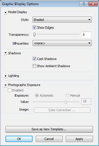
There are many graphic options available, including customized backgrounds, photographic exposure, and a transparency slider. Experiment with a variety of the settings to see which ones meet your presentation and documentation needs. You’ll learn much more about graphic styles in Chapter 11, “Visualization.”
Work Plane Viewer
Most modeling tools and commands require an active work plane on which to place geometry. When you are working in a plan view, the work plane is usually set to the current level associated with the view. In a 3D, section, or elevation view, the definition of an active work plane may be a bit more confusing. In addition to levels, work planes can be defined as reference planes, a structural grid, or a surface of another object. To help you visualize an active work plane, a work plane viewer is available in Revit.
The Viewer option is located on the Work Plane panel of the Architecture tab. This viewer is available from all model views when you’re in the project environment. By default, the work plane is based on the active work plane of the last active view. But when you enter Sketch mode, the active work plane is that of the sketch (Figure 2.19). So even if the project window shows a 3D view, the viewer shows the plane of the sketch—and you can sketch directly in the work plane viewer! This is useful for working on sloped surfaces such as roofs.
Figure 2.19 Sketch mode with active work plane

Navigation Methods
One of the challenges in any 3D modeling software is to create methods of navigation that are as intuitive as possible. If you have used more than one modeling application such as Rhino or SketchUp or Digital Project, you will know that there is no standard 3D navigation functionality. Autodesk has created consistency across most of their industry-based applications such as AutoCAD®, 3ds Max®, Navisworks®, and Revit. In addition to the consistency within the Autodesk applications, you have a variety of navigation methods to meet your personal preference, including the ViewCube® tool, the Steering Wheel® tool, and basic mouse controls.
ViewCube
 A 3D navigation tool known as the ViewCube is available in most Autodesk design software. This tool will appear by default in the upper-right corner of any 3D view. Click any face of the cube to orient the view to that face, or click a corner of the cube to orient to an axonometric angle. Press and hold the left mouse button while hovering the mouse pointer over the ViewCube to orbit the view freely. Press and hold the left mouse button while hovering over the compass, and the view will rotate as if it were on a turntable.
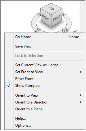
Hovering over the ViewCube with your mouse pointer reveals the Home option (the little house above the ViewCube), which you click to return to your home view. Right-clicking the ViewCube opens a menu that allows you to set, save, and orient your view (see Figure 2.20). Selecting Options from the context menu takes you directly to the ViewCube options in the Options dialog box, which you can also access from the Application menu. The ViewCube options allow you to customize the placement, transparency, and functional behavior of the tool.
Figure 2.20 ViewCube context menu
Steering Wheel
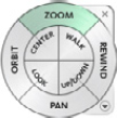 Another method of navigation that is unique to Autodesk software is the Steering Wheel. This tool can be activated by pressing the F8 key, by pressing Shift+W, or from the Navigation bar. The Steering Wheel will follow your mouse pointer as you move about a view and will stop when the mouse movement slows, allowing you to hover the mouse pointer over one of the command areas on the wheel. As you hover the mouse pointer over a navigation command, press and hold the left mouse button while moving the mouse to activate the corresponding navigation method. This is easier to demonstrate than explain in text, so feel free to try the various modes of the Steering Wheel as you continue through this book.
If you use a laptop or mobile workstation without the benefit of a mouse, the Steering Wheel can be a welcome substitute for traditional pointer-based navigation. The touch pads or pointing sticks on most laptops do a poor job of emulating the press-and-drag motions of a mouse along with simultaneous keyboard button combinations that drive native navigation in Revit. If you’re struggling without a mouse connected to your laptop, try the Steering Wheel and you might thank us!
Navigating with the Mouse
As with most modern design applications, the mouse can also be used to navigate in any view. You are not constrained to using the ViewCube, Steering Wheel, or Navigation bar. You might have already figured out that pressing the left mouse button selects objects and the right mouse button is used to access contextual menus. We discuss selection methods with greater detail in Chapter 3. For now, let’s review how you can use the mouse to navigate the views in Revit.
To pan in any view, press and hold the wheel button on your mouse while moving it around. Hold the Shift key and use the wheel button on the mouse to orbit a 3D view.
The mouse wheel can be used to zoom in and zoom out of any view, but the zooming may be somewhat choppy. Hold the Ctrl key and press the wheel button while moving the mouse forward to zoom out (pushing the model away) or backward to zoom in (pulling the model toward you). In camera views, zooming works a bit differently. Scrolling the mouse wheel zooms in and out but includes the view’s crop region. To adjust the view within the crop region, only the Steering Wheel and the ViewCube can be used.
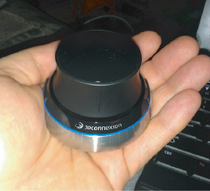
In addition to a traditional mouse, you can also use a 3D navigation device such as the Space Navigator™ from 3Dconnexion (www.3dconnexion.com), as shown in Figure 2.21. A 3D mouse allows you to navigate in multiple directions simultaneously using joystick-like motions. Simply attach the device to your computer, install the 3Dconnexion software, and a 3Dconnexion button will be displayed on the Navigation bar. The 3D mouse will automatically navigate in any 2D or 3D view, but the Navigation bar button allows you to toggle between modes.
Figure 2.21 The Space Navigator 3D mouse from 3Dconnexion
Project Organization
If you have experience with 2D CAD software, you’re likely familiar with many of the terms and concepts related to designing and documenting a project, but not all of them have exact equivalents in Revit software. You may be comfortable with thinking in terms of what needs to be drawn and coordinated: plans, sections, elevations, details, schedules, and so on. Such information is likely stored in a plethora of separate files that have to be linked together in order to reference other parts of a building design. For teams collaborating on design, you are also likely accustomed to allowing only one person in one file at a time. And finally, maintaining all your project settings and standards is a struggle across so many disconnected files.
Working in the Revit environment affords you much more control and efficiency in managing the aforementioned issues. Allow us to posit the four key components of a holistic and efficient design process as relationships, repetition, representations, and restrictions. These concepts are respectively managed in Revit software as datum objects, content, views, and project management. And they are managed from within a single, bidirectional database.
Figure 2.22 shows what we like to think of as a Revit organization chart, which gives you a visual description of these four top-level categories and the kinds of things these categories contain. In the following sections, we’ll discuss each of these categories and describe its particular role in your Revit project environment.
Figure 2.22 Revit organization chart

Datum Objects (Relationships)
Data (plural) are sometimes referred to in Revit software as datum objects and consist of references, grids, and levels (Figure 2.23). Datum objects establish geometric behavior by controlling the location and extents of your content (the building, stuff that goes in a building, and the stuff you need to document your building).
Figure 2.23 Datum objects

Reference planes can be created in any 2D view from the main ribbon tabs (Architecture, Structure, or Systems), but once created, they may not be visible in 3D. After you add reference planes to your project, they can be set and seen from the Work Plane panel. This will allow you to work with respect to the desired work plane.
Grids are used to locate structural elements in your project. You are not required to include grids in your project, but they are quite useful in managing structural walls and columns. Like reference planes, grid lines can be added to any 2D view. Keep in mind that grids can only be perpendicular to levels. Furthermore, grids are only visible in views that are perpendicular to the grid. So if the grid is in a north–south orientation, you’ll be able to see it only in plan and from the east–west orientation.
Levels are datum objects that are parallel to the ground plane. They serve several purposes. First, they are the main method for placing and managing the elevation (or Z-location) of content. Virtually all content placed in a Revit model has a Level parameter. You can even move objects from one level to another simply by changing this property in the Properties palette. Levels also function as constraints for objects such as walls and columns. These objects have top and bottom constraints that can be set to levels so that they will automatically update if the levels are adjusted. Levels may be seen and created only in elevation and section views; therefore, you can’t create levels in plan, and they can’t be diagonal to the ground plane.
Creating any datum is easy. Simply select the desired tool from the Architecture tab, and then pick two points to define the start and end locations. Despite their two-dimensional appearance, all datum objects have three-dimensional extents that help you manage their appearance throughout a project. You will explore this further in the section “3D and 2D Datum Extents” later in this chapter.
Creating and Duplicating Levels
In the previous section, we discussed the overall purpose of datum objects; however, there are special conditions related to the creation of levels. First, you should understand that a level does not always require an associated plan view. Levels that have plan views will have a blue graphic symbol at the end (double-click it to go to that view), whereas those that don’t will have a black graphic symbol. When you create a new level, you have the option to create a corresponding plan view by using the Make Plan View option from the Options bar.
Copying an existing level will not create the corresponding plan views. This is useful if you are working on a larger project, such as a high-rise, and you want to quickly configure multiple levels without creating them one at a time. You might also want to use levels just as a reference for content but not for a specific plan, such as for an intermediate landing or mezzanine.
While it is easy to create many levels by copying or arraying, only create the levels that are necessary to manage major parts of your project. You don’t need to create a level for every slab, stair, or floor offset. Too many levels can have a negative impact on your project’s performance.
Let’s explore the creation and duplication of levels with an exercise. First, download and open the file c02-Levels-Start.rvt or c02-Levels-Start-Metric.rvt from this book’s website at www.sybex.com/go/masteringrevit2014. Then follow these steps:
 2. From the Architecture tab in the ribbon, find the Datum panel and click the Level tool. In the Options bar, ensure that the Make Plan View option is selected.
 5. Return to the South elevation view and select Level 3. From the Modify tab in the ribbon, click the Copy tool. In the Options bar, select the Multiple option.
Figure 2.24 Create multiple copies of levels.
As we stated earlier, plan views are not created for levels that are copied or arrayed. This gives you the flexibility to quickly generate levels for taller buildings without all the associated views that may increase your project file size unnecessarily. While this workflow may be beneficial for you in early design phases, what do you do when you need all those floor plans and ceiling plans for that high-rise design?
If you want to convert a level that doesn’t have a view to one that does, find the Create panel on the Views tab and then select the Plan View command. This opens the dialog box shown in Figure 2.25. You can select among all the levels without corresponding views in your project. Note that only the levels you copied in the previous exercise steps are listed in the dialog box.
Figure 2.25 Adding views to levels
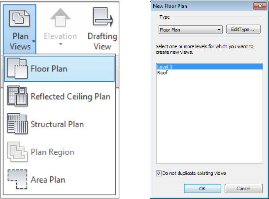
You can also use this command to create duplicate views of existing levels. Clear the Do Not Duplicate Existing Views option at the bottom of the dialog box to see all the levels in your project.
Select the Roof level and click OK. A floor plan will be created for the Roof level, and that floor plan will be opened. It is important to note that every plan you create with this method will be opened as you complete the command. Remember to use the Close Hidden Views tool (available in the Quick Access toolbar) to avoid slower performance in your work session.
3D and 2D Datum Extents
Datum objects—specifically grids and levels—have two types of extents: 3D (analytic) and 2D (graphic). These extents are expressed as grips that are shown at the endpoints of the grids and levels in plans, sections, and elevations. The analytic grips control the extents of the datum across the entire project and all views. The analytic grip is shown as an open circle and the indicator will display as 3D, as shown in Figure 2.26.
Figure 2.26 Controlling the 3D (analytic) extents of the datum

If you want to adjust the 2D extents of your datum in only the current view, click the 3D icon and it will change to 2D. You can then modify the 2D extents of the datum object without affecting the 3D extents. We will explore this further in an exercise later in this section.
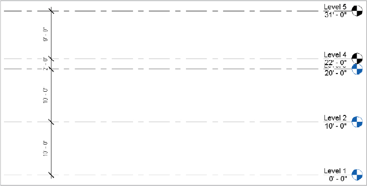
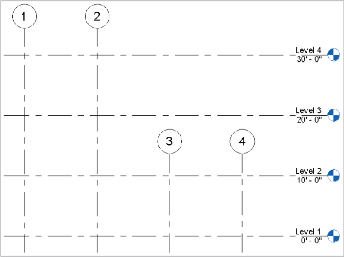
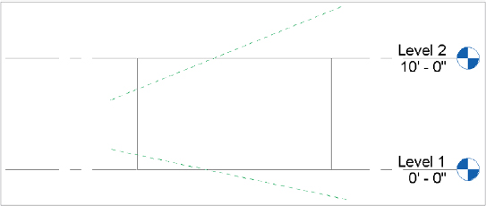
Datum objects are visible only in views that intersect their 3D extents. The elevation in Figure 2.27 shows four grids and four levels. Grid lines 3 and 4 are not visible on Levels 3 and 4 because their 3D extents are not intersecting those levels.
Figure 2.27 3D (analytic) extents affect visibility of datum objects.
You can use the 3D and 2D extents to your liking in any view. In Figure 2.28, for example, the 3D extent of grid line 1 crosses both Level 1 and Level 2, but the 2D extent is above Level 2. This means that the grid datum would still be visible in both levels, even though it looks like it doesn’t intersect the levels.
Figure 2.28 Customizing graphic and analytic extents

When you move a datum object, one way or another, content is going to respond. If you move a level, walls and furniture are going to move accordingly. If you move a grid, structural elements are going to relocate. And if you move references, the elements associated with them will update. As a matter of fact, you’ll often constrain or pin datum objects in order to restrict their movement as your project is starting to develop.
Let’s continue with the exercise from the section “Creating and Duplicating Levels” and edit the 2D extents for one of the levels you copied. Remember that although this exercise utilizes levels, these methods can be applied to grids as well. Here are the steps:
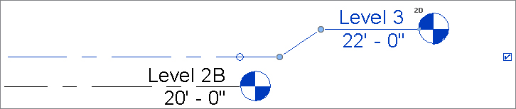
Figure 2.29 Adjusting the graphic extents of a level
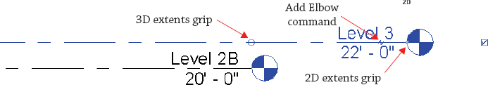
Figure 2.30 Adding an elbow to a level
Propagating Extents
Quite often you will adjust the extents of datum objects that need to be replicated in several other views. Fortunately, there is a tool to help you accomplish this—Propagate Extents. While the premise of this tool is simple, you must be aware of the subtleties in applying it to a three-dimensional model.
The Propagate Extents tool pushes any modifications you apply to a datum object from one view to other parallel views of your choosing. This tool does not work well on levels because the parallel views are essentially mirrored views of each other. For example, the orientation of the South elevation is the opposite of the North elevation; therefore, if you make a change to the extents at the right end of a level in the South elevation, those changes would be propagated to the left end in the North elevation.
The best way to apply the Propagate Extents tool is with the 2D extents of grids. Why only the 2D extents? Because changing the 3D extents affects the datum object throughout the project, independent of any specific view. Let’s examine this behavior with a quick exercise:
Figure 2.31 Adjusting the 2D extents of grids

Before you continue, open the Level 1 and Level 2 floor plans and observe that grids 3 and 4 are still visible. If you had adjusted the 3D extents of the grids in the South elevation view, those changes would already be reflected in the other views. We’re using this method because we want to maintain the 3D extents but modify the 2D extents only in the South elevation view.
Figure 2.32 Propagating extents to other views

You can use the Propagate Extents command to easily copy datum settings to any parallel views in your project. This is especially effective for propagating grid extents to many plan views in high-rise buildings.
Resetting or Maximizing 3D Extents
Two commands you might need when adjusting datum object extents are commands that give you the ability to reset or maximize the 3D extents. These commands are available in the context menu when you have a datum object selected (Figure 2.33).
Figure 2.33 Extent commands in the context menu
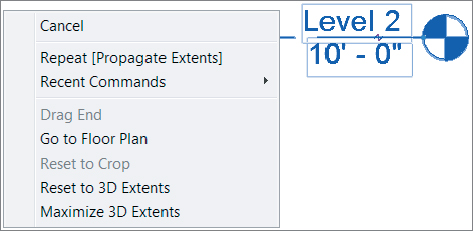
The Reset To 3D Extents command allows you to reset any graphic extent modifications back to the analytic extents. Let’s apply this command in the continued exercise file:
The other command in this pair serves a similar purpose in dealing with datum objects. Maximize 3D Extents is most often used if your levels or grids are exhibiting strange behavior. There are various reasons why this happens, but you’ll realize it when it does. You can use this command to set the analytic extents of a datum object to the outer boundaries of your project geometry.
Continuing in the exercise file, return to the Level 1 floor plan and notice that grid line C seems to be displayed like all the other grids. Now activate Section 1 from the Project Browser or by double-clicking the section head shown in the floor plan. You’ll notice that grid line C is not visible in the section view. This is because someone mistakenly pulled the analytic (3D) extents far to the left in plan while the graphic (2D) extents remained consistent with the other grids. Let’s continue the exercise and repair this problem:
Using Reference Planes
Objects in the Revit model are able to maintain relationships with other objects; however, you may not always have other model elements (like walls, floors, and roofs) to relate to other geometry. This is why datum objects are so important.
If you’ve been using Revit for a reasonable amount of time, it seems obvious that levels and grids would control content, but reference planes aren’t often appreciated. Here’s a simple exercise to demonstrate this special kind of relationship between reference planes and walls:
Figure 2.34 Concentric walls
Figure 2.35 Reference planes and levels shown in elevation
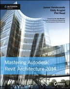
 Top is the default selection in the Options bar, so first pick the upper reference plane. Click the Attach Top/Base button again, make sure Attach Wall Base is selected in the Options bar, and then pick the lower reference plane.
Figure 2.36 shows the results in a 3D view, once you’ve attached the top and bottom of the walls to the upper and lower reference planes.
Figure 2.36 Finished walls

Try moving and rotating the reference planes, and notice that the walls will maintain their relationships to the planes. This is shown in a section view of the walls in Figure 2.37.
Figure 2.37 Section view

While you can use levels, grids, and reference planes to customize model elements, there may be situations where you need to establish relationships with nonplanar geometry. You can find video tutorials on custom wall constraints posted on our YouTube channel at www.youtube.com/user/MasteringRevit.
Content (Repetition)
Effective use of content is all about repeated elements in a hierarchy (project, family, type, instance) that you put in your Revit project to develop and document your design. Content can often maintain relationships with other content, but more important, content maintains relationships to datum objects. As you can see from the Revit organization chart shown earlier in Figure 2.22, content includes system families, component families, and spaces.
System families (also called host families) are content that is part of the Revit project environment. These families are not created and stored in external files (RFA)—they’re found only in the RVT project file. If you need another type of a system family, you’ll duplicate an existing type from within the project. System families can be 3D elements such as walls, floors, roofs, ceilings, stairs, and railings or 2D elements such as text, dimensions, revision bubbles, and insulation.
Component families are created in the Family Editor and are either 2D or 3D content. This means that you’ll have to create and load these kinds of families outside the Revit project environment as RFA files. When you start to create a component family, you’ll need to select an appropriate family template (Figure 2.38). By selecting the right family template, you’ll be certain that the component that you’re creating is going to behave, view, schedule, and (if necessary) export properly.
Figure 2.38 Selecting a family template

While most system families help shape the physical aspects of a building, the occupied voids within are critical to a successful design. These elements are spaces, which take the form of rooms and areas. Spaces maintain relationships to datum objects but also to model elements including floors, walls, ceilings, and roofs. In addition to spatial properties, rooms are used to document finishes within your project. Take a look at the properties of a room, and you’ll find Floor Finish, Base Finish, Wall Finish, and Ceiling Finish.
Type and Instance Parameters
All content in a Revit project has parameters, which are simply the information or data about something. Parameters can affect many different aspects of an object, such as visibility, behavior, size, shape, and material.
To develop a fundamental understanding of parameters, you must note that there are two kinds of parameters: type and instance. Type parameters control information about every element of the same type. So, for example, if the material of a piece of furniture is designated as a type parameter and you change it, the material for all the furniture of that type will change. Instance parameters control only the instances that you have selected. So if the material of the piece of furniture that you’ve selected is an instance parameter, you’ll be editing only the selected elements.
Instance parameters can be constantly exposed in the Properties palette. Selecting something initially displays the instance parameters. Figure 2.39 shows the instance parameters of a wall that control the relative height, constraints, and structural usage.
Figure 2.39 Instance parameters of a wall

By clicking the Edit Type button, you expose the type parameters (Figure 2.40). These parameters control values such as the structure, graphics, and assembly code.
Figure 2.40 Type parameters of a wall

While this section provided you with a basic overview of families and parameters, you will learn much more about these concepts in Chapter 14.
Views (Representation)
Views are the means by which you will interact with and document the project. As you can see in the Revit organization chart shown earlier in Figure 2.22, there are both 2D and 3D views. Two-dimensional views are oriented to specific coordinates like plan, elevation, section, and so on. Schedules and material takeoffs are yet another way of viewing information in a project that is neither 2D nor 3D. Three-dimensional views are either orthographic or perspective (camera view) in nature. Views also have type and instance parameters that control properties such as name, scale, detail level, phase filter, and graphic display options.
Common Properties of Views
Let’s first review, in detail, some of the properties that apply to most views:
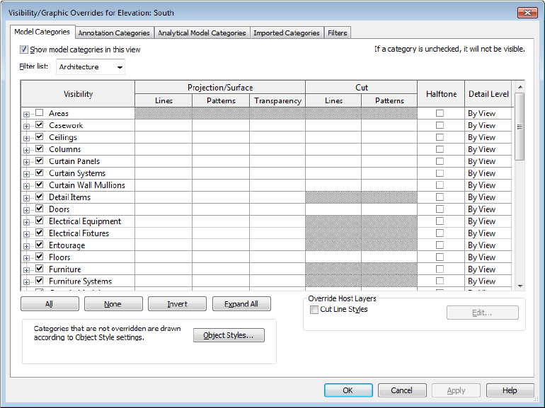
Figure 2.41 Visibility and graphic overrides for an elevation
Creating and Duplicating Views
You can create views in various ways in order to work with your project in a manner that meets your needs. Although creating views is quick and easy, you should avoid populating your project file with too many unnecessary views. An overabundance of unused views will increase the size of your project file and cause it to perform poorly. Let’s review the procedures to create different view types and see how to control their extents after they’re created.
New views can be generated from the Create panel on the View tab of the ribbon (Figure 2.42), and the process is quite simple. Click one of the buttons, and a new view is activated and stored in the Project Browser.
Figure 2.42 Creating new views from the ribbon

Another quick way to create new views is to right-click a view name in the Project Browser and select one of the Duplicate View commands (Figure 2.43). You can also duplicate the current view by using the Duplicate View button in the Create panel of the ribbon.
Figure 2.43 Duplicating views from the Project Browser

As you can see in Figure 2.43, there are three choices in the Duplicate View flyout command: Duplicate, Duplicate With Detailing, and Duplicate As A Dependent. Let’s take a quick look at what each of these options means:
Floor Plans and Ceiling Plans
As you learned in the section “Creating and Duplicating Levels” earlier in this chapter, when you create a level in an elevation or section view, you have the option to create a plan view for that level in the Options bar. If you have levels without corresponding plan views, you can also use the Plan Views tool from the ribbon to create a plan view.
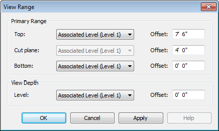
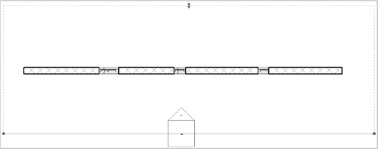
The vertical extents of plans and ceiling plans are controlled by the View Range settings. The View Range settings, as shown in Figure 2.44, define the vertical range of the view.
Figure 2.44 View Range dialog box
The view range properties can be difficult to understand, so we have created a diagram to illustrate the principles. In Figure 2.45, you will see that the primary range is the zone you usually see in a default floor or ceiling plan. If an object crosses the cut plane, the object’s Cut values are used. If the object is below the cut plane but above the bottom, the object’s Projection values are used.
Figure 2.45 View range properties explained
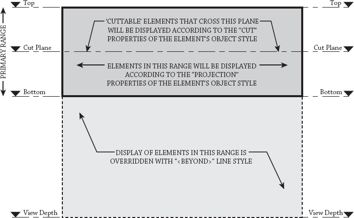
For most views, the Bottom and View Depth parameters are set to the same plane. Therefore, objects below the bottom of the view range simply won’t appear. So, what happens if you need to show objects on a lower terrace for reference in the current view? When you set View Depth to Level Below or Unlimited, objects that are below the bottom of the view range but within the view depth will be overridden with the <Beyond> line style.
Perhaps you only need to apply a different view range setting to isolated areas of a view. This can be accomplished with the use of the Plan Region tool. You can find this tool in the Create panel of the View tab along with the other Plan View tools. The Plan Region tool allows you to sketch a boundary within which the View Range dialog box will be available to make specific changes. This method can be utilized for areas such as windows that might be placed in a wall above the cut plane but need to be shown on the plan for documentation.
Another useful property of plans is known as an underlay. While this property may function more like a tool, it is found in the Properties palette along with the other view properties. An underlay allows you to use any other level as a reference in the current view. You can use the underlay to display ceiling soffits in a floor plan, to display furniture layouts in a ceiling plan, or to use another level as a reference for replicating partition layouts.
Elevations
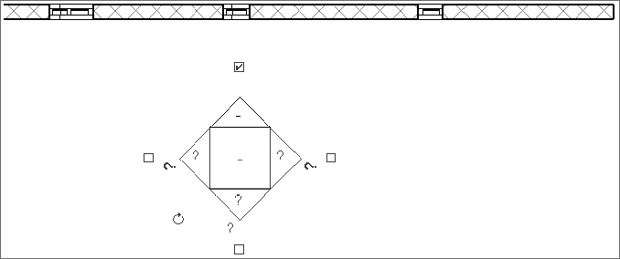
Selecting the Elevation function on the View tab creates elevations of various types. You’ll also notice that as you place an elevation tag, the elevations automatically orient to walls (Figure 2.46). If there’s no host element nearby to reference, they’ll automatically orient to the left.
Figure 2.46 Elevation tag orientation

Selecting the center of the tag will allow you to create additional elevation views (more typically done for interior elevations) by selecting the unchecked boxes that surround the elevation tag (Figure 2.47).
Figure 2.47 Creating additional elevations
If you select the nose of the elevation tag, you’ll see a blue line that defines the beginning of the cut plane for the elevation as well as a dashed line that defines the side and rear extents (Figure 2.48). This allows you to control the analytic extents of the elevation without moving the graphic tag, which is useful if you want the tag in a particular location but you want the cutting plane to start somewhere else.
Figure 2.48 Elevation extents
Finally, there are three types of elevations in a Revit project: exterior, interior, and framing. Their differences are more than graphic. Exterior elevations by default don’t have an active crop boundary, only a starting cut plane. Interior elevations have their crop boundary on by default and attempt to find boundaries of host elements, like walls, floors, and ceilings. Framing elevations can be placed only along a grid line, and their cut plane corresponds to the respective grid.
Sections
Selecting the Section function on the View tab creates sections. By default, there are three types of sections available from the Type Selector: Building, Wall, and Callout Detail. This allows them to be grouped with better clarity in the Project Browser, but there are also other important properties.
Unlike with elevations, the cutting plane of a section must correspond with its graphic line. Figure 2.49 shows the instance properties of a Building section. The far and side cut planes of a section can also be controlled. This goes for both Building and Wall sections.
Figure 2.49 Section properties and extents
Building and Wall sections must be created in a perpendicular orientation with respect to levels. But after you create them, they can be rotated in elevation. However, doing so would lead to confusion in your project because, once rotated, the section wouldn’t be displayed in plan.
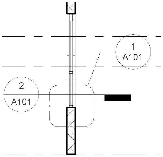
This is where the Detail section is such a great help. A Detail section that’s created in plan not only can be seen in corresponding views, but it will also assume different graphic conventions.
For example, look at the two Detail sections in Figure 2.50 that are to the right of the Building section. When you create a Detail section, it will look like Detail Section 1. But when you view it in referring views, it will look like Detail Section 2.
Figure 2.50 Detail sections in plan view

The other thing that you should note is the color of callout and section heads in Figure 2.50. These blue icons act as hyperlinks to the other views in your project. The great thing about them is they are automatically coordinated numerically when you place the views on sheets in your document set.
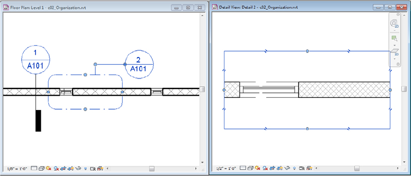
If you go to the view of the Building section, you see that the Detail sections are graphically the opposite of what you’ve seen in plan view (Figure 2.51).
Figure 2.51 Detail sections in section view
Callouts
There are two types of callouts available in the Type Selector: Detail and Floor Plan. Although Detail callouts may look like Detail sections graphically, they’re not visible inside other perpendicular views. So a callout created in plan view will not be visible in elevations or sections like a Detail section.
It’s probably best to think of a Detail callout as an enlarged view. Its Far Clip settings are by default the same as those of the parent view. Detail callouts will be filed under Detail Views in the Project Browser. They also have the ability to be displayed in intersecting views, while Floor Plan callouts do not. In other words, a Detail callout placed in a plan view will appear as a Detail section in an intersecting view such as a Building or Wall section.
You can think of a Floor Plan callout as another plan view but with associated callout graphics. Floor Plan callouts also have all the same view controls as a regular plan view, such as Depth Clipping and View Range (Figure 2.52). Take a moment to note the line and control arrows around the border of the view. By modifying the location of these arrows, you’re modifying the extents of the view. Of course, more than plan views can have their extents modified; elevations, sections, and callouts can all have their view extents modified in the same way.
Figure 2.52 Floor Plan callout
Drafting Views
Drafting views give you the ability to draw without first creating a reference to something in your project. They may contain Detail and Repeating Detail components and any other annotation content. Drafting views are great for quickly documenting typical conditions that don’t require an actual model geometry.
Once you’ve created a drafting view, you can refer to this view when creating an elevation, section, detail, and so on that would normally rely on an actual view of the model. As you start to create a standard project view (Figure 2.53), simply select the Reference Other View option, and then you’ll be allowed to select a reference view from all the other like views in your project as well as any drafting views.
Figure 2.53 Drafting view reference

Legends
Legends are views in which you can display samples of model elements that won’t affect schedules and quantity takeoffs. There are two types of legends: legends and keynote legends. Regular legends are used to assemble analytic views of content in your project, graphics, geometry, tags, and so on—anything that lives in your project. Legends may contain Detail, Repeating Detail, and Legend components—which are live representations of 3D model elements.
A Legend component (Figure 2.54) is a special live representation of a system or component family that may appear only in legend views (not drafting views). If you make a change to an element in your project, the representation of that element in the legend will change as well. When you are creating a legend view, the Legend Component tool is located in the Component flyout button on the Detail panel of the Annotate tab in the ribbon.
Figure 2.54 Legend components

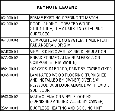
Keynote legends are special schedules. When creating a keynote legend, you’ll be prompted much the same way as you are when creating a schedule (Figure 2.55). These types of legends are meant to be placed on either one sheet or multiple sheets. If the legend is placed on every sheet in which keynotes are used, the Filter By Sheet option should be selected on the Filter tab of the Keynote Legend Properties dialog box. With this option selected, only those keynotes that appear in views placed on a sheet will appear in the sheet’s keynote legend.
Figure 2.55 An example of a keynote legend placed on a sheet
Schedules
All model elements have information about their properties such as size, material, and cost. You can report and interact with this information in tabular views known as schedules. There are six types of schedule views that can be accessed from the Create panel in the View tab of the ribbon: Schedule/Quantities, Graphical Column Schedule, Material Takeoff, Sheet List, Note Block, and View List.
Sheets
You will use sheets to organize views and other annotation for the purpose of issuing printable (physical or digital) documents. Sheet borders can be customized, but the important fact to realize is that sheets are always scaled at 1:1. The important thing to remember is that you’re not going to select a scale when you print a sheet; it’s really more like printing than plotting. If you need your sheet to be smaller or fit on the desired page, these options are available, and using them is little different than printing from a word processing application.
You will learn more about creating sheets in Chapter 17.
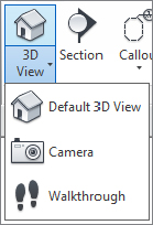
3D Views
Two kinds of 3D views are supported: orthographic and perspective. The Default 3D view is orthographic, while Camera and Walkthrough views are in perspective. You can’t change one to another after they are created, so select carefully (Figure 2.56). We’ll also cover 3D views in more detail in Chapter 11.
Figure 2.56 Creating 3D view types
Orthographic views will always show parallel edges along Cartesian x-, y-, and z-axes. Orthographic views are best if you need to show model information to scale. A lot of people don’t realize that it’s possible to dimension and detail in Revit software from a 3D orthographic view. For a more thorough explanation of annotating a 3D view, refer to Chapter 20, “Presenting Your Design.”
Create Camera views by placing the start and end points of a camera (typically from a plan view). It should be noted that the first point you select in plan is the point from which the view will be taken, but the second point is also the rotation origin for the view (Figure 2.57). This is important because if you select a second point that is far beyond your view, when you open the view and attempt to modify it, it will rotate around a target that doesn’t seem to make sense. That’s because the target location of the view is off in the distance.
Figure 2.57 Setting camera and target origin

A perspective view will not be to scale, but it can be made relatively larger or smaller by selecting the view’s crop region and then selecting the Size Crop button from the Modify | Camera tab (Figure 2.58). Once you do this, you’ll have the option to change the view size and field of view (proportionally or nonproportionally). You can also simply drag the nodes of the bounding box.
Figure 2.58 Modifying the view size and field of view

Camera extents are defined by the Far Clip Offset option, accessed in the Properties palette for the view. If the Far Clip Offset is too low, the view may resemble the image shown in Figure 2.59. Geometry that you’d expect to see will be “clipped” in the view.
Figure 2.59 The Far Clip Offset is too shallow.
Simply increase the Far Clip Offset value to show more of the model. You may also do this graphically by returning to a plan view, right-clicking the Camera view in the Project Browser, and then selecting Show Camera. Once the camera is shown in your plan view, you can select the node at the far end of your clipping plane and manually drag the node to extend the far clip offset of your view in a similar manner to that shown previously in Figure 2.57.
Finally, the extents of 3D views (even walkthroughs) may be customized with the use of section boxes. You can find the Section Box option in the Properties palette for a 3D view (Figure 2.60). This will allow you to control how much of the project is shown and is helpful for creating cutaway visualizations in real time or in renderings.
Figure 2.60 Section box applied to a 3D view

Once a section box is enabled in a 3D view, you can select it in order to stretch or rotate it according to your needs. The section box is not considered a crop region, and therefore it is not affected when you use the Crop Region Visible command. If you want to hide a crop region, select it and then select Hide Elements from the View panel in the ribbon.
Project Management (Restrictions)
Project management involves all the project settings that control (and therefore restrict) the graphic information previously described in this chapter as relationships, repetition, and representations. Returning to the organization chart in Figure 2.22, you’ll see that a Revit project is managed with settings such as line styles, phasing, and view templates.
To cover all aspects of project management in this one chapter would be overwhelming; therefore, you can find more detailed information about the following topics throughout this book:
- For object styles, line styles, fill patterns, line weights and view templates, refer to Chapter 4.
- For worksets and worksharing, refer to Chapter 5.
- For phasing and design options, refer to Chapter 10, “Working with Phasing, Groups, and Design Options.”
- To learn about locations and shared positioning, refer to Chapter 3.