
17. GUI Components: Part 2
Objectives
In this chapter you’ll learn:
• To create and manipulate sliders, menus, pop-up menus and windows.
• To change the look-and-feel of a GUI, using Swing’s pluggable look-and-feel.
• To create a multiple-document interface with JDesktopPane and JInternalFrame.
• To use additional layout managers.
An actor entering through the door, you’ve got nothing. But if he enters through the window, you’ve got a situation.
—Billy Wilder
...the force of events wakes slumberous talents.
—Edward Hoagland
You and I would see more interesting photography if they would stop worrying, and instead, apply horse-sense to the problem of recording the look and feel of their own era.
—Jessie Tarbox Beals
Outline
17.1 Introduction
17.2 JSlider
17.3 Windows: Additional Notes
17.4 Using Menus with Frames
17.5 JPopupMenu
17.6 Pluggable Look-and-Feel
17.7 JDesktopPane and JInternalFrame
17.8 JTabbedPane
17.9 Layout Managers: BoxLayout and GridBagLayout
17.10 Wrap-Up
17.1 Introduction
In this chapter, we continue our study of GUIs. We discuss additional components and layout managers and lay the groundwork for building more complex GUIs.
We begin our discussion with menus that enable the user to effectively perform tasks in the program. The look-and-feel of a Swing GUI can be uniform across all platforms on which a Java program executes, or the GUI can be customized by using Swing’s pluggable look-and-feel (PLAF). We provide an example that illustrates how to change between Swing’s default metal look-and-feel (which looks and behaves the same across platforms), a look-and-feel that simulates Motif (a popular UNIX look-and-feel) and one that simulates Microsoft’s Windows look-and-feel.
Many of today’s applications use a multiple-document interface (MDI)—a main window (often called the parent window) containing other windows (often called child windows) to manage several open documents in parallel. For example, many e-mail programs allow you to have several e-mail windows open at the same time so that you can compose or read multiple e-mail messages. We demonstrate Swing’s classes for creating multiple-document interfaces. The chapter finishes with a series of examples discussing additional layout managers for organizing graphical user interfaces.
Swing is a large and complex topic. There are many more GUI components and capabilities than can be presented here. Several more Swing GUI components are introduced in the remaining chapters of this book as they are needed.
17.2 JSlider
JSliders enable a user to select from a range of integer values. Class JSlider inherits from JComponent. Figure 17.1 shows a horizontal JSlider with tick marks and the thumb that allows a user to select a value. JSliders can be customized to display major tick marks, minor tick marks and labels for the tick marks. They also support snap-to ticks, which cause the thumb, when positioned between two tick marks, to snap to the closest one.
Fig. 17.1. JSlider component with horizontal orientation.
Most Swing GUI components support user interactions through the mouse and the keyboard. For example, if a JSlider has the focus (i.e., it is the currently selected GUI component in the user interface), the left arrow key and right arrow key cause the thumb of the JSlider to decrease or increase by 1, respectively. The down arrow key and up arrow key also cause the thumb of the JSlider to decrease or increase by 1 tick, respectively. The PgDn (page down) key and PgUp (page up) key cause the thumb of the JSlider to decrease or increase by block increments of one-tenth of the range of values, respectively. The Home key moves the thumb to the minimum value of the JSlider, and the End key moves the thumb to the maximum value of the JSlider.
JSliders have either a horizontal orientation or a vertical orientation. For a horizontal JSlider, the minimum value is at the left end of the JSlider and the maximum is at the right end. For a vertical JSlider, the minimum value is at the bottom and the maximum is at the top. The minimum and maximum value positions on a JSlider can be reversed by invoking JSlider method setInverted with boolean argument true. The relative position of the thumb indicates the current value of the JSlider.
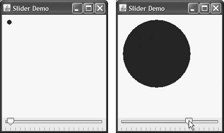
The program in Figs. 17.2–17.4 allows the user to size a circle drawn on a subclass of JPanel called OvalPanel (Fig. 17.2). The user specifies the circle’s diameter with a horizontal JSlider. Class OvalPanel knows how to draw a circle on itself, using its own instance variable diameter to determine the diameter of the circle—the diameter is used as the width and height of the bounding box in which the circle is displayed. The diameter value is set when the user interacts with the JSlider. The event handler calls method setDiameter in class OvalPanel to set the diameter and calls repaint to draw the new circle. The repaint call results in a call to OvalPanel’s paintComponent method.
Fig. 17.2. JPanel subclass for drawing circles of a specified diameter.
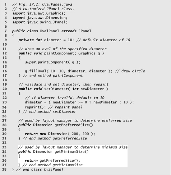
Fig. 17.3. JSlider value used to determine the diameter of a circle.
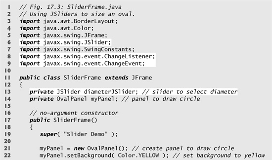
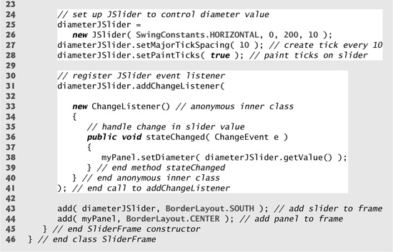
Fig. 17.4. Test class for SliderFrame.
Class OvalPanel (Fig. 17.2) contains a paintComponent method (lines 12–17) that draws a filled oval (a circle in this example), a setDiameter method (lines 20–25) that changes the circle’s diameter and repaints the OvalPanel, a getPreferredSize method (lines 28–31) that returns the preferred width and height of an OvalPanel and a getMinimumSize method (lines 34–37) that returns an OvalPanel’s minimum width and height.
Look-and-Feel Observation 17.1
If a new GUI component has a minimum width and height (i.e., smaller dimensions would render the component ineffective on the display), override method getMinimumSize to return the minimum width and height as an instance of class Dimension.
Software Engineering Observation 17.1
For many GUI components, method getMinimumSize is implemented to return the result of a call to the component’s getPreferredSize method.
Class SliderFrame (Fig. 17.3) creates the JSlider that controls the diameter of the circle. Class SliderFrame’s constructor (lines 17–45) creates OvalPanel object myPanel (line 21) and sets its background color (line 22). Lines 25–26 create JSlider object diameterSlider to control the diameter of the circle drawn on the OvalPanel. The JSlider constructor takes four arguments. The first argument specifies the orientation of diameterSlider, which is HORIZONTAL (a constant in interface SwingConstants). The second and third arguments indicate the minimum and maximum integer values in the range of values for this JSlider. The last argument indicates that the initial value of the JSlider (i.e., where the thumb is displayed) should be 10.
Lines 27–28 customize the appearance of the JSlider. Method setMajorTickSpacing indicates that each major tick mark represents 10 values in the range of values supported by the JSlider. Method setPaintTicks with a true argument indicates that the tick marks should be displayed (they are not displayed by default). For other methods that are used to customize a JSlider’s appearance, see the JSlider on-line documentation (java.sun.com/javase/6/docs/api/javax/swing/JSlider.html).
JSliders generate ChangeEvents (package javax.swing.event) in response to user interactions. An object of a class that implements interface ChangeListener (package javax.swing.event) and declares method stateChanged can respond to ChangeEvents. Lines 31–41 register a ChangeListener to handle diameterSlider’s events. When method stateChanged (lines 36–39) is called in response to a user interaction, line 38 calls myPanel’s setDiameter method and passes the current value of the JSlider as an argument. JSlider method getValue returns the current thumb position.
17.3 Windows: Additional Notes
In this section, we discuss several important JFrame issues. A JFrame is a window with a title bar and a border. Class JFrame is a subclass of java.awt.Frame (which is a subclass of java.awt.Window). As such, JFrame is one of the few Swing GUI components that is not a lightweight GUI component. When you display a window from a Java program, the window is provided by the local platform’s windowing toolkit, and therefore the window will look like every other window displayed on that platform. When a Java application executes on a Macintosh and displays a window, the window’s title bar and borders will look like those of other Macintosh applications. When a Java application executes on a Microsoft Windows system and displays a window, the window’s title bar and borders will look like those of other Microsoft Windows applications. And when a Java application executes on a UNIX platform and displays a window, the window’s title bar and borders will look like other UNIX applications on that platform.
Class JFrame supports three operations when the user closes the window. By default, a window is hidden (i.e., removed from the screen). This can be controlled with JFrame method setDefaultCloseOperation. Interface WindowConstants (package javax.swing), which class JFrame implements, declares three constants—DISPOSE_ON_CLOSE, DO_NOTHING_ON_CLOSE and HIDE_ON_CLOSE (the default)—for use with this method. Some platforms allow only a limited number of windows to be displayed on the screen. Thus, a window is a valuable resource that should be given back to the system when it is no longer needed. Class Window (an indirect superclass of JFrame) declares method dispose for this purpose. When a Window is no longer needed in an application, you should explicitly dispose of it. This can be done by calling the Window’s dispose method or by calling method setDefaultCloseOperation with the argument WindowConstants.DISPOSE_ON_CLOSE. Terminating an application will return window resources to the system. Setting the default close operation to DO_NOTHING_ON_CLOSE indicates that the program will determine what to do when the user indicates that the window should be closed.
Performance Tip 17.1
A window is an expensive system resource. Return it to the system by calling its dispose method when the window is no longer needed.
By default, a window is not displayed on the screen until the program invokes the window’s setVisible method (inherited from class java.awt.Component) with a true argument. A window’s size should be set with a call to method setSize (inherited from class java.awt.Component). The position of a window when it appears on the screen is specified with method setLocation (inherited from class java.awt.Component).
Common Programming Error 17.1
Forgetting to call method setVisible on a window is a runtime logic error—the window is not displayed.
Common Programming Error 17.2
Forgetting to call the setSize method on a window is a runtime logic error—only the title bar appears.
When the user manipulates the window, this action generates window events. Event listeners are registered for window events with Window method addWindowListener. Interface WindowListener provides seven window-event-handling methods—windowActivated (called when the user makes a window the active window), windowClosed (called after the window is closed), windowClosing (called when the user initiates closing of the window), windowDeactivated (called when the user makes another window the active window), windowDeiconified (called when the user restores a window from being minimized), windowIconified (called when the user minimizes a window) and windowOpened (called when a program first displays a window on the screen).
17.4 Using Menus with Frames
Menus are an integral part of GUIs. Menus allow the user to perform actions without unnecessarily cluttering a GUI with extra components. In Swing GUIs, menus can be attached only to objects of the classes that provide method setJMenuBar. Two such classes are JFrame and JApplet. The classes used to declare menus are JMenuBar, JMenu, JMenuItem, JCheckBoxMenuItem and class JRadioButtonMenuItem.
Look-and-Feel Observation 17.2
Menus simplify GUIs because components can be hidden within them. These components will be visible only when the user looks for them by selecting the menu.
Class JMenuBar (a subclass of JComponent) contains the methods necessary to manage a menu bar, which is a container for menus. Class JMenu (a subclass of javax.swing.JMenuItem) contains the methods necessary for managing menus. Menus contain menu items and are added to menu bars or to other menus as submenus. When a menu is clicked, it expands to show its list of menu items.
Class JMenuItem (a subclass of javax.swing.AbstractButton) contains the methods necessary to manage menu items. A menu item is a GUI component inside a menu that, when selected, causes an action event. A menu item can be used to initiate an action, or it can be a submenu that provides more menu items from which the user can select. Sub-menus are useful for grouping related menu items in a menu.
Class JCheckBoxMenuItem (a subclass of javax.swing.JMenuItem) contains the methods necessary to manage menu items that can be toggled on or off. When a JCheckBoxMenuItem is selected, a check appears to the left of the menu item. When the JCheckBoxMenuItem is selected again, the check is removed.
Class JRadioButtonMenuItem (a subclass of javax.swing.JMenuItem) contains the methods necessary to manage menu items that can be toggled on or off like JCheckBoxMenuItems. When multiple JRadioButtonMenuItems are maintained as part of a ButtonGroup, only one item in the group can be selected at a given time. When a JRadioButtonMenuItem is selected, a filled circle appears to the left of the menu item. When another JRadioButtonMenuItem is selected, the filled circle of the previously selected menu item is removed.
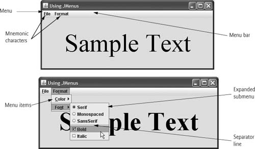
The application in Figs. 17.5–17.6 demonstrates various menu items and how to specify special characters called mnemonics that can provide quick access to a menu or menu item from the keyboard. Mnemonics can be used with all subclasses of javax.swing.AbstractButton.
Fig. 17.5. JMenus and mnemonics.
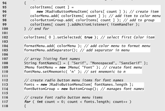
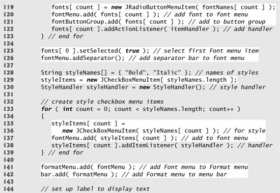
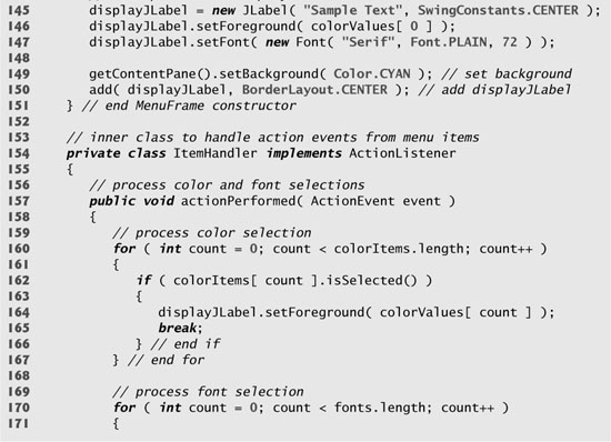
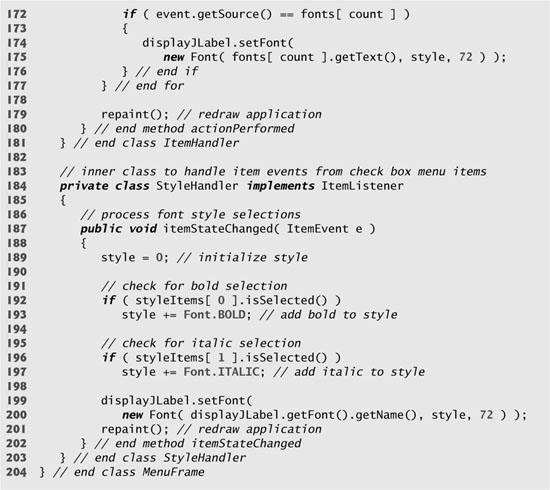
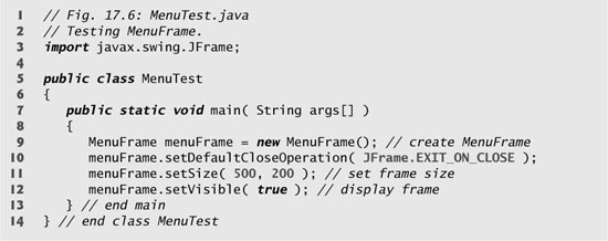
Fig. 17.6. Test class for MenuFrame.
Class MenuFrame (Fig. 17.5) declares the GUI components and event handling for the menu items. Most of the code in this application appears in the class’s constructor (lines 34–151).
Lines 38–76 set up the File menu and attach it to the menu bar. The File menu contains an About... menu item that displays a message dialog when the menu item is selected and an Exit menu item that can be selected to terminate the application.
Line 38 creates a JMenu and passes to the constructor the string "File" as the name of the menu. Line 39 uses JMenu method setMnemonic (inherited from class AbstractButton) to indicate that F is the mnemonic for this menu. Pressing the Alt key and the letter F opens the menu, just as clicking the menu name with the mouse would. In the GUI, the mnemonic character in the menu’s name is displayed with an underline. (See the screen captures in Fig. 17.6.)
Look-and-Feel Observation 17.3
Mnemonics provide quick access to menu commands and button commands through the keyboard.
Look-and-Feel Observation 17.4
Different mnemonics should be used for each button or menu item. Normally, the first letter in the label on the menu item or button is used as the mnemonic. If several buttons or menu items start with the same letter, choose the next most prominent letter in the name (e.g., x is commonly chosen for a button or menu item called Exit).
Lines 42–43 create JMenuItem aboutItem with the text “About...” and set its mnemonic to the letter A. This menu item is added to fileMenu at line 44 with JMenu method add. To access the About... menu item through the keyboard, press the Alt key and letter F to open the File menu, then press A to select the About... menu item. Lines 47–56 create an ActionListener to process aboutItem’s action event. Lines 52–54 display a message dialog box. In most prior uses of showMessageDialog, the first argument was null. The purpose of the first argument is to specify the parent window that helps determine where the dialog box will be displayed. If the parent window is specified as null, the dialog box appears in the center of the screen. Otherwise, it appears centered over the specified parent window. In this example, the program specifies the parent window with MenuTest.this—the this reference of the MenuTest object. When using the this reference in an inner class, specifying this by itself refers to the inner-class object. To reference the outer-class object’s this reference, qualify this with the outer-class name and a dot (.).
Dialog boxes are typically modal. A modal dialog box does not allow any other window in the application to be accessed until the dialog box is dismissed. The dialogs displayed with class JOptionPane are modal dialogs. Class JDialog can be used to create your own modal or nonmodal dialogs.
Lines 59–72 create menu item exitItem, set its mnemonic to x, add it to fileMenu and register an ActionListener that terminates the application when the user selects exitItem.
Lines 74–76 create the JMenuBar, attach it to the application window with JFrame method setJMenuBar and use JMenuBar method add to attach the fileMenu to the JMenuBar.
Common Programming Error 17.3
Forgetting to set the menu bar with JFrame method setJMenuBar prevents the menu bar from displaying in the JFrame.
Look-and-Feel Observation 17.5
Menus appear left to right in the order that they are added to a JMenuBar.
Lines 78–79 create menu formatMenu and set its mnemonic to r. (F is not used because that is the File menu’s mnemonic.)
Lines 84–85 create menu colorMenu (this will be a submenu in the Format menu) and set its mnemonic to C. Line 88 creates JRadioButtonMenuItem array colorItems, which refers to the menu items in colorMenu. Line 89 creates ButtonGroup colorGroup, which will ensure that only one of the menu items in the Color submenu is selected at a time. Line 90 creates an instance of inner class ItemHandler (declared at lines 154–181) that responds to selections from the Color and Font submenus (discussed shortly). The for statement at lines 93–100 creates each JRadioButtonMenuItem in array colorItems, adds each menu item to colorMenu and to colorGroup and registers the ActionListener for each menu item.
Line 102 invokes AbstractButton method setSelected to select the first element in array colorItems. Line 104 adds colorMenu as a submenu of formatMenu. Line 105 invokes JMenu method addSeparator to add a horizontal separator line to the menu.
Look-and-Feel Observation 17.6
A submenu is created by adding a menu as a menu item in another menu. When the mouse is positioned over a submenu (or the submenu’s mnemonic is pressed), the submenu expands to show its menu items.
Look-and-Feel Observation 17.7
Separators can be added to a menu to group menu items logically.
Look-and-Feel Observation 17.8
Any lightweight GUI component (i.e., a component that is a subclass of JComponent) can be added to a JMenu or to a JMenuBar.
Lines 108–126 create the Font submenu and several JRadioButtonMenuItems and select the first element of JRadioButtonMenuItem array fonts. Line 129 creates a JCheckBoxMenuItem array to represent the menu items for specifying bold and italic styles for the fonts. Line 130 creates an instance of inner class StyleHandler (declared at lines 184–203) to respond to the JCheckBoxMenuItem events. The for statement at lines 133–139 creates each JCheckBoxMenuItem, adds each menu item to fontMenu and registers the ItemListener for each menu item. Line 141 adds fontMenu as a submenu of formatMenu. Line 142 adds the formatMenu to bar (the menu bar).
Lines 145–147 create a JLabel for which the Format menu items control the font, font color and font style. The initial foreground color is set to the first element of array colorValues (Color.BLACK) by invoking JComponent method setForeground, and the initial font is set to Serif with PLAIN style and 72-point size. Line 149 sets the background color of the window’s content pane to cyan, and line 150 attaches the JLabel to the CENTER of the content pane’s BorderLayout.
ItemHandler method actionPerformed (lines 157–180) uses two for statements to determine which font or color menu item generated the event and sets the font or color of the JLabel displayLabel, respectively. The if condition at line 162 uses AbstractButton method isSelected to determine the selected JRadioButtonMenuItem. The if condition at line 172 invokes the event object’s getSource method to get a reference to the JRadioButtonMenuItem that generated the event. Line 175 invokes AbstractButton method getText to obtain the name of the font from the menu item.
The program calls StyleHandler method itemStateChanged (lines 187–202) if the user selects a JCheckBoxMenuItem in the fontMenu. Lines 192 and 196 determine whether either or both of the JCheckBoxMenuItems are selected and use their combined state to determine the new style of the font.
17.5 JPopupMenu
Many of today’s computer applications provide so-called context-sensitive pop-up menus. In Swing, such menus are created with class JPopupMenu (a subclass of JComponent). These menus provide options that are specific to the component for which the pop-up trigger event was generated. On most systems, the pop-up trigger event occurs when the user presses and releases the right mouse button.
Look-and-Feel Observation 17.9
The pop-up trigger event is platform specific. On most platforms that use a mouse with multiple buttons, the pop-up trigger event occurs when the user clicks the right mouse button on a component that supports a pop-up menu.
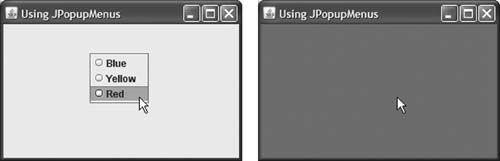
The application in Figs. 17.7–17.8 creates a JPopupMenu that allows the user to select one of three colors and change the background color of the window. When the user clicks the right mouse button on the PopupTest window’s background, a JPopupMenu containing colors appears. If the user clicks a JRadioButtonMenuItem for a color, ItemHandler method actionPerformed changes the background color of the window’s content pane.
Fig. 17.7. JPopupMenu for selecting colors.
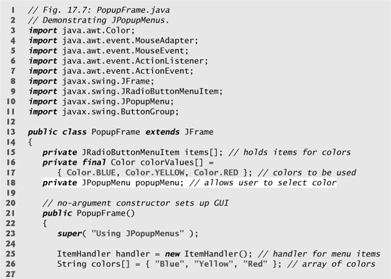
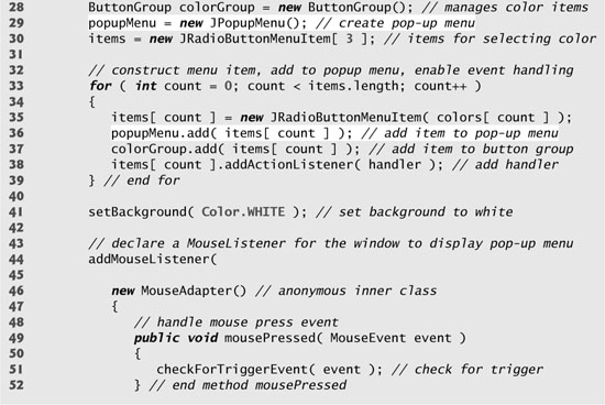
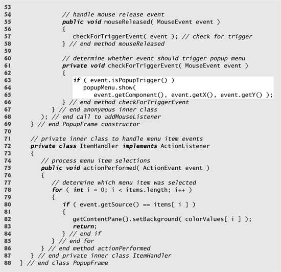
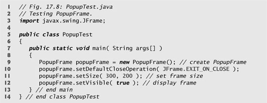
Fig. 17.8. Test class for PopupFrame.
Line 25 of the PopupFrame constructor (lines 21–69) creates an instance of class ItemHandler (declared in lines 72–87) that will process the item events from the menu items in the pop-up menu. Line 29 creates the JPopupMenu. The for statement (lines 33–39) creates a JRadioButtonMenuItem object (line 35), adds it to popupMenu (line 36), adds it to ButtonGroup colorGroup (line 37) to maintain one selected JRadioButtonMenuItem at a time and registers its ActionListener (line 38). Line 41 sets the initial background to white by invoking method setBackground.
Lines 44–68 register a MouseListener to handle the mouse events of the application window. Methods mousePressed (lines 49–52) and mouseReleased (lines 55–58) check for the pop-up trigger event. Each method calls private utility method checkForTriggerEvent (lines 61–66) to determine whether the pop-up trigger event occurred. If it did, MouseEvent method isPopupTrigger returns true, and JPopupMenu method show displays the JPopupMenu. The first argument to method show specifies the origin component, whose position helps determine where the JPopupMenu will appear on the screen. The last two arguments are the x-y coordinates (measured from the origin component’s upper-left corner) at which the JPopupMenu is to appear.
Look-and-Feel Observation 17.10
Displaying a JPopupMenu for the pop-up trigger event of multiple GUI components requires registering mouse-event handlers for each of those GUI components.
When the user selects a menu item from the pop-up menu, class ItemHandler’s method actionPerformed (lines 75–86) determines which JRadioButtonMenuItem the user selected and sets the background color of the window’s content pane.
17.6 Pluggable Look-and-Feel
A program that uses Java’s Abstract Window Toolkit GUI components (package java.awt) takes on the look-and-feel of the platform on which the program executes. A Java application running on a Macintosh looks like other applications running on a Macintosh. A Java application running on Microsoft Windows looks like other applications running on Microsoft Windows. A Java application running on a UNIX platform looks like other applications running on that UNIX platform. This is sometimes desirable, because it allows users of the application on each platform to use GUI components with which they are already familiar. However, it also introduces interesting portability issues.
GUI components look different on different platforms and may require different amounts of space to display. This could change their layout and alignments.
Portability Tip 17.2
GUI components on different platforms have different default functionality (e.g., some platforms allow a button with the focus to be “pressed” with the space bar, and some do not).
Swing’s lightweight GUI components eliminate many of these issues by providing uniform functionality across platforms and by defining a uniform cross-platform look-and-feel (known as the metal look-and-feel). Swing also provides the flexibility to customize the look-and-feel to appear as a Microsoft Windows-style look-and-feel (on Window systems), a Motif-style (UNIX) look-and-feel (across all platforms) or a Macintosh look-and-feel (Mac systems).
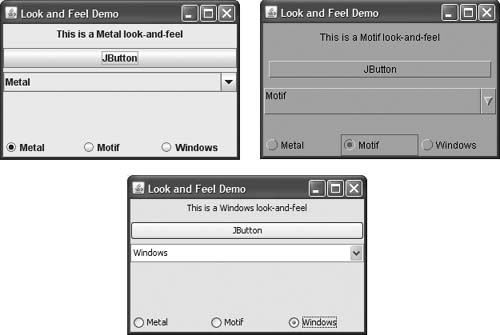
The application in Figs. 17.9–17.10 demonstrates how to change the look-and-feel of a Swing GUI. It creates several GUI components, so you can see the change in the look-and-feel of several GUI components at the same time. The first output window shows the standard metal look-and-feel, the second shows the Motif look-and-feel, and the third shows the Windows look-and-feel.
Fig. 17.9. Look-and-feel of a Swing-based GUI.
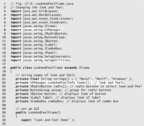
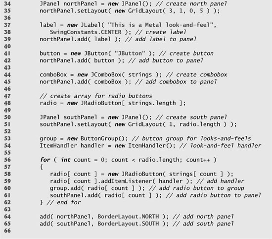
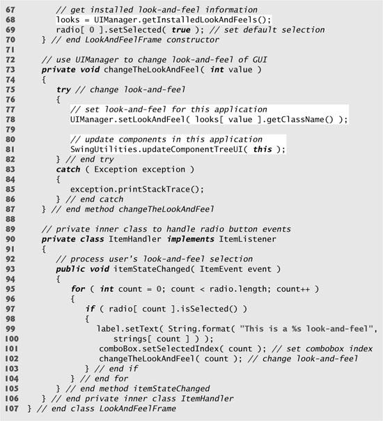
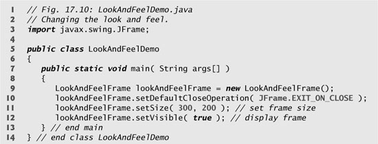
Fig. 17.10. Test class for LookAndFeelFrame.
All the GUI components and event handling in this example have been covered before, so we concentrate on the mechanism for changing the look-and-feel. Class UIManager (package javax.swing) contains nested class LookAndFeelInfo (a public static class) that maintains information about a look-and-feel. Line 22 declares an array of type UIManager.LookAndFeelInfo (note the syntax used to identify the inner class LookAndFeelInfo). Line 68 uses UIManager static method getInstalledLookAndFeels to get the array of UIManager.LookAndFeelInfo objects that describe each look-and-feel available on your system.
Performance Tip 17.2
Each look-and-feel is represented by a Java class. UIManager method getInstalledLookAndFeels does not load each class. Rather, it provides the names of the available look-and-feel classes so that a choice can be made (presumably once at program start-up). This reduces the overhead of having to load all the look-and-feel classes even if the program will not use some of them.
Our utility method changeTheLookAndFeel (lines 73–87) is called by the event handler for the JRadioButtons at the bottom of the user interface. The event handler (declared in private inner class ItemHandler at lines 90–106) passes an integer representing the element in array looks that should be used to change the look-and-feel. Line 78 invokes static method setLookAndFeel of UIManager to change the look-and-feel. Method getClassName of class UIManager.LookAndFeelInfo determines the name of the look-and-feel class that corresponds to the UIManager.LookAndFeelInfo object. If the look-and-feel class is not already loaded, it will be loaded as part of the call to setLookAndFeel. Line 81 invokes static method updateComponentTreeUI of class SwingUtilities (package javax.swing) to change the look-and-feel of every GUI component attached to its argument (this instance of our application class LookAndFeelDemo) to the new look-and-feel.
17.7 JDesktopPane and JInternalFrame
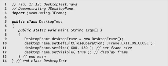
Many of today’s applications use a multiple-document interface (MDI)—a main window (called the parent window) containing other windows (called child windows), to manage several open documents that are being processed in parallel. For example, many e-mail programs allow you to have several windows open at the same time, so you can compose or read multiple e-mail messages simultaneously. Similarly, many word processors allow the user to open multiple documents in separate windows, making it possible to switch between them without having to close one to open another. The application in Figs. 17.11–17.12 demonstrates Swing’s JDesktopPane and JInternalFrame classes for implementing multiple-document interfaces.
Fig. 17.11. Multiple-document interface.
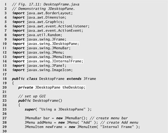
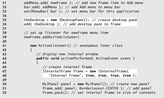
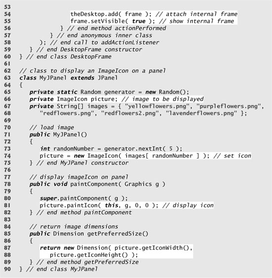
Fig. 17.12. Test class for DeskTopFrame.
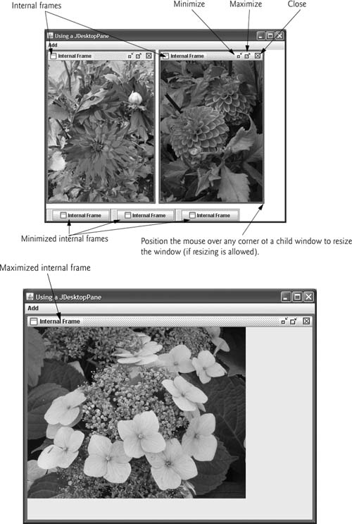
Lines 27–33 create a JMenuBar, a JMenu and a JMenuItem, add the JMenuItem to the JMenu, add the JMenu to the JMenuBar and set the JMenuBar for the application window. When the user selects the JMenuItem newFrame, the application creates and displays a new JInternalFrame object containing an image.
Line 35 assigns JDesktopPane (package javax.swing) variable theDesktop a new JDesktopPane object that will be used to manage the JInternalFrame child windows. Line 36 adds the JDesktopPane to the JFrame. By default, the JDesktopPane is added to the center of the content pane’s BorderLayout, so the JDesktopPane expands to fill the entire application window.
Lines 39–58 register an ActionListener to handle the event when the user selects the newFrame menu item. When the event occurs, method actionPerformed (lines 44–56) creates a JInternalFrame object in lines 47–48. The JInternalFrame constructor used here takes five arguments—a string for the title bar of the internal window, a boolean indicating whether the internal frame can be resized by the user, a boolean indicating whether the internal frame can be closed by the user, a boolean indicating whether the internal frame can be maximized by the user and a boolean indicating whether the internal frame can be minimized by the user. For each of the boolean arguments, a true value indicates that the operation should be allowed (as is the case here).
As with JFrames and JApplets, a JInternalFrame has a content pane to which GUI components can be attached. Line 50 creates an instance of our class MyJPanel (declared at lines 63–90) that is added to the JInternalFrame at line 51.
Line 52 uses JInternalFrame method pack to set the size of the child window. Method pack uses the preferred sizes of the components to determine the window’s size. Class MyJPanel declares method getPreferredSize (lines 85–89) to specify the panel’s preferred size for use by the pack method. Line 54 adds the JInternalFrame to the JDesktopPane, and line 55 displays the JInternalFrame.
Classes JInternalFrame and JDesktopPane provide many methods for managing child windows. See the JInternalFrame and JDesktopPane online API documentation for complete lists of these methods:
java.sun.com/javase/6/docs/api/javax/swing/JInternalFrame.html
java.sun.com/javase/6/docs/api/javax/swing/JDesktopPane.html
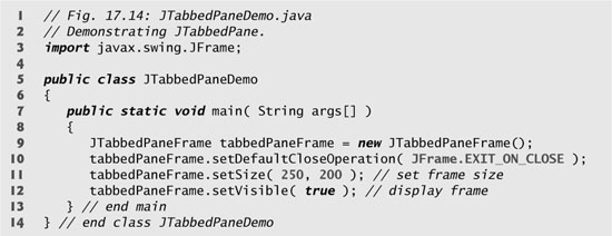
17.8 JTabbedPane
A JTabbedPane arranges GUI components into layers, of which only one is visible at a time. Users access each layer via a tab—similar to folders in a file cabinet. When the user clicks a tab, the appropriate layer is displayed. The tabs appear at the top by default but also can be positioned at the left, right or bottom of the JTabbedPane. Any component can be placed on a tab. If the component is a container, such as a panel, it can use any layout manager to lay out several components on the tab. Class JTabbedPane is a subclass of JComponent. The application in Figs. 17.13–17.14 creates one tabbed pane with three tabs. Each tab displays one of the JPanels—panel1, panel2 or panel3.
Fig. 17.13. JTabbedPane used to organize GUI components.
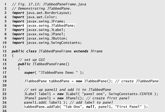
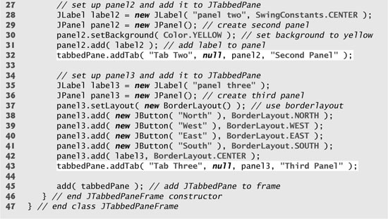
Fig. 17.14. Test class for JTabbedPaneFrame.
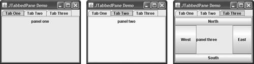
The constructor (lines 15–46) builds the GUI. Line 19 creates an empty JTabbedPane with default settings—that is, tabs across the top. If the tabs do not fit on one line, they will wrap to form additional lines of tabs. Next the constructor creates the JPanels panel1, panel2 and panel3 and their GUI components. As we set up each panel, we add it to tabbedPane, using JTabbedPane method addTab with four arguments. The first argument is a string that specifies the title of the tab. The second argument is an Icon reference that specifies an icon to display on the tab. If the Icon is a null reference, no image is displayed. The third argument is a Component reference that represents the GUI component to display when the user clicks the tab. The last argument is a string that specifies the tool tip for the tab. For example, line 25 adds JPanel panel1 to tabbedPane with title "Tab One" and the tool tip "First Panel". JPanels panel2 and panel3 are added to tabbedPane at lines 32 and 43. To view a tab, click it with the mouse or use the arrow keys to cycle through the tabs.
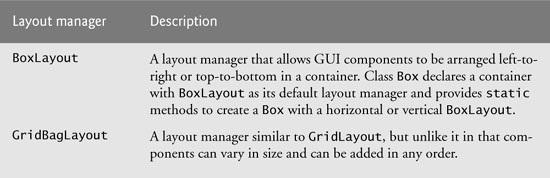
17.9 Layout Managers: BoxLayout and GridBagLayout
In Chapter 11, we introduced three layout managers—FlowLayout, BorderLayout and GridLayout. This section presents two additional layout managers (summarized in Fig. 17.15). We discuss these layout managers in the examples that follow.
Fig. 17.15. Additional layout managers.
BoxLayout Layout Manager
The BoxLayout layout manager (in package javax.swing) arranges GUI components horizontally along a container’s x-axis or vertically along its y-axis. The application in Figs. 17.16–17.17 demonstrates BoxLayout and the container class Box that uses BoxLayout as its default layout manager.
Fig. 17.16. BoxLayout layout manager.
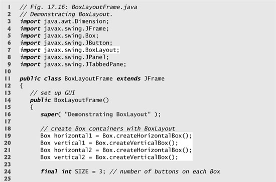
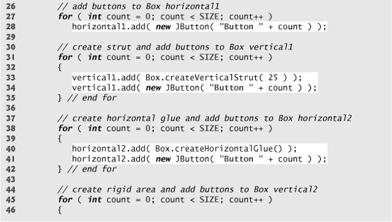
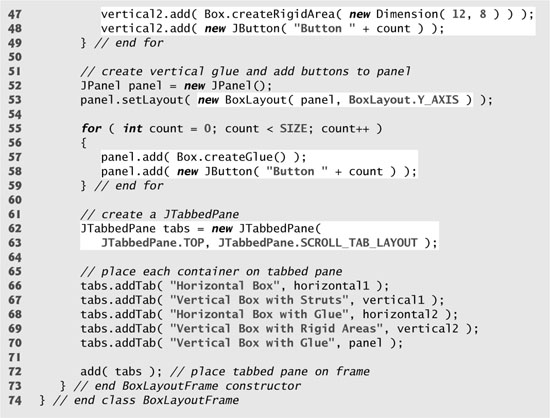
Fig. 17.17. Test class for BoxLayoutFrame.
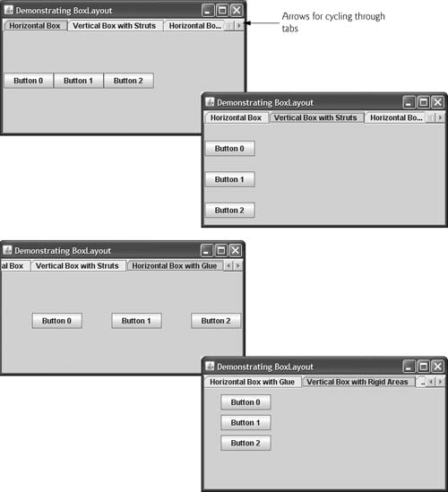
Lines 19–22 create Box containers. References horizontal1 and horizontal2 are initialized with static Box method createHorizontalBox, which returns a Box container with a horizontal BoxLayout in which GUI components are arranged left-to-right. Variables vertical1 and vertical2 are initialized with static Box method createVerticalBox, which returns references to Box containers with a vertical BoxLayout in which GUI components are arranged top-to-bottom.
The for statement at lines 27–28 adds three JButtons to horizontal1. The for statement at lines 31–35 adds three JButtons to vertical1. Before adding each button, line 33 adds a vertical strut to the container with static Box method createVerticalStrut. A vertical strut is an invisible GUI component that has a fixed pixel height and is used to guarantee a fixed amount of space between GUI components. The int argument to method createVerticalStrut determines the height of the strut in pixels. When the container is resized, the distance between GUI components separated by struts does not change. Class Box also declares method createHorizontalStrut for horizontal BoxLayouts.
The for statement at lines 38–42 adds three JButtons to horizontal2. Before adding each button, line 40 adds horizontal glue to the container with static Box method createHorizontalGlue. Horizontal glue is an invisible GUI component that can be used between fixed-size GUI components to occupy additional space. Normally, extra space appears to the right of the last horizontal GUI component or below the last vertical one in a BoxLayout. Glue allows the extra space to be placed between GUI components. When the container is resized, components separated by glue components remain the same size, but the glue stretches or contracts to occupy the space between them. Class Box also declares method createVerticalGlue for vertical BoxLayouts.
The for statement at lines 45–49 adds three JButtons to vertical2. Before each button is added, line 47 adds a rigid area to the container with static Box method createRigidArea. A rigid area is an invisible GUI component that always has a fixed pixel width and height. The argument to method createRigidArea is a Dimension object that specifies the area’s width and height.
Lines 52–53 create a JPanel object and set its layout to a BoxLayout in the conventional manner, using Container method setLayout. The BoxLayout constructor receives a reference to the container for which it controls the layout and a constant indicating whether the layout is horizontal (BoxLayout.X_AXIS) or vertical (BoxLayout.Y_AXIS).
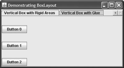
The for statement at lines 55–59 adds three JButtons to panel. Before adding each button, line 57 adds a glue component to the container with static Box method createGlue. This component expands or contracts based on the size of the Box.
Lines 62–63 create a JTabbedPane to display the five containers in this program. The argument JTabbedPane.TOP sent to the constructor indicates that the tabs should appear The argument JTabbedPane.SCROLL_TAB_LAYOUT specifies that the tabs should scroll if there are too many to fit on one line.
The Box containers and the JPanel are attached to the JTabbedPane at lines 66–70. Try executing the application. When the window appears, resize the window to see how the glue components, strut components and rigid area affect the layout on each tab.
GridBagLayout Layout Manager
One of the most powerful predefined layout managers is GridBagLayout (in package java.awt). This layout is similar to GridLayout in that it arranges components in a grid. However, GridBagLayout is more flexible. The components can vary in size (i.e., they can occupy multiple rows and columns) and can be added in any order.
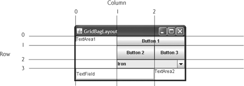
The first step in using GridBagLayout is determining the appearance of the GUI. For this step you need only a piece of paper. Draw the GUI and then draw a grid over it, dividing the components into rows and columns. The initial row and column numbers should be 0, so that the GridBagLayout layout manager can use the row and column numbers to properly place the components in the grid. Figure 17.18 demonstrates drawing the lines for the rows and columns over a GUI.
Fig. 17.18. Designing a GUI that will use GridBagLayout.
A GridBagConstraints object describes how a component is placed in a GridBagLayout. Several GridBagConstraints fields are summarized in Fig. 17.19.
Fig. 17.19. GridBagConstraints fields.
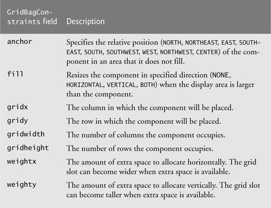
GridBagConstraints field anchor specifies the relative position of the component in an area that it does not fill. The variable anchor is assigned one of the following GridBagConstraints constants: NORTH, NORTHEAST, EAST, SOUTHEAST, SOUTH, SOUTHWEST, WEST, NORTHWEST or CENTER. The default value is CENTER.
GridBagConstraints field fill defines how the component grows if the area in which it can be displayed is larger than the component. The variable fill is assigned one of the following GridBagConstraints constants: NONE, VERTICAL, HORIZONTAL or BOTH. The default value is NONE, which indicates that the component will not grow in either direction. VERTICAL indicates that it will grow vertically. HORIZONTAL indicates that it will grow horizontally. BOTH indicates that it will grow in both directions.
Variables gridx and gridy specify where the upper-left corner of the component is placed in the grid. Variable gridx corresponds to the column, and variable gridy corresponds to the row. In Fig. 17.18, the JComboBox (displaying “Iron”) has a gridx value of 1 and a gridy value of 2.
Variable gridwidth specifies the number of columns a component occupies. The JComboBox occupies two columns. Variable gridheight specifies the number of rows a component occupies. The JTextArea on the left side of Fig. 17.18 occupies three rows.
Variable weightx specifies how to distribute extra horizontal space to grid slots in a GridBagLayout when the container is resized. A zero value indicates that the grid slot does not grow horizontally on its own. However, if the component spans a column containing a component with nonzero weightx value, the component with zero weightx value will grow horizontally in the same proportion as the other component(s) in the same column. This is because each component must be maintained in the same row and column in which it was originally placed.
Variable weighty specifies how to distribute extra vertical space to grid slots in a GridBagLayout when the container is resized. A zero value indicates that the grid slot does not grow vertically on its own. However, if the component spans a row containing a component with nonzero weighty value, the component with zero weighty value grows vertically in the same proportion as the other component(s) in the same row.
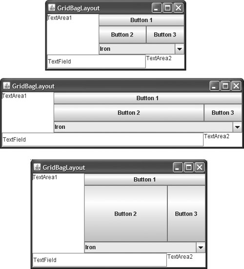
In Fig. 17.18, the effects of weighty and weightx cannot easily be seen until the container is resized and additional space becomes available. Components with larger weight values occupy more of the additional space than those with smaller weight values.
Components should be given nonzero positive weight values—otherwise they will “huddle” together in the middle of the container. Figure 17.20 shows the GUI of Fig. 17.18 with all weights set to zero.
Fig. 17.20. GridBagLayout with the weights set to zero.
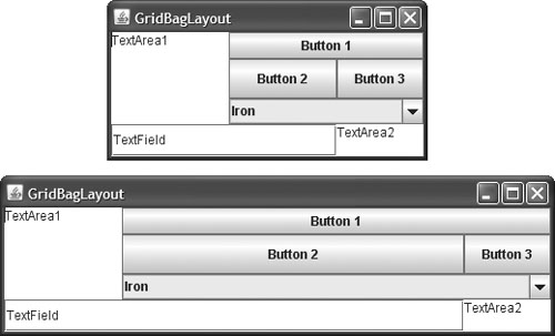
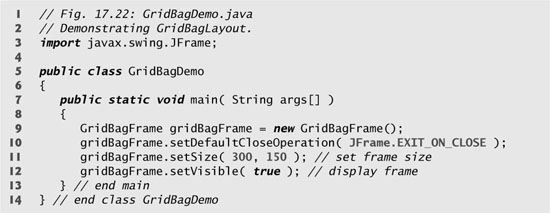
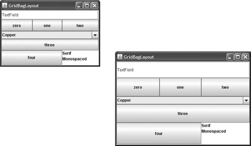
The application in Figs. 17.21–17.22 uses the GridBagLayout layout manager to arrange the components of the GUI in Fig. 17.18. The application does nothing except demonstrate how to use GridBagLayout.
Fig. 17.21. GridBagLayout layout manager.
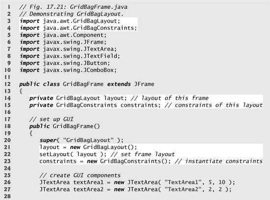
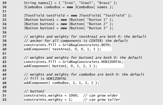
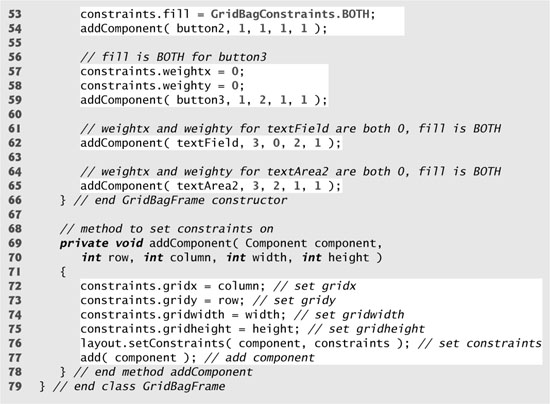
Fig. 17.22. Test class for GridBagFrame.
The GUI consists of three JButtons, two JTextAreas, a JComboBox and a JTextField. The layout manager for the content pane is GridBagLayout. Lines 21–22 create the GridBagLayout object and set the layout manager for the JFrame to layout. Line 23 creates the GridBagConstraints object used to determine the location and size of each component in the grid. Lines 26–35 create each GUI component that will be added to the content pane.
Lines 39–40 configure JTextArea textArea1 and add it to the content pane. The values for weightx and weighty values are not specified in constraints, so each has the value zero by default. Thus, the JTextArea will not resize itself even if space is available. However, it spans multiple rows, so the vertical size is subject to the weighty values of JButtons button2 and button3. When either button is resized vertically based on its weighty value, the JTextArea is also resized.
Line 39 sets variable fill in constraints to GridBagConstraints.BOTH, causing the JTextArea to always fill its entire allocated area in the grid. An anchor value is not specified in constraints, so the default CENTER is used. We do not use variable anchor in this application, so all the components will use the default. Line 40 calls our utility method addComponent (declared at lines 69–78). The JTextArea object, the row, the column, the number of columns to span and the number of rows to span are passed as arguments.
JButton button1 is the next component added (lines 43–44). By default, the weightx and weighty values are still zero. The fill variable is set to HORIZONTAL—the component will always fill its area in the horizontal direction. The vertical direction is not filled. The weighty value is zero, so the button will become taller only if another component in the same row has a nonzero weighty value. JButton button1 is located at row 0, column 1. One row and two columns are occupied.
JComboBox comboBox is the next component added (line 48). By default, the weightx and weighty values are zero, and the fill variable is set to HORIZONTAL. The JComboBox button will grow only in the horizontal direction. Note that the weightx, weighty and fill variables retain the values set in constraints until they are changed. The JComboBox button is placed at row 2, column 1. One row and two columns are occupied.
JButton button2 is the next component added (lines 51–54). It is given a weightx value of 1000 and a weighty value of 1. The area occupied by the button is capable of growing in the vertical and horizontal directions. The fill variable is set to BOTH, which specifies that the button will always fill the entire area. When the window is resized, button2 will grow. The button is placed at row 1, column 1. One row and one column are occupied.
JButton button3 is added next (lines 57–59). Both the weightx value and weighty value are set to zero, and the value of fill is BOTH. JButton button3 will grow if the window is resized—it is affected by the weight values of button2. Note that the weightx value for button2 is much larger than that for button3. When resizing occurs, button2 will occupy a larger percentage of the new space. The button is placed at row 1, column 2. One row and one column are occupied.
Both the JTextField textField (line 62) and JTextArea textArea2 (line 65) have a weightx value of 0 and a weighty value of 0. The value of fill is BOTH. The JTextField is placed at row 3, column 0, and the JTextArea at row 3, column 2. The JTextField occupies one row and two columns, the JTextArea one row and one column.
Method addComponent’s parameters are a Component reference component and integers row, column, width and height. Lines 72–73 set the GridBagConstraints variables gridx and gridy. The gridx variable is assigned the column in which the Component will be placed, and the gridy value is assigned the row in which the Component will be placed. Lines 74–75 set the GridBagConstraints variables gridwidth and gridheight. The gridwidth variable specifies the number of columns the Component will span in the grid, and the gridheight variable specifies the number of rows the Component will span in the grid. Line 76 sets the GridBagConstraints for a component in the GridBagLayout. Method setConstraints of class GridBagLayout takes a Component argument and a GridBagConstraints argument. Line 77 adds the component to the JFrame.
When you execute this application, try resizing the window to see how the constraints for each GUI component affect its position and size in the window.
GridBagConstraints Constants RELATIVE and REMAINDER
Instead of gridx and gridy, a variation of GridBagLayout uses GridBagConstraints constants RELATIVE and REMAINDER. RELATIVE specifies that the next-to-last component in a particular row should be placed to the right of the previous component in the row. REMAINDER specifies that a component is the last component in a row. Any component that is not the second-to-last or last component on a row must specify values for GridbagConstraints variables gridwidth and gridheight. The application in Figs. 17.23–17.24 arranges components in GridBagLayout, using these constants.
Fig. 17.23. GridBagConstraints constants RELATIVE and REMAINDER.
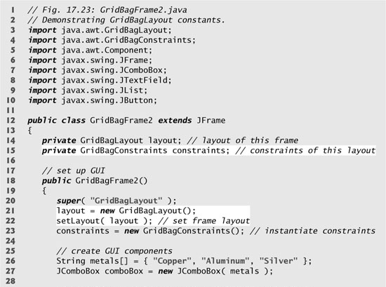
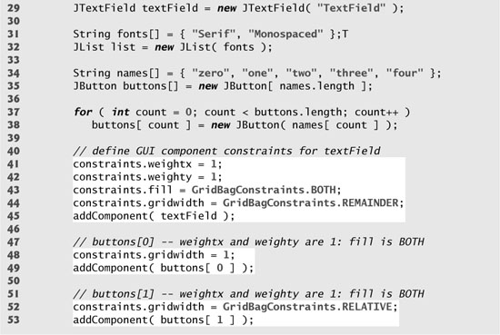
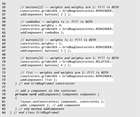
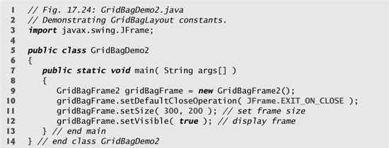
Fig. 17.24. Test class for GridBagDemo2.
Lines 21–22 create a GridBagLayout and use it to set the JFrame’s layout manager. The components that are placed in GridBagLayout are created in lines 27–38—they are a JComboBox, a JTextField, a JList and five JButtons.
The JTextField is added first (lines 41–45). The weightx and weighty values are set to 1. The fill variable is set to BOTH. Line 44 specifies that the JTextField is the last component on the line. The JTextField is added to the content pane with a call to our utility method addComponent (declared at lines 79–83). Method addComponent takes a Component argument and uses GridBagLayout method setConstraints to set the constraints for the Component. Method add attaches the component to the content pane.
JButton buttons[ 0 ] (lines 48–49) has weightx and weighty values of 1. The fill variable is BOTH. Because buttons[ 0 ] is not one of the last two components on the row, it is given a gridwidth of 1 and so will occupy one column. The JButton is added to the content pane with a call to utility method addComponent.
JButton buttons[ 1 ] (lines 52–53) has weightx and weighty values of 1. The fill variable is BOTH. Line 52 specifies that the JButton is to be placed relative to the previous component. The Button is added to the JFrame with a call to addComponent.
JButton buttons[ 2 ] (lines 56–57) has weightx and weighty values of 1. The fill variable is BOTH. This JButton is the last component on the line, so REMAINDER is used. The JButton is added to the content pane with a call to addComponent.
The JComboBox (lines 60–62) has a weightx of 1 and a weighty of 0. The JComboBox will not grow in the vertical direction. The JComboBox is the only component on the line, so REMAINDER is used. The JComboBox is added to the content pane with a call to addComponent.
JButton buttons[ 3 ] (lines 65–67) has weightx and weighty values of 1. The fill variable is BOTH. This JButton is the only component on the line, so REMAINDER is used. The JButton is added to the content pane with a call to addComponent.
JButton buttons[ 4 ] (lines 70–71) has weightx and weighty values of 1. The fill variable is BOTH. This JButton is the next-to-last component on the line, so RELATIVE is used. The JButton is added to the content pane with a call to addComponent.
The JList (lines 74–75) has weightx and weighty values of 1. The fill variable is BOTH. The JList is added to the content pane with a call to addComponent.
17.10 Wrap-Up
This chapter completes our introduction to GUI. In this chapter, you learned about more advanced GUI topics, such as menus, sliders, pop-up menus and the multiple-document interface. All these components can be added to existing applications to make them easier to use and understand. In the next chapter, you’ll learn about multithreading, a powerful capability that allows applications to use threads to perform multiple tasks at once.