
Appendix C
Market Breadth
In 2006 McGraw-Hill published my book, The Complete Guide to Market Breadth Indicators. Breadth was an area I had spent a great deal of time on over the past 30-plus years. Breadth was almost totally ignored by the technical analysis community as most of the popular books on technical analysis usually only devoted a chapter to the subject of breadth. The book was in actuality a giant research project for me, one that took well over a year to complete even though I had been collecting breadth data and information since the 1980s. I tried to include every known breadth indicator or relationship in existence. I think I almost did that. The information following is from that book, and what I feel is the absolute most important part of the book. Enjoy!
Why Breadth?
- It takes advantage of inefficient markets. If investors are irrational and prone to excessive optimism with the latest hot stocks and excessive pessimism with those issues that have suffered recently, then market capitalization weighting reflects those inefficiencies from its very definition of shares times price. Breadth, which is equal weighted, does not have that problem.
- Avoid heavy concentration into a few stocks. Market capitalization weighting often causes a large portion of a portfolio to be concentrated in only a few issues—concentration risk. Breadth totally avoids this.
- Get more exposure to small capitalization stocks. Merely by the concept of capitalization weighting, small stocks will have a smaller effect on the portfolio. True, they are generally considered riskier, but they have also had historically stronger performance. Breadth deals with large and small capitalization stocks equally.
Breadth analysis is like quantum mechanics, it does not predict a single definite result, instead it predicts a number of different possible outcomes, and tells us how likely each one will be. Breadth directly represents the market, no matter what the indices are doing. It is the footprint of the market and the best measure of the market’s liquidity.
Most breadth indicators are at best, coincident indicators, and usually somewhat lagging. Any of the indicators that are smoothed with moving averages are certainly lagging. Lagging means that the indicator is only telling you what is happening after it has happened. Lagging is not a problem, once you realize that picking exact tops and bottoms in the market is better left to gamblers. The confirmation of lagging indicators, however, is very important. Some breadth indicators, especially some of the ratios, can offer leading indications based upon the identification and use of previous levels or thresholds that are consistent with similar market action. An oscillator that reached a threshold level, either positive or negative, with consistency relative to market tops and bottoms is such an indicator. Many breadth indicators work in this manner.
A Familiar Breadth Indicator
Most investors are familiar with the long-running Friday night show, Wall Street Week, on Public Broadcasting hosted by Louis Rukeyser, who, every week would comment on his elves (his term for technical analysts) and the Wall Street Week Index. What you may not have known is that this index was a composite of 10 indicators, three of which were breadth-based. Robert Nurock, long-time panelist and Chief Elf, created it. Robert Nurock was the editor of the Astute Investor, a technical newsletter for many years.
The Arms Index was one of the indicators in the Wall Street Week Index. A 10-day moving average was used with bullish signals given when it was about 1.2 and bearish when it was below 0.8. The advances minus the declines were used over a 10-day period and bullish signals were from the point where the index exceeds 1,000 to a peak and down to a point 1,000 below the peak. Bearish signals were just the opposite. The third breadth indicator used was the new highs compared to the new lows. For bullish signals an expansion of the 10-day average of new highs from less than 10 up to 10-day average of new lows. Similarly, bearish signals were an expansion of 10-day average of new lows from less than 10 until it exceeds the 10-day average of new highs.
Breadth Components
Breadth components are readily available from newspapers, online sources, and so on and consist of daily and weekly statistics. They are: Advances, Declines, Unchanged, Total Issues, Up Volume, Down Volume, Total Volume (V), New Highs, and New Lows.
From one day to the next, any issue can advance in price, decline in price, or remain unchanged. Also any issue can make a new high or a new low. Here are more specific definitions:
- Advancing Issues or Advances (A)—Stocks that have increased in price from one day to the next, even if only by one cent, are considered as advancing issues or advances.
- Declining Issues or Declines (D)—Stocks that have decreased in price from one day to the next are considered declining issues or declines.
- Unchanged Issues or Unchanged (U)—Stocks that do not change in price from one day to the next are considered unchanged issues or unchanged.
Note: Prior to July 1997, stock prices were measured in eighths of a point, or about 12.5 cents as the minimum trading unit. In July 1997 the NYSE went from using eighths to sixteenths. This made the minimum trading unit about 6.25 cents. On January 2, 2002, they went to a decimalization pricing that made the minimum trading price equal to one cent (a penny).
- Total Issues (TI)—This is the total of all issues available for trading on a particular exchange. If you added the advances, declines, and unchanged issues together it would equal the total issues.
- Advancing Volume or Up Volume (UV)—This is the volume traded on a day for each of the stocks that are advancing issues. It is the total volume of all the advances.
- Declining Volume or Down Volume (DV)—This is the total volume for all the declines for a particular day.
- Total Volume (V)—This is the total volume of all trading for a particular day. Total volume is the sum of Up Volume, Down Volume, and Unchanged Volume. To find Unchanged Volume subtract the sum of Up Volume and Down Volume from the Total Volume. Total volume is not generally considered a breadth component, but is many times used in a ratio with the up or down volume to alleviate the increase in trading activity over long periods of time.
- New High (H)—Whenever a stock’s price reaches a new high price for the last 52 weeks it is termed a new high.
- New Low (L)—Whenever a stock’s price reaches a new low price for the last 52 weeks it is termed a new low.
Note: The NYSE new highs and new lows are now computed on a fixed 52-week moving time window starting on January 1, 1978. Before that, the new highs and new lows were computed on a variable time window of anywhere from two and a half months to 14 and a half months. This rendered the new high new low data prior to 1978 almost useless, and certainly confusing to use.
Breadth versus Price
Breadth does not consider the amount or magnitude of price change. It also does not consider the number of shares traded (volume). And it does not consider the shares outstanding for individual stocks. Most stock market indices, such as the New York Stock Exchange Composite Index, the Nasdaq Composite Index, S&P 500 Index, the Nasdaq 100, and so on, weigh each stock based on its price and number of outstanding shares. This makes their contribution to the index based on their value and are sometimes called market-value weighted indices or capitalization weighted indices. Because of this (at this writing), Microsoft, Qualcomm, Intel, Cisco, eBay, Nextel, Dell, Amgen, Comcast, and Oracle account for more than 40 percent of the Nasdaq 100 Index and its ETF, QQQQ. Ten percent of the components account for 40 percent of the price movement of the index. This can lead to an incorrect analysis of the markets, especially if some of these large cap stocks experience price moving events. Many times the reference to the large caps issues is that of the generals, while the small caps are referred to as the soldiers. As you will find out, the generals are not always the leaders.
Breadth treats each stock the same. An advance of $10 in Microsoft is equally represented in breadth analysis as the advance of two cents of the smallest, least capitalized stock. Breadth is truly the best way to accurately measure the liquidity of the market.
The Difference between Daily and Weekly Breadth Data
You just cannot add up daily breadth data for the week to get the weekly data. Here is a scenario that will explain why (Table C.1).
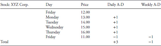
Table C.1 Daily Breadth versus Weekly Breadth
Here’s the narrative: An advance or decline for the week should be based on its price change from the previous Friday close to the close of the current week. It has absolutely nothing to do with the daily data. Take a single stock; its previous Friday close price was $12. On Monday it was up $1 to $13. It went up a dollar each day for the first four days of the week and closed on Thursday at $16. However on Friday it dropped $5 to $11. For the week it was down $1, which would be one decline for the week. However, on a daily basis, it accounted for four advances and one decline, or a net three advances.
John McGinley, past editor of Technical Trends, and sidekick of the late Arthur Merrill, sent this note: “I strongly believe that in creating weekly figures for the advance declines, one does not use the published weekly data for they disguise and hide what really went on during the week. For instance, imagine a week with 1,500 net advances one day and the other four days even. The weekly data would hide the devastation which occurred that dramatic day.”
Advantages and Disadvantages of Using Breadth
Consider a period of distribution (market topping process) such as 1987, 1999, 2007, 2011, and so on. As an uptrend slowly ends and investors seek safety, they do so by moving their riskier holdings such as small cap stocks, into what is perceived to be safer large cap and blue chip stocks. This is certainly a normal process and one that can’t be challenged. However, the mere act of moving from small to large cap stocks causes the capitalization weighted (Nasdaq Composite, New York Stock Exchange Index, S&P 500) and price weighted (Dow Industrials) to move higher simply because of the demand for large cap issues. Breadth, on the other hand, begins to deteriorate from this action. It is said that breadth arrives at the party on time, but always leaves early. Another analogy is that the troops are no longer following the generals. There is a nice chart showing this concept in Figure 13.9.
Breadth data seems to not be consistent among the data providers. If you think about it, if a stock is up it is an advance for the day, so why is there a disparity? Some data services will not include all stocks on the exchange. They will eliminate preferred issues, warrants, rights, and so on. This is fine as long as they tell you that is what they are doing. In the past few years, the number of interest-sensitive issues on the New York Stock Exchange has increased so that they account for more than half of all the issues. These issues are preferred stocks, closed-end bond funds, electric utility stocks, to mention a few.
Many analysts such as Sherman and Tom McClellan, Carl Swenlin, and Larry McMillan use common stocks only breadth indicators. Richard Russell refers to it as an operating company–only index. Using stocks that have listed options available is another good way to avoid the interest sensitive issues, since most stocks that have listed options are common stocks.
Each breadth indicator seems to have its benefits and its shortcomings. The fact that breadth measures the markets in a manner not possible with price is the key element in these conclusions. Breadth measures the movement of the market, its acceleration and deceleration. It is not controlled by General Electric, Microsoft, Intel, Cisco, General Motors, and so on; any more than it is controlled by the smallest capitalized stock on the exchange.
Table C.2 shows the breadth components needed for calculation of the indicator, whether the indicator is better for picking market bottoms, market tops, trend analysis, and whether it is better for short- or long-term analysis. Keep in mind that short term is generally some period of time less than five to six months. Identification of a market bottom can be an event that can last only a few days or launch a giant secular bull market. In Table C.2, the terms short- and long-term refer to the frequency of signals as much as anything. A number of the long-term indicators are good for trend following; in Table C.2 if neither Bottoms nor Tops were checked, it was because the indicator is better at trend analysis.

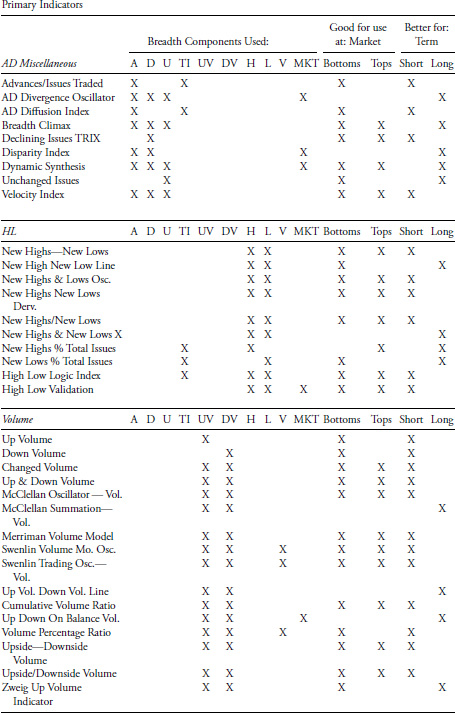

Table C.2 Breadth Indicators
To access an online version of this table, please visit www.wiley.com/go/morrisinvestingebook.
Some indicators are better at Tops, Bottoms, and both; and at different times, but are only identified by Bottoms and/or Tops below. Great effort was made to determine if one appeared to be better at one or the other. If no difference could be ascertained, they were reported as being good for both Bottoms and Tops. Please keep in mind the nature of market bottoms versus market tops. Bottoms are generally sharp and quick and usually much easier to identify, whereas market tops are usually long periods of distribution where most market indices rotate through their peaks at different times. You will notice that considerably more indicators are noted as being good at Bottoms than at Tops. Add to that the subjective interpretation of the various indicators and the table that follows should be viewed as a beginning guide only.
| Table Columns | |
|---|---|
| A | Advances |
| D | Declines |
| U | Unchanged |
| TI | Total Issues |
| UV | Up Volume |
| DV | Down Volume |
| H | New Highs |
| L | New Lows |
| V | Total Volume |
| MKT | Market Index |
Note: If neither Bottoms nor Tops are checked (X), it means the indicator is better at trend analysis.
Favorite Breadth Indicators
Here is a list of breadth indicators that I believe are good ones to follow. Some are for daily analysis and some are used merely to be kept aware of their indications. There are some really good breadth indicators that have made some very good market calls over the years—they are marked as awareness only below. I try to avoid noisy indicators that require too much interpretation and very short term in nature.
| Breadth Indicator | When Used |
|---|---|
| Advance Decline Line | Long term and usually early |
| Advance Decline Line Normalized | Good breadth overbought oversold |
| Breadth Thrust | Awareness only |
| Eliades Sign of the Bear | Awareness only |
| New Highs New Lows Line | Long-term trend |
| New Highs New Lows | Intermediate trends |
| McClellan Oscillator | Short to intermediate |
| McClellan Summation with Miekka Adj. | Longer term and market staying power |
| Moving Balance Indicator | Very good for bottoms (oversold) |
| Swenlin Breadth Momentum | Short-term picture |
| Trend Exhaustion Index | Good for topping alert |
| Up Volume (smoothed) | Good for the beginning of market tops |
| WTrin10 | Short-term overbought oversold |
| Zahorchak Method | Good for trend following |
| Zweig Up Volume Indicators | Awareness only |
New High New Low Validation Measure
During my research on breadth I became acutely aware that most analysts treated new highs and new lows in the same manner as they did with advances, declines, up volume, and down volume. A terrible mistake as I will attempt to explain. This will help validate and show how to interpret new high and new low data. If you consider the facts relating to new highs and new lows, you will see the necessity for this. A new high means that the closing price reached a high that it had not seen in the past year (52 weeks). Similarly, a new low is at a low not seen for at least a year. This indicator tries to identify when the new high or new low is determined to be good or bad using the following line of thinking.
Consider that prices have been in a narrow range for more than a year. Something then triggers an event that causes the market to move out of that trading range to the upside. This will immediately cause almost every stock that moves with the market to also become a new high. New highs are generally the force that keeps good up moves going. The new lows in this scenario will dry up, as expected. Now consider that the market has had a steady advance for quite some time. The number of new highs will generally continue to remain high as most stocks will rise with the market. Of course, there will be drops as the market makes it corrections on its path to higher prices. When the number of new highs starts to dry up, you will probably notice that the number of unchanged issues starts to increase slightly because a lot of stocks will just cease to participate in the continuing rise. New lows will not happen for some time because the market is just starting to form a top. The number of new lows will increase as the market forms its broad top, while the number of new highs gets smaller and smaller. It will be the time frame of this topping action that determines when the new lows will start to kick in. Remember, you cannot have a new low until an issue is at a new low price over the last year.
When the market declines and you start to see fewer new lows, it means the market is losing its downside momentum. Why is this so? It is because some issues have already bottomed and are not continuing to make new lows. This is tied to the rotational effect, sometimes caused by various market sectors hitting bottoms at different times. Figure C.1 is an attempt to show this visually. Up spikes (solid line) equal to +2 represent good new highs. Up spikes (dashed line) equal to +1 represent bad new highs. Similarly, down spikes (solid line) at −2 equates to good new lows and −1 (dotted line) equates to bad new lows. You might read that again since it is not obvious. I wanted to keep the new highs as the up spikes and the new lows as the down spikes. Short up spikes are bad new highs and short down spikes are bad new lows. Bad, in this case, means they did not conform to the theory talked about above.
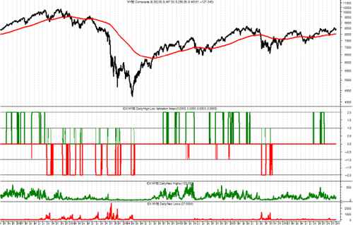
FIGURE C.1 New High New Low Validation
Source: Chart courtesy of MetaStock.
In Figure C.1 the top plot is the NYSE Composite index with a 252 day exponential average overlaid. The bottom plot is the new lows, the next to the bottom is the new highs, and the second from the top plot is the New High New Low Validation Measure. It is the plot that has the tooth-like moves both up and down. The top of the up moves is at a value of 2 and represents valid new highs. The bottom of the down moves is at −2 and represents valid new lows. The smaller up and down moves are at +1 and −1 and represent new highs and new lows, respectively, which are good, but not as good as the ones at +2 and −2. Although this is a great deal of information to put into a single chart in a black-and-white book, you can look at the validated periods and compare them to the top plot of the NYSE Composite and see that they do a really good job of pointing out new highs and new lows that are meaningful.
This method of trying to determine when the new highs and new lows are truly good ones, involves the rate of change of the market, a smoothed value of each component relative to the total issues traded, and their relationships with each other. For example, if the market is in a rally (rate of change high) and the new highs are increasing, any new lows that appear are not good ones. Similarly, if the market is in a downtrend, with high negative rate of change, then any new highs that appear are not good ones. The use of the term good ones refers to whether they are valid to use in any new high new low analysis.