
Creating plots that are publication-ready is essential, simply because we must be able to share our knowledge. In this section, we're going to take a look at plotting multiple variables on a single plot, adding a legend to that plot, and then saving our plots to a file. Let's go back to our notebook and check the last plot that we created in the previous section, which was the 200-day moving average of the stock price of Apple since the beginning. I want to point out a few things about our previous plot. First, we have a legend at the top that just says plot1.dat, and, if you've never seen this before, currently that doesn't really mean anything to anyone. Also, there's no way in this mechanism to save to a file the output that you see. We could definitely get some screenshot software and then create our own screenshot of this image, but that'd be a little bit of extra work. Let's go ahead and check out a few customizations of this plot and we would like to save this plot to a file. There are two variables in this notebook that we will be working on. One is aapl, which we created in the Line plots of a single variable section, and the other one is aaplMA, which we created in the Plotting a moving average section. What we will do now is plot these two datasets on the same image. To do that we're going to plot X11, and then we're going to introduce a list where each item in that list is going to be Data2D, as demonstrated in the following command:

As you can see, we have added both the entries here, aapl and aaplMA. So, that's what our command looks like, and you'll see, from the following screenshot, that we now have two plots on this particular line:

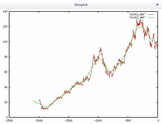
The red line is aapl and the green line is aaplMA. We have both our original and our moving average plotted on the same plot, and that's nice. Notice how little information is presented from about -3000 to -9000. It's almost a straight line. There's a little bump there at -4000, but the most interesting parts of the data are within the last 2,000 trading days. So, let's go ahead and plot just the last 2,000 trading days. So, we are going to modify our last statement as follows:

In our dateset, we have added take 2000 and this is going to plot just the last 2,000 trading days, as demonstrated in the following screenshot:

So, take a moment, and examine that green line. Do you notice something funny about it? It's supposed to be a moving average, but if it were a true moving average, shouldn't it follow the red line more closely? It looks like it's lagging behind the red line a little bit. That's because the moving average is always computing the previous 200 data points. We would really like to center that moving average over the point where it spreads 100 units in either direction. So, we can make a quick change to our plot, where we simply reset the starting point of the moving average to be 100 points behind, as shown in the following command:

So, for dataset aaplMA, we'll start the list with -100 and -101. We're starting at -100 simply because 100 is half of 200. This achieves the following result:
This plot has a much better moving average, where the green line now delicately hugs that red line. It's a much better visualization. Now, imagine that you're seeing this image for the first time and you have no idea what these lines mean, and there is a legend in this plot but it just says plot1.dat and plot2.dat.
Those aren't helpful at all. What we need to do now is introduce titles to each of these plots. So we are again going to modify our statement, as demonstrated in the following example:

Now in the options, after Style Lines, we have the option of creating a title, so we have added AAPL Adj. Close and AAPL 220-day MA. This is demonstrated with the following graph:

Now you can quickly identify a line based on its color, and you can see which color is associated with each dataset. This is important for the sharing of knowledge. Let's say that we don't like the colors of our plot. Our defaults are red and green, and that's great for most cases, but let's change this to, say, blue and black. We will take our plot again, and, after our title, we will add the colors as follows:

The result with new colors is as follows:

Now, if you go through the EasyPlot documentation, you're going to see lots of colors that can be defined for our plots. Finally, we would like to save this plot. To do that, we need to change how the image is directed, and that involves changing X11, as demonstrated in the following command:

So, we have changed X11 to PNG, which means we are saving this as a PNG file. We have named the file adjcloseWith20DayMA.png. Now, it doesn't display anything on the screen. It simply writes that to a file in our local directory. If we go to our Terminal, and look at our analysis folder, we will see the file present there, as shown by the following screenshot:

Next, I have used Iceweasel to look at my file. The output will be shown on a browser as follows:

Great. Now we can drop that image into a publication—say, a Word document or a LaTeX document and it should be sufficient. Now, one thing that EasyPlot won't do is that it won't add titles and it won't add axis lines. So, what I recommend you to do is add that information into the legend details. In our next section we will looking at feature rescaling.