
7
Bootstrapping the React Project
In this chapter, we’ll bootstrap the frontend application for our project. We’ll start by learning about React and its main advantages and differentiation points compared to alternative frameworks. Then, we’ll learn how to create a React project from scratch and the recommended dependencies to start building a complete frontend application. Next, we’ll create a common layout for the task manager that will be shared among the task manager pages to create a consistent look and feel. Finally, we’ll create a temporary dummy page to check that all of the application’s scaffolding features work as expected.
By the end of this chapter, you should have a basic understanding of React, frontend routing, global state management, and the advantages of using a styled component library. You should also be able to bootstrap an application from scratch that leverages several libraries to offer all of these features.
In this chapter, we will cover the following topics:
- What is React?
- Creating a React project
- Creating the common layout
- Displaying a dummy page
Technical requirements
You will need the latest Node.js LTS version (at the time of writing, 16.15). In this book, we will be using Fedora Linux, but you can use Windows or macOS as well.
You can download the full source code for this chapter from https://github.com/PacktPublishing/Full-Stack-Quarkus-and-React/tree/main/chapter-07.
What is React?
React is one of the most popular and widely adopted open source JavaScript libraries for building user interfaces with components. It was initially released by Facebook, now Meta, in 2013. Nowadays, it’s still primarily maintained by Meta, although it has become a community project due to its extensive adoption.
React is a declarative library, which makes it simple and easy to use and provides a pleasant developer experience. Developers declare their user interfaces (UIs) and views for each state of their application, and React takes care of efficiently rendering and updating the appropriate components when the input data changes.
In contrast to other frontend frameworks such as Angular, React only focuses on component rendering and state management. To build a complete web application, developers will need to combine React with additional libraries to cover the rest of the features React doesn’t provide. The main advantage is that developers have the freedom to select their stack, and have plenty of options to choose from. However, this also means that there are multiple solutions to the same problem. Depending on the technologies an application is based on, there might be more or less documentation and examples for such options.
Now that we have a good overview of React and its advantages, let’s try to create and bootstrap a new project from scratch.
Creating a React project
There are many options and alternatives to creating a new React application project. In this book, we’ll be using Create React App, since it is one of the easiest approaches both for the initial project creation and for its future maintenance. The main advantage of Create React App is that it provides all of the build configuration and scripts for you with a single project dependency. Under the hood, it uses popular tools such as Webpack, Babel, ESLint, and others. Another of its advantages is that there is no lock-in, so you can opt out at any point by performing an “eject” operation. When the project is “ejected,” the single react-scripts dependency will be replaced by all of the required dependencies, and the build scripts will be generated and persisted in the source directory.
We can bootstrap the application by navigating to the src/main directory and executing the following command:
npx create-react-app frontendThe command should complete successfully, and you should be able to see the following log messages:

Figure 7.1 – Screenshot of the result of executing npx create-react-app frontend
The new React application should be available under the src/main/frontend directory. We’ve chosen this location because we’ll be distributing the application along with the Quarkus backend. In Chapter 11, Quarkus Integration, we’ll integrate both projects and add the frontend build as part of the backend compilation process, and this location will make the integrating process much easier. Note that src/main/frontend is the root directory for the frontend application, so all of the future directory and file references in the rest of this chapter will be relative to this folder.
Create React App bootstraps a working and functional application. Let’s try to start the application in development mode by navigating to the frontend application directory and executing the following command:
cd frontend
npm start
The command should start the application and we should be able to see the following message in the console:

Figure 7.2 – Screenshot of the result of executing npm start
A development server process should be up and running and we should be able to navigate to the application’s home. Let’s try to check the application in a browser by navigating to http://localhost:3000. If everything goes well, you should see the following page:

Figure 7.3 – A screenshot of a browser pointing to http://localhost:3000
Now, let’s stop the server process by pressing Ctrl + C on our keyboard. Create React App configures the application with several scripts in the project’s package.json file. We’ve already seen what happens with npm start, so let’s go over what each of these commands does:
- npm start: This command invokes a script that runs the application in development mode. Any changes you make to the source code will force a page reload in the browser and will be reflected in the running application.
- npm run build: This command invokes the script that builds your application for production. It will transpile, bundle, and minimize your application and its dependencies. The final result will be available in the build directory, with the application ready to be deployed.
- npm test: This command invokes the test runner script. The script is configured to run the application’s tests and stay in watch mode. This means that any change you make to the application code, or its tests, will automatically trigger a new test run.
- npm run eject: This command invokes the eject script. We’ve learned that Create React App has no lock-in. You can easily upgrade to a more complex build and script configurations by ejecting the application. This action will replace your project’s react-scripts dependency with the individual dependencies for the required build tools. It will also persist all of the configurations and required files into your project. This action is permanent, which means that once you’ve ejected your application and tweaked your configuration files, you won’t be able to move back to the Create React App approach. This is one of the greatest advantages of Create React App since you can bootstrap a project to get up and running quickly and move to complex builds once your application becomes more intricate.
Now that we’ve bootstrapped the frontend application and learned about the available scripts, let us analyze the project structure and the available files.
Directory structure
The Create React App script should have created a new project with a structure that looks like this:

Figure 7.4 – A screenshot of IntelliJ’s UI showing the project’s directory structure and files
At the project root, we can find the package.json file. This file contains the project configuration and its metadata. It is used to manage the project name, version, dependencies, scripts, and so on.
The public folder contains all of the assets that won’t be processed by Webpack and will be directly copied during the build process to the build output directory. You can add assets that you want to distribute alongside the application without further processing to this directory. This folder also contains the index.html file, which is the page template and main entry point for the application. You can tweak this file to set the static page title, add additional meta tags, and so on.
The src directory contains the source code for the web application. Webpack will only process source files located under this subdirectory. This means that any js or css file needs to be in this directory to be taken into account for processing. When we implement the application, we’ll add the source code files into the subdirectories of this folder to better organize the project.
The bootstrapped application source contains an index.js file, which is the main JavaScript entry point for the application. We will be adding logic and code that affects the global application to this file.
We can also find several .css files in the bootstrapped src directory. These files contain the styles for our application. In our case, for simplicity purposes, we’ll be using styled components that won’t require the use of additional styling (or, at most, very subtle changes).
There is also a complete sample component implementation, with its source code in the App.js, App.css, and App.test.js files:
- App.js: This file contains the component implementation – see Figure 7.3 – which, at this point, is a spinning image with the message Edit src/App.js and save to reload. We will be modifying this component in the Displaying a dummy page section and using it as the routing entry point.
- App.css: This file contains the specific styles for this component. Since we’ll be using styled-components, this file won’t be necessary in the future.
- App.test.js: This file contains a simple test for the App component that verifies it renders and the message is displayed correctly. Note that the file is named with the .test.js suffix. Create React App testing scripts, which use Jest under the hood, search for files with this extension to run the tests they implement.
Jest
Jest is one of the most popular and widely adopted JavaScript testing frameworks. It allows you to write tests for both server backend applications and frontend applications. Jest provides full support for every aspect of testing: running the tests, mocking, setting expectations and assertions, and so on.
As we’ve learned, React only focuses on component rendering and its state management. We’ll need to add some additional dependencies to provide routing, state management, and UI functionalities. Now, let’s learn how to add frontend routing support by leveraging an additional library.
Adding routing
When implementing a frontend application, it’s advisable to use a routing framework that allows you to define friendly URLs and helps deal with page navigation. Users of applications that have friendly routes can easily bookmark and share page locations. Neither React nor Create React App prescribe a specific routing solution. In our case, we’ll be using React Router, which is one of the most popular options.
We’ll start by adding the dependency to our project by executing the following command:
npm install react-router-dom@~6.3.0The command should complete successfully, and the following line should be visible in the dependencies section of our package.json file:
"react-router-dom": "~6.3.0",In the Displaying a dummy page section, we’ll learn how to set up the routing for the application. Now, let’s continue by adding a UI component library.
Adding the React Material UI component library
To speed up and simplify the task manager application development process, we’ll be using a frontend component library. This will allow us to focus on developing the application functionalities without needing to deal with styling or implementing component UI interaction features. We will be using the MUI Core component library, which provides a rich set of components and tools based on Google’s Material Design guidelines.
Material Design
Material Design is a system of guidelines and tools that supports the best practices and principles of good design when creating and designing user interfaces. It was created by Google in 2014 and was first introduced in Android 12. Its main purpose is to provide a consistent user experience for users of Google’s products across all of its supported platforms, including the web and mobile.
Let’s add the required dependencies to our project by executing the following command:
npm install @mui/material@~5.8.0 @emotion/react@~11.9.0 @emotion/styled@~11.8.1 @mui/icons-material@~5.8.0The command should complete successfully, and the following lines should be visible in the dependencies section of our package.json file:
"@emotion/react": "~11.9.0",
"@emotion/styled": "~11.8.1",
"@mui/icons-material": "~5.8.0",
"@mui/material": "~5.8.0",
Google’s Material Design type system is based on the Roboto typography, which is not included as part of the MUI packages. The easiest way to include the font in the application is by using a markup link to load the font from Google’s content delivery network (CDN). We can do this by editing the public/index.html file and including a link in the head section. The following code snippet shows the relevant parts:
  <title>React App</title>
  <link
      rel="stylesheet"
      href="https://fonts.googleapis.com/css?family=
        Roboto:300,400,500,700&display=swap"
  />
</head>
So far, we’ve created a React application and included additional libraries to provide routing and UI capabilities. Now, let’s include a library to manage the global state of the application.
Adding state management
So far, we’ve learned that React can manage the state of the application’s components. However, it doesn’t provide a built-in, easy way to manage the global state of the application. A global state enables the application to share data between components easily. This allows components to both modify and react to changes performed on the global application state and the data it represents.
Redux is one of the most popular JavaScript libraries for centralizing and managing an application’s global state. However, it involves a complex setup and requires verbose and repetitive boilerplate code. This has always raised criticism among its users and competitors and is the main reason why the maintainers created Redux Toolkit, the library we’ll be using. Redux Toolkit is an opinionated distribution of Redux that includes utilities that simplify its configuration for the most common use cases.
Now, let’s add the required dependencies to our project by executing the following command:
npm install @reduxjs/toolkit@~1.8.1 react-redux@~8.0.1The command should complete successfully, and the following lines should be visible in the dependencies section of our package.json file:
"@reduxjs/toolkit": "~1.8.1",
"react-redux": "~8.0.1",
With that, we’ve added all of the required dependencies to our project and we’re ready to start implementing the application’s functionality.
Now, let’s learn how to create a common layout for the application’s pages.
Creating the common layout
In this section, we’ll create a common layout component that will be used across the different application pages as a wrapper to provide a consistent look and feel. Our layout will include a top bar that contains the application’s title, a home link, and an icon with a drop-down menu to perform user-specific actions. We’ll also include a drawer with a menu containing entries to navigate to each of the application’s pages.
We’ll start by creating a layout directory beneath the src folder that will hold the components and code related to the layout. The application layout will consist of two basic components: a drawer and a top bar. Let’s start by creating the TopBar component.
Note on the React component exports
When implementing the React components, we’ll create specific JavaScript files for each of them. We’ll also group the files and components into modules/directories based on the features they provide. To define a public API, easy imports, naming consistency, and some additional benefits, we’ll export the components in an index.js file for each of the component directories. You can check the resulting directory structure and component modules in this book’s GitHub repository: https://github.com/PacktPublishing/Full-Stack-Development-with-Quarkus-and-React/tree/main/chapter-07/src/main/frontend.
Creating the TopBar component
The TopBar component is used to display the current page title and has buttons to navigate to the home page, create a new task, and perform actions related to the logged-in user. The resulting component should look like this when rendered:
Figure 7.5 – A screenshot of the TopBar component
To implement the component, let’s create a new file in the src/layout directory called TopBar.js, which will contain its source code. The following snippet contains the relevant part of the code (you can find the complete code in this book’s GitHub repository at https://github.com/PacktPublishing/Full-Stack-Quarkus-and-React/blob/main/chapter-07/src/main/frontend/src/layout/TopBar.js):
export const TopBar = ({goHome, newTask, toggleDrawer}) => (
  <AppBar position='fixed' sx={{zIndex: theme =>
    theme.zIndex.drawer + 1}}>
    <Toolbar>
      <IconButton size='large' edge='start' color='inherit'
        aria-label='menu'
        onClick={toggleDrawer} >
        <MenuIcon />
      </IconButton>
      <Tooltip title='Home'>
        <IconButton color='inherit' onClick={goHome}>
          <HomeOutlinedIcon />
        </IconButton>
      </Tooltip>
      <Typography variant='h6' component='div' sx={{
        flexGrow: 1 }}>
        Task manager
      </Typography>
      <Tooltip title='Quick Add'>
        <IconButton color='inherit' onClick={newTask}>
          <AddIcon />
        </IconButton>
      </Tooltip>
      <AccountCircleIcon />
    </Toolbar>
  </AppBar>
);
In the first line, we’re defining a named export (export const TopBar) and we are assigning the variable with a JavaScript arrow function that implements a React functional component. The component accepts three properties:
- goHome: Expects a function that, when invoked, will help the application navigate to the home page
- newTask: Expects a function that, when invoked, will start the new task creation workflow
- toggleDrawer: Expects a function that, when invoked, will collapse and uncollapse the application drawer alternately
The component implementation is based on the composition of several MUI components and icons using JavaScript XML (JSX) syntax. The main container is AppBar, which in Material Design is used to display information and actions related to the current screen. We define the position property with a fixed value; this means that whenever we scroll the page, the top bar will remain visible and won’t scroll with the page. The sx property is common to all MUI components and is used to override or provide additional CSS styles. Since our layout combines a drawer with AppBar, we need to override the z-index to make sure that AppBar always appears on top of the drawer. Let’s examine some of the other MUI components:
- <Toolbar>: This component is intended to be used along AppBar to act as a wrapper around the components it contains.
- <IconButton>: A type of button that contains a single icon and no text. They are commonly found in toolbars, or as toggle buttons.
- <Tooltip>: Tooltips are used to display informative messages whenever a user hovers over, focuses, or taps the element they surround.
- <Typography>: This is a convenient MUI component that can be used to present textual content to the user with different appearances and styles without needing to provide additional CSS configuration. In this case, we’re using it to place the page title in AppBar.
JSX
JSX is an extension to the JavaScript language provided by React. Its convenient syntax is similar to HTML and allows you to define complex UI component compositions in a very simple way using its markup.
Now that we have the TopBar component ready, let’s continue by implementing the application drawer.
Creating the MainDrawer component
The MainDrawer component is used to display navigation links to the different pages and sections of the task manager application. Currently, there are still no pages to link to, so we’ll just add a single item pointing to the home page. Whenever we implement a new page, we’ll add a new entry to the list. The resulting component should look like this when rendered in its expanded state:

Figure 7.6 – A screenshot of the expanded MainDrawer component
The drawer can also be in a collapsed state. In that case, the items won’t show the page name, and a tooltip will be presented when the user focuses or hovers over the icon button. The resulting component should look like this when rendered in its collapsed state:

Figure 7.7 – A screenshot of the collapsed MainDrawer component
Let’s create a new file in the src/layout directory called MainDrawer.js that will contain the component’s source code. The following snippet contains the relevant part of the code:
export const MainDrawer = ({drawerOpen, toggleDrawer}) => (
  <Drawer
    open={drawerOpen} onClose={toggleDrawer} variant='permanent'
    sx={{
      width: theme => drawerOpen ? theme.layout.drawerWidth : theme.spacing(7),
      '& .MuiDrawer-paper': theme => ({
        width: theme.layout.drawerWidth,
        ...(!drawerOpen && {
          width: theme.spacing(7),
          overflowX: 'hidden'
        })
      })
    }}
  >
    <Toolbar/>
    <Box sx={{overflow: drawerOpen ? 'auto' : 'hidden'}}>
      <List>
        <Item disableTooltip={drawerOpen} Icon={InboxIcon}
          title='Todo' to='/'/>
      </List>
    </Box>
  </Drawer>
);
Just like we did for the TopBar component, in the first line, we’re defining a named export (export const MainDrawer) and assigning the variable with an arrow function that implements a React functional component. In this case, the component accepts two properties – toggleDrawer, which we already analyzed, and drawerOpen. The drawerOpen property accepts a Boolean value to indicate whether the drawer is collapsed or expanded. The component’s implementation is also using a composition of several MUI components. Let’s study the most relevant ones:
- <Drawer>: In Material Design, a navigation drawer provides access to destinations in your application, so <Drawer> is the MUI component used to define them. There are several variants available – in our case, we’ll use the permanent variant. This kind of drawer sits on the same surface elevation as the rest of the content and can be open (visible) or closed (hidden). However, we’ll tweak the component’s style by setting its sx attribute so that the drawer is never completely hidden, but collapsed.
In the code snippet, we’re setting the sx.width and sx.’& .MuiDrawer-paper’ properties of Drawer with a function that accepts the MUI theme. The sx property can either be set with a fixed value or with a function that receives the theme (this can be useful if you want to calculate a value based on a theme property). In our case, if the drawer is open, we return the standard drawer width; if it’s not, a width equivalent to seven spacing units is used.
- <Toolbar>: We’ve already learned about the Toolbar component and its usage within AppBar. However, in this case, we’re using it as a spacer. Since the TopBar component sits on top of the MainDrawer component, we use Toolbar to push the rest of the drawer’s components down so that they appear just beneath the TopBar component and not behind it.
- <Box>: This component serves as a wrapper and can be used to provide styling. In this case, we’re using it to configure the overflow whenever the drawer is collapsed to prevent a scroll bar from being shown.
- <List>: In Material Design, lists are continuous, vertical indexes of text or images. They are composed of items that enable users to perform the actions represented by the element’s text description or image. In our case, we’ll use this component to wrap the <Item> entries with links to each of the application’s pages.
The List component contains an <Item> entry that we haven’t analyzed yet. This is another of the components that we need to define within the MainDrawer.js file. The following snippet contains the code for this component:
const Item = ({Icon, iconSize, title, to, disableTooltip=false}) => {
  const match = Boolean(useMatch(to));
  return (
    <ListItemButton component={Link} to={to}
      selected={match}>
      {Icon && <Tooltip title={title} placement='right'
        disableHoverListener={disableTooltip}>
        <ListItemIcon><Icon fontSize={iconSize}/>
          </ListItemIcon>
      </Tooltip>
      }
      <ListItemText primary={title}/>
    </ListItemButton>
  )
};
Just like the rest of the components we’ve defined, this is a React functional component that accepts the following properties:
- Icon: The icon image to display in the list item
- iconSize: The size variant for the icon image
- title: The text to display in the list item when the drawer is expanded, or in the tooltip when collapsed
- to: The target page
- disableTooltip: Whether the tooltip should be disabled when the drawer is collapsed
The component function implementation starts by calling the useMatch React hook provided by React Router to verify that the current browser location matches the target page. We will use this to highlight the navigation <Item> that points to the current user’s location.
The function returns a composition of several components. Let’s analyze those we haven’t checked yet:
- <ListItemButton>: This MUI component intends to wrap each of the clickable entries of <List>. The component attribute allows you to specify what the effective root component of the entry will be. In our case, we’re setting it to a React Router <Link> component. The selected attribute is used to mark the entry as selected; in our case, it will be selected whenever the location matches the item’s target. The rest of the attributes will be passed on to the Link component.
- <Link>: This React Router component renders an HTML hyperlink whose destination targets the effective path denoted by the to attribute.
- <ListItemIcon>: This MUI component wraps around the icon to be displayed in the list item entry.
- <ListItemText>: This MUI component wraps around the text to be displayed in the list item entry. It allows you to set specific properties for the text node. In this case, we’re setting the primary textual content of the element.
React hooks
React hooks were initially introduced in React 16.8, and allow users to use state and other features without writing a class. Before hooks, users who needed to provide state or life cycle management for their components had to implement a JavaScript class. With hooks, users can define their components using standard JavaScript functions and still take advantage of these features.
Now that we have created the required components for the application’s layout, let’s learn how to globally manage the layout’s state.
Managing the layout’s state
In this chapter, we’re creating the main layout for our application. The only feature we’re adding so far is the possibility to expand and collapse the drawer. This could be easily achieved using a React hook within the layout component. However, in the next few chapters, we’ll be adding additional functionality that will require a global application state for the layout.
In the Adding state management section, we introduced Redux Toolkit and added the required dependencies. Redux Toolkit manages a global store for the application that can be divided into separate slices for better organization. In this section, we’ll create a slice for the layout. Let’s create a new file in the src/layout directory called redux.js that will contain the layout-related state source code. The following snippet contains the relevant part of the code:
const layoutSlice = createSlice({
  name: 'layout',
  initialState: {
    drawerOpen: true,
  },
  reducers: {
    toggleDrawer: state => {
      state.drawerOpen = !state.drawerOpen;
    }
  }
});
export const {
  toggleDrawer
} = layoutSlice.actions;
export const {reducer} = layoutSlice;
To create the slice, we use the createSlice function provided by Redux Toolkit to initialize the layoutSlice variable. This function requires three parameters:
- Name: Defines the name of the slice that will be used to prefix the redux action constant names.
- initialState: Accepts an object containing the initial state values. In this case, we’re creating an object with the drawerOpen property, which will be used to evaluate whether the drawer should be expanded or collapsed. We’re setting its initial value to true, which means that the drawer will be expanded by default.
- Reducers: This object contains each of the reducers applicable for this slice. In Redux, a reducer is a function that receives the current state and an action object. The function’s implementation contains the logic to be applied to the provided state based on the given action to return a new state.
In this case, we’re defining a single reducer, toggleDrawer, that will toggle the value of the drawerOpen state property.
Once we’ve created the slice and stored it in the layoutSlice constant, we can export the generated reducer and action creator functions. Now that we have all of the necessary parts to complete the Layout component, let’s continue by analyzing its implementation.
Creating the Layout component
We will be using the Layout component as a wrapper in each of the application’s page definition components to ensure a consistent look and feel.
Let’s create a new file in the src/layout directory called Layout.js that will contain the component’s source code. The following snippet contains the relevant part of the code:
export const Layout = ({children}) => {
  const navigate = useNavigate();
  const dispatch = useDispatch();
  const drawerOpen = useSelector(state => state.layout.
    drawerOpen);
  const doToggleDrawer = () => dispatch(toggleDrawer());
  return (
    <Box sx={{display: 'flex'}}>
      <TopBar
        goHome={() => navigate('/')}
        newTask={() => {/* TODO */}}
        toggleDrawer={doToggleDrawer} drawerOpen=
          {drawerOpen}
      />
      <MainDrawer
        toggleDrawer={doToggleDrawer} drawerOpen=
          {drawerOpen}
      />
      <Box sx={{flex: 1}}>
        <Toolbar />
        <Box component='main'>
          {children}
        </Box>
      </Box>
    </Box>
  );
};
In the first line, we’re assigning a functional component to a named export Layout. In this case, the only property is children. In React, this is a special property that contains the child elements enclosed by the opening and closing tags of the component. This fits in the powerful composition model on which React is based; when we want to apply this layout to a given page, we simply need to enclose the components of the page with the <Layout> and </Layout> tags. The composition approach is recommended by the React guidelines instead of component inheritance or other more complex strategies.
In the first part of the component implementation, we are consuming some hooks and defining functions. Let’s check them out in detail:
- useNavigate(): This is a React Router hook that enables programmatic navigation to a given path within the application. By calling this hook, we initialize the navigate variable, which is a function we can later call within our component’s event handling attribute functions.
- useDispatch(): This is a Redux hook that returns a reference to the dispatch function. This function can be used later to dispatch actions to our application’s Redux store. In this case, we’re using it to define a function called doToggleDrawer that we pass to the TopBar and MainDrawer components. When invoked, the drawer will collapse and expand alternately for each invocation.
- useSelector(state => state.layout.drawerOpen): This is a Redux hook that allows you to extract data from the application’s Redux store. In this case, we’re using it to query whether the drawer is currently expanded or collapsed. The resulting value is stored in a variable and then passed on to the child components so that they display accordingly.
The return statement of the function is a component composition containing TopBar, MainDrawer, and Box enclosing the child elements provided by the children property. We learned about these components when we analyzed the TopBar and MainDrawer implementations.
The Layout component is now ready to be used. Now, let’s learn how to implement a dummy page so that we can put everything together before we implement the real application pages in the following chapters.
Displaying a dummy page
In this section, we’ll be implementing a temporary dummy page that will allow us to put everything we’ve learned until now together and see the application in action. To implement this page, we’ll create a new file called InitialPage.js in the src directory. The following snippet contains the relevant parts of the code:
export const InitialPage = () => (
  <Layout>
    <Typography variant='h4' >
      Greetings Professor Falken!
    </Typography>
  </Layout>
);
InitialPage is just a functional React component that leverages our Layout component to display a message. When we implement the task manager’s pages, we’ll be using a similar approach and enclosing all of the required page components between the Layout elements.
The page is now ready; however, we still need to provide some additional global settings such as creating the global store, overriding the MUI theme, and setting up the application router before we can navigate to this page.
Setting up the global store
The main requirement to be able to use Redux in our application to obtain global state management is to create a store. Fortunately, Redux Toolkit provides a very simple way to construct one. Let’s start by creating a new file called store.js under the src directory, which is where we’ll provide its implementation. The following snippet contains the relevant parts of the code (you can find the complete code in this book’s GitHub repository at https://github.com/PacktPublishing/Full-Stack-Quarkus-and-React/blob/main/chapter-07/src/main/frontend/src/store.js):
const appReducer = combineReducers({
  layout: layoutReducer
});
const rootReducer = (state, action) => {
  return appReducer(state, action);
};
export const store = configureStore({
  reducer: rootReducer
});
In the first block, we’re creating the global application reducing function (appReducer) by combining the reducing functions for each of the store slices. The Redux combineReducers helper function accepts an object whose properties are assigned to different reducing functions and returns a single reducing function. This is useful when the application grows in complexity to break up the store into different sections that can be managed independently. In this case, we only have a single reducer (layoutReducer), but whenever we implement a new store slice, we’ll add its reducer as a new entry.
In the second block, we define the rootReducer reducer function, which we’ll use when creating the application’s store to define the root reducer. At the moment, it’s redundant to the appReducer variable since we’re delegating the call to that function. However, in the future, this function will become handy when we want to respond to actions that affect the whole application’s state and not only one of its slices.
In the third and final block, we are defining the application’s store with a named export. We’re using Redux Tookit’s configureStore function for this purpose. This is a simplification of the Redux createStore function, which provides opinionated defaults so that we can create a store without the need to supply repetitive configuration. In this case, we’re just configuring the rootReducer function we created in the previous steps of the code for the store.js file.
Now that we have the application’s store ready, let’s learn how to customize the task manager by providing an extended MUI theme.
Overriding the MUI theme
MUI comes with a predefined theme that includes a nice set of defaults that might be good enough for most use cases. However, if you want to override one of those default settings, you can easily achieve this by providing your own customized theme.
We’ll start by creating a new styles directory beneath the src folder, which will hold the source code files related to the application styling. Next, we’ll create a new theme.js file in this directory, where we’ll implement our theme. The following snippet contains the relevant part of the code (you can find the complete code in this book’s GitHub repository at https://github.com/PacktPublishing/Full-Stack-Development-with-Quarkus-and-React/tree/main/chapter-07/src/main/frontend/src/styles/theme.js):
export const theme = createTheme({
  layout: {
    drawerWidth: 240,
  }
});
We are leveraging the createTheme function provided by MUI to create a new theme and share it through a named export. The createTheme function creates a new theme based on the default theme overriding its defaults with the values provided by the object passed as the first argument. In this case, we’re overriding the default drawer’s width to make it wider (240 px).
Now that we have set up the global store and overridden some of the MUI theme defaults, let’s learn how to set up the application routing.
Setting up the application router
In the Creating a React project section, we added the React Router dependency and learned how a frontend routing library can be useful to create bookmarkable and user-friendly URLs for your application. In this section, we’ll learn how to set it up in our project.
We’ll start by opening the App.js file in our IDE and replacing its code with the following snippet (only the relevant part is shown here; please check this book’s GitHub repository for the complete source code at https://github.com/PacktPublishing/Full-Stack-Development-with-Quarkus-and-React/tree/main/chapter-07/src/main/frontend/src/App.js):
export const App = () => (
  <BrowserRouter>
    <Routes>
      <Route exact path='/' element={<Navigate to='
        /initial-page' />} />
      <Route exact path='/initial-page' element={
        <InitialPage />} />
    </Routes>
  </BrowserRouter>
);
With these changes, we have modified the purpose of this component to make it the main router for our application. React Router is extremely simple to use since it provides several components that you can combine to create the routes for the application. Let’s analyze what each component does:
- <BrowserRouter>: This component is the standard implementation of React Router’s Router interface. React Router provides several router implementations from which you can choose, depending on your needs and your application’s nature: NativeRouter, HashRouter, and so on. BrowserRouter is the recommended implementation and the one that’ll allow us to provide user-friendly URLs.
- <Routes>: This is a required component for enclosing one or more Route component definitions.
- <Route>: This component defines each of the router entries. Each Route contains a matcher expression in its path attribute and a React component reference in the element attribute. If the current browser location matches one of the route entries path expressions, React Router will render the component defined in the element property of the matching route.
Our first Route definition matches the root path and uses the Navigate component to redirect the user to the /initial-page path. The second Route definition matches the /initial-page path and renders the InitialPage component. Considering both routes, each time a user navigates to the / URL, React Router will redirect the user to the /initial-page path and eventually render the InitialPage component.
Now that we have implemented the initial page, the application’s global store, a specific theme, and configured the routing, let’s learn how to put everything together and test that everything works as expected.
Putting it all together
The last step before we can launch the application is putting all of the pieces we just created together. We’ll need to edit the src/index.js file and replace its content with the following code (only the relevant part is shown here; please check this book’s GitHub repository for the complete source code at https://github.com/PacktPublishing/Full-Stack-Development-with-Quarkus-and-React/tree/main/chapter-07/src/main/frontend/src/index.js):
const root = ReactDOM.createRoot(document.getElementById('root'));
root.render(
  <React.StrictMode>
    <Provider store={store}>
      <ThemeProvider theme={theme}>
        <CssBaseline />
        <App/>
      </ThemeProvider>
    </Provider>
  </React.StrictMode>
);
The ReactDOM.createRoot and root.render statements are common to most React applications and are used to render the application in the root HTML DOM element. In the root.render method argument, we pass the components we want React to render. Let’s learn what each of them does:
- <React.StrictMode>: StrictMode is a React development tool that highlights potential problems in the application and helps you identify them by logging them into the console. These checks are only active when the application runs in development mode.
- <Provider store={store}>: This component is provided by Redux to make the store available to its descendent components. In this case, we’re providing access to the store we created in the Setting up the global store section.
- <ThemeProvider theme={theme}>: This MUI component allows you to customize the theme of its descendants. If you don’t have a custom theme, this is optional. In our case, we are using it to provide the theme we created in the Overriding the MUI theme section.
- <CssBaseline>: This MUI component performs a global CSS reset to provide a simple, elegant, and consistent style baseline across browsers. When rendered, it will add the required styles to the web page.
- <App/>: This is the actual component that React will render. Since we changed it to define the route definitions for our application, different components will be rendered, depending on the browser location.
In the following screenshot, you can see the resulting code and the directory tree listing all of the files we’ve created and modified throughout this chapter:
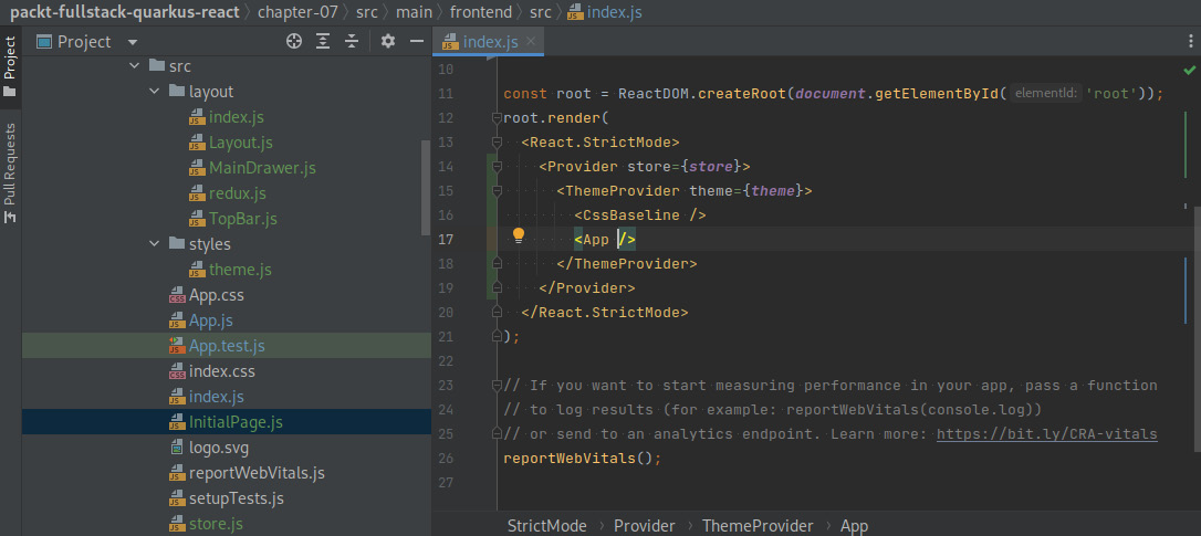
Figure 7.8 – A screenshot of IntelliJ displaying the content of the index.js file
The application’s dummy page should be ready by now. Let’s try to execute our application and load it in a browser. We’ll start by executing the following command:
npm startThe development server process should start and we should be able to navigate to the application’s home. Let’s try to check the application in a browser by navigating to http://localhost:3000:

Figure 7.9 – A screenshot of a browser pointing to http://localhost:3000/initial-page
The browser should automatically redirect us to http://localhost:3000/initial-page and we should see the result of rendering the InitialPage component. Notice how all of the layout components render appropriately and how the sample content we provided on this page is placed in the main area. We can try to click on the menu icon and see how the drawer collapses and expands alternately. By leveraging React’s powerful composition model, creating new pages that share this same look and feel will be effortless.
Summary
In this chapter, we learned how to bootstrap the frontend application for our project. We started by learning about React and its advantages. Then, we learned how to create a React project and added the required dependencies to support the task manager features. Next, we created a common layout to provide a consistent look and feel for our application. Finally, we created an initial dummy page to put everything together and be able to see our application in action.
You should now have a good overview of React and the required dependencies to be able to bootstrap a functional frontend application from scratch. In the next chapter, we’ll set up the frontend application so that we can consume the secured backend HTTP API. We’ll create a login page to initialize the authentication flow, and the required logic to protect some of the URLs and routes.
Questions
- Who created Material Design and what was its purpose?
- Why should we use a frontend routing solution?
- Does React prescribe any routing library?
- What are the advantages of Redux Toolkit compared to the standard Redux library?
- What is a React hook?
- What is JavaScript XML?
- What do the React guidelines recommend – composition or inheritance?