
3 METHODS AND TECHNIQUES
In the previous chapter, we looked at the main tools used by front-end developers every day in their practice. Along with the front-end development triangle of HTML, CSS and JavaScript, there are methods and techniques which a front-end developer will likely need to be aware of, and we will look at some of those in this chapter.
AGILE
There are many approaches to software development and management, including the Waterfall and Spiral methodologies, but by far the most popular at present is Agile. In fact, Agile came about when a group of individuals were brainstorming alternatives to traditional methodologies such as Waterfall and Spiral. This group met in early 2001 and developed the Agile Manifesto (https://agilemanifesto.org), which has at its heart four values that we will look at in the subsections below.
According to Lexico, Agile is defined as:
Relating to or denoting a method of project management, used especially for software development, that is characterized by the division of tasks into short phases of work and frequent reassessment and adaptation of plans.
[A]gile methods replace high-level design with frequent redesign. (Oxford University Press, n.d.)
What does that mean in practice, though?
When we undertake a development task, we can become overwhelmed by the sheer amount of work which is scheduled. There will be the underlying infrastructure (often server-side, though more frequently serverless1) to provision. There will be the logic associated with that infrastructure and any associated technologies required.
Somewhere there should be someone with an understanding of the overall architecture of the project, and that architect will have their own biases related to the programming language and datastore – either SQL or NoSQL (more on these later in this chapter) – which should be employed. There might be a designer with a vision for how the application should look, and there will hopefully be at least one front-end developer tasked with making sure that the designer’s vision can interact appropriately with everything below the application in the stack of technologies.
All this can, and often does, lead to confusion. A little like the famed terror which confronts an artist faced with a blank canvas (Landi, 2014), the fear, uncertainty and dread associated with starting a new project can seem overwhelming. This is the situation Agile hopes to address.
The second part of the quote above seems the most appropriate for the start of the development process. Instead of spending an age planning out every part of the final application, the team can concentrate on producing a minimal viable product.
The minimal viable product (MVP) is a concept from Lean Startup2 (Wikipedia, 2020g) and classically means creating something basic to gain an idea of the interest associated with a new product. Some or all of the business logic of an MVP may be mocked up or even reliant upon human interaction,3 and it is most suitably used to gauge the interest of users, effectively meaning that the initial offering may only represent a ‘vision’ of the final product rather than a working prototype. ‘MVP’ can be used to describe the first iteration of an application within the Agile methodology, but this is not strictly an appropriate use of the phrase.
Within an Agile methodology, an application is initially produced and then undergoes multiple iterations until it is deemed acceptable. While this might also be the case for more traditional methodologies, such as Waterfall, there is within those methodologies an understanding that there is flow towards a finished product, whereas Agile embraces the concept of an ever-improving solution rather than working through a defined process; Agile is far looser in its approach.
As noted earlier, Agile came about partly because of frustration with the over-regulation imposed by so-called heavyweight methodologies. Agile is classified as lightweight and has the following four values.
Individuals and interactions over processes and tools
The Waterfall methodology dictates the process to be followed while developing software (gather requirements for the software, design the software, implement the software, verify the suitability of the software and maintain the software). In contrast, Agile suggests that it is the interaction of skilled and competent developers working together that makes development work. While tools and processes can be used, they should only be used while they are making things easy and effective for the developers.
Working software over comprehensive documentation
The requirements-gathering part of the Waterfall process detailed above, along with the writing of test cases, layouts, specifications and a list of features, can amount to a significant amount of documentation. This documentation may well be out of date by the time the software has been completed, and the users might never use some features.
Agile prefers working software over documentation. This software can then be released to users who, in turn, provide feedback on what extra features or improvements they require. This leads to a far quicker and much more iterative approach to development.
Customer collaboration over contract negotiation
Alongside a reduction in documentation, the iterative process of Agile means that customer collaboration is vital. Rather than meeting with customers at the beginning and end of the project, as in the Waterfall methodology, Agile encourages constant collaboration, with feedback being sought immediately to inform development – hopefully leading to greater customer satisfaction.
Responding to change over following a plan
Change can be challenging in all walks of life. The Waterfall methodology minimised its impact by making detailed plans and methodologies mandatory and strictly adhered to those plans and methodologies. Agile, alternatively, embraces the concept that the only thing that is constant is change,4 and this allows the developers to embrace change and respond to altered requirements during the process of software development. In this way, change is seen less as a problem and rather as an opportunity.
Agile has at its heart the concept of the sprint, which is a duration of time (most often a week or fortnight) used by a Scrum team (a team of people of different specialisations). The sprint should accomplish a set of stories. It ends after a specified period, and any stories left over are either carried forward to the next sprint or moved into the backlog (which is a collection of stories held in reserve, should all stories be completed within the sprint).
It must be noted that Scrum is one Agile methodology and that there are others. Kanban is one and is similar to Scrum, but Kanban does not prescribe a particular workflow, nor does it have defined roles as Scrum does, such as Scrum master, product owner and team member. It also places a far greater emphasis on system thinking rather than being team-centric. For a more detailed exploration of the differences, see LeanKit (2018).
Stories are discrete units of work, such as implementing an area of new functionality within an application. They are allocated story points, which indicate their complexity, rather than the length of time they should take to complete. As you can probably imagine, a task which one developer might see as complex, another will find easier, depending on their level of experience or ability, so the story points are decided collaboratively. Deciding whether a story can be marked as completed can be problematic, with some teams requiring acceptance testing5 by a user and others accepting the decision of either another developer or a dedicated quality assurance (QA) tester.

In my current team – despite the emphasis on story points representing complexity – we assign two story points to a day, so a typical fortnight-long sprint will see a developer being assigned 20 story points’ worth of work. This assignment is slightly against the principles of Scrum, in that it uses story points to represent time rather than complexity – but it must be noted that ‘a Story Point is a relative unit of measure, decided upon and used by individual Scrum teams, to provide relative estimates of effort for completing requirements’ (Davidson, 2014).
Progress on Agile projects is discussed, briefly, in a daily stand-up (also known as the ‘morning rollcall’ or ‘daily scrum’) where each member details their progress and plans for the coming day. Stand-ups can also be used to raise issues and garner ideas from other members. These issues might take the form of impediments or blockers (Carlton, 2016). Alternatively, a developer might be confronted by an issue which is beyond their capabilities but is not beyond those of other members of the team. In such cases, the stand-up enables help to be offered as soon as possible. The number of points completed in a sprint serves as a measure of the Scrum team’s velocity and will influence the number of story points allocated to the Scrum for the next sprint.
I suggest that you spend some time reading and learning more about Agile. However, suffice to say that, like many revolutionary approaches, it has in many cases become just as rigid as the methodologies it replaced, in my opinion. Methodology can suffocate a developer if imposed too strictly.
TECHNIQUES
Many of the techniques examined in this section will be employed on many of the websites you interact with each day. We interact with those sites using a browser, and browsers have a wealth of tools for front-end developers built-in.
You should become familiar with inspecting the elements of a web page, even if you do not pursue a career as a front-end developer. It is almost like going behind the curtain in Oz to discover that all the exciting things you can see are just made up of words.
Learning about the developer tools, and likewise teaching them to someone, is empowering. They allow us to understand what is going on behind the scenes and alter it, if only in the local context. Additionally, the ability to use a browser’s JavaScript interpreter from the developer console6 means that you can solve maths problems without having to use a calculator.
Once you get into the habit of thinking about the things that confront you in a browser in an investigative way, by interrogating them using the developer tools, many mysteries will be made manifest. You will gain valuable insights into how other front-end developers have achieved their aims.
Forms
A web application is of very little use without some input from the user. Imagine your day-to-day interactions on the internet – do you find yourself entering information into forms? Even if it is only your name and email address to subscribe to an email newsletter, you will be using a form. We can garner information from our users without forms, but, in terms of gathering rich and detailed information from them, forms are beyond compare.
HTML 2 introduced the form element. Early internet forms required the user to either download them, fill them in and then email them back or print them, fill them in and post them to the webmaster (Editorial Team, 2016). Thankfully we are much more nuanced these days, and nearly every interaction with officialdom can be carried out online.
At their most basic, and traditionally, forms are documents with areas for a user to put information which is relevant to some purpose or another. Generally some sort of transaction is taking place, with the user providing data to accomplish a goal.
Forms are themselves a subtle form of communication and can reveal things about the person or institution asking the questions – nearly as much as they can about those who fill them in.
Forms in HTML are made up of fields for types of data. The best forms have labels to tell the user what the data should be, and some even have a placeholder which gives a further illustration of the structure of that data. Following is an example of an email input, and Figure 3.1 shows the output of the code.
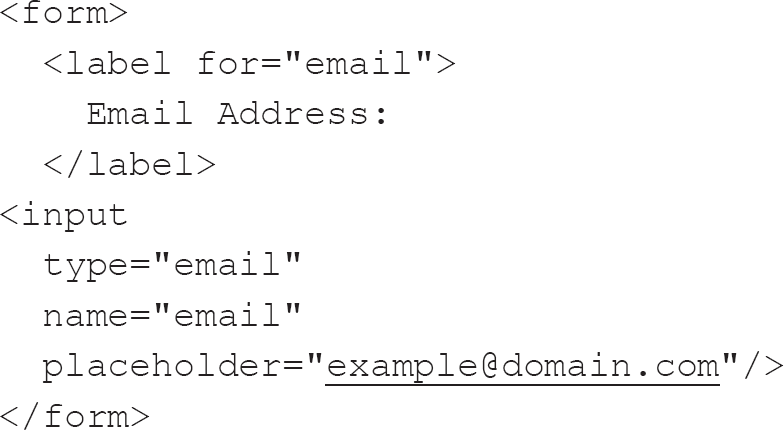
Figure 3.1 A simple email form

There are very many types of form input, and the number of types increased markedly after the introduction of HTML5. Not all types of input are supported by all browsers, though, and often their implementation can be markedly different across browsers and devices. Examples of the most common types of input are:
• text: for inputting a single line of text;
• password: for inputting a password – the entered text is often obfuscated or hidden in some way, usually by replacing the characters with asterisk or star characters;
• submit: for submitting form data to a form handler;
• radio: allows the user to select a single option from several available options;
• checkbox: defines a binary option – the value can either be true or false.
Alongside inputs, there are two other elements which can be placed within forms: textarea and select. A textarea is used for the collection of multi-line text and can be enhanced to provide WYSIWYG-type inputs (see Chapter 1 for more on WYSIWYG), whereas select allows for similar functionality to be applied to radio inputs except that multiple options can be allowed with the use of the multiple attribute.
Labels and placeholders in forms
Why, you might ask, is there an instance of label as well as placeholder in the code above? The subject of placeholders and labels is contentious, with some suggesting that using one or the other is fine and using both is overkill.
In the example above, the label and placeholder serve different purposes, with the label telling the user what is expected and the placeholder giving an example of the value required. There are many instances where you will see the placeholder used as a label, but this is questionable.
Labels are essential for many reasons. Clicking on a label places the focus on the input and, in the case of checkbox inputs, toggles the state of the input.

As a front-end developer, I often click on the text beside checkbox inputs (i.e. asking if I would like to opt out of marketing when creating an account on a website) rather than the input itself in the expectation that my choices will be respected, only to have to click the much smaller input, as what I was expecting to be the label was just text. This choice of replacing a semantic element with simple text makes no sense.
Assistive technologies, such as screen readers, use labels to understand the meaning of inputs. While most users are likely to be able to understand the context of the input from the other content within the page, many assistive technologies read out the text of the label related to the input. The label should describe in sufficient detail what input is required from the user. This is another reason why using labels is essential.
It once was fashionable to omit labels altogether in favour of placeholders but, as pointed out by the Nielsen Norman Group, this led to significant issues:
Placeholder text within a form field makes it difficult for people to remember what information belongs in a field, and to check for and fix errors. It also poses additional burdens for users with visual and cognitive impairments. (Sherwin, 2018)
Thankfully this was a short-lived fad. I can understand why using placeholders instead of labels is attractive, as it reduces the screen real-estate required for forms while assuming that a placeholder might fulfil the same purpose as a label. However, as we can see, this is not the case (W3C, 2011).
While placeholders can provide specific advice for users, labels should be your default option for inputs, though this conclusion also raises a further area of contention – that of the placement of the labels.
Traditionally, paper-based forms had the label placed on the top left above the field it was associated with, and users are used to this convention. There are, though, places where forms work differently, with the label being to the left, sometimes with further information beneath, and the input is on the right of the page. This type of form layout might seem to be a clear way to offer users full and proper prompting for the information required without having to have large amounts of horizontal space between inputs, but studies have shown that following the convention is easier for users (Wroblewski, 2005).
Fieldset and legend in forms
Along with the label–input pairing, there is another pairing of elements worth bearing in mind concerning forms, that of the fieldset and legend. The fieldset element is used to group related inputs, and the legend acts as a label for those fields so grouped. It is implemented mainly on long forms but seems to be less prevalent than it once was, mostly because forms are getting smaller and being split into multiple pages, so the need to separate distinct areas of a form has been replaced with the use of separate subforms.
Validation
Validation is essential for form fields. It is carried out before a form is submitted and ensures that the data requested for a form is complete and that it has been entered in the correct format.
Browers are catching up with native implementations of most methods of validation using a Boolean attribute. A Boolean attribute indicates something when it exists on an element, even without a value. There are a few Boolean attributes, and adding them via JavaScript can sometimes be problematic because when adding attributes via JavaScript it is usual to give the attribute and then the new value.7 These attributes include required,8 checked9 and disabled10 (Schouten, 2015).
In the email input code example above, to make use of the browser’s built-in validation, we would write the HTML like this:
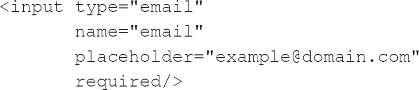
The above code represents an input of the type email. It has a name – email – which will be sent to the form handler and gives a visual indication to the user of what type of information it will require in the form of an example email address. It is also a required input.
This browser-based validation can cope with many, but not all, use cases. For instance, if we need to check a telephone number, we can make an input of type tel, as in this example from MDN Web Docs (formerly the Mozilla Developer Network) (Mozilla, 2019c):
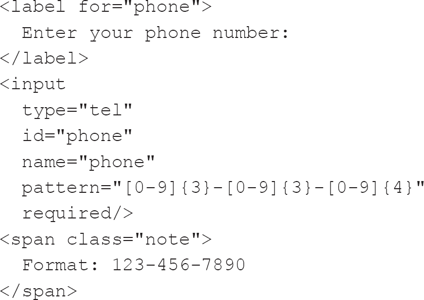
As you can see, the input has a pattern attribute which has a regular expression indicating a phone number from the USA. In this case, the accompanying span shows an example of valid input, but this is not a valid format for a UK phone number (Sandeepsure, 2012); validation becomes confusing for internationally formatted phone numbers.
There are pitfalls of validating a phone number, but addresses can be even more problematic. There is, however, an International Organization for Standardization (ISO) standard (ISO 19160 (International Cartographic Association, 2017)), which defines a conceptual model and associated terms and definitions, providing for the conversion of address information between specifications. Addresses within the UK are, compared to some jurisdictions, a breeze, with a house number and postal code often being enough to find an address – though those who live in less conventional accommodation, such as boats, can find this convention problematic.
Despite the perils of validation, keep in mind that we are here to help our users interact with our work. Often developers have invested significant time in becoming familiar with a JavaScript validation framework, such as the jQuery Validation Plugin (Arkni & Staab, 2018), and are reticent about using the native capabilities of the browser. Despite constraint validation being available, they can seem to prefer shoe-horning their own, preferred method rather than take advantage of the capabilities of the browser. Such non-standard validation can leave users confused, and the addition of further JavaScript can have an impact on page-load times.
Quite apart from validation in the browser, we should be conscious that the server should also validate all responses – if only to ensure that no malicious content is saved in the database. The W3C goes into far greater depth on this issue in its article on SQL injection (W3Schools, 2020c).
In his article ‘HTML Forms’ Time Has Come (Again)’, George Mauer (2017) points to a lack of browser-side validation as being one of the primary reasons why forms became unpopular for a period.
Despite all this contention around forms, they will doubtless play a significant part in your career. Bear in mind the advice from the Web Accessibility Initiative (W3C, 2019) when thinking about forms: making forms accessible for users with disabilities only improves the experience for all your users and will improve the semantics11 of your page, allowing it to be useful to software agents.12
Layouts
Once we know what we need to show our users, we need to decide how we should display it – how we should arrange the various elements on the page appropriately and pleasingly. This is the layout.
Table-based layouts
As I have mentioned, HTML was initially designed for the presentation of academic documents. Tables and tabular data played a significant part in these documents, and we can imagine a nascent designer seeing tables and thinking that they might offer a simple way of arranging content on a page.
Tables lent themselves to the archetypal two-column layout with header and footer so beloved of designers. Such a design is easy to create using a table-based layout, which explains why it was as popular as it was for many years.
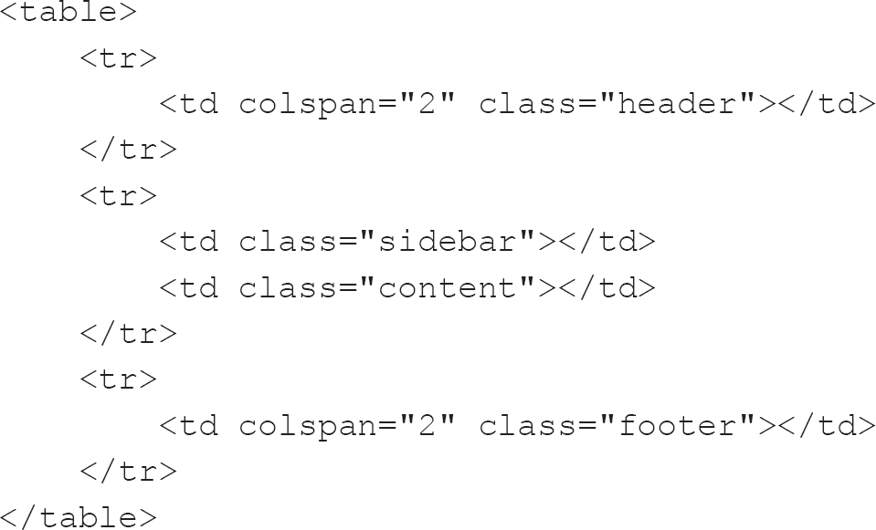
The following is a simple example of a table-based layout:
It can be combined with this CSS:
table {
width: 100%;
border-collapse: collapse;
}
.header {
background: #808080;
height: 20px;
width: 100%;
}
.sidebar {
background: #DCDCDC;
height: 50px;
width: 25%;
}
.content {
background: #000000;
height: 20px;
width: 75%;
}
.footer {
background: #A9A9A9;
height: 20px;
}
Together, they produce a layout with a grey header, 20px tall; a left-hand sidebar, which is the colour gainsboro,13 50px tall and 25% the width of the table; a content area which is black and takes up the remaining space (75%), also 50px tall; and a grey footer, 20px tall.
Figure 3.2 A simple table layout

There is some controversy surrounding table layouts, mainly because tables are designed to display tabular data and are thus semantically incorrect for layout. Rather than using CSS to determine the presentation, the tables themselves determine the presentation. Assistive technologies such as screen readers will perceive a table and attempt to explain it to the user as though it were a table showing tabular data rather than it being used for the layout of the page. Alongside the issues table layouts have in assistive technologies, they also take up more space in terms of the markup transmitted, and they prevent incremental rendering of the page, so the user has to wait longer to see anything on the page.
It is not only assistive technologies which have issues with tables, as search engines also use similar techniques to parse the page and extract relevant content. If a page is not parsed correctly by a search agent, then the indexing of the page will suffer. This is an issue with table-based layouts because a search agent is likely to try to read a table layout as though it were tabular data, in the order in which a table would be read – while the table layout might have the pertinent search data nested in a difficult-to-find place.
Making a page accessible has been described as the hallmark of a professional developer (Kyrnin, 2018). Eli Weinstock-Herman, in his article ‘The History of HTML Table Layouts’, uses this analogy to describe the issue:
Building a house is hard. Can the house builder cut corners to get your house up faster? Sure. But at the end of the day, if the builder is professional they won’t cut corners because those cut corners reduce the value of the house, reduce the satisfaction of the buyer, and increase the ongoing maintenance costs. (Weinstock-Herman, 2011)
Table-based layouts should also be avoided due to maintenance difficulties. Even though tables might seem like an easy win, they can quickly become a nightmare to maintain, and they perform worse than CSS-based layouts.
Quite apart from all these caveats of using table-based layouts, they are also prohibited, if not frowned upon, by the standards to which we should be working. For instance, the HTML 4.01 specification stated:
Tables should not be used purely as a means to layout document content as this may present problems when rendering to non-visual media. Additionally, when used with graphics, these tables may force users to scroll horizontally to view a table designed on a system with a larger display. To minimize these problems, authors should use style sheets to control layout rather than tables. (W3C, 1999)
HTML5 does not prohibit the use of table layout if the HTML is valid, but it does discourage it, saying that ‘tables should not be used as layout aids’ (W3C, 2017b). Now we know how not to lay out a page, what alternatives exist?
CSS-based layouts
As developers are strongly discouraged, if not actively prohibited, from using table layouts, they have instead moved to use CSS to produce the same results.
Replacing tables with CSS layouts To start with, those wanting to replace tables with CSS layouts had recourse to the float and display14 properties. These worked well but could be finicky and confusing initially. Using floats was the primary method of replacing table-based layouts for a long time, and it is worth understanding why and what pitfalls could trip up front-end developers while creating them.
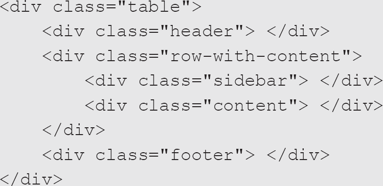
The float attribute specifies how an element should float within its container. To understand them, it is worth thinking about how pages are structured with div HTML elements. The div element is used to signify a division of content so, for example, the two-column header and footer example provided earlier could be represented using four divisions within the body element of the HTML. Usually, these four div elements would have appropriately named id or class attributes such as header, sidebar, content and footer. These would then be targeted by the relevant CSS to prevent their default display one after the other. Note that the div element defaults to displaying as a block, which stretches the full width of the viewport and stretches vertically only as much as is required by the content of the div.
Using floats, we could pretty much ignore the header; give the sidebar a defined width and float it to the left; give the content a width, which when combined with the width of the sidebar would total less than the page width, and float it to the right; and direct the footer to clear15 both.
This can be illustrated using this HTML:
<div class="header"></div>
<div class="sidebar"></div>
<div class="content"></div>
<div class="footer"></div>
And this CSS:
.header {
background: #808080;
height: 20px;
}
.sidebar {
background: #DCDCDC;
height: 50px;
width: 25%;
float: left;
}
.content {
background: #000000;
height: 50px;
width: 75%;
float: right;
}
.footer {
background: #A9A9A9;
height: 20px;
clear: both;
}
From these, we get an identical layout to the table layout shown in Figure 3.2 with a significant saving of markup and reduced complexity. Rather than directing the div elements sidebar and content to float either left or right, it is possible to float both elements to the left and wrap them within a container div element with the overflow property set to hidden (this increases the amount of markup by adding an extra container; as you start to examine other developers’ markup, you will gain an appreciation of simplicity and elegance – not least if you have to edit it later):
.header {
background: #808080;
height: 20px;
}
.main {
overflow: hidden;
}
.sidebar {
background: #DCDCDC;
height: 50px;
width: 25%;
float: left;
}
.content {
background: #000000;
height: 50px;
width: 75%;
float: left;
}
.footer {
background: #A9A9A9;
height: 20px;
clear: both;
}
Using the float property is one way of replacing table-based layouts. Another is to use the position property, but it does require slightly more CSS:
.header {
background: #808080;
height: 20px;
position: absolute;
top: 0;
left: 0;
width: 100%;
}
.sidebar {
background: #DCDCDC;
height: 50px;
position: absolute;
width: 25%;
top: 20px;
left: 0;
}
.content {
background: #000000;
height: 50px;
position: absolute;
width: 75%;
top: 20px;
right: 0;
}
.footer {
background: #A9A9A9;
height: 20px;
position: absolute;
width: 100%;
top: 70px;
right: 0;
}
This use of absolute positioning can be useful but it does not consider differing viewports, as it relies on the developer being specific. In the CSS above we see that the element with the class of header is precisely placed with its top-left corner on the top left of the viewport, with it being 20px high and 100% of the width of the page. The element with the class of sidebar has its top-left corner placed 20px down from the top left of the page, and is 50px tall and 25% the width of the page. The element with the class of content is placed beside the element with the class of sidebar, with its top-left corner being 20px down and 25% of the page width from the left-hand side – it is 75% of the page width and 50px tall. The element with the class of footer has its top-left corner towards the left of the page and 70px down (20px for the element with the class of header and 50px for the element with the class of sidebar); like the element with the class of header, it is 100% of the page width.
There are likely more nuanced approaches to using absolute–relative positioning, and I encourage you to look at the useful resource developed by BarelyFitz Designs (2006). This tutorial provides an intuitive and informative way of learning CSS positioning in ten steps. When I first started, I spent a great deal of time reminding myself of the rules with this tutorial.
There is a way of getting back to the table effect with CSS should one desire; we can persuade HTML elements to display as though they were elements within a table using the display property:
The above HTML could use the following CSS to get our layout using the display property:
.table {
display: table;
width: 100%;
}
.row-with-content {
display: table;
width: 100%;
}
.header {
background: #808080;
height: 20px;
display: table-row;
width: 100%;
}
.sidebar {
background: #DCDCDC;
height: 50px;
display: table-cell;
width: 25%;
}
.content {
background: #000000;
height: 20px;
display: table-cell;
width: 75%;
}
.footer {
background: #A9A9A9;
height: 20px;
}
This sort of gets around the issue of having table layouts, by getting the browser to treat our elements as though they were table elements, but there are limitations regarding a lack of colspan and rowspan equivalents.
The colspan attribute defines the number of columns a cell should span, and a rowspan attribute specifies the number of rows a cell should span.
The colspan attribute is used twice in the example I gave at the beginning of this section on table-based layouts, once for the header and again for the footer. As such, the example in this box required extra markup to mimic the float and position layout equivalents – nearly as much markup as the table layout.
Using such a pseudo-table layout is not something I would recommend, but it is worth knowing as it might come in useful at some point if only to decipher CSS written by someone else. I would suggest it as an alternative to float- or position-based layouts only if you do not have access to more modern techniques and need your solution to work in non-evergreen browsers.
Modern layouts The layout methods detailed above illustrate something of the history of CSS layout techniques. We will now examine the two more modern approaches to layout, which will be the ones you will likely be tasked with implementing: flexbox and grid.
Flexbox layouts CSS-based layouts were a huge improvement over table layouts but are still limited in terms of their use in mobile devices, such as phones or tablets; using percentages and fixed widths in the way that they do means that information can become illegible. A more modern layout approach requires a little more markup but will likely prove to be much more flexible.
Consider the following HTML:
<div class="header"></div>
<div class="main">
<div class="sidebar"></div>
<div class="content"></div>
</div>
<div class="footer"></div>
with the following CSS:
.header {
background: #808080;
height: 20px;
}
.main {
display: flex;
}
.sidebar {
background: #DCDCDC;
height: 50px;
flex: 1;
}
.content {
background: #000000;
height: 50px;
flex: 3;
}
.footer {
background: #A9A9A9;
height: 20px;
}
This code uses the flexbox-layout module, which provides an efficient way to lay out, align and distribute space among items in a container, without being overly concerned about their content. This allows for responsive layouts.
The flexbox-layout module has several features and allows the developer to control several aspects of the initial layout as well as providing rules which enable better placement of content within different devices, such as mobile phones or tablets. The developer can control the direction of the flow of elements within a container such that any cardinal direction is possible (left to right, right to left, top to bottom or bottom to top). The ordering of the elements can also be controlled, as can their wrapping behaviour in smaller containers – with that wrapping being either horizontal or vertical. Further elements can grow or shrink depending on the available space, and their alignment can be controlled within their container.
Flexbox layouts are concerned with one dimension, either horizontal or vertical. Flexbox rules are made up of two main components:
• The flexbox container: setting the display property of an element to flex is enough to invoke the flexbox rules, and the element will align to fit the available space and place child elements in the associated flex-direction (row, row-reverse, column or column-reverse). Although flexbox is associated with one dimension, elements can wrap should children take up more than the available space, and we have some control over this wrapping with the flex-wrap rule.
• The flex items: while the flexbox container is in charge of the general layout of the elements it contains, the elements themselves are in charge of their display and can have an initial size and an ability to grow and shrink by making use of the space within the flex-container using flex-basis, flex-grow and flex-shrink.
Flexbox is fast becoming the standard layout system, but it can be daunting for those who are used to older layout systems. There are many resources available to help the developer to learn it, such as Flexbox Froggy (http://flexboxfroggy.com).
Grid layouts Closely aligned to flexbox layouts are grid layouts. According to the web developer and blogger Chris Coyier:
Flexbox layout is most appropriate to the components of an application, and small-scale layouts, while the Grid layout is intended for larger scale layouts. (Coyier, 2018)
The two have very similar syntax, and, in the case of grid layouts, they can be massaged into playing nicely with earlier browsers, such as Internet Explorer 11 (probably the earliest browser you will be asked to support). Following is the equivalent CSS to the flexbox example above using a grid layout:
.header {
background: #808080;
height: 20px;
}
.main {
display: grid;
grid-template-columns: repeat(4, 1fr);
height: 50px;
}
.sidebar {
background: #DCDCDC;
grid-column: 1;
}
.content {
background: #000000;
grid-column: 2 / 5;
}
.footer {
background: #A9A9A9;
height: 20px;
}
One thing to take note of above is the use of the fr unit. It represents a fraction of the leftover space in a grid container (W3C, 2017a), so the above code splits the area of the container into four equally spaced segments. The fr unit can also be used to measure the vertical space within a container, and this ability, along with the fact that developers can mix and match units, means that the grid-layout method is infinitely flexible.

Grid is the fifth technique I have had to learn to produce the same result. It is the one that seems to me to be the most exciting and, after struggling to get it working with Internet Explorer 11 (Myers, 2018b), it is the one I feel most comfortable using and supporting going forward.
It must be noted that Internet Explorer 11 has a non-standard approach to CSS grid layouts, and so investigating a polyfill16 or learning its peculiarities is worthwhile.
In much the same way as flexbox layouts have two main elements, so too do grid layouts:
• The grid container: again, setting the display property of an element to grid generates a block-level grid (setting it to inline-grid generates an inline-level grid for use in flow-based layouts). Setting the display to grid is only useful when we define the columns and rows using grid-template-columns and grid-template-rows rules or even the grid-template rule. We can also specify a gap between child elements using the grid-gap rule17 as well as align items along both directions and align the grid within its parent container. As you can probably imagine, with their ability to control a two-dimensional grid, the rules associated with grid containers are extensive. CSS-Tricks has produced an excellent resource on this (CSS-Tricks, 2020).
• The grid items: the primary rules associated with grid elements deal with how they are placed within their parent’s grid container and are associated with which grid and column they should start in and which grid or column cell they should stretch to. These rules allow for fine control over their placement, but note that the numbering system starts from 1 rather than from 0, which is what you will become used to once you are proficient with JavaScript. Again, I refer you to the resource from CSS-Tricks (2020) for more information.
The grid rows and columns can be named within any template rules you create on the grid container. This will help your understanding of the placement of elements within the grid.
Discussion of flexbox and grid Throughout this section, we have looked at how layouts can be accomplished using several CSS techniques and finished off by looking at both the flexbox and grid layouts. These are becoming by far the most popular methods of laying out pages, so we spent a little time introducing both. It should be noted, though, that there is a fundamental difference between them. Flexbox is made for one-dimensional layouts, whereas grid is made for two-dimensional layouts. To put this another way, a flexbox can be either a row or a column, whereas a grid layout can be both rows and columns. We do have the ability to wrap elements within flexbox containers to ensure that those elements which do not fit within the single dimension wrap into another row or column, but we do not have the fine-grained control offered by grid layouts.
When it comes to deciding whether you should use one or the other, I would instead suggest using both, as they complement each other. Grid can be used predominantly to build the scaffolding of websites and flexbox can be used to structure the elements contained within the scaffold. To summarise: learn both and use them together.
Final thoughts on layouts
We have seen several ways of generating the same design using different techniques, but by far the most useful are the more modern flexbox and grid layouts. I encourage you to familiarise yourself with the others as well, as there might be a place for them in your practice. However, despite Internet Explorer 11’s non-standard implementation of grid, flexbox and grid should be your primary tools going forward as they will help you to create responsive layouts.
Tables
The previous section mentioned something of the chequered past of tables on the internet. Using tables for layout was a necessary part of the evolution of the internet. However, now that CSS techniques have removed the need to use them for layout, we can reuse them for their proper – if not traditional – purpose: displaying tabular data.
Like the html element, the table element should have at least a head and a body, but these can be supplemented with a foot, so a table element can have a thead (a table header) and a tfoot (a table footer), and should have a tbody (a table body). While a proper table should have at least a thead and a tbody, tables which omit both will still render correctly, due to browser manufacturers appreciating the abuse tables were subjected to in the past.
Tables are used to represent two-dimensional, tabular data – that is, data which is suited to display within rows and columns because it shares some common characteristics. For example, we could show the people with perfect Pac-Man scores on a particular day, as each person who has managed this shares some attributes, namely that they scored 3,333,360 in Pac-Man, they have a name, they scored on a specific date and they took a specified period to achieve their score. This data lends itself to display in a tabular format because we have our headings in place already. We can use ‘Name’, ‘Date’ and ‘Time’ as the text for our table header (th) elements in the thead, and we can duplicate the same arrangements of cells within the tfoot as well. Thus, each person would be represented within the table as a row and each attribute as a column.
The following is a minimal table of two records:
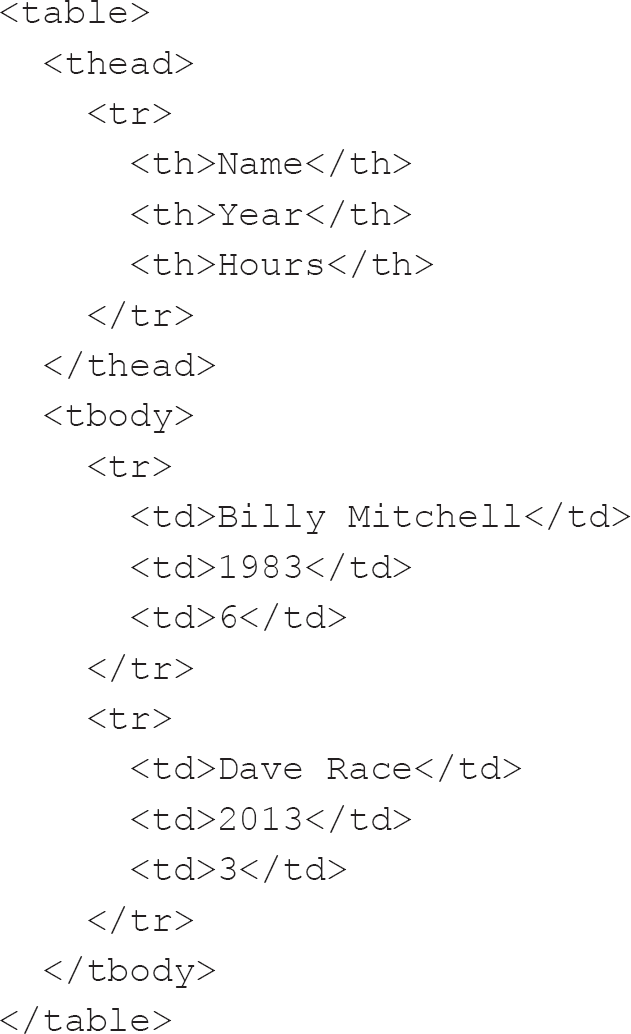
This produces the table shown in Figure 3.3.
Figure 3.3 A simple table

For completeness sake, we should add a tfoot to the table just beneath the thead and above the tbody (to allow rendering of the tfoot while the browser is still processing the table data (Network Working Group, 1996)). However, let’s first look at the other elements used in the table.
Rows are signified using the tr (table-row) element, but within the tr we have either th (table-header) or td (table-data) elements.
th elements are not limited to use within the thead. A row can also have a th element, usually to denote some column of the row being of importance. So, in our example, the name of the person scoring could be a th instead of a td. It is also worth noting that the thead element can hold multiple rows, which can ease the layout – for instance, denoting a grouping of th elements under a shared category can be accomplished in this way.
Both the td and th elements can span multiple rows and columns, something which we looked at earlier when examining table layouts. For instance, if we had a table of orders with one column for unit price, another for units ordered and the last for a total (unit price multiplied by the number of units ordered), the last row might contain totalled numbers. We might not be interested in the total number of items ordered and we certainly gain nothing from a total of the individual prices of single units; however, if we were to total the total row values, then we could have the total of the whole order. We could have empty cells under the unit price and the units ordered, or we could remove those three cells and replace them with one cell with a colspan of 3, perhaps right-aligning the contents of the cell, as shown in Figure 3.4.
Figure 3.4 A simple table with a total of the row totals

We should perhaps employ the same convention used within spreadsheets and make sure that all cells with numbers are right aligned. This helps our users to parse the numbers and aids them in totalling the numbers in their head (Brocka, 2012).
Tables can also contain other optional elements aside from those listed above. These include:
• caption: this, if present, should be the first element within the table and is the title of the table.
• colgroup: this should appear, if present, after the caption and before the main content of the table (i.e. the thead, tbody and tfoot). As you might be able to imagine from the name, it describes a group of one or more columns and should contain one or more span or col elements. These are primarily associated with the visual formatting of the data and are useful because they can be used to apply such formatting to multiple columns of data at once.
Probably due to the previous misuse of tables, they can have multiple attributes which have now almost totally been replaced by CSS directives. Most of these attributes are unsupported in HTML5, but you will see them used. Perhaps the most common ones are cellpadding, cellspacing and border. CSS can be used to replace these attributes, leaving much cleaner markup. A padding CSS directive can replace the cellpadding attribute, and border-spacing can be used instead of cellspacing.
One of the best ways of enhancing tables is DataTables (Jardine, 2018), but there are many others. DataTables can sort tables on one or more arbitrary columns, and provide sensible ordering on the type of data, such as ordering dates sequentially.
This ability of DataTables to cope with dates is by no means as simple as you might think, as dates are presented in all sorts of odd ways. As a front-end developer, you will likely become, if you are not already, adept at being able to parse dates entered by users from other regions of the world from your own.
For me at least, understanding US-formatted dates was a huge pain, but I can cope as I see them so frequently. DataTables also allows for the filtering of rows using either a regular expression or simple text. Additionally, being able to use pagination so that users are not presented with long tables is brilliant, as is being able to offload the heavy lifting to the server when using pagination so that only the visible data is within the structure of the page.
Whichever table enhancement you choose to adopt, if any, be aware that you might have to cope with making sure it will work with whatever framework you are using at the time (Angular, React, Vue or whatever else arises). This flexibility is by no means always clear cut, as I personally still include jQuery despite it being less and less necessary, just so that I can continue to use DataTables.
I imagine that these enhancements to the HTML table element may well be addressed natively in the future. The standard certainly seems to be suggesting that, as it was only in 2016 that the sortable and sorted attributes were removed from the draft specification for HTML5.1 (Faulkner, 2016). However, until browsers support such abilities natively, we will have to use JavaScript.
Images
Front-end developers are rarely tasked with creating images, but it is worth understanding them because they will make up much of your working life. Front-end developers are often asked to use images within the application either as decoration or for illustrative purposes. Being a front-end developer means being engaged in a creative process, whether you appreciate your inner artist or not. Who knows, if you do not already dabble in the creation of art, you may well find yourself drawn to it in the future – if only to supplement any designs a designer or client might provide you with.
Images are used for many purposes within HTML: to create an atmosphere or feeling, to help explain a concept, to identify people, places or objects, and even to reinforce the message contained within the text or build brand loyalty.
Raster images
Raster images are composed of pixels, quite often lots and lots of pixels. Each can be a different colour from its neighbouring pixel. Raster images can also be called bitmaps.
When it comes to digital images, the artist starts with a blank canvas. However, in the context of raster images, there is a multitude of choices about the canvas itself. A conventional artist has some questions they must answer before ever putting an image on a canvas. Do they have a defined palette of colours with which to work? What are the dimensions of the canvas? What media (such as paintbrushes, airbrushes, pen, pencil or a combination of any of them) will be used?
In the realm of the front-end, these choices are duplicated except for the choice of media. In our purview, media might best be equated with software, as different programs are suited to the production of different types of image.
It might be that you have an image for inclusion in the project you are developing but it requires some tweaking. These tweaks can take myriad different forms: the image might be the wrong size for the container it needs to fill, it might be the wrong aspect ratio18 or (and this is my all-time least favourite issue) it might have a background colour which needs to be changed. Let’s look at how we can address these issues.
Image size and aspect ratio issues If an image is the wrong aspect ratio, we can address this problem in two ways. We might edit the image in an external editor to ensure it is correct or we might employ CSS. Using CSS has the advantage of ensuring the image remains unsullied, but we might lose detail which the designer is hoping to convey, by accidentally trimming off the relevant detail. Editing the image is likely to be more precise and will allow you to ensure that it has been made suitable for inclusion by shrinking the resolution to that of its container. For instance, we might have a container which is 200px wide and 100px tall but be supplied with an image that is 2,000px wide and 1,000px tall. While the browser is capable of shrinking the image, we have transferred a significantly larger image than that which is required over the network; it would be far better to supply the image in the desired dimensions initially.
Background colour Very rarely do images fit a square or rectangular shape (there are of course exceptions), and filling the whole four-sided canvas is quite rare. That means that the person creating the image is left with a problem, and that problem is what colour to put behind the thing which is depicted. Artists using traditional media do not always have quite the same problem because the media itself often has a colour, but digital artists can have a background or not – a little like a traditional artist painting on either an opaque or a transparent surface.
Imagine a logo for a company. How does one display that within an HTML document? We looked at the img element when we looked at HTML in Chapter 2, but what about the actual image itself? We know that, if it is a raster image, it will be a quadrilateral made up of some individual pixels of different colours. The colour of the underlying container is a given and will, generally, be associated with the overall theme of the site, so the designer may well opt to use the same colour as the background for the logo.
However, what if, for example, next year the designer goes on maternity leave and another designer is brought in. They may choose to put their stamp on the company design and change the hue of the theme. As a consequence you, as a front-end developer, may be tasked with updating the theme across the whole web estate of the company. You tweak the CSS and dig down into the minutiae of the JavaScript to change any variables there to reflect the new coloration. It takes a significant amount of time to ensure you have caught all references to the old colour and replaced them with the new hex value (more of which later), but you finally think you are ready to test your changes in the browser. Everything looks good, except for one glaring instance which is visible on every page: the logo. All your hard work is for nought as there is a discordant image on each page; the original designer did not envisage the theme colour changing and so used it as the background to the logo. She is not available, nor are the assets she used in the creation of the logo, and, besides, the source for the image is a Photoshop file, and you do not have a licence for it.
In a situation like this, you can fire up Gimp19 (GIMP, 2018) and, if you need to, frantically search for tutorials on how to remove a background from an image (Viola, 2012). Once the original background has been removed, you are left in something of a quandary: whether to leave the background transparent or add the new background colour. You assume that the original designer will not be away from work forever and that the current designer might not be in place when she returns, so it might be best to back up the original and replace it with a new image with the new colour. You could also remove the background colour and allow the underlying colour to show through the transparent areas of the image. What you decide to do will depend upon the format of the image. Some image formats support transparency, and some support multiple types of transparency.
Some image formats do not support transparency at all, and these are generally the formats used to display photographs. Photographs are pictures of real, concrete things such as products, people or locations. As such, there is no need for transparency, as the image is flat. When we are not displaying photographs, though, we can make use of transparency.
In the old days, there was a single format which supported transparency, and that was the Graphics Interchange Format (GIF), developed in 1987. Nowadays we have a much more nuanced approach to transparency with other formats.
GIF images are brilliant, though. They are primarily dominant because of the compression they use to generate quite small files, and this means that each pixel has a colour, one of which can be transparent.
A powerful aspect of GIF is its ability to be used for animation. This ability to contain numerous frames and data on display is perhaps the primary reason for GIFs’ continued popularity, with sites such as Giphy.com allowing users to embed pertinent animations in a multitude of places.
That means that in our example scenario, we could convert the original logo to a GIF with transparency, and we should be fine. We should be aware, though, that our logo once had a background, and on the edges of the logo there will be artefacts of that background colour left behind because of the nature of raster images. In raster images, lines are not lines at all; instead, they are a collection of many squares which, at a distance, appear as though they are lines.
We are now nearly there. Nearly everything looks correct, and the old colour has been replaced throughout, except for the weird jagging around the logo, so what to do? First we need to understand how colours are represented digitally and why another image format – Portable Network Graphics (PNG) – might be preferable to GIF.
Vector images
We have looked at the issues associated with using raster images and how these issues lead to interesting solutions such as using alternative colour models (more of which later). This is primarily down to the fact that raster images are mainly designed to display pictures such as photographs. Photographs record light falling upon a surface and, in this aspect at least, they mimic the human eye. However, they are not appropriate for all images. In the case of the logo problem discussed earlier, the issue was the bounding line and the jagging surrounding it.
Vector graphics are made up of lines.
I use the term ‘graphics’ in this context to distinguish images which are generated by a computer from visual representations of things. There is something of a blurring of this distinction, though, with many photographic images now having significant input from software.
Vector graphics are made up of two-dimensional points connected by lines or curves to form shapes. Whereas we can use Photoshop for raster images, we can use Adobe Illustrator for vector graphics. Those who are looking for alternatives can use Gimp and Inkscape for similar purposes. Inkscape uses the Scalable Vector Graphic (SVG) format natively.
SVG Initially, it was only possible to view SVG images using a browser plugin created by Adobe but in 2009 Internet Explorer 9 gained native support for the format. However, even the last iteration of Internet Explorer had issues with the scaling of SVG images (Deveria, n.d.-a) so supporting the format across all the major browsers requires some extra work, but the effort is well worth it to have vector graphics.
Working with SVG is very similar to working with HTML as the format makes use of angle brackets and elements in a similar way, which makes sense, as it is also XML-based. Where things get interesting, though, is that there are many different elements with many attributes which may well seem unfamiliar. It is outside the remit of this book to go into much detail on the minutiae of the format; however, there is a wealth of resources available. For advice on using SVG in your practice, I recommend you read Chris Coyier’s Practical SVG (Coyier, 2016).
Including SVG within HTML can be problematic, though this situation was significantly eased by HTML5, which incorporates the ability to embed SVG directly in the HTML markup of a document (W3Schools, 2020d). Before HTML5, a SVG file could be referenced in the src attribute of an img element; it could also be referenced in the data attribute of an object element with a type attribute of image/svg+xml. One other alternative existed, and this was the embed element, with the SVG being referenced again within the src attribute. The embed element method is unusual as it is an element that was only added to the HTML standard with HTML5 but was used widely beforehand, as a de facto part of the standard for the inclusion of non-HTML content, such as audio. HTML5 also added audio and video elements, making their inclusion within HTML significantly less fraught unless the developer is working with older browsers unable to support HTML5.
In much the same way as raster images sometimes require some form of compression to not delay the user in their journey through an interaction with the product you are helping to develop, SVGs can become bloated. They are therefore compressed using GNU zip (GZIP) compression to produce SVGZ files, which are typically 50% to 80% smaller.
Scripting images Where SVGs hold the crown, though, is that they can be scripted with JavaScript. Scripting means that not only can you use your text editor to create them (though internally visualising the final output can be tricky) but you can also use JavaScript to interact with the SVG document, allowing some quite complex and engaging visualisations to be produced. That is by no means the only option available when it comes to simple animation or styling of SVGs, though. As well as JavaScript, CSS and SMIL20 can be used to animate SVGs, and Chris Coyier’s Practical SVG (mentioned above) has a whole section comparing the methods.
That is not to say that the same cannot be done with raster graphics. With the introduction and widespread adoption of the canvas element, JavaScript gained the ability to interact with raster images. There are significant differences between the two technologies, but the front-end developer does have ways of generating dynamic illustrations using each.
We should investigate this a little more, though, as the philosophies of interacting with SVG images and canvas elements are profoundly different. Whereas we use JavaScript to interact with the document object model (DOM) of an SVG image by creating, editing or deleting objects within the DOM, canvas objects are drawn in an immediate mode, meaning that there is no opportunity to interrogate the canvas to see what is already there, so no editing is possible, excepting redrawing of the entire canvas element. We need to record the placement of elements within the JavaScript and, if a part of the image requires creation, editing or deletion, then the whole canvas has to be drawn. When I imagine this process, I think of stop-motion animation, but instead of using acetate sheets for the backgrounds, they would be stored within a JavaScript variable or function.
Embedding SVG images with HTML used to be a very complicated process but has been made very much easier as the standard has gained support. SVG markup can be placed directly inline in HTML5 documents but is perhaps best used with the img element, with the SVG file being the target of the src attribute. You can also use the object or embed elements or reference the img within the HTML. The best way will depend on your use case and whether the SVG is interactive in some way. If it is, then using the object element or inline SVG would be the most suitable ways of including the SVG.
Just as we can use the img element to embed SVG files within HTML, we can also take advantage of the picture element. This element can contain multiple source elements and one img element to serve as a fallback should any of the offered source elements not be suitable. What I mean by this is that each source element can have a media attribute which will be evaluated – these are like CSS media queries (discussed in the previous chapter) – such that we can define a min-width (for instance). Then, if the media attribute evaluates to false, then the next source will be evaluated. As well as having an optional media attribute, the source can have a type attribute, and the two work together if the browser supports the MIME type21 for images. If the media and optional type attributes evaluate to true, then the image within the srcset is used. The srcset attribute is a comma-separated list of image descriptors with each descriptor being made up of a URL to the image and either a width descriptor or a pixel density descriptor. The picture element is relatively new but very powerful, and allows you to have dedicated images for different browsers and devices.
In the same way that CSS has different measurement units suited to different purposes, there is no best image format. Both raster and vector have their uses in different contexts, and they are, if anything, complementary rather than incompatible.
Ways of representing colour
Hex values Hex values are one of many ways of describing colours. They are formed of either three or six numbers, preceded by the hash symbol, and they represent colours using red, green and blue. In the case of three-digit hex values, each digit represents a single value; in the case of six-digit values, each grouping of two digits represents a value for red, green and blue with red being the first two digits after the hash symbol, green the second set of two and blue the final set of two digits.
Each set of one or two digits represents a number between 0 and 255, with single digits jumping every 16 numbers. This conversion between three-digit numbers (such as 255) and two-digit numbers (such as FF) is necessary because hex numbers, as you might be able to guess from the name, use the hexadecimal number base. This means that once we have run out of regular decimal numbers, we move on to letters. This progression goes 0, 1, 2, 3, 4, 5, 6, 7, 8, 9, A, B, C, D, E and F. In hex numbers that are three digits long, 0 means 0, 10 means 16 (11 hexadecimal means one 16 and one 1), 20 means 32 (22 hexadecimal means two 16s and two 1s, giving us 34), all the way up to FF, meaning 25522 (FF hexadecimal means that we have access to 256 possible values as 0 is a valid value, so 0 through to 255 represents 256 possible integer – or whole number – values). It is important to note that using the three-digit shorthand reduces the number of possible colours to 4,096, whereas the six-digit notation allows for a palette of 16,777,216.
Hex is the primary method of representing colours that you will see during your professional life, but it is by no means the only method available to you. It is worth looking at the others available in CSS, such as the Hue, Saturation, Lightness (HSL) representation.
If you have a licence for Photoshop, it is worth investigating the colour models available in that program as some are fascinating – I especially like Cyan, Magenta, Yellow and Key (CMYK), but it is primarily used in print media.
RGB and RGBA Hex colours are part of the Red, Green, Blue (RGB) colour model, in which hexadecimal numbers represent the values for each colour. However, there are other ways of representing RGB colours. For instance, if you are uncomfortable using hexadecimal, it is also possible to use decimal integers (for example, rgb(255, 0, 0) is equivalent to #FF0000) or even percentages (rgb(100%, 0%, 0%)).
The RGB model did not, until the introduction of CSS3, support transparency. It does now, using the Red, Green, Blue and Alpha (RGBA) model, which introduced an extra, fourth, channel which indicates the degree of opacity of each pixel. Within CSS this fourth channel has a value between 0 and 1, with 0 being transparent and 1 being opaque so that a semi-transparent red would be described like this: rgba(255, 0, 0, 0.5). More recent browsers can even use four- or eight-digit hex numbers to represent RGBA values; in this case, the same semi-transparent red would appear like this: #FF000080.
The RGBA model is the colour model used in the Portable Network Graphics (PNG) format (mentioned earlier) and will allow us to remove the background from the logo in our earlier example, without fear of artefacts showing from the previous background colour. Using the PNG format means that the lines which bound our logo can gradually taper off to transparency towards the edge rather than being blocks of solid colour, thus allowing any new background colour to seep through and removing the slight jagging we noted using the GIF format. Most raster editors are able to export images as PNGs.
JPEG and WebP There are now more options available to us in terms of graphics formats, and even the trusty JPEG has seen some evolution with the introduction of Progressive JPEG, which alters the way JPEG images are displayed. Rather than rendering each pixel from the top of the image downwards, they instead initially render a lower-quality image which becomes more lavish in detail as the browser loads more of the picture.
A newer format is Google’s WebP, which is smaller than equivalent PNG and JPEG images thanks to its use of a different encoding mechanism. Internet Explorer 11 is unable to support WebP, but polyfills provide older browser support. If you do not need to support anything other than evergreen browsers, WebP is a good choice as it also supports alpha transparency and is about 26% smaller in terms of file size, meaning that images load much faster.
Data visualisation
As a front-end developer, anything that helps your user to understand a process is an excellent idea, and visualisations can be a big part of that. Visualisations seek to distil pertinent information into a format that can be easily understood. It is essential to use words as well, though, especially for users with limited visual acuity.
You will doubtless see data visualisations every day yourself, even if only in mainstream media such as newspapers and TV news programmes. Indeed, many innovative methods of visualising data have come from such media – sometimes from their concrete manifestations, sometimes from their online portals.
Tables
We have looked at tables before and the place they have within the context of front-end development. Tables are one of the most elegant forms of visualisation, despite often not being recognised as such. Indeed, Kevin Dunn (2018) notes that the human eye cannot adequately decode angles (for instance, in pie charts), whereas we have minimal difficulty with linear data, such as that displayed within a table.
However, Mitch Daniels of Viget Labs notes that ‘while our team loves the smell of a cleanly-formatted CSV [comma-separated values file], our clients are often… less enthused with that raw data. They recognise its value but staring at tables can make their eyes glaze over’ (Daniels, 2016). He has a point, and this is a situation where it is worth bearing in mind our own biases and prior experiences.
I am not a spreadsheet guru, but the work I have done with DataTables means that I am more than happy with tabular data, no matter the delivery format. I delight in writing tools to gain further insights into this data using JavaScript, even going so far as to write methods through which arbitrary CSV (comma-separated values) files can be imported and displayed. Our users are probably not so experienced, though, or might be limited concerning the time they can invest scrolling through long data sets.
I caution against using other forms of data visualisation where a table would suffice. For instance, if you need to compare exact figures within a range for a specific row, a table is of far more use than a chart as there is no requirement to check the legend or the key – instead, the user can find the intersection of a column and row to see the value. Tables are also particularly helpful when it comes to comparing individual values and even different units of measurement. Their ultimate use, though, is in providing totals.
Charts
Despite my appreciation of tables, there are times when a relationship is only apparent when data is displayed in a chart. This is particularly the case when it comes to imagining the shape of the values within a data set, such as patterns, trends and exceptions. Charts are also invaluable when it comes to revealing relationships between whole sets of values – for example, to compare sales figures among teams.
I was once tasked with mapping the management structure of an NHS Trust and found a very complicated management structure, with people managed by multiple direct supervisors and sometimes-circular chains of responsibility. Exploring such a data set using a table would have been confusing but displaying it in a chart made the relationships obvious.
There are many charting libraries to choose from: D3 and Chart.js are just two examples. Your employer might have their preference and may well have opted to use a commercial library.
Doughnut charts and pie charts can be brilliant for displaying the relative proportions of multiple classes of data and for displaying a data set in a visual form. They also have the added benefit of being widely understood and requiring minimum additional explanation except for labels for the different wedges.
Stephen Few notes in his article ‘Save the Pies for Dessert’ (Few, 2007) that doughnut and pie charts can be confusing, as readers are often unable to distinguish similarly sized slices of the pie from each other. Sven Hamberg (2018) expands on this, showing that being able to differentiate between 29% and 33% (for example) in a pie chart can be difficult, with this difficulty exacerbated by the surrounding data within the set.
Where data sets are large or have similar values, it might be better to employ something like a bar chart to avoid any issues with distinguishing similar values, as can be the case with pie charts. Bar charts allow users to compare the length of the bars representing the data – or indeed height, should the chart be oriented vertically rather than horizontally. This enables users to ascertain the proportional values represented.
With advances in CSS, it might be possible to get away without using a library or your custom solution to make simple bar charts. Also, many online and offline productivity suites provide the facility to generate and export charts, so it may well be that the visualisation you choose to show will be in the form of an image produced in another program.
Bar charts can suffer from similar issues to pie charts, though. For example, in stacked bar charts,23 it can be problematic to distinguish similarly sized bars. Robert Kosara, a research scientist at Tableau Software (2018), has written about the issues with stacked bar charts (Kosara, 2016) and compared stacked bar charts to pie charts. When a data set is employed to display a total value, it is easy to judge which bar is highest (or longest); where confusion can set in, though, is when a comparison is made of the constituents of those bars. Because they have different starting points, there can be visual confusion when the difference in values is slight, and when comparing segments of data across categories.
There are many other types of chart, including bullet charts, histograms, line charts, scatter plots and funnel charts, to name just a few. Each is suited to a different type of data. It might be that using multiple visualisations for the same data set is appropriate in that the user is then presented with the same data but can choose to view the chart which best suits them.
Server-side languages (such as PHP with the GD Graphics Library24) can be used to generate visualisations from the data stored on the server, and these can be cached to save making repeated requests for the same image. There are many visualisations which make use of concrete things you might see every day, such as traffic lights and gauges, and these can be fun to make yourself (Myers, 2010).
I would suggest perusing blogs such as FlowingData (Yau, 2018) to see how statisticians, designers, data scientists and others are using visualisation to represent data in innovative ways.
Web analytics
As a front-end developer, you may not have to deal with web analytics, though more enlightened employers might ask you to tweak any code sent off to an analytics service on a specific page when a particular action is initiated by your users.
Web analytics might mean that you discover that a particular part of your application attracts many more visitors than another but that it is not easily accessible via the navigation of your application. This might enable you to make the area readily available and ease your users’ journey.
The Web Analytics Association’s Standards Committee defines web analytics as ‘the measurement, collection, analysis and reporting of web data for purposes of understanding and optimizing web usage’ (WAA Standards Committee, 2008).
Web analytics requires data, collected either via server logs25 or from JavaScript tagging.26 By far the most popular is the latter approach, but the server logs approach can also offer insights. Google has made significant inroads into making the use of JavaScript tagging the default choice, as it is highly customisable and accurate (Gawron, 2016). However, server logs can be useful in situations where a site handles sensitive information which should not be exposed to external services. Server logs can also be useful on older or more content-heavy websites, where it can be impractical to insert JavaScript tagging into each page. Such sites may benefit from implementing a web template engine27 (Wikipedia, 2020a), as integrating JavaScript tagging into a template is trivial.
Once the data has been collected, it needs to be processed into usable information, such as by placing it within a table or some other visualisation. Though humans are usually excellent at noticing patterns, those patterns can sometimes get lost in the noise.
However the data is translated into information, it is used to develop key performance indicators (KPIs), which are in turn used to measure the performance of the application or website being analysed. To a greater or lesser extent, these KPIs are generally associated with conversion of user visits into actions, such as visitors making their way through an e-commerce site to finally make a purchase. However, they can also be associated with statistics such as the average order value of a transaction.
Once the KPIs have been developed, an online strategy is formulated which aims to make changes to improve the business’ scores against the KPIs. You will see that each step in this four-step process (collection of data, processing of data into information, development of KPIs and formulation of an online strategy) is informed by the preceding and following steps. As a front-end developer, you will likely play a part in each stage of this process, perhaps being asked to implement code that records a user’s journey through some or all of the application. You might then be asked to process and visualise that data and should be involved in discussions around any issues discovered.
Perhaps the most common web analytics technology at the time of writing is Google Analytics, thanks in no small part to it being free (up to a point (Ganguly, 2015)) and it having peer support from a vast user base.
Web analytics represents just one area where we can embrace research, and it produces concrete data we can analyse about factors outside our purview, such as the impact a social media marketing campaign might have on page impressions. There are more research techniques we can employ to justify the decisions we make and persuade our employers and colleagues of their validity, and I would like to spend some time investigating this area next.
Research
John W. Creswell (2008) defines research as ‘a process of steps used to collect and analyse information to increase our understanding of a topic or issue’ (p. 3). It consists of three fundamental steps:
1. Define the question.
2. Collect data to answer the question.
3. Present the answer.
This research process can be expanded to include other actions (Blankenship, 2010), but generally these are the three main steps.
There are at least four methods of research available to the front-end developer (primary, secondary, generative and evaluative), and these will be detailed further within this section. However, to start we will look at why research can be a vital technique for the front-end developer to learn.
An introduction to research
Let me give you some context as to why research is so vital for front-end developers. A colleague who was not overly well versed in front-end development, being primarily a back-end developer, was asked to develop a system for adding individuals to a table – with all individuals being members of the same family. She asked me for some input on the best process and I, in turn, asked another front-end developer for their opinion. During this second consultation, we disagreed about the best approach, so I decided to carry out some user research to discover the best approach.
Thus a pleasant afternoon was spent working up a couple of prototypes, both coming from the main page which asked the user to enter details about themselves and the members of their family. I used a table for the family members with the user details entered in simple fields such as ‘Title’, ‘Forename’, ‘Surname’ and ‘Date of birth’. The same features were required for each family member. They were entered using a modal dialog and displayed in a DataTable enhanced table, where there were also buttons which could be clicked to either remove a family member or edit their details.
My fellow front-end developer said that the best way of getting more details about each family member was to ask the user to enter each specific item one at a time. In our test, we decided that the family members’ handedness, eye colour and hair colour would be the most straightforward set of details to obtain, so we created tables for each attribute. The user first created the family members on one page and then they entered the details using multiple modal dialogs, first selecting the family member using a single select input and then choosing the eye colour, handedness and hair colour. When an attribute was added for a family member, the modal dialog was closed and the details shown in another table. The details could be removed or edited by clicking on buttons in the row. This method of entering the data meant that each attribute had its table, and the whole page had three separate tables with three different modal dialogs.
My approach was to display each family member within a table, with each attribute being related to a column in the table and each family member represented by a row. While there was no facility to remove a family member, each cell in the column which was not the name of a family member had a button on it which prompted the user to enter details. Clicking on this button called a modal dialog with a simple select for the attribute. Once a value had been selected and the modal dismissed, the relevant cell was updated, but the value for the attribute was in the form of a button so that the user could again invoke the modal dialog and either update or remove the attribute (see Figure 3.5).
For the test to be as unbiased as possible, we provided instructions on the first page with the user able to choose the two options afterwards; each had similar instructions, differing only in their implementation. The family members’ attributes were base6428 encoded and added to the URL, so the details were transmitted between the parent page and its two child pages. I then sent out an email to everyone in the company and shared a link to the test on Facebook to get as many people trying both methods as possible.
Once I had uploaded the files to Firebase for hosting (Myers, 2018c), checked everything was working correctly, emailed everyone and then asked people to comment via social media, I returned to my original work to await the results with some quiet satisfaction, as I do love a bit of action research. I did not have to wait long, though, as helpful colleagues started testing as soon as they got the email.
I used Firebase as it offers free hosting for a small number of files. While I could have written the test using a single-page application (SPA) using something like Vue on JSFiddle, I wanted to get it out and gather the data as quickly as possible, and at the time I was not overly familiar with SPAs. In reflection, an SPA would have provided a much faster mechanism as, rather than loading three pages’ worth of HTML, CSS and JavaScript for each page, one page would have contained all the markup, styling and business logic. Further, I could have taken advantage of a state management pattern29 such as Vuex, as well as Lazy Loading30 to ensure that only the relevant data would be within the browser.
Figure 3.5 Single-table approach
In the process of collating the results of the test, I was pleased to note that my idea won out, with 16 out of 18 respondents preferring the single table, one favouring the multiple tables and one not expressing a preference. I had requested feedback on each user’s preference and any comments. This mixture of open and closed questions31 was useful as we wanted to gain a definitive answer regarding the choice of input method as well as to garner further details as to why that option was preferred. Three respondents were concerned about the real-estate of the multiple tables approach and were worried that users might not have the patience to scroll.
Those respondents with experience of front-end development and familiarity with user experience suggested that each method was suited to different scenarios, with all but one choosing the single-table approach. While the details of our example did not replicate the purpose of the original developer’s question, the example was analogous regarding the quantity of information being sought.
A nice side-effect of using the single-table method related to the underlying data structure. We were storing the details in JavaScript Object Notation (JSON) and each interaction with the table, and its associated modal dialogs, triggered the DataTable to call its draw function, allowing us to update the underlying JSON object. This could even have been used to make AJAX calls to update the data on the server (or Salesforce, in this instance).
Primary research
The above process is an example of primary research, which can also include:
• Action research: this type of research came from the social sciences but has a place within front-end development. It involves making changes and then judging the impact of the changes through reflection. This reflection does not need to be limited to you but can include any of the other methods of research.
• Asking research subjects to engage in an interaction using a prototype: we have looked at this approach already and noted the difficulties associated with it in terms of the expertise of the subjects.
• Conducting interviews: interviews can be held in several different ways, with some occurring face to face and others taking place over the telephone or an online chat system. Interviews are much more personal than other research methods, but this can be one of their downfalls in that any bias on the part of the interviewer may be transferred to the interviewee. They may also produce extraneous data, especially if the interviewer uses open questions.
• The use of user groups: user groups are like interviews but engage more users and so can garner results from many individuals at the same time. Again the question of bias must be acknowledged with this type of research. The chance of bias occurring may be increased by the inclusion of powerful or influential members within the user group.
• Contextual inquiries: these are semi-structured interviews carried out while the user is engaged in the subject of the research. In the case of front-end developer research, this means that the user is questioned while they are involved in the process being developed to see if their perception of their journey matches the journey observed. This kind of research can be excellent but it does take time.
• Diary studies: these are like contextual inquires but take place over a period of time. For example, a user might be asked to interact with an application for a week and to document their feelings regarding its ease of use over that period once the initial shock of the new has worn off.
All types of primary research collect data directly from subjects, meaning that the data is fresh. In contrast, secondary research (considered next) generally uses distilled information from primary research. All methods are open to bias, though, and they do take significant time to implement.
Secondary research
Answering a question by referring to existing resources (such as academic sources or the writings of experts in the field) and previous research often means that it is possible to avoid duplicating the effort made by someone else and reach an answer quicker. However, it does require some facility with search engines, as we need to understand how to ask our question.
Often secondary research is my first approach to answering a question as it requires the least effort; rather than designing a prototype and thinking about which research methodologies would be most useful to answer my question, I prefer to first see whether the problem already has an answer. This secondary research takes the form of reading books, asking questions in relevant forums such as Stack Exchange (while Stack Overflow will eventually become a resource you will use daily in your professional life, there are many other forums under its umbrella), and using multiple search engines.
Secondary research can also be useful to support your decisions regarding design choices you make. One area where this is important is forms. There are many different decisions to make regarding forms. For example, sometimes it seems to make logical sense to group inputs next to each other, such as start date and end date for entering a duration – you will doubtless have seen such design choices in practice. However, this is not the best way of entering such data. This justification can be used to defend your decisions to any stakeholder who might question them.
Generative research
Generative, sometimes known as exploratory, research overlaps with primary research significantly, as it involves gaining a deeper understanding of the question being asked and the essential reason for its posing. It consists of looking at the world around you for opportunities to improve and innovate, but it does run the risk of creating something that is never used as it was never required.
For instance, as a front-end developer you might be tasked with improving interaction in a specific area of an application. Primary research in the form of interviews might reveal complaints from a few users about one particular mechanism, that of adding tasks to a system. A modal dialog is displayed upon clicking a button and the details of the task are entered within a form, which is submitted to the server for storage. Some of the users note that they often have to enter multiple tasks at one time and have to repeatedly open the modal by clicking on the button. In this scenario, you might decide to add an option at the end of the modal dialog which allows the creation of a new task without waiting for the last to be saved, thus eliminating a single keypress to invoke another dialog. This could be done either by adding a checkbox at the end of the form with the label ‘Add another task’ or by adding a button next to the ‘Save’ option with the text ‘Save and add another’. While this might not seem like a massive saving for users, it will be noticed and might lead users to have small moments of delight. This possibility can be confirmed via further interviews.
This is an example of generative research, because you were tasked with improving a general area but you did not know what you would do to improve it until you saw the results of interviews. You then decided to add the option to add another task. The example does make use of primary research as well. Janelle Estes (2020) of User Testing has written about the ways that information can be gathered for generative research as well as the differences between generative research and the next type of research we will examine: evaluative research.
Evaluative research
Evaluative research helps us to understand how our users think while interacting with an application and provides some feedback on the solution developed as a result of the initial primary research. For example, using the family example above, once the decision had been taken on which approach to take to gather the required information from users (either a single table or multiple tables), then the users would be asked for their feelings about the finished application. This kind of feedback can be instrumental in the realm of front-end development as it allows us to gather evidence to justify our decisions and can inform future work.
As an aside, in our example, we asked our users for feedback at the end of the process of completing the task. This is known as a ‘summative assessment’. If we had asked our users for their thoughts while they were working through the task, then we would have been employing ‘formative assessments’. Both formative and summative assessments can be carried out, and they might give further insights, such as any challenges that users encounter while engaged in the task.32 Both formative and summative assessments can be used in primary and evaluative research.
Further thoughts on research
This section has only touched on a few areas of research, but this is a vast area and it can be extremely important for front-end developers. I encourage you to investigate further and to engage in research. To an extent, we are all involved in research all the time, and the work we produce throughout our career serves as generative research to inform our future practice. Asking a question is good; understanding your need to ask the question is even better and will undoubtedly have an impact on the solution you reach.
You may well have come across the term ‘A/B testing’. If you have enough time at your disposal, you might want to use this method of experimentation to find the best possible solution. In A/B testing, subjects are assigned to one of two options or approaches (A or B) randomly, so as to enable the front-end developer to judge which is the most successful approach. A/B testing can even be widened to use more than two approaches; this is known as ‘multivariate testing’. Despite the time associated with A/B testing and the fiddly nature of deploying solutions with two different approaches, it is an advantageous way of judging the impact of changes.
However you approach your research activity, you must engage in some sort of research. It gives you a greater facility to make the user comfortable with your software and fulfil your role as a front-end developer to the best of your ability.
Special care should be taken to ensure research is ethical. Consent needs to be obtained in all research using human participants and not assumed once the study has started. Participants must also be able to leave the study whenever they desire. Any sensitive data should be handled sympathetically and kept confidentially. Informing participants why they are engaged in the research is also vital (Mortensen, 2018).
I would suggest reading Ditte Mortensen’s article ‘Conducting Ethical User Research’ to gain a greater understanding of ethical research considerations (Mortensen, 2018).
Research is not the only area where the front-end developer must consider ethics; we will examine this area further at the end of this chapter.
Data
We have looked at ways of displaying data in tables and other visualisations but have spent very little time looking at ways of storing data. In this section we will look at JavaScript Object Notation (JSON) and also touch on databases. While you might not be tasked with working directly with a database, you will doubtless be asked to display data retrieved from one, so it is worth having an understanding of the underlying technology.
JSON
JSON can be used similarly to XML in that it is a data-interchange format that uses human-readable text to transmit data objects. Like the all-encompassing structure of XML, each JSON object is enclosed within a single pair of curly brackets (also known as braces). JSON is an unordered set of name–value pairs. Where things get interesting, though, is that the value can be any native JavaScript data, including JSON itself, meaning that we can have an object which holds an array of family member objects and those family member objects can have, for example, titles, forenames, surnames, dates of birth, eye colour, hair colour and handedness name–value pairs.
Despite it coming from JavaScript, many other languages are also able to generate and parse JSON. For example, if we were to use XML, we would shrink it down by using many more attributes rather than elements to reach a similar level of compression to that of JSON, meaning that in the example of the family data-gathering research we looked at earlier, the JSON would come in at 1,034 characters, the XML at 1,124, and the XML (using attributes rather than elements) at 748. Removing the speech marks around the name in JSON name–value pairs seems to be a more and more popular way of writing JSON, but even doing that in the example of the family we discussed earlier would only make the character count 976. Why this is important is all down to speed: the fewer characters transmitted, the better in terms of the responsiveness of the application.
Despite the size differences in our example, Josh Wyse (2014) suggests that JSON is a clear winner over XML, saying that XML uses more words than is necessary and XML parsing is cumbersome because of the repetitive nature of the format. This qualification is sometimes correct, but we have been parsing an XML-like format since the introduction of HTML – the formats are very similar – and all modern browsers have a built-in XML parser that can convert text into an XML DOM which can then be interrogated. The interrogation of the resulting XML DOM can be clunky, though.
Consider the following HTML:
<div id="member">
<p id="title"></p>
<p id="forename"></p>
<p id="surname"></p>
<p id="dateOfBirth"></p>
<p id="hairColour"></p>
<p id="eyeColour"></p>
<p id="handedness"></p>
</div>
Following is how we would populate it with a family member from XML using attributes:
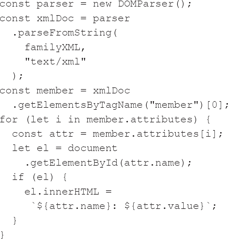
When we use JSON, though, this is the equivalent JavaScript:
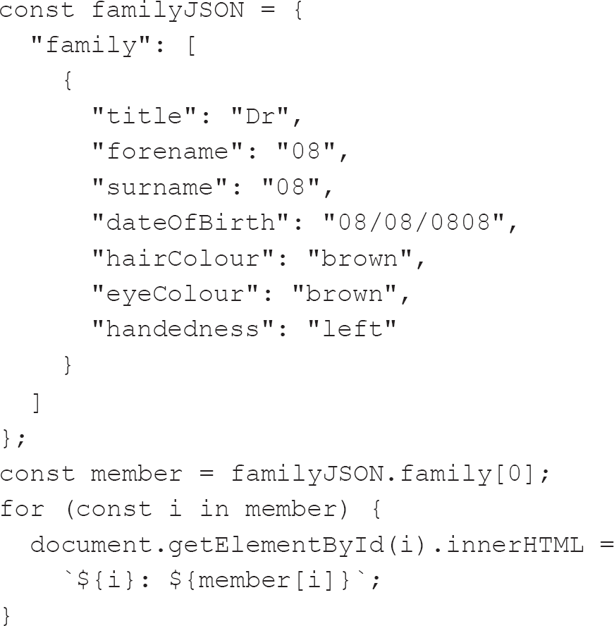
To get the member from the XML, we needed to invoke a DOMParser (W3Schools, 2020e) and then search it for the correct family member. Once we have the right family member, we then need to fetch its attributes and iterate33 over them to update the HTML. In the JSON example, we are lucky that families are small in comparison to other potential data sets. Care must be taken when looking through JSON as it is unordered, so it is always important to properly check that what you get is what you wanted. Iterating over the object (which did not require any extra parsing) is trivial using more modern JavaScript (Mozilla, 2020e) – so insignificant that I did not feel the need to check the intermediate attr variable and instead used the i variable.
This ease of use is at the heart of Wyse’s (2014) assertion that JSON is the preferred format because instead of having to navigate the tree that XML represents, we alternatively browse a map. While the map can be limiting (it is a truism to say that the map is not the territory (Lesswrongwiki, 2012)), Wyse goes on to suggest that limiting the developer is not a bad thing because it makes the code simpler, predictable and easier to read. That is certainly borne out by the code examples above. Further, there are fewer, if any, intermediary steps required for a JSON object to be converted into a native code object as it aligns itself to object-oriented programming concepts.
Both XML and JSON have their place, but more and more APIs seem to be moving towards the JSON format if they are not already using it. Even the popular MySQL relational database management system (RDBMS) now supports JSON natively, allowing it to be interrogated (though the syntax is a little obtuse – to my eyes at least).
I mentioned SQL and NoSQL when we looked at Agile methodologies earlier in this chapter, and I have just mentioned RDBMS, so let’s look at these in greater detail next.
Relational databases and SQL
A database is an organised collection of data. Like most of the subjects we have covered thus far, databases have evolved, but mostly they stem from the 1970s and the work of Dr Edgar F. Codd (1970), who proposed the relational modal. It was not until computer hardware became sufficiently robust, in the 1980s, that relational databases were widely adopted.
Before Codd did his work, databases used either the hierarchical or network models. In the former, the relationships between entities form a tree-like structure that, while simple, is inflexible, with each link confined to a one-to-many relationship. As an approach, databases gained further appreciation with the rise of XML – another tree-like structure – in the late 1990s. This led to the XML database, a type of NoSQL database (more of which later in this section).
Network-based databases, on the other hand, do not limit the relationships between entities to the one-to-many kind. Instead, they are far more flexible regarding links, with any entity able to have multiple parent and child entities.
The distinction between the two is interesting in that in hierarchical models, an entity can have a single parent, while in a network model, an object can have multiple parents. Looking at it another way, both use one-to-many relationships, but network models are less picky about which the parent is, and which the child.
A relational database must be traversed if it is to be queried, and the relationships between entities must be known. The relational model is currently supreme among databases, and, at its heart, it is all about storing like with like. In the data for the family example introduced earlier in this chapter, we have a table for individuals with a finite number of columns, each associated with a specific attribute of the family member, such as title, forename, surname, dateOfBirth, hairColour, eyeColour and handedness. We can present this using a table, as shown in Table 3.1.
Each column holds a specific type of data, and we tell the database what that is when we create it. Our data is contrived, but most columns would be of a string type, except for dateOfBirth, which would be of a date type.
What would happen, though, if we needed to store the addresses or the phone numbers of the family members? We could add further columns to the table such that there would be columns for each element of the address and the phone numbers, but we would be repeating ourselves as multiple people would have the same address. And suppose the family moved or the address was entered incorrectly for one member of the family – or, heaven forfend, a family member had multiple phone numbers?
Our data starts to get complicated when there begins to be a need for ‘normalisation’, a term first introduced by Codd (1970). Normalisation seeks to ensure that data is clean and reduces redundancy so that the same data is not held in more than one place.
It is likely that you will have to think about normalisation during your career, but perhaps not so much as you embark on your career. It is an important subject and something worth knowing about even if you do not use it professionally. Once it gets into your thinking, it is pervasive. I remember learning about it at college and thinking that it was just about the best thing ever. It just seemed such a neat and tidy way of organising data.
Table 3.1 How the family members could be stored in a database
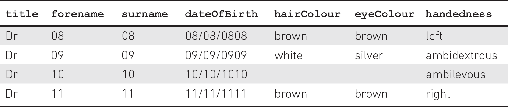
To interact with a relational database, we use Structured Query Language (SQL). There are many different dialects of SQL. As a language, it is not all that impenetrable as it uses English words which do what they suggest, such as select, update, delete and insert.
One thing that front-end developers need to be aware of is SQL injection attacks. In an SQL injection attack, a user replaces the data we are expecting with an SQL command. So, instead of getting a user’s first name, we might get, and subsequently pass to the back-end of our application, an SQL command which destroys our database. These attacks are why validation in front-end forms must always be supplemented by back-end validation. Another way of guarding against SQL injection, and a way of evening the field between different SQL dialects, is to use database abstraction layers34 or other language-specific interfaces and frameworks.
My favourite framework for interacting with MySQL is PHP’s Medoo (Lai, 2018), but that is primarily because a lot of my personal development experience has involved using the Linux, Apache, MySQL and PHP (LAMP) stack to create applications. Many of my current colleagues swear by Microsoft’s Language Integrated Query (LINQ) framework, and more recently Facebook’s GraphQL has gained popularity, with some hailing it as a replacement for Representational State Transfer (REST).35
REST was developed to correspond with the Hypertext Transfer Protocol (HTTP), the foundation of data communication for the World Wide Web. You will most often come across it when working with simple forms, when data can be sent to the back-end using the GET, POST, PUT, DELETE or PATCH methods. Being asked to describe REST is a favourite interview question, so it is worthwhile spending time familiarising yourself with the concept.
REST is primarily an architectural concept for decoupling an API from the client, whereas GraphQL is a query language, a specification and a collection of tools. Further information can be found in the article ‘GraphQL vs REST: Overview’ (Sturgeon, 2017).
We have looked at relational databases, the ways of structuring data within them and how to interact with the data within them. But there is an alternative called NoSQL.
NoSQL
NoSQL as a term dates to the opening years of the 21st century and originally came from a relational database which did not expose a standard SQL interface.
The creator of that database, Carlo Strozzi, suggested that the term ‘NoSQL’ should not be used. Instead, he suggested using the word ‘NoREL’ to describe databases which are not relational. Despite this suggestion, the name ‘NoSQL’ has become the de facto umbrella term for such databases.
NoSQL databases are difficult to classify as they can fall under different categories, but they generally belong to one of four basic types: key-value stores, document databases, wide-column stores and graph databases (I’m Programmer, 2020). What this means is that we can store the JSON representation of the family we had before in a NoSQL database and not worry about Dr 11 having multiple phone numbers.
Going into further detail about NoSQL databases without a specific context in mind would be something of a fool’s errand as, depending on your requirements and circumstances, you have multiple options available to you. I would therefore encourage you to do your own research into your specific use case.
NoSQL databases are cheaper to provision than relational databases as, when a relational database needs to be scaled up in size, it either requires more powerful hardware or must be distributed among multiple servers, and the handling of tables across different servers can be difficult. Some NoSQL databases are designed to be scalable from the outset, and the complexity associated with scaling is reduced. This focus on scalability means that they are also suited to utilising cheaper hardware. This use of more affordable equipment further reduces their cost, especially as some relational databases charge significant amounts for licences.
A further advantage of NoSQL databases is that the data is not structured. If the business requirements change regarding the data required, a traditional database might need to be re-architected to conform with the three normal forms of normalisation. In contrast, in a NoSQL database, it is possible to add new information to records on the fly.
The unstructured nature of the data has negatives too, though. Many developers spend years training their minds to understand normalisation and now do it almost subconsciously, with the result that they are very familiar with the SQL JOIN.36 NoSQL systems do sometimes lead to the issues normalisation seeks to address, with data being replicated unnecessarily.
TESTING
Testing will undoubtedly make up at least a small part of any interview you have for the role of front-end developer, so it is worthwhile spending time writing and implementing tests in even the most trivial examples of your code. We will take a brief look at this subject now, but do ensure that any code you submit as a part of the interview process has at least some basic tests.
Testing within front-end development can be split into three main areas: end-to-end testing, integration testing and unit testing. We will look at each in turn.
End-to-end testing
End-to-end (E2E) testing is also known as user interface (UI) testing, and this is where a good QA team member is worth their weight in gold, as they take the stress out of testing every aspect of the application when changes are made. This kind of testing is carried out to ensure that changes have not broken any part of the application (these are sometimes referred to as ‘breaking changes’). It is possible to automate some or all parts of E2E testing, using something like Selenium (https://selenium.dev), which can be scripted to interact with a browser window and await responses to actions before continuing. With the introduction of headless browsers,37 this process has been made much faster. It may well be that, if you have a QA person within your team, they will employ such automated testing.
Integration testing
Also known as functional or snapshot testing, this involves testing the interactions between different elements of your application, such as communication between various UI components or between UI components and the back-end of the application. It might even involve testing the UI component against something like the localStorage property38 or cookies.39
Unit testing
Unit testing involves testing components, methods or functions in isolation. Unit testing is by far the easiest way of testing and can be automated quickly and simply using a wealth of testing frameworks, such as Jest (https://jestjs.io).40 At its most basic, a testing script compares the result of a function with the expected result. Following is an example of a simple Jest test to check that a function which adds two numbers works as expected:
const sum = (a, b) => a + b;
test('adds 1 + 2 to equal 3', () => {
expect(sum(1, 2)).toBe(3);
});
Testing overview
While E2E, integration and unit testing make up the testing pyramid (see Figure 3.6), there are other tests you need to be aware of, such as testing CSS41 and page-speed testing.
There is some discussion about whether testing should be approached from the top of the pyramid or the bottom, with Stefano Magni (2019) arguing that rather than picking the low-hanging fruit by working from the bottom up, approaching testing from the top down might mean that you will avoid having to write integration and unit tests as you already know that the application is working. If an E2E test fails, though, the other tests are valuable in terms of pinpointing the cause of the failure.
Figure 3.6 The testing pyramid
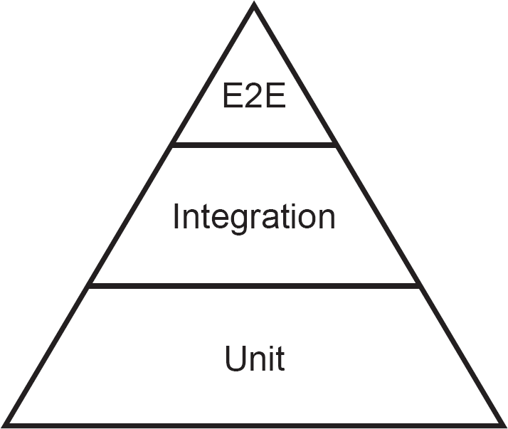
Along with others (e.g. Yerburgh, 2017), Magni also points out that the pyramid could be reversed in terms of time and effort required, with unit testing being easy and fast, integration testing being less easy and slightly slower, and end-to-end testing taking by far the most time and effort.
Speed testing42 is essential and can often be picked up during integration testing as the interactions between different parts of the application may highlight issues if there is a significant delay.
ETHICS
An additional benefit of developing the empathy I suggested earlier in this book (see Chapter 2) would hopefully be an enhanced sense of ethics. It might not be obvious why ethics is essential to front-end development, but it plays a massive part in what you will be doing.
We have an ethical responsibility to both our employers and our users to produce a quality solution, but there can be conflict within that responsibility. We will have honed and developed expertise in providing solutions to our users, but our employers may well choose to ignore our suggestions and ask us to create solutions which act against a subset of our potential users. For example, if we know that a colour scheme will make an application illegible to a subset of our users but our employer insists upon it, what should we do? We can point out that 1 in 20 Caucasian males are colour blind (Bailey, 2018) and that the business would thus run the risk of alienating 5% of its male market, but, given a directive to use the colour scheme, can we refuse?
Judging where your ethical concerns direct you to step away from a role can be difficult.
Morten Rand-Hendriksen (2018) believes that ethics should be a core component of web design and computer science in general, primarily because what we do has such a direct impact on our users. It can help significantly to personalise users by imagining someone close to you yet technically less adept using the application you are enhancing. After all, we hope that many users will use our work, so our audience could be huge! Even the smallest decisions we make have the potential to impact a significant portion of the population, so it is vital that we make the best choices we can.
The BCS Code of Conduct
One starting point for developing your ethical position is the BCS Code of Conduct (BCS – The Chartered Institute for IT, 2015).
Public interest
Of particular relevance to front-end developers is the section on public interest, which states that you shall:
a. have due regard for public health, privacy, security and wellbeing of others and the environment;
b. have due regard for the legitimate rights of Third Parties (the term ‘Third Parties’ includes any person or organisation that might be affected by your activities in your professional capacity, irrespective of whether they are directly aware or involved in those activities);
c. conduct your professional activities without discrimination on the grounds of sex, sexual orientation, marital status, nationality, colour, race, ethnic origin, religion, age or disability, or of any other condition or requirement;
d. promote equal access to the benefits of IT and seek to promote the inclusion of all sectors in society wherever opportunities arise.
As a springboard for developing your distinct ethical standpoint, you cannot ask for a better base, but do not merely follow these four rules blindly. Instead, examine them and try to put yourself, or those you care about, in the frame.
I like that BCS chooses to put ‘public interest’ above ‘professional competence and integrity’, ‘duty to relevant authority’ and ‘duty to the profession’ in its Code of Conduct, because public interest is the most crucial aspect of the work we do. The other areas should not be ignored, however.
Kostya Stepanov (2017) has written about his ethical standpoint. In not taking on a contract from a rival of an existing client, which cost him and his company $100,000, he took a laudable ethical stand. Thankfully his morals did not harm him in the long run, as you will see from reading the article, but there will be situations where acting ethically will have a harmful effect. What you choose to do in such cases is up to you, but I know from my own experience that avoiding feelings of guilt is almost as satisfying as altruism.
Professional competence and integrity
In terms of professional competence and integrity, again BCS has you covered with its seven guidelines. The Code states that you shall, as a member of BCS (although this advice applies equally to the IT profession at large, regardless of whether you are a member of BCS):
a. only undertake to do work or provide a service that is within your professional competence;
b. NOT claim any level of competence that you do not possess;
c. develop your professional knowledge, skills and competence on a continuing basis, maintaining awareness of technological developments, procedures, and standards that are relevant to your field;
d. ensure that you have the knowledge and understanding of Legislation (the term ‘Legislation’ means any applicable laws, statutes and regulations) and that you comply with such Legislation, in carrying out your professional responsibilities;
e. respect and value alternative viewpoints and, seek, accept and offer honest criticisms of work;
f. avoid injuring others, their property, reputation, or employment by false or malicious or negligent action or inaction;
g. reject and will not make any offer of bribery or unethical inducement.
Regarding only undertaking to do work or provide a service that is within your professional competence, learning by doing can be useful. However, do appreciate that sometimes it is appropriate to suggest a certain piece of work is carried out by someone else in the team if they are more skilled in the area and thus will be capable of doing the task much faster. Alternatively, you can ask colleagues for help to both up-skill yourself and ensure the work is completed promptly.
Duty to relevant authority
The next section of the Code deals with our duty to our relevant authority, with ‘relevant authority’ defined as most usually our employer or client. It states that you shall:
a. carry out your professional responsibilities with due care and diligence in accordance with the Relevant Authority’s requirements whilst exercising your professional judgement at all times;
b. seek to avoid any situation that may give rise to a conflict of interest between you and your Relevant Authority;
c. accept professional responsibility for your work and for the work of colleagues who are defined in a given context as working under your supervision;
d. NOT disclose or authorise to be disclosed, or use for personal gain or to benefit a third party, confidential information except with the permission of your Relevant Authority, or as required by Legislation;
e. NOT misrepresent or withhold information on the performance of products, systems or services (unless lawfully bound by a duty of confidentiality not to disclose such information), or take advantage of the lack of relevant knowledge or inexperience of others.
These are all quite straightforward instructions, and the first is something we should always strive to achieve. Taking pride in one’s work seems a quite straightforward ideal and is certainly something I hope I have illustrated in this book, even if it only relates to ensuring that your code is indented correctly.
One area not expressly covered by the Code of Conduct is that of employers clawing back training costs. Many employers now ask for repayment if you leave soon after completing a course or training. For instance, PRINCE2 training costs more than £1,000 and involves a significant investment of time both from yourself and your employer. Any time you need to take off to study can become quite expensive for your employer too. This investment of time and money means that your employer might be able to pursue more lucrative contracts, but it also makes you significantly more employable. Would it be fair to leave directly after finishing the course and getting your certificate? I would suggest that you should spend some time justifying your employer’s investment by continuing to work for them for a while. However, if you decide to leave, be aware that an employer can only ask you to repay training costs if it has previously been agreed that you will do so (Citizens Advice, 2018). Many contracts now include such a provision, so please do check.
Duty to the profession
The final section of the Code details your duty to the profession, saying that you shall:
a. accept your personal duty to uphold the reputation of the profession and not take any action which could bring the profession into disrepute;
b. seek to improve professional standards through participation in their development, use and enforcement;
c. uphold the reputation and good standing of BCS, the Chartered Institute for IT;
d. act with integrity and respect in your professional relationships with all members of BCS and with members of other professions with whom you work in a professional capacity;
e. notify BCS if convicted of a criminal offence or upon becoming bankrupt or disqualified as a Company Director and in each case give details of the relevant jurisdiction;
f. encourage and support fellow members in their professional development.
On the sixth point, I would hope that encouraging others to develop professionally will eventually lead them to join BCS. By acting as a positive example to others, you will foster in them an appreciation of the professionalism of the IT industry and the professional framework offered by BCS.
SUMMARY
We have covered a considerable number of subjects in this chapter, all of which are worthy of far, far greater exploration. By a long way, the most critical technologies you need to be comfortable with are HTML, CSS and JavaScript – you will likely be able to pick the others up along the way. The quantity of information available to you when it comes to learning these methods and techniques is almost limitless, and your employer will doubtless have preferred sources of such learning. Ask your employer and your friends and colleagues about relevant resources and how they learnt, and you should be well set.
1 Serverless infrastructure does not imply an absence of servers, but instead means that the servers are managed by a provider who manages the resources required by the server.
2 Lean Startup is a way of developing products in an iterative way. It involves investigating and experimenting with solutions and subsequently rigorously testing those solutions in order to inform the development of the next iteration of the solution.
3 Answers to queries might be found by taking a ‘best guess’ approach, or the queries might even be answered by human agents, rather than developing a back-end infrastructure.
4 A concept whose first known iteration came from Heraclitus in about 500BC.
5 Acceptance testing evaluates whether the system is compliant with the requirements of the business and is carried out before the system is released for delivery to the end users. It is most often carried out by the product owner.
6 MDN Web Docs has an excellent article on the developer console and the other tools available within a browser (Mozilla, 2020j).
7 There is a fascinating discussion of this issue on Stack Overflow (see Stack Overflow, 2019). The first answer is particularly enlightening.
8 Required indicates that the input must have a value. It works with the following input types: text, search, url, tel, email, password, date pickers, number, checkbox, radio and file.
9 Checked indicates whether the input is pre-selected. It works with the following input types: checkbox and radio.
10 Disabled indicates whether an input is disabled and will prevent its submission to the form handler. It can be useful to ensure that a previous condition has been met before allowing input.
11 Semantics is all about the meaning of words. If a form is well structured semantically (e.g. with form inputs organised into groups which make sense), then it is far easier to understand what is required. This is best illustrated by thinking about forms that ask for an address. They usually have a structure which asks for First Line, Second Line, City/Town, State/Province/Region, Zip/Postal Code and finally Country. This semantic grouping is something you will doubtless see frequently, and placing a Phone Number input between any of the above inputs would be semantically jarring.
12 A software agent is a program that acts on behalf of a user, such as Alexa (Amazon), Cortana (Microsoft), Siri (Apple) or Google’s Assistant.
13 A light grey colour.
14 Display specifies the display behaviour of an element. Refer to W3Schools (2020a) for more information.
15 In CSS settings, the clear property specifies on which side of an element floating elements can float.
16 A polyfill is a plugin or piece of code that provides the technology that a browser should provide.
17 Though not in Internet Explorer 11.
18 The ratio of the width to the height of an image. It is expressed as two numbers separated by a colon such that an image with an aspect ratio of 16:9 describes proportions which are 16 units wide and 9 units tall (the actual units do not matter in a ratio).
19 Gimp is an open-source image editor and alternative to Photoshop.
20 SMIL (pronounced ‘smile’) stands for Synchronized Multimedia Integration Language.
21 Multipurpose Internet Mail Extension (MIME) is a standardised way of classifying file types on the internet. It is made up of two parts: a type and a subtype separated by a slash.
22 This can be confusing, but we count digits including 0.
23 Like normal bar charts, stacked bar charts use bars to show differences within categories of data but are further made up of segments which represent different parts of the whole bar. For a more detailed explanation, see the article ‘Understanding Stacked Bar Charts: The Worst or the Best?’ by Vitaly Radionov (2017) who suggests that they can be concise and easy to read in comparison with some other ways of displaying similar data.
24 The GD Graphics Library can be used to dynamically create and manipulate images on the server.
25 A server log records all activities that have an impact on the back-end of the application. It can be conceived as being like sonar: echoes of what the user does are reflected within the server log. JavaScript tagging, however, offers a more accurate picture of what the user is doing, almost as if you can peer over their shoulder as they interact with the application.
26 Snippets of JavaScript that collect data and send it to an analytics service from the website in which it is embedded.
27 A web template engine enforces the presentation of each page within an application. Each page will have a similar look and feel while the content of each area is different.
28 Though primarily used to encode binary data, base64 can also be used to encode other data. It uses a different number base from decimal to encode data, such that the string ‘Hello World’ would become ‘SGVsbG8gV29ybGQ=’. It can be useful when transferring data because it removes spaces without encoding them – for example, encoding ‘Hello World’ results in ‘Hello%20World’ using traditional encoding.
29 A state management pattern is logic which keeps track of the data within an application to perform a function, such as disabling submit buttons unless all required fields are filled in within a form. There are many options available to developers, but many frameworks have their preferred solutions.
30 Lazy Loading addresses the concern mentioned in the text. Rather than there being a need to load multiple single pages, routing allows all the resources required for multiple pages to be loaded at once. Thus, duplicate resources such as HTML (for elements which will not change during the application lifecycle, such as headers and footers) and CSS need load only once. This does mean that the initial load can be larger, though, as the business logic for all pages must be downloaded. One way of addressing this is for the page to automatically download those specific parts of the application only when they are required using Lazy Loading.
31 Open questions are those which cannot be answered by simply saying ‘yes’ or ‘no’ but invite a richer response. They can be very useful but difficult to categorise. Closed questions have a pre-determined set of possible answers (such as ‘yes’ and ‘no’).
32 Such challenges can also be called ‘transitive challenges’, and in this instance they might not be picked up at the end of the process. If someone finds it difficult to interact with a process but is pleased at the conclusion, then often the challenges are forgotten as a result of the relief of completing the process.
33 In computer programming, ‘iteration’ is the act of repeating a set of actions. In the example above, we would repeatedly examine each family member until we reach the end.
34 A database abstraction layer provides an interface between a computer program and a database. Traditionally, different databases accept slightly different commands. The database abstraction layer provides an identical interface without the developer needing to learn a different database dialect.
35 MDN Web Docs has a concise introduction to REST (see Mozilla, 2019h).
36 A JOIN clause within SQL is used to combine rows from two or more tables based on the related column between them.
37 A headless browser is a browser without a graphical user interface. The HTML and other elements exist but are not displayed so there is far less of an overhead in terms of testing the application as the headless browser can be controlled via a script.
38 Data which is stored within the browser and is persistent between sessions so that data stored can be accessed by the application the next time it is run. It is a relatively new technique and used to be limited to cookies.
39 The first type of local storage, cookies are stored in small text files and can be read by the application. They are often added to any requests made by the application to the back-end.
40 Described by its makers as a ‘Delightful JavaScript Testing Framework’, it was developed by Facebook and is primarily used for testing React applications, but it can test all JavaScript.
41 CSS testing is introduced very well by Chris Coyier in the article ‘Automatic CSS Testing’ (Coyier, 2015).
42 Google provides a tool, called PageSpeed Insights, which can help with some initial testing (https://developers.google.com/speed/pagespeed/insights).