
2 TOOLS OF THE TRADE
In this chapter, we will examine the primary tools you should be aware of and familiar with as a front-end developer.
PRIMARY TOOLS
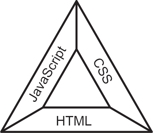
Fire is only possible if oxygen, heat and fuel are present. Similarly, in order to have some measure of professional competence, the front-end developer must have some degree of familiarity with each of the following three technologies: Hypertext Markup Language (HTML), Cascading Style Sheets (CSS)1 and JavaScript. These form the front-end developer triangle, pictured in Figure 2.1. This first section of the chapter details each of these technologies in turn.
To properly understand the importance of HTML, CSS and JavaScript, some understanding of browsers is required. All browsers share similar functionality in that they:
Figure 2.1 Front-end developer triangle
• Fetch data: a dedicated network layer fetches data from web servers via the internet.
• Process data: the network layer passes the data to several processing subsystems.
• Display data: once processed, the data is displayed to the user.
• Store data: some information needs to be stored, and several mechanisms are available for this purpose.
Further, the processing and display of the data can be broken down even more:
• The rendering engine: generates the render tree from parsed HTML and CSS.
• The JavaScript engine: reads and converts into machine code any JavaScript present.
• The UI back-end: ‘paints’ the product generated by the rendering engine.
The first of these, the rendering engine, is where the first two of our three technologies – HTML and CSS – are processed. The HTML is parsed to create the document object model (DOM) tree, while all CSS is parsed to create a CSS object model (CSSOM) tree. The DOM and CSSOM trees are then combined to generate a render tree, which represents a tree of styled DOM nodes. It is at this point that the browser knows where things should appear on the device displaying the processed data – that is, where items should appear on the rendered page. A rather gruesome analogy would be between a skull and a face: on its own the DOM represents the skeleton of what we will eventually see. It is only when we add the musculature, flesh and skin represented by the CSSOM that the final figure becomes clear. The render tree is not presented to the UI back-end in one chunk of data; instead, the rendering process passes processed data piecemeal, as and when the networking layer has fetched the data and the data has been processed; thus, the UI back-end optimistically paints the contents of the page as they are processed – it takes a best guess at rendering the content, which can sometimes mean that the layout changes as more HTML and CSS is processed.
JavaScript can interrupt the rendering engine if it is contained in an inline script element within the HTML, at which point the JavaScript engine executes the JavaScript before again allowing the rendering engine to continue with its work.
Should the JavaScript element have a reference to an external file, then the JavaScript will be fetched by the networking layer. Once it arrives, it will be processed by the JavaScript engine. Once the JavaScript engine has finished processing the retrieved JavaScript, the rendering engine continues parsing the rest of the HTML.
There are significant benefits of having the script inline as there is less of a delay to the rendering engine if the JavaScript requested is already within the page and does not require fetching. However, JavaScript files can be large and so it is now the common preferred practice for external JavaScript files to be referenced at the bottom of the page to allow the rendering engine to get on with its primary task without interruptions.
You might be wondering why the JavaScript engine can interrupt the vital business of the rendering engine. This delay is required because JavaScript can be employed to interact with the DOM and CSSOM of the page. In such cases, there would be little point parsing and rendering HTML and CSS as it might then be affected by the processed JavaScript. In other words, it makes sense for the browser to give priority to JavaScript over HTML and CSS – though it is worthwhile noting that CSS can block the JavaScript engine, as the browser understands that the JavaScript can alter the CSSOM, so it will need to be in place before the JavaScript can interact with it.
This is a simplistic overview of how browsers work. There are different types of browser, and they all have slightly different ways of working with HTML, CSS and JavaScript.
Ensure you place your JavaScript just before the closing body element of any pages you create so that the HTML and CSS are processed and rendered without any delay caused by downloading and processing JavaScript. This will also ensure that any JavaScript that alters either the DOM or the CSSOM has something to work with.
HTML
For the front-end developer, HTML (Hypertext Markup Language) is both the canvas and the paint which we use. If we have no understanding of the medium in which we work, we are left not being able to use all the tools we have at our disposal, and that would be a waste, as HTML is a remarkable language.

When I began learning systems analysis and design, the tutors on my course asked about languages we had used and all sorts were mentioned, such as Pascal, C and C++, and I think there was even mention of C#. I admitted I knew nothing to any great depth, as I had been a practising nurse, but I do remember the subtle chuckle which was prompted by someone answering ‘HTML’.
At the time I did not clock the issue, which is that HTML is not classed as a ‘proper’ programming language and is instead seen as a markup language (although I am pretty sure my lecturers said that it was a valid answer). A markup language is one in which information has structure. The markup allows the device rendering the information to receive hidden instructions regarding its layout, without those instructions generally being seen by the reader. I didn’t know enough to argue, but I did remember my wife of the time coming back from university some time previously and waxing lyrical about this new technology called HTML, and the opportunities it offered for exploring language in the context of literature (she was undertaking a combined English and women’s studies degree).
So, I went off and tried to learn it myself and got distracted by its precursor – XML – and down I fell, lost in the rabbit hole.
Initially developed by Tim Berners-Lee in 1989 while he was working at CERN, HTML was designed to allow academics to share papers on the early internet, having roots some 20 years further back.
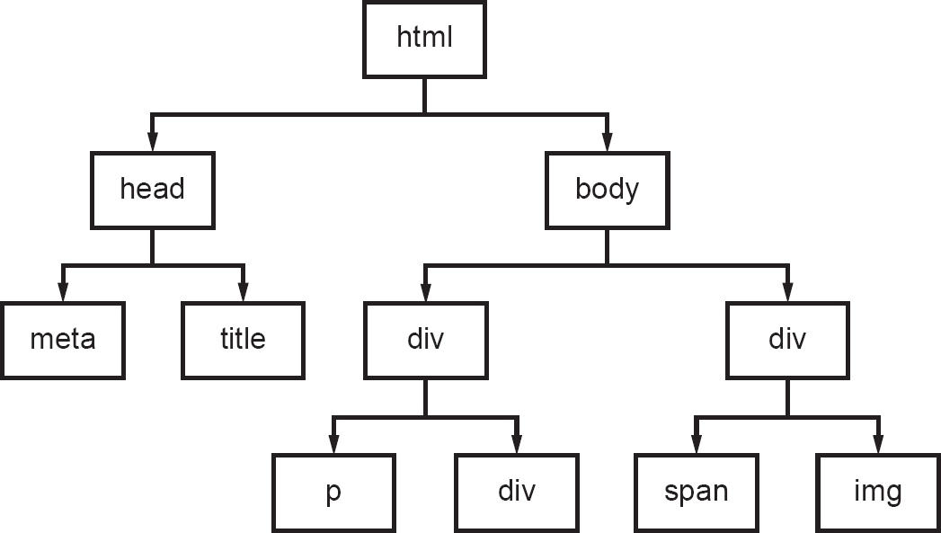
I mentioned the DOM tree earlier, but how should we imagine it? You can try to imagine it as a real tree, though that is not entirely appropriate, as it’s more of an inverted tree or the root system of a tree – a sort of organogram, hierarchy or family tree (as shown in Figure 2.2). In this way, a DOM tree can be represented as a sort of branching structure with elements spreading out to many ultimate termini. Each part or node of the page represents an element within a hierarchy.
HTML is the trunk which encapsulates the boughs; the boughs then encapsulate the branches, the branches encapsulate the twigs and the twigs encapsulate the leaves.
The trunk of the tree that is any web page is the html element (the markup is made up of ‘elements’, but you will also see them referred to as ‘tags’). It is the most crucial part of a web page but also the part most often ignored. It is primarily important because along with the document type definition it tells the browser how to interpret the contents of the page.
Figure 2.2 A simple DOM tree
A document type definition (DTD) is a document that defines the structure of the HTML document – the web page or application – and any associated rules. It was primarily important in documents written before HTML5 (the most recent version of HTML at the time of writing), as they were based on an older language called Standard Generalized Markup Language (SGML) and were invalid without a DTD.
The DTD is referred to in the very first element of an HTML document, even before the html element. Before HTML5, it contained four declarations:
• the root element – for HTML documents this would be html;
• the type of DTD to be referenced – usually PUBLIC in the case of HTML;
• the formal public identifier (FPI) of the DTD – used to identify a specification uniquely;
• the final part, the uniform resource locator (URL) – the location of the DTD.
You will likely only ever see this form of doctype element, rather than being asked to write HTML in anything other than HTML5. HTML5 is no longer related to SGML and so has one declaration, as you can see in the skeleton code below. It is important to understand the other forms of doctypes, though, as this will allow you to understand what previous developers were aiming to produce when you look over their work.
There are only two boughs coming from the trunk represented by the html element, but everything else hangs from those two boughs. They are the head and body elements.
Traditionally, the body is where most of the content of the web page resides, with the head element being something of a stub, usually only used to provide information for the browser and tell it where to get any CSS associated with the page and to hold other metadata (data about data). Metadata is not displayed to the user, but the head element also contains the title of the document, which is presented to the user within the tab of the page. Metadata can tell the browser which character set the document should use as well as a whole list of other information, such as the keywords for search engines and information about the author of the page.
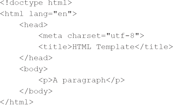
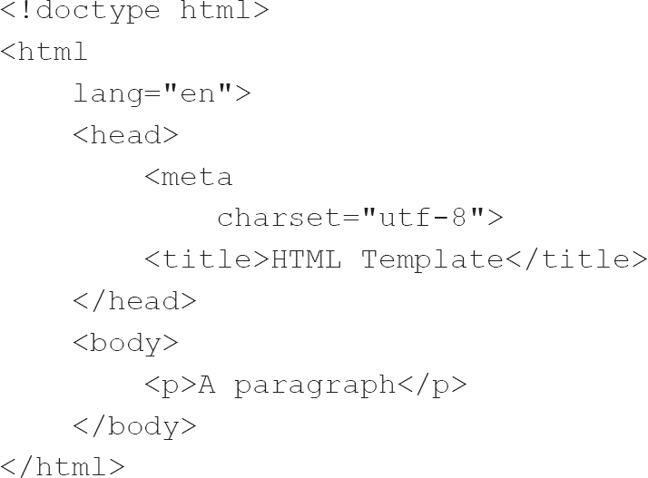
At its most basic, this suffices as an HTML page:
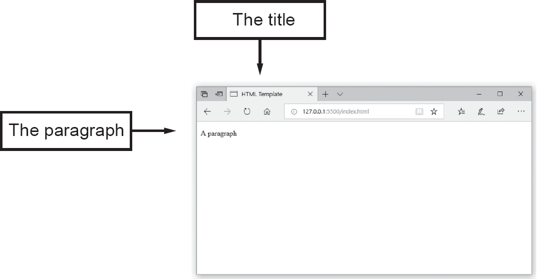
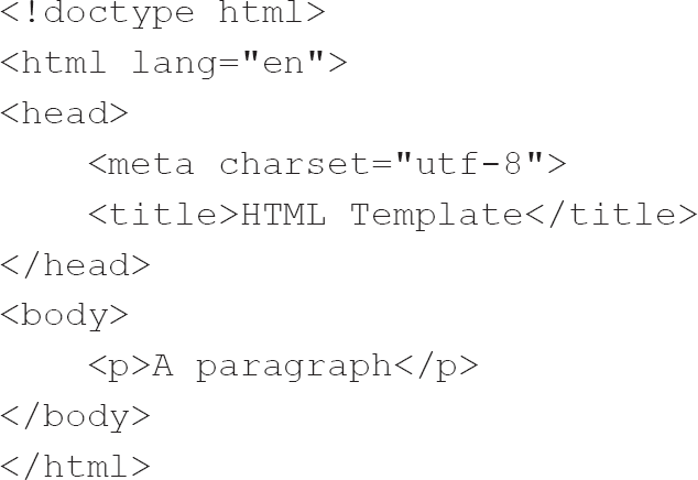
Producing this within a browser gives the result shown in Figure 2.3.
Figure 2.3 A basic HTML template reproduced in a browser
We have talked about elements but what do we mean by that? Let’s flesh out the HTML above.
Anatomy of HTML
HTML elements are simply one or more characters surrounded by angle brackets. When we look at the content of the body element above, we can see a paragraph element (p) with some text within it. The text is the content of the element and is surrounded by an opening tag and a closing tag – we know it is a closing tag because it has the slash character (/) preceding the name of the element.
As we can see from the HTML above, elements can contain other elements in the same way that the html element contains the body element and the body element includes the p (paragraph) element. Further, all HTML elements can have attributes. We will now examine these structures a little more.
Attributes The example above is quite simple, and the only elements which have attributes are html and meta.
If we go back to the tree analogy, we have a set of nested containers (tree, bough, branch, twig and leaf), but what if we want to say something that is a quality of the containing element? HTML borrows a mechanism from XML and uses attributes. Attributes such as lang in our opening html, or charset in the meta element, tell the browser that we are presenting it with an HTML document written in English (en) using the utf-8 character set. Here we say that the html element has the name of lang and the value of en and the meta element has the name of charset with a value of utf-8. As you can tell, attributes are most often made up of name–value pairs, but some attributes simply have a name.
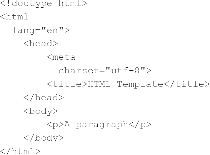
The code below is the same as the example above but with different formatting: the attributes are displayed on new lines underneath their elements. Such formatting can be make the parsing of markup easier, especially if there are many attributes and also if the document is very long and complex. I use similar formatting myself as it makes navigating the code much simpler and allows me to see at a glance the attributes and their values.
Attributes are vital to HTML. They are one of the more powerful parts of the language, and there are even some elements which have little or no use without attributes, most notably the img element, which embeds an image in the HTML (images are discussed later in this chapter). Most attributes have a value, while some affect their element merely by being present (W3C, 1991).
Indentation Looking back at the code above, within most editors, you will see the same structure formatted like this:
This formatting places the head and body elements at the same level of the hierarchy as the html element, but this misrepresents its philosophical importance within the structure. Another thing to note is the indentation, and this is something every developer will appreciate. Improperly indented code is unhelpful and can lead to mistakes, and even the method of indentation can be problematic.
An exciting revelation from the Stack Overflow 2017 Developer Survey was that there are financial implications associated with the choice of indentation (Robinson, 2017). The results of the survey showed that those developers who care little about the mechanism of indentation – those developers who, so long as the indentation ‘looks’ correct, are happy to use a mixture of tabs and spaces – earn less than those who are consistent with their method of indentation, be it tabs or spaces. It might be supposed that the lack of consistency this approach represents raises concerns among employers.
When we look at the markup code above, we can parse it merely by scanning down the page; we see the vertical wave, and that wave becomes increasingly complex the more extensive the document and the higher the number of nested elements.
What happens when we put many attributes on the same element? Depending on the editor or integrated development environment (IDE) used, there will be some line breaks or lines will break out of the nominal 80-character limit, or even off the side of the screen. The 80-character limit is historical and arose from the original width of the IBM Punch Card (Coster, 2012), but it is worth bearing in mind as, even though it is arbitrary, it is a convention.
One way of solving this issue is to use the same indentation for the attributes of the element as is used for the children of that element (i.e. those elements which are contained within it in the hierarchy). However, personally, I find that aesthetically unpleasing in that it misrepresents the hierarchy. Such a form of gross indentation is what I have illustrated above, but the jarring gap between the html and meta elements and their children does not help with understanding the visual flow of the markup. Instead, I prefer to use two spaces between the start of the element and its attributes so that there is a subtler distinction and then use four spaces between nested elements. Thus the above snippet could be presented like this:
Such indentation is going overboard, though, and is not required unless lines are likely to break the 80-character limit.
This approach to indentation is one of the preferred HTML line-wrapping styles in the Google HTML/CSS Style Guide (Google, 2018). Reading style guides can be worthwhile, not least because they generally offer justification for the decisions made; such arguments can inform your practice.
Structure of HTML
We now understand the nature of HTML elements, so next we will look at some common elements which you will see as a front-end developer. In the example we have been looking at above, we only have two elements with any substance, the title element and the p (paragraph) element.
As mentioned earlier, HTML was first used to share academic papers over the nascent internet. Its primary purpose was the display of written information, so it makes sense that Tim Berners-Lee shortened the paragraph element to a single p. In text rich documents, this is likely to be used extensively.
I have noted that HTML elements can contain other elements and that those elements, such as the p element, can contain further elements, such as span elements (see below). Such nesting allows children to inherit behaviour and styling from their parent elements.
A full discussion of all the elements of HTML is beyond this book, but a simple examination of the basics follows.
Headings HTML provides six levels of heading (h1 through to h6) for use in the separation of content in much the same way as headlines are used in newspapers to attract the attention of the reader or describe the content, and lower levels of heading are used to highlight less important content. The h1 element is used for the primary heading, and, in much the same way as there is only ever one main newspaper headline, an HTML document should only have one h1 element. Each browser will display them in similar ways with increasingly smaller text but all in bold text and with margins.
Division The division (div) element is the primary container for other elements and can contain any other text or HTML element. It is a block-level element, which means that by default browsers place a line break before and after the element. A div element commonly has an id attribute, which allows it to be identified for CSS styling or JavaScript manipulation. Such id attributes must be unique within the page to ensure that the target is individual. Should you wish to target multiple elements, then the class attribute does not have the same restriction of uniqueness. Both id and class can be present in an element’s opening tag.
Span Unlike the div element, the span element is displayed inline with no break above or beneath by default. The span element typically contains short pieces of text or other HTML elements which need to be separated from the main body of the containing element.
Other inline elements Like the span element, there are two further inline elements which can separate content from the containing element but are primarily used for styling text. These two elements are the em (standing for ‘emphasis’) and strong elements. The em element generally renders its child text as italic, and the strong element presents it as bold. A further inline element is a line break (br), which is used to force a line break within the body of the text. The br is one inline element that does not have to include a closing tag.
Lists Lists allow the display of information in one of two ways, either through the use of a numbered list (using an ol element) or through the use of bullets in no particular order (using a ul element). Each type of list contains a set of items identified using the li element. The usage of the ol and ul elements is similar but different: you can think of the li elements of an ol element being a sequence and the li elements of the ul as a set of elements in no particular order. The choice of whether you use a ul or ol is dependent upon whether or not the order of the child li elements is important.
Images The img element is one element that relies upon its attributes. The img element is self-closing in that it has an opening tag but no closing tag; instead, it has a slash preceding the final angle bracket. The img element must have a source (src) attribute set to the URL of an image. This example of a simple img element is taken from MDN Web Docs (formerly Mozilla Developer Network) (Mozilla, 2020f):
<img src="mdn-logo-sm.png" alt="MDN" />
Here we can see that we are asking the browser to display an image saved as ‘mdn-logo-sm.png’, which is in the PNG (portable network graphics) format. Further, the image has an alternative attribute (alt) of ‘MDN’, which will be displayed if the image link fails or the image has not yet been retrieved.
The alt attribute, along with some other attributes, such as title and longdesc, is essential for users who have visual impairments, but do please check the MDN document for further aids to accessibility (Mozilla, 2020f). Along with these standard HTML attributes, the Web Accessibility Initiative has developed some Accessible Rich Internet Application (AWI-ARIA or ARIA) attributes, which warrant far greater discussion than can be provided within this book.
While I prefer to make both img and br elements self-closing, HTML5 has removed such directives, and you will see them both with and without a slash before the final angle bracket.

Another element which, in my opinion, warrants self-closing is the input element, but this is again a stylistic choice. We will examine input elements in far greater detail in Chapter 3 when we examine forms but, as might be surmised from their name, they allow users to enter data in an application. I prefer these elements to be self-closing as it merely feels more complete.
Opinionated practices are rife in all areas of development and throughout human endeavour. If you do not agree with mine, please develop your own, but do bear in mind that you are signing your work whenever you do.
Videos We are now no longer limited to displaying images within HTML documents and can make use of videos. They share the src attribute but are not self-closing as their text content is presented to the viewer if the format of the video is not supported or if the video fails to load, acting a little like the alt attribute of the image. Videos can also have width, height and controls attributes, with the controls attribute defining whether or not the browser should display video controls such as ‘play’ and ‘pause’.
HTML summary
The above are some of the most common HTML elements. There are many more and their number is increasing, so do keep abreast of developments. A wider discussion of HTML is beyond the scope of this book, but do spend some time reading around the subject – it is fascinating.
As you journey through your career, you will start to appreciate that there are many ways to accomplish the same thing. Despite the constant trend towards managers being desirous of conformity, individual developers all have their style.
I have had opportunities to appreciate this, especially when seeking out a developer in a team to ask for clarification. I often find that I know just whom to approach because I recognise their style of coding.
In terms of where your HTML will be displayed, it must be noted that trends are always in a state of flux, with screen sizes increasing on the desktop but fluctuating massively elsewhere. As such, we must take a little time to think about the users’ journey and navigation around our work. We cannot trust that keeping the user limited to a screen height will allow even the most straightforward headline to be displayed appropriately – we might have banners or menus at the top of the screen which will make the headline appear out of the current view when the page loads.
CSS
In this section, we will examine Cascading Style Sheets (CSS). To borrow an analogy from the military: when an officer tells you to jump, it is the sergeant who tells you how high. In this case, the HTML is an instruction to the browser (the officer) and the CSS is the modifier which details the presentation of the direction (the sergeant). Put another way: the HTML is the structure and the CSS details how the structure should be presented.
While HTML deals with the structure and content of the page and allows some limited formatting of that data, using HTML on its own offers very little control over that formatting. Each browser implements limited styling using its built-in stylesheets, called ‘user agent stylesheets’ (Meiert, 2007), but each browser manufacturer has slightly different thoughts about how specific elements should be displayed. No plain HTML file is presented in the same way in different browsers, and sometimes not even between different versions of the same browser.
Tim Berners-Lee and others initially saw HTML’s lack of formatting control as a good thing because HTML was deemed to be a language for the publication of documents on the internet and nothing else. Abilities that were available in word processors of the time were not supported – changing the typeface, colour or any other aspect of the presentation was not possible.
While it may have been enough for academics to have minimal control over the final rendering of a page, the web was becoming more popular. Businesses and designers were far more conscious of their image, preferring not to let software manufacturers dictate how their presence on the web be displayed.
The original specification of CSS was called ‘Cascading HTML Style Sheets’ (Lie, 1994), suggesting that it might be used in other markup languages. Along with the control that CSS offered in conjunction with user agent stylesheets, it was thought that the user might want to dictate how the page would appear and override the user agent stylesheet2 and the author.
Once it had been standardised, CSS quickly took off as a way of styling HTML documents.
Anatomy of CSS
CSS works by breaking up styling declarations into rules, with each rule consisting of a selector and a declaration block. What that means in practical terms is that each element in an HTML document can be selected and rules applied to that selector. A selector can be a common element such as a single paragraph (p), a subset of all paragraphs with a specific class or a particular paragraph identified with a unique id attribute. The following rules, for instance, target all paragraphs, paragraphs with a class (emphasis) and a single paragraph (with the id of recently-deleted):
p {
color: red;
}
p.emphasis {
font-weight: bold;
}
p#recently-deleted {
text-decoration: line-through;
}
In the example above, we can see that a period indicates a class and a hashtag indicates an id. To go a little deeper, we are saying that all p elements should have a color of red, those p elements which have a class of emphasis should have a font-weight3 of bold, and the p element with an id of recently-deleted should have a text-decoration of line-through.
Note that you will be unlikely to see such specific selectors when you examine CSS files, as it is unusual for the selector to be so precise.
This HTML illustrates the concept:
<p>This should be red</p>
<p class="emphasis">
This should be red and bold
</p>
<p class="emphasis"
id="recently-deleted">
This paragraph should be
red, bold and there should
be a line throught it.
</p>
The CSS declaration block is made up of one or more declarations, which are property–value pairs separated by semicolons enclosed within braces. To return to our military analogy, the order to jump is the property, but the value is how high. To return to the HTML tree analogy in the previous section, the CSS tells us how the tree should look – the shade of the leaves and the texture of the bark, if you will.
In the CSS example above, we are targeting all paragraphs with a class of emphasis in our second rule. However, if we wanted all heading elements with a class of emphasis, we would need to duplicate the rules for each heading element (h1, h2, h3, h4, h5 and h6). Rather than duplicate the same rule for similar classes, we can instead select all elements with the class of emphasis by removing the p from the declaration, thus making our rule less targeted:
.emphasis {
font-weight: bold;
}
To return once again to our tree analogy, the DOM represents one tree whereas the CSSOM represents a similar tree which mirrors some or all parts of the DOM tree. According to the analogy provided earlier, HTML is the skull and CSS is the flesh and skin that sit atop the skull.
The cascade
The term ‘Cascading Style Sheet’ warrants exploration. ‘Style Sheet’ suggests an external document separate from the HTML document, but this is not always the case: CSS can be an external document referred to in the head of the HTML document using a link element:
<link rel="stylesheet" type="text/css" href="style.css">
Here we see that the link element has three attributes:
• the rel attribute, which specifies the relationship between the current document and the linked document (the example above tells the browser to create a link between the document and a stylesheet);
• the type attribute, which instructs the browser to expect that the stylesheet will be in the media type of text/css;
• the href attribute, which specifies the URL of the document.
Alternatively, it is possible to embed the CSS within the head element of the HTML within a style element. Putting a style declaration within the head increases the size of the initial document, though, and if you wish to use the same styles in different documents, you have to duplicate the style element. This means that if a style needs to be changed, all instances of the style element must be edited.
CSS can also be used directly in the element using a style attribute:
<p style="color: red; font-weight: bold;">
This should be red and bold
</p>
This kind of use of CSS is called ‘inline CSS’. It can be useful, but it loses many of the advantages of CSS, as it mixes the content with the presentation. It should therefore be avoided or used sparingly.
I recently came across a problem where I had to add CSS dynamically via JavaScript in order for a matrix to change dimensions. This was unavoidable, but it was limited to only those aspects which would change, as the main style was dictated in an external CSS file.
We have looked at the three ways of including CSS because doing so illustrates the term ‘cascading’. The final styling for a document depends on where the rules are: external, internal (within a style element) or inline. The source matters: inline styles have precedence over external and internal styles, and internal rules have greater priority than external styles. Further, rules loaded later have precedence over earlier rules; this means that if rules are loaded from multiple external sources, then the final source referenced within the head takes precedence. That is to say, if we load two external stylesheets with different rules for styling a specific element, the last takes precedence over the first.
There are further principles regarding the specificity of the rules, with more specific being applied over generic rules. To expand on this further: if we have multiple elements all styled a specific way but one has a class, then styles associated with the class will be applied rather than the generic styling. We saw an example of this when we looked at the styling of three paragraph elements earlier.
Chaining or extending
At the beginning of this section we looked at an example of adding an emphasis class to some elements, but what if we wanted to make one of these elements italic as well as bold? We could write a new CSS rule called emphasis-italic or instead create another class called italic. This distinction illustrates the difference between chaining and extending a class; instead of extending the emphasis class to style the text italic, we instead chain another class which makes the text italic.
Using the modular technique of chaining means that your CSS codebase is kept clean, and you can give your classes names that are appropriate to what they do, which makes it easier to keep track of them. It can cause something called ‘class madness’4 – but in practice it is easy to maintain such a naming system, and it might be something you’ll thank yourself for later.
Extending classes makes for far more readable and clutter-free HTML, but the CSS can become much more cumbersome. Sarah Dayan (2018) offers some thoughts about the issues of chaining and extending extensively, with examples and arguments for and against each approach. Whichever you choose, it’s important to understand both and to implement them consistently and sensibly. I appreciate a well-named class that tells me just what it does, be that an element having a class attribute having a value of emphasis-italic or emphasis and italic. To give an example in code, this shows how to extend a class:
<div class="emphasis-italic">Some bold and italic text styled by extending the emphasis class</div>
Whereas this shows class chaining:
<div class="emphasis italic">Some bold and italic text styled by adding two separate classes</div>
CSS toolchain
Modern CSS can be written in other dialects, such as Stylus or Syntactically Awesome Style Sheets (SASS). There are many such dialects that promise to make writing CSS more manageable, though there is something of a learning curve involved and recent changes to CSS (such as custom properties – sometimes referred to as ‘CSS variables’) are making their use less relevant. These dialects are called ‘pre-processors’, and once they have outputted the desired CSS it is often piped through an auto-prefixer5 post-processor, to ensure that even though the developer has written CSS3,6 it will work across all browsers which support the CSS module.
These steps between the writing of the original CSS in a dialect and the final CSS lead to the term ‘toolchain’. The dialect is converted into idealised CSS, which should work in a world of standards-compliant browsers, and then the relevant prefixes are added. Sometimes, too, whole new rules are written for specific features on older browsers (for instance, Internet Explorer 11 has an older implementation of grid layout, and some auto-prefixers are smart enough to generate the appropriate CSS for you). This multistep process is known as a toolchain, and we will learn about other toolchains when we explore JavaScript later in this chapter.
CSS measurement units
To an extent, there are two general types of CSS measurements: those which are characterised as fixed and those which are characterised as relative. There is significant debate about which kind is preferred among developers.
Absolute units We have absolute (sometimes also called ‘fixed’) units of measurement, such as cm, mm, Q, in, pt, pc and px. But even these can be different across devices:
• cm is a measurement in centimetres.
• mm is a measurement in millimetres.
• Q is a measurement in quarter-millimetres.
• in is a measurement in inches.
• pt is a measurement in points, with there being 72 points in an inch.
• pc is a measurement in picas, with a pica being 12 points, meaning that there are 6 picas per inch.
• px is a measurement in pixels.
Most of these measurements are absolute, in that neither the imperial nor the decimal measurements are subject to change. This is not the case with pixels, though, as pixel density is increasing all the time.
USING PIXELS (PX) AND POINTS (PT)
Pixel density is measured using either pixels per inch (PPI) or pixels per centimetre (PPCM) and is calculated from the diagonal size of the screen and the resolution of the screen in pixels. This variety explains why displays are often described using their diagonal size (Tyson & Carmack, 2000). The size of a pixel is not guaranteed to be the same across all the devices your users will be working on, so why are they used?
Design software such as Photoshop defaults to using pixels as a unit of measurement, so designers use them in the designs passed to front-end developers (if designers are involved; they are more prevalent in larger projects). Front-end developers understand pixels because they are closely associated with what they see all day during their practice. Thus, they represent a point of contact between designers and front-end developers.
Despite pixels being a measure shared by two members of the development team, the user is unlikely to be overly concerned with them, excepting that they might be persuaded to buy a device with a higher number of pixels per inch over another product, thanks to the perceived benefit of higher pixel density. There are accessibility concerns with using the pixel though.
Using pixels as your preferred measure can lead to unforeseen consequences, especially when a user alters their default font size. Imagine a user setting their font size to be significantly larger than the 16px default when you have created header elements with a restricted size. This change would dramatically impact the appearance of the final product. As discussed in Chapter 1, accessibility should not be something you merely consider at the end of your work process but should be at the forefront of everything you do. While the pixel does not scale upwards for visually impaired users, neither does it scale downwards very well for users working on mobile devices.
The point is the smallest unit of measurement in typography, and it is still used extensively within the world of desktop publishing. For example, Microsoft Word uses it as a measure for the height of all its fonts. Points suffer from the same restrictions as pixels, though. Moreover, they originate in the world of print media, which is very different from digital, with this divergence only growing wider.
Both pixels and points should be used with caution and with an understanding that their deployment should be examined for any impact on accessibility.
Relative units So much for the absolute measurements. What are the relative units of measurement?
• % is a measurement as a percentage relative to another element, usually its parent.
• One em is the height of the font (it is based on the width of the uppercase letter M, which is generally as wide as it is tall).
• One rem is the height of the font size of the root element of an HTML document.
• One ch is the width of the 0 (zero) character.
• One ex is the height of a lowercase x in a typeface.
• One vh is 1% of a viewport’s height.7
• One vw is 1% of a viewport’s width.
• One vmin is 1% of a viewport’s height or width (whichever is the smaller value).
• One vmax is 1% of a viewport’s height or width (whichever is the higher value).
• One fr represents a fraction of the leftover space in a grid container (see Chapter 3 for more on grid layouts).
The units em and rem are closely related, but it is easy to get them confused and easy to get in trouble with nested elements, as the em takes its parent element as the reference when its size is calculated. While this can be useful when we know we want a child element to display at a different size to its parent, it can get confusing when using such relative units, especially in deeply nested elements, such as ordered or unordered lists (ol or ul elements, respectively). I have come a cropper with this myself so I fully appreciate the rem, as it does not change relative to any container other than the root element. Using this unit also means that to adjust the size of all elements within a document, we can change the size of the root element.
Similarly, ch and ex are related in that they are concerned with the measurement of specific characters, but, even then, these can be different across different typefaces and are thus determined by the font-family directive within a document’s CSS. The ch unit is not as well supported as the ex unit and, according to Jonathan Cutrell (2014), the ex unit’s primary usage is for micro-adjustments of typography, with Stephen Poley (2013) suggesting it could be ignored completely.
The vh, vw, vmin and vmax units are all associated with the viewport being used by our users and as such should be things we consider.
I have found the vh, vw, vmin and vmax units immensely useful when using Grid-layouts to ensure that the text within those elements fits, depending on the resolution of the screen.
It has been pointed out that similar effects can be achieved using media queries (which we will look at next). However, to make the exact same effect, media queries would need to be duplicated multiple times whereas using viewport units means that ‘when the height or width of the initial containing block is changed, they are scaled accordingly’ (W3C, 2018).
Regarding the fr unit, it is worth noting that it can be mixed with other units of measurement when using Grid layouts, allowing us to define fixed widths and heights and allowing the browser to fill in the remaining fractions of space.
Then there is the percentage measurement, which is especially useful in conjunction with the calc (Mozilla, 2020a) CSS function (explored further below). It is like the viewport units, but there are some caveats, as the width of the body element (as a percentage) does not considering any margin. The viewport units have warnings too, as issues can arise with any scrollbars which are present on the page.
Both absolute and relative measurement units have their place. While I have briefly touched on the debate between the different camps, you will doubtless see much more of these arguments while researching your work. It is essential to understand what each unit means, but it is also important to consider your aesthetic principles. I would suggest that relative units are particularly important when considering typography and general layouts, but absolute units can be useful in their place, such as for print layouts where the output medium is known. The front-end developer is in a conflicted world and needs to understand both absolute and relative elements, as will be seen in greater depth when we examine images in the next chapter and look at the differences between raster and vector images.
CSS media queries
I suggested above that media queries can fulfil the same role as viewport units but that we might find ourselves duplicating CSS declarations with only small changes between each media query. But what do I mean by media queries?
Media queries were suggested by Lie as part of the original CSS proposal in 1994, but they did not make it into the specification until 2001 and were only correctly supported in 2012. They do not look like regular CSS but rather enclose CSS, with that enclosed CSS only being used when the media query returns true. They are made up of a media type and one or more expressions. More often than not that media type will be screen for front-end developers, unless you are asked to develop specific styling for printing – in which case you will want the print media type.
The expressions involve querying media features, and it is worth looking at least at the width feature, which details the width of the rendering surface, as it is used to check the width of the device accessing the application or website and so can be used to alter the styles used by the browser, depending on the device. The following example, from W3Schools,8 illustrates a typical use case for media queries:
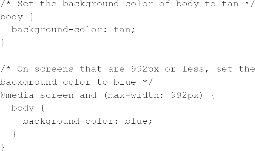
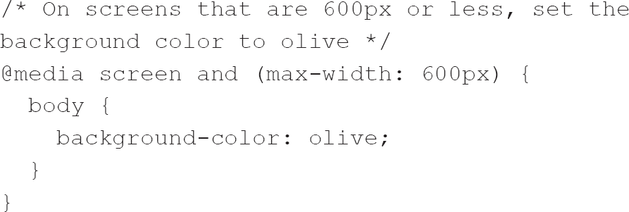
While changing the background colour of the body element depending on the width of the screen, as in the code above, is not a usual requirement, the numbers above are ones that might become familiar to you. 992px and 600px are known as ‘typical breakpoints’ for device widths. You will likely see such breakpoints where developers have not embraced more modern layout techniques (which we will discuss in the next chapter). Using the width queries above means that front-end developers can design a page for screens of different widths, ensuring a consistent user experience whether the user accesses the application from a phone or on a regular computer.
Justin Avery (2014) argues that this use of media queries is no longer required as we now have flexbox and grid layouts. Take, for example, Avery’s list of typical breakpoints. It contains 24 media queries for various devices, but that list can only grow. It is possible to automate some of the difficulty by using JavaScript, but why not abandon such an approach and use more modern layout techniques to accomplish the same effect with less effort?
While we have primarily looked at querying the width, media queries can detect many other features, which allows for different CSS to be applied depending on the result. Another – and perhaps more useful – way of employing media queries is to implement a separate stylesheet when the user prints the current page (e.g. one that uses absolute units of measurement). Science fiction writer William Hertling (n.d.) has a helpful introduction to printing from the internet and notes that pages can be printed to PDF rather than paper.
Many, perhaps most, of your users will doubtless see your work via a mobile phone, and so it sometimes makes sense to use such devices as the basis for your design. Rather than working towards a finished product which works well on your desktop monitor or laptop screen, you should use empathy and first develop for mobile devices. Such an approach, that of mobile-first or bottom-up development, rather than desktop-first or top-down development, should, in such cases, ease your development process going forward.
CSS calc function
Earlier we explored how CSS measurement units fall into two main groups – absolute and relative – but what happens when you want to mix the two types of unit?
There are rough comparisons between the different units, with all sorts of guides or utilities available online to convert pixels to ems, for example, but they are all approximations, and different devices will, as noted, have different pixel resolutions. How much better would it be if we could use the browser to calculate for us? The calc (Mozilla, 2020a) function comes into its own here as we can mix and match measurement units.
I use the calc function extensively to ensure that elements within a div are correctly positioned and mix percentages with pixels to ensure appropriate positioning.
The calc function is particularly useful in situations where the viewport changes. In such cases, the browser does not merely do some simple calculation and store the result as the value to use within the CSS; instead, the calc function itself is used as the value for the property. This dynamism is at the heart of the power of the calc function. The function can use the four simple operators (add, subtract, multiply and divide) and can even be nested, though browser support for nested calc functions is spotty.
If you have some experience of CSS pre-processors, you might note that the calc function is like the math functions of all such pre-processors. calc is perhaps another example where evolution in the standard has removed some of the workarounds created by developers – but, in this case, it is far more nuanced, as calc is dynamic and reacts to changes in the viewport without having to rely on media queries or clever JavaScript noticing changes in the viewport.
I have been talking primarily about widths of elements as well as font sizes in these sections, but these are not the limits of the calc function. Anywhere a length (Mozilla, 2019e), frequency (Mozilla, 2019b), angle (Mozilla, 2019a), time (Mozilla, 2019g), percentage (Mozilla, 2020h), number (Mozilla, 2019f) or integer (Mozilla, 2019d) value can be used, it is possible to use the calc function. Keep in mind that support can be problematic, though, so it is always worthwhile providing a fallback as, should a browser not support your usage, the calc function will be ignored and the previous value will be used instead.
CSS summary
You may perhaps have seen references to CSS3, suggesting that CSS has evolved in a series of stages from 1 through 3. This idea of a step-by-step evolution is false, though, there is no CSS3 standard as such (Mozilla, 2020d), due in part to browser manufacturers dragging their heels while working towards CSS2 from CSS1. It is a continually evolving technology and one that you need to keep abreast of, while continually checking how the browsers you target implement the standard, to ensure you do not waste too much time developing a solution which might not work on your intended browser.
Quite apart from keeping up to date, play with the new techniques, as they will inform your decision making when it comes to creating new or enhancing old applications.
JavaScript
In this section, we will look at the final side of the front-end development triangle, JavaScript.
Initially created by Brendan Eich under the auspices of Netscape in 1995, JavaScript has been ‘extended to contexts that range far beyond the initial intent of its designers’ (Champeon, 2001).
While under initial development, JavaScript was called Mocha and then LiveScript, but when it was released in Netscape 2.0 it was called JavaScript. Its naming is somewhat controversial. Champeon (2001) writes that it was named LiveScript because it was intended to aid designers with integrating Java applets9 into web pages, and that its name was changed when Sun and Netscape asserted that it was a complement to HTML and Java. Nicholas Zakas (2005) states that Netscape changed the name in an attempt to cash in on the latest buzzword of the time.
Champeon notes that the changes of name plagued front-end developers for years to come, as the names were confused on mailing lists and Usenet discussions. This confused situation persists to some degree, as even now some call it ECMAScript.10
JavaScript can be described as a high-level interpreted programming language (Wikipedia, 2020d). Let’s unpack that a little. A ‘high-level’ language is one that is abstracted from the bare metal of the machine upon which it runs. Rather than using arcane and obscure commands to interact with the registers of the processor, it uses much easier-to-understand, human-friendly language (Wikipedia, 2020b). An ‘interpreted’ language is one that is executed directly rather than being compiled into machine language (Wikipedia, 2020c). JavaScript relies on an interpreter (sometimes called an engine) to run, and each browser has a slightly different interpreter with slightly different capabilities. The existence of these many different interpreters explains why it used to be so difficult to ensure that JavaScript written with one browser in mind would work in a different browser or even a different version of the same browser, or the identical version on a different architecture (e.g. Windows PC vs Apple Mac). This situation is no longer the case and all evergreen browsers11 can understand the same JavaScript, although there can be small differences in terms of their speed of operation.
Front-end developers typically use JavaScript to manipulate the DOM and enable richer interfaces in HTML documents. However, interactivity is increasingly becoming the domain of CSS, with enhancements in CSS meaning that JavaScript is now less relevant for such purposes.
JavaScript enables front-end developers to control all the elements within the DOM and change elements and their attributes, as well as to create new elements and remove existing ones. It can also react to events and change the styling of elements within the DOM. This control is so total that more modern JavaScript libraries create a virtual DOM, an abstraction of the HTML DOM detached from the browser’s DOM – which itself is an abstraction generated by the browser from the HTML written by the front-end developer. Many modern frameworks, such as Facebook’s React, use a JavaScript-generated virtual DOM to populate the HTML DOM, with a near-empty HTML document merely serving as a base upon which JavaScript builds the page in its entirety.
Despite this power, JavaScript was initially intended to be both a back-end and a front-end language – and, with the recent introduction of Node.js, this is what it has become again.
Node.js is a technology which allows JavaScript to run on the server and it has had a significant impact on the development of front-end JavaScript. This impact has included significant investments in time and effort to improve the development process of JavaScript. The Node Package Manager is now extensively used on the front-end despite originally having been developed to help Node.js developers to discover, share and use JavaScript from other developers working on the back-end. Other outcomes include JavaScript now being recognised as a serious language and improvements in the tools available for JavaScript development. It is primarily a server-side (or back-end) technology, except where it impacts on modern development tooling12 and toolchains.
You will see many references to JavaScript libraries and frameworks. There is a difference between these two terms, but it can be a subtle difference at times. I think of libraries as JavaScript tools which allow me to get things done, whereas I see frameworks as guidelines about how things should be done. The distinctions between the two will be explored further below.
I have mentioned JavaScript libraries, and we should look at some of them in greater depth because, even though efforts at standardisation are bearing fruit, the use of certain libraries is still prevalent, if only to support older browsers without more modern features of the language. Perhaps the most popular JavaScript library is jQuery. Different browsers used to have significantly different ways of interacting with the DOM; jQuery simplified DOM tree traversal and manipulation as well as asynchronous JavaScript and XML (AJAX) by providing an abstraction library which – under the hood – used the browser’s native ability to make requests to the server.
AJAX
Why was this abstraction (mentioned in the previous paragraph) so important? To explain, we need to look at what AJAX is and why it is important. We have seen that a browser requests an HTML document and renders it onto the screen, and that is generally enough if all you are doing is consuming the information contained in the document (see Figure 2.4).
Figure 2.4 Traditional web usage
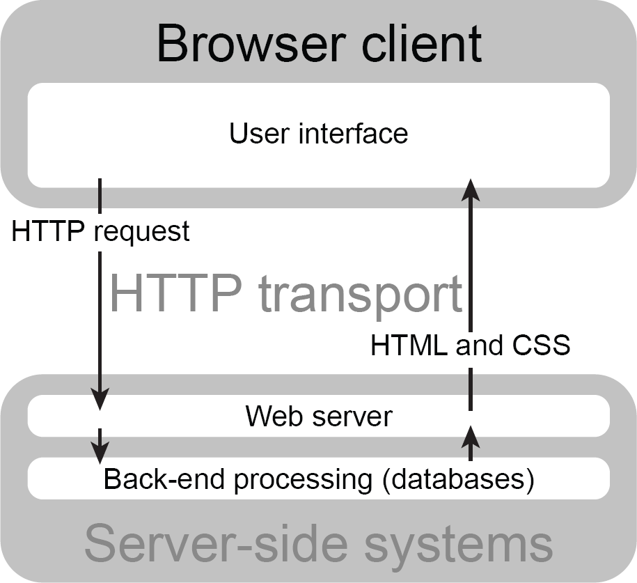
But what happens if you need to interact with the document in some way? We used to have to rely on forms to do this. A user would fill in a form and submit the data back to the server, where it could be processed and stored within a database. If the processing required it, then a further document would be sent to the browser to be displayed, with the whole DOM and CSSOM rendering process occurring at each stage of the process. As you can imagine, for complex interactions, there was a tremendous amount of redundancy with similar content being transported and rendered repeatedly. It also took a painfully long time over slower connections.
Using the browser as nothing more than a dumb terminal seems strange to us, primarily as processing power within clients has increased, but that was how we were limited to doing things online until the development of AJAX.
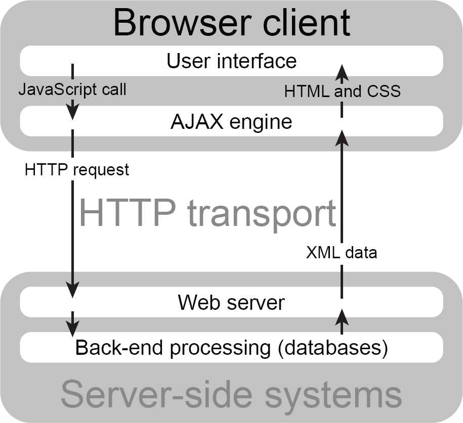
Jesse James Garrett, who wrote the seminal article which popularised the term ‘Ajax’, argues that the delay associated with repeated HTTP requests was the primary reason for using AJAX, though he comes at the issue from the direction of user interaction. He said:
An Ajax application eliminates the start-stop-start-stop nature of interaction on the Web by introducing an intermediary – an Ajax engine – between the user and the server. It seems like adding a layer to the application would make it less responsive, but the opposite is true. (Garrett, 2005)
As you can see from this quote, AJAX allowed a more nuanced approach to interacting with a back-end server. Rather than massive exchanges between the client and the server with a great deal of redundancy, there was an initial hit from loading a slightly larger initial payload, with JavaScript directions and any associated libraries, but then subsequently much smaller transfers of data.
Another interesting point is the use of asynchronous communication, meaning that the client fires off a request and acts upon the result of that request when it is received, rather than waiting for the response (see Figure 2.5). Sometimes this can seem uncomfortable, as we must trust that a result has been sent, but it does improve performance for the user, and the delay often goes unnoticed.
Figure 2.5 AJAX web usage
JavaScript libraries
JavaScript libraries are often used to make JavaScript development easier, either by providing a unified way of interacting with the DOM or by manipulating data. Libraries are facing increased competition from frameworks but still offer shortcuts to front-end developers. We will look at some of the most common ones now.
jQuery If you attempted to write an AJAX request in the early days of the technology, using JavaScript without a library, you would have had to code in many conditionals13 to detect the tools the browsers made available. jQuery solved this problem by abstracting that process away from the developer, and often an AJAX request was made with a one-line function call.
Both Microsoft and Nokia bundle jQuery on their platforms. To an extent this might help to explain its popularity, as the number of corporate developers as well as corporate backing cannot help but boost its usage. Along with backing by some of the most significant players in the market, jQuery enables others to build plugins which address specific needs. It is a library that, at its core, makes use of CSS selectors to interact with the DOM, making use of these selectors on native HTML elements to encourage separation of the JavaScript and HTML by easing the addition of event handlers on elements.
Let me explain this a little more. We can add an event handler to an element by adding a specific attribute to that element using HTML like this:
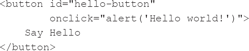
Using jQuery, we could write the same code like this:
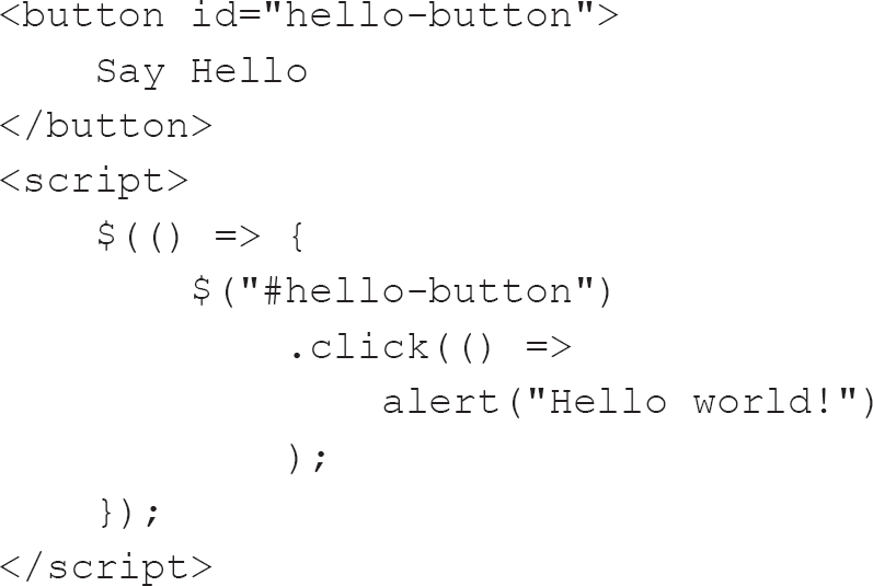
The above represents a significant overhead regarding the number of lines of code required to have the same effect, but it does mean there is a separation of concerns (Wikipedia, 2020f). This separation is essential in much the same way as placing CSS in external files is critical; it allows us to reuse the JavaScript in a modular way.
The inline JavaScript in the first example is removed from the HTML and placed within a script element; this JavaScript can even be in a separate file elsewhere on the server or a content delivery network. It is a far cleaner approach, with the HTML standing alone as a document but enhanced by the JavaScript once it has been loaded.
It must be pointed out, though, that the jQuery above can now trivially be replaced with JavaScript in more modern browsers, though it is important to check any logs available to you to see whether your audience is using older browsers. Sometimes jQuery will be included as the application depends on one or more plugins which require it, and sometimes there just has not been time to rewrite the application using more modern JavaScript.
This is the equivalent modern JavaScript; it replicates the above jQuery:


jQuery also encourages brevity and clarity by using chainable and shorthand functions. More specifically, once we have a handle on one or more elements, we can apply a function to them repeatedly within a chain. Going back to our CSS markup, we could replace the CSS with this jQuery:
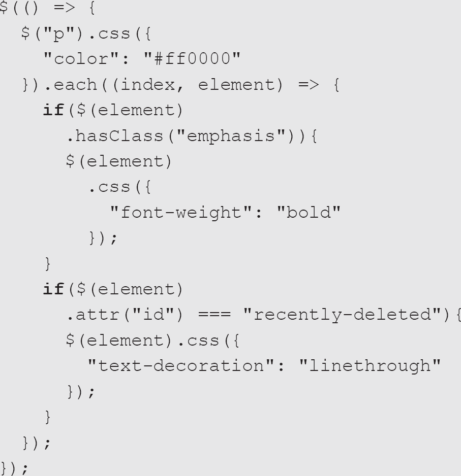
This code illustrates both chaining and brevity. Instead of checking for the class attribute, we can use the hasClass function, which returns either true or false rather than having to make a specific check on the value of the attribute. The code chains the test for the emphasis class and the id called recently-deleted after setting the colour of all elements to red.
By far jQuery’s most useful feature for me as a beginner programmer was the elimination of cross-browser incompatibilities, and, to an extent, this also aided its increased popularity, as it allowed developers to write plugins which would work across all browsers. There is a vast ecosystem of jQuery plugins available which can help you to do all sorts of things, from validating forms to creating image carousels to manipulating tables.
Be wary of relying on jQuery too much, though. As browser manufacturers have worked towards making their JavaScript engines more compliant with developing standards, the need for jQuery has waned. However, that ecosystem of plugins and its ability to play nicely with Vanilla JavaScript14 means that we will likely see the number of sites bundling jQuery continue to rise for some time yet before it plateaus and goes into a decline. At the time of writing, jQuery is used by 96.4% of all the websites whose JavaScript library is widely known; to put this into context, this is 74.1% of all sites (W3Techs, n.d.).
Other JavaScript libraries Other JavaScript libraries you are likely to come across are Bootstrap, Underscore.js, MooTools, Lodash and Modernizr. At the time of writing, these are the most popular libraries, but these statistics are bound to change over time. The sheer momentum behind these libraries, however, means that they will likely still be in play for some time to come.
The inclusion of Bootstrap in this list is perhaps odd in that Bootstrap includes several jQuery plugins and so usually requires jQuery as well – though there are conversions of Bootstrap to JavaScript frameworks, such as Angular, React and Vue (which are explored further below).
These other JavaScript libraries all, to some degree or another, seek to address cross-browser incompatibilities. Modernizr works to achieve this by detecting browser features (Modernizr, n.d.) and Underscore.js provides over a hundred functions which are generally unsupported by older browsers (Underscore, 2018). Despite its utility, Underscore.js seems to be being superseded somewhat by Lodash at present as, while they offer similar functionality, Lodash provides a much more consistent API (application programming interface) while also providing additional functions. It may well be that you will come across both while looking at older code. If so, I would suggest that you investigate the removal of one or the other to reduce the dependencies in the application.
I use (and envisage continuing to use) any number of libraries each day in my development practice, but often these are more niche libraries, such as D3 (Bostock, 2017) for creating interactive visualisations, Moment.js to help with using dates and times in JavaScript, and p5.js for teaching programming concepts to primary school students. Numeral.js is also useful and acts in a similar way to Moment.js, but for numbers rather than dates and times.
It is crucial to keep abreast of new libraries and to continue learning to maintain your relevance as a front-end developer and improve your employment prospects.
JavaScript frameworks
There are many JavaScript frameworks, and I have used most, if not all, of them. I have also been bitten by choosing the wrong one.
A framework is distinguished from a library in that a framework defines the entire application design, whereas a library offers functions to be called by code. Another way of looking at the difference is in terms of control; we developers call the functions of a library, whereas a framework provides the skeleton which we need to flesh out with code, sometimes from a library.
At the time of writing, there are three significant frameworks, and they continually jockey for pole position (Biton, 2018). These are React, Angular and Vue, and we will briefly look at each. It is a matter of choice which one you want to invest your time in learning, but I will make some suggestions. To an extent, spending time familiarising yourself with all of them is worthwhile as it will broaden your appeal to potential employers; however, there is a growing appreciation that knowing one in greater depth will not hurt, as the concepts learnt are transferable.
Before you begin, however, you should always decide whether a framework is required or whether Vanilla JavaScript would suffice. ES6,15 sometimes also known as ECMAScript 2015, has seen considerable improvements in the language, and it is now more elegant to read and write as well as being a thorough delight to use as it seems to me to be so much more expressive. A more prolonged examination of the changes in JavaScript is beyond the scope of this book. However, if you find yourself in the unfortunate position of needing to support Internet Explorer 11, be aware that there are tools available, such as Babel, which will transform your modern code into code suitable for older browsers.
React There is some discussion about whether React can be called a framework, with many thinking of it more as a library (Petrosyan, 2018). Indeed, it is primarily used as the ‘view’ in a model–view–controller (MVC) application.16 React bridges the distinction between a framework and a library while sharing the component-based architecture of many other frameworks, so I consider it valid to discuss it in this section rather than the section concerned with JavaScript libraries.
React was initially developed under the auspices of Facebook and is grounded in a similar PHP-based technology also developed by Facebook.
React makes use of a virtual DOM to make selected changes to the HTML DOM by calculating the differences between the in-memory representation of the HTML DOM and the actual representation of the document. Using the virtual DOM means that subtle changes are made without the whole page reloading. This might seem memory-intensive until one appreciates the increasing resources available to client applications in browsers, regardless of the architecture on which the browser resides.
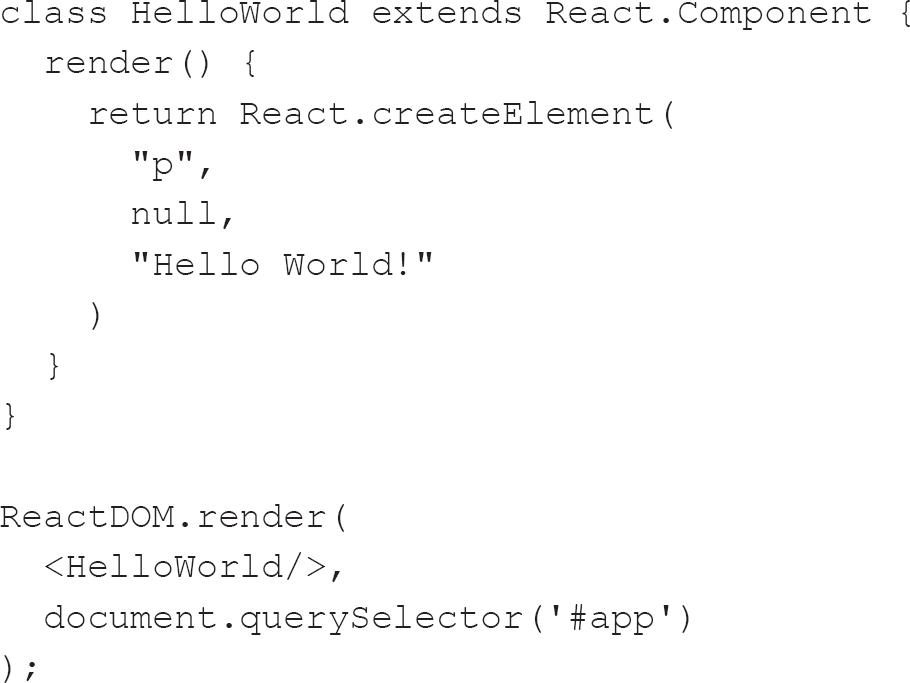
One crucial thing about React is its use of JavaScript XML (JSX), which is an extension of JavaScript syntax and allows developers to write HTML-like syntax within JavaScript rather than relying upon the browser’s API methods to create elements. The following represents a simple ‘Hello World’ application in React:
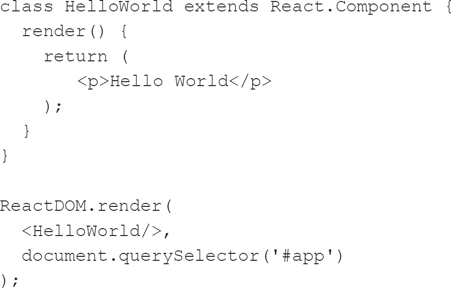
JSX can leave some feeling uncomfortable as it mixes HTML with JavaScript. An alternative is to use the methods built into React to create an HTML element rather than using React to parse JSX. The result can then be used to create HTML elements, like this:
React can be used in conjunction with another library to manage the state of an application. One such library is Redux. This reliance on external libraries can be problematic for those coming from an MVC background, though, as the concept is slightly different in the world of React and Redux. Rather than models, views and controllers, React and Redux have actions, reducers, stores and components. There is an interesting analogy on the blog Hackernoon which goes into greater detail (Levkovsky, 2017).
Angular There are now two distinct flavours of Angular. Both are being used extensively in production environments, with later versions becoming more prevalent over time as people update their legacy systems.
AngularJS The original Angular is often called AngularJS or Angular 1. It was developed in 2009 by Miško Hevery (n.d.) and Adam Abrons (Austin, 2014) and was written in JavaScript. To an extent, it kicked off the development of many other frameworks. It was revolutionary in that it acknowledged that HTML is primarily for the display of static documents and that previous efforts at making it dynamic had, by and large, failed. It was initially developed to offer developers the ability to interact with both the front- and the back-end of applications. However, after Hevery made a wager that he could refactor a 17,000-line application using his framework (then called GetAngular) in a fortnight, it became the darling of Google. He took three weeks to refactor the application and replaced the 17,000 lines with 1,500.
Due to its age and it being superseded by current versions of Angular, it would perhaps not be appropriate for a new front-end developer to spend too much time familiarising themselves with AngularJS, unless they have been tasked with maintaining a legacy system. A glance at the documentation should suffice.
Angular Rather than being written in 100% JavaScript as AngularJS was, Angular (also known as Angular 2+ or Angular v2 and beyond) is a complete rewrite using Microsoft’s TypeScript.
TypeScript is a superset of JavaScript and offers optional static typing despite the fact that it can be transpiled to conformant JavaScript. JavaScript’s lack of static typing is one of the significant complaints aimed at it. TypeScript’s static typing has eased JavaScript’s adoption within Enterprise, where such typing is prevalent in languages such as C#.
Most, if not all, of the other JavaScript frameworks can be prototyped quickly on platforms such as JSFiddle,17 but Angular requires transpilation, which is beyond the capabilities of that platform. There are various platforms which facilitate Angular development, but even the most straightforward programs often require a significant overhead (in terms of the tools required) for the associated infrastructure to transpile the TypeScript.
Angular is undoubtedly popular in the realm of Enterprise, but this is continuously changing, with React taking a significant chunk of market share in 2018 (Elliott, 2017). Angular’s popularity in part stems from its age, as it was the first framework to be released and so many developers are used to working with it. With its use of TypeScript, it is also easy to transition to from other statically typed languages, such as Microsoft’s C#. Proponents of Angular point out that it saves time, is easy to learn, has excellent data-binding, offers a declarative expression of the user interface (UI) and is free (Thinkwik, 2017). However, both Angular and React are under threat by the next framework we will examine.
Vue Also known as Vue.js, this is most often written in ES6, and there are syntax styles associated with it. Like Angular, it has roots in Google, but it came about from its primary developer, Evan You, who said:
I figured, what if I could just extract the part that I really liked about Angular and build something really lightweight without all the extra concepts involved? (Cromwell, 2017)
Rather than following MVC architecture, Vue uses a model–view–viewmodel (MVVM)18 architecture. The distinctions between these architectures are convoluted and confused. It might be worthwhile playing with each and then deciding how you would prefer your systems to be architected. Suffice it to say that the controller is replaced with a viewmodel.
Rather than using a separate language like JSX, Vue can use template HTML elements (Mozilla, 2020i), and it is designed to be incrementally adoptable with there being a strong suggestion that developers can replace jQuery with Vue (Drasner, 2018). While it is possible to embed Vue within an application, perhaps sourced from a content delivery network, and start using it immediately, a developer can also take advantage of modern toolchains like that used by Angular. This flexibility means that Vue has attracted an enormous audience, as you can start coding when there is no internet connection. Its minified size (86KB) is comparable to modern jQuery (87KB), and it has so much more to offer, though it is possible to use both on the same page.
Just like React, Vue utilises a virtual DOM. It also has a similar approach to components to both Angular and React. It borrows extensively from both frameworks (H & V, n.d.) and is better for appropriating and implementing similar strategies. This derivation of strategy and technique might also aid its adoption by developers used to one of the other popular frameworks: should you be feeling limited by your current framework, the learning curve associated with switching to Vue is likely to be less steep than that of moving between Angular and React (Value Coders, 2018).
The Vue website provides a comprehensive comparison of Vue with other frameworks (George, 2018).
Other frameworks Along with the big three JavaScript frameworks, there are many more, such as Ember (Tilde Inc., 2018), Knockout (Sanderson, n.d.), Polymer (Polymer Project, 2018) and Riot (RIOT, 2018). Their number is continually growing, so it is wise to keep an eye on resources such as ThoughtWorks’ Technology Radar (ThoughtWorks, 2018).
I think that one of the reasons we have so many frameworks is down to front-end developers. It used to be that to be able to call oneself a developer one had to have written at least one content management system (Palas, 2017). Perhaps now we are entering a world where to call yourself a proper developer you need to have written your own, distinct, framework or library?
Many such frameworks are likely to be superseded, some sooner rather than later. The toolchain involved in building even the smallest single-page application is enormous and can be confusing, and it is gradually being made redundant by developments within JavaScript itself. Whereas once we needed module bundlers (tools which take JavaScript and any dependencies the code might have, such as libraries used, and bundle them all into a single file) and module loaders (libraries for loading, interpreting and executing JavaScript modules) in the form of tools such as Webpack and Browserfy, we are now in a period where we have native modules (though it is likely that we will need to continue using module bundlers for at least a few more years, as native modules are still not fully supported in all major browsers – or we may at least need to use both methods).
MODULES
What are modules, I hear you say? Let me explain. In modular programming, we use a software design technique which separates the functionality of a program into distinct modules. So, we could have a module dedicated to handling dates and times (e.g. Moment.js) and another dedicated to dealing with charts (e.g. D3), which could, in turn, be split into modules dealing with different types of chart. So, an application could be made up of any number of files, and the order of their loading could be an issue; a jQuery plugin needs to be aware of jQuery before it can act upon the page, for instance.
Browsers used to be quite bad at dealing with these situations, but that is less and less the case. However, what does all this mean to us front-end developers? It means that we can make use of distinct modules in native JavaScript without having to be overly concerned with a toolchain to transpile and bundle our code.
Native modules seem to be another of those situations where the evolving technology has taken over from workarounds. This progression is something to be welcomed, and I guess that it was only through noticing the pain-points associated with using JavaScript to manipulate animation and conflicting module definitions that the industry created or adapted existing standards.
JAVASCRIPT TOOLCHAIN
I have mentioned the term ‘toolchain’ already, but what does it mean? We have looked at how JavaScript is loaded into the browser, but the generation of that JavaScript can, depending on requirements, involve using many libraries or frameworks, and bundling them all together can be problematic. This is where a toolchain comes in handy.
There are three main components in a JavaScript toolchain:
• package manager;
• bundler;
• compiler.
Package manager
You will find throughout your career that someone somewhere has already accomplished many of the things you are trying to do, and often they have made their code available to others in a library. You can ‘borrow’ their work using a package manager.
There are two primary package managers you will likely see: Node Package Manager and Facebook’s YARN. Both of these package managers use a manifest file to keep track of the libraries and packages you are using as well as their versions. They also identify any dependencies the packages require and install them. Finally, they should generate a lock file which contains all the information needed to reproduce the full dependency source tree19 – this means that the whole dependency source tree can be regenerated later. This mechanism is particularly valuable when it comes to saving your work in a version control system (covered in the next section), as the amount of code transferred can be limited to only your work.
Bundler
Bundlers combine and compress many different JavaScript files into one single file and thus reduce the number of downloads required by the browser (although modern browsers can now download multiple files at once). We touched on bundles when we examined frameworks. A standard module system was introduced in 2015 as part of ES6, but before that there were several different ways of making JavaScript modules. Despite my preference for using native modules without a bundler, support for earlier browsers and the other optimisations offered by bundlers mean that they are likely to be required in at least the short to medium term.
The other tools provided by bundlers include minimising the size of the resultant code as well as a facility for using plugins to transpile SCSS20 into CSS, for example. There are many different bundlers, so it is worth doing some research to find one that will accomplish what you require.
Compiler
Often called by the bundler, the compiler will allow you to write modern JavaScript with the understanding that the resultant code will work in older browsers. By far the most popular compiler at the time of writing is Babel.
JavaScript summary
JavaScript has been called ‘the world’s most misunderstood programming language’ (Crockford, 2001) because, underneath its simplicity, there is a great deal of power. It is also an evolving language and one with which you will doubtless become familiar if you choose to become a front-end developer. However, I would advise you to spend some time becoming familiar with it even if you do not decide to become a front-end developer. I use it regularly in my non-work-related life when writing apps and scripts to run in Google Sheets to calculate my day-to-day finances, for example. The wealth of learning resources can be overwhelming, but I would suggest starting with MDN Web Docs (https://developer.mozilla.org).
OTHER TOOLS
Along with our front-end development triangle, there are many other tools with which you should be at least slightly familiar. Let’s look at some of them.
Version control system
When you start working in development, you may not appreciate the need for a version control system (VCS), but it will probably not be long before you make an unrecoverable mistake or your local machine suffers some form of failure, leaving all your work lost to the aether. This is where a VCS is worth its weight in gold! A VCS tracks your changes to code and provides you with control over them.
A VCS is also of paramount importance when working within a team as it allows changes made by different developers to be merged into a cohesive whole, while mitigating the chance of code being lost.
By far the most popular VCS is Git. While initially it can seem daunting, you can get by with a small number of commands. With many graphical UIs now being available (such as Atlassian’s Sourcetree (Atlassian, 2018) and GitHub’s own GitHub Desktop (GitHub, 2018)), there is a much lower barrier to using Git.
There are other VCS options, but another reason for choosing Git is that pointing people to your GitHub21 profile is an excellent way of demonstrating your abilities.
As well as maintaining your own set of GitHub repositories (or ‘repos’ – locations where all the files associated with a project are stored), contributing to other projects on GitHub is a fantastic way of raising your profile as a developer – and there is nothing quite so exciting as having a pull request accepted by a high-profile repo.22
A wealth of free and paid resources are available for you to access when it comes to learning Git. Git allows users to track changes to files across different users and merge those changes into a final file. It is a distributed VCS, so many users can work on the same project at the same time, with all those changes being unified into a single, master branch. Often these merges take place in a web-based hosting service, such as GitHub, although there are many other services available, such as Bitbucket, SourceForge and GitLab, to name just three.
Editor and integrated development environment
The choice of editor and integrated development environment (IDE) is another area where you will find many conflicting opinions – sometimes from the same person over time. This is where you will spend much of your time as a front-end developer, so it is well worth testing the options. There used to be significant differences between editors and IDEs, but some editors have plugins which give them IDE-like capabilities.
Editors
Typically, an editor is merely a tool which allows you to edit text. Not all editors are equal – it might be appropriate to suggest that Microsoft Word is an editor, but it is unsuited to some tasks, in much the same way that Microsoft’s Notepad is unsuited to writing a dissertation, for instance.
This is not to say that you cannot write code in Microsoft Word (Paulb, 2012) – there is a Japanese gentleman who uses Microsoft Excel to create stunning art (Pinar, 2017), after all – but it would perhaps be best to use an editor better suited to the task.
It is common to find that developers use more than one editor during their work. This profligate use of editors is because each has its strengths and weaknesses.
During my day, I will often have Sublime Text (Sublime HQ Pty Ltd, 2018) and Brackets.io (Adobe, 2018) open at the same time. I use Brackets.io because of its useful Live Preview (Adobe, 2017), which helps with the rapid prototyping of concepts that I am working on, and Sublime Text because of its sheer sophistication.
I have a favourite editor in Boxer (Hamel, 2018b), though. I install it on every machine I use because of its ability to wrangle text and because I am familiar with it and its powerful macro capability (Hamel, 2018a).
Integrated development environments
An IDE includes an editor, but only as part of a more comprehensive suite of tools required to write, test and deploy projects. The other tools will likely include build automation (meaning you can configure your IDE to transpile SCSS for you) and a debugger, which you should be able to attach to an instance of a browser. This attachment to a browser instance means that code you change should be reflected in the browser without having to go through the process of being deployed to a server.
While I would encourage you to spread your affections regarding your use of editors, being extravagant in your use of IDEs is less than ideal. There are IDEs which have a particular focus on a technology stack, such as Visual Studio, which is used to develop .NET languages; PHPStorm (developed by JetBrains), which is used to develop with PHP; and Eclipse, which is used for Java development. However, most IDEs can be made to work with a range of languages.
Visual Studio is seeking to widen its reach, especially with the introduction of the free Community edition (Wikipedia, 2020e) in 2014. With the wealth of plugins available, the Visual Studio Code editor is approaching an IDE in terms of its facilities.
Choosing editors and integrated development environments
There are things you should be aware of when choosing editors and IDEs. Of course, you might find that some editors and IDEs are suited to different aspects of your work; you might develop a preference for a particular editor for developing CSS, another for HTML and a third for JavaScript. This is perfectly acceptable, and it might even be the case that an editor or IDE you initially disregarded is improved in a newer release, tempting you to try it again.
Typography While we are usually interested in the typeface we display to our users, we also likely have preferences when it comes to the appearance of our code. Though this preference is likely to be assuaged by an understanding that the typeface is of less importance than the code we are writing, is it essential to use a typeface which aids the parsing of your code. Using a non-fixed-width typeface is possible and some developers say that it aids their comprehension of the code, although there are arguments against it – for example, in code it is important for each individual character to be correct, and fixed-width typefaces enable developers to find typos quickly.
My preference is for Dank Mono (Plückthun, 2018), designed by Phil Plückthun. The primary reason I like it so much is aesthetic more than anything. When a test for equality occurs in JavaScript, we use three equals signs (= = =), and when Dank Mono is used to do this, it replaces the three equals signs with three horizontal lines of the same width as the three individual characters. Arrow functions (=>) also look much more like arrows and the non-equality operator looks like a gate.
These seem like very minor reasons for spending my hard-earned money on something which no one else will notice, but such moments of delight are what we are trying to engender in our audience. It seems like the worst kind of masochism to avoid producing the same moments of happiness for ourselves.
Themes Closely linked to the issue of typefaces are themes. Most editors and IDEs allow their users to alter at least the colour scheme of their interface, and some enable many more configurable options. You will spend so much time looking at the code you’re working on that you need a theme which will not strain your eyes, especially in different external lighting conditions.
There is significant debate about themes so I would suggest downloading and installing some (if your choice of editor/IDE allows theming) and trying them out. Sometimes merely changing the theme is enough to improve your workflow, as it prevents the tool from becoming stale and allows more moments of delight as you notice subtle enhancements.
THE MOST IMPORTANT TOOL
I have saved the most critical tool until last: you.
All front-end developers I know have the qualities in this section to some degree or another. That is not to say that they are not shared by other types of developer, but they are particularly crucial for those developers who are responsible for creating the interface between the rest of the team and the users of the system that is being developed.
Empathy
Empathy is the ability to put yourself into the shoes of someone else. In front-end development it allows the practitioner to have some idea of the state of mind of someone visiting a web application or website for the very first time, and of those who have perhaps visited many times before but who have been confronted with a change in the interface. We do not always know who our users are, except in certain circumstances: they could be from any walk of life and have different abilities and experiences. While we cannot necessarily know all or any of our users, we can imagine them and their circumstances and seek to provide an enjoyable, or at least stress-free, experience. In the case of changes to an interface, this needs to be handled sensitively as not everyone is comfortable with change. Trying to understand what users might be thinking and feeling will inform your design and development decisions in such an instance.
At the beginning of my previous career as a psychiatric nurse, one of my earliest lectures was on the difference between sympathy and empathy. Sympathy is an older term than empathy, but generally it suggests that someone feels pity for another, and pity is not helpful. Sympathy is an emotion whereas empathy is an ability, and it is an ability which can constantly be developed to empower your work as a front-end developer.
Listening and understanding
Listening is essential for a front-end developer and understanding what you are listening to even more so. There may be all sorts of reasons why someone has reached their own beliefs and conclusions, and it is only through listening and attempting to see things from their perspective that you can hope to achieve an understanding of why they think the way they do.
This is not to say that you should expend significant effort trying to explore why a client might want a colour range to contain a set of colours in a nonsensical order, or whether a quartile should be displayed as five quantiles. Sometimes the client is right, even if they are not really, and so ensuring they are satisfied with the final product of your efforts, despite missing opportunities that are obvious to you, is important. Knowing when to bow out gracefully is sometimes the best that one can hope for, but please do be aware of your ethical responsibility too (more on this in the next chapter).
As well as trying to understand the person you are listening to, it is worth spending some time trying to understand yourself. Dedicating as much, if not more, attention to your own biases as you spend examining others will help you to develop an open mind and self-acceptance.
A further aspect of understanding is an appreciation of the setting of your users. We sometimes imagine our users in a similar environment to ourselves. We imagine them sitting in comfortable chairs, in front of a monitor or two, and warm, dry and well fed and watered. What, then, would we think of someone interacting with our work while sitting on public transport, perhaps surrounded by others while hungry and thirsty, and pressured in terms of time and attention? I mentioned above that empathy is the ability to wear the shoes of others, but might it not be better to not only wear those shoes but also walk the same streets?
Communication
You will doubtless be involved in asking many questions in your career. There are several facets to this, but here we are looking at communication in the context of empathy.
Sometimes just asking a client or user how they think things should be done will help you to reach a joint conclusion. They might have experience of a particularly enjoyable UI that they want to use again or replicate. Sometimes such an interface will be impracticable, but even so, it is still worth discovering what it is and why they were so engaged with it. It might be that you will have to explain why it is inappropriate in this context or is impracticable. Alternatively, you might agree with them that it is the better approach and so change the solution to include it. It is brilliant to learn from our clients, and this possibility should be embraced rather than rejected out of misplaced pride – you should spend your whole career learning!
If you are unable to communicate with your clients, you will have to rely upon having an empathetic understanding of them and take a best guess. However, you will need to be able to justify your decisions.
If you find yourself dealing with any communication issues – for instance, with an abrasive or aggressive client – you should endeavour to remain calm, not argue, and try to listen and understand what is behind the aggression. If you are unable to reach a solution, the communication should be ended as safely and as amicably as possible.
Curiosity
As a front-end developer you need to be curious – curious about the product you will be working on so that you can understand why your users will be using it, as well as curious about the work your colleagues will be doing, as that will inform your own. You will also likely need to be curious about what the end-user will be expecting to see on the screen, before, during and after each interaction.
You will need to be curious more widely too, to keep abreast of the latest developments in your field, and this is no simple matter. Whereas other professions, such as nursing, expect you to carry out post-registration education and practice, this is not the case within front-end development – or, for that matter, other areas of development. Organisations such as BCS, The Chartered Institute for IT aim to remedy this situation somewhat.
In the world of IT, anyone can decide that they are now a practitioner – with no formal requirements for training or continued professional development. While it is arguable that nurses should be demonstrably competent because they are responsible for the care of others, there are roles within IT which share comparable responsibilities (such as when developers work with medical software) but without the equivalent prerequisites or scrutiny.
I feel somewhat uncomfortable with this lack of obligation for IT practitioners to engage in any continued professional development. That is why I am a member of BCS and I would encourage you to join as well – not because it is a requirement for membership of the profession, but because it demonstrates an intention to be responsible for your practice.
A news aggregator such as Feedly can be useful to keep an eye on the developments within your field, but there are many, many other resources available. Email newsletters and podcasts, as well as conferences and meetups,23 can be especially helpful, so it is worth reaching out to your fellow local developers and seeing what is available in your area.
It may be difficult to scrutinise the competence of IT professionals properly, especially in front-end development, because of the stratification of this role: how, for instance, would one expect to assess the abilities of a developer who specialises in CSS and pre- and post-processors, alongside a developer who specialises in the React framework? Both developers will likely carry out much the same work but will have specialist knowledge in their realms.
Resilience
A 2018 survey carried out by Blind (Cimpanu, 2018) revealed that 57% of tech workers suffer from some form of ‘burnout’. Burnout is characterised as exhaustion and is caused by stress, most often the stress of not being able to work in a way in which you are comfortable.
Aside from financial security, why is working important? Occupational therapists and others will tell you that work is a vital part of our identity, despite most people wishing for a life of leisure. Those in meaningful employment are generally healthier and live longer, more fulfilled lives. You need to work, not just to put a roof over your head but to enjoy a longer life, so please do not let your employment harm your health by allowing stress to overwhelm you. If you are unhappy, look at changing employer or even career.
Developing a healthy work–life balance is of paramount importance. You will likely spend decades working, but you won’t be working every hour of every day of those decades, so ensuring that your interests, family, and social and leisure activities receive the attention they deserve will all improve your resilience.
AVOIDING IMPOSTER SYNDROME
Throughout this book, I am conscious that I have touched upon many technologies (as well as all sorts of other subjects), and I will continue doing so for the rest of it, but note that you are not expected to know everything! I am by no means an expert, but I am interested in learning and cannot think of a time when I might feel that I have learnt enough. I dare say you are similar, or else why would you be reading this book?
This curiosity and subsequent acknowledgement that we do not know everything is perhaps why developers sometimes suffer from ‘imposter syndrome’. Imposter syndrome is a psychological pattern in which an individual doubts their accomplishments and feels a persistent fear that they will be exposed as a fraud.
Imposter syndrome is rife in the world of IT. Perhaps the best advice I have seen for overcoming it comes from Dr Sue Black via Girl’s Guide to Project Management (Harrin, 2017) and involves first acknowledging your feelings to yourself and others – you will doubtless find that your colleagues share your anxieties to some degree. I suggest that you do some research of your own and recognise the symptoms of imposter syndrome – and work up some strategies for how to combat it when (not if) you feel it.
It is also important to acknowledge that sometimes imposter syndrome prompts you to learn more, which is no bad thing in itself, but it can be overwhelming and damaging.
SUMMARY
In this chapter we have looked at the most critical tools for front-end developers and ended by pointing out that by far the most important tool has absolutely nothing to do with technology. While an understanding of technology is undoubtedly essential, knowing how to do something is less important than understanding why you want to do it. I mentioned delight in the preface to this book, and not the least part of that delight is that the field is continually changing and you will be continuously challenged not only by advances in techniques but also by trends. Please do continue to learn and hone your skills but never neglect empathy in particular – especially for yourself. Be gentle with yourself.
1 While HTML allows for some basic styling conventions, such as making a heading appear different from the content of the application, we can get much more fine-grained control using CSS.
2 The ‘user agent stylesheet’ is the default set of styles within a browser. They dictate the appearance of markup when there is no CSS within a page.
3 A discussion of all CSS properties and their associated values is beyond the scope of this book, but there are excellent introductions provided by W3Schools (2020b) and MDN Web Docs (Mozilla, 2020c).
4 ‘Class madness’ is a term used by Sarah Dayan in a discussion of chaining or extending CSS classes (Dayan, 2018). She notes that the use of chaining can lead to very many classes being added to elements.
5 A prefix is sometimes added to a CSS property by a browser so that the browser can start to support experimental CSS declarations. Each vendor has a different one, with WebKit (used by Chrome, Safari, newer versions of Opera and the default Android browser) using -webkit, Firefox using -moz, older (pre-WebKit) Opera using -o and Internet Explorer using -ms. An auto-prefixer takes the experimental property and duplicates it four times, prepends the relevant prefix to take into account all of these browsers, and inserts the resulting code above the original rule.
6 See the summary of this section below for an explanation of CSS3.
7 The viewport, in this context, is the area taken up by the browser window. When the browser is in full-screen mode on a desktop or laptop computer, this is the whole size of the monitor used. In the case of mobile phones or tablets, this is most often the size of the display – though, taking into account that a phone might be rotated 90°, this might be either portrait of landscape.
8 https://www.w3schools.com/css/tryit.asp?filename=trycss_mediaqueries_ex1.
9 A Java applet is a program written in Java that can be embedded within an HTML page. They were depreciated in 2017 (when a technology is depreciated, it means that it should no longer be used; for example, while it is still possible to see applets online, the manufacturer discourages their usage).
10 ECMAScript is a specification for a scripting language from the Ecma International standardisation body, whereas JavaScript is the implementation of the specification.
11 An evergreen browser is one in which updates are downloaded and installed automatically, ensuring that the user always has the most up-to-date version.
12 Many modern JavaScript frameworks use features of the language which are not fully supported in all browsers. There is a wealth of tools within possible JavaScript toolchains and we will look further at some of these later.
13 Conditional statements test a condition and do something depending on the result of the test. The most common type is the if … else statement but there are others (Mozilla, 2020g).
14 Vanilla JavaScript, or VanillaJS, is a term often used to remind developers that they don’t always need to use a framework or library. Many times using the language itself will suffice.
15 The sixth edition of ECMAScript was a significant update to JavaScript. It is widely used and compatible with all evergreen browsers (browsers that are automatically upgraded to the latest version).
16 An application design model composed of three interconnected parts: the model (data), the view (user interface) and the controller (processes that handle input).
17 JSFiddle is a popular online integrated development environment that allows developers to quickly prototype and test HTML, CSS and JavaScript within the browser.
18 The MVC format is specifically designed to create a separation of concerns between the model and view, while the MVVM format (which uses data-binding) is designed specifically to allow the view and model to communicate directly with each other.
19 A dependency source tree lists all the packages and their version, along with each package’s dependencies, so that they can be downloaded again later.
20 SCSS is a more modern type of Syntactically Awesome Style Sheets, which is a dialect of CSS.
21 GitHub provides external hosting for Git repositories (repos). This means that once your code has been committed to a repo and the commit has been pushed to GitHub, it can be retrieved on another device and development can be continued. It is also an excellent mechanism for backing up your work.
22 A pull request is made when you want to make changes to a Git repo. The owner of the repo can commit the pull request to the relevant branch (a working copy of the code).
23 A meetup is way for predominantly online communities to meet in real life. These online communities are varied and not limited to technology – the endeavour started as a result of Scott Heiferman wanting to meet his New York neighbours after the 9/11 attacks.