Chapter 10: Components That Show Performance Against a Target
In This Chapter
• Using variance to compare performance with a target
• Displaying performance against organizational trends
• Creating a thermometer-style chart
• Creating a bullet graph
• Showing performance against a target range
No matter what business or industry you talk about, you can always point to some sort of target to measure data against. That target could be anything from a certain amount of revenue to the number of boxes shipped or phone calls made. The business world is full of targets and goals. Your job is to find effective ways to represent performance against those targets.
What is performance against a target? Imagine that your goal is to break the land speed record (currently 763 miles per hour). Your target speed is 771 miles per hour. After you jump into your car and go as fast as you can, you will have a final speed of some number. That number is considered to be your performance against the target.
In this chapter, we discuss some new and interesting ways to create components that show performance against a target.
Showing Performance with Variances
The standard way of displaying performance against a target is to plot the target and then plot the performance. This is usually done with a line chart or a combination chart, such as the one shown in Figure 10-1.

Figure 10-1: A typical chart showing performance against a target.
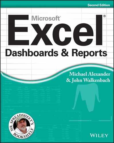
Although this chart allows you to visually pick the points where performance exceeded or fell below targets, it gives you a rather one-dimensional view and provides minimal information. Even if this chart offered labels that showed the actual percent of sales revenue versus target, you’d still get only a mildly informative view.
A more impactful and informative way of displaying performance against a target is to plot the variances between the target and the performance. Figure 10-2 shows the same performance data you see in Figure 10-1, but includes the variances (sales revenue minus target). This way, you not only see where performance exceeded or fell below targets but also you get an extra layer of information showing the dollar impact of each rise and fall.
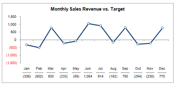
Figure 10-2: Consider using variances to plot performance against a target.
Showing Performance Against Organizational Trends
The target you use to measure performance doesn’t necessarily have to be set by management or organizational policy. In fact, some of the things you measure may never have a target or goal set for them. In situations where you don’t have a target to measure against, it’s often helpful to measure performance against some organizational statistic.
For example, the component in Figure 10-3 measures the sales performance for each division against the median sales for all the divisions. You can see that divisions 1, 3, and 6 fall well below the median for the group.
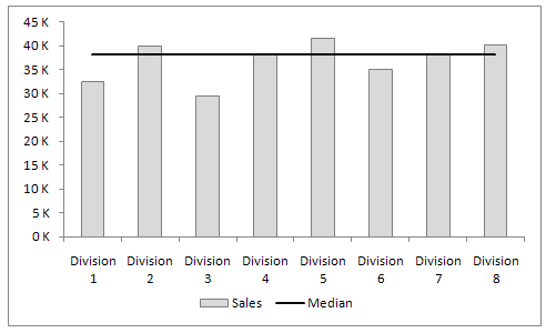
Figure 10-3: Measuring data when there’s no target for a measure.
Here’s how you create a median line similar to the one you see in Figure 10-3:
1. Start a new column next to your data and type the simple MEDIAN formula, as shown in Figure 10-4.
Note that this formula can be any mathematical or statistical operation that works for the data you’re representing. Just ensure that the values returned are the same for the entire column. This gives you a straight line.

Figure 10-4: Start a new column and enter a formula.
2. Copy the formula down to fill the table.
Again, all the numbers in the newly created column should be the same.
3. Plot the table into a column chart.
4. Right-click the Median data series and choose Change Series Chart Type.
5. Change the chart type to a line chart.
Using a Thermometer-Style Chart
A thermometer-style chart offers a unique way to view performance against a goal. As the name implies, the data points shown in this type of chart resemble a thermometer. Each performance value and its corresponding target are stacked on top of one another, giving an appearance similar to that of mercury rising in a thermometer. In Figure 10-5, you see an example of a thermometer-style chart.

Figure 10-5: Thermometer-style charts offer a unique way to show performance against a goal.
To create this type of chart, follow these steps:
1. Starting with a table that contains revenue and target data, plot the data into a new column chart.
2. Right-click the Revenue data series and choose Format Data Series.
3. In the Format Data Series dialog box, select the Secondary Axis.
4. Go back to your chart and delete the new vertical axis that was added; it’s the vertical axis to the right of the chart.
5. Right-click the Target series and choose Format Data Series.
6. In the dialog box, adjust the Gap Width property so that the Target series is slightly wider than the Revenue series — between 45% and 55% is typically fine.
Using a Bullet Graph
A bullet graph is a type of column/bar graph developed by visualization expert Stephen Few to serve as a replacement for dashboard gauges and meters. He developed bullet graphs to allow for the clear display of multiple layers of information without occupying a lot of space on a dashboard. A bullet graph, as seen in Figure 10-6, contains a single performance measure (such as YTD [year-to-date] revenue); compares that measure to a target; and displays it in the context of qualitative ranges, such as Poor, Fair, Good, and Very Good.

Figure 10-6: Bullet graphs display multiple perspectives in an incredibly compact space.
Figure 10-7 breaks down the three main parts of a bullet graph. The performance bar represents the performance measure. The target marker represents the comparative measure. And the background fills represent the qualitative range.

Figure 10-7: The parts of a bullet graph.
Creating a bullet graph
Creating a bullet graph in Excel involves quite a few steps, but it isn’t necessarily difficult. Follow these steps to create your first bullet graph:
1. Start with a data table that gives you all the data points you need to create the three main parts of the bullet graph.
Figure 10-8 illustrates what that data table looks like. The first four values in the data set (Poor, Fair, Good, and Very Good) make up the qualitative range. You don’t have to have four values — you can have as many or as few as you need. In this scenario, you want the qualitative range to span from 0 to 100%. Therefore, the percentages (75%, 15%, 10%, and 5%) must add up to 100%. Again, this can be adjusted to suit your needs. The fifth value in Figure 10-8 (Value) creates the performance bar. The sixth value (Target) makes the target marker.

Figure 10-8: Start with data that contains the main data points of the bullet graph.
2. Select the entire table and plot the data on a stacked column chart.
The chart that’s created is initially plotted in the wrong direction.
3. To fix the direction, click the chart and select the Switch Row/Column button, as shown in Figure 10-9.

Figure 10-9: Switch the orientation of the chart to read from columns.
4. Right-click the Target series and choose Change Series Chart Type. Use the Change Chart Type dialog box to change the Target series to a Stacked Line with Markers and to place it on the secondary axis (see Figure 10-10). After you confirm your change, the Target series will show on the chart as a single dot.
Figure 10-10: Use the Change Chart Type dialog box to change the Target series to a Stacked Line with Markers and place it on the secondary axis.
5. Right-click the Target series again and choose Format Data Series to open that dialog box. Click the Marker option and adjust the marker to look like a dash, as shown in Figure 10-11.

Figure 10-11: Adjust the marker to a dash.
6. Still in the Format Data Series dialog box, click the Fill & Line icon (the paint bucket). Expand the Fill section and Solid Fill property to set the color of the marker to a noticeable color like red.
7. Still in the Format Data Series dialog box, expand the Border section and set the Border to No Line.
8. Go back to your chart and delete the new secondary axis that was added to the right of your chart (see Figure 10-12).
This is an important step to ensure that the scale of the chart is correct for all data points.
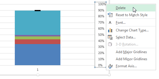
Figure 10-12: Be sure to delete the newly created secondary vertical axis.
9. Right-click the Value series and choose Format Data Series.
10. In the Format Data Series dialog box, click Secondary Axis.
11. Still in the Format Data Series dialog box under Series Options, adjust the Gap Width property so that the Value series is slightly narrower than the other columns in the chart — between 205% and 225% is typically okay.
12. Still in the Format Data Series dialog box, click the Fill icon (the paint bucket), expand the Fill section, and then select the Solid fill option to set the color of the Value series to black.
13. All that’s left to do is change the color for each qualitative range to incrementally lighter hues.
At this point, your bullet graph is essentially done! You can apply whatever minor formatting adjustments to size and shape the chart to make it look the way you want. Figure 10-13 shows the newly created bullet graph formatted with a legend and horizontal labels.
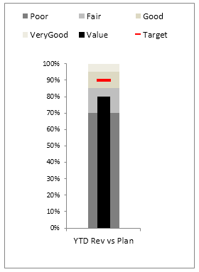
Figure 10-13: Your formatted bullet graph.
Adding data to your bullet graph
After you’ve built your chart for the first performance measure, you can use the same chart for any additional measures. Take a look at Figure 10-14.
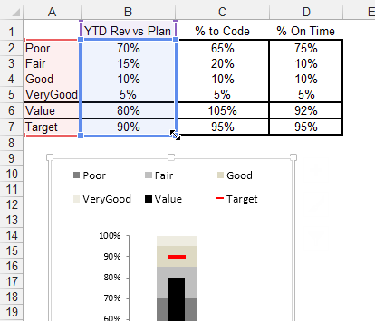
Figure 10-14: To add more data to your chart, manually expand the chart’s data source range.
As you can see in Figure 10-14, you’ve already created this bullet graph with the first performance measure. Imagine that you add two more measures and want to graph those. Here’s how to do so:
1. Click the chart so that the blue outline appears around the original source data.
2. Hover your mouse over the blue dot in the lower-right corner of the blue box.
Your cursor turns into an arrow, as seen in Figure 10-14.
3. Click and drag the blue dot to the last column in your expanded data set.
Figure 10-15 illustrates how the new data points are added without one ounce of extra work!
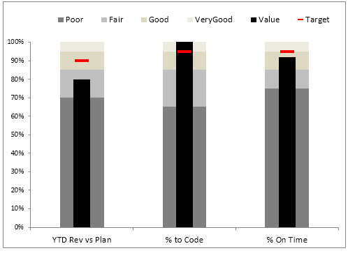
Figure 10-15: Expanding the data source automatically creates new bullet graphs.
Final thoughts on formatting bullet graphs
Before wrapping up this introduction to bullet graphs, we discuss two final thoughts on formatting:
→ Creating qualitative bands
→ Creating horizontal bullet graphs
Creating qualitative bands
First, if the qualitative ranges are the same for all the performance measures in your bullet graphs, you can format the qualitative range series to have no gaps between them. For instance, Figure 10-16 shows a set of bullet graphs where the qualitative ranges have been set to 0 Gap Width. This creates the clever effect of qualitative bands.

Figure 10-16: Try setting gap widths to zero to create clean-looking qualitative bands.
1. Right-click any one of the qualitative series and choose Format Data Series.
2. In the Format Series dialog box, adjust the Gap Width property to 0%.
Creating horizontal bullet graphs
If you’re waiting for the section about horizontal bullet graphs, there’s good and bad news. The bad news is that creating a horizontal bullet graph from scratch in Excel is a much more complex endeavor than creating a vertical bullet graph — one that doesn’t warrant the time and effort it takes to create it.
The good news is that there is a clever way to get a horizontal bullet graph from a vertical one — and in three steps, no less. Here’s how you do it:
1. Create a vertical bullet graph.
Refer to the earlier section “Creating a bullet graph” for more on that topic.
2. Change the alignment for the axis and other labels on the bullet graph so that they’re rotated 270 degrees (see Figure 10-17).
3. Use Excel’s Camera tool to take a picture of the bullet graph.
After you have a picture, you can rotate it to be horizontal. Figure 10-18 illustrates a horizontal bullet graph.
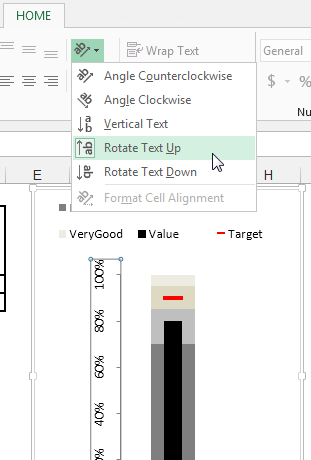
Figure 10-17: Rotate all labels so that they’re on their sides.
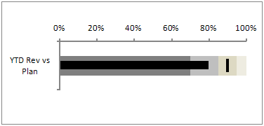
Figure 10-18: A horizontal bullet graph.
The nifty thing about this trick is that because the picture is taken with the Camera tool, the picture automatically updates when the source table changes.
 Never heard of the Camera tool? Check out Chapter 4 for a detailed look at benefits of the Camera tool.
Showing Performance Against a Target Range
In some businesses, a target isn’t one value — it’s a range of values. That is to say, the goal is to stay within a defined target range. Imagine you manage a small business selling boxes of meat. Part of your job is to keep your inventory stocked between 25 and 35 boxes in a month. If you have too many boxes of meat, the meat will go bad. If you have too few boxes, you’ll lose money.
To track how well you do at keeping your inventory of meat between 25 and 35 boxes, you need a performance component that displays on-hand boxes against a target range. Figure 10-19 illustrates a component you can build to track performance against a target range. The gray band represents the target range you must stay within each month. The line represents the trend of on-hand meat.
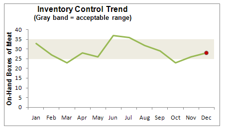
Figure 10-19: You can create a component that plots performance against a target range.
Obviously, the trick to this type of component is to set up the band that represents the target range. Here’s how you do it:
1. Set up a limit table where you can define and adjust the upper and lower limits of your target range.
Cells B2 and B3 in Figure 10-20 serve as the place to define the limits for the range.
2. Build a chart feeder that’s used to plot the data points for the target range.
This feeder consists of the formulas revealed in cells B8 and B9 in Figure 10-20.
The idea is to copy these formulas across all the data.
The values you see for Feb, Mar, and Apr are the results of these formulas.
3. Add a row for the actual performance values (see Figure 10-21).
These data points create the performance trend line.
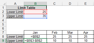
Figure 10-20: Create a chart feeder that contains formulas that define the data points for the target range.

Figure 10-21: Add a row for the performance values.
4. Select the entire chart feeder table and plot the data on a stacked column chart.
5. Right-click the Values series and choose Change Series Chart Type. Use the Change Chart Type dialog box to change the Values series to a Line and to place it on the secondary axis (see Figure 10-22). After confirming your change, the Values series will show on the chart as a line.

Figure 10-22: Use the Change Chart Type dialog box to change the Values series to a Line chart and place it on the secondary axis.
6. Go back to your chart and delete the new vertical axis that was added; it’s the vertical axis to the right of the chart.
7. Right-click the Lower Limit data series and choose Format Data Series.
8. In the Format Data Series dialog box, click the Fill icon. Choose the No Fill option under Fill and the No Line option under Border (see Figure 10-23).
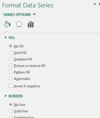
Figure 10-23: Format the Lower Limit series so that it’s hidden.
9. Right-click the Upper Limit series and select Format Data Series.
10. In the Format Series dialog box, adjust the Gap Width property to 0%.
That’s it. All that’s left to do is apply the minor adjustments to colors, labels, and other formatting.