Often, in an application, we'll need to allow interaction with controls that affect the application state. To accomplish this, we'll use actions.
The {{action}} helper is used on HTML elements to send actions back to the template's corresponding controller or component when the user clicks on an element. Let's take a look at an example of this.
- Create a new project, navigate to the root of the
applicationdirectory, and type this command to generate a new component:$ ember g component action-componentKeep in mind that all components must have a dash in their names. This will generate the component template, JavaScript files, and test files.
- Edit the
action-component.jsfile in thecomponentsfolder. We'll add the action,toggleText:// app/components/action-component.js import Ember from 'ember'; export default Ember.Component.extend({ showText: true, actions: { toggleText(){ this.toggleProperty('showText'); } } });In this example, we have a
showTextproperty that's defaulted totrue. When the action,toggleText, is triggered, it toggles theshowTextproperty. ThetogglePropertymethod sets the opposite value of its current property. - The
toggleTextaction is now ready to be added to the template. The next step is to add the action to the component template using the{{action}}helper:// app/templates/components/action-component.hbs {{#if showText}} Lorem ipsum dolor sit amet, consectetur adipiscing elit. Aenean dui est, auctor sit amet augue vel, mattis maximus libero. Praesent feugiat ex justo, vitae convallis nulla venenatis quis. {{/if}}<br> <button {{action 'toggleText'}}>{{if showText 'Hide Text' 'Show Text'}}</button> {{yield}}The
ifhelper will display text only if theshowTextproperty istrue. The button at the bottom has an action calledtoggleTextattached to it. Whenever this button is pressed, thetoggleTextaction will be invoked by the correspondingaction-componentcomponent. To keep things clear, the button text will showHide Textif the text is shown andShow Textif it's hidden.The
actionhelper can be added to any HTML element. As soon as the element is clicked, the action will be triggered. - It's good to know that you can attach an action to any HTML element but not all will respond. Some browsers may ignore the click event. In this case, you can use this
csstrick as a workaround:[data-ember-action] { cursor: pointer; }Tip
Specifying the type of event
By default, all actions listen for click events. When a click occurs, that action is triggered in the context, component, or controller. You can specify an alternative to the click event with the
onoption. For example, a button with a double-click action would look like<button {{action 'toggleText' on='doubleClick'}}Show Text</button>. All event names must be camel-cased and lowercase when assigned toon. - We now need to add the component to the
applicationtemplate file so that it can be displayed:// app/templates/application.hbs <h2 id="title">Welcome to Ember</h2> <br> <br> {{action-component}} {{outlet}} <br>This will add our action component to our
applicationtemplate. - After loading the application with the Ember server, it will look as follows:
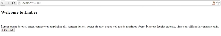
Pressing the Hide Text button will hide the text. Pressing it again will show the text.
Tip
Allowing modifier keys
By default, the
actionhelper will ignore click events when modifier keys such as Alt or Ctrl are pressed at the same time. If needed, you can specify anallowedKeysoption. For example, a button with an allowed key Alt would look like<button {{action 'toggleText' allowedKeys='alt'}}Show Text</button>.
You can have arguments in an action handler that will be passed back to the context. Anything after the action name of the action helper will be passed as an argument to the component or controller.
- To begin, we'll create a new component. After the project is created, run this command in the root of the
projectfolder:$ ember g component param-componentThis will generate the necessary component files for our new
param-component. - Edit the
param-component.jsfile and add a new action calledpressed:// app/components/param-component.js import Ember from 'ember'; export default Ember.Component.extend({ actions: { pressed(text){ alert(text); } } });In this simple example, the
pressedaction has only one parameter. When the action is triggered, analertbox is displayed with the passed in parameter text. - The next step is to edit the template and add the action:
// app/templates/components/param-component.hbs
{{input text='text' value=hello}}
<button {{action 'pressed' hello}}>Press Me</button>
{{yield}}
In this template, we have an
inputhelper. Theinputhelper will be discussed in more detail in the Using template input helpers recipe. The button press triggers thepressedaction and passes thehellotext from the input helper to the action.Note
Allowing default browser action
The action helper, by default, prevents the default browser action of the DOM event. In other words, when a user clicks on a link or button that might otherwise reload the page, Ember prevents this. If needed, you can turn this behavior off using
preventDefault=false. For example, we can add an action event to a link and have it redirected to a page as well as trigger an event<a href="thispage.htm" {{action 'pressed' preventDefault=false}}>Press Me</a>. - The next step is to add
param-componentto the application:// app/templates/application.hbs <h2 id="title">Welcome to Ember</h2> <br> <br> {{param-component}} {{outlet}} <br>In this code, we added
param-componentto theapplicationtemplate. - After starting the server, a textbox will be displayed. Pressing the Press Me button will display the text in an alert box. It should look as follows:
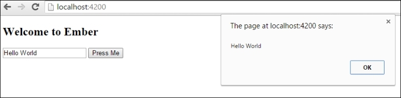
- In some cases, we may not be using an
inputhelper. Let's say that we want to have an action event triggeronblur. We can specify avalueoption in ouractionhelper:// app/templates/components/param-component.hbs <input type="text" value={{hello}} onblur={{action 'pressed' value='target.value'}} />The input
textfield hasvalueequal to thehelloproperty. Theonblurevent is raised whenever the element loses focus. By default, the action handler receives the first parameter of the event listener. In this case, it would beEvent {}. We must specify thevalueoption to specify the target value usingtarget.value.
Unfortunately, due to the way Ember binds values, we cannot simply just send the hello property as a parameter to the action. This is why we must use the value option.
You can test this by entering text in the textbox and clicking outside the box so that it loses focus. It should show the correct text in the alert popup.
The action helper attaches to HTML elements in order to allow user interaction. It sends named events to the template's corresponding context, component, or controller.
The action helper by default sends the first parameter of the event listener. You can send any parameter that you want after the action event. If needed, you can specify the value option and use value.target, which will send the target of the event.