
Some benefits of monitoring are immediate, such as early detection, evidence-based decision making, and automation. But its full value extends beyond that. Monitoring plays a central role in the absorption of job knowledge and driving innovation. You can’t manage what you don’t measure. A widely deployed monitoring solution keeps everyone on the same page. Timeseries plots allow for the exchange of complex ideas that would otherwise take a thousand words. Monitoring adds great value to the system and helps to foster the culture of rapid and informed learning.
The main purpose of monitoring is to gain near real-time insight into the current state of the system, in the context of its recent performance. The extracted information helps to answer many important questions, assists in the verification of nonstandard behavior, lets you drill down for more information on an issue that has been reported, and helps you estimate the capacity of the system. Before I move on to discussing all these useful aspects, I think it will help if I discuss the fundamental building blocks of a system from the bottom up.
The process of monitoring starts with gathering data by collection agents, specialized software programs running on monitored entities such as hosts, databases, or network devices. Agents capture meaningful system information, encapsulate it into quantitative data inputs, and then report these data inputs to the monitoring system at regular intervals. The inputs are then collated and aggregated into metrics to be presented as data points on a timeseries at a later stage. Input collection may be a continuous process or it may occur periodically at even time intervals, depending on the nature of the measurement and the cost of the resources involved in data collection.
Data collection agents can be categorized into the following groups:
- White-box
- Log parsers
These extract specific information from log entries, such as the status codes and response times of requests from a web server log.
- Log scanners
These count occurrences of strings in log files, defined by regular expressions. For instance, to look for both regular errors and critical errors, you can check the number of occurrences of the regex “ERROR|CRITICAL” in a log file.
- Interface readers
These read and interpret system and device interfaces. Examples include readings of CPU utilization from a Linux /proc pseudo-filesystem and readings of temperature or humidity from specialized devices.
- Black-box
- Probers
These run outside the monitored system and send requests to the system to check its response, such as ping requests or HTTP calls to a website to verify availability.
- Sniffers
These monitor network interfaces and analyze traffic statistics such as number of transmitted packets, broken down by protocol.
Before the data collection can take place, agents must be deployed to the monitored entities system-wide. However, in some circumstances, it might be desirable to monitor remote entities without the use of deployable agents. This alternative approach is referred to as agentless data collection, during which the data is transmitted from the monitored entity through an agreed protocol and is interpreted outside the monitored system.
You might want to resort to agentless monitoring in systems with heavy restrictions on custom software deployments, such as proprietary systems that disallow custom additions, legacy systems that don’t support the execution of agents, and high-security systems with restrictions imposed by policy.
Examples of agentless data collection include:
Gathering statistics from proprietary operating systems running on networking gear via Simple Network Management Protocol (SNMP).
Periodically executing diagnostic commands via SSH and parsing the output.
Mounting the /proc on Linux remotely via sshfs for local interpretation.
Agentless monitoring comes with a couple of disadvantages:
Network link outages between the monitored and the interpreting entity can result in missing data points.
There is additional overhead, as the data must first get transferred to the interpreting entity, where the inputs are extracted.
Complete monitoring should cover three major groups of metrics: resource availability, software performance, and, where applicable, user behavior. The metrics for all groups should be retrievable as a timeseries through a common interface that allows for effective identification of problem sources by correlating the timeseries of neighboring layers in a system stack. Full monitoring coverage spans networking, hardware, OS, middleware, the application, and a set of key performance indicators. Figure 2-1 illustrates the layers of coverage in a system stack.
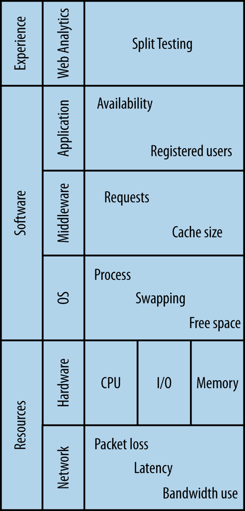
Every action in the system costs CPU cycles. Most require memory, information exchange takes up bandwidth, data takes storage space, and communication between devices consumes I/O throughput. Resource usage patterns change with load. Large systems with human users tend to follow load patterns based on circadian rhythm with increased consumption of resources during the day and minimal utilization at night. It is important to realize what typical usage patterns are. Monitoring resource utilization helps you do that. Networking and computational resources require close and constant attention.
Data on resource utilization and availability can be collected directly from devices providing the resources. Usage levels are reported in the form of statistics from drivers through a programmable interface.
Data delivered over the network travels with a sometimes noticeable latency: the time delay caused by digital processing and physical transport media. A network link also has a limited throughput, defined as the amount of information conveyed per unit of time. Latency must be kept to a minimum and the higher the throughput the better. Transmission disruptions can be expressed in terms of increased latency and reduced throughput.
Because computer networks are central to the idea of distributed computing, any network disruptions will inevitably be manifested in the overall system’s performance. Applications are designed with an assumption that the network simply works, but in reality it’s dangerous to take this for granted. System performance problems resulting from network dysfunction have been succinctly captured in the set of Fallacies of Distributed Computing formulated in the nineties by L. Peter Deutsch. In essence, packet loss will take place, network latency will affect the application’s performance, and network bandwidth will become limited. For these reasons, the network must be monitored closely.
The basic currency in the world of information systems is a unit of capacity. The cost of any user activity can be expressed in terms of the resources it uses. But overdrafts of this currency are not allowed, which is why it is so important to keep a close eye on resource saturation at all times.
A typical computational action in a web service environment is a request. Every request takes resources: at a minimum it consumes memory and CPU cycles, but frequently it also reads and writes some data to other devices such as disk drives, introducing further I/O cost.
The depletion of any resource required to serve a request leads to creation of the so-called performance bottleneck. Usage patterns cannot be predicted with 100% reliability and resource shortages may not always be prevented by accurate capacity planning or dynamic allocation of instances in the cloud. Remember that meeting the load with additional capacity is not always desirable. Consider Denial of Service (DoS) attacks, where the attacker’s objective is to shut down the service by driving the saturation of the scarcest resource it can manipulate. Monitoring computational resources in the context of system use is necessary to discern patterns and react accordingly.
A solution stack commonly consists of three parts: the operating system (OS), middleware, and an application running on top. Each layer generates information about the state of each component. It is important to have an overview of and collect metrics for all components of the solution stack, because faults can arise at any layer. The more software metrics that are reported, the more conclusions you can draw without digging into logs. There is nothing wrong with log analysis—logs will contain crucial, precise information that may never make it into a timeseries—but plotting metrics is much faster, and most of the time you don’t need the precise data logs yield, while you almost always need to see the big picture fast.
While tightly bound to resource utilization, operating system monitoring examines resource usage more at the software level: it aims to find out how efficiently resources are being used, in what proportions, and by whom. Typically, OS level metrics report on the proportion of user-to-system CPU time; virtual memory management including swapping and memory statistics; process management, including context switching and waiting queue states; and finally filesystem level statistics like inode information.
Various operating systems respond differently to different usage patterns, and within any OS many parameters are tunable. Fine tuning the OS according to your use case may result in better performance, which will obviously be reflected in monitoring metrics.
Early indications of physical hardware failures sometimes get reported in OS level logs, which may enable operators to act preventively before a machine fails in production.
On top of the OS, the middleware layer serves as the platform for an application. It provides a standard set of combinable, purpose-specific software components which, put together, act as the engine of the solution. Middleware in distributed computing includes software web servers and application server frameworks. For monitoring purposes, these gather per-request information, keeping track of the amount of open sessions and states of transactions.
Application metrics contain information specific to the operation and state of the application only. They often introduce high-level abstract constructs specific to the domain of the application. Thus, a batch processing system can express a batch in terms of size and number of items contained. A content management system can describe a modification operation by the extent of changes (major or minor), type (addition, deletion, or both), the time a person took to update content, etc.
Application inputs may vary from relatively few long-lived events (e.g., open sessions) to an extremely large number of short-lived metrics (such as ad impressions). In both cases it is usually appropriate to measure their turnaround times and express them as delay measurements. The application-level load measurements can be expressed through input levels (i.e., incoming traffic and number of submitted inputs).
Availability is also measured at the application level of the stack. A failure in any of the underlying layers of the system stack takes away from the overall availability of your system. Therefore, for an availability metric to be meaningful, it must be recorded from external locations so the network is measured as well.
Finally, monitoring user behavior is carried out with web analytics software in order to answer questions about user experience. Classic user behavior metrics used in websites are the average time spent on the site and the percentage of returning visitors. User behavior monitoring is a broad subject and is beyond the scope of this book.
Monitoring metrics are collections of numeric data inputs organized in groups of consecutive, chronologically ordered lists. Each data input consists of a recorded measurement value, the timestamp at which the measurement took place, and a set of properties describing it.
When data inputs from a metric are segmented into fixed time intervals and summarized by a mathematical transformation in some meaningful way, they can be presented as a timeseries and interpreted on two-dimensional plots.
The length of data point intervals, also referred to as time granularity, depends on types of measurements and the kind of information that is to be extracted. Common intervals include 1, 5, 15, and 60 minutes, but it is also possible to render intervals as granular as one second and as coarse one day.
The single most important advantage of using timeseries for monitoring is their property of accurately illustrating the process of change in a context of historical data. They are an indispensable tool for finding the answer to the critical question: what has changed and when?
Timeseries are two-dimensional with data on the y-axis and time on the x-axis. This means that any two independent timeseries will always share one dimension—time. This way, plotting data from multiple metrics against one another adds just a single layer of complexity at a time to the chart. For that reason, timeseries provide an efficient means of highlighting correlative relationships between data from many sources, such as interlayer dependencies in a software stack.
Monitoring metrics store data inputs and describe their properties. Generating and plotting a timeseries involves retrieving a subset of data inputs by specifying a set of properties (for example, hostname, group), dividing them into evenly spaced time intervals, and mathematically summarizing data inputs in each interval. This is done with the use of summary statistics. Commonly used summary statistics are:
- n
The count of inputs per interval
- sum
Sum of values from all inputs
- avg
Mean value for all inputs (sum / n)
- p0-p100
Percentiles (0-100) of the input values including min (p0) and max (p100) values as well as the median (p50)
- deviation
Standard deviation from the average in the distribution of the collected inputs
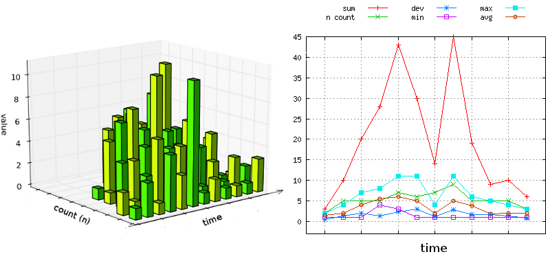
Summary statistics describe observed input sets by their centers (average or median), the total (sum, n), and the distribution and spread (percentiles and deviations). They can summarize huge data sets in a compact and concise way. Turning many numbers into a single one does cause information loss, but the summary is usually accurate enough to draw reliable conclusions. Figure 2-2 shows how data from an irregular data set are represented through summary statistics.
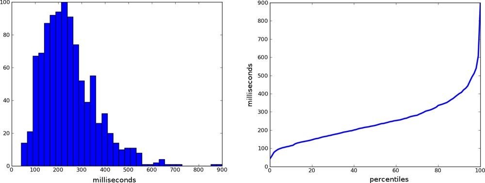
Frequency distribution is a summary of a data set that combines numeric items (a process called binning) into groups and presents the groups in manner that lets you quickly see their relative size. The distribution is most commonly illustrated in a histogram, as depicted on Figure 2-3. The x-axis here is not a timeline, as it is when presenting a timeseries. The left side of Figure 2-3, labeled “milliseconds,” answers the question “How many transactions took 300 milliseconds, compared to 100 milliseconds, etc.?”
Histograms often fall along a normal distribution, with their bins fitting right under the famous Gaussian curve. But system data is usually not that regular and typically displays a long right tail; that is, the distribution is skewed to the left. There is a simple reason for that: the lower limit on performance is a hard one—it can’t break the laws of physics. Think of latency, for instance: the best case scenario turnaround time must always be more than zero time units. Its upper limit, on the other hand, is a soft one—theoretically, you could wait forever.
Summary statistics plotted as data points over time are convenient for observing change, but timeseries don’t necessarily reveal the true nature of the data.
You can extract raw data inputs from offline log analysis and present them on a histogram to show their relative frequency. This information gives operators a good idea of what value to expect from a typical input and what the input distribution looks like behind each summarized data point.
An alternative way to summarize frequency distribution is a percentile plot. For any set of inputs, a percentile is a real number in the range of 0 to 100 with a corresponding value from that set. The number at a particular percentile shows how many values are smaller than the value of that percentile.
Percentiles get calculated by sorting the set of inputs by value in ascending order, finding the rank for a given percentile (that is, the address of the value in the sorted list), and looking up the value by rank.
The 0th percentile is the measurement of the lowest value (the first element in a sorted list, min), and the 100th percentile is the maximum recorded value (the last element in the list, max). The 50th percentile or p50 is commonly referred to as the median, and stands for the middle value in the set. Percentiles make distribution easy to interpret; for example, for measuring response time a p98 value of 3 seconds means that 98% of all requests completed in 3 seconds or less. Conversely, 2% of the slowest requests took 3 seconds or more.
Rate of change illustrates the degree of change between data points on a timeseries or other curve. Effectively, where the slope of the original timeseries plot is rising, its rate of change has positive values. Conversely, when the slope descends, the values on the rate of change series are negative. The rate of change derived from a timeseries can be presented as another timeseries.
Rate of change is a useful conceptual tool for illustrating levels of growth or decline over time. It is used extensively with counter metrics (discussed further) to express number of counter increments per time interval.
Data points in a timeseries are presented at a fixed time granularity. Fine granularity translates to short data point periods. The coarser the granularity, the longer the period.
Fine granularity metrics tend to reveal the exact time of an event and are therefore useful for finding direction in causal relationships, as well as describing timelines. They might, however, be more expensive to store. Coarse granularity metrics, on the other hand, are much more suited for illustrating trends.
Selecting the right granularity to present a metric is important for accurate interpretation of data. Both too granular and very coarse measurements may obscure the point you’re trying to convey.
Some monitoring systems lock the user into using predefined constant intervals, whereas others allow the user to specify arbitrary periods. However, some minimum interval is always required. Even if we were able to present events on a continuous time scale (with an infinitesimally fine granularity), it would probably not be very helpful. In the real world, no two events happen at the exact same time, so recording that on a continuous scale would never make the event count stack up on the plot. In other words, the maximum event count on our continuous timeseries would never exceed 1 at any given data point. Going to the other extreme, if the data point interval is extremely long, such as one year, the output will be a huge collection of event occurrences. That can be somewhat useful for purposes of data analysis but not for monitoring.
In distributed systems, data inputs for the same metric come from many sources. Think of a group of web servers behind a load balancer, reporting statistics about requests being served. One way to view the request data is in the form of multiple timeseries, one for each web server, plotted out against each other. However, aggregation could combine the results from the web servers into a single timeseries with a total of all requests.
Aggregation enables you to get an overview of the data and simplifies the chart, but the ability to drill down to view each source of data is no less important. Suppose one of the servers stops taking requests. It will either report zero-valued data points or stop sending inputs altogether. The fault can be detected by looking at the individual server metrics, but it wouldn’t necessarily show on the aggregated plot.
Many faults, however, are a lot subtler than that and manifest themselves through slight depressions in the number of requests rather than their complete disappearance. In these cases, it is also desirable to aggregate data points from all sources and present them as a single metric to show the cumulative effect.
Metric aggregation is not to be confused with alarm aggregation, discussed in more detail in Chapter 3.
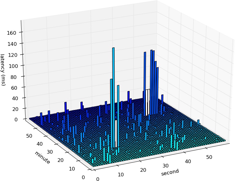
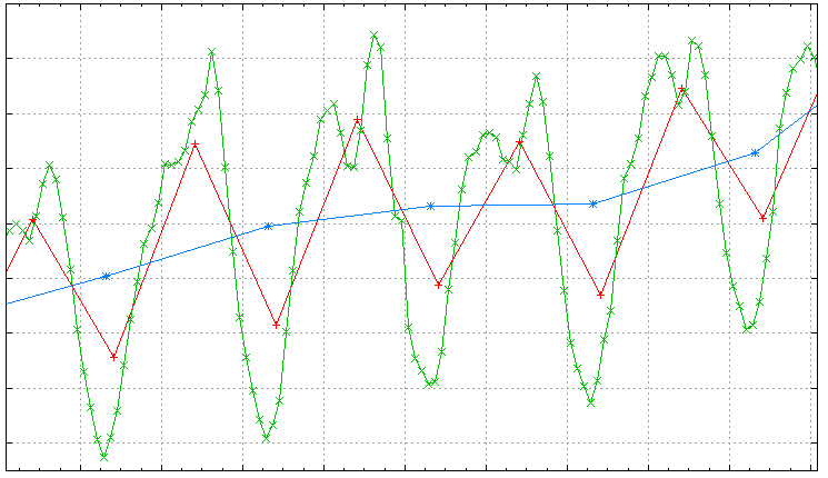
I created some sample data by sending ICMP echo requests every second for a period of one hour and recording the round-trip time for each request. Figure 2-4 shows a 3D plot of latency. The plot includes all data inputs in their unreduced form. Two clusters of very high latency are visible: one peaking at 177ms between 10 and 20 seconds of minute 14, and the other peaking at 122ms between 40 and 50 seconds of minute 40. Their empty bars signify packet loss.
The plot on Figure 2-5 was created from the same set of inputs as that on Figure 2-4. The inputs were gathered in active mode and served as a basis for two separate multi-N metrics, one for packet loss and one for latency. Both are presented as timeseries with data points at one-minute intervals and summarized by arithmetic mean.
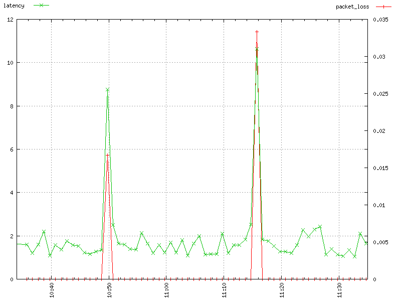
This time we see latency as a line with crosses (green). Each cross marks one data point, summarized from measurements taken at the interval of one minute. The y-axis of this line is measured by the numbers on the left-hand side of the figure. Packet loss is shown as a plain red line). The y-axis for packet loss is measured by the numbers on the right-hand side of the figure, which range from 0 (no packet loss, which is the case most of the time) to 0.035 (3.5% packet loss).
Because the data is chunked by minute, and the test sent a packet once per second, the packet loss metric is calculated by dividing the number of packets lost during a minute by 60. The two spikes in packet loss are at minute 14, where it reached 0.017 (1.7%), denoting that 1 out of 60 inputs was lost, and almost 3.5% at minute 40, which denotes 2 lost packets.
Overall, Figure 2-5 illustrates how you can trade off the loss of some detail in order to get a quicker grasp of underlying issues.
A solid understanding of data presented in metrics is essential to drawing reliable conclusions from timeseries plots. Knowing which category a metric belongs to and where its data originates is helpful in realizing the impact of pattern shifts and presenting the information in the most conclusive ways. Some summary statistics emphasize the key insight better than others, and the same data may appear dissimilar when displayed at a different time granularity. Realizing differences of that sort assists in constructing plots that clearly convey the point.
This section breaks down the interpretation of metrics by looking at their basic properties. Looking at metrics in this way should enable you to make reliable assumptions about the data and their origin and understand likely changes in metric behavior. But hey, don’t just take my word for it. Visit RRDTool Gallery. The page contains tens of performance graphs and timeseries examples submitted by RDDTool users from around the globe. Try going there before and after reading this section. Are you able to extract some more meaning the second time?
Each metric can be seen in three general ways based on the type of its units.
- Amount
A collection of discrete or continuous values resulting from inputs; examples include number of matches in a search result, packet size, price, free disk space.
This group of metrics is by far the most common. Resulting data plotted as timeseries illustrates operational flow and states. Amounts are typically recorded at all levels of the software stack.
Units: bytes, kilograms, price, sum of returned items.
- Time Delay
An amount of time required for an action to complete; examples include latency, web request response time, ICMP round-trip time, time spent by a user on the website.
Just like amounts, delays are typically recorded at all levels and play a crucial role in performance monitoring due to the immediate effect of response times on user experience. Resulting data points are almost always a blend of multiple inputs that happened in a given time period. Typically, their average, median, and high percentile values are watched most closely.
Units: milliseconds, seconds, minutes, hours, days, CPU cycles.
- Amount per Time
Discrete or continuous amounts flowing through the system per unit of time, more generally referred to as throughput; examples include bit rate and Input/Output Operations Per Second (IOPS).
Such metrics are suitable for monitoring small data bits produced in big amounts with high potential variability of values. They are most commonly used for monitoring lower level metrics such as hardware device statistics. Typically, the underlying hardware device has a built-in mechanism for keeping track of and reporting on the flow of throughput. In such cases, amount per time metrics represent one input per data point: that is, the device was queried for its state once in a given data point period. In other cases, where multiple inputs are available per data point, the variability of throughput can be observed through input distribution via use of percentiles, just as in case of the previous two types.
Units: bits per second, IOPS, miles per hour.
Let me illustrate this classification with an example of requests to a web server.
A web server accepts HTTP requests and issues a response to each of them that takes a non-zero amount of time. The duration dependent on the size of the request.
Suppose the server accepts up to 15 simultaneous requests and that each request takes on average 200 ms to complete. Requests may come at different times and their duration may vary, but let’s assume that the server can safely take 75 requests per second. All three types of metrics could find application here:
Amount: Request size, or the record of each request’s magnitude in bytes. The metric can be interpreted in terms of multiple summary statistics:
The sum of inputs reveals the total size of incoming user data. This information can later be used for billing purposes.
The avg, p0, p50, and p100 carry information about the variability of request sizes, revealing the average, smallest, most typical, and largest values respectively. This information about distribution of request sizes can be used for stress testing and capacity planning.
Time Delay: Response time, or amount of time necessary for a request to complete. Interesting summary statistics include the average, the fluctuation of which reveals sudden changes in the underlying distribution, and p99, which holds the time of the slowest 1% of all responses.
Amount per Time: Number of requests per second, the effective throughput of requests. Assuming that the inputs are measured every second to construct one-minute data points, p100 reveals the maximum number of requests per second. When this number approaches the defined limit of approximately 75 requests per second, a degradation of user experience might be observed; in the absence of a queuing mechanism, the requests will have to be dropped and the user will be forced to retry them.
In this particular case, there exists a strong correlation between all three measurements. The first two are positively correlated: the larger the request, the longer the response time. The amount per time metric and the other two are negatively correlated: the bigger the requests and thus the longer the responses, the fewer requests per second may be accepted.
Data collection agents can operate in two modes, active or passive, depending on the actions taken to extract the data.
- Active
An active monitoring entity proactively issues test requests to gather state and health information; examples include an ICMP ping request or an HTTP GET health probe.
Active monitoring introduces overhead into the net cost of system operation. The overhead is not usually monitored itself, but the operator should be aware of the proportion of introduced cost to the overall cost of normal system operation. When possible, monitoring impact should be kept at negligible levels.
- Passive
In passive monitoring, the agent watches the flow of data and gathers statistics without introducing any cost into the system. In monitoring networks, the data is gathered by reading statistics from network gear and through the use of packet sniffers. The resulting information yields the number of transmitted packets and proportion of traffic divided into OSI model.
Another way to classify measurements is by the locus of the data gathering agent, internal or external.
- Internal
Measurements are gathered within the system (log data, device statistics).
Data inputs are collected internally with the help of agents executed continuously or at specific intervals and reporting statistics read from system’s interfaces such as the /proc filesystem in Linux. Centralized monitoring systems may also gather data in an agentless fashion by opening SSH sessions from their central location to a set of monitored destination hosts in order to read the statistics and interpret them locally.
- External
Measurements are gathered and reported by an external entity. External monitors typically operate in an active mode to establish availability (see the earlier examples of active monitoring), but they can also passively monitor data flow (through network sniffers inspecting and classifying traffic, for instance).
External black-box monitoring is aimed at verifying the system’s health. Health check agents send probes through system entry points to measure end-to-end availability.
When the scale of the organization is significant enough, a special kind of external monitoring is possible through watching social networks. A huge number of results for “is Google down or is it just me” in a Twitter search query, for instance, might be an indication of problems with accessing the website.
Metric measurements can be further divided into multiple subcategories based on the number of inputs required to construct a data point and the nature of the measurement.
- Multi-N
Data points for multi-N metrics are summary statistics combined from multiple processed inputs. The inputs get aggregated and the resulting data point contains a full set of useful summary statistics describing cumulative effects (sum, n), typical values (average, median) and distribution of the data (percentiles).
Examples include bytes transferred, number of HTTP requests, average time on site, and p99 of the response time.
- Single-N or 1-N
Data points for these metrics require only a single input in order to construct a meaningful data point. In most cases, the metric illustrates state change over time. Although the schema of the data point may include the full set of summary statistics, the one and only recorded value will be assigned to all of them and n will be equal to 1.
Examples include IOPS, CPU utilization, and message count.
Metrics can also be interpreted by the type of quantity they represent.
- Flow
This kind of metric records events and their properties.
Flow records a variable number of inputs per interval (that is, it is multi-N). The data is gathered from multiple sources and is summarized after being aggregated. A high variability of input values allows the viewer to draw conclusions from the distribution of inputs. High values of extreme percentiles are an early indication of changes, some of which could be interpreted as worrying.
Examples include the sizes of packets sent, prices of sold items, and response times for each request.
- Throughput
This measures the rate of processing over a period of time.
Throughput metrics record continuity and intensity of flow. They are expressed in units per time and illustrate levels of resource consumption. Because throughput limits can be reliably tested and clearly defined, this type of metric is used for alarming on resource saturation and identifying bottlenecks.
Examples include bit rate and IOPS.
- Stock
This indicates an accumulated quantity at a specific point in time.
Stock metrics are single-N. They record a single data input per data point interval. They are expressed in simple units of quantity and represent a total of the agglomerated value. The levels of stock may be changed by processes that are recorded by flow metrics, and the intensity of these changes is expressed by throughput metrics.
Examples include memory usage, free disk space, queue length, temperature, and volume level.
- Availability
This measures the degree to which the expected result is returned.
The source of input for availability metrics are probes—requests issued proactively that return success on the receipt of an expected response or failure otherwise. Probes may be internal or external. As a multi-N metric, with low variability of input values (1 on success and 0 on failure), the average of inputs yields availability in percentage terms (a number ranging from 0.0 to 1.0).
Examples include HTTP GET requests expecting a 200 response code, ICMP ping results, and packet loss.
Data points on a time series follow patterns that strongly depend not only on the number and variability of recorded inputs but also on the temporal granularity and the properties of the selected summary statistic. The finer the temporal granularity, the more spiky the timeseries will appear, while series with coarser granularity demonstrate less variability of data point values. Summarizing multiple inputs with extreme percentiles also leads to higher variability (more fluctuations) than when summarizing with average. Analyzing timeseries in terms of their patterns is crucial in understanding their normal behavior and plays a role in selecting the right alerting strategy.
Figure 2-6 shows eight common patterns. We’ll take a look at what each pattern indicates.

- Spiky
This is often found in flow and throughput metrics and can be attributed to high variability or burstiness of inputs: their sudden change in values or quantity. Spiky patterns are often noticed on metrics relating to bandwidth usage and computational resources that are prone to rapid changes in utilization patterns.
- Steady
This appears when data point values have a low variability at a non-zero level. Their value range is probably restrained from one side, for instance, by the laws of physics (latency, speed of light in glass) or a hard limit at 100%. This pattern is seen when measuring availability and underutilized resources. When no distinguishable trends are present, accurate alarm threshold values can be calculated from average and standard deviation.
- Counter
This is a special case that occurs with a stock metric, where a discrete value keeps increasing until it gets flushed. These metrics are a reflection of a counter variable plotted over time. Counters include records of event occurrences since a certain date or indicate an age, where the counter variable increases at a constant time interval, thus measuring the temporal distance since a point in time. Counters do not decrease, but they might get reset to 0. They are used for evidencing and predicting the necessity for maintenance. The record of counter’s rate of change can be interpreted as a flow of incrementing events (see Flow).
Examples include the number of seconds since last update (age in seconds) and the number of reboots since last filesystem check (usage-age).
- Bursty
These metrics come as a result of an intermittent operation of system components, with extended periods of inactivity, as in the case of CPU utilization on batch processing systems such as map-reduce clusters. These jump up to almost 100% on the processing of a job, but stay low while awaiting submissions.
- Cyclic
Series following sinusoidal patterns are subject to cycles. Virtually all metrics that come as a result of interactions with humans from a selected geolocation and at scale—for instance, website traffic—reflect humans’ diurnal cycle with trends and seasonal effects.
- Binary
These appear for availability metrics recording only two values: 1 and 0 on success and failure, or the presence and absence of events. Depending on the graphing system, a binary pattern can be presented as a square wave alternating between 0 and 1 or as a change of background color in affected temporal space (for instance, a red background for data points during which health probes failed).
- Sparse
Sparse timeseries are ones whose metrics do not receive inputs at every interval. They record events that happen irregularly. Sparse timeseries can be subdivided into two categories: ones that record a value of zero even when no data inputs were reported, and ones that don’t. In the former case, the recording of null values prevents interpolation between distant data points and makes the plots more interpretable, while the latter solution, less expensive to store and retrieve, may be a good fit for measurements taken on an irregular basis.
Sparse series are commonly used for recording errors and events unlikely to occur in normal operation.
- Stairy
This pattern is observed when data points rise and fall sharply to stay at the same level for extended periods. It’s commonly seen in stock metrics expressing level of consumption or activity, such as those that measure disk space, free memory, or number of processes running.
Timeseries data are used to extract information about the past, present, and future. Real-time plots help to detect problems while they are occurring and help to confirm the validity of mitigative actions (for instance, in the case of high memory usage on a server and you watch it decrease after throttling an offending client IP). Data points gathered over time describe the operational system state in historical context, facilitating the detection of chronic problems that would otherwise not be classified as critical. In addition to preventative analysis, trends and seasonal variations are used for more accurate capacity planning.
Deviations of data points from standard patterns carry meaning that can be read like a symbolic language, its alphabet the spikes and dips, bursts and plummets, depressions and elevations, as well as flattening effects. The vocabulary of the language is somewhat limited and, therefore, the grammar must be based on strong contextual knowledge and a sense of proportion.
For a vast majority of timeseries, data point values change all the time, but only some of the time are they significant enough to be noticed and categorized as anomalies. Anomalous fluctuations can be considered in terms of their direction (rise or fall), magnitude of deviation (distance from the baseline), duration in data points, and progression.
Spikes and dips differ in direction (dips are negative spikes). They are short-lived (the timeseries recovers just after a few data points) and because of their short duration, they manifest no progression.
Elevation and depression also differ in direction, but take more data points to recover from and therefore may reveal different progression patterns: a sudden jump with sustained level, a linear increase/decline, or an exponential rise and fall.
The key to interpreting these sorts of fluctuations in a timeseries is to recognize the type of recorded quantity and the summary statistic used. Summary statistics can be binned in two groups: one describes the total of inputs as a bulk quantity, such as their sum or recorded amount (n), whereas the other describes how steady individual inputs are by means of average and percentile distribution.
The previous section described five quantity types: flow, stock, availability, and throughput.
Flow records some property shared by multiple events. The n statistic describes flow levels, that is, number of inflowing events per interval of time. Think again of requests incoming to a web server and their response times. The n statistic displays traffic levels. Sudden bursts and spikes can be attributed to client usage patterns. Given that not all requests have equal costs, the sum of request times can be interpreted as the total cost of operation expressed in computational hours. The average (avg) is the mean request time. An unsteady average hints at changes in the distribution of input values, typically a slowdown of a portion of requests.
Such a change is best highlighted by the use of high percentiles, such as p95 or p99. Their exceptionally high values imply a shortage of resources or bandwidth saturation. If it’s the former, spikes of p99 should align with spikes of the sum (total computation time) and underlying CPU utilization stats. Although the average might be skewed by a fraction of slow requests, p50 reliably describes typical user experience.
Note
The reason why it is more common to see distribution changes at higher rather than lower percentiles is that most metrics have hard limits for values at the lower end. At the same time, there is no restriction at the other end. Let me take network latency as an example: the lowest value is only as small as permitted by the laws of physics, while nothing prevents the response from taking arbitrarily long.
Stock quantities record information about capacity levels. They may pertain to storage, memory, or abstract constructs such as software queues. Stock metrics are inherently single-N, so their only valid summary statistic is the sum. Changes in data point values reflect inflows and outflows, which may be described in more detail by related flow metrics.
Suppose you monitor a data pipeline consisting of three components: a submitting entity, a queue, and a processing entity. The submitting entity enqueues requests and the processing entity dequeues and processes them sequentially. If the rate of submissions is lower than the rate of processing, the stock metric describing the queue level will remain at 0, occasionally reaching the value of 1. When the submission rate is higher than processing rate, the queue will increase steadily and a backlog will accumulate. If the submitting entity ceases its operation, the processing entity will drain the queue over time.
The counter type is a specialized case of a stock quantity, in which regular inflows are accepted, but the outflow is performed explicitly once in a while to flush the counter back to zero. As a stock metric, it is single-N and doesn’t make any use of summary statistics. Deriving rate of change from a counter produces a timeseries for flow, describing the rate at which the counter increases.
In information systems, counters are often used to hold information about periodic maintenance, such as the number of partition mounts since the most recent filesystem check or the time in seconds since the most recent content update. Counters find their application also at the application level. Suppose you run an advertising platform, and display ads in rounds of 1000 impressions. When the counter reaches the impression limit, the counter is reset and the next ad is served.
The rate of increase should change with rates of Internet penetration. If the data points flatten out at a steady level for suspiciously long, the ads have probably been discontinued for some reason, and the issue might need to be investigated.
Consider another example. A fleet of machines requires regular maintenance that has to happen at least once every five days, but may happen more often. The way to keep track of time elapsed since the last maintenance is to record the difference between the current timestamp and the timestamp when the last maintenance completed. An alarm set up around such a metric’s sum statistic with a threshold of 432000 seconds (five days) will issue a alert notification about a missed update.
Availability is a special case of a flow metric in which data inputs take one of two possible values, 0 and 1, corresponding to failure and success, respectively. When the total of collected inputs is averaged per data point, the data point takes a value of a fraction reflecting availability expressed in percentage terms. For example, if 9 out of 10 probes return success and 1 returns failure, the average availability for that data point equals:
Throughput metrics record intensity of utilization and are expressed as average units of flow during a period of time or a percentage of total resource utilization per interval. Resource limitations are conveniently expressed in terms of their throughput, so this type of metric is perfectly suited for observing and alarming when resource saturation occurs. Examples of throughput metrics include CPU utilization, which really is a ratio of utilized clock ticks to all available ticks in a given interval of time, and the speed of transmission, or bit rate.
Table 2-1 summarizes the kinds of information extractable from combinations of summary statistics and quantity types.
Table 2-1. Information extractable from different types of metrics.
| Type of Quantity | Measure of Total (n, sum) | Measure of Steadiness (average, percentiles) |
|---|---|---|
| Flow | Input levels, processing rate, total work or gain | Existence of bottlenecks, early indications of resource saturation, regularity of inputs |
| Stock | Available space, freshness, state since last reset, continuity of operation | N/A |
| Availability | N/A | Level of availability, event incidence in percentage terms, content coverage |
| Throughput | N/A | Intensity of utilization, saturation, burstiness |
We can now survey a few commonly seen patterns in the quantity data discussed in the previous section.
A flattening effect is manifested when the line on the plot reaches an artificially steady level, compared to historical data points (Figure 2-7). The effect may occur in many different types of metrics and for various reasons, but it almost never brings good news. It usually signifies a saturation of a resource or discontinuation of flow.
Some concrete examples include:
A sudden flattening on a counter metric indicates a discontinuation of flow. Its rate of change series is equal to flow metric continuously recording a 0 value.
A flattening at 200 ms of p99 in a response time metric may be a fallout of high packet loss combined with a retransmission timeout setting of 200 ms.
Flat lines in CPU utilization point to resource saturation.
This effect occurs when a new server is put in service and the application has had no time yet to get up to speed. Due to initially empty system caches, the host processes data at a rate slower from the one observed in a steady running state. Warm-up effects manifest themselves as short-lived increases in response time (Figure 2-8).
Warming up a server before placing it in service is a tested method of avoiding degraded user experience. The idea is quite simple: simulate the load that the machine will handle and prepare the machine for operation by feeding the server with a sample of production traffic extracted from historical logs as it reenters the system.
This consists of a returning record of anomalies, usually spikes, happening at equally spaced time intervals during resource-intensive automated processes (Figure 2-9).
The sources of the spike can be either internal or external. The fastest way to locate the internal cause is to check the crontab logs. Correlating the times of spikes with timestamps in the logs uncovers the direct cause. Anomalies occurring at shorter intervals up to an hour may be caused by a failing hardware device that is performing a periodic self-check or a retry. External causes are reflected in the input to the system, for example, intensified frequency or cost of incoming requests as observed during periodic web scraping.
On some occasions, traffic troughs correlate with high values of response time on extreme percentiles (deep in tail of input distribution) despite no performance degradation (Figure 2-10). During a trough, the system comes under very little load, so a trough should influence overall response times in a positive way—and it does. Still, mysterious indications of poor response time during a trough sometimes turn up, and feeble alerting configurations may set off alerts on this peculiarity. The effect might be a little counterintuitive at first, but it can be easily explained when one understands the nature of percentiles.

Consider a system that accepts 500 user queries per minute during its peak. Response times are monitored by watching the p99 values on a minute-by-minute basis. Throughout the day, a healthcheck prober sends a single control request to the database every minute. It is very comprehensive and takes disproportionately longer than a normal user query. During a trough, the user query volume falls to the level of approximately 100 per one-minute data point, and this is when the data point values of the p99 go high.
Let’s take a look at what happens to p99: at peak, it represents the fastest out of five slowest queries (1% of 500). At trough, when the system gets only 100 queries a minute, the slowest query makes it into p99. This is why p99 jumps up so drastically. Only at trough does it include one exceptionally long running query. The general lesson one can derive from this example is to ensure that the underlying metric can supply your observation with a big enough sample size.
To respond effectively to emergent system events, you must break through uncertainty in real time. The operator is expected to find the root of the problem by backward chaining from its symptoms to the cause and to subsequently apply mitigative action. When the process is broken down in three logical steps, the efficacy of investigation is significantly improved.
Find correlation. Most commonly, the process starts with the identification of undesired symptoms. To find the potential cause, gather and juxtapose timeseries from other system metrics that display similar levels of abnormality. Your timeseries database might host thousands of metrics, but you need not look at all of them. It’s important to remember that computer systems are organized in software stacks. Keep checking successively for metrics originating from layers or components surrounding the one that reveals symptoms.
Generic practical hints: for loss of availability, refer to network metrics. For problems with performance, check levels of resource utilization. For higher-level problems related specifically to a service, display metrics generated from system logs.
Found something? Great, but correlation does not imply causation, which brings up the next point.
Establish direction. Which is the horse and which is the cart? The need for a cause to precede its effects gives you the answer. Knowing that the problem comes either downstream or upstream (a layer above or below in the system stack), which anomalous timeseries recorded abnormal data points first? Here is where a timeseries of fine time granularity comes in very handy, as temporal precedence is usually a matter of seconds. If the time interval on your series is too coarse, you can still try to parse the logs. If that’s not possible, maybe one of the outer-layer timeseries reveals less visible anomalies leading up to the trouble.
At this point you should have identified one or more potential troublemakers among components of the system.
Rule out confounding factors. Okay, so you think you have it, but you can’t be sure until your hypothesis is verified. Under exceptional circumstances, many components may display abnormal behavior, but it doesn’t necessarily mean that they are contributing. If a number of potential sources of trouble are identified and the situation permits (if the fleet of hosts is big enough to allow for such experimentation), try to switch off or restart the suspected faulty components separately, each on its own host. This tests the hypothesis with all other things being equal. The machine that recovers after sample corrective action wins.
With time and experience, operators tend to develop strong intuition, which significantly expedites the identification of faults. To save time they have to make assumptions, and they will be right most of the time. On rare occasions, though, the assumptions prove wrong. At this point, backtracking and performing a full three-step search for cause might be a good idea.
How Causality Can Be Tricky to Find
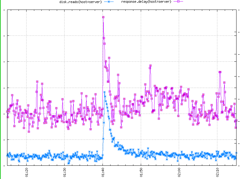
I remember an interesting incident that happened during one of my on-call shifts. We were monitoring a fleet of front-end servers with web content generated on the back end. The back end continuously delivered the content in the form of updates to the front-end servers. The rate of updates was variable, but never reached alarming levels. The inexpensive process accepting updates on the front-end servers was commonly known to be absolutely independent from the web server part; that is, it could be shut down for extended periods of time without affecting the web server functionality in the slightest, almost as if it wasn’t there at all. It was the web server that kept the machines busy, while the update processing component typically utilized CPU and I/O at negligible levels.
At one point we observed a huge increase in response latency at the web server. To establish the source of the symptoms we looked upstream and downstream, so we plotted traffic levels and CPU utilization along high latency on the graph. Our hope, as this chapter has stressed, was to conclusively determine the direction of the problem. High CPU utilization combined with low incoming traffic levels could imply that the problem is caused internally, while very high traffic levels would explain exceptionally high load reflected in CPU utilization. And in fact, the traffic graph showed five times the normal levels—easy! Some very aggressive client deserved to get blocked.
Remarkably, though, the CPU utilization graph started going up a moment before the client pounded the fleet with requests, as if anticipating and preparing for it (Figure 2-11). This suggested a downstream cause of the problem. Eventually, we correlated the initially high CPU levels with significantly more updates coming from the back end, which had some effect on the fleet’s resource utilization. We dismissed this as a coincidence and blocked the offending client—the two systems are orthogonal, right?
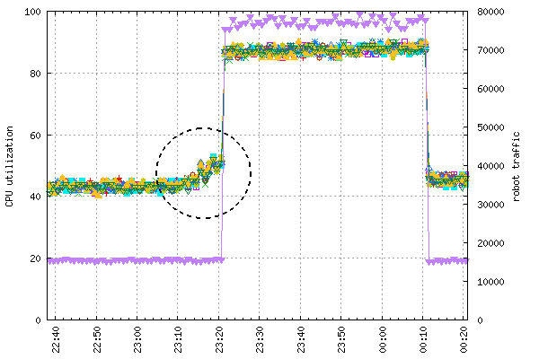
The next day at a completely different time the same thing happened—five times the traffic, shortly after big amounts of updates had started to arrive. Okay, what were the odds of this double crisis?
The second time we didn’t interpret the symptoms as coincidence. We switched off the component accepting updates and, to our surprise, the traffic went away. And turning it back on reinvited the traffic. How?
After some digging, it turned out that massive amounts of incoming back-end updates did have an impact on the system resources and contributed somewhat to raised response times. Most of the fleet continued to work at tolerable levels, but a few hosts responded really slowly. The web client in question was an automated process with an impatient retry mechanism, implemented to get the answers as quickly as possible. Essentially, when the client had not received a response fast enough, it assumed packet loss and issued another query. Then it used one of the two responses, whichever came first.
This had worked in the past, but now the system was genuinely slower because of the volume of incoming content updates. The client kept aggressively issuing requests up to five times, until it finally got an answer. This put additional load on the fleet already under strain, in effect causing increasingly more hosts to serve requests at really long response times. The harder the client pounded us with retries, the more hosts were going out of balance…
Of course, the problem had many facets: lack of a sufficient throttling mechanism, no admission control for incoming updates, and a bad retry mechanism on the part of the client, just to name a few factors. But that’s not really unusual. Most outages do not have a single cause. What’s interesting is the ease with which a plausible conclusion—in this case an external attack—got accepted immediately while the actual cause was discarded as a coincidence despite some evidence to the contrary.
Tracking causality is not the same as root cause analysis (RCA), but may serve as its starting point. Chapter 6 covers RCA in more detail.
Most metrics record system state information pertaining to the current operation of the system. They are recorded “just in case” and are extremely useful for troubleshooting during outage responses. For instance, Figure 2-12 shows data points aggregated over one, twelve, and twenty-four hours.
As the system evolves, gets upgraded, and changes scale, the specific performance information becomes less and less relevant. This is why the retention period for resource utilization metrics rarely exceeds four weeks: a little bit of historical context is necessary to make reliable assumptions while troubleshooting, but retaining the I/O and CPU data for each individual host beyond this period is of little value.
However, metrics recording usage patterns encapsulate a more universal kind of information and should be retained much longer to be analyzed for trend and seasonality. The demand for the service your system provides is by and large dictated by its overall effectiveness and to a lesser extent by specific technical conditions. Your users will not care how effectively your resources are utilized as long as they are not affected by their shortage. When you measure demand progression, you should exclude inconsiderable variables that are present in resource utilization metrics. These variables include fleet size (because host utilization levels vary depending on the breadth of the fleet), hardware type, software efficacy, etc.
Systems with seasonal usage patterns must identify and capture demand indicators so you can plan capacity accurately. Planning is important because underutilizing resources is wasteful, but when there is not enough of them you’re at risk of degraded performance and availability loss.
Non-realtime data pipelines and batch processing systems may defer excess load for less busy periods, so the problem is most pronounced for interactive systems, such as most websites.
First of all, identify a metric that objectively reflects the usage pattern. For all intents and purposes, traffic metrics seem to be the best choice. For a conclusive outcome, a minimum of a yearly record of at least one hour granularity of traffic sum is necessary.
All websites follow the 24-hour daily cycle from peak to trough. It is important to be aware of the exact times at which the system enters and leaves the periods of most intense activity. It is during that time that the system is most productive but at the same time most vulnerable. All maintenance work should be pushed out to the quieter trough periods.
In addition to a daily fluctuation, a weekly variance is observed. Weekend usage will probably differ from that of trading days. The pattern strongly depends on the nature of hosted content and cultural factors. For instance, websites with professional information are busiest during the week, while deals, movie streaming, and entertainment websites will be busier on weekends.
A trend is a long-term, gradual change of data point values, not influenced by seasonality and cyclical components. The quickest way to highlight its existence is to aggregate data points by week. Such improvised trend estimation satisfies most informal needs by hiding trading day effects. If you need exact trend estimation, export your data and use a statistical package capable of timeseries analysis.
Finally, long-term observations of traffic patterns reveal seasonal fluctuations caused by calendar events and holiday periods. Seasonal events occur around the same time every year. Some months of the year require more resources than others; in retail the first quarter of the year is known to be the quietest, while the final quarter the busiest due to the holiday season.