
Chapter 9: K-Nearest Neighbors, Decision Tree, Random Forest, and Gradient Boosted Regression
As is true for support vector machines, K-nearest neighbors and decision tree models are best known as classification models. However, they can also be used for regression and present some advantages over classical linear regression. K-nearest neighbors and decision trees can handle nonlinearity well and no assumptions regarding the Gaussian distribution of features need to be made. Moreover, by adjusting our value of k for K-nearest neighbors (KNN) or maximal depth for decision trees, we can avoid fitting the training data too precisely.
This brings us back to a theme from the previous two chapters – how to increase model complexity, including accounting for nonlinearity, without overfitting. We have seen how allowing some bias can reduce variance and give us more reliable estimates of model performance. We will continue to explore that balance in this chapter.
Specifically, we will cover the following main topics:
- Key concepts for K-nearest neighbors regression
- K-nearest neighbors regression
- Key concepts for decision tree and random forest regression
- Decision tree and random forest regression
- Using gradient boosted regression
Technical requirements
In this chapter, we will work with the scikit-learn and matplotlib libraries. We will also work with XGBoost. You can use pip to install these packages.
Key concepts for K-nearest neighbors regression
Part of the appeal of the KNN algorithm is that it is quite straightforward and easy to interpret. For each observation where we need to predict the target, KNN finds the k training observations whose features are most similar to those of that observation. When the target is categorical, KNN selects the most frequent value of the target for the k training observations. (We often select an odd value for k for classification problems to avoid ties.)
When the target is numeric, KNN gives us the average value of the target for the k training observations. By training observation, I mean those observations that have known target values. No real training is done with KNN, as it is what is called a lazy learner. I will discuss that in more detail later in this section.
Figure 9.1 illustrates using K-nearest neighbors for classification with values of 1 and 3 for k. When k is 1, our new observation will be assigned the red label. When k is 3, it will be assigned blue:

Figure 9.1 – K-nearest neighbors with a k of 1 and 3
But what do we mean by similar, or nearest, observations? There are several ways to measure similarity, but a common measure is the Euclidean distance. The Euclidean distance is the sum of the squared difference between two points. This may remind you of the Pythagorean theorem. The Euclidean distance from point a to point b is as follows:

A reasonable alternative to Euclidean distance is Manhattan distance. The Manhattan distance from point a to point b is as follows:

Manhattan distance is sometimes called taxicab distance. This is because it reflects the distance between two points along a path on a grid. Figure 9.2 illustrates the Manhattan distance and compares it to the Euclidean distance:
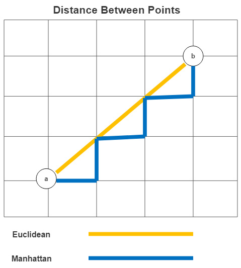
Figure 9.2 – Euclidean and Manhattan measures of distance
Using Manhattan distance can yield better results when features are very different in terms of type or scale. However, we can treat the choice of distance measure as an empirical question; that is, we can try both (or other distance measures) and see which gives us the best-performing model. We will demonstrate this with a grid search in the next section.
As you likely suspect, KNN models are sensitive to the choice of k. Lower values of k will result in a model that attempts to identify subtle distinctions between observations. Of course, there is a substantial risk of overfitting at very low values of k. But at higher values of k, our model may not be flexible enough. We are once again confronted with the variance-bias trade-off. Lower k values result in less bias and more variance, while high values result in the opposite.
There is no definitive answer to the choice of k. A good rule of thumb is to start with the square root of the number of observations. However, just as we would do for the distance measure, we should test a model’s performance at different values of k.
K-nearest neighbors is a lazy learner algorithm, as I have already mentioned. No calculations are performed at training time. The learning happens mainly during testing. This has some disadvantages. KNN may not be a good choice when there are many instances or dimensions in the data, and the speed of predictions matters. It also tends not to perform well when we have sparse data – that is, datasets with many 0 values.
K-nearest neighbors is a non-parametric algorithm. No assumptions are made about the attributes of the underlying data, such as linearity or normally distributed features. It can often give us decent results when a linear model would not. We will build a KNN regression model in the next section.
K-nearest neighbors regression
As mentioned previously, K-nearest neighbors can be a good alternative to linear regression when the assumptions of ordinary least squares do not hold, and the number of observations and dimensions is small. It is also very easy to specify, so even if we do not use it for our final model, it can be valuable for diagnostic purposes.
In this section, we will use KNN to build a model of the ratio of female to male incomes at the level of country. We will base this on labor force participation rates, educational attainment, teenage birth frequency, and female participation in politics at the highest level. This is a good dataset to experiment with because the small sample size and feature space mean that it is not likely to tax your system’s resources. The small number of features also makes it easier to interpret. The drawback is that it might be hard to find significant results. That being said, let’s see what we find.
Note
We will be working with the income gap dataset throughout this chapter. The dataset has been made available for public use by the United Nations Development Program at https://www.kaggle.com/datasets/undp/human-development. There is one record per country with aggregate employment, income, and education data by gender for 2015.
Let’s start building our model:
- First, we must import some of the same sklearn libraries we used in the previous two chapters. We must also import KNeighborsRegressor and an old friend from Chapter 5, Feature Selection – that is, SelectFromModel. We will use SelectFromModel to add feature selection to the pipeline we will construct:
import pandas as pd
import numpy as np
from sklearn.model_selection import train_test_split
from sklearn.preprocessing import StandardScaler
from sklearn.impute import SimpleImputer
from sklearn.pipeline import make_pipeline
from sklearn.model_selection import RandomizedSearchCV
from sklearn.neighbors import KNeighborsRegressor
from sklearn.linear_model import LinearRegression
from sklearn.feature_selection import SelectFromModel
import seaborn as sns
import matplotlib.pyplot as plt
- We also need the OutlierTrans class that we created in Chapter 7, Linear Regression Models. We will use it to identify outliers based on the interquartile range, as we first discussed in Chapter 3, Identifying and Fixing Missing Values:
import os
import sys
sys.path.append(os.getcwd() + "/helperfunctions")
from preprocfunc import OutlierTrans
- Next, we must load the income data. We also need to construct a series for the ratio of female to male incomes, the years of education ratio, the labor force participation ratio, and the human development index ratio. Lower values for any of these measures suggest a possible advantage for males, assuming a positive relationship between these features and the ratio of female to male incomes. For example, we would expect the income ratio to improve – that is, to get closer to 1.0 – as the labor force participation ratio gets closer to 1.0– that is, when the labor force participation of women equals that of men.
- We must drop rows where our target, incomeratio, is missing:
un_income_gap = pd.read_csv("data/un_income_gap.csv")
un_income_gap.set_index('country', inplace=True)
un_income_gap['incomeratio'] =
un_income_gap.femaleincomepercapita /
un_income_gap.maleincomepercapita
un_income_gap['educratio'] =
un_income_gap.femaleyearseducation /
un_income_gap.maleyearseducation
un_income_gap['laborforcepartratio'] =
un_income_gap.femalelaborforceparticipation /
un_income_gap.malelaborforceparticipation
un_income_gap['humandevratio'] =
un_income_gap.femalehumandevelopment /
un_income_gap.malehumandevelopment
un_income_gap.dropna(subset=['incomeratio'], inplace=True)
- Let’s look at a few rows of data:
num_cols = ['educratio','laborforcepartratio',
'humandevratio','genderinequality','maternalmortality',
'adolescentbirthrate','femaleperparliament',
'incomepercapita']
gap_sub = un_income_gap[['incomeratio'] + num_cols]
gap_sub.head()
incomeratio educratio laborforcepartratio humandevratio
country
Norway 0.78 1.02 0.89 1.00
Australia 0.66 1.02 0.82 0.98
Switzerland 0.64 0.88 0.83 0.95
Denmark 0.70 1.01 0.88 0.98
Netherlands 0.48 0.95 0.83 0.95
genderinequality maternalmortality adolescentbirthrate
country
Norway 0.07 4.00 7.80
Australia 0.11 6.00 12.10
Switzerland 0.03 6.00 1.90
Denmark 0.05 5.00 5.10
Netherlands 0.06 6.00 6.20
femaleperparliament incomepercapita
country
Norway 39.60 64992
Australia 30.50 42261
Switzerland 28.50 56431
Denmark 38.00 44025
Netherlands 36.90 45435
- Let’s also look at some descriptive statistics:
gap_sub.
agg(['count','min','median','max']).T
count min median max
incomeratio 177.00 0.16 0.60 0.93
educratio 169.00 0.24 0.93 1.35
laborforcepartratio 177.00 0.19 0.75 1.04
humandevratio 161.00 0.60 0.95 1.03
genderinequality 155.00 0.02 0.39 0.74
maternalmortality 174.00 1.00 60.00 1,100.00
adolescentbirthrate 177.00 0.60 40.90 204.80
femaleperparliament 174.00 0.00 19.35 57.50
incomepercapita 177.00 581.00 10,512.00 123,124.00
We have 177 observations with our target variable, incomeratio. A couple of features, humandevratio and genderinequality, have more than 15 missing values. We will need to impute some reasonable values there. We will also need to do some scaling as some features have very different ranges than others, from incomeratio and incomepercapita on one end to educratio and humandevratio on the other.
Note
The dataset has separate human development indices for women and men. The index is a measure of health, access to knowledge, and standard of living. The humandevratio feature, which we calculated earlier, divides the score for women by the score for men. The genderinequality feature is an index of health and labor market policies in countries that have a disproportionate impact on women. femaleperparliament is the percentage of the highest national legislative body that is female.
- We should also look at a heatmap of the correlations of features and the features with the target. It is a good idea to keep the higher correlations (either negative or positive) in mind when we are doing our modeling. The higher positive correlations are represented with the warmer colors. laborforcepartratio, humandevratio, and maternalmortality are all positively correlated with our target, the latter somewhat surprisingly. humandevratio and laborforcepartratio are also correlated, so our model may have some trouble disentangling the influence of each. Some feature selection should help us figure out which feature is more important. (We will need to use a wrapper or embedded feature selection method to tease that out well. We discuss those methods in detail in Chapter 5, Feature Selection.) Look at the following code:
corrmatrix = gap_sub.corr(method="pearson")
corrmatrix
sns.heatmap(corrmatrix, xticklabels=corrmatrix.columns,
yticklabels=corrmatrix.columns, cmap="coolwarm")
plt.title('Heat Map of Correlation Matrix')
plt.tight_layout()
plt.show()
This produces the following plot:

Figure 9.3 – Correlation matrix
- Next, we must set up the training and testing DataFrames:
X_train, X_test, y_train, y_test =
train_test_split(gap_sub[num_cols],
gap_sub[['incomeratio']], test_size=0.2, random_state=0)
We are now ready to set up the KNN regression model. We will also build a pipeline to handle outliers, do an imputation based on the median value of each feature, scale features, and do some feature selection with scikit-learn’s SelectFromModel.
- We will use linear regression for our feature selection, but we can choose any algorithm that will return feature importance values. We will set the feature importance threshold to 80% of the mean feature importance. The mean is the default. Our choice here is fairly arbitrary, but I like the idea of keeping features that are just below the average feature importance level, in addition to those with higher importance of course:
knnreg = KNeighborsRegressor()
feature_sel = SelectFromModel(LinearRegression(), threshold="0.8*mean")
pipe1 = make_pipeline(OutlierTrans(3),
SimpleImputer(strategy="median"), StandardScaler(),
feature_sel, knnreg)
- We are now ready to do a grid search to find the best parameters. First, we will create a dictionary, knnreg_params, to indicate that we want the KNN model to select values of k from 3 to 19, skipping even numbers. We also want the grid search to find the best distance measure – Euclidean, Manhattan, or Minkowski:
knnreg_params = {
'kneighborsregressor__n_neighbors':
np.arange(3, 21, 2),
'kneighborsregressor__metric':
['euclidean','manhattan','minkowski']
}
- We will pass those parameters to the RandomizedSearchCV object and then fit the model. We can use the best_params_ attribute of RandomizedSearchCV to see the selected hyperparameters for our feature selection and KNN regression. These results suggest that the best hyperparameter values are 11 for k for KNN and Manhattan for the distance metric:
The best model has a negative mean squared error of -0.05. This is fairly decent, given the small sample size. It is less than 10% of the median value of incomeratio, which is 0.6:
rs = RandomizedSearchCV(pipe1, knnreg_params, cv=4, n_iter=20,
scoring='neg_mean_absolute_error', random_state=1)
rs.fit(X_train, y_train)
rs.best_params_
{'kneighborsregressor__n_neighbors': 11,
'kneighborsregressor__metric': 'manhattan'}
rs.best_score_
-0.05419731104389228
- Let’s take a look at the features that were selected during the feature selection step of the pipeline. Only two features were selected – laborforcepartratio and humandevratio. Note that this step is not necessary to run our model. It just helps us interpret it:
selected = rs.best_estimator_['selectfrommodel'].get_support()
np.array(num_cols)[selected]
array(['laborforcepartratio', 'humandevratio'], dtype='<U19')
- This is a tad easier if you are using scikit-learn 1.0 or later. You can use the get_feature_names_out method in that case:
rs.best_estimator_['selectfrommodel'].
get_feature_names_out(np.array(num_cols))
array(['laborforcepartratio', 'humandevratio'], dtype=object)
- We should also take a peek at some of the other top results. There is a model that uses euclidean distance that performs nearly as well as the best model:
results =
pd.DataFrame(rs.cv_results_['mean_test_score'],
columns=['meanscore']).
join(pd.DataFrame(rs.cv_results_['params'])).
sort_values(['meanscore'], ascending=False)
results.head(3).T
13 1 3
Meanscore -0.05 -0.05 -0.05
regressor__kneighborsregressor__n_neighbors 11 13 9
regressor__kneighborsregressor__metric manhattan manhattan euclidean
- Let’s look at the residuals for this model. We can use the predict method of the RandomizedSearchCV object to generate predictions on the testing data. The residuals are nicely balanced around 0. There is a little bit of negative skew but that’s not bad either. There is low kurtosis, but we are good with there not being much in the way of tails in this case. It likely reflects not very much in the way of outlier residuals:
pred = rs.predict(X_test)
preddf = pd.DataFrame(pred, columns=['prediction'],
index=X_test.index).join(X_test).join(y_test)
preddf['resid'] = preddf.incomeratio-preddf.prediction
preddf.resid.agg(['mean','median','skew','kurtosis'])
mean -0.01
median -0.01
skew -0.61
kurtosis 0.23
Name: resid, dtype: float64
- Let’s plot the residuals:
plt.hist(preddf.resid, color="blue")
plt.axvline(preddf.resid.mean(), color='red', linestyle='dashed', linewidth=1)
plt.title("Histogram of Residuals for Gax Tax Model")
plt.xlabel("Residuals")
plt.ylabel("Frequency")
plt.xlim()
plt.show()
This produces the following plot:

Figure 9.4 – Residuals for the income ratio model with KNN regression
The residuals also look pretty decent when we plot them. There are a couple of countries, however, where we are more than 0.1 off in our prediction. We over-predict in both of those cases. (The dashed red line is the average residual amount.)
- Let’s also look at a scatterplot. Here, we can see that the two large over-predictions are at different ends of the predicted range. In general, the residuals are fairly constant across the predicted income ratio range. We just may want to do something with the two outliers:
plt.scatter(preddf.prediction, preddf.resid, color="blue")
plt.axhline(0, color='red', linestyle='dashed', linewidth=1)
plt.title("Scatterplot of Predictions and Residuals")
plt.xlabel("Predicted Income Gap")
plt.ylabel("Residuals")
plt.show()
This produces the following plot:

Figure 9.5 – Scatterplot of predictions and residuals for the income ratio model with KNN regression
We should take a closer look at the countries where there were high residuals. Our model does not do a good job of predicting income ratios for either Afghanistan or the Netherlands, over-predicting a fair bit in both cases. Recall that our feature selection step gave us a model with just two predictors: laborforcepartratio and humandevratio.
For Afghanistan, the labor force participation ratio (the participation of females relative to that of males) is very near the minimum of 0.19 and the human development ratio is at the minimum. This still does not get us close to predicting the very low income ratio (the income of women relative to that of men), which is also at the minimum.
For the Netherlands, the labor force participation ratio of 0.83 is a fair bit above the median of 0.75, but the human development ratio is right at the median. This is why our model predicts an income ratio a little above the median of 0.6. The actual income ratio for the Netherlands is, then, surprisingly low:
preddf.loc[np.abs(preddf.resid)>=0.1,
['incomeratio', 'prediction', 'resid',
'laborforcepartratio', 'humandevratio']].T
country Afghanistan Netherlands
incomeratio 0.16 0.48
prediction 0.32 0.65
resid -0.16 -0.17
laborforcepartratio 0.20 0.83
humandevratio 0.60 0.95
Here, we can see some of the advantages of KNN regression. We can get okay predictions on difficult-to-model data without spending a lot of time specifying a model. Other than some imputation and scaling, we did not do any transformations or create interaction effects. We did not need to worry about nonlinearity either. KNN regression can handle that fine.
But this approach would probably not scale very well. A lazy learner was fine in this example. For more industrial-level work, however, we often need to turn to an algorithm with many of the advantages of KNN, but without some of the disadvantages. We will explore decision trees and random forest regression in the remainder of this chapter.
Key concepts for decision tree and random forest regression
Decision trees are an exceptionally useful machine learning tool. They have some of the same advantages as KNN – they are non-parametric, easy to interpret, and can work with a wide range of data – but without some of the limitations.
Decision trees group the observations in a dataset based on the values of their features. This is done with a series of binary decisions, starting from an initial split at the root node, and ending with a leaf for each grouping. All observations with the same values, or the same range of values, along the branches from the root node to that leaf, get the same predicted value for the target. When the target is numeric, that is the average value for the target for the training observations at that leaf. Figure 9.6 illustrates this:

Figure 9.6 – Decision tree model of nightly hours of sleep
This is a model of nightly hours of sleep for individuals based on weekly hours worked, number of children, number of other adults in the home, and whether the person is enrolled in school. (These results are based on hypothetical data.) The root node is based on weekly hours worked and splits the data into observations with hours worked greater than 30 and 30 or less. The numbers in parentheses are the percentage of the training data that reaches that node. 60% of the observations have hours worked greater than 30. On the left-hand side of the tree, our model further splits the data by the number of children and then by the number of other adults in the home. On the other side of the tree, which represents observations with hours worked less than or equal to 30, the only additional split is by enrollment in school.
I realize now that all readers will not see this in color. We can navigate up the tree from each leaf to describe how the tree has segmented the data. 15% of observations have 0 other adults in the home, more than 1 child, and weekly hours worked greater than 30. These observations have an average nightly hours slept value of 4.5 hours. This will be the predicted value for new observations with the same characteristics.
You might be wondering how the decision tree algorithm selected the threshold amounts for the numeric features. Why greater than 30 for weekly hours worked or greater than 1 for the number of children, for example? The algorithm selects the split at each level, starting with the root, which minimizes the sum of squared errors. More precisely, splits are chosen that minimize:

You may have noticed the similarity with optimization for linear regression. But there are several advantages of decision tree regression over linear regression. Decision trees can be used to model both linear and nonlinear relationships without us having to modify features. We also can avoid feature scaling with decision trees, as the algorithm can deal with very different ranges in our features.
The main disadvantage of decision trees is their high variance. Depending on the characteristics of our data, we can get a very different model each time we fit a decision tree. We can use ensemble methods, such as bagging or random forest, to address this issue.
Using random forest regression
Random forests, perhaps not surprisingly, are collections of decision trees. But this would not distinguish a random forest from bootstrap aggregating, commonly referred to as bagging. Bagging is often used to reduce the variance of machine learning algorithms that have high variances, such as decision trees. With bagging, we generate random samples from our dataset. Then, we run our model, such as a decision tree regression, on each of those samples, averaging the predictions.
However, the samples generated with bagging can be correlated, and the resulting decision trees may have many similarities. This is more likely to be the case when there are just a few features that explain much of the variation. Random forests address this issue by limiting the number of features that can be selected for each tree. A good rule of thumb is to divide the number of features available by 3 to determine the number of features to use for each split for each decision tree. For example, if there are 21 features, we would use seven for each split. We will build both decision tree and random forest regression models in the next section.
Decision tree and random forest regression
We will use a decision tree and a random forest in this section to build a regression model with the same income gap data we worked with earlier in this chapter. We will also use tuning to identify the hyperparameters that give us the best-performing model, just as we did with KNN regression. Let’s get started:
- We must load many of the same libraries as we did with KNN regression, plus DecisionTreeRegressor and RandomForestRegressor from scikit-learn:
import pandas as pd
import numpy as np
from sklearn.model_selection import train_test_split
from sklearn.impute import SimpleImputer
from sklearn.pipeline import make_pipeline
from sklearn.model_selection import RandomizedSearchCV
from sklearn.tree import DecisionTreeRegressor, plot_tree
from sklearn.ensemble import RandomForestRegressor
from sklearn.linear_model import LinearRegression
from sklearn.feature_selection import SelectFromModel
- We must also import our class for handling outliers:
import os
import sys
sys.path.append(os.getcwd() + "/helperfunctions")
from preprocfunc import OutlierTrans
- We must load the same income gap data that we worked with previously and create testing and training DataFrames:
un_income_gap = pd.read_csv("data/un_income_gap.csv")
un_income_gap.set_index('country', inplace=True)
un_income_gap['incomeratio'] =
un_income_gap.femaleincomepercapita /
un_income_gap.maleincomepercapita
un_income_gap['educratio'] =
un_income_gap.femaleyearseducation /
un_income_gap.maleyearseducation
un_income_gap['laborforcepartratio'] =
un_income_gap.femalelaborforceparticipation /
un_income_gap.malelaborforceparticipation
un_income_gap['humandevratio'] =
un_income_gap.femalehumandevelopment /
un_income_gap.malehumandevelopment
un_income_gap.dropna(subset=['incomeratio'],
inplace=True)
num_cols = ['educratio','laborforcepartratio',
'humandevratio', 'genderinequality',
'maternalmortality', 'adolescentbirthrate',
'femaleperparliament', 'incomepercapita']
gap_sub = un_income_gap[['incomeratio'] + num_cols]
X_train, X_test, y_train, y_test =
train_test_split(gap_sub[num_cols],
gap_sub[['incomeratio']], test_size=0.2,
random_state=0)
Let’s start with a relatively simple decision tree– one without too many levels. A simple tree can easily be shown on one page.
A decision tree example with interpretation
Before we build our decision tree regressor, let’s just look at a quick example with maximum depth set to a low value. Decision trees are more difficult to explain and plot as the depth increases. Let’s get started:
- We start by instantiating a decision tree regressor, limiting the depth to three, and requiring that each leaf has at least five observations. We create a pipeline that only preprocesses the data and passes the resulting NumPy array, X_train_imp, to the fit method of the decision tree regressor:
dtreg_example = DecisionTreeRegressor(
min_samples_leaf=5,
max_depth=3)
pipe0 = make_pipeline(OutlierTrans(3),
SimpleImputer(strategy="median"))
X_train_imp = pipe0.fit_transform(X_train)
dtreg_example.fit(X_train_imp, y_train)
plot_tree(dtreg_example,
feature_names=X_train.columns,
label="root", fontsize=10)
This generates the following plot:

Figure 9.7 – Decision tree example with a maximum depth of 3
We will not go over all nodes on this tree. We can get the general idea of how to interpret a decision tree regression plot by describing the path down to a couple of leaf nodes:
- Interpreting the leaf node with labor force participation ratio <= 0.307:
The root node split is based on labor force participation ratios less than or equal to 0.601. (Recall that the labor force participation ratio is the ratio of female participation rates to male participation rates.) 34 countries fall into that category. (True values for the split test are to the left. False values are to the right.) There is another split after that that is also based on the labor force participation ratio, this time with the split at 0.378. There are 13 countries with values less than or equal to that. Finally, we reach the leaf node furthest to the left for countries with a labor force participation ratio less than or equal to 0.307. Six countries have labor force participation ratios that low. Those six countries have an average income ratio of 0.197. Our decision tree regressor would then predict 0.197 for the income ratio for testing instances with labor force participation ratios less than or equal to 0.307.
- Interpreting the leaf node with labor force participation ratio between 0.601 and 0.811, and humandevratio <= 0.968:
There are 107 countries with labor force participation ratios greater than 0.601. This is shown on the right-hand side of the tree. There is another binary split when the labor force participation ratio is less than or equal to 0.811, which is split further based on the human development ratio being less than or equal to 0.968. This takes us to a leaf node that has 31 countries, those with human development ratio less than or equal to 0.968, and a labor force participation ratio less than or equal to 0.811, but greater than 0.601. The decision tree regressor would predict the average value for income ratio for those 31 countries, 0.556, for all testing instances with values for human development ratio and labor force participation ratio in those ranges.
Interestingly, we have not done any feature selection yet, but this first effort to build a decision tree model already suggests that income ratio can be predicted with just two features: laborforcepartratio and humandevratio.
Although the simplicity of this model makes it very easy to interpret, we have not done the work we need to do to find the best hyperparameters yet. Let’s do that next.
Building and interpreting our actual model
Follow these steps:
- First, we instantiate a new decision tree regressor and create a pipeline that uses it. We also create a dictionary for some of the hyperparameters– that is, for the maximum tree depth and the minimum number of samples (observations) for each leaf. Notice that we do not need to scale either our features or the target, as that is not necessary with a decision tree:
dtreg = DecisionTreeRegressor()
feature_sel = SelectFromModel(LinearRegression(),
threshold="0.8*mean")
pipe1 = make_pipeline(OutlierTrans(3),
SimpleImputer(strategy="median"),
feature_sel, dtreg)
dtreg_params={
"decisiontreeregressor__max_depth": np.arange(2, 20),
"decisiontreeregressor__min_samples_leaf": np.arange(5, 11)
}
- Next, we must set up a randomized search based on the dictionary from the previous step. The best parameters for our decision tree are minimum samples of 5 and a maximum depth of 9:
rs = RandomizedSearchCV(pipe1, dtreg_params, cv=4, n_iter=20,
scoring='neg_mean_absolute_error', random_state=1)
rs.fit(X_train, y_train.values.ravel())
rs.best_params_
{'decisiontreeregressor__min_samples_leaf': 5,
'decisiontreeregressor__max_depth': 9}
rs.best_score_
-0.05268976358459662
As we discussed in the previous section, decision trees have many of the advantages of KNN for regression. They are easy to interpret and do not make many assumptions about the underlying data. However, decision trees can still work reasonably well with large datasets. A less important, but still helpful, advantage of decision trees is that they do not require feature scaling.
But decision trees do have high variance. It is often worth sacrificing the interpretability of decision trees for a related method, such as random forest, which can substantially reduce that variance. We discussed the random forest algorithm conceptually in the previous section. We’ll try it out with the income gap data in the next section.
Random forest regression
Recall that random forests can be thought of as decision trees with bagging; they improve bagging by reducing the correlation between samples. This sounds complicated but it is as easy to implement as decision trees are. Let’s take a look:
- We will start by instantiating a random forest regressor and creating a dictionary for the hyperparameters. We will also create a pipeline for the pre-processing and the regressor:
rfreg = RandomForestRegressor()
rfreg_params = {
'randomforestregressor__max_depth': np.arange(2, 20),
'randomforestregressor__max_features': ['auto', 'sqrt'],
'randomforestregressor__min_samples_leaf': np.arange(5, 11)
}
pipe2 = make_pipeline(OutlierTrans(3),
SimpleImputer(strategy="median"),
feature_sel, rfreg)
- We will pass the pipeline and the hyperparameter dictionary to the RandomizedSearchCV object to run the grid search. There is a minor improvement in terms of the score:
rs = RandomizedSearchCV(pipe2, rfreg_params, cv=4, n_iter=20,
scoring='neg_mean_absolute_error', random_state=1)
rs.fit(X_train, y_train.values.ravel())
rs.best_params_
{'randomforestregressor__min_samples_leaf': 5,
'randomforestregressor__max_features': 'auto',
'randomforestregressor__max_depth': 9}
rs.best_score_
-0.04930503752638253
- Let’s take a look at the residuals:
pred = rs.predict(X_test)
preddf = pd.DataFrame(pred, columns=['prediction'],
index=X_test.index).join(X_test).join(y_test)
preddf['resid'] = preddf.incomegap-preddf.prediction
plt.hist(preddf.resid, color="blue", bins=5)
plt.axvline(preddf.resid.mean(), color='red', linestyle='dashed', linewidth=1)
plt.title("Histogram of Residuals for Income Gap")
plt.xlabel("Residuals")
plt.ylabel("Frequency")
plt.xlim()
plt.show()
This produces the following plot:
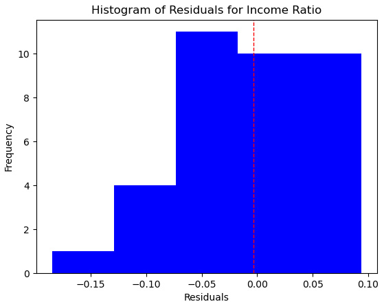
Figure 9.8 – Histogram of residuals for the random forest model on income ratio
- Let’s also take a look at a scatterplot of residuals by predictions:
plt.scatter(preddf.prediction, preddf.resid, color="blue")
plt.axhline(0, color='red', linestyle='dashed', linewidth=1)
plt.title("Scatterplot of Predictions and Residuals")
plt.xlabel("Predicted Income Gap")
plt.ylabel("Residuals")
plt.show()
This produces the following plot:

Figure 9.9 – Scatterplot of predictions by residuals for the random forest model on income ratio
- Let’s take a look a closer look at the one significant outlier where we are seriously over-predicting:
preddf.loc[np.abs(preddf.resid)>=0.12,
['incomeratio','prediction','resid',
'laborforcepartratio', 'humandevratio']].T
country Netherlands
incomeratio 0.48
prediction 0.66
resid -0.18
laborforcepartratio 0.83
humandevratio 0.95
We still have trouble with the Netherlands, but the fairly even distribution of residuals suggests that this is anomalous. It is actually good news, in terms of our ability to predict an income ratio for new instances, showing that our model is not working too hard to fit this unusual case.
Using gradient boosted regression
We can sometimes improve upon random forest models by using gradient boosting instead. Similar to random forests, gradient boosting is an ensemble method that combines learners, typically trees. But unlike random forests, each tree is built to learn from the errors of previous trees. This can significantly improve our ability to model complexity.
Although gradient boosting is not particularly prone to overfitting, we have to be even more careful with our hyperparameter tuning than we have to be with random forest models. We can slow the learning rate, also known as shrinkage. We can also adjust the number of estimators (trees). The choice of learning rate influences the number of estimators needed. Typically, if we slow the learning rate, our model will require more estimators.
There are several tools for implementing gradient boosting. We will work with two of them: gradient boosted regression from scikit-learn and XGBoost.
We will work with data on housing prices in this section. We will try to predict housing prices in Kings County in Washington State in the United States, based on the characteristics of the home and of nearby homes.
Note
This dataset on housing prices in Kings County can be downloaded by the public at https://www.kaggle.com/datasets/harlfoxem/housesalesprediction. It has several bedrooms, bathrooms, and floors, the square feet of the home and the lot, the condition of the home, the square feet of the 15 nearest homes, and more as features.
Let’s start working on the model:
- We will start by importing the modules we will need. The two new ones are GradientBoostingRegressor and XGBRegressor from XGBoost:
import pandas as pd
import numpy as np
from sklearn.model_selection import train_test_split
from sklearn.impute import SimpleImputer
from sklearn.pipeline import make_pipeline
from sklearn.preprocessing import OneHotEncoder
from sklearn.preprocessing import MinMaxScaler
from sklearn.compose import ColumnTransformer
from sklearn.model_selection import RandomizedSearchCV
from sklearn.ensemble import GradientBoostingRegressor
from xgboost import XGBRegressor
from sklearn.linear_model import LinearRegression
from sklearn.feature_selection import SelectFromModel
import matplotlib.pyplot as plt
from scipy.stats import randint
from scipy.stats import uniform
import os
import sys
sys.path.append(os.getcwd() + "/helperfunctions")
from preprocfunc import OutlierTrans
- Let’s load the housing data and look at a few instances:
housing = pd.read_csv("data/kc_house_data.csv")
housing.set_index('id', inplace=True)
num_cols = ['bedrooms', 'bathrooms', 'sqft_living',
'sqft_lot', 'floors', 'view', 'condition',
'sqft_above', 'sqft_basement', 'yr_built',
'yr_renovated', 'sqft_living15', 'sqft_lot15']
cat_cols = ['waterfront']
housing[['price'] + num_cols + cat_cols].
head(3).T
id 7129300520 6414100192 5631500400
price 221,900 538,000 180,000
bedrooms 3 3 2
bathrooms 1 2 1
sqft_living 1,180 2,570 770
sqft_lot 5,650 7,242 10,000
floors 1 2 1
view 0 0 0
condition 3 3 3
sqft_above 1,180 2,170 770
sqft_basement 0 400 0
yr_built 1,955 1,951 1,933
yr_renovated 0 1,991 0
sqft_living15 1,340 1,690 2,720
sqft_lot15 5,650 7,639 8,062
waterfront 0 0 0
- We should also look at some descriptive statistics. We do not have any missing values. Our target variable, price, has some extreme values, not surprisingly. This will probably present a problem for modeling. We also need to handle some extreme values for our features:
housing[['price'] + num_cols].
agg(['count','min','median','max']).T
count min median max
price 21,613 75,000 450,000 7,700,000
bedrooms 21,613 0 3 33
bathrooms 21,613 0 2 8
sqft_living 21,613 290 1,910 13,540
sqft_lot 21,613 520 7,618 1,651,359
floors 21,613 1 2 4
view 21,613 0 0 4
condition 21,613 1 3 5
sqft_above 21,613 290 1,560 9,410
sqft_basement 21,613 0 0 4,820
yr_built 21,613 1,900 1,975 2,015
yr_renovated 21,613 0 0 2,015
sqft_living15 21,613 399 1,840 6,210
sqft_lot15 21,613 651 7,620 871,200
- Let’s create a histogram of housing prices:
plt.hist(housing.price/1000)
plt.title("Housing Price (in thousands)")
plt.xlabel('Price')
plt.ylabel("Frequency")
plt.show()
This generates the following plot:

Figure 9.10 – Histogram of housing prices
- We may have better luck if we use a log transformation of our target for our modeling, as we tried in Chapter 4, Encoding, Transforming, and Scaling Features with the COVID total cases data.
housing['price_log'] = np.log(housing['price'])
plt.hist(housing.price_log)
plt.title("Housing Price Log")
plt.xlabel('Price Log')
plt.ylabel("Frequency")
plt.show()
This produces the following plot:

Figure 9.11 – Histogram of the housing price log
- This looks better. Let’s take a look at the skew and kurtosis for both the price and price log. The log looks like a big improvement:
housing[['price','price_log']].agg(['kurtosis','skew'])
price price_log
kurtosis 34.59 0.69
skew 4.02 0.43
- We should also look at some correlations. The square feet of the living area, the square feet of the area above the ground level, the square feet of the living area of the nearest 15 homes, and the number of bathrooms are the features that are most correlated with price. The square feet of the living area and the square feet of the living area above ground level are very highly correlated. We will likely need to decide between one or the other in our model:
corrmatrix = housing[['price_log'] + num_cols].
corr(method="pearson")
sns.heatmap(corrmatrix,
xticklabels=corrmatrix.columns,
yticklabels=corrmatrix.columns, cmap="coolwarm")
plt.title('Heat Map of Correlation Matrix')
plt.tight_layout()
plt.show()
This produces the following plot:

Figure 9.12 – Correlation matrix of the housing features
- Next, we create training and testing DataFrames:
target = housing[['price_log']]
features = housing[num_cols + cat_cols]
X_train, X_test, y_train, y_test =
train_test_split(features,
target, test_size=0.2, random_state=0)
- We also need to set up our column transformations. For all of the numeric features, which is every feature except for waterfront, we will check for extreme values and then scale the data:
ohe = OneHotEncoder(drop='first', sparse=False)
standtrans = make_pipeline(OutlierTrans(2),
SimpleImputer(strategy="median"),
MinMaxScaler())
cattrans = make_pipeline(ohe)
coltrans = ColumnTransformer(
transformers=[
("stand", standtrans, num_cols),
("cat", cattrans, cat_cols)
]
)
- Now, we are ready to set up a pipeline for our pre-processing and our model. We will instantiate a GradientBoostingRegressor object and set up feature selection. We will also create a dictionary of hyperparameters to use in the randomized grid search we will do in the next step:
gbr = GradientBoostingRegressor(random_state=0)
feature_sel = SelectFromModel(LinearRegression(),
threshold="0.6*mean")
gbr_params = {
'gradientboostingregressor__learning_rate': uniform(loc=0.01, scale=0.5),
'gradientboostingregressor__n_estimators': randint(500, 2000),
'gradientboostingregressor__max_depth': randint(2, 20),
'gradientboostingregressor__min_samples_leaf': randint(5, 11)
}
pipe1 = make_pipeline(coltrans, feature_sel, gbr)
- Now, we are ready to run a randomized grid search. We get a pretty decent mean squared error score, given that the average for price_log is about 13:
rs1 = RandomizedSearchCV(pipe1, gbr_params, cv=5, n_iter=20,
scoring='neg_mean_squared_error', random_state=0)
rs1.fit(X_train, y_train.values.ravel())
rs1.best_params_
{'gradientboostingregressor__learning_rate': 0.118275177212,
'gradientboostingregressor__max_depth': 2,
'gradientboostingregressor__min_samples_leaf': 5,
'gradientboostingregressor__n_estimators': 1577}
rs1.best_score_
-0.10695077555421204
y_test.mean()
price_log 13.03
dtype: float64
- Unfortunately, the mean fit time was quite long:
print("fit time: %.3f, score time: %.3f" %
(np.mean(rs1.cv_results_['mean_fit_time']),
np.mean(rs1.cv_results_['mean_score_time'])))
fit time: 35.695, score time: 0.152
- Let’s try XGBoost instead:
xgb = XGBRegressor()
xgb_params = {
'xgbregressor__learning_rate': uniform(loc=0.01, scale=0.5),
'xgbregressor__n_estimators': randint(500, 2000),
'xgbregressor__max_depth': randint(2, 20)
}
pipe2 = make_pipeline(coltrans, feature_sel, xgb)
- We do not get a better score, but the mean fit time and score time have improved dramatically:
rs2 = RandomizedSearchCV(pipe2, xgb_params, cv=5, n_iter=20,
scoring='neg_mean_squared_error', random_state=0)
rs2.fit(X_train, y_train.values.ravel())
rs2.best_params_
{'xgbregressor__learning_rate': 0.019394900218177573,
'xgbregressor__max_depth': 7,
'xgbregressor__n_estimators': 1256}
rs2.best_score_
-0.10574300757906044
print("fit time: %.3f, score time: %.3f" %
(np.mean(rs2.cv_results_['mean_fit_time']),
np.mean(rs2.cv_results_['mean_score_time'])))
fit time: 3.931, score time: 0.046
XGBoost has become a very popular gradient boosting tool for many reasons, some of which you have seen in this example. It can produce very good results, very quickly, with little model specification. We do need to carefully tune our hyperparameters to get the preferred variance-bias trade-off, but this is also true with other gradient boosting tools, as we have seen.
Summary
In this chapter, we explored some of the most popular non-parametric regression algorithms: K-nearest neighbors, decision trees, and random forests. Models built with these algorithms can perform well, with a few limitations. We discussed some of the advantages and limitations of each of these techniques, including dimension and observation limits, as well as concerns about the time required for training, for KNN models. We discussed the key challenge with decision trees, which is high variance, but also how that can be addressed by a random forest model. We explored gradient boosted regression trees as well and discussed some of their advantages. We continued to improve our skills regarding hyperparameter tuning since each algorithm required a somewhat different strategy.
We discuss supervised learning algorithms where the target is categorical over the next few chapters, starting with perhaps the most familiar classification algorithm, logistic regression.