
Chapter 13: Support Vector Machine Classification
There are some similarities between support vector classification models and k-nearest neighbors models. They are both intuitive and flexible. However, support vector classification, due to the nature of the algorithm, scales better than k-nearest neighbor. Unlike logistic regression, it can handle nonlinear models rather easily. The strategies and issues with using support vector machines for classification are similar to those we discussed in Chapter 8, Support Vector Regression, when we used support vector machines for regression.
One of the key advantages of support vector classification (SVC) is the ability it gives us to reduce model complexity without increasing our feature space. But it also provides multiple levers we can adjust to limit the possibility of overfitting. We can choose a linear model or select from several nonlinear kernels. We can use a regularization parameter, much as we did for logistic regression. With extensions, we can also use these same techniques to construct multiclass models.
We will explore the following topics in this chapter:
- Key concepts for SVC
- Linear SVC models
- Nonlinear SVM classification models
- SVMs for multiclass classification
Technical requirements
We will stick to the pandas, NumPy, and scikit-learn libraries in this chapter. All code in this chapter was tested with scikit-learn versions 0.24.2 and 1.0.2. The code that displays the decision boundaries needs scikit-learn version 1.1.1 or later.
Key concepts for SVC
We can use support vector machines (SVMs) to find a line or curve to separate instances by class. When classes can be discriminated by a line, they are said to be linearly separable.
There may, however, be many possible linear classifiers, as we can see in Figure 13.1. Each line successfully discriminates between the two classes, represented by dots and squares, using the two features x1 and x2. The key difference is in how the lines would classify new instances, represented by the transparent rectangle. Using the line closest to the squares would cause the transparent rectanglez to be classified as a dot. Using either of the other two lines would classify it as a square.

Figure 13.1 – Three possible linear classifiers
When a linear discriminant is very close to training instances, as is the case with two of the lines in Figure 13.2, there is a greater risk of misclassifying new instances. We want a line that gives us the maximum margin between classes; one that is furthest away from border data points for each class. That is the middle line in Figure 13.1, but it can be seen more clearly in Figure 13.2:

Figure 13.2 – SVM classification and maximum margin
The bold line splits the maximum margin and is referred to as the decision boundary. The border data points for each class are known as the support vectors.
We use SVM to find the linear discriminant with the maximum margin between classes. It does this by finding an equation representing a margin that can be maximized, where the margin is the distance between a data point and the separating hyperplane. With two features, as in Figure 13.2, that hyperplane is just a line. However, this can be generalized to feature spaces with more dimensions.
With data points such as those in Figure 13.2, we can use what is known as hard margin classification without problems; that is, we can be strict about all observations for each class being on the correct side of the decision boundary. But what if our data points look like those in Figure 13.3? Here, there is a square very close to the dots. The hard margin classifier is the left line, giving us quite tiny margins.
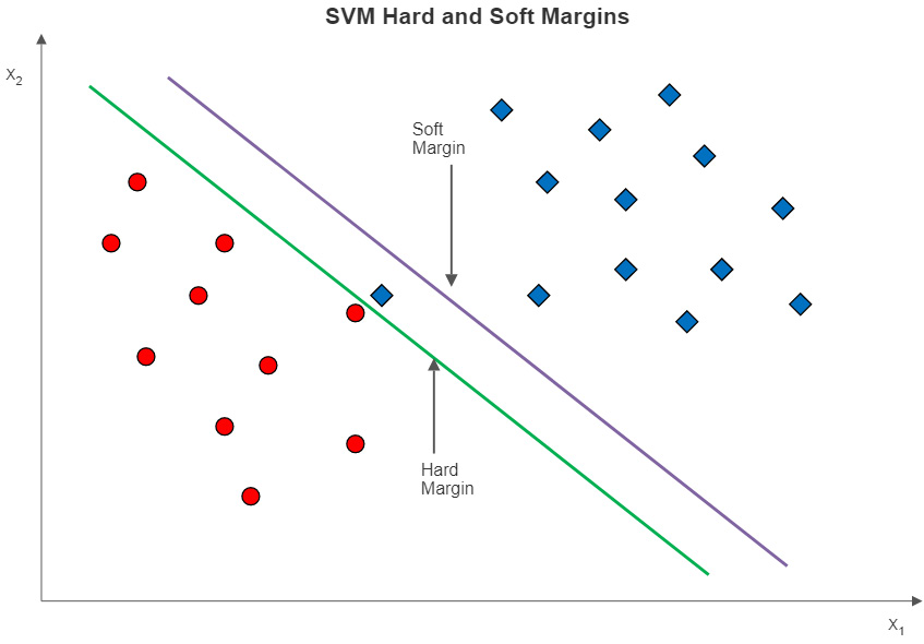
Figure 13.3 – SVMs with hard and soft margins
If we use soft margin classification instead, we get the line to the right. Soft margin classification relaxes the constraint that all instances have to be correctly separated. As is the case with the data in Figure 13.3, allowing for a small number of misclassifications in the training data can give us a larger margin. We ignore the wayward square and get a decision boundary represented by the soft margin line.
The amount of relaxation of the constraint is determined by the C hyperparameter. The larger the value of C, the greater the penalty for margin violations. Not surprisingly, models with larger C values are more prone to overfitting. Figure 13.4 illustrates how the margin changes with values of C. At C = 1, the penalty for misclassification is low, giving us a much greater margin than when C is 100. Even at a C of 100, however, some margin violation still happens.

Figure 13.4 – Soft margins at different C values
As a practical matter, we almost always build our SVC models with soft margins. The default value for C in scikit-learn is 1.
Nonlinear SVM and the kernel trick
We have not yet fully addressed the issue of linear separability with SVC. For simplicity, it is helpful to return to a classification problem involving two features. Let’s say a plot of two features against a categorical target looks like the illustration in Figure 13.5. The target has two possible values, represented by the dots and squares. x1 and x2 are numeric and have negative values.
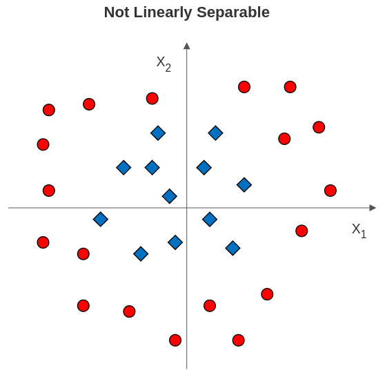
Figure 13.5 – Class labels not linearly separable with two features
What can we do in a case like this to identify a margin between the classes? It is often the case that a margin can be identified at a higher dimension. In this example, we can use a polynomial transformation, as illustrated in Figure 13.6:

Figure 13.6 – Using polynomial transformation to establish the margin
There is now a third dimension, which is the sum of the squares of x1 and x2. The dots are all higher than the squares. This is similar to how we used polynomial transformation with linear regression.
One drawback of this approach is that we can quickly end up with too many features for our model to perform well. This is where the kernel trick comes in very handy. SVC can use a kernel function to expand the feature space implicitly without actually creating more features. This is done by creating a vector of values that can be used to fit a nonlinear margin.
While this allows us to fit a polynomial transformation like the hypothetical one illustrated in Figure 13.6, the most frequently used kernel function with SVC is the radial basis function (RBF). RBF is popular because it is faster than other common kernel functions and because it can be used with the gamma hyperparameter for additional flexibility. The equation for the RBF kernel is as follows:

Here, ![]() and
and ![]() are data points. Gamma,
are data points. Gamma, ![]() , determines the amount of influence of each point. With high values of gamma, points have to be very close to each other to be grouped together. At very high values of gamma, we start to see islands of points.
, determines the amount of influence of each point. With high values of gamma, points have to be very close to each other to be grouped together. At very high values of gamma, we start to see islands of points.
Of course, what is a high value for gamma, or of C, depends partly on our data. A good approach is to create visualizations of decision boundaries at different values for gamma and C before doing much modeling. This will give us a sense of whether or not we are underfitting or overfitting at different hyperparameter values. We will plot decision boundaries at different values of gamma and C in this chapter.
Multiclass classification with SVC
All of our discussion about SVC so far has centered on binary classification. Fortunately, all of the key concepts that apply to SVMs for binary classification also apply to classification when our target has more than two possible values. We transform the multiclass problem into a binary classification problem by modeling it as a one-versus-one, or a one-versus-rest problem.
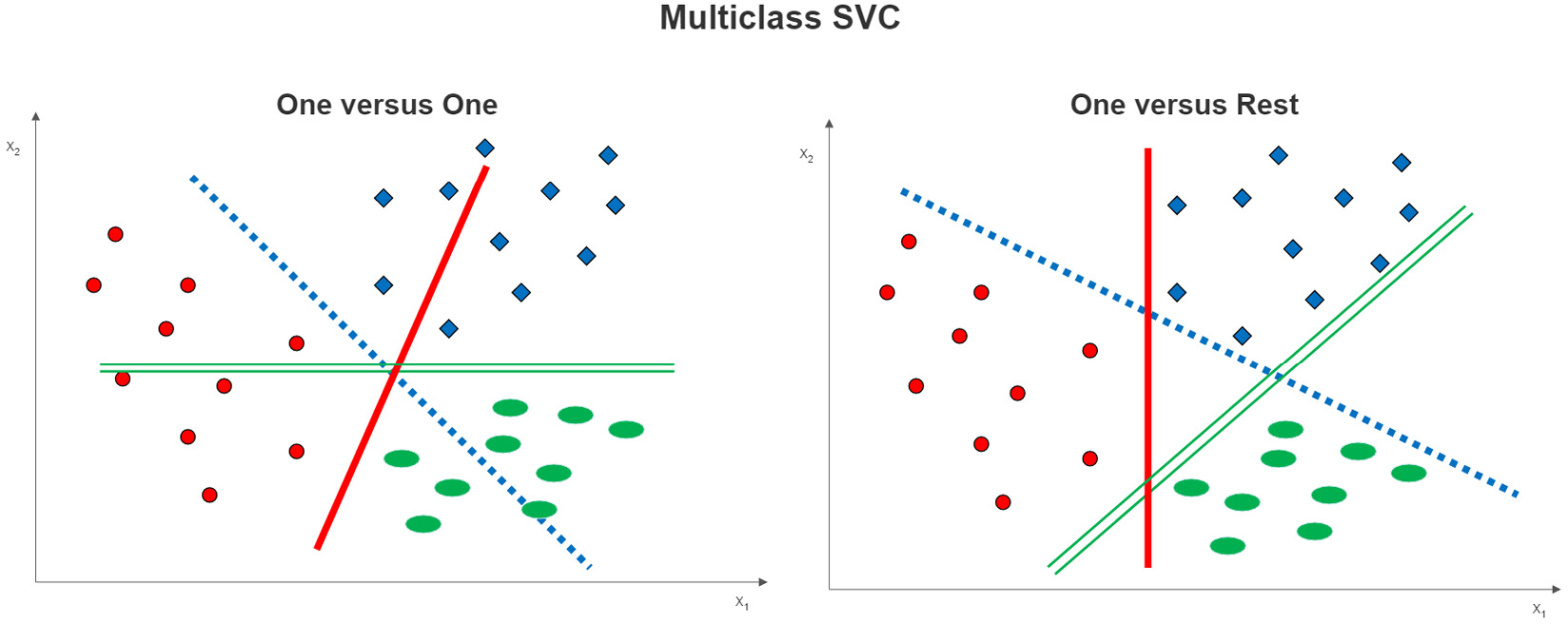
Figure 13.7 – Multiclass SVC options
One-versus-one classification is easy to illustrate in a three-class example, as shown on the left side of Figure 13.7. A decision boundary is estimated between each class and each of the other classes. For example, the dotted line is the decision boundary for the dot class versus the square class. The solid line is the decision boundary between the dots and the ovals.
With one-versus-rest classification, a decision boundary is constructed between each class and those instances that are not of that class. This is illustrated on the right side of Figure 13.7. The solid line is the decision boundary between the dots and the instances that are not dots (those that are squares or ovals). The dotted and double lines are the decision boundaries for the squares versus the rest and the ovals versus the rest of the instances, respectively.
We can construct both linear and nonlinear SVC models using either one-versus-one or one-versus-rest classification. We can also specify values for C to construct soft margins. However, the construction of more decision boundaries with each of these techniques claims greater computational resources than SVC for binary classification. If we have a large number of observations, many features, and more than a couple of parameters to tune, we will likely need very good system resources to get timely results.
The three-class example hides one thing that is different about one-versus-one and one-versus-rest classifiers. With three classes, they use the same number of classifiers (three), but the number of classifiers increases relatively rapidly with one-versus-one. The number of classifiers will always be equal to the number of class values with one-versus-rest, whereas, with one-versus-one, it is equal to the following:

Here, S is the number of classifiers and N is the cardinality (the number of class values) of the target. So, with a cardinality of 4, one-versus-rest needs 4 classifiers, and one-versus-one uses 6.
We explore multiclass SVC models in the last section of this chapter, but let’s start with a relatively straightforward linear model to see SVC in action. There are two things to keep in mind when doing the preprocessing for an SVC model. First, SVC is sensitive to the scale of features, so we will need to address that before fitting our model. Second, if we are using hard margins or high values for C, outliers might have a large effect on our model.
Linear SVC models
We can often get good results by using a linear SVC model. When we have more than two features, there is no easy way to visualize whether our data is linearly separable or not. We often decide on linear or nonlinear based on hyperparameter tuning. For this section, we will assume we can get good performance with a linear model and soft margins.
We will work with data on National Basketball Association (NBA) games in this section. The dataset has statistics from each NBA game from the 2017/2018 season through the 2020/2021 season. This includes the home team, whether the home team won, the visiting team, shooting percentages for visiting and home teams, turnovers, rebounds, and assists by both teams, and a number of other measures.
Note
NBA game data is available for download for the public at https://www.kaggle.com/datasets/wyattowalsh/basketball. This dataset has game data starting with the 1946/1947 NBA season. It uses nba_api to pull stats from nba.com. That API is available at https://github.com/swar/nba_api.
Let’s build a linear SVC model:
- We start by loading the familiar libraries. The only new modules are LinearSVC and DecisionBoundaryDisplay. We will use DecisionBoundaryDisplay to show the boundaries of a linear model:
import pandas as pd
import numpy as np
from sklearn.model_selection import train_test_split
from sklearn.preprocessing import OneHotEncoder, StandardScaler
from sklearn.svm import LinearSVC
from scipy.stats import uniform
from sklearn.impute import SimpleImputer
from sklearn.pipeline import make_pipeline
from sklearn.compose import ColumnTransformer
from sklearn.feature_selection import RFECV
from sklearn.inspection import DecisionBoundaryDisplay
from sklearn.model_selection import cross_validate,
RandomizedSearchCV, RepeatedStratifiedKFold
import sklearn.metrics as skmet
import seaborn as sns
import os
import sys
sys.path.append(os.getcwd() + "/helperfunctions")
from preprocfunc import OutlierTrans
- We are ready to load the NBA game data. We just have a little cleaning to do. A small number of observations have missing values for our target, WL_HOME, whether the home team won. We remove those observations. We convert the WL_HOME feature to a 0 and 1 feature.
There is not much of a problem with a class imbalance here. This will save us some time later:
nbagames = pd.read_csv("data/nbagames2017plus.csv", parse_dates=['GAME_DATE'])
nbagames =
nbagames.loc[nbagames.WL_HOME.isin(['W','L'])]
nbagames.shape
(4568, 149)
nbagames['WL_HOME'] =
np.where(nbagames.WL_HOME=='L',0,1).astype('int')
nbagames.WL_HOME.value_counts(dropna=False)
1 2586
0 1982
Name: WL_HOME, dtype: int64
- Let’s organize our features by data type:
num_cols = ['FG_PCT_HOME','FTA_HOME','FG3_PCT_HOME',
'FTM_HOME','FT_PCT_HOME','OREB_HOME','DREB_HOME',
'REB_HOME','AST_HOME','STL_HOME','BLK_HOME',
'TOV_HOME','FG_PCT_AWAY','FTA_AWAY','FG3_PCT_AWAY',
'FT_PCT_AWAY','OREB_AWAY','DREB_AWAY','REB_AWAY',
'AST_AWAY','STL_AWAY','BLK_AWAY','TOV_AWAY']
cat_cols = ['SEASON']
- Let’s look at some descriptive statistics. (I have omitted some features from the printout to save space.) We will need to scale these features since they have very different ranges. There are no missing values but we will generate some when we assign missings to extreme values:
nbagames[['WL_HOME'] + num_cols].agg(['count','min','median','max']).T
count min median max
WL_HOME 4,568 0.00 1.00 1.00
FG_PCT_HOME 4,568 0.27 0.47 0.65
FTA_HOME 4,568 1.00 22.00 64.00
FG3_PCT_HOME 4,568 0.06 0.36 0.84
FTM_HOME 4,568 1.00 17.00 44.00
FT_PCT_HOME 4,568 0.14 0.78 1.00
OREB_HOME 4,568 1.00 10.00 25.00
DREB_HOME 4,568 18.00 35.00 55.00
REB_HOME 4,568 22.00 45.00 70.00
AST_HOME 4,568 10.00 24.00 50.00
.........
FT_PCT_AWAY 4,568 0.26 0.78 1.00
OREB_AWAY 4,568 0.00 10.00 26.00
DREB_AWAY 4,568 18.00 34.00 56.00
REB_AWAY 4,568 22.00 44.00 71.00
AST_AWAY 4,568 9.00 24.00 46.00
STL_AWAY 4,568 0.00 8.00 19.00
BLK_AWAY 4,568 0.00 5.00 15.00
TOV_AWAY 4,568 3.00 14.00 30.00
- We should also review the correlations of the features:
corrmatrix = nbagames[['WL_HOME'] +
num_cols].corr(method="pearson")
sns.heatmap(corrmatrix,
xticklabels=corrmatrix.columns,
yticklabels=corrmatrix.columns, cmap="coolwarm")
plt.title('Heat Map of Correlation Matrix')
plt.tight_layout()
plt.show()
This produces the following plot:
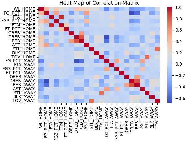
Figure 13.8 – Heat map of NBA game statistics correlations
Several features are correlated with the target, including the field goal percentage of the home team (FG_PCT_HOME) and defensive rebounds of the home team (DREB_HOME).
There is also correlation among the features. For example, the field goal percentage of the home team (FG_PCT_HOME) and the 3-point field goal percentage of the home team (FG3_PCT_HOME) are positively correlated, not surprisingly. Also, rebounds of the home team (REB_HOME) and defensive rebounds of the home team (DREB_HOME) are likely too closely correlated for any model to disentangle their impact.
- Next, we create training and testing DataFrames:
X_train, X_test, y_train, y_test =
train_test_split(nbagames[num_cols + cat_cols],
nbagames[['WL_HOME']], test_size=0.2, random_state=0)
- We need to set up our column transformations. For the numeric columns, we check for outliers and scale the data. We one-hot encode the one categorical feature, SEASON. We will use these transformations later with the pipeline for our grid search:
ohe = OneHotEncoder(drop='first', sparse=False)
cattrans = make_pipeline(ohe)
standtrans = make_pipeline(OutlierTrans(2),
SimpleImputer(strategy="median"), StandardScaler())
coltrans = ColumnTransformer(
transformers=[
("cat", cattrans, cat_cols),
("stand", standtrans, num_cols)
]
)
- Before constructing our model, let’s look at a decision boundary from a linear SVC model. We base the boundary on two features correlated with the target: the field goal percentage of the home team (FG_PCT_HOME) and defensive rebounds of the home team (DREB_HOME).
We create a function, dispbound, which will use the DecisionBoundaryDisplay module to show the boundary. This module is available with scikit-learn versions 1.1.1 or later. DecisionBoundaryDisplay needs a model to fit, two features, and target values:
pipe0 = make_pipeline(OutlierTrans(2),
SimpleImputer(strategy="median"), StandardScaler())
X_train_enc = pipe0.
fit_transform(X_train[['FG_PCT_HOME','DREB_HOME']])
def dispbound(model, X, xvarnames, y, title):
dispfit = model.fit(X,y)
disp = DecisionBoundaryDisplay.from_estimator(
dispfit, X, response_method="predict",
xlabel=xvarnames[0], ylabel=xvarnames[1],
alpha=0.5,
)
scatter = disp.ax_.scatter(X[:,0], X[:,1],
c=y, edgecolor="k")
disp.ax_.set_title(title)
legend1 = disp.ax_.legend(*scatter.legend_elements(),
loc="lower left", title="Home Win")
disp.ax_.add_artist(legend1)
dispbound(LinearSVC(max_iter=1000000,loss='hinge'),
X_train_enc, ['FG_PCT_HOME','DREB_HOME'],
y_train.values.ravel(),
'Linear SVC Decision Boundary')
This produces the following plot:
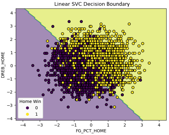
Figure 13.9 – Decision boundary for a two-feature linear SVC model
We get a pretty decent linear boundary with just the two features. That is great news, but let’s do a more carefully constructed model.
- To build our model, we first instantiate a linear SVC object and set up recursive feature elimination. We then add the column transformation, the feature selection, and the linear SVC to a pipeline and fit it:
svc = LinearSVC(max_iter=1000000, loss='hinge',
random_state=0)
rfecv = RFECV(estimator=svc, cv=5)
pipe1 = make_pipeline(coltrans, rfecv, svc)
pipe1.fit(X_train, y_train.values.ravel())
- Let’s see what features were selected from our recursive feature elimination. We need to first get the column names after the one-hot encoding. We can then use the get_support method of the rfecv object to get the features that were selected. (You will get a deprecated warning regarding get_feature_names if you are using scikit-learn versions 1 or later. You can use get_feature_names_out instead, though that will not work with earlier versions of scikit-learn.):
new_cat_cols =
pipe1.named_steps['columntransformer'].
named_transformers_['cat'].
named_steps['onehotencoder'].
get_feature_names(cat_cols)
new_cols = np.concatenate((new_cat_cols, np.array(num_cols)))
sel_cols = new_cols[pipe1['rfecv'].get_support()]
np.set_printoptions(linewidth=55)
sel_cols
array(['SEASON_2018', 'SEASON_2019', 'SEASON_2020',
'FG_PCT_HOME', 'FTA_HOME', 'FG3_PCT_HOME',
'FTM_HOME', 'FT_PCT_HOME', 'OREB_HOME',
'DREB_HOME', 'REB_HOME', 'AST_HOME',
'TOV_HOME', 'FG_PCT_AWAY', 'FTA_AWAY',
'FG3_PCT_AWAY', 'FT_PCT_AWAY', 'OREB_AWAY',
'DREB_AWAY', 'REB_AWAY', 'AST_AWAY',
'BLK_AWAY', 'TOV_AWAY'], dtype=object)
- We should look at the coefficients. Coefficients for each of the selected columns can be accessed with the coef_ attribute of the linearsvc object. Perhaps not surprisingly, the shooting percentages of the home team (FG_PCT_HOME) and the away team (FG_PCT_AWAY) are the most important positive and negative predictors of the home team winning. The next most important features are the number of turnovers of the away and home teams:
pd.Series(pipe1['linearsvc'].
coef_[0], index=sel_cols).
sort_values(ascending=False)
FG_PCT_HOME 2.21
TOV_AWAY 1.20
REB_HOME 1.19
FTM_HOME 0.95
FG3_PCT_HOME 0.94
FT_PCT_HOME 0.31
AST_HOME 0.25
OREB_HOME 0.18
DREB_AWAY 0.11
SEASON_2018 0.10
FTA_HOME -0.05
BLK_AWAY -0.07
SEASON_2019 -0.11
SEASON_2020 -0.19
AST_AWAY -0.44
OREB_AWAY -0.47
DREB_HOME -0.49
FT_PCT_AWAY -0.53
REB_AWAY -0.63
FG3_PCT_AWAY -0.80
FTA_AWAY -0.81
TOV_HOME -1.19
FG_PCT_AWAY -1.91
dtype: float64
- Let’s take a look at the predictions. Our model predicts the home team winning very well:
pred = pipe1.predict(X_test)
print("accuracy: %.2f, sensitivity: %.2f, specificity: %.2f, precision: %.2f" %
(skmet.accuracy_score(y_test.values.ravel(), pred),
skmet.recall_score(y_test.values.ravel(), pred),
skmet.recall_score(y_test.values.ravel(), pred, pos_label=0),
skmet.precision_score(y_test.values.ravel(), pred)))
accuracy: 0.93, sensitivity: 0.95, specificity: 0.92, precision: 0.93
- We should confirm that these metrics are not a fluke by doing some cross-validation. We use repeated stratified k folds for our validation, indicating that we want seven folds and 10 iterations. We get pretty much the same results as we did during the previous step:
kf = RepeatedStratifiedKFold(n_splits=7,n_repeats=10,
random_state=0)
scores = cross_validate(pipe1, X_train,
y_train.values.ravel(),
scoring=['accuracy','precision','recall','f1'],
cv=kf, n_jobs=-1)
print("accuracy: %.2f, precision: %.2f, sensitivity: %.2f, f1: %.2f" %
(np.mean(scores['test_accuracy']),
np.mean(scores['test_precision']),
np.mean(scores['test_recall']),
np.mean(scores['test_f1'])))
accuracy: 0.93, precision: 0.93, sensitivity: 0.95, f1: 0.94
- We have been using the default value of C of 1 so far. We can try to identify a better value for C with a randomized grid search:
svc_params = {
'linearsvc__C': uniform(loc=0, scale=100)
}
rs = RandomizedSearchCV(pipe1, svc_params, cv=10,
scoring='accuracy', n_iter=20, random_state=0)
rs.fit(X_train, y_train.values.ravel())
rs.best_params_
{'linearsvc__C': 54.88135039273247}
rs.best_score_
0.9315809566584325
The best C value is 2.02 and the best accuracy score is 0.9316.
- Let’s take a closer look at the scores for each of the 20 times we ran the grid search. Each score is the average accuracy score across 10 folds. We actually get pretty much the same score regardless of the C value:
results =
pd.DataFrame(rs.cv_results_['mean_test_score'],
columns=['meanscore']).
join(pd.DataFrame(rs.cv_results_['params'])).
sort_values(['meanscore'], ascending=False)
results
meanscore linearsvc__C
0 0.93 54.88
8 0.93 96.37
18 0.93 77.82
17 0.93 83.26
13 0.93 92.56
12 0.93 56.80
11 0.93 52.89
1 0.93 71.52
10 0.93 79.17
7 0.93 89.18
6 0.93 43.76
5 0.93 64.59
3 0.93 54.49
2 0.93 60.28
19 0.93 87.00
9 0.93 38.34
4 0.93 42.37
14 0.93 7.10
15 0.93 8.71
16 0.93 2.02
- Let’s now look at some of the predictions. Our model does well across the board, but not any better than the initial model:
pred = rs.predict(X_test)
print("accuracy: %.2f, sensitivity: %.2f, specificity: %.2f, precision: %.2f" %
(skmet.accuracy_score(y_test.values.ravel(), pred),
skmet.recall_score(y_test.values.ravel(), pred),
skmet.recall_score(y_test.values.ravel(), pred, pos_label=0),
skmet.precision_score(y_test.values.ravel(), pred)))
accuracy: 0.93, sensitivity: 0.95, specificity: 0.92, precision: 0.93
- Let’s also look at a confusion matrix:
cm = skmet.confusion_matrix(y_test, pred)
cmplot =
skmet.ConfusionMatrixDisplay(confusion_matrix=cm, display_labels=['Loss', 'Won'])
cmplot.plot()
cmplot.ax_.set(title='Home Team Win Confusion Matrix',
xlabel='Predicted Value', ylabel='Actual Value')
This produces the following plot:

Figure 13.10 – Confusion matrix for wins by the home team
Our model largely predicts home team wins and losses correctly. Tuning the value of C did not make much of a difference, as we get pretty much the same accuracy regardless of the C value.
Note
You may have noticed that we are using the accuracy metric more often with the NBA games data than with the heart disease and machine failure data that we have worked with in previous chapters. We focused more on sensitivity with that data. There are two reasons for that. First, accuracy is a more compelling measure when classes are closer to being balanced for reasons we discussed in detail in Chapter 6, Preparing for Model Evaluation. Second, in predicting heart disease and machine power failure, we are biased towards sensitivity, as the cost of a false negative is higher than that of a false positive in those domains. For predicting NBA games, there is no such bias.
One advantage of linear SVC models is how easy they are to interpret. We are able to look at coefficients, which helps us make sense of the model and communicate the basis of our predictions to others. It nonetheless can be helpful to confirm that we do not get better results with a nonlinear model. We will do that in the next section.
Nonlinear SVM classification models
Although nonlinear SVC is more complicated conceptually than linear SVC, as we saw in the first section of this chapter, running a nonlinear model with scikit-learn is relatively straightforward. The main difference from a linear model is that we need to do a fair bit more hyperparameter tuning. We have to specify values for C, for gamma, and for the kernel we want to use.
While there are theoretical reasons for hypothesizing that some hyperparameter values might work better than others for a given modeling challenge, we usually resolve those values empirically, that is, with hyperparameter tuning. We try that in this section with the same NBA games data that we used in the previous section:
- We load the same libraries that we used in the previous section. We also import the LogisticRegression module. We will use that with a feature selection wrapper method later:
import pandas as pd
import numpy as np
from sklearn.preprocessing import MinMaxScaler
from sklearn.pipeline import make_pipeline
from sklearn.svm import SVC
from sklearn.linear_model import LogisticRegression
from scipy.stats import uniform
from sklearn.feature_selection import RFECV
from sklearn.impute import SimpleImputer
from scipy.stats import randint
from sklearn.model_selection import RandomizedSearchCV
import sklearn.metrics as skmet
import os
import sys
sys.path.append(os.getcwd() + "/helperfunctions")
from preprocfunc import OutlierTrans
- We import the nbagames module, which has the code that loads and preprocesses the NBA games data. This is just a copy of the code that we ran in the previous section to prepare the data for modeling. There is no need to repeat those steps here.
We also import the dispbound function we used in the previous section to display decision boundaries. We copied that code into a file called displayfunc.py in the helperfunctions subfolder of the current directory:
import nbagames as ng
from displayfunc import dispbound
- We use the nbagames module to get the training and testing data:
X_train = ng.X_train
X_test = ng.X_test
y_train = ng.y_train
y_test = ng.y_test
- Before constructing a model, let’s look at the decision boundaries for a couple of different kernels with two features: the field goal percentage of the home team (FG_PCT_HOME) and defensive rebounds of the home team (DREB_HOME). We start with the rbf kernel, using different values for gamma and C:
pipe0 = make_pipeline(OutlierTrans(2),
SimpleImputer(strategy="median"),
StandardScaler())
X_train_enc =
pipe0.fit_transform(X_train[['FG_PCT_HOME',
'DREB_HOME']])
dispbound(SVC(kernel='rbf', gamma=30, C=1),
X_train_enc,['FG_PCT_HOME','DREB_HOME'],
y_train.values.ravel(),
"SVC with rbf kernel-gamma=30, C=1")
Running this a few different ways produces the following plots:

Figure 13.11 – Decision boundaries with the rbf kernel and different gamma and C values
At values for gamma and C near the default, we see some bending of the decision boundary to accommodate a few wayward points in the loss class. These are instances where the home team lost despite having very high defensive rebound totals. With the rbf kernel, two of these instances are now correctly classified. There are also a couple of instances with a high home team field goal percentage but low home team defensive rebounds, which are now correctly classified. However, there is not much change overall in our predictions compared with the linear model from the previous section.
But this changes significantly if we increase values for C or gamma. Recall that higher values of C increase the penalty for misclassification. This leads to boundaries that wind around instances more.
Increasing gamma to 30 causes substantial overfitting. High values of gamma mean that data points have to be very close to each other to be grouped together. This results in decision boundaries closely tied to small numbers of instances, sometimes just one instance.
- We can also show the boundaries for a polynomial kernel. We will keep the C value at the default to focus on the effect of changing the number of degrees:
dispbound(SVC(kernel='poly', degree=7),
X_train_enc, ['FG_PCT_HOME','DREB_HOME'],
y_train.values.ravel(),
"SVC with polynomial kernel - degree=7")
Running this a couple of different ways produces the following plots:

Figure 13.12 – Decision boundaries with polynomial kernel and different degrees
We can see some bending of the decision boundary at higher degree levels to handle a couple of unusual instances. There is not much overfitting here, but not really much improvement in our predictions either.
This at least hints at what to expect when we construct the model. We should try some nonlinear models but there is a good chance that they will not lead to much improvement over the linear model we used in the previous section.
- Now, we are ready to set up the pipeline that we will use for our nonlinear SVC. Our pipeline will do the column transformation and a recursive feature elimination. We use logistic regression for the feature selection:
rfecv = RFECV(estimator=LogisticRegression())
svc = SVC()
pipe1 = make_pipeline(ng.coltrans, rfecv, svc)
- We create a dictionary to use for our hyperparameter tuning. This dictionary is structured somewhat differently from other dictionaries we have used for this purpose. That is because certain hyperparameters only work with certain other hyperparameters. For example, gamma does not work with a linear kernel:
svc_params = [
{
'svc__kernel': ['rbf'],
'svc__C': uniform(loc=0, scale=20),
'svc__gamma': uniform(loc=0, scale=100)
},
{
'svc__kernel': ['poly'],
'svc__degree': randint(1, 5),
'svc__C': uniform(loc=0, scale=20),
'svc__gamma': uniform(loc=0, scale=100)
},
{
'svc__kernel': ['linear','sigmoid'],
'svc__C': uniform(loc=0, scale=20)
}
]
Note
You may have noticed that one of the kernels we will be using is linear, and wonder how this is different from the linear SVC module we used in the previous section. LinearSVC will often converge faster, particularly with large datasets. It does not use the kernel trick. We will also likely get different results as the optimization is different in several ways.
- Now we are ready to fit an SVC model. The best model is actually one with a linear kernel:
rs = RandomizedSearchCV(pipe1, svc_params, cv=5,
scoring='accuracy', n_iter=10, n_jobs=-1,
verbose=5, random_state=0)
rs.fit(X_train, y_train.values.ravel())
rs.best_params_
{'svc__C': 1.1342595463488636, 'svc__kernel': 'linear'}
rs.best_score_
0.9299405955437289
- Let’s take a closer look at the hyperparameters selected and the associated accuracy scores. We can get the 20 randomly chosen hyperparameter combinations from the params list from the grid object’s cv_results_ dictionary. We can get the mean test score from that same dictionary.
We sort by accuracy score in descending order. Linear kernels outperform polynomial and rbf kernels, though not substantially better than polynomial at 3, 4, and 5 degrees. rbf kernels perform particularly poorly:
results =
pd.DataFrame(rs.cv_results_['mean_test_score'],
columns=['meanscore']).
join(pd.json_normalize(rs.cv_results_['params'])).
sort_values(['meanscore'], ascending=False)
results
C gamma kernel degree
meanscore
0.93 1.13 NaN linear NaN
0.89 1.42 64.82 poly 3.00
0.89 9.55 NaN sigmoid NaN
0.89 11.36 NaN sigmoid NaN
0.89 2.87 75.86 poly 5.00
0.64 12.47 43.76 poly 4.00
0.64 15.61 72.06 poly 4.00
0.57 11.86 84.43 rbf NaN
0.57 16.65 77.82 rbf NaN
0.57 19.57 79.92 rbf NaN
Note
We use the pandas json_nomalize method to handle the somewhat messy hyperparameter combinations we pull from the params list. It is messy because different hyperparameters are available depending on the kernel used. This means that the 20 dictionaries in the params list will have different keys. For example, the polynomial kernels will have values for degrees. The linear and rbf kernels will not.
- We can access the support vectors via the best_estimator_ attribute. There are 625 support vectors holding up the decision boundary:
rs.best_estimator_['svc'].
support_vectors_.shape
(625, 18)
- Finally, we can take a look at the predictions. Not surprisingly, we do not get better results than we got with the linear SVC model that we ran in the last section. I say not surprisingly because the best model was found to be a model with a linear kernel:
pred = rs.predict(X_test)
print("accuracy: %.2f, sensitivity: %.2f, specificity: %.2f, precision: %.2f" %
(skmet.accuracy_score(y_test.values.ravel(), pred),
skmet.recall_score(y_test.values.ravel(), pred),
skmet.recall_score(y_test.values.ravel(), pred,
pos_label=0),
skmet.precision_score(y_test.values.ravel(), pred)))
accuracy: 0.93, sensitivity: 0.94, specificity: 0.91, precision: 0.93
Although we have not improved upon our model from the previous section, it was still a worthwhile exercise to experiment with some nonlinear models. Indeed, this is often how we discover whether we have data that can be successfully separated linearly. This is typically difficult to visualize and so we rely on hyperparameter tuning to tell us which kernel classifies our data best.
This section and the previous one demonstrate the key techniques for using SVMs for binary classification. Much of what we have done so far applies to multiclass classification as well. We will take a look at SVC modeling strategies when our target has more than two values in the next section.
SVMs for multiclass classification
All of the same concerns that we had when we used SVC for binary classification apply when we are doing multiclass classification. We need to determine whether the classes are linearly separable, and if not, which kernel will yield the best results. As discussed in the first section of this chapter, we also need to decide whether that classification is best modeled as one-versus-one or one-versus-rest. One-versus-one finds decision boundaries that separate each class from each of the other classes. One-versus-rest finds decision boundaries that distinguish each class from all other instances. We try both approaches in this section.
We will work with the machine failure data that we worked with in previous chapters.
Note
This dataset on machine failure is available for public use at https://www.kaggle.com/datasets/shivamb/machine-predictive-maintenance-classification. There are 10,000 observations, 12 features, and two possible targets. One is binary: the machine failed or did not. The other has types of failure. The instances in this dataset are synthetic, generated by a process designed to mimic machine failure rates and causes.
Let’s build a multiclass SVC model:
- We start by loading the same libraries that we have been using in this chapter:
import pandas as pd
from sklearn.model_selection import train_test_split
from sklearn.preprocessing import OneHotEncoder, MinMaxScaler
from sklearn.pipeline import make_pipeline
from sklearn.svm import SVC
from scipy.stats import uniform
from sklearn.impute import SimpleImputer
from sklearn.compose import ColumnTransformer
from sklearn.model_selection import RandomizedSearchCV
import sklearn.metrics as skmet
import os
import sys
sys.path.append(os.getcwd() + "/helperfunctions")
from preprocfunc import OutlierTrans
- We will load the machine failure type dataset and take a look at its structure. There is a mixture of character and numeric data. There are no missing values:
machinefailuretype = pd.read_csv("data/machinefailuretype.csv")
machinefailuretype.info()
<class 'pandas.core.frame.DataFrame'>
RangeIndex: 10000 entries, 0 to 9999
Data columns (total 10 columns):
# Column Non-Null Count Dtype
--- ------ -------------- -----
0 udi 10000 non-null int64
1 product 10000 non-null object
2 machinetype 10000 non-null object
3 airtemp 10000 non-null float64
4 processtemperature 10000 non-null float64
5 rotationalspeed 10000 non-null int64
6 torque 10000 non-null float64
7 toolwear 10000 non-null int64
8 fail 10000 non-null int64
9 failtype 10000 non-null object
dtypes: float64(3), int64(4), object(3)
memory usage: 781.4+ KB
- Let’s look at a few observations:
machinefailuretype.head()
udi product machinetype airtemp processtemperature
0 1 M14860 M 298 309
1 2 L47181 L 298 309
2 3 L47182 L 298 308
3 4 L47183 L 298 309
4 5 L47184 L 298 309
rotationalspeed torque toolwear fail failtype
0 1551 43 0 0 No Failure
1 1408 46 3 0 No Failure
2 1498 49 5 0 No Failure
3 1433 40 7 0 No Failure
4 1408 40 9 0 No Failure
- Let’s also look at the distribution of the target. We have a significant class imbalance, so we will need to deal with that in some way:
machinefailuretype.failtype.
value_counts(dropna=False).sort_index()
Heat Dissipation Failure 112
No Failure 9652
Overstrain Failure 78
Power Failure 95
Random Failures 18
Tool Wear Failure 45
Name: failtype, dtype: int64
- We can save ourselves some trouble later by creating a numeric code for failure type, which we will use rather than the character value. We do not need to put this into a pipeline since we are not introducing any data leakage in the conversion:
def setcode(typetext):
if (typetext=="No Failure"):
typecode = 1
elif (typetext=="Heat Dissipation Failure"):
typecode = 2
elif (typetext=="Power Failure"):
typecode = 3
elif (typetext=="Overstrain Failure"):
typecode = 4
else:
typecode = 5
return typecode
machinefailuretype["failtypecode"] =
machinefailuretype.apply(lambda x: setcode(x.failtype), axis=1)
- We should also look at some descriptive statistics. We will need to scale the features:
num_cols = ['airtemp','processtemperature',
'rotationalspeed','torque','toolwear']
cat_cols = ['machinetype']
machinefailuretype[num_cols].agg(['min','median','max']).T
min median max
airtemp 295.30 300.10 304.50
processtemperature 305.70 310.10 313.80
rotationalspeed 1,168.00 1,503.00 2,886.00
torque 3.80 40.10 76.60
toolwear 0.00 108.00 253.00
- Let’s now create training and testing DataFrames. We should also use the stratify parameter to ensure an equal distribution of target values in our training and testing data:
X_train, X_test, y_train, y_test =
train_test_split(machinefailuretype[num_cols + cat_cols],
machinefailuretype[['failtypecode']],
stratify=machinefailuretype[['failtypecode']],
test_size=0.2, random_state=0)
- We set up the column transformations we need to run. For the numeric columns, we set outliers to the median and then scale the values. We do one-hot-encoding of the one categorical feature, machinetype. It has H, M, and L values for high, medium, and low quality:
ohe = OneHotEncoder(drop='first', sparse=False)
cattrans = make_pipeline(ohe)
standtrans = make_pipeline(OutlierTrans(3),
SimpleImputer(strategy="median"),
MinMaxScaler())
coltrans = ColumnTransformer(
transformers=[
("cat", cattrans, cat_cols),
("stand", standtrans, num_cols),
]
)
- Next, we set up a pipeline with the column transformation and the SVC instance. We set the class_weight parameter to balanced to deal with class imbalance. This applies a weight that is inversely related to the frequency of the target class:
svc = SVC(class_weight='balanced', probability=True)
pipe1 = make_pipeline(coltrans, svc)
We only have a handful of features in this case so we will not worry about feature selection. (We might still be concerned about features that are highly correlated, but that is not an issue with this dataset.)
- We create a dictionary with the hyperparameter combinations to use with a grid search. This is largely the same as the dictionary we used in the previous section, except we have added a decision function shape key. This will cause the grid search to try both one-versus-one (ovo) and one-versus-rest (ovr) classification:
svc_params = [
{
'svc__kernel': ['rbf'],
'svc__C': uniform(loc=0, scale=20),
'svc__gamma': uniform(loc=0, scale=100),
'svc__decision_function_shape': ['ovr','ovo']
},
{
'svc__kernel': ['poly'],
'svc__degree': np.arange(0,6),
'svc__C': uniform(loc=0, scale=20),
'svc__gamma': uniform(loc=0, scale=100),
'svc__decision_function_shape': ['ovr','ovo']
},
{
'svc__kernel': ['linear','sigmoid'],
'svc__C': uniform(loc=0, scale=20),
'svc__decision_function_shape': ['ovr','ovo']
}
]
- Now we are ready to run the randomized grid search. We will base our scoring on the area under the ROC curve. The best hyperparameters include the one-versus-one decision function and the rbf kernel:
rs = RandomizedSearchCV(pipe1, svc_params, cv=7, scoring="roc_auc_ovr", n_iter=10)
rs.fit(X_train, y_train.values.ravel())
rs.best_params_
{'svc__C': 5.609789456747942,
'svc__decision_function_shape': 'ovo',
'svc__gamma': 27.73459801111866,
'svc__kernel': 'rbf'}
rs.best_score_
0.9187636814475847
- Let’s see the score for each iteration. In addition to the best model that we saw in the previous step, there are several other hyperparameter combinations that have scores that are nearly as high. One-versus-rest with a linear kernel does nearly as well as the best-performing model:
results =
pd.DataFrame(rs.cv_results_['mean_test_score'],
columns=['meanscore']).
join(pd.json_normalize(rs.cv_results_['params'])).
sort_values(['meanscore'], ascending=False)
results
meanscore svc__C svc__decision_function_shape svc__gamma svc__kernel
7 0.92 5.61 ovo 27.73 rbf
5 0.91 9.43 ovr NaN linear
3 0.91 5.40 ovr NaN linear
0 0.90 19.84 ovr 28.70 rbf
8 0.87 5.34 ovo 93.87 rbf
6 0.86 8.05 ovr 80.57 rbf
9 0.86 4.41 ovo 66.66 rbf
1 0.86 3.21 ovr 85.35 rbf
4 0.85 0.01 ovo 38.24 rbf
2 0.66 7.61 ovr NaN sigmoid
- We should take a look at the confusion matrix:
pred = rs.predict(X_test)
cm = skmet.confusion_matrix(y_test, pred)
cmplot = skmet.ConfusionMatrixDisplay(confusion_matrix=cm,
display_labels=['None', 'Heat','Power','Overstrain','Other'])
cmplot.plot()
cmplot.ax_.set(title='Machine Failure Type Confusion Matrix',
xlabel='Predicted Value', ylabel='Actual Value')
This produces the following plot:

Figure 13.13 – Confusion matrix for machine failure type prediction
- Let’s also do a classification report. We do not get great scores for sensitivity for most classes, though our model does predict heat and overstrain failures pretty well:
print(skmet.classification_report(y_test, pred,
target_names=['None', 'Heat','Power', 'Overstrain', 'Other']))
precision recall f1-score support
None 0.99 0.97 0.98 1930
Heat 0.50 0.91 0.65 22
Power 0.60 0.47 0.53 19
Overstrain 0.65 0.81 0.72 16
Other 0.06 0.15 0.09 13
accuracy 0.96 2000
macro avg 0.56 0.66 0.59 2000
weighted avg 0.97 0.96 0.96 2000
When modeling targets such as machine failure types that have a high class imbalance, we are often more concerned with metrics other than accuracy. This is partly determined by our domain knowledge. Avoiding false negatives may be more important than avoiding false positives. Doing a thorough check on a machine too early is definitely preferable to doing it too late.
The 96 to 97 percent weighted precision, recall (sensitivity), and f1 scores do not provide a good sense of the performance of our model. They mainly reflect the large class imbalance and the fact that it is very easy to predict no machine failure. The much lower macro averages (which are just simple averages across classes) indicate that our model struggles to predict some types of machine failure.
This example illustrates that it is relatively easy to extend SVC to models that have targets with more than two values. We can specify whether we want to use one-versus-one or one-versus-rest classification. The one-versus-rest approach can be faster when the number of classes is above three since there will be fewer classifiers trained.
Summary
In this chapter, we explored the different strategies for implementing SVC. We used linear SVC (which does not use kernels), which can perform very well when our classes are linearly separable. We then examined how to use the kernel trick to extend SVC to cases where the classes are not linearly separable. Finally, we used one-versus-one and one-versus-rest classification to handle targets with more than two values.
SVC is an exceptionally useful technique for binary and multiclass classification. It can handle both straightforward and complicated relationships between features and the target. There are few supervised learning problems for which SVMs should not at least be considered. However, it is not very efficient with very large datasets.
In the next chapter, we will explore another popular and flexible classification algorithm, Naive Bayes.