
10
Data Visualization
In the previous chapters, we discussed various AWS services and tools that can help with building and running high-performance computation applications. We talked about the storage, compute instances, data processing, machine learning model building and hosting, and edge deployment of these applications. All these applications, especially those based around machine learning models, generally need some type of visualization. This visualization may vary from exploratory data analysis to model evaluation and comparison, to building dashboards showing various performance and business metrics.
Data visualization is very important for finding various business insights as well as deciding on what feature engineering steps to take to train a machine learning model that provides good results. AWS provides a few managed services to build data visualizations, as well as dashboards.
In this chapter, we are going to discuss one such option, Amazon SageMaker Data Wrangler, that enables users working in the domains of data science, machine learning, and analytics to build insightful data visualizations without writing much code. SageMaker Data Wrangler provides several in-built visualization options, along with the capability of adding custom visualizations with a few clicks and not much effort. This helps the data scientists with exploratory analysis, feature engineering, and experimentation processes involved in any data-driven use case.
In addition, we will also briefly touch upon the topic of AWS’s graphics-optimized instances, since these instances can be used to create animated live data visualizations along with other high-performance computing applications such as game streaming and machine learning.
In this chapter, we’ll cover the following topics:
- Data visualization using Amazon SageMaker Data Wrangler
- Amazon’s graphics-optimized instances
Data visualization using Amazon SageMaker Data Wrangler
Amazon SageMaker Data Wrangler is a tool in SageMaker Studio that helps data scientists and machine learning practitioners carry out exploratory data analysis and feature engineering/transformation. SageMaker Data Wrangler is a low-code/no-code tool where users can either use built-in plotting or feature engineering capabilities or use code to make custom plots and carry out custom feature engineering. In data science projects with large datasets requiring visualization to carry out exploratory data analysis, SageMaker Data Wrangler can help build plots and visualizations very quickly with just a few clicks. We can import data from various data sources into Data Wrangler and also do operations such as joins and filtering. In addition, data insights and quality reports can also be generated to detect if there are any abnormalities in the data.
In this section, we will go through an example of how to build a workflow to carry out data analysis and visualization using SageMaker Data Wrangler.
SageMaker Data Wrangler visualization options
In SageMaker Data Wrangler, first, we need to import the data and then build a workflow to carry out various transformation and visualization tasks. At the time of writing, data can be imported into SageMaker Data Wrangler from Amazon S3, Amazon Athena, and Amazon Redshift. Figure 10.1 shows the Import data screen in Amazon SageMaker Data Wrangler. To add data from Amazon Redshift, we need to click on the Add data source button near the top right:

Figure 10.1 – SageMaker Data Wrangler Data’s import interface
Next, we will show an example of importing data into SageMaker Data Wrangler from Amazon S3, and then illustrate the various visualization options for this data. We are going to use the Adult dataset available at the University of California at Irvine’s Machine Learning Repository (https://archive.ics.uci.edu/ml/datasets/Adult). This dataset classifies an individual into two classes: whether the person earns more than 50,000 dollars a year or not. There are various numerical and categorical features in the dataset. While importing the data, we can select whether we want to load the entire dataset or a sample of the dataset. Figure 10.2 shows the workflow created by SageMaker Data Wrangler after importing the entire Adult dataset:
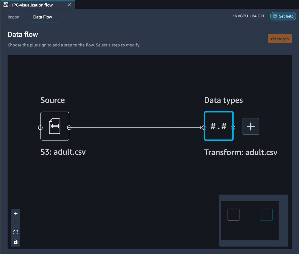
Figure 10.2 – Workflow created by SageMaker Data Wrangler after importing the data
By pressing the plus sign on the block on the right, we can add transformation and visualization steps to the workflow, as we are going to demonstrate next.
Adding visualizations to the data flow in SageMaker Data Wrangler
After importing the data, we can also view the data in SageMaker Data Wrangler, along with the column (variable) types. Figure 10.3 shows a view of the Adult data table. This view can help data scientists and analysts quickly look at the data and validate it:
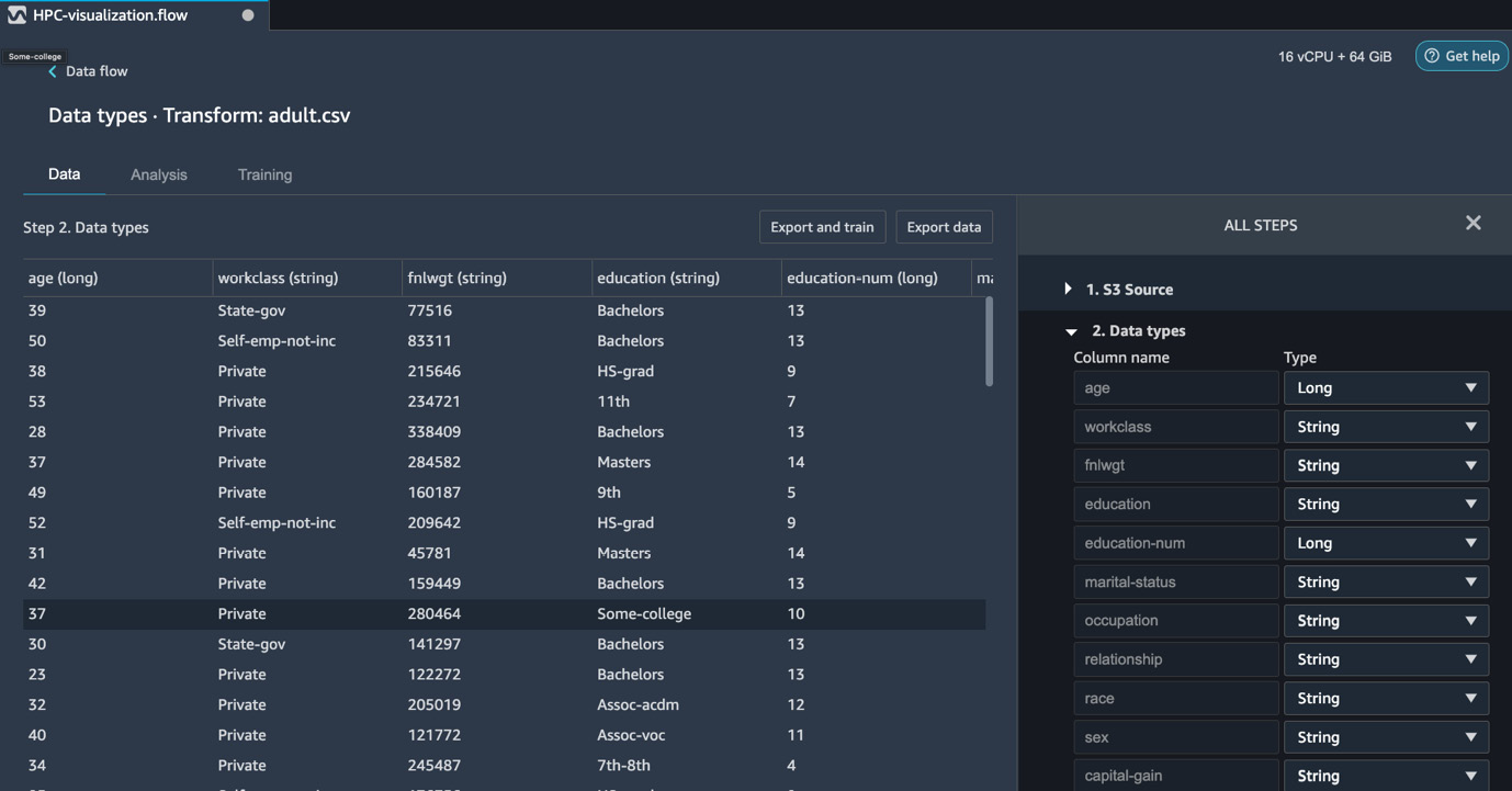
Figure 10.3 – Adult data table along with the column types
To construct various visualizations on our dataset, we must press the + sign on the Transform: adult.csv block shown in Figure 10.2. This shows us the various analysis and visualization options available in SageMaker Data Wrangler. We will now look at a few visualization examples while using SageMaker Data Wrangler on the Adult dataset.
Histogram
A histogram is one of the most commonly used plots that data scientists and analysts use in their exploratory data analysis, as well as for building the final reports of machine learning model results. SageMaker Data Wrangler provides the option of building histograms very quickly without writing any code. Figure 10.4 shows a histogram plotted with SageMaker Data Wrangler, showing the distribution of the education-num (number of years of education) variable. We have also colored this distribution using the income target variable to show how income depends on the number of years of education:

Figure 10.4 – Histogram of the number of education years (education-num), colored for the two classes (<=50k and > 50k)
In addition to color, we can also use the Facet by feature, which plots a histogram of one column for each value in another column. This is shown in Figure 10.5, where we have plotted the histogram of education-num colored by income. This is faceted by the sex variable to show the distribution for males and females separately:

Figure 10.5 – Histogram of the number of education years (education-num), colored for the two classes (<=50k and > 50k), and faceted by sex
We can see that creating histograms with multiple columns this way with just a few clicks and no need to write any code can be very useful for carrying out quick exploratory analysis and building reports in a short amount of time. This is often needed for several high-performance computation use cases, such as machine learning.
Scatter plot
With a scatter plot, we can plot the data points as a function of two or more variables using the X and Y axes, as well as color. Furthermore, like histograms, scatter plots can also be faceted by the values in an additional column. This type of data plot is useful when we want to see the relationship between variables and not just the distribution. Figure 10.6 shows the scatter plot of age versus education-num, faceted by sex:

Figure 10.6 – Scatter plot of age versus education-num, faceted by sex, for the Adult dataset
Combined with histograms, scatter plots are extremely useful visualization tools that are used for exploratory data analysis in machine learning use cases.
Multicollinearity
In a dataset, multicollinearity arises when variables are related to each other. This is important in machine learning use cases since data dimensionality can be reduced if multicollinearity is detected. Data dimensionality reduction helps with avoiding the curse of dimensionality, as well as improving the performance of machine learning models. Furthermore, it also helps with reduced model training time, storage space, memory requirements, and data processing time during inference, hence cutting down on total cost. In SageMaker Data Wrangler, we can use the following methods to detect multicollinearity in our variables:
- Variance Inflation Factor (VIF)
- Principal Component Analysis (PCA)
- Lasso feature selection
Next, we will show examples of each of these methods using our Adult dataset in SageMaker Data Wrangler.
VIF
VIF indicates whether a variable is correlated to other variables or not. It is a positive number with a value of one indicating that the variable is uncorrelated to other variables in the dataset. A value greater than one means that the variable is correlated with other variables in the dataset. The higher the value, the higher the correlation with other variables. Figure 10.7 shows the VIF plot for the numerical variables in the Adult dataset:
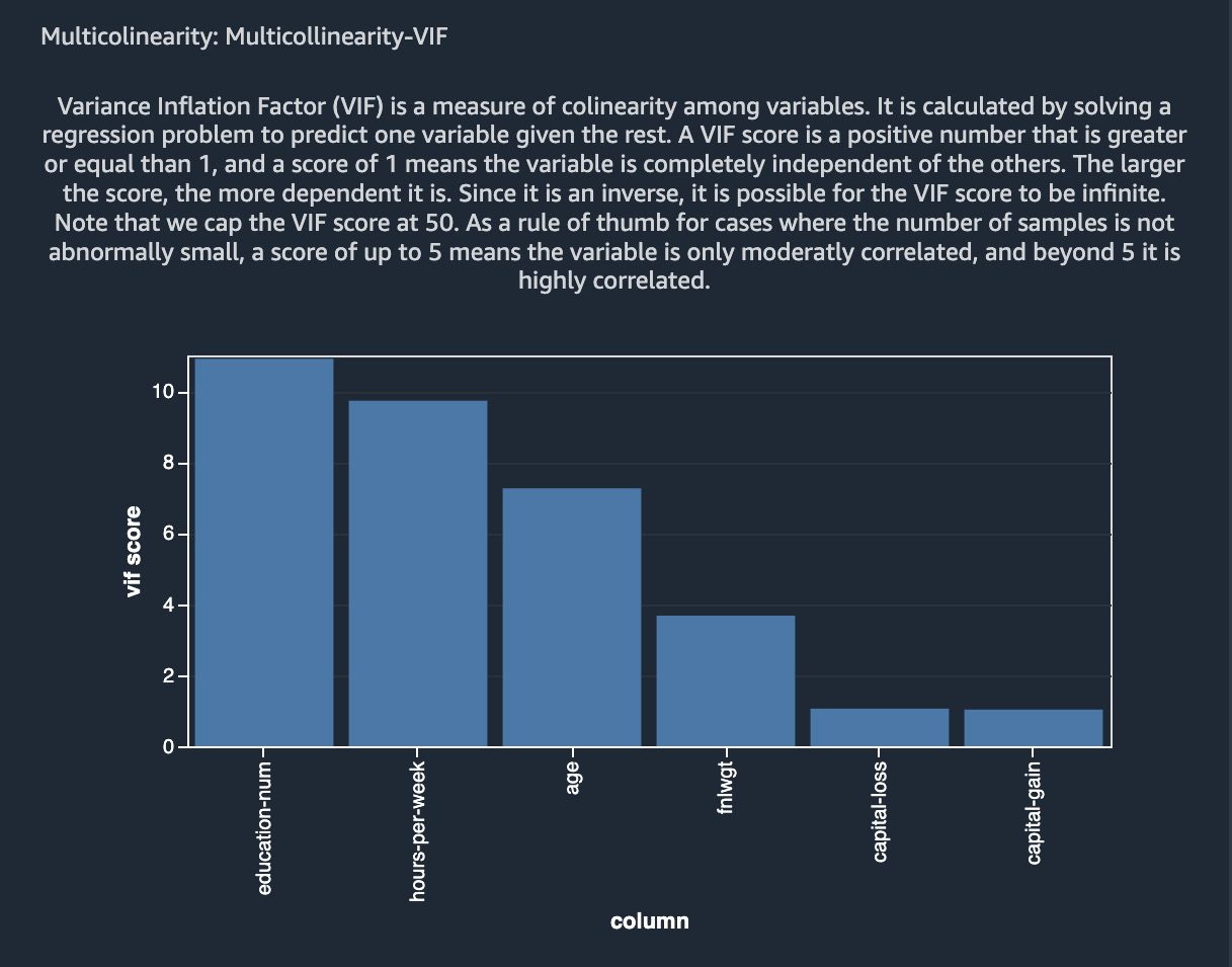
Figure 10.7 – VIF for the various numerical variables in the Adult dataset
As can be seen, education-num, hours-per-week, and age are highly correlated with other variables, whereas capital-gain and capital-loss do not correlate with other variables based on the VIF scores.
PCA
PCA is one of the most commonly used feature transformation and dimensionality reduction methods in machine learning. It is generally used not only as an exploratory data analysis tool but also as a preprocessing step in supervised machine learning problems. PCA projects data onto dimensions that are orthogonal to each other. The variables that are generated this way are ordered with decreasing variance (or singular values). These variances can be used to determine how much multicollinearity is in the variables. Figure 10.8 shows the results of applying PCA to our Adult dataset using SageMaker Data Wrangler:
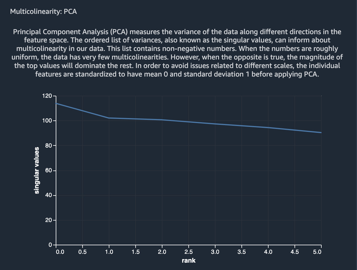
Figure 10.8 – Results of PCA on the Adult dataset using SageMaker Data Wrangler
As can be inferred from this figure, most of the variables do not have multicollinearity, whereas a few variables do.
Lasso feature selection
In SageMaker Data Wrangler, we can use lasso feature selection to find the most predictive variables for the target variable in our dataset. It uses the L1 regularization method to generate coefficients for each variable. A higher coefficient score means that the feature is more predictive of the target variable. Just like VIF and PCA, lasso feature selection is commonly used to reduce the dimensionality of datasets in machine learning use cases. Figure 10.9 shows the results of applying lasso feature selection to our Adult dataset in SageMaker Data Wrangler:

Figure 10.9 – Lasso feature selection results on the Adult dataset using SageMaker Data Wrangler
Next, we will discuss how we can also study variable importance using SageMaker Data Wrangler’s Quick Model feature.
Quick Model
We can use Quick Model in Data Wrangler to evaluate variable/feature importance for our machine learning dataset. Quick Model trains a random forest regressor or random forest classifier, depending on the supervised learning problem type, and determines feature importance scores using the Gini importance method. The feature importance score is between 0 and 1, and a higher feature importance value indicates greater importance of that feature for the dataset. Figure 10.10 shows the quick model plot created using SageMaker Data Wrangler for our Adult dataset:

Figure 10.10 – Quick Model results for the Adult dataset using SageMaker Data Wrangler
Quick Model can help data scientists quickly evaluate the importance of features, and then use the results for dimensionality reduction, model performance improvement, or business insights.
Bias report
With a bias report, we can visualize if there is a potential bias or class imbalance in our dataset. This information can then be used to carry out class balancing, feature transformation, and model improvement. With SageMaker Data Wrangler, we can visualize class imbalance as well as several bias parameters for the dataset. Figure 10.11 shows an example of a bias report for the sex variable (male or female), showing class imbalance and two other metrics:

Figure 10.11 – Bias report for the Adult dataset using SageMaker Data Wrangler
For more information on these metrics, please refer to the Further reading section in this chapter.
Data quality and insights report
We can also build a data quality and insights report in SageMaker Data Wrangler. This report shows things such as a table summary, duplicate rows, the distribution of a target variable, anomalous samples, results of running a Quick Model, a confusion matrix (for classification problems), a feature summary along with feature importance, and feature detail plots. Figure 10.12 shows the table summary for the Adult dataset:
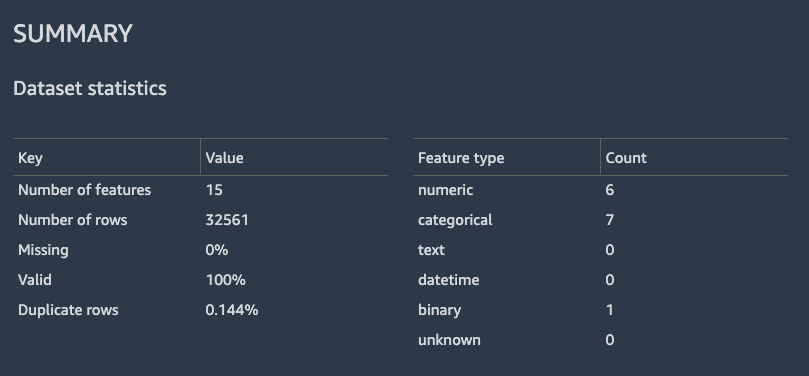
Figure 10.12 – Table summary showing data statistics for the Adult dataset
Figure 10.13 shows the histogram of the target variable, along with various values of the occupation variable:
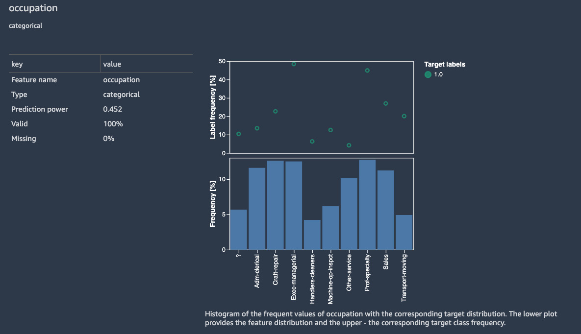
Figure 10.13 – Histogram of the target variable, along with various values of the occupation variable
Having access to these plots, metrics, and distributions with just a few clicks saves a lot of time and effort while performing exploratory data analysis.
Data flow
As we add steps to our data analysis in SageMaker Data Wrangler, they show up in the data flow. The data flow visualization shown in Figure 10.14 is for the group of transformations that we have carried out in this flow so far:

Figure 10.14 – SageMaker Data Wrangler flow showing the groups of steps we have performed on our dataset
We can click on the individual boxes to see the exploratory analysis steps and data transformations carried out so far in the workflow. For example, clicking on the center box shows us the steps shown in Figure 10.15:

Figure 10.15 – Various exploratory data analysis and data transformation steps carried out on our dataset in SageMaker Data Wrangler
Clicking on the right-hand box shown in Figure 10.14 shows us our bias and data quality reports, as shown in Figure 10.16:
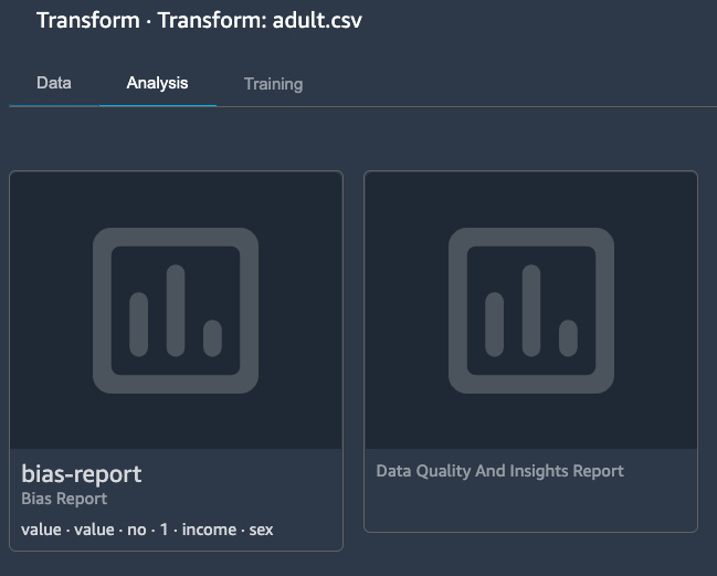
Figure 10.16 – Bias report and data quality and insights report steps in a SageMaker Data Wrangler flow
SageMaker Data Wrangler allows the results of these steps to be exported to the SageMaker Feature Store or Amazon S3. Furthermore, we can also export these steps as code to SageMaker pipelines or as Python code.
In this section, we discussed the various visualization options in Amazon SageMaker using SageMaker Data Wrangler. There is a variety of built-in visualization and exploratory analysis options in Data Wrangler that we can use in our machine learning use cases. In the next section, we are going to discuss Amazon’s graphics-optimized instance options.
Amazon’s graphics-optimized instances
Amazon has a variety of graphics-optimized instances that can be used in high-performance computing applications such as machine learning use cases and applications that require graphics-intensive computation workload. These instances are available with either NVIDIA GPUs or AMD GPUs and are required for high-performance computation use cases such as game streaming, graphics rendering, machine learning, and so on.
Benefits and key features of Amazon’s graphics-optimized instances
In this section, we will outline a few of the benefits and key features of Amazon’s graphics-optimized instances:
- High performance and low cost: Machines with good GPUs are generally quite expensive to purchase and difficult to scale due to their high cost. Amazon provides options to get high-performance instances equipped with state-of-the-art GPUs at low cost. These instances can be used to run graphics-intensive applications, build visualizations, and carry out machine learning training and inference. Also, these instances provide over a terabyte of NVMe-based solid-state storage for very fast access to local data, which is often needed in high-performance computation use cases.
While AWS has a very wide variety of GPU-based instances that can be used for different types of high-performance computing applications, P3, P3dn, P4, and G4dn instances are especially suited for carrying out distributed machine learning model training tasks on multiple nodes. In addition, these instances can provide up to 400 gigabits per second of network bandwidth for applications that have very high throughput requirements.
- Fully managed offerings: Amazon’s graphics-optimized instances can be provisioned as Elastic Compute Cloud (EC2) instances for a variety of use cases, including machine learning, numerical optimization, graphics rendering, gaming, and streaming. Users can install custom kernels and libraries and manage them as needed. These instances also support Amazon machine images for common deep learning frameworks such as TensorFlow, PyTorch, and MXNet. In addition, users can use these instances within Amazon SageMaker to train deep learning models. When used within SageMaker for training jobs, these instances are fully managed by AWS and are used only for the duration of the training job, thus reducing the cost significantly.
In the following section, we will summarize what we have learned in this chapter.
Summary
In this chapter, we discussed how to build quick visualizations for analytics and machine learning use cases using Amazon SageMaker Data Wrangler. We showed a few of the various exploratory data analysis, plotting, and data transformation options available within SageMaker Data Wrangler. The ability to quickly and easily build these visualizations and bias and quality reports is very important for data scientists and practitioners in the machine learning domain since it helps in cutting down on the cost and effort associated with exploratory data analysis significantly. In addition, we discussed Amazon’s graphics-optimized instances that are available for high-performance computing applications such as game streaming, rendering, and machine learning use cases.
From the next chapter onwards, we will start discussing various applications of high-performance computing and applied machine learning, with the first one being computational fluid dynamics.
Further reading
To learn more about the topics we discussed in this chapter, please refer to the following resources:
- Adult dataset at UC Irvine’s Machine Learning Repository: https://archive.ics.uci.edu/ml/datasets/Adult
- Amazon SageMaker Data Wrangler: https://aws.amazon.com/sagemaker/data-wrangler/
- Amazon SageMaker Data Wrangler documentation: https://docs.aws.amazon.com/sagemaker/latest/dg/data-wrangler.html
- Amazon SageMaker Data Wrangler visualization: https://docs.aws.amazon.com/sagemaker/latest/dg/data-wrangler-analyses.html
- Random forest regressor used in SageMaker Data Wrangler: https://spark.apache.org/docs/latest/ml-classification-regression.html#random-forest-regression
- Random forest classifier used in SageMaker Data Wrangler: https://spark.apache.org/docs/latest/ml-classification-regression.html#random-forest-classifier
- Data bias reports: https://docs.aws.amazon.com/sagemaker/latest/dg/data-bias-reports.html
- Amazon EC2 G4 instances: https://aws.amazon.com/ec2/instance-types/g4/