
Chapter 3: Kick-Starting Your Enterprise Architecture Repository
When stakeholders introduce an idea of developing a new application to solve some business problems, your job as an enterprise architect is to help them and everyone involved to have a better understanding of what the application is for. Long before starting any designs, you need to identify what service the application is intending to provide, who will be using it, and with which existing applications it will exchange data. Whether you are planning to build this application in-house, hire a contractor to build it, or buy it off the shelf, you still need to develop these conceptual models to help the stakeholders make the right decision – including the decision of approving or rejecting the application altogether. Your role as an enterprise architect is to clarify and formalize the ideas and turn them into requirements for the solutions architect to build and/or deploy the application.
We have a backlog from the previous chapter that contains tasks for creating models (diagrams) and tasks for creating metamodels. The words diagram and model will be used interchangeably as they both have the same meaning. Architects prefer to use model while users prefer to use diagram, so keep that in mind. Metamodels, in a nutshell, are models that tell us how to build models, so it makes sense to start by building the metamodels first and then derive models from them. However, in some cases, you may find that starting from the model and reverse engineering it to develop the metamodel is more convenient, especially if you are experienced in reading and interpreting the standard metamodels of TOGAF® and ArchiMate®. It is the ever-lasting question of what comes first, the chicken or the egg.
In this chapter, we will start with the model and will do the focused metamodel in the next chapter. This means that we are starting with the egg on purpose as we do not want to spend a lot of time on the theory (the metamodel part) without you experiencing an example of what the result is. We will learn the following while practicing building the Tracking App application context diagram:
- Building the application component context diagram
- Establishing your first diagram
- Adding elements to the diagram
If you are new to using Sparx as an enterprise architecture tool, this is your chance to learn the basics by using an example and following step-by-step instructions, so let's get started.
Technical requirements
If you have not installed Sparx Systems Enterprise Architect yet, it is now the time to do so; we will use it here and in all the remaining chapters of this book, and it is better to practice using it while reading. If you do not have a licensed copy, you can download a fully functional 30-day trial from the Sparx Systems website (https://sparxsystems.com/products/ea/trial/request.html). If you prefer to use another tool, you can do so, but you will need to figure out how to implement the examples in your tool of choice.
Installing Sparx is fairly straightforward for desktop users, as explained in this online video: https://sparxsystems.com/resources/show-video.html?video=gettingstarted-installingea. Corporate users need to consult their network admins for possible restrictions on installing software, and they will also need to get the proper connection string to the backend SQL database.
Because this is the first chapter to use Sparx Systems Enterprise Architect, we will be delving into a large amount of detail around navigating the tool. If you're already familiar with Sparx, please be patient. Subsequent chapters will go into less detail as we expect everyone to have become familiar with the tool by then.
Building the application component context diagram
A context diagram, as the name implies, is a diagram that shows the surroundings of a specific component. The main purpose of context diagrams is to provide a high-level introduction to an element such as an application component by answering the following questions:
- What is the element and why does it (or will it) exist?
- What does it provide to the enterprise?
- Who will be using it?
- Are there any other applications that interact or exchange data with it?
- What data is being (or will be) exchanged?
Context diagrams can be useful for describing existing elements (as is) and for describing targeted elements (to be). The same concept applies, and the same types of elements can be used in both cases. Before you roll your sleeves up, let's see how to establish your first diagram.
Establishing your first diagram
In this section, we will be building a brand-new enterprise architecture repository that will contain all our diagrams and elements. Diagrams visually show how elements are related to convey an idea, such as what a specific component is composed of, how a specific service is provided, or how a group of data centers are connected and what they contain. An element can be represented by different diagrams, each showing a different aspect of it, so the same element can appear in many diagrams.
Packages, on the other hand, represent a physical containment of their content, such as elements, diagrams, and other packages. A child element can have one parent only, but parents can have many children. Packages look and act like folders in file systems as they contain other elements, while elements and diagrams are the equivalents of files in file systems. You can nest packages within packages as much as you may need, but you need to keep in mind that very deeply nested packages can make it difficult for you and other repository users to find the information, so keep the users in mind when you build the structure.
If users find it easy to locate and get information in the enterprise architecture repository, they will use it as a reliable source of information; otherwise, they will keep doing whatever they are comfortable with. Therefore, make sure that the structure of the repository, including the names of the packages, elements, and diagrams, makes sense. As we progress in this book and our repository grows and matures, the need for restructuring will start to become clear, and we will see how we can respond to these needs. There is no one right way to do things, of course, but I am providing you with a tested way.
The repository itself is a relational database. If you store it locally on your machine, the database will be of the Microsoft Jet type (Microsoft Access basically), but it will be accessible only by you. You can choose to create the repository in a centralized server using any number of different database engines. All Sparx instances on desktop machines will connect to it and contribute to the enterprise architecture content.
Note
If you are using Sparx within an organization, you may need to consult your IT helpdesk to get the connection string to the SQL server, and there might be some rules, constraints, and guidelines that you need to be aware of.
Migrating content between your local database and the centralized database can take place at any package level, so you can export only the new content of the package that you need. From the Sparx application, navigate to the Publish ribbon. From the Model Exchange section of the ribbon, select Export-XML, then Export XML for Current Package; read or bookmark the related online help for more information on how to do this (https://sparxsystems.com/enterprise_architect_user_guide/15.2/model_publishing/exporttoxmi.html). We have just started a brand-new repository, so we do not need to worry about migrating content now, but one day, you will need to move content between different repositories for sure, so you know now that it is a simple thing to do.
In this section, we will learn the following:
- How to create the repository file
- How to create the diagram
- How to describe the diagram
- How to change the diagram theme
This section is our first step toward building our enterprise architecture repository, so make sure that Sparx is up and running. Now, let's get started.
Creating the repository file
After starting Sparx, you will be welcomed by the start page, which asks you whether you want to open a file, create a new one, or open one from the recently opened projects. This is our first diagram in a brand-new repository, so we need to create a new project:
- Choose the Create a New Project option under the New menu and select a folder to place the Sparx project file in.
- Type any name of your choice; I will use the name EA Repository for this purpose.
You should now see a single item named Model in the Project Browser window. This is called the root node and we will use it as our top-level package for our architecture content for now.
- We need to give the root node a more meaningful name than Model, so click on the root node then press F2 to rename it to Architecture Content.
The structure of the repository is extremely flexible when there is a need to change it, and this need will come sooner or later. The enterprise will keep changing and the way you understand it will keep changing too, so the repository must be flexible enough to accommodate these changes with ease. Fortunately, this can be easily done in Sparx, and it is similar to organizing files and folders in a file system, so do not worry if you started with a different understanding in mind and want to change it later.
For example, if you put an element in package A, link this element to other elements, place the element on several diagrams, and then decide to move it to a different package, the links will not be broken no matter where the element is relocated. Using an enterprise architecture tool such as Sparx versus using simple Microsoft Office documents can have a huge positive impact on your ability to successfully implement an enterprise architecture practice. If your enterprise architecture artifacts are all in Office documents stored in a file system or even in a document management system, any links between these documents (such as reference URLs) will be broken the moment you start moving files around, and it can be very costly to fix. Remember that everything is connected in the enterprise, so having broken connections can be fatal to the reputation of the enterprise architecture repository. In Chapter 11, Publishing Model Content, we show you how to render your enterprise architecture repository information in different formats, including Microsoft Office documents.
We have an empty repository, so now we need to create a new package to contain our first diagram and all the related elements.
Creating the diagram
We need to create a package to contain the diagram that we will create and that will contain all the elements that will be placed on it. Diagrams cannot be created under the root node directly; they need to be created within a package under the root node or under another package.
Creating packages and creating diagrams can be performed together in one step or separately as two steps. In this example, we will create both in one step, and I will show you in other examples how to create each in its own step.
To create a package, follow these steps in order:
- Click on the Architecture Content root node and from the Toolbar, choose Design > Model > Add > Package to create a new package. This will bring up the New Package pop-up window, as in the following figure:

Figure 3.1 – New Package pop-up window
- Enter Tracking App in the Name field and select Create Diagram. Click OK, and the New Diagram window will open, as shown in Figure 3.2.
If you selected Package Only in the New Package window, the New Diagram window will not be launched automatically, and you will get an empty package. You can add a diagram at any time by right-clicking on the package and selecting Add Diagram from the context menu, which will bring up the same New Diagram window, as follows:

Figure 3.2 – The New Diagram window
- Type Tracking App Context Diagram into the Diagram field, select Enterprise Architecture > ArchiMate from the Type drop-down list, highlight ArchiMate 3.1, and select Application from the available diagram types.
- Click OK to accept the selections, which will close the window and open a blank diagram for you to start drawing on.
We need to pause for a few seconds here and explore what we have on the screen after the previous actions. As you can see, an empty diagram is now shown in the diagram area as a tab. Clicking on the x icon on the tab will close it, and you can re-open it from the project browser window. In the project browser area to the left of the screen, you can see the newly created diagram under the Tracking App package. If you double-click the diagram icon, the diagram will be reopened and displayed in the diagram area again, as shown here:

Figure 3.3 – Empty application component diagram
To the right, there are two areas: the Toolbox and Notes areas. The Toolbox area changes according to the type of diagram that you have chosen in the New Diagram window. Because we chose Application as the diagram type, the Toolbox contains all ArchiMate® 3.1 Application-layer elements.
The Notes area is context sensitive to the currently selected item. If you select a different element from the Project Browser window, the Notes content will change accordingly. We will use the Notes area to describe all the elements that we create and make the content ready for publishing.
Describing the diagram
It is a good practice to add descriptive text for every diagram and every element you create. What you think of as obvious information may not be for other users, and sometimes may not be obvious to you if you revisit a diagram that you have created after a while. Adding comments in code while programming is just as important for helping yourself when you come back to it as helping other developers who will be working on it.
In this section, we will see two different ways to add descriptive text to your diagrams: one is by using labels and the other one is by using the diagram notes fields.
Using labels
Labels act like titles to diagrams and they immediately inform the readers what the diagram is about. Labels are elements, so we need to add them from the Toolbox to the diagram area and add descriptive text to them. Follow these steps to add a label to a diagram:
- Scroll down the Toolbox all the way near the bottom until you find the Common section.
- Expand the Common section and find Text Element. Click and hold Text Element and drag and drop it onto the diagram. Alternatively, you can click once on Text Element (or any element in general), move the mouse where you want to create it, and click on the diagram to create the element where you clicked.
- Type Tracking App Context Diagram in the designated text area and click anywhere on the diagram to see your text element updated.
- You can format the font and adjust the font size by locating the font configuration button in the Layout > Style menu, which is indicated by a capital letter A.
- Select the font name, style, and size that you like from the pop-up window. The defaults are Calibri, Regular, and size 8. I will keep using the same font name and style but will change the size to be 16 pt in labels and 10 pt in all the other elements.
- Since this is a label, change the size to 16 and press OK to accept and close.
You can move the label and place it at any desired location on the diagram, but labels are usually placed at the top-left corner of the diagram area as this is where readers will usually start reading.
Note
Some organizations are required by law to use specific font names, sizes, colors, or styles in their content, especially public-facing ones. Some other organizations enforce using specific font styles for marketing and brand identity purposes. You need to check with the designated units in your organization for any such requirements and make sure that you follow them in the entire repository.
Keep in mind that text elements can be used for any type of text content that we want to add to the diagram. They can contain a description of something, a set of instructions, side notes, things to do, and so on; they have many different usages. Using them as labels is just one of them.
Using the diagram notes field
Diagram notes are fields that can contain any text that you feel is useful to add. They are not visible in the diagram area, but Sparx users can see them in the Notes window when they click on the diagram area. Another useful benefit of entering a diagram description in the Notes field is making the documents that will be published from Sparx richer in content. You can customize your document templates in a way that prints the Notes field before or after the diagrams, as we will see later in Chapter 11, Publishing Model Content.
To add a description in the diagram Notes field, we need to do the following:
- Right-click on the diagram background and select Properties, which will open the Properties pop-up window for the diagram. As you can see, there are multiple tabs in this popup, and we will explore some of these options as we go. On the first tab, labeled General, you can rename the diagram, change the author's name, change the notes, and adjust other settings.
- In the Notes field at the bottom, type any text that describes what this diagram is about. You can use this sample text if you want: This diagram shows the context of the Tracking App application component. It describes what the application component is, what it provided, who will use it, what other applications will integrate with it, and what it needs in order to operate.
- You can educate your Enterprise Architect users to look at the Notes section of diagrams if they want to know what the diagrams are about and what viewpoint they are addressing. Make your notes short and descriptive because most of the description should be conveyed in the diagram that you are creating, not in a text note.
Keep this popup open as we need to change the theme of the diagram in the next step.
Changing the diagram theme
Themes are predefined settings that affect the way your diagrams look, mainly by applying different background and foreground colors. Themes are applicable at the diagram level, so you can have different themes for different diagrams.
However, because the selection of themes affects the way your diagrams look, I advise you to stick to one theme for the entire repository. Every enterprise architect who contributes to the content will be required to use the same theme to maintain consistency. If you think that this will be too much to enforce, then you're better off using the default theme and asking everyone not to change it.
To change the theme of the current diagram, you need to have the diagram properties popup open:
- Go to the Theme tab and scroll through the dropdown until you find High Contrast White.
This is my favorite theme because it is the closest one to how colors appear on paper. It reduces the possibility of seeing things differently on paper than on screen.
- Select High Contrast White from the list and click OK to apply the changes, and then close the popup.
The choice of themes and colors is purely up to your preference, so you are free to pick any one of them you feel comfortable with.
Note
If you are working with a team of architects, you all need to agree on the same theme and use it to maintain consistency among your deliverables. If team members are using different themes but not using the default colors of that theme, the way diagrams will look will vary from one computer to another, which affects the consistency among enterprise architecture team members.
We have established the initial structure for the content that will be created and established an empty diagram, and in the next section, we will add more elements to it.
Adding elements to the diagram
Element is a generic word for anything you place on a diagram. New elements are provided in toolboxes, and for each type of diagram, Sparx makes one toolbox the default toolbox for that diagram. When creating our diagram, we chose that we wanted to create an ArchiMate® 3.1 Application diagram; therefore, Sparx has set ArchiMate® 3.1 Application as the default toolbox for us. This can be changed, as we will see later, but first, we need to add the main element to the diagram, which is the application component.
Starting with the application component
It is always a great idea to have an imaginary picture of the diagram in your head or a sketch on a piece of paper before starting to model it. In this diagram, we need to convey what the new application is about, what it provides, who will be using it, and what other applications need to integrate with it. Therefore, I am imagining an application component in the middle of the diagram, surrounded by Actors and applications, each getting or sending something to the application. This should be a conceptual diagram that describes the application at a high level, and it should be easy to read and be understood by any audience.
Defining an application component
An application component is defined as "an encapsulation of application functionality aligned to implementation structure, which is modular and replaceable" (https://pubs.opengroup.org/architecture/archimate3-doc/chap09.html#_Toc10045392).
An application component is meant to provide one or more functions to users and other applications (formally known as Actors). It encapsulates these functionalities, so it is unknown to the Actors how it works internally, but services are provided to them through interfaces. Interfaces can vary based on the Actors, such as the User Interfaces (UIs) for communicating with human Actors (or users) and the Application Programming Interfaces (APIs) for communicating programmatically with other applications. In modern programming, UIs are nothing more than loosely coupled application components that communicate data captured in forms to other backend application components through APIs.
Application components can comprise other application components, so the size of the component does not matter if it is modular and replaceable. An application component can be as large as a monolith Enterprise Resource Planning (ERP) application that has hundreds of modules, each having hundreds of submodules, or it can be as small as a microservice that takes in a text value and returns it with double quotes around it. These are both considered application components according to the definitions.
ArchiMate® 3.1 provides two notations for modeling application components, rectangular and borderless, as shown in the following figure:

Figure 3.4 – Application component notations in ArchiMate®
That is all for the definition, and by now I hope that you have Sparx up and running because we will start modeling right away.
Creating an Application Component
The first element that we need to add to the diagram is the Application Component element, so follow these steps:
- From the Toolbox, drag an Application Component element and drop it in the center of the diagram.
- Sparx will expect you to rename the element to a more meaningful name, so you can type Tracking App and then press Enter or click anywhere outside the element.
You have performed two steps in one: you have created a new element in the repository that represents Tracking App, and you have placed that element on the diagram. There are other ways to create elements directly in the Project Browser without having them placed on a diagram, but this is the most common and easiest way to do it.
Keep in mind that if you want to create another diagram that contains Tracking App, you must reuse the same application element from the Project Browser. If you drag another Application Component element from the Toolbox and name it Tracking App too, Sparx will accept it and will never check for or warn you about possible duplicates because the name is not a unique identifier for elements.
You need to know whether you want to create a new element or reuse an already existing one. Always remember to drag and drop from the Toolbox to create new elements and drag and drop from the Project Browser to reuse existing elements.
If you are not sure whether an element exists or not, you can press Ctrl + F to search for it and reuse it. Searching for elements is essential to building a well-organized and trusted enterprise architecture repository, and luckily, Sparx has a good search engine that you will find handy. We will talk more about searching as we create more elements and diagrams in the repository that require us to search.
Adding a description to a component
Make it a habit to describe every element you create in the repository, because the enterprise architecture repository is supposed to be the source of the most accurate information about your enterprise elements:
- Open the Properties window of the Tracking App element by right-clicking on the element on the diagram and selecting Properties > Properties. Alternatively, you can select the element and then press Alt + Enter as a keyboard shortcut to open the same Properties window.
- Type in a short description of the application component in the Notes section, such as This mobile app will be installed on truck drivers' smartphones to allow the shipping managers and partners to track the location of the truck at any given moment.
It is better to have the information and not need it than to need the information and not have it. On the contrary, awfully long notes can discourage readers from looking at them, so you need to maintain a balance, which I suggest is between three and six lines of descriptive notes. There are other ways to add lengthy documentation to an element, which we will explore later.
Displaying a note in a Note element
After you close the Properties window, the notes will be hidden, and if someone is looking at a published or printed version of the diagram, they will not be able to see the notes. Therefore, we need to place a Note element to show this information:
- Scroll down the Toolbox, expand the Common area, and you will see the Note element at the top of the list.
- Drag the Note element and drop it onto the diagram area close to the Application Component element.
Important
Do not get confused between the Notes field and the Note element. Every element and every diagram has a designated Notes field that you can use to write descriptive text about that element or diagram. These notes are not visible on the diagrams by default but can be visible in some Sparx windows. On the other hand, there is a Note element, which is part of the Common group in every toolbox. You can place it on a diagram to display a descriptive message about anything you want, and it is always visible to the reader, just like a Post-it note.
Notice that adding the Note element to the diagram did not appear in the project browser; that is because some elements, such as Note, Text, and Boundary, are not meant to be reused and they belong only to the diagram that they have been placed on. In other words, they are not considered architectural elements, so they have no physical presence in the enterprise architecture repository, but just a visual presence on a specific diagram.
The Note element is empty, and you can type anything in it or link it to another element and display that element's Notes field instead. In our case, we need to display the text that we have typed in the application component's Notes field to make it visible always because our goal is to tell the readers what the application is.
- Click on the Note element and you will see three small action buttons on the right side of the element: an arrow, a menu, and a brush, as you can see in the following diagram:
Figure 3.5 – Action buttons appear when you highlight an element
These three buttons provide contextual actions, and they are available for each element on the diagram. Click on the Application Component element now and you will see the same action buttons next to it:
- The arrow-shaped button is used to create relationships between elements.
- The menu-shaped button displays a context menu.
- The brush-shaped button provides appearance and formatting options.
You can still access all these options using different menus, so it is just a matter of convenience.
- Click and hold the arrow button and drag it to the Application Component element. Once the mouse pointer is above the application component, release the mouse and you will get a list of possible relationships that you can create between the source (in this case, the Note element) and the target (in this case, the Application Component element).
- For these two types of elements, there is only one type of possible relationship: Link. When selected, you will see a dotted line now connecting the two elements, which represents a link relationship.
The Note element is still empty, and we can type the same text description that we typed earlier in the application component's Notes field. However, this means that we must maintain that text in two different places now. This can be a time-consuming task when you have a large repository full of elements and notes, and most of the time, you will end up making changes in one place and forgetting the other, resulting in inconsistency.
What we need to do is to tell Sparx that we want to display the exact same application component notes in the Note element.
- To do that, right-click on the link relationship and click on the Link this note to an element feature option, which will bring up a pop-up dialog box.
- Open the Feature Type drop-down list and select Element Note.
- Click OK to accept the changes and close the popup.

Figure 3.6 – Link note to element feature pop-up window
You can see now that the text that you typed in the Note section of the application component is now displayed in the Note element on the diagram.
Next, you will see how to style the elements that we have placed on the diagram so far.
Styling elements
You can optionally change the color of the Application Component and Note elements to give them a nicer look. Take the following steps to do that:
- From the Layout > Style menu, set the fill color to white (RGB 255, 255, 255) and the border color to royal blue (RGB 65, 105, 225).
- From the same Layout > Style menu, change the font size from 8 to 10.
Since Application Component will be the main element on the diagram, let's give it a thicker border and make it bigger in size so the reader will be able to tell from the first look which element in the diagram is the main subject.
- Using the same Layout > Style menu items, adjust the width of the border from the default value of 1 pt to 2 pt.
- Also, change the fill color of the Note element to light yellow (RGB 255, 255, 224) to give it the style of a real Post-it note.
- Finally, change the notation of the application component to the borderless notation by right-clicking on it and unchecking Advanced > Use Rectangle Notation. Alternatively, you can click on the Application Component element, then click on the brush action button and uncheck Use Rectangle Notation from the menu.
- Save your changes by pressing Ctrl + S on your keyboard or click on Layout > Diagram > Save from the Toolbar.
By now, your diagram should look like the following diagram, or you should at least know why it does not. You can see the label in the top-left corner, the application component, and the Note element displaying what is in the Notes field of the component:

Figure 3.7 – The Tracking App context diagram so far
The next thing that we need to show on the diagram is what Tracking App provides to its users.
Introducing application services
Application components are meant to provide services to users, so we need to add more information to our diagram telling them what services Tracking App will provide. Based on the description of the first scenario in Chapter 2, Introducing the Practice Scenarios, Tracking App is targeted to provide a single service within the current scope, which is Vehicle Tracking.
The best way to identify the services that an application component provides is to refer to the Use Case documents if available. Use cases describe how Actors will interact with a system; they tell you what services a component exposes to the external Actors, which can either be users or other applications. Remember that we are still conceptualizing the application so we may discover more information as we share the diagrams with the stakeholders. A simple diagram will help stakeholders to reorganize their thoughts and visualize what they are expecting to see in the target solution, so high-level use cases are what you need to consider at this stage.
This subsection will show you how to model the application services that are provided by an application component.
Adding an Application Service element
We need to describe the services that are provided by Tracking App. ArchiMate® has provided the Application Service element for this purpose, and each service will be represented by an Application Service element.
Like what we have previously done when we added an application component and a note to the diagram, the Application Service element can be found in the same toolbox. Follow these steps to add the Vehicle Tracking service to the diagram:
- From the Toolbox, drag an Application Service element, drop it on the diagram, and rename it to Vehicle Tracking.
- Open the Element Properties window and in the Notes section, type a short description about this service, such as This service provides information about the current location of the smartphone that will be carried by the truck drivers during shipment delivery.
- Click OK to close the Properties window and return to the diagram.
To remain consistent with other elements in the diagram, we need to style the Application Service element, which will be described next.
Styling the element
Optionally, style the Application Service element to give it the look and feel of other application architecture elements:
- Follow the same steps that we defined for the application component to style the application service. Make the font size 10, the fill color white (RGB 255, 255, 255), and the border color royal blue (RGB 65, 105, 225).
- Since the application service is not the center of focus in this diagram, we need to keep the border width as 1.
To avoid repeating the same styling steps for every element we add, it will be better if we save the style and reuse it whenever needed, which will be explained next.
Saving the style for reusability
We will be using the same element style over and over for every application architecture element in the repository, so it is best to save it for later reuse. Saving styles also increases the consistency between different team members as they will all use the same style. Follow these steps to save the style for reuse:
- Highlight the Application Service element on the diagram and locate the Layout > Style > Manage appearance styles toolbar button (which has a disk and pencil icon).
- Click on the small arrow to open the drop-down list and select Save as New Style. Self-descriptive names are always recommended but we are limited to 12 characters only for the style name. Type App Arch as the value and click OK to accept.
The name of your newly added style now appears in the styles drop-down list in the same menu items group. You can now apply this style to any application architecture element that you create simply by highlighting the element and selecting this style from the menu.

Figure 3.8 – The style of the highlighted element is saved for future reuse
Now we have the application service created and styled, we need to relate it to the Tracking App application component.
Relating the component to the service
According to the ArchiMate® 3.1 specification, the relationship between an application component and an application service is assignment. Assignment simply means that we are describing part of the Tracking App behavior in the Vehicle Tracking service. This relationship is represented as an arrow with a solid line and a dot at its base, as you can see in the following diagram:

Figure 3.9 – The assignment relationship
We will talk in more detail about the structure and behavior of enterprise elements, along with more elaboration of the definitions of the relationship, in the next chapter.
We need to create an assignment relationship between the Application Component and Application Service elements, so we need to do the following:
- Locate the assignment relationship in the Toolbox, click on it once, and you will see the shape of the mouse pointer changing to a hand symbol, indicating that you are now in relationship creation mode.
- Click on the application component and keep holding the mouse button, move your mouse over the application service, and release it.
Alternatively, you can click on the application component, click and hold the arrow-shaped action button, release it on the application service, and select Assigned to from the menu.
- Press Ctrl + S to save.
This will create the desired relationship between the two elements. This relationship is not only visible on this diagram, but it also connects them internally and will appear automatically whenever you place both elements on any other diagram. This relationship is part of the enterprise architecture repository and is not limited to the current diagram.
To know the relationships between any element and other elements, highlight it and open the Properties pop-up window by pressing Alt + Enter or right-clicking on the element and choosing Properties > Properties > Related > Links, as shown in the following figure:

Figure 3.10 – Relationships between the current element and other elements
If you discover a need for adding additional application services, you can follow the same steps to add them. For now, your diagram must look as in the following figure:
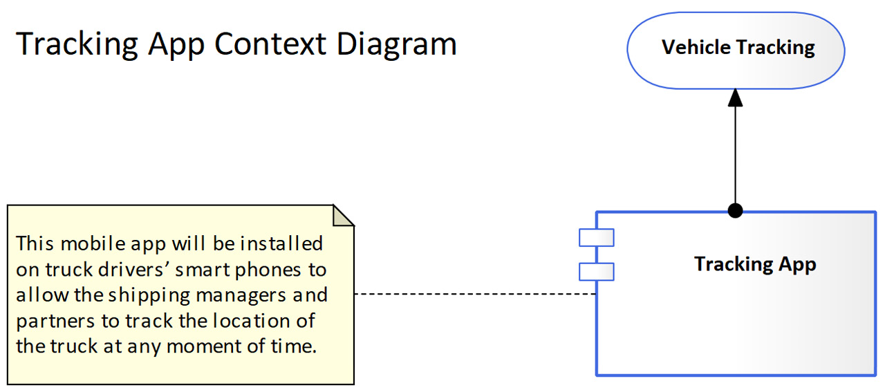
Figure 3.11 – Tracking App and the service it provides
As you can see, the diagram is starting to take shape, but we still need to add more to the context diagram, so let's keep adding more content.
Adding Actors
Now we need to place the users of the application on the diagram, and we will use the Business Actor element for this purpose. Business Actors are not part of the Application toolbox, so we need to bring in the ArchiMate® 3.1 Business toolbox instead, as we will see in this section. We will perform the following steps to add Business Actors to the application context diagram:
- Activate the ArchiMate® 3.1 Business toolbox.
- Place the Business Actors on the diagram.
- Define the proper relationships between the Business Actors and other elements.
- Style the Business Actors.
As you can see, the steps are similar to those we have followed to add the application service, but first, we need to activate the Business toolbox to be able to use the business elements.
Activating the ArchiMate® 3.1 Business toolbox
Sparx made ArchiMate® 3.1 Application the default toolbox for our diagram because we earlier chose that we wanted to create an ArchiMate® 3.1 Application diagram. However, in many cases, we may need to add elements from different toolboxes, so Sparx provides a way to do this. If you look at the top part of the Toolbox, you will see a search box, a search button, and a toolbox menu (also known as a hamburger menu), as shown in the following figure:
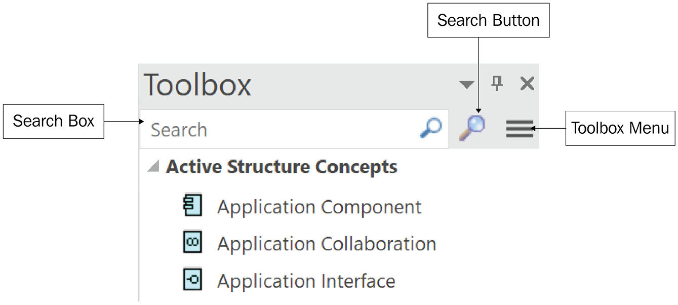
Figure 3.12 – The Toolbox menu items
The search box allows you to search within the active toolbox, the search button allows you to search within all Sparx toolboxes, and the toolbox menu allows you to change the toolbox and the Perspective.
Sparx groups toolboxes that serve a similar purpose in what it calls a Perspective, so there is a Perspective for ArchiMate® 3.1 that contains all the toolboxes under the ArchiMate® 3.1 specification, there is a Perspective for UML 2.5, a Perspective for Strategy, and so on. Use the toolbox menu whenever you need to use an element from a different toolbox within the same Perspective, or to change to another Perspective altogether.
Note
The toolbox menu uses a symbol that is informally known as the hamburger menu because of the way it looks. This is not standard naming, but it is well known among developers and most internet users.
Keep in mind that based on your purchased Sparx license, some Perspectives may show in the list, but they will contain no toolboxes, which means they are not included in your license.
To activate the Business toolbox, click the toolbox menu > ArchiMate 3.1 > Business, where you can see all the business architecture elements.
Placing the Business Actors on the diagram
While reading the Use Case documentation, you will have realized that three main Business Actors will be using Tracking App: truck drivers, shipping managers, and business partners.
Note
The techniques for identifying Actors for a specific application fall more into the business analysis domain, which is not our focus in this book. We are assuming that some form of documentation already exists, and it does not have to be formal, but may exist in presentations, spreadsheets, or web pages.
To add the Business Actors to the diagram, make sure you do the following:
- With the Business toolbox open, drag three Business Actor elements from the Toolbox, and drop them onto the diagram above the application service.
- Rename the three Actors as Truck Driver, Shipping Manager, and Business Partner.
- Add a short description for each Actor in the designated Notes field.
With more elements added to the diagram, you may realize that you need to move elements to a different location to make space for more elements to be added. Let's look at how to move the elements on a diagram.
If you need some space between the diagram label and the elements that you have placed, you can follow the same selection techniques that you are already familiar with in other tools, such as the following:
- You can click and hold your left mouse button to draw a selection rectangle. Every element that falls fully or partially within the selection rectangle will be selected.
- You can hold the Ctrl key on the keyboard and click on elements to select or unselect them.
- You can press Ctrl + A to select all elements on the diagram and then use the Ctrl + click technique to unselect the unwanted ones.
All these techniques are pretty standard and available in every modeling tool (and even in Windows File Explorer), possibly with slight variations, so there is nothing new to say here except to remind you that the same old techniques that you may know already work in Sparx too.
After selecting the elements that you want to move, click and hold any of them, drag them to where you want to move them, and release. Alternatively, you can move a group of selected elements by one point at a time using Shift + arrow keys to move the selection to the left, right, up, or down accordingly. This is a very helpful technique to slowly move objects for more accurate positioning.
Next, we will see how to relate the three Business Actors to the existing elements on the diagram.
Defining the relationships to Actors
It is important to keep in mind that everything is connected in the enterprise. There should be no single element in the entire enterprise repository that exists by itself and has no connections to at least one other element. Defining the proper relationships will help us to identify and analyze the impact of making changes, as we will see later in Chapter 8, Business Architecture Models.
The relationship between an application service and a Business Actor is of the serving type, and I will show you in the next section of this chapter how I know that. The serving relationship looks like a straight arrow with a solid line. The arrow base is connected to the element that is providing the service, and the arrowhead points to the element that receives the service.

Figure 3.13 – An application service serving Business Actors
Since you know how the relationship looks, it will be easy to find it in the Toolbox and create it between the elements:
- Locate the serving relationship in the Toolbox, click and hold the application service, move to the first Actor, and release.
- Repeat the same for the other two Actors.
- Another way to connect is to click on the source element (the application service) to highlight it, use the small action arrow that appears to the side, hold it, and release it above the target element (the Actor), and then select Serving from the context menu.
Just like we did with other elements that we have placed on the diagram, we need to style the Business Actors.
Styling the Business Actors
For styling business architecture elements such as Business Actors, we will use the same font size that we have used for the application elements. However, we will use a different color for the border to visually differentiate elements that belong to different architecture layers. After styling one Business Actor element, we will save the style and apply it to the remaining Business Actors, as you will see in the following steps:
- Select one of the Business Actors and adjust its font size to 10, set the fill color to white (RGB 255, 255, 255), and set the border color to orange (RGB 255, 165, 0).
- Save this style for future reuse as Biz Arch so you can apply it to other business architecture-layer elements without repeating the styling steps every time.
Now we have the style saved, we can apply it to any other element. Reusing styles is a very important factor in maintaining the consistency of diagrams within a single repository, especially when there are multiple users contributing to the content.
- Highlight the other Business Actors on the diagram either together as a group or one by one and apply the saved Biz Arch style to them.
- Optionally, you can change the notation of the Business Actors to the borderless notation.
- Save your work by pressing Ctrl + S.
If you have forgotten how to perform any of the listed steps, I encourage you to refer to previous sections in this chapter where we have provided detailed step-by-step instructions for both the Application Component and Application Service elements.
If you have followed the steps so far, your diagram will look like the following:

Figure 3.14 – Tracking App context diagram so far
The diagram is shaping up and is telling us more about Tracking App now. The project stakeholders may agree or disagree with what you are proposing but this is the main objective of conceptual diagrams. Our goal is to have all stakeholders on the same page of understanding, and opening doors for questions and answers always helps with this goal.
We still have more information to add to the diagram and one of them is the dependencies on other applications, so let's add it.
Identifying other dependent elements
With the identified services of Tracking App, there is not much information to exchange with other applications. Tracking App needs to send the phone's current location at specified time periods to the Trading Web application.
The Trading Web application is the main business application that internal users and external partners use to make orders, get item information, make payments, and access many other core online services. Identifying all these services will add great value to your enterprise repository, because the Trading Web application represents the information technology backbone of the ABC Trading business, and the more knowledge we can build about it, the more valuable information we can give to the decision-makers. However, this effort will shift your focus away from what you are tasked to do now. The best thing you can do in this case is to add a new user story to the artifacts backlog and discuss it with the product owner. For now, all we know is that our enterprise has an application component called Trading Web and it will exchange data with Tracking App.
Adding the Trading Web application component
We know that we have not created the Trading Web application component before, so we will create a new application component from the Toolbox:
- Drag an application component from the Toolbox and drop it on the diagram to the side of Tracking App.
- Rename it to Trading Web, style it by using the App Arch style, and add a description in the Notes area as desired.
- Add descriptive text to the Notes field of the Trading Web component.
Note
Human Actors and other applications (which are technically considered Actors too) can use the same service if they need to access the same data. They may require two different types of interfaces to do so but it is still the same service and the same data. Human Actors (or users) require having a UI, while applications require an API to access the same service. We will talk in more detail about application services and application interfaces in the next chapter.
Tracking App will send the location of the truck (or vehicle in general) to the Trading Web app through the Vehicle Tracking service at every specified period. In other words, Tracking App will be serving Trading Web with vehicle location data.
- Use the Toolbox or the arrow action button to create a serving relationship going from the Vehicle Tracking service to the Trading Web application component.
Next, we will style the Trading Web application component just like we did with the other elements.
Styling the Trading Web application component
Trading Web is an application component, so you can reuse the previously saved App Arch style as we have done earlier, or use this quick copy/paste method to apply a style from one element to another element on the spot:
- Highlight the Vehicle Tracking application service.
- Locate the Layout > Style > Pickup toolbar button, which has an eye drop icon. Click it, and the style will be copied to the clipboard and will remain there until you copy another style or close Sparx.
- Now, highlight Trading Web and click the Layout > Style > Apply button – which has a brush icon – to apply the style that is in memory on the selected element.
- Either keep the default rectangular notation or use the borderless one.
So far, we have learned two ways for reusing styles, and each has its own benefits:
- Saving the style: This is useful if you will use the same style over and over in different places within the repository for a long period of time, so it is more for permanent reusability.
- Copy/paste the style: This is useful for quickly applying a style of one element to another, and if you want it to stay in memory for a short period of time, so it is more for temporary reusability.
Save a style only if you are sure that you will reuse it later because you do not want to pollute the styles list with unused elements. If you are not sure that you will reuse the style again, it is more efficient and cleaner for the repository to copy/paste the style from another styled element.
Note
If you are working in a corporate environment and your repository is hosted in a centralized server, saved styles will be shared across all users. Therefore, only save styles that you will be reusing as a team and avoid saving styles that are just your personal preference.
This is what the diagram will look like at this point:
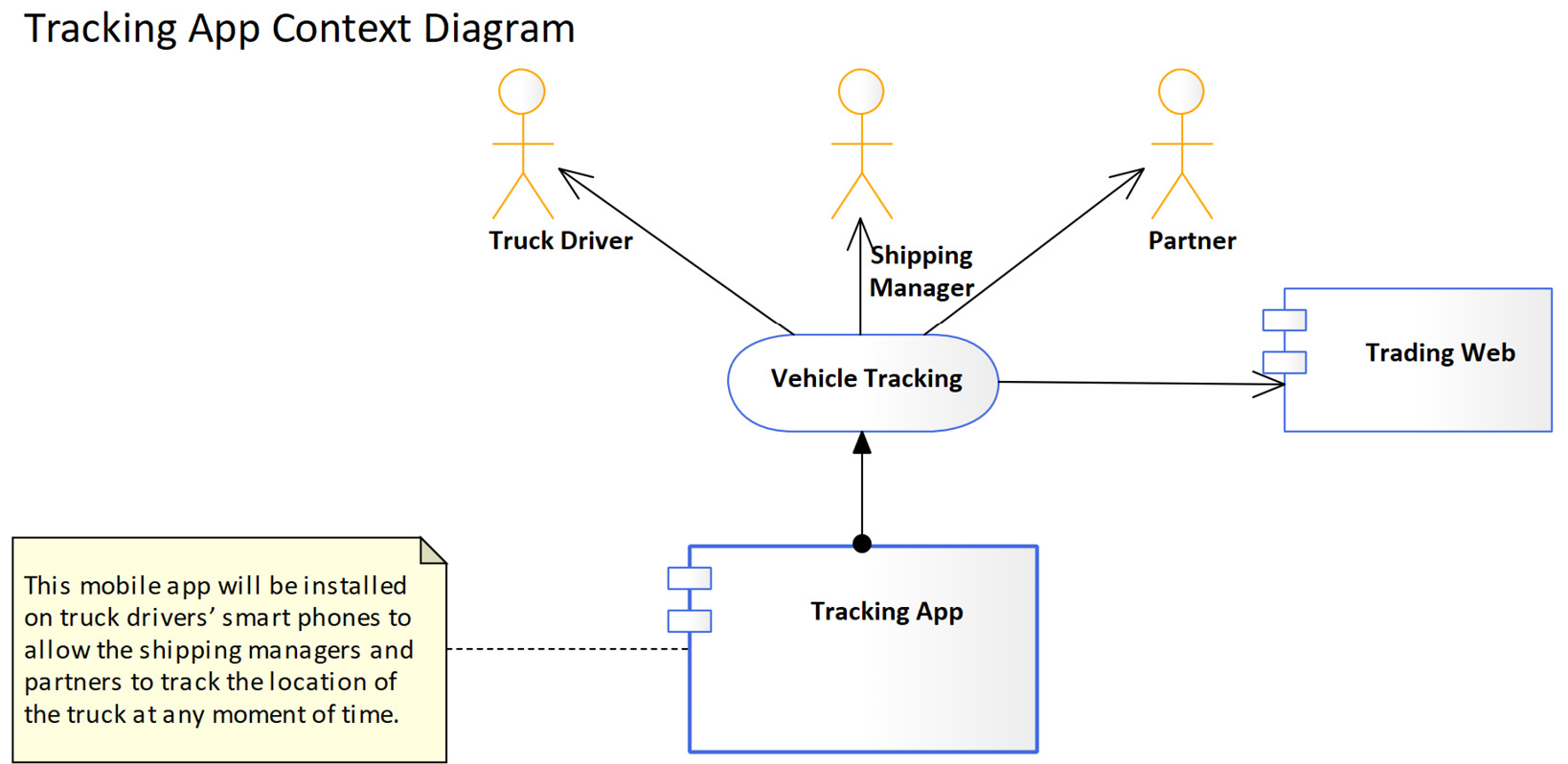
Figure 3.15 – The Tracking App context diagram up to this point
The last question that we need to answer is what technology services will be required to support this application, so let's do that.
Adding the supporting technology services
The location of the truck will be determined by the location of the phone that runs the application. This is a service that is already provided by the phone's operating system, so all we need to do is to use it. At this level of abstraction, we only need to mention that we will use the location service provided by the operating system. This type of service is known as technology services, which we will talk about in more detail in Chapter 6, Modeling in the Technology Layer, and Chapter 7, Enterprise-Level Technology Architecture Models.
Technology services are like application services since they both describe the exposed behavior of a structure element. Technology services are business neutral while application services have some business logic that is related to the business domain of the organization. The Vehicle Tracking service, for example, is a service that is of use only to a business that has requirements to track vehicles, so it is classified as an application service. The Device Location service, on the other hand, is a service provided by the phone regardless of what applications use it. It can be used by a navigation application, a marketing application, a social application, or even a game, so it is business neutral and therefore classified as a technology service.
We need to add a new Technology Service element to the diagram, but since the currently active toolbox is the Application architecture toolbox, we need to change it to the Technology architecture toolbox. Follow these steps to add a new Technology Service element to the diagram:
- Click on the hamburger action menu, and then select the ArchiMate 3.1 > Technology architecture. This will activate the ArchiMate® Technology architecture toolbox.
- Locate the Technology Service element in the Toolbox, drag it, and drop it on the diagram below the Application Component element.
- Rename the service to Device Location, change the font size to 10, change the fill color to white (RGB 255, 255, 255), and change the border color to dark green (RGB 0, 100, 0).
- Save the style as a new Tech Arch style for future reusability.
- Add descriptive text to the Notes field describing the technology service.
- Use the borderless notation if you prefer, or keep the default rectangular notation.
- The Device Location service will provide location data to the application component. In other words, the Device Location service is serving the Tracking App component with the phone's location data. Therefore, create a relationship of the serving type going from the technology service to the application component.
- Save the changes by pressing Ctrl + S.
Showing relationships between two elements is good and showing what gets transferred through these relationships is even better. We will see next how to model the data that goes from one element to another.
Adding the sent data
The operating system will provide the device's location in the form of data. We do not know a lot about the structure of the data at this time, but we know that data will be provided from the Device Location service to the Tracking App component, so we need to model that. There are multiple ways to model how data flows from one element to another. I will use one way for this case and will show you the other ways in other examples as we progress:
- Open the ArchiMate 3.1 > Application toolbox and locate the Data Object element.
- Drag the Data Object element and drop it onto the diagram near the Device Location service.
- Change the data object's name to Device Location Data and style it as App Arch.
- Add a proper description to the Notes field describing the data object.
Notice that there is only one notation for data objects so you will not see the option to change it in the context menu. Now we need to indicate that the data object will be provided or served by the Device Location technology service to the Tracking App component.
- Click on the serving relationship and you will see a small action arrow that appears to the right of the relationship.
- Hold this arrow, drag it to Device Location Data, and select Associated with. This creates an association relationship between the serving relationship and the data object and tells the user what data will be served.
- Press Ctrl + S to save.
If you were following properly, then your diagram will look similar to the following one:

Figure 3.16 – The Tracking App context diagram in its final state
The diagram is mature enough at this point to be shared with stakeholders. If a stakeholder wants to deliver a presentation on the application, having this diagram can answer a lot of the questions in a very simple yet well-documented way. The diagram gives enough information at a conceptual level; you must keep your context diagrams at this level of abstraction.
The application context diagram is meant to build a common understanding of a specific application component. By looking at it, any user at any level of experience will have the same understanding of what the application component is or is supposed to be. There is no technical jargon, no abbreviations, no third-party products, and no specific implementation enforcement. It is meant to have every stakeholder on the same page.
In the next chapter, we will create a simple and easy-to-read metamodel, which will help us when we create more diagrams that have the application component as the main element.
Summary
This chapter has introduced many new concepts that will be followed throughout the remaining chapters of this book. We have learned how to create packages in Sparx, how packages can contain diagrams and elements, and how to build nice-looking yet useful diagrams. EA artifacts in general, and diagrams in particular, are what architects use the most to communicate information. Mastering the skills of modeling is a key to your success as a practical enterprise architect.
In the next chapter, we will look at how to navigate the ArchiMate® 3.1 standard and how to build your own standard reference, the focused metamodel. This is a very important aspect of building and maintaining trust in your enterprise repository, so keep moving forward before losing momentum.