
Chapter 9: Exploring and Visualizing Your Data with Excel
We have now created multidimensional and tabular models in the previous chapters. The data is ready, so let's visualize it. We will start our data visualization in Excel. Microsoft Excel has been the most prolific analytics tool on the market for years. While that is not its primary focus, its utility, simplicity, and reach far exceed those of its nearest competitor.
In this chapter, we will connect our models to Excel, build out some reports and dashboards, and explore the differences between these models in Excel. We will wrap up the chapter with some advanced visualization techniques that are unique to Excel when working with analytical models built in SQL Server. We will be creating two Excel workbooks, one for each model. This will allow us to compare how the models interact with Excel.
When you are finished with this chapter, you should be comfortable with connecting both multidimensional and tabular models to Excel and building basic reports with their data. You will also learn some advanced techniques that will help with the creation of dashboards and unique visualizations in Excel.
In this chapter, we're going to cover the following main topics:
- Connecting Excel to your models
- Building visualizations with your models
- Building and enhancing an Excel dashboard
- Advanced design with CUBE functions
- Sharing your Excel dashboards with others
Technical requirements
In this section, you will need to deploy and have running the multidimensional model (WideWorldImportersMD) that you created in Chapter 3, Preparing Your Data for Multidimensional Models, Chapter 4, Building a Multidimensional Cube in SSAS 2019, and Chapter 5, Adding Measures and Calculations with MDX. You will also need the tabular model we expanded in Chapter 6, Preparing Your Data for Tabular Models, deployed and running (WideWorldImportersTAB). We will not be working with the workspace version of your tabular models. You will also need Microsoft Excel to work through the hands-on work in this chapter. All of the examples in this chapter will be using the latest version of Excel in Office 365 ProPlus at the time of writing (the May 2020 release). Because Excel is updated continually via a subscription model, some examples may look different for you.
Connecting Excel to your models
Let's get started with Excel by creating two workbooks that will allow us to work through the design process with both model types. Our workbooks are called WideWorldImporters-MD.xlsx and WideWorldImporters-TAB.xlsx. This matches the naming convention we have used throughout this book. Now that we have our workbooks created, let's get connected to our models.
Connecting to the multidimensional model
Multidimensional models (or cubes) and Excel have been working together for a very long time. One of the great things about multidimensional models is the high level of interactivity and capabilities that Excel seamlessly supports. This functionality propelled cubes to the forefront of ad hoc analysis in businesses throughout the world. Let's begin:
- Open your multidimensional workbook, WideWorldImporters-MD.xlsx.
- On the Data tab, select Get Data | From Database | From Analysis Services. These steps are illustrated in the following screenshot:
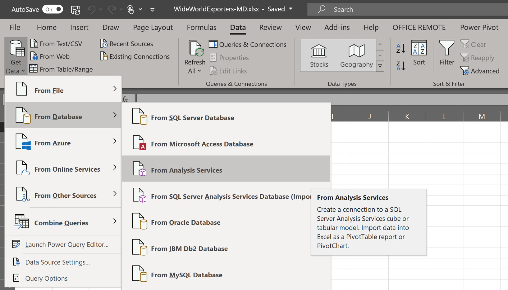
Figure 9.1 – Connecting to Analysis Services
- In the Data Connection Wizard, enter your SSAS Server name and click Next. You need to use the SSAS instance for your multidimensional model. Be sure to choose the correct server.
- In the next dialog, the Data Connection Wizard, you should see the Wide World Importers cube and the Invoicing perspective as shown in the following screenshot:
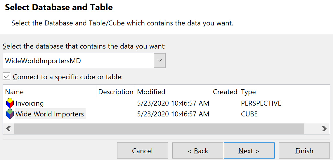
Figure 9.2 – Select the cube to connect to
You may recall in Chapter 3, Preparing Your Data for Multidimensional Models, we created a perspective that was a subset of our cube. This is a scenario where perspectives can support a better user experience in Excel. It is very common for cubes to be large and overflowing with objects. Perspectives allow you, as the designer, to organize logical groups of objects for your users so they can work easily with the analytics you have prepared for them.
- Now, choose Wide World Importers and click Next.
- The next dialog will save the connection file to the default location on your PC. If you plan to distribute this workbook to other users, you can use this file to share the connection with the workbook. We will leave it in the default location at this time. We will give this connection a better, more friendly name: Wide World Importers MD. This will make it easy to identify when using that connection with a different workbook later.
- Now click Finish.
- This will open the Import Data dialog shown in the following screenshot. We now have some different options to choose for how we want to bring the data from our cube into our database initially:

Figure 9.3 – Import Data options in Excel
As you can see in the preceding screenshot, we have a number of options to work with. Some options are not available when working with direct connections to SSAS, such as viewing the data in a Table and the choice to Add this data to the Data Model.
Note
The data model is the underlying Power Pivot model in Excel. We cannot use that with direct connections to Analysis Services models. This makes sense as they are effectively the same structure. Analysis Services models, both tabular and multidimensional, should be considered ready for use and do not require additional mashup or manipulation in Power Pivot.
Out of the four options in the following list, the first two are the key options to consider after creating your connection:
i) The first is how you want to view the data. The default is to create a PivotTable report. This is the most common pattern to start working with the data. This effectively allows Excel users to interact with the data from the cube in an ad hoc manner.
ii) The second option will create the PivotTable and a matching PivotChart. While interesting, you will typically find that it is easier to work with the PivotTable and then add the PivotChart later.
iii) The third option here is to Only Create Connection. If you use Excel to create a lot of reports or dashboards, you will likely use this option more frequently, as you can use the connection to create multiple visualizations in Excel where and how you want to.
iv) The other option is to choose where you want to create the PivotTable or PivotChart. The default will be the cell selected when you choose Get Data from the menu. If you don't select a cell, you will typically see the $A$1 cell selected on the first sheet of the workbook. You can change this location by selecting a different cell in the workbook. If you have chosen to create a connection only, you will not be able to choose the location because no object is being created.
- Now, for our first connection, we will leave the default settings as they are and click OK. This will create the PivotTable in the upper-left corner and connect to the cube. Your workbook should look like the following screenshot and you are ready to start querying and visualizing data from your cube in Excel:
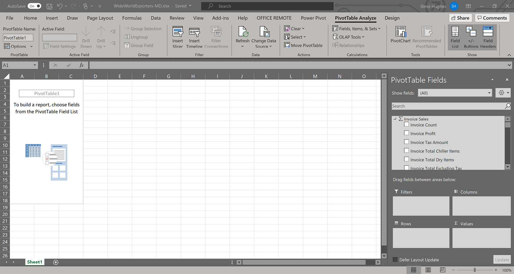
Figure 9.4 – PivotTable with Analysis Services model
Let's now connect Excel to our tabular model.
Connecting to the tabular model
The process to connect to the tabular model is nearly identical to connecting Excel to the multidimensional model. We will call out the steps here and refer to the preceding screenshots where relevant:
- Open the workbook you created to connect to your tabular model. Ours is called WideWorldImporters-TAB.xlsx.
- On the Data tab, select Get Data | From Database | From Analysis Services.
- In the Data Connection Wizard, enter the SSAS Server name for your tabular model and click Next. Be sure to choose the correct server.
- In the next dialog in the Data Connection Wizard, you should see the Model cube. Tabular models are all called Model by default. You will also notice that the dialog refers to the model as a Cube. Be sure to check your database name in the dropdown as shown in the following screenshot. If you still have Visual Studio open with your model, you will see the name of your database with the Globally Unique Identifier (GUID), which means it is a workspace model, and will get a different name, and it will close when the project is closed:

Figure 9.5 – Deployed and workspace tabular model databases
- Choose WideWorldImportersTAB and click Next.
- The next dialog will save the connection file to the default location on your PC. If you deploy this broadly, you can use this file to help distribute your workbook. We will leave it in the default location at this time. We will give this connection a better, more friendly name: Wide World Importers TAB. This will make it easy to identify when using that connection with a different workbook later. Now click Finish.
- This will open the Import Data dialog. As we did in the previous section, let's leave the defaults and click OK. The workbook will have a PivotTable and the PivotTable Fields area open. You now have a successful connection to your tabular model in Excel.
You should now have two workbooks connected to your Analysis Services models. As you can see, Excel shares the connection method between the two models. This typically keeps the learning curve low if you are transitioning between the model types. Let's start exploring the visualization options in Excel.
Building visualizations with your models
For the remainder of this chapter, we will be creating the visualizations and queries primarily using our multidimensional model. We can do this because Excel interacts with both models in a similar way. Where differences appear, they will be called out to make you aware. Let's get started.
Understanding the PivotTable Fields panel
Before we get into the details of designing visualizations in Excel, let's break down the PivotTable Fields panel in Excel. How data is presented from each model type does vary here and we will look at those differences.
The PivotTable Fields panel in Excel is made up of two main sections, first, the Fields section, and second, the areas they are put into in the PivotTable, called Areas to Place Fields, as shown in the following screenshot:
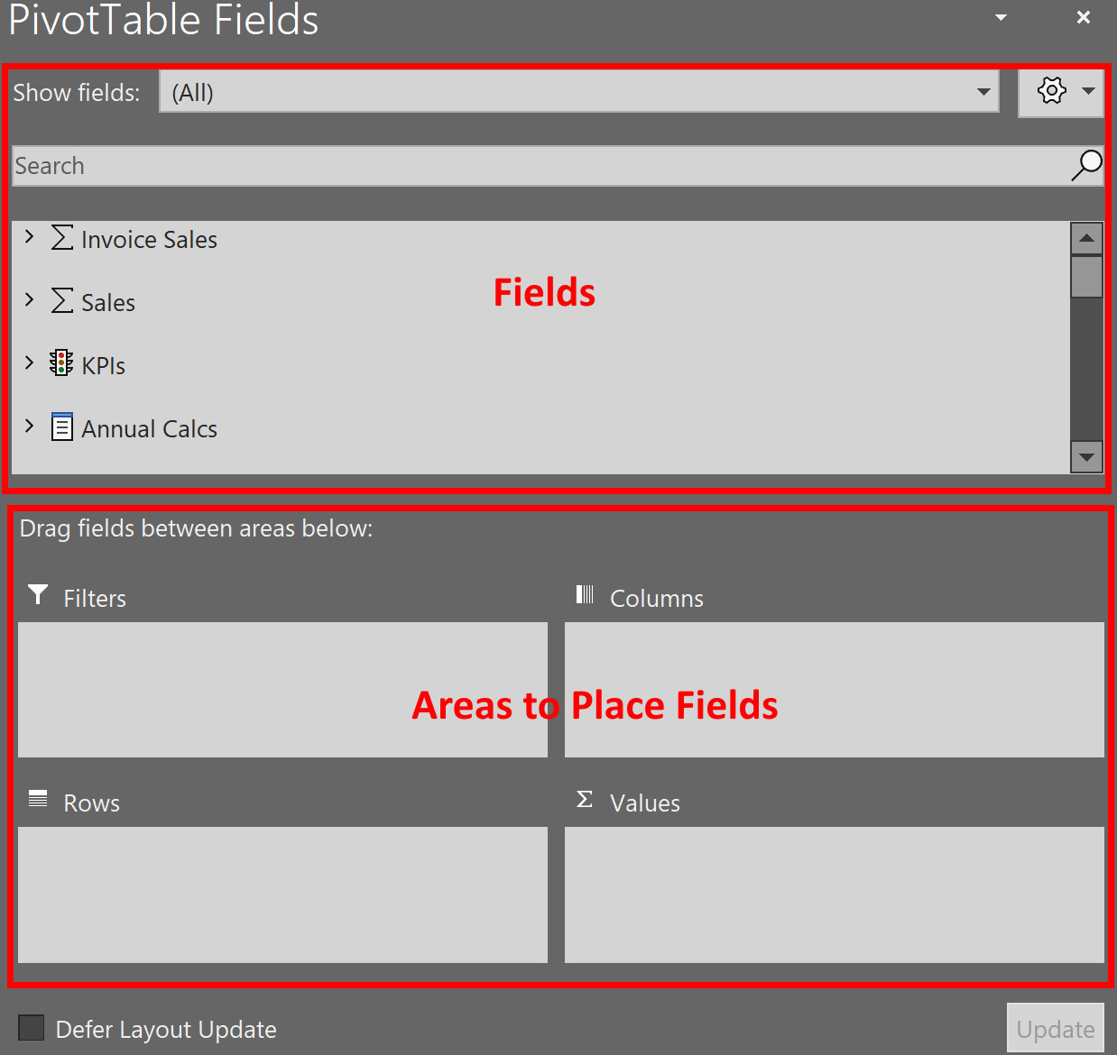
Figure 9.6 – PivotTable Fields panel
Let's understand the features of the PivotTable Fields panel:
- The Show fields dropdown filters the field list to the group as defined in the model. In multidimensional models, the fields are organized by measure group. We have two measure groups in this scenario – Sales and Invoice Sales. Tabular models are based on tables. In tabular models, this shows all the tables and calculation groups. Keep in mind that this only filters the list of available fields to choose from, it does not filter data or results. It is simply a mechanism to reduce the field list for ease of use.
- The area labeled Fields shows the available fields you can choose from. The fields are grouped either by the source, such as tables and measure groups, or data type, such as KPIs.
- The area labeled Areas to Place Fields specifies where the fields should be placed in the PivotTable. The Values area typically takes numeric values, which commonly have a sigma or sum symbol by them. Text or attribute fields make up Rows and Columns. These are most commonly marked by a table symbol in Fields. The Filter area will create a drop-down filter option for your PivotTable and also uses text or attribute fields.
When we created our multidimensional model, we placed the measures on colors that we created into a folder called Color Analysis. You will find these measures in the Values group in the PowerPivot Fields panel. This group contains a folder called Color Analysis. You can see how these folders help organize calculations for ease of use for users.
Implicit calculations are turned off
In our tabular model, we have turned off implicit calculations. Only the measures we create in the model can be added to the Values section. In older versions of tabular models, this is not the default. If that feature is turned off, you can drag numeric fields from the tables that aren't in measures and Excel will create an implicit calculation.
When you add fields to the area, the assumption is that we are adding row and column headers in the PivotTable like a matrix visualization. The values to be calculated, dropped into the Values section, are effectively sliced by the row and column combination. The last section is the Filter section, which applies to the PivotTable we are working in. Now that you have a basic understanding of the PivotTable Fields panel, let's create some visuals.
Creating a PivotTable
The activity of creating a PivotTable is the same using either model. For the following steps, we will be using the multidimensional model in our WideWorldImporters-MD workbook. When we originally created the connection, a simple PivotTable was created in the workbook. We will use this as our starting point. The next steps will create a PivotTable visualization with the color analysis we did in both models. The steps are as follows:
- In the field list, find the Color Analysis folder in Values. Select % Black Items and % Blue Items from the list of fields. You should now see these measures in the Values area in the bottom-right corner of the PivotTable Fields panel. You will also see these fields in the Excel worksheet as column headers with the values below them. As you can see in the worksheet, the formatting from the server is pulled through to the worksheet. If you click in the field with the percentage value in it, you can also see that the formatting in the cell is applied to a highly precise value.
- Now that we have our first set of values in place, let's add some rows. Find City and select Sales Region. This will add the Sales Region hierarchy to the rows. You can see that one value, Americas, has a cross next to it. If you click the cross, you will see the next level in the hierarchy, which is Northern America. Expand that to see a list of regions under Northern America.
There are two more levels in the hierarchy, State Province and City. This is the concept of drilling down. The creation of hierarchies in either type of model is intended to give users an easy-to-use, well-defined drill-down path. As you can see, the calculations represent the percentages of blue or black items in the context of the row or region level.
- Let's add employees to the columns. This will give us the percentage of sales by employee and item colors that have been selected:
i) Find Salesperson and Employee in the field list.
ii) Drag Employee to the Columns area and drop it above the Values item in the same area. If you drop it below Values, you can drag it above Values or you can click the down arrow to move it in the direction you need.
If you selected the Employee field in the field list, it may have dropped Employee into the Rows areas. You can drag it over to Values or select Move to Column Labels to move it to the Columns area.
- To wrap up our first PivotTable, drag the Invoice Date.Calendar hierarchy into the Filters area.
- Using the drop-down functionality in the filter in the grid, select CY2016 to filter the data for calendar year 2016. When you have completed this, your PivotTable should look similar to the following screenshot. Take some time to try variations of rows, columns, and filters as you explore your model with Excel:

Figure 9.7 – Our first PivotTable created in Excel
Visible and hidden fields in our models
During the creation of our models, we have various ways to hide fields from the tools that are interacting with the model. In multidimensional models, it is common to add fields to a hierarchy and then not show the base fields. This optimizes performance and cube size. We can also explicitly hide fields in the model design as well. We have similar options in the tabular model. We can choose to hide fields from the users explicitly.
You will notice in our tabular model that all fields remain visible, whereas we hid some fields in our multidimensional model. The City dimension highlights this difference well. In our multidimensional model, we created two hierarchies that contained all the fields. These fields are not visible outside of the hierarchy, whereas, in our tabular model, the same hierarchies exist but a More Fields list is available as well. This list contains all the fields. This has different design options and needs to be planned for your model creation.
There is little performance impact, if any, from including all the fields in tabular models. In multidimensional models, hierarchies support better aggregated performance based on storage and you need to be more intentional about what you expose in your model.
As we wrap up this section on PivotTables, you must understand that the value of creating models is that users can plug into and view data as they wish. You can repeat this experience in the tabular model workbook. The primary differences are the numbers (we have additional filters on the tabular model calculations) and the fact that the Date table is used to get the Calendar hierarchy. In the tabular model, we do not start with role-playing dimensions. Next, we will add a PivotChart to our workbook.
Adding a PivotChart
We will now add a PivotChart to our workbook. Add a sheet to your workbook to get us started, then proceed with the following steps:
- We already have a connection to our model so we can reuse that connection. Go to the Data tab and select Existing Connections.
- In the Existing Connections dialog, choose Connections and select the connection for your multidimensional model, Wide World Importers MD. Click Open.
- This will open the Import Data dialog. Choose PivotChart and click OK.
- You should now have a blank PivotChart in the middle of your spreadsheet with the PivotTable Fields pane. Let's start by adding in the % Black Items and % Blue Items values. Select those to add them to the Values area. You should see the default column chart created with those.
- Drag the Invoice Date.Calendar hierarchy into the Axis (Categories) area. This will update the bar chart to show the percentages by year. We now have a nice start to a chart visualization. Your chart should be similar to the following chart:

Figure 9.8 – Our first PivotChart in Excel
There are a few parts of the PivotChart you need to understand before moving forward:
i) You can see that the fields we have added to the chart are also represented as field buttons. They allow you to modify the chart in various ways. If you right-click on the buttons, you can change the order, move them to a different area, or remove them altogether.
ii) You can change the hierarchy level as well. Click the down arrow to the right of the Invoice Date.Calendar button. This will expand the hierarchy selector, which allows you to adjust the level or filter levels out if you prefer. You can drill up or down with the plus (+) and minus (-) buttons in the lower right of the chart. This is not very readable in our scenario, but the option is there if you choose to use it.
iii) The plus symbol at the top, outside of the chart area, allows you to choose the chart elements you want to see in the chart. Let's add a Chart Title with the name Black & Blue Analysis. The paintbrush below the plus (+) button allows you to change the color scheme and style of the chart. We will not change ours at this time, but you should still look at the options.
- With the chart selected, click the Design tab in the Excel ribbon.
- Click the Change Chart Type button to see the types of charts we can use to visualize our data. We are going to change our chart to a line chart.
- Select the Line option in the Change Chart Type dialog. Choose Line with Markers from the selections at the top of the dialog and click OK. The chart should now look like the following screenshot:
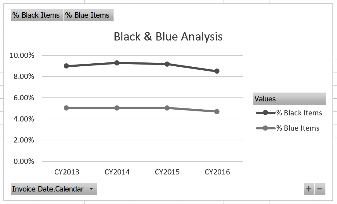
Figure 9.9 – Line chart with a title
You now have a nice line chart that shows the variance in the percentages of blue versus black items sales by calendar year. We will use this chart in the next section as well.
Adding slicers
Slicers in Excel are buttons that allow you to filter the contents of your workbook in a highly visual and touch-friendly way. Slicers have been in Excel for quite a while. In this section, we are going to add an Employee slicer to the Black & Blue Analysis chart. The last step in the section will show how to apply this slicer to the PivotTable we created. This works because both items share a connection. Let's begin:
- With the chart selected, navigate to the PivotChart Analyze tab on Excel's ribbon. Click Insert Slicer.
- This opens the Insert Slicers dialog. It shows you all the fields you can use to filter the chart. Slicers do not support hierarchies, but levels in hierarchies can be selected. If you choose a hierarchy or the top-level item, all of the fields will get separate slicers. Find the Salesperson table and choose the Employee item to create our slicer. Click OK.
- This will drop the Employee slicer in the middle of your sheet, usually not where you want it. You can move the slicer around to where you want it. We will place the slicer to the right of the chart.
- Click on the dot on the bottom of the slicer and expand the slicer until the scrollbar disappears and you can see all of the salespeople. When you have the slicer in place and expand your sheet, it should look as follows:
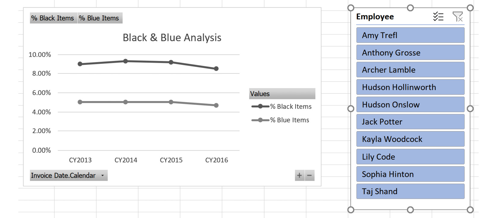
Figure 9.10 – Slicers added to the PivotChart
At the top of the slicer, there are two buttons next to the title. The first toggles the multiselect option. The second clears any filter applied. The slicer is single-select by default.
- Choose a salesperson to filter the data. The chart will now show the sliced or filtered data. The unselected salespeople are now white or unhighlighted. If a slicer has options with no data, those buttons are typically gray and cannot be selected.
- In the final step, we will show you how to apply the slicer's filtering to the PivotTable we created initially. Select the Employee slicer. Then select the Slicer tab on the ribbon. Next, click Report Connections:

Figure 9.11 – Report Connections dialog for the Employee slicer
- In the Report Connections dialog shown in the preceding screenshot, you can see the reports that share a connection with the slicer. They do not need to be on the same sheet to be affected. Select PivotTable1 and click OK.
- Now, look at the values on the PivotTable in your first sheet. Go back and change the slicer and see how the values have changed.
- Before we move to the next section, go back to the slicer and deselect this connection. You can also try using the multiselect functionality and clearing the filter to familiarize yourself with those features.
Slicers can be used with any field or fields that interact with the data in your Excel PivotTables and charts. While dates can be filtered with slicers, we will demonstrate a timeline with the PivotTable. One last point on slicers: you can create the same slicer with tabular models. The process is identical to the preceding steps.
Adding timelines
Timelines are special filter controls that support date fields. They have the ability to build out the date hierarchies natively. This means that the data types of the field need to be of the date data type (for example, Date or DateTime).
Date tables in our models
This control requires that the table or dimension be designated as the date or time table. In the multidimensional model we created, the Date dimension was designated as a Time type in the dimension's properties. In our tabular model, the Date table was marked as the date table. These property settings are picked up by the control. When working with the multidimensional model, you will see two options for the timeline control, Invoice Date and Delivery Date. Both of these are built on the same Date dimension as role-playing dimensions. This functionality is not supported the same way in tabular models. Even though we created a calculated table that supports the delivery date, only one table can be marked as the date table so only one option is available from the tabular model.
Let's look at the steps to add timelines:
- Open the worksheet in Excel where you created your first PivotTable.
- Click on the PivotTable. Remove the Invoice Date.Calendar filter from the PivotTable. Click the down arrow on the field name in the Filters area in the PivotTable Fields pane. Select Remove Field to remove that filter.
- On the ribbon, go to the PivotTable Analyze tab and click Insert Timeline.
- In the Insert Timelines dialog, choose Invoice Date and click OK.
- Like the slicer, the timeline control is dropped into the middle of your sheet. Let's move it to the right of the PivotTable. Your sheet should look as follows:

Figure 9.12 – PivotTable with a timeline
The timeline control has some cool features we want to highlight here. Let's start with the dropdown that shows MONTHS right now. If you select the down arrow you will see YEARS, QUARTERS, MONTHS, and DAYS as options. This changes the granularity of the highlighted bar in the visual. You can select one or more months in the bar that is shown in the middle. When you make a selection, the All Periods label in the upper left will display what is selected, such as Feb 2016.
The scroll bar at the bottom of the visual lets you scroll through the available options. Be aware that the dates shown in the visualization cover the date range supported in your date table. For example, if you select Aug 2016, the PivotTable will no longer contain data as our dataset does not contain data past the middle of 2016.
- Change the dropdown to YEARS. Select 2015.
- Change the dropdown to MONTHS. You will see that the months are filtered for 2015 as well. Select JAN.
- On either side of the bar for JAN, you can drag to expand the selection. Try this now by expanding the selection to include FEB and MAR.
You can use the same steps to connect this filter to the PivotChart we created that we used when connecting the slicer. Review the preceding steps if you want to experiment with connecting this to the PivotChart as well. You can remove the filter by clicking the button with the filter and the red X on it.
Also, like the slicer control, the timeline control can be added using the same process with your tabular model. We are going to put this all together in the next section.
Building and enhancing an Excel dashboard
The focus of this section is to turn our work into a full dashboard for our users. We will explore some more advanced techniques to make our dashboards more user friendly and interactive. We will continue to focus on the multidimensional model and highlight the differences that occur with tabular models.
We are going to combine everything we have created so far into a single sheet and make various enhancements along the way. Let's get started.
Moving the PivotTable and the filter
Let's move the PivotTable and the filter:
- Our first step is to move the PivotTable. Select the PivotTable and navigate to the PivotTable Analyze tab on the ribbon. Then select Move PivotTable in the Actions section on the tab.
- In the Move PivotTable dialog, we will be keeping the PivotTable on the existing worksheet. Set Location to $B$13 by selecting that cell in the sheet. Click OK when you have updated the location.
- Next, move the Invoice Date filter to a location in the upper-left corner of the worksheet.
Updating the Employee slicer
Let's now move the Employee slicer:
- We will move the Employee slicer next. You can simply select the slicer, then cut and paste it to the first sheet. Paste it next to the timeline filter. It will overlap the PivotTable a bit, but we will fix that in the next step.
- Resize the slicer by making its height the same as the timeline. Next, double the width of the slicer. The top of your worksheet will look something like the following screenshot once you have resized the slicer:

Figure 9.13 – Timeline and slicer resized and repositioned
- With the slicer selected, navigate to the Slicer tab on the ribbon. Select Slicer Settings on the menu. This opens the Slicer Settings dialog shown here:

Figure 9.14 – Slicer Settings
We are going to make a number of changes in this dialog over the next few steps. Name is the name of the field we pulled from the model. For our purposes, we can keep the name.
- We will keep the Display header option on. However, we will change the name to Salesperson, which is a better description for the slicer.
- The next section in the dialog is Item Sorting and Filtering. Because we are working with names, we can change the sort order to Ascending (A to Z) to make sure it sorts as we want. If the data you are using in the slicer is not sorted correctly in the server, this is the opportunity to sort the values in a more user-friendly fashion.
The filtering section has three options:
i) By default, Visually indicate items with no data and Show items with no data last are selected. Items with no data are grayed out and moved to the bottom of the list with these settings. You can keep the slicer data in order by deselecting the last option. This will still gray out options with no data but not move them to the bottom.
ii) If you select the top option, the other two options cannot be selected. The first option, Hide items with no data, will completely remove slicer items from view if no data exists. You will need to determine the best option for your users based on the content to filter. We will leave this setting on its default. Click OK to close the dialog and save our setting changes.
- We would still like to show all the options in our slicer. We can do this by changing the column count. In the Slicer tab, change the Columns value from 1 to 3. You may need to adjust the size of the slicer in order to remove the vertical scroll bar.
- The last step for the slicer is to add the PivotTable back into the Report Connections dialog. Select Report Connections and add the PivotTable to the connections. Your worksheet should look like the following screenshot:

Figure 9.15 – Updated dashboard with fixed slicer
This wraps up the slicer settings. Let's continue modifying our Excel dashboard.
Adjusting the other PivotTable
We will now adjust the PivotTable:
- We now need to move the PivotChart from the other tab to the first sheet. Cut and paste the PivotChart next to our slicer.
- This takes up more space than we have at the top of the sheet. You can add rows above the PivotTable, which will push it down further on the sheet. The other option is to use the Move PivotTable option used in Step 2 of the Moving the PivotTable and the filter section. Add enough rows for the PivotChart to fit cleanly above the PivotTable. Your sheet should now look like the following screenshot:

Figure 9.16 – Updated dashboard with PivotChart added
- Select the PivotChart and go to the PivotChart Analyze tab on the Excel ribbon. There are two buttons on the far right of the menu:
i) The first button, Field List, will show or hide the PivotTable Fields pane. You can use this option if you are not planning to add any additional data to the PivotChart.
ii) The second button is the Field Buttons drop-down list. The field buttons are the gray areas in the preceding screenshot. The list contains the area for each set of field buttons. We don't have a reason to leave any field buttons on our chart. Choose Hide All to remove or hide the buttons on the chart.
- When we have copied the chart to the new tab, we may have broken the connections to the slicer. We also need to add a connection to the timeline. Select the PivotChart. Go to the PivotChart Analyze tab on the ribbon. Click Filter Connections to open the Filter Connections dialog.
- Select both filters if they have not already been selected. This will apply the Employee slicer and Invoice Date timeline selections to the PivotChart. Click OK to apply the changes and close the dialog.
- In the PivotTable, you may have noticed that Column Labels and Row Labels are showing. You can hide those labels using a similar set of buttons to those we used when cleaning up the PivotChart:

Figure 9.17 – Showing the options for PivotTables
- Click Field Headers to remove those labels. Field List will hide the PivotTable Fields pane while working with the PivotTable.
- The +/- Buttons option will remove the ability to drill up or down in the PivotTable. We will use this option to fix the rows in the PivotTable to show the Northern America regions only.
- While we were changing the size of the cells in the PivotTable, the slicer may have moved around. In order to prevent that from happening as we continue to work on the dashboard design, we need to fix the position of the slicer. Right-click on the slicer and select Size and Properties from the shortcut menu. This opens the Format Slicer pane in Excel.
- In Format Slicer, expand the Properties section and choose Don't move or size with cells. Once you have made the change you can close the Format Slicer pane.
Cleaning up our dashboard design
- Let's clean up some other items as we wrap up this phase of our design. First, let's hide the gridlines. On the View tab on the ribbon in Excel, you can choose to hide the gridlines.
- We can also hide the headings here. But before we hide those, reduce the size of column A to move the PivotTable closer to the left side of the sheet. The goal is to leave a small margin there.
- Once you have it adjusted to your liking, you can hide Headings from the View tab. This will clean up the dashboard for a better user experience when it is deployed.
- Our PivotChart moved when we adjusted the size of column A. Select the chart and navigate to the Format tab. Select Format Selection on the menu to open the Format Chart Area pane in Excel.
- You need to open the Size and Properties sections in the Format Chart Area pane. This is the third button on the pane, as shown here:

Figure 9.18 – Format Chart Area – Size and Properties pane
- In the Properties section, choose Don't move or size with cells to lock the PivotChart in place on the dashboard. Then close the Format Chart Area pane.
Once all these steps are completed, your sheet should look similar to the following screenshot:

Figure 9.19 – Our black and blue dashboard after formatting
So now what? We have cleaned up our dashboard with slicers, timelines, PivotCharts, and PivotTables. The same steps can be used for the tabular models. We will now look at one other advanced design feature, which will allow us to add some nice visuals to fill in the space between the filters and the PivotTable.
Advanced design with CUBE functions
This section covers the CUBE functions available in Excel. This functionality allows you to operate on data from Analysis Services without using PivotTables or PivotCharts. These techniques are advanced and require basic Multidimensional Expression (MDX) skills. However, we will walk you through the simplest way to learn and use these functions initially.
We will use these functions to create the following three single-value visualizations on our dashboard:
- Total black items sold in the selected period
- Total blue items sold in the selected period
- Black and blue items sales amount in the selected period
In the next sections, we will walk through the steps to add these measures and apply the timeline filter to them.
Adding PivotTables to a new sheet
Let's begin by adding PivotTables:
- In our multidimensional workbook, add a new sheet.
- Add another PivotTable to this sheet (Data | Existing Connections | Wide World Importers MD).
- In this PivotTable, select Blue Items and Black Items from the Color Analysis folder.
- Add another PivotTable from the same connection.
- Add Total Excluding Tax from the Sales values to the Values area of the new PivotTable.
- Add Color from the Item table to the Filters area.
- Expand the filter and click the Select Multiple Items option at the bottom. Then select Black and Blue from the options. The filter will now show (Multiple Items) as the selection.
Converting the PivotTable to formulas
We will now convert PivotTables to formulas:
- Select a value from the first PivotTable. On the PivotTable Analyze tab in the ribbon, expand the OLAP Tools menu and select Convert to Formulas. You should see the PivotTable formatting disappear for these values.
- Select the cell that has Black Items in it. In the formula bar you will see the following function:
=CUBEMEMBER("Wide World Importers MD","[Measures].[Black Items]")
CUBEMEMBER is one of a set of functions that can use the connection to refer to a value in the cube using MDX syntax. In this case, the formula returns the name of the member, which is Black Items. The field below this uses a different formula:
=CUBEVALUE("Wide World Importers MD",B$1)
It is using CUBEMEMBER to determine the value to display in the cell. In our use case, we need to merge these into a single formula.
- In a new cell, use the following formula to return the count of Black Items:
=CUBEVALUE("Wide World Importers MD","[Measures].[Black Items]")
- Now we need to add the timeline slicer to this formula. We will use the name of the timeline filter to return the filter member to use in our formula:
=CUBEVALUE("Wide World Importers MD","[Measures].[Black Items]",Timeline_Invoice_Date)
If we wanted to add the Employee slicer, we would add the name to the formula as well. The formula is building an MDX calculation based on the intersection of the members we have chosen. By not including the Employee slicer, these values will have the values for the filtered period regardless of the salespeople who may be selected. This adds flexibility to the design.
- Now, create another formula for Blue Items:
=CUBEVALUE("Wide World Importers MD","[Measures].[Blue Items]",Timeline_Invoice_Date)
- Now we can add these values to the dashboard, copy each formula, and add it to a cell on the dashboard below the filters and above the PivotTable. Your dashboard should look like the following screenshot:

Figure 9.20 – Black and blue dashboard with raw item counts
- Now let's create the formula for the sales amount. Return to the new sheet we created. Select the PivotTable with the filters. Once again, go to the PivotTable Analyze tab on the ribbon and select Convert to Formulas in the OLAP Tools menu.
This time we get a Convert to Formulas warning message. This warning message prevents users from unintentionally converting their PivotTables. This operation is irreversible, so Excel is confirming the change.
We have the option here to convert the report filters as well. There are times you may want to keep the filters in place. For example, if we wanted to continue to filter values in our formulas using the filter as is, then we would leave this box unselected. However, in our case, we want to get all the parts of the PivotTable converted to formulas so we can build a filtered value for our dashboard. Select the Convert Report Filters option and click Convert to complete the process.
- Now that we have the various parts converted, select the field with (Multiple Items) in it that uses a new CUBESET function to create a set that is used to filter the measure:
=CUBESET("Wide World Importers MD","{[Item].[Color].&[Blue],[Item].[Color].&[Black]}","(Multiple Items)")
The set is named Multiple Items and is used in the CUBEVALUE function by referring to the cell in the function options ($B$4 in our workbook) as follows:
=CUBEVALUE("Wide World Importers MD",$B$4,$A$6,Timeline_Invoice_Date)
By using what we have discovered here, we can complete the custom CUBEVALUE formula for our dashboard:
=CUBEVALUE("Wide World Importers MD", CUBESET("Wide World Importers MD", "{[Item].[Color].&[Blue],[Item].[Color].&[Black]}"), "[Measures].[Total Excluding Tax]",Timeline_Invoice_Date)
- As you can see, we embedded the CUBESET function into the CUBEVALUE formula to get the result we wanted. This formula can now be copied onto our dashboard the same way we did for the others.
Formatting the new fields
Now that we have our new metrics copied into fields, we can format them (it is helpful to turn Gridlines and Headings back on during this process. Be sure to hide them when you are done formatting these values):
- Select four cells using the cell with the value as the upper-left cell, then choose Merge and Center from the Home tab on the ribbon. This will create a larger block to display the number.
- From the same tab, click the Middle Align button to center the values in the middle of the merged cells vertically.
- Increase the font size for those cells to 14 or to a size you like.
- Merge and center the two cells above the newly configured cells. We will use this as our header. Add text to these merged cells to be the labels – Black Items, Blue Items, and Black & Blue Sales.
- Format the sales cell as Currency as we did not format the Total Excluding Tax measure in the tabular model.
- Highlight the six cells you created at this point and add borders and shading to suit your desired look for the dashboard. When you are done, your dashboard should look similar to ours, as follows:
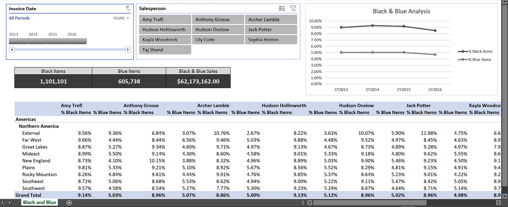
Figure 9.21 – Completed black and blue dashboard
This completes the basic dashboard for Excel. You can create the same dashboard using the tabular model data as well. The functionality is the same. Using the OLAP Tools functionality effectively sends MDX to the tabular model as well. As a result, you will see that the naming conventions used with the tabular model are the same as those used with the multidimensional model.
For example, the Measures dimension is used in the tabular model formulas, but that actual dimension is not in the tabular model. This is handled by the communication protocols and drivers between Excel and SSAS.
In the next section, we will explore some options that can be used to share your completed dashboard.
Sharing your Excel dashboards with others
Now that you have this awesome dashboard created, how can you share it? It is easy to share it by sending it to others via email, but you always risk them making changes to the data or design. If you want to share this with users while limiting their ability to edit, there are several good options such as OneDrive, SharePoint, and even Power BI workspaces. The next sections help you prepare for deploying your workbook to be shared.
Checking your capabilities
In order to share using one of the key services such as Power BI or SharePoint Online, you need to have access to these services and the services need to have access to the location of your model. Both services require Microsoft 365 subscriptions to use. The SharePoint solution will be similar to an on-premises deployment if you have that available.
Checking your credentials
When deploying to an online service, you need to make sure that the credentials you will be running under have access to the database. In all of our examples here, we have been running entirely locally. When you move to an online service, your credentials need to have access to your local server in order to refresh the data. You will be able to push the Excel sheet to SharePoint or OneDrive, but any data refresh will require Active Directory in order to complete the authentication process.
Deploying your workbook
You can deploy your workbook to OneDrive (personal or corporate), SharePoint, or Power BI. However, in order to properly share your Excel workbook with a live connection to Analysis Services, Analysis Services must be on the Active Directory or Azure Active Directory domain for the easiest and most optimal deployment.
If you have created your dashboard in an Active Directory-supported environment, you should be able to refresh the data as required. If you are working in a disconnected development environment, this may not be possible. While you can deploy the workbook, none of the interactive functionality will work because the query is not using the correct credentials.
Use the following steps to deploy your dashboard to OneDrive:
- Open the OneDrive location you want to upload the file to.
- Use the Upload button and choose your file to deploy your Excel dashboard to OneDrive as shown here:

Figure 9.22 – OneDrive upload location
- Open your Dashboard in OneDrive. This will be the online experience for your dashboard.
- Now that you have your dashboard deployed, you can use the Share button as shown here to share it with others:
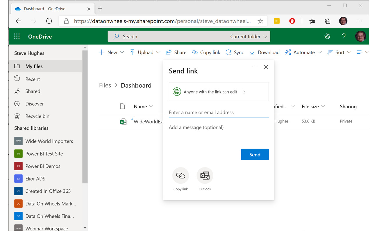
Figure 9.23 – Share your deployed Excel dashboard
This is just one approach you can use to share your dashboard with others. As you may have noticed in the link, this is the equivalent of sharing your dashboard on SharePoint.
Summary
In this chapter, you saw the various types of interaction you can have with multidimensional and tabular models when working with Excel. You created PivotTables and charts and supported these with timeline and slicer filters. These skills you learned will help you to visualize your data using Excel and both multidimensional and tabular models. You are also now able to enhance your Excel workbook visualizations to make them more appealing to your users and focus on the data to support your business scenario.
In the next chapter, we will use Power BI Desktop to live-connect to our models and create a similar dashboard. When the goal is to visualize the data in your models for users, Power BI has more visual capabilities than Excel.