
In this chapter, we'll focus on data visualization. Representing your data and insights visually will help business users to understand it. A good data application allows the business user to explore data, understand it, and discover new things.
Usually, a dashboard is a visual representation of the most important Key Performance Indicator (KPI) of a company, department, or business process. A dashboard can be created on a sheet of paper, in a spreadsheet, or with the help of a data visualization tool such as Qlik Sense.
When you create a dashboard with Qlik Sense, you create a live application. A Qlik Sense application can take the form of a dashboard or an analytic application. As you will see in this chapter, Qlik Sense allows you to combine this dashboard, analysis, and reporting in the same data application.
In data visualizations; charts, tables and other visualizations are the building blocks. We'll start by describing the visualizations provided by Qlik Sense and look at some basic rules to create them. We're not going to explain how to create a chart in Qlik Sense, because we did that in Chapter 4, Creating Your First Qlik Sense Application.
After data visualization, we'll discuss how to create a data application. We'll focus on the important features of Qlik Sense and on one particular approach to data application design.
Finally, we'll focus on data storytelling, a way to present your data and conclusions.
In Chapter 4, Creating Your First Qlik Sense Application, we saw how to create a Qlik Sense application. We also saw how to load data and how to create charts. The objective of this chapter is not to create a lot of charts. We are going to explore, in detail, a bar chart to explore the configuration options and we'll describe the charts provided by Qlik Sense and when to use the different data visualizations. We'll also look at some ideas on how to create data visualizations.
To see all the available options, open a Qlik Sense application in Edit mode and you will find all the options in the left hand pane. In the following screenshot, we can see the Charts pane:

Qlik Sense provides the following default charts:
- Bar chart: This is the simplest chart, it helps us to answer questions such as "Who are my best customers?" and "Who are the top performing salespeople?".
- Combo chart: In this chart, you can combine bars, lines, and points or symbols. I like to use it to represent metrics of different types such as sales and margins; you can use bars to represent the amount of sales and points to represent the margin.
- Filter pane: You can use a filter pane to contain the most common filters such as the year, month, or country; in this way, the user has easy access to the most common filters.
- Gauge and KPI: These charts only represents a metric with no dimensions. The Gauge chart shows the metric like a speedometer (Radial Gauge) or like a thermometer (Bar Gauge) and the KPI chart shows the metric as a text. Be careful when representing a single metric; if a dashboard tells us that the amount of sales is € 318,000, we don't know if the performance is high or low. If you compare the amount of sales with another metric like the target or the last year sales, this will add context to our metric. In the following screenshot you can see the same metric as a Radial Gauge, Bar Gauge, and KPI.

- Line chart: This chart is very useful when showing the evolution of a metric over time.
- Map: A different way to discover patterns in data is to visualize data in a map. By adding a location to your business data, you are providing a new context that can help you to obtain new insights. In Qlik Sense, there are two types of map polygons or area maps, as well as slippy maps or point maps.
- Pie chart: Sometimes, we need to see how a metric such as sales is distributed; the pie chart is a very effective method to show distributions. Be careful, if our dimension has a lot of values, this chart can get confusing.
- Scatter plot: To discover if two quantitative values are correlated and to which degree, we can use a scatter plot. With a scatter plot, we can see if there is a correlation between two variables.
- Table and Pivot Table: Tables are very useful when studying exact numbers or details.
- Text & image: By using text and image objects we can combine text, images, and measures. This is very useful in the main sheet of a dashboard. Usually, you place the headlines in this first sheet, and you can use the font size and type to provide more relevance to a text or value.
- Treemap: A treemap is a very useful tool to represent hierarchical (tree-structured) data. In a treemap, each branch is plotted as a rectangle, split by other branches or leaves. Finally, each leaf is plotted as a rectangle, the size of this rectangle depends on the measure's value. In the following screenshot, Europe and America are two branches and the countries are leaves:

- Extensions: Qlik Sense allows developers to create Extensions, which are additional developments that extend Qlik Sense functionality. There are several websites where you can find extensions, such as the following:
- Qlik Community (http://community.qlik.com/): This is a very active community about Qlik Sense and Qlik View.
- Qlik Market (http://market.qlik.com/): This is an exchange platform for useful solutions. There are three types of solutions: Connectors, Applications, and Extensions. This site is a very useful resource. Some extensions are free and some of them are chargeable.
- Qlik Branch (http://branch.qlik.com/): This is a collaborative site for developers to share their projects and extensions. You can find extensions and other developments that add functionalities to Qlik Sense.
You can find detailed instructions on how to use each chart on YouTube. Qlik has a channel called Qlik and there is a very good series called Qlik Sense Desktop Tutorials.
Tip
Qlik Sense charts are Responsible and Smart. The charts adapt themselves to the space to show information to the user in the smartest possible way. These kinds of charts are very useful for mobile devices. We're using Qlik Desktop, which is a PC based tool but, when using Qlik Sense Enterprise, we can access and develop from a PC, tablet, or smartphone and the Smart Charts adapt to the available space. The ability of the charts to adapt to space is very important for mobility purposes. If we access Qlik Sense with a browser from any device, from a cell phone to a desktop, every component in Qlik Sense is able to adapt to the available display screen space.
A good visualization or chart has to be clear, complete, and necessary. The user needs to be able to understand the visualization, for this reason you have to remember the following:
- Avoid complex charts
- Include legends whenever necessary
- Label axes
- Include titles, subtitles, and footnotes wherever necessary
Each visualization is a message and it's important that each chart has a complete meaning of its own. Finally, use only the necessary chart to avoid hiding the important ones in an ocean of plots.
In this section, we will use a simple bar chart to explore most of the configuration options of a Qlik Sense chart. In a bar chart, you have different values side-by-side. This chart is very useful when looking at the difference between dimensions. You can look over your sales in the different regions and it is very easy to compare actual versus planned, or see the differences between regions. You can use this chart for rank analysis or to show the top values, like the best sales representatives or the bestselling products.
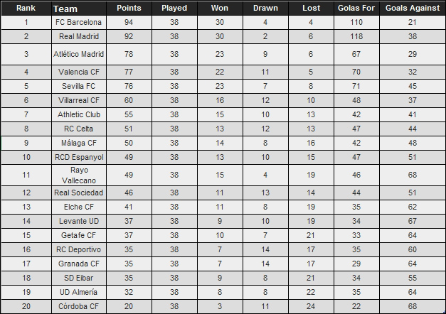
To create a bar chart, I've created a small dataset with the final classification of Liga BBVA 2014-2015, the Spanish soccer league, as shown in the following screenshot:
Our objective is to create a chart like the following:

This chart shows us the final classification, the number of points for each team and we used color to represent goals against. The chart tells us that FC Barcelona won the league and Real Madrid was second. Real Madrid and FC Barcelona were very close because the final number of points are very similar. In general, the teams with more goals against, perform worse; for this reason the bars on the right are darker than the bars on the left. There are two exceptions: Real Madrid and Rayo Vallecano. Real Madrid have more goals against than Atlético de Madrid or Valencia but have a better placing; probably they scored a lot of goals. Rayo Vallecano have the same issue as Real Madrid; they have a lot of goals against. As you can see, bar charts are very simple but they can provide a lot of information.
From the previous chapters, you know how to load data and how to create a bar chart. In this chart, we used Team for the dimension and Points for the measure.
To personalize bar charts, we've four main menus:
- Data
- Sorting
- Add-ons
- Appearance
These menus are illustrated in the following screenshot:

In this section, we're going to describe these four menus; they are similar in all charts.
To create a chart to represent the final placing at the end of the season, the first important decision is what to represent in the chart. The dimension is very obvious, we choose the variable Team. For measure, there are different options, such as Rank, or Points. If we use Rank as the measure, we'll see the final rank, but if we use Points, we'll see the final rank and the difference in points between teams. In this example, we've used Points because it provides us with more information:

From the previous chapters, you already know how to set Points and Team as the measure and dimension. In this example, we're going to focus on a few additional settings that will help us customize the chart.
In the Dimensions box, we see two interesting options, as follows:
- The Show null values checkbox
- The Limitation checklist
The Show null values checkbox tells us what to do when the value of the dimension is null. In the following piece from the original dataset, we've deleted the name of a football team; if the checkbox is checked, Qlik Sense will place a - in the place of the team name. If the checkbox is unchecked, Qlik Sense will draw RC Celta and RCD Espanyol, and will omit the ninth team, as illustrated here:

This check is very useful when looking for problems in your dataset. Imagine that you have a dataset with sales transactions; each row contains product, amount sold, customer, and salesman. If you plot a chart with amount sold as the measure and Product, Customer or Salesman as the dimension, a value of amount sold with - as label, this means that, in the original dataset, one or more rows have missing values for the dimension; as happened with the ninth team in our previous example.
The second important setting in dimensions is the Limitation listbox. This setting limits the number of values that Qlik Sense plots. There are four possible options, as depicted in the following table:
|
Limitation |
Illustration |
Description |
|---|---|---|
|
No limitation |
 |
Qlik Sense will plot all possible dimensions; in our example Qlik Sense will plot all teams. |
|
Fixed number |
 |
Qlik Sense will plot a fixed number of values (teams). This option is useful to create a Top 10 analysis. |
|
Exact value |
 |
Qlik Sense will plot only the Teams that have a number of points that agree to the condition. |
|
Relative value |
 |
Qlik Sense will plot only the Teams that have a number of points that agree to the condition. |
An important setting for the measure is Number formatting. By default, this setting option is Auto; generally Qlik Sense selects the best option, but if you want to be sure how the numbers are going to be formatted, you can set it however you wish. An example setting is shown here:

You can choose between these different Number formatting settings:
- Auto
- Number
- Money
- Date
- Duration
- Custom
For Money, Date and Duration, Qlik Sense Desktop takes the format from the first lines in Load Script. Qlik Sense Desktop automatically creates these lines from your computer's local settings. You can use the Custom option to create your own formatting mask.
The Sorting menu allows us to personalize how values are sorted in our bar chart. This menu looks like this:

In this example, we can sort the values by the measure, Points, or by the dimension, Team. Qlik Sense Desktop chooses the top variable to sort the values; in this case we will use Points to sort the values. If two teams have the same amount of points, they will be sorted by the second variable; in this case, Team.
If we place Team at the top of the variable list, the values will be sorted alphabetically by the name of the team.
As you can see in the previous screenshot, Qlik Sense Desktop sets the sorting type, by default, to Auto. You can set this option to Custom and personalize how you want to sort the values.
This menu provides us with the personalization options, Data handling and Reference lines, as shown in this screenshot:

Data Handling has only one option: Show zero values. If this option is checked, as shown in the preceding screenshot, Qlik Sense Desktop plots a team with zero points. If we uncheck this option, Qlik Sense Desktop does not plot a team with zero points.
With Reference lines we can add horizontal lines to our bar chart. In the following screenshot, you can see how to set a line by taking the points average:

The Appearance menu has five options, as listed here:
- General
- Presentation
- Colors and legend
- X-axis
- Y-axis
This menu is illustrated in the following screenshot:

Under the General submenu, there are the Title, Subtitle, and Footnote options. When you see an fx symbol in the textbox, it means that you can use an expression. We're going to use this functionality in the following example.
In the Presentation submenu, we can choose between Vertical and Horizontal orientation, the type of grid, and whether we use the Value labels switch, to plot the value of each bar in the bar chart. In this example, if you turn on this switch, the amount of points for each team will be plotted in each bar.
The X-axis and Y-axis submenus allow us to personalize labels and titles for each axis. If the variable is numeric, such as Points, we can also personalize the axis range.
The Appearance menu is further illustrated as follows:

Finally, using the Colors and legend submenu, we can personalize the color of each bar. Qlik Sense Desktop offers us four options:
- Single color: All bars have the same color.
- By dimension: Each different value in the dimension variable has a different color. In our example, each team has a different color. We used this option in Chapter 4, Creating Your First Qlik Sense Application.
- By measure: In our example, Qlik Sense Desktop uses the variable Points to color each bar.
- By expression: In this option, we can use a new expression to color the bars. This option is very useful because it allows us to code more information in the same plot. In this example we used the variable Goals Against; in this way we discovered that Real Madrid and Rayo Vallecano conceded an unusual number of goals. The expression can return a number, as in this example, or a color code, as in the example in Chapter 5, Clustering and Other Unsupervised Learning Methods.
In the next section, we're going to use title and subtitle expressions to add information to our chart.