In Chapter 2, you saw a few simple examples of actions you could create with buttons. Now you will focus on a few more. This chapter will cover
A review of the Action tab’s properties in various fields and non-form items
Looking at built-in triggers and actions that require no coding
Applying what you discover to buttons for page navigation
How to use button icons rather than just text
How a button can become a help icon to show or hide information in an order form
How a check box can show or hide information in combination with a reset button
Note
If you want to work along in this lesson or review the final result, download the Chapter 4 files from www.apress.com/9781484228920 . The file with the label “Start” is the file without the code and the file with the label “End” is the final result. You will also find folders with original MS Word and PDF files if you would like to edit them and a folder containing the original images if you would like to add them to your own PDF forms.
To view the properties of a field you must select the Prepare Form tool. Only then can you right-click or double-click a field to review its properties.
If you are creating your form from an original PDF that contains no form fields, refer to the “Forms Review” section in Chapter 1.
Creating a Button Icon
Not all buttons have to be just text; you can also have text and an image or just an image that you created in a program like Adobe Photoshop or GIMP. As in the QR code stamp example in Chapter 3, the file can be many formats including a JPEG, GIF, or PNG.
The icon for the button is placed in the Options tab when you click the Choose Icon button (Figure 4-1).

Figure 4-1. The Option tab with the Choose Icon button
Choose the layout setting of the icon only or have the icon on top or in another location if you want to use the icon in combination with text (known as a label).
The layout options are
Label only (this setting will not allow you to add an icon)
Icon only
Icon top, label bottom
Label top, icon bottom
Icon left, label right
Label left, icon right
Label over icon
The Advanced button will allow you to adjust the placement of the icon precisely (refer to Figure 4-2).

Figure 4-2. Clicking the Advanced button in the Options tab opens the Icon Placement dialog box
Example of a Button as a Label Only
Figure 4-3 is an example of a button with only a label applied, as found in the Newsletter file. This button’s label says Next Page because you want the user to go to the next page when they click the button. The label is a helpful hint so that the user will know what will happen when the button is clicked. These types of buttons can be used in any document that contains three or more pages.

Figure 4-3. Label-only button
Note
The current state is Up based on the behavior of the button.
A behavior like push will give other options; instead of one icon or label you could add three. See Figure 4-4 for some of the options.

Figure 4-4. Example of various behaviors and states applied to a button
Figure 4-5 shows an example of a three-button group that has an icon image and some actions applied to them. Without actions, these buttons would function independently and not interact with each other.

Figure 4-5. Example button group with different show and hide fields applied to each button in the Order Form PDF
If you enter each of the buttons properties, you will see, as in Figure 4-6, various hide and show actions.

Figure 4-6. Example button group with show and hide fields applied
All actions can be
Added using the Add button
Rearranged using the Up and Down buttons
Edited using the Edit button
Deleted using the Delete button
Non-Form Properties Actions
The following sections take a quick look at the kinds of properties you can apply actions to that are not part of forms.
Pages
For this example, refer to the Newsletter Navigation PDF file and see Figure 4-7.

Figure 4-7. Accessing the page thumbnails
Under View ➤ Show/Hide ➤ Navigation Panes ➤ Page Thumbnails you will find on the left-hand side of Acrobat all the page thumbnails of your current document.
Select one of the pages in the Thumbnail section and from the dropdown choose Page Properties at the bottom of the options list to access this dialog box (refer to Figure 4-8).

Figure 4-8. The Page Properties option in the Action tab
Pages can have actions applied for improved navigation. Remember that you can access this area on the left side of Acrobat in the Page Thumbnail section. Alternately, you can right-click on a thumbnail and choose Page Properties from the list .
Bookmarks
For this example, refer to the Newsletter Navigation PDF file.
Under View ➤ Show/Hide ➤ Navigation Panes ➤ Bookmarks you will find on the left-hand side of Acrobat all the bookmarks of your current document (refer to Figure 4-9).

Figure 4-9. Bookmarks found in the Newsletter file in the Navigation Panes area
Select one of the bookmarks and from the Options menu at the bottom of the list choose Properties. This will allow you to add or view the actions for the bookmark (refer to Figure 4-10).

Figure 4-10. Bookmark properties in the Action tab
Remember that you can access this area on the left side of Acrobat in the Bookmark Thumbnail section. Alternately, you can right-click on a bookmark and choose Properties from the list.
Web Hyperlinks
For this example, refer to the Newsletter Navigation PDF file.
You can access this area under Tools ➤ Edit PDF ➤ Link ➤ Add or Edit Web or Document Link if a link already exists. Then right-click the link and choose Properties from the list. (refer to Figure 4-11).

Figure 4-11. Accessing link properties in the Action tab
Alternately, outside of the Edit PDF tool, you can Select the link by right-clicking the link and choosing Edit Link from the list (refer to Figure 4-12).

Figure 4-12. Accessing the link properties in the Action tab outside of the Edit PDF tool
Rich Media Non-Form Navigation Buttons
For this example, refer to the Floor Plan Layout PDF file.
Buttons can be added either via the Forms tool or the Rich Media tool (refer to Figure 4-13).

Figure 4-13. Rich Media Button Properties dialog box in the Action tab
Non-form button actions can be used for video media, 3D models, navigation, or later for forms while working with the Rich Media tool. However, after you close the file and open it again, to access the buttons properties, you will need to go into the Prepare Form tool to edit the button actions because you lose access after exiting the Rich Media tool.
Layers Basic Actions
For this example, refer to the Floor Plan Layout PDF file.
Under View ➤ Show/Hide ➤ Navigation Panes ➤ Layers you will find on the left-hand side of Acrobat all the layers of your current document (refer to Figure 4-14).

Figure 4-14. Access to the layers in the Navigation Panes area
To access the Layer properties , you can select a layer and from the Options menu and choose Layer Properties from the bottom of the list. Alternately, you can right-click on a layer and choose Properties (refer to Figure 4-15).

Figure 4-15. Layer properties as seen in the Floor Plan example when you select a layer and either choose from the Options menu or right-click the layer in the Navigation pane
Layer actions have some similarities to Acrobat page transitions.
Layers can have a default state of on or off.
Layers are good for use as overlays to show, for example, optional layouts of a room or floor. The layers can be separated and exported out of program such as Adobe InDesign when you create an interactive PDF.
Unlike other actions, they can be tricky to set up and are best kept to one or two layers.
As you can see, most of these non-form properties can be accessed in the navigation pane/thumbnail area in Acrobat. The same is true for layers .
Triggers for Actions
Before you choose an action, it is important to select a trigger.
Trigger + Select Action = Result You Want
The most common trigger to use in digital forms is Mouse Up, as seen in Figure 4-16.

Figure 4-16. Various action triggers that can be selected
The following describes this and a few other actions you may encounter:
Mouse Up: When the mouse button is released after a click. This is the most common button trigger because it gives the user one last chance to drag the pointer off the button and not activate the action.
Mouse Down: When the mouse button is clicked (without being released). In most cases, Mouse Up is the preferred trigger.
Mouse Enter: When the pointer enters the field or play area.
Mouse Exit: When the pointer exits the field or play area.
On Receive Focus (media clips only): When the link area receives focus, either through a mouse action or tabbing. Also called On Focus.
On Lose Focus (media clips only): When the focus moves to a different link area. Also called On Blur.
The exceptions to properties not having an available trigger are bookmarks and hyperlinks.
It is assumed that you will click the link with your mouse or finger and that the action of going to that page or URL will be executed .
Refer to the following Adobe link for more details: https://helpx.adobe.com/acrobat/using/applying-actions-scripts-pdfs.html .
Choose an Action That Requires No Code
There are many actions you can choose from. As you can see in Figure 4-17, once you choose a trigger you can add an action to a button that will allow you to move to another page or print all the pages in the document.

Figure 4-17. Various actions that can be selected
You will look at some specific actions shortly. However, take a moment to review some of the actions that are available in this list:
Execute a menu item: Executes a specified menu command as the action.
Go to a 3D/multimedia view: Jumps to the specified 3D view.
Go to a page view: Jumps to the specified destination in the current document.
Import form data: Brings in form data from another file, and places it in the active form.
Multimedia operation (Acrobat 9 and later): Executes a specified action for a multimedia object in the file (such as playing a sound file). The multimedia object must be added to the file before you can specify an action for it.
Open a file: Launches and opens a file. If you are distributing a PDF file with a link to another file, the reader needs the native application of that linked file to open it successfully. (You may need to add opening preferences for the target file ).
Open a web link: Jumps to the specified destination on the Internet. You can use HTTP, FTP, and mailto protocols to define your link.
Play a sound: Plays the specified sound file. The sound is embedded into the PDF document in a cross-platform format.
Play media (Acrobat 5, or Acrobat 6 and later compatible): Plays the specified QuickTime or AVI movie that was created as Acrobat 5 or 6-compatible. The specified movie must be embedded in a PDF document.
Read an article: Follows an article thread in the active document.
Reset a form: Clears previously entered data in a form. You can control the fields that are reset with the Select Fields dialog box.
Run a JavaScript: Runs the specified JavaScript. This requires JavaScript to do some custom action.
Set layer visibility: Determines which layer settings are active. Before you add this action, specify the appropriate layer settings.
Show/hide a field: Toggles between showing and hiding a field in a PDF document. This option is especially useful in form fields. For example, if you want an object to pop up whenever the pointer is over a button, you can set an action that shows a field on the Mouse Enter trigger and hides a field on Mouse Exit .
Submit a form: Sends the form data to the specified URL. You may need someone in your IT department to help you test this first (refer to Figure 4-18).

Figure 4-18. Submit Form Selections dialog box
It is important to note, in the case of the “Execute a menu item,” additional possible variations to the action will appear when the Add button is clicked, such as assorted options for page and document navigation. Figures 4-19 and 4-20 illustrate what options are available.

Figure 4-19. An example of an action added to the Actions tab from the selected action “Execute a menu item ”

Figure 4-20. The many different menu options that are available
In the Actions tab, more than one action can be added using the Add button. One example is to show and hide items on a form; refer to Figure 4-21. It shows some fields and then hides others.

Figure 4-21. Multiple actions applied to one field
Newsletter Navigation with Buttons
Open the Newsletter Navigation End file in the Chapter 4 folder. Test the buttons. You can use labels with or without images to enhance the navigation experience. See Figure 4-22 for the buttons with an example of an action applied.

Figure 4-22. Applying an action to a button to navigate to another page (see pages 1-3 of the Newsletter End file)
Choose an action of “Execute a menu item” and apply one of the following types of navigation to your button:
View ➤ Page Navigation ➤
First Page
Previous Page
Next Page
Last Page
Go to Page
Previous View
Next View
As shown back in Figure 4-20, other types of viewing include
Page Display
Zoom
Portfolio
Show/Hide of Panes
Full Screen Mode
The Next Page button and the right-pointing arrow icon button in the Newsletter Document have had the action View ➤ Page Navigation ➤ Next Page applied. The Previous Page button and the left-pointing arrow button have had the action View ➤ Page Navigation ➤ Previous Page applied.
To navigate to a file in the same folder or an attachment within the PDF document, see Figure 4-23 with the Go to Form button and the actions applied .

Figure 4-23. Navigate to a file somewhere on your hard drive or within the PDF file. Refer to page 4 of the Newsletter End PDF.
With the Go To Form button created, you could do one of the following to open the form :
Open a file.
Execute a menu item ➤ View ➤ Show/Hide ➤ Navigation Pane ➤ Attachments.
As mentioned earlier, navigation can be a link or even a bookmark.
In the Newsletter Navigation PDF, you can alter the URL link called “New finds in China.” This link can either go to a website or it additionally can have a bookmark that will anchor or jump to that to when clicked. If your bookmark name is no longer the same as the section title because you altered the link action, you can rename the bookmark, as you can see in Figure 4-24. The bookmark has now been renamed and matches the URL or section it is jumping to.
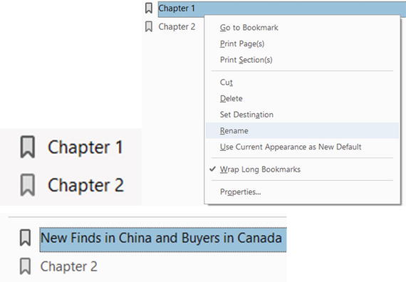
Figure 4-24. A bookmark can be used a link to a section within a book or to navigate to a URL
Form Navigation with a Button as Helpful Hint
If a client is unsure what to enter in a field, a hint can be created to give information. Open the TMC Order Form End example to see how this is done.
This example uses “Show/hide a field” to accomplish this. Refer to the button next to the Customer Order Code and Figure 4-25 .

Figure 4-25. Show and hide example
Here is a breakdown of each of the buttons:
Info button: Show-Close, Show-Info Window, Hide-Info (Figure 4-26).

Figure 4-26. The Info button is visible at first glance
Close button: Hide-Close, Hide-Info Window, Show-Info (Figure 4-27).

Figure 4-27. The Close button appears on top of the Info Window button
Info Window button: No actions applied. Leave Action tabs blank (Figure 4-28).

Figure 4-28. The Info Window button appears below the Close button
Adding a Comb of Characters
A comb of characters spreads the user-entered text evenly across the width of the text field. If a border color is specified in the Appearance tab, each character entered in the field is separated by lines of that color. This option is available only when no other check box is selected; refer to Figure 4-29.

Figure 4-29. Without and with a comb of characters
Note
When entering a code, it can helpful to add a comb of characters properties so that the client knows they have entered the correct amount of letters or numbers.
Before Comb and After Comb
Figure 4-30 shows how a text field in the Option tab properties appears before you apply the comb of characters. When you uncheck all other options, only then will the comb of characters be available to alter how many characters will be in it.

Figure 4-30. Adding the comb of characters to the text field in the Options tab
So that the comb of characters displays correctly, go into the Appearance tab and add a border color, line thickness, and line style so that the comb will appear; refer to Figure 4-31.

Figure 4-31. Adjusting the appearance of the comb in the Appearance tab
There are other ways to help clients when they are unsure what to enter into a field, and we will look at them in later chapters .
More Action Triggers to Show and Hide
Check boxes and buttons can be used in combination to create fields that show or hide. Refer here to the TMC Order Form End file to see the final example and Figures 4-32 and 4-33.

Figure 4-32. Show and hide a shipping address using a check box

Figure 4-33. Show and hide a shipping address using a check box
The settings for the check box actions are
Show Text and Button fields (Figure 4-34):
First_Name_2
Last_Name_2
Address_2
City_2
Province_2
Country_2
Postal Code_2
Hide and Clear Fields Button

Figure 4-34. When the check box is click, some fields in the form will show that they were hidden. Since you must set the show fields one at a time, refer to the list to see which field should have the Show setting.
Hide and Clear Fields Button
This button uses a combination of Reset and Show/Hide. If the shipping address is the same, you don’t want to store duplicate data, so you clear the fields that were shown when the check box was checked and hide them again along with the button. Refer to Figure 4-35.
Figure 4-35. Reset button
The settings for the button actions are shown in Figure 4-36.

Figure 4-36. When the button is clicked, some fields in the form will hide that were shown. Since you must set the hide fields one at a time, refer to the list to see which field should have the Hide setting .
Hide Text and Button fields:
First_Name_2
Last_Name_2
Address_2
City_2
Province_2
Country_2
Postal Code_2
Hide and Clear Fields Button
Finally, reset all the fields mentioned in the check box except for the button, which cannot be reset. Refer to Figure 4-37.

Figure 4-37. Reset button that clears the information in the fields and hides them again
Set Layer Visibility
As mentioned earlier, adding and setting layer visibility in a document can be tricky. One of the examples in this chapter is a file of a floor plan, showing how this can be achieved if you have a document with one or more layers. You can either use bookmarks or buttons to show and hide your layers. Refer to Figure 4-38.

Figure 4-38. The layers in the floor plan PDF
Note
In the properties of each layer, I have set only the default mode of the title layer to be on when the document opens; the others are set to Off. Remember that to access the properties of a layer you need to right-click the layer and choose properties.
More details about adding and working with layers can be found at https://helpx.adobe.com/acrobat/using/pdf-layers.html .
Using Bookmarks
If you don’t want to use buttons, you can alternatively use bookmarks to show and hide layers. See Figure 4-39.

Figure 4-39. Setting Bookmark properties
Begin by making sure that the layers you want visible or hidden are on or off to create the correct view for your bookmark.
Once you’ve created a bookmark, you can right-click it and choose Properties from the menu. The properties will appear. Then select the Actions tab as in Figure 4-40.

Figure 4-40. Bookmark Action properties
Notice that the action “Go to a page in this document” is already added. However, you will need to add the action of “Set layer visibility.” Upon clicking Add, an info warning will appear reminding you that whatever the current state the layers are in now will be what this bookmark will display. If you do not like your layer visibility, click Cancel and set your layers to the correct state before choosing OK to add this action.
Now your bookmark should be able to show or hide the layer. As with any action, it can be removed by clicking the Delete button.
Using Buttons
As with bookmarks, buttons can be used as well. Refer to Figure 4-41. However, you may want to hide some buttons along with the layers while some layers are visible to reduce clutter. Also, you may want to reset all the layers to the off or hidden state as well with a button. You can review the file to see what the final effect looks like. The bulleted list below shows what settings were applied to each button. As with the bookmarks, make sure that the layers are in the state you want before you set the layer visibility for each button. Make sure to test your file when you’re done.

Figure 4-41. Example of settings applied to the buttons
Show Floor Plan button: Set layer visibility, Show Vendor Number, and Show-Hide Layers Button.
Show Vendor Numbers button: Set layer visibility.
Hide Layer button: Set layer visibility, Hide Vendor Number, and Hide-Hide Layers Button.
In the Layers pane, only the title layer is set to on; all other layers are turned off.
Only turn on layers that you want visible before adding the action of layer visibility to each button. Click OK to confirm setting. Refer to Figure 4-42.

Figure 4-42. This is the info alert that appears as layer visiblity is set
Once you are finished setting the buttons, return the layers to your default settings, save the file, and close it.
Summary
This chapter covered a lot of topics concerning actions that can be applied to form fields and non-form items like layers, bookmarks, buttons, pages, and links. As you can see, Acrobat offers a lot of options in regard to navigation and controlling how you view or hide fields.
At this point, you haven’t added any custom JavaScript. You’ve only used the settings that come with the Acrobat Actions tab. However, in part 2, you are going to look at running your own JavaScript and how this effects what you input into your form fields.
Before you go any farther in this book, take some time to practice these actions on your own and try adding them to a few of your own projects.